
 Home/Blog
John Christy and I received an email today from Marcel Crok, who presented our satellite observations-vs-models graphs to the Dutch version of the American Physical Society (APS).
He said there was considerable push-back about the way we plot the data…not from the society itself, but from global warming activist bloggers.
I’ve heard these objections before, and mostly ignored them as uninformed and lame, since I’ve never heard one from an actual climate scientist.
But apparently it’s worthwhile to address the objections, since they seem to be lurking out there in the blogosphere.
Marcel summarized the objections he heard as follows, where “they” refers to us (Spencer & Christy):
1. They shift the modelled temperature anomaly upwards to increase the discrepancy with observations by around 50%.
2. Using a four year baseline from 1979-83 shifts UAH down lower compared to the surface record.
3. Why did John Christy use a four year baseline period instead of a 30 year baseline as is usual?
4. One other trick played in the Spencer/Christy graph is to start all of the models from the same point. That�s not what is done in practice � they are run-up over a period of time and and have a distribution along the entire period.
5. The baseline Christy used 1979-1983 is a 5 year period, it includes 79,80,81,82 and 83. It�s basically the first point on his running 5 year mean. Of course that ISNT the 5 year average centered on 1983. It�s the average centered on 81. So Christy�s graph is shifted 2 years to the right.
These complaints are all interrelated, and are mostly variations on the same objection.
Let’s start with one of our graphs Marcel presented (this isn’t exactly the same as the one he presented, but it would cause the same objections he encountered):
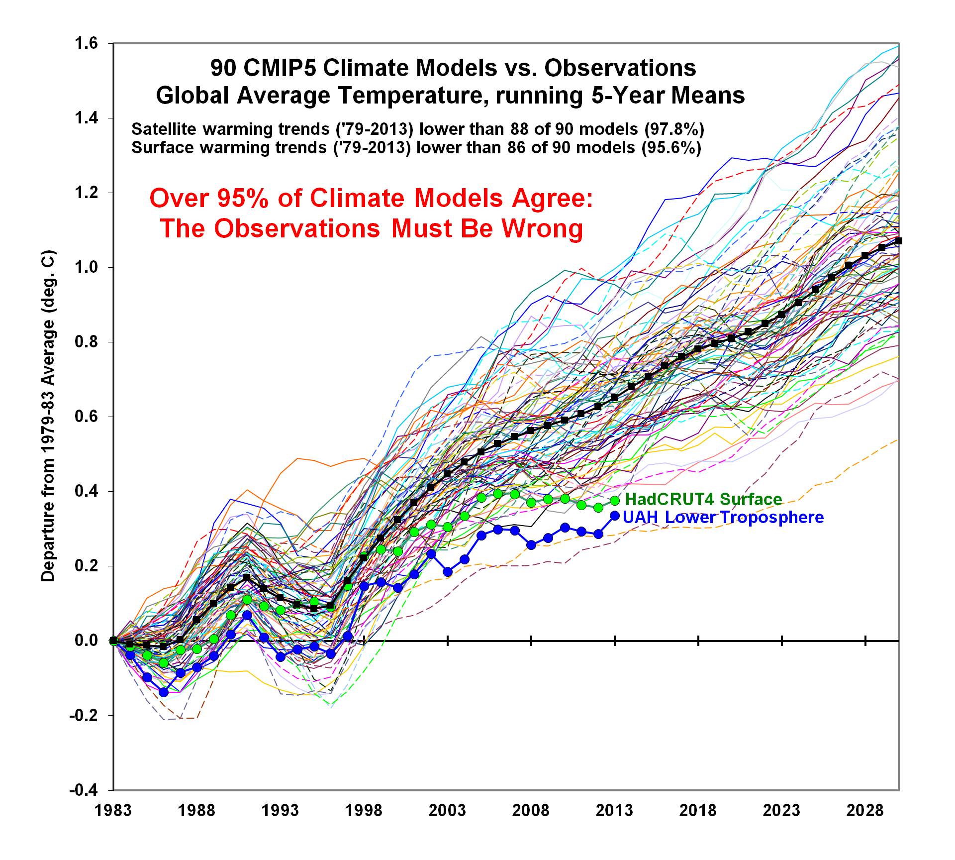
Now, see the text on the graph about how the warming *TRENDS* are almost always greater in the models than the observations?
Well, the difference in trends between models and observations is not affected by any of the 5 objections listed above.
It doesn’t matter how you plot the data with vertical offsets, or different starting points: these issues do not affect the trends, and trends are probably the single most important statistical metric to test the models against observations.
The vast majority of the models have greater warming trends than the observational data show. How members of a Dutch “Physical Society” would not know any of this is beyond me.
Beyond this overriding issue which make the 5 objections moot, I will still answer them (in sequence, see above) because John Christy and I believe that the way we plot the data is the most physically meaningful and the most defensible.
1. We do NOT shift the models upward to enhance the discrepancy with the observations. They diverge upward when starting at the same initial point: the 1979-1983 average (the first 5 years of the satellite record).
2. See #1.
3. The anomalies ARE relative to the same 30-year baseline. But when you plot the results, and the models have such a different warming trend, you then must decide whether to plot just the anomalies (which would have the models too COLD early in the record, then too WARM late in the record), or have them all start the “warming race” at the same time…like we did…relative to their respective 1979-1983 starting temperatures.
4. See #3.
5. Shifting of the year labels on the graph by 2 years has no impact on the discrepancy between models and observations.
I hope the above helps to clarify why we plot the model-vs-observations comparisons the way we do.
NOTE: The above has been edited to better reflect who Marcel Crok received objections from.


