
 Home/Blog
I am seeing an increasing number of people on social media pointing to the weekly CDC death statistics which show a unusually low number of total deaths for this time of year, when one would expect the number to be increasing from COVID-19. But what most people don’t realize is that this is an artifact of the late arrival of death certificate data as gathered by the National Center for Health Statistics (NCHS).
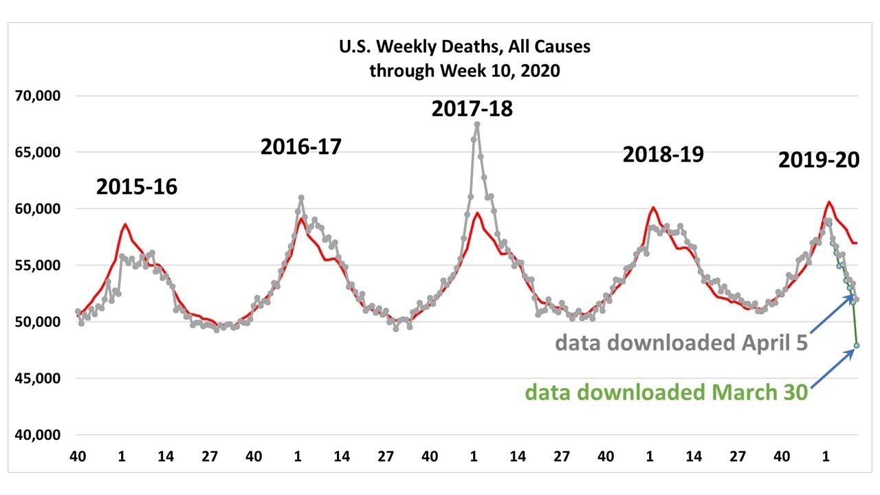
This first came to my attention as a tweet by some researchers who were using the CDC weekly death data in a research paper pointing out the downturn in deaths in early 2020 and had to retract the paper because of the incomplete data problem. A disclaimer at the CDC website points out the incomplete nature of recent data. While they say that the new totals could be adjusted either upward or downward, it appears that the adjustments are almost always upward (i.e. recent data have a low bias in reported deaths).
As a first attempt to possibly correct for this under-reporting problem, I downloaded the data two weeks in a row (approximately March 30 and April 5, 2020) to examine how the recent data changes as new death certificate data are obtained. I realize this is only one week’s worth of changes, and each week would provide additional statistics. But the basic methodology could be applied with additional weeks of data added.
I first use the 4.5 years of reported weekly death data to compute an average seasonal cycle in deaths, with the slow upward trend included (red line in the following figure). Also shown are the total deaths reported on 2 successive weeks, showing the increase in reported deaths from late reports coming in.
Although it is not obvious in the above plot, there were new deaths reported as much as 1 year late. If we use the difference between the two successive weeks’ reports as an estimate of how many new reports will come in each week as a percentage of the average seasonal cycle, and sum them up for 52 weeks, we can get a rough estimate of what the totals will look like a year from now (the blue line in the following figure).
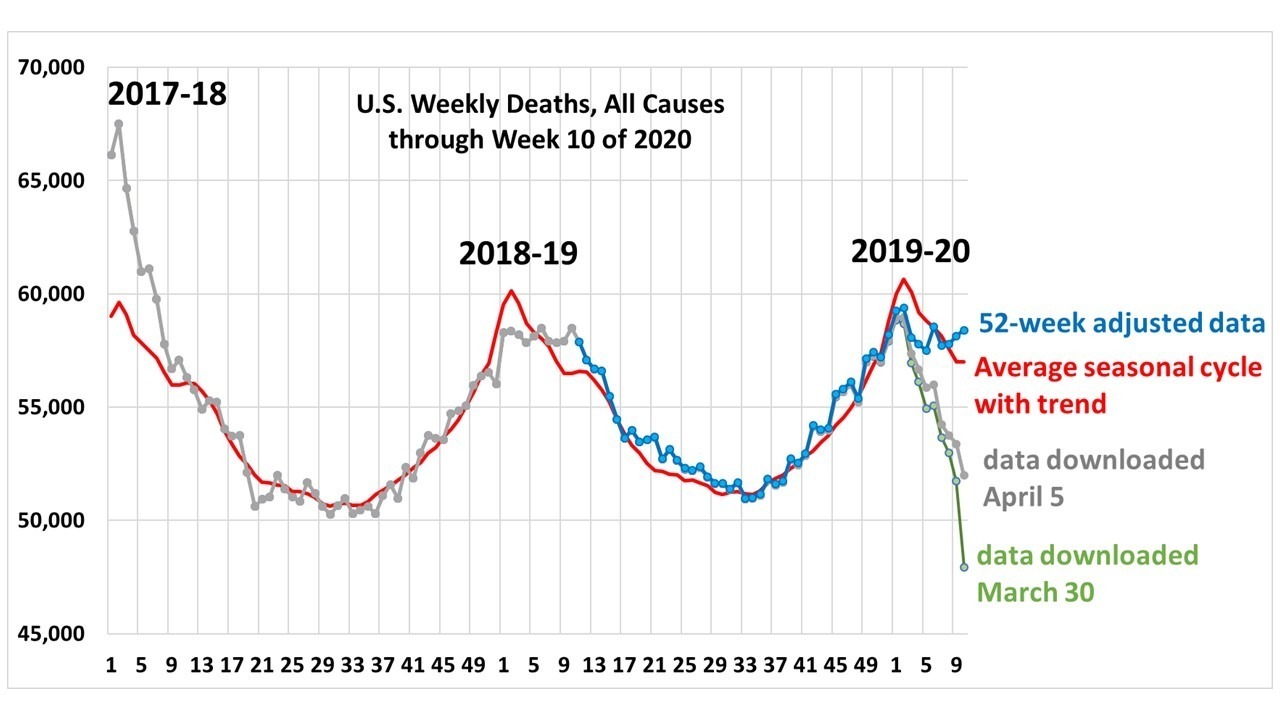
The blue line shows behavior quite close to that seen last year at this time. Keep in mind that Week 10 is only through early March, at which point there were only 30 COVID-19 deaths reported, which is too small a number to show up on these plots. I’m posting this as just a suggestion for those who want to analyze recent weekly death data and make some sense out of it.
It is also of interest how bad the 2017-18 flu season was compared to this season. I’m sure many medical people are aware of this, but I don’t recall it being a huge news story two years ago.


I’m very glad to stop-by this website. I learned a lot. Thanks for sharing a wonderful article.
https://electricianglenmorepark.net.au/residential-electrician-regentville/
Nếu bạn đang thắc mắc khng biết chơi game ti xỉu đổi tiền thật rt tiền mặt ở đu uy tn th bạn vo đng địa chỉ rồi đấy. Cng Bet Đy Rồi tải app qua 9 link tải game ti xỉu online đổi thưởng uy tn nhất năm 2022 nh.
https://betdayroi.com/tai-xiu-online-doi-thuong-p298.html