Archive for the ‘Blog Article’ Category

Spencer vs. Schmidt: My Response to RealClimate.org Criticisms

Wednesday, January 31st, 2024

What follows is a response to Gavin Schmidt’s blog post at RealClimate.org entitled Spencer’s Shenanigans in which he takes issue with my claims in Global Warming: Observations vs. Climate Models. As I read through his criticism, he seems to be trying too hard to refute my claims while using weak (and even non-existent) evidence.

To summarize my claims regarding the science of global warming:

  1. Climate models relied upon to guide public policy have produced average surface global warming rates about 40% greater than observed over the last half-century (the period of most rapid warming)
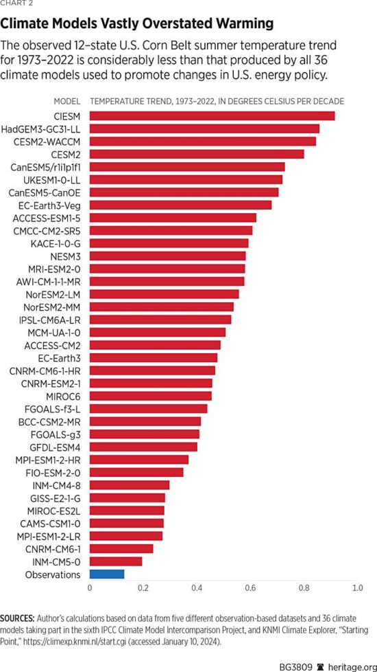
  2. The discrepancy is much larger in the U.S. Corn Belt, the world-leader in corn production, and widely believed to be suffering the effects of climate change (despite virtually no observed warming there).
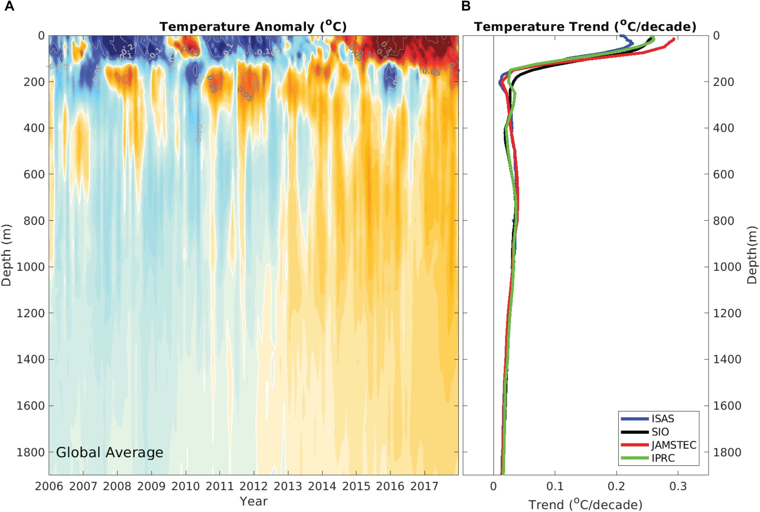
  3. In the deep-troposphere (where our weather occurs, and where global warming rates are predicted to be the largest), the discrepancy between models and observations is also large based upon multiple satellite, weather balloon, and multi-data source reanalysis datasets.
  4. The global energy imbalance involved in recent warming of the global deep oceans, whatever its cause, is smaller than the uncertainty in any of the natural energy flows in the climate system. This means a portion of recent warming could be natural and we would never know it.
  5. The observed warming of the deep ocean and land has led to observational estimates of climate sensitivity considerably lower (1.5 to 1.8 deg. C here, 1.5 to 2.2 deg. C, here) compared to the IPCC claims of a “high confidence” range of 2.5 to 4.0 deg. C.
  6. Climate models used to project future climate change appear to not even conserve energy despite the fact that global warming is, fundamentally, a conservation of energy issue.

In Gavin’s post, he makes the following criticisms, which I summarize below and which are followed by my responses. Note the numbered list follows my numbered claims, above.

1.1 Criticism: The climate model (and observation) base period (1991-2020) is incorrect for the graph shown (1st chart of 3 in my article). RESPONSE: this appears to be a typo, but the base period is irrelevant to the temperature trends, which is what the article is about.

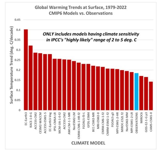
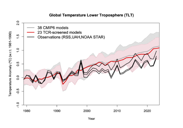
1.2 Criticism: Gavin says the individual models, not the model-average should be shown. Also, not all the models are included in the IPCC estimate of how much future warming we will experience, the warmest models are excluded, which will reduce the discrepancy. RESPONSE: OK, so if I look at just those models which have diagnosed equilibrium climate sensitivities (ECS) in the IPCC’s “highly likely” range of 2 to 5 deg. C for a doubling of atmospheric CO2, the following chart shows that the observed warming trends are still near the bottom end of the model range:

And since a few people asked how the results change with the inclusion of the record-warm year in 2023, the following chart shows the results don’t change very much.

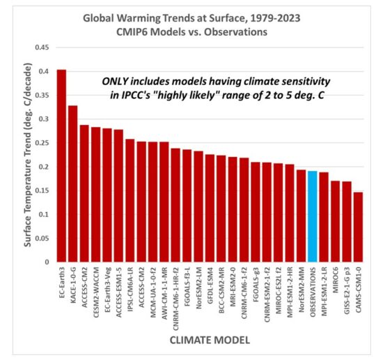
Now, it is true that leaving out the warmest models (AND the IPCC leaves out the coolest models) leads to a model average excess warming of 28% for the 1979-2022 trends (24% for the 1979-2023 trends), which is lower than the ~40% claimed in my article. But many people still use these most sensitive models to support fears of what “could” happen, despite the fact the observations support only those models near the lower end of the warming spectrum.

1.3 Criticism: Gavin shows his own comparison of models to observations (only GISS, but it’s very close to my 5-dataset average), and demonstrates that the observations are within the envelope of all models. RESPONSE: I never said the observations were “outside the envelope” of all the models (at least for global average temperatures, they are for the Corn Belt, below). My point is, they are near the lower end of the model spread of warming estimates.

1.4 Criticism: Gavin says that in his chart “there isn’t an extra adjustment to exaggerate the difference in trends” as there supposedly is in my chart. RESPONSE: I have no idea why Gavin thinks that trends are affected by how one vertically align two time series on a graph. They ARE NOT. For comparing trends, John Christy and I align different time series so that their linear trends intersect at the beginning of the graph. If one thinks about it, this is the most logical way to show the difference in trends in a graph, and I don’t know why everyone else doesn’t do this, too. Every “race” starts at the beginning. It seems Gavin doesn’t like it because it makes the models look bad, which is probably why the climate modelers don’t do it this way. They want to hide discrepancies, so the models look better.

2.1 Criticism: Gavin doesn’t like me “cherry picking” the U.S. Corn Belt (2nd chart of 3 in my article) where the warming over the last 50 years has been less than that produced by ALL climate models. RESPONSE: The U.S. Corn Belt is the largest corn-producing area in the world. (Soybean production is also very large). There has been long-standing concern that agriculture there will be harmed by increasing temperatures and decreased rainfall. For example, this publication claimed it’s already happening. But it’s not. Instead, since 1960 (when crop production numbers have been well documented), (or since 1973, or 1979…it doesn’t matter, Gavin), the warming has been almost non-existent, and rainfall has had a slight upward trend. So, why did I “cherry pick” the Corn Belt? Because it’s depended upon, globally, for grain production, and because there are claims it has suffered from “climate change”. It hasn’t.

3.1 Criticism: Gavin, again, objects to the comparison of global tropospheric temperature datasets to just the multi-model average (3rd of three charts in my article), rather than to the individual models. He then shows a similar chart, but with the model spread shown. RESPONSE: Take a look at his chart… the observations (satellites, radiosondes, and reanalysis datasets) are ALL near the bottom of the model spread. Gavin makes my point for me. AND… I would not trust his chart anyway, because the trend lines should be shown and the data plots vertically aligned so the trends intersect at the beginning. This is the most logical way to illustrate the trend differences between different time series.

4. Regarding my point that the global energy imbalance causing recent warming of the deep oceans could be partly (or even mostly) natural, Gavin has no response.

5. Regarding observational-based estimates of climate sensitivity being much lower than what the IPCC claims (based mostly on theory-based models), Gavin has no response.

6. Regarding my point that recent published evidence shows climate models don’t even conserve energy (which seems a necessity, since global warming is, fundamentally, an energy conservation issue), Gavin has no response.

Gavin concludes with this: “Spencer’s shenanigans are designed to mislead readers about the likely sources of any discrepancies and to imply that climate modelers are uninterested in such comparisons — and he is wrong on both counts.”

I will leave it to you to decide whether my article was trying to “mislead readers”. In fact, I believe that accusation would be better directed at Gavin’s criticisms and claims.

P.S. For those who haven’t seen it, Gavin and I were interviewed on John Stossel’s TV show, where he refused to debate me, and would not sit at the table with me. It’s pretty revealing.

How Much Ocean Heating is Due To Deep-Sea Hydrothermal Vents?

Monday, January 29th, 2024

I sometimes see comments to the effect that recent ocean warming could be due to deep-sea hydrothermal vents. Of course, what they mean is an INCREASE in hydrothermal vent activity since these sources of heat are presumably operating continuously and are part of the average energy budget of the ocean, even without any long-term warming.

Fortunately, there are measurements of the heat output from these vents, and there are rough estimates of how many vents there are. Importantly, the vents (sometimes called “smokers”) are almost exclusively found along the mid-oceanic ridges, and those ridges have an estimated total length of 75,000 km (ref).

So, if we had (rough) estimates of the average heat output of a vent, and (roughly) know how many vents are scattered along the ridges, we can (roughly) estimate to total heat flux into the ocean per sq. meter of ocean surface.

Direct Temperature Measurements Near the Vents Offer a Clue

A more useful observation comes from deep-sea surveys using a towed sensor package which measures trace minerals produced by the vents, as well as temperature. A study published in 2016 described a total towed sensor distance of ~1,500 km just above where these smokers have been located. The purpose was to find out just how many sites there are scattered along the ridges.

Importantly, the study notes, “temperature anomalies from such sites are commonly too weak to be reliably detected during a tow“.

Let’s think about that: even when the sensor package is towed through water in which the mineral tracers from smokers exist, the temperature anomaly is “too weak to be reliably detected”.

Now think about that (already) extremely weak warmth being mixed laterally away from the (relatively isolated) ocean ridges, and vertically through 1,000s of meters of ocean depth.

Also, recall the deep ocean is, everywhere, exceedingly cold. It has been calculated that the global-average ocean temperature below 200m depth is 4 deg. C (39 deg. F). The cold water originates at the surface at high latitudes where it becomes extra-salty (and thus dense) and it slowly sinks, filling the global deep oceans over thousands of years with chilled water.

The fact that deep-sea towed probes over hydrothermal vent sites can’t even measure a temperature increase in the mineral-enriched water means there is no way for buoyant water parcels to reach up several kilometers to reach the thermocline.

Estimating The Heat Flux Into the Ocean from Hydrothermal Vents

We can get some idea of just how small the heat input is based upon various current estimates of a few parameters. The previously mentioned study comes up with a possible spacing of hydrothermal sites every ~10 km. So, that’s 7,500 sites around the world along the mid-oceanic ridges. From deep-sea probes carrying specialized sampling equipment, the average energy output looks to be about 1 MW per vent (see Table 1, here). But how many vents are there per site? I could not find a number. They sampled several vents at several sites. Let’s assume 100, and see where the numbers lead. The total heat flux into the ocean from hydrothermal vents in Watts per sq. meter (W m-2) would then be:

Heat Flux = (7,500 sites)x(100 vents per site)x(1 MW per vent)/(360,000,000,000,000 sq. m ocean sfc).

This comes out to 0.00029 W m-2.

That is an exceedingly small number, about 1/4,000th of the 1 W m-2 estimated energy imbalance from Argo float measurements of (very weak) ocean warming over the last 20 years or so. Even if the estimate is off by a factor of 100, the resulting heat flux is still 1/40th of global ocean heating rate. I assume that oceanographers have published some similar estimates, but I could not find them.

Now, what *is* somewhat larger is the average geothermal heat flux from the deep, hot Earth, which occurs everywhere. That has a global average value of 0.087 W m-2. This is approximately 1/10 of the estimate current ocean heating rate. But remember, it’s not the average geothermal heat flux that is of interest because that is always going on. Instead, that heat flux would have to increase by a factor of ten for decades to cause the observed heating rate of the global deep oceans.

Evidence Ocean Warming Has Been Top-Down, Not Bottom-Up

Finally, we can look at the Argo-estimate vertical profile of warming trends in the ocean. Even though the probes only reach a little more than half-way to the (average) ocean bottom, the warming profile supports heating from above, not from below (see panel B, right). Given these various pieces of evidence, it would difficult to believe that deep-sea hydrothermal vents — actually, an increase in their heat output — can be the reason for recent ocean warming.

New Article on Climate Models vs. Observations

Thursday, January 25th, 2024

UPDATE: Since commenter Nate objects to my inclusion of the Corn Belt graph (yes, it is a small area), please go to the actual article link at Heritage.org where 2 out of the 3 graphs I provide are for global average temperatures. But also remember that we are being told (through the National Climate Assessment’s authors’ belief in climate models) that U.S. agriculture is at risk from warming and drying– the first claim is mostly wrong, and the second claim is (so far) totally wrong. I’ve blogged on this before, folks.

I was asked by Heritage Foundation to write an article on the exaggerated global warming trends produced by climate models over the last 50 years or so. These are the models being used to guide energy policy in the U.S. and around the world. The article is now up at Heritage.org. As a sneak peek, here’s a comparison between models and observations for the U.S. Corn Belt near-surface air temperatures in summer:

UAH Global Temperature Update for December, 2023: +0.83 deg. C

Wednesday, January 3rd, 2024

2023 Was the Warmest Year In the 45-Year Satellite Record

The Version 6 global average lower tropospheric temperature (LT) anomaly for December, 2023 was +0.83 deg. C departure from the 1991-2020 mean, down from the November, 2023 anomaly of +0.91 deg. C.

The 2023 annual average global LT anomaly was +0.51 deg. C above the 1991-2020 mean, easily making 2023 the warmest of the 45-year satellite record. The next-warmest year was +0.39 deg. C in 2016. The following plot shows all 45 years ranked from the warmest to coolest.

The linear warming trend since January, 1979 still stands at +0.14 C/decade (+0.12 C/decade over the global-averaged oceans, and +0.19 C/decade over global-averaged land).

It might be partly coincidence, but the +0.51 deg. C number for 2023 from satellites is the same as the surface air temperature estimate from the NOAA/NCEP/NCAR Climate Data Assimilation System (CDAS). Note that the CDAS estimate is only partly based upon actual surface air temperature observations… it represents a physically consistent model-based estimate using a wide variety of data sources (surface observations, commercial aircraft, weather balloons, satellites, etc.). [UPDATE: it appears the CDAS anomalies are not relative to the 1991-2020 base period… I recomputed them, and the CDAS anomaly appears to be +0.45 deg. C, not +0.51 deg. C]:

Various regional LT departures from the 30-year (1991-2020) average for the last 24 months are:

YEARMOGLOBENHEM.SHEM.TROPICUSA48ARCTICAUST
2022Jan+0.03+0.07+0.00-0.23-0.12+0.68+0.10
2022Feb+0.00+0.02-0.01-0.24-0.04-0.30-0.49
2022Mar+0.16+0.28+0.03-0.07+0.23+0.74+0.03
2022Apr+0.27+0.35+0.18-0.04-0.25+0.45+0.61
2022May+0.18+0.25+0.10+0.02+0.60+0.23+0.20
2022Jun+0.07+0.08+0.05-0.36+0.47+0.33+0.11
2022Jul+0.36+0.37+0.35+0.13+0.85+0.56+0.65
2022Aug+0.28+0.32+0.25-0.03+0.60+0.51+0.00
2022Sep+0.25+0.43+0.06+0.03+0.88+0.69-0.28
2022Oct+0.32+0.44+0.21+0.05+0.17+0.94+0.05
2022Nov+0.17+0.21+0.13-0.16-0.50+0.52-0.56
2022Dec+0.05+0.13-0.02-0.34-0.20+0.80-0.38
2023Jan-0.04+0.05-0.13-0.38+0.12-0.12-0.50
2023Feb+0.09+0.17+0.00-0.10+0.68-0.24-0.11
2023Mar+0.20+0.24+0.17-0.13-1.43+0.17+0.40
2023Apr+0.18+0.11+0.26-0.03-0.37+0.53+0.21
2023May+0.37+0.30+0.44+0.40+0.57+0.66-0.09
2023June+0.38+0.47+0.29+0.55-0.35+0.45+0.07
2023July+0.64+0.73+0.56+0.88+0.53+0.91+1.44
2023Aug+0.70+0.88+0.51+0.86+0.94+1.54+1.25
2023Sep+0.90+0.94+0.86+0.93+0.40+1.13+1.17
2023Oct+0.93+1.02+0.83+1.00+0.99+0.92+0.63
2023Nov+0.91+1.01+0.82+1.03+0.65+1.16+0.42
2023Dec+0.83+0.93+0.73+1.08+1.26+0.26+0.85

The full UAH Global Temperature Report, along with the LT global gridpoint anomaly image for December, 2023, and a more detailed analysis by John Christy, should be available within the next several days here.

The monthly anomalies for various regions for the four deep layers we monitor from satellites will be available in the next several days:

Lower Troposphere:

http://vortex.nsstc.uah.edu/data/msu/v6.0/tlt/uahncdc_lt_6.0.txt

Mid-Troposphere:

http://vortex.nsstc.uah.edu/data/msu/v6.0/tmt/uahncdc_mt_6.0.txt

Tropopause:

http://vortex.nsstc.uah.edu/data/msu/v6.0/ttp/uahncdc_tp_6.0.txt

Lower Stratosphere:

http://vortex.nsstc.uah.edu/data/msu/v6.0/tls/uahncdc_ls_6.0.txt

UAH Global Temperature Update for November, 2023: +0.91 deg. C

Friday, December 1st, 2023

The Version 6 global average lower tropospheric temperature (LT) anomaly for November, 2023 was +0.91 deg. C departure from the 1991-2020 mean, statistically unchanged from the October, 2023 anomaly of +0.93 deg. C.

The linear warming trend since January, 1979 still stands at +0.14 C/decade (+0.12 C/decade over the global-averaged oceans, and +0.19 C/decade over global-averaged land).

Various regional LT departures from the 30-year (1991-2020) average for the last 23 months are:

YEARMOGLOBENHEM.SHEM.TROPICUSA48ARCTICAUST
2022Jan+0.03+0.07-0.00-0.23-0.12+0.68+0.10
2022Feb-0.00+0.01-0.01-0.24-0.04-0.30-0.49
2022Mar+0.15+0.28+0.03-0.07+0.23+0.74+0.03
2022Apr+0.27+0.35+0.18-0.04-0.25+0.45+0.61
2022May+0.18+0.25+0.10+0.01+0.60+0.23+0.20
2022Jun+0.06+0.08+0.05-0.36+0.47+0.33+0.11
2022Jul+0.36+0.37+0.35+0.13+0.84+0.56+0.65
2022Aug+0.28+0.32+0.24-0.03+0.60+0.51-0.00
2022Sep+0.25+0.43+0.06+0.03+0.88+0.69-0.28
2022Oct+0.32+0.43+0.21+0.05+0.16+0.94+0.04
2022Nov+0.17+0.21+0.13-0.16-0.51+0.51-0.56
2022Dec+0.05+0.13-0.03-0.35-0.21+0.80-0.38
2023Jan-0.04+0.05-0.14-0.38+0.12-0.12-0.50
2023Feb+0.09+0.170.00-0.11+0.68-0.24-0.11
2023Mar+0.20+0.24+0.16-0.13-1.44+0.17+0.40
2023Apr+0.18+0.11+0.25-0.03-0.38+0.53+0.21
2023May+0.37+0.30+0.44+0.39+0.57+0.66-0.09
2023June+0.38+0.47+0.29+0.55-0.35+0.45+0.06
2023July+0.64+0.73+0.56+0.87+0.53+0.91+1.44
2023Aug+0.70+0.88+0.51+0.86+0.94+1.54+1.25
2023Sep+0.90+0.94+0.86+0.93+0.40+1.13+1.17
2023Oct+0.93+1.02+0.83+1.00+0.99+0.92+0.62
2023Nov+0.91+1.01+0.82+1.03+0.65+1.16+0.42

The full UAH Global Temperature Report, along with the LT global gridpoint anomaly image for November, 2023 and a more detailed analysis by John Christy, should be available within the next several days here.

Lower troposphere:

http://vortex.nsstc.uah.edu/data/msu/v6.0/tlt/uahncdc_lt_6.0.txt

Middle troposphere:

http://vortex.nsstc.uah.edu/data/msu/v6.0/tmt/uahncdc_mt_6.0.txt

Tropopause:

http://vortex.nsstc.uah.edu/data/msu/v6.0/ttp/uahncdc_tp_6.0.txt

Lower stratosphere:

http://vortex.nsstc.uah.edu/data/msu/v6.0/tls/uahncdc_ls_6.0.txt

‘Demographic Warming’: Humans Increasingly Choose to Live Where It’s Warmer

Wednesday, November 8th, 2023

The urban heat island (UHI) was first described by Luke Howard in 1833 for London, England. Urban area air temperatures are almost always warmer than their rural surroundings, especially at night. Thus, the average human experiences warmer temperatures than they would if they lived in wilderness conditions.

This has nothing to do with global warming, and would occur even if there was no long-term ‘global warming’. In fact, since over 50% of the Earth’s population now lives in urban areas (expected to increase to nearly 70% by 2045), the temperatures humans actually experience would continue to break high temperature records even without climate change. For reference, the following plot shows the increase in global population between 1800 and 2023.

Our new global gridded UHI dataset allows one to compute just how much warmth (vs wilderness conditions) the average person experiences merely because most people live where human settlements cause localized warming. The following plot shows my computed ‘demographic warmth’ (during June, July, and August) experienced by the average human and how it has changed since 1800. For comparison I’ve also plotted the area-average temperature departures from the 1885-1984 average of the land portion of the HadCRUT4 thermometer dataset.

What can one conclude from this plot? At a minimum it shows humans choose to live under warmer conditions just by living in densely populated areas — and increasingly so. I will leave it up to the reader to decide if it shows anything beyond that. Note that this does not include the effect of (for instance) the migration of the U.S. population from colder to warmer latitudes, which would show an additional source of demographic warming. The warming shown by the red curve is only for urban effects relative to wilderness conditions at the same location.

Now, don’t be confused about what this means regarding the UHI impact on the thermometer measurements — that’s a different subject. All this shows is an metric of human-centric experienced warmth, not a thermometer-centric estimate of how much warming from the thermometer network can be attributed to UHI effects. The UHI effect on air temperature is due to a variety of processes associated with human settlements, such as replacement of vegetation with buildings and impervious surfaces and generation of waste heat that change the daily energy budget of those locations. Our UHI dataset simply approximates all of those processes using population density as a proxy, a choice made for us by the fact that it is the best (and possibly only) long-term dataset that exists to analyze the UHI problem.

Examples from our New UAH Urban Heat Island Dataset

Tuesday, November 7th, 2023

Since few people who visit here will actually download and analyze data, I present some imagery of the new Urban Heat Island (UHI) dataset we have developed, at their full (~9×9 km or better) spatial resolution.

A Review: The Method

(Skip this section if you just want to see the pretty pictures, below).

To review, the dataset is based upon over 13 million station-pairs of monthly average air temperature measurements at closely-spaced GHCN stations between 1880 and 2023. It quantifies the average *spatial* relationship between 2-station differences in temperature and population density (basically, quantifying the common observation that urban locations are warmer than suburban, which are in turn warmer than rural). The quantitative relationships are then applied to a global population density dataset extending back through time.

The quantitative relationships between temperature and population are almost the same whether I use GHCN raw or adjusted (homogenized) data, with the homogenized data producing a somewhat stronger UHI signal. They are also roughly the same whether I used data from 1880-1920, or 1960-1980; for this global dataset, all years (1880 through 2023) are used together to derive the quantitative relationships.

I use six classes of station-pair average population density to construct the (nonlinear) relationship between population density and the UHI effect on air temperature. To make the UHI dataset, I apply these equations (derived separately in 7 latitude bands and 4 seasons) to global gridded population density data since 1800.

As I previously announced, our paper submitted for publication on the method showed that UHI warming in the U.S. since 1895 is 57% of the GHCN warming trend averaged over all suburban and urban stations. But because most of the U.S. GHCN stations that go into the CONUS area average are rural, the UHI warming trend area averaged across all GHCN stations is only 20% of that computed from GHCN data. Thus, there is evidence that GHCN warming trends for the U.S. as a whole have been inflated somewhat (20% or so) by the urban heat island effect, but by a much larger fraction at urban station locations. The UHI contamination of the area average trends could be larger than this, since we do not account for some regions possibly having increased levels of UHI contamination as prosperity increases (more buildings, pavement, vehicles, air conditioning, and other waste heat sources) increases but population remains the same.

Some Dataset Examples

Here are some examples of the UHI dataset for several regions, showing the estimated total UHI effect on air temperature in the years 1850 and 2023 (I have files every 10 years from 1800 to 1950, then yearly thereafter). By “total UHI effect” I mean how much warmer the locations are compared to wilderness (zero population density) conditions. I emphasize the warm season months, which is when the UHI effect is strongest.

Remember, these quantitative relationships hold for the *average* of all GHCN stations in 7 separate latitude bands. It is unknown how accurate they are at individual locations depicted in the following imagery.

First let’s start with a global image for April, 2023 that Danny Braswell put together for me using mapping software, for April of 2023 (click on the image for higher resolution… and if you dare, here is a super-duper-hi-res version):

And here are some regional images using my crude Excel “mapping” (no map outlines):

In my next post I will probably do some graphs of just how many people in the world live in various levels of elevated temperature just because the global population is increasingly urbanized. Over 50% of the population now lives in urban areas, and that fraction is supposed to approach 70% by 2045. This summer we have seen how the media reports on temperature records being broken for various cities and they usually conflate urban warmth with global warming even through such record-breaking warmth would increasingly occur even with no global warming.

Again, all of the ArcGIS format (ASCII grid) files are located here (public permissions now fixed).

A New Global Urban Heat Island Dataset: Global Grids of the Urban Heat Island Effect on Air Temperature, 1800-2023

Friday, November 3rd, 2023

As a follow-on to our paper submitted on a new method for calculating the multi-station average urban heat island (UHI) effect on air temperature, I’ve extended that initial U.S.-based study of summertime UHI effects to global land areas in all seasons and produced a global gridded dataset, currently covering the period 1800 to 2023 (every 10 years from 1800 to 1950, then yearly after 1950).

It is based upon over 13 million station-pair measurements of inter-station differences in GHCN station temperatures and population density over the period 1880-2023. I’ve computed the average UHI warming as a function of population density in seven latitude bands and four seasons in each latitude band. “Temperature” here is based upon the GHCN dataset monthly Tavg near-surface air temperature data (the average of daily Tmax and Tmin). I used the “adjusted” (homogenized, not “raw”) GHCN data because the UHI effect (curiously) is usually stronger in the adjusted data.

Since UHI effects on air temperature are mostly at night, the results I get using Tavg will overestimate the UHI effect on daily high temperatures and underestimate the effect on daily low temperatures.

This then allows me to apply the GHCN-vs-population density relationships to global historical grids of population density (which extend back many centuries) for every month and every year since as early as I choose. The monthly resolution is meant to capture the seasonal effects on UHI (typically stronger in summer than winter). Since the population density dataset time resolution is every ten years (if I start in, say, 1800) and then it is yearly starting in 1950, I have produced the UHI dataset with the same yearly time resolution.

As an example of what one can do with the data, here is a global plot of the difference in July UHI warming between 1800 and 2023, where I have averaged the 1/12 deg spatial resolution data to 1/2 deg resolution for ease of plotting in Excel (I do not have a GIS system):

If I take the 100 locations with the largest amount of UHI warming between 1800 and 2023 and average their UHI temperatures together, I get the following:

Note that by 1800 there was 0.15 deg. C of average warming across these 100 cities since some of them are very old and already had large population densities by 1800. Also, these 100 “locations” are after averaging 1/12 deg. to 1/2 degree resolution, so each location is an average of 36 original resolution gridpoints. My point is that these are *large* heavily-urbanized locations, and the temperature signals would be stronger if I had used the 100 greatest UHI locations at original resolution.

Again, to summarize, these UHI estimates are not based upon temperature information specific to the year in question, but upon population density information for that year. The temperature information, which is spatial (differences between nearby stations), comes from global GHCN station data between 1880 and 2023. I then apply the GHCN-derived spatial relationships between population density and air temperature during 1880-2023 to those population density estimates in any year. The monthly time resolution is to capture the average seasonal variation in the UHI effect in the GHCN data (typically stronger in summer than winter); the population data does not have monthly time resolution.

In most latitude bands and seasons, the relationship is strongly nonlinear, so the UHI effect does not scale linearly with population density. The UHI effect increases rather rapidly with population above wilderness conditions, then much more slowly in urban conditions.

It must be remembered that these gridpoint estimates are based upon the average statistical relationships derived across thousands of stations in latitude bands; it is unknown how accurate they are for specific cities and towns. I don’t know yet how finely I can regionalize these regression-based estimates of the UHI effect, it requires a large number (many thousands) of station pairs to get good statistical signals. I can do the U.S. separately since it has so many stations, but I did not do that here. For now, we will see how the seven latitude bands work.

I’m making the dataset publicly available since there is too much data for me to investigate by myself. One could, for example, examine the growth over time of the UHI effect in specific metro regions, such as Houston, and compare that to NOAA’s actual temperature measurements in Houston, to get an estimate of how much of the reported warming trend is due to the UHI effect. But you would have to download my data files (which are rather large, about 117 MB for a single month and year, a total of 125 GB of data for all years and months). The location of the files is:

https://www.nsstc.uah.edu/public/roy.spencer

You will be able to identify them by name.

The format is ASCII grid and is exactly the same as the HYDE version 3.3 population density files (available here) I used (ArcGIS format). Each file has six header records, then a grid of real numbers with dimension 4320 x 2160 (longitude x latitude, at 1/12 deg. resolution).

Time for Willis to get to work.

UAH Global Temperature Update for October, 2023: +0.93 deg. C

Thursday, November 2nd, 2023

The Version 6 global average lower tropospheric temperature (LT) anomaly for October, 2023 was +0.93 deg. C departure from the 1991-2020 mean. This is slightly above the September, 2023 anomaly of +0.90 deg. C, and establishes a new monthly high temperature anomaly record since satellite temperature monitoring began in December, 1978.

The linear warming trend since January, 1979 still stands at +0.14 C/decade (+0.12 C/decade over the global-averaged oceans, and +0.19 C/decade over global-averaged land).

Various regional LT departures from the 30-year (1991-2020) average for the last 22 months are:

YEARMOGLOBENHEM.SHEM.TROPICUSA48ARCTICAUST
2022Jan+0.03+0.07-0.00-0.23-0.12+0.68+0.10
2022Feb-0.00+0.01-0.01-0.24-0.04-0.30-0.49
2022Mar+0.15+0.28+0.03-0.07+0.23+0.74+0.03
2022Apr+0.27+0.35+0.18-0.04-0.25+0.45+0.61
2022May+0.18+0.25+0.10+0.01+0.60+0.23+0.20
2022Jun+0.06+0.08+0.05-0.36+0.47+0.33+0.11
2022Jul+0.36+0.37+0.35+0.13+0.84+0.56+0.65
2022Aug+0.28+0.32+0.24-0.03+0.60+0.51-0.00
2022Sep+0.25+0.43+0.06+0.03+0.88+0.69-0.28
2022Oct+0.32+0.43+0.21+0.05+0.16+0.94+0.04
2022Nov+0.17+0.21+0.13-0.16-0.51+0.51-0.56
2022Dec+0.05+0.13-0.03-0.35-0.21+0.80-0.38
2023Jan-0.04+0.05-0.14-0.38+0.12-0.12-0.50
2023Feb+0.09+0.170.00-0.11+0.68-0.24-0.11
2023Mar+0.20+0.24+0.16-0.13-1.44+0.17+0.40
2023Apr+0.18+0.11+0.25-0.03-0.38+0.53+0.21
2023May+0.37+0.30+0.44+0.39+0.57+0.66-0.09
2023June+0.38+0.47+0.29+0.55-0.35+0.45+0.06
2023July+0.64+0.73+0.56+0.87+0.53+0.91+1.44
2023Aug+0.70+0.88+0.51+0.86+0.94+1.54+1.25
2023Sep+0.90+0.94+0.86+0.93+0.40+1.13+1.17
2023Oct+0.93+1.02+0.83+1.00+0.99+0.92+0.62

The full UAH Global Temperature Report, along with the LT global gridpoint anomaly image for October, 2023 and a more detailed analysis by John Christy, should be available within the next several days here.

Lower troposphere:

http://vortex.nsstc.uah.edu/data/msu/v6.0/tlt/uahncdc_lt_6.0.txt

Middle troposphere:

http://vortex.nsstc.uah.edu/data/msu/v6.0/tmt/uahncdc_mt_6.0.txt

Tropopause:

http://vortex.nsstc.uah.edu/data/msu/v6.0/ttp/uahncdc_tp_6.0.txt

Lower stratosphere:

http://vortex.nsstc.uah.edu/data/msu/v6.0/tls/uahncdc_ls_6.0.txt

New paper submission: Urban heat island effects in U.S. summer temperatures, 1880-2015

Thursday, October 19th, 2023

After years of dabbling in this issue, John Christy and I have finally submitted a paper to Journal of Applied Meteorology and Climatology entitled, “Urban Heat Island Effects in U.S. Summer Surface Temperature Data, 1880-2015“.

I feel pretty good about what we’ve done using the GHCN data. We demonstrate that, not only do the homogenized (“adjusted”) dataset not correct for the effect of the urban heat island (UHI) on temperature trends, the adjusted data appear to have even stronger UHI signatures than in the raw (unadjusted) data. This is true of both trends at stations (where there are nearby rural and non-rural stations… you can’t blindly average all of the stations in the U.S.), and it’s true of the spatial differences between closely-space stations in the same months and years.

The bottom line is that an estimated 22% of the U.S. warming trend, 1895 to 2023, is due to localized UHI effects.

And the effect is much larger in urban locations. Out of 4 categories of urbanization based upon population density (0.1 to 10, 10-100, 100-1,000, and >1,000 persons per sq. km), the top 2 categories show the UHI temperature trend to be 57% of the reported homogenized GHCN temperature trend. So, as one might expect, a large part of urban (and even suburban) warming since 1895 is due to UHI effects. This impacts how we should be discussing recent “record hot” temperatures at cities. Some of those would likely not be records if UHI effects were taken into account.

Yet, those are the temperatures a majority of the population experiences. My point is, such increasing warmth cannot be wholly blamed on climate change.

One of the things I struggled with was how to deal with stations having sporadic records. I’ve always wondered if one could use year-over-year changes instead of the usual annual-cycle-an-anomaly calculations, and it turns out you can, and with extremely high accuracy. (John Christy says he did it many years ago for a sparse African temperature dataset). This greatly simplifies data processing, and you can use all stations that have at least 2 years of data.

Now to see if the peer review process deep-sixes the paper. I’m optimistic.