I have previously addressed the NASA study that concluded the AIRS satellite temperatures “verified global warming trends“. The AIRS is an infrared temperature sounding instrument on the NASA Aqua satellite, providing data since late 2002 (over 16 years). All results in that study, and presented here, are based upon infrared measurements alone, with no microwave temperature sounder data being used in these products.
That reported study addressed only the surface “skin” temperature measurements, but the AIRS is also used to retrieve temperature profiles throughout the troposphere and stratosphere — that’s 99.9% of the total mass of the atmosphere.
Since AIRS data are also used to retrieve a 2 meter temperature (the traditional surface air temperature measurement height), I was curious why that wasn’t used instead of the surface skin temperature. Also, AIRS allows me to compare to our UAH tropospheric deep-layer temperature products.
So, I downloaded the entire archive of monthly average AIRS temperature retrievals on a 1 deg. lat/lon grid (85 GB of data). I’ve been analyzing those data over various regions (global, tropical, land, ocean). While there are a lot of interesting results I could show, today I’m going to focus just on the United States.
Because the Aqua satellite observes at nominal local times of 1:30 a.m. and 1:30 p.m., this allows separation of data into “day” and “night”. It is well known that recent warming of surface air temperatures (both in the U.S. and globally) has been stronger at night than during the day, but the AIRS data shows just how dramatic the day-night difference is… keeping in mind this is only the most recent 16.6 years (since September 2002):
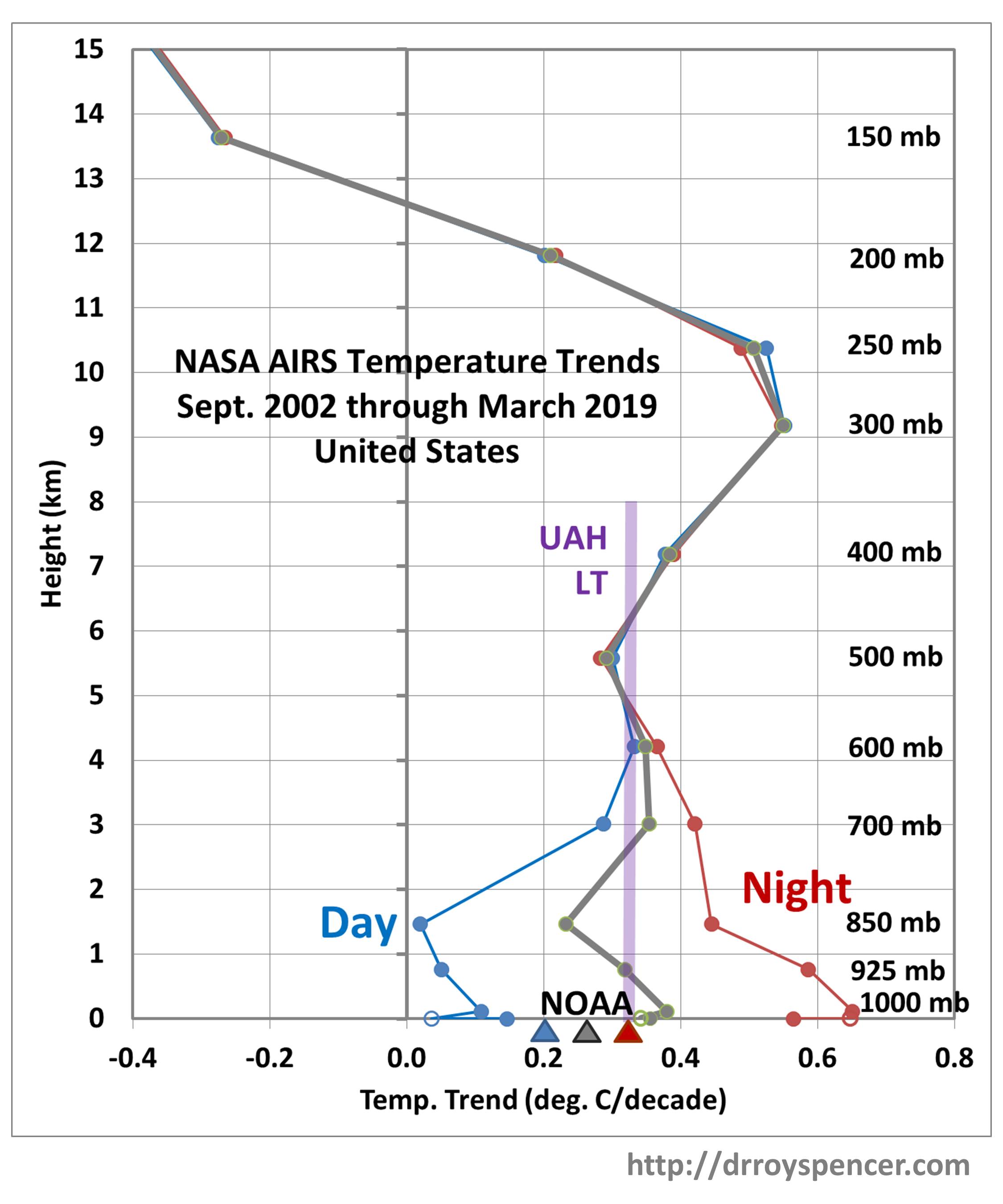
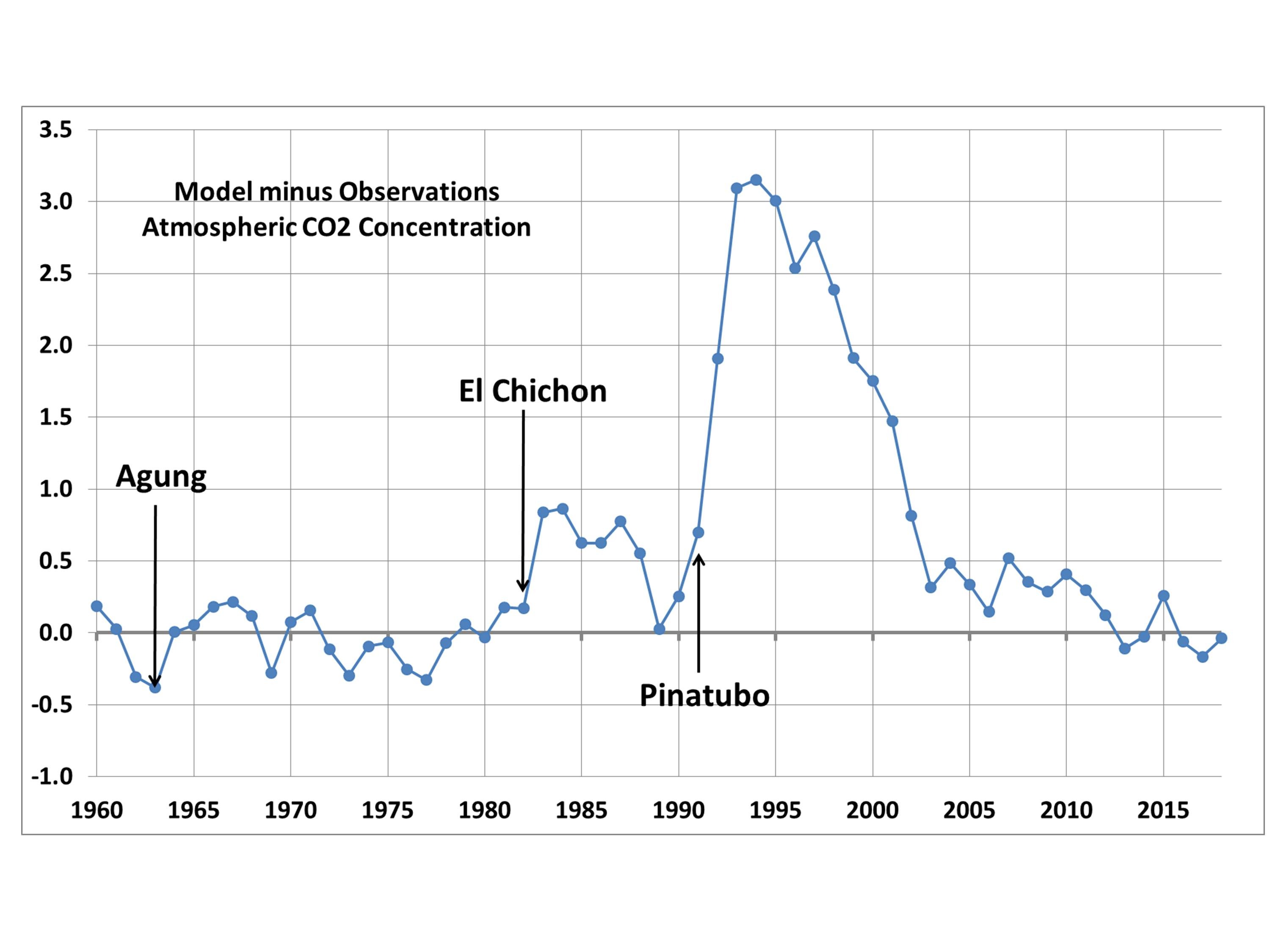
AIRS temperature trend profiles averaged over the contiguous United States, Sept. 2002 through March 2019. Gray represents an average of day and night. Trends are based upon monthly departures from the average seasonal cycle during 2003-2018. The UAH LT temperature trend (and it’s approximate vertical extent) is in violet, and NOAA surface air temperature trends (Tmax, Tmin, Tavg) are indicated by triangles. The open circles are the T2m retrievals, which appear to be less trustworthy than the Tskin retrievals.
The AIRS surface skin temperature trend at night (1:30 a.m.) is a whopping +0.57 C/decade, while the daytime (1:30 p.m.) trend is only +0.15 C/decade. This is a bigger diurnal difference than indicated by the NOAA Tmax and Tmin trends (triangles in the above plot). Admittedly, 1:30 a.m. and 1:30 pm are not when the lowest and highest temperatures of the day occur, but I wouldn’t expect as large a difference in trends as is seen here, at least at night.
Furthermore, these day-night differences extend up through the lower troposphere, to higher than 850 mb (about 5,000 ft altitude), even showing up at 700 mb (about 12,000 ft. altitude).
This behavior also shows up in globally-averaged land areas, and reverses over the ocean (but with a much weaker day-night difference). I will report on this at some point in the future.
If real, these large day-night differences in temperature trends is fascinating behavior. My first suspicion is that it has something to do with a change in moist convection and cloud activity during warming. For instance more clouds would reduce daytime warming but increase nighttime warming. But I looked at the seasonal variations in these signatures and (unexpectedly) the day-night difference is greatest in winter (DJF) when there is the least convective activity and weakest in summer (JJA) when there is the most convective activity.
One possibility is that there is a problem with the AIRS temperature retrievals (now at Version 6). But it seems unlikely that this problem would extend through such a large depth of the lower troposphere. I can’t think of any reason why there would be such a large bias between day and night retrievals when it can be seen in the above figure that there is essentially no difference from the 500 mb level upward.
It should be kept in mind that the lower tropospheric and surface temperatures can only be measured by AIRS in the absence of clouds (or in between clouds). I have no idea how much of an effect this sampling bias would have on the results.
Finally, note how well the AIRS low- to mid-troposphere temperature trends match the bulk trend in our UAH LT product. I will be examining this further for larger areas as well.
NOTE: See the update from John Christy below, addressing the use of RATPAC radiosonde data.
This post has two related parts. The first has to do with the recently published study of AIRS satellite-based surface skin temperature trends. The second is our response to a rather nasty Twitter comment maligning our UAH global temperature dataset that was a response to that study.
The AIRS Study
NASA’s Atmospheric InfraRed Sounder (AIRS) has thousands of infrared channels and has provided a large quantity of new remote sensing information since the launch of the Aqua satellite in early 2002. AIRS has even demonstrated how increasing CO2 in the last 15+ years has reduced the infrared cooling to outer space at the wavelengths impacted by CO2 emission and absorption, the first observational evidence I am aware of that increasing CO2 can alter — however minimally — the global energy budget.
The challenge for AIRS as a global warming monitoring instrument is that it is cloud-limited, a problem that worsens as one gets closer to the surface of the Earth. It can only measure surface skin temperatures when there are essentially no clouds present. The skin temperature is still “retrieved” in partly- (and even mostly-) cloudy conditions from other channels higher up in the atmosphere, and with “cloud clearing” algorithms, but these exotic numerical exercises can never get around the fact that the surface skin temperature can only be observed with satellite infrared measurements when no clouds are present.
Then there is the additional problem of comparing surface skin temperatures to traditional 2 meter air temperatures, especially over land. There will be large biases at the 1:30 a.m./p.m. observation times of AIRS. But I would think that climate trends in skin temperature should be reasonably close to trends in air temperature, so this is not a serious concern with me (although Roger Pielke, Sr. disagrees with me on this).
The new paper by Susskind et al. describes a 15-year dataset of global surface skin temperatures from the AIRS instrument on NASA’s Aqua satellite. ScienceDaily proclaimed that the study “verified global warming trends“, even though the period addressed (15 years) is too short to say much of anything much of value about global warming trends, especially since there was a record-setting warm El Nino near the end of that period.
Furthermore, that period (January 2003 through December 2017) shows significant warming even in our UAH lower tropospheric temperature (LT) data, with a trend 0.01 warmer than the “gold standard” HadCRUT4 surface temperature dataset (all deg. C/decade):
I’m pretty sure the Susskind et al. paper was meant to prop up Gavin Schmidt’s GISTEMP dataset, which generally shows greater warming trends than the HadCRUT4 dataset that the IPCC tends to favor more. It remains to be seen whether the AIRS skin temperature dataset, with its “clear sky bias”, will be accepted as a way to monitor global temperature trends into the future.
What Satellite Dataset Should We Believe?
Of course, the short period of record of the AIRS dataset means that it really can’t address the pre-2003 adjustments made to the various global temperature datasets which significantly impact temperature trends computed with 40+ years of data.
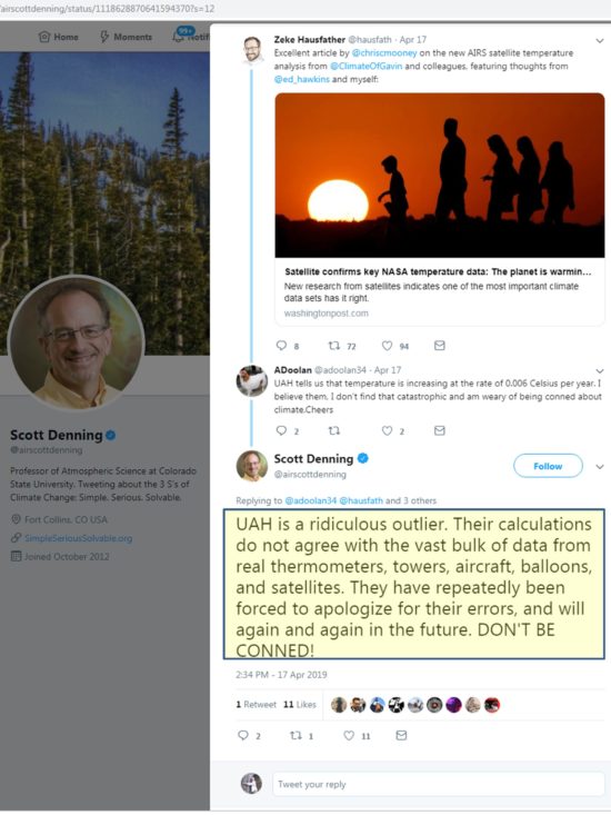
What I want to specifically address here is a public comment made by Dr. Scott Denning on Twitter, maligning our (UAH) satellite dataset. He was responding to someone who objected to the new study, claiming our UAH satellite data shows minimal warming. While the person posting this objection didn’t have his numbers right (and as seen above, our trend even agrees with HadCRUT4 over the 2003-2017 period), Denning took it upon himself to take a swipe at us (see his large-font response, below):
First of all, I have no idea what Scott is talking about when he lists “towers” and “aircraft”…there has been no comprehensive comparisons of such data sources to global satellite data, mainly because there isn’t nearly enough geographic coverage by towers and aircraft.
Secondly, in the 25+ years that John Christy and I have pioneered the methods that others now use, we made only one “error” (found by RSS, and which we promptly fixed, having to do with an early diurnal drift adjustment). The additional finding by RSS of the orbit decay effect was not an “error” on our part any more than our finding of the “instrument body temperature effect” was an error on their part. All satellite datasets now include adjustments for both of these effects.
Nevertheless, as many of you know, our UAH dataset is now considered the “outlier” among the satellite datasets (which also include RSS, NOAA, and U. of Washington), with the least amount of global-average warming since 1979 (although we agree better in the tropics, where little warming has occurred). So let’s address the remaining claim of Scott Denning’s: that we disagree with independent data.
The only direct comparisons to satellite-based deep-layer temperatures are from radiosondes and global reanalysis datasets (which include all meteorological observations in a physically consistent fashion). What we will find is that RSS, NOAA, and UW have remaining errors in their datasets which they refuse to make adjustments for.
From late 1998 through 2004, there were two satellites operating: NOAA-14 with the last of the old MSU series of instruments on it, and NOAA-15 with the first new AMSU instrument on it. In the latter half of this overlap period there was considerable disagreement that developed between the two satellites. Since the older MSU was known to have a substantial measurement dependence on the physical temperature of the instrument (a problem fixed on the AMSU), and the NOAA-14 satellite carrying that MSU had drifted much farther in local observation time than any of the previous satellites, we chose to cut off the NOAA-14 processing when it started disagreeing substantially with AMSU. (Engineer James Shiue at NASA/Goddard once described the new AMSU as the “Cadillac” of well-calibrated microwave temperature sounders).
Despite the most obvious explanation that the NOAA-14 MSU was no longer usable, RSS, NOAA, and UW continue to use all of the NOAA-14 data through its entire lifetime and treat it as just as accurate as NOAA-15 AMSU data. Since NOAA-14 was warming significantly relative to NOAA-15, this puts a stronger warming trend into their satellite datasets, raising the temperature of all subsequent satellites’ measurements after about 2000.
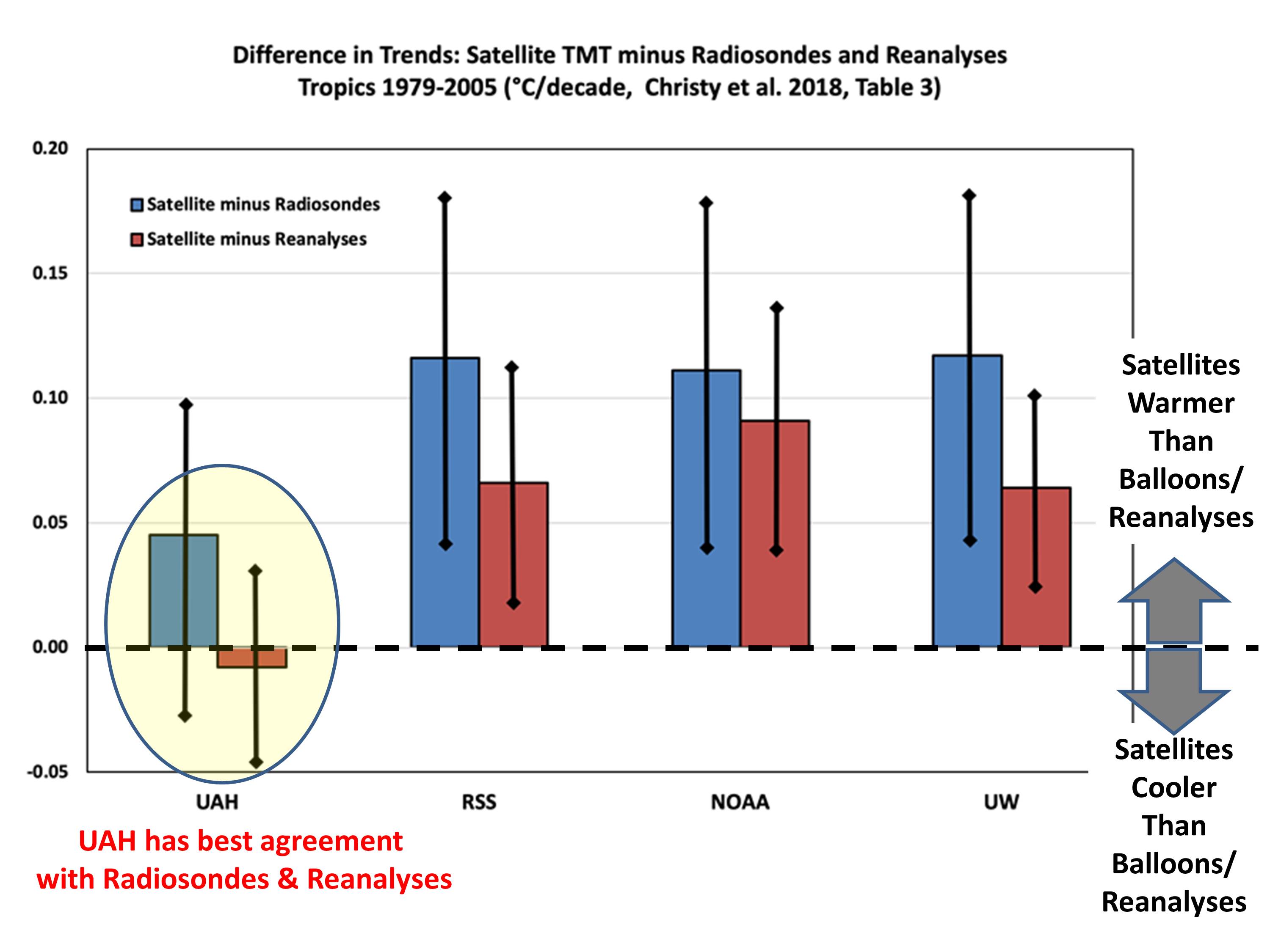
But rather than just asserting the new AMSU should be believed over the old (drifting) MSU, let’s look at some data. Since Scott Denning mentions weather balloon (radiosonde) data, let’s look at our published comparisons between the 4 satellite datasets and radiosondes (as well as global reanalysis datasets) and see who agrees with independent data the best:
Trend differences 1979-2005 between 4 satellite datasets and either radiosondes (blue) or reanalyses (red) for the MSU2/AMSU5 tropospheric channel in the tropics. The balloon trends are calculated from the subset of gripoints where the radiosonde stations are located, whereas the reanalyses contain complete coverage of the tropics. For direct comparisons of full versus station-only grids see the paper.
Clearly, the RSS, NOAA, and UW satellite datasets are the outliers when it comes to comparisons to radiosondes and reanalyses, having too much warming compared to independent data.
But you might ask, why do those 3 satellite datasets agree so well with each other? Mainly because UW and NOAA have largely followed the RSS lead… using NOAA-14 data even when its calibration was drifting, and using similar strategies for diurnal drift adjustments. Thus, NOAA and UW are, to a first approximation, slightly altered versions of the RSS dataset.
Maybe Scott Denning was just having a bad day. In the past, he has been reasonable, being the only climate “alarmist” willing to speak at a Heartland climate conference. Or maybe he has since been pressured into toeing the alarmist line, and not being allowed to wander off the reservation.
In any event, I felt compelled to defend our work in response to what I consider (and the evidence shows) to be an unfair and inaccurate attack in social media of our UAH dataset.
UPDATE from John Christy (11:10 CDT April 26, 2019):
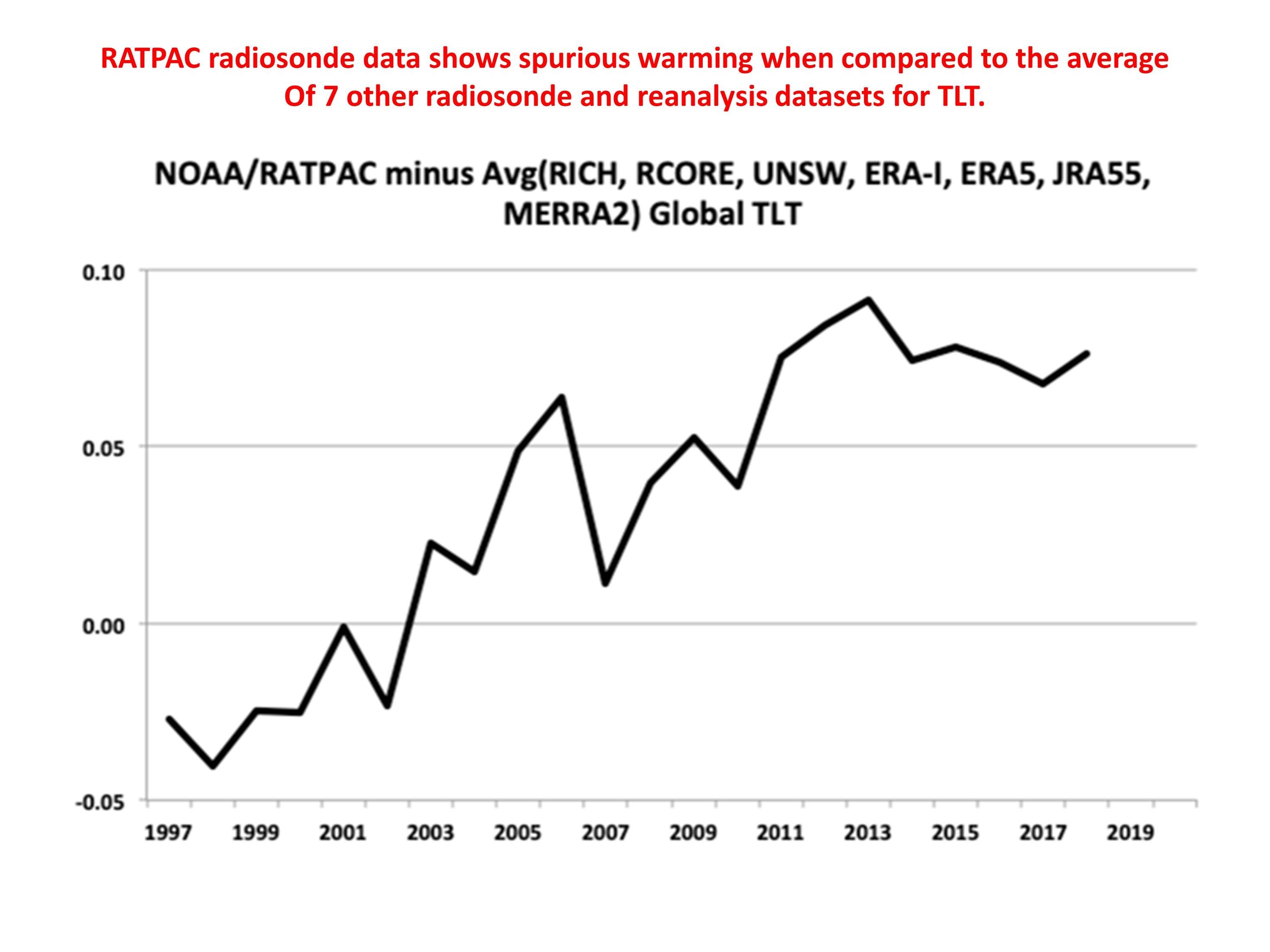
In response to comments about the RATPAC radiosonde data having more warming, John Christy provides the following:
The comparison with RATPAC-A referred to in the comments below is unclear (no area mentioned, no time frame). But be that as it may, if you read our paper, RATPAC-A2 was one of the radiosonde datasets we used. RATPAC-A2 has virtually no adjustments after 1998, so contains warming shifts known to have occurred in the Australian and U.S. VIZ sondes for example. The IGRA dataset used in Christy et al. 2018 utilized 564 stations, whereas RATPAC uses about 85 globally, and far fewer just in the tropics where this comparison shown in the post was made. RATPAC-A warms relative to the other radiosonde/reanalyses datasets since 1998 (which use over 500 sondes), but was included anyway in the comparisons in our paper. The warming bias relative to 7 other radiosonde and reanalysis datasets can be seen in the following plot:
SUMMARY:A simple model of the CO2 concentration of the atmosphere is presented which fairly accurately reproduces the Mauna Loa observations 1959 through 2018. The model assumes the surface removes CO2 at a rate proportional to the excess of atmospheric CO2 above some equilibrium value. It is forced with estimates of yearly CO2 emissions since 1750, as well as El Nino and La Nina effects. The residual effects of major volcanic eruptions (not included in the model) are clearly seen. Two interesting finding are that (1) the natural equilibrium level of CO2 in the atmosphere inplied by the model is about 295 ppm, rather than 265 or 270 ppm as is often assumed, and (2) if CO2 emissions were stabilized and kept constant at 2018 levels, the atmospheric CO2 concentration would eventually stabilize at close to 500 ppm, even with continued emissions.
A recent e-mail discussion regarding sources of CO2 other than anthropogenic led me to revisit a simple model to explain the history of CO2 observations at Mauna Loa since 1959. My intent here isn’t to try to prove there is some natural source of CO2 causing the recent rise, as I think it is mostly anthropogenic. Instead, I’m trying to see how well a simple model can explain the rise in CO2, and what useful insight can be deduced from such a model.
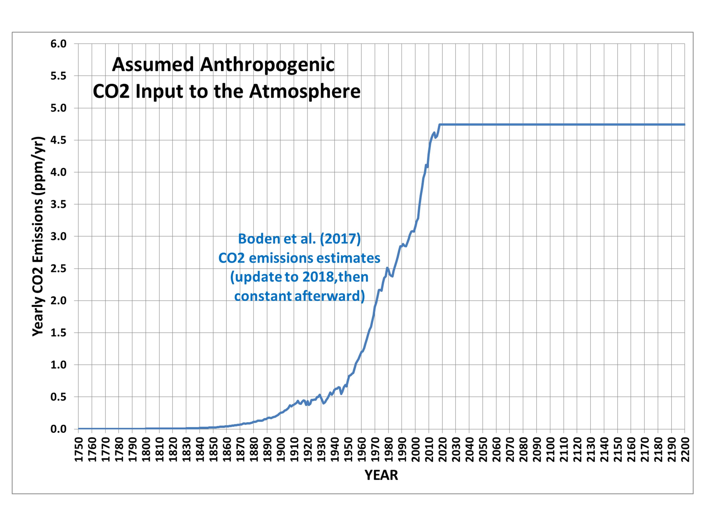
The model uses the Boden et al. (2017) estimates of yearly anthropogenic CO2 production rates since 1750, updated through 2018. The model assumes that the rate at which CO2 is removed from the atmosphere is proportional to the atmospheric excess above some natural “equilibrium level” of CO2 concentration. A spreadsheet with the model is here.
Here’s the assumed yearly CO2 inputs into the model:
Fig. 1. Assumed yearly anthropogenic CO2 input into the model atmosphere.
I also added in the effects of El Nino and La Nina, which I calculate cause a 0.47 ppm yearly change in CO2 per unit Multivariate ENSO Index (MEI) value (May to April average). This helps to capture some of the wiggles in the Mauna Loa CO2 observations.
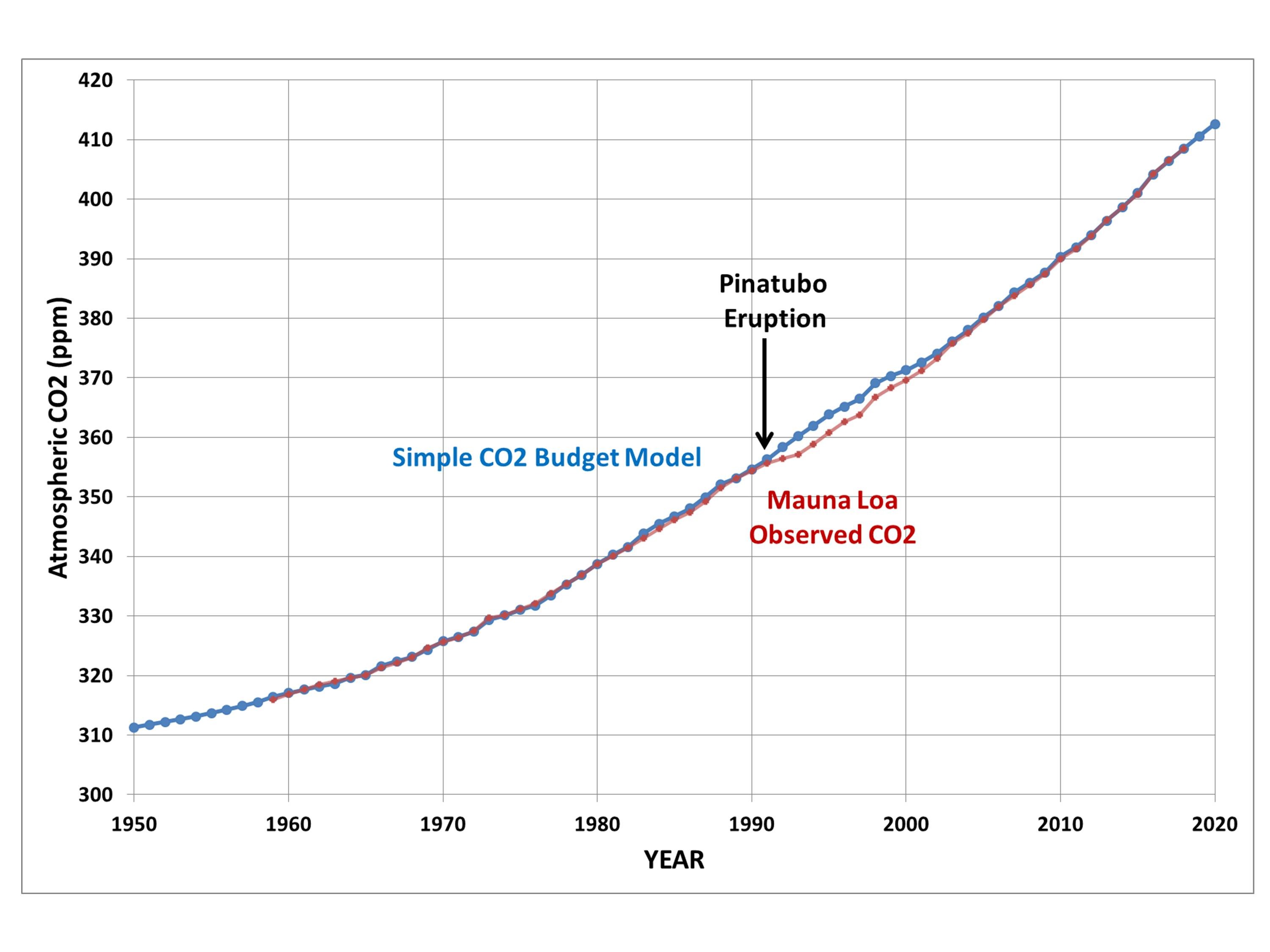
The resulting fit to the Mauna Loa data required an assumed “natural equilibrium” CO2 concentration of 295 ppm, which is higher than the usually assumed 265 or 270 ppm pre-industrial value:
Fig. 2. Simple model of atmospheric CO2 concentration using Boden et al. (2017) estimates of yearly anthropogenic emissions, an El Nino/La Nina natural source/sink, after fitting of three model free parameters.
Click on the above plot and notice just how well even the little El Nino- and La Nina-induced changes are captured. I’ll address the role of volcanoes later.
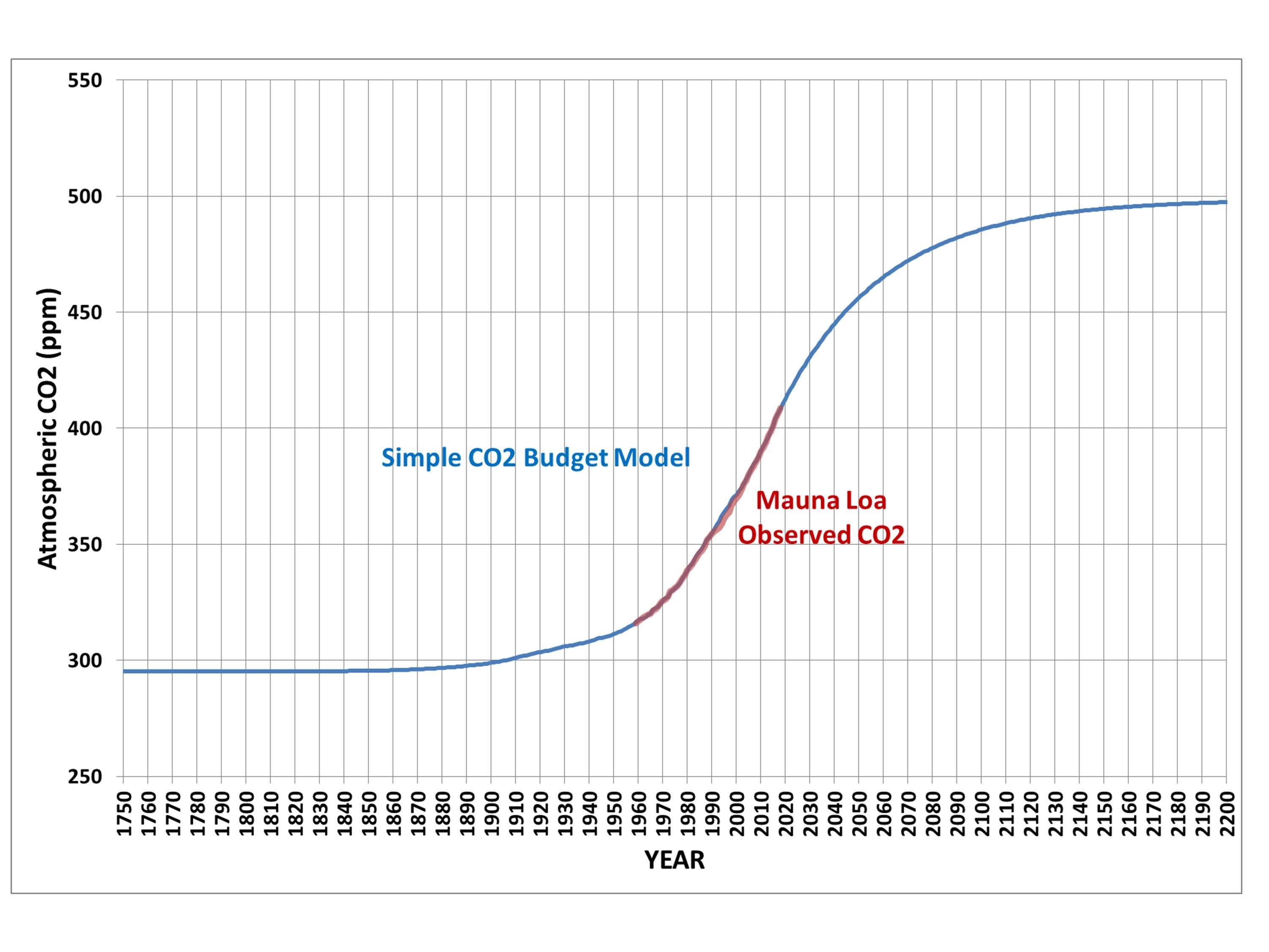
The next figure shows the full model period since 1750, extended out to the year 2200:
Fig. 3. As in Fig. 2, but for the full model period, 1750-2200.
Interestingly, note that despite continued CO2 emissions, the atmospheric concentration stabilizes just short of 500 ppm. This is the direct result of the fact that the Mauna Loa observations support the assumption that the rate at which CO2 is removed from the atmosphere is directly proportional to the amount of “excess” CO2 in the atmosphere above a “natural equilibrium” level. As the CO2 content increases, the rate or removal increases until it matches the rate of anthropogenic input.
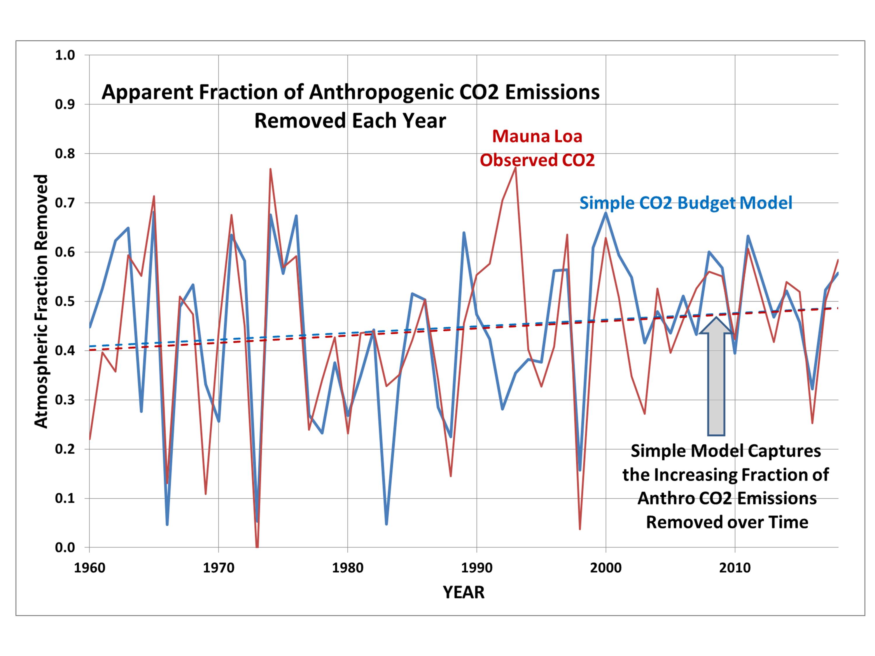
We can also examine the removal rate of CO2 as a fraction of the anthropogenic source. We have long known that only about half of what is emitted “shows up” in the atmosphere (which isn’t what’s really going on), and decades ago the IPCC assumed that the biosphere and ocean couldn’t keep removing excess CO2 at such a high rate. But, in fact, the fractional rate of removal has actually been increasing, not decreasing.And the simple model captures this:
Fig. 4. Rate of removal of atmospheric CO2 as a fraction of the anthropogenic source, in the model and observations.
The up-and-down variations in Fig. 4 are due to El Nino and La Nina events (and volcanoes, discussed next).
Finally, a plot of the difference between the model and Mauna Loa observations reveals the effects of volcanoes. After a major eruption, the amount of CO2 in the atmosphere is depressed, either because of a decrease in natural surface emissions or an increase in surface uptake of atmospheric CO2:
Fig. 5. Simple model of yearly CO2 concentrations minus Mauna Loa observations (ppm), revealing the effects of volcanoes which are not included in the model.
What is amazing to me is that a model with such simple but physically reasonable assumptions can so accurately reproduce the Mauna Loa record of CO2 concentrations. I’ll admit I am no expert in the global carbon cycle, but the Mauna Loa data seem to support the assumption that for global, yearly averages, the surface removes a net amount of CO2 from the atmosphere that is directly proportional to how high the CO2 concentration goes above 295 ppm. The biological and physical oceanographic reasons for this might be complex, but the net result seems to follow a simple relationship.
A near-repeat of March’s “bomb cyclone” will bring up to 30 inches of snow this week to portions of Minnesota and South Dakota, with blizzard conditions and a threat of severe thunderstorms.
Roughly the same area that experienced flooding rains in March — and still trying to dry out enough to plant corn and soybeans — will see another round of heavy rain and heavy snow. The forecast location of the intense cyclone as of Thursday morning April 11 shows it taking a similar path to the record-setting March storm:
Forecast locations of strong low pressure and precipitation patterns Thursday morning, April 11, 2019 (Weatherstreet.com).
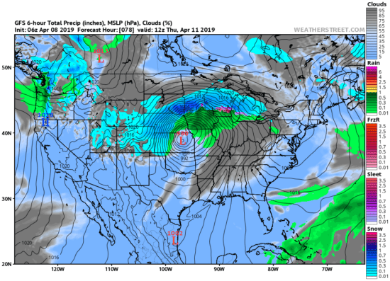
Forecast snowfall totals by midday Friday April 12 indicate the heaviest snowfall (up to 30 inches) over southern Minnesota, with 12-16 inches for Minneapolis:
Forecast total snowfall from the GFS model by midday Friday April 12 (graphic courtesy of Weatherbell.com).
The European ECMWF forecast model adds similarly heavy (~30 inches) snow totals in eastern South Dakota. Much of Wisconsin and northern Michigan are forecast to receive 6 to 12 inches.
The energy for such intense cyclones comes from the strong temperature contrast between two air masses. For example, by late Wednesday the temperatures in Nebraska will range from the 70s in the southeast to the 20s in the northwest, simultaneously feeding both blizzard conditions and a severe thunderstorm threat within the state.
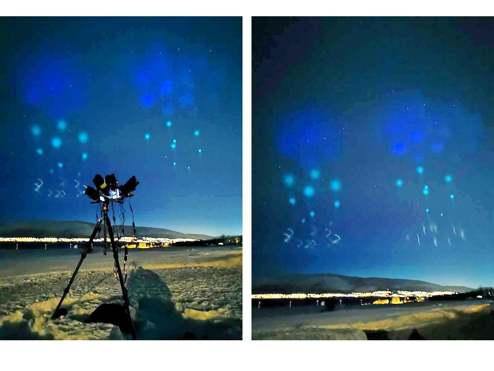
Famed Arctic and aurora photographer Ole C Salomonsen has reported in the last hour strange lights over Tromso, Norway. Ole says the sight is the “weirdest stuff I’ve seen”.
I’ve taken the liberty of increasing the brightness of two of the images he posted:
Strange lights in the sky photographed by famed aurora photographer Ole Salomonsen around midnight, Saturday April 6 2019 from Tromso, Norway.
I can’t imagine what this is, but I suspect it’s related to some sort of rocket-borne experiment. But the spatial distribution of the lights is very strange. I assume Ole will update us with time lapse photography in the near future.
UPDATE: Frank Olsen, also in Norway, posted the following photo, and said that this was indeed rocket-borne experiments containing special chemicals:
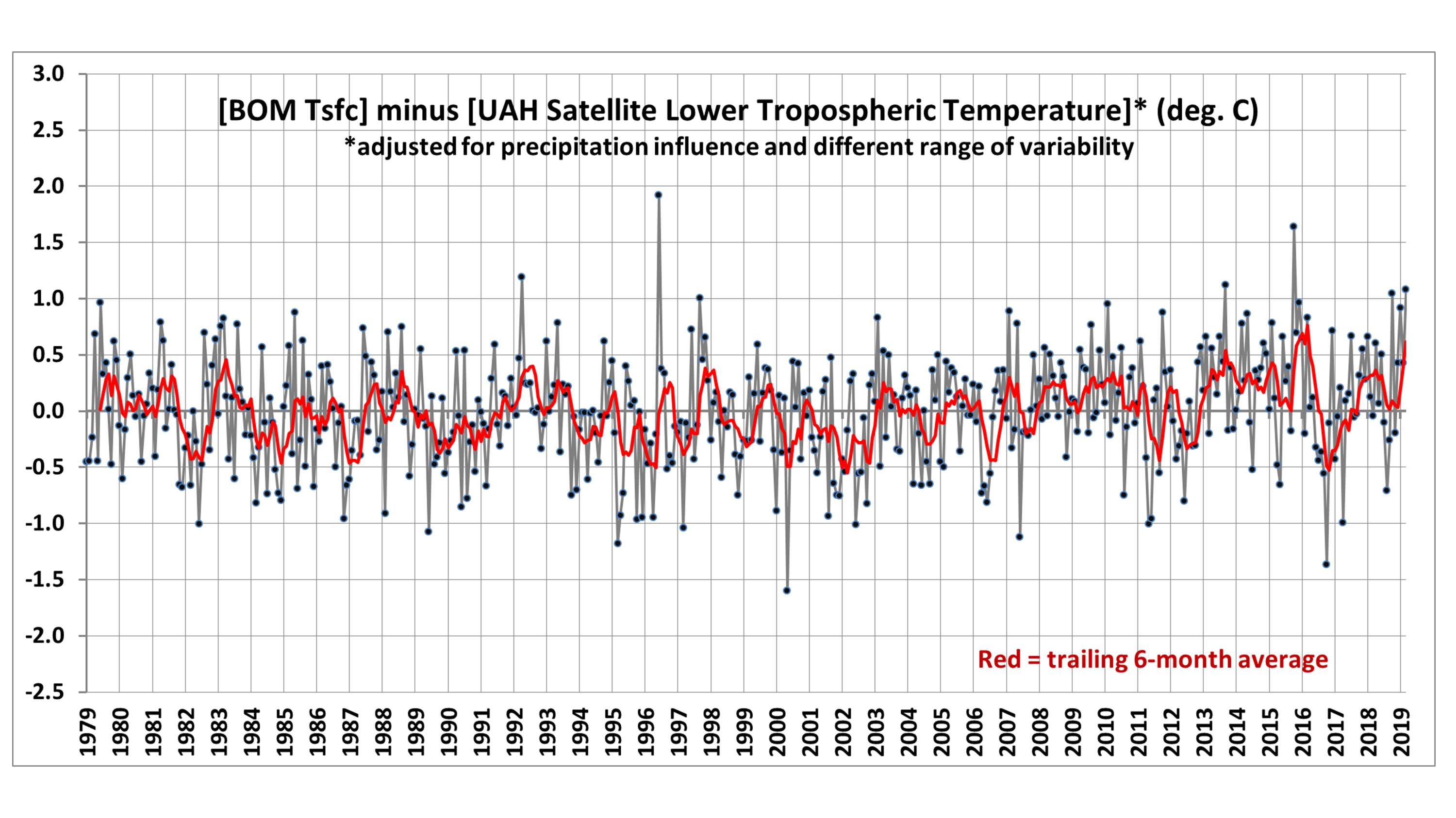
Summary:The monthly anomalies in Australia-average surface versus satellite deep-layer lower-tropospheric temperatures correlate at 0.70 (with a 0.57 deg. C standard deviation of their difference), increasing to 0.80 correlation (with a 0.48 deg. C standard deviation of their difference) after accounting for precipitation effects on the relationship. The 40-year trends (1979-2019) are similar for the raw anomalies (+0.21 C/decade for Tsfc, +0.18 deg. C for satellite), but if the satellite and rainfall data are used to estimate Tsfc through a regression relationship, the adjusted satellite data then has a reduced trend of +0.15 C/decade. Thus, those who compare the UAH monthly anomalies to the BOM surface temperature anomalies should expect routine disagreements of 0.5 deg. C or more, due to the inherently different nature of surface versus tropospheric temperature measurements.
I often receive questions from Australians about the UAH LT (lower troposphere) temperature anomalies over Australia, as they sometimes differ substantially from the surface temperature data compiled by BOM. As a result, I decided to do a quantitative comparison.
While we expect that the tropospheric and surface temperature variations should be somewhat correlated, there are reasons to expect the correlation to not be high. The surface-troposphere system is not regionally isolated over Australia, as the troposphere can be affected by distant processes. For example, subsidence warming over the continent can be caused by vigorous precipitation systems hundreds or thousands of miles away.
I use our monthly UAH LT anomalies for Australia (available here), and monthly anomalies in average (day+night) surface temperature and rainfall (available from BOM here). All monthly anomalies from BOM have been recomputed to be relative to the 1981-2010 base period to make them comparable to the UAH LT anomalies. The period analyzed here is January 1979 through March 2019.
Results Before Adjustments
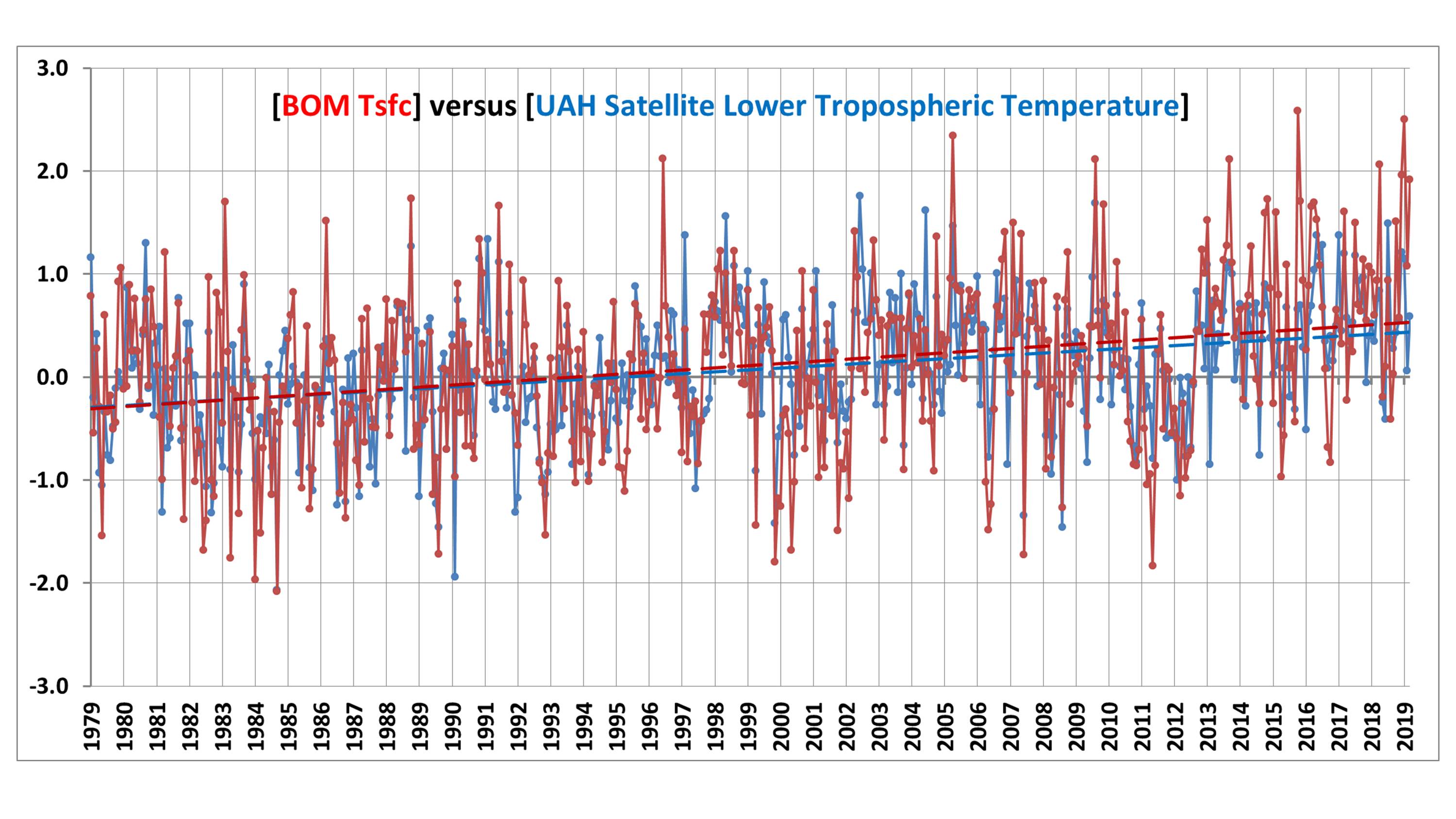
A time series comparison between monthly Tsfc and LT anomalies shows warming in both, with a Tsfc warming trend of +0.21 C/decade, and and a satellite LT trend of +0.18 C/decade:
Fig. 1. Australia average surface temperature (red) and satellite lower tropospheric temperature (LT, blue) anomalies from January 1979 through March 2019.
The correlation between the two time series is 0.70, indicating considerable — but not close — agreement between the two measures of temperature. The standard deviation of their difference is 0.57 deg. C, which means that people doing a comparison of UAH and BOM anomalies each month should not be surprised to see 0.6 deg. C differences (or more).
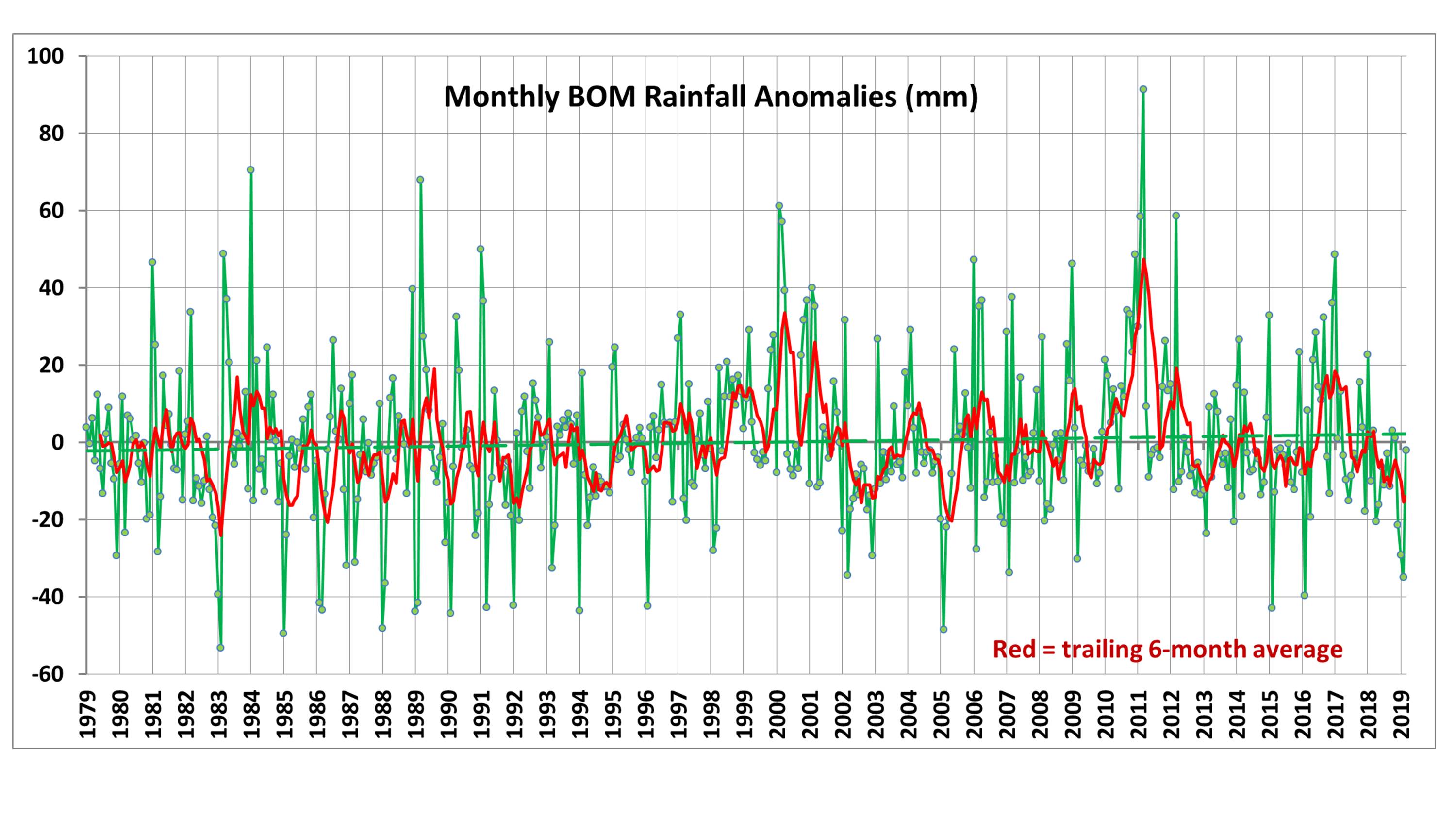
Part of the disagreement comes from rainfall conditions, which can affect the temperature lapse rate in the troposphere. For reference, the following plot shows Australian precipitation anomalies for the same period:
Fig. 2. Australia precipitation anomalies from January 1979 through March 2019.
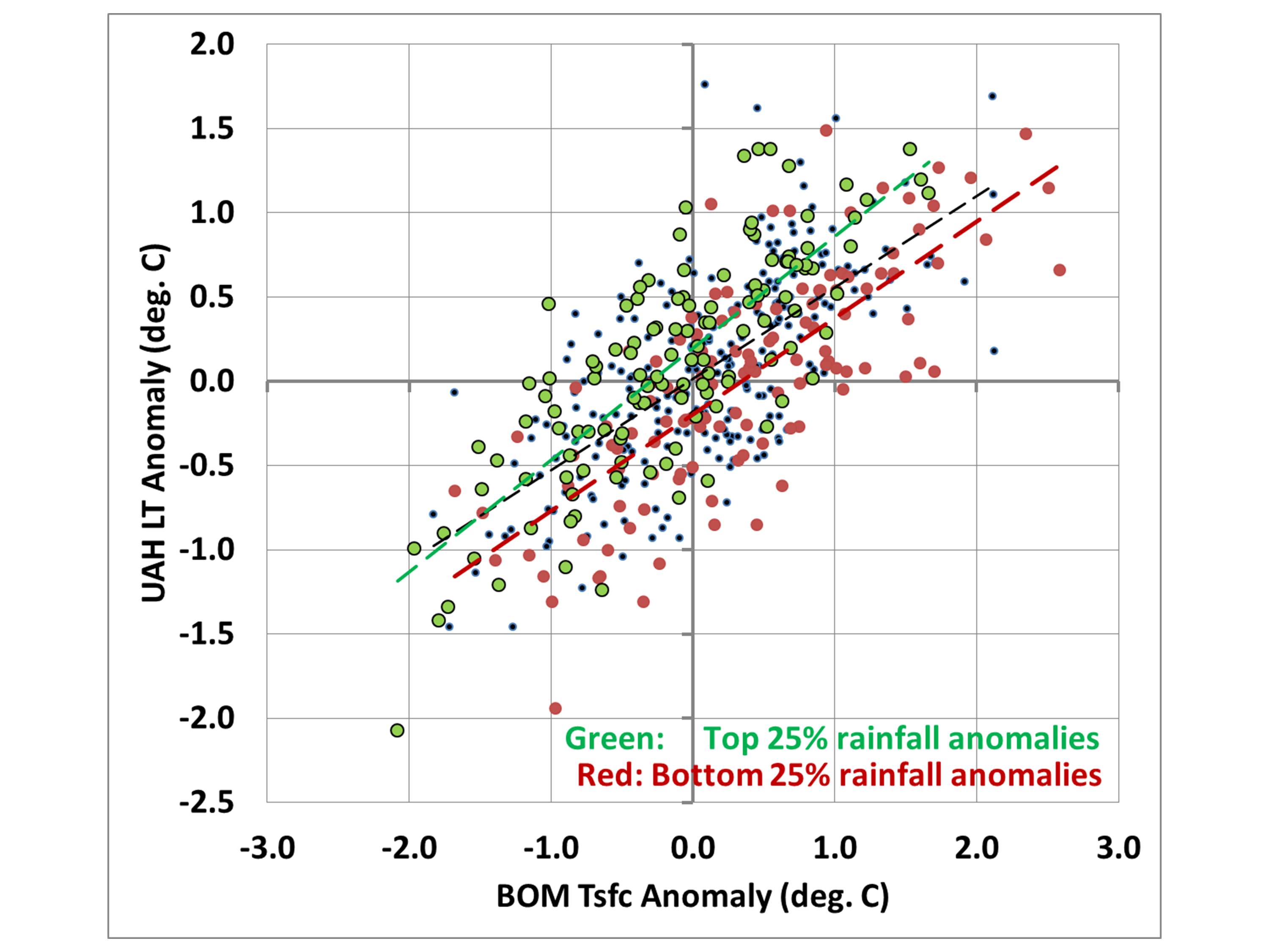
If we take the data in Fig. 1 and create a scatter plot, but show the months with the 25% highest precipitation anomalies in green and the lowest 25% precipitation in red, we see that drought periods tend to have higher surface temperatures compared to tropospheric temperatures, while the wettest periods tend to have lower surface temperatures compared to the troposphere:
Fig. 3. Scatterplot of the data in Fig. 1, but with color coding of those months with the 25% highest (green) and lowest (red) precipitation departures from average.
A More Apples-to-Apples Comparison
Comparing tropospheric and surface temperatures is a little like comparing apples and oranges. But one interesting thing we can do is to regress the surface temperature data against the tropospheric temperatures plus rainfall data to get equations that provide a “best estimate” of the surface temperatures from tropospheric temperatures and rainfall.
I did this for each of the 12 calendar months separately because it turned out that the precipitation relationship evident in Fig. 3 was only a warm season phenomenon. During the winter months of June, July, and August, the relationship to precipitation had the opposite sign, with excessive precipitation being associated with warmer surface temperature versus the troposphere, and drought conditions associated with cooler surface temperatures than the troposphere (on average).
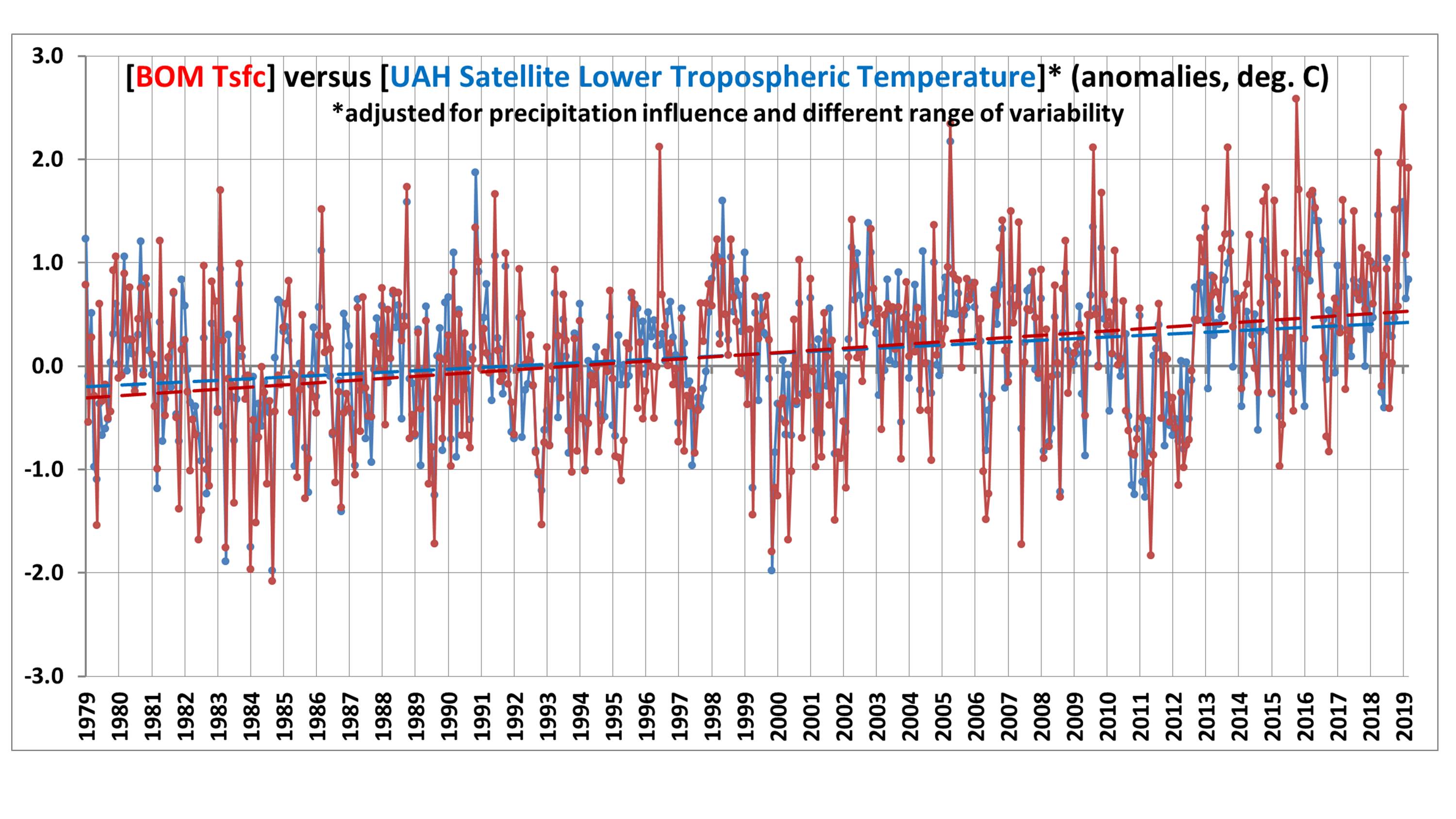
So, using a different regression relationship for each calendar month (each month having either 40 or 41 years represented), I computed a satellite+rainfall estimate of surface temperature. The resulting “satellite” time series then changes somewhat, and the correlation between them increases from 0.70 to 0.80:
Fig. 4. As in Fig. 1, but now the satellite data are used along with precipitation data to provide a regression estimate of surface temperature.
Now the “satellite-based” trend is lowered to +0.15 C/decade, compared to the observed Tsfc trend of +0.21 C/decade. I will leave it to the reader to decide whether this is a significant difference or not.
To make the differences in Fig. 4 a little easier to see, we can plot the difference time series between the two temperature measures:
Fig. 5. Difference between the two time series shown in Fig. 4.
Now we can see evidence of an enhanced warming trend in the Tsfc data versus the satellite over the most recent 20 years, which amounts to 0.40 deg. C during April 1999 – March 2019. I have no opinion on whether this is some natural fluctuation in the relationship between surface and tropospheric temperatures, problems in the surface data, problems in the satellite data, or some combination of all three.
Conclusions
The UAH tropospheric temperatures and BOM surface temperatures in Australia are correlated, with similar variability (0.70 correlation). Accounting for anomalous rainfall conditions increases the correlation to 0.80. The Tsfc trends have a slightly greater warming trend than the tropospheric temperatures, but the reasons for this are unclear. Users of the UAH data should expect monthly differences between the UAH and BOM data of 0.6 deg. C or so on a rather routine basis (after correcting for their different 30-year baselines used for anomalies: BOM uses 1961-1990 and UAH uses 1981-2010).
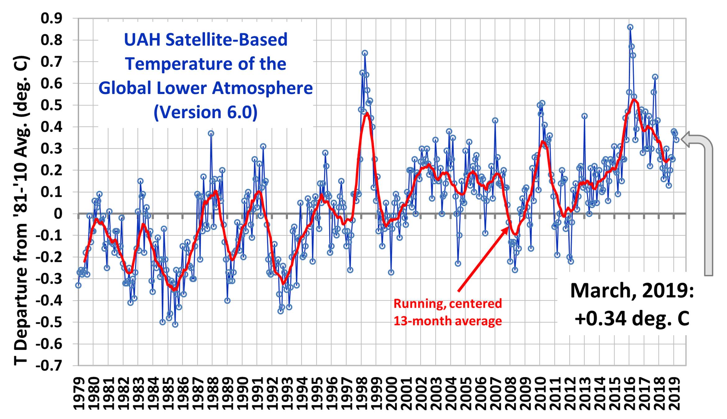
The Version 6.0 global average lower tropospheric temperature (LT) anomaly for March, 2019 was +0.34 deg. C, down slightly from the February, 2019 value of +0.37 deg. C:
We have made two changes in satellite processing starting with the March 2019 update. First, we have decided to stop processing of NOAA-18 data starting in 2017 because that satellite has drifted in local observation time beyond the ability of our Version 6 diurnal drift correction routine to handle it acccurately, as evidenced by spurious warming (not shown) in that satellite relative to the Metop-B satellite (which does not drift). By itself, this change reduces the trends very slightly. Secondly, we have applied a diurnal drift correction to NOAA-19, which previously did not need one because it had not drifted very far in local observation time. By itself, this increases the trends slightly.
The net effect of these two changes is virtually no change in trends (the global trend for 1979-2019 remains at +0.13 C/decade). However, individual monthly anomalies since January 2017 have changed somewhat, by amounts that are regionally dependent. For example, the standard deviation of the difference between the old and new monthly anomalies since January 2017 is 0.03 deg. C for the global averages, and 0.07 deg. C for the USA48 averages.
Various regional LT departures from the 30-year (1981-2010) average for the last 15 months are:
SUMMARY:Evidence is presented that an over-correction of satellite altimeter data for increasing water vapor might be at least partly responsible for the claimed “acceleration” of recent sea level rise.
UPDATE:A day after posting this, I did a rough calculation of how large the error in altimeter-based sea level rise could possibly be. The altimeter correction made for water vapor is about 6 mm in sea level height for every 1 mm increase in tropospheric water vapor. The trend in oceanic water vapor over 1993-2018 has been 0.48 mm/decade, which would require about [6.1 x 0.48=] ~3 mm/decade adjustment from increasing vapor. This can be compared to the total sea level rise over this period of 33 mm/decade. So it appears that even if the entire water vapor correction were removed, its impact on the sea level trend would reduce it by only about 10%.
I have been thinking about an issue for years that might have an impact on what many consider to be a standing disagreement between satellite altimeter estimates of sea level versus tide gauges.
Since 1993 when satellite altimeter data began to be included in sea level measurements, there has been some evidence that the satellites are measuring a more rapid rise than the in situ tide gauges are. This has led to the widespread belief that global-average sea level rise — which has existed since before humans could be blamed — is accelerating.
I have been the U.S. Science Team Leader for the Advanced Microwave Scanning Radiometer (AMSR-E) flying on NASA’s Aqua satellite. The water vapor retrievals from that instrument use algorithms similar to those used by the altimeter people.
I have a good understanding of the water vapor retrievals and the assumptions that go into them. But I have only a cursory understanding of how the altimeter measurements are affected by water vapor. I think it goes like this: as tropospheric water vapor increases, it increases the apparent path distance to the ocean surface as measured by the altimeter, which would cause a low bias in sea level if not corrected for.
What this potentially means is that *if* the oceanic water vapor trends since 1993 have been overestimated, too large of a correction would have been applied to the altimeter data, artificially exaggerating sea level trends during the satellite era.
What follows probably raises more questions that it answers. I am not an expert in satellite altimeters, I don’t know all of the altimeter publications, and this issue might have already been examined and found to be not an issue. I am merely raising a question that I still haven’t seen addressed in a few of the altimeter papers I’ve looked at.
Why Would Satellite Water Vapor Measurements be Biased?
The retrieval of total precipitable water vapor (TPW) over the oceans is generally considered to be one of the most accurate retrievals from satellite passive microwave radiometers.
Water vapor over the ocean presents a large radiometric signal at certain microwave frequencies. Basically, against a partially reflective ocean background (which is then radiometrically cold), water vapor produces brightness temperature (Tb) warming near the 22.235 GHz water vapor absorption line. When differenced with the brightness temperatures at a nearby frequency (say, 18 GHz), ocean surface roughness and cloud water effects on both frequencies roughly cancel out, leaving a pretty good signal of the total water vapor in the atmosphere.
What isn’t generally discussed, though, is that the accuracy of the water vapor retrieval depends upon the temperature, and thus vertical distribution, of the water vapor. Because the Tb measurements represent thermal emission by the water vapor, and the temperature of the water vapor can vary several tens of degrees C from the warm atmospheric boundary layer (where most vapor resides) to the cold upper troposphere (where little vapor resides), this means you could have two slightly different vertical profiles of water vapor producing different water vapor retrievals, even when the TPW in both cases was exactly the same.
The vapor retrievals, either explicitly or implicitly, assume a vertical profile of water vapor by using radiosonde (weather balloon) data from various geographic regions to provide climatological average estimates for that vertical distribution. The result is that the satellite retrievals, at least in the climatological mean over some period of time, produce very accurate water vapor estimates for warm tropical air masses and cold, high latitude air masses.
But what happens when both the tropics and the high latitudes warm? How do the vertical profiles of humidity change? To my knowledge, this is largely unknown. The retrievals used in the altimeter sea level estimates, as far as I know, assume a constant profile shape of water vapor content as the oceans have slowly warmed over recent decades.
Evidence of Spurious Trends in Satellite TPW and Sea Level Retrievals
For many years I have been concerned that the trends in TPW over the oceans have been rising faster than sea surface temperatures suggest they should be based upon an assumption of constant relative humidity (RH). I emailed my friend Frank Wentz and Remote Sensing Systems (RSS) a couple years ago asking about this, but he never responded (to be fair, sometimes I don’t respond to emails, either.)
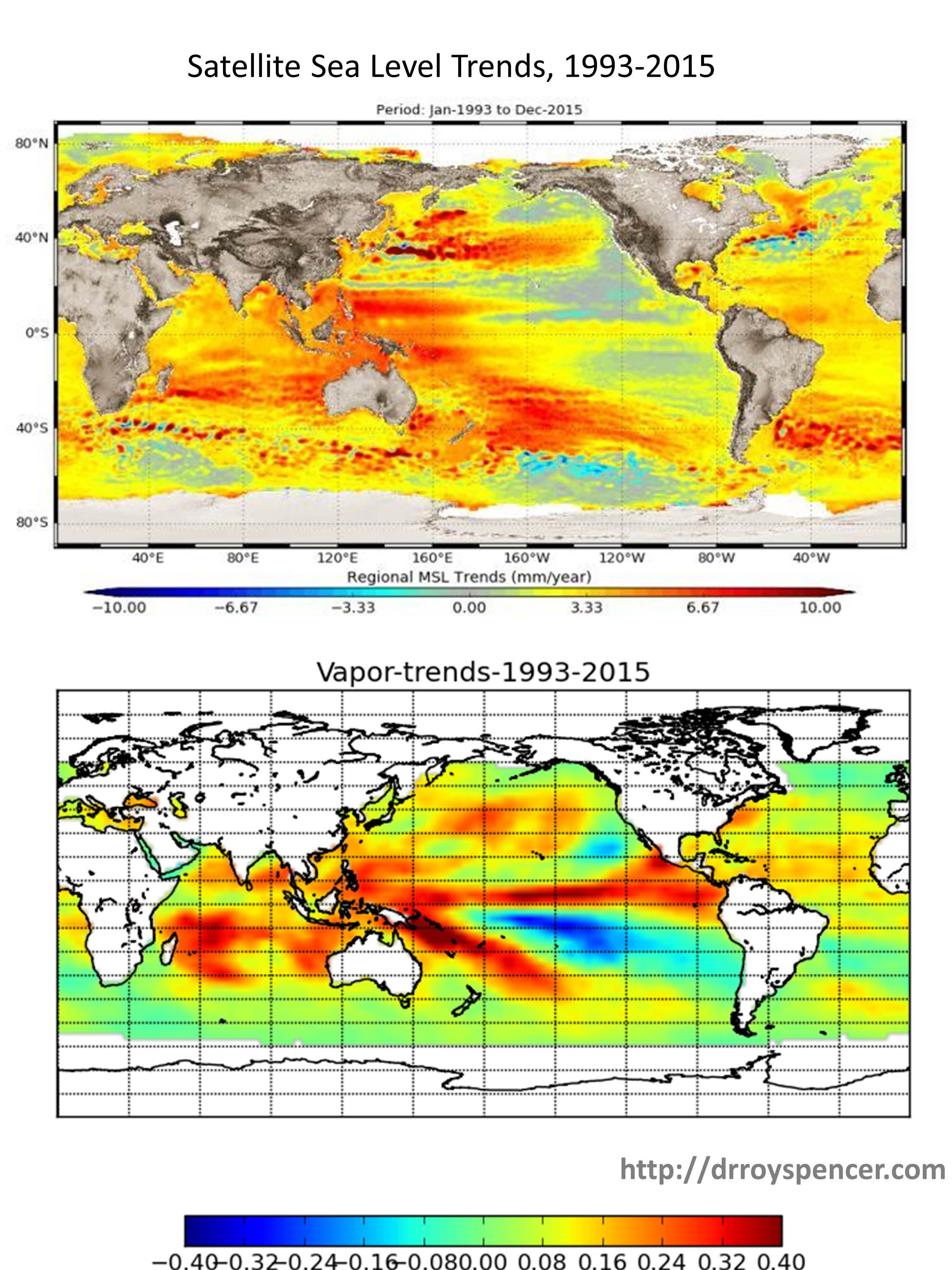
For example, note the markedly different trends implied by the RSS water vapor retrievals versus the ERA Reanalysis in a paper published in 2018:
The upward trend in the satellite water vapor retrieval (RSS) is considerably larger than in the ERA reanalysis of all global meteorological data. If there is a spurious component of the RSS upward trend, it suggests there will also be a spurious component to the sea level rise from altimeters due to over-correction for water vapor.
Now look at the geographical distribution of sea level trends from the satellite altimeters from 1993 through 2015 (published in 2018) compared to the retrieved water vapor amounts for exactly the same period I computed from RSS Version 7 TPW data:
The geographic pattern of 23-years of sea level rise from satellite altimeter data looks similar to the pattern of water vapor increase (percent per decade), suggesting cross-talk between the water vapor correction and sea level retrieval.
There is considerably similarity to the patterns, which is evidence (though not conclusive) for remaining cross-talk between water vapor and the retrieval of sea level. (I would expect such a pattern if the upper plot was sea surface temperature, but not for the total, deep-layer warming of the oceans, which is what primarily drives the steric component of sea level rise).
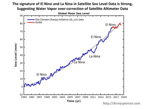
Further evidence that something might be amiss in the altimeter retrievals of sea level is the fact that global-average sea level goes down during La Nina (when vapor amounts also go down) and rise during El Nino (when water vapor also rises). While some portion of this could be real, it seems unrealistic to me that as much as ~15 mm of globally-averaged sea level rise could occur in only 2 years going from La Nina to El Nino conditions (figure adapted from here) :
Especially since we know that increased atmospheric water vapor occurs during El Nino, and that extra water must come mostly from the ocean…yet the satellite altimeters suggest the oceans riserather than fall during El Nino?
The altimeter-diagnosed rise during El Nino can’t be steric, either. As I recall (e.g. Fig. 3b here), the vertically integrated deep-ocean average temperature remains essentially unchanged during El Nino (warming in the top 100 m is matched by cooling in the next 200 m layer, globally-averaged), so the effect can’t be driven by thermal expansion.
Finally, I’d like to point out that the change in the shape of the vertical profile of water vapor that would cause this to happen is consistent with our finding of little to no tropical “hot-spot” in the tropical mid-troposphere: most of the increase in water vapor would be near the surface (and thus at a higher temperature), but less of an increase in vapor as you progress upward through the troposphere. (The hotspot in climate models is known to be correlated with more water vapor increase in the free-troposphere).
Again, I want to emphasize this is just something I’ve been mulling over for a few years. I don’t have the time to dig into it. But I hope someone else will look into the issue more fully and determine whether spurious trends in satellite water vapor retrievals might be causing spurious trends in altimeter-based sea level retrievals.
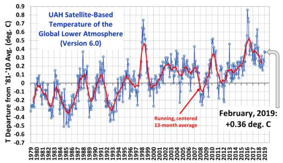
The Version 6.0 global average lower tropospheric temperature (LT) anomaly for February, 2019 was +0.36 deg. C, essentially unchanged from the January, 2019 value of +0.37 deg. C:
Various regional LT departures from the 30-year (1981-2010) average for the last 14 months are:
The linear temperature trend of the global average lower tropospheric temperature anomalies from January 1979 through February 2019 remains at +0.13 C/decade.
The UAH LT global anomaly image for February, 2019 should be available in the next few days here.
The new Version 6 files should also be updated at that time, and are located here:
I’ve received many more requests about the new disappearing-clouds study than the “gold standard proof of anthropogenic warming” study I addressed here, both of which appeared in Nature journals over the last several days.
The widespread interest is partly because of the way the study is dramatized in the media. For example, check out this headline, “A World Without Clouds“, and the study’s forecast of 12 deg. C of global warming.
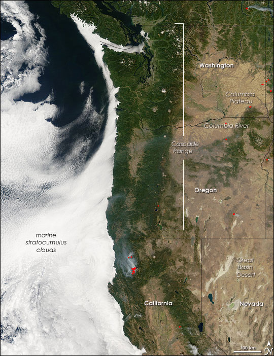
The disappearing clouds study is based upon the modelling of marine stratocumulus clouds, whose existence substantially cools the Earth. These extensive but shallow cloud decks cover the subtropical ocean regions over the eastern ocean basins where upwelling cold water creates a strong boundary layer inversion.
Marine stratocumulus clouds off the U.S. West Coast, which form in a water-chilled shallow layer of boundary layer air capped by warmer air aloft (NASA/GSFC).
In other words, the cold water causes a thin marine boundary layer of chilled air up to a kilometer deep, than is capped by warmer air aloft. The resulting inversion layer (the boundary between cool air below and warm air aloft) inhibits convective mixing, and so water evaporated from the ocean accumulates in the boundary layer and clouds then develop at the base of the inversion. There are complex infrared radiative processes which also help maintain the cloud layer.
The new modeling study describes how these cloud layers could dissipate if atmospheric CO2 concentrations get too high, thus causing a positive feedback loop on warming and greatly increasing future global temperatures, even beyond what the IPCC has predicted from global climate models. The marine stratocumulus cloud response to warming is not a new issue, as modelers have been debating for decades whether these clouds would increase or decrease with warming, thus either reducing or amplifying the small amount of direct radiative warming from increasing CO2.
The new study uses a very high resolution model that “grows” the marine stratocumulus clouds. The IPCC’s climate models, in contrast, have much lower resolution and must parameterize the existence of the clouds based upon larger-scale model variables. These high resolution models have been around for many years, but this study tries to specifically address how increasing CO2 in the whole atmosphere changes this thin, but important, cloud layer.
The high resolution simulations are stunning in their realism, covering a domain of 4.8 x 4.8 km:
The main conclusion of the study is that when model CO2 concentrations reach 1200 ppm or so (which would take as little as another 100 years or so assuming worst-case energy use and population growth projections like RCP8.5), a substantial dissipation of these clouds occurs causing substantial additional global warming, with up to 12 deg. C of total global warming.
Shortcomings in the Study: The Large-Scale Ocean and Atmospheric Environment
All studies like this require assumptions. In my view, the problem is not with the high-resolution model of the clouds itself. Instead, it’s the assumed state of the large-scale environment in which the clouds are assumed to be embedded.
Most importantly, it should be remembered that these clouds exist where cold water is upwelling from the deep ocean, where it has resided for centuries to millennia after initially being chilled to near-freezing in polar regions, and flowing in from higher latitudes. This cold water is continually feeding the stratocumulus zones, helping to maintain the strong temperature inversion at the top of the chilled marine boundary layer. Instead, their model has 1 meter thick slab ocean that rapidly responds to only whats going on with atmospheric greenhouse gases within the tiny (5 km) model domain. Such a shallow ocean layer would be ok (as they claim) IF the ocean portion of the model was a closed system… the shallow ocean only increases how rapidly the model responds… not its final equilibrium state. But given the continuous influx of cold water into these stratocumulus regions from below and from high latitudes in nature, it is far from a closed system.
Second, the atmospheric environment in which the high-res cloud model is embedded is assumed to have similar characteristics to what climate models produce. This includes substantial increases in free-tropospheric water vapor, keeping constant relative humidity throughout the troposphere. In climate models, the enhanced infrared effects of this absolute increase in water vapor leads to a tropical “hot spot”, which observations, so far, fail to show. This is a second reason the study’s results are exaggerated. Part of the disappearing cloud effect in their model is from increased downwelling radiation from the free troposphere as CO2 increases and positive water vapor feedback in the global climate models increases downwelling IR even more. This reduces the rate of infrared cooling by the cloud tops, which is one process that normally maintains them. The model clouds then disappear, causing more sunlight to flood in and warm the isolated shallow slab ocean. But if the free troposphere above the cloud does not produce nearly as large an effect from increasing water vapor, the clouds will not show such a dramatic effect.
The bottom line is that marine stratocumulus clouds exist because of the strong temperature inversion maintained by cold water from upwelling and transport from high latitudes. That chilled boundary layer air bumps up against warm free-tropospheric air (warmed, in turn, by subsidence forced by moist air ascent in precipitation systems possibly thousands of miles away). That inversion will likely be well-maintained in a warming world, thus maintaining the cloud deck, and not causing catastrophic global warming.

 Home/Blog