
 Home/Blog
Overview
A relatively new global dataset of urbanization changes over the 40 year period 1975-2014 based upon Landsat data is used to determine the average effect urbanization has had on surface temperatures. A method is presented to compute the magnitude of the Urban Heat Island (UHI) effect on temperatures using the example of summertime 09 UTC (early morning) Integrated Surface Database (ISD) hourly data (mostly from airports) over the period 1973-2022 by comparing urbanization differences to temperature differences from closely-spaced weather stations. The results for the eastern U.S. lead to a 50-year warming trend 50% less than that from the official NOAA homogenized surface temperature dataset. It is likely that the daytime reductions in temperature trends will be less dramatic.
Background
Over the U.S., summertime warming in the official NOAA surface temperature record has been less than in all of the climate models used to guide national energy policy. That discrepancy could be even larger if spurious warming from increasing urbanization remains in surface temperature trends. While NOAA’s homogenization procedure has largely removed the trend differences between closely-spaced rural and urban stations, it is not clear whether the NOAA methodology actually removes increasing Urban Heat Island (UHI) effects since it’s possible it simply adjusts rural warming to match urban warming.
Anthony Watts has spearheaded a years-long effort to try to categorize how well-sited the USHCN network of temperature-monitoring stations is, and has found that the best-sited ones, on average, show temperature trends considerably lower than the official trends from NOAA. The well-sited thermometers are believed to have minimized the influence of local outbuildings, sidewalks, HVAC systems, parking lots, etc, on the trends. But economic growth, even in rural areas, can still lead to gradual spurious warming as the area outside the immediate vicinity of the thermometer undergoes growth. The issue is important enough that other methods of computing land-based temperature trends should be investigated. To that end, John Christy and I have been discussing ways to produce a new dataset of surface temperatures, with a largely independent set of weather stations and a very different data-adjustment philosophy.
Many readers here know I have been experimenting off an on over the years with U.S. surface thermometer data to try to determine how much U.S. warming trends have been affected by increasing urban influences. I have been trying to use datasets that can be applied globally, since it is impractical to visit and examine every weather observation site in the world. So far, I had been limited to using population density as a proxy for urbanization, but I have never been convinced this is good enough. The temperature data I use are mostly independent of the max/min data utilized by NOAA, and come from mostly airports. In the U.S., ASOS (Automated Surface Observing System) and AWOS data make up the bulk of these measurements, which are taken hourly, and which NOAA then does light quality control on and provides for a global network of stations as the Integrated Surface Database (ISD).
The Global Human Settlement (GHS) Datasets
Recently I became aware the EU’s European Commission Global Human Settlement Layer project which has developed global, high-resolution datasets quantifying the increasing influence of humans on the terrestrial environment. Of these Global Human Settlement (GHS) datasets I have chosen the “Built-Up” dataset layer of manmade structure densities developed from the Landsat series of satellites since 1975 as being the one most likely to be related to the UHI effect. It is on a global latitude/longitude grid at 30 second (nominal ~1 km) spatial resolution, and there are four separate dataset years: 1975, 1990, 2000, and 2014. This covers 40 of the 50 years (1973-2022) of hourly ISD I have been analyzing data from. In what follows I extrapolate that 40-year record for each weather station location to extend to the full 50 years (1973-2022) I am analyzing temperature data for.
Has Urbanization Increased Since the 1970s?
I feel like the starting point is to ask, Has there been a measurable increase in urbanization since the 1970s? Of course, the answer will depend upon the geographical area in question.
Since I like to immerse myself in a new dataset, I first examined the change in satellite-measured “Built-Up” areas in two towns I know well, at the full 1 km spatial resolution. My hometown of Sault Ste. Marie, Michigan (and area with very little growth during 1975-2014), and the area around Huntsville International Airport, which has seen rapid growth, especially in neighboring Madison, Alabama. The changes I saw for both regions looked entirely believable.
Next, I asked Danny Braswell to plot an image of the 40-year change in urbanization from this dataset over the southeast U.S. The result is shown in Fig. 1.
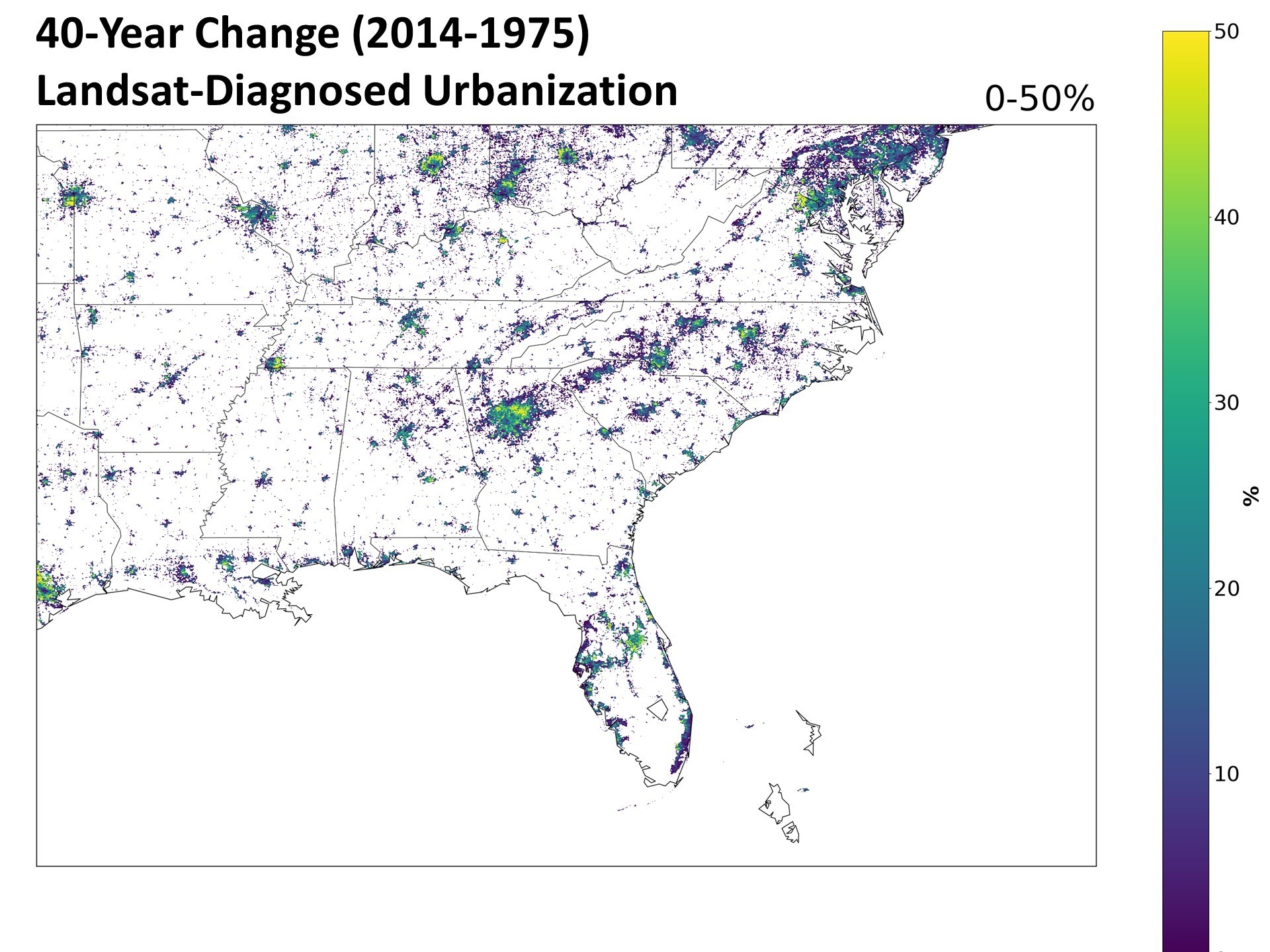
Fig. 1. The 40-year change in urbanization (2014 minus 1975) over the southeast U.S. from the Landsat-based “Built-Up” dataset.
Close examination shows that there has been an increase in manmade structures nearly everywhere that human settlements already existed. I was somewhat surprised to see that these increases are also widespread in Europe, so that we can expect some of the results I summarize below might well extend to other countries.
Quantifying the Urbanization Effect on Surface Air Temperature
I took all hourly-reporting weather stations (ASOS and AWOS), mostly from airports, in the ISD dataset and for all stations having data at least as far back as 1973. I computed the temperature differences at 09 UTC (close to the daily minimum temperature time) between stations no more that 50 km apart, as well as differences in the Landsat Built-Up values (0 to 100). The Built Up datasets are from 4 separate years: 1975, 1990, 2000, and 2014. I used five years of temperature data centered on those four Landsat years for a total of 20 years of August average 09 UTC temperatures to compare to the corresponding four years of urbanization differences. After considerable experimentation, I settled on the four spatial averaging zones shown in Fig. 2 to compute those urbanization differences. This allows a determination of the magnitude of the UHI influence as a function of distance from the thermometer station location.
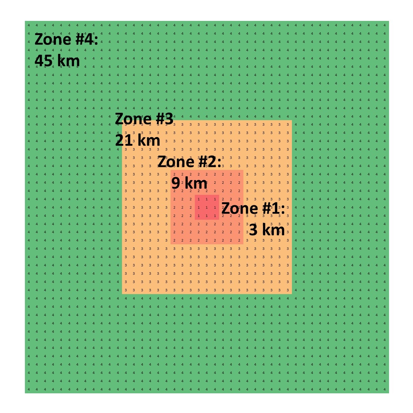
Fig. 2. Averaging zones for Landsat-based “Built-Up” data, nominally at 1 km resolution, for comparison to inter-station temperature differences.
The station pairs used in the analysis are shown in Fig. 3 (sorry for the lack of state boundaries).
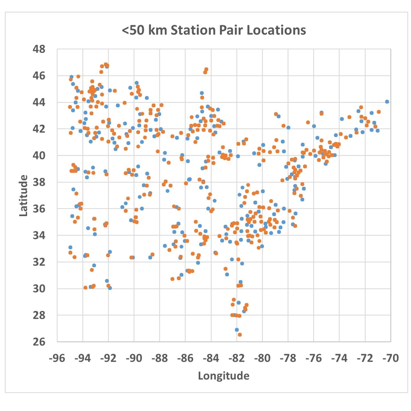
Fig. 3. Weather station pair locations used in the data analysis.
When the temperature differences are computed between those station pairs, they can be plotted against the Zone-average differences in urbanization as measured from Landsat. An example for Zone #3 is shown in Fig. 4, where we see the difference in closely spaced station temperatures is indeed related to the difference in Landsat-based urbanization, with some differences in temperature reaching 4 to 5 deg. C (up to 10 deg. F).
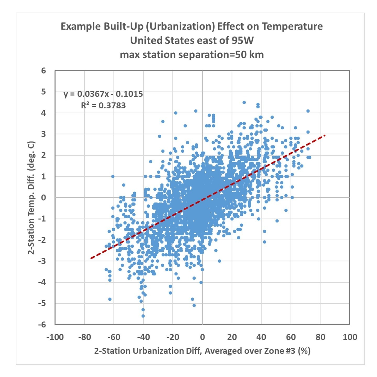
Fig. 4. Twenty years of inter-station temperature differences versus Landsat-based urbanization differences over the eastern United state. Temperature data were the monthly August averages at 09 UTC (close to the time of daily minimum temperature).
The actual algorithm to adjust temperatures uses not just the zone shown in Fig. 4, but all four zones of average Built-Up values in a multiple regression procedure. The resulting coefficients were:
Zone #1: +0.050 deg. C per 10% urbanization difference
Zone #2: +0.061 deg. C per 10% urbanization difference
Zone #3: +0.172 deg. C per 10% urbanization difference
Zone #4: +0.081 deg. C per 10% urbanization difference
The sum of these coefficients is 0.37 deg. C/per 10%, which is essentially the same as the regression coefficient in Fig. 3 for a single zone. The difference is that by using 4 averaging zones together, the correlation is improved somewhat (r=0.67 for the multiple regression), and we also get to see what regions of urbanization have the most influence on the temperatures. From the results above we see all of the averaging zones are important, with Zone 3 contributing the most to explaining the UHI effect on warming, and the 3×3 km zone closest to the thermometer has the last amount of information. Note that I have no information regarding the microclimate right next to the thermometer site (as Anthony uses), so if heat generating equipment was added in the vicinity of the thermometer over the 40 year period 1975-2014, that would not be quantified here and such spurious warming effects will remain in the temperature data even after I have de-urbanized the temperatures.
Application of the Method to Eastern U.S. Temperatures
The resulting regression-based algorithm basically allows one to compute the urban warming effect over time over the last 40-50 years. To the extent that the stations used in the analysis represent all of the eastern U.S., the regression relationship can be applied anywhere in that region, whether there are weather stations there or not.
I applied the method to 269 stations having sufficient data to compute 50-year trends (1973-2022) for August 09 UTC temperatures, and Fig. 5 shows the raw temperature trends versus the de-urbanized temperature trends. When stations in each of the 37 states are averaged together, and the state averages are area-weighted, there is a 40% reduction in the average temperature trend for those 37 states.
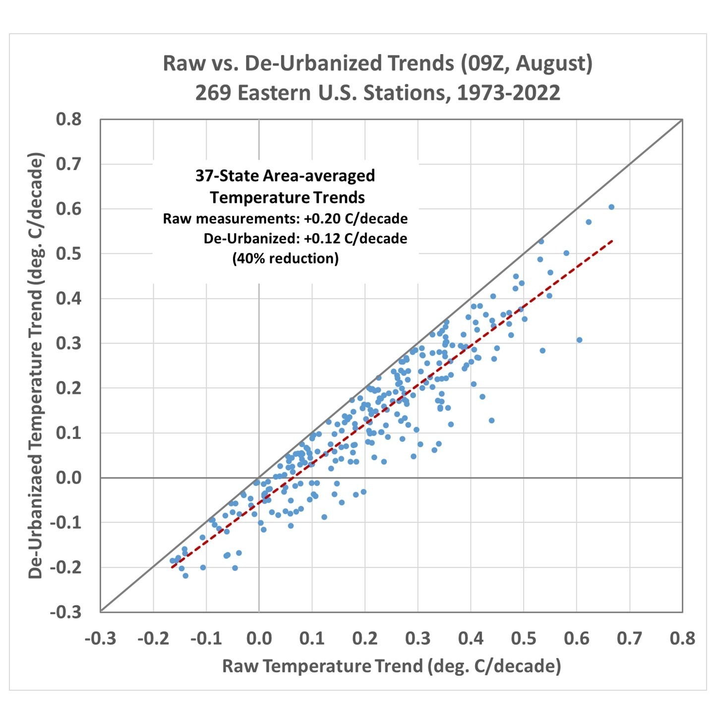
Fig. 5. Raw versus de-urbanized temperature trends across 269 stations in the eastern U.S. for 09 UTC August temperatures (approximately, August daily minimum temperatures).
For the reasons stated above, this might well be an underestimate of the full urbanization effect on eastern U.S. temperature trends.
We can examine the temperature at some individual stations. For example, Figs. 6, 7, 8, and 9 show the raw versus de-urbanized temperatures at Orlando, Indianapolis, Waterloo (IA), and Sault Ste. Marie, (MI). Since I am only dealing with a single month (August) there are no seasonal effects to remove so we can plot actual temperatures rather than temperature anomalies.
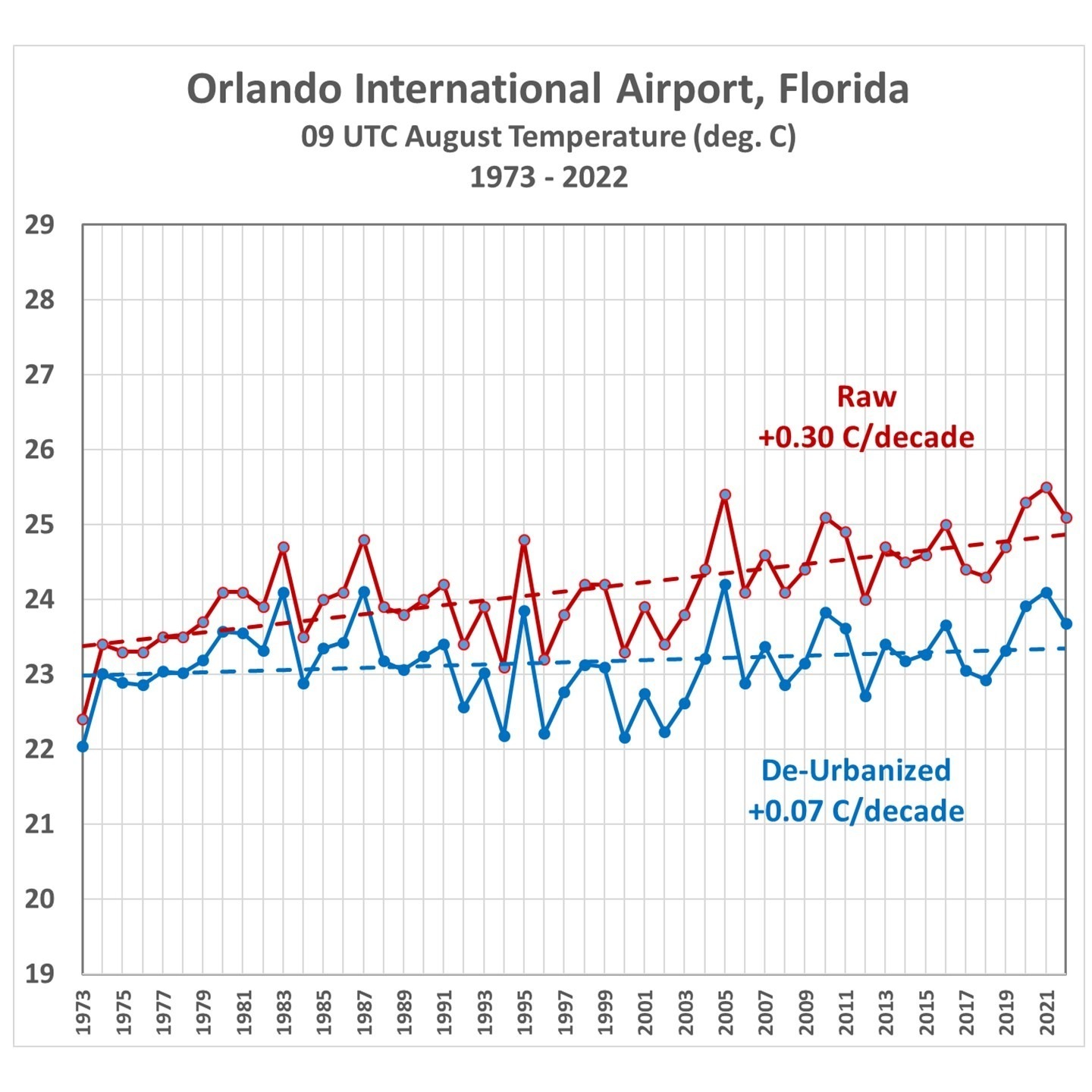
Fig. 6. Average August 09 UTC temperatures, 1973-2022, from raw hourly measurements and after Landsat-based de-urbanization adjustment.
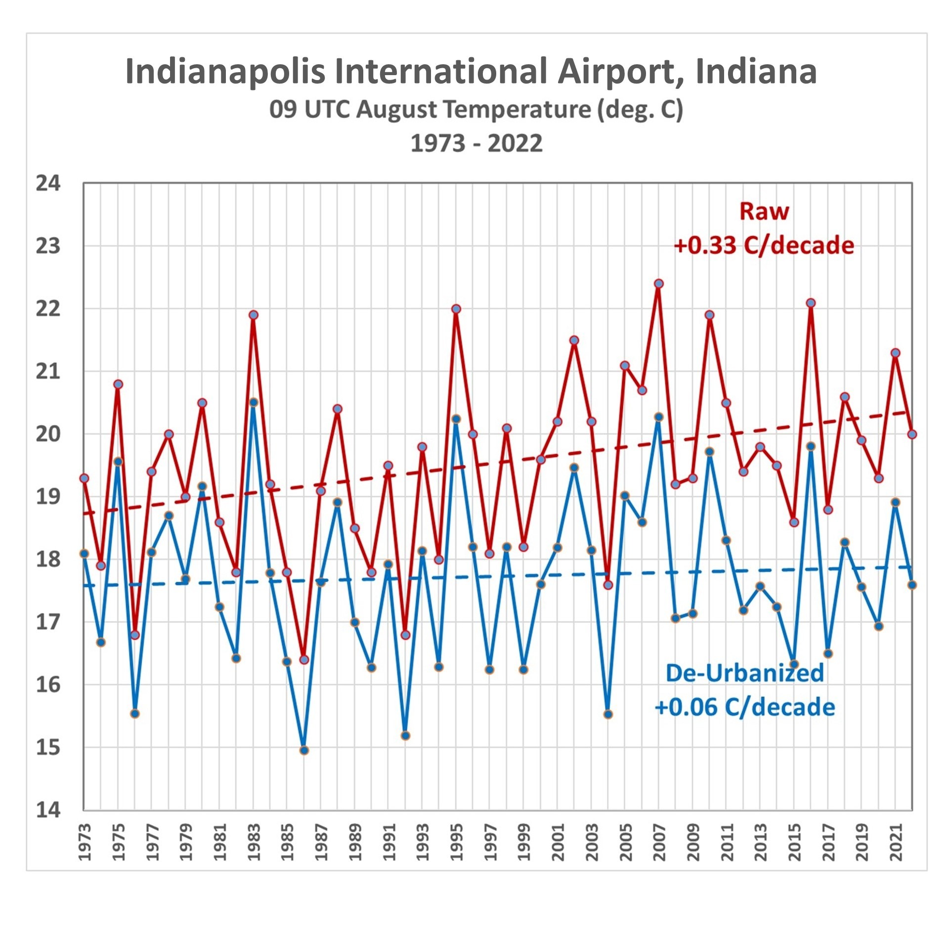
Fig. 7. Indianapolis average August 09 UTC temperatures, 1973-2022, from raw hourly measurements and after Landsat-based de-urbanization adjustment.
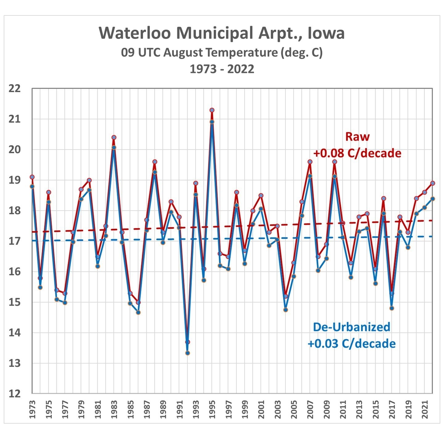
Fig. 8. Waterloo, IA average August 09 UTC temperatures, 1973-2022, from raw hourly measurements and after Landsat-based de-urbanization adjustment.
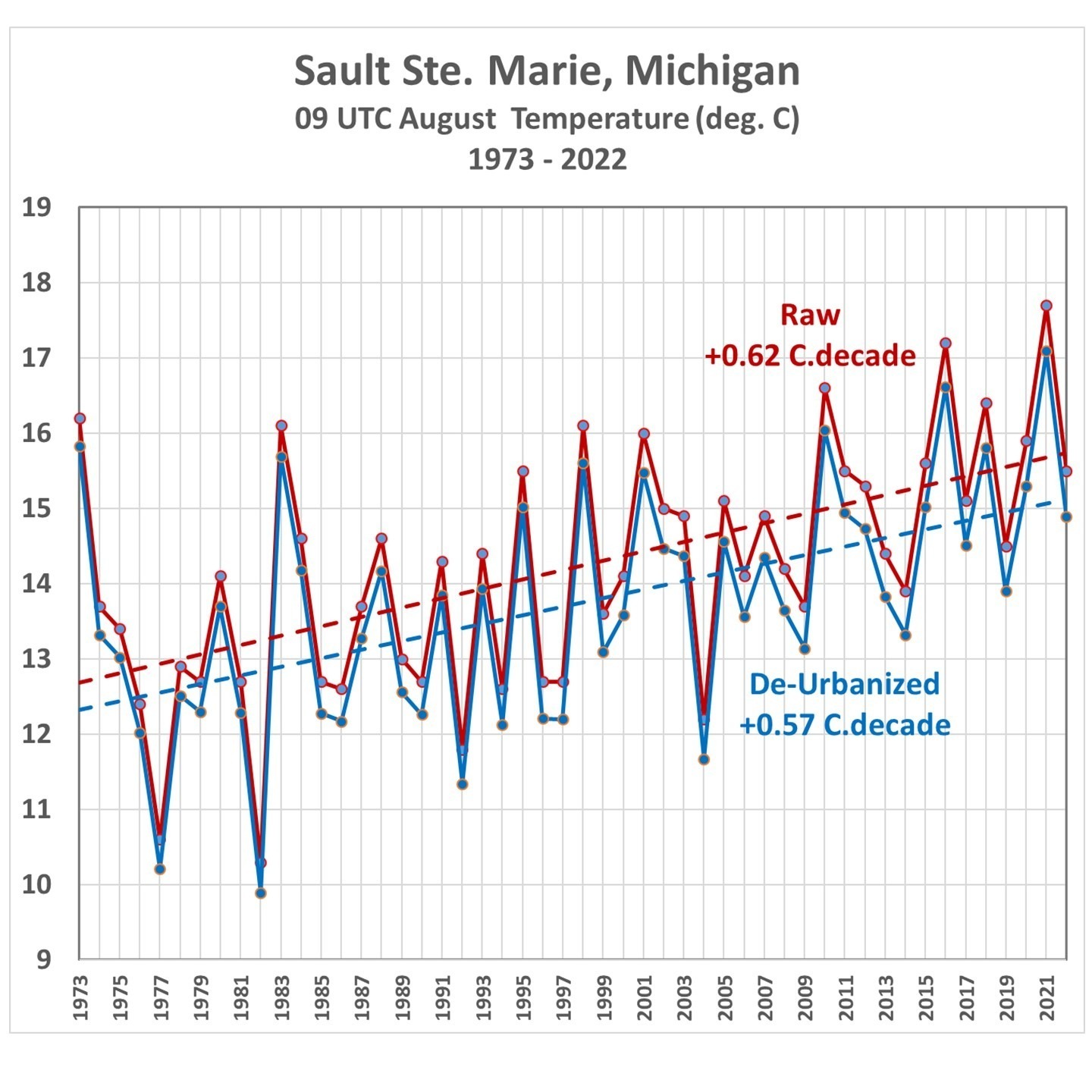
Fig. 9. Sault Ste. Marie, MI, average August 09 UTC temperatures, 1973-2022, from raw hourly measurements and after Landsat-based de-urbanization adjustment.
(As an aside, while I was in the University of Michigan’s Atmospheric and Oceanic Science program, I worked summers at the Sault weather office, and made some of the temperature measurements in Fig. 9 during 1977-1979.)
How Do These Trends Compare to Official NOAA Data?
The statewide-average temperatures from NOAA’s Climate at a Glance website were compared to the corresponding statewide averages computed here. First let’s look at how the raw ISD trends compare to the NOAA-adjusted data (Fig. 10).
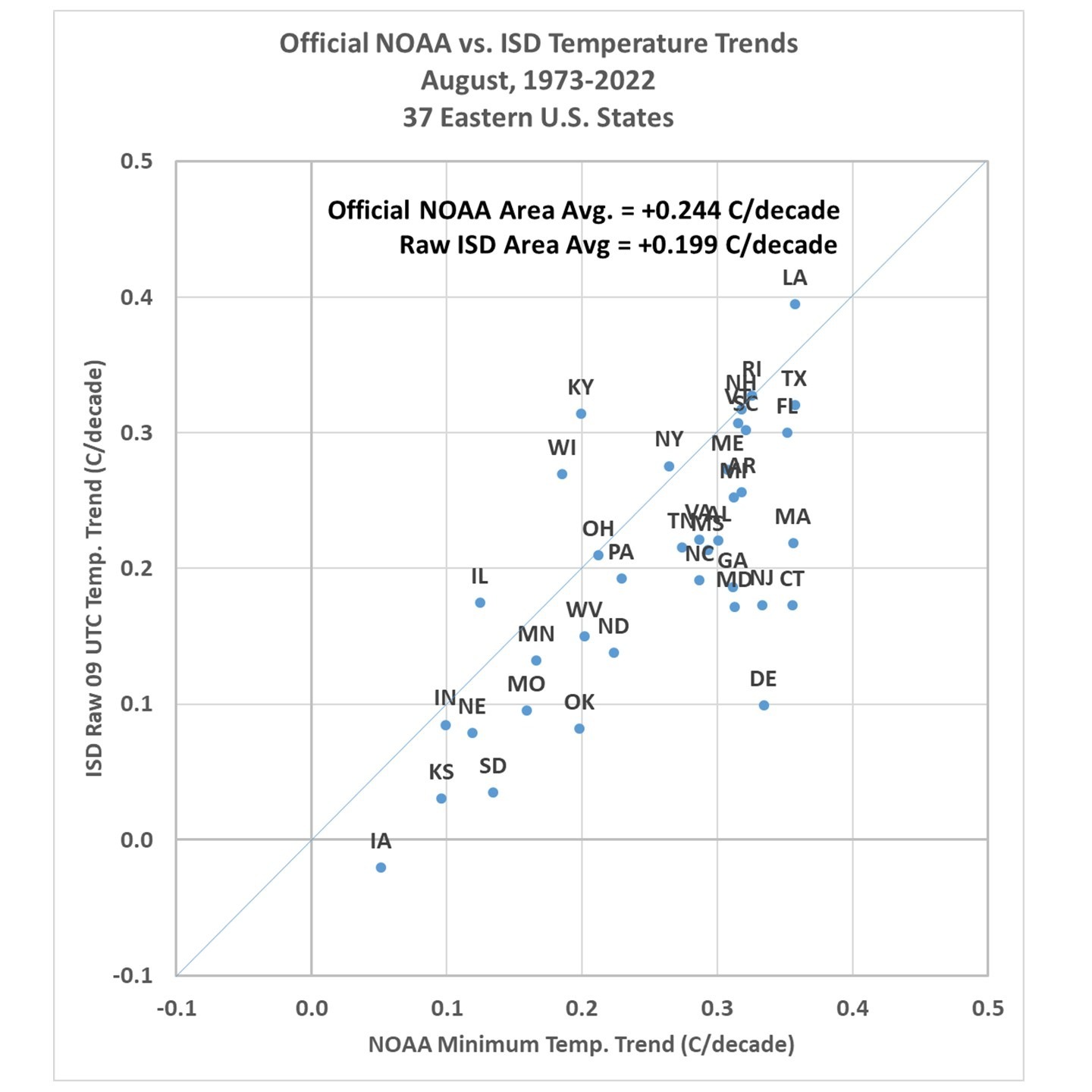
Fig. 10. Statewide-average August temperature trends, 1973-2022, from official NOAA-adjusted data versus the unadjusted hourly temperatures at 09 UTC.
Note the official NOAA temperatures have an average trend higher than the raw ISD data trend (they are mostly independent data sources): +0.244 C/decade vs. +0.199 C/decade. Once the de-urbanization procedure is applied to the individual ISD stations, the results show an average trend fully 50% below that produced by the official NOAA product (Fig. 11).
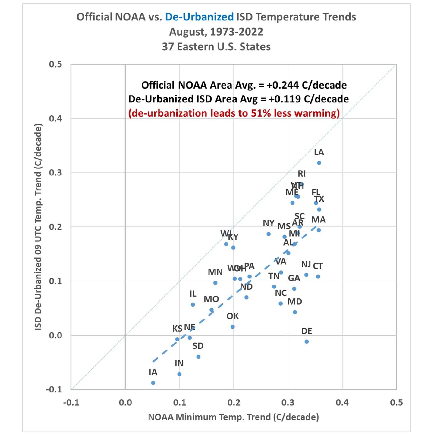
Fig. 11. As in Fig. 10, but after de-urbanization of the ISD 09 UTC temperatures and trends recomputed.
Summary and Conclusions
There is much more I could show, but from the analysis I’ve done so far I believe that the Landsat-based “Built-Up” (urbanization) dataset, which extends back to the 1970s, will be be useful for “de-urbanizing” land-based surface temperature datasets, in the U.S. as well as in other countries. The methodology outlined here is straightforward and the regression statistics are robust (the regression coefficients are all significant, at the 3-sigma level or better).
The urbanization effect on surface temperature trends for August at 09 UTC (near the time of daily minimum temperature) results in a 50% reduction in those trends over the last 50 years. From some preliminary looks I have had at the data from other months and times of day I’d say this will likely be the upper limit of de-urbanization adjustments. So, it is likely that trends in daytime temperature near the time of the daily maximum will not be reduced nearly as much as 50%.
But given the fact that all CMIP6 climate models produce U.S. summer temperature trends greater than the NOAA observations means the discrepancy between climate models and observations is even larger than currently suspected by many of us. John Christy and I believe it is time for a new surface temperature dataset, and the methodology outlined above looks like a viable approach to that end.


The first question that comes to mind is-
Why do you not regard UHI as a form of global warming?
EM-
Why? Let me count the ways. (1) It isn’t global.. it’s non-existent over most of the Earth (oceans and rural land areas). (2) It has an entirely different cause from the cause of “Global Warming” as currently defined and understood by everyone. And, (3) the climate models that must be tested with the surface temperatures do not include increasing urbanization effects.
-Roy
It is, but it’s not global warming of earth, it’s global warming of where people live.
To reduce energy use, generally you want high density population.
Btw, this doesn’t mean big cities- small towns can have a high density population.
I think you build high density populations in ocean settlements.
gbaikie:
You are conflating 2 different processes. One is “global warming” from increasing CO2, everywhere. That is the same whether lots of people live in a location or not.
-Roy
-Roy
This is weird, but I will reply:
–gbaikie:
You are conflating 2 different processes. One is global warming from increasing CO2, everywhere. That is the same whether lots of people live in a location or not.
-Roy
-Roy —
You don’t understand my point.
New York state has low per capita emission, largely due to population density.
UHI effect doesn’t have anything to due with local levels of CO2.
But cities or towns do have higher local CO2 levels. And also wildly varying CO2 levels. Hence why measure global CO2 level on a high mountain in the Pacific.
Dr. Spencer,
This is what you’ve been suggesting for years UHI has influenced a lot of the data. I wish you’d take a look at the data from a different perspective, that is, step-changes, and not linear analysis. Murry Salby suggests that temperature data is step-changing. For instance, in 1979 it oscillated at about -0.3C, then it stepped up and oscillated at about 0.0 and in 2012 it stepped up and is oscillating at about 0.2C. So, not looking at max and min but what it is oscillating about.
Has it influenced temperature trends that much though? Even using the 0.08 C/decade effect from the article as representative of all land areas that works out to 0.024 C/decade globally using a 30/70 split of land/ocean area. And that is being generous since that 0.08 C/decade figure is for 1) a particularly urban land area and 2) not arrived at using an area weighted technique like gridding. So I think 0.024 C/decade is on the extreme upper end of the plausible range of UHI effect upon the global temperature. That’s only 13% of the +0.19 C/decade trend since 1979 from BEST, ERA, Had.C.RUT, and GISTEMP and again that’s being very generous.
It would change the points of your line plots, I think, so the slope would be different.
bdgwx, It may not be a lot but getting corrections to temp records can better align the various ways of measuring climate change. I would think that there isn’t just a single error in our monitoring finding them one by one and rooting them out will eventually lead to more agreement.
Keep in mind that many components of the surface record has been repeatedly corrected often by forcing it to balance to other records. It would be hard for an auditor to be comfortable with that without a full historical analysis and validation with all the available science as the amount of warming we have seen is so modest its doubtful anybody would have noticed it empirically without special devices.
It seems to me the UHI (local warming) effect at each station will not keep raising the temperature once the area density has reached its maximum, will it? So any increases above that point can be attributed to CO2? And if that is true, if the temperature doesn’t increase once the density is maxed? To what will that be attributed? Is that why “global warming” is now “climate change?” That increased levels of CO2 create both warm and cold changes?
Even if one accepts that nano-increases in CO2 might affect temperatures, any such thing locally would be greatly overshadowed by the effects of concrete, metal, and asphalt structures and atmospheric water vapor.
Yes.. we know 100% of how urban areas have their own dynamic. That’s not a problem.. it is the areas that are not affected by large human populations that Roy Spencer seems to ignore. Where are these comparative stats I wonder?
We shouldn’t be removing the UHI effect. We only want to remove the UHI bias. Those are two different, albeit related, concepts. The effect is real and should be included. The bias is caused by the gridding strategy. For example, a grid cell that is a mix of urban and rural with a declining urban-to-rural station ratio would have a negative UHI bias despite the urban portion having a positive UHI effect. That’s right. It is possible for the UHI bias to be negative. And that is what Wickham et al. 2013 actually found globally though it was a statistically insignificant result of -0.01 +/- 0.02 C/decade bias. Again, the goal is not to “deurbanize” the datasets. The goal is to remove urban bias. The keyword here is bias.
bdgwx:
If you actually read my post (which it appears you did not) the method I provided removes the bias as a function of time. Of 269 stations, only ONE had no change in urbanization (El Dorado, Arkansas). There were NO station locations with a decrease in Landsat-observed urbanization.
I don’t know how you can ignore the evidence…. given the evidence, your comment makes little sense.
-Roy
Dr. Spencer said: “If you actually read my post (which it appears you did not) the method I provided removes the bias as a function of time.”
I did read the post. The way I’m understanding it (which could be wrong) is that you removed the effect; not the bias.
For example, the Orlando International Airport is +0.30 C/decade “raw” and +0.07 C/decade “deurbanized” in the graphic. But the thing is…that site really warmed at a rate of +0.30 C/decade; not +0.07 C/decade.
Sure, it is almost certain that a significant portion of that +0.30 C/decade of warming is caused by land use changes. But, that is a real effect. Just because the effect is positive does not mean that the site introduced a positive bias on a spatial average. The bias depends mostly on the gridding and averaging strategy that effect how much urban measurements are used as proxies for rural measurements and vice-versa.
bdgwx:
You said: “Sure, it is almost certain that a significant portion of that +0.30 C/decade of warming is caused by land use changes. But, that is a real effect. Just because the effect is positive does not mean that the site introduced a positive bias on a spatial average. The bias depends mostly on the gridding and averaging strategy that effect (you mean “affect”?) how much urban measurements are used as proxies for rural measurements and vice-versa.”
OK, so you admit that land use change (urbanization) is a real effect and impacts temperatures. But, yes, if the station has this effect it DOES introduce a bias on the spatial averages! That’s the whole point, there are so many urban stations that they are representing rural areas!! Virtually NONE of the stations are rural, and so when 5 or ten mostly-urban stations are averaged together to represent the whole state, then yes, the spatial average is also impacted! NOAA does NOT actively reduce the urban temperatures to match rural. They throw all of the data together and let the greatest number of stations win!
-Roy
-Roy
Dr. Spencer said: “OK, so you admit that land use change (urbanization) is a real effect and impacts temperatures.”
Absolutely!
Dr. Spencer said: “But, yes, if the station has this effect it DOES introduce a bias on the spatial averages!”
It influences the spatial average. It does not bias it. Remember, a bias is just a measurement error. The UHI effect itself does not cause measurement error. It just causes the measurement to be higher than it would be otherwise. The error (or bias) comes into play when you use an urban measurement as a proxy for a rural area and vice versa.
Dr. Spencer said: “Thats the whole point, there are so many urban stations that they are representing rural areas!!”
That could be true. But this isn’t the way to test for the bias. There isn’t really any perfect way to test for the bias. There are only options each with its own limitations.
Dr. Spencer said: “Virtually NONE of the stations are rural, and so when 5 or ten mostly-urban stations are averaged together to represent the whole state, then yes, the spatial average is also impacted!”
That’s not how spatial averages are done though. Spatial averages are done by gridding the region and taking the average of the grid; not the stations.
Dr. Spencer said: “NOAA does NOT actively reduce the urban temperatures to match rural.”
Nor should they. What they should do is use counter measures to mitigate the proxification of rural areas with urban observations and vice versa. That’s the hard part.
bdgwx:
It appears you have some misunderstandings about how gridded datasets are constructed. If there are only a scattering of actual data point across a gridded field, there is no addition information added from “gridding”. If all you have are urban-biased measurements (which virtually all stations are), these WILL affect the gridded values where no actual data exist. Nothing you have said helps our understanding of all of this.
-Roy
There is additional information added by gridding…the area weights applied to the observations.
For example, consider a 4 cell grid. Cells #1, #2, and #3 are rural each with one observation of 15 C. Cell #4 is urban with 5 observations of 16, 16, 15, 17, and 17 C. The trivial average is (15 + 15 + 15 + 16 + 16 + 15 + 17 + 18) / 8 = 15.9 C. But the grid average is only (15 + 15 + 15 + (16 + 16 + 15 + 17 + 18) / 5) / 4 = 15.4 C. The UHI effect in cell #4 is 1.4 C which causes a bias on the trivial average of 0.5 C due to the overweighting of urban observations. The UHI effect on the grid average is 0.4 C yet the UHI bias is 0.0 C because we used to the area information from the grid to avoid injecting the bias.
You get a similar problem with infilling. Consider a 3×3 grid with 9 cells. The bottom left corner cell is urban with observations 16, 17, and 18 C with a cell average of (16 + 17 + 18) / 3 = 17 C. The remaining 7 perimeter cells are rural each with one observation of 15 C. The center cell is rural as well but has no observation so you decide on a simple linear interpolation strategy of the neighboring 8 cells. You fill that cell via ((16+17+18)/3 + 7*15) / 8 = 15.3 C. In reality the cell actually should have been just 15 C since it was rural. The grid average is (7*15 + 15.3 + 17) / 9 = 15.3 C. But if we replace the 15.3 C value infilled on the center cell with the true 15 C value we have (7*15 + 15 + 17) / 9 = 15.2 C. As you can see the UHI effect increased the grid average by 0.2 C while the bias increased it a further 0.1 C. The bias occurred because you used the urban observations as a proxy (at least partially) for a rural area.
As you can see there is a difference between the bias and the effect. We want to keep the effect because it is real. It is the bias and only the bias that we want to avoid if the goal is an accurate global average temperature.
By adjusting the urban observations you might remove any bias they inject into the average at the expense of also removing the effect as well. That’s fine if the goal is to isolate the UHI effect. Though, I’ll argue that gridding must still be performed to appropriately area weight the observations. It’s not fine if the goal is to form an accurate average temperature.
I haven’t fully digested the blog post, but my understanding is that Dr Spencer is applying an “urbanization correction” to each station.
At any point in time that difference might be viewed as a “bias”. However, because urbanization is a time varying factor, the per station correction is time varying. Further, because urbanization is increasing on average the corrections have a net positive trend, which when removed decrease the net warming trend.
What he’s done seems plausible enough so far as it goes, but there are potential pitfalls in this sort of analysis like station moves and instrument changes that haven’t explicitly been addressed.
Deurbanization is plausible if the goal is to isolate the UHI effect. Though, I have questions about whether the method is really doing that even (I’m certainly open to accepting it is). It’s not plausible if the goal is to arrive at a correct average temperature. Urbanization itself does not cause a bias in the average temperature. It just causes the average temperature to be higher than it would be otherwise. Saying UHI itself is a “bias” is the equivalent of saying that changes in solar output is a “bias”. Neither is a bias. They are simply contributors to the temperature trend just like CO2, CH4, cloud cover, snow/ice cover, etc. The bias comes into play when you use urban areas as a proxy for rural areas and vice versa.
I think I see your point.
AGW has contributions from (at least) atmospheric GHG, aerosols, and land use changes.
Viewing “urbanization” as a component of “land use change” a hazard is that effects observed at a monitoring station may reflect an issue strictly local to the station or it may reflect a real change over a broader area. I’m not clear on whether the approach described effectively distinguishes between these two extremes and how big the effect from “real change over a broader area” might be.
Dr. Roy,
The US Climate Reference Network (USCRN) should provide a good estimate of how much of the warming due to urbanization effect because the USCRN stations are all located in pristine areas.
However NOAA recently change USCRN dataset. The website says that all they did was change the numbers from which they calculate the monthly anomalies from the 1981-2010 Climate Normals to 1991-2020 Normals. My understanding of the Climate Normals is that they are a set of 12 monthly normal for each USCRN site, as calculated from nearby COOP sites.
But the change in the dataset turned what had been a nearly eight-year cooling trend of 2.4 F per century into a nearly eight-year warming trend of 3.8 F per century. I think that changing the base from which the monthly anomalies are calculated would not change the slope. I asked NOAA why the slope changed. No response yet.
Dr. Spencer said: “The sum of these coefficients is 0.37 deg. C/per 10%”
But the spatial average on that 45 km grid is given by:
Z1 = 0.050 C/decade.10% * 3km * 3km = 0.45 C.km2/decade.10%
Z2 = 0.061 C/decade.10% * 9km * 9km – Z1 = 4.49 C.km2/decade.10%
Z3 = 0.172 C/decade.10% * 21km * 21km – Z2 – Z1 = 70.91 C.km2/decade.10%
Z4 = 0.081 C/decade.10% * 45km * 45km – Z3 – Z2 – Z1 = 88.18 C/km2/decade.10%
Zavg = (Z1 + Z2 + Z3 + Z4) C.km2/decade.10% / (45km * 45km) = 0.08 C/decade.10%.
Note that Zavg is only for those 45km*45km grid cells that have urbanization. Most of the grid cells in the United States are not urbanized at all.
There is about 10,000,000 km2 of land area in the US. That means there are 4938 grid cells of size 45km*45km. Of that I estimate generously that 10% is urbanized which means there are 494 cells with a +0.08 C/decade.10% effect and 4444 with 0.00 C/decade.10% effect. The spatial average is thus (0.08 * 494 + 0.00 * 4444 / 4938) = +0.008 C/decade.10%. So even if urbanization were 50% that would have a 0.008 C/decade.10% * 50% = +0.04 C/decade affect on the United States spatial average and that is using some generous assumptions. I doubt 10% of the grid cells in the United States are urbanized nor that those cells urbanized by 50%.
Stupid arithmetic mistake. Let me correct that.
Z1 = 0.050 C/decade.10% * 9 km2 = 0.45 C.km2/decade.10%
Z2 = 0.061 C/decade.10% * (81 km2 – 9 km2) = 4.39 C.km2/decade.10%
Z3 = 0.172 C/decade.10% * (441 km2 – 81 km2) = 61.92 C.km2/decade.10%
Z4 = 0.081 C/decade.10% * (2025 km2 – 441 km2) = 128.30 C.km2/decade.10%
Zavg = 0.10 C/decade.10%
Therefore with 10% urban coverage and 50% increase urbanization that would be +0.05 C/decade contribution to the United States spatial average.
BDGWX:
(1) The spatial averages of Built-Up values are the average of many 1×1 km bins. So, yes, you can think of them as having “per sq. km” in the denominator…. it’s the average over those entire zones, each comprising many 1×1 km bins….
(2) But what you say about averaging across the U.S. is irrelevant… if ALL of the stations in the U.S. were urban (most of them are, to some degree) then the point is that those urban-influenced measurements are being applied (say, by NOAA) to the rural regions as well. They (NOAA, me, anyone),in effect, have to interpolate between urban measurements across large rural swaths of land, in order to compute an “area average” for the U.S. (or even for just a single state). I assume you understand this.
The fact that there are more urban observations than rural observations just means that the urban cells have more observations that contribute to their final value. It does not necessarily mean that the urban observations are influencing the value of the rural cells. What does influence the value of rural cells is when they have no observations at all have to be infilled. If the infilling strategy uses urban observations to infill rural cells then you have a bias.
bdgwx:
I know that’s the way you would think it works, but NOAA’s homogenization procedure apparently allows the urban characteristics to rule over the rural if there are more urban observations. They have nothing (that I know of) in place to actually adjust too-warm urban locations to better match the rural.
Your wording makes it sound like you know how they do it… if you have info, please enlighten us,
-Roy
Vose et al. 2013: Improved Historical Temperature and Precipitation Time Series for U.S. Climate Divisions
Hausfather et al. 2012: Quantifying the Effect of Urbanization on
U.S. Historical Climatology Network Temperature Records
Then theres the all important question, when you make the adjustment, how does it compare to the satellite data?
so the takeaway seems to be:
“Existing automated homogeneity techniques correct for the majority of bias”
bdgwx says:
”We shouldnt be removing the UHI effect. We only want to remove the UHI bias.”
really doesn’t matter bdgwx. The effect on global mean warming is almost nil. Thats because areas of urbanization is a teensy area in comparison to the area of the world.
The bias though is significant as kriging multiplies the real effect by 1) the predominance of weather stations place within areas of on going development over truly rural stations undergoing zero development; 2) that overly represented warming then is kriged over huge areas with radii of up to 1500km from the weather station. 3) At least James Hansen’s record is also used to influence ocean temperatures up to 1500km from shore not sure how it is or was handled by others.
So real effect on global mean land temperature is only likely 2 or 3% of what the bias effect might be on GMLT.
So if you had in the last century a 1 degree warming predominately over land and .3 of it was due to urbanization effect and bias (.3deg) or .02deg/decade.
Figuring the error from that would leave on about .0006 per decade actual effect which wouldn’t even show up in a per decade record run out to 3 significant digits as is the UAH record.
One would need the specific kriging software to estimate the effect of extrapolating the urban warming over the oceans but it could be quite significant considering how much urbanization is on the shorelines.
In short the actual correct effect on global mean temperature is completely immaterial. Nearly all the UHE is infused by over representation of urban areas in the sampling program.
Of course I have seen tons of propaganda arguing that only the real effect should count and claiming truthfully the real effect is immaterial. But the overall claim is simply a lie because these people know better and are relying on the public being ignorant.
Hi, Doug! Bye, Doug! (snip)
still not biting… (snip)
(snip)
While UHI effect on temperature is likely very real,
it has nothing to do with GH gas emissions changing the global climate.
It has nothing to do with any concept of a ‘climate emergency’.
It has nothing to do with any need to spend trillions of $ reducing modern civilization to hunter-gather levels.
Therefore, if temperature trends are in any way relevant to the climate or to keeping temperature increases below an arbitrary value, removing it in order to see what the earth in general is doing, temperature wise (if that has any relevance to anything for human cultures), is a valid and useful bias correction.
(snip)
(snip)
There are lots of datasets, each referring t themselves as ‘fixed’ with regard to a global average, corrected for missing data, corrected for, (well, fill in any reason you like here).
All adjustments are prone to error, over use, some may even be just right and perfectly adjust the data. But tomorrow, the algorithm could be wrong for reasons that just cannot be known today.
Wouldn’t it be easier to use a data set that needs no trimming, no adjustment and yet meets the purpose of reporting a trend in global data?
The Pacific ocean is large, actually huge, even as a percentage of the globe. It is mostly free of urban settlement, it is mostly free of localised clouds, caused by localised events, eg power stations and their cooling towers, etc.
So why not use a series of data points localised over the Pacific ocean as a proxy for the world?
Why not pick 100 points, (numbers may vary as required), covering the water surface away from land and use that as a proxy. Do not adjust for any changes in any way and just report the trend in the data.
This can only be done with a satellite collected data set, for obvious reasons.
So what is the Pacific ocean trend in the satellite era, (unadjusted, accepting for real sensor changes or error)?
That, to me, would be a trend that I could accept as a global measure, everything else can be argued to be swayed by one teams interpretation of change compared to another. Even the above proposal has some points that I could question, (there are going to be a range of answers to each), for example, the size of each of the grid squares, why not double the edge length of each shape, or halve them? Or how about the use of four years of data, 1975, 1990, 2000, and 2014. Why not use 1976 instead of 1975, does it make a difference? And of course, the report picks up on the localised problems of a carpark being built adjacent to a sensor, or maybe an HVAC outlet, this could sway the data, both the rural end and the city end, making the data set trend float up or down depending on which end is affected.
I would propose that UHI does not affect the Pacific ocean data points. As a bonus, there is no need to take only 4 data point years into consideration. Use the whole set. Use the whole year. Use every year.
So, who would like to tell me the answer for the Pacific ocean, (proxy), temperature trend.
Ian:
There are not enough pristine land stations to get regional land averages, and there certainly are not enough small islands in the world. Temperatures are already monitored on what few island there are, but no one in this business believes you can get ocean-average temperature trend from them.
-Roy
Argo floats are in Pacific and there are thousands of them, and they pop up to surface to send their data of Ocean temperature.
gbaikie:
Yes, Argo seems to be the best ocean temperature data we have, at least since about 2005. I use that data almost entirely in our climate sensitivity research.
-Roy
I, too, have wondered about the seeming emphasis on land temperatures. Compared to the oceans and other bodies of water, land has very little ‘thermal memory’, which amplifies temperature changes for a given change in thermal energy. Are land temperatures used because they are easier to measure? If so, it seems a little like attaching an accelerometer to a dog’s tail in an effort to track the dog’s position over time, since the tail moves more and the signals are much larger.
Also, it seems like most of the “tipping points” the CAGW crowd frets about are water-based (melting glaciers, methane clathrate release, etc.) And without tipping points, even the CAGW crowd admits there would be nothing to worry about, right? I suspect that one could come up with possible scenarios where climate change affects the relationships between land and ocean temperatures, where average land temperatures could increase significantly without triggering the water-based tipping points.
In other words, should we even care about land-based thermometers, and instead focus solely on water-based thermometers?
“should we even care about land-based thermometers”
Its true that ocean T is less variable, and is where most of the added heat is stored. So it may indeed be a better gauge of climate change.
Although the surface T has been in a plateau since 2016, you can see that the Global Ocean Heat Content has continued to rise. No plateau.
https://www.ncei.noaa.gov/data/oceans/woa/DATA_ANALYSIS/3M_HEAT_CONTENT/GRAPHS/heat_content2000m.png
But the land is where people live, grow their food, and get their water.
Land is heating faster. Thus the warming in 50 y is ~ 3 degrees F over the Northern hemisphere temperate land areas, where most people live. This is a noticeable change.
https://www.ncei.noaa.gov/access/monitoring/climate-at-a-glance/global/time-series/europe/land/36/9/1880-2022?trend=true&trend_base=10&begtrendyear=1972&endtrendyear=2022&filter=true&filterType=binomial
It is where people experience extreme weather, heat waves, drought, floods.
Except what you just pointed out are BIASED numbers. The Land as just demonstrated is NOT warming as much as you claim. The Measurements are biased due to UHI and reported trends are further biased by the techniques described. You can never just use the Pacific, because there is not a scientist on the planet who can explain La Nina and El Nino cycles. We are in a triple La Nina phase, that means COOLING. So clearly CO2 is not trapping more heat and storing it in the oceans. Too much overthinking by the respondents as usual. For decades and today those who promote the CO2 man made warming theory as the only way to explain the small observed warming , dismiss UHI as insignificant. This technique further demonstrates the record bias , which in turn demonstrates the inaccuracy and unreliability of the ‘official’ and adjusted records. It is just basic common sense that UHI has influenced the reported ‘warming’ and that it is not nearly as much as claimed. So to be clear, the earth has definitely warmed over the past 150 years. That is expected as part of natural cycles in this current interglacial based on all available science. CO2 as a GHG has an effect in our atmospheres ability to retain heat. But using bad data to support a narrative that is incomplete and build on several houses of cards should be exposed, as is done in this research.
One problem with using fixed locations on the ocean is that many wandering hot spots underlying the oceans, which cause unpredictable variations in surface temperatures.
Another problem, of course, is tectonic plate movement, and the resultant effect on currents due to convection, which are chaotic and unpredictable.
Australia, for example, is moving NNE at around 7cm per annum, and there is no theoretical minimum which can cause enormous changes to outputs of a chaotic system. A continent moving is certainly a fair disturbance to an ocean.
Even Argo floats – float. They are carried by currents, and as far as I know, have no way of sending their location when at some depth. As deep currents may flow at 180 to each other, just because a float surfaces at some point, nothing can be known about its sub-surface wandering. Fairly useless for anything. If they were fitted with some sort of recording inertial guidance system, at least the other data could be related to a known position.
Nature seems restless, and not inclined to sit still and have its temperature taken under the same conditions at various time intervals.
I was imaging the use of satellite derived data. The locations can be fixed, the data scanned as often as the satellite goes over. It would be a lot easier to measure a trend WITHOUT UHI and then to extrapolate that to the world on a wider scale, rather than trying to strip UHI from a dataset and then use that adjustment to the world.
I do not see the point of having islands to measure from. Surely chasing the UHI adjustments in the hope that you could sway someone that the world is not warming alarmingly is just throwing another debatable point into the argument.
Eliminate the need to consider UHI, just shoot the temperatures, (via the air above them), and tell us what the mean temperature over the Pacific ocean is. Any subsequent discussion that some smaller continent is getting hotter/colder can be discussed relative to A, a very large portion of the earth’s surface and B, water has a much higher resistance to a change in temperature than a land surface.
Surely, the answer is on/over the Pacific. Not whether someone can show that UHI exists or whether an airconditioner has damaged the data trail.
Things happen within the Pacific Ocean that result in large “local” changes, such as the “blobs” that, fairly recently, have persisted for several years in some locations, or broken into two or three “blobs” that separated extensively from each other but still themselves persisted for a considerable time. They effected largish regions but probably not the entire planet.
There is the Pacific Warm Pool, which seems to effect most of the globe during El Nino events but have less global effect between events, and there are upwellings of deep cold water that happen at irregular interval, significantly effecting much of the globe. The global results of these events probably cannot be objectively quantized from measurements over the sites themselves.
There is the recent study by a Chinese(?) scientists that seems to have extensive data going back to about 1975, that he interprets as showing that underwater geological activity, such as volcanos, are much more globally important than generally accepted. He seems to have put enough together that his work deserves analysis and debate based on what he presents rather than just dismissal because of beliefs that underwater geological activity is too small to really matter.
I though I had book marked his recently produced video but, frustratingly, I cant find it. Surely Im not the only person to have seen it. I would appreciate someone posting the link again if they have it.
In summary, it seems to me that some fairly large Pacific (and probably also every other ocean basin) events have only regional results and others have global or nearly global results that would be very difficult or impossible to understand just from measurements at the ocean sites where they occur.
Good read and a much needed analysis. Humbly offered correction: The legend on fig 7 reads “Indianapolis International Airport, Florida.” A one-time Hoosier wishes that it was just so.
OK, thanks. -Roy
I did this study and used to post a whole list of stations that showed no warming. All you need to do is go to the NASA GISS website and chose desert locations with BIs of less than 15. There are literally hundreds of locations that show no warming. Here is my favorite.
Alice Springs (23.8S, 133.88E) ID:501943260000
https://data.giss.nasa.gov/cgi-bin/gistemp/stdata_show_v3.cgi?id=501943260000&dt=1&ds=5
This is literally how easy it is to prove CO2 doesn’t impact temperature. Simply control for the UHI and Water Vapor by choosing locations that fit that description.
https://data.giss.nasa.gov/cgi-bin/gistemp/stdata_show_v4.cgi?id=USC00454338&ds=14&dt=1
https://data.giss.nasa.gov/cgi-bin/gistemp/stdata_show_v4.cgi?id=USC00457267&ds=14&dt=1
NASA’s own data can be used to debunk their AGW Theory if you simply understand basic science and know how to test a hypothesis using their data.
Re Australian stations like Alice Springs, Tom Berger and I wrote a piece on WUWT about ten days ago about uncertainty in these routine temperature measurements. Short summary, I doubt if anyone outside official circles has seen truly “raw” data. What is offered as raw has already been adjusted. Our BOM is quiet on all the questions we raised and on the irrefutable evidence we showed for station after station with “adjusted” raw data.
In the context of UAH data, Dr Spencer has consistently shown a willingness to improve the methodology when shown a plausible need. This is rare, refreshing and appreciated in the current global scene of refusal to debate and/or denigration of those who differ. Thank you, Dr Spencer. Geoff S
“Anthony Watts has spearheaded a years-long effort to try to categorize how well-sited the USHCN network of temperature-monitoring stations is, and has found that the best-sited ones, on average, show temperature trends considerably lower than the official trends from NOAA.”
Fall et al (2011) didn’t come to that conclusion.
Watts peer-reviewed paper found bias in min/max temperatures, but concluded that mean temperature trends were not much different between the best-sited stations and the NOAA official US temp record.
The opposite-signed differences in maximum and minimum temperature trends at poorly sited stations compared to well-sited stations were of similar magnitude, so that average temperature trends were statistically indistinguishable across classes. For 30 year trends based on time-of-observation corrections, differences across classes were less than 0.05°C/decade, and the difference between the trend estimated using the full network and the trend estimated using the best-sited stations was less than 0.01°C/decade.
https://agupubs.onlinelibrary.wiley.com/doi/full/10.1029/2010JD015146
A bit more from the paper, more directly linking the comparison to the NOAA US temp record:
Overall, this study demonstrates that station exposure does impact USHCNv2 temperatures. The temperatures themselves are warmest compared to independent analyses at the stations with the worst siting characteristics. Temperature trend estimates vary according to site classification, with poor siting leading to an overestimate of minimum temperature trends and an underestimate of maximum temperature trends, resulting in particular in a substantial difference in estimates of the diurnal temperature range trends. Homogeneity adjustments are necessary and tend to reduce the trend differences, but statistically significant differences remain for all but average temperature trends.
Interesting. Thanks Barry.
This is consistent with the Berkeley Earth study that also found little difference for global average land trend between rural only and all sites.
It seems Roy’s summary of that work left out that rather important conclusion.
Fall et al buried the finding that average temp trends were corroborated deep in the paper and underneath the differences in min/max and diurnal term trend. Easy to miss….
Dr Spencer,
If my speculations are correct, diurnal temperature range should show decreases in line with urbanization, in general, for obvious reasons related to overall energy production and use.
Unfortunately, other unrelated factors causing increased cloud cover, humidity etc., will tend to confuse what might otherwise be significant correlation, as well as depressing maxima.
Dang! Snookered in all directions!
Swenson,
DTR values as Tmax-Tmin were calculated from “raw” daily values for a dozen or so Australian stations with long temperature records.
For each station, for summary work, the duration was split into 5 equal terms and stats were calculated to give results shown here for the city of Adelaide.
http://www.geoffstuff.com/dtr.jpg
In this summary study, there was no simple discernable systematic time change of DTR. Some stations showed an increase, most were irregular. My conclusion was not to bother further with DTR.
This is unsurprising. The events that happen each day that lead to a number being recorded as Tmax or Tmin are many and varied and noisy, quite unlikely to be the same each day over many days of study.
An impression is that DTR is like the difference between two sets of random numbers, each set being comtained in an envelope that usually (but not always) separates the Tmax cloud from the Tmin cloud.
(There are no angels in these clouds.)
Geoff S
Dug,
Except in the ocean, of course.
As the gravity increases , the temperature drops. Quite the opposite to the crust, where the deeper you go, the hotter it gets.
Maybe you could consult some physics textbooks, and figure out why.
The second law of thermodynamics is at work – no exception due to gravity.
No gravitothermal effect, no GHE, no heat creep.
Dug,
Except in the ocean, of course.
As the gravity increases , the temperature drops. Quite the opposite to the crust, where the deeper you go, the hotter it gets.
Maybe you could consult some physics textbooks, and figure out why.
The second law of thermodynamics is at work no exception due to gravity.
No gravitothermal effect, no GHE, no heat creep.
No point in arguing with facts – I leave that to strange lads like you.
This is a cool work flow- it will be neat to evaluate globally. My question is reflected above in discussions, but why all the focus on the US? Is it the agricultural aspect? It’s sort of like the argument for reducing CO2, US drops in output are basically insignificant to global CO2. Similarly the change in US temp trend by refining methodology is basically irrelevant to over-all AGW. I’d enjoy the global thermometer story in places where there are less weather stations and less effort to correct urban heat, but even entire onshore change is likely minor to global trends.
IPCC reports regional projections including for North America and sub-regions.
This may not have significance WRT to the globe or other regions, but if US projections are too high then that would be useful to know when planning (say infrastructure) for the future. I agree it doesn’t say much WRT to global warming under global CO2 emissions.
Best place to try it out is the U.S., we have the most dense observational network. If it doesn’t work here, little chance of it working elsewhere. As I said, the method can be extended to other regions.
Another place to try is the poles, particularly the Arctic in order to winnow out the effects of UHI. In this case, models tend to underestimate the warming that has occurred.
There’s more at play than station density, and it has been shown quite regularly that you don’t need a forest of weather stations to capture change across a region. it’s too easy to suggest the US as a proxy for the globe based on just that.
Dug,
You wrote –
“What happens to photons bearing the electromagnetic energy in the back radiation is called stimulated emission which you can read about . . . ”
You really don’t understand any of this, do you?
You might want to re-read, and then understand, the somewhat misleading Wikipedia article.
It’s alright, though. Some idiots at NASA wrote this –
“The amount of heat radiated from the atmosphere to the surface (sometimes called “back radiation”) is equivalent to 100 percent of the incoming solar energy.”
Feel free to agree with NASA if you can’t find anything wrong with their nonsense.
Dumb and dumber?
Dug,
You’re ducking and weaving.
Decided that you didn’t understand what you were reading?
That “stimulated emission” is as silly as “back radiation”, when talking about “global warming”?
No gravitothermal effect, no GHE, no heat creep.
Carry on trying to avoid reality.
D*ug Co**on
“And when Roy quotes the usual climatology conjecture THAT IS TRUE FOR THE *NET* HEAT FLOW there is no word net in the Second Law of Thermodynamics. ”
There should be. For the largest system, the universe, entropy always increases. Smaller systems can show negative entropy.
Your body is an example.
Compare that with Marcott et al 2013.
Citations 1296
References 61
https://www.researchgate.net/publication/235885717_A_Reconstruction_of_Regional_and_Global_Temperature_for_the_Past_11300_Years
By the measures of publication impact you are scoring very poorly.
“You could now prove water can flow up a creek to a lake at the top of a mountain provided that it will some day flow further down another creek on the other side.
Entropy was reduced on the way up, but increased more on the way down.”
The Dinorwig power station does exactly that. It makes water flow from the bottom of a mountain to the top.
https://en.m.wikipedia.org/wiki/Dinorwig_Power_Station
Considered in isolation Dinorwig shows negative entropy when it fills the upper reservoir.
Considered as part of the larger universe, electricity is generated elsewhere to power the pumps and over time the stored energy is released back into the grid. The net entropy always increases.
This is one of your blind spots. You only look at entropy at a universal scale. You cannot conceive that locally and temporarily the rate of increase of entropy can slow or become negative.
I was curious about this last summer and prepared a 1200 cell grid with five villages, two towns, and one city with one, two, and three degrees of UHI respectively covering one, nine, and twenty five cells respectively. All more or less randomly scattered across the grid. With three weather stations centered in the two towns and the city I got 42 times as much temperature increase (~2500 units in 1200 cells or average about 2 degree increase across the whole grid) when using the UHI weather stations as representative of the whole grid as compared to the heat that is actually added by the eight UHIs (5 x 1 + 2 x 10 + 1 x 35 = 60 units in 1200 cells or an average of 0.05 degrees).
Yeah. In your case the UHI effect was 0.05 degrees while the UHI bias was 2.1 degrees. The bias occurs because you contaminated the non-UHI portion of the grid with UHI observations.
I present a similar example highlighting the differences between the effect and the bias for a 3×3 grid where 1 cell was urban and 8 cells were rural with one of the rural cells missing an observation that had to be infilled. In that case the UHI effect was 0.2 C while the UHI bias injected on the infilling step added another 0.1 C.
https://www.drroyspencer.com/2022/11/de-urbanization-of-surface-temperatures-with-the-landsat-based-built-up-dataset/#comment-1391411
A regional grid of UHI effect based on rural vs. urban calibrated Landsat through time allows subtraction of UHI grid cell values from total warming at any particular weather station(s) to get a remainder more representative of GHG warming. Where the rural stations are of good quality the UHI grid cell values will be the sum of both UHI effect and Watts’ urban station deficiencies. UHI bias can be estimated by subtracting corrected temperatures from measured temperatures. But because urban station deficiencies are not separated from the UHI effect, only their sum is estimated and gridded.
thanks, this explains a lot
back during the “fabricated/infilled” hullabaloo the powers-that-be argued, accurately if not entirely relevantly, that simple averages of raw station data are a “terrible way to measure temperature”
left unaddressed were the rather glaring data auditing question of why the simple average trend was cooler than the spatially-adjusted, TOBS-corrected, and otherwise “improved” trend, the size of the corrected errors relative to the US trend, the growing number of corrections applied, and the increasing trend added over time in the corrections
Roy has now proved, at minimum, that a using urban stations with UHI as a proxy for large rural areas is problematic enough to call half the entire US trend into question
sorry for the typos above, s/b “questions”
also possibly worth noting — in the US, 97% of the land area is rural while the vast majority of stations are urban, making it virtually certain urban stations’ UHI will be spread across nearby rural areas, at least without a de-urbanization correction
Deurbanization does not prevent urban stations from being used as proxies for rural areas and vice versa. All it does is remove the UHI effect from the urban stations and make them look rural. You’re now left with a dataset that used (at least partially) rural observations as a proxy for urban areas and removed a real component of the warming in the process.
“and removed a real component of the warming in the process.”
If you mean that UHI really results in higher (or different) temperatures for urban areas, while true, that effect/result is not relevant to the GHG debate or to any policy decisions that involve spending huge amounts of treasure on unreliable power generating systems, while destroying one of the major life support system of modern civilization, and forcing major life shattering changes on the general population.
Of course it is relevant. It just gets categorized as a land use change instead of a GHG change. I think the reason why some people want to remove it is to make the warming trend look less than it really is even though its impact on the global average temperature isn’t that much to begin with. The reason I think this is because there are other land use changes (like agriculture) that also effect and possibly bias average temperatures yet no one cares to remove those changes.
lol reading comprehension
” … while the vast majority of stations are urban … ”
The very raw GHCN daily data set for example contains about 40,000 weather stations busy with temperature measurements, of which about 20,000 are located in the US:
https://www.ncei.noaa.gov/pub/data/ghcn/daily/ghcnd-stations.txt
https://www.ncei.noaa.gov/pub/data/ghcn/daily/ghcnd-inventory.txt
Feel free to inspect all of them, station by station, and prove us being right with such a manifestly superficial claim sustained by no real analysis.
*
Sometimes I think that one day, some Pseudo-Skeptics will say ‘UHI is in the air’.
Bunny,
You wrote –
“Feel free to inspect all of them, station by station, and prove us being right with such a manifestly superficial claim sustained by no real analysis.”
I admit you have bested me. I have no idea what you are talking about.
Who is “us”? Who wants to “prove” that you are “right”? About what?
Maybe you believe that crypticism and inscrutability make you look clever. I don’t, of course.
If anybody else believes that your word salad has some hidden meaning, maybe they could translate your sentence into plain English.
Are you denying that anthropogenic heat output affects thermometers? Why do you believe that?
Maybe you need to have a think before hammering away on your keyboard.
As usual, nothing to see here else than Flynnson’s dumb, arrogant, egomaniacal polemics.
No evaluable contents.
That’s the reason why your posts are from my point of view so similar to what dogs leave everywhere all the time.
Not I myself am fixated on canine faeces, Flynnson: you are fixated on posting all the time what reminds me them.
Or would you prefer I describe your permanently content-free outputs as flatulences?
And by the way, arrogant teacher Flynnson…
” If anybody else believes that your word salad has some hidden meaning, maybe they could translate your sentence into plain English. ”
Feel free to write a complaint to Google because you are not happy with their translations!
Although you might – to my own surprise – well be able to use other languages to communicate, your subcutaneous arrogance here is once again typical of a certain category of Anglo-Saxons who appear to know no language other than English, but gossip about people who have another mother tongue and therefore cannot use your own language in the way you patronizingly expect.
Binny,
You wrote –
“Or would you prefer I describe your permanently content-free outputs as flatulences?”
You may do as you wish – you seem sufficiently possessed of both ignorance and arrogance to make up your own mind without seeking my preferences.
I would prefer you to explain why the purported GHE was unable to prevent the Earth’s surface from cooling from its original molten state, but ignorance and arrogance are unlikely to help you accepting reality.
Carry on.
it was stated in Roy’s post, take it up with him
or ask Watts, who did actually check all the US sites
> its possible [the NOAA] simply adjusts rural warming to match urban warming.
Is it not something you could inspect directly in their method, Roy?
Dir Roy Spencer ever have a look at Nick Stokes’ analysis of the differences between NOAA’s NClimDiv and USCRN data?
https://moyhu.blogspot.com/2022/08/claim-new-bombshell-report-found-that.html
Bindidon,
There is only small value in comparisons when the big question is about the absolutely correct value.
In our WUWT post on uncertainty, there are 2 graphs with the BOM logo, for global warming estimates.
The pre-2010 estimate made in 2020 is not the same as the estimate made in 2010. There was a change of pre-2010 values made between 2010 and 2020.
This gace two different outcomes.
Only one can be absolutely correct.
Which one is wrong, and why?
Geoff S
https://wattsupwiththat.com/2022/10/14/uncertainty-of-measurement-of-routine-temperatures-part-iii/
Maybe you try to express your thoughts in a less confused manner?
And anyway, I’m often attacked on this blog by Pseudoskeptics to ‘dissect the past’.
I do that in the hope to make the present more comprehensible.
I guess they will never accuse you of doing so: because you criticize what they themselves endlessly discredit.
Bunny,
No answer?
Is that due to ignorance or arrogance?
Do you now think that your silly dissecting of the past makes the present more comprehensible? Previously, you claimed it enabled experts to predict the future, I believe.
Oh well, carry on avoiding reality – you can always talk about arrogance, ignorance, and dog poop.
Bindidon,
As you request, here is a summary in simple words.
The Australian BOM changed its graphical display of global warmin from a 2010 version to a 2020 version that shows more global warming before 2010.
Got that?
One question is, why was it changed?
Another question is, which version is correct? Why?
……
Questions like this are fundamentally important because of the possibility of unlawful fiddles.
Contemplate a company selling an insurance product. After a customer buys a policy, the seller changes the conditions of the insurance, but does not tell the customer. Customer files a claim that is denied. That is clearly contrary to law, as well as to ethics and morals.
Geoff S
Geoff Sherrington
I have no idea of what happens in your giant Australia with about 3 inhabs/km^2 (US: 23, Germoney where I live: 230).
But you certainly will recall a claim by Watts around 2011 that of the over 1,200 HCN stations in the US, only about 70 would show very low UHI influence.
*
Here is the comparison of a time series generated using these 71 ‘well-sited’ stations with over 300 stations with higher UHI influence, located in the respectively same 1 degree grid cells:
https://drive.google.com/file/d/14OiHmTn0DjbJF_s7cEZXicQd6-oAiCqe/view
*
I read out of your WUWT post that you strangely don’t trust anomalies – OMG, in 2022, how is that possible?
Here is therefore the same data in absolute form:
https://drive.google.com/file/d/1z_DzIyNeALILLGpEkp8pHX-3ugMMR5pZ/view
How can 71 ‘well-sited’ stations show nearly the same as 329 stations in their near, selected by random?
Bunny,
You wrote –
“I have no idea of what happens in your giant Australia with about 3 inhabs/km^2 (US: 23, Germoney where I live: 230).”
You have no idea about many things.
I suppose you are ignorant and arrogant enough to believe that CO2 and H2O have magical heating powers (which have resulted in the surface cooling from a molten state – ha, ha), without being able to show a single reproducible experiment to back up your fantasies!
Go on, talk about arrogance, ignorance, dog poop and flatulence.
Reality doesn’t seem to value your opinions, does it?
Ha!
Finally, Flynnsonito visits us again with his superintelligent thoughts.
Wonderful.
Que ferions-nous sans vous, Flynnsonito?
Bunny,
You wrote
I have no idea of what happens in your giant Australia with about 3 inhabs/km^2 (US: 23, Germoney where I live: 230).
You have no idea about many things.
I suppose you are ignorant and arrogant enough to believe that CO2 and H2O have magical heating powers (which have resulted in the surface cooling from a molten state ha, ha), without being able to show a single reproducible experiment to back up your fantasies!
Go on, talk about arrogance, ignorance, dog poop and flatulence.
Reality doesnt seem to value your opinions, does it?
Bindidon,
Please do not deflect to other countries, other authors, other data when I am discussing particular Australian data.
If you cannot provide a meaningful reply, there is always the option of saying nothing.
Geoff S
Maybe instead of keeping in your Australia (which seems, from the point of view of climate data, to be an absolute exception) you try to escape out of it…
There is the matter that the US Climate Reference Network shows as much warming as the US Historical Climate Network.
There is also the observation that the paired USCRN sites show that there is an inherent uncertainty in the measurement at any one site (even with very good thermometers).
Dr S,
Can you bottom line any of this for us? For example-How Does de-urbanizing the surface temperature data compare with UAH warming trends in the lower atmosphere for the US 48? You report the 43 year trend is .18 degrees C/ decade. (I think) your estimate for the de-urbanized US surface temperature came in much lower. Clarify?
posa:
That will take some time. I need to decide at what regional level I will derive separate coefficients for (e.g. NCEI uses 9 climate regions in the U.S., and I’m going to start with the Southeast region, since John Christy is the Alabama State Climatologist), then I have to compute coefficients for 12 separate months and at least 2 times a day (times closest to Tmax and Tmin).
So, potentially 9 x 12 x 2 sets of equations to derive, then those must be applied to all of the temperature monitoring stations with sufficient data to compute trends, 1973-2022. Then the regional-average trends will be compared to NOAA’s numbers.
So far, I’m just outlining the methodology and showing that for summer minimum temperature in the Eastern U.S., the trends are well below the official NOAA trends. But the effect will be smaller in other seasons and for Tmax.
Thanks for the detailed response Dr Roy Spencer. Your efforts and insights are much appreciated
Fairly old, but possibly relevant –
“From Urban to National Heat Island: the effect of anthropogenic heat output on climate change in high population industrial countries: National Heat Islands.”
Roy,
Back in 2016, while trying to tease out UHI, I chose 44 BOM weather stations thought likely to be least affected by the Hand of Man. I used daily Tmax and Tmin data to look at trends over the easily-available data period of 1972 to 2006.
The summarised findings are on this easily-read Excel file:
http://www.geoffstuff.com/pristine_44_2018.xls
My conclusions back then were mainly fourfold:
1. The more remote the weather station, the poorer the data quality.
2. There was little useful, systematic overall trend in these numbers because of high noise levels
3. It is unsafe to use these numbers when seeking correlations with other variables, as shown by the trend with WMO numbers that exists, but means nothing.
4. When I updated several of these stations by adding 15 years to year 2021, the results and conclusions were wildly different to these.
I am happy to cooperate by supply of Australian data to test your method, since Australian geography and population demographics allow a much higher ratio of urban:rural than in USA48.
Geoff S
Geoff,
The poorer the data quality? Is that because the old non-adjusted data shows no warming?
No. Globally the unadjusted data shows more warming than the adjusted data.
https://www.carbonbrief.org/explainer-how-data-adjustments-affect-global-temperature-records/
In Australia, homogenisation by BOM for their ACORN-SAT series, now being adopted as the primary data base, has conclusively resulted in steeper warming trends than “raw” data shows.
Many analyses support this. Here is a very detailed examination by colleague Chris Gillham.
waclimate.net/acorn2/index.html
Even the BOM’s raw data is not reliable anymore since they started putting limits on how low a temperature reading can go.
s p a,
The poorer data quality at remote stations reflects among many things –
1. Low staffing levels to read instruments daily, hence many missing values, probably some values invented after the fact to cover up absences
2. Lower frequency of visits by quality control teeams from Head Office that can be over 1,000 miles away
3. Smaller population of people trained to make observations, so missing values and suspect values increase when the primary observer is unavailable
4. Small local populations lead to less awareness of the requirements of the observations, as in nobody nearby knows enough to help
5. More isolated stations have poorer metadata because fewer people are nearby to notice and write down effects like growing tree shades and other perturbations.
I could give more reasons, but this quote from the BOM station catalogue about Palmerville tells a story:
“The same observer performed observations for 63 years from 1936 to 1999, and was the areas sole remaining resident during the later part of that period. After manual observations ceased upon on her departure in 1999, observations did not resume until the automatic station was commissioned. The automatic weather station was installed in mid-2000, 160 m south-east of the former site, but did not begin transmitting data until July 2001.”
Much of the Palmerville temperature data is recorded to whole numbers of degrees, with many other problems shown by statistical analysis.
Please see Palmerville in our analysis at
https://wattsupwiththat.com/2022/10/14/uncertainty-of-measurement-of-routine-temperatures-part-iii/
Berkeley Earth study found no significant UHI contribution to their global land temperature record. I wonder why the difference?
http://static.berkeleyearth.org/papers/UHI-GIGS-1-104.pdf
Simple Nate. Berkeley Earth scientists phoned it in without even figuring out how to measure it.
They figured that since cities are warmer than the rural areas that cities must warm faster than rural areas. Absolutely wrong.
Cities only get warmer than rural areas by the act of development. Should make perfect sense to anybody that even knows a little about radiation. Its the act of replacing a field of grass with asphalt that causes the surface to warm. After it has been replaced and is now warmer it should relatively warm at the same rate if the sun gets brighter. If the warming comes from more greenhouse effect then cities should warm slightly slower than rural areas as greenhouse effects dim the sun.
So to measure it you have to measure how much warming occurs as they cut down the vegetation, pave the streets, and build structures and compare that to to the warming of areas that aren’t developed. And Berkeley Earth neglected to do that. They were in over their head chasing fat grants and using their institutional clout to rob tax payers. . . .you know like the MIC.
“Cities only get warmer than rural areas by the act of development.”
Always ready with the certainty that work that runs against your narrative must be horrible and deserving of ad-homs.
“We defined
a site as ‘very-rural’ if the MOD500 map showed no urban regions
within one tenth of a degree in latitude or longitude of the site. This choice should minimize errors that occur from MODIS classifications in fringe areas. We expect these very-rural sites to be reasonably free from urban heating effects”
So you propose that these ‘very rural’ sites STILL contain urban heat island effects???
Any evidence?
As they discuss, there are plenty of other studies with various approaches, also finding negligible UHI effect on the global T trend data.
Even the Watts study concludes negligible effect on average T trend.
If you bothered to look at the areas defined as rural they weren’t rural. BE was considering suburbia to be rural compared to the city center.
Specifics?
what you want to read is the conversation in this forum back when Roy posted some estimates of UHI.
So nothing specific in the paper then, as you mislead us to believe…
Par for the Bill course.
Obviously you didn’t read the discussion. Lazy boy. . . .always been. . . .always will.
Perhaps it is due to this:
“urban areas are only 0.5% of the
land area (according to the MOD500 map), and station slope analysis
shows that there are also a large number of sites with negative trend lines. Some of these could be due to cooling effects resulting from anthropogenic changes to the landscape. For example, in an urban area if an asphalt surface is replaced by concrete, we might expect the solar ab*sor*ption to decrease, leading to a net cooling effect. Rural areas could show temperature biases due to anthropogenic effects, for
example, changes in irrigation.”
WOW… what a stretch on their part. Virtually everyone who commutes between the suburbs and town- or city-center experiences a significant UHI effect. Where I live it averages about 5 deg. F over a 3 mile distance, and that’s to a built-up area that’s not very extensive.
Roy Spencer
You write:
” WOW… what a stretch on their part. Virtually everyone who commutes between the suburbs and town- or city-center experiences a significant UHI effect. ”
My answer:
WOW^2! Because at WUWT, many suburbs and most rural corners have been considered just as UHI-infested as the inner cities for quite some time…
One day, UHI will be everywhere.
“One day, UHI will be everywhere.”
Except in the 70% of the globe that is ocean.
What else could we expect from genius RLH?
We’re talking surface, but the genius thinks he needs to draw the blog’s attention to what he personally feels is more important.
Now Blinny thinks that the ocean does not have a surface.
P.S. 70% is greater than 50% but don’t let that get in the way of your thinking.
Apologies!
Were talking about LAND surface, but the genius thinks he needs to draw the blogs attention to what he personally feels is more important.
Blinny thinks that 30% is more important than 70%
” Blinny thinks that 30% is more important than 70% ”
Once more, Linsely Hood intentionally misrepresents my thoughts.
No, I do NOT think that ‘30% is more important than 70%’, Linsley Hood genius.
And by the way, Roy Spencer doesn’t either; but you carefully avoid to tell him the same nonsense, don’t you?
I repeat: You consider what you personally feel and therefore urge to share to be more important than what the article is about: UHI.
Blinny: Any UHI and its impact, which is solely land based, has to be set in the context of Land/Ocean.
What is really important is the difference in UHI between 1800 and 2020 if the long term trends are believed to be important.
Bindidon,
Please stop making stuff up.
In Australia, it is easy to find many locations where you can see out of the window of an aircraft that there were no towns in sight for the last hour. Thus, no chance of UHI.
You seem to have little idea of the meaning of “urban”.
Geoff S
” You seem to have little idea of the meaning of ‘urban’. ”
Oh, really, Mr Sherrington?
Here is a chart I made years ago on the base of GHCN V3 for CONUS:
https://drive.google.com/file/d/1U7g4GNPNBzZUFKUTVPqXLOHWrXpBAZG6/view
and here one for the entire Globe:
https://drive.google.com/file/d/1Ya7uzs8SmIwN_Z_u7udshZoIXaKs7qiX/view
Finally, a comparison of running trends for the two global time series:
https://drive.google.com/file/d/1ajcms876eYNo7czV8AekfL-GfWAFhlbC/view
*
Of course: it was clear to me that within GHCN V3, the distinction between ‘rural’, ‘suburban’ and ‘urban’ mixed together with nightlight categories ‘A’, ‘B’, ‘C’, would not necessary be ideal, and would inevitably suffer from the human expansion everywhere.
But at least, it was a trial to understand the differences.
*
Feel free to keep condescending, Sir, no problem for me.
Sure, but again, the issue is trend.
And, regardless, isnt 0.5% a negligible fraction?
Hang on there just a sec, pardner!
Isn’t 400 parts per million an even more negligible fraction? (The proportion of CO2 molecules to the rest of the atmosphere.)
You’re right, the issue is the trend. Over the last four and a half billion years or so, the surface temperature trend has been downwards (and so has the energy of our planetary system, of course.)
So there you go – obviously CO2 is completely ineffective at preventing four and a half billion years or so of continuous cooling. If you still believe that CO2 has started to heat the planet, presumably you have some reason for believing the four and a half billion years or so has ceased, and the trend has changed.
What miracle occurred and when? The event doesn’t seem to have been recorded anywhere. Maybe the Sacrum Clima Fraternitatis has hidden the secret document away – too holy for mere mortals to gaze upon!
Or do you think that makes me sound as silly and deluded as you?
The denialist’s dilemma.
420ppm Co2 is a negligible trace gas far too dilute to have any effect on climate.
At the same time it is a vital gas without which plants could not grow and hence without which we could not survive.
How can CO2 be both at once?
EM,
You are exhibiting the stupidity of the SkyDragon cult, and trying to pose pointless gotchas.
If you think you know the answers, but are trying to make me appear stupid, then you are both ignorant and stupid.
If you really don’t know the answers, you are merely ignorant.
Resorting to stupid semantic games (a la Willard), by writing “denialist’s dilemma, shows that you don’t know what you are talking about.
CO2, like every other constituent of the atmosphere, has an unquantifiable effect on the motions of the atmosphere. As Feynman pointed out, chaos theory is not required to show that future states of the atmosphere are completely unpredictable. Just the application of the uncertainty principle on a single photon. I will assume you are merely ignorant of physics, and not completely delusional.
If you don’t know that CO2 is essential for plant life, then you are truly ignorant. You should perhaps refrain from exposing your ignorance, unless you enjoy being laughed out for being a fool.
Off you go now, try and find a useful description of the GHE.
Mike Flynn,
A semantic game is to insist that to slow down cooling is not exactly warming and to pretend that greenhouse gases indeed slow down cooling but that should not be named the greenhouse effect.
Know anyone foolish enough to waste a decade on this website with such a silly semantic argument?
Cheers.
Willard,
You wrote –
“A semantic game is to insist that to slow down cooling is not exactly warming and to pretend that greenhouse gases indeed slow down cooling but that should not be named the greenhouse effect.
Know anyone foolish enough to waste a decade on this website with such a silly semantic argument?”
No semantic game, you idiot. There is no greenhouse effect. Cooling is cooling – a reduction in temperature. Slow cooling is not warming.
If you want to believe that cooling is warming, go ahead.
SkyDragons like you are definitely foolish enough to waste their time claiming that there is a greenhouse effect (slow cooling), and that this magically results in heating, after four and a half billion years or so of cooling!
A few billion years of cooling from a molten surface to now, is certainly slow – but it’s still cooling, not heating, you donkey!
Silly semantic games don’t overcome reality.
> Cooling is cooling.
See, Mike?
*That* is a silly semantic argument!
Long live and prosper.
As usual, Flynnson can’t follow a discussion.
“obviously CO2 is completely ineffective at preventing four and a half billion years or so of continuous cooling. ”
And for the 647th time, troll Swenson gets the facts wrong about ‘continuous cooling’, and is clueless about what insulation can and cannot do.
He seems to believe that an insulated hot object should NEVER COOL!
Nate,
You wrote –
“He seems to believe that an insulated hot object should NEVER COOL!”
Your mindreading capabilities are obviously defective, but that is usual for SkyDragon cultists who refuse to accept reality.
I merely pointed out an obvious fact – that the Earth has cooled over the past four and a half billion years or so. Even you seem to accept this fact, but you don’t like it, as it points out that the mythical GHE was unable to prevent this cooling.
Are you suggesting, perhaps, that the GHE is really just a cultist redefinition of “insulation”, as Raymond Pierrehumbert acknowledged when he pointed out that “CO2 is just planetary insulation”? You agree that insulation does not prevent cooling!
Is CO2 a magic insulator, do you think? Allows cooling for four and a half billion years or so, then magically induces heating?
You are obviously suffering from some delusional condition if you believe in magic.
Carry on being a confused SkyDragon cultist.
“Is CO2 a magic insulator, do you think? Allows cooling for four and a half billion years or so, then magically induces heating?”
And thus you repeat the stupidity. It hasnt been true or effective 647 times, maybe 648 will do the trick.
No magic insulation here, just ordinary ones.
And your insulated coffee mug isnt magic either. It will SLOW the cooling. But it won’t prevent your coffee from cooling down by the end of the day.
By your illogic its insulation SHOULD have prevented its cooling, but since it failed, it is not insulating, or some such nonsense.
Feel free to clarify your pointless point.
“then magically induces heating.”
Well yes the Earth has warmed recently. No magic required.
You know very well the solar heat source is present, and you know very well we have recently increased the GHE insulation.
Why pretend to be ignorant?
Nate,
You wrote –
“You know very well the solar heat source is present, and you know very well we have recently increased the GHE insulation.”
You idiot. I suppose you are going to claim that when past CO2 and H2O levels were far higher, the surface stopped cooling, and heated up!
Won’t work, dummy. For example, before the first liquid water formed, every bit of H2O (the most important so-called “greenhouse gas”) was in the atmosphere. Result? Cooling continued.
And of course, far higher CO2 levels in the past (as evidenced by vast quantities of carbon extracted from the atmosphere and sequestered as fossil fuels), failed to halt cooling.
Apart from that, of course you can’t point to a single experiment to support your fantasy – that increasing the amount of insulation between the Sun and a thermometer makes the thermometer hotter!
That makes you a delusional SkyDragon cultist. Go on, produce a fact if you can.
[laughs at fact-free idiot]
None of that nonsense helps your claim that the Earth has continuously cooled.
The record shows that it has not. Glacial cycles, and in the last century it has warmed ~ 1C. Nothing you say about cooling makes that warming vanish.
Each time you say something like:
“mythical GHE was unable to prevent this cooling.”
you are displaying for the world your supreme ignorance over what insulation can and cannot do.
Get this straight: insulation doesnt prevent cooling.
Or continue to be a dimwitted troll.
Your 0.5% assumes the definition of what is ‘urban’ since the 1800s.
Ken,
I think Canute was trying to point out to all his sycophants that he wasn’t accepting their self seeking praise blindly.
A great pity a few of our “leaders” don’t have Canute’s backbone.
Nate,
What one expects, and what one gets, is the difference between speculation and reality.
From a peer reviewed paper in a prestigious journal, 2021 –
“The results indicate that asphalt’s heating performance is worse than that of concrete, showing slightly lower surface temperatures and limited snow melting capabilities.”
It all depends, doesn’t it?
No context. No cite. Pointless.
Literally 2 seconds with google.
https://www.researchgate.net/publication/351996957_The_performance_of_geothermal_passive_heating_and_cooling_for_asphalt_and_concrete_pavement
“The results indicate that asphalt’s heating performance is worse than that of concrete, showing slightly lower surface temperatures and limited snow melting capabilities. During heavy snowfall, concrete’s surface remained snow-free, while asphalt’s surface was covered under a thin layer of snow, indicating that snow is melted not fast enough.”
Richard:
There was something fishy about what you are claiming here, so I checked out that paper. You neglected to quote the very next sentence:
“However, in summer, asphalt, due to its lower albedo, had a significantly higher energy output of 450 W/m compared to 290 W/m of concrete.”
This matches common sense. The paper is about internally-heated concrete vs. asphalt surfaces. Asphalt doesn’t conduct heat as well, so isn’t as good at melting snow in the winter when heated internally. But under solar illumination asphalt gets hotter than concrete due to (1) lower albedo, and (2) its lower thermal conductivity.
-Roy
Dr Spencer,
You may be interested in this – “Pavement Thermal Performance And Contribution To Urban And Global Climate.” – US Federal Highway Administration.
Roy: The point was that google found me the paper on which the claims were made, something that Nate could not be bothered with apparently. I know it is about heating from below not anything else. Strange what quotes can be made out of shortening something!
“something that Nate could not be bothered with apparently.”
Yes knowing that whatever TROLL Swenson posts is likely to be BS, means its not worth my time.
By leaving out the source and the context, his clear intent was to mislead.
Thats what trolls do. And we are not fooled.
Context conveniently left out by both of you:
“Hydronic pavement heating and cooling applications have been well established to provide road safety over the past two decades. ”
They are talking about artificially heated pavement, dimwits!
I know. The original quote did not include that important information.
And nor did yours…
You can and did apparently read the paper.
Just stop trolling.
Test
FAILED.
Roy Spencer
I can’t post due to an internal server error.
Thus, I stored my reply into a pdf file:
https://drive.google.com/file/d/1xL4A9nJUrkPA2rq_f-lKV-F3wYKTRlNL/view
I would enjoy your reply.
Did you get that moderator job ??? I see you have a list of people who disagree with you to ban already
Aaaah, the babbling and all time stalking Edog again!
As usual, you turn everything such that it fits your lying narrative.
If this doesn’t work out you should apply for Twitter,
I hear they are suddenly severely short on lefties moderators.
#2
Aaaah, the babbling and all time stalking Edog again!
As usual, you turn everything such that it fits your lying narrative.
Looks like your brain is stuck in one groove
Binny,
Strange that Watts found these well sited stations had a lower trend than NOAA. But you seem to find this is not the case?
I recall once, driving from Saskatoon, Saskatchewan to Regina, Saskatchewan in mid-winter. It got so cold en route that my gas pedal mechanism, a wire operated inside a coiled metal sheath, froze solid.
I got out to remove the pedal actuator and crank up the idle so I could idle the 30 miles back to Regina, I could not stay outside the car anymore than about 30 seconds at a time. It was that cold, albeit wind aided.
After idling back to Regina, and entering streets with apartments building and homes that blocked the wind, my gas line suddenly unfroze. The air had warmed that much, even though it was still darned cold outside. Mind you, the heat from my engine helped but it did not help on the highway even though the gas pedal mechanism was mounted on the warm engine block.
Was it just the wind block provided by the apartment buildings and homes, or was the air actually warmer. I had no problem getting out of my car in the city, even in the wind that existed there. It was that much warmer, in a relative sense.
My point. It’s not just thermometer Stevenson boxes placed next to heat sources, it’s also the boxes placed in areas sheltered from the elements in winter.
Theoretically, a Stevenson screen should prevent wind from affecting a thermometer. Easier said than done. I’d like to see how much the atmospheric air is warmed by major cities in winter, and for how far around a city. The Regina temperatures are measured at Regina Airport, I presume, and it is not far from the city.
Gordon:
“After idling back to Regina, and entering streets with apartments building and homes that blocked the wind, my gas line suddenly unfroze. The air had warmed that much, even though it was still darned cold outside. Mind you, the heat from my engine helped but it did not help on the highway even though the gas pedal mechanism was mounted on the warm engine block.”
–
Yes, Gordon, I have experienced myself a similar situation…
What I think happens is that in the urban area at winter the surrounding buildings IR emission is what makes it warmer in the streets.
Buildings get heated inside and that makes their outer walls emitting more IR EM energy than the surroundings in the countryside areas.
–
https://www.cristos-vournas.com
cristos…good point. Thanks for input.
G.R.,
I can relate to that. Flying from Saskatoon to Uranium City, we had to put down at La Ronge SK, where the average January daily low is -24.2C or -11.6F.
Our warm gear was in suitcases in the baggage compartment.
It was a cold couple of hours. Geoff S
geoff…yeah…when you get into climes like La Ronge, or even Regina when it dips below -35C, problems occur that we never experience in warmer climes. For example, your eye lashes can freeze closed due to tears freezing in them.
I recall as a newbie in Regina that I was at a party. The guys I went with were having a good time but I was tired and needed to get back home for sleep. It was only a mile walk so I set out. They soon caught up with me, calling me crazy, insisting that I could have frozen to death even though I was well dressed.
The cold creeps up on you and suddenly you are shivering and near hypothermia.
Those are things you learn the hard way. Even in the warmer climate of Vancouver, I still advise people to carry blankets or a sleeping bag in their cars in winter. You never know when you’ll have a problem like I had on the way back to Regina. Fortunately my engine was running but it is stopped, temperatures would drop drastically and quickly, even in the car.
Gordo, you need to stop driving around naked. Wear some clothes, man!
stephen…it’s more fun driving naked.
When the climate advocates are caught making basic science errors such as this, one has to question the validity of the more complex science such as computer modeling they present as fact. I believe there is an inherent uncertainty in climate modeling due the complexity and large number of chaotic interactions. It seems very reasonable to assume that anthropogenic greenhouse gases contribute is some way, but that effect is very difficult to separate from other effects such as ENSO, convective cloud effects, and other long term ocean effects.
” It seems very reasonable to assume … ”
It would be even more reasonable to prove that it ” is very difficult to separate from other effects such as ENSO, convective cloud effects, and other long term ocean effects”, e.g. by doing the work you criticize.
Or, by taking an intelligent view of the wide scatter of published results where almost all differ from reality.
” … where almost all differ from reality. ”
What you believe but could never prove.
I believe you are not very bright, or just simply trolling. Which is it?
” I believe you are not very bright, or just simply trolling. Which is it? ”
Typical insult from people who can’t admit being unable to prove what they gullibly accept.
Bunny,
Your reality avoiding response indicates that Tim S generously avoided the most likely scenario – that you are not very bright, and a troll, as well.
Maybe you produce a reproducible experiment which supports whatever delusional SkyDragon fantasy you happen to believe at the moment.
How hard can it be?
Only joking – a stupid troll could not even specify what current fantasy has taken possession of his mental processes, meagre though they might be. Stick to banging on about faeces and flatulence – just like immature, ignorant dimwits do.
Have fun.
Yes, we know.
That is the point of doing a number of runs, to show the range of outcomes possible under different future conditions.
It is then possible to tell policy makers the probable outcome of different policy options.
EM,
You wrote –
“That is the point of doing a number of runs, to show the range of outcomes possible under different future conditions.”
You idiot, computer modelling is no better at predicting future climate states than is peering at the entrails of dead animals.
Even the delusional IPCC said that predicting future climate states is not possible!
The “range of outcomes” is a completely meaningless piece of jargon, of no use to man nor beast. I know neither you nor any other SkyDragon cultist can come up with anything of benefit to anyone, but you could at least make a genuine effort.
Just saying that the future may hold floods, droughts, famines, pestilence or similar occurrences, is the stock in trade of fanatics rushing around crying “Repent! Repent! The End is Nigh!”
Got anything of use? No?
Why am I not surprised?
The IPCC takes the average of a range of incorrect outcomes and declares it to be the correct answer. Then they claim that everything outside the average has a certain probability of being correct, when in fact the average has just as much probability of being wrong as the largest outliers — positive and negative. The large range of outcomes from the models does not prove that the average of those errors is correct, it proves the opposite. There is no correct answer beyond the statistical possibility that one of those incorrect predictions will turn out to be correct by random chance.
See King Canute for details about the vanity of even suggesting we can influence climate with our activities.
Ken,
I think Canute was trying to point out to all his sycophants that he wasnt accepting their self seeking praise blindly.
A great pity a few of our leaders dont have Canutes backbone.
Visible blockage of the circulation over the Bering Sea, which causes an influx of Arctic air into the US.
https://i.ibb.co/QbyQNpq/mimictpw-alaska-latest.gif
Roy, Im wondering whether you think reanalysis data would do a better job of excluding UHI? Since it is providing us with accurate weather predictions, it would seem to be effectively minimizing local UHI effects on the T of large circulating air masses.
Reanalysis such as
https://oz4caster.files.wordpress.com/2022/11/d1-gfs-gta-daily-2022-11-05.gif?
Reanalysis is sort of a black box, with statistical assimilation schemes taking all observational data and coming up with a best estimate of the state of the atmosphere. If you have a bunch of land surface air temperatures that have an urban warm bias, those will just get assimilated into the 3D temperature field, and the UHI effect will just be carried along, influencing the whole region. Some forecast models now have land types in them and show the urban areas.
But how do you then translate that spatial signal into a 50 year history? I suppose it’s possible, using something like the Landsat data I used. So, yeah, on second thought I guess some reanalysis model study is one way to approach the problem. Have 2 model configurations: one with growing cities and towns, and one just rural.
The inclusion of short station records is something I’m considering with tide gauges.
How do you not mess with trends when current technology is so much more advanced that we can add a station with little or no effort.
Reanalysis short term prediction T map of NE US.
https://climatereanalyzer.org/wx/fcst/?mdl_id=hrrr&dm_id=usne-ced&wm_id=t2
shows no clear UHI in cities. So it seems that one can sample this map rural or urban and it will give the same result without an urban station bias.
Nate,
This from US Dept & Transportation (you can look it up, if you have the motivation and ability).
“Although urban heat islands (UHIs) are most often thought of as existing in the atmosphere above the city, they actually exist at many different levels, including at the ground/pavement surface, in the air just above the surface (near-surface), and in the ambient air temperatures well above street level, as well as in the atmosphere above the city. In many cases, it is convenient to consider near-surface heat islands, which are characterized by increased ambient air temperature just above the ground/pavement surface, typically at 3 to 6 feet (1 to 2 m) where human outdoor activities occur (Li et al. 2013).”
Practical research, hoping for practical outcomes.
I suppose you are aware of the increased costs associated with elevated pavement temperature and its effect both on vehicles and the pavement itself?
On the other hand, the economic costs involved with lower temperature pavement construction, also need to be considered. I suppose SkyDragons have a glib one sentence prescription, based on ignorance, stupidity, or both – what’s yours?
You don’t even understand why the experiments with various pavements relating to hydronic heating systems were considered, do you? You have no understanding that those experiments demolish your mythical GHE – having a heat source, insulation between the heat source and the surface, and a very sensitive temperature measuring system (water which is either frozen or not). Try and convince yourself or anybody else that increasing the insulation between the heat source and the surface results in a hotter surface – which of course is the aim of the exercise!
No GHE. You are delusional.
“You dont even understand why the experiments with various pavements relating to hydronic heating systems were considered, do you? You have no understanding that those experiments demolish your mythical GHE ”
Black asphalt is well known to heat up MORE in the sun then light colored concrete, dimwit.
Your quote about hydronic heated pavements is not relevant, and lacked this context because it was intended to mislead people.
Nate,
As I said, it all depends.
At night, black asphalt cools faster. So?
It loses 100% of the heat it gained during the day, and at a faster rate than concrete.
But back to the Earth. During the night, the surface loses all the heat of the day, and a little bit of its internal store of heat as well.
That’s why the surface is no longer molten, in spite of four and a half billion years or so of continuous sunlight – emitted at about 5600 K.
You don’t actually understand any of this, do you? Try and describe your GHE deity – you can’t, can you?.
Idiot SkyDragon.
“At night, black asphalt cools faster. So?
It loses 100% of the heat it gained during the day, and at a faster rate than concrete.”
Why? You assume cuz its black? That would be wrong. When u assume, u make an ass of u.
Evidence? No of course not.
“But back to the Earth. During the night, the surface loses all the heat of the day, and a little bit of its internal store of heat as well.”
Evidence? No, of course not. Since we know the Earth has warmed over the last century, your statement is clearly FALSE.
Nate, you nitwit,
Measurements establish that the principle “A Good Absorber is a Good Emitter” holds
Now you can try to deny that the Earth is no longer molten – that is, it has cooled. Try making a fantasy into fact by praying to the GHE!
Humans produce and use about a hundred times as much heat as they did 100 years ago. Thermometers measure the increased heat, as they are designed to do.
Maybe GHE SkyDragons use thermometers which do not respond to man-made heat, do you think?
Try another diversion or evasion.
This link seems to have disappeared.
Dr. S, I would like you to consider this method created by Roman about a decade ago. It creates a better, more accurate trend, that I would like to apply to sea level data.
https://noconsensus.wordpress.com/2010/03/25/thermal-hammer-part-deux/
I would be happy to get you guys over the hump on the math, not that I have any illusions that you can’t work it. Roman’s method is literally ‘correct’ whereas others are approximations.
In the summer heatwave a number of record temperatures were claimed. The common factor was they were at locations close to airports.
Do you think these locations are anomolous and shouldn’t be used for monitoring climate change?
As Dr. Spencer has mentioned, AWOS/ASOS weather stations are mostly located at airports, and are fed into the NWS. Airports are an ideal place to identify UHI, as they have both large masses of concrete and traffic composed of jet engines.
It’s easy to imagine temperatures a couple of degrees hotter there than if the airport had not been built.
Mark Wapples
I understand your point, which has been mine until I started processing weather stations temperature data.
*
A few years ago, lots of people were ranting at Watts’ WUWT Heartland corner against a weather station at Anchorage airport, which dared to show all the time temperatures 2 C higher than those measured somewhere else in the town!
On the one hand, they were right. The difference was visible.
But as so often, they got also ranting on this being a proof for all time increasing temperatures, hence suspecting the station at Anchorage AP to be highly UHI-infested.
Once more they confounded ‘warmer’ and ‘warming’, as if a 2 C difference between two measurement points would automatically mean a trend increase over time.
A quick check showed that the trends in Anchorage kept similar despite their 2 C differences.
*
To avoid someone suspecting some ‘bad correlation’ within a heavily UHI-suspected corner, I looked at a station located
– far away from Anchorage AP
– in the middle of nowhere
and found this one:
https://www.google.com/maps/place/60%C2%B043'25.0%22N+150%C2%B026'53.9%22W/@60.7236,-151.5689055,242546m/data=!3m1!1e3!4m5!3m4!1s0x0:0xfd0f112dfcb37036!8m2!3d60.7236!4d-150.4483?hl=en
It is the USCRN station AK_Kenai_29_ENE, present in both the USCRN and in the GHCN daily data sets:
26563 60.7237 -150.4484 86.0 AK_Kenai_29_ENE
USW00026563 60.7236 -150.4483 86.0 AK KENAI 29 ENE
Here is Anchorage AP in the GHCN daily data set:
USW00026451 61.1689 -150.0278 36.6 AK ANCHORAGE INTL AP
The comparison starts with Kenai’s USCRN activity begin (end of 2010).
*
1. Absolute temperatures
https://drive.google.com/file/d/1D6Plbj3pZiYE3kQS05B6_6mcgOLxNB5n/view
As we can see, 2C difference, but… no visible trend difference, and the higher trend isn’t where so many would expect it to be:
– Anchorage: 1.9 C
– Kenai: 2.1 C
Btw: despite a distance of about 50 km between the two stations, the two thick lines showing 12 month running means look amazingly similar.
*
2. Anomalies wrt 2011-2020 (reference period common to both stations)
https://drive.google.com/file/d/1OhCuDiAFUT80Ws4S8XopciaWQTp4rorn/view
Here too, the linear estimates do not show any increasing at Anchorage compared to Kenai.
Regardless whether we look at the time series
– Anchorage: 0.9 C
– Kenai: 1.0 C
or at their Savitzky-Golay filter smoothings:
– Anchorage: 0.8 C
– Kenai: 0.9 C
the estimates for Kenai surprisingly keep a bit above those of Anchorage AP.
*
How is it possible that when UHI plays such a central role, a supposedly UHI-infested station – above all located at an airport !!! – shows over the same period a linear trend lower than that of a pristine USCRN station located in the middle of nowhere ??
Apos: the standard errors and the trend info (C per decade) are missing.
1. Absolute temperatures
– Anch AP: 1.9 +- 2.2
– Kenai: 2.1 +- 2.2
(such trends are not significant at all)
2.1 Anomalies wrt the mean of 2011-2020
– Anch AP: 0.88 +- 0.57
– Kenai: 1.0 +- 0.73
2.2 Anomaly smoothings
– Anch AP: 0.76 +- 0.17
– Kenai: 0.89 +- 0.19
Earlier, Nate wrote –
“Get this straight: insulation doesnt prevent cooling.
Or continue to be a dimwitted troll.”
At the moment SkyDragon acolytes seem to be claiming that the GHE is just SkyDragon jargon for insulation – which is supported by Raymond Pierrehumbert writing that CO2 is just planetary insulation.
Nate doesn’t seem to accept that if CO2 doesn’t prevent cooling, its presence in the atmosphere is irrelevant in regards to claims that it not only prevents cooling, but then creates heating!
I suppose a SkyDragon like Nate will turn round and say “CO2 doesn’t prevent heating, either!”
Perfectly true, and completely irrelevant. Insulators are inert – for example, a chunk of dry ice (frozen CO2) measurable insulating properties, as does frozen H2O. Depending on either to keep you warm in winter is just stupid, as are SkyDragons like Nate.
The march of the idiots continues apace.
Nate the nitwit wrote –
“None of that nonsense helps your claim that the Earth has continuously cooled.”
Not a claim, nitwit, just an observation.
The surface used to be molten, now it’s not. That’s called cooling.
You claim that the Earth has heated and subsequently cooled, at various times. Physically impossible – unless you invoke magic. Maybe you could come up with some object, initially white hot, which after being exposed to continuous sunlight only, heated up, then cooled, then heated up . . .
See how ridiculous you sound?
Go away and have a rethink.
“You claim that the Earth has heated and subsequently cooled, at various times. Physically impossible unless you invoke magic.”
So I see that you accept the geologic record if it shows the Earth has cooled, but not when it shows the Earth has warmed, as it has on many occasions, including the last century.
IOW, you cherry pick only the bits of the science that fit your beliefs, and leave out the inconvenient parts, with no rationale whatsoever.
And why should we trust you to make this selection for us?
You could teach a class on cherry picking and obfuscation.
So you also think the Earth has only ever cooled, Stephen?
We’re pretty certain in the beginning it was mostly molten. Now it isn’t. Nothing in nature goes in a straight line, even temperature. That’s what I’ve been trying to explain to you Climate Gizmo’s.
Nate the nitwit,
You wrote –
“So you also think the Earth has only ever cooled, Stephen?”
Ooooh! Another completely pointless SkyDragon gotcha!
It doesn’t matter what people think, you ninny! The surface was molten, now it’s not, neither external nor internal heat sources have increased. That’s called cooling.
You need additional energy at a sufficiently elevated temperature to create heating. For example, a zillion joules from ice is not enough to raise the temperature of a microgram of liquid water.
In the absence of an increased supply of appropriate energy, and a colder environment, a body will continue to cool. Your SkyDragon fantasies, obfuscation, and ignorance, haven’t indicated where you think this additional energy might come from.
There is no GHE, you nitwit! Nobody can even describe this mythical creature, let alone say where it might be reliably observed, measured and documented!
Carry on. You might want to obtain advice on how to compose better gotchas.
[laughing at dimwitted attempt at gotcha]
“It doesnt matter what people think, you ninny! The surface was molten, now its not, neither external nor internal heat sources have increased. Thats called cooling.”
The observed warming of the last century show that Feynman was right: if your theory doesnt agree with observations, its WRONG!
You need additional energy at a sufficiently elevated temperature to create heating. ”
This is incorrect, Swenson.
There are many real world examples where the heat source is fixed and the ONLY change is the amount of insulation, and the result is WARMING.
-Put on a coat in the winter. Your skin T rises.
-Oven on, close the oven door, the internal T rises.
-Furnace on, close the windows on your house, the house T rises.
-Sun shining, increase atmospheric insulation (GHE), the surface T rises.
Again, any opportunity to show the world your ignorance about insulation and heat transfer, you seem willing to take.
Nate
My suggestion is to no longer attempt rational discussion with this mindless troll. I have found logic and reason will never change this poster. He has been saying the same things over and over for years on this blog. If this one is not a bot I would be surprised. The repetion and lack of reason are amazing if this is a real human.
“Sun shining, increase atmospheric insulation (GHE), the surface T rises”
Increase in rising air is the more likely outcome, as any simple experiment will show.
Where is the high temperature hotspot in the tropics that the models all predicted?
“Increase in rising air is the more likely outcome, as any simple experiment will show.”
What ‘simple experiment’ is that?
“Where is the high temperature hotspot in the tropics that the models all predicted?”
Haven’t heard that meme for a fair while. The troposphere hot spot was observed in the radiosonde data in 2013.
https://agupubs.onlinelibrary.wiley.com/doi/full/10.1002/grl.50465
https://iopscience.iop.org/article/10.1088/1748-9326/10/5/054007
ET: Are you claiming that Roy and John are wrong?
“What ‘simple experiment’ is that?”
Any experiment that heats the lowest part of the atmosphere differentially. It will always cause an increase in the rate of the rising air column, unless you change physics that is.
RLH,
Rising ground temperature does not always result in a rising air column. Depending on pressure, the air can expand laterally, displacing and compressing less dense air. At ground level, no change may be noticed in either case, depending on where you are.
Leading to –
“All in a hot and copper sky,
The bloody Sun, at noon,
Right up above the mast did stand,
No bigger than the Moon.
Day after day, day after day,
We stuck, nor breath nor motion;
As idle as a painted ship
Upon a painted ocean.” – Rime of the Ancient Mariner.
No offense intended, but some people think that surface winds are invariably a result of surface heating. Not always. For example, some of the strongest winds in the world are found in the Antarctic, due to rapid surface cooling (lack of sunlight, lack of GHGs), and consequent descent of dense air.
Like lots of things – it all depends.
“Any experiment that heats the lowest part of the atmosphere differentially. It will always cause an increase in the rate of the rising air column, unless you change physics that is.”
Firstly, this is vague.
Second, an increase in rising air column (convection) is a CONSEQUENCE of a surface warming. To claim no surface warming is happening makes NO SENSE.
Second, the point was not about extra heating, it was
‘Sun shining, increasing atmospheric insulation (GHE), the surface T rises’.
If you understand the basics of heat transfer, you should understand that with a fixed heat source (in this case solar input), if the insulation is increased, then the body temperature must rise.
Just as it does in the other examples, like putting on a coat with internal heat flow fixed, the skin T warms.
Nate, you idiot,
You wrote again –
“Sun shining, increasing atmospheric insulation (GHE), the surface T rises”.
What a stupid thing to say!
Increasing the insulation between a heat source and an object, results in the object’s temperature falling, of course!
Prof John Tyndall demonstrated this in his meticulous experiments over 150 years ago!
Even NASA agrees, closely, with Tyndall’s measurements of the heat blocking properties of the atmosphere, which results in far lower maximum temperatures on the Earth’s surface, compared with the airless Moon.
Keep praying to your SkyDragon deity, GHE. GHE definitely works, like the gods, in mysterious ways. Global cooling, global warming, heat waves, cold snaps, floods, droughts, fires, pestilence . . .! All hail to the power of GHE!
You idiot, the GHE doesn’t exist – you are worshipping a false god. The GHE doesn’t do everything, it does nothing!
Pray harder – see if your god will smite with a thunderbolt for my heresy! The GHE is like its SkyDragon worshippers – completely powerless and impotent. That’s a fact – I laugh at the GHE, and its delusional believers, and neither it nor you can do a darn thing about it!
Oh dear, should I be afraid?
What a donkey you are!
“Increasing the insulation between a heat source and an object, results in the objects temperature falling, of course!”
Wrong again, troll.
In this case, the insulation, which is transparent to solar radiation, is increasing between a warm Earth surface and a VERY COLD place, outer space.
This has been pointed out to you dozens of times. Yet you continue to act clueless and misrepresent the problem.
That’s how recognize a troll who cannot win on the actual facts and must make up his own.
Nate,
Nobody has to take my word for anything.
The Earth has not “warmed”, as you put it. It is a physical impossibility. yYou are confused, and have associated a rise in the temperature of various thermometric devices situated around the globe (sparsely scattered over 30% of the globe, and not even on the surface), with the internal energy content of the planetary system.
Humans are producing roughly 70 to 100 times the energy that they did a century ago. Fools like you refuse to believe that the heat generated by this energy production (all of it, eventually), can be detected and measured by instruments designed to measure it!
Pretty foolish rejecting reality, isnt it?
You can’t even describe this mythical mechanism which allows the planet to cool, and the heats it, time after time, can you?
So carry on, talk about cherry picking, rationale, arguments, consensus – whatever the SkyDragon topic de jour happens to be. When Nature craps on you, don’t blame me. It was all your own work.
“The Earth has not ‘warmed’, as you put it. It is a physical impossibility.”
Like a child declaring ‘It is not bedtime!’, you can stamp your feet, deny its happening and declare it impossible all you want, but it won’t make a bit of difference.
Nate,
Oh well, then. You can’t describe a situation where the Earth would warm spontaneously (that doesnt require the use of magic), and you can’t find any experiment where a glowing molten body placed in direct sunlight magically heats and cools, heats and cools . . .
You can’t even describe this GHE, can you? Magic indeed, if the SkyDragon cultists are to be believed. Apparently, this wondrous effect allowed the Earth to cool from the molten state to something like 33 C colder than its present surface temperature, then heated it up to its present temperature. If dimwits like Bindidon are to be believed, the “trend” will have the seas boiling in a few thousand years!
You’re right, I don’t believe it.
You can believe any silly nonsense you want, but convincing others might not work too well unless you can provide some details, and answer a few pointed questions.
I’ll start you off – where may this GHE be observed, so that it may be measured and documented? Off you go now, and hammer out an answer on your keyboard.
How hard can it be?
“You cant describe a situation…”
This is just a poor attempt to change the subject away from your repeated idiotic claims.
The observable fact is that the Earths surface has warmed at least 1 degree C in the last century. Loads of data available.
The observable fact is that the Earth warmed more than 5 degrees C 20,000 years ago and massive ice sheets melted. Loads of geologic evidence for this is available.
Your posts are entirely based on ongoing denial of these proven episodes of the Earth warming.
You can continue to blather on and on about the Earth only ever cooling, but you offer no evidence whatsoever, so you’ve lost that argument.
Oh well.
Go find someone more gullible to troll. Maybe try your mom.
Nate,
Only idiot SkyDragons believe that science is about arguments. Its about facts. As Feynman said (you invented a quote from him before, but that’s typical of GHE believers) –
“It doesn’t matter how beautiful your theory is, it doesn’t matter how smart you are. If it doesn’t agree with experiment, it’s wrong.”
Now, you don’t even have a theory to propose, let alone an experiment, do you?
If you believe in a GHE that nobody can describe, good for you!
If you believe that the Earth magically gets hotter and colder because of a GHE – good for you again.
At the monument, the Antarctic continent is mostly covered by ice up to several kilometers thick – which wasn’t there before – at least according to the fossil remains found under the ice.
You magical GHE must work in mysterious ways. I can see why SkyDragons worship it.
Off you go now – take to the streets with a large placard saying “Stop Climate Change”, if you like. Win a few arguments.
Dimwit.
“It doesnt matter how beautiful your theory is, it doesnt matter how smart you are. If it doesnt agree with experiment, its wrong.”
This is a perfect self goal.
Feynman is speaking to YOU here, pointing out that your pet theory that the Earth should only be cooling is proven wrong by the observable data showing it has warmed.
You can whine and sling all the BS and ad-homs all you want, but it wont change this inconvenient truth.
Oh well.
I wonder if it would be possible to collect information about construction projects at or around airports in the data set, i.e. a new runway, a resurfacing, etc., and see if they map to a discontinuity in the data.
In 10 days, winter will attack in North America with full force.
https://i.ibb.co/fxffg26/gfs-z70-nh-f240.png
https://www.wetteronline.de/?pid=p_city_local&sid=Pictogram&diagram=true&fcdatstr=20221117&daytime=night&iid=namk
You should try to get hired by this German weather service!
They manifestly need you.
It seems the sun’s activity could have an effect on UHI effects.
Solar wind
speed: 397.5 km/sec
density: 10.92 protons/cm3
Sunspot number: 78
Daily Sun: 07 Nov 22
The Radio Sun
10.7 cm flux: 131 sfu
Thermosphere Climate Index
today: 16.22×10^10 W Neutral
Oulu Neutron Counts
Percentages of the Space Age average:
today: +5.4% High
48-hr change: +1.2%
https://www.spaceweather.com/
“SOLAR FLARE AND RADIO BLACKOUT: Sunspot AR3141 exploded on Nov. 7th (0011 UT), producing an impulsive M5-class solar flare. ”
3141 sunspot pretty big and coming around to face Earth
I am guessing we will get more sunspots soon- the southern
hemisphere will start to get more active like northern.
Yeah maybe the sun will follow Bindiclown’s ballistic rise
https://i.postimg.cc/v8NjTZZW/1-Solar-flux-F10-SC25-vs-SC241.png
There is exactly one clown here, babbling Edog, and that’s you.
I think so, at least in the short term- which is all it’s showing.
It could be we go spotless, instead- in the short term.
But if acts like 24, there seems good chance we aren’t going to have solar grand minimum- which I would prefer
According to Bindiclown’s Mega ballistic rise the Sun will soon go Nova
#2
There is exactly one clown here, babbling Edog, and thats you.
Bunny,
Talking to yourself in a mirror won’t change a thing, you know!
Nobody cares.
Solar wind
speed: 300.4 km/sec
density: 7.11 protons/cm3
Daily Sun: 11 Nov 22
Sunspot number: 79
The Radio Sun
10.7 cm flux: 139 sfu
Thermosphere Climate Index
today: 16.13×10^10 W Neutral
Oulu Neutron Counts
Percentages of the Space Age average:
today: +4.1% Elevated
48-hr change: +0.2%
“CHANCE OF X-FLARES: Sunspot AR3141 is growing more dangerous. During the past 24 hours it has developed an unstable ‘delta-class’ magnetic field that habors energy for X-flass solar flares. Any explosions today will be geoeffective because the sunspot is directly facing Earth.”
It’s half over, I don’t see more coming from farside and in days fireworks fade- unless more appear. It seems have southern hemisphere and northern going at same time to get much activity
I wonder how high you have to go to negate the heat island effect. I strikes me we have an enormous network of Cell towers with electricity and communications lines already on them . For all i know they may already log the temperature as part of the cell system. It would vastly expand the temperature station coverage at minimal; cost and reduce of eliminate heat island effects near the ground.
… and that little thing below
https://i.postimg.cc/DZNNqS1M/Screenshot-2022-11-07-at-23-53-06.png
you want to put on top of a cell tower? Hmmmh.
Bunny,
There are things called thermometers, you know. Solid state, very accurate, less than the size of a mobile phone – solar power included.
Have you linked to a picture of one of those?
If not, why not?
Blinny: Tell me why there is such disparity between USCRN paired sites even with their triple high accuracy thermometers? They are just a few km apart.
Why I should tell you anything?
Find out for yourself, Linsley Hood, instead of stalking me.
So you agree with my observations. That is a start at least.
Of course I don’t, you tricky stalker!
One more time, you insinuate an agreement which does not exist at all.
Why the heck would I agree to ‘observations’ you didn’t even communicate anything of?
You can lookup the USCRFN sites for yourself and compare them if you wish.
….the USCRN paired sites….
https://www.researchgate.net/figure/The-USCRN-station-distribution-at-the-end-of-2012-Paired-sites-are-denoted-with-blue_fig4_258758117
Even USCRN is not infallible for encroachment/UHI issues it seems.
https://wattsupwiththat.com/2018/04/09/infrastructure-encroachment-at-a-noaa-climate-reference-uscrn-site-makes-the-data-warmer/
RLH,
Most people don’t realise that it is exceptionally difficult to measure air temperature.
Even NIST give a grudging acknowledgement. NIST states – “Regardless of the shape, the enclosure is white in color to reflect solar radiation, which heats the thermometer and keeps it from getting an accurate air temperature reading. The enclosure also typically has slatted sides to allow air flow, and a double roof (a roof and a raised roof over that) to protect the thermometer from rain and further resist the influence of the Sun.”
So there are two attempts to “resist the influence of the Sun”, neither of which is, or can be, quantified.
But who cares anyway? The air temperature is what it is – continuously varying. Certain niche areas use air temperature meaningfully – the aviation industry, for example, in calculating maximum aircraft takeoff loads, temperature is one parameter, affecting air density. Both lift and engine power may be affected. Even here, the pilot is more likely to trust his aircraft thermometer than one some distance away, of unknown reliability.
Knowing the air temperature won’t change it, nor even allow you to predict what it may be in the future. Not really much point to it at all, is there? Historical curiosity, and not much more.
“Most people dont realise that it is exceptionally difficult to measure air temperature.”
Even more don’t realize how difficult it is to get an accurate ‘average’ temperature of bulk air in the open. At best it is just a guess with very limited accuracy.
” Even USCRN is not infallible for encroachment/UHI issues it seems.
https://wattsupwiththat.com/2018/04/09/infrastructure-encroachment-at-a-noaa-climate-reference-uscrn-site-makes-the-data-warmer/ ”
*
It’s hard to imagine to which extent people can become gullible followers of misinformation.
UHI issues in the USCRN corner: that is really the very best I have ever heard about.
This WUWT thread deals about the alleged ‘encroachment’ between two paired USCRN stations in Rhode Island:
54796 41.4911 -71.5413 35.1 RI_Kingston_1_NW (“Plains Road Site”)
54797 41.4782 -71.5417 32.3 RI_Kingston_1_W (“Peckham Farm Site”)
Their data you find in several variants, e.g. hourly:
https://www.ncei.noaa.gov/pub/data/uscrn/products/hourly02/
and therein you find all the years for all stations, e.g.
2002/CRNH0203-2002-RI_Kingston_1_NW.txt
2002/CRNH0203-2002-RI_Kingston_1_W.txt
You easily can see that in 2002, there were very different hourly data situations at the two sites, concerning the number of error flags:
RI_Kingston_1_NW: 803 hourly reports flagged
RI_Kingston_1_W: 333
Zooming into October of that year:
RI_Kingston_1_NW: 240 hourly reports flagged
RI_Kingston_1_W: 0
Any person dealing with the processing of weather station data (temperature, wind, rain, etc.) immediately understands that two stations can experience completely different error situations during their lifetime.
And consequently, their daily and monthly reports could hardly be the same – whether they are close to each other or work 1,000 km away.
*
The author of the superficial WUWT thread (link above), Gary Boden, worked at surfacestations.org, financed by Heartland (i.e. the Koch brothers, if I’m well informed), exactly as is WUWT’s Anthony Watts.
Ceci explique cela, Frogs would say.
So you agree that 2 stations close to each other can easily show different results. Yet somehow this is not important when considering infill data between those points.
Also, UHI (and encroachment) also covers change in land use (though to a lesser extent). Even better drainage will produce variations in both temperature and moisture. The ‘bleed’ of UHI into what would otherwise be considered ‘rural’ is not insignificant either when considered over longer timescales from 1800 to 2022.
If you would do some work instead of smalltalking and stalking me all the time, you would for example collect data, process it, and produce a chart explaining how nonsensical your encroaching and UHI claims in reality are wrt USCRN.
https://drive.google.com/file/d/1Cu2DIG-O4tCNt-Q6roRBL4QHN0rc7hlJ/view
A well-written piece of software detects such anomalies and drops them off.
Things a guy like Gary Boden is obviously unable to do.
Are you?
https://tradingeconomics.com/commodity/coal
China coal prices have been lower over last couple month.
Currently at $345 per US ton.
It could be due to changes in policy or some other reason, anyhow
if trend continues, could be below $300 per ton in a month or two.
Not saying it will, just saying.
currently at $325:
https://tradingeconomics.com/commodity/coal
Might be sooner than a month.
$334.60
https://tradingeconomics.com/commodity/coal
Not sooner than month
Coal recently, before 2020, was trading between 50 and 150.
As an economical choice, at 300+, coal is not a good choice.
Relying on a commodity, with price spikes like the ones seen in coal the last two years sucks as an energy policy.
Natural gas is not as bad, its only tripled in price the last year.
Ding Dong the fossil fuel witch is dead.
Cheap reliable fossils fuels are so 2019.
This is what China is paying to import.
I am saying China is at Peak Coal.
But Peak anything is more than lack of coal to Mine.
It could be lack technology or skill to mine it, or
you could governmental laws causing it.
Non transported coal, coal used to make electrical power
at mine site, in US is less than $30 per ton, last time
I looked at it. US is not anywhere near peak coal or peak
anything despite what politicians do.
But China coal price has been going down, so I am guessing
China change some govt policies which caused to go thru the roof,
but I also think China is going reach peak coal in terms of running
out coal which is cheap enough to mine.
Or I agree that Coal at price of 300 or more per ton, is not really
mineable coal.
One can mine the un-mineable but something will break, or China economy will crash if mines un-mineable Coal or imports Coal at too high a price.
It costs about $50 per ton to ship Coal to China, China uses the most coal in world- or China sets the price of international coal.
But also it doesn’t set price, because there a limit to how much coal China can import related to required infrastructure to do it, and because China banned Coal imports- so it’s not predictable, and no one sane to build up their infrastructure needed to ship it.
Or seems China might able to import 1/2 billion tons of the +4 billion tons they use.
Also China imports the most coal in world and pays highest price
for it.
This is driving force of making coal be international energy source, because despite it’s banning coal imports, it simply needs a lot
coal imported, which means it pays for the infrastructure to export coal. So all countries have to do to use coal is make the infrastructure to import coal.
Transporting coal long distances is like transporting wood long distances- it’s generally a stupid and outdated idea.
But in terms of short term, it can sort of work. Or Natural gas is cheaper if one has infrastructure, and avoid the time and money to make this infrastructure a poorer country might import coal if other countries have enough infrastructure to export it.
At $349.40
https://tradingeconomics.com/commodity/coal
Which seems to support idea that China is at Peak Coal
“China holds 149,818 million tons (MMst) of proven coal reserves as of 2016, ranking 4th in the world and accounting for about 13% of the world’s total coal reserves of 1,139,471 million tons (MMst).
China has proven reserves equivalent to 34.7 times its annual consumption. This means it has about 35 years of Coal left (at current consumption levels and excluding unproven reserves).”
https://www.worldometers.info/coal/china-coal/
Above also shows chart of a history of China not finding much new
reserves
2023 – 2016 = 7 years. 34.7 – 7 = 27.7 years left of coal.
Without finding more, this is Peak Coal.
If you are in business with 27.7 years left, you want to sell that
business. And if you buy that business, you not investing in the future of that business. You also would want to sell coal, later than sooner and use capital [of coal business- to invest in other things with future value- or you are eating your business- and that is Peak
Coal- that creates the crash.
It might good to invest in mining natural gas or other energy related
stuff- but you can’t imagine China as having free enterprise, getting capital out China such mining coal in other countries and these other countries might exporting Coal to China. But for China to continue to have Coal based economy, only small portion can be imported.
Also if they got 27 years of coal left, do imagine 27 years left of coal is the best coal to mine, or did they picked the best coal mine to mine first and left coal which is poorer quality and more expensive to mine for later. So, 1/2 of it might never be mined.
And you also factor is not accurate estimate, one be rewarded to say there more coal then there is. Though it possible it’s under estimated. But China govt lies, they could have accurate estimates and be lying about it.
$380.00 per ton
Could over 400 in less than a month [or less than week].
https://tradingeconomics.com/commodity/coal
China Boasts About ‘Thriving’ Economy as Mass Protests, Police Violence Fill Streets
https://pjmedia.com/news-and-politics/catherinesalgado/2022/11/27/china-boasts-about-thriving-economy-as-mass-protests-police-violence-fill-streets-n1648893
From: https://instapundit.com/
I wonder if starving millions of people will cause population
growth- it does tends to make people want to have more children.
It’s only after china became slighter richer, that they got the less children problem.
Some say it was from the one child policy, but it seems me, it seems to have only made slightly worse- or was about 50% of it.
25 August 2022
“When will Chinas population peak? It depends who you ask
Data show the country is facing a demographic crisis, with an ageing population and young couples having fewer children.”
https://www.nature.com/articles/d41586-022-02304-8
“In the 1960s, China saw a major baby boom after the Great Chinese Famine. In a bid to limit rapid population growth, the government launched a one-child policy in 1980 that restricted most families to having only a single child. The strategy brought down the countrys population growth rate, which dropped from 2.5% in 1970 to 0.7% in 2000. But the policy did not end until 2016 (see Chinas growth rate). Many demographers, including Jianxin Li at Peking University in Beijing, think the policy ending came too late to reverse the countrys crashing fertility rate. Li projected as early as 1997 that Chinas population could peak in 2024 if the population-control policy remained in place.”
CO2 increase in 3.3 decades [21], 1988 to 2021: 417 – 348 = 69 ppmv
Average global water vapor increase trend from Figure 3, which is a graph of NASA/RSS TPW data, is 0.04188/29 * 100 * 10 = 1.444 % per decade.
From Figure 2, at 30 degrees latitude (area to pole = area to equator) average global WV = 10,000 ppmv. WV increase in 3.3 decades = 0.01444 * 10,000 * 3.3 = 477 ppmv
WV molecules have been increasing 477/69 ≈ 6.9 times faster than CO2 molecules.
(Refs and Figs are from http://globalclimatedrivers2.blogspot.com )
Humanitys contribution to warming, if any, is from water vapor increase, not CO2 increase. WV increase has been substantially faster than possible from just feedback. https://drive.google.com/file/d/1ssnzJADem1mOKH6weJTn21JSYcdkPmSk/view?usp=share_link
As you know Dan, water vapor is predicted to rise with warming, thus it is a feedback to the increase of non-condensible GHG like CO2.
This is a predicted part of the theory, not a different mechanism.
“WV increase has been substantially faster than possible from just feedback.”
You keep making this claim, but the flaws in your conclusions have been pointed out several times, but you continue to come back and show them un-changed.
Why? That is not how ordinary science works.
A search of legitimate science publications finds no such conclusion that ‘faster than possible’ increase in WV is happening.
Earlier, Nate attempted a few SkyDragon cultist diversions. He wrote –
“There are many real world examples where the heat source is fixed and the ONLY change is the amount of insulation, and the result is WARMING.
-Put on a coat in the winter. Your skin T rises.
-Oven on, close the oven door, the internal T rises.
-Furnace on, close the windows on your house, the house T rises.
-Sun shining, increase atmospheric insulation (GHE), the surface T rises.”
Put a coat on a corpse in the sunshine. T drops
Put the oven in the Sun, with the electricity off, put a coat on it. Internal T drops.
Turn the furnace off. Close the windows. Increase the insulation (put a big coat on it). In sunlight, internal T drops.
Now Nate leaps with both feet into SkyDragon fantasy –
“-Sun shining, increase atmospheric insulation (GHE), the surface T rises.”
Well no, it doesn’t. It falls. Increasing the amount of insulation between the Sun and the surface causes temperature to fall. That is why temperatures on the airless Moon hit 127 C, while on Earth, it is impossible to even boil water by leaving it in full sunlight.
A couple of example of extreme insulation are night time (where the bulk of the Earth is between the Sun and an observer on the surface), during a solar eclipse, or even when a cloud passes between the Sun and a thermometer on the surface.
Nate will no doubt try to redefine “insulation”, but it will do him no good. Here’s the first definition of insulation that bobbed up for me “the act of covering something to stop heat, sound, or electricity from escaping or entering, or the fact that something is covered in this way:.”
Insulation is inert. Heat moves from hot to cold, and insulation just slows the rate at which it does. There is no magical one way insulation which transmits more energy in one direction than another – perpetual motion would be the result, and I don’t believe in perpetual motion any more than I believe in the GHE.
Nate doesn’t want to believe the Earth has cooled, and his GHE deity was powerless to prevent the cooling. Oh well, people are free to believe anything they like. Good luck to them. They might need it.
Dont know why you are unable to respond in the right place. Likely another attempt to evade honest debate.
“Well no, it doesnt. It falls. Increasing the amount of insulation between the Sun and the surface causes temperature to fall. ”
As explained here, this is false and intended to mislead, as expected from a troll.
You leave out the critical fact that the insulation is increased between the warm surface and the cold of space.
https://www.drroyspencer.com/2022/11/de-urbanization-of-surface-temperatures-with-the-landsat-based-built-up-dataset/#comment-1394399
“Heat moves from hot to cold, and insulation just slows the rate at which it does. ”
Very good. And the atmospheric GHE is an insulation of the hot Earth surface from the cold of space. Heat is flowing from hot to cold, and this insulation slows the rate of this solar-heated body, maintaining the surface at a higher T. Just as an insulating coat slows the rate of cooling of an internally heated human in winter and maintains the skin at a higher T.
No magic, just basic optics is required for sunlight to pass thru atmospheric gases that are transparent to sunlight.
These are not difficult concepts.
Now you can stop repeating the idiotic and self contradictory claim that since the Earth cooled incredibly slowly over 4.5 Billion years it cannot have had insulation.
Nate, you idiot,
You wrote –
“Now you can stop repeating the idiotic and self contradictory claim that since the Earth cooled incredibly slowly over 4.5 Billion years it cannot have had insulation.”
You can’t quote me saying that, can you? That’s because I didn’t, you ninny.
The Earth has cooled for four and a half billion years or so, and nothing at all stopped it from doing so. Insulators do not prevent a body from cooling – if it is hotter than the surrounding environment.
Maybe you could bring yourself to quote my exact words – surely you can find something to grumble about. Some SkyDragons, for example complain that I should “warming” instead of “heating”, sometimes they complain in the completely opposite fashion.
Maybe you could complain that I have stated that predicting future climate states is impossible? Dimwit – even the IPCC agrees!
What have you got left? Nothing, that’s what.
Accept reality.
“The Earth has Insulators do not prevent a body from cooling if it is hotter than the surrounding environment.”
Very good. Thanks for acknowledging that insulators cannot not PREVENT an object from cooling.
Now you need to see that, logically,
your many similar statements that
“Earth has cooled for four and a half billion years or so, and nothing at all stopped it from doing so.”
has NO RELEVANCE to the presence or absence of a GHE acting as an insulator between the warm Earth’s surface and the cold of space.
OK, since you offer no rebuttal showing actual relevance, we can expect that you, not wanting to mislead people, will stop repetitively posting this non-relevant factoid?
Earlier, Whacky Wee Willy (Willard) wrote –
“> Cooling is cooling.
See, Mike?
*That* is a silly semantic argument!
Long live and prosper.”
I suppose I should have realised that SkyDragons tend not to be the sharpest tools in the shed, so to speak.
From time to time, some dimwitted cultist will put forward the proposition that slow cooling is really heating. This leads to idiots like Nate saying that the GHE is really just insulation, which he states doesn’t stop cooling, which implies that it actually heats the planet!
Hence, my pointing out, yet again, to delusional SkyDragons, that cooling is cooling – ie a drop in temperature. No heating, no warming.
Willard is so dimwitted that he insists on calling me “Mike” for some reason known only to himself. If he is attempting to be gratuitously offensive, it is not working. He has also referred to me as Warnie and a few other names. He is obviously pandering to his fantasies.
His “Long live and prosper” seems to indicate he suffers from some form of dyslexia, and is Jewish – neither of which have anything to do with me.
The Earth has cooled over the past four and a half billion years or so. If SkyDragon cultists want to claim their imaginary GHE is solely responsible, good for them,
Ordinary physical explanations are good enough for me. Cooling is cooling.
Mike Flynn,
You say:
“From time to time, some dimwitted cultist will put forward the proposition that slow cooling is really heating.”
See?
That is a silly semantic argument!
But wait – why are you using “heating” instead of “warming”?
Oh! Oh! Oh!
Weepy Wee Willy,
I see you have appointed yourself the defined and arbiter of silly semantic arguments.
How appropriate.
Then you demonstrated either ignorance or stupidity by writing –
“But wait why are you using “heating” instead of “warming””?
What prompted your involuntary outburst? Was it ignorance, stupidity, or just some SkyDragon induced mental aberration?
Carry on.
Mike Flynn,
I just wanted you to confirm your strawman.
That is all.
Weepy Wee Willy,
I see you have appointed yourself the definer and arbiter of silly semantic arguments, as well as mythical strawman confirmation expert!
How appropriate.
Earlier, you demonstrated either ignorance or stupidity by writing
But wait why are you using heating instead of warming?
What prompted your involuntary outburst? Was it ignorance, stupidity, or just some SkyDragon induced mental aberration?
Carry on, dimwitted fool.
Roy, you say: “From the results above we see all of the averaging zones are important, with Zone 3 contributing the most to explaining the UHI effect on warming, and the 33 km zone closest to the thermometer has the last amount of information. ”
A few comments.
1) This seems like an odd way to describe the results. I would bet that of all the 3×3 zones, the one closest to the center has the MOST information. Zone 3 is only more powerful because it is so much larger.
2) Did you ever consider using rings rather than squares? Like “all the squares within 2 km”, “all the squares within 5 km” etc. It seems that would be slightly better correlated (but maybe just a bit tougher to program).
3) Did you ever consider questions like “how do areas toward the east compare to areas toward the west?” It seems that prevailing wind directions could make one direction more strongly correlated than the other.
4) Finally, have you thought about trying to look for other correlations? You get R^2 = 0.38, so there is quite a bit of variation NOT explained by urbanization. Factors like elevation or rainfall or humidity or latitude at the sight.
Have YOU considered that uncertainty in the observations locally makes true correlations all but impossible.
RLH,
Yeah, I do know there is a LOT of scatter in the data and a lot of potentially interrelated causes. And there is always the possibility of ‘finding’ false correlations when you simply test dozens of factors. (when p=0.05 is your criterion, 1/20 data sets will likely show ‘statistically significant’ correlations.)
But sometimes fascinating information is hidden in data sets like these when you simply look at the data in new ways.
The USCRN paired sites show the sort of disparities that can arise on a site by site basis. This translates into a discrete uncertainty that no large number of observations can remove.
Tim,
You wrote –
“But sometimes fascinating information is hidden in data sets like these when you simply look at the data in new ways.”
Have you found any fascinating new information? Would you care to share? Only joking, of course.
As far as I can see, all atmospheric temperature observations are chaotic, and therefore impossible to predict with any more precision than a naive forecast based on extrapolating past records.
For example, in my location, predicting tomorrow’s maximum to be the same as today’s, is more than 90% accurate within 1 standard deviation! In general, this sort of prediction will be 85% correct anywhere on Earth.
You may or may not realise that commercial wind power generators are supplied with such naive forecasts, down to 5 mins. However, this from a government overview document describing such a system –
” make no representation or warranty, express or implied, as to the currency, accuracy, reliability or completeness of the information in this document; and
are not liable (whether by reason of negligence or otherwise) for any statements or representations in this document, or any omissions from it, or for any use or reliance on the information in it.”
This begs the question – why spend taxpayers’ money to produce the document if it is stated to be worthless and unreliable?
Dissecting past temperature records may be fascinating, but seems to be useless in any scientific sense.
Life goes on regardless. Fascinating, isn’t it?
“As far as I can see, all atmospheric temperature observations are chaotic and therefore impossible to predict with any more precision than a naive forecast based on extrapolating past records.”
The top post is exactly about temperature observations that are NOT simply chaotic. There is a clear, statistically significant relationship between temperatures and urbanization. This falsifies your conclusion.
Tim,
You have addressed something I did not say.
I didn’t mention any chaotic relationship between temperature and urbanisation.
There are many temperature correlations, for example temperature and nighttime, which are obvious, but also meaningless.
As I have mentioned previously, there is a correlation between anthropogenic heat production and hotter thermometers. However, observations of temperature, are, as I mentioned, chaotic and hence not predictable any better than a naive projection.
Disagree with something I actually addressed, and provide some facts to support your objection. When I become aware of new facts, I change my views.
I assume you do likewise.
Swenson, you said “all atmospheric temperature observations”. I was responding directly to your “all” claim. Furthermore, temperature predictions are actually quite accurate a few hours or a few days out. Much better than ‘extrapolating past records’.
Also, you say: “Disagree with something I actually addressed, and provide some facts to support your objection.” This is indeed good advice, which you might heed.
I never addressed:
* actually finding data myself.
* wind turbines.
* government documents.
* tomorrow’s forecast.
I did actually address “sometimes fascinating information is hidden in data sets”. So if you want to address what I wrote about, then address that. Are you denying that fascinating information can be found in data sets?
Tim,
I wrote – As far as I can see, all atmospheric temperature observations are chaotic, and therefore impossible to predict with any more precision than a naive forecast based on extrapolating past records.
You don’t agree? Do you have some basis for your disagreement? No?
I didn’t think so.
You wrote initially-
“But sometimes fascinating information is hidden in data sets like these when you simply look at the data in new ways.”
Give me an example of what you find fascinating, and I will tell you whether I find it fascinating or not. All your opinions about fascination (plus$5), will get you a $5 cup of coffee.
When you wrote ” Furthermore, temperature predictions are actually quite accurate a few hours or a few days out. Much better than “extrapolating past records”.”
You are just being silly now, aren’t you?
Predict the temperature a few hours or day out at my brother-in-laws current location. Oh, you want to know what the last recorded temperature was, do you?
You idiot.
In this post, I find the correlations between urbanization and temperature fascinating. Dr Roy found a clear signal for the UHI effect in this data. He found a new way to look at that data.
In the next post, I find in fascinating that the data shows a clear difference between daytime and night time temperature trends associated with urbanization (Las Vegas vs Winnemucca) . He found new ways to look at the data.
More broadly, read any of the “Freakonomics” books for fascinating data about child safety seats, cheating school teachers, real estate agents, sumo wrestlers, and more.
Fascinating data is all around. If you are unable to see data as interesting, then you are in the wrong field.
**************************
Here is YOUR challenge. For 10 days running, you predict the next day’s weather in ‘your location’ based on “predicting tomorrows maximum to be the same as todays”. I will predict it based on my weather app. Heck, I’ll predict two days ahead — I don’t need “the last recorded temperature”. “Let’s see who ends up with a better track record.
Tim,
Off you go then.
“Predict the temperature a few hours or day out at my brother-in-laws current location. Oh, you want to know what the last recorded temperature was, do you?”
Use any app you like.
Make sure it doesn’t use any past records to arrive at it’s forecast.
You idiot.
By the way, do you mean fascinating or interesting, as you seem to be using both interchangeably? You obviously are ignorant of many things, which is why you no doubt find them fascinating – just as a primitive person might find a modern day mirror fascinating.
Ignorance is not a sign of low intelligence – just a lack of knowledge. I don’t find data that supports what I already know all that fascinating, although it is sometimes interesting.
Dr Spencer didn’t find “a new way” to look at data – unless you think he stood on his head, and observed the figures through a mirror. That would be interesting – something like this from court documents – “Mann inverted data from a dataset known as the Tiljander
proxies in a version of the Hockey Stick published in 2008, and even after published identification of the mistake, he repeated this in subsequent publications.”
Do find Michael Mann’s behaviour interesting or fascinating?
“Make sure it doesnt use any past records ..”
This is known as ‘moving the goalposts’. I never made any such claim.
“Dr Spencer didnt find a new way to look at data …”
Sure he did. Have you ever seen a chart like the one in this post or the next? He used his intelligence and experience and creativity to do two new analyses in these two posts, and present the results in clear, precise ways. .
Tim,
As to (3), I strongly agree. Siting a thermometer upwind of say, a steelworks or power station, should show marked differences to downwind siting.
Wind speed, direction, and wind temperature at least, all need to be considered.
Too many uncertainties for me. Maybe a SkyDragon could chime in and say that the wind is irrelevant to the GHE, ECS, TCS, and all the rest?
You forgot to mention cloud and particulates.
There’s an old Welsh steelworks joke.
Two Welsh drunks sat on a bench looking at the sky.
One asks “Is that the Sun or the Moon?
The other replies “I don’t know. I live near Port Talbot.”
ET,
No, I didn’t. Why do you think you can read my mind?
I didn’t mention bananas, either!
Silly man.
Steelworks and fossil fuel power plants emit water vapour which condenses into clouds and particulates which affect albedo.
I hadn’t realised that they emitted bananas, but if you say so…
More seriously, it would be interesting to know how steelworks affected the climate and UHI of a steeltown like Chicago.
Neighbor station comparison is a very clever idea. My opinion doesn’t count much, but I think you are on to something very clean.
If you turn it into a standard method, I hope it is very accessible for folks who can handle software.
To that end, John Christy and I have been discussing ways to produce a new dataset of surface temperatures, with a largely independent set of weather stations and a very different data-adjustment philosophy.
we should really abandon the surface datasets, like we were supposed to when the satellites made them obsolete lo these many decades ago
but as an exercise in demonstrating why surface datasets adjustments are a perfect instrument for sophistry, well…
Need information to complete a study that proves that solar variation completely explains the thermal change in the seas and atmosphere.
I’ve spent five years studying global temperatures, CO2, SST, and Sea Heat Flux. When I’m done, I’ll try and stop by to share what I found to get your thoughts before I share it with the world. It’s a bit astounding, which is an understatement. No worries. What I found speaks highly of the incredible work that you and Christy do.
Is the lower troposphere used in your global temperature record have an average over time of about 9,900 meters elevation? A range would also be nice but not necessary.
Can you reply to my e-mail directly so I know that you responded?