September Temperature Unchanged from August
NOTE: This is the eighteenth monthly update with our new Version 6.0 dataset. Differences versus the old Version 5.6 dataset are discussed here. Note we are now at “beta5” for Version 6, and the paper describing the methodology has been conditionally accepted for publication.
The Version 6.0 global average lower tropospheric temperature (LT) anomaly for September 2016 is +0.44 deg. C, statistically unchanged from the August, 2016 value of +0.43 deg. C (click for full size version):
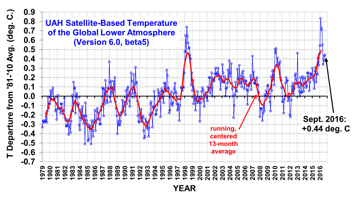
[Note that the August value of +0.43 is changed slightly from its previously reported value of +0.44. This is because inter-satellite calibrations are improved with each additional month of global data, which can change previous months’ results by several thousandths of a degree.]
The global, hemispheric, and tropical LT anomalies from the 30-year (1981-2010) average for the last 21 months are:
YEAR MO GLOBE NHEM. SHEM. TROPICS
2015 01 +0.30 +0.44 +0.15 +0.13
2015 02 +0.19 +0.34 +0.04 -0.07
2015 03 +0.18 +0.28 +0.07 +0.04
2015 04 +0.09 +0.19 -0.01 +0.08
2015 05 +0.27 +0.34 +0.20 +0.27
2015 06 +0.31 +0.38 +0.25 +0.46
2015 07 +0.16 +0.29 +0.03 +0.48
2015 08 +0.25 +0.20 +0.30 +0.53
2015 09 +0.23 +0.30 +0.16 +0.55
2015 10 +0.41 +0.63 +0.20 +0.53
2015 11 +0.33 +0.44 +0.22 +0.52
2015 12 +0.45 +0.53 +0.37 +0.61
2016 01 +0.54 +0.69 +0.39 +0.84
2016 02 +0.83 +1.17 +0.50 +0.99
2016 03 +0.73 +0.94 +0.52 +1.09
2016 04 +0.71 +0.85 +0.58 +0.94
2016 05 +0.55 +0.65 +0.44 +0.72
2016 06 +0.34 +0.51 +0.17 +0.38
2016 07 +0.39 +0.48 +0.30 +0.48
2016 08 +0.43 +0.55 +0.32 +0.50
2016 09 +0.44 +0.50 +0.39 +0.37
The pause in El Nino cooling continues as recent Climate Prediction Center forecasts have been leaning more toward ENSO-neutral condtions rather than La Nina.
To see how we are now progressing toward a record warm year in the satellite data, the following chart shows the average rate of cooling for the rest of 2016 that would be required to tie 1998 as warmest year in the 38-year satellite record:
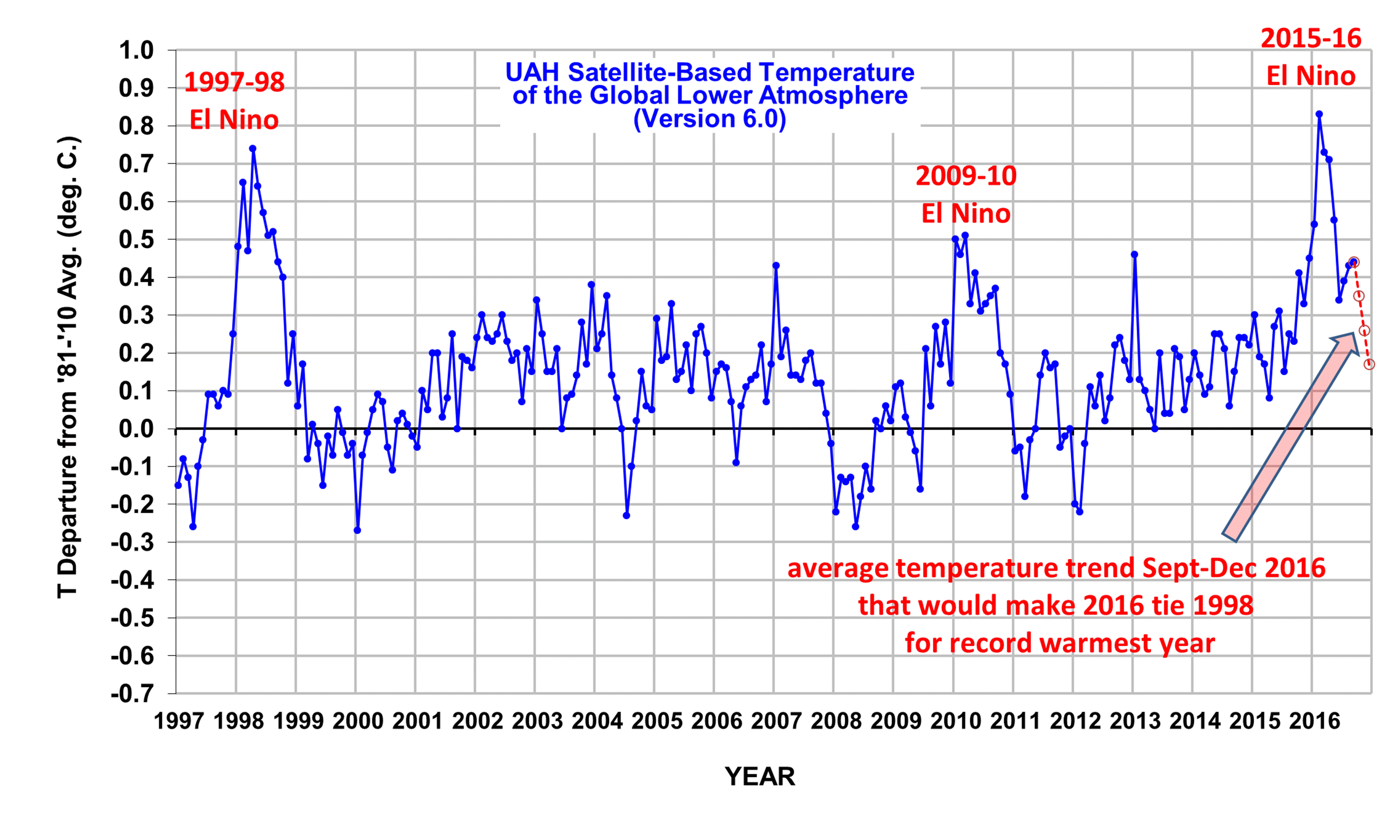
Based upon this chart, as we enter the home stretch, it looks increasingly like 2016 might be a new record-warm year (since the satellite record began in 1979) in the UAH dataset.
The “official” UAH global image for September, 2016 should be available in the next several days here.
The new Version 6 files (use the ones labeled “beta5”) should be updated soon, and are located here:
Lower Troposphere: http://vortex.nsstc.uah.edu/data/msu/v6.0beta/tlt/uahncdc_lt_6.0beta5.txt
Mid-Troposphere: http://vortex.nsstc.uah.edu/data/msu/v6.0beta/tmt/uahncdc_mt_6.0beta5.txt
Tropopause: http://vortex.nsstc.uah.edu/data/msu/v6.0beta/ttp/uahncdc_tp_6.0beta5.txt
Lower Stratosphere: http://vortex.nsstc.uah.edu/data/msu/v6.0beta/tls/uahncdc_ls_6.0beta5.txt
“it looks increasingly like 1998 might be a new record-warm year”
1998?
Gah! My eyes see one thing, my brain sees another.
There has been no significant warming since 2016.
TB
Quite.
Only if you ignore the warming temperatures in the ocean, which covers most of the earth. The warming ocean contributed to the most recent El Nio being so strong.
What have these guys done ? Is this a counter to the “no” tropospheric hotspot:
“Climate scientists find elusive tropospheric hot spot” at: http://phys.org/news/2015-05-climate-scientists-elusive-tropospheric-hot.html
Don’t worry. Our resident expert, mpainter, gas assured us in writing that the transition to la Nia is unstoppable. This cannot be happening,
La Nina will be at least two years (perhaps more).
http://www.tropicaltidbits.com/analysis/ocean/nino34.png
“Our resident expert, mpainter, gas assured”
Says it all about mpainter really 🙂
Sorry to mpainter though. Gas or not, is doesn’t look like there is going to be a La Nina this time. At least not according to the recent data published by the Australian BOM, who I trust more than NOAA:
http://www.bom.gov.au/climate/enso/#tabs=Sea-surface
Their models now look unlikely to even deliver a late La Nina (rare, but not unheard of)
http://www.bom.gov.au/climate/enso/#tabs=Outlooks
Well, there’s nothing unusual about this. ENSO forecasts are always stated in terms of probability, and if you look at the record of the cycle there is nothing at all unusual in the state approaching neutral and then either “reversing” or just hovering about the neutral state for a couple of years. In fact, this is exactly what happened with recent years’ el Nino forecasts, so it should not surprise anyone in the slightest if the same happens to la Nina.
mpainter assured us that the “alarmists” were wrong in their imaginary statements than la Nina could not go into reverse, but of course he did not just have to make up imaginary statements in order to find something to lie about. ENSO goes into “reverse” all the time, and its near-term development is extremely hard to forecast at all.
The balanced moving average is now quite clearly above the 1998 peak, although I am sure the denialists will soon find some other cherry to pick, probably starting this year. As I’ve said in the past, yearly records are a distraction and calendar-yearly records more so. What matters is the overall trend, and there has been no doubt about that for some considerable time now.
Perhaps this marks a new step up beginning now hovering at .4 degree anomaly (conjecture). The last 15 years it was hovering around .1 degree anomaly. 15 years previous to that, hovering around -.1. If this continues, we’ll have 2 degrees of warming in 100 years.
I hope so.
I hate snow and ice..
GO GLOBAL WARMING
In the mountains in Europe above 1,000 meters snow will fall. Temperature will be like in November.
http://www.cpc.ncep.noaa.gov/products/precip/CWlink/blocking/real_time_nh/forecast_1_nh.gif
Looks out window. Laughs.
I live in the mountains in Europe. I got a sunburn yesterday. There’s not a trace of snow on the Churfirsten, Flumserberg or, as far as I can see from here, the Falknis or the Pizol. All of these are 2,500m, and occasionally get snow in July and August. But not now.
I you are reduced to claiming that the temperature in October will be like in November, by the way, you’re in trouble even before you have to start scouring other parts of the Earth to find a fit.
The Polish mountains are already white.
http://kasprowy.webcamera.pl/
October 10 will also be white in the Alps above 1000 m.
The only thing pointing up for average global temperature is the rising water vapor (TPW).
Sure, what else might ever be rising ?
“The only thing [significant] pointing up for average global temperature is the rising water vapor (TPW).”
I don’t think there’s a chance of a record year. 2016 is playing out very similarly to 2010 with an abrupt pause in post El-Nio cooling and a rise in tropospheric temperature during the June-September period, exactly like 2010. And I would expect a 2010-like collapse in tropospheric heat anomalies during the last 3 months of the year which may well edge this year below 1998.
Thank you for an interesting observation! I did notice one difference between 2010 and 2016. Namely 2016 seems to be a month behind 2010 with respect to ENSO numbers. Could this imply only a two month drop off? And if so, will that be enough?
You’re welcome. I think that while the transition to La Nia was delayed compared to 2010 according to the latest weekly ENSO report from NOAA its finally happening and it will nevertheless be sufficient to exert considerable downward pressure on atmospheric warm anomalies. It won’t take much to push 2016 below 1998, all it needs is for LT heat anomalies to decline by roughly 0.25 deg C over the next three months. That could easily happen in two months if the cool off is steep enough. So even if there is a lag of a month that does not mean that the cooling will not be sharp when it comes.
http://www.cpc.ncep.noaa.gov/products/analysis_monitoring/lanina/enso_evolution-status-fcsts-web.pdf
Werner,
According to the Australian BOM forecasts, 2 months from now is likely to be the bottom of the current slightly negative phase of ENSO, with sea surface temperatures most to rise after that. If that prediction is accurate and given the ~3-4 month delay between typically El Nino/La Nina peak/trough in sea surface temperatures and the peak troposphere response evidenced by satellite data, we are most likely to see some slight further cooling in the UAH data over the next 4-6 months and then a gradual rise.
see
http://www.bom.gov.au/climate/enso/#tabs=Outlooks
for the BOM ENSO forecast
Thank you Dave and Kevin. The following is interesting:
http://www.tropicaltidbits.com/analysis/ocean/nino34.png
This powerful pressure will escort a lot of heat to the tropopause.
https://earth.nullschool.net/#2016/10/08/1200Z/wind/isobaric/850hPa/overlay=mean_sea_level_pressure/orthographic=-338.46,66.01,1037
I think there’s something wrong with the averaging method that claims 2016 as being warmer than 1998.
A quick look at the graph shows the 1998 spike as being much wider than the 2016 spike. Furthermore, the 1998 spike is built from the baseline up whereas the 2016 spike is built on an established foundation of around 0.3C. Seems to me you should subtract that base before comparing spikes.
Fundamentally, it is true that the 2016 spike reached a greater height than the 1998 spike by a smidgen, therefore it can technically lay claim to having been warmer than 1998 at one point. However, when you take it over an entire year, the degree of warmth of 1998 far exceeds the warmth of 2016.
I might add that the 1998 spike remained above 0.5C far longer than the 2016 spike. I think the 2016 spike is a lightweight pretender.
Once again, when applying statistics, the context must be observed. Mount Everest is the highest mountain in the world because it reaches the highest altitude. However, the base of Everest starts at 18,000 feet, making the overall height of the mountain itself about 11,000 feet plus. There are mountains in the world that are larger than that based on the altitude of their base.
Mauna Loa, anyone?
The math isn’t very difficult. Just download the data and do it for yourself. The last 12 months to August or September 2016 are clearly warmer than any 12 month period in 1998, no matter which month you start/end on. Or which data set you use (UAH, RSS, Hadlet CRU etc).
Dave…did you subtract the 0.3C base as I suggested? 2016 began about 0.3C warmer than 1998 and no one has ever explained that 0.3C plateau that appeared suddenly following the 1998 EN.
Dave…in other words, if the 0.3C plateau was caused by the 1998 EN, then 1998 made 2016 warmer by supplying the foundation upon which it is built.
Well if what you mean is that the 2016 event is riding on a base of 0.3 degrees of temperature increase since 1998, then no I didn’t. Roy seems to have stopped putting a trend line through the UAH V6.0b5 data, but if you look at the RSS tool for their version 3.6 data (admittedly outdated but still very similar to UAH 6.0 dataset) you can see that if you account for the long term trend, the start points for 1997/8 and 2015/6 are similar. This was probably overall a less substantial El Nino outside the Nino 3.4 region. Other indices certainly suggest so. The long term trend is clear.
Sorry – forgot to post the link to the RSS data:
http://images.remss.com/msu/msu_time_series.html
Dave…”forgot to post the link to the RSS data:”
I never did trust RSS. My understanding is that RSS was formed to prove UAH wrong but only managed to verify UAH.
The graph to which you link is a scientific misrepresentation. At least, such a trend line should never be presented by a responsible scientist.
The trend line on the RSS graph represents 18 years of sub-baseline temperatures, meaning they were years of cooling. The positive trend, post-1998, does not exist and can only be included as an overall representation of the raw data, which included 18 years of recovery from cooling induced partly by volcanic aerosols.
I might add that Mann’s hockey stick claimed that 1990s cooling as unprecedented warming while the satellite telemetry saw it as a relative cooling period. The blade on his hockey stick should have been a small nub pointing down the way. The shaft should have been a very crooked stick based on the Little Ice Age and the Medieval Warming Period.
Dave…I don’t know you and I have nothing against you. If you believe that RSS nonsense, you really need to do some serious study into statistics and their application. It is now obvious to me that RSS are not serious and they are alarmists.
Dave…”you can see that if you account for the long term trend, the start points for 1997/8 and 2015/6 are similar”.
They have to be in reality. The baseline is the global average from 1980 – 2010. Positive anomalies have to be stated wrt that baseline. However, an unexplained warming of 0.3 C appeared around 2001 that has never been explained. The 1998 EN suddenly increased the global average a whopping 0.8 C whereas the 2016 EN increased the average about 0.5C.
Do you understand what I’m getting at? I imagine Roy is bound to present the data in a formalized manner based on certain precedents. Otherwise, it would be like comparing apples to oranges.
Even though UAH does present it’s trends based on the data over the 1979 – present range, in the 33 year report, they amend the 1979 – 2012 trend from about 0.14C/decade to around 0.09/decade by statistically removing the effect of volcanic aerosols.
Even at that, a visual inspection of the graph reveals a sudden warming of around 0.3C circa 2001 following the 1998 EN. The 0.14C/decade trend has to include that sudden, unexplained increase in global warming, therefore, the trend is suspect.
To make the trend more accurate it would have to be discontinuous, which would likely not fit any statistical algorithm. In other words, to apply trend lines correctly to the data, you would have to inspect the data first and break it into regions, or contexts.
In other words, there is no way to draw a straight-line trend from 1979 – present and have it mean anything.
Gordon,
“if the 0.3C plateau …”
What plateau? In what month did it “suddenly appear” and when did the previous plateau “suddenly disappear”? I think you are seeing what you want to see. If you care to convince people otherwise, please provide any sort of statistical analysis the indicates a statistically significant “step” to a new “plateau”.
“no one has ever explained … “
Its called “the greenhouse effect”. Increased CO2 level should lead to a warmer over all temperature. And apparently they have.
“did you subtract the 0.3C base… “
Even if there were a plateau (which is yet to be established), why subtract such a “baseline”? Any adjustment to the baseline is simply an acceptance that global warming is occuring (whatever the cause). Basically you are saying “in a world where global warming is the norm, this just sort of warm relative to the already warm temperatures”. But that would still make it a record.
Tim..”please provide any sort of statistical analysis the indicates a statistically significant step to a new plateau”.
Why don’t you look at the graph with the red running average curve, the sudden rise and plateau are as plain as the nose on your face. The abrupt rise happens around 2001 then the red curve plateaus from about 2001 to 2008. Following it is a cosine wave featuring the 2008 LN cooling followed by the 2010 EN warming. the average of a cosine wave is 0…a plateau extension if you like.
Prior to 2001, you have the 98 EN followed by a wide LN cooling. That averages to about 0 as well. That’s why UAH reports little or no warming during that period.
The IPCC even reports a plateau (aka hiatus) from 1998 – 2012. The plateau is the average.
Tim…”no one has ever explained
Its called the greenhouse effect. Increased CO2 level should lead to a warmer over all temperature. And apparently they have”.
The GHE is a simplified metaphor. Richard Lindzen, a prof at MIT who teaches atmospheric physics says as much. He claimed atmospheric problems are sometimes so complex that a simplified model is used as a starting point.
In 1909, a scientist by the name of Woods, hypothesized that radiation has little or no effect on atmospheric warming. He claims that atmospheric warming is due to solar energy heating the surface and conduction/convection carrying that heat into the air. He claimed further that a heated gas is a poor radiator.
Lindzen claimed the same, that heat is transported high into the atmosphere and radiated to space.
“Even if there were a plateau (which is yet to be established), why subtract such a baseline?”
The 1998 EN started out from the 0C baseline. If you are going to compare ’98 with 2016, you have to consider their starting points. You cannot claim the ’16 EN began at the 0C baseline, it had a leg up to at least 0.3C. The peak warming created by the ’98 EN was about 0.8C from it’s base whereas the ’16 EN only produced 0.5C warming.
Tim Folkerts says, October 3, 2016 at 2:23 PM:
This plateau:
https://okulaer.files.wordpress.com/2016/02/pausen.png
It was firmly established during 1998, in the direct aftermath of the great 1997/98 El Nino:
https://okulaer.files.wordpress.com/2016/02/97-98-anim.gif
https://okulaer.files.wordpress.com/2016/02/nino-vs-gl.png
It’s obvious it’s the other way around: You simply don’t want to see what you actually do see. What the data is showing you.
Why do you need a “statistical analysis”, Tim? When you have the actual data in front of you. You’re suffering from the “Climate Science^TM” syndrome: The data can’t be trusted before it’s been statistically reworked and smoothed beyond recognition. William M. Briggs:
“If we want to know if there has been a change from the start to the end dates, all we have to do is look! Im tempted to add a dozen more exclamation points to that sentence, it is that important. We do not have to model what we can see. No statistical test is needed to say whether the data has changed. We can just look.
I have to stop, lest I become exasperated. We statisticians have pointed out this fact until we have all, one by one, turned blue in the face and passed out, the next statistician in line taking the place of his fallen comrade.
(…)
Again, if you want to claim that the data has gone up, down, did a swirl, or any other damn thing, just look at it!“
http://wmbriggs.com/post/5107/
continues …
Continued …
No. Apparently they haven’t:
https://okulaer.files.wordpress.com/2016/06/uahv6-tlt-trop-x.png
https://okulaer.files.wordpress.com/2016/09/tlt-vs-olr.png
https://okulaer.files.wordpress.com/2016/10/ceres-gl-net-lw-sfc.png
OLR at the ToA (Earth’s heat loss to space) simply follows tropospheric temps over the last 30+ years – a pure radiative effect. According to the idea of an “enhanced GHE”, it shouldn’t have …
Earth’s global surface ‘net LW’ (radiant heat loss) has increased over the last 16 years. Meaning the surface has strengthened its ability to shed its heat via radiation. According to the idea of an “enhanced GHE”, this ability should’ve weakened …
This isn’t about whether there is (or has been) ‘global warming’ going on. It’s about whether we’re to blame for it. And whether we can do anything to ‘stop’ it from happening.
And the warming is EVIDENTLY natural (Sun+Ocean). There is no sign whatsoever of an “enhanced GHE” being somehow the culprit. And you know it, Tim …
Kristian, it seems to be the latest, greatest group think that we have to wait 30 years to take the temperature of mother earth. I went back and read your new years exchange with dr jan. At one point he seemed to concur with you, but only with the caveat that the duration of the ceres data was not long enough to tell us anything. I’m seeing this group think among skeptics and warmists alike… (oddly enough, mosher does not seem to be in this group)
Gordon says the 0.3C jump in temps occurred in 2001.
Kristian says the 0.3C jump in temps occurred in 1997/8.
Yet neither discuss their differences.
Because messaging is more important than truth, I guess.
Just download the data and do it for yourself.
Or just go to WFT and plot what you want with a mean of 12. Then check where the mean of 12 is highest.
Werner…”Just download the data and do it for yourself”.
That’s the problem, you are blindly applying statistics without regard for the context. We are comparing years. The 1998 spike started at the baseline whereas the 2016 spike began roughly around 0.3C.
In the context of years, we should judge the year based on it’s baseline. Subtract the 0.3C from 2016 before applying your statistics and take note of the visual width of the spikes on the graph. There’s no way 2016 comes even close to 1998 for width and for persistence above 0.5C.
Statistical methods should never be applied blindly to raw data before understanding what the data means. That’s why many alarmists insist that a linear trend of UAH data is about 0.14C/decade. Blindly applying statistical averaging to the data does reveal that but a visual examination of the data shows 18 years of the data in a negative anomaly region.
Even the alarmists at NOAA admit that a negative anomaly region is cooling compared to the baseline. How can anyone run a simple linear trend line from a region of cooling to a region of true warming that has been flat for close to 20 years and claim the trend means anything?
In discussing the comparison of this year to 1998, I think most people here are interested in whether there has been warming since then. There is no point in subtracting a baseline for this purpose, since the ‘baseline’ is part of the warming.
Subtracting a baseline would be useful if one is interested in isolating and comparing the two El Ninos’ effects on global temperature.
Is that what you are interested in?
Gordon wrote:
“The 1998 spike started at the baseline whereas the 2016 spike began roughly around 0.3C.”
And why is that? Because the LT has warmed since the 1990s.
Gordon, what you are suggesting doing makes sense if you want a better idea of whether the current El Nino was bigger than the previous El Nino. That’s a different subject. You are basically saying, remove the “global warming” signal (I’m not implying causation of warming here). Well, most people are the most interested in what you are advocating removing.
Dr. Roy – Well put. The question of whether one ENSO peak is greater than another is interesting, in a way, but it has little potential directly to conflict with interests. What mainly interests us about the data set, and what potentially conflicts with ideological interests, is not what you get when you take out the warming signal and compare the isolated events but what you get when you take out the isolated events and examine for a warming signal.
Roy…”You are basically saying, remove the global warming signal (Im not implying causation of warming here)”.
I got your point from the article Roy, and I am not arguing against it. I am responding to people who claim 2016 is the warmest year ever based on it’s peak value.
Using calculus and applying the area under the curve as a visual criterion, 1998 still appears to have more area and it remains above 0.5C longer. To compare years, I think you have to subtract the ~0.3C base on which the 2016 spike is built.
The 1998 spike was a relative whopper. I find it impressive that it drove the global average 0.8C above the baseline whereas 2016 could only manage 0.5C above it’s 0.3C base.
Roy…”You are basically saying, remove the global warming signal (Im not implying causation of warming here). Well, most people are the most interested in what you are advocating removing”.
Roy…is the roughly 0.3C warming above the baseline from 1998 – 2016 a true global warming signal related to AGW or is it an artefact of the 1998 EN? Going out on a limb, I am sensing some kind of overshoot caused by the 1998 spike. Whether it dies off eventually would be a major guess.
There was a similar boost circa 1977 related to the PDO. Unfortunately that won’t appear in the sat data.
I am not a global warming denier, I acknowledge there has been warming. I just don’t subscribe to the notion that it is caused by ACO2. I think it has been caused by totally natural events.
Gordon Robertson says:
“I am not a global warming denier, I acknowledge there has been warming. I just dont subscribe to the notion that it is caused by ACO2.”
So do you think CO2 doesn’t absorb infrared radiation, or do you think the Earth doesn’t emit any?
Of course it may transpire that the calendar year average is close to or similar to 1998 – that would indeed be the result of the slender mountain you refer to. In such a variable time course (the variability is called weather, NOT climate!) it is statistically nonsense to judge climate change by a single month (or even a few months either side) representing the peak during an El Nino event, whether the higher value be in 1998 or 2016.
Dave…”it is statistically nonsense to judge climate change by a single month…”
The IPCC did not claim it as statistically insignificant when they claimed in 2013 that no average warming had occurred since 1998. In fact, they called it a hiatus, inferring the warming would continue.
Well, it did not. Excluding the 2016 spike, we’ve had nearly 20 years of no average warming and that is statistically significant.
Besides, what has climate got to do with this? Climate is a highly variable condition depending on where you are located in the world. There is no global climate and we should not be talking about it in the context of global warming, which is the topic under discussion.
Gordon
I think identifying jumps in such a highly variable time series is very difficult, and statistically hard to prove.
Identifying long term trends is easier, especially if you average over longer periods. Here are the averages over decades.
UAH AVERAGES FOR DECADES
80s -0.1425
90s 0.052666667
00s 0.1045
10s 0.211728395
I don’t see evidence of a 20 year pause in this data (maybe slower and faster periods). Nor do we see much of a jump between 90s 00s
Well, the pause is thought to have started in 1998, so it would be hard to find it in decadal data: you can’t count most of the 90s, and the current decade we’re in is not over (and we don’t know if we’ll return to pause-like temperatures for the remainder of the decade after the current El Nino). So the only full decade you have to look at is the 00s.
The pause is said to be from 1998 to 2014, unless it resumes in the future, so you could break up that period into 1998-2006 and 2007-2014, or ’98-’05 and ’06-’14 and compare those halves of the pause.
Even in the decadal analysis you have, the increase of 1/20th of a degree between the last two full decades, the 90s and the 00s, is pretty minor, as you said, and not statistically significant.
Here’s another way of doing it with more data:
http://www.woodfortrees.org/plot/uah6/plot/uah6/to:1998/trend/plot/uah6/trend
To get the preferred resulting of slowdown/pause, one has to split the data. But when one does that the error bars get so wide that the trends can be anywhere from lots of cooling to lots of warming.
Only with periods of 25+ years are you guaranteed to get statistical significance in satellite data trends.
Nate…in the UAH 33 year report they reported little or no warming prior to 1998 and little or no warming post-1998.
The IPCC reported no warming from 1998 – 2012. Called it a hiatus.
Gordon Robertson says:
“Natein the UAH 33 year report they reported little or no warming prior to 1998 and little or no warming post-1998.”
The linear trend of UAH LT from inception to Dec 1997 is +0.09 C/decade.
The trend from Jan 1999 to present is +0.12 C/decade.
“Excluding the 2016 spike, weve had nearly 20 years of no average warming and that is statistically significant.”
Hmmm… Sounds like a bit of cherry picking to me! By specifically INCLUDING a big spike at the beginning and specifically EXCLUDING a spike at the end, you found a period that is close to flat. Yes, a period that long without warming was unexpected, but given that the trend on either side of that hiatus is towaRd warming, I’m not ready to give up on global warming just Hewett.
Tim…”…you found a period that is close to flat”.
So did the IPCC, and without consulting me. Imagine that.
New data has come in since the IPCC’s 5AR.
David…”New data has come in since the IPCCs 5AR”.
You mean synthesized data from NOAA, which is run by the uber-alarmists US Environmental Protection Agency.
I don’t trust people calling themselves scientists who take real data and run it through a climate model to synthesize data points they have discarded.
Gordon Robertson says:
“I dont trust people calling themselves scientists who take real data and run it through a climate model to synthesize data points they have discarded.”
Those data are not run through a “climate model,” they are run through a data model.
UAH data comes from a model too, you know (right?). In fact, satellites don’t even measure temperatures.
The raw data are biased, so the bias must be removed. Here is the best popular artile I know explaining why this must be done, and how it is done. You should read it.
“Thorough, not thoroughly fabricated: The truth about global temperature data: How thermometer and satellite data is adjusted and why it *must* be done,” Scott K Johnson, 1/21/16
http://arstechnica.com/science/2016/01/thorough-not-thoroughly-fabricated-the-truth-about-global-temperature-data/
Gordon Robertson says:
“Excluding the 2016 spike, weve had nearly 20 years of no average warming and that is statistically significant.”
UAH LT has never had a 20-yr linear trend below zero.
It bottomed out in Nov 2014, at +0.02 C/decade. (+/- 0.04 C/decade if you don’t include autocorrelation.)
Whatever happens at the end, the difference between 1998 and 2016 will be less than 0.1 so it will be a statistical tie. The difference now is 0.07 and this will get less if anomalies go down or even if they stay at 0.44. No one expects a net increase over the next three months.
Werner, what value are you using for the uncertainty of each month’s LT anomaly?
I am basing my comment on recalling that one of the authors of this site said the uncertainty for UAH is 0.1 for a 12 month average.
Thanks.
I warn readers of the USA. Probably 6 October hurricane Matthew will be in the vicinity of Florida, then you will be moved along the east coast. As in the case of Sandy could meet up with a cold front from the west.
AO goes down.
http://www.cpc.ncep.noaa.gov/products/precip/CWlink/daily_ao_index/ao.obs.gif
AO in 2012 and forecasts.
2012 -0.220 -0.036 1.037 -0.035 0.168 -0.672 0.168 0.014 0.772 -1.514 -0.111 -1.749
http://www.cpc.ncep.noaa.gov/products/precip/CWlink/daily_ao_index/ao.sprd2.gif
It is time to start proclaiming that 2016 will be a record year so that we can have egg on our face when fickle nature does its own thing!
Until the global anomalies retreat below ~0.3 Celsius–and stay there fairly consistently–there’s scant empirical basis for claiming that any cooling phase of multi-decadal oscillations has arrived.
0.44C ties September 2016 with 1998 as the warmest September in the UAH record. Are they also ties to 3 decimal places? Thanks.
TFN
The 13-month average line has already surpassed its previous peak, from 1998, so whether the current calendar year ends up warmer than ’98 is only important for public relations purposes. The fact is that the lower troposphere has been warmer during this current El Nio period than during the 1998 El Nio.
The significance of this to analyzing long-term global temperature trends is very limited. What’s more significant is that the officially-recognized climate models continue to severely overestimate global temperature increases.
One would think that .03C would be considered statistically insignificant…
If .03C refers to the difference by which this year’s peak of the 13-month average temperature is greater than in 1998 I haven’t calculated it, but eyeballing it on the graph, it looks about right then yes, that’s statistically pretty insignificant.
The larger point, as I said, is that despite the predictions of the climate models on which policy is being made, we’re in essentially the same place we were 18 years ago. “.03C” is more like the amount of warming the models and the IPCC predict in ONE year, not eighteen.
If .03C refers to the difference by which this year’s peak of the 13-month average temperature is greater than in 1998 I haven’t calculated it, but eyeballing it on the graph, it looks about right then yes, that’s statistically pretty insignificant.
The larger point, as I said, is that despite the predictions of the climate models on which policy is being made, we’re in essentially the same place we were 18 years ago. “.03C” is more like the amount of warming the models and the IPCC predict in ONE year, not eighteen!
The global temperature trend will be down. I am very confident.
Prolonged Minimum Solar conditions are once again becoming established , ENSO is now neutral.
Salvatore, happy to see that you were able to check out dr spencer’s graph of the 11 year cycle in global temps. With further investigation, i realized that two of the four solar mins in that time period that he graphed had large el ninos. So, i would think that it was some what of a mistake to simply smooth them three years. One has to think the difference from solar min to solar max is more like .2C than his .12C. At any rate, the good doctor has confirmed for us that we should indeed expect to see cooling in the coming years. Only question being will it be similar to ’08 or worse. (worse being a subjective term; anything to shut up svalgaard has got to be better… ☺)
Salvatore, you’ve been confident before:
“here is my prediction for climate going forward, this decade will be the decade of cooling.”
– Salvatore del Prete, 11/23/2010
http://ourchangingclimate.wordpress.com/2010/10/20/andrew-dessler-debating-richard-lindzen/#comment-8875
“Global cooling has started, and it will be here for sometime to come. All the factors that control the climate are now in, or going toward a colder phase”
Salvatore del Prete
December 31, 2010
Well I am no expert but large swathes of west oz are coldest on record for September and most of the country has had a shed load of above average rain (500%). My question is with all this moisture out of the atmosphere how long before the lt temps reflect the change in wv?
Crakar24 – you see what you see. Overall – not taking one day or spatial days of Winter where they were down, Australian Queensland Winter daily temps overall have been HIGHEST averages on record.
I have put forth those solar parameters /duration of time which I feel are needed to impact the climate and I think gong forward the solar parameters I have put forth will come to be which will then manifest itself in the climate system by causing it to cool. I dare say I think it has started already.
How cool it is hard to say because there are climatic thresholds out there which if the terrestrial items driven by solar changes should reach could cause a much more dramatic climatic impact.
Terrestrial Items
atmospheric circulation patterns
volcanic activity
global cloud coverage
global snow coverage
global sea surface temperatures
global sea ice coverage
ENSO a factor within the overall global sea surface temperature changes.
Solar Parameters Needed and Sustained.
cosmic ray count 6500 or greater
solar wind speed 350 km/sec or less
euv light 100 units or less.
solar irradiance off by .15% or more
ap index 5 or lower
Interplanetary Magnetic Field 4.5 nt or lower
Solar Flux 90 or lower
Duration of time over 1 year following at least 10 years of sub solar activity in general which we have had going back to year 2005.
Right now EUV LIGHT ,AND SOLAR FLUX have met my criteria, COSMIC RAY FLUX on the verge of meeting my criteria.
SOLAR WIND ,AP INDEX still above my criteria always the last to come down and will in time.
Salvatore,
Are you familiar with the practice of over-fitting data?
This is a trap for those who claim to be able to explain the behaviour of real-world phenomena by using a relatively large number of independent variables.
For example, I can probably explain a lot of the UAH data using a combination of
stock prices
numbers of car accidents
the price of fish
my football team’s scores
Donald Trump’s poll ratings
The point being that you can obtain a good fit to the data using unrelated data and therefore fool yourself into thinking you have a predictive model. The fact that your predictions have not been successful suggests you may have fallen into this trap.
My predictions have yet to be determined because the sun has yet to reach my criteria. Once the sun reaches my criteria then we will know but until then the jury is out.
Salvatore wrote:
“My predictions have yet to be determined because the sun has yet to reach my criteria.”
This is from above, 12/31/10:
“Global cooling has started, and it will be here for sometime to come. All the factors that control the climate are now in, or going toward a colder phase, those being AO,NAO, SOI oscillation,volcanic activity ,solar activity, pdo, with amo to follow by 2015.”
– Salvatore del Prete, December 31, 2010
http://www.drroyspencer.com/2010/12/dessler-and-spencer-debate-cloud-feedback/#comment-8257
A simple thing – such pressure above the Arctic Circle means hard winter in the northern hemisphere. The decrease in the speed of the solar wind it indicates.
http://www.cpc.ncep.noaa.gov/products/stratosphere/strat-trop/gif_files/time_pres_HGT_ANOM_ALL_NH_2016.png
http://www.cpc.ncep.noaa.gov/products/stratosphere/strat-trop/gif_files/time_pres_UGRD_ANOM_ALL_NH_2016.png
The 13-month average line has already surpassed its previous peak, from 1998, so whether the current calendar year ends up warmer than ’98 is only important for public relations purposes. The fact is that the lower troposphere has been warmer during this current El Nino period than during the 1998 El Nino.
The significance of this to analyzing long-term global temperature trends is very limited. What’s more significant is that the officially-recognized climate models continue to severely overestimate global temperature increases.
Well according to the satellites it has been a warmer than average year for the globe but that sure was not reflected at my little piece of the earth here in central Indiana. 90 deg F temps a rarity even in July this year. And so much precip that my grass has and still is growing like it’s spring time. The only time I saw even the small bit of brown in my lawn was the last two weeks of July but that little patch has long ago greened again. I honestly can’t remember a wetter summer here.
It is going to be a record year for yield and crop quality for corn and soybeans in the corn belt as long as things dry enough for harvest.
Anybody feel sorry for mpainter ?
Gone is his precious “pause”, his precious “cooling trend” and his even more precious “step-up/down/whatever”.
He pinned his hopes on a gigantic La nina which has now fizzled.
I believe he was last seen rowing out to the central equatorial Pacific with a a case load of ice cubes.
no, i tend to feel sorry for seedy bastards like you…
I may be a greedy bastard, a weedy bastard, a needy bastard, even a common plain old bastard but never a seedy bastard – whatever that is.
Look it up, you illiterate dolt…
Its such a pleasure debating science with you.
Does anyone wonder who “dr.no’satroll” is.
Maybe the same person who is “appell’sajerk”
And who also posted in an immediate reply to mpainter.
http://www.drroyspencer.com/2016/07/uah-global-temperature-update-for-june-2016-0-34-deg-c/#comment-216009
Does anyone think that that person/those persons are “big or clever”.
Does anyone expect Roy to ban that poster?
Elliott Bignell 6/9/16 5:53am says:
“I pop up here every few months to practice on you because I am bored. I’m basically just killing time until I can have you all executed in its stead.”
(you missed one)
Far too early to discount an La Nina. As for the pause. Pause from WHAT? .03 warming? God forbid we’re all gonna die!
0.18K per decade, I think you’ll find. (Well, YOU won’t, but someone who measured it would.)
If you’re going to throw in an insult, why don’t you give the source of your calculation? (Calculation is what I assume you meant by your referrence to measuring.)
Anyway, 0.18C per decade is a lot less than the officially relied-on climate models predict, which should put those models and their assumptions in doubt. And, as has been noted in the pause/hiatus discussion, there was more warming in the first half of the satellite record than in the second, contrary to forecasts which predicted significant acceleration in warming. Both of those disparities will probably increase even further in the coming months if temps drop by another 0.2C (a decade’s worth of warming!) as the El Nino dissipates.
Eliot says:
“Anyway, 0.18C per decade is a lot less than the officially relied-on climate models predict….”
How so?
Recall that climate models do not project future temperatures do not rise linearly. (They don’t predict anything.)
PS: If Elliott is writing about the lower troposphere, UAH’s overall trend is +0.12 C/decade. RSS’s LT trend is +0.14 C/decade.
David’s giving different numbers on per-decade warming than Elliott underscores my point that people should provide the source and details of any numbers they throw around. If they don’t know or remember the source or specifics, then they should say so.
Linear or not, the climate models officially relied-on by policy-makers do project a certain amount of warming that should have taken place over the last few decades; and the amount of warming that they project is a lot more than the amount of warming actually recorded. Furthermore, the models project an acceleration in warming, while the reality is that there has been a noticeable DEceleration in warming (if not a complete halt) in the second half of the satellite record.
Eliot wrote:
“Linear or not, the climate models officially relied-on by policy-makers do project a certain amount of warming that should have taken place over the last few decades; and the amount of warming that they project is a lot more than the amount of warming actually recorded.”
Prove it, Eliot.
Then compare to:
http://www.climate-lab-book.ac.uk/comparing-cmip5-observations/
The temperature “observations” (a misleading term, given the amount of statistical adjustments and data massaging that has been done to produce them) of global average surface temperature in that link, David, are not from satellite measurements of lower troposphere temps (the subject of this blog post), which are more comprehensive and less vulnerable to statistical manipulation, or simply poor or problematic data and instruments, than surface data. All those CMIP models also produce projections of temps in the lower troposphere, in addition to surface temps, which can be compared to measurements.
Even with the surface data in the link (most of which is of course the temperatures of the water surface in the ocean, rather than air temperature, due to issues with using air temperatures over the oceans) it requires a very strong El Nino for the plot of “observed” temperature to make an excursion from the bottom edge of the spaghetti plot of model forecasts to anywhere close to the center, “just below the median of the model simulations,” as the text puts it. A dissipation of the remaining El Nino heat could easily bring it back to the edge.
It’s been stated frequently that before the 2015-16 El Nino, real-world temperature (or at least it’s officially-derived surface global average) has been outside the 95% confidence intervals of, not only almost every officially-recognized model, but almost every officially-recognized model run. And the webpage you linked itself states, “There are several possible explanations for why the earlier [pre-2015] observations are at the lower end of the CMIP5 range…” So it’s clearly recognized as something potentially problematic for the accuracy of the model projections, and something that requires further investigation and “explanations”.
Some of the explanations of the underwhelming amount of warming through 2014 are of course ideas that critics of climate alarmism had previously brought forth, only to be dismissed. The following explanation given on that webpage, in particular, is kind of what the heart of the debate is about: “the real world may have a climate sensitivity towards the lower end of the CMIP5 range.” To borrow a phrase from someone pretty prominent in the climate change public relations wars, that would be an inconvenient truth.
Re Gordon’s comments on 1998 vs. 2016.
2016 is warmer using only the average of months so far.
2016 is warmer using the average of the last 12 months. This has been the case for 2 months running.
Other than doing these operations, I don’t know how else to compare 2016 with 1998. At the moment 2016 is slightly warmer – possibly a statistical tie.
This is just for interest’s sake. The long-term trends matter, not short-term. 1998 only matters because it’s been a meme.
That’s it. The denial industry has invested all its rhetorical capital in making the 1998 peak the basis of all analysis. Scientifically, the difference between two transient peaks a few years apart is meaningless. Politically, it is potentially huge,
From a scientific perspective there are much more interesting measures to talk about, and ones with much less potential for deliberate confusion. Which may even be a tautology.
Elliot…how could it be meaningless when the spikes have such an affect right around the globe. CO2 has not been shown to do that and Trenberth became so frustrated over such true warming spikes that he labeled it a travesty. He was referring to the apparent lack of warming due to CO2 and he inferred it was because they couldn’t make out CO2 warming for the real warming.
Duh???
barry…”1998 only matters because its been a meme”.
It’s far more significant than that. As they pointed out in the UAH 33 year report, it represented the first true warming since 1979. There were short bursts of it in the 18 years but the average was below the baseline.
Suddenly, in late 1997, an EN drove the global average 0.8C above the baseline. That’s monumental considering the past century could barely muster that much warming. Then it was gone.
Almost.
Here’s the other significant part. There was an apparent rebound effect from the EN. In 2001, rather than returning to the pattern of 1979 – 1997 pattern, there was an abrupt 0.25C warming. You can’t account for that by claiming it’s due to AGW…it happened way too fast for that.
In 1977, there was a similar abrupt warming of a similar degree. Researchers called it the Great Climate Shift till it’s true cause was identified as the PDO. Why is no one investigating the current climate shift that is so apparent on the UAH graph?
As I pointed out, the same graph shows the 2016 spike sitting on top of that 0.25C mysterious warming plateau. It’s plain as can be that the 2016 spike warmed the globe by only 0.5C as opposed to the 0.8C of the 1998 spike. Furthermore, the 1998 spike stayed above the 0.5C anomaly much longer.
If 2016 was as warm as 1998 then the 2016 spike should have driven the global average above 1C. As it stands, it barely exceeded the 1998 spike even though it had 0.3C start.
“Its plain as can be that the 2016 spike warmed the globe by only 0.5C as opposed to the 0.8C of the 1998 spike. Furthermore, the 1998 spike stayed above the 0.5C anomaly much longer.”
Did you consider that maybe this was a weaker El Nino?
Gordon,
“In 2001… there was an abrupt 0.25C warming. You cant account for that by claiming its due to AGWit happened way too fast for that.”
Yes I see there was an abrupt warming in 2001. Then there was an abrupt cooling in 2008…another abrupt warming 2010, a cooling in 2011, and now another warming in 2015.
I also agree the jumps not AGW. But you imply these jumps are mysterious.
But they are well understood in terms of El Nino and LaNina.
You can correlate these jumps to ENSO indices such as the MEI index:
http://www.esrl.noaa.gov/psd/enso/mei/index.html
Notice the index stays positive for the period 2002-2006. Hence the apparent plateau in this period. Nothing mysterious here.
But also notice that while the MEI index gyrates a lot, it is flat over the long term, while the UAH is tilted up. This is AGW.
Nate…”Yes I see there was an abrupt warming in 2001. Then there was an abrupt cooling in 2008another abrupt warming 2010, a cooling in 2011, and now another warming in 2015″.
Nate…the significance of the 2001 jump for me is that the 0.25 jump plateaued till 2008. Please be aware that I am basing this on Roy’s red running average curve.
If you visualize the overall period from 98 till pre-2016 EN, the 0.25C average seems to have been maintained despite the 2008 cooling and the subsequent EN warmings.
You could almost draw a straight horizontal line across the 2002 – 2008 red running average curve and see a symmetry above and below the ruler pre 2002 through post 2008.
The IPCC has acknowledged that in part by claiming a hiatus from 1998 – 2012. That flat-lining would have to be drawn through Roy’s red running average curve from 2002 – 2008, from 1998 – 2012.
Where did that initial 0.25 C come from, after 18 years of negative anomalies? It seems related to the 98 EN.
Gordon,
The wiggles of UAH in 2000s match up pretty darn well with MEI series. Take a look:
http://www.esrl.noaa.gov/psd/enso/mei/index.html
If there is a natural explanation for the data, why look for another?
Nate…”If there is a natural explanation for the data, why look for another?”
The NOAA ENSO graphic is far too broad to cover the 0.25C sudden warming I’m talking about. Prior to 1998, the UAH graph with the red running average curve is pretty well below the base line for 18 years. Suddenly, a relatively enormous EN spike drives the average 0.8C above the baseline and within two years the average has leveled off 0.25C above the baseline.
Why?
Gordon Robertson says:
“The IPCC has acknowledged that in part by claiming a hiatus from 1998 2012.”
That was before better data came in.
See Karl et al, Science 2015, which shows no hiatus.
Dave…”Did you consider that maybe this was a weaker El Nino?”
That’s my point, 1998 was a lot stronger than 2016. Had 2016 been as strong as ’98, the global average would have exceeded 1C.
I am not arguing that 2016 was not a tad warmer than ’98 with regard to their peak warmth. I am arguing that ’16 had a head start of nearly 0.3C yet barely managed to exceed ’98.
I consider ’98 to be a heads up to anyone interested in science. It seemed to come out of nowhere and it seems to have dictated global temperatures since. The planet seems not to have recovered from it as yet, if it ever will.
If you introduce the same kind of spike to an electronics circuit, it has a tendency to ‘ring’. That means it will oscillate parasitically, depending on the components. The ringing also depends on a dampening factor that determines whether the oscillation persists as a dampened sine wave or whether there is one ring and out.
I wonder if the Earth responds to such a pulse in a much slower fashion. We have several oscillations besides ENSO, like the PDO, the AMO, the AO, and so on. Tsonis et al investigated the interactions of those oscillations over a century and concluded that global warming/cooling is related to the phase of those oscillations.
In fact, Tsonis claimed there was little point investigating ACO2 till we had investigated the oceanic oscillations and their relationship to each other. Of course, there is no money in that for researchers. The UN, through the IPCC, is only interested in finding us humans guilty.
In the the period nov to marts the tropics receives 20 w/m2 more than in the period may to septemper because of the earth’s distance to the Sun.
I wonder if this change is visible in the tropics temperature?
The total change in insolation should be around 7%.
I suspect it’s warmer when insolation is lower, because of the Sahara desert. Maybe just the tropical oceans could be examined for its annual cycle, I don’t recall if we have looked at the before or not.
I refuse to react to short term noise. I predict it will “definetly” either go down, or stay the same, or maybe go up.
Aaron,
But are you sure?
Cheers.
Well i googled definetly and Yep it was clear why you were confused. It will “Definitely” move. Haha.
Or, it could go in reverse. That would be different.
Roy…”Or, it could go in reverse. That would be different”.
I find myself willing to suffer the implications of that just to get rid of the politically-correct politicians who are using carbon taxing as a cash cow.
It’s gotten so bad with me, a socialist, that I am rooting for Trump to win the presidency. I can’t begin to imagine how Clinton will use this pseudo-science to mess up your country and those of us who are dependent on your leadership.
Why am i not surprised you are a Trump supporter.
I bet most deniers here are.
dr no…”Why am i not surprised you are a Trump supporter.
I bet most deniers here are”.
You missed my reasoning. I am a socialist, one of the only socialists I know who will admit that. Not the ‘socialist’ stolen by the Bolsheviks to legitimize their corruption and violence by relating it to workers, or the socialist capitalists like to equate to Russian communism to discredit socialism.
I’m talking about socialism that came into being in Canada and the good old US of A, and other countries as a worker’s movement aimed at better wages and conditions, pensions, Medicare, workers’ compensation, womens’ right, etc. Did not quite catch on in the US but remains strong in Canada.
Normally, I would not touch a Conservative or a Republican with a ten foot pole but I feel strongly the world has become far too politically correct and we need someone like Trump to stand it on its ear. We need change…now…and I’ll hold my nose and support Trump to bring that about.
We need to end this pseudo-scientific nonsense about AGW once and for all and I think Trump’s the man for the job. As far as social values are concerned, I think a term with Trump will convince people to take a closer look at the benefits of socialism.
Clinton will make things far worse and in conjunction with the silver-spooner running our country, things could get downright unbearable.
“You missed my reasoning. I am a socialist, ”
I think you missed my point.
I propose that climate change denial is closely correlated with support for Donald. It does not matter if you are a socialist or not.
I think a
corollary is that climate change denial is often (wrongly) equated with political correctness. For your information, I am also wary of political correctness, but not of climate change science – seeing as I worked hard at it for many years.
Another corollary(?) is that it would be unusual to find a Clinton supporter who is a denier?
dr no…”I propose that climate change denial is closely correlated with support for Donald. It does not matter if you are a socialist or not”.
That pretty well sums up AGW logic.
“Another corollary(?) is that it would be unusual to find a Clinton supporter who is a denier?”
Clinton and all her followers are in deep denial of the fact that the global average has been flat for nearly 20 years. Clinton’s government get their facts from the IPCC yet they deny the IPCC claim in 2013 that no average warming occurred between 1998 and 2012.
Clinton herself is in denial that Lying Willie actually had affairs with other women. When he finally admitted to abusing the sanctity of the Oval Office by having sex in it with a female employee, she attacked the female.
Gordon Robertson says:
“We need to end this pseudo-scientific nonsense about AGW once and for all and I think Trumps the man for the job”
So do you think the Earth doesn’t emit infrared radiation, or do you think the atmosphere doesn’t absorb it??
Sometimes when im depressed about polar bears modeled demise (despite their pop growth), I read the graph in a mirror and feel better.
So let’s look at the UAH LT total trend, Dec 1978 to present (37.8 yrs of data):
trend = +0.12 +/- 0.02 C/dec
Uncertainty is the 95% confidence level.
Questions?
Roy…under your comment, there is a reference to 2 + 2 = 4. Not true in base 4, where only the number 0, 1, 2 and 3 are allowed.
2 + 2 in base 4 is 10.
Interesting comparison of numbering systems:
https://en.wikipedia.org/wiki/Quaternary_numeral_system
Stupid irrelevant response.
When downloading and comparing several ENSO indices (Nino3.4, ONI, JMA, MEI, SOI) you easily discover that for none of them the 1997/98 ENSO edition was bypassed by 2015/16.
Certain persons repeatedly try to deduce ENSO power out of tropospheric temperatures: UAH anomalies for example were from time to time a bit stronger in 2015/16 than in 1997/98, even when compared wrt a common begin, e.g. january 1997/2015.
That is simple unscientific nonsense.
Maybe this time the link passes this site’s Maginot line:
http://fs5.directupload.net/images/161006/nbnjmfqd.jpg
Bindidon says:
“When downloading and comparing several ENSO indices (Nino3.4, ONI, JMA, MEI, SOI) you easily discover that for none of them the 1997/98 ENSO edition was bypassed by 2015/16.”
If I understand your awkward phrasing…your claim is not true.
1997-98 Nino 3.4 anomaly peaked at +2.8 C on 11/26/1997.
Latest El Nino 3.4 anomaly peaked at +3.1 C on 11/18/2015.
Data at:
http://www.cpc.ncep.noaa.gov/data/indices/wksst8110.for
You seem to write faster than you read (if that you did anyway).
Because if you had read my comment, you probably would have understood that I performed a comparison of
– FIVE different ENSO indices;
– relative to their januaries for both periods, in order to offset differences only due to the difference between the absolute periods values rather than to the difference between their relative values.
So it is HERE of no importance
– wether or not absolute monthly values of 2015/16 accidentally bypassed those of 1997/98;
– which specific values Nino3.4 had, as I compare all the FIVE indices.
Look at the chart comparing them, and at the means for the two periods.
Maybe you then understand what I wanted to show.
I anticipate you answering that it is of no importance.
Bindi: That is such a crappy graph it is impossible to make heads or tails of it.
David, I think you’re comparing SST anomalies there, not (detrended) ENSO anomalies.
Here is the index purely for ENSO based on Nino3.4:
http://www.cpc.ncep.noaa.gov/products/analysis_monitoring/ensostuff/detrend.nino34.ascii.txt
You’ll get the best reference using the anomaly data on the right.
It’s difficult to assess relative strengths, as the results change depending on how you bound the event (how many months to include). Peak value doesn’t tell you what the overall strength was.
I reckoned the latest el Nino was slightly weaker than 1998, based this on the MEI index (bi-monthly, starting Dec-Jan)
http://www.esrl.noaa.gov/psd/enso/mei/rank.html
http://www.esrl.noaa.gov/psd/data/correlation/mei.data
Oh, and based on this:
http://www.cpc.ncep.noaa.gov/products/analysis_monitoring/ensostuff/detrend.nino34.ascii.txt
Jan 2016 ENSO anom exceeded the highest anom in 97/98 by 0.01C.
Which is nothing to talk about. A better exercise would be to average the monthly anomalies over the respective periods el Nino was active. even deciding which months they should be could prompt argument.
BTW Bindidon – JMA does not base ENSO events on NINO3.4 – they base it on NINO3 region SSTs.
The same remark as for Appell holds for you as well. Read my comment again.
BTW Barry I never told about on what JMA bases ENSO events.
I simply downloaded the data available for the five mentioned ENSO indices, compared them relatively to their januaries to offset absolute differences between the two ENSO periods, and then built the means for all them.
Of course at that time ENSO 2015/16 was on the way since many months but at a very low level. Nothing to talk about.
Dunno what you mean by comparing them to “their Januaries”. ENSO events don’t run clockwork regular. They start and finish in different months, follow slightly different evolutions each time.
The latest el Nino lasted longer than 1997/98. How does that factor in an analysis of their relative ‘strengths’?
I don’t think there’s an easy way to compare the two events. I’m not even sure of the purpose just now. If you say why you want to rank them that might suggest a useful method for doing it.
Well, barry, I apologize for english being no more than my 3rd language, far behind german and french.
1. But I nevertheless don’t know why you don’t understand what I mean here: to simply make, for all anomaly sequences to be compared, their january as zero level, by subtracting the january values from all anomalies.
More simple than that is for me hard to imagine.
2. Starting by january when comparing ENSO events is quite usual since longer time; that’s the reason I do as well.
I repeat: Of course at that time ENSO 2015/16 was on the way since many months but at a very low level. Nothing to talk about.
3. I personally don’t want to rank them. All you read here exclusively deals with strange elucubrations like
https://wattsupwiththat.com/2016/09/19/uah-and-enso-now-includes-july-and-august-data/
barry, now as the comment’s head passed through the automatic controls, so it makes sense to add the tail.
You told you don’t understand what I mean with a comparison of time series all beginning with a january, base(line)d on these januaries.
Did you have even a little look at these charts?
http://fs5.directupload.net/images/161006/nbnjmfqd.jpg
http://fs5.directupload.net/images/161007/2szjikx9.jpg
Shall I guess you didn’t?
I know what you’ve done – yes I looked at the graphs – but question the method.
WUWT are trying to play down global warming by super-sizing the latest el Nino. While it was underway they were donwplaying the el Nino because they didn’t want to see high temperatures. bob Tisdale has a post asking if 2015/16 el nino is stronger than 97/98. His answer? “In a word, no.”
But they’ll keep poking through various keyholes until they find one that fits the key de jour. Because the “pause is over,” because most data sets are going to have a record warm year, they need to blame that on the recent el Nino.
barry, you can’t trust WUWT for anything.
Nothing.
Don’t even try. They are not honest players.
BOM seems a tad behind.
https://www.longpaddock.qld.gov.au/seasonalclimateoutlook/southernoscillationindex/index.php
By two days.
http://www.bom.gov.au/climate/enso/soi.txt
To the attention of some always-better-knowers, I would like to add to my comment on October 6, 2016 at 2:28 PM that ENSO indices after all are temperature anomalies, even if sometimes behaving more complex (e.g. SOI as the product of them with the pressure difference between Tahiti and Darwin).
This is the reason why I compare them relatively to a common begin – just like I compare temperature anomalies between the two ENSO periods in the same way.
Let us take as examples UAH6.0beta5 TLT and RSS3.3 TLT (the same holds for other tropospheric layers and surface temperatures of course).
Comparing UAH anomalies in 1997/98 with those in 2015/16 without normalizing them means to compare, for the januaries, a value of -0.15 C for 1997 with a value of +0.30 C for 2015.
To pretend that this difference of +0.45 C between the two must by definition indicate a much stronger ENSO power for 2015/16 is simply bare nonsense: this difference rather should be explained by the gap of the two januaries wrt the mean of 1981-2010, no matter what the gap is due to.
(A small part of the gap might be explained by a warming of whatever origin: Santer, Bonfils et alii have shown in 2014 that removing, out of the RSS3.3 TLT time series, all ENSO and volcano influences, gives a residual trend of about 0.085 C per decade, giving in this case 0.145 C, i.e. 33%.)
Idem for RSS with a gap of 0.40 C between the ENSO periods.
Thus it seems much more meaningful to normalize the temperature series wrt a common begin, letting them start at zero there.
And while you can see that UAH’s 2015/16 mostly supersedes 1997/98 even in the normalized plot, this is no longer the case neither when comparing the periods using UAH Tropics nor when comparing them using RSS3.3 TLT (no matter wether global or tropical latitudes), or any surface temperature series.
Here is a chart with plots of 3 surface and 3 troposphere temperature series for january 1997/2015 till august 1998/2016:
http://fs5.directupload.net/images/161007/2szjikx9.jpg
Thus no doubt: Gordon Robertson imho is right when pretending in his comment on October 5, 2016 at 12:40 PM that ENSO 1997/98 supersedes 2015/16 by a lot.
Pretending the contrary with a reference on UAH6.0b5’s supremacy during 2015/16, by restricting above all the comparison to the Globe, is using the one and only exception to demonstrate it.
With this method the result is very sensitive to the choice of month you set as zero. Choosing July, for example would give a very different result.
Why January for both periods, when el Nino may have begun in different months? The various ENSO indices are not in complete agreement on the timing of ENSO events, and ENSO events are not bounded by the calendar.
ENSO timing 1997/98 and 2015/16
NOAA / NINO3.4 (Link)
May 1997 to May 1998
Nov 2014 to May 2016
MEI (corr) (Link)
Apr/May 2015 to May/Jun 1998
Apr/May 2015 to Jul/Aug 2016
MEI (rank) (Link)
Mar/Apr 1997 to May/Jun 1998
Jan/Feb 2015 to May/Jun 2016
Apr/May 2015 to May/Jun 1998
Should of course be
Apr/May 1997 to May/Jun 1998
barry, feel free to choose your method and above all to present it to us, instead of endless criticizing what other people do.
To make things clear, I have also compared the two ENSO periods 1997/98 and 2015/16 with a different approach, by averaging, for Nino3.4 and MEI, all their values ( for the cases > 0 and > 1) since their respective period begin (i.e. where the index moves from ‘La Nina’ to ‘El Nino’ status).
Here is the result:
http://fs5.directupload.net/images/160922/gw6w9hgh.jpg
It’s evident that I could do the same for ONI, SOI and JMA, with probably quite similar results.
I did similar to get the same result.
I’m not sure what you mean by >0, >1.
Each index has its own thresholds for Nina/Nino, so I averaged whatever period the particular index indicated for the Nino.
Yesterday I saw that the 2016 Nino by NOAA.s tri-monthly NINO3.4 had been extended by some months (back to Nov 2014).
Like the temp records, the values may change. Another reason why making a determined call when they are so close is problematic.
WRT estimating the impact of el Ninos on surface temps, that’s a little trickier. First up, the tri-monthly method at NOAA – do I include the first month of Oct 2014, which has an anomaly below the Nino threshold (0.34), but makes it because when averaged with the subsequent 2 months yields Nino threshold anomaly?
I chose not to include it. I got a comparative averaged anomaly for both el Ninos:
1997/8 – 1.58
2014/6 – 1.25
However, the recent al Nino lasted 6 months longer than 97/98 according to NOAA. So the recent el Nino contributed heat to surface temps for 50% longer time than in 97/98. How to square that?
I don’t know.
MEI is probably a better index to get the strength of the el Nino, but not for its impact on surface temps, as many more components are included in the assessment.
Barry: you are doing numerology, not science.
Using temperature data, another method could be to centre all the temp records on the peak warm month during el Nino. Rebaseline temp records to normalise with each other and then average the months either side of the peak to get respective values.
Could do similar with the ENSO indices, rather than temps.
I can see April this year shows distinctly where mother earth yelled at me lower my temperature.. 58 might seem low co.pared to 1998, but the slow climb upwards is the impending dire problem. It only takes 11.14C above normal to freeze us all over the earth, so how do we solve our industrial problem to lower this formality? If we are seeing a climactal climb, then why and when, will we cease to pollute our planet. There isn’t another. The freeze will, also act like ‘Day after tomorrow’. You can see 5swirls already up, if you look at Wundermap properly.
How will the living species survive nuclear winter? Nothing will….
Whacked.
Only true if you ignore ocean temperatures. And most of the earth is covered by oceans. The warming of the ocean helped make this El Nio so strong.
By far not only this one, as you can see here in a comparison of UAH’s “Tropics Ocean” anomalies with those for the entire Globe:
http://fs5.directupload.net/images/160922/oayqquai.jpg
Patricia…” The warming of the ocean helped make this El Nio so strong”.
It’s not that strong, not nearly as strong as the 1998 EN. The ’98 EN began at the then 1979 – 1998 global average, rose abruptly to 0.8C then remained above 0.5C for several months.
The 2016 EN began around 0.3C and did not exceed the peak of ’98 by a significant amount. The global average has been stuck around 0.25C +/- since 1998 therefore 2016 began around that level. That makes it a much weaker EN than 1998.
People who claim it as strong as ’98 are basing it on the baseline. It did not start at the baseline. Prior to late ’97, the global average had been below the baseline for 18 years then the late ’97 EN drove it dramatically above the baseline, where the average has remained since.
The 2016 EN did not remain about 0.5C for long. It essentially jumped to 0.8C then back down in a month or so.
barry says:
“RSS anomaly for September was a 0.1C increase on last month, compared to no change for UAH”
Utterly irrelevant to considerations of climate change (30 yrs or more).
RSS anomaly for September was a 0.1C increase on last month, compared to no change for UAH. Here are the anomalies for each for the year.
Month / RSS / UAH
1 : 0.679 : 0.540
2 : 0.989 : 0.832
3 : 0.866 : 0.734
4 : 0.783 : 0.715
5 : 0.543 : 0.545
6 : 0.485 : 0.339
7 : 0.492 : 0.389
8 : 0.471 : 0.435
9 : 0.576 : 0.440
As they’re differently baselined it might be more interesting to see how each month departed from the previous.
Month / UAH / RSS
1 : #0.000 : #0.000
2 : +0.310 : +0.292
3 : -0.123 : -0.098
4 : -0.083 : -0.019
5 : -0.240 : -0.170
6 : -0.058 : -0.206
7 : +0.007 : +0.050
8 : -0.021 : +0.046
9 : +0.105 : +0.005*
(* 3 decimal place figure not yet available)
Or we could just look at a graph.
http://www.woodfortrees.org/plot/rss/from:2016/plot/uah6/from:2016
The (simple variant of the) baseline correction for RSS wrt UAH is -0.097 C.
Thus your graph looks like this when applied:
http://www.woodfortrees.org/plot/rss/from:2016/offset:-0.097/plot/uah6/from:2016
So its looking more and more likely this El Nino will result in a step shift upwards in the global temperatures again.
There are a couple of observations around that…
Firstly I dont believe the GCMs dont do that. Its a behavior of the earth’s energy as measured by surface temperature that isn’t a feature of the GCMS.
Secondly it will be very interesting to see if there is another extended period of no warming until the next El Nino.
Well, Tool Man…
1. There were three big El Ninos since the beginning of the temperature measurements of the troposphere by satellites:
– 1982/83
– 1997/98
– 2015/16
You speak of “no warming until the next El Nino”. That lets me think that in your opinion, there would be no warming if these El Ninos wouldn’t have occured.
But… shouldn’t you then remove all the La Ninas as well, e.g. the really strong one of 2010?
2. As mentioned in my comment posted October 7, 2016 at 9:00 AM, extracting all ENSO (thus all Ninos and all Ninas) and volcano influences out of the RSS3.3 lower troposphere temperature series gives a residual trend of 0.085 C per decade (to be compared with the original value of 0.130 C).
Whatever its origin, I wouldn’t name such a residual trend “no warming”.
It amounts to saying, “let’s start every trend from the biggest spikes in noisy data.”
A method pretty much guaranteed to make it look like there are successive periods of flat trends.
Here’s a question for ‘step-up’ lovers. This applies to any kind of data.
Say there is an actual trend (because the causes are known) with a big spike right in the middle of the data period.
How would you determine that there was a trend and not a step-up using only the data?
Tim, you can find similar ‘step shifts’ in individual model runs. But they’re not ‘step shifts’, just noisy data making it look that way.
Its a behavior of the earths energy
I think it’s pretty odd that the ‘Earth’s energy’ would suddenly change by a third of a degree. Doesn’t seem physically possible. That’s a fantastic amount of energy in a short period of time. Whereas a gradual change, with lots of variability at the slice of the biosphere being measured, makes more sense physically.
barry says:
“I think its pretty odd that the Earths energy would suddenly change by a third of a degree.”
The LT number isn’t “Earth’s energy.”
Almost all of the extra energy goes into the ocean. Look there.
Almost nothing goes into the LT. It is the worst place to look for a global energy imbalance.
So even with the significant lowering of temperatures for the 2000s from the 2014 report to the 2015 report:
Did we just have the hottest 12 months on record?
The hottest 5 year stretch on record?
The hottest 10 year stretch on record?
Yes, yes and yes.
But don’t expect anyone here to mention it. Not even Roy.
Looks like you are right. All of the usual websites that shout with glee about how we didn’t have a record month (OMG!! Don’t listen to the mainstream media!!!!!) since they are discussing satellite data vs. the thermometers have been silent all of a sudden about satellite temperature data.
Roy, I”ve asked you this before, with no answer.
Why does it take so long for UAH monthly data to appear in the data files?
What’s happening to the data between the time you announce it and the time it appears on the Web?
I don’t often agree with David but he’s right on this one !
It’s “15-Oct-2016” and the NSSTC(.uah.edu) website still has NOT been updated with the September data (and the August data took until “10-Sep-2016” to be posted).
PS : Any chance of getting a postgrad to remove the “tlt*_6.0beta5” files from the “./data/msu/v6.0beta/” directory (the ones timestamped “03-Aug-2016 13:48”) ?
They unnecessarily separate the /tlt/ and /tmt/ sub-directories.
If you MUST feed on up-to-date anomaly data, go here every six hours:
http://models.weatherbell.com/temperature.php
You can usually guess the UAH and RSS numbers for the Hemispheres and the Tropics, before they come out.