Archive for March, 2012

McKitrick & Michaels Were Right: More Evidence of Spurious Warming in the IPCC Surface Temperature Dataset

Friday, March 30th, 2012

UPDATE: I’ve appended the results for the U.S. only, which shows evidence that CRUTem3 has overstated U.S. warming trends during 1973-2011 by at least 50%.

The supposed gold standard in surface temperature data is that produced by Univ. of East Anglia, the so-called CRUTem3 dataset. There has always been a lingering suspicion among skeptics that some portion of this IPCC official temperature record contains some level of residual spurious warming due to the urban heat island effect. Several published papers over the years have supported that suspicion.

The Urban Heat Island (UHI) effect is familiar to most people: towns and cities are typically warmer than surrounding rural areas due to the replacement of natural vegetation with manmade structures. If that effect increases over time at thermometer sites, there will be a spurious warming component to regional or global temperature trends computed from the data.

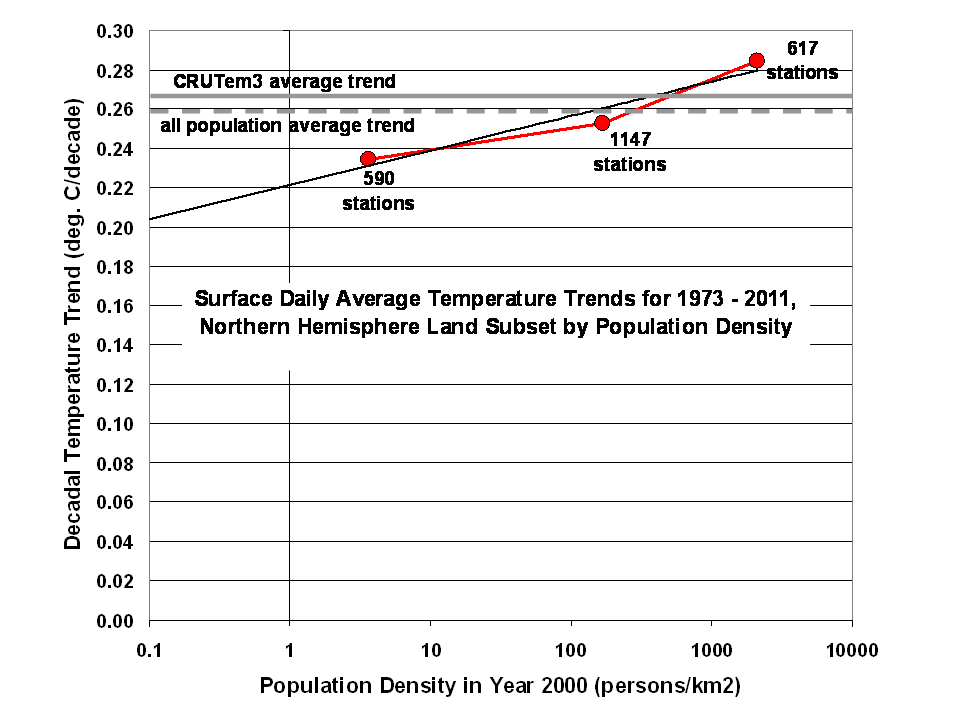
Here I will show based upon unadjusted International Surface Hourly (ISH) data archived at NCDC that the warming trend over the Northern Hemisphere, where virtually all of the thermometer data exist, is a function of population density at the thermometer site.

Depending upon how low in population density one extends the results, the level of spurious warming in the CRUTem3 dataset ranges from 14% to 30% when 3 population density classes are considered, and even 60% with 5 population classes.

DATA & METHOD

Analysis of the raw station data is not for the faint of heart. For the period 1973 through 2011, there are hundreds of thousands of data files in the NCDC ISH archive, each file representing one station of data from one year. The data volume is many gigabytes.

From these files I computed daily average temperatures at each station which had records extending back at least to 1973, the year of a large increase in the number of global stations included in the ISH database. The daily average temperature was computed from the 4 standard synoptic times (00, 06, 12, 18 UTC) which are the most commonly reported times from stations around the world.

At least 20 days of complete data were required for a monthly average temperature to be computed, and the 1973-2011 period of record had to be at least 80% complete for a station to be included in the analysis.

I then stratified the stations based upon the 2000 census population density at each station; the population dataset I used has a spatial resolution of 1 km.

I then accepted all 5×5 deg lat/lon grid boxes (the same ones that Phil Jones uses in constructing the CRUTem3 dataset) which had all of the following present: a CRUTem3 temperature, and at least 1 station from each of 3 population classes, with class boundaries at 0, 15, 500, and 30,000 persons per sq. km.

By requiring all three population classes to be present for grids to be used in the analysis, we get the best ‘apples-to-apples’ comparison between stations of different population densities. The downside is that there is less geographic coverage than that provided in the Jones dataset, since relatively few grids meet such a requirement.

But the intent here is not to get a best estimate of temperature trends for the 1973-2011 period; it is instead to get an estimate of the level of spurious warming in the CRUTem3 dataset. The resulting number of 5×5 deg grids with stations from all three population classes averaged around 100 per month during 1973 through 2011.

RESULTS

The results are shown in the following figure, which indicates that the lower the population density surrounding a temperature station, the lower the average linear warming trend for the 1973-2011 period. Note that the CRUTem3 trend is a little higher than simply averaging all of the accepted ISH stations together, but not as high as when only the highest population stations were used.

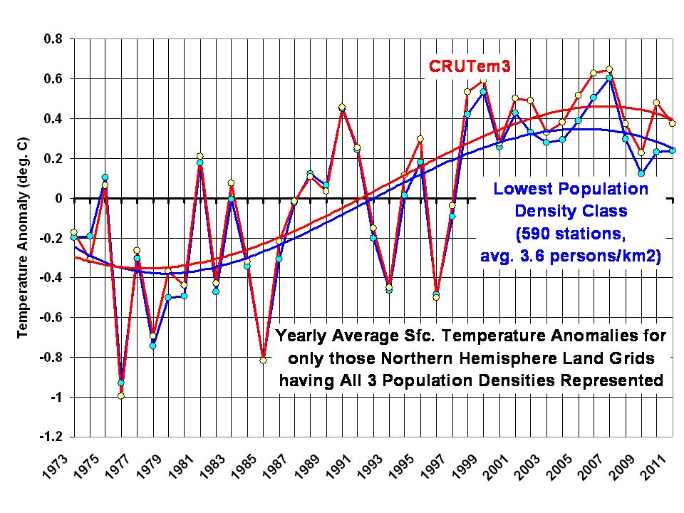
The CRUTem3 and lowest population density temperature anomaly time series which go into computing these trends are shown in the next plot, along with polynomial fits to the data:

Again, the above plot is not meant to necessarily be estimates for the entire Northern Hemispheric land area, but only those 5×5 deg grids where there are temperature reporting stations representing all three population classes.

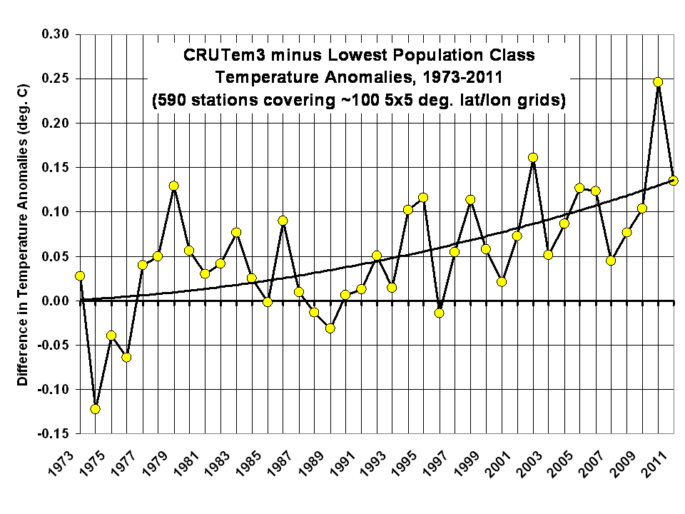
The difference between these two temperature traces is shown next:

From this last plot, we see in recent years there appears to be a growing bias in the CRUTem3 temperatures versus the temperatures from the lowest population class.

The CRUTem3 temperature linear trend is about 15% warmer than the lowest population class temperature trend. But if we extrapolate the results in the first plot above to near-zero population density (0.1 persons per sq. km), we get a 30% overestimate of temperature trends from CRUTem3.

If I increase the number of population classes from 3 to 5, the CRUTem3 trend is overestimated by 60% at 0.1 persons per sq. km, but the number of grids which have stations representing all 5 population classes averages only 10 to 15 per month, instead of 100 per month. So, I suspect those results are less reliable.

I find the above results to be quite compelling evidence for what Anthony Watts, Pat Michaels, Ross McKitrick, et al., have been emphasizing for years: that poor thermometer siting has likely led to spurious warming trends, which has then inflated the official IPCC estimates of warming. These results are roughly consistent with the McKitrick and Michaels (2007) study which suggested as much as 50% of the reported surface warming since 1980 could be spurious.

I would love to write this work up and submit it for publication, but I am growing weary of the IPCC gatekeepers killing my papers; the more damaging any conclusions are to the IPCC narrative, the less likely they are to be published. That’s the world we live in.

UPDATE:

I’ve computed results for just the United States, and these are a little more specific. The ISH stations were once again stratified by local population density. Temperature trends were computed for each station individually, and the upper and lower 5% trend ‘outliers’ in each of the 3 population classes were excluded from the analysis. For each population class, I also computed the ‘official’ CRUTem3 trends, and averaged those just like I averaged the ISH station data.

The results in the following plot show that for the 87 stations in the lowest population class, the average CRUTem3 temperature trend was 57% warmer than the trend computed from the ISH station data.
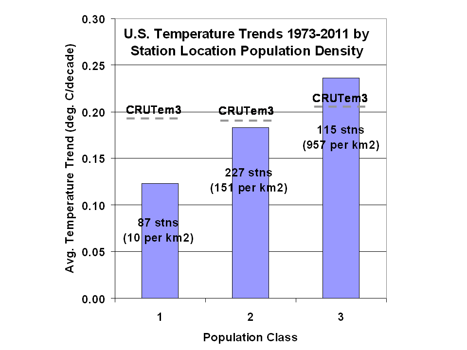
These are apples-to-apples comparisons…for each station trend included in the averaging for each population class, a corresponding, nearest-neighbor CRUTem3 trend was also included in the averaging for that population class.

How can one explain such results, other than to conclude that there is spurious warming in the CRUTem3 dataset? I already see in the comments, below, that there are a few attempts to divert attention from this central issue. I would like to hear an alternative explanation for such results.

added 15:07 CDT: BTW, the lowest population class results come from approx. 4 million temperature measurements.

Stossel Re-Airing on FoxNews, Sunday Afternoon

Friday, March 23rd, 2012

As expected, I was in the final segment of the 1 hour show last night, which will air again on Fox News Channel this Sunday (March 25) at 5 a.m. and 3 p.m. EDT.

Could Arctic Sea Ice Decline be Caused by the Arctic Oscillation?

Thursday, March 22nd, 2012

While the IPCC claims that recent Arctic sea ice declines are the result of human-caused warming, there is also convincing observational evidence that natural cycles in atmospheric circulation patterns might also be involved.

And unless we know how much of the decline is natural, I maintain we cannot know how much is human-caused.

In 2002, a paper was published in the Journal of Climate entitled Response of Sea Ice to the Arctic Oscillation, where the authors (one of whom, Mike Wallace, was a co-discoverer of the AO) shows that changing wind patterns associated with the AO contributed to Arctic sea ice declines from one decade to the next: from 1979-1988 to 1989-1998.

The Arctic Oscillation involves sea level pressure patterns over the Arctic Ocean, North Atlantic, and North Pacific. Since sea ice moves around with the wind (see this movie example), sea level pressure patterns can either expose or cover various sections of the Arctic Ocean.

When there are many winters in a row with high (or low) pressure, it can affect sea ice cover on decadal time scales. Over time, ice can become more extensive and thicker, or less extensive and thinner.

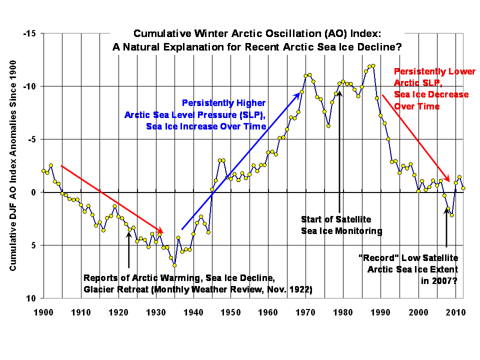
There is a time lag involved in all of this, as discussed in the above paper. So, to examine the potential cumulative effect of the AO, I made the following plot of cumulative values of the winter (December-January-February) AO (actually, their departures from the long-term average) since 1900. I’ve attached a spreadsheet with the data for those interested, updated through this past winter.

Consistent with the analysis in the above-cited paper, the sea ice decline since satellite monitoring began in 1979 was during a period of persistent positive values of the AO index (note the reversed vertical scale). Since the satellite period started toward the end of a prolonged period of negative AO values, this raises the question of whether we just happened to start monitoring Arctic sea ice when it was near peak coverage.

Note that back in the 1920’s, when there were reports of declining sea ice, record warmth, and disappearing glaciers, there was similar AO behavior to the last couple of decades. Obviously, that was before humans could have influenced the climate system in any substantial way.

I won’t go into what might be causing the cyclic pattern in the AO over several decades. My only point is that there is published evidence to support the view that some (or even most?) of the ~20 year sea ice decline up until the 2007 minimum was part of a natural cycle, related to multi-decadal changes in average wind patterns.

Spencer on Stossel Tonight: Illegal Jobs

Thursday, March 22nd, 2012

I’ll be on John Stossel’s show tonight (Thursday, March 22, 9 p.m. EDT, Fox Business Channel) entitled “Illegal Jobs”.

John and I discuss the EPA’s overreach in regulating carbon dioxide and fine particulate matter in the air. Based upon how taping went, I think my segment might be the last one of the show, since it represents the ultimate in job killing, war-on-the-poor policies which have unintended consequences far greater than the good those policies were (supposedly) designed to bring about.

As always, Stossel does a great job at simplifying these issues and framing them in ways that speak to the citizens.

Global Warming As Cargo Cult Science

Saturday, March 17th, 2012

Science is all about establishing and understanding cause and effect. Unfortunately, there are few examples in science where causation can be easily established, since the physical world involves myriad variables interacting in different ways.

I would argue that this is why there is a “scientific method” at all. Because it is so easy to fool ourselves regarding what causes what to happen in the physical world.

Laboratory experiments are powerful because, if you can control the factors you think are operating, you can isolate a specific effect and more reliably trace it to its cause.

But many problems are not amenable to laboratory investigation. Global warming is one of them. There is only a single subject, or ‘patient’ if you will (the Earth), it apparently has a low-grade fever, and we are trying to determine the cause of the fever.

It’s not that there isn’t any laboratory evidence supporting global warming theory. There have been many laboratory (spectroscopic) investigations where it has been convincingly established that carbon dioxide absorbs infrared radiation (the fundamental starting point for global warming theory). We even see evidence from satellites that greenhouse gases reduce the Earth’s ability to cool to space.

But to extend those observations to the conclusion that adding more CO2 to the atmosphere will cause substantial global warming is another matter entirely.

If we had hundreds of Earth-like planets nearby that we could visit with satellites and probes, we might randomly split them into two equal groups, inject one group with more carbon dioxide, then monitor them to see whether that group of planets’ climate systems warmed relative to the others. This would allow us to more reliably determine how much warming (if any) was likely due to adding CO2 versus natural, internal quasi-chaotic climate variations, which are always occurring. This is one of the more rigorous methods of research in epidemiology, but one which is not often performed due to expense and ethical issues.

Needless to say, we don’t have hundreds of Earth-like planets to do experiments on. Instead, we have only one subject to study, the Earth. Establishing causation in such a situation is dicey, at best.

Contrary to what you have probably been told, there are no ‘fingerprints’ of human-induced warming which distinguish it from other, natural radiatively induced sources of warming. The warming is indeed (as the IPCC so artfully claims) “consistent” with increasing CO2, but it would also be consistent with other potential causes. Maybe not from direct effects of solar irradiance changes, or from changes in ozone, but I could list many more possibilities which we don’t have good enough data for enough years to thoroughly investigate.

Cargo Cult Science

I am on a mailing list of a career MD/JD who claims much of what passes as policy-relevant science these days (global warming, air pollution epidemiological studies) is what physicist Richard Feynman in 1974 called “cargo cult science“.

The story goes that after primitive South Pacific tribes were exposed to the modernized world with transport planes bringing supplies, they later tried to build mock-airstrips and planes which they believe would ’cause’ the real cargo planes to reappear.

Of course, the villagers were confused about causation. In this case, the need of advanced societies to deliver cargo is what causes airports to be built, not the other way around.

Humans are endlessly ingenious at devising explanations for physical phenomena, while typically there is only one explanation. You can believe that global warming is mostly caused by increasing CO2, changing sunspots, natural climate cycles (my personal favorite), the moon, the planets, HAARP experiments in Alaska, or whatever you can dream up. But to actually prove any of those is impossible, and to even convincingly establish a connection is more a matter of how easy it is to convince people, rather than how good the evidence is.

The Earth has warmed…but there is also abundant proxy evidence that it warmed (and cooled) in the past. So, did increasing CO2 in the last half century really cause the most recent period of warming? We might never know.

The courts are increasingly deferring such matters of causation to the “expertise” of government agencies, such as the EPA. The Circuit Court of DC recently heard challenges to EPA’s 2010 endangerment finding (or ruling) that increasing CO2 is a threat to human health and welfare, and thus must be regulated under the Clean Air Act.

Yet the judges sitting on that court did not want to hear any challenges to the science(!) If the endangerment finding was based upon the science, how the hell can a court hear challenges to the Finding if it does not want to hear about the science? I’m not an attorney, but it seems like lawyers are so busy arguing procedural and obscure legal issues, they are not willing to go after the fundamental premise: that more CO2 in the atmosphere is bad for you.

Yeah, science is hard. It can make your head hurt. But if you are going to base policy on what some scientists claim, you’d better be prepared to address challenges to that science.

What Causes the Large Swings in Global Satellite Temperatures?

Friday, March 16th, 2012

One of the most frequent questions I get pertains to the large amount of variability seen in the daily global-average temperature variations we make available on the Discover website. From Aqua AMSU ch. 5, these temperatures can undergo wide swings every few weeks, leading to e-mail questions like, Is the satellite broken?

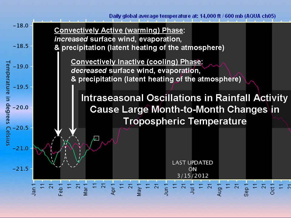
Unusually good examples of these have occurred over the last couple months. In the following plot I took from today, we see January and February of 2012 experiencing two full cycles of temperature variations of about 0.5 deg. C (click for large version):

We have observed this behavior ever since John Christy and I started the satellite-based global temperature monitoring business over 20 years ago.

These temperature swings are mostly the result of variations in rainfall activity. Precipitation systems, which are constantly occurring around the world, release the latent heat of condensation of water vapor which was absorbed during the process of evaporation from the Earth’s surface.

While this process is continuously occurring, there are periods when such activity is somewhat more intense or widespread. These events, called Intra-Seasonal Oscillations (ISOs) are most evident over the tropical Pacific Ocean.

During the convectively active phase of the ISO, there are increased surface winds of up to 1 to 2 knots averaged over the tropical oceans, which causes faster surface evaporation, more water vapor in the troposphere, and more convective rainfall activity. This above-average release of latent heat exceeds the rate at which the atmosphere emits infrared radiation to space, and so the resulting energy imbalance causes a temperature increase (see the above plot).

During the convectively inactive phase, the opposite happens: a decrease in surface wind, evaporation, rainfall, and temperature, as the atmosphere radiatively cools more rapidly than latent heating can replenish the energy.

(As I keep emphasizing, a temperature change is caused by an imbalance between energy gain and energy loss. You can cause warming either by increasing the rate of energy gain, or by decreasing the rate of energy loss. This is how the “greenhouse effect” works, by reducing the rate of radiative energy loss by the surface).

There are observed cloud and radiation budget changes associated with ISOs, as described in our 2007 paper which analyzed the average behavior of the ISO over a 6 year period (see Figs. 1, 2, and 3 in that paper). The main mode of ISO activity is called the Madden-Julian Oscillation.

How Can Rainfall Cause Warming?

I will admit, even as a fresh PhD researcher, the idea that rainfall causes heating seemed counter-intuitive. This is because we are used to the cooling effect of rain when it falls to the surface, which is where we live. But high up in the atmosphere where the rain forms, huge amounts of heat are given up in the process. Just as water evaporating from your skin feels cool, that extra heat is given up when the water condenses back into liquid.

The most vivid example of this process is the warm core of a hurricane, which is heated by the rainfall occurring around the hurricane eye. What actually happens is that the latent heat release within clouds causes localized warming which is almost immediately “relieved” by ascending motion (convective updrafts, which frequent flyers are familiar with).

Because rising air cools, there is little net temperature change in the ascending parcels of air…but all of that rising air also forces air outside of the cloud systems to sink, causing “subsidence warming”. That is where most of the actual temperature increase takes place. The hurricane eye is the most extreme example of this process, where subsiding air gets concentrated in a relatively small region and the temperature can rise many degrees. More commonly though (such as with the ISO phenomenon), the subsidence warming gets spread over hundreds or thousands of km of atmosphere, and the temperature rise is only a fraction of a degree.

Slaying the Slayers with the Alabama Two-Step

Wednesday, March 14th, 2012

last edited for clarity 11:05 CDT 3/14/2012

A recent article by S. Fred Singer in American Thinker entitled Climate Deniers are Giving Us Skeptics a Bad Name has caused a resurgence of attacks against those of us who believe that the Earth does indeed have a “greenhouse effect” which makes the Earth’s surface warmer than it would otherwise be.

As a result of Fred’s article, angry E-mails have been flying like arrows, and belligerent blog posts have littered the landscape. (Well, maybe that’s a bit of an exaggeration. But I enjoyed writing it.)

In the American Thinker article, Fred has taken the tack that the “denier” label (which left-leaning folk seem to love calling us) should be applied to those who deny the so-called greenhouse effect (which states that infrared absorbing gases in the atmosphere perform a surface-warming function) and should not be applied to those of us who are skeptical of how much humans have warmed the climate system by slightly enhancing the natural greenhouse effect with more carbon dioxide from burning of carbon based fuels. The anti-greenhouse crowd’s bible seems to be the book, Slaying the Sky Dragon – Death of the Greenhouse Gas Theory.

The arguments between us and the anti-greenhouse advocates often become technical and devolve into disputes over the 1st or 2nd Law of Thermodynamics, whether photons really exist, whether a carbon dioxide molecule which absorbs IR energy immediately releases it again, whether outer space is an ‘insulator’, etc. Lay people quickly become overwhelmed, and even some of us technical types end up feeling ill-equipped to argue outside our areas of expertise.

I believe the fact that infrared-absorbing gases warm the surface and lower atmosphere can be easily demonstrated with 2 simple steps. The first step is in the realm of everyone’s daily experience. The second step is based upon satellite measurements of the Earth giving off infrared energy, measurements which were first made over 40 years ago.

The Alabama Two-Step

STEP 1:
Temperature is determined by rates of energy gain and energy loss. It does not matter whether we are talking about the human body, a car engine, a pot of water on the stove, or the climate system. The temperature (and whether it is rising or falling) is determined by the rates of energy gain and energy loss. In the case of the climate system, the Earth receives energy from the sun (primarily at visible wavelengths of light), and loses energy to outer space (primarily at infrared wavelengths). A temperature rise can occur either from (1) increasing the rate of energy gain, or (2) decreasing the rate of energy loss. The greenhouse effect has to do with the 2nd of these possibilities.

STEP 2:
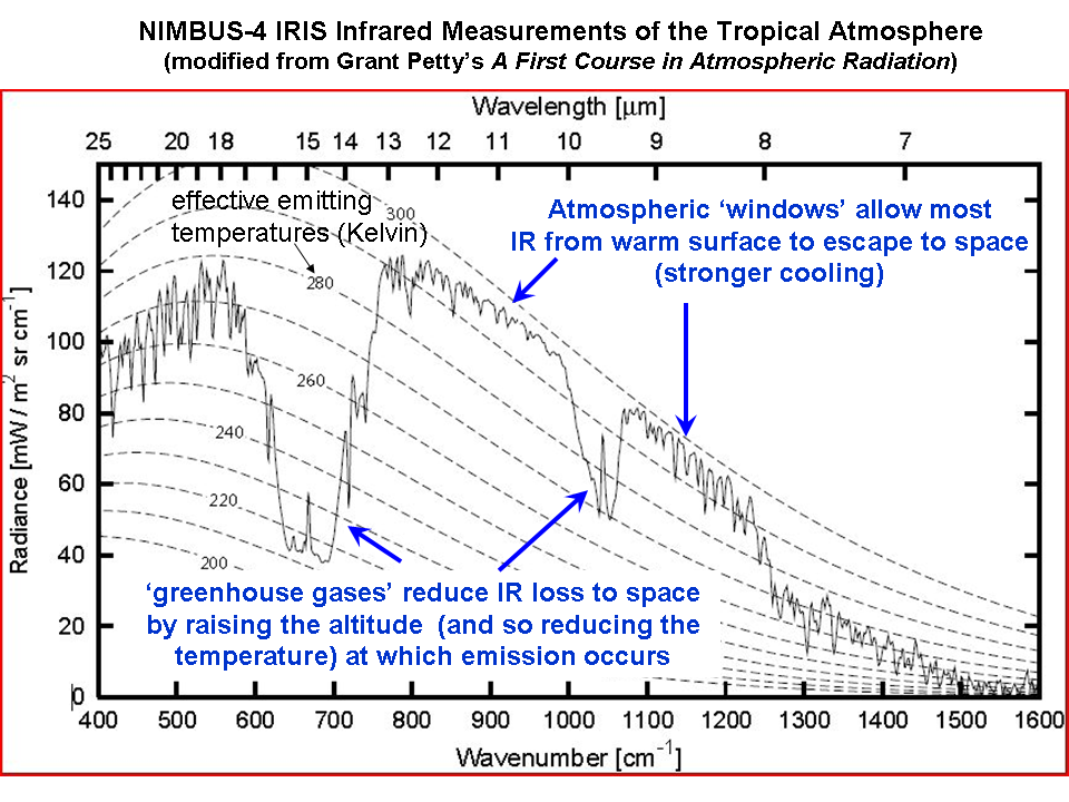
Infrared absorbing gases reduce the rate at which the Earth loses infrared energy to space. Satellite measurements of the rate at which the Earth loses infrared energy to space have been made as early as the 1970’s, from the NASA Nimbus 4 spacecraft. The following plot shows the IR intensity (vertical axis) as a function of IR wavelength (horizontal axis). The area under the jagged curve is proportional to the rate of energy loss to space. Note that at the wavelengths where water vapor, carbon dioxide, and ozone absorb and emit IR energy, the rate of energy loss by the Earth is reduced.

Now, lets take Steps 1 and 2 together: If you add more of these “greenhouse gases” and nothing else changes then the rate at which the Earth, as a whole, loses energy to space is reduced. This must lead to a warming tendency, at least at the surface and lower atmosphere (the upper atmosphere will actually experience a cooling effect).

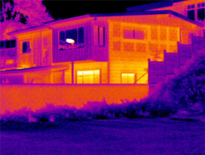
If your head is already exploding at this point, let’s use the (admittedly imperfect) analogy of a thermal IR image of a house at night, which shows how the windows and poorly insulated parts of a house are points of greater IR energy loss:

When you add insulation to your house, you reduce the rate of energy loss in the winter, which will raise the temperature inside the house (all other things being the same), while at the same time reducing the temperature of the exterior of the house. Similarly, greenhouse gases provide “radiative insulation” to the climate system, raising the temperature of the surface and lower atmosphere, while lowering the temperature of the middle and upper atmosphere.

The above analysis is, I believe, consistent with the views of MIT’s Dick Lindzen. It clearly demonstrates that IR absorbing gases (greenhouse gases) reduce the Earth’s ability to cool to outer space. No amount of obfuscation or strawman arguments in the comments section, below, will be able to get around this fact.

But HOW MUCH Warming?

The question of how much warming will result from adding carbon dioxide to the atmosphere is what we skeptics are skeptical of. The climate system is amazingly complex, and the IPCC position that elements within the climate system (especially clouds) will change in ways which amplify the resulting small warming tendency is highly questionable, to say the least. If the climate system instead acts to reduce the warming, then anthropogenic global warming (AGW) becomes for all practical purposes a non-issue.

This represents what I believe to be the simplest description of how greenhouse gases cause warming of the surface. It bypasses all of the esoteric discussions and instead deals only with observations, which I believe cannot be easily explained any other way:

FIRST, warming can be caused by a decrease in the rate of energy loss by the climate system (or any other system, for that matter).

SECOND, IR absorbing gases are observed from satellites to reduce the rate of energy loss to space.

THEREFORE, adding more IR absorbing gases will cause a warming tendency.

QED.

Again I emphasize, however, the above simple argument is necessarily true only to the extent that all other elements of the climate system remain the same, which they will not. These other changes are called ‘feedbacks’, and they can either make or break theories of global warming and associated climate change.

Regarding the Inevitable Questions…

1. Yes, the CO2 absorption bands are already mostly saturated…but the wings of those bands are not, as is evident in the above graph of satellite measurements. This saturation effect partly explains why the approximate 40% increase in atmospheric CO2 since pre-industrial times has resulted in only a 1% decrease in the rate of IR loss by the Earth to space (theoretically calculated). This is already accounted for in the climate models used by the IPCC.

2. Yes, convection is indeed a major mechanism of heat loss from the Earth’s surface. It greatly reduces the surface temperature of the Earth (and, by energy conservation, greatly increases the temperature of the middle and upper troposphere). And my view is that convective effects are what will cause feedbacks to minimize surface warming from CO2 increases. Climate models already contain convection…if they didn’t the modeled surface temperature of the Earth would average around 140 deg. F.

The global warming narrative advanced by the IPCC involves a chain of physical processes which must all be true in order for their conclusions to be true. The existence of the greenhouse effect is, in my view, one of the stronger links in the chain. Feedbacks are the weakest link.

Gleick’s Watergate Too

Sunday, March 11th, 2012

I don’t usually blog about posts on other blogs, but I’m making an exception for Steve McIntyre’s excellent analysis showing how similar Peter Gleick’s actions were to the Watergate burglary, primarily because both were covert attempts to obtain financial donor lists from the ‘enemy’.

Given Gleick’s expertise in water science, I think we should re-brand the event “Watergate Too”.

A Little Pollution Saves Lives

Wednesday, March 7th, 2012

I’ve been studying up to help out on a future John Stossel segment which will likely address the EPA’s overreach in trying to reduce pollution to vanishingly small levels.

Of course, if we could do such a thing at reasonable cost, and there were clear benefits to human health and welfare, then such a goal might make sense. But what was once a noble and achievable goal to clean up most of our air and water pollution has become an end in itself: to keep making things cleaner and cleaner, no matter the cost.

I remember driving through the Gary, Indiana industrial complex in the 1960s. The air pollution was simply unbelievable. You could not escape the stench and smoke; rolling up the car windows did not help.

I also remember the Cuyahoga River fire of 1969. There is no question that the EPA has greatly helped…but we must remember that the EPA was the result of the public’s realization that is was time to start cleaning up some of our messes.

The fundamental problem, though, is that the EPA was given what amounts to limitless power. They do not have to show that their regulations will not do more harm than good to human health and welfare. Now, I will admit they do provide periodic reports on their estimates of costs versus benefits of regulations, but the benefits are often based upon questionable statistical studies which have poor correlations, very little statistical signal, and little cause-and-effect evidence that certain pollutants are actually dangerous to humans.

And the costs of those regulations to the private sector are only the direct costs, because indirect costs to the economy as a whole are so difficult to assess.

Even if some (or even all) pollutants present some risk to human health and welfare, it makes no sense to spend more and more money to reduce that risk to arbitrarily low levels at the expense of more worthy goals.

Economists will tell you that society has unlimited wants but only limited resources, and so we must choose carefully to achieve maximum benefits with minimum cost. It is easy to come up with ideas that will “save lives”; it is not so easy to figure out how many lives your idea will cost. The same is true of government jobs programs, which only create special interest jobs at the expense of more useful (to the consumer) private sector jobs.

The indirect costs to the economy can be the greatest costs, and since we know very well that poverty kills, when we reduce economic prosperity, people — especially poor people — die.

Income is directly proportional to longevity; you cannot keep siphoning off money to chase the impossible dream of pure air and pure water, because those are simply not achievable goals. It makes absolutely no sense to give a government agency unlimited authority to regulate pollution to arbitrarily low levels with no concern over the indirect cost to society.

But that’s what we have with today’s EPA. Several years ago I gave an invited talk at a meeting of CAPCA, the Carolinas Air Pollution Control Association. There was also an EPA representative who spoke, and to everyone’s amazement stated something to the effect that “we can’t stop pushing for cleaner and cleaner air”. Eyebrows were raised because in the real world, such a stated goal ignores physical and economic realities. There is no way to totally avoid pollution, only reduce it.

How far we reduce it is the question, and so far the EPA really does not care how many people they might kill in the process. Or, they are too dumb to understand such basic economic principles.

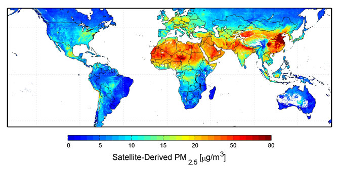
Let’s take the example of fine particulate matter in the air (the so-called PM2.5, particles less than 2.5 microns in size), which the EPA recently decided is unsafe at any level (“no threshold” at which it is safe). Let’s take a look at a satellite estimate of the global distribution of this “pollution”:

You will note that the most “polluted” air occurs where almost no one is around to pollute: in the deserts. This is because wind blowing over bare soil causes dust particles. If you really are worried about fine particulate air pollution, do not go outside on a windy day.

Also note in the above map the blue to cyan areas, which have concentrations below 10 micrograms per cubic meter. Those are levels the World Health Organization has previously deemed safe. The western United States is largely below that level. If one examines the monitoring station data west of Denver, there is no correlation between changes in fine particulate matter pollution and deaths, but the oft-quoted Pope et al analysis of those data lumps all of the U.S. data together and finds a weak statistical relationship between deaths and changes in fine particulate pollution.

The EPA then concludes that NO level of such pollution is safe, even though the data from the western U.S. suggests there is a safe level.

As a scientist who deals in statistics and large datasets on almost a daily basis, I can tell you it is easy to fool yourself with statistical correlations. The risk levels that epidemiologists talk about these days for air pollution are around 5% or 10% increased risk compared to background. This is in the noise level compared to the increased health risk from cigarette smoking, which is more like 1,500%. When statistical signals are that small, one needs to look far and wide for confounding factors, that is, other more important variables you may not have accounted for to the accuracy needed to make any significant conclusion.

Actually establishing a mechanism of disease causation is not required for the EPA to regulate; just weak correlations and a board of “independent” scientific advisers who are themselves supported by the EPA.

Of course, when Congress makes any attempt to rein in the EPA, there are screams that decades of air pollution control progress is being “rolled back”. Bulls&!t. The new pollution regulations now being considered have reached the point of diminishing returns and greatly increased cost.

This week I was with about 250 representatives of various companies involved in different aspects of growing America’s (and a good part of the world’s) food supply. The most common complaint is the overreach of government regulation, which is increasing costs for everyone. The extra costs have been somewhat shielded from the consumer by industry, but they told me that sharply increasing food prices are now inevitable, in fact they are already showing up in grocery stores.

And I haven’t even mentioned carbon dioxide regulations. Even if we could substantially reduce U.S. CO2 emissions in the next 20 years, which barring some new technology is virtually impossible, the resulting (theoretically-computed) impact on U.S or global temperatures would be unmeasurable….hundredths of a degree C at best.

The cost in terms of human suffering, however, will be immense.

It is time for the public to demand that Congress limit the EPA’s authority. The EPA operates outside of real world constraints, and is itself an increasing threat to human health and welfare — the very things that the EPA was created to protect.

A Technical Apology to Juliet Eilperin

Wednesday, March 7th, 2012

It has been close to 2 weeks since WaPo reporter Juliet Eilperin interviewed me for an article about why some climate scientists become so outspoken on climate issues. After that interview, I had a bad feeling (as I always do) about how my views would be portrayed in the mainstream media, and so I had a blog post which ended:

“It will be interesting to see how Juliet represents my views. I predict spin. But if she accurately and fairly represents my views, I will apologize for doubting her.”

So how did she do in her article, “In climate wars, advocacy by some researchers brings risks“?

Well, she did not actually “spin” my views, so for that unusual gift of journalistic balance, I will gladly apologize for doubting her.

On a first, quick read the article seemed more balanced that I was expecting (keeping in mind my expectations are usually pretty low in such matters). So, in response to her e-mail to me a couple mornings ago, I said my apology would be forthcoming when I get a chance (I was busy with a corn growers-related meeting in Kansas City).

Now, after re-reading the article, I realize that while she did not actually misrepresent my views…she instead simply did not bother to represent most of what I said.

On the positive side, she accurately described me as one of the scientists who questions the level to which humans are responsible for recent climate change. A great step in the right direction, since we are not “climate deniers”. In fact, we believe more in climate change than the anthropocentric scientists who believe only humans can change climate.

But that was it. The meat of what I told her was ignored, which was on the topic of why scientists on both sides of the global warming debate choose to speak out publicly.

She provided several paragraphs alluding to why scientists on the other side of the issue speak out, but nowhere could I find reasons why WE speak out.

I had told her that ill-conceived energy policies that hurt economic growth kill poor people. Was that not a sufficiently interesting thing to report on? Or, was she afraid that anyone reading a statement like that might actually start thinking for themselves about the unintended consequences of carbon dioxide regulation?

Instead, her article continues the tired tradition journalists have of making the “consensus” scientists sound like they are the only ones who have the best interests of humanity at heart, while continuing to ignore the reasons why I (and others like me) feel WE are really the ones who have the best interests of humanity at heart. I believe we are the ones who own the moral high ground.

She gave more ink to someone from the Union of Concerned Scientists, a misleading name for an organization if I ever heard one. You remember them, they are the ones who even let dogs join, as long as they have a credit card.

So, Juliet, your article was a step in the right direction. But if you are going to have a balanced article about why scientists on both sides of the global warming issue speak out, then please, represent both sides.