Archive for November, 2023

‘Demographic Warming’: Humans Increasingly Choose to Live Where It’s Warmer

Wednesday, November 8th, 2023

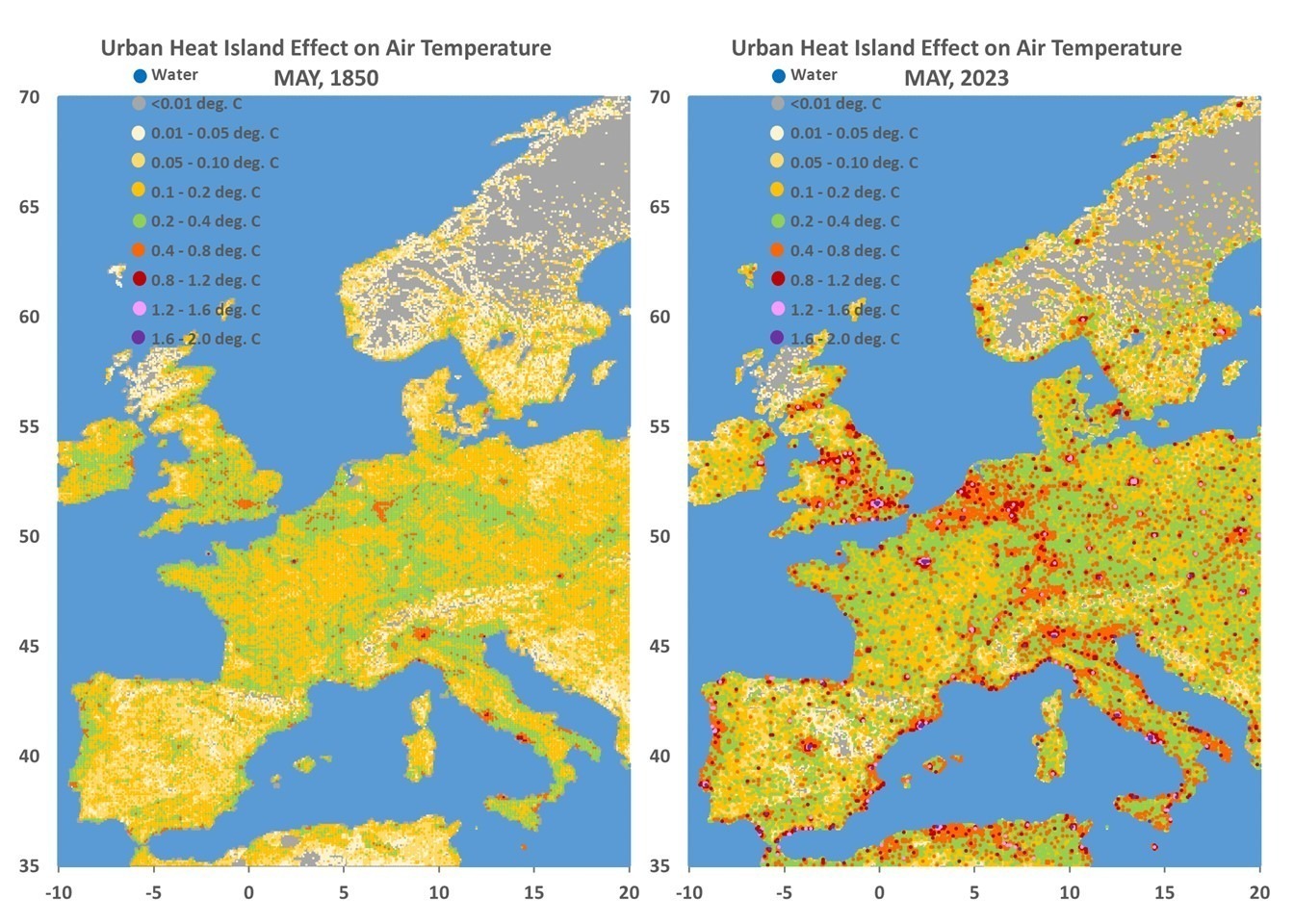
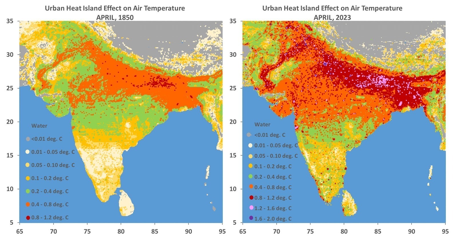
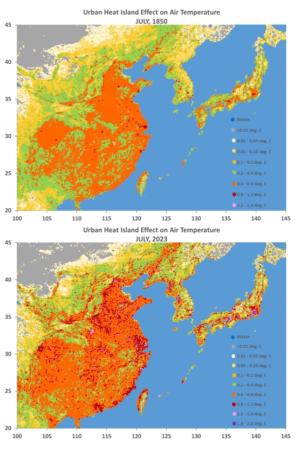
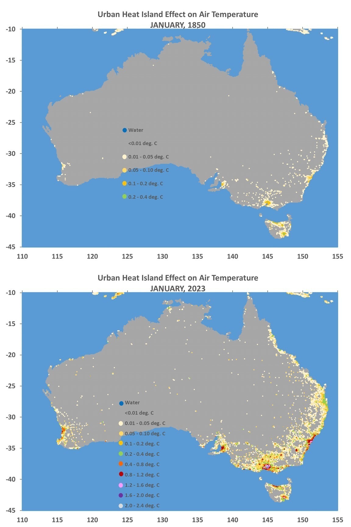
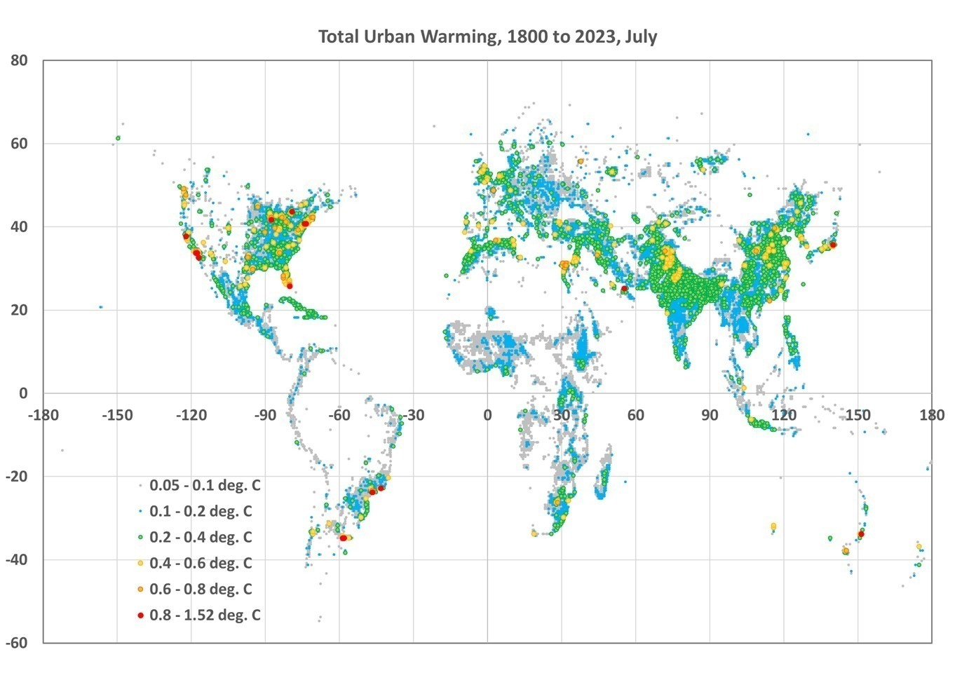
The urban heat island (UHI) was first described by Luke Howard in 1833 for London, England. Urban area air temperatures are almost always warmer than their rural surroundings, especially at night. Thus, the average human experiences warmer temperatures than they would if they lived in wilderness conditions.

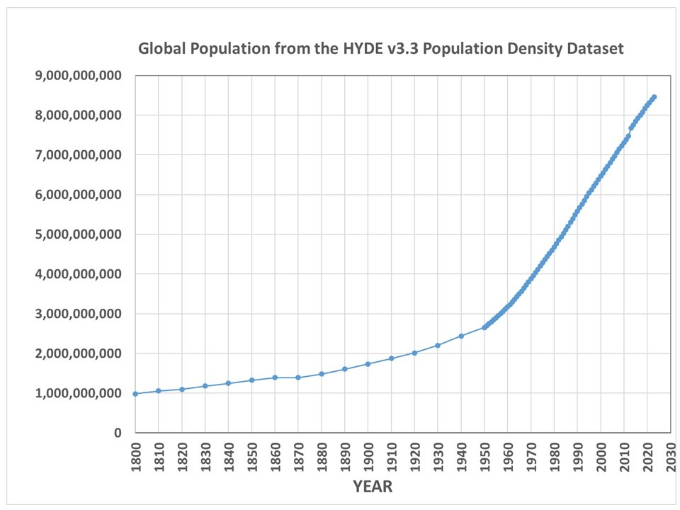
This has nothing to do with global warming, and would occur even if there was no long-term ‘global warming’. In fact, since over 50% of the Earth’s population now lives in urban areas (expected to increase to nearly 70% by 2045), the temperatures humans actually experience would continue to break high temperature records even without climate change. For reference, the following plot shows the increase in global population between 1800 and 2023.

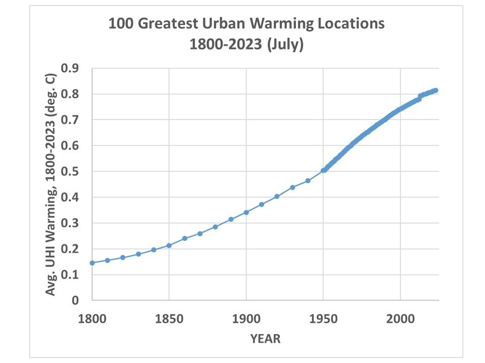
Our new global gridded UHI dataset allows one to compute just how much warmth (vs wilderness conditions) the average person experiences merely because most people live where human settlements cause localized warming. The following plot shows my computed ‘demographic warmth’ (during June, July, and August) experienced by the average human and how it has changed since 1800. For comparison I’ve also plotted the area-average temperature departures from the 1885-1984 average of the land portion of the HadCRUT4 thermometer dataset.

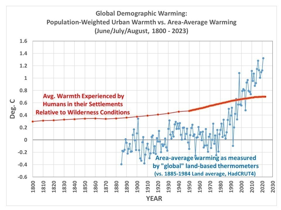
What can one conclude from this plot? At a minimum it shows humans choose to live under warmer conditions just by living in densely populated areas — and increasingly so. I will leave it up to the reader to decide if it shows anything beyond that. Note that this does not include the effect of (for instance) the migration of the U.S. population from colder to warmer latitudes, which would show an additional source of demographic warming. The warming shown by the red curve is only for urban effects relative to wilderness conditions at the same location.

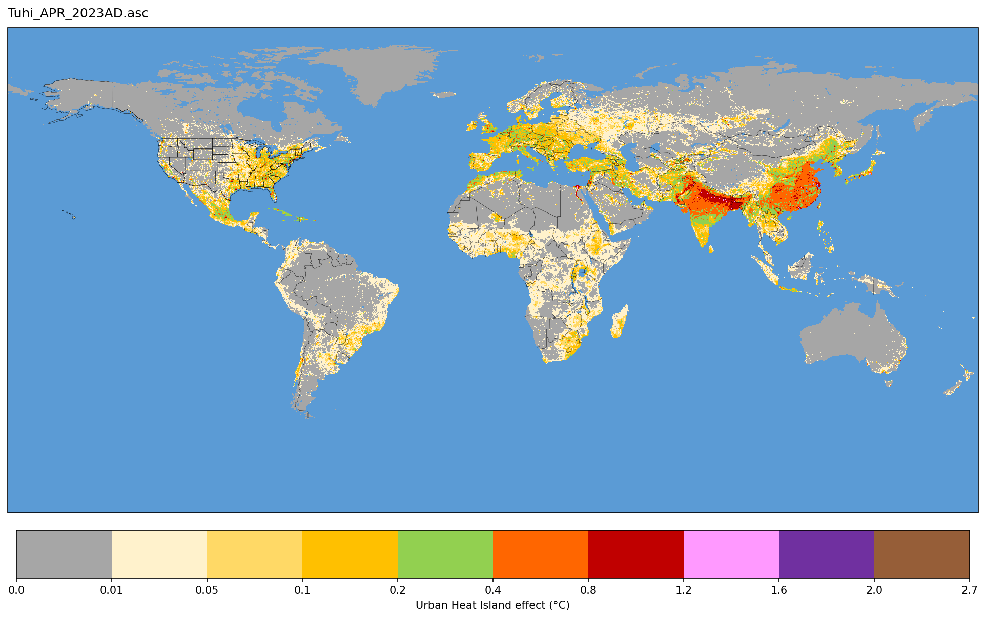
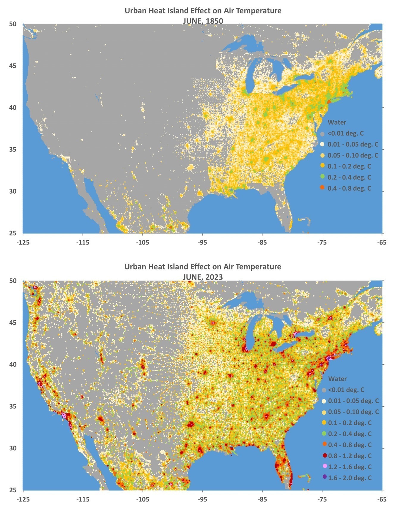
Now, don’t be confused about what this means regarding the UHI impact on the thermometer measurements — that’s a different subject. All this shows is an metric of human-centric experienced warmth, not a thermometer-centric estimate of how much warming from the thermometer network can be attributed to UHI effects. The UHI effect on air temperature is due to a variety of processes associated with human settlements, such as replacement of vegetation with buildings and impervious surfaces and generation of waste heat that change the daily energy budget of those locations. Our UHI dataset simply approximates all of those processes using population density as a proxy, a choice made for us by the fact that it is the best (and possibly only) long-term dataset that exists to analyze the UHI problem.

Examples from our New UAH Urban Heat Island Dataset

Tuesday, November 7th, 2023

Since few people who visit here will actually download and analyze data, I present some imagery of the new Urban Heat Island (UHI) dataset we have developed, at their full (~9×9 km or better) spatial resolution.

A Review: The Method

(Skip this section if you just want to see the pretty pictures, below).

To review, the dataset is based upon over 13 million station-pairs of monthly average air temperature measurements at closely-spaced GHCN stations between 1880 and 2023. It quantifies the average *spatial* relationship between 2-station differences in temperature and population density (basically, quantifying the common observation that urban locations are warmer than suburban, which are in turn warmer than rural). The quantitative relationships are then applied to a global population density dataset extending back through time.

The quantitative relationships between temperature and population are almost the same whether I use GHCN raw or adjusted (homogenized) data, with the homogenized data producing a somewhat stronger UHI signal. They are also roughly the same whether I used data from 1880-1920, or 1960-1980; for this global dataset, all years (1880 through 2023) are used together to derive the quantitative relationships.

I use six classes of station-pair average population density to construct the (nonlinear) relationship between population density and the UHI effect on air temperature. To make the UHI dataset, I apply these equations (derived separately in 7 latitude bands and 4 seasons) to global gridded population density data since 1800.

As I previously announced, our paper submitted for publication on the method showed that UHI warming in the U.S. since 1895 is 57% of the GHCN warming trend averaged over all suburban and urban stations. But because most of the U.S. GHCN stations that go into the CONUS area average are rural, the UHI warming trend area averaged across all GHCN stations is only 20% of that computed from GHCN data. Thus, there is evidence that GHCN warming trends for the U.S. as a whole have been inflated somewhat (20% or so) by the urban heat island effect, but by a much larger fraction at urban station locations. The UHI contamination of the area average trends could be larger than this, since we do not account for some regions possibly having increased levels of UHI contamination as prosperity increases (more buildings, pavement, vehicles, air conditioning, and other waste heat sources) increases but population remains the same.

Some Dataset Examples

Here are some examples of the UHI dataset for several regions, showing the estimated total UHI effect on air temperature in the years 1850 and 2023 (I have files every 10 years from 1800 to 1950, then yearly thereafter). By “total UHI effect” I mean how much warmer the locations are compared to wilderness (zero population density) conditions. I emphasize the warm season months, which is when the UHI effect is strongest.

Remember, these quantitative relationships hold for the *average* of all GHCN stations in 7 separate latitude bands. It is unknown how accurate they are at individual locations depicted in the following imagery.

First let’s start with a global image for April, 2023 that Danny Braswell put together for me using mapping software, for April of 2023 (click on the image for higher resolution… and if you dare, here is a super-duper-hi-res version):

And here are some regional images using my crude Excel “mapping” (no map outlines):

In my next post I will probably do some graphs of just how many people in the world live in various levels of elevated temperature just because the global population is increasingly urbanized. Over 50% of the population now lives in urban areas, and that fraction is supposed to approach 70% by 2045. This summer we have seen how the media reports on temperature records being broken for various cities and they usually conflate urban warmth with global warming even through such record-breaking warmth would increasingly occur even with no global warming.

Again, all of the ArcGIS format (ASCII grid) files are located here (public permissions now fixed).

A New Global Urban Heat Island Dataset: Global Grids of the Urban Heat Island Effect on Air Temperature, 1800-2023

Friday, November 3rd, 2023

As a follow-on to our paper submitted on a new method for calculating the multi-station average urban heat island (UHI) effect on air temperature, I’ve extended that initial U.S.-based study of summertime UHI effects to global land areas in all seasons and produced a global gridded dataset, currently covering the period 1800 to 2023 (every 10 years from 1800 to 1950, then yearly after 1950).

It is based upon over 13 million station-pair measurements of inter-station differences in GHCN station temperatures and population density over the period 1880-2023. I’ve computed the average UHI warming as a function of population density in seven latitude bands and four seasons in each latitude band. “Temperature” here is based upon the GHCN dataset monthly Tavg near-surface air temperature data (the average of daily Tmax and Tmin). I used the “adjusted” (homogenized, not “raw”) GHCN data because the UHI effect (curiously) is usually stronger in the adjusted data.

Since UHI effects on air temperature are mostly at night, the results I get using Tavg will overestimate the UHI effect on daily high temperatures and underestimate the effect on daily low temperatures.

This then allows me to apply the GHCN-vs-population density relationships to global historical grids of population density (which extend back many centuries) for every month and every year since as early as I choose. The monthly resolution is meant to capture the seasonal effects on UHI (typically stronger in summer than winter). Since the population density dataset time resolution is every ten years (if I start in, say, 1800) and then it is yearly starting in 1950, I have produced the UHI dataset with the same yearly time resolution.

As an example of what one can do with the data, here is a global plot of the difference in July UHI warming between 1800 and 2023, where I have averaged the 1/12 deg spatial resolution data to 1/2 deg resolution for ease of plotting in Excel (I do not have a GIS system):

If I take the 100 locations with the largest amount of UHI warming between 1800 and 2023 and average their UHI temperatures together, I get the following:

Note that by 1800 there was 0.15 deg. C of average warming across these 100 cities since some of them are very old and already had large population densities by 1800. Also, these 100 “locations” are after averaging 1/12 deg. to 1/2 degree resolution, so each location is an average of 36 original resolution gridpoints. My point is that these are *large* heavily-urbanized locations, and the temperature signals would be stronger if I had used the 100 greatest UHI locations at original resolution.

Again, to summarize, these UHI estimates are not based upon temperature information specific to the year in question, but upon population density information for that year. The temperature information, which is spatial (differences between nearby stations), comes from global GHCN station data between 1880 and 2023. I then apply the GHCN-derived spatial relationships between population density and air temperature during 1880-2023 to those population density estimates in any year. The monthly time resolution is to capture the average seasonal variation in the UHI effect in the GHCN data (typically stronger in summer than winter); the population data does not have monthly time resolution.

In most latitude bands and seasons, the relationship is strongly nonlinear, so the UHI effect does not scale linearly with population density. The UHI effect increases rather rapidly with population above wilderness conditions, then much more slowly in urban conditions.

It must be remembered that these gridpoint estimates are based upon the average statistical relationships derived across thousands of stations in latitude bands; it is unknown how accurate they are for specific cities and towns. I don’t know yet how finely I can regionalize these regression-based estimates of the UHI effect, it requires a large number (many thousands) of station pairs to get good statistical signals. I can do the U.S. separately since it has so many stations, but I did not do that here. For now, we will see how the seven latitude bands work.

I’m making the dataset publicly available since there is too much data for me to investigate by myself. One could, for example, examine the growth over time of the UHI effect in specific metro regions, such as Houston, and compare that to NOAA’s actual temperature measurements in Houston, to get an estimate of how much of the reported warming trend is due to the UHI effect. But you would have to download my data files (which are rather large, about 117 MB for a single month and year, a total of 125 GB of data for all years and months). The location of the files is:

https://www.nsstc.uah.edu/public/roy.spencer

You will be able to identify them by name.

The format is ASCII grid and is exactly the same as the HYDE version 3.3 population density files (available here) I used (ArcGIS format). Each file has six header records, then a grid of real numbers with dimension 4320 x 2160 (longitude x latitude, at 1/12 deg. resolution).

Time for Willis to get to work.

UAH Global Temperature Update for October, 2023: +0.93 deg. C

Thursday, November 2nd, 2023

The Version 6 global average lower tropospheric temperature (LT) anomaly for October, 2023 was +0.93 deg. C departure from the 1991-2020 mean. This is slightly above the September, 2023 anomaly of +0.90 deg. C, and establishes a new monthly high temperature anomaly record since satellite temperature monitoring began in December, 1978.

The linear warming trend since January, 1979 still stands at +0.14 C/decade (+0.12 C/decade over the global-averaged oceans, and +0.19 C/decade over global-averaged land).

Various regional LT departures from the 30-year (1991-2020) average for the last 22 months are:

YEARMOGLOBENHEM.SHEM.TROPICUSA48ARCTICAUST
2022Jan+0.03+0.07-0.00-0.23-0.12+0.68+0.10
2022Feb-0.00+0.01-0.01-0.24-0.04-0.30-0.49
2022Mar+0.15+0.28+0.03-0.07+0.23+0.74+0.03
2022Apr+0.27+0.35+0.18-0.04-0.25+0.45+0.61
2022May+0.18+0.25+0.10+0.01+0.60+0.23+0.20
2022Jun+0.06+0.08+0.05-0.36+0.47+0.33+0.11
2022Jul+0.36+0.37+0.35+0.13+0.84+0.56+0.65
2022Aug+0.28+0.32+0.24-0.03+0.60+0.51-0.00
2022Sep+0.25+0.43+0.06+0.03+0.88+0.69-0.28
2022Oct+0.32+0.43+0.21+0.05+0.16+0.94+0.04
2022Nov+0.17+0.21+0.13-0.16-0.51+0.51-0.56
2022Dec+0.05+0.13-0.03-0.35-0.21+0.80-0.38
2023Jan-0.04+0.05-0.14-0.38+0.12-0.12-0.50
2023Feb+0.09+0.170.00-0.11+0.68-0.24-0.11
2023Mar+0.20+0.24+0.16-0.13-1.44+0.17+0.40
2023Apr+0.18+0.11+0.25-0.03-0.38+0.53+0.21
2023May+0.37+0.30+0.44+0.39+0.57+0.66-0.09
2023June+0.38+0.47+0.29+0.55-0.35+0.45+0.06
2023July+0.64+0.73+0.56+0.87+0.53+0.91+1.44
2023Aug+0.70+0.88+0.51+0.86+0.94+1.54+1.25
2023Sep+0.90+0.94+0.86+0.93+0.40+1.13+1.17
2023Oct+0.93+1.02+0.83+1.00+0.99+0.92+0.62

The full UAH Global Temperature Report, along with the LT global gridpoint anomaly image for October, 2023 and a more detailed analysis by John Christy, should be available within the next several days here.

Lower troposphere:

http://vortex.nsstc.uah.edu/data/msu/v6.0/tlt/uahncdc_lt_6.0.txt

Middle troposphere:

http://vortex.nsstc.uah.edu/data/msu/v6.0/tmt/uahncdc_mt_6.0.txt

Tropopause:

http://vortex.nsstc.uah.edu/data/msu/v6.0/ttp/uahncdc_tp_6.0.txt

Lower stratosphere:

http://vortex.nsstc.uah.edu/data/msu/v6.0/tls/uahncdc_ls_6.0.txt