Archive for July, 2017

4,300 Days Since Last U.S. Major Hurricane Strike

Monday, July 31st, 2017

Wednesday of this week will mark 4,300 days since the last major hurricane (Category 3 or stronger, 111-129 mph maximum sustained winds) made landfall in the U.S.

That’s almost 12 years.

The last major hurricane to make landfall in the U.S. was Wilma striking Florida on October 24, 2005, one of several strong hurricanes to hit the U.S. that year. The unusual hurricane activity in 2005 was a central focus of Al Gore’s 2006 movie, An Inconvenient Truth, in which Mr. Gore suggested 2005 was going to be the new normal. As you might recall, Gore went on to receive a Nobel Peace Prize for helping to raise awareness of the severe weather dangers from global warming.

Instead, the bottom dropped out of Atlantic hurricane activity after 2005. The “drought” of landfalling U.S. major hurricanes continues, and as seen in this graphic from WeatherStreet.com, no hurricanes have yet formed anywhere in the Atlantic basin in 2017, despite the forecast for an above-normal hurricane season:

Cumulative number of Atlantic hurricanes by date during the hurricane seasons of 2017, 2016, and the record-active year of 2005.

Study: Sea Level Rise Revised Downward

Friday, July 21st, 2017

If I had not looked past the headline of the press report on a new study, I would have just filed it under “It’s worse than we thought”. A new study in Nature reported on July 17 carried the following headlines:

“Satellite snafu masked true sea-level rise for decades”
“Revised tallies confirm that the rate of sea-level rise is accelerating as the Earth warms and ice sheets thaw.”

When I read that, I (like everyone else) assumed that corrections to the satellite sea level data since 1993 have now led to a revised trend toward faster (not slower) sea level rise. Right?

Wrong.

During the satellite era (since 1993), the trend in sea level rise was revised downward, by almost 10%, from 3.28 mm/year to about 3.0 mm/year. (For those concerned about Miami going underwater, these numbers equate to a little more than one inch every 10 years). This result was published back in April in Geophysical Research Letters, and the new Nature study looks at the wiggles in the revised data since 1993 and makes ominous pronouncements about sea level rise “acceleration”.

I’m calling “fake science news” on the Nature reporter who covered the story. The headline was technically correct…but misleading. (I can also make up technically correct headlines: “Scientists Agree: Sea Levels are Rising, We are All Going to Die”)

The researchers in April made a major adjustment to the first 1/4 of the satellite record, bringing those early sea levels up. This results in adding curvature to the upward trend (an acceleration) by flattening out the early part of the curve. This new signature of “acceleration” was what made the news in the new Nature study, even though the long term trend went down.

Should this New “Acceleration” be the News?

In a word, no.

Short-term undulations in the sea level rise curve should not be used as a predictive curve for the future. They are affected by a wide variety of natural phenomena. For example, ice loss from Greenland (which was large in 2011-12) has recently reversed itself with huge gains made in the last year. These events are governed by natural variations in weather patterns, which have always occurred.

For longer-term variations, yes, the rate of sea level rise during the entire period since 1993 probably is a little more than, say, during the period since 1900 (sea level rise was occurring naturally, anyway). But the inferred acceleration is small. And even that acceleration could be mostly natural — we simply don’t know.

My main point is that the Nature headline was misleading. They clearly had to find something in the study that supported the alarmist view of sea level rise, and they figured few people would read past the headline.

A face-value reading of the two main studies together results in the conclusion that sea level rise since 1993 has been revised downward. The most recent study then reads too much into the wiggles in the new data, and even implies the acceleration will continue with the statement, “The suggested acceleration… highlights the importance and urgency of mitigating climate change and formulating coastal adaptation plans to mitigate the impacts of ongoing sea level rise”.

The new study does NOT revise recent sea level rise upward, as is suggested by the Nature headline quoted above.

Warming in the Tropics? Even the New RSS Satellite Dataset Says the Models are Wrong

Friday, July 14th, 2017

Tropical cloud systems seen from the International Space Station.

From recent media reports (e.g. the WaPo’s Capital Weather Gang) you would think that the new RSS satellite dataset for the lower troposphere (LT) has resolved the discrepancy between climate models and observations.

But the new LT dataset (Version 4, compared to Version 3.3) didn’t really change in the tropics. This can be seen in the following plot of a variety of observational datasets and the average of 102 CMIP5 climate model simulations.

Comparison of 102 CMIP5 climate model runs (average of 32 groups) against various observations for tropical lower tropospheric temperature anomalies during 1979-2016. All yearly time series were vertically placed so that their linear trends all intersect at zero, which is the proper way to display them to compare how much warming has occurred over the entire time period. The results were then displayed as running 5 year averages.

It’s pretty clear that the models are producing too much atmospheric warming compared to satellites, radiosondes (weather balloons), and multi-observational atmospheric reanalyses. (And remember, the observations have a record warm El Nino at the end of the time series, which the model average does not. Without that, the discrepancy would be even larger).

For those who claim, But humans live at the surface, not up in the atmosphere, do those same people ignore the warming of the deep oceans, too? Or maybe they will claim, But most people don’t live in the tropics — do those people worry about Arctic sea ice melting? (The Arctic Ocean covers 2.8% of the Earth, while the tropical results in the above plot are for 35.5% of the Earth).

The fact is that how much warming is occurring in the troposphere (and in the deep oceans) tells us something about whether the climate models can be trusted. If their feedbacks are reasonably correct (which will determine how much global warming we should see in the future), the models should tell a reasonably consistent story in the atmosphere, in the ocean, at the surface, in the tropics, and outside the tropics.

Remember, the climate models are the basis for energy policy changes, and so their quantitative projections are central to the case that we must do something about our greenhouse gas emissions.

The Great American Eclipse – 40 days to go

Wednesday, July 12th, 2017

The March 29, 2006 total solar eclipse, composite photo taken from images gathered by 3 separate Canon 5D cameras ranging from 8 sec to 1/1000 sec exposure time (Miloslav Druckmller, Peter Aniol, click image for full-resolution).

The Great American Eclipse of Monday, August 21, 2017 will be one of only a couple of chances for many Americans to experience a total solar eclipse. This is the first coast-to-coast total eclipse since 1918. The last total eclipse visible from any point in the contiguous U.S. was 38 years ago, in 1979. Your next chance will be April 8, 2024.

A total solar eclipse at mid-day will be amazing. If you are in the path of totality, some of the brighter stars and planets will appear. The temperature can fall rapidly.

The following map, provided by greatamericaneclipse.com, has a wealth of information regarding how much of the sun will be covered, at what time, and how long totality will last:

Eclipse details for the 21 August 2017 total solar eclipse, click image for full-resolution.

While a partial eclipse will be experienced everywhere in the U.S., where you will want to be is in the narrow (~70 mile wide) path of “totality”, there the moon completely covers the sun. If the skies are partly clear, some of the brighter stars will appear as well as a couple of planets. Totality will last for as long as 2 minutes and 40 seconds.

As long as you are within about 25 miles of the center of the path, you will experience the better part of that maximum time of totality. So (for example), even though Nashville, TN will be 25 miles from the centerline, it will still experience 2 minutes of total solar eclipse.

Safety First!

Since the August 21 eclipse will occur when the sun is high in the sky, it WILL NOT BE SAFE to view it with the naked eyes at any time until totality occurs (the moon completely covers the sun). Until that time, you will need a pair of solar viewing glasses, which are MUCH darker than sunglasses. Do NOT attempt to view the sun with sunglasses, you will permanently damage your eyes. Just before totality, there will be a tiny sliver of bright sunlight…do NOT be tempted to look at it. Solar viewing glasses (and even solar viewing binoculars) might well sell out early, so get them soon.

Will It Be Cloudy?

Climatologically, certain parts of the country will have a greater chance of seeing the eclipse than others. Eclipse2017.org has those probabilities.

But, as a meteorologist I can tell you that weather — not climate — will determine whether you have mostly clear skies or are under a thick thunderstorm anvil.

The following MODIS satellite imagery for mid-day on 21 August 2015 shows that your success will depend heavily upon just what kind of weather systems are occurring and where.

MODIS satellite imagery on 21 August 2015, with the 2017 eclipse path of totality superimposed, showing the wide range of cloud conditions that can occur during a summer eclipse in the United States.

It could be that one of the climatologically best locations (say, north-central Oregon) will be completely cloud covered (as it was on 21 August 2015), while one of the worst places (the Smokey Mountains) will have mostly clear skies if a cool front recently passed by. There is no way to know more than a few days in advance. Thunderstorm anvils blowing off large thunderstorm complexes will likely ruin the experience for many people. This is why I won’t decide where I will go until 1-2 days before the eclipse. I’d love to be in Teton Village for the event, but not if it’s cloudy.

Here in the southeast U.S. in August, even a mostly sunny day will have “popcorn” cumulus clouds that develop by mid-day. One option I’m considering (if that’s the weather forecast) is to go to one of the large reservoirs which tend to stay clear under such condtions, for example Kentucky Lake east of Paducah, or Watts Bar Lake in eastern Tennessee.

But even if you are stuck under the clouds, it is still worth experiencing being in the path of totality. It’s going to get really, really dark in the middle of the day.

To Travel or Not to Travel?

If you live farther than about 6 hours away from the path of totality, and can’t drive there the morning of the eclipse, your other option is to get within 100-200 miles of the path of totality and stay in a hotel the night before, then drive the rest of the way in the morning. Hotels in the path of totality have all been sold out for about a year or so.

I was originally considering going to downtown Nashville, but I’ve heard that hundreds of thousands of people might converge on some of the metro areas, and there could be gridlock. So, I’m still conflicted about whether to go metro or rural.

How to Record the Event?

For most people, just experiencing the event will be magical. Being with a large group of people will raise the excitement level (although if you are easily annoyed by a few overly-excited voices, you might want to avoid crowds).

Now that most people have smartphones, taking some video of the event will be the easiest way to capture the moment. There will be lots of great photos of the sun itself after the event, and they will all look about the same. So, capture the scenery and the reactions of people in cell phone video, instead.

For those of us with heavy-duty photo equipment, we have a number of choices, none of which are easy. Video or stills? If video, real-time or time lapse? Wide-angle landscape shots or zoom in on the sun (with solar filters if not during totality)? I haven’t decided yet. I will probably have one camera on a tripod doing wide-angle video with the sun near the top of the frame, and another camera with a 200-300mm focal length lens taking bracketed exposures of the solar corona over the ~2 minutes of totality, which is what went into the spectacular composite photo at the start of this article.

No matter where we choose to go, happy eclipse hunting, everyone…lets hope for blue skies for as many people as possible!

2017 Eclipse Websites

GreatAmericanEclipse.com

Eclipse2017.org

Space.com

Eclipse2017.nasa.gov

SkyandTelescope.com

Comments on the New RSS Lower Tropospheric Temperature Dataset

Thursday, July 6th, 2017

It was inevitable that the new RSS mid-tropospheric (MT) temperature dataset, which showed more warming than the previous version, would be followed with a new lower-tropospheric (LT) dataset. (Carl Mears has posted a useful FAQ on the new dataset, how it differs from the old, and why they made adjustments).

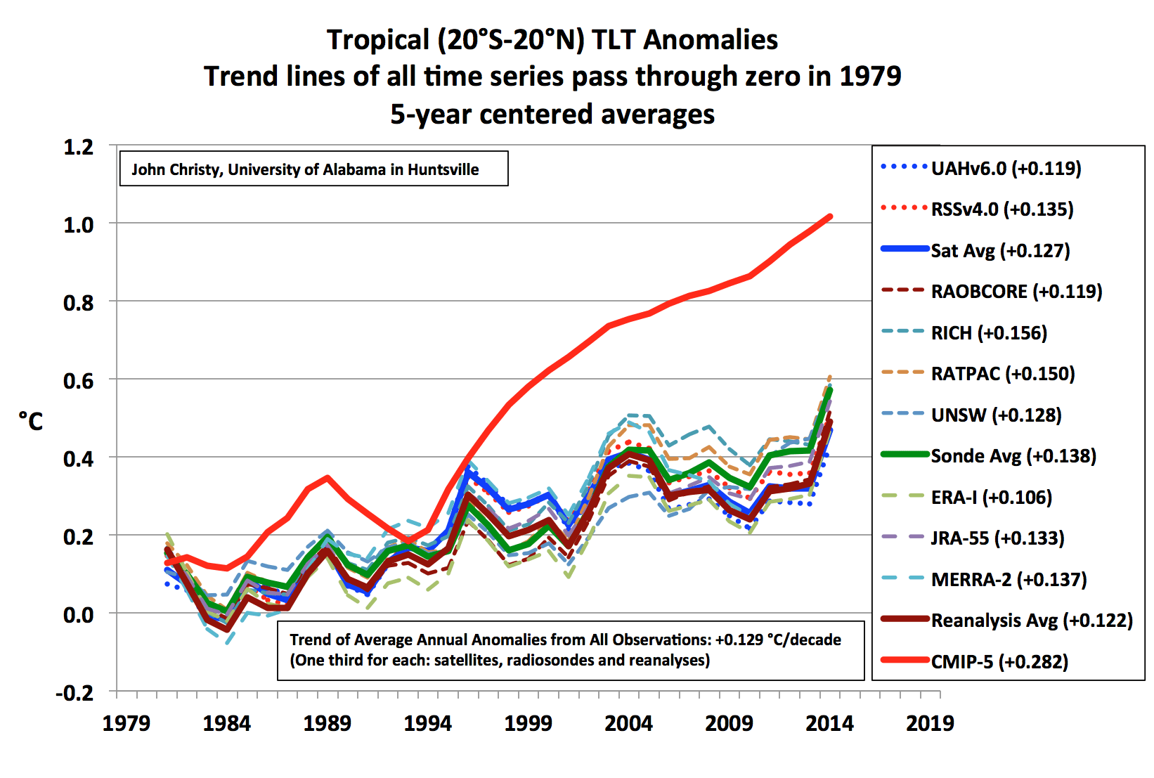
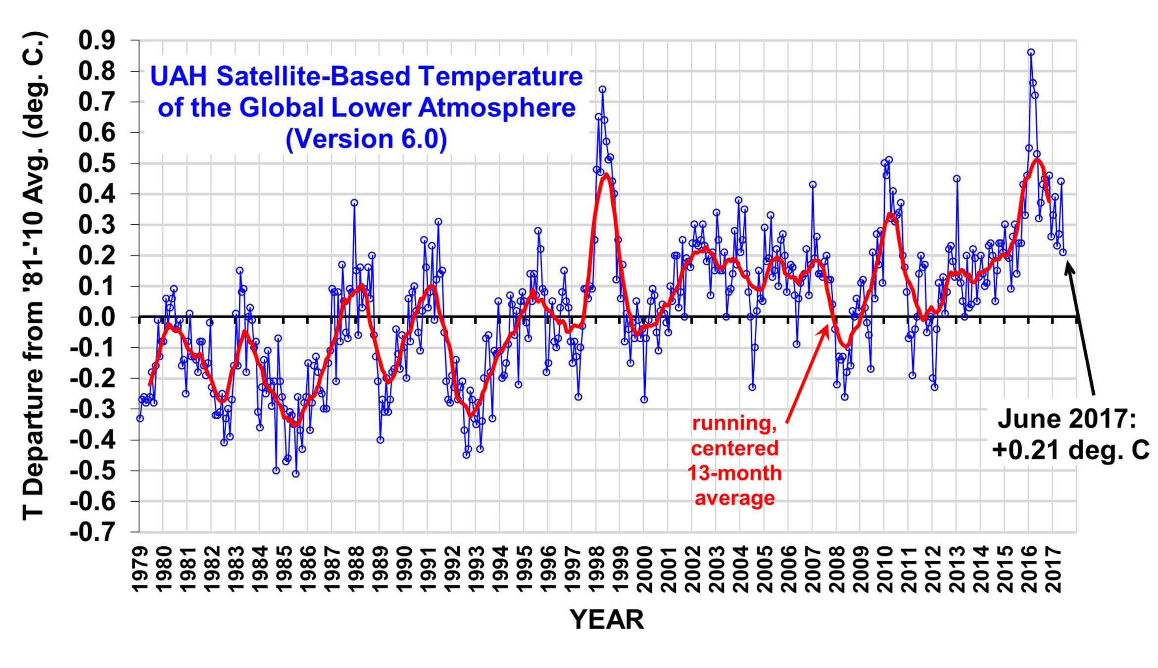
Before I go into the details, let’s keep all of this in perspective. Our globally-averaged trend is now about +0.12 C/decade, while the new RSS trend has increased to about +0.17 C/decade.

Note these trends are still well below the average climate model trend for LT, which is +0.27 C/decade.

These are the important numbers; the original Carbon Brief article headline (“Major correction to satellite data shows 140% faster warming since 1998”) is seriously misleading, because the warming in the RSS LT data post-1998 was near-zero anyway (140% more than a very small number is still a very small number).

Since RSS’s new MT dataset showed more warming that the old, it made sense that the new LT dataset would show more warming, too. Both depend on the same instrument channel (MSU channel 2 and AMSU channel 5), and to the extent that the new diurnal drift corrections RSS came up with caused more warming in MT, the adjustments should be even larger in LT, since the diurnal cycle becomes stronger as you approach the surface (at least over land).

Background on Diurnal Drift Adjustments

All of the satellites carrying the MSU and AMSU instruments (except Aqua, Metop-A and Metop-B) do not have onboard propulsion, and so their orbits decay over the years due to very weak atmospheric drag. The satellites slowly fall, and their orbits are then no longer sun-synchronous (same local observation time every day) as intended. Some of the NOAA satellites were purposely injected into orbits that would drift one way in local observation time before orbit decay took over and made them drift in the other direction; this provided several years with essentially no net drift in the local observation time.

Since there is a day-night temperature cycle (even in the deep-troposphere the satellite measures) the drift of the satellite local observation time causes a spurious drift in observed temperature over the years (the diurnal cycle becomes “aliased” into the long-term temperature trends). The spurious temperature drift varies seasonally, latitudinally, and regionally (depending upon terrain altitude, available surface moisture, and vegetation).

Because climate models are known to not represent the diurnal cycle to the accuracy needed for satellite adjustments, we decided long ago to measure the drift empirically, by comparing drifting satellites with concurrently operating non-drifting (or nearly non-drifting) satellites. Our Version 6 paper discusses the details.

RSS instead decided to use climate model estimates of the diurnal cycle, and in RSS Version 4 are now making empirical corrections to those model-based diurnal cycles. (Generally speaking, we think it is useful for different groups to use different methods.)

Diurnal Drift Effects in the RSS Dataset

We have long known that there were differences in the resulting diurnal drift adjustments in the RSS versus our UAH dataset. We believed that the corrections in the older RSS Version 3.3 datasets were “overdone”, generating more warming than UAH prior to 2002 but less than UAH after 2002 (some satellites drift one way in the diurnal cycle, other satellites drift in the opposite direction). This is why the skeptical community liked to follow the RSS dataset more than ours, since UAH showed at least some warming post-1997, while RSS showed essentially no warming (the “pause”).

The new RSS V4 adjustment alters the V3.3 adjustment, and now warms the post-2002 period, but does not diminish the extra warming in the pre-2002 period. Hence the entire V4 time series shows more warming than before.

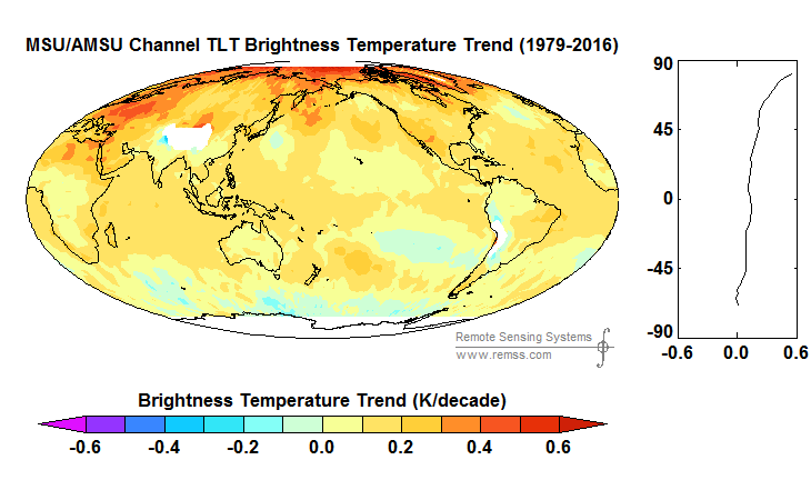
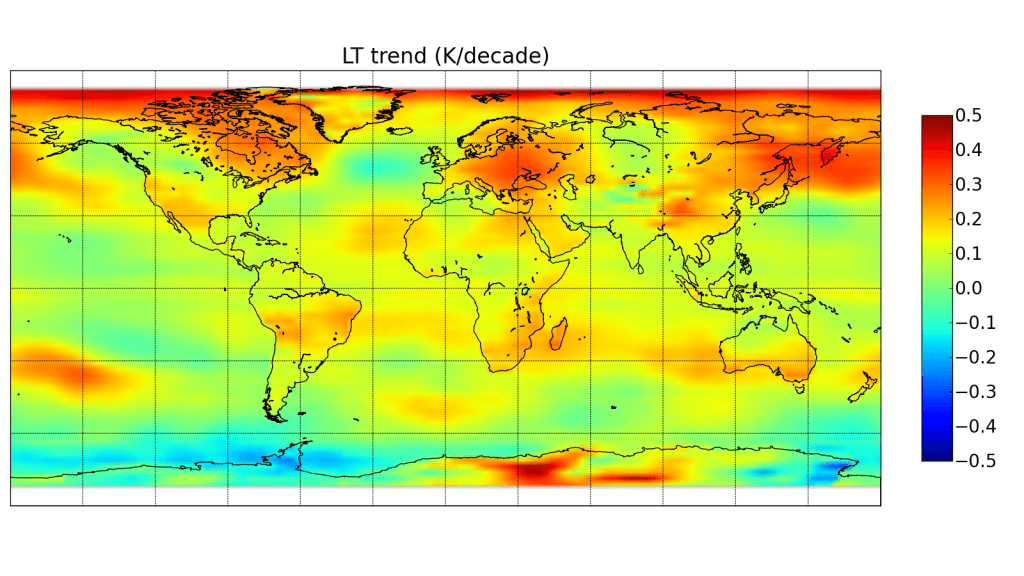
Examination of a geographic distribution of their trends shows some elevation effects, e.g. around the Andes in S. America (You have to click on the image to see V4 compared to V3.3…the static view below might be V3.3 if you don’t click it).

Gridpoint lower tropospheric temperature trends, 1979-2016, in the V3.3 versus V4 RSS datasets.

We also discovered this and, as discussed in our V6 paper, attributed it to errors in the oxygen absorption theory used to match the MSU channel 2 weighting function with the AMSU channel 5 weighting function, which are at somewhat different altitudes when viewing at the same Earth incidence angle (AMSU5 has more surface influence than MSU2). Using existing radiative transfer theory alone to adjust AMSU5 to match MSU2 (as RSS does) leads to AMSU5 still being too close to the surface. This affects the diurnal drift adjustment, and especially the transition between MSU and AMSU in the 1999-2004 period. The mis-match also can cause dry areas to have too much warming in the AMSU era, and in general will cause land areas to warm spuriously faster than ocean areas.

Here are our UAH LT gridpoint trends (sorry for the different map projection):

In general, it is difficult for us to follow the chain of diurnal corrections in the new RSS paper. Using a climate model to make the diurnal drift adjustments, but then adjusting those adjustments with empirical satellite data feels somewhat convoluted to us.

Final Comments

Besides the differences in diurnal drift adjustments, the other major difference affecting trends is the treatment off the NOAA-14 MSU, last in the MSU series. There is clear drift in the difference between the new NOAA-15 AMSU and the old NOAA-14 MSU, with NOAA-14 warming relative to NOAA-15. We assume that NOAA-14 is to blame, and remove its trend difference with NOAA-15 (we only use it through 2001) and also adjust NOAA-14 to match NOAA-12 (early in the NOAA-14 record). RSS does not assume one satellite is better than the other, and uses NOAA-14 all the way through 2004, by which point it shows a large trend difference with NOAA-15 AMSU. We believe this is a large component of the overall trend difference between UAH and RSS, but we aren’t sure just how much compared to the diurnal drift adjustment differences.

It should be kept in mind that the new UAH V6 dataset for LT uses three channels, while RSS still uses multiple view angles from one channel (a technique we originally developed, and RSS followed). As a result, our new LT weighting function is a little higher in the atmosphere, with considerably more weight in the upper troposphere and slightly more weight in the lower stratosphere. Based upon radiosonde temperature trend profiles, we found the net effect on the difference between the two LT weighting functions on temperature trends to be very small, probably 0.01 C/decade or less.

We have a paper in peer review with extensive satellite dataset comparisons to many balloon datasets and reanalyses. These show that RSS diverges from these and from UAH, showing more warming than the other datasets between 1990 and 2002 – a key period with two older MSU sensors both of which showed signs of spurious warming not yet addressed by RSS. I suspect the next chapter in this saga is that the remaining radiosonde datasets that still do not show substantial warming will be the next to be “adjusted” upward.

The bottom line is that we still trust our methodology. But no satellite dataset is perfect, there are uncertainties in all of the adjustments, as well as legitimate differences of opinion regarding how they should be handled.

Also, as mentioned at the outset, both RSS and UAH lower tropospheric trends are considerably below the average trends from the climate models.

And that is the most important point to be made.

No, it didn’t snow in Kenya yesterday

Wednesday, July 5th, 2017

There is much internet buzzing about “snow” in Kenya yesterday, and its connection to climate change.

Here’s what the event looked like on a road near Nyahururu, Kenya, which is on a plateau around 7,800 ft. elevation, and is positioned right on the equator:

Small hail covering the ground near Nyahururu, Kenya, on July 4, 2017.

If you click to get the full-size photo, you will notice that the ditch is running with water, and there is fog just above the ice. This means there was heavy rain with the event, and that the air is relatively warm and humid, and the ice on the ground is cooling the air to below the dewpoint, causing the fog.

This was a hailstorm, not “snow”.

Here’s what the area looked like from the MODIS instrument on a NASA satellite:

MODIS satellite imagery of central Kenya on July 4, 2017 showing thunderstorm clouds. Three successive satellite passes showed the storms growing at this time and moving eastward (to the right).

Those are thunderstorm clouds, not snow-producing clouds. Mountain hikers are familiar with summer storms producing small hail.

The GFS weather forecast model fields for yesterday showed that there was no cold air mass intrusion from high latitudes. The air mass temperature was near normal. At this latitude, you would have to go up to around 18,000 ft altitude to experience actual “snow”, which sometimes falls on the summit of Mt. Kenya (~17,000 ft.), and frequently on Kilimanjaro (~19,000 ft.)

Stephen Hawking Flies off the Scientific Reservation

Monday, July 3rd, 2017

I can understand when pop-scientists like Bill Nye spout scientific silliness.

But complete nonsense coming from Stephen Hawking? Really?

In this video, Stephen Hawking claims that Trump withdrawing the U.S. from the Paris Accord could lead to the Earth being pushed past a tipping point, with Venus-like 250 deg. C temperatures and sulfuric acid rain.

The trouble with this statement is that no reputable climate scientist would claim such a thing. The reason is that Venus has about 220,000 times as much carbon dioxide in its atmosphere as does Earth.

Meanwhile, human civilization will have trouble simply doubling (2x) our atmospheric CO2 concentration (it’s taken about 100 years to increase it by 50%, which is half way to doubling).

Since we don’t know what our future energy mix will be in 50-100 years, it’s not obvious we will even reach “2XCO2”.

So, how could we possibly get from 2x to 220,000x?

We can’t.

Impossible.

Not even if we wanted to.

Venus is a very different planet. Venus has 93x as much atmosphere as Earth, and it is almost 100% CO2. The CO2 concentration in our comparatively thin atmosphere is only 0.04%.

I have no idea where Hawking ever got such a wild idea. Apparently, he had his audience in tears with his dire predictions.

This is partly why the public makes fun of scientists. Sad.

UAH Global Temperature Update for June, 2017: +0.21 deg. C

Monday, July 3rd, 2017

Lowest global temperature anomaly in last 2 years (since July, 2015)

The Version 6.0 global average lower tropospheric temperature (LT) anomaly for June, 2017 was +0.21 deg. C, down from the May, 2017 value of +0.44 deg. C (click for full size version):

Global area-averaged lower tropospheric temperature anomalies (departures from 30-year calendar monthly means, 1981-2010). The 13-month centered average is meant to give an indication of the lower frequency variations in the data; the choice of 13 months is somewhat arbitrary… an odd number of months allows centered plotting on months with no time lag between the two plotted time series. The inclusion of two of the same calendar months on the ends of the 13 month averaging period causes no issues with interpretation because the seasonal temperature cycle has been removed as has the distinction between calendar months.

The global, hemispheric, and tropical LT anomalies from the 30-year (1981-2010) average for the last 18 months are:

YEAR MO GLOBE NHEM. SHEM. TROPICS
2016 01 +0.55 +0.73 +0.38 +0.84
2016 02 +0.86 +1.19 +0.52 +0.99
2016 03 +0.76 +0.99 +0.54 +1.10
2016 04 +0.72 +0.86 +0.58 +0.93
2016 05 +0.53 +0.61 +0.45 +0.71
2016 06 +0.32 +0.47 +0.17 +0.38
2016 07 +0.37 +0.43 +0.30 +0.48
2016 08 +0.43 +0.53 +0.32 +0.50
2016 09 +0.45 +0.50 +0.39 +0.38
2016 10 +0.42 +0.42 +0.41 +0.46
2016 11 +0.46 +0.43 +0.49 +0.36
2016 12 +0.26 +0.26 +0.27 +0.23
2017 01 +0.33 +0.32 +0.33 +0.09
2017 02 +0.39 +0.58 +0.19 +0.07
2017 03 +0.23 +0.37 +0.09 +0.06
2017 04 +0.27 +0.29 +0.26 +0.22
2017 05 +0.44 +0.39 +0.49 +0.41
2017 06 +0.21 +0.32 +0.09 +0.39

NOTE: We have added the Metop-B satellite to the processing stream, with data since mid-2013. The Metop-B satellite has its orbit actively maintained, so the AMSU data from it does not require corrections from orbit decay or diurnal drift. As a result of adding this satellite, most of the monthly anomalies since mid-2013 have changed, by typically a few hundredths of a degree C. The 1979-2017 linear trend remains at +0.12 C/decade.

The UAH LT global anomaly image for June, 2017 should be available in the next few days here.

The new Version 6 files should also be updated in the coming days, and are located here:

Lower Troposphere: http://vortex.nsstc.uah.edu/data/msu/v6.0/tlt/uahncdc_lt_6.0.txt
Mid-Troposphere: http://vortex.nsstc.uah.edu/data/msu/v6.0/tmt/uahncdc_mt_6.0.txt
Tropopause: http://vortex.nsstc.uah.edu/data/msu/v6.0/ttp/uahncdc_tp_6.0.txt
Lower Stratosphere: http://vortex.nsstc.uah.edu/data/msu/v6.0/tls/uahncdc_ls_6.0.txt