Archive for November, 2022

An Apology to Willis Eschenbach

Thursday, November 24th, 2022

It has been brought to my attention that I owe Willis Eschenbach an apology, based upon a comment I made on my blog:

“I’ve previously commented on Willis thermostat hypothesis of climate system regulation, which Willis never mentioned was originally put forth by Ramanathan and Collins in a 1991 Nature article.”

Some have interpreted my words as implying that Willis knew of the previously published Thermostat Hypothesis and chose not to reveal it, which would suggest plagiarism. That was not my intention, and I apologize to Willis if my comment made it look that way.

Canadian Summer Urban Heat Island Effects: Some Results in Alberta

Saturday, November 19th, 2022

Summary

Comparison of rural with urban temperature monitoring sites across Canada during the summers of 1978-2022 shows the expected average nighttime warm bias in urban areas, with a weaker daytime effect. When applied to the Landsat imagery-based diagnoses of increased urbanization over time, 20% of the temperature trends in a small region encompassing Calgary and Edmonton are found to be due to increasing urbanization. Calgary leads the list of Canadian cities with increased urbanization, with an estimated 50% of the nighttime warming trends across 10 Canadian mostly-metro areas attributable to increased urbanization, and 20% of the daytime warming trends.

Introduction

This is part of my continuing investigation of the degree to which land-based temperature datasets are producing warming trends exaggerated by increasing urbanization (the urban heat island effect, UHI). Current “homogenization” techniques for thermometer data adjustment do not explicitly attempt to correct urban trends to match rural trends, although I would expect that they do perform this function if most of the stations are rural. Instead, they amount to statistical “consensus-building” exercises where the majority wins. So, if most of the stations are affected by increasing UHI effects, to varying degrees, these are not forced to match the rural stations. Instead, the reverse occurs. For example, in the U.S. the Watts et al. analysis of station data showed that the U.S. homogenized dataset (USHCN) produced temperature trends as large as those produced by the stations with the worst siting in terms of spurious heat sources. They further found that use of only well-sited thermometer locations leads to substantial reductions in temperature trends compared to the widely used homogenized dataset.

I consider homogenization to be a black-box approach that does not address the spurious warming in thermometer records resulting from widespread urbanization over time. My approach has been different: Document the absolute temperature differences between station pairs and relate that to some independent measure of urbanization difference. The Landsat-based global dataset of “built-up” areas (which I will loosely refer as measures of urbanization) offers the opportunity to correct for urbanization in thermometer data extending back to the 1970s (when the Landsat series of satellite started).

My main region of focus to start has been the southeast U.S., partly because my co-researcher, John Christy, is the Alabama state climatologist, and I am partly funded through that office. But I am also examining other regions. So far, I’ve done some preliminary analysis for the UK, France, Australia, China, and Canada. Here I will show some initial results for Canada.

The first step is to quantify, from closely-spaced stations, the difference in monthly-average temperatures between more-urban and more-rural sites. The temperature dataset I am using is the Global Hourly Integrated Surface Database (ISD), archived on a continuing basis at NOAA/NCEI. The data are dominated by operational hourly (or 3-hourly) observations made to support aviation at airports around the world. They are mostly (but not entirely) independent of the maximum and minimum (Tmax and Tmin) measurements that make up other widely-used and homogenized global temperature datasets. The advantages of the ISD dataset is the hourly time resolution, allowing more thorough investigation of day vs. night effects, and better instrumentation and maintenance for aviation safety support. A disadvantage is that there are not as many stations in the dataset compared to the Tmax/Tmin datasets.

As I discussed in my last post on the subject, a critical component to my method is the relatively recent high-resolution (1 km) global dataset of urbanization derived from the Landsat satellites since 1975 as part of the EU’s Global Human Settlement (GHS) project. This allows me to compare neighboring stations to quantify how much urban warmth is associated with differences in urbanization as diagnosed from Landsat imagery of “built-up” structures.

Urban vs. Rural Summertime Temperatures in Canada

Canada is a mostly-rural country, with widely scattered temperature monitoring stations. Most of the population (where most of the thermometers are) is clustered along the coasts and especially along the U.S. border. There are relatively few airports compared to the size of the country which limits how many rural-vs-urban match-ups I can make.

For 150 km maximum space between station pairs, as well as a few other tests for inclusion (e.g. less than 300 m elevation difference between stations), Fig. 1 shows the differences in average temperature and area-average Landsat-based urbanization values for (a) 09 UTC (late night) and (b) 21 UTC (afternoon). These times were chosen to approximate the times of minimum and maximum temperatures (Tmin and Tmax) which make up other global temperature datasets, so I can do a comparison to them.

Fig. 1 Comparison of closely-spaced Canadian station differences in temperature versus Landsat-based urbanization estimates for (a) nighttime and (b) daytime. Data included are monthly average temperatures for June, July, and August for the years 1988-1992, 1998-2002, and 2012-2016, which correspond to the Landsat dataset years of 1990, 2000, and 2014. There were not sufficient thermometer data in the ISD archive to use with the 1975 Landsat urbanization estimates. The area-averaging Zone 3 is ~21×21 km in size, centered on each station.

As other studies have documented, the UHI effect on temperature is larger at night, when solar energy absorbed into the ground by pavement (which has high thermal conductivity compared to soil or vegetation) is released into the air and is trapped over the city by the stability of the nocturnal boundary layer and weaker winds compared to daytime. For this limited set of Canadian station pairs the UHI warm bias is 0.21 deg. C per 10% urbanization during the day, and 0.35 deg. C per 10 % at night.

Next, if we apply these relationships to the monthly temperature and urbanization data at ~70 individual stations scattered across Canada, we get some idea of how much increasing urbanization has affected temperature trends. (NOTE: the relationships in Fig. 1 only apply in an average sense, and so it is not known how well they apply to the individual stations in the tables below.)

Across approximately 70 Canadian stations, the 10 stations with the largest diagnosed spurious warming trends (1978-2022) are listed below. Note that the raw trends have considerable variability, some of which is likely not weather- or climate-related (changes in instrumentation, siting, etc.). Table 1 has the nighttime results, which Table 2 is for daytime.

TABLE 1: Most Urbanized Nighttime Temperature Trends (1978-2022)

LocationRaw Temp. Trend De-urbanized TrendUrban Trend Component
Calgary Intl. Arpt.+0.33 C/decade+0.16 C/decade+0.17 C/decade
Ottawa Intl. Arpt.+0.07 C/decade-0.08 C/decade+0.14 C/decade
Windsor+0.20 C/decade+0.08 C/decade+0.11 C/decade
Montreal/Trudeau Intl.+0.47 C/decade+0.36 C/decade+0.10 C/decade
Edmonton Intl. Arpt.+0.10 C/decade 0.00 C/decade+0.10 C/decade
Saskatoon Intl. Arpt.+0.03 C/decade-0.04 C/decade+0.07 C/decade
Abbotsford+0.48 C/decade+0.41 C/decade+0.07 C/decade
Regina Intl.-0.11 C/decade-0.17 C/decade+0.06 C/decade
Grande Prairie+0.07 C/decade+0.02 C/decade+0.05 C/decade
St. Johns Intl. Arpt.+0.31 C/decade+0.27 C/decade+0.04 C/decade
10-STN AVERAGE+0.19 C/decade+0.10 C/decade+0.09 C/decade

Calgary, Ottawa, Windsor, Montreal, and Edmonton are the five station locations with the greatest rate of increased urbanization since the 1970s as measured by Landsat, and therefore the greatest rate of spurious warming since 1978 (the earliest for which I have complete hourly temperature data). Averaged across the 10 highest-growth locations, 48% of the average warming trend is estimated to be due to urbanization alone.

Table 2 shows the corresponding results for summer afternoon temperatures, which from Fig. 1 we know have weaker UHI effects than nighttime temperatures.

TABLE 2: Most Urbanized Afternoon Temperature Trends (1978-2022)

LocationRaw Temp. Trend De-urbanized TrendUrban Trend Component
Calgary Intl. Arpt.+0.26 C/decade+0.16 C/decade+0.11 C/decade
Ottawa Intl. Arpt.+0.27 C/decade+0.19 C/decade+0.09 C/decade
Windsor+0.27 C/decade+0.20 C/decade+0.07 C/decade
Montreal/Trudeau Intl.+0.35 C/decade+0.28 C/decade+0.06 C/decade
Edmonton Intl. Arpt.+0.42 C/decade 0.36 C/decade+0.06 C/decade
Saskatoon Intl. Arpt.+0.18 C/decade+0.13 C/decade+0.04 C/decade
Abbotsford+0.45 C/decade+0.40 C/decade+0.04 C/decade
Regina Intl.+0.08 C/decade+0.04 C/decade+0.04 C/decade
Grande Prairie+0.19 C/decade+0.16 C/decade+0.03 C/decade
St. Johns Intl. Arpt.+0.31 C/decade+0.28 C/decade+0.03 C/decade
10-STN AVERAGE+0.28 C/decade+0.22 C/decade+0.06 C/decade

For the top 10 most increasingly urbanized stations in Table 2, the average reduction in the observed afternoon warming trends is 20%, compared to 48% for the nighttime trends.

Comparison to the CRUTem5 Data in SE Alberta

How do the results in Table 1 affect widely-reported warming trends averaged across Canada? Given that Canada is mostly rural with only sparse measurements, that would be difficult to determine from the available data. But there is no question that the public’s consciousness regarding climate change issues is heavily influenced by conditions where they live, and most people live in urbanized areas.

As a single sanity test of the use of these mostly airport-based measurements of temperature for climate monitoring, I examined the region of southeast Alberta bounded by the latitude/longitudes of 50-55N and 110-115W, which includes Calgary and Edmonton. The comparison area is determined by the IPCC-sanctioned CRUTem5 temperature dataset, which reports average data on a 5 deg. latitude/longitude grid.

There are 4 stations in my dataset in this region, and averaging the 4 stations’ raw temperature data produces a trend (Fig. 2) essentially identical to that produced by the CRUTem5 dataset, which has extensive homogenization methods and (presumably) many more stations (which are often limited in their periods of record, and so must be pieced together). This high level of agreement is at least partly fortuitous.

Fig. 2. Monthly average summer (June-July-August) temperatures, 1978-2022, for southeast Alberta, from the IPCC CRUTem5 dataset (green), raw temperatures from 4 stations (red) and de-urbanized 4-station average temperatures (blue). A temperature offset is applied to the CRUTem5 anomalies so the trend lines intersect in 1978.

Applying the urbanization corrections from Fig. 1 (large for Calgary and Edmonton, tiny for Cold Lake and Red Deer) lead to an average reduction of 20% in the area-average temperature trend. This supports my claim that homogenization procedures applied to global Tmax/Tmin datasets have not adjusted urban trends to rural trends, but instead represent a “voting” adjustment where a dataset dominated by stations with increasing urbanization will mostly retain the trend characteristics of the UHI-contaminated locations.

Conclusions

Canadian cities show a substantial urban heat island effect in the summer, especially at night, and Landsat-based estimates of increased urbanization suggest that this has caused a spurious warming component of reported temperature trends, at least for locations experiencing increased urbanization. A limited comparison in Alberta suggests there remains an urban warming bias in the CRUTem5 dataset, consistent with my previous postings on the subject and work done by others.

The issue is important because rational energy policy should be based upon reality, not perception. To the extent that global warming estimates are exaggerated, so will be energy policy decisions. As it is, there is evidence (e.g. here) that the climate models used to guide policy produce more warming than observed, especially in the summer when excess heat is of concern. If that observed warming is even less than being reported, then the climate models become increasingly irrelevant to energy policy decisions.

A Thank You to My Donors

Thursday, November 10th, 2022

I’d like to thank everyone who has stepped up and made donations here after Google decided to de-monetize my web site. Your monthly donations have added up to more that what I brought in with Google’s Adsense program, and I am very grateful! Y’all rock!

The Warming that Happens in Vegas, Stays in Vegas

Thursday, November 10th, 2022

Now that I’m back to researching the surface air temperature record and the Urban Heat Island (UHI) effect, I decided to revisit the temperatures in Las Vegas, Nevada. It’s been over 8 years since I posted about Las Vegas being the poster child for the UHI effect and I showed some warming trend calculations from the hourly temperature data at McCarren International Airport (now Harry Reid International Airport… not kidding) which suggested that much of the warming there has been from the urban heat island, not global climate change.

And this is the trouble with monitoring global climate trends — most of the land data are gathered where people build things… increasingly so. In June of last year, The Guardian, predictably, conflated the urban heat island effect with climate change when it stated,

“Driven by the climate crisis and intensified by the city’s expansive growth, Vegas is already cooking — and it is going to get worse.”

Many people don’t really make a distinction between the two. It is reasonable to ask the question, how much has the region around Las Vegas warmed in the last several decades, compared to in the city itself? The trouble is that there are few hourly temperature measurement locations with data extending back at least 50 years in the region that are rural in nature. The area is, after all, a desert, and people don’t usually choose to live in such locations.

I computed 50-year trends for Las Vegas and for a rural Nevada station, Winnemucca from 24-hourly data, which allows us to see how the trends change with time of day. I did this for the warmest half of the year, April through September. The following plot shows a remarkable feature… the strong warming in Las Vegas has been entirely at night. Winnemucca shows the background climate signal, with fairly uniform (and weak) warming trends throughout the day. But the impervious surfaces in Vegas — buildings, concrete, asphalt — absorb more sunlight during the day than the surrounding desert, and then at night release that heat into the air.

Part of the reason this happens is the albedo of the city is lower than that of the surrounding desert (thanks to Anthony Watts for reminding me of this). But at least as important is that fact that concrete has a thermal conductivity 9 times as large as sand does, so when it is heated by the sun, much more energy is stored down into the pavement. Sand would have gotten exceedingly hot, but just at the surface, and the extra energy would radiate away (infrared) as well as drive stronger atmospheric (dry) convection which would carry that heat away during the daytime.

Why would such a thing not show up during the day just as well? Because turbulent mixing driven by a strong super-adiabatic lapse rate near the surface spreads the heat up through the atmosphere and cooler air comes down to replace it, cooling the city during the day. But then at night, a temperature inversion forms, and the lowest levels of the atmosphere no longer exchange energy convectively with higher altitudes. In effect, the strong nighttime inversion that naturally occurs in the desert has weakened over the city as the pavement releases the extra energy it has stored during the day.

The actual background climate warming in the last 50 years in Las Vegas (whatever its cause), based upon the above plot, looks to be around 0.25 deg. C/decade. This is also part of the reason why it is important to monitor global temperature trends with satellite measurements of the deep troposphere — it provides a more robust measurement that is not as influenced by surface effects, such as the Urban Heat Island, and avoids conflation of Las Vegas heat with the “climate crisis”.

De-Urbanization of Surface Temperatures with the Landsat-Based “Built-Up” Dataset

Wednesday, November 2nd, 2022

Overview

A relatively new global dataset of urbanization changes over the 40 year period 1975-2014 based upon Landsat data is used to determine the average effect urbanization has had on surface temperatures. A method is presented to compute the magnitude of the Urban Heat Island (UHI) effect on temperatures using the example of summertime 09 UTC (early morning) Integrated Surface Database (ISD) hourly data (mostly from airports) over the period 1973-2022 by comparing urbanization differences to temperature differences from closely-spaced weather stations. The results for the eastern U.S. lead to a 50-year warming trend 50% less than that from the official NOAA homogenized surface temperature dataset. It is likely that the daytime reductions in temperature trends will be less dramatic.

Background

Over the U.S., summertime warming in the official NOAA surface temperature record has been less than in all of the climate models used to guide national energy policy. That discrepancy could be even larger if spurious warming from increasing urbanization remains in surface temperature trends. While NOAA’s homogenization procedure has largely removed the trend differences between closely-spaced rural and urban stations, it is not clear whether the NOAA methodology actually removes increasing Urban Heat Island (UHI) effects since it’s possible it simply adjusts rural warming to match urban warming.

Anthony Watts has spearheaded a years-long effort to try to categorize how well-sited the USHCN network of temperature-monitoring stations is, and has found that the best-sited ones, on average, show temperature trends considerably lower than the official trends from NOAA. The well-sited thermometers are believed to have minimized the influence of local outbuildings, sidewalks, HVAC systems, parking lots, etc, on the trends. But economic growth, even in rural areas, can still lead to gradual spurious warming as the area outside the immediate vicinity of the thermometer undergoes growth. The issue is important enough that other methods of computing land-based temperature trends should be investigated. To that end, John Christy and I have been discussing ways to produce a new dataset of surface temperatures, with a largely independent set of weather stations and a very different data-adjustment philosophy.

Many readers here know I have been experimenting off an on over the years with U.S. surface thermometer data to try to determine how much U.S. warming trends have been affected by increasing urban influences. I have been trying to use datasets that can be applied globally, since it is impractical to visit and examine every weather observation site in the world. So far, I had been limited to using population density as a proxy for urbanization, but I have never been convinced this is good enough. The temperature data I use are mostly independent of the max/min data utilized by NOAA, and come from mostly airports. In the U.S., ASOS (Automated Surface Observing System) and AWOS data make up the bulk of these measurements, which are taken hourly, and which NOAA then does light quality control on and provides for a global network of stations as the Integrated Surface Database (ISD).

The Global Human Settlement (GHS) Datasets

Recently I became aware the EU’s European Commission Global Human Settlement Layer project which has developed global, high-resolution datasets quantifying the increasing influence of humans on the terrestrial environment. Of these Global Human Settlement (GHS) datasets I have chosen the “Built-Up” dataset layer of manmade structure densities developed from the Landsat series of satellites since 1975 as being the one most likely to be related to the UHI effect. It is on a global latitude/longitude grid at 30 second (nominal ~1 km) spatial resolution, and there are four separate dataset years: 1975, 1990, 2000, and 2014. This covers 40 of the 50 years (1973-2022) of hourly ISD I have been analyzing data from. In what follows I extrapolate that 40-year record for each weather station location to extend to the full 50 years (1973-2022) I am analyzing temperature data for.

Has Urbanization Increased Since the 1970s?

I feel like the starting point is to ask, Has there been a measurable increase in urbanization since the 1970s? Of course, the answer will depend upon the geographical area in question.

Since I like to immerse myself in a new dataset, I first examined the change in satellite-measured “Built-Up” areas in two towns I know well, at the full 1 km spatial resolution. My hometown of Sault Ste. Marie, Michigan (and area with very little growth during 1975-2014), and the area around Huntsville International Airport, which has seen rapid growth, especially in neighboring Madison, Alabama. The changes I saw for both regions looked entirely believable.

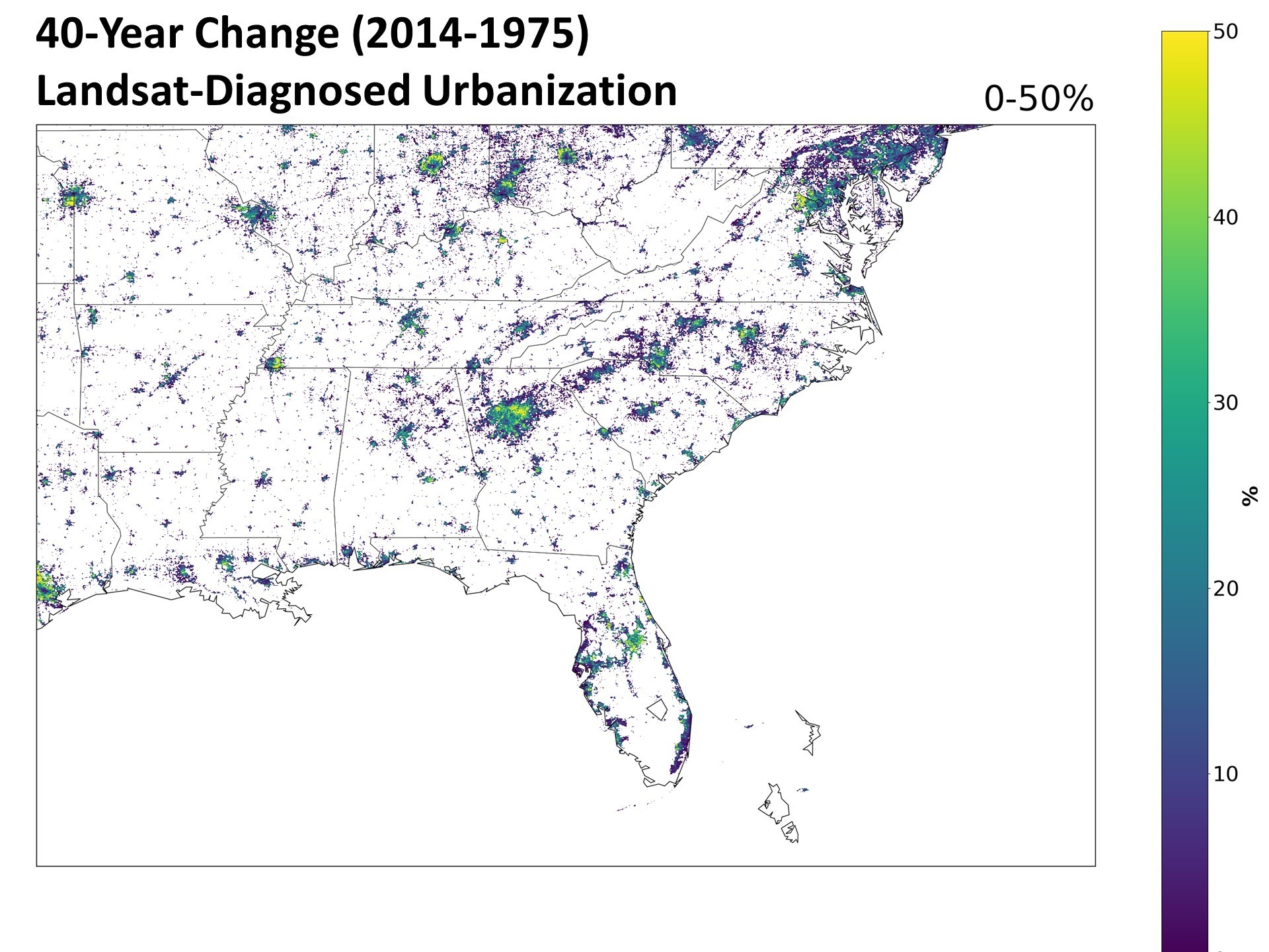
Next, I asked Danny Braswell to plot an image of the 40-year change in urbanization from this dataset over the southeast U.S. The result is shown in Fig. 1.

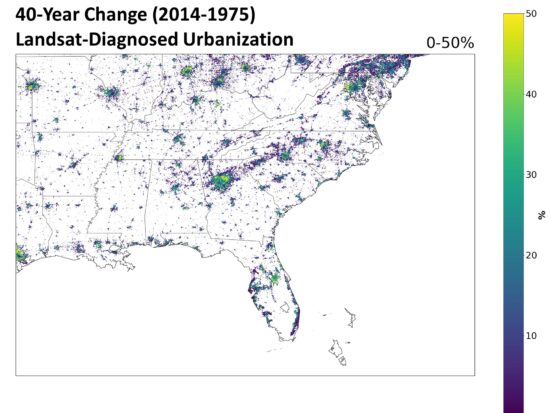
Fig. 1. The 40-year change in urbanization (2014 minus 1975) over the southeast U.S. from the Landsat-based “Built-Up” dataset.

Close examination shows that there has been an increase in manmade structures nearly everywhere that human settlements already existed. I was somewhat surprised to see that these increases are also widespread in Europe, so that we can expect some of the results I summarize below might well extend to other countries.

Quantifying the Urbanization Effect on Surface Air Temperature

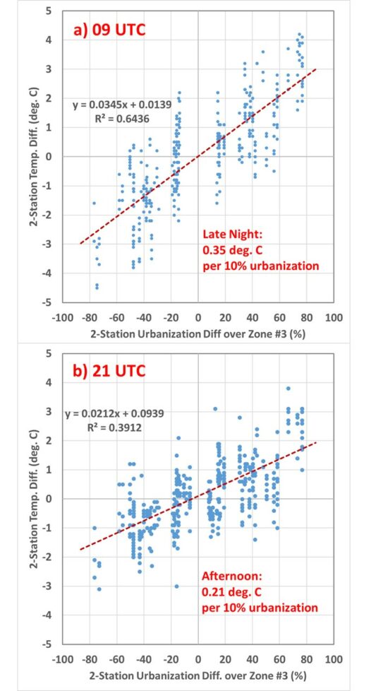
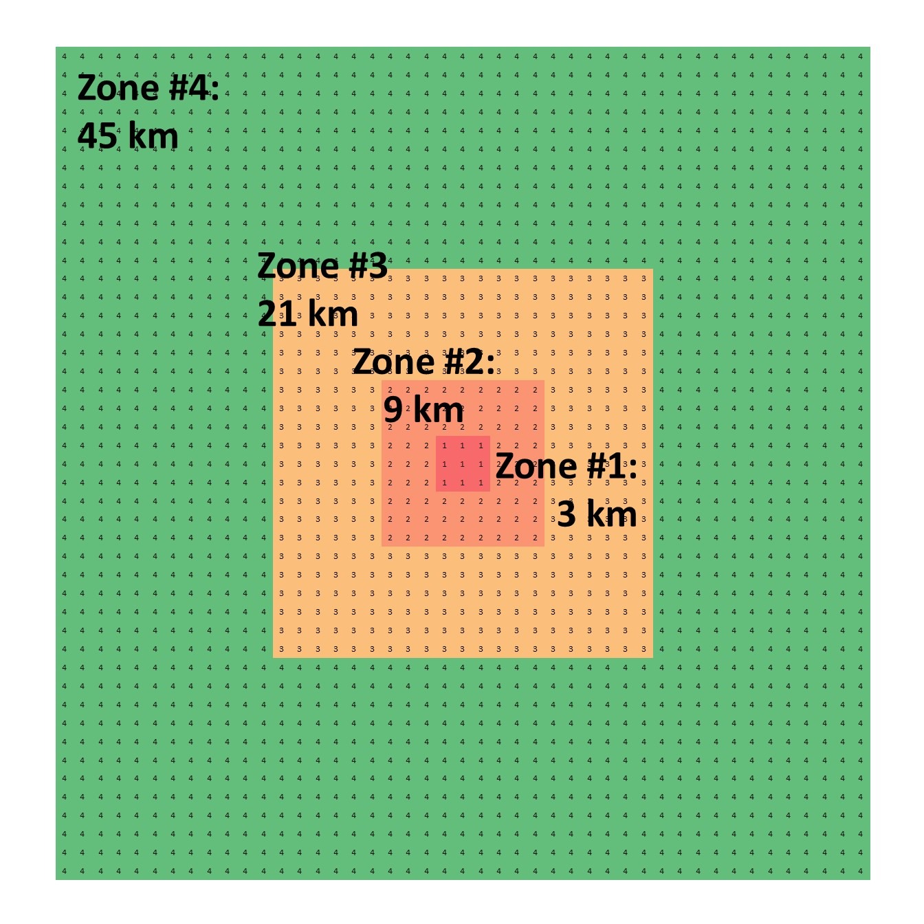
I took all hourly-reporting weather stations (ASOS and AWOS), mostly from airports, in the ISD dataset and for all stations having data at least as far back as 1973. I computed the temperature differences at 09 UTC (close to the daily minimum temperature time) between stations no more that 50 km apart, as well as differences in the Landsat Built-Up values (0 to 100). The Built Up datasets are from 4 separate years: 1975, 1990, 2000, and 2014. I used five years of temperature data centered on those four Landsat years for a total of 20 years of August average 09 UTC temperatures to compare to the corresponding four years of urbanization differences. After considerable experimentation, I settled on the four spatial averaging zones shown in Fig. 2 to compute those urbanization differences. This allows a determination of the magnitude of the UHI influence as a function of distance from the thermometer station location.

Fig. 2. Averaging zones for Landsat-based “Built-Up” data, nominally at 1 km resolution, for comparison to inter-station temperature differences.

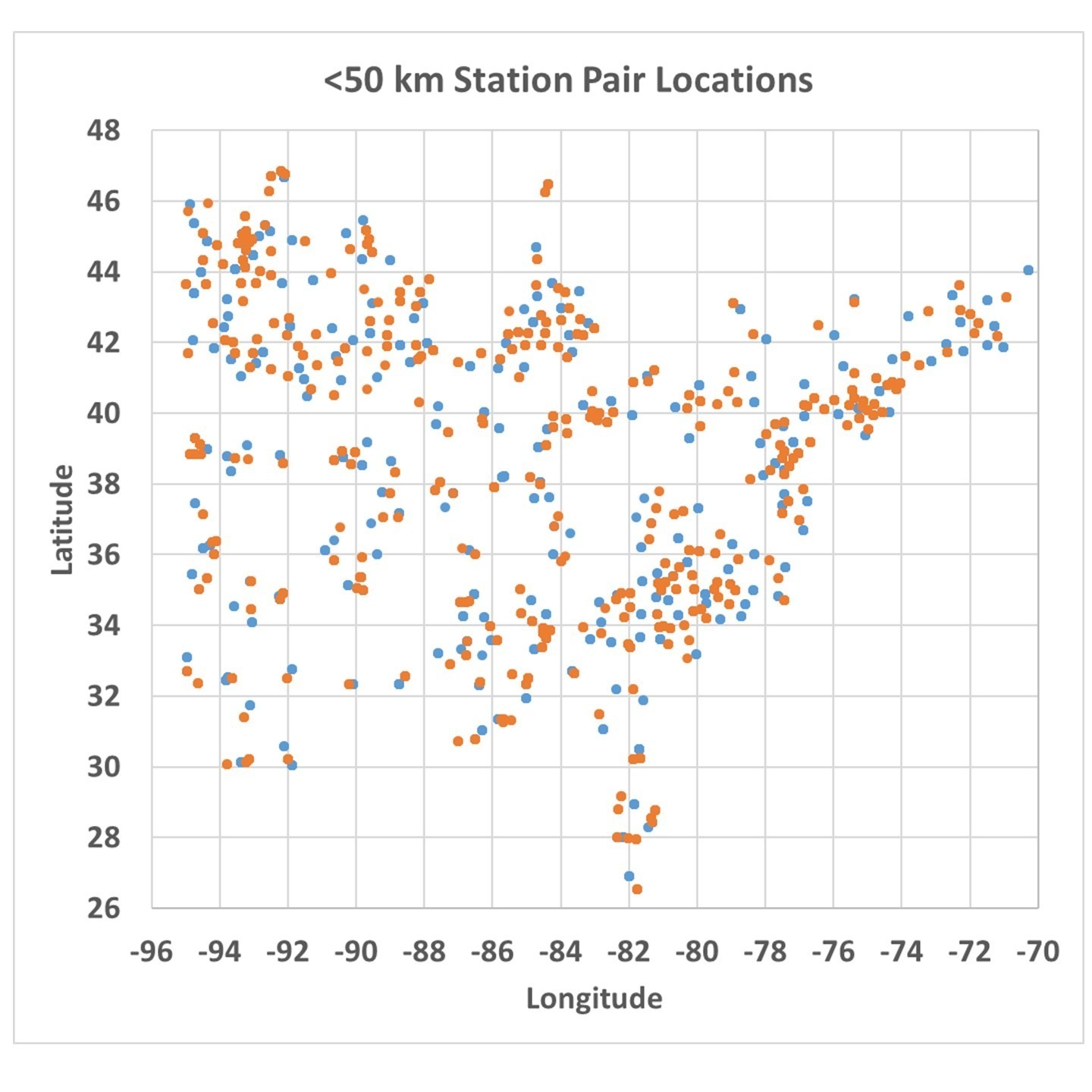
The station pairs used in the analysis are shown in Fig. 3 (sorry for the lack of state boundaries).

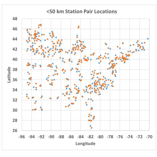
Fig. 3. Weather station pair locations used in the data analysis.

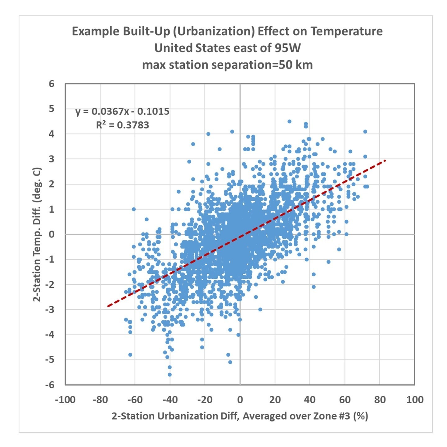
When the temperature differences are computed between those station pairs, they can be plotted against the Zone-average differences in urbanization as measured from Landsat. An example for Zone #3 is shown in Fig. 4, where we see the difference in closely spaced station temperatures is indeed related to the difference in Landsat-based urbanization, with some differences in temperature reaching 4 to 5 deg. C (up to 10 deg. F).

Fig. 4. Twenty years of inter-station temperature differences versus Landsat-based urbanization differences over the eastern United state. Temperature data were the monthly August averages at 09 UTC (close to the time of daily minimum temperature).

The actual algorithm to adjust temperatures uses not just the zone shown in Fig. 4, but all four zones of average Built-Up values in a multiple regression procedure. The resulting coefficients were:

Zone #1: +0.050 deg. C per 10% urbanization difference

Zone #2: +0.061 deg. C per 10% urbanization difference

Zone #3: +0.172 deg. C per 10% urbanization difference

Zone #4: +0.081 deg. C per 10% urbanization difference

The sum of these coefficients is 0.37 deg. C/per 10%, which is essentially the same as the regression coefficient in Fig. 3 for a single zone. The difference is that by using 4 averaging zones together, the correlation is improved somewhat (r=0.67 for the multiple regression), and we also get to see what regions of urbanization have the most influence on the temperatures. From the results above we see all of the averaging zones are important, with Zone 3 contributing the most to explaining the UHI effect on warming, and the 3×3 km zone closest to the thermometer has the last amount of information. Note that I have no information regarding the microclimate right next to the thermometer site (as Anthony uses), so if heat generating equipment was added in the vicinity of the thermometer over the 40 year period 1975-2014, that would not be quantified here and such spurious warming effects will remain in the temperature data even after I have de-urbanized the temperatures.

Application of the Method to Eastern U.S. Temperatures

The resulting regression-based algorithm basically allows one to compute the urban warming effect over time over the last 40-50 years. To the extent that the stations used in the analysis represent all of the eastern U.S., the regression relationship can be applied anywhere in that region, whether there are weather stations there or not.

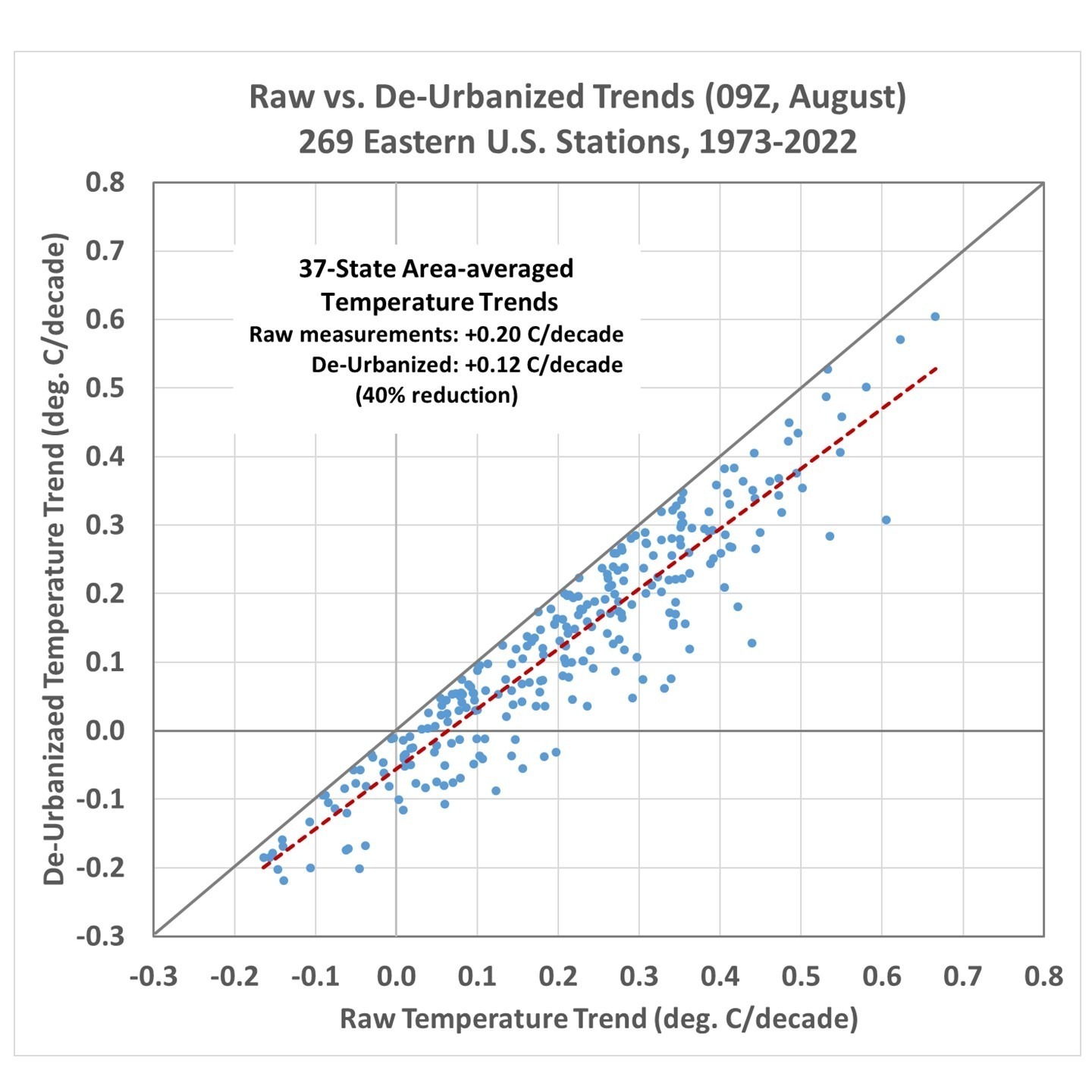
I applied the method to 269 stations having sufficient data to compute 50-year trends (1973-2022) for August 09 UTC temperatures, and Fig. 5 shows the raw temperature trends versus the de-urbanized temperature trends. When stations in each of the 37 states are averaged together, and the state averages are area-weighted, there is a 40% reduction in the average temperature trend for those 37 states.

Fig. 5. Raw versus de-urbanized temperature trends across 269 stations in the eastern U.S. for 09 UTC August temperatures (approximately, August daily minimum temperatures).

For the reasons stated above, this might well be an underestimate of the full urbanization effect on eastern U.S. temperature trends.

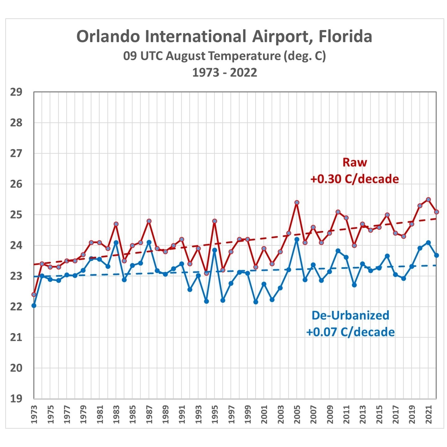
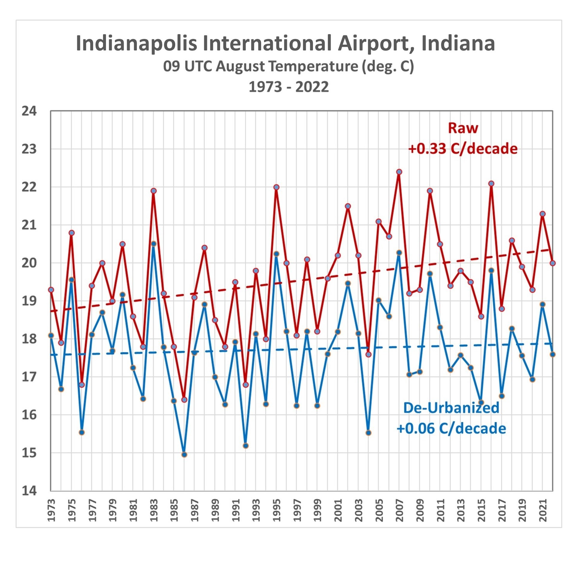
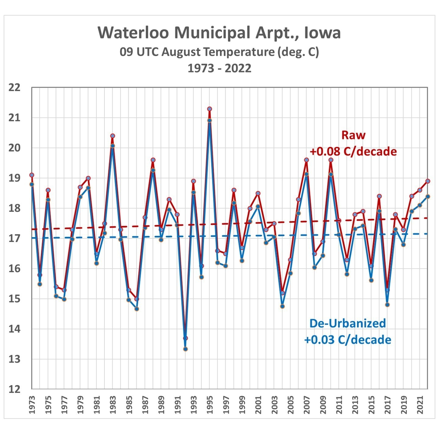
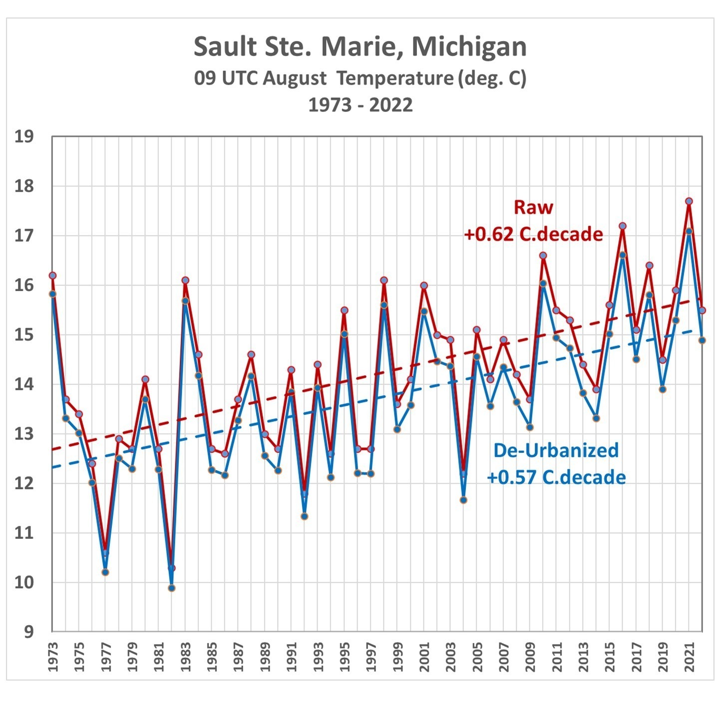
We can examine the temperature at some individual stations. For example, Figs. 6, 7, 8, and 9 show the raw versus de-urbanized temperatures at Orlando, Indianapolis, Waterloo (IA), and Sault Ste. Marie, (MI). Since I am only dealing with a single month (August) there are no seasonal effects to remove so we can plot actual temperatures rather than temperature anomalies.

Fig. 6. Average August 09 UTC temperatures, 1973-2022, from raw hourly measurements and after Landsat-based de-urbanization adjustment.

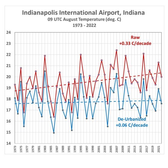
Fig. 7. Indianapolis average August 09 UTC temperatures, 1973-2022, from raw hourly measurements and after Landsat-based de-urbanization adjustment.

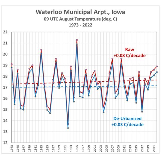
Fig. 8. Waterloo, IA average August 09 UTC temperatures, 1973-2022, from raw hourly measurements and after Landsat-based de-urbanization adjustment.

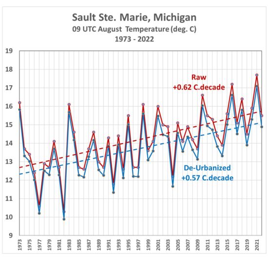
Fig. 9. Sault Ste. Marie, MI, average August 09 UTC temperatures, 1973-2022, from raw hourly measurements and after Landsat-based de-urbanization adjustment.

(As an aside, while I was in the University of Michigan’s Atmospheric and Oceanic Science program, I worked summers at the Sault weather office, and made some of the temperature measurements in Fig. 9 during 1977-1979.)

How Do These Trends Compare to Official NOAA Data?

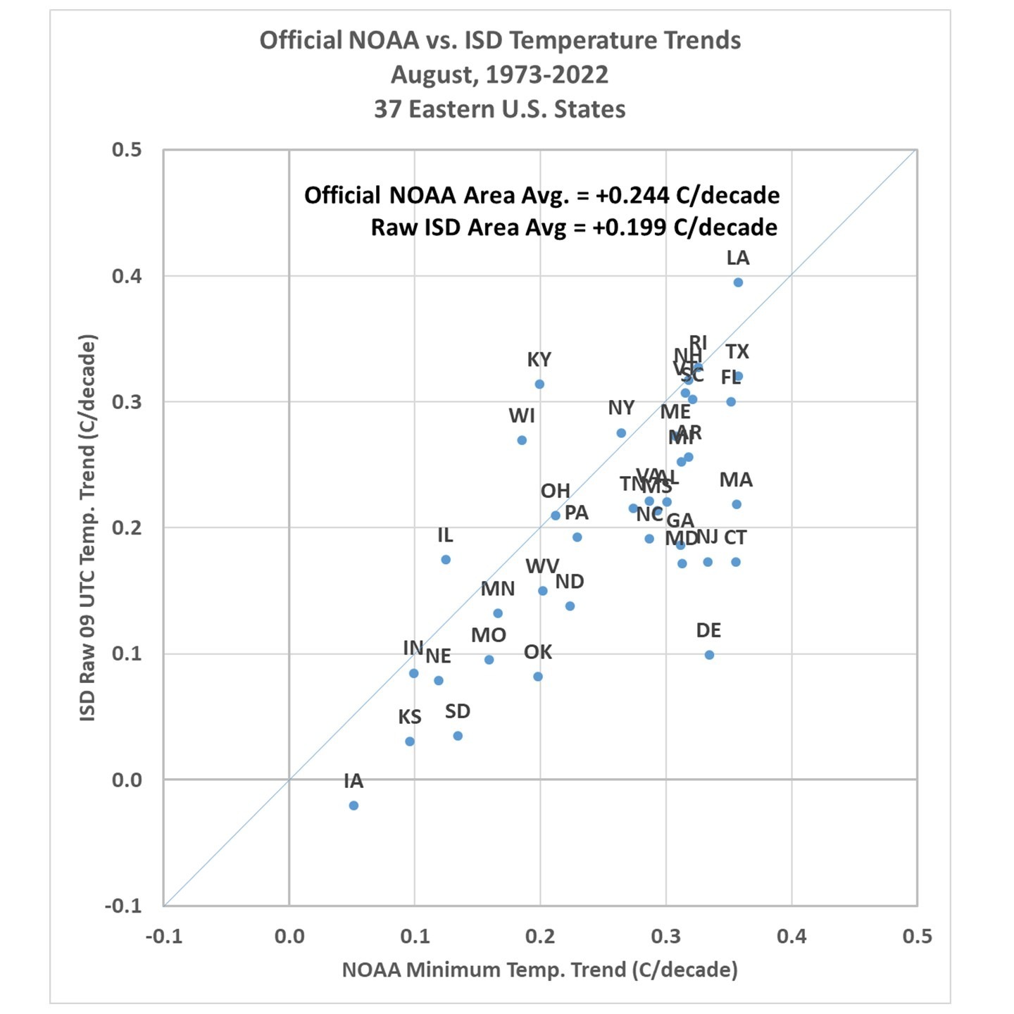
The statewide-average temperatures from NOAA’s Climate at a Glance website were compared to the corresponding statewide averages computed here. First let’s look at how the raw ISD trends compare to the NOAA-adjusted data (Fig. 10).

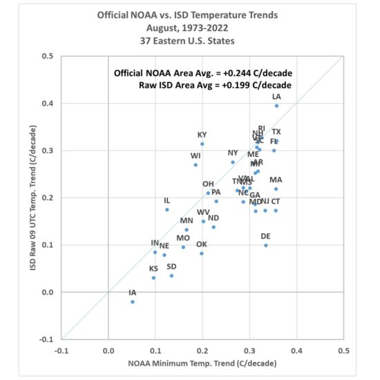
Fig. 10. Statewide-average August temperature trends, 1973-2022, from official NOAA-adjusted data versus the unadjusted hourly temperatures at 09 UTC.

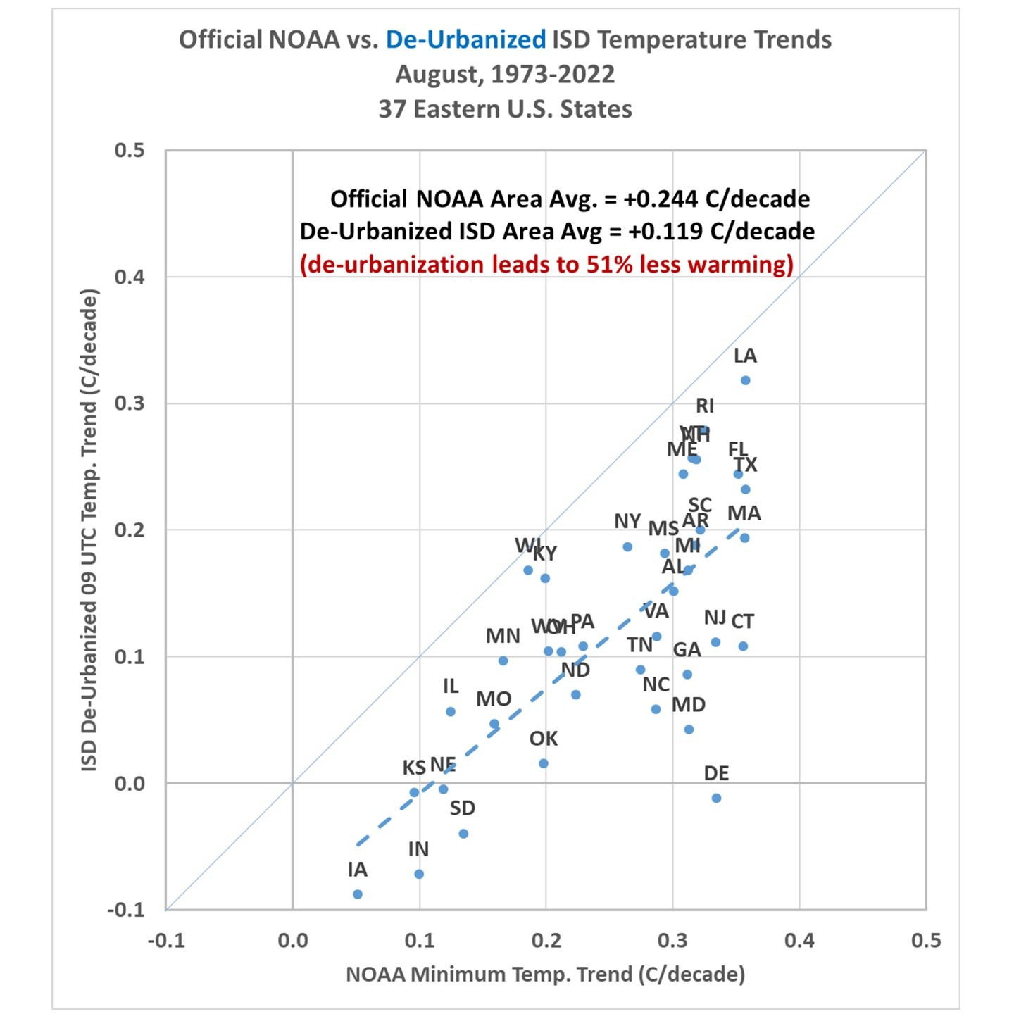
Note the official NOAA temperatures have an average trend higher than the raw ISD data trend (they are mostly independent data sources): +0.244 C/decade vs. +0.199 C/decade. Once the de-urbanization procedure is applied to the individual ISD stations, the results show an average trend fully 50% below that produced by the official NOAA product (Fig. 11).

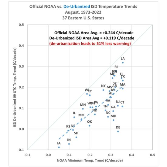
Fig. 11. As in Fig. 10, but after de-urbanization of the ISD 09 UTC temperatures and trends recomputed.

Summary and Conclusions

There is much more I could show, but from the analysis I’ve done so far I believe that the Landsat-based “Built-Up” (urbanization) dataset, which extends back to the 1970s, will be be useful for “de-urbanizing” land-based surface temperature datasets, in the U.S. as well as in other countries. The methodology outlined here is straightforward and the regression statistics are robust (the regression coefficients are all significant, at the 3-sigma level or better).

The urbanization effect on surface temperature trends for August at 09 UTC (near the time of daily minimum temperature) results in a 50% reduction in those trends over the last 50 years. From some preliminary looks I have had at the data from other months and times of day I’d say this will likely be the upper limit of de-urbanization adjustments. So, it is likely that trends in daytime temperature near the time of the daily maximum will not be reduced nearly as much as 50%.

But given the fact that all CMIP6 climate models produce U.S. summer temperature trends greater than the NOAA observations means the discrepancy between climate models and observations is even larger than currently suspected by many of us. John Christy and I believe it is time for a new surface temperature dataset, and the methodology outlined above looks like a viable approach to that end.

UAH Global Temperature Update for October, 2022: +0.32 deg. C

Wednesday, November 2nd, 2022

The Version 6.0 global average lower tropospheric temperature (LT) anomaly for October, 2022 was +0.32 deg. C, up from the September, 2022 value of +0.24 deg. C.


The linear warming trend since January, 1979 now stands at +0.13 C/decade (+0.12 C/decade over the global-averaged oceans, and +0.18 C/decade over global-averaged land).

Various regional LT departures from the 30-year (1991-2020) average for the last 22 months are:

YEAR MO GLOBE NHEM. SHEM. TROPIC USA48 ARCTIC AUST 
2021 01 0.12 0.34 -0.09 -0.08 0.36 0.50 -0.52
2021 02 0.20 0.32 0.08 -0.14 -0.65 0.07 -0.27
2021 03 -0.01 0.13 -0.14 -0.29 0.59 -0.78 -0.79
2021 04 -0.05 0.06 -0.15 -0.28 -0.01 0.02 0.29
2021 05 0.08 0.14 0.03 0.07 -0.41 -0.04 0.02
2021 06 -0.01 0.30 -0.32 -0.14 1.44 0.64 -0.76
2021 07 0.20 0.33 0.07 0.13 0.58 0.43 0.80
2021 08 0.17 0.27 0.08 0.07 0.33 0.83 -0.02
2021 09 0.25 0.19 0.33 0.09 0.67 0.02 0.37
2021 10 0.37 0.46 0.28 0.33 0.84 0.64 0.06
2021 11 0.09 0.11 0.06 0.14 0.50 -0.42 -0.29
2021 12 0.21 0.27 0.15 0.04 1.63 0.01 -0.06
2022 01 0.03 0.06 0.00 -0.23 -0.13 0.68 0.09
2022 02 -0.00 0.01 -0.02 -0.24 -0.04 -0.30 -0.50
2022 03 0.15 0.27 0.02 -0.07 0.22 0.74 0.02
2022 04 0.26 0.35 0.18 -0.04 -0.26 0.45 0.60
2022 05 0.17 0.25 0.10 0.01 0.59 0.23 0.19
2022 06 0.06 0.08 0.04 -0.36 0.46 0.33 0.11
2022 07 0.36 0.37 0.35 0.13 0.84 0.55 0.65
2022 08 0.28 0.31 0.24 -0.04 0.60 0.50 -0.01
2022 09 0.24 0.43 0.06 0.03 0.88 0.69 -0.29
2022 10 0.32 0.43 0.21 0.04 0.16 0.93 0.04

The full UAH Global Temperature Report, along with the LT global gridpoint anomaly image for October, 2022 should be available within the next several days here.

The global and regional monthly anomalies for the various atmospheric layers we monitor should be available in the next few days at the following locations:

Lower Troposphere: http://vortex.nsstc.uah.edu/data/msu/v6.0/tlt/uahncdc_lt_6.0.txt
Mid-Troposphere: http://vortex.nsstc.uah.edu/data/msu/v6.0/tmt/uahncdc_mt_6.0.txt
Tropopause: http://vortex.nsstc.uah.edu/data/msu/v6.0/ttp/uahncdc_tp_6.0.txt
Lower Stratosphere: http://vortex.nsstc.uah.edu/data/msu/v6.0/tls/uahncdc_ls_6.0.txt