The radiative resistance to global temperature change is what limits the temperature change in response to radiative forcing from (say) increasing CO2, or the sun suddenly deciding to pump out a 1 percent more sunlight.
If the climate system sheds only a little extra energy with warming, it warms even more until radiative energy balance is restored. If it sheds a lot of energy, then very little warming is required to restore global energy balance. This is the climate sensitivity holy grail, and it will determine just how much warming results from increasing CO2 in the atmosphere.
John Christy and I are preparing a paper based upon Dept. of Energy-sponsored research explaining why the tropical troposphere hasn’t warmed as much in nature as in climate models. (The discrepancy exists for surface temperature trends; for both RSS and UAH tropical tropospheric trends; as well as for global reanalysis datasets). Danny Braswell and I did a lot of research on this subject about 5-10 years ago, and published several papers.
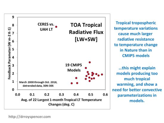
Without going into the gory details of why it is so difficult to measure “feedbacks” (how strong the climate system radiatively resists a temperature change in response to radiative forcing), I’m going to present one graph of new results from our work that suggests where the problem with the models might be.
The plot I will show is based upon month-to-month variations in area-averaged tropical (30N-30S) tropospheric temperatures. When those temperature changes are the largest, we expect to see the clearest signal of radiative resistance (negative “feedback”) which, by definition, is a response to that temperature change. In contrast, if the month-to-month temperature change was zero, any change in radiative flux would result in an infinite feedback parameter, which is clearly unphysical.
So, let’s focus on the biggest observed temperature changes. If we take the 10% of the 224 months of detrended CERES satellite radiative flux data (March 2000 through October 2018) which have the LARGEST month-to-month temperature changes (warming and cooling) in detrended UAH LT data, and compare them, we get the following plot of diagnosed feedback parameter (flux change divided by temperature change) versus average absolute temperature change. Also included in the plot are the results computed in the same manner from 19 different CMIP5 climate models, where I have used the model surface to 500 mb geopotential thickness converted to temperature to approximate the UAH LT product.
There is a clear discrepancy between the 19 different climate models and the observations. The observations suggest a much larger resistance to a temperature change (vertical axis) than the models do, by over a factor of 4, for the same temperature change. This large feedback parameter is probably why the observations also show the smallest month-to-month temperature changes (horizontal axis) compared to the models (about 50% weaker than the models): the radiative resistance to temperature change actually reduces the month-to-month temperature fluctuations.
What Does this Mean?
The results are qualitatively consistent with Lindzen’s “infrared iris” effect, as we find the discrepancy between models and observations is larger in the infrared (LW) component of radiative flux than in the reflected solar (SW) component (SW and LW plots not shown here).
Interestingly, I had to exclude the GISS model results because they show increasing temperatures lead to a feedback parameter with the wrong sign, which is not physically possible for a stable climate system. It could be the GISS model has issues with energy conservation.
Just how these results would impact global warming projections remains to be seen. First, improvements in how tropical convection and its associated clouds and vertical distributions of water vapor *change with temperature* would have to be put into the models. Then, the models would have to be run with increasing CO2 to see whether model projections of warming are reduced.
My prediction is that, if this was done, the models would produce considerably less tropical warming than they currently do. This might also extend to reduced warming rates outside of the tropics, since the tropics export excess heat energy to higher latitudes. If less heat builds up in the tropics, less will be exported out of the tropics.
We have many more results on this issue, including comparisons to a simple time-dependent forcing-feedback model that can replicate both the observations and the CMIP5 model behavior.
This has nothing to do with climate or climate change, but as a photographer it interests me.
Some version of the following image has been making the rounds on social media for many years. The accompanying claim goes something like this:
“These two blocks are exactly the same shade of grey. Hold your finger over the seam and check.”
I can demonstrate that this is not the case.
The two blocks actually are very different in their shades of gray, given the source of illumination as implied by (1) the area between them and (2) the shadow below them on the ground.
If you cover up that seam (and the shadow as well), they only appear to be the same shade of gray because your brain then assumes (without any other visual cues) that they are both illuminated equally. But given the knowledge of the direction of the illumination, your brain is telling you that they really are different shades of gray.
If you still don’t believe me, you could demonstrate this with two different pieces of paper having very different shades of gray and take them out in the sun, orienting them like the two objects above. You would need to find two shades of gray (say, two paint swatch cards) where their apparent brightness (as measured by, say, taking a photo and analyzing the digital counts in Photoshop) would be approximately the same. In that case, would you say, “These two cards have the same shade of gray because I measured them in Photoshop?”
Of course not.
Now, the question arises, why do the center of the surfaces still appear to be different brightness, even though they are the same? As a photographer, I’ve noticed that when you take a photo of a very contrasty scene, your eye can see details in the shadows that the recorded camera image cannot. Similarly, very bright areas might show details to the eye, but be totally washed out in the camera image.
I don’t believe this is just the differences in dynamic range of the eye versus a camera, because the iris opening of the eye is the same for the entire scene, and the inherent integration time of the eye-brain system is presumably the same across your rods and cones. I think it’s because our brain does a sort of localized contrast enhancement within our field of view, making shadowed things seem brighter and very bright things seem dimmer. (You can make similar adjustments using “curves” in Photoshop).
It’s sort of the visual equivalent of audio compression. The brain alters perceived brightness locally to enhance contrasts. I believe this is why we photographers often use adjustments in software to get the image to look more like what our eye and brain perceived.
I just discovered that my explanation involving localized contrast enhancement seems to be supported by a 1999 article in The Journal of Neuroscience entitled, An Empirical Explanation of the Cornsweet Effect.
I like using simple analogies to demonstrate basic concepts
Pots of Water on the Stove
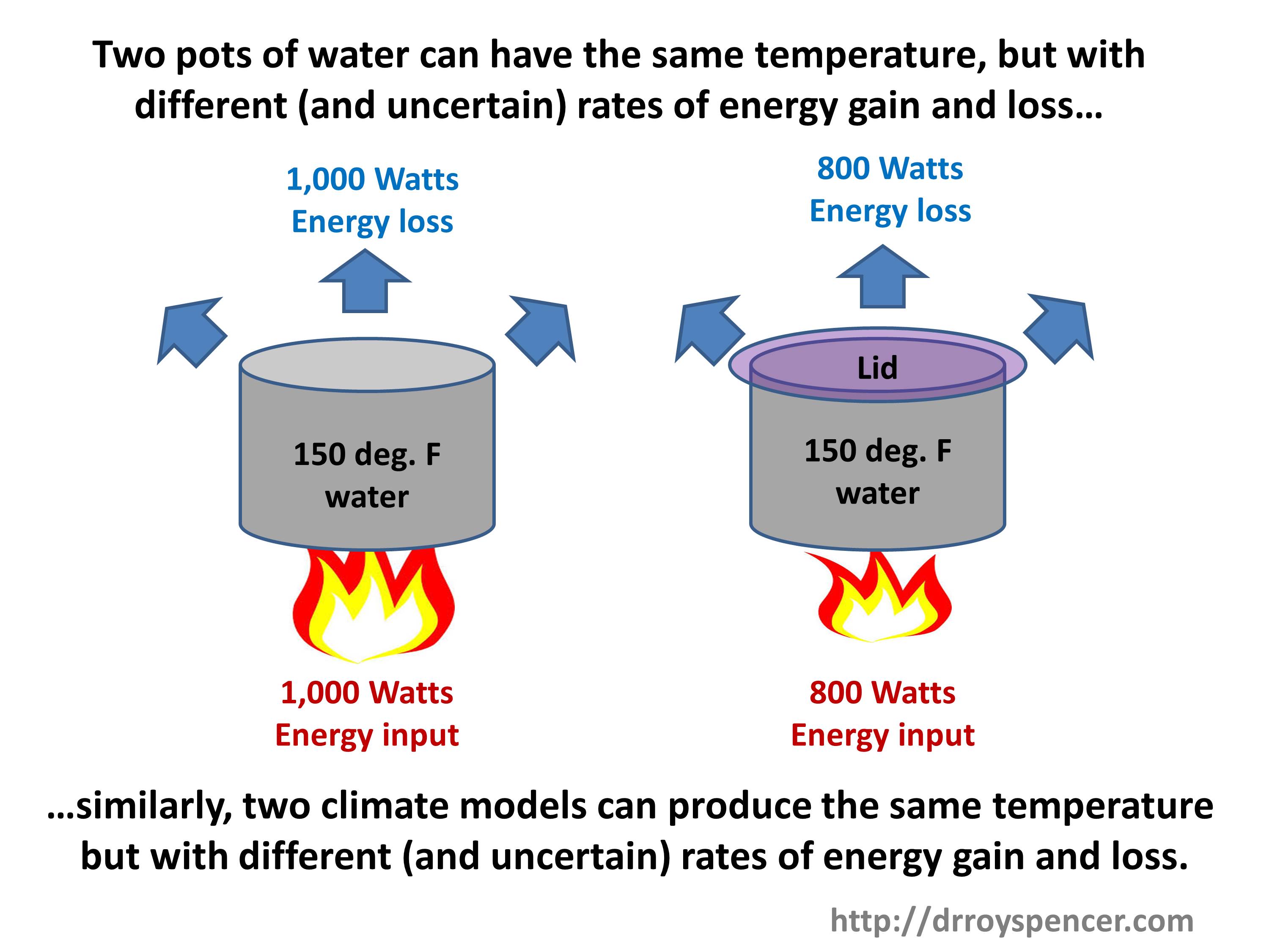
A pot of water warming on a gas stove is useful for demonstrating basic concepts of energy gain and energy loss, which together determine temperature of the water in the pot.
If we view the pot of water as a simple analogy to the climate system, with a stove flame (solar input) heating the pots, we can see that two identical pots can have the same temperature, but with different rate of energy gain and loss, if (for example) we place a lid on one of the pots.
A lid reduces the warming water’s ability to cool, so the water temperature goes up (for the same rate of energy input) compared to if no lid was present. As a result, a lower flame is necessary to maintain the same water temperature as the pot without a lid. The lid is analogous to Earth’s greenhouse effect, which reduces the ability of the Earth’s surface to cool to outer space.
The two pots in the above cartoon are analogous to two climate models having different energy fluxes with known (and unknown) errors in them. The models can be adjusted so the various energy fluxes balance in the long term (over centuries) but still maintain a constant global average surface air temperature somewhere close to that observed. (The model behavior is also compared to many observed ocean and atmospheric variables. Surface air temperature is only one.)
Next, imagine that we had twenty pots with various amounts of coverage of the pots by the lids: from no coverage to complete coverage. This would be analogous to 20 climate models having various amounts of greenhouse effect (which depends mostly on high clouds [Frank’s longwave cloud forcing in his paper] and water vapor distributions). We can adjust the flame intensity until all pots read 150 deg. F. This is analogous to adjusting (say) low cloud amounts in the climate models, since low clouds have a strong cooling effect on the climate system by limiting solar heating of the surface.
Numerically Modeling the Pot of Water on the Stove
Now, let’s say we we build a time-dependent computer model of the stove-pot-lid system. It has equations for the energy input from the flame, and loss of energy from conduction, convection, radiation, and evaporation.
Clearly, we cannot model each component of the energy fluxes exactly, because (1) we can’t even measure them exactly, and (2) even if we could measure them exactly, we cannot exactly model the relevant physical processes. Modeling of real-world systems always involves approximations. We don’t know exactly how much energy is being transferred from the flame to the pot. We don’t know exactly how fast the pot is losing energy to its surroundings from conduction, radiation, and evaporation of water.
But we do know that if we can get a constant water temperature, that those rates of energy gain and energy loss are equal, even though we don’t know their values.
Thus, we can either make ad-hoc bias adjustments to the various energy fluxes to get as close to the desired water temperature as we want (this is what climate models used to do many years ago); or, we can make more physically-based adjustments because every computation of physical processes that affect energy transfer has uncertainties, say, a coefficient of turbulent heat loss to the air from the pot. This is what model climate models do today for adjustments.
If we then take the resulting “pot model” (ha-ha) that produces a water temperature of 150 deg. F as it is integrated over time, with all of its uncertain physical approximations or ad-hoc energy flux corrections, and run it with a little more coverage of the pot by the lid, we know the modeled water temperature will increase. That part of the physics is still in the model.
Example Pot Model (Getty images).
This is why climate models can have uncertain energy fluxes, with substantial known (or even unknown) errors in their energy flux components, and still be run with increasing CO2 to produce warming, even though that CO2 effect might be small compared to the errors. The errors have been adjusted so they sum to zero in the long-term average.
This directly contradicts the succinctly-stated main conclusion of Frank’s paper:
“LWCF [longwave cloud forcing] calibration error is +/- 144 x larger than the annual average increase in GHG forcing. This fact alone makes any possible global effect of anthropogenic CO2 emissions invisible to present climate models.”
I’m not saying this is ideal, or even a defense of climate model projections. Climate models should ideally produce results entirely based upon physical first principles. For the same forcing scenario (e.g. a doubling of atmospheric CO2) twenty different models should all produce about the same amount of future surface warming. They don’t.
Instead, after 30 years and billions of dollars of research they still produce from 1.5 to 4.5 deg. C of warming in response to doubling of atmospheric CO2.
The Big Question
The big question is, “How much will the climate system warm in response to increasing CO2?” The answer depends not so much upon uncertainties in the component energy fluxes in the climate system, as Frank claims, but upon how those energy fluxes change as the temperature changes.
And that’s what determines “climate sensitivity”.
This is why people like myself and Lindzen emphasize so-called “feedbacks” (which determine climate sensitivity) as the main source of uncertainty in global warming projections.
NOTE:This post has undergone a few revisions as I try to be more precise in my wording. The latest revision was at 0900 CDT Sept. 12, 2019.
If this post is re-posted elsewhere, I ask that the above time stamp be included.
Yesterday I posted an extended and critical analysis of Dr. Pat Frank’s recent publication entitled Propagation of Error and the Reliability of Global Air Temperature Projections. Dr. Frank graciously provided rebuttals to my points, none of which have changed my mind on the matter. I have made it clear that I don’t trust climate models’ long-term forecasts, but that is for different reasons than Pat provides in his paper.
What follows is the crux of my main problem with the paper, which I have distilled to its essence, below. I have avoided my previous mistake of paraphrasing Pat, and instead I will quote his conclusions verbatim.
In his Conclusions section, Pat states “As noted above, a GCM simulation can be in perfect external energy balance at the TOA while still expressing an incorrect internal climate energy-state.”
This I agree with, and I believe climate modelers have admitted to this as well.
But, he then further states, “LWCF [longwave cloud forcing] calibration error is +/- 144 x larger than the annual average increase in GHG forcing. This fact alone makes any possible global effect of anthropogenic CO2 emissions invisible to present climate models.”
While I agree with the first sentence, I thoroughly disagree with the second. Together, they represent a non sequitur. All of the models show the effect of anthropogenic CO2 emissions, despite known errors in components of their energy fluxes (such as clouds)!
Why?
If a model has been forced to be in global energy balance, then energy flux component biases have been cancelled out, as evidenced by the control runs of the various climate models in their LW (longwave infrared) behavior:
Figure 1. Yearly- and global-average longwave infrared energy flux variations at top-of-atmosphere from 10 CMIP5 climate models in the first 100 years of their pre-industrial “control runs”. Data available from https://climexp.knmi.nl/
Importantly, this forced-balancing of the global energy budget is not done at every model time step, or every year, or every 10 years. If that was the case, I would agree with Dr. Frank that the models are useless, and for the reason he gives. Instead, it is done once, for the average behavior of the model over multi-century pre-industrial control runs, like those in Fig. 1.
The ~20 different models from around the world cover a WIDE variety of errors in the component energy fluxes, as Dr. Frank shows in his paper, yet they all basically behave the same in their temperature projections for the same (1) climate sensitivity and (2) rate of ocean heat uptake in response to anthropogenic greenhouse gas emissions.
Thus, the models themselves demonstrate that their global warming forecasts do not depend upon those bias errors in the components of the energy fluxes (such as global cloud cover) as claimed by Dr. Frank (above).
That’s partly why different modeling groups around the world build their own climate models: so they can test the impact of different assumptions on the models’ temperature forecasts.
Statistical modelling assumptions and error analysis do not change this fact. A climate model (like a weather forecast model) has time-dependent differential equations covering dynamics, thermodynamics, radiation, and energy conversion processes. There are physical constraints in these models that lead to internally compensating behaviors. There is no way to represent this behavior with a simple statistical analysis.
Again, I am not defending current climate models’ projections of future temperatures. I’m saying that errors in those projections are not due to what Dr. Frank has presented. They are primarily due to the processes controlling climate sensitivity (and the rate of ocean heat uptake). And climate sensitivity, in turn, is a function of (for example) how clouds change with warming, and apparently not a function of errors in a particular model’s average cloud amount, as Dr. Frank claims.
The similar behavior of the wide variety of different models with differing errors is proof of that. They all respond to increasing greenhouse gases, contrary to the claims of the paper.
The above represents the crux of my main objection to Dr. Frank’s paper. I have quoted his conclusions, and explained why I disagree. If he wishes to dispute my reasoning, I would request that he, in turn, quote what I have said above and why he disagrees with me.
UPDATE: (1300CDT, Sept. 11, 2019). I’ve added a plot of ten CMIP5 models’ global top-of-atmosphere longwave IR variations in the first 100 years of their control runs.
UPDATE #2: 0800 CDT Sept. 12, 2019) After comments from Dr. Frank and a number of commenters here and at WUWT, I have posted Additional Comments on the Frank (2019) Propagation of Error Paper, where I have corrected my mistake of paraphrasing Dr. Frank’s conclusions, when I should have been quoting them verbatim.
I’ve been asked for my opinion by several people about this new published paper by Stanford researcher Dr. Patrick Frank.
I’ve spent a couple of days reading the paper, and programming his Eq. 1 (a simple “emulation model” of climate model output ), and included his error propagation term (Eq. 6) to make sure I understand his calculations.
Frank has provided the numerous peer reviewers’ comments online, which I have purposely not read in order to provide an independent review. But I mostly agree with his criticism of the peer review process in his recent WUWT post where he describes the paper in simple terms. In my experience, “climate consensus” reviewers sometimes give the most inane and irrelevant objections to a paper if they see that the paper’s conclusion in any way might diminish the Climate Crisis™.
Some reviewers don’t even read the paper, they just look at the conclusions, see who the authors are, and make a decision based upon their preconceptions.
Readers here know I am critical of climate models in the sense they are being used to produce biased results for energy policy and financial reasons, and their fundamental uncertainties have been swept under the rug. What follows is not meant to defend current climate model projections of future global warming; it is meant to show that — as far as I can tell — Dr. Frank’s methodology cannot be used to demonstrate what he thinks he has demonstrated about the errors inherent in climate model projection of future global temperatures.
A Very Brief Summary of What Causes a Global-Average Temperature Change
Before we go any further, you must understand one of the most basic concepts underpinning temperature calculations: With few exceptions, the temperature change in anything, including the climate system, is due to an imbalance between energy gain and energy loss by the system. This is basic 1st Law of Thermodynamics stuff.
So, if energy loss is less than energy gain, warming will occur. In the case of the climate system, the warming in turn results in an increase loss of infrared radiation to outer space. The warming stops once the temperature has risen to the point that the increased loss of infrared (IR) radiation to to outer space (quantified through the Stefan-Boltzmann [S-B] equation) once again achieves global energy balance with absorbed solar energy.
While the specific mechanisms might differ, these energy gain and loss concepts apply similarly to the temperature of a pot of water warming on a stove. Under a constant low flame, the water temperature stabilizes once the rate of energy loss from the water and pot equals the rate of energy gain from the stove.
The climate stabilizing effect from the S-B equation (the so-called “Planck effect”) applies to Earth’s climate system, Mars, Venus, and computerized climate models’ simulations. Just for reference, the average flows of energy into and out of the Earth’s climate system are estimated to be around 235-245 W/m2, but we don’t really know for sure.
What Frank’s Paper Claims
Frank’s paper takes an example known bias in a typical climate model’s longwave (infrared) cloud forcing (LWCF) and assumes that the typical model’s error (+/-4 W/m2) in LWCF can be applied in his emulation model equation, propagating the error forward in time during his emulation model’s integration. The result is a huge (as much as 20 deg. C or more) of resulting spurious model warming (or cooling) in future global average surface air temperature (GASAT).
He claims (I am paraphrasing) that this is evidence that the models are essentially worthless for projecting future temperatures, as long as such large model errors exist. This sounds reasonable to many people. But, as I will explain below, the methodology of using known climate model errors in this fashion is not valid.
First, though, a few comments. On the positive side, the paper is well-written, with extensive examples, and is well-referenced. I wish all “skeptics” papers submitted for publication were as professionally prepared.
He has provided more than enough evidence that the output of the average climate model for GASAT at any given time can be approximated as just an empirical constant times a measure of the accumulated radiative forcing at that time (his Eq. 1). He calls this his “emulation model”, and his result is unsurprising, and even expected. Since global warming in response to increasing CO2 is the result of an imposed energy imbalance (radiative forcing), it makes sense you could approximate the amount of warming a climate model produces as just being proportional to the total radiative forcing over time.
Frank then goes through many published examples of the known bias errors climate models have, particularly for clouds, when compared to satellite measurements. The modelers are well aware of these biases, which can be positive or negative depending upon the model. The errors show that (for example) we do not understand clouds and all of the processes controlling their formation and dissipation from basic first physical principles, otherwise all models would get very nearly the same cloud amounts.
But there are two fundamental problems with Dr. Frank’s methodology.
Climate Models Do NOT Have Substantial Errors in their TOA Net Energy Flux
If any climate model has as large as a 4 W/m2 bias in top-of-atmosphere (TOA) energy flux, it would cause substantial spurious warming or cooling. None of them do.
Why?
Because each of these models are already energy-balanced before they are run with increasing greenhouse gases (GHGs), so they have no inherent bias error to propogate.
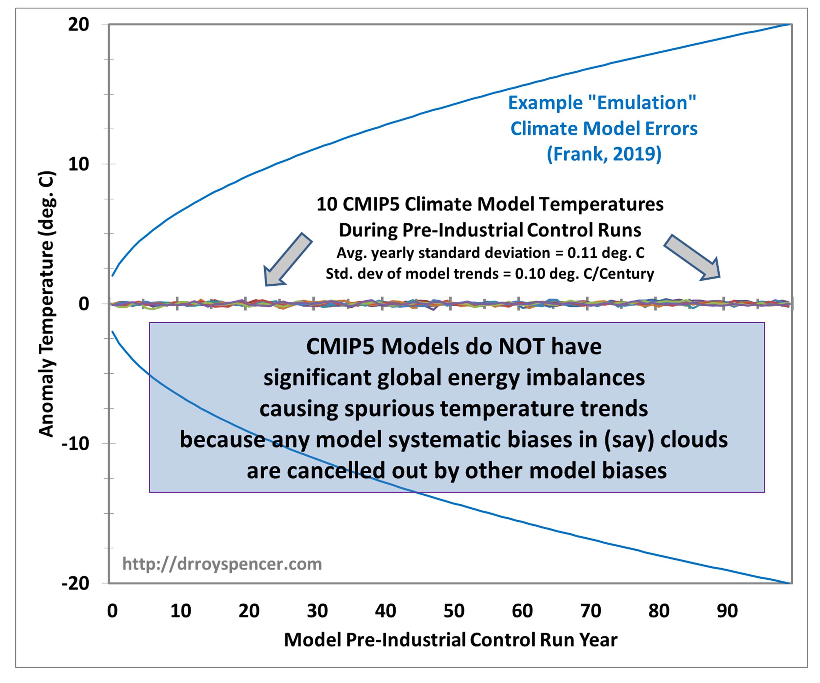
For example, the following figure shows 100 year runs of 10 CMIP5 climate models in their pre-industrial control runs. These control runs are made by modelers to make sure that there are no long-term biases in the TOA energy balance that would cause spurious warming or cooling.
Figure 1. Output of Dr. Frank’s emulation model of global average surface air temperature change (his Eq. 1) with a +/- 2 W/m2 global radiative imbalance propagated forward in time (using his Eq. 6) (blue lines), versus the yearly temperature variations in the first 100 years of integration of the first 10 models archived at https://climexp.knmi.nl/selectfield_cmip5.cgi?id=someone@somewhere .
If what Dr. Frank is claiming was true, the 10 climate models runs in Fig. 1 would show large temperature departures as in the emulation model, with large spurious warming or cooling. But they don’t. You can barely see the yearly temperature deviations, which average about +/-0.11 deg. C across the ten models.
Why don’t the climate models show such behavior?
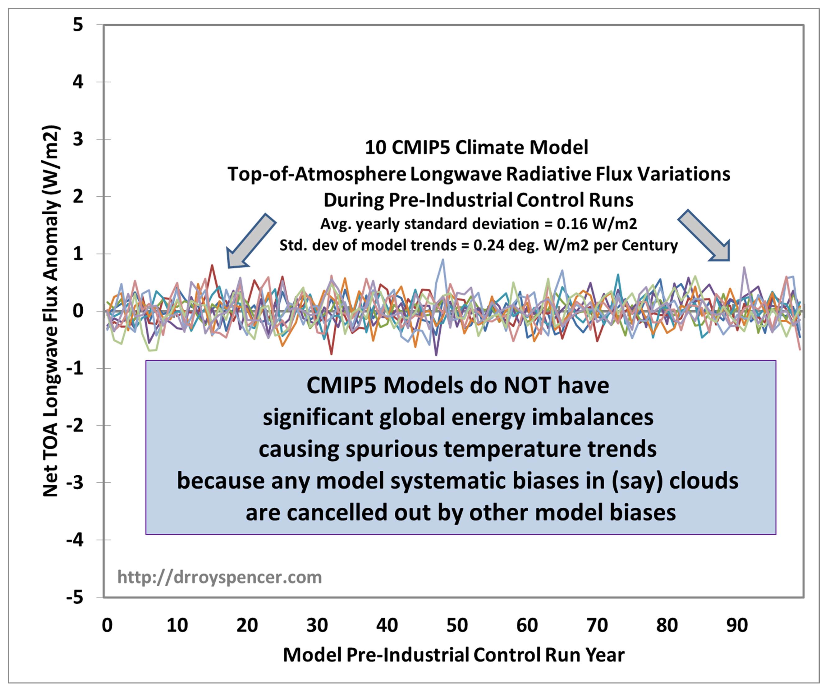
The reason is that the +/-4 W/m2 bias error in LWCF assumed by Dr. Frank is almost exactly cancelled by other biases in the climate models that make up the top-of-atmosphere global radiative balance. To demonstrate this, here are the corresponding TOA net longwave IR fluxes for the same 10 models shown in Fig. 1. Clearly, there is nothing like 4 W/m2 imbalances occurring.
Figure 2. Same as in Fig. 1, but for TOA longwave (IR) fluxes.
The average yearly standard deviation of the LW flux variations is only 0.16 W/m2, and these vary randomly.
And it doesn’t matter how correlated or uncorrelated those various errors are with each other: they still sum to nearly zero in the long term, which is why the climate model trends in Fig 1 are only +/- 0.10 C/Century… not +/- 20 deg. C/Century. That’s a factor of 200 difference.
This (first) problem with the paper’s methodology is, by itself, enough to conclude the paper’s methodology and resulting conclusions are not valid.
The Error Propagation Model is Not Appropriate for Climate Models
The new (and generally unfamiliar) part of his emulation model is the inclusion of an “error propagation” term (his Eq. 6). After introducing Eq. 6 he states,
“Equation 6 shows that projection uncertainty must increase in every simulation (time) step, as is expected from the impact of a systematic error in the deployed theory“.
While this error propagation model might apply to some issues, there is no way that it applies to a climate model integration over time. If a model actually had a +4 W/m2 imbalance in the TOA energy fluxes, that bias would remain relatively constant over time. It doesn’t somehow accumulate (as the blue curves indicate in Fig. 1) as the square root of the summed squares of the error over time (his Eq. 6).
Another curious aspect of Eq. 6 is that it will produce wildly different results depending upon the length of the assumed time step. Dr. Frank has chosen 1 year as the time step (with a +/-4 W/m2 assumed energy flux error), which will cause a certain amount of error accumulation over 100 years. But if he had chosen a 1 month time step, there would be 12x as many error accumulations and a much larger deduced model error in projected temperature. This should not happen, as the final error should be largely independent of the model time step chosen. Furthermore, the assumed error with a 1 month time step would be even larger than +/-4 W/m2, which would have magnified the final error after a 100 year integrations even more. This makes no physical sense.
I’m sure Dr. Frank is much more expert in the error propagation model than I am. But I am quite sure that Eq. 6 does not represent how a specific bias in a climate model’s energy flux component would change over time. It is one thing to invoke an equation that might well be accurate and appropriate for certain purposes, but that equation is the result of a variety of assumptions, and I am quite sure one or more of those assumptions are not valid in the case of climate model integrations. I hope that a statistician such as Dr. Ross McKitrick will examine this paper, too.
Concluding Comments
There are other, minor, issues I have with the paper. Here I have outlined the two most glaring ones.
Again, I am not defending the current CMIP5 climate model projections of future global temperatures. I believe they produce about twice as much global warming of the atmosphere-ocean system as they should. Furthermore, I don’t believe that they can yet simulate known low-frequency oscillations in the climate system (natural climate change).
But in the context of global warming theory, I believe the largest model errors are the result of a lack of knowledge of the temperature dependent changes in clouds and precipitation efficiency (thus free-tropospheric vapor, thus water vapor “feedback”) that actually occur in response to a long-term forcing of the system from increasing carbon dioxide. I do not believe it is because the fundamental climate modeling framework is not applicable to the climate change issue. The existence of multiple modeling centers from around the world, and then performing multiple experiments with each climate model while making different assumptions, is still the best strategy to get a handle on how much future climate change there *could* be.
My main complaint is that modelers are either deceptive about, or unaware of, the uncertainties in the myriad assumptions — both explicit and implicit — that have gone into those models.
There are many ways that climate models can be faulted. I don’t believe that the current paper represents one of them.
It’s been ten years since I addressed this issue in a specific blog post, so I thought it would be useful to revisit it. I mention it from time to time, but it is so important, it bears repeating and remembering.
Over and over again.
I continue to strive to simply these concepts, so here goes another try. What follows is as concise as I can make it.
The temperature change in anything, including the climate system, is the result of an imbalance between the rates of energy gain and energy loss. This comes from the First Law of Thermodynamics. Basic stuff.
Global warming is assumed to be due to the small (~1%) imbalance between absorbed sunlight and infrared energy lost to outer space averaged over the Earth caused by increasing atmospheric CO2 from fossil fuel burning.
But we don’t know whether the climate system, without human influence, is in a natural state of energy balance anyway. We do not know the quantitative average amounts of absorbed sunlight and emitted infrared energy across the Earth, either observationally or from first physical principles, to the accuracy necessary to blame most recent warming on humans rather than nature. Current best estimates, based upon a variety of datasets, is around 239-240 Watts per sq. meter for these energy flows. But we really don’t know.
When computer climate models are first constructed, these global-average energy flows in and out of the climate system do not balance. So, modelers adjust any number of uncertain processes in the models (for example, cloud parameterizations) until they do balance. They run the model for, say, 100 years and make sure there is little or no long-term temperature trend to verify balance exists.
Then, they add the infrared radiative effect of increasing CO2, which does cause an energy imbalance. Warming occurs. They then say something like, “See? The model proves that CO2 is responsible for warming we’ve seen since the 1950s.”
But they have only demonstrated what they assumed from the outset. It is circular reasoning. A tautology. Evidence that nature also causes global energy imbalances is abundant: e.g., the strong warming before the 1940s; the Little Ice Age; the Medieval Warm Period. This is why many climate scientists try to purge these events from the historical record, to make it look like only humans can cause climate change.
I’m not saying that increasing CO2 doesn’t cause warming. I’m saying we have no idea how much warming it causes because we have no idea what natural energy imbalances exist in the climate system over, say, the last 50 years. Those are simply assumed to not exist.
(And, no, there is no fingerprint of human-caused warming. All global warming, whether natural or human-caused, looks about the same. If a natural decrease in marine cloudiness was responsible, or a decrease in ocean overturning [either possible in a chaotic system], warming would still be larger over land than ocean, greater in the upper ocean than deep ocean, and greatest at high northern latitudes and least at high southern latitudes).
Thus, global warming projections have a large element of faith programmed into them.
Summary:Twenty-two major hurricanes have struck the east coast of Florida (including the Keys) since 1871. It is shown that the observed increase in intensity of these storms at landfall due to SST warming over the years has been a statistically insignificant 0.43 knots per decade (0.5 mph per decade). Thus, there has been no observed increase in landfalling east coast Florida major hurricane strength with warming.
In the news reporting of major Hurricane Dorian which devastated the NW Bahamas, it is commonly assumed that hurricanes in this region have become stronger due to warming sea surface temperatures (SSTs), which in turn are assumed to be caused by human-caused greenhouse gas emissions.
Here I will use observational data since the 1870s to address the question: Have landfalling major hurricanes on the east coast of Florida increased in intensity from warming sea surface temperatures?
The reason I am only addressing landfalling hurricanes on the east coast of Florida is three-fold: (1) this area is a hotbed of major hurricane activity; (2) the record is much longer for landfalling hurricanes, since before the early 1970s the intensity of major hurricanes well offshore was much more uncertain; and (3) the coastal population there is now several million people, the region south of West Palm Beach is historically prone to major hurricane strikes, and so the question of whether hurricane intensity there has increased due to ocean warming is of great practical significance to many people.
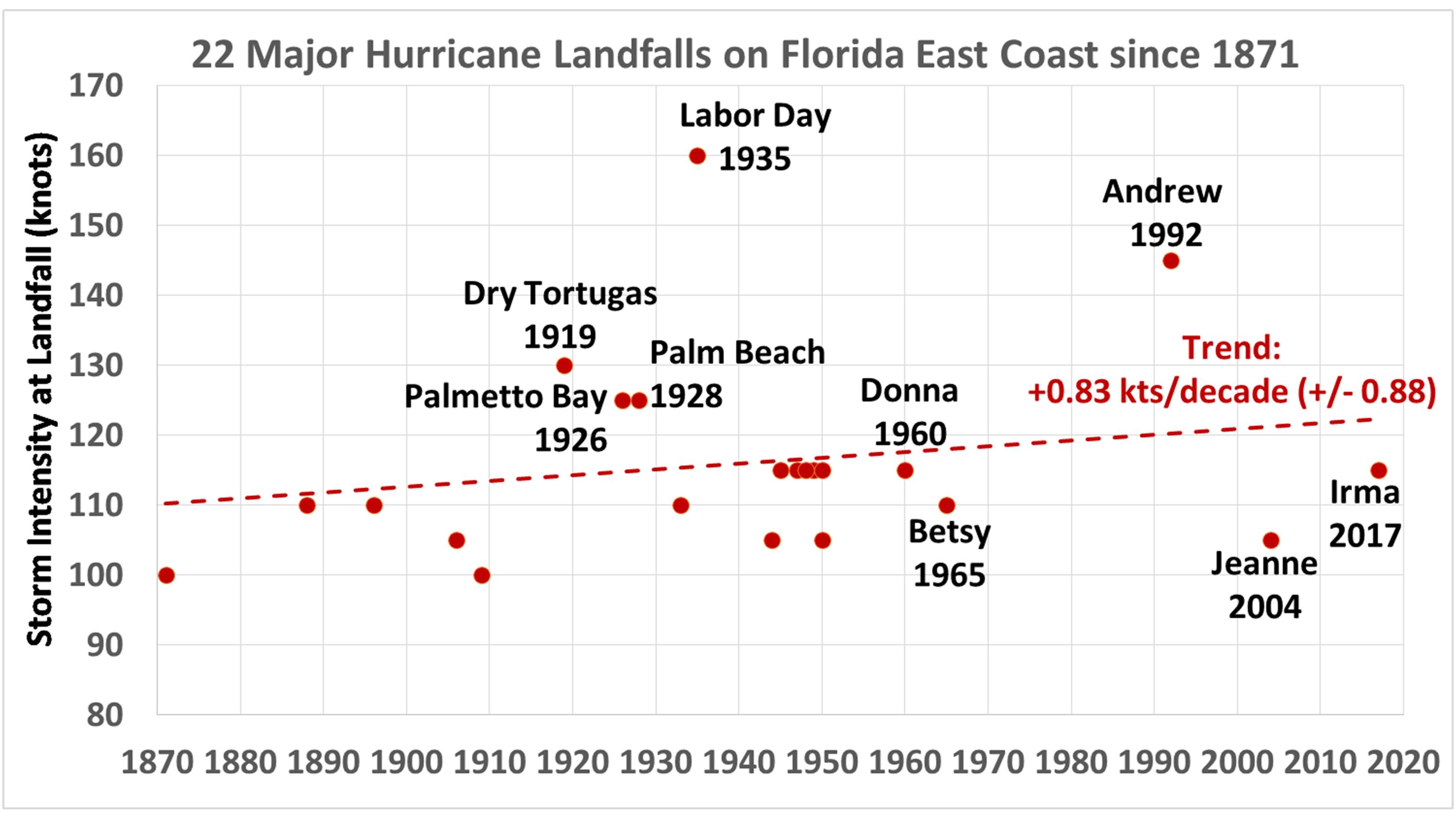
First let’s start with the record of major hurricane strikes on the east coast of Florida, including the keys. There have been 22 such storms since 1871, occurring quite irregularly over time.
While there has been a slight increase in the intensity of these storms over time, amounting to +0.8 knots per decade, the correlation is quite low (0.21) and the quantitative relationship is only barely significant at the 1-sigma level.
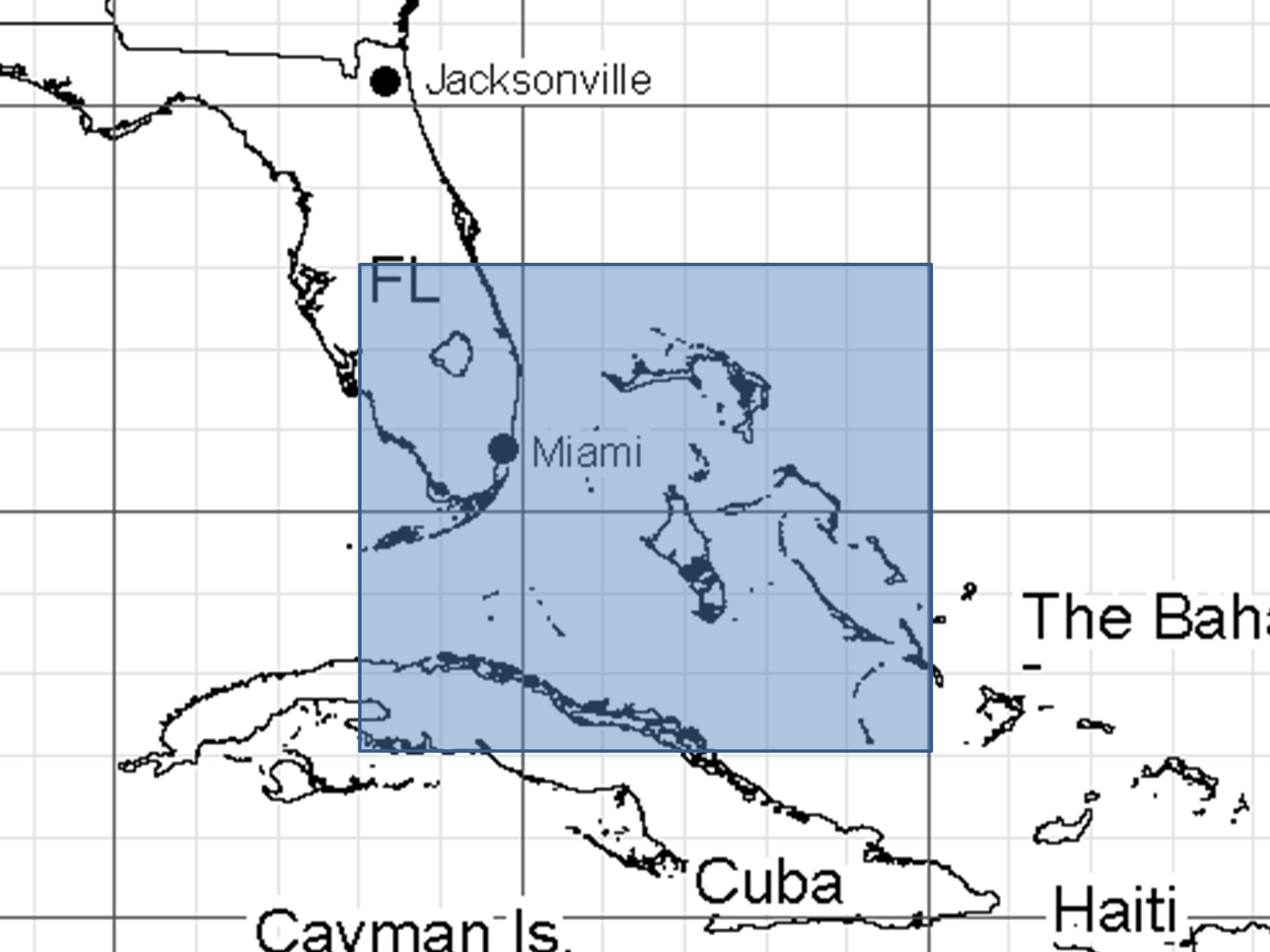
But this doesn’t tell us the role of sea surface temperatures (SSTs). So, next let’s examine how SSTs have changed over the same period of time. Since all of these major hurricanes made landfall in the southern half of Florida, I chose the following boxed region (22N-28N, 75W-82W) to compute area-averaged SST anomalies for all months from 1870 through 2018 (HadSST data available here).
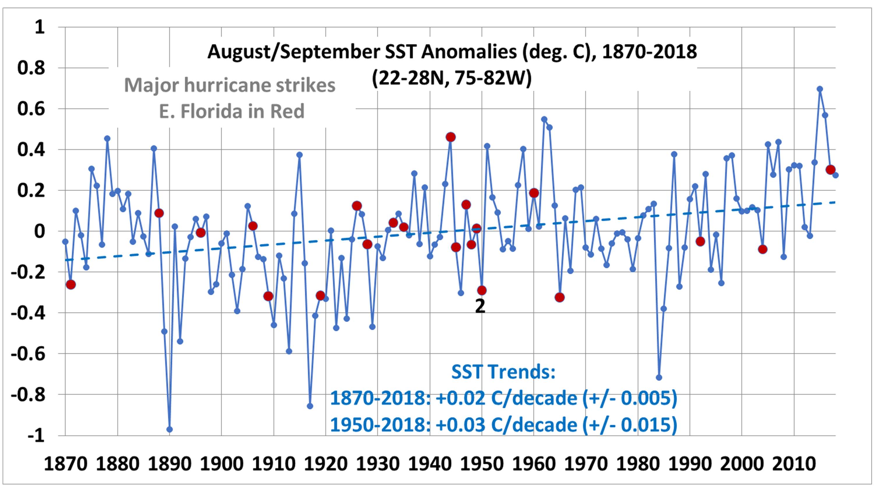
Since 18 of the 22 major hurricane strikes occurred in either August (4) or September (14), (and 4 were in October), I focused on the average SST anomaly for the 2-month periods August-September. Here’s the 2-month average SST anomalies for 1870-2018.
Note that the years with major hurricane strikes are marked in red. What surprised me is that the SST warming in this region during peak hurricane season (August/September) has been very weak: +0.02 C/decade since 1871, and +0.03 C/decade since 1950.
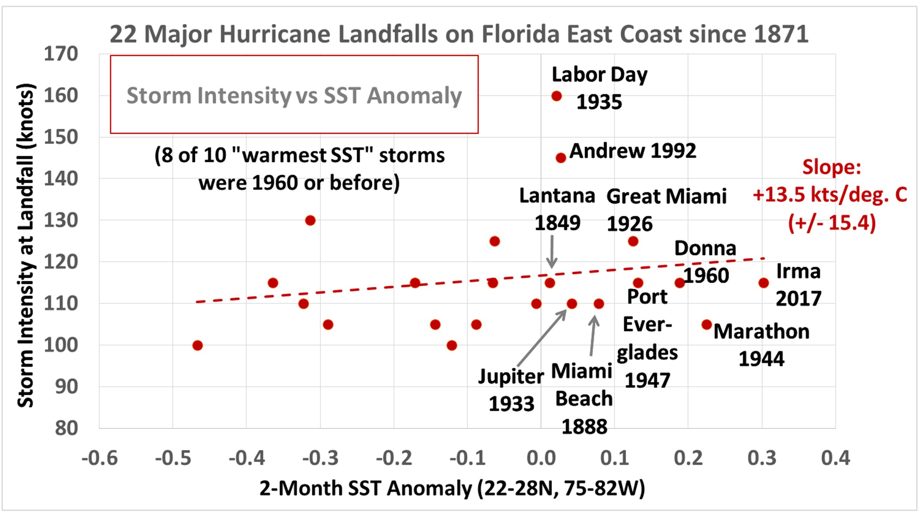
If we then compare SST anomaly with storm intensity at landfall, we get the following plot. Here I took into account which month the hurricane occurred in for the purposes of computing a 2-month SST anomaly. For example, if the storm hit in October, I used the September/October average. If landfall was in August, I used the July/August average.
There is a weak relationship between SST and storm intensity (correlation = 0.19), but the regression coefficient (+13.5 kts/deg. C warming) is not statistically significant at the 1-sigma level.
Now, if we just ignore statistical lack of significance and assume these quantitative relationships are mostly signal rather than noise, we can multiply the 0.03 C/decade SST warming trend since 1950 by the 13.5 kts/deg C “warming sensitivity parameter”, and get +0.43 kts/decade of storm intensity increase per decade due to SST warming, which is almost exactly 0.5 mph per decade.
This is an exceedingly small number. That would be 5 mph per century.
So, based upon the observed SST data from the Hadley Centre, and hurricane data from the National Hurricane Center, we conclude that warming SSTs have caused a tiny increase in intensity of landfalling major hurricanes by 0.5 mph per decade.
I suspect a statistician (which I am not) would say that this is in the noise level.
In other words, there is no observational evidence that warming SSTs have made landfalling hurricanes on the east coast of Florida any stronger.
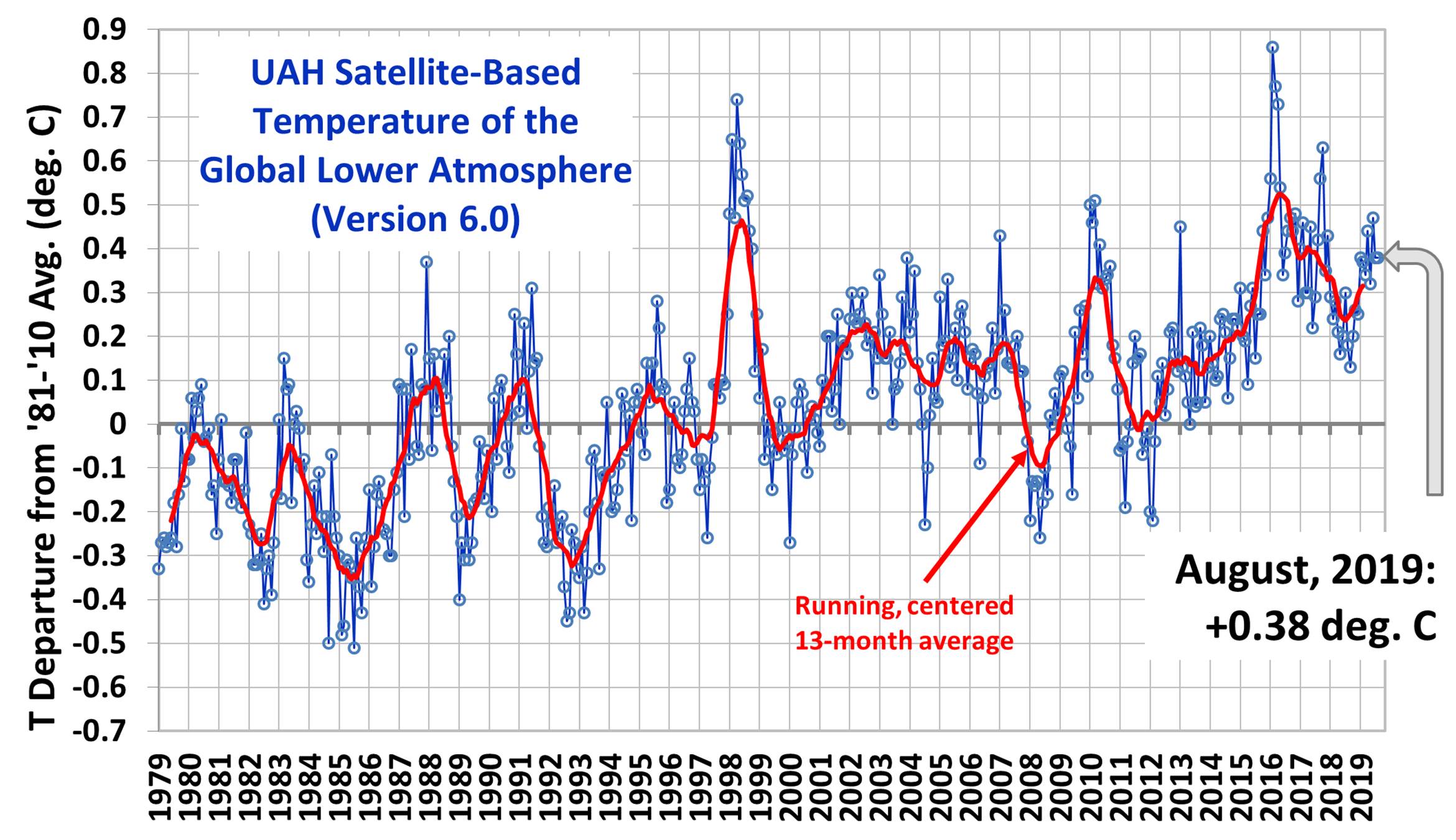
This makes August, 2019 the 4th warmest August in the 41 year satellite record, behind 1998 (+0.52), 2016 (+0.44), and 2017 (+0.42).
The UAH LT global anomaly image for August, 2019 should be available in the next few days here.
The global and regional monthly anomalies for the various atmospheric layers we monitor should be available in the next few days at the following locations:
About an hour ago I posted an objection to a Weather.com article entitled: Hurricane Dorian Becomes the 5th Atlantic Category 5 in 4 Years. Then I deleted it. When I first read the Weather.com article it appeared that the headline was what they were claiming was a record. If so, then it was wrong because the 1930s also had a stretch of 4 years with 5 Category 5 Atlantic hurricanes.
I had not heard about the claim until my interview on Tucker Carlson last evening (hosted by Martha McCallum):
But it turns out that (reading carefully) what they claim is a record (which appears so) is that we have now had a stretch of 4 consecutive years with at least one Cat5 hurricane.
I claim that is a contrived statistic.
Which is more significant in a “climate change” context: that in 1933-34 there were two Cat5 storms (both in 1933), or in 2018-2019 there were also two Cat5 storms, but one in each year? Because that what this boils down to.
I think those would be considered equal in a climate context. In statistics you can always find some insignificant way of slicing and dicing the data to make a certain time period look “unique”. The recent 11+ year period (2006-2016) with no major hurricane landfalls in the U.S. (an unprecedented event) was in my opinion less contrived of a statistic, but since it didn’t fit the global warming narrative, few people are aware of it.
If you think the Weather.com claim is legitimate and related to climate change, let me ask you: Is global warming really spreading out Cat5 hurricanes across the years, so multiple ones don’t occur in the same year? Because that’s the only difference between the 1930s “record” and the current “record”.
The important thing is that the main conclusion as represented by the title of their article (Hurricane Dorian Becomes the 5th Atlantic Category 5 in 4 Years) does not represent a record. It also happened in the 1930s, as shown by the chart in their article.

 Home/Blog