Archive for January, 2016

After the Snowstorm: Color Satellite Views

Monday, January 25th, 2016

The VIIRS color imager on the Suomi/NPP satellite provided nice views yesterday of the heavy blanket of snow produced by the epic snowstorm of January 22-23, 2016.

Here’s the big picture of the eastern U.S. (click image for the super-sized version, suitable for computer desktop wallpaper):

Suomi-jan-24-2016-snowstorm-1

And here’s a zoomed version covering the area from DC through NYC:

Suomi-jan-24-2016-snowstorm-2

The whitest areas have the least vegetation, usually farm fields.

Enjoy!

On that 2015 Record Warmest Claim

Friday, January 22nd, 2016

We now have the official NOAA-NASA report that 2015 was the warmest year by far in the surface thermometer record. John and I predicted this would be the case fully 7 months ago, when we called 2015 as the winner.

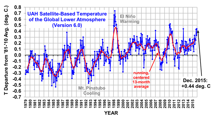
In contrast, our satellite analysis has 2015 only third warmest which has also been widely reported for weeks now. I understand that the RSS satellite analysis has it 4th warmest.

And yet I have had many e-mail requests to address the new reports of warmest year on record. I’ve been reluctant to because, well, this is all old news. (Also, my blog has been under almost constant “brute force login attacks” for the last month, from a variety of IP addresses, making posting nearly impossible most days).

There are many things I could say, but I would be repeating myself:

– Land measurements …that thermometers over land appear to have serious spurious warming issues from urbanization effects. Anthony Watts is to be credited for spearheading the effort to demonstrate this over the U.S. where recent warming has been exaggerated by about 60%, and I suspect the problem in other regions of the global will be at least as bad. Apparently, the NOAA homogenization procedure forces good data to match bad data. That the raw data has serious spurious warming effects is easy to demonstrate…and has been for the last 50 years in the peer-reviewed literature….why is it not yet explicitly estimated and removed?

– Ocean Measurements …that even some NOAA scientists don’t like the new Karlized ocean surface temperature dataset that made the global warming pause disappear; many feel it also forces good data to agree with bad data. (I see a common theme here.)

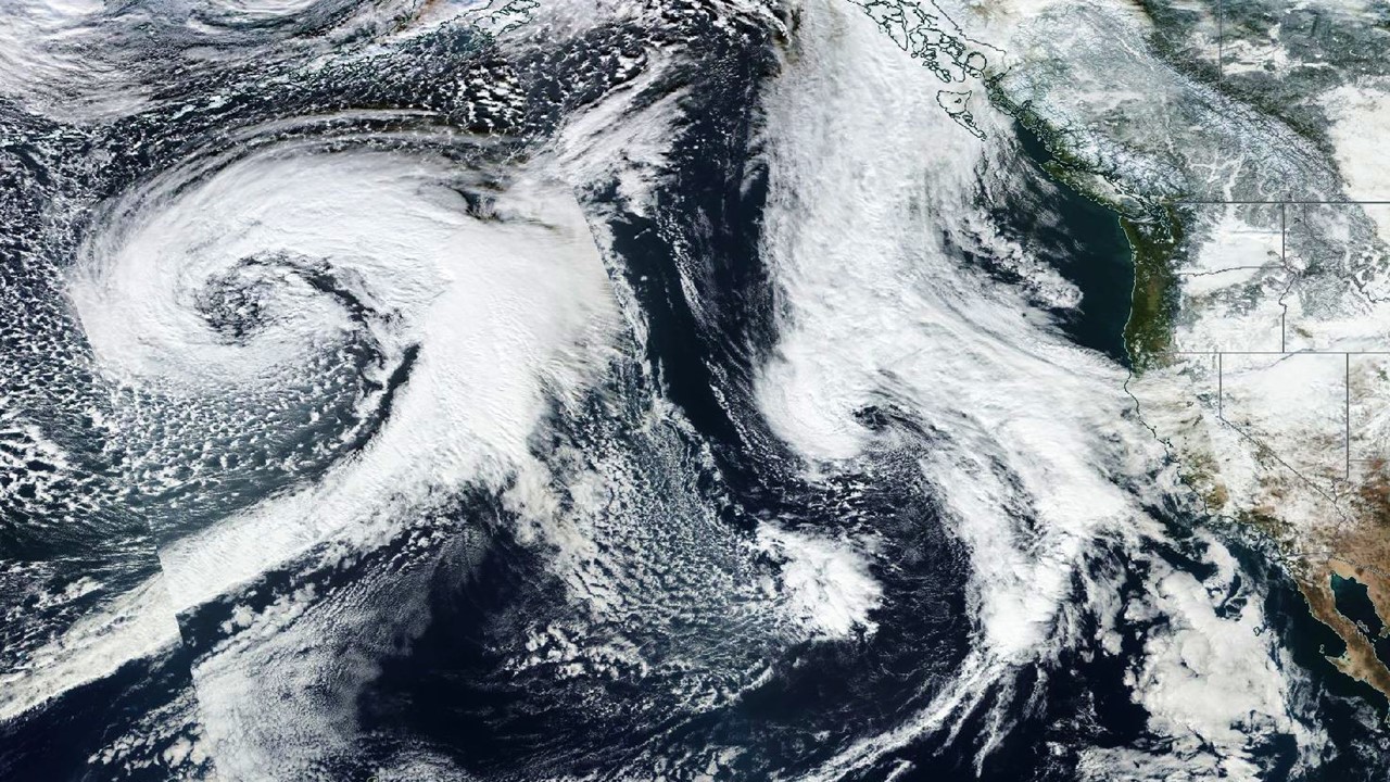
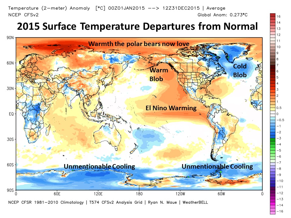
– El Nino …that a goodly portion of the record warmth in 2015 was naturally induced, just as it was in previous record warm years.

– Thermometers Still Disagree with Models …that even if 2015 is the warmest on record, and NOAA has exactly the right answer, it is still well below the average forecast of the IPCC’s climate models, and something very close to that average forms the basis for global warming policy. In other words, even if every successive year is a new record, it matters quite a lot just how much warming we are talking about.

Then we have scientists out there claiming silly things, like the satellites measure temperatures at atmospheric altitudes where people don’t live anyway, so we should ignore them.

Oh, really? Would those same scientists also claim we should ignore the ocean heat content measurements — also where nobody lives — even though that is supposedly the most important piece of evidence that heat is accumulating in the climate system?

Hmmm?

Finally, I don’t see why any of this matters anyway. Didn’t the Paris agreement in December signify that world governments are going to fix the global warming problem?

Or was that message oversold, too?

I’m not claiming our satellite dataset is necessarily the best global temperature dataset in terms of trends, even though I currently suspect it is closer to being accurate than the surface record — that will be for history to decide. The divergence in surface and satellite trends remains a mystery, and cannot (in my opinion) continue indefinitely if both happen to be largely correct.

But since the satellites generally agree with (1) radiosondes and (2) most global reanalysis datasets (which use all observations radiosondes, surface temperatures, commercial aircraft, satellites, etc. everything except the kitchen sink), I think the fact that NOAA-NASA essentially ignores it reveals an institutional bias that the public who pays the bills is becoming increasingly aware of.

And this brings up the elephant in the room that I have a difficult time ignoring

By now it has become a truism that government agencies will prefer whichever dataset supports the governments desired policies. You might think that government agencies are only out to report the truth, but if that’s the case, why are these agencies run by political appointees?

I can say this as a former government employee who used to help NASA sell its programs to congress: We weren’t funded to investigate non-problems, and if global warming were ever to become a non-problem, funding would go away. I was told what I could and couldn’t say to Congress…Jim Hansen got to say whatever he wanted. I grew tired of it, and resigned.

Let me be clear: I’m not saying climate change is a non-problem; only that government programs that fund almost 100% of the research into climate change cannot be viewed as unbiased. Agencies can only maintain (or, preferable, grow) their budgets if the problem they want to study persists. Since at least the 1980s, an institutional bias exists which has encouraged the climate research community to view virtually all climate change as human-caused.

There indeed is a climate change problem to study…but I don’t think we know with any certainty how much is natural versus manmade. There is no way to know, because there is (contrary to the IPCC’s claims) no fingerprint of human versus natural warming. Even natural warming originating over the ocean will cause faster warming over land than over ocean, just as we already observe.

But since the government has framed virtually all of the research programs in terms of human-caused climate change, that’s what the funded scientists will dutifully report it to be, in terms of supposed causation.

And until the culture in the government funding agencies changes, I don’t see a new way of doing business materializing. It might require congress to direct the funding agencies to spend at least a small portion of their budgets to look for evidence of natural causes of climate change.

Because scientists, I have learned, will tend to find whatever they are paid to find in terms of causation…which is sometimes very difficult to pin down in science.

75 Million to Get Snowblasted

Wednesday, January 20th, 2016

The snowstorm expected to begin in earnest on Friday is still looking like one for the record books, especially in the DC area up through Philadelphia and New York City.

The heavily-populated I-95 corridor from the Mid-Atlantic to New England will see the heaviest snowfalls, starting Friday and spreading northeastward on Saturday.

By Sunday morning, nearly one-quarter of the U.S. population (about 75 million people) could get 6 inches or more of snow. Consistent with the weather model forecasts for the last several of days, the latest GFS model forecast continues to indicate the area around Washington D.C. would be hardest hit, with about 2 feet of snow expected (graphic courtesy of Weatherbell.com, click image for full-size):

Total forecast snowfall by midday Sunday, Jan. 24, 2016.

Total forecast snowfall by midday Sunday, Jan. 24, 2016.

New York City could see 16 to 20 inches, and nor’easter type conditions are expected for coastal areas from the Delmarva peninsula northward, with winds gusting over 50 mph.

Frost Flowers: The Frost Awakens

Wednesday, January 6th, 2016

The frost flower arrangement I made a time lapse video of last night.

The frost flower arrangement I made a time lapse video of last night.

It’s been over a year since I first found “frost flowers” growing in our backyard one chilly morning. This past summer I let the plants grow (I usually whack the weeds in the woods), and they grew over 6 feet tall, with Queen Anne’s lace-type white flowers at the top that bloom in the fall.

Due to El Nino, our warm winter has delayed the frost flower formation by about a month. The first ones showed up two nights ago, when it reached about 26 deg. F. Then last night I set up my camera for time lapse photos, even though the stems were partially shredded and it looked like the temperature might not dip below 30 deg. F, which is barely cold enough for the frost flowers to form.

But this morning there was a rather nice display. The following video compresses 12 hours into 30 seconds, from about 6 p.m. to 6 a.m. Be sure to click on the full-screen icon, since this is high-def video, and you can watch the ribbons of ice grow.

So, what does this have to do with global warming, you ask? Well, if not for global warming, the temperature would have been 2 deg. F colder and the flowers would have been 15% bigger, of course.

Another casualty of human-caused climate change.

You can read more about the mechanism of frost flower formation here.

UAH V6 Global Temperature Update for Dec. 2015: +0.44 deg. C

Tuesday, January 5th, 2016

NOTE: This is the ninth monthly update with our new Version 6.0 dataset. Differences versus the old Version 5.6 dataset are discussed here. Note we are now at “beta4” for Version 6, due to our accidental omission of lower stratospheric data from NOAA-9 post-Feb. 1987.

The Version 6.0 global average lower tropospheric temperature (LT) anomaly for December, 2015 is +0.44 deg. C, up from the November, 2015 value of +0.33 deg. C (click for full size version):

UAH_LT_1979_thru_December_2015_v6

This makes 2015 the third warmest year globally (+0.27 deg C) in the satellite record (since 1979), behind 1998 (+0.48 deg C) and 2010 (+0.34 deg. C). Since 2016 should be warmer than 2015 with the current El Nino, there is a good chance 2016 will end up as a record warm year…it all depends upon how quickly El Nino wanes later in the year.

The global, hemispheric, and tropical LT anomalies from the 30-year (1981-2010) average for the last 12 months are:

YR MO GLOBE NH SH TROPICS
2015 01 +0.28 +0.40 +0.16 +0.13
2015 02 +0.17 +0.30 +0.05 -0.06
2015 03 +0.16 +0.26 +0.07 +0.05
2015 04 +0.08 +0.18 -0.01 +0.09
2015 05 +0.28 +0.36 +0.21 +0.27
2015 06 +0.33 +0.41 +0.25 +0.46
2015 07 +0.18 +0.33 +0.03 +0.47
2015 08 +0.27 +0.25 +0.30 +0.51
2015 09 +0.25 +0.34 +0.17 +0.55
2015 10 +0.43 +0.64 +0.21 +0.53
2015 11 +0.33 +0.43 +0.23 +0.53
2015 12 +0.44 +0.51 +0.37 +0.61

The tropics continue warm due to El Nino conditions, with December unsurprisingly the warmest month yet during the El Nino event.

The global image for December, 2015 should be available in the next several days here.

The new Version 6 files (use the ones labeled “beta4”) should be updated soon, and are located here:

Lower Troposphere: http://vortex.nsstc.uah.edu/data/msu/v6.0beta/tlt
Mid-Troposphere: http://vortex.nsstc.uah.edu/data/msu/v6.0beta/tmt
Tropopause: http://vortex.nsstc.uah.edu/data/msu/v6.0beta/ttp
Lower Stratosphere: http://vortex.nsstc.uah.edu/data/msu/v6.0beta/tls

Sierra Expecting 10 Feet of Snow in Next 10 Days

Sunday, January 3rd, 2016
Suomi satellite color image of Pacific storms lining up on January 2, 2016.

Suomi satellite color image of Pacific storms lining up on January 2, 2016.

With the Sierra Nevada snowpack above normal in this El Nino-fueled winter, we now enter what is usually the peak stormy season for the West Coast when El Nino gets in full swing.

As suggested in the above satellite image, a series of Pacific storms will bring more rain and abundant mountain snows, with totals ranging up to 10 feet over the next 10 days, and widespread amounts over 4 feet (GFS model graphic courtesy of Weatherbell.com):

GFS model forecast of total snowfall in the next 10 days, ending January 13, 2016.

GFS model forecast of total snowfall in the next 10 days, ending January 13, 2016.

While the California drought is far from over, the coming storms are a good sign that the snowpack might be headed for a more comfortable 150% of normal come April 1, which is what will be required to bring reservoirs close to a normal level after the snow melts.

The snows will not be restricted to California, as almost all mountain ranges in the West will also be receiving substantial new accumulations over the same period.

What Causes El Nino Warmth?

Friday, January 1st, 2016

2015-CFS-T2m-global-temperature-anomaly

Dick Lindzen suggested to me recently that this might be a good time to address the general question, “what causes the global-average warmth during El Nino?”

Some of you might say, “the sun, of course”. Yes, the sun’s energy is the ultimate source of energy for the climate system, but it really doesn’t explain why El Nino years are unusually warm…or why La Nina years are unusually cool.

The answer lies in the circulation of the Pacific Ocean, more specifically the vertical circulation of that ocean basin.

The short answer is that, during El Nino, there is an average decrease in the vertical overturning and mixing of cold, deep ocean waters with solar-heated warm surface waters. The result is that the surface waters become warmer than average, and deeper waters become colder than average. The opposite situation occurs during La Nina.

Importantly, the change shows up in global average ocean computations, based upon ocean temperature data (see our Fig. 3, here); this means that the changes centered in the Pacific are not offset by changes of the opposite sign occurring in other ocean basins.


The Details

Most of the depth of the world’s oceans is very cold, even in the tropics. Only the near-surface layers are warm, with the rest of the ocean depths being filled up over thousands of years by surface water chilled to low temperatures at high latitudes. (This leads to the interesting observation that the mass-weighted average temperature of the climate system is actually very cold).

This average state of warm surface (due to solar heating) and cold depths is continually being offset by vertical mixing processes (wind-driven wave-induced mixing, tidal flows over bottom topography, and other processes). When these processes slow down during El Nino, surface water (mainly the upper 100 meters) become warmer than normal. At the same time, the layers below 100 meters become colder than normal (100 m is the global-average depth of this demarcation).

In a sense, the deep ocean provides an air conditioner for the climate system, and during El Nino the air conditioner isn’t working as hard to cool the atmosphere. During La Nina, it’s working harder than normal, leading to global-average coolness.

Since the atmosphere responds to surface heating, anomalous warmth in the upper ocean layers gradually heats the atmosphere, mainly through increased precipitation heating in response to large rates of evaporation from the warm surface waters. This initially occurs in the tropics where the ocean circulation change is the strongest, but then spreads to higher latitudes as well. The warming is not uniform, of course, and a few regions can even experience below normal temperatures…but in the global average, there is warming.

The plot of 2015 temperature anomalies shown above reveals there are indeed other things happening (graphic courtesy of Weatherbell.com, annotated by me). It should be mentioned that the map projection greatly exaggerates the actual size of the polar areas compared to the tropics.

Note that I have not mentioned Pacific westerly wind bursts, or propagating Kelvin waves, or reduced ocean upwelling, since these are just regional manifestations of the whole process…

In the “big picture”, the cause of El Nino warmth is still a reduction in the overall vertical mixing of warm surface waters with cold deep waters. (Reduced upwelling of cold deep water must, by mass continuity, be accompanied by decreased downwelling of warm surface water, which just means an overall reduction in vertical mixing in the ocean.)

Does El Nino Warm the Entire Climate System?

This is an interesting question that we addressed in our 2014 APJAS paper. The consensus opinion of El Nino and La Nina is that it is just a quasi-periodic oscillation of the climate system that has no long-term impact on global temperature trends.

But we demonstrated that as El Nino develops there is an increase in radiative energy input into the global-average climate system which precedes peak El Nino warmth by about 9 months. This is mostly likely due to a small decrease in low cloud cover associated with the changing atmospheric circulation patterns during El Nino (La Nina would have increased cloud cover).

Thus, if the climate system goes through a multi-decadal period of increased El Nino activity (and decreased La Nina activity), like what happened after the 1970s, there can be a multi-decadal natural warming trend that is entirely natural in origin as more solar energy is absorbed by the system. This complicates identification and quantification of the human greenhouse gas-forced portion of climate change, leading (in my opinion) to overestimates of the anthropogenic warming effect.

Now, everyone who studies the El Nino/La Nina (ENSO) phenomenon comes to a somewhat different conceptual understanding, and I might be missing some important component that others are welcome to point out. But the above represents my view as a result of our analysis of global average ocean temperature fluctuations as a function of depth since the 1950s which was part of our 2014 APJAS paper, as well as our analysis in that paper of CERES satellite radiative budget changes associated with ENSO.

Again, my emphasis is on the global-average manifestation of ENSO, which then leads to an explanation of global average warmth associated with El Nino. Regional changes involving Kelvin waves, westerly wind bursts, etc., are not sufficient to explain the net warming effects of El Nino. That instead requires (in my view) a global-average decrease in the mixing of warm surface waters and cold deep waters, as I have outlined above.