Archive for May, 2011

The Tornado – Pacific Decadal Oscillation Connection

Wednesday, May 25th, 2011

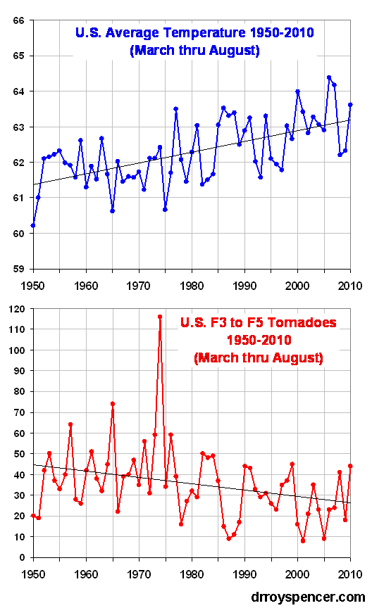
This is a continuation of the theme of my last 2 blog posts, dealing with the fact that a greater number of strong to violent tornadoes occur in unusually COOL years, not warm years. As a quick review, the following plot clearly shows this:

This refutes the claim of a few of the global-warming-causes-everything pundits who assume that more tornadoes MUST be Gaia’s way of punishing us for providing her with more plant food (carbon dioxide).

There are 2 main reasons why stronger tornadoes are usually associated with unseasonably cool conditions, and why there has been a decrease in strong tornadoes during a period of average warming:

1) The missing ingredient for tornado formation is not a lack of warm moist air, but a lack of synoptic (large) scale wind shear.

2) At least until recently, the positive phase of the Pacific Decadal Oscillation (PDO) which has predominated since the late 1970’s has suppressed strong tornado activity.

Let’s look at these two issues.

THE MISSING INGREDIENT: WHY 99% OF THUNDERSTORMS DO NOT PRODUCE TORNADOES
I’ve been trying to think of why some might assume a warmer climate would produce more tornadoes, and I suspect the main reason is that tornadoes are produced by thunderstorms, and thunderstorms require warm, moist air for fuel. Ergo, warming should lead to more tornadoes.

But even here in the U.S., which is Tornado Central for the world, 99 out of 100 thunderstorms do NOT produce tornadoes. Why is this?

The missing ingredient is wind shear, specifically an increase in wind speed with height, and a change in wind direction with height.

So what causes this type of wind shear? It occurs in advance of low pressure areas that form along the boundary between warm and cool air masses. So, anything that increases the frequency of these conditions could lead to more tornadoes.

The classic tornado situation involves a longwave low pressure trough over the western U.S., caused by an unusually cool atmosphere in the lowest 5-10 miles of the atmosphere. This has remained true for this year’s enhanced tornado activity. I suspect the persisting mountain snowpack from a very snowy winter has played a role in this.

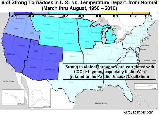
The following plot of the U.S. shows correlation between the annual number of strong (F3) to violent (F5) warm-season (March through August) tornadoes and regional temperature departures from normal.

First, we see in ALL regions a negative correlation between temperature and the total number of strong to violent tornadoes in the U.S.

This is basically the regional breakdown of the U.S.-average relationship shown in the first plot above, which demonstrates that the increased frequency of strong tornadoes with cooler, not warmer, temperatures. This is no doubt an indirect effect, mirroring the more frequent intrusion of unseasonably cool air masses, which cause the wind shear conditions more conducive to tornado formation.

Secondly, we see that the relationship is the strongest over the western U.S. This pattern is consistent with a longwave low pressure trough over the western U.S., which favors more tornado formation for the reasons outlined above.

So, the next question is, what favors unseasonably cool weather over the West during tornado season? This is where the Pacific Decadal Oscillation (PDO) comes in.

THE TORNADO-PDO CONNECTION

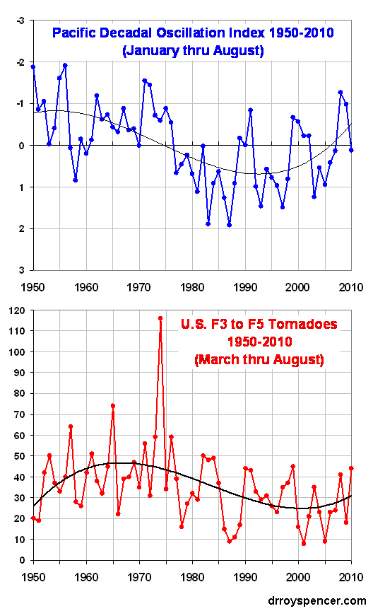
The following plot shows that the positive phase of the PDO, which predominated roughly from the late 1970s up until just a few years ago, was also a period of depressed strong tornado activity in the U.S. Conversely, more strong tornadoes seem to be associated with the negative phase of the PDO.

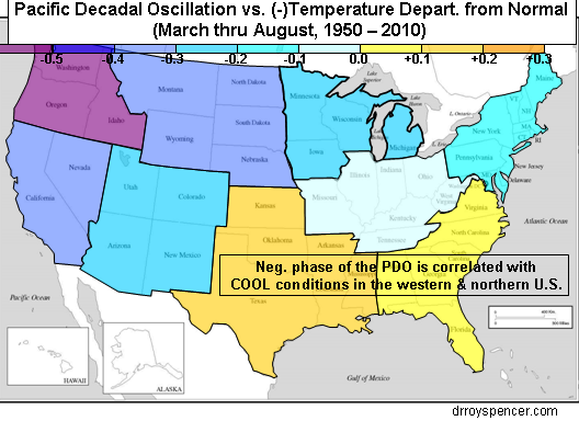
The reason why this is the case appears to be that the negative phase of the PDO also favors longwave low pressure troughs over the U.S. The following regional correlation plot between the negative of the PDO and temperature shows this quite clearly, with a very cool West and somewhat warm South and Southeast:

Of course, the negative PDO/more tornadoes connection will not necessarily hold every year, just as the La Nina/more hurricanes connection does not hold every year.

But the major point here is that it is NOT the lack of warm air that inhibits tornado formation during tornado season…it is the lack of sufficient wind shear to cause thunderstorms to rotate. And it is the persistence of unseasonably cool air, over most of the U.S., that produces these wind shear conditions.

Today’s Tornado Outlook: High Risk of Global Warming Hype

Tuesday, May 24th, 2011


After the catastrophic death toll from the Joplin, MO tornado, which now stands at 117, we are no doubt in for more claims — dutifully amplified by the news media — that ‘climate change’ must somehow be at least partly responsible for this Spring’s wild weather.

And, to some extent, I’m inclined to agree. That is, if they are talking about the natural cooling effects of La Nina and the tendency for tornado outbreaks to be associated with cooler (not warmer) climate conditions.

But I suspect that’s just the opposite of the message they will be preaching.

So, let’s look at 2 statistics: 1) the number of strong to violent tornadoes, and 2) the deadliest tornadoes in U.S. history

THE DOWNTURN IN STRONG TORNADOES WITH WARMING
The bottom panel of following graphic shows what most meteorologists already know: there has been a downward trend in strong (F3) to violent (F5) tornadoes in the U.S. since statistics began in the 1950s. As seen in the top panel, this has also been a period of general warming. For those statistics buffs, the correlation coefficient is -0.31. Obviously, the conclusion should be that warming causes fewer strong tornadoes, not more. (Or, maybe a lack of tornadoes causes global warming!)

Even when I de-trend the data, the remaining year-to-year variability still has a negative correlation: -0.17, so the conclusion is the same for the long-term trend AND the year-to-year variations in strong tornado activity.

So how does anyone get away with claiming that global warming is contributing to more tornadoes?

Well, maybe because there has indeed been an UPward trend in total reported tornado sightings in the U.S. during the same period of time. But this is only because (as I mention in my first book, Climate Confusion) there are so many more people now spread across the fruited plain, with so many video cameras, and now so many Doppler radars are measuring the wind rotation associated with tornadoes, that it is difficult for any to go unnoticed by at least someone.

THE DOWNTURN IN TORNADO DEATHS
Also, if you hear any news reports that more deaths due to tornadoes are due to global warming, this is also a bogus claim. Here’s a little quiz for you:

QUESTION: Out of the 25 deadliest tornadoes in U.S history, how many would you guess have occurred in the last 50 years (since 1960)?

…wait for it….

ANSWER: Up until a month ago, NONE of them.

On April 27, one of the Alabama tornadoes made the bottom of the list at #25, but now has been knocked back off the list because Sunday’s tornado in Joplin will be ranked #8.

So, to the extent that you hear reports of ANYONE connecting tornadoes to global warming, I think it proves only one thing: The belief that global warming is causing most of the world’s ills is so pervasive that the facts simply do not matter anymore.

Indirect Solar Forcing of Climate by Galactic Cosmic Rays: An Observational Estimate

Thursday, May 19th, 2011

UPDATE (12:35 p.m. CDT 19 May 2011): revised corrections of CERES data for El Nino/La Nina effects.

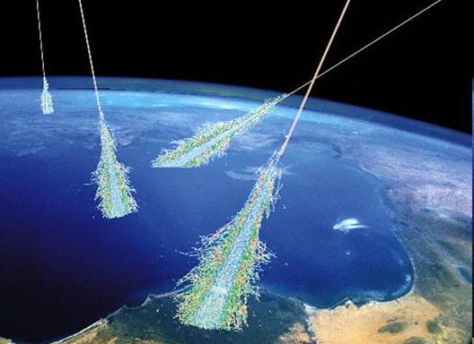
While I have been skeptical of Svensmark’s cosmic ray theory up until now, it looks like the evidence is becoming too strong for me to ignore. The following results will surely be controversial, and the reader should remember that what follows is not peer reviewed, and is only a preliminary estimate.

I’ve made calculations based upon satellite observations of how the global radiative energy balance has varied over the last 10 years (between Solar Max and Solar Min) as a result of variations in cosmic ray activity. The results suggest that the total (direct + indirect) solar forcing is at least 3.5 times stronger than that due to changing solar irradiance alone.

If this is anywhere close to being correct, it supports the claim that the sun has a much larger potential role (and therefore humans a smaller role) in climate change than what the “scientific consensus” states.
BACKGROUND

The single most frequently asked question I get after I give my talks is, “Why didn’t you mention the sun?” I usually answer that I’m skeptical of the “cosmic ray gun” theory of cloud changes controlling climate. But I point out that Svensmark’s theory of natural cloud variations causing climate change is actually pretty close to what I preach — only the mechanism causing the cloud change is different.

Then, I found last year’s paper by Laken et al. which was especially interesting since it showed satellite-observed cloud changes following changes in cosmic ray activity. Even though the ISCCP satellite data they used are not exactly state of the art, the study was limited to the mid-latitudes, and the time scales involved were days rather than years, the results gave compelling quantitative evidence of a cosmic ray effect on cloud cover.

With the rapid-fire stream of publications and reports now coming out on the subject, I decided to go back and spend some time analyzing ground-based galactic cosmic ray (GCR) data to see whether there is a connection between GCR variations and variations in the global radiative energy balance between absorbed sunlight and emitted infrared energy, taken from the NASA CERES radiative budget instruments on the Terra satellite, available since March 2000.

After all, that is ultimately what we are interested in: How do various forcings affect the radiative energy budget of the Earth? The results, I must admit, are enough for me to now place at least one foot solidly in the cosmic ray theory camp.

THE DATA

The nice thing about using CERES Earth radiative budget data is that we can get a quantitative estimate in Watts per sq. meter for the radiative forcing due to cosmic ray changes. This is the language the climate modelers speak, since these radiative forcings (externally imposed global energy imbalances) can be used to help calculate global temperature changes in the ocean & atmosphere based upon simple energy conservation. They can then also be compared to the estimates of forcing from increasing carbon dioxide, currently the most fashionable cause of climate change.

From the global radiative budget measurements we also get to see if there is a change in high clouds (inferred from the outgoing infrared measurements) as well as low clouds (inferred from reflected shortwave [visible sunlight] measurements) associated with cosmic ray activity.

I will use only the ground-based cosmic ray data from Moscow, since it is the first station I found which includes a complete monthly archive for the same period we have global radiative energy budget data from CERES (March 2000 through June 2010). I’m sure there are other stations, too…all of this is preliminary anyway. Me sifting through the myriad solar-terrestrial datasets is just as confusing to me as most of you sifting through the various climate datasets that I’m reasonably comfortable with.

THE RESULTS

The following plot (black curve) shows the monthly GCR data from Moscow for this period, as well as a detrended version with 1-2-1 averaging (red curve) to match the smoothing I will use in the CERES measurements to reduce noise.
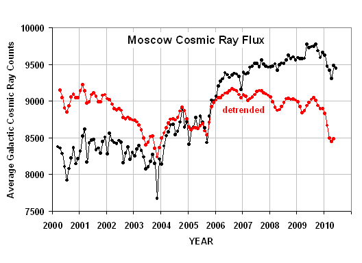
Detrending the data isolates the month-to-month and year-to-year variability as the signal to match, since trends (or a lack of trends) in the global radiative budget data can be caused by a combination of many things. (Linear trends are worthless for statistically inferring cause-and-effect; but getting a match between wiggles in two datasets is much less likely to be due to random chance.)

The monthly cosmic ray data at Moscow will be compared to global monthly anomalies the NASA Terra satellite CERES (SSF 2.5 dataset) radiative flux data,
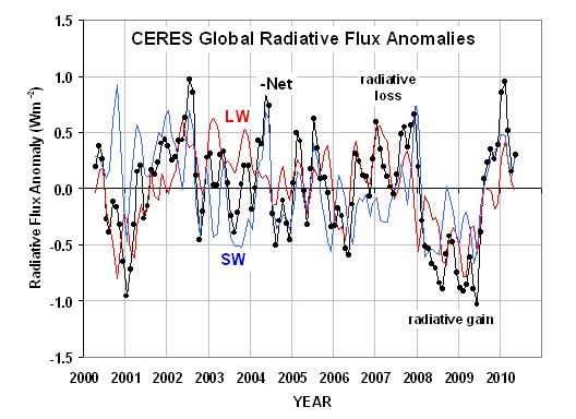
which shows the variations in global average reflected sunlight (SW), emitted infrared (LW), and Net (which is the estimated imbalances in total absorbed energy by the climate system, after adjustment for variations in total solar irradiance, TSI). Note I have plotted the variations in the negative of Net, which is approximately equal to variations in (LW+SW)

Then, since the primary source of variability in the CERES data is associated with El Nino and La Nina (ENSO) activity, I subtracted out an estimate of the average ENSO influence using running regressions between running 5-month averages of the Multivariate ENSO Index (MEI) and the CERES fluxes. I used the MEI index along with those regression coefficients in each month to correct the CERES fluxes 4 months later, since that time lag had the strongest correlation.
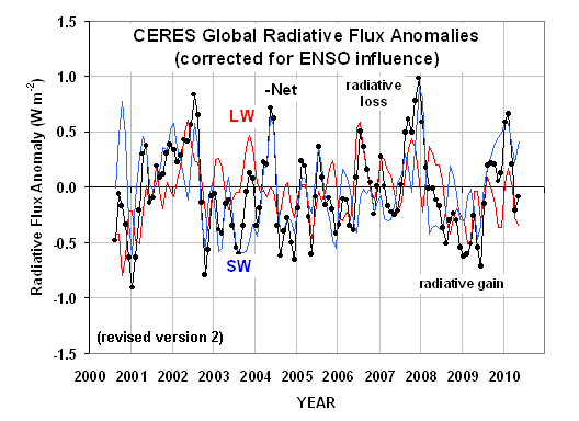
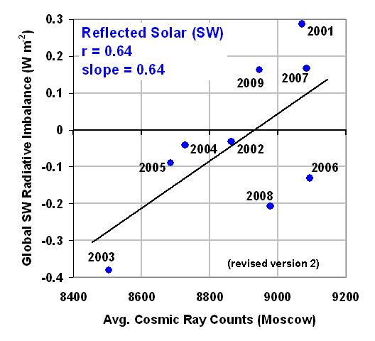
Finally, I performed regressions at various leads and lags between the GCR time series and the LW, SW, and -Net radiative flux time series, the results of which are shown next.
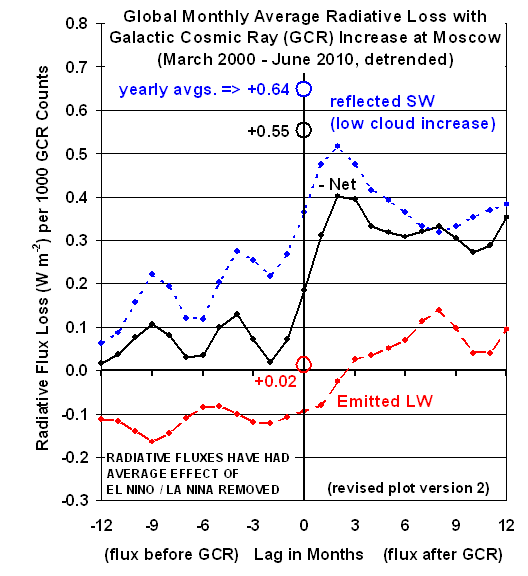
The yearly average relationships noted in the previous plot come from this relationship in the reflected solar (SW) data,
while the -Net flux (Net is absorbed solar minus emitted infrared, corrected for the change in solar irradiance during the period) results look like this:
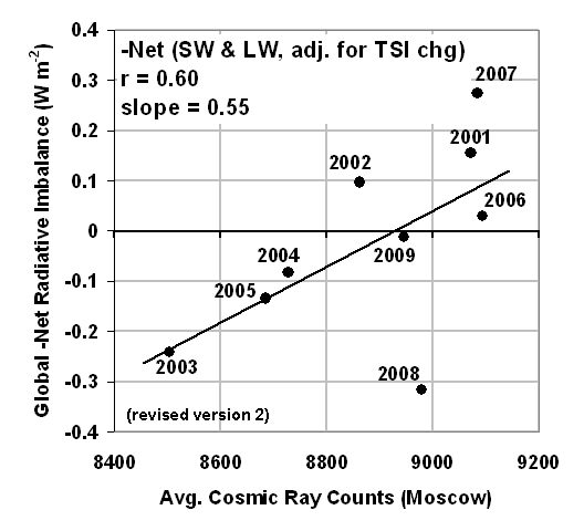
It is that last plot that gives us the final estimate of how a change in cosmic ray flux at Moscow is related to changes in Earth’s radiative energy balance.

SUMMARY

What the above three plots show is that for a 1,000 count increase in GCR activity as measured at Moscow (which is somewhat less than the increase between Solar Max and Solar Min), there appears to be:

(1) an increase in reflected sunlight (SW) of 0.64 Watts per sq. meter, probably mostly due to an increase in low cloud cover;
(2) virtually no change in emitted infrared (LW) of +0.02 Watts per sq. meter;
(3) a Net (reflected sunlight plus emitted infrared) effect of 0.55 Watts per sq. meter loss in radiant energy by the global climate system.

WHAT DOES THIS MEAN FOR CLIMATE CHANGE?

Assuming these signatures are anywhere close to being real, what do they mean quantitatively in terms of the potential effect of cosmic ray activity on climate?

Well, just like any other forcing, a resulting temperature change depends not only upon the size of the forcing, but also the sensitivity of the climate system to forcing. But we CAN compare the cosmic ray forcing to OTHER “known” forcings, which could have a huge influence on our understanding of the role of humans in climate change.

For example, if warming observed in the last century is (say) 50% natural and 50% anthropogenic, then this implies the climate system is only one-half as sensitive to our greenhouse gas emissions (or aerosol pollution) than if the warming was 100% anthropogenic in origin (which is pretty close to what we are told the supposed “scientific consensus” is).

First, let’s compare the cosmic ray forcing to the change in total solar irradiance (TSI) during 2000-2010. The orange curve in following plot is the change in direct solar (TSI) forcing between 2000 and 2010, which with the help of Danny Braswell’s analytical skills I backed out from the CERES Net, LW, and SW data. It is the only kind of solar forcing the IPCC (apparently) believes exists, and it is quite weak:
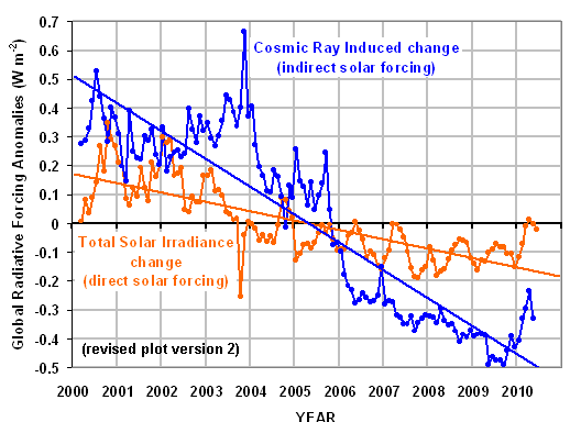
Also shown is the estimated cosmic ray forcing resulting from the month-to-month changes in the original Moscow cosmic ray time series, computed by multiplying those monthly changes by 0.55 Watts per sq. meter per 1,000 cosmic ray counts change.

Finally, I fitted the trend lines to get an estimate of the relative magnitudes of these two sources of forcing: the cosmic ray (indirect) forcing is about 2.8 times that of the solar irradiance (direct) forcing. This means the total (direct + indirect) solar forcing on climate associated with the solar cycle could be 3.8 times that most mainstream climate scientists believe.

One obvious question this begs is whether the lack of recent warming, since about 2004 for the 0-700 meter layer of the ocean, is due to the cosmic ray effect on cloud cover canceling out the warming from increasing carbon dioxide.

If the situation really was that simple (which I doubt it is), this would mean that with Solar Max rapidly approaching, warming should resume in the coming months. Of course, other natural cycles could be in play (my favorite is the Pacific Decadal oscillation), so predicting what will happen next is (in my view) more of an exercise in faith than in science.

In the bigger picture, this is just one more piece of evidence that the IPCC scientists should be investigating, one which suggests a much larger role for Mother Nature in climate change than the IPCC has been willing to admit. And, again I emphasize, the greater the role of Nature in causing past climate change, the smaller the role humans must have had, which could then have a profound impact on future projections of human-caused global warming.

Weak Warming of the Oceans 1955-2010 Implies Low Climate Sensitivity

Thursday, May 12th, 2011

UPDATE (1:20 pm. CDT 5/13/11): Since the issue of deep ocean warming (below 700 m depth) has been raised in the comments section, I have re-run the forcing-feedback model for the following two observations: 1) a net 50 year warming of 0.06 deg. C for the 0-2000 meter layer, and (2) a surface warming of 0.6 deg. C over the same period. The results suggest a net feedback parameter of 3 W m-2 K-1, which corresponds to a climate sensitivity of 1.3 deg. C from 2XCO2, which is below the 1.5 deg. C lower limit the IPCC has placed on future warming.

Weak Warming of the Oceans 1955-2010 Implies Low Climate Sensitivity

Assuming that the Levitus record of global oceanic heat content increase is anywhere near accurate, what might it tell us about climate sensitivity; e.g., how much global warming we might expect from increasing atmospheric carbon dioxide concentrations? As we will see, the oceans have not warmed nearly as much as would be expected if the climate system really is as sensitive as the IPCC claims.

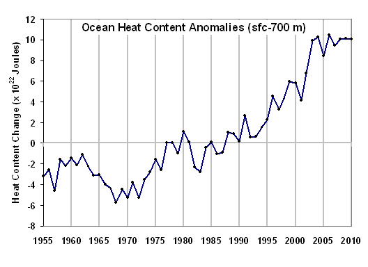
The following now-familiar plot of ocean heat content change for the surface – 700 meter depth layer is the result of a layer average temperature increase of about 0.17 deg. C over the 55 year record:

In the meantime, global average sea surface temperatures have reportedly increased at about 3.5 times this rate, about 0.6 deg. C, based upon the HadSST2 data.

As Bob Tisdale has pointed out, the above plot expressing heat content in terms of gazillions of Joules sounds dramatic (if you didn’t know, 1022 is 1 gazillion) — but the 0.2 deg. C warming upon which it is based?…maybe not so much.

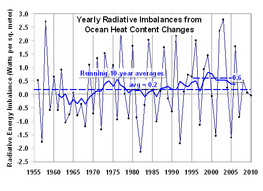
Nevertheless, what is useful about the heat content data is that it is relatively easy to then calculate from the yearly changes in ocean heat content how much of an energy imbalance (energy flow rate into the ocean) is required to achieve such changes.

This ends up being an average of 0.2 Watts per sq. meter for the 55 year period 1955-2010…a calculation that Levitus also made. Here’s what the yearly energy imbalances look like which are required to cause the yearly changes in ocean heat content:

Note that with considerable smoothing of the data, we see a peak imbalance around 0.6 W m-2 during the maximum warming rate around the year 2000.

Now, by way of comparison, how much radiative forcing does James Hansen (GISS) estimate the climate system has undergone during the same period of time? The following plot shows the various forcings Hansen has assumed:

Let’s assume, for the sake of illustration, that Hansen is correct for all of these forcings. In that case, the average of the all-forcings curve over the period 1955-2010 is about 0.8 W m-2.

Now let’s compare these 2 numbers for the period 1955-2010:

Average Radiative Forcing from CO2, aerosols, volcanoes: 0.8 W m-2
Average Radiative Imbalance from increasing ocean heat content: 0.2 W m-2

Assuming the ocean heat content data and Hansen’s forcing estimates are accurate, how could the average radiative forcing be 4 times the average radiative imbalance? The answer is FEEDBACK:

Radiative Imbalance = Forcing – Feedback

As the system GAINS energy (and warms) from forcing, it LOSES energy from feedbacks: e.g., changes in clouds, water vapor, and most importantly the extra loss of IR energy directly to space from warmer temperatures (which is usually not considered a feedback per se, but it is THE main climate stabilizing influence, and for purposes of discussion I will treat it as a “feedback”).

If there was no feedback (which would indicate a borderline unstable climate system), then the ocean heat content-inferred radiative imbalance (0.2 W m-2) would equal the forcing (0.8 W m-2), which it clearly doesn’t since there is a 4x difference.

Of course, some believe that CO2 forcings do not even exist (although I’m not one of them). Here I am simply trying to determine what might be concluded about climate sensitivity if we assume Hansen’s forcings and the OHC increases are correct. As we will see, the large difference between forcing (0.8) and radiative imbalance (0.2) implies an insensitive climate system.

Next, we can use these numbers to estimate the net feedbacks operating in the climate system. The simple time-dependent model of the climate system in this case looks like this:

Cp[dT700/dt] = Forcing – λTsfc

Which computes the change in temperature with time of the 700 m deep ocean layer (dT700/dt) which has a heat capacity of Cp in response to Hansen’s radiative forcings and radiative feedback in response to surface temperature changes (λTsfc).

The reason why we need to use 2 temperatures is that the surface has reportedly warmed about 3.5 times faster than the 0-700 meter ocean layer does, and radiative feedback will be controlled by changes in the temperature of the sea surface and the atmosphere that is convectively coupled to it.

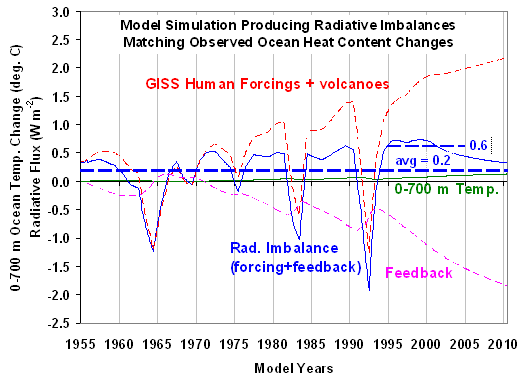
If we run this model, we can adjust the feedback parameter λ until we get the kinds of radiative imbalances inferred from the ocean heat content changes. The following shows what seemed to provide a reasonable match:

The feedback parameter λ used here is 4 W m-2 K-1, which implies a climate sensitivity of only 1 deg. C warming from a doubling of CO2. This is much less than the IPCC’s estimate of 2.5 to 3 deg. C of warming.

In particular, note from the above model simulation how the strong feedback mostly offsets the forcing, leaving a small radiative imbalance, consistent with the large discrepancy between Hansen’s average forcing (0.8 W m-2) and the ocean heat content-inferred energy imbalance (0.2 W m-2).

The bottom line is that the ocean has not warmed nearly as much as would be expected based upon the climate sensitivities exhibited by all of the climate models tracked by the IPCC.

Now, what I do not fully understand is why the IPCC claims that the ocean heat content increases indeed ARE consistent with the climate models, despite the relatively high sensitivity of all of the IPCC models. While some might claim that it is because warming is actually occurring much deeper in the ocean than 700 m, the vertical profiles I have seen suggest warming decreases rapidly with depth, and has been negligible at a depth of 700 m.

Also, note that I have not even addressed any natural sources of warming. If Mother Nature was also involved in the ocean warming during 1955-2010, then this would imply an even LOWER climate sensitivity than I have estimated here.

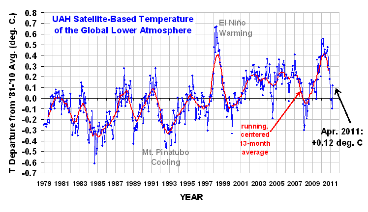
UAH Temperature Update for April, 2011: +0.12 deg. C

Tuesday, May 10th, 2011

UAH_LT_1979_thru_Apr_2011

YR MON GLOBAL NH SH TROPICS
2010 01 0.542 0.675 0.410 0.635
2010 02 0.510 0.553 0.466 0.759
2010 03 0.554 0.665 0.443 0.721
2010 04 0.400 0.606 0.193 0.633
2010 05 0.454 0.642 0.265 0.706
2010 06 0.385 0.482 0.287 0.485
2010 07 0.419 0.558 0.280 0.370
2010 08 0.441 0.579 0.304 0.321
2010 09 0.477 0.410 0.545 0.237
2010 10 0.306 0.257 0.356 0.106
2010 11 0.273 0.372 0.173 -0.117
2010 12 0.181 0.217 0.145 -0.222
2011 01 -0.010 -0.055 0.036 -0.372
2011 02 -0.020 -0.042 0.002 -0.348
2011 03 -0.101 -0.073 -0.128 -0.342
2011 04 0.120 0.199 0.042 -0.229

NEW! Monthly UAH temperature reports and global images.

La Nina Fades
The global average lower tropospheric temperature anomaly for April 2011 jumped up to +0.12 deg. C, further evidence that La Nina is fading.

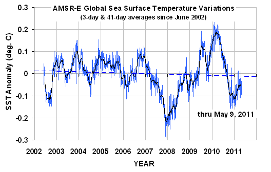
I have also updated the global sea surface temperature anomaly from AMSR-E through yesterday, May 9 (note that the base period is different, so the zero line is different than for the lower tropospheric temperature plot above):

WeatherShop.com Gifts, gadgets, weather stations, software and more...click here!

Tornado Cleanup in Fords Chapel, Alabama

Tuesday, May 3rd, 2011

Power is gradually being restored in and around Huntsville. UAH is closed till tomorrow, which would be my first day back to work in a week…except that I have to go to DC for the biannual NASA Aqua satellite review.

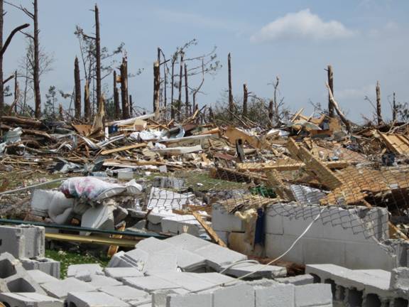
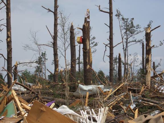
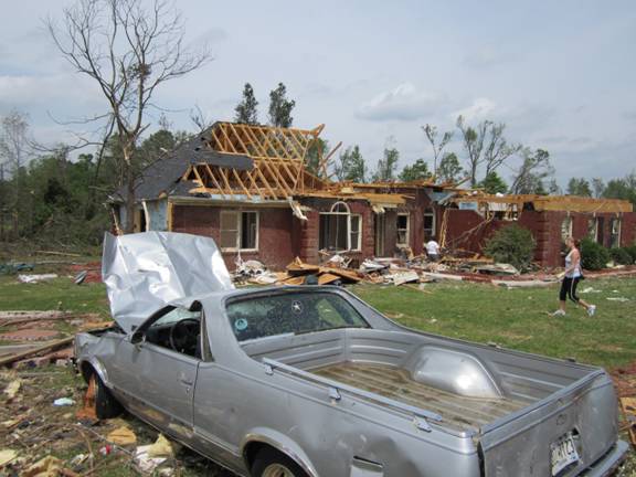
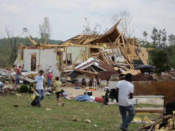
Yesterday I helped with the tornado cleanup effort in Fords Chapel, a small community northwest of Huntsville on the edge of Anderson Hills…an area that has now gone through its second major tornado disaster. The church group I was with spent most of our time with chainsaws cutting up downed trees and dragging them to the road to be picked up.

Here are a few of the photos I took there yesterday:

The minivan above was covered with volunteers’ messages, signatures, etc.

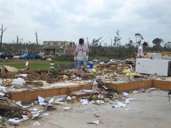
Thousands of volunteers have been helping out across Alabama. The National Guard and local fire departments have been driving around making sure people have enough water to drink. As can be seen, a few areas are so devastated that they will just have to wait for bulldozers and frontend loaders to come and cart everything away.

One man picking through what was left of his home simply said to me, “Time to start over.”