Archive for January, 2011

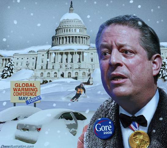
OMG! ANOTHER GLOBAL WARMING SNOWSTORM!!

Monday, January 31st, 2011

I really can’t decide whether I should hate Al Gore… or thank him for giving me something to write about.

He has caused the spread of more pseudo-scientific incompetence on the subject of global warming (I’m sorry — climate change) than any climate scientist could possibly have ever accomplished. Who else but a politician could spin so much certainty out of a theory?

As someone who has lived and breathed meteorology and climate for 40 years now, I can assure you that this winter’s storminess in the little 2% patch of the Earth we like to call the ‘United States of America’ has nothing to do with your SUV.

Natural climate variability? Maybe.

But I would more likely chalk it up to something we used to call “WEATHER”.

Let me give you a few factoids:

1) No serious climate researcher — including the ones I disagree with — believes global warming can cause colder weather. Unless they have become delusional as a result of some sort of mental illness. One of the hallmarks of global warming theory is LESS extratropical cyclone activity — not more.

2) If some small region of the Earth is experiencing unusually persistent storminess, you can bet some other region is experiencing unusually quiet weather. You see, in the winter we get these things called ‘storm tracks’….

3) Evidence for point #2 is that we now have many years of global satellite measurements of precipitation which shows that the annual amount of precipitation that falls on the Earth stays remarkably constant from year to year. The AREAS where it occurs just happen to move around a whole lot. Again, we used to call that “weather”.

4) Global average temperature anomalies (departures from seasonal norms) have been falling precipitously for about 12 months now. Gee, maybe these snowstorms are from global cooling! Someone should look into that! (I know…cold and snow from global cooling sounds crazy….I’m just sayin’….)

I could go on and on.

Now, I know I’m not going to change the minds of any of the True Believers…those who read all of Reverend Al’s sermons, and say things like, “You know, global warming can mean warmer OR colder, wetter OR drier, cloudier OR sunnier, windier OR calmer, …”. Can I get an ‘amen’??

But I hope I can still save a few of those out there who are still capable of independent reasoning and thought.

NOW can I go to bed?

UPDATE: Further Evidence of Low Climate Sensitivity from NASA’s Aqua Satellite

Friday, January 28th, 2011

After yesterday’s post, I decided to run the simple forcing-feedback model we developed to mimic the Aqua satellite observations of global oceanic temperature and radiative flux variations.

I’ve also perused the comments people have made there, and will try to clarify what I’ve done and why it’s important.

First of all, my (and even the IPCC’s) emphasis on changes in the global radiative budget cannot be overemphasized when we are trying to figure out whether “global warming” is mostly manmade or natural, and how the climate system responds to forcing.

Changes in the global-average radiative budget are about the only way for the Earth to warm or cool on time scales of years or longer (unless there is some sort of change in geothermal heat flux…we won’t even go there.)

What we want to know, ultimately, is how much warming will result from the radiative imbalance caused by adding CO2 to the atmosphere. It is natural to try to answer that question by examining how Mother Nature handles things when there are natural, year-to-year warmings and coolings. I believe that the NASA satellite assets we have in orbit right now are going to go a long way toward providing that answer.

The answer depends upon how clouds, evaporation, water vapor, etc., change IN RESPONSE TO a temperature change, thus further altering the radiative balance and final temperature response. This is called feedback, and it is traditionally referenced to a surface temperature change.

The GOOD news is that we have pretty accurate satellite measurements of the rather small, year-to-year changes in global radiative fluxes over the last 10 years, as well as of the temperature changes that accompanied them.

The BAD news is that, even if those measurements were perfect, determining feedback (temperature causing radiative changes) is confounded by natural forcings (radiative changes causing temperature changes).

This interplay between natural variations in global-average temperature and radiative flux are always occurring, intermingled together, and the goal is to somehow disentangle them to get at the feedback part.

Keep in mind that “feedback” in the climate system is more of a conceptual construct. It isn’t something we can measure directly with an instrument, like temperature. But the feedback concept is useful because we are pretty sure that elements of the climate system (e.g. clouds) WILL change in response to any radiative imbalance imposed upon the system, and those changes will either AMPLIFY or REDUCE the temperature changes resulting from the initial imbalance. (While it might not be exactly the same kind of feedback electrical engineers deal with, there is currently no better term to describe the process…a process which we know must be occurring, and must be understood in order to better predict human-caused global warming.)

More than any other factor, feedbacks will determine whether anthropogenic global warming is something we need to worry about.

An Example from the Kitchen
While this might all seem rather cryptic, ALL of these processes have direct analogs to a pot of water warming on the stove. You can turn the heat up on the stove (forcing), and the water will warm. But if you also remove the lid in proportion to the stove being turned up (negative feedback), you can reduce the warming. It’s all based upon energy conservation concepts, which ordinary people are exposed to every day.

The IPCC believes Mother Nature covers up the pot even more as the stove is turned up, causing even more warming in response to a “forcing”.

I think they are wrong.

NASA Aqua Satellite Observations of the Global Oceans
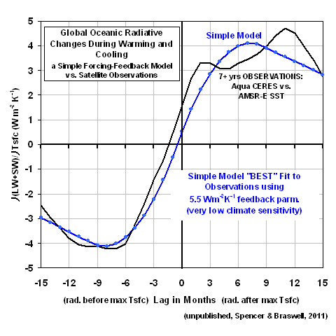
Similar to what I plotted yesterday, the following plot shows time-lagged regression coefficients between time series of global oceanic radiative flux (from the CERES instrument on Aqua), and sea surface temperature (from AMSR-E on Aqua). Yesterday’s plot also showed the results when I used the Hadley Center’s SST measurements (the dashed line in that graph), and the results were almost identical. But since I’m the U.S. Science Team Leader for AMSR-E, I’ll use it instead. 🙂

The way these regression coefficients can be interpreted is that they quantify the rate at which radiative energy is GAINED by the global ocean during periods when SST is rising, and the rate at which radiative energy is LOST when SST is falling. Conceptually, the vertical line at zero months time lag can be thought of as corresponding to the time of peak SST.
The Simple Model “Best” Match to the Satellite Data
I’ve run our simple forcing-feedback model (originally suggested to us by Isaac Held at Princeton) to try to match the satellite observations. I force the model with quasi-random time variations in the global radiative energy budget — representing, say, natural, quasi-chaotic variations in cloud cover — and then see how the model temperatures respond. The model has been available here for many months now, if you want to play with it.

The model’s response to these radiative forcings depends upon how I set the model’s: (1) ocean mixing depth, which will determine how much the temperature will change for a given energy imbalance imposed upon the model, and (2) feedback parameter, which is what we ultimately want to determine from the satellite data.

I found that a 70 meter deep layer provided about the right RATIO between the satellite-observed monthly radiative variations (0.8 Watts per sq. meter standard deviation) and SST variations (0.08 deg. C standard deviation). At the same time, I had to adjust the magnitude of the radiative forcing to get about the right ABSOLUTE MAGNITUDES for those standard deviation statistics, too.

The “best fit” I got after about an hour of fiddling around with the inputs is represented by the blue curve in the above chart. Importantly, the assumed feedback parameter (5.5) is solidly in “negative feedback” territory. IF this was the true feedback operating in the real climate system on the long time scales of ‘global warming’, it would mean that our worries over anthropogenic global warming have been, for all practical purposes, a false alarm.

The Simple Model Run With the IPCC’s Average Feedback

At this point, a natural question is, How does the simple model behave if I run it with a feedback typical of the IPCC climate models? The average net feedback parameter across the IPCC models is about 1.4 Watts per sq. meter per degree, and the following plot shows the simple model’s response to that feedback value compared to the satellite observations.
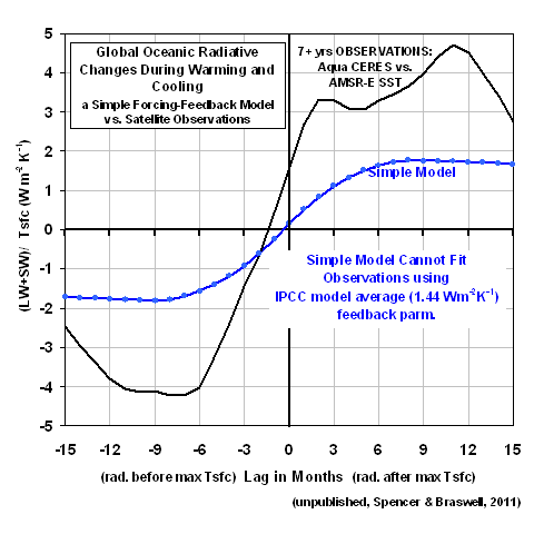
A comparison between the 2 charts above would seems to indicate that the satellite data are more consistent with negative feedback (which, if you are wondering, is a net feedback parameter greater than 3.2 W m-2 K-1) than they are with positive feedback. But it could be that feedbacks diagnosed from the IPCC models only over the global oceans will be necessary to provide a more apples-to-apples comparison on this point.

Important Caveat
While it would be tempting to think that the IPCC models are potentially invalidated by this comparison, Dessler (2010) has correctly pointed out that the short-term feedback behavior of the IPCC models appear to have little or no relationship to their long-term climate sensitivity.

In other words, even if short-term feedbacks in the real climate system are strongly negative, this doesn’t prove the long-term global warming in the models is wrong.

In fact, NO ONE HAS YET FOUND A WAY WITH OBSERVATIONAL DATA TO TEST CLIMATE MODEL SENSITIVITY. This means we have no idea which of the climate models projections are more likely to come true.

This dirty little secret of the climate modeling community is seldom mentioned outside the community. Don’t tell anyone I told you.

This is why climate researchers talk about probable ranges of climate sensitivity. Whatever that means!…there is no statistical probability involved with one-of-a-kind events like global warming!

There is HUGE uncertainty on this issue. And I will continue to contend that this uncertainty is a DIRECT RESULT of researchers not distinguishing between cause and effect when analyzing data.

Toward Improved Climate Sensitivity Estimates
As I mentioned yesterday, Dessler (2010) only addressed ZERO-time lag relationships, as did all previous investigators doing similar kinds of work. In contrast, the plots I am presenting here (and in yesterday’s post) show how these regression coefficients vary considerably with time lag. In fact, at zero time lag, the relationships become virtually meaningless. Cause and effect are hopelessly intertwined.

But we CAN measure radiative changes BEFORE a temperature peak is reached, and in the months FOLLOWING the peak. Using such additional “degrees of freedom” in data analysis will be critical if we are to ever determine climate sensitivity from observational data. I know that Dick Lindzen is also advocating the very same point. If you are a lay person who understands this, can i get an “amen”? Because, so far, other climate researchers are keeping their mouths shut.

It is imperative that the time lags (at a minimum) be taken into account in such studies. Our previous paper (Spencer & Braswell, 2010) used phase space plots as a way of illustrating time lag behavior, but it could be that plots like I have presented here would be more readily understood by other scientists.

Unfortunately, the longer the climate community establishment keeps its head in the sand on this issue , the more foolish they will look in the long run.

New Results on Climate Sensitivity: Models vs. Observations

Thursday, January 27th, 2011

Partly as a result of my recent e-mail debate with Andy Dessler on cloud feedbacks (the variable mostly likely to determine whether we need to worry about manmade global warming), I have once again returned to an analysis of the climate models and the satellite observations.

I have just analyzed the 20th Century runs from the IPCC’s three most sensitive models (those producing the most global warming), and the 3 least sensitive models (those that produce the least global warming), and compared their behavior to the 10 years of global temperature and radiative budget data Dessler analyzed (as did Spencer & Braswell, 2010).

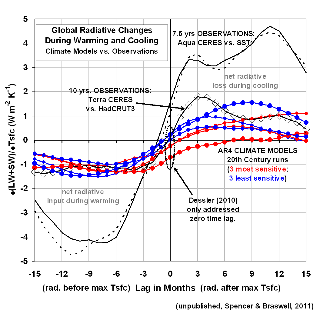
The following plot shows the most pertinent results. While it requires some explanation, an understanding of it will go a long way to better appreciating not only how climate models and the real world differ, but also what happens when the Earth warms and cools from year-to-year…say from El Nino or La Nina.

What the plot shows is (on the vertical axis) how much net loss or gain in radiant energy occurs for a given amount of global-average surface warming, at different time lags relative to that temperature peak (on the horizontal axis). You can click on the graph to get a large version.

All observations are shown with black curves; the climate model relationships are shown in either red (3 models that predict the most global warming during the 21st Century), or blue (the 3 models predicting the least warming). Let’s examine what these curves tell us:

1) RADIATIVE ENERGY ACCUMULATES DURING WARMING IN ADVANCE OF THE TEMPERATURE PEAK: In the months preceding a peak in global temperatures (the left half of the graph), both models and observations show the Earth receives more radiant energy than it loses (try not to be confused by the negative sign). This probably occurs from circulation-induced changes in cloud cover, most likely a decrease in low clouds letting more sunlight in (“SW” means shortwave, i.e. solar)…although an increase in high cloud cover or tropospheric humidity could also be involved, which causes a reduction in the rate if infrared (longwave, or “LW”) energy loss. This portion of the graph supports my (and Lindzen’s) contention that El Nino warming is partly a radiatively-driven phenomenon. [The curves with the much larger excursions are for oceans-only, from instruments on NASA’s Aqua satellite. The larger excursions are likely related to the higher heat capacity of the oceans: it takes more radiative input to cause a given amount of surface warming of the oceans than of the land.]

2) RADIATIVE ENERGY IS LOST DURING COOLING AFTER THE TEMPERATURE PEAK: In the months following a peak in global average temperature, there is a net loss of radiative energy by the Earth. Note that THIS is where there is more divergence in the behavior of the climate models, and the observations. While all the climate models showed about the same amount of radiative input per degree of warming, during the cooling period there is a tendency for the least sensitive climate models (blue curves) to lose more energy than the sensitive models. NOTE that this distinction is NOT apparent at zero time lag, which is the relationship examined by Dessler 2010.

WHAT DOES THE DIVERGENCE BETWEEN THE MODELS DURING THE COOLING PERIOD MEAN?
Why would the climate models that produce less global warming during the 21st Century (blue curves) tend to lose MORE radiant energy for a given amount of surface temperature cooling? The first answer that comes to my mind is that a deeper layer of the ocean is involved during cooling events in these models.

For instance, look that the red curve with the largest dots…the IPCC’s most sensitive model. During cooling, the model gives up much less radiant energy to space than it GAINED during the surface warming phase. The most obvious (though not necessarily correct) explanation for this is that this model (MIROC-Hires) tends to accumulate energy in the ocean over time, causing a spurious warming of the deep ocean.

These results suggest that much more can be discerned about the forcing and feedback behavior of the climate system when time lags between temperature and radiative changes are taken into account. This is why Spencer & Braswell (2010) examined phase space plots of the data, and why Lindzen is emphasizing time lags in 2 papers he is currently struggling to get through the peer review cycle.

SO WHICH OF THE CLIMATE MODELS IS MORE LIKELY TO BE CORRECT?

This is a tough one. The above plot seems to suggest that the observations favor a low climate sensitivity…maybe even less than any of the models. But the results are less than compelling.

For instance, at 3 months after the temperature peak, the conclusion seems clear: the satellite data show a climate system less sensitive than even the least sensitivie model. But by 9 months after the temperature peak, the satellite observations show the same relationship as one of the most sensitive climate models.

So, I’m sure that you can look at this chart and see all kinds of relationships that support your view of climate change, and that’s fine. But *MY* contention is that we MUST move beyond the simplistic statistics of the past (e.g., regressions only at zero time lag) if we are to get ANY closer to figuring out whether the observed behavior of the real climate system supports either (1) a resilient climate system virtually immune to the activities of humans, or (2) a climate system that is going to punish our use of fossil fuels with a global warming Armageddon.

The IPCC is no nearer to answering that question than they were 20 years ago. Why?

Dessler-Spencer Cloud Feedback Debate Update

Thursday, January 20th, 2011

The e-mail debate I have been having with Andy Dessler over his recent paper purporting to show positive cloud feedback in 10 years of satellite data appears to have reached an impasse.

Dick Lindzen has chimed in on my side in recent days, but Andy continues to claim that – at least during the 2000-2010 period in question — I have provided no evidence that clouds cause climate variations.

This is remarkably similar to how Kevin Trenberth rebutted my last congressional testimony…”clouds don’t cause climate change”, is approximately what I recall Kevin saying.

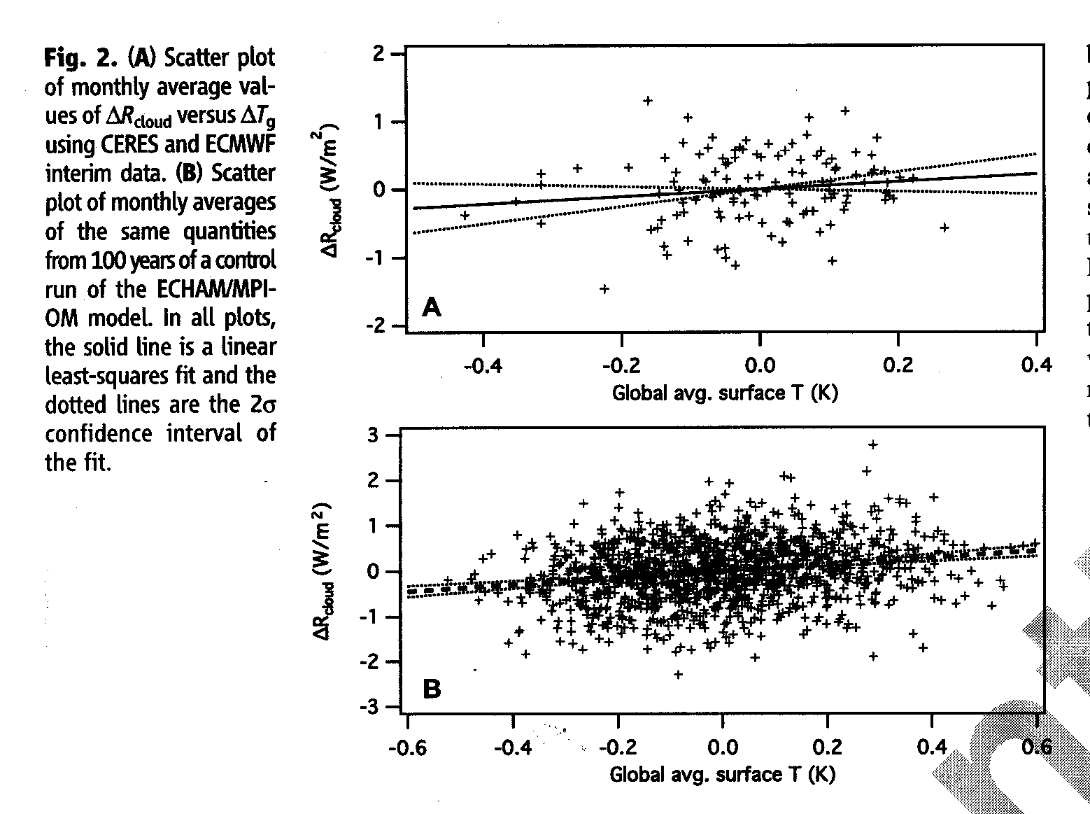
So, let’s return to Andy Dessler’s main piece of evidence, which is Fig. 2 from his paper, showing how monthly, global-average changes in (1) clouds and (2) surface temperature relate to each other, in the satellite observations (top panel), and in the ECHAM climate model (bottom panel, click for large version):

Andy has fitted regression lines to the data, and both have a slope approaching zero (for some reason, I can’t even find correlation coefficients in his paper). He claims these regression slopes support positive cloud feedback, in both the satellite observations and the climate model.

Now, why do I (and Dick Lindzen) disagree with this interpretation of the data? Because, while feedback is — by definition — temperature change (the horizontal axis) causing a cloud-induced radiative change (the vertical axis), NO ACCOUNTING HAS BEEN MADE FOR CAUSATION IN THE OPPOSITE DIRECTION.

And as shown most recently by Spencer & Braswell (2010, SB2010), any non-feedback source of cloud variations will (necessarily) cause a temperature response that is highly DE-correlated…just as we see in the satellite data! In fact, we showed that a near-zero regression slope can occur with even strongly NEGATIVE cloud feedback.

The bottom line is that, you can not use simple regression to infer cloud feedbacks from data like those seen in Dessler’s data plots.

This is not a new claim…there have been earlier papers cautioning against inferring cloud feedback (a specific kind of causation) from such data. The first two papers that come to mind are Aries & Rossow (2003 QJRMS), and Stephens (2005 J Climate). Nevertheless, researchers continue to use such statistics to try to justify the claimed reality of continuing climate model projections of strong global warming.

I’m sorry, but finding some statistical relationship with a near-zero correlation in BOTH the satellite data AND in the climate model behavior is (in my opinion) nowhere near proving that climate models are useful for long-term predictions of the climate system.

If that makes me a “denier”, so be it.

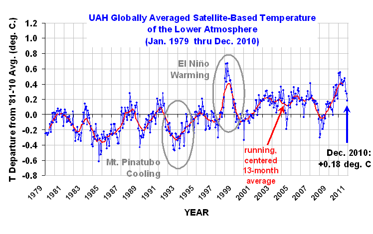
Dec. 2010 UAH Global Temperature Update: +0.18 deg. C

Monday, January 3rd, 2011

UPDATE #1(1/3/10, 2:50 p.m. CST): Graph fixed…it was missing Dec. 2010.

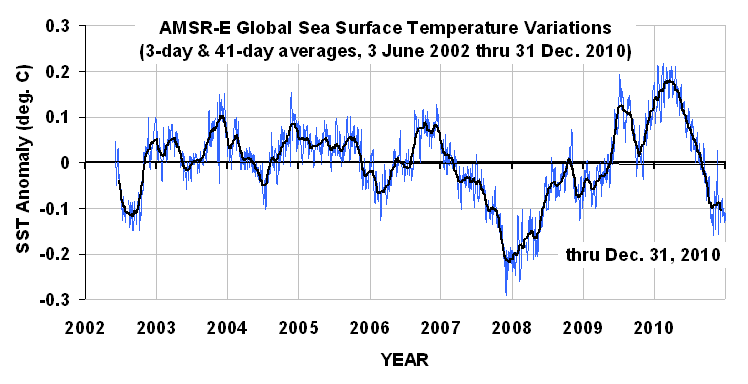
UPDATE #2(1/3/10, 3:25 p.m. CST): Appended global sea surface temperature anomalies from AMSR-E.

NEW 30-YEAR BASE PERIOD IMPLEMENTED!


YR MON GLOBE NH SH TROPICS
2010 1 0.542 0.675 0.410 0.635
2010 2 0.510 0.553 0.466 0.759
2010 3 0.554 0.665 0.443 0.721
2010 4 0.400 0.606 0.193 0.633
2010 5 0.454 0.642 0.265 0.706
2010 6 0.385 0.482 0.287 0.485
2010 7 0.419 0.558 0.280 0.370
2010 8 0.441 0.579 0.304 0.321
2010 9 0.477 0.410 0.545 0.237
2010 10 0.306 0.257 0.356 0.106
2010 11 0.273 0.372 0.173 -0.117
2010 12 0.180 0.213 0.147 -0.221


UAH_LT_1979_thru_Dec_10

NEW 30-YEAR BASE PERIOD IMPLEMENTED!
Sorry for yelling like that, but if you have been following our global tropospheric temperature updates every month, you will have to re-calibrate your brains because we have just switched from a 20 year base period (1979 – 1998) to a more traditional 30 year base period (1981-2010) like that NOAA uses for climate “normals”.

This change from a 20 to a 30 year base period has 2 main impacts:

1) because the most recent decade averaged somewhat warmer than the previous two decades, the anomaly values will be about 0.1 deg. C lower than they used to be. This does NOT affect the long-term trend of the data…it only reflects a change in the zero-level, which is somewhat arbitrary.

2) the 30-year average annual cycle shape will be somewhat different, and more representative of “normal” of the satellite record than with 20 years; as a result, the month-to-month changes in the anomalies might be slightly less “erratic” in appearance. (Some enterprising person should check into that with the old versus new anomaly datasets).

Note that the tropics continue to cool as a result of the La Nina still in progress, and the Northern Hemisphere also cooled in December, more consistent with the anecdotal evidence. 🙂

I will provide a global sea surface temperature update later today.

WHO WINS THE RACE FOR WARMEST YEAR?
As far as the race for warmest year goes, 1998 (+0.424 deg. C) barely edged out 2010 (+0.411 deg. C), but the difference (0.01 deg. C) is nowhere near statistically significant. So feel free to use or misuse those statistics to your heart’s content.

THE DISCOVER WEBSITE: NOAA-15 PROBLEMS STARTING IN MID-DECEMBER
For those tracking our daily updates of global temperatures at the Discover website, remember that only 2 “channels” can be trusted for comparing different years to each other, both being the only ones posted there from NASA’s Aqua satellite:

1) only ch. 5 data should be used for tracking tropospheric temperatures,
2) the global-average “sea surface” temperatures are from AMSR-E on Aqua, and should be accurate.

The rest of the channels come from the AMSU on the 12 year old NOAA-15 satellite, WHICH IS NOW EXPERIENCING LARGE AMOUNTS OF MISSING DATA AS OF AROUND DECEMBER 20, 2010. This is why some of you have noted exceptionally large temperature changes in late December. While we wait for NOAA to investigate, it seems like more than coincidence that the NOAA-15 AMSU status report had a December 17 notice that the AMSU scan motor position was being reported incorrectly due to a bit error.

The notice says that problem has been sporadic, but increasing over time as has the amount of missing data I have seen during my processing. At this early stage, I am guessing that the processing software cannot determine which direction the instrument is pointing when making its measurements, and so the data from the radiometer are not being processed.

The daily NOAA-15 AMSU imagery available at the Discover website shows that the data loss is much more in the Northern Hemisphere than the Southern Hemisphere, which suggests that the temperature of the instrument is probably involved in the bit error rate. But at this point, this is all my speculation, based upon my past experience studying how the temperature of these instruments vary throughout the orbit as the solar illumination of the spacecraft varies.

SST UPDATE FROM AMSR-E

The following plot shows global average sea surface temperatures from the AMSR-E instrument over the lifetime of the Aqua satellite, through Dec 31, 2010. The SSTs at the end of December suggest that the tropospheric temperatures in the previous graph (above) still have a ways to fall in the coming months to catch up to the ocean, which should now be approaching its coolest point if it follows the course of previous La Nina’s.

WeatherShop.com Gifts, gadgets, weather stations, software and more...click here!

Why Most Published Research Findings are False

Monday, January 3rd, 2011

Those aren’t my words — it’s the title of a 2005 article, brought to my attention by Cal Beisner, which uses probability theory to “prove” that “…most claimed research findings are false”. While the article comes from the medical research field, it is sufficiently general that some of what it discusses can be applied to global warming research as well.

I would argue that the situation is even worse for what I consider to the central theory of the climate change debate: that adding greenhouse gases to the atmosphere causes significant warming of the climate system. Two corollaries of that theory are that (1) the warming we have seen in recent decades is human-caused, and (2) significant warming will continue into the future as we keep using fossil fuels.

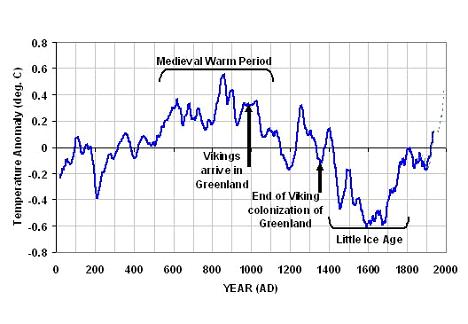
The first problem I see with scientifically determining whether the theory of anthropogenic global warming (AGW) is likely to be true is that it is a one-of-a-kind event. This immediately reduces our scientific confidence in pinpointing the cause of warming. The following proxy reconstruction of temperature variations over the last 2,000 years suggests global warming (and cooling), are the rule, not the exception, and so greenhouse gas increases in the last 100 years occurring during warming might be largely a coincidence.

Twice I have testified in congress that unbiased funding on the subject of the causes of warming would be much closer to a reality if 50% of that money was devoted to finding natural reasons for climate change. Currently, that kind of research is almost non-existent.

A second, related problem is that we cannot put the Earth in the laboratory to run controlled experiments on. Now, we CAN determine in the laboratory that certain atmospheric constituents (water vapor, water droplets, carbon dioxide, methane) absorb and emit infrared energy…the physical basis for the so-called greenhouse effect. But the ultimate uncertainty over atmospheric feedbacks — e.g. determining whether cloud changes with warming reduce or amplify that warming — cannot be tested with any controlled experiment.

A third problem is the difficulty in separating cause from effect. Determining whether atmospheric feedbacks are positive or negative requires analysis of entire, quasi-global atmospheric circulation systems. Just noticing that more clouds tend to form over warm regions does not tell you anything useful about whether cloud feedbacks are positive or negative. Atmospheric and oceanic circulation systems involve all kinds of interrelated processes in which cause and effect must surely be operating. But separating cause from effect is something else entirely.

For example, just establishing that years experiencing global warmth have less cloud cover letting more sunlight in does not prove positive cloud feedback…simply because the warming could have been the result of — rather than the cause of — fewer clouds. This is the subject that Andy Dessler and I have been debating recently, and I consider it to be the Achilles heel of AGW theory.

After all, it is not the average role of clouds in the climate system that is being debated — we already know it is a cooling effect. It’s instead how clouds will change as a result of warming that we are interested in. Maybe they are the same thing (which is what I’m betting)…but so far, no one has found a way to prove or disprove it. And I believe cause-versus-effect is at the heart of that uncertainty.

A fourth problem with determining whether AGW theory is true or not is closely related to a similar problem medical research has — the source of funding. This has got to be one of the least appreciated sources of bias in global warming research. In pharmaceutical research, experimentally demonstrating the efficacy of some new drug might be influenced by the fact that the money for the research came from the company that developed the drug in the first place. This is partly why double-blind studies involving many participants (we have only one: Earth) were developed.

But in global warming research, there is a popular misconception that oil industry-funded climate research actually exists, and has skewed the science. I can’t think of a single scientific study that has been funded by an oil or coal company.

But what DOES exist is a large organization that has a virtual monopoly on global warming research in the U.S., and that has a vested interest in AGW theory being true: the U.S. Government. The idea that government-funded climate research is unbiased is laughable. The push for ever increasing levels of government regulation and legislation, the desire of government managers to grow their programs, the dependence of congressional funding of a problem on the existence of a “problem” to begin with, and the U.N.’s desire to find reasons to move toward global governance, all lead to inherent bias in climate research.

At least with medical research, there will always be funding because disease will always exist. But human-caused warming could end up to be little more than a false alarm…as well as a black eye for the climate research community. And lest we forget, possibly the biggest funding-related source of bias in climate research is that research community of scientists. Everyone knows that if the AGW “problem” is no longer a problem, their source of research funding will disappear.

Sometimes I get accused of being a conspiracy nut for believing these things. Well, whoever accuses me of that has obviously not worked in government or spent much time dealing with program managers in Washington. There is no conspiracy, because these things are not done in secret. The U.N.’s Agenda 21 is there for all to read.

The bottom line is that there could scarcely be a more ill-posed scientific question than whether global warming is human-caused: a one of a kind event, the Earth can’t be put into a laboratory to study, cause and effect are intermingled, and the political and financial sources of bias in the resulting research are everywhere.

So, when some scientist says we “know” that warming is human-caused, I cringe at the embarrassing abundance of scientific ignorance on display. No wonder the public doesn’t trust scientific predictions — just as suggested by the 2005 study I mentioned at the outset, those predictions have almost always been wrong!