As part of a DOE grant we are testing climate models against satellite observations, particularly regarding the missing �hotspot� in the tropics, that is, the expected region of enhanced warming in the tropical mid- and upper troposphere as the surface warms. Since 1979 (the satellite period of record), it appears that warming in those upper layers has been almost non-existent, despite some surface warming and increases in low-level humidity.
For years I have claimed that the missing hotspot could be evidence of neutral or even negative water vapor feedback, which would also help explain weaker than expected surface warming.
Climate modelers are all but certain that water vapor feedback is positive. I have discussed elsewhere (e.g. here) how that might not be the case, even as lower atmospheric water vapor increases, and it�s related to how precipitation efficiency might change with warming leading to drying of the troposphere above the boundary layer. This is also part of Lindzen�s �Iris Effect�. While water vapor at the lowest altitudes over the ocean is strongly tied to surface temperature, free-tropospheric humidity is controlled by precipitation microphysics, and we have little information on how that changes with warming.
So, I�ll get right to the subject of this post. We have analyzed 11 years of water vapor channel (183.3 GHz) data from the AMSU-B instrument on the NOAA-18 satellite, and compared it to the mid-tropospheric temperature data from AMSU channel 5 (the �MT� channel). Specifically, we computed monthly gridpoint anomalies in all channels over the 11 year period, and regressed the 183.3 GHz brightness temperature (Tb) anomalies against the channel 5 Tb anomalies. This should give information on how much the free troposphere moistens or dries when it changes temperature.
The following image shows the gridpoint regression coefficients for the monthly anomalies during June 2005 through May 2015:
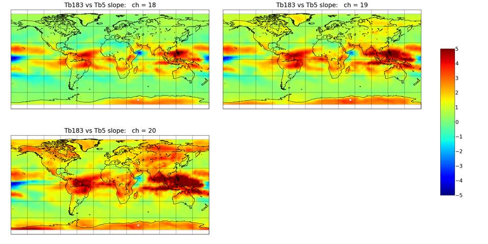
Fig. 1. Gridpoint regression coefficients between the NOAA-18 AMSU-b 183.3 GHz channels Tb and AMSU-A channel 5 Tb during June 2005 through May 2015. Ch. 18 is 183.3+/-1 GHz, generally peaking in the upper troposphere; ch. 19 is 183.3+/-3 GHz peaking in the upper-mid troposphere, and ch. 20 is 183.3 +/-7 GHz peaking in the lower mid-troposphere.
Yellow to red colors are where absolute humidity decreases with warming; green is humidity increasing to roughly maintain constant RH, and blue is where humidity increases even more than constant RH. The signal of El Nino/La Nina is clear over the Pacific Ocean, where the features represent a regional rearrangement of deep convection (upward motion) and subsidence (sinking motion) patterns.
But what really matters for water vapor feedback is the net effect of these patterns…how they average together. The following graph (left panel) shows latitude band averages of the gridpoint regression coefficients in the above imagery, while the right panel shows the same computations from 15 years (2006-2020) from the GFDL ESM2M climate model:
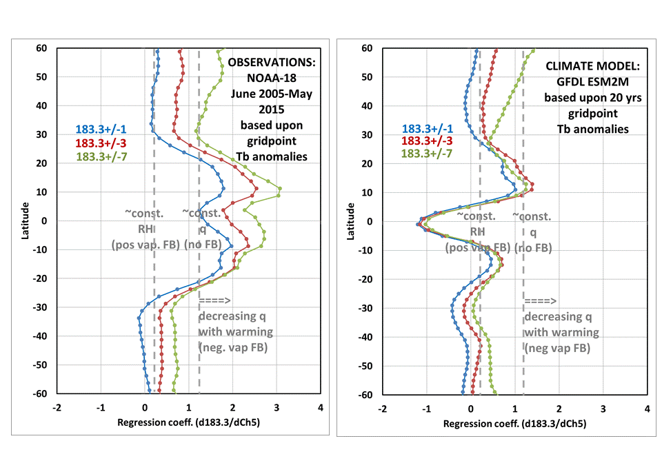
Fig. 2. Zonal averages of the patterns seen in Fig. 1 (left panel), and similar computations made from the GFDL ESM2M climate model (right panel).
The vertical dashed lines in Fig. 2 are based upon computations made from the AFGL tropical and mid-latitude radiosonde profile data; values of about 0.2 correspond to constant relative humidity (RH) with warming, while values of ~1.2 correspond to constant specific humidity, q (no water vapor increase). Values over 1.2 would be water vapor (q) actually decreasing with warming, and potentially indicative of negative water vapor feedback.
Note that in the tropical observations portion of the left panel in Fig. 2, all three 183.3 GHz channels (corresponding to different free-tropospheric layers) suggest decreasing water vapor with warming. (I don�t know how cirrus clouds might also be affected, but Lindzen has argued as part of his Iris Effect hypothesis that vapor and cirrus cloud cover should change together, and the 183.3 GHz data are affected somewhat by thick cirrus).
The mid-latitudes seem to be mostly in the realm of positive water vapor feedback, although maybe not constant RH (which is what the models tend to do). It would take more work to determine just what these extratropical humidity channel changes really mean in terms of broadband infrared radiative feedback.
Comparison of these same metrics to CMIP5 climate model data has been slow, since the necessary humidity and temperature profile data have been unavailable from the CMIP5 archive for months. Nevertheless, we were able to download data for two GFDL models (from the GFDL website), and I�m showing one of those in the right panel above, where we used a radiative transfer model to compute the same satellite microwave channels from the model temperature and humidity profiles. Note that in the tropics (say, 25N to 25S) the model tends to keep approximately constant RH when all those latitude bands are taken together.
This is pretty typical behavior for climate models, which are tuned to act this way. The models don�t actually contain the necessary precipitation microphysics, something even their convective parameterizations can�t fix because we really don�t know how detrainment from convection changes with warming anyway. In other words, you can’t parameterize something that you don’t even understand and can’t measure.
One curious clue from the above plots of models versus observations is how the three 183.3 GHz channel curves separate in the tropical observations, but not in the model. This would occur if convection detrains at higher altitudes with warming, with the mid-tropospheric humidity getting depressed even more as that very dry air descends from aloft, while mid-tropospheric detrainment and mixing from convection into the surrounding environmental air decreases.
Presumably, the primary source of variability in the observations is El Nino/La Nina (ENSO), which many climate models do not mimic very well. But the GFDL model we chose to compare to in Fig. 2 also produces very strong ENSO activity, so we think this is a pretty valid comparison between a model and observations.
This is all very preliminary, and we await the CMIP5 archive coming back online again late this month so that we can analyze more models. But if this discrepancy between models and observations holds across most or all models, we might have some important insight into how the models might not be accounting for increasing precipitation efficiency during warming, and in turn why the hotspot hasn�t developed� and why global warming in general is weaker than programmed into the climate models.

 Home/Blog