Archive for August, 2009

Spurious SST Warming Revisited

Monday, August 31st, 2009

My previous post described what I called “smoking gun” evidence of a spurious drift in the NOAA sea surface temperature (SST) product when compared to SSTs from the TRMM satellite Microwave Imager (TMI). The drift seemed to be mostly confined to 2001, almost a ‘step’ jump. The moored buoy validation statistics of the TMI sea surface temperatures from Frank Wentz’s web site (SSMI.com) suggested that the TMI SSTs had good long-term stability.

But 2001 was also the year that the TRMM satellite was boosted into a higher orbit, which concerned me. I asked Frank about the effect of this event on the TMI SSTs (which also come from his web site). Frank couldn’t remember the details, but said he spent quite a bit of time correcting for the altitude change on the retrieved SSTs since the microwave emission of the sea surface depends upon the TMI instrument’s view angle with respect to the local vertical.

I know from our many years of work together on the AMSR-E Science Team that Frank is indeed a careful researcher, yet it seemed like more than a coincidence that the TMI and NOAA sea surface temperatures diverged during the same year as the orbit boost. So, I went back to see what might have caused the problem. I went back and thought about the different ways in which one can compute area averages from satellite data.

To make a long story short, because the orbit boost caused the TMI to be able to “see” to slightly higher latitudes, the way in which individual latitude bands are handled has a significant impact on the resulting temperature anomalies that are computed over time. The previous results I presented were for the 40N to 40S latitude band, which is nominally what the TMI instrument sees today. But before 2001, the latitudinal extent was slightly smaller than it was after 2001.

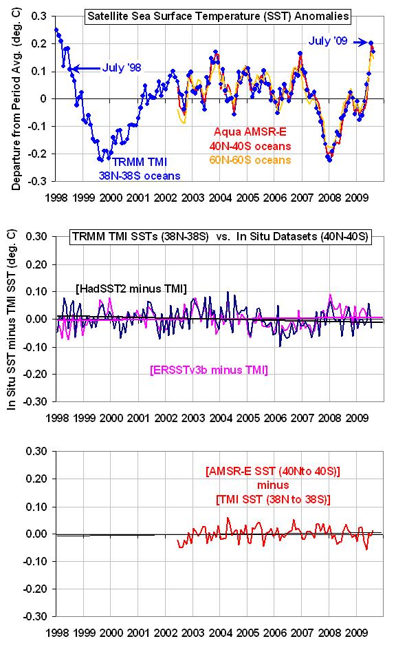
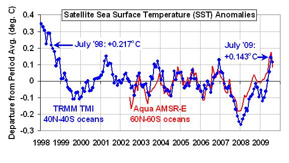
As shown in the following figure, if I restrict the latitude range to 38N to 38S, which was always covered during the entire TRMM mission, I find that the divergence between the TMI and NOAA average SST measurements essentially disappears.

TMI-AMSRE-ERSSTv3b-comparisons-1998-2009-revisited

Even though I was processing the NOAA and TMI datasets in the same manner, I should NOT have been. This is because there were not as many gridpoints over cooler SST regions going into the ‘global’ averages before the satellite altitude boost as after the boost. So, for example, one must be very careful in computing a latitude band average, say from 39N to 40N, to make sure that there has been no long-term change in the sampling of that band.

Based upon the above comparisons, I would now say there is no statistically significant difference in the SST trends since 1998 between TMI, the NOAA ERSSTv3b product, and the HadSST2 product. And it does look like July 2009 might well have experienced a warmer SST anomaly than July 1998, as was originally claimed by NOAA. (Remember, TMI can not see all of the global oceans, just equatorward of about 40 deg. N and S latitude.)

In the bottom panel of the above figure, I also have a comparison between the TMI and AMSR-E sea surface temperatures, which are available only since June of 2002 from the Aqua satellite. As can be seen, there is no evidence of a calibration (or sampling) drift in that comparison either.

So, what’s the moral of this story? Always question your results…even after finding the obvious errors. And maybe I should eliminate the term ‘smoking gun evidence’ from any results I describe in the future.

Oh…and don’t believe everything you read on the internet.


Spurious Warming in New NOAA Ocean Temperature Product: The Smoking Gun

Thursday, August 27th, 2009

IMPORTANT (2:15 p.m. CDT, 8/31/09): The results of this post have been superseded.

After crunching data this week from two of our satellite-based microwave sensors, and from NOAA’s official sea surface temperature (SST) product ERSST v3b, I think the evidence is pretty clear:

The ERSST v3b product has a spurious warming since 1998 of about 0.2 deg. C, most of which occurred as a jump in 2001.

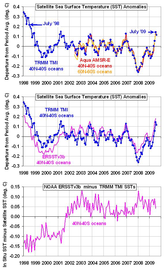
The following three panels tell the story. In the first panel I’ve plotted the TRMM Microwave Imager (TMI) SST anomalies (blue) for the latitude band 40N to 40S. I’ve also plotted SST anomalies from the more recently launched AMSR-E instrument (red), computed over the same latitude band, to show that they are nearly identical. (These SST retrievals do not have any time-dependent adjustments based upon buoy data). The orange curve is anomalies for the entire global (ice-free) oceans, which shows there is little difference with the more restricted latitude band.

TMI-AMSRE-ERSSTv3b-comparisons-1998-2009

In the second panel above I’ve added the NOAA ERSST v3b SST anomalies (magenta), calculated over the same latitude band (40N to 40S) and time period as is available from TRMM.

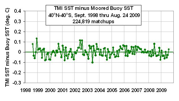
The third panel above shows the difference [ERSST minus TMI], which reveals an abrupt shift in 2001. The reason why I trust the microwave SST is shown in the following plot, where validation statistics are displayed for match-ups between satellite measurements and moored buoy SST measurements. The horizontal green line is a regression fit to the data. (An average seasonal cycle, and 0.15 deg. C cool skin bias have been removed from these data…neither affects the trend, however.)

TMI-buoy-comparisons-1998-2009

I also checked the TMI wind speed retrievals, and there is no evidence of anything unusual happening during 2001. I have no idea how such a large warm bias could have entered into the ERSST dataset, but I’d say the evidence is pretty clear that one exists.

Finally, the 0.15 to 0.20 deg. C warm bias in the NOAA SST product makes it virtually certain that July 2009 was not, as NOAA reported, a record high for global sea surface temperatures.


TRMM Satellite Suggests July 2009 Not a Record for Sea Surface Temperatures

Wednesday, August 26th, 2009

(UPDATED 8/26/09 at 13:30 CDT
Added a new plot comparing TMI and AMSR-E global monthly SSTs)

NOAA/NCDC recently announced that July 2009 set a new record high global sea surface temperature (SST) for the month of July, just edging out July 1998. This would be quite significant since July 1998 was very warm due to a strong El Nino, whereas last month (July, 2009) is just heading into an El Nino which has hardly gotten rolling yet.

If July was indeed a record, one might wonder if we are about to see a string of record warm months if a moderate or strong El Nino does sustain itself, with that natural warming being piled on top of the manmade global warming that the “scientific consensus” is so fond of.

I started out looking at the satellite microwave SSTs from the AMSR-E instrument on NASA’s Aqua satellite. Even though those data only extend back to 2002, I though it would provide a sanity check. My last post described a significant discrepancy I found between the NOAA/NCDC “ERSST” trend and the satellite microwave SST trend (from the AMSR-E instrument on Aqua) over the last 7 years…but with the AMSR-E giving a much warmer July 2009 anomaly than the NCDC claimed existed! The discrepancy was so large that my sanity-check turned into me going a little insane trying to figure it out.

So, since we have another satellite dataset with a longer record that would allow a direct comparison between 1998 and 2009, I decided to analyze the full record from the TRMM Microwave Imager (TMI). The TRMM satellite covers the latitudes between 40N and 40S, so a small amount of N. Hemisphere ocean is being missed, and a large chunk of the ocean around Antarctica will be missed as well. But since my analysis of the ERSST and AMSR-E SST data suggested the discrepancy between them was actually between these latitudes as well, I decided that the results should give a pretty good independent check on the NOAA numbers. All of the original data that went into the averaging came from the Remote Sensing Systems (RSS) website, SSMI.com. Anomalies were computed about the mean annual cycle from data over the whole period of record.

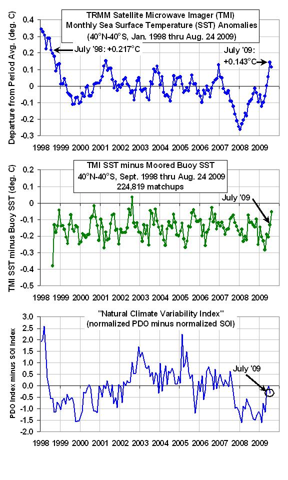
The results are shown in the following three panels. The first panel shows monthly SST anomalies since January 1998, and as can be seen July 2009 came in about 0.06 deg. C below July 1998. At face value, this suggests that July 2009 might not have been a record. And as you can see from the first 3 weeks of August data, it looks like this month will come in even cooler.

TMI-SST-comparisons-1998-2009
Now, if you are wondering how accurate these monthly anomalies are, the second panel shows the validation statistics that RSS archives in near-real time. Out of the 5 different classes of in situ validation data, I chose just the moored buoys due to their large volume of data (over 200,000 matchups between buoys and satellite observations), and a relatively fixed geographic coverage (unlike drifting buoys). As can be seen, the TMI SST record shows superb long-term stability. The 0.15 deg. C cool bias in the TMI measurements is from the “cool skin” effect, with water temperatures in the upper few millimeters being slightly cooler on average than the SSTs measured by the buoys, typically at a depth around 1 meter.

The third and final panel in the above figure shows that a substantial fraction of the monthly SST variability from year to year is due to the Southern Oscillation (El Nino/La Nina), and the Pacific Decadal Oscillation, PDO. Each of these indices have a correlation of 0.33 with SST for monthly averages over the 40N-40S latitude band, while their sum (taking the negative of the SOI first) is correlated at 0.39. I did not look at lag correlations, which might be higher, and it looks like some additional time averaging would increase the correlation.

I will post again when I have new information on my previously reported discrepancy between NOAA’s results and the AMSR-E results. That is still making me a little crazy.

8/26/09 13:30 CDT UPDATE

I computed the monthly global (60N to 60S latitudes) AMSR-E SST anomalies, adjusted them for the difference in annual cycles with the longer TMI record, and then plotted the AMSR-E and TMI SST anomalies together. Even though the TMI can not measure poleward of 40 deg. latitude (N or S), we see reasonable agreement between the two products.

TMI-AMSRE-SST-comparisons-1998-2009
None of this represents proof that July 2009 was not a record warm month in ocean surface temperatures, but it does cast significant doubt on the claim. But the focus on a single month misses the big picture: recent years have yet to reach the warmth of 1998. Only time will tell whether we get another year that approaches that unusual event.


Something’s Fishy With Global Ocean Temperature Measurements

Saturday, August 22nd, 2009

(edited 8/23/09 0710 CDT: Changed plots & revised text to reflect the fact that NCDC, not CRU, is apparently the source of the SST dataset; also add discussion of possible RFI interference in satellite measurements)

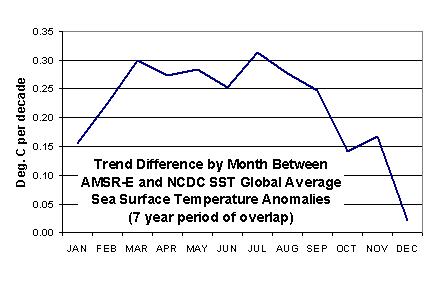
(edited 8/22/09 1415 CDT: added plot of trend differences by month at bottom)

In my previous blog posting I showed the satellite-based global-average monthly sea surface temperature (SST) variations since mid-2002, which was when the NASA Aqua satellite was launched carrying the Advanced Microwave Scanning Radiometer for EOS (AMSR-E). The AMSR-E instrument (which I serve as the U.S. Science Team Leader for) provides nearly all-weather SST measurements.

The plot I showed yesterday agreed with the NOAA announcement that July 2009 was unusually warm…NOAA claims it was even a new record for July based upon their 100+ year record of global SSTs.

But I didn’t know just HOW warm, since our satellite data extend back to only 2002. So, I decided to download the NOAA/NCDC SST data from their website — which do NOT include the AMSR-E measurements — to do a more quantitative comparison.

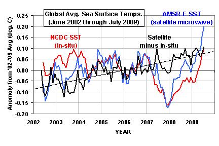
From the NOAA data, I computed monthly anomalies in exactly the same manner I computed them with the AMSR-E data, that is, relative to the June 2002 through July 2009 period of record. The results (shown below) were so surprising, I had to go to my office this Saturday morning to make sure I didn’t make a mistake in my processing of the AMSR-E data.

Global-SST-NCDC-vs-AMSRE

As can be seen, the satellite-based temperatures have been steadily rising relative to the conventional SST measurements, with a total linear increase of 0.15 deg C over the 7 year period of record versus the conventional SST measurements.

If the satellite data are correct, then this means that the July 2009 SSTs reached a considerably higher record temperature than NOAA has claimed. The discrepancy is huge in terms of climate measurements; the trend in the difference between the two datasets shown in the above figure is the same size as the anthropogenic global warming signal expected by the IPCC.

I have no idea what is going on here. Frank Wentz and Chelle Gentemann at Remote Sensing Systems have been very careful about tracking the accuracy of the AMSR-E SST retrievals with millions of buoy measurements. I checked their daily statistics they post at their website and I don’t see anything like what is shown in the above figure.

Is it possible that the NCDC SST temperature dataset has been understating recent warming? I don’t know…I’m mystified. Maybe Frank, Chelle, Phil Jones, or some enterprising blogger out there can figure this one out.

UPDATE #1 (8/22/09)
Here’s the trend differences between the satellite and in-situ data, broken out by calendar month. The problem seems to be mainly a Northern Hemisphere warm season phenomenon.

Global-SST-NCDC-vs-AMSRE-trend-diff-by-month

UPDATE#2 (8/23/09)
Anthony Watts has suggested that the radio frequency interference (RFI) that we see in the AMSR-E 6.9 GHz data over land might be gradually invading the ocean as more boats install various kinds of microwave transmitters. While it’s hard for me to believe such an effect could be this strong (we have never seen obvious evidence of oceanic RFI before), this is still an interesting hypothesis, so this week I will examine the daily 1/4 deg. grids of AMSR-E SST and compute a spatial “speckle” statistic to see if there is any evidence of this kind of interference increasing over time. I should note that we HAVE seen more RFI reflected off the ocean from geostationary TV communication satellites in the AMSR-E data in recent years.


Record July 2009 Sea Surface Temperatures? The View from Space

Friday, August 21st, 2009

Since NOAA has announced that their data show July 2009 global-average sea surface temperatures (SSTs) reaching a record high for the month of July, I thought I would take a look at what the combined AMSR-E & TMI instruments on NASA’s Aqua and TRMM satellites (respectively) had to say. I thought it might at least provide an independent sanity check since NOAA does not include these satellite data in their operational product.

The SSTs from AMSR-E are geographically the most complete record of global SSTs available since the instrument is a microwave radiometer and can measure the surface through most cloud conditions. AMSR-E (launched on Aqua in May 2002) provides truly global coverage, while the TMI (which was launched on TRMM in late 1997) does not, so the combined SST product produced by Frank Wentz’s Remote Sensing Systems provides complete global coverage only since the launch of Aqua (mid-2002). Through a cooperative project between RSS, NASA, and UAH, The digital data are available from the same (NASA Discover) website that our daily tropospheric temperatures are displayed, but for the SSTs you have to read the daily binary files and compute the anomalies yourself. I use FORTRAN for this, since it’s the only programming language I know.

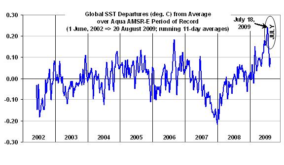
As can be seen in the following plot of running 11 day average anomalies, July 2009 was indeed the warmest month during the relatively short Aqua satellite period of record, with the peak anomaly occurring about July 18.

AMSRE-SST-global

The large and frequent swings in global average temperature are real, and result from changes in the rate at which water evaporates from the ocean surface. These variations are primarily driven by tropical Intraseasonal Oscillations, which change tropical-average surface winds by about 2 knots from lowest wind conditions to highest wind conditions.

As can be seen, the SSTs started to fall fast during the last week of July. If you are wondering what I think they will do in the coming months, well, that’s easy…I have no clue.


July 2009 Global Temperature Update: +0.41 deg. C

Wednesday, August 5th, 2009


YR MON GLOBE NH SH TROPICS
2009 1 +0.304 +0.443 +0.165 -0.036
2009 2 +0.347 +0.678 +0.016 +0.051
2009 3 +0.206 +0.310 +0.103 -0.149
2009 4 +0.090 +0.124 +0.056 -0.014
2009 5 +0.045 +0.046 +0.044 -0.166
2009 6 +0.003 +0.031 -0.025 -0.003
2009 7 +0.410 +0.211 +0.609 +0.427

July 2009 experienced a large jump in the global average tropospheric temperature anomaly, from +0.00 deg. C in June to +0.41 deg. C in July, with the tropics and southern hemisphere showing the greatest warming.

NOTE: For those who are monitoring the daily progress of global-average temperatures here, we will be switching from NOAA-15 to Aqua AMSU in the next few weeks, which will provide more accurate tracking on a daily basis. We will be including both our lower troposphere (LT) and mid-tropospheric (MT) pre-processing of the data.


My Favorite Renewable Energy Concept: The Solar Updraft Tower

Wednesday, August 5th, 2009

There are many different ways that you can extract usable energy from sunlight, and they all have their advantages and disadvantages. Historically, the biggest disadvantage has been cost when compared to more traditional sources of energy, such as coal-fired power plants. For if solar power was an economical and practical alternative to other forms of energy generation today, it would already be deployed on a wide scale.

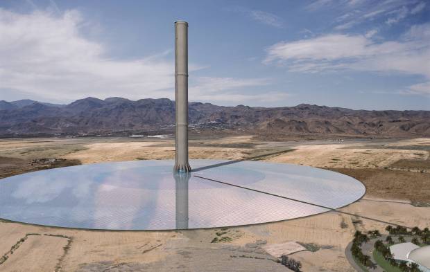
I think it is only a matter of time before renewable energy sources become more cost competitive. The question is which methods make the most sense. My favorite idea is the ‘Solar Tower’ (or ‘solar updraft tower’, or ‘solar chimney’), an artists rendering of which is shown below.

Solar-Tower

While most people have never heard about it, the Solar Tower design was implemented on a small scale in Spain years ago to test the concept. More recently, a privately-funded company called EnviroMission has been working toward the construction of one or more 200 megawatt power plants in the Australian Outback. The company has also been actively pursuing plans to build power plants in China and Nevada.

The design appeals to me because it harnesses the weather, albeit on a small scale. Specifically, it collects the daily production of warm air that forms near the ground, and funnels all of that warm air into a chimney where turbines are located to extract energy from the rising air. It’s a little like wind tower technology, but rather than just extracting energy from whatever horizontally-flowing wind happens to be passing by, the Solar Tower concentrates all of that warm air heated by the ground into the central tower, or chimney, where the air naturally rises. Even on a day with no wind, the solar tower will be generating electricity while conventional wind towers are sitting there motionless.

The total amount of energy that can be generated by a Solar Tower depends upon two main factors: (1) how much land area is covered by the clear canopy, and (2) the total height of the tower. EnviroMission’s baseline design has included a glass canopy covering up to several square miles of desert land, and a tower 1,000 meters tall. Such a tower would be the tallest manmade structure of any kind in the world, although more recently EnviroMission has been talking about several smaller-scale power plants as a more cost-effective approach. Since the design is proprietary, details have remained secret.

Since the Solar Tower is based upon physical processes that people like me deal with routinely in our research, I can immediately see ways in which the efficiency of the design can be maximized. For instance, a third major factor that also determines how much energy would be generated is the temperature difference between the power plant’s surroundings and the air underneath the canopy. After all, it is that temperature difference which provides the energy source, since warm air is less dense than cool air, and so ‘wants’ to rise.

This means that you could increase the power plant’s output by building it where the sand is quite reflective (bright), and then covering the ground under the canopy area with black rock — say crushed lava rock — which would then get the hottest when the sun shines on it.

One of the advantages of a Solar Tower over using photovoltaic cells to generate electricity is that the Solar Tower keeps generating electricity even after the sun goes down. Because the ground under the canopy stays warm at night, it continues to warm the air while the land around the canopy cools much more rapidly. This maintains a temperature difference between the canopy-covered air and the plant’s surroundings, which translates into continued energy generation at night. Additionally, the Solar Tower does not require the huge volume of water that coal-fired plants use.

From what I’ve read, the Solar Tower is potentially cost-competitive with coal-fired power plants, but the investment in infrastructure is large, and there is still some uncertainty (and therefore investment risk) involved in just how efficient Solar Towers would be.

If the government insists on providing subsidies for renewable energy, I think Solar Towers might be one of the best investments of the public’s money. But the last I knew, the U.S. Department of Energy was not actively pursuing the Solar Tower technology. I have no idea whether government involvement would help or hurt the private efforts of EnviroMission. Ultimately, the technology needs to be sustainable from a cost standpoint, and when that point is reached it is best if the government stays out of the way.

But just from a political standpoint, I think the Obama administration would benefit by pursuing Solar Towers as a national goal to reduce our dependence on foreign energy. If electricity in the sunnier parts of the country was cheap enough, then plug-in hybrid cars would become more popular there as well, which would reduce our dependence on foreign oil.

A very cool computer-generated video tour of an EnviroMission Solar Tower design can be viewed here (be sure to turn the sound up!). As the video shows, a Solar Tower 1,000 meters tall would also provide quite a tourist attraction.


STILL No Tropical Storms? Must Be Global Warming

Monday, August 3rd, 2009

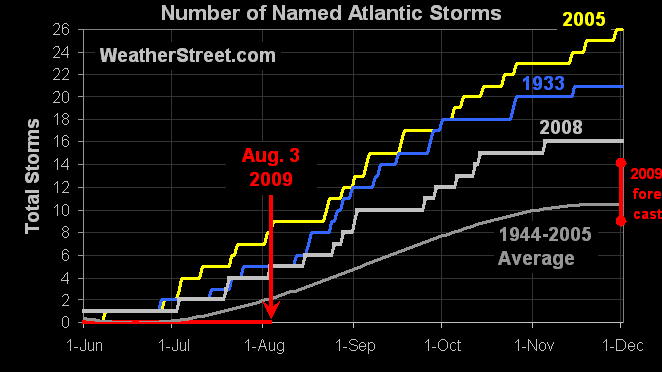
So, where are all of the news stories about the fact we’ve had no tropical storms yet this year? As can be seen in the following graphic, as of this date in 2005 we already had 8 named storms in the Atlantic basin. And tomorrow, August 4, that number will increase to 9. In 2005 we were even told to expect more active hurricane seasons from now on because of global warming.

named-storms-climatology

Of course, even though it is interesting that the 2009 tropical season is off to such a slow start, it may well have no significance in terms of long-term trends. But the lack of news coverage on the subject does show the importance of unbiased reporting when it comes to global warming. Let me explain.

Let’s say we really were in a slow, long-term cooling trend. What if the media decided they would only do news stories when there are record high temperatures or heat waves, ignoring record cold, and would then attribute those events to human-caused global warming? This would end up making the public fearful of global warming, even if the real threat was from global cooling.

The public expects – or used to expect – the media to report on all sides of important issues, so that we can be better informed on the state of the world. There have always been high temperature records set, and there have always been heat waves. In some sense, unusual weather is normal. It might not happen every day, but you can be assured, it will happen. But reporting on heat-related events while ignoring cold temperature records or events that do not support the claims of global warming theorists, will lead to a bias in the way the public views climate change.

Of course, someone might come along and claim that global warming has disrupted tropical storm activity this year, and so an unusually quiet season will also be claimed as evidence of global warming. This has already happened to some extent with cold weather and more snow being blamed on global warming.

But when the natural climate cycle deniers reach that level of desperation, they only appear that much more ridiculous to those of us who have not yet lost our ability to reason.