NOTE: This post was updated on 30 August to include Hurricane Michael (2018).
Atlantic hurricane activity is notoriously variable, not only from year to year, but decade to decade.
In fact, based upon studies of overwash sediments in coastal lakes stretching from the Florida panhandle to eastern Louisiana, it appears that the period from 1,000 to 3,800 years ago had a considerably higher incidence of Category 4 & 5 hurricanes than in the last 1,000 years. These are admittedly indirect, proxy estimates, but if you read this American Scientist article, it sounds like the researchers have pretty strong evidence.
Why would major hurricane activity vary so much? No one knows. Our climate is a nonlinear dynamical system, capable of undergoing unforced changes both locally and globally. Atmospheric steering currents, wind shear, and African easterly wave activity all play a role in hurricane formation. Tropical Atlantic sea surface temperatures (SSTs) in the late summer are always sufficiently warm to support a major hurricane and are, in my opinion, overrated as a controlling factor. Factors other than SST tend to largely determine hurricane activity and strength.
More direct measurements of hurricane landfalls in Florida have only been possible in the last 120 years or so since prior to 1900 very few people lived there. Before 1900, the intensities of these storms at landfall were quite uncertain. It could be some even went unreported.
If we examine the record of major (Category 3 or greater) hurricanes at landfall in Florida since 1900, and assume that Hurricane Dorian strikes Florida as a 115 kt Category 4 storm, we see that there will still be no long-term trends in either the intensity or number of major landfalling hurricanes.
If Hurricane Dorian makes landfall in Florida as a 115 kt Category 4 storm, there will still be no long term trend in Florida major hurricane landfalls since 1900.
This is not to say there won’t be potentially catastrophic damage. For example, the population of Miami in 1900 was less than 1,700 people. It is now 2.74 million. Needless to say, vast expanses of storm-vulnerable infrastructure has been built over the last 120 years across the Miami-Ft. Lauderdale-West Palm Beach metroplex, and northward along most of the Florida coastline.
But increasing storm damage does not mean increasing storminess.
No, I’m not in favor of burning down all of the rainforest in Brazil (or neighboring countries, which are being given a pass for some reason). But the recent outrage over increased fire activity this year in Brazil during the annual burn season seems pretty manufactured to me. And it’s largely political, placing blame at the feet of Brazil’s President Bolsonaro, who took office at the beginning of 2019.
The widespread reporting on this makes it sound like fires in Amazonia this time of year are a new thing. With 50 million Brazilians living below the poverty line, many take up farming which involves clearing land to grow grass to feed cattle, pigs, chickens, etc. They make about US$5.50 a day.
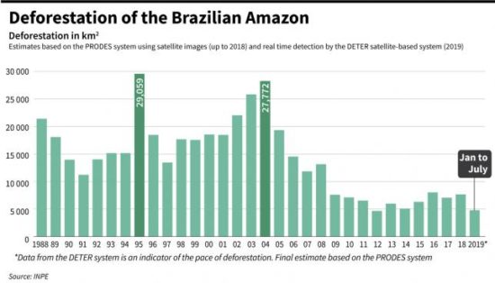
Now, tell me exactly what about that graph suggests that things have suddenly gotten worse in terms of rainforest destruction?
If you say, “Well, that’s only through July of this year. Maybe August is much worse!”, then I will point out that the original news article from The Guardian about the “88% rise” in rainforest destruction “under Bolsonaro” was way back on July 3!!
In that article they were comparing June of 2019 to June of 2018, which sounds like cherry-picking to me, when a much more extensive and complete history in the above graph suggests 2019 will not be exceptional for rainforest destruction compared to previous years.
This year’s dry season (June-August) has indeed been exceptionally dry, though. Brazil’s rainfall is tied to sea surface temperature patterns in both the Pacific and Atlantic, especially related to El Nino and La Nina activity. NASA satellite data show that the fires there, mainly set for agricultural purposes, are burning exceptionally hot, probably due to a lack of moisture in the fuel. Anyone who has a wood burning fireplace, or has tried making a campfire with wood that is not thoroughly dry, is familiar with this effect. The fires are burning hotter and “cleaner” than usual. If you look at NASA’s daily satellite imagery of smoke you will see that many previous years were smokier in Amazonia than this year is.
This is just one more example of the media controlling the narrative and selectively and hypocritically placing blame on a particular (and almost always right-leaning) political party.
To be clear: I’m not supporting President Bolsonaro’s policies. I’m pointing out the hypocrisy of the media in its environmental reporting.
There is a story going around that President Trump once suggested using nuclear weapons to weaken hurricanes before they hit land. While he has denied it, the idea has actually been batted around for years.
A less radioactive idea, called Project Stormfury, was carried out by the U.S. Government for about twenty years starting in the early 1960s. Aircraft seeded hurricane clouds with silver iodide in an attempt to strengthen the outer portions of the storm in hopes of weakening the intense storm core.
The project was a failure because it was learned that hurricanes already efficiently convert the available cloud water to precipitation anyway, throughout the storm. The hurricane doesn’t respond to seeding with silver iodide.
What Fuels a Hurricane?
I’ve found that there is a general lack of appreciation of just how much energy nature uses in weather systems. Hurricanes are, of course, an example of an accumulation of a lot of energy that is organized into a single weather system with dramatic effects.
That energy was accumulated over many sunny days and weeks as huge expanses of ocean soaked up tropical sunshine and warmed. The hurricane circulation then draws upon that pent-up energy. The tropical oceans nearly everywhere have the energy required to fuel a hurricane; what is usually missing is an atmospheric disturbance with low wind shear throughout the depth of the troposphere so that the heat produced by rain clouds isn’t just blown away rather than concentrated into a small geographic area.
The average hurricane releases that much energy every 10 seconds.
So, the hurricane probably wouldn’t care that much about a brief nuclear kick in the shins. (The idea of spreading all of that radioactivity would not go over very well with the public, either.)
But let’s say we had hundreds or even thousands of megaton-class weapons that were cheap and did not produce dangerous radiation. What could be done to weaken a hurricane?
The most fundamental problem with trying to weaken a hurricane is that hurricanes are driven by heat release, and these bombs would just add more heat to the storm, potentially making it worse. As mentioned above, in a hurricane, water vapor condenses into clouds and rain, releasing latent heat, which warms the troposphere and causes intense low pressure at the surface, leading to strong surface winds.
I suspect the idea would be to release the bomb energy in portions of the storm that could — theoretically — disrupt the inner core (the eyewall) where most of the hurricane damage occurs. But adding large amounts of heat energy could result in unforeseen strengthening of the core hours later. Who knows? It’s not nice to fool Mother Nature.
An old mantra of the news business is, “if it bleeds, it leads”. If someone was murdered, it is news. That virtually no one gets murdered is not news. That, by itself, should tell you that the mainstream media cannot be relied upon as an unbiased source of climate change information.
There are lots of self-proclaimed climate experts now. They don’t need a degree in physics or atmospheric science. For credentials, they only need to care and tell others they care. They believe the Earth is being murdered by humans and want the media to spread the word.
Most people do not have the time or educational background to understand the global warming debate, and so defer to the consensus of experts on the subject. The trouble is that no one ever says exactly what the experts agree upon.
When you dig into the details, what the experts agree upon in their official pronouncements is rather unremarkable. The Earth has warmed a little since the 1950s, a date chosen because before that humans had not produced enough CO2 to really matter. Not enough warming for most people to actually feel, but enough for thermometers to pick up the signal buried in the noise of natural weather swings of many tens of degrees and spurious warming from urbanization effects. The UN consensus is that most of that warming is probably due to increasing atmospheric CO2 from fossil fuel use (but we really don’t know for sure).
For now, I tend to agree with this consensus.
And still I am widely considered a climate denier.
Why? Because I am not willing to exaggerate and make claims that cannot be supported by data.
Take researcher Roger Pielke, Jr. as another example. Roger considers himself an environmentalist. He generally agrees with the predictions of the UN Intergovernmental Panel on Climate Change (IPCC) regarding future warming. But as an expert in severe weather damages, he isn’t willing to support the lie that severe weather has gotten worse. Yes, storm damages have increased, but that’s because we keep building more infrastructure to get damaged.
So, he, too is considered a climate denier.
What gets reported by the media about global warming (aka climate change, the climate crisis, and now the climate emergency) is usually greatly exaggerated, half-truths, or just plain nonsense. Just like the economy and economists, it is not difficult to find an expert willing to provide a prediction of gloom and doom. That makes interesting news. But it distorts the public perception of the dangers of climate change. And because it is reported as “science”, it is equated with truth.
In the case of climate change news, the predicted effects are almost universally biased toward Armageddon-like outcomes. Severe weather events that have always occurred (tornadoes, hurricanes, floods, droughts) are now reported with at least some blame placed on your SUV.
The major media outlets have so convinced themselves of the justness, righteousness, and truthfulness of their cause that they have banded together to make sure the climate emergency is not ignored. As reported by The Guardian, “More than 60 news outlets worldwide have signed on to Covering Climate Now, a project to improve coverage of the emergency”.
The exaggerations are not limited to just science. The reporting on engineering related to proposed alternative sources of energy (e.g. wind and solar) is also biased. The reported economics are biased. Unlimited “free” energy is claimed to be all around us, just waiting to be plucked from the unicorn tree.
And for most of America (and the world), the reporting is not making us smarter, but dumber.
Why does it matter? Who cares if the science (or engineering or economics) is exaggerated, if the result is that we stop polluting?
Besides the fact that there is no such thing as a non-polluting energy source, it matters because humanity depends upon abundant, affordable energy to prosper. Just Google life expectancy and per capita energy use. Prosperous societies are healthier and enjoy longer lives. Expensive sources of energy forced upon the masses by governmental fiat kill poor people simply because expensive energy exacerbates poverty, and poverty leads to premature death. As philosopher Alex Epstein writes in his book, The Moral Case for Fossil Fuels, if you believe humans have a right to thrive, then you should be supportive of fossil fuels.
We don’t use wind and solar energy because it is economically competitive. We use it because governments have decided to force taxpayers to pay the extra costs involved and allowed utilities to pass on the higher costs to consumers. Wind and solar use continue to grow, but global energy demand grows even faster. Barring some new energy technology (or a renewed embrace of nuclear power), wind and solar are unlikely to supply more than 10% of global energy demand in the coming decades. And as some European countries have learned, mandated use of solar and wind comes at a high cost to society.
Not only the media, but the public education system is complicit in this era of sloppy science reporting. I suppose most teachers and journalists believe what they are teaching and reporting on. But they still bear some responsibility for making sure what they report is relatively unbiased and factual.
I would much rather have teachers spending more time teaching students how to think and less time teaching them what to think.
Climate scientists are not without blame. They, like everyone else, are biased. Virtually all Earth scientists I know view the Earth as “fragile”. Their biases affect their analysis of uncertain data that can be interpreted in multiple ways. Most are relatively clueless about engineering and economics. I’ve had discussions with climate scientists who tell me, “Well, we need to get away from fossil fuels, anyway”.
And maybe we do, eventually. But exaggerating the threat can do more harm than good. The late Stephen Schneider infamously admitted to biased reporting by scientists. You can read his entire quote and decide for yourself whether scientists like Dr. Schneider let their worldview, politics, etc., color how they present their science to the public. The unauthorized release of the ‘ClimateGate’ emails between IPCC scientists showed how the alarmist narrative was maintained by undermining alternative views and even pressuring the editors of scientific journals. Even The Guardian seemed shocked by the misbehavior.
It’s fine to present the possibility that human-caused global warming could be very damaging, which is indeed theoretically possible. But to claim that large and damaging changes have already occurred due to increasing CO2 in the atmosphere is shoddy journalism. Some reporters get around the problem by saying that the latest hurricane might not be blamed on global warming directly, but it represents what we can expect more of in a warming world. Except that, even the UN IPCC is equivocal on the subject.
Sea level rise stories in the media, as far as I can tell, never mention that sea level has been rising naturally for as long as we have had global tide gauge measurements (since the 1850s). Maybe humans are responsible for a portion of the recent rise, but as is the case for essentially all climate reporting, the role of nature is seldom mentioned, and the size of the problem is almost always exaggerated. That worsening periodic tidal flooding in Miami Beach is about 50% due to sinking of reclaimed swampland is never mentioned.
There are no human fingerprints of global warming. None. Climate change is simply assumed to be mostly human-caused (which is indeed possible), while our knowledge of natural climate change is almost non-existent.
Computerized climate models are programmed based upon the assumption of human causation. The models produce human-caused climate change because they are forced to produce no warming (be in a state of ‘energy balance’) unless CO2 is added to them.
As far as we know, no one has ever been killed by human-caused climate change. Weather-related deaths have fallen dramatically — by over 90% — in the last 100 years.
Whose child has been taught that in school? What journalist has been brave enough to report that good news?
In recent years I’ve had more and more people tell me that their children, grandchildren, or young acquaintances are now thoroughly convinced we are destroying the planet with our carbon dioxide emissions from burning of fossil fuels. They’ve had this message drilled into their brains through news reporting, movies, their teachers and professors, their favorite celebrities, and a handful of outspoken scientists and politicians whose knowledge of the subject is a mile wide but only inches deep.
In contrast, few people are aware of the science papers showing satellite observations that reveal a global greening phenomenon is occurring as a result of more atmospheric CO2.
Again I ask, whose child has been taught this in school? What journalist dares to report any positive benefits of CO2, without which life on Earth would not exist?
No, if it’s climate news, it’s all bad news, all the time.
More Examples of Media Bias
Here are just a few recent (and not-so-recent) examples of media reporting which only make matters worse and degrade the public debate on the subject of climate change. Very often what is reported is actually weather-related events that have always occurred with no good evidence that they have worsened or become more frequent in the last 60+ years that humans could be at least partly blamed.
The Amazon is burning
A few days ago, The Guardian announced Large swathes of the Amazon rainforest are burning. I don’t know how this has suddenly entered the public’s consciousness, but for those of us who keep track of such things, farmland and some rainforest in Amazonia and adjacent lands has been burned by farmers for many decades during this time of year so they can plant crops. This year is not exceptional in this regard, yet someone decided to make an issue of it this year. In fact, it looks like 2019 might be one of the lowest years for biomass burning. Deforestation there has gone down dramatically in the last 20 years.
The rainforest itself does not burn in response to global warming, and in fact warming in the tropics has been so slow that it is unlikely that any tropical resident would perceive it in their lifetime. This is not a climate change issue; it’s a farming and land use issue.
Greenland Is rapidly melting
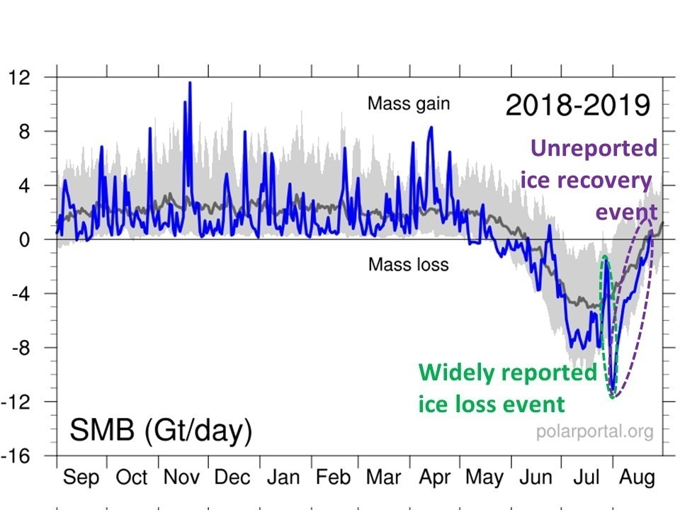
The Greenland ice sheet gains new snow every year, and gravity causes the sheet to slowly flow to the sea where ice is lost by calving of icebergs. How much ice resides in the sheet at any given time is based upon the balance between gains and losses.
During the summer months of June, July, and August there is more melting of the surface than snow accumulation. The recent (weather-related) episode of a Saharan air mass traveling through western Europe and reaching Greenland led to a few days of exceptional melt. This was widely reported as having grave consequences.
Forbes decided to push the limits of responsible journalism with a story title, Greenland’s Massive Ice Melt Wasn’t Supposed to Happen Until 2070. But the actual data show that after this very brief period (a few days) of strong melt, conditions then returned to normal.
The widely reported Greenland surface melt event around 1 August 2019 (green oval) was then followed by a recovery to normal in the following weeks (purple oval), which was not reported by the media.
Of course, only the brief period of melt was reported by the media, further feeding the steady diet of biased climate information we have all become accustomed to.
Furthermore, after all of the reports of record warmth at the summit of the ice cap, it was found that the temperature sensor readings were biased too warm, and the temperature never actually went above freezing.
Was this reported with the same fanfare as the original story? Of course not. The damage has been done, and the thousands of alarmist news stories will live on in perpetuity.
This isn’t to say that Greenland isn’t losing more ice than it is gaining, but most of that loss is due to calving of icebergs around the edge of the sheet being fed by ice flowing downhill. Not from blast-furnace heating of the surface. It could be the loss in recent decades is a delayed response to excess snow accumulation tens or hundreds of years ago (I took glaciology as a minor while working on my Ph.D. in meteorology). No one really knows because ice sheet dynamics is complicated with much uncertainty.
My point is that the public only hears about these brief weather events which are almost always used to promote an alarmist narrative.
July 2019 was the hottest month on record
The yearly, area-averaged surface temperature of the Earth is about 60 deg. F. It has been slowly and irregularly rising in recent decades at a rate of about 0.3 or 0.4 deg. F per decade.
So, let’s say the average temperature reaches 60.4 deg. F rather than a more normal 60 deg. F. Is “hottest” really the best adjective to use to inform the public about what is going on?
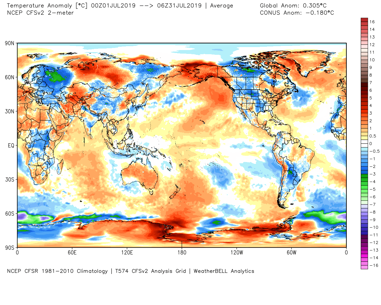
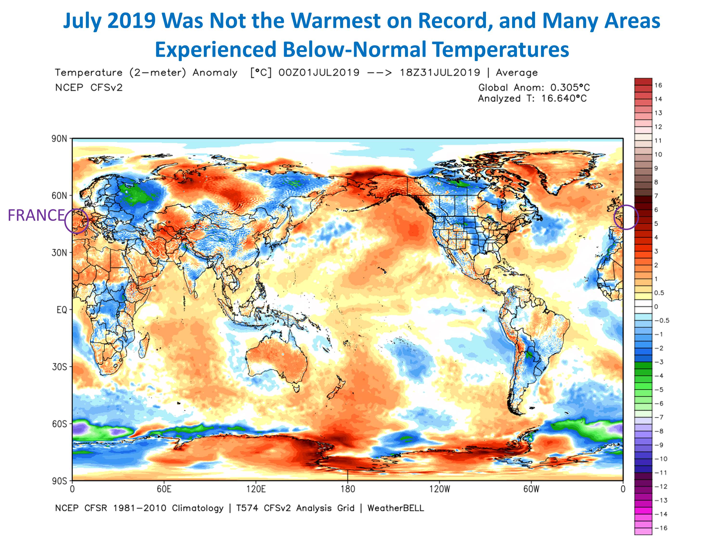
Here’s a geographic plot of the July 2019 departures from normal from NOAA’s Climate Forecast System model.
July 2019 surface temperature departures from normal. The global average is only 0.3 deg. C (0.5 deg. F) above the 1981-2010 average, and many areas were below normal in temperature. (Graphic courtesy WeatherBell.com).
Some areas were above normal, some below, yet the headlines of “hottest month ever” would make you think the whole Earth had become an oven of unbearable heat.
Of course, the temperature changes involved in new record warm months is so small it is usually less than the uncertainty level of the measurements. And, different global datasets give different results. Monitoring global warming is like searching for a climate needle in a haystack of weather variability.
Bait and Switch: Models replacing observations
There is an increasing trend toward passing off climate model projections as actual observations in news reports. This came up just a few days ago when I was alerted to a news story that claimed Tuscaloosa, Alabama is experiencing twice as many 100+ deg. F days as it used to. To his credit, the reporter corrected the story when it was pointed out to him that no such thing has happened, and it was a climate model projection that (erroneously) made such a “prediction”.
Another example happened last year with a news report that the 100th Meridian climate boundary in the U.S. was moving east, with gradual drying starting to invade the U.S. Midwest agricultural belt. But, once again, the truth is that no such thing has happened. It was a climate model projection, being passed off as reality. Having worked with grain-growing interests for nearly 10 years, I addressed this bit of fake climate news with actual precipitation measurements here.
Al Gore and Bill Nye’s global warming in a jar experiment
This is one of my favorites.
As part of Al Gore’s Climate Reality Project, Bill Nye produced a Climate 101 video of an experiment where two glass jars with thermometers in them were illuminated by lamps. One jar had air in it, the other had pure CO2. The video allegedly shows the jar with CO2 in it experiencing a larger temperature rise than the jar with just air in it.
Of course, this was meant to demonstrate how easy it is to show more CO2 causes warming. I’m sure it has inspired many school science experiments. The video has had over 500,000 views.
The problem is that this experiment cannot show such an effect. Any expert in atmospheric radiative transfer can tell you this. The jars are totally opaque to infrared radiation anyway, the amount of CO2 involved is far too small, the thermometers were cheap and inaccurate, the lamps cannot be exactly identical, the jars are not identical, and the “cold” of outer space was not included the experiment. TV meteorologist Anthony Watts demonstrated that Bill Nye had to fake the results through post-production video editing.
The warming effect of increasing atmospheric CO2 is surprisingly difficult to demonstrate. The demonstration is largely a theoretical exercise involving radiative absorption calculations and a radiative transfer model. I believe the effect exists; I’m just saying that there is no easy way to demonstrate it.
The trouble is that this fraudulent video still exists, and many thousands of people are being misled into believing that the experiment is evidence of how obvious it is to
Greta Thunberg’s sailboat trip
The new spokesperson for the world’s youth regarding concerns over global warming is 16-year-old Swede Greta Thunberg. Greta is travelling across the Atlantic on what CNN describes as a “zero-emissions yacht” to attend the UN Climate Action Summit on September 23 in New York City.
To begin with, there is no such thing as a zero-emissions yacht. A huge amount of energy was required to manufacture the yacht, and it transports so few people so few miles over its lifetime the yacht is a wonderful example of the energy waste typical of the lifestyles of the wealthy elite. Four (!) people will need to fly from Europe to the U.S. to support the return of the yacht to Europe after Greta is delivered there.
The trip is nothing more than a publicity stunt, and it leads to further disinformation regarding global energy use. In fact, it works much better as satire. Imagine if everyone who traveled across the ocean used yachts rather than jet airplanes. More energy would be required, not less, due to the manufacture of tens of thousands of extra yachts which inefficiently carry few passengers on relatively few, very slow trips. In contrast, the average jet aircraft will travel 50 million miles in its lifetime. Most people don’t realize that travel by jet is now more fuel efficient than travel by car.
The Greta boat trip story is in so many ways the absolute worst way to raise awareness of climate issues, unless you know knothing of science, engineering, or economics. It’s like someone who is against eating meat consuming three McDonalds cheeseburgers to show how we should change our diets. It makes zero sense.
I could give many more examples of the media helping to destroy the public’s ability to have a rational discussion about climate change, how much is caused by humans, and what can or should be done about it.
Instead, the media chooses to publish only the most headline-grabbing stories, and the climate change issue is then cast as two extremes: either you believe the “real scientists” who all agree we are destroying the planet, or you are a knuckle-dragging 8th-grade educated climate denier with guns and racist tendencies.
Sixteen days ago I had back surgery to have a bone spur removed at L3-L4, a ruptured disc shaved at L2-L3, and a rogue piece of bone hanging out around my spinal cord deported. I had gone many years living with chronic pain, especially when standing, that was the worst in my right leg. Since it went away with bed rest, I could live with it, but I finally decided I couldn’t go through life living on my back as my symptoms were only getting worse with age (I am 63).
The post surgical pain was worse than I expected. The pain meds they give you these days are almost worthless, so it’s a good thing post-op pain is severe for only a few days.
Then five days after surgery, I developed nausea with cold sweats and near-fainting. I started throwing up. For the first time in my life I called 911. I’ve never been hospitalized for anything (no prior surgeries), but decided that dying from stubbornness would not be in my family’s best interest. I lost a sister due to stubbornness a few years ago.
While in the ambulance the paramedic gave me nitroglycerin, just it case it was a heart attack. That brought on all of the worst symptoms again. I started cold sweats, my blood pressure plummeted and I started to lose my eyesight. I said something like, “OK, you’re losing me…reverse that last thing you just did.” I was wondering if this was what the death experience was like for some people.
At the hospital the first concern was that a blood clot from the surgery reached my chest. After a number of tests, including a CT scan of my chest with contrast and lots of blood tests, it was decided my heart, lungs, kidneys, and liver were all in great shape. I was sent home.
Still feeling like death, I started monitoring my blood pressure and heart rate every 20 minutes or so, and plotting everything in Excel, which at least gave me something to do. My systolic pressure and heart rate correlated very well with how badly I felt. The lower the numbers the lower I felt. After day 3 my numbers finally started to rise (systolic had gone below 100 several times and my HR struggled to stay above 60). I finally started feeling human again about 10 days after surgery.
Then, while my body injury repair personnel were off working on my lower back stab wound and my still-inflamed leg nerve, some bacteria decided it was the perfect time to invade my lungs and sinuses. I’ve gone close to two weeks now with little to no appetite.
I saw the surgeon yesterday for my first post-op checkup, and he passed it all off with, “Surgery is a major jolt to the body. You are getting better now, right?” I asked him about why I felt like I was dying when my BP and HR were very low, and he answered, “Well, when you die, they go to zero, right? You were just somewhere in between.” Funny guy.
He asked if I needed any more pain meds. I said, “I quit using the ones you gave me (Norco 7.5s) because they didn’t seem to do anything.” He smiled and said something like, “Yeah, we mostly count on a placebo effect with those.”
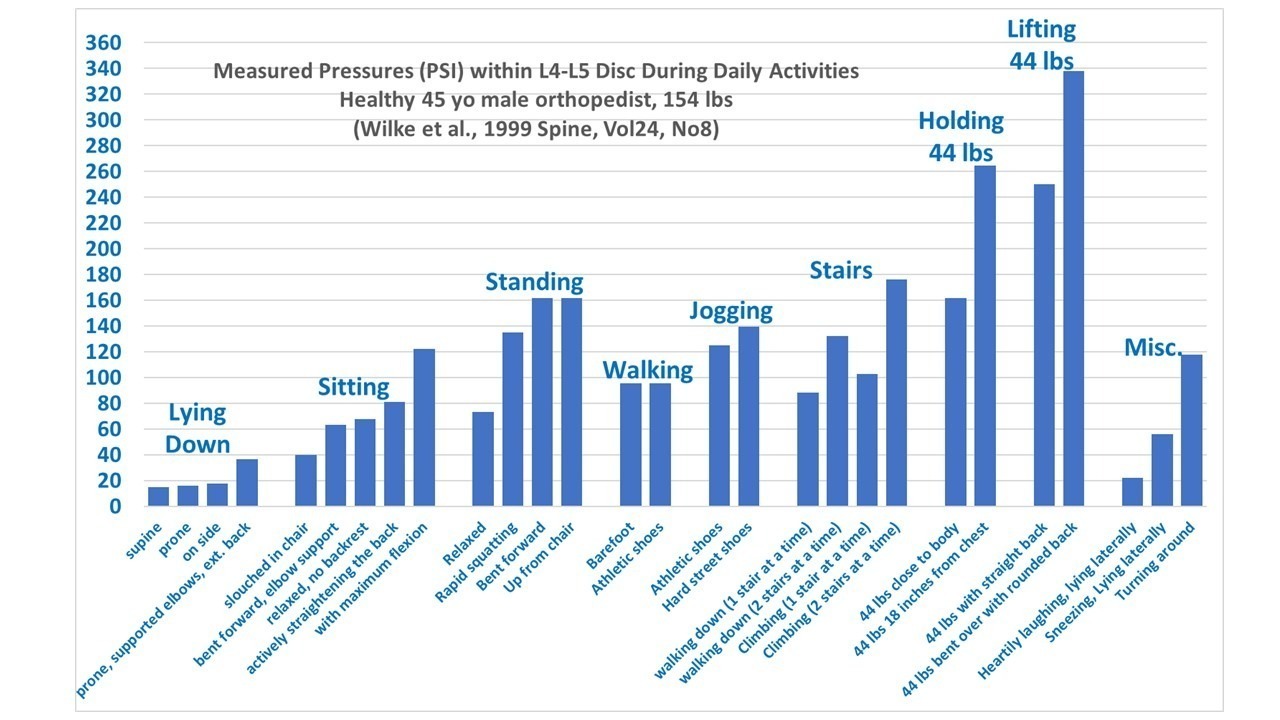
Watch Your Back
Before surgery I categorized some published data on the pressures put on your spine during normal activities and made a chart, which I gave the surgeon. He loves it. The reason I did it was because I read that sitting up straight after surgery is important because it puts less pressure on the spine. But I’m a sloucher, and I didn’t believe it. I needed to see some numbers.
It turns out that for many years no one really knew what kinds of activities cause what kinds of strain on the spine because there were no in vivo measurements of these pressures. Doctors just told you things they had no quantitative evidence for. So, some enterprising and inquisitive orthopedists drew straws and the loser had a pressure sensor implanted in the lowest disc on the spine and they took pressure measurements for various daily activities.
Here I’ve converted their pressure units to PSI and logically organized the activities into groups that put increasing pressure on the spine.
Other that verifying my suspicion that slouching puts much less pressure on your lower spine that sitting up straight, what the chart really shows is why you should avoid bending over for up to six weeks after having a disc shaved. Bending over (especially if you are pick up any amount of weight) puts a huge amount of pressure on your lower spine, and can put you right back into surgery if you don’t follow doctors orders.
In fact, it looks to me like there should be a lifetime ban on lifting anything while bending over. There should be a government regulations and an agency, with back enforcement police going around and cracking young mothers on the ankles with a baton if they see them picking up their toddler without using their legs rather than back.
Just kidding, of course.
Anyway, I am on the mend and will be back to causing trouble here again very soon. I’ve been following the other blogs and news and see that the field of climate change lunacy and hypocrisy continues to be a target-rich environment.
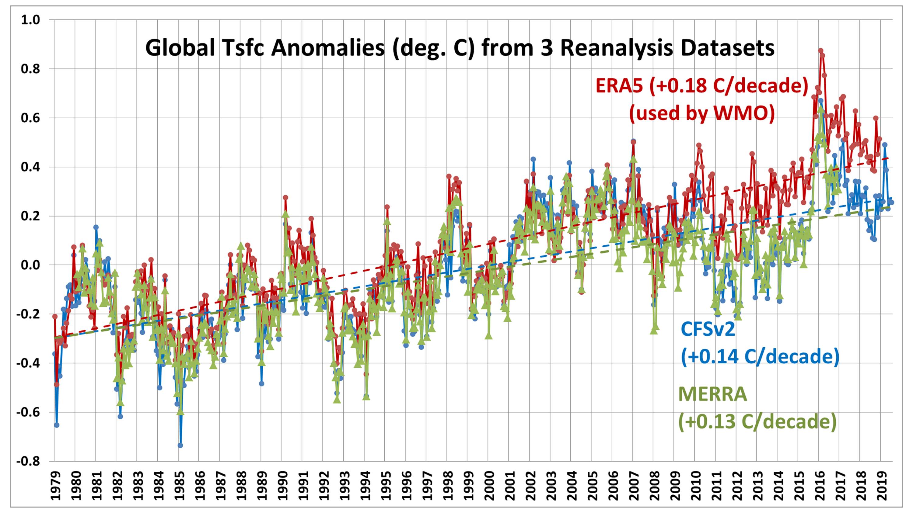
As a followup to my post about whether July 2019 was the warmest July on record (globally-averaged), I’ve been comparing reanalysis datasets since 1979. It appears that the ERA5 reanalysis upon which WMO record temperature pronouncements are made might have a problem, with spurious warmth in recent years.
Here’s a comparison of the global-average surface air temperature variations from three reanalysis datasets: ERA5 (ECMWF), CFSv2 (NOAA/NCEP), and MERRA (NASA/GSFC). Note that only CFSv2 covers the full period, January 1979 to July 2019:
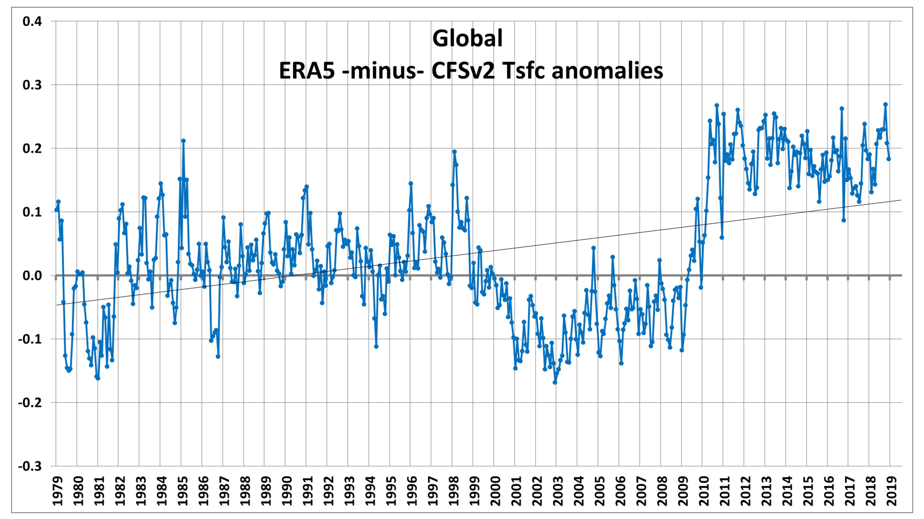
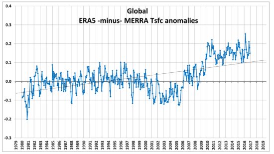
ERA5 has a substantially warmer trend than the other two. By differencing ERA5 with the other datasets we can see that there are some systematic changes that occur in ERA5, especially around 2009-2010, as well as after 1998:
These kinds of changes suggest to me differences in how the satellite deep-layer air temperatures from MSU and AMSU are handled, which through the data assimilation process can affect surface temperatures.
Reanalysis datasets’ dependence upon various data sources is difficult to diagnose because a wide variety of data are included in them: surface thermometers, weather balloons, aircraft, ships, buoys, and a variety of satellites. Because the satellites are the only truly global source, they have the potential to significantly impact global-average quantities.
If the satellites turn out to be the main reason for these differences, this means how the satellites are adjusted as the orbits decay, intercalibrated with each other, and even whether certain problematic satellites are excluded from analysis, all become significant factors in the interpretation of global average temperatures from the reanalyses.
For example, the WMO’s pronouncement that July would be at or near record warmth (which is based upon the ERA5 reanalysis) would then depend on how they did their satellite data adjustments.
So, I am no longer standing by my previous statement that the current reanalysis datasets should be used for determining record warm months. At this point, it’s not even clear to me that reanalysis datasets are better for inferring record high (or low) surface temperatures than our (UAH) satellite dataset is, even though the satellite senses much more of the troposphere than it does of the surface.
This is all very preliminary, and I am open to other interpretations.
July 2019 was probably the 4th warmest of the last 41 years. Global “reanalysis” datasets need to start being used for monitoring of global surface temperatures. [NOTE: It turns out that the WMO, which announced July 2019 as a near-record, relies upon the ERA5 reanalysis which apparently departs substantially from the CFSv2 reanalysis, making my proposed reliance on only reanalysis data for surface temperature monitoring also subject to considerable uncertainty].
We are now seeing news reports (e.g. CNN, BBC, Reuters) that July 2019 was the hottest month on record for global average surface air temperatures.
One would think that the very best data would be used to make this assessment. After all, it comes from official government sources (such as NOAA, and the World Meteorological Organization [WMO]).
But current official pronouncements of global temperature records come from a fairly limited and error-prone array of thermometers which were never intended to measure global temperature trends. The global surface thermometer network has three major problems when it comes to getting global-average temperatures:
(1) The urban heat island (UHI) effect has caused a gradual warming of most land thermometer sites due to encroachment of buildings, parking lots, air conditioning units, vehicles, etc. These effects are localized, not indicative of most of the global land surface (which remains most rural), and not caused by increasing carbon dioxide in the atmosphere. Because UHI warming “looks like” global warming, it is difficult to remove from the data. In fact, NOAA’s efforts to make UHI-contaminated data look like rural data seems to have had the opposite effect. The best strategy would be to simply use only the best (most rural) sited thermometers. This is currently not done.
(2) Ocean temperatures are notoriously uncertain due to changing temperature measurement technologies (canvas buckets thrown overboard to get a sea surface temperature sample long ago, ship engine water intake temperatures more recently, buoys, satellite measurements only since about 1983, etc.)
(3) Both land and ocean temperatures are notoriously incomplete geographically. How does one estimate temperatures in a 1 million square mile area where no measurements exist?
There’s a better way.
A more complete picture: Global Reanalysis datasets
(If you want to ignore my explanation of why reanalysis estimates of monthly global temperatures should be trusted over official government pronouncements, skip to the next section.)
Various weather forecast centers around the world have experts who take a wide variety of data from many sources and figure out which ones have information about the weather and which ones don’t.
But, how can they know the difference? Because good data produce good weather forecasts; bad data don’t.
The data sources include surface thermometers, buoys, and ships (as do the “official” global temperature calculations), but they also add in weather balloons, commercial aircraft data, and a wide variety of satellite data sources.
Why would one use non-surface data to get better surface temperature measurements? Since surface weather affects weather conditions higher in the atmosphere (and vice versa), one can get a better estimate of global average surface temperature if you have satellite measurements of upper air temperatures on a global basis and in regions where no surface data exist. Knowing whether there is a warm or cold airmass there from satellite data is better than knowing nothing at all.
Furthermore, weather systems move. And this is the beauty of reanalysis datasets: Because all of the various data sources have been thoroughly researched to see what mixture of them provide the best weather forecasts (including adjustments for possible instrumental biases and drifts over time), we know that the physical consistency of the various data inputs was also optimized.
Part of this process is making forecasts to get “data” where no data exists. Because weather systems continuously move around the world, the equations of motion, thermodynamics, and moisture can be used to estimate temperatures where no data exists by doing a “physics extrapolation” using data observed on one day in one area, then watching how those atmospheric characteristics are carried into an area with no data on the next day. This is how we knew there were going to be some exceeding hot days in France recently: a hot Saharan air layer was forecast to move from the Sahara desert into western Europe.
This kind of physics-based extrapolation (which is what weather forecasting is) is much more realistic than (for example) using land surface temperatures in July around the Arctic Ocean to simply guess temperatures out over the cold ocean water and ice where summer temperatures seldom rise much above freezing. This is actually one of the questionable techniques used (by NASA GISS) to get temperature estimates where no data exists.
If you think the reanalysis technique sounds suspect, once again I point out it is used for your daily weather forecast. We like to make fun of how poor some weather forecasts can be, but the objective evidence is that forecasts out 2-3 days are pretty accurate, and continue to improve over time.
The Reanalysis picture for July 2019
The only reanalysis data I am aware of that is available in near real time to the public is from WeatherBell.com, and comes from NOAA’s Climate Forecast System Version 2 (CFSv2).
The plot of surface temperature departures from the 1981-2010 mean for July 2019 shows a global average warmth of just over 0.3 C (0.5 deg. F) above normal:
Note from that figure how distorted the news reporting was concerning the temporary hot spells in France, which the media reports said contributed to global-average warmth. Yes, it was unusually warm in France in July. But look at the cold in Eastern Europe and western Russia. Where was the reporting on that? How about the fact that the U.S. was, on average, below normal?
The CFSv2 reanalysis dataset goes back to only 1979, and from it we find that July 2019 was actually cooler than three other Julys: 2016, 2002, and 2017, and so was 4th warmest in 41 years. And being only 0.5 deg. F above average is not terribly alarming.
Why don’t the people who track global temperatures use the reanalysis datasets?
The main limitation with the reanalysis datasets is that most only go back to 1979, and I believe at least one goes back to the 1950s. Since people who monitor global temperature trends want data as far back as possible (at least 1900 or before) they can legitimately say they want to construct their own datasets from the longest record of data: from surface thermometers.
But most warming has (arguably) occurred in the last 50 years, and if one is trying to tie global temperature to greenhouse gas emissions, the period since 1979 (the last 40+ years) seems sufficient since that is the period with the greatest greenhouse gas emissions and so when the most warming should be observed.
So, I suggest that the global reanalysis datasets be used to give a more accurate estimate of changes in global temperature for the purposes of monitoring warming trends over the last 40 years, and going forward in time. They are clearly the most physically-based datasets, having been optimized to produce the best weather forecasts, and are less prone to ad hoc fiddling with adjustments to get what the dataset provider thinks should be the answer, rather than letting the physics of the atmosphere decide.
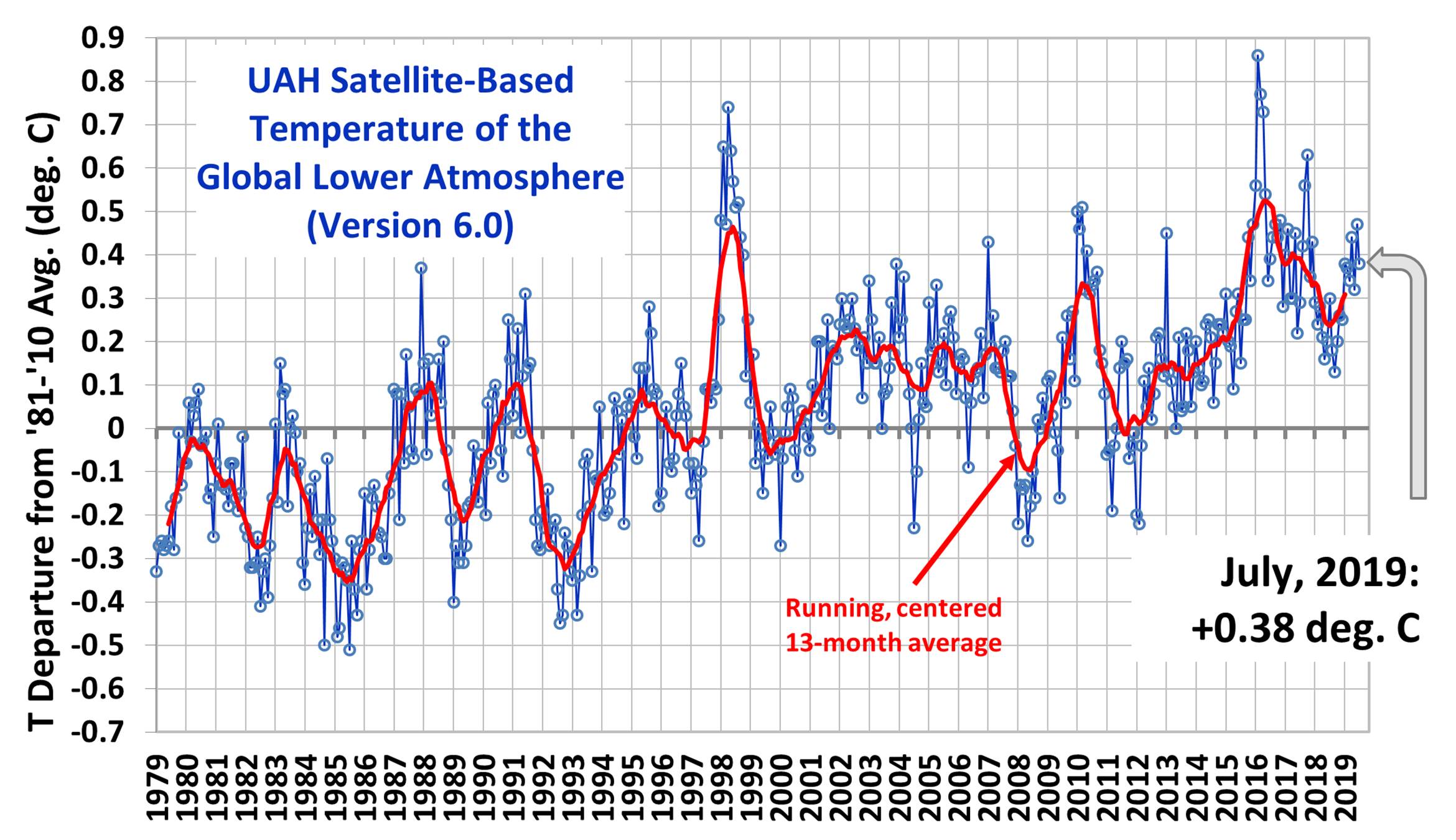
The Version 6.0 global average lower tropospheric temperature (LT) anomaly for July, 2019 was +0.38 deg. C, down from the June, 2019 value of +0.47 deg. C:
The linear warming trend since January, 1979 remains at +0.13 C/decade.
Various regional LT departures from the 30-year (1981-2010) average for the last 19 months are:
The UAH LT global anomaly image for July, 2019 should be available in the next few days here.
The global and regional monthly anomalies for the various atmospheric layers we monitor should be available in the next few days at the following locations:

 Home/Blog
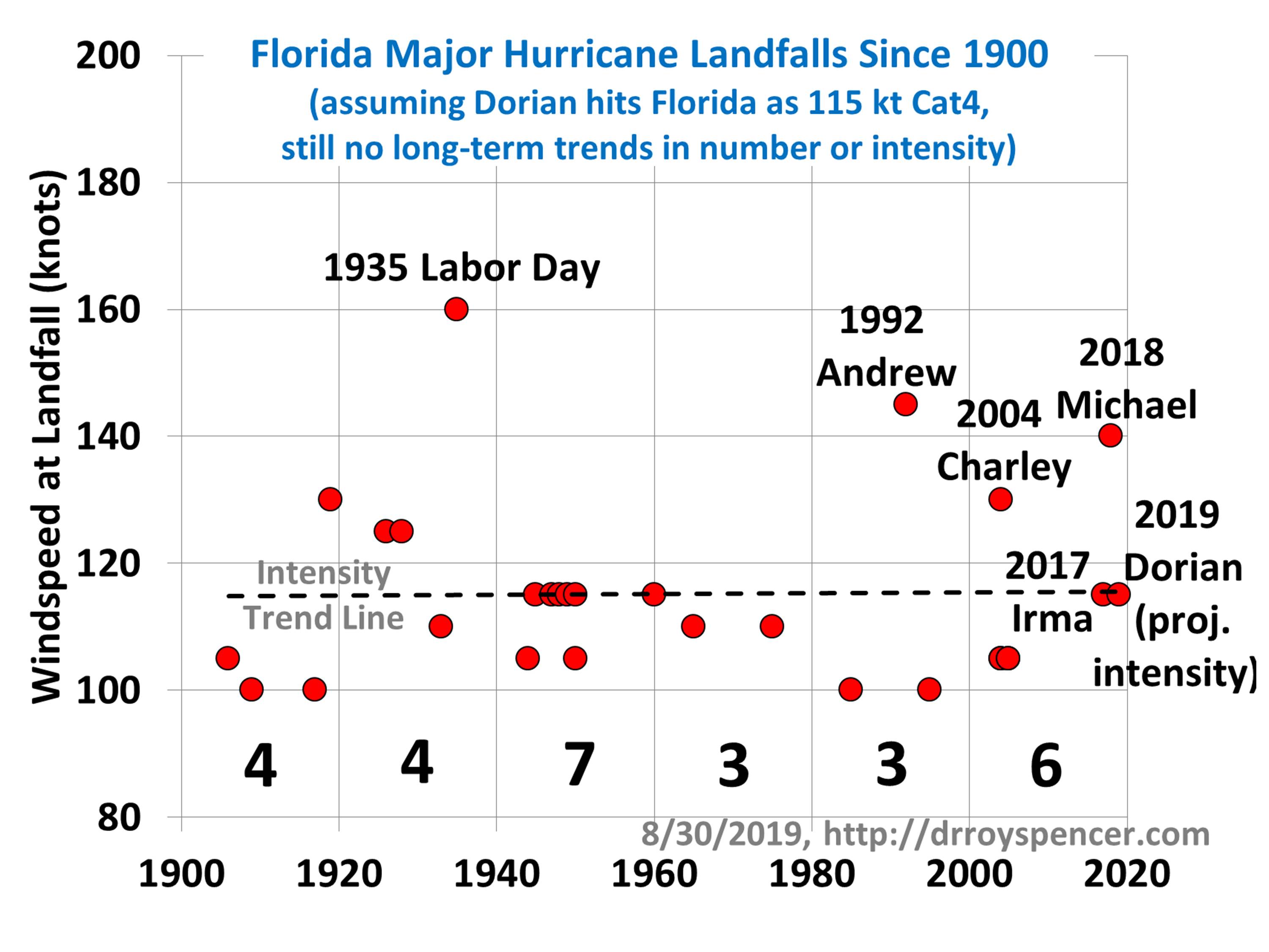


