Archive for November, 2017

Mysterious Night Flashes Near Mt. Agung Volcano Observed from Satellite

Monday, November 27th, 2017

Today I was watching the 10-minute imagery from the Japanese Himawari geostationary weather satellite for the next eruption of Mt. Agung in Bali, Indonesia, and in the last hour or so there have been some distinct flashes in the nighttime imagery, which you can access here. These only show up in the nighttime imagery.

UPDATE: here’s an animated GIF of the flashes (click on the image to animate):

Nighttime flashes in Japanese weather satellite imagery around Mt. Agung as a new eruption began on 27 November 2017. The flashes occur at 19:50, 20:10, and 20:30 UTC. The city lights have been added separately from previous observations from a different satellite, to assist in nighttime geolocation; the village lights of Besakih, on the southwest slope of Mt. Agung, can be seen within the dashed circle.

Thinking this was just sensor noise, I examined other areas for similar flashes, and saw none. But after reviewing nighttime imagery over the last week, I saw similar behavior during the early stages of the eruptions on Nov. 25 & 26. The flashes appear first, and then the ash cloud appears. Since the eruption plume does not show up in nighttime imagery until it has reached a sufficient altitude to be cold enough to show up in infrared sensors, it seems the lightning is more prevalent early in the eruption (assuming that’s what this is). [See UPDATE below…probably not lightning].

So, there might be a new eruption of Agung in progress. Last I checked the news, however, I saw nothing. [UPDATE: After my original post, Foxnews started streaming video of a new eruption in progress as the sun was rising.]

UPDATE: It appears that the flashes are not lightning, but are either (1) hotspots in the 3.9 micron portion of this product, a channel which is also used to detect wildfires, or (2) some portion of the eruption cloud that has low emissivity at 3.9 microns. Evidence for the latter possibility is that if you look at the early stages of a different volcano eruption in GOES-12 imagery documented here, there is a hotspot (in this case, color-coded as dark) in the 3.9 micron imagery, but then two bright flashes appear as the eruption begins.

[This post has been edited from the original as I have discovered the flashes are likely not lightning, but some other phenomenon.]

UPDATE (10:00 a.m. CST Nov. 28, 2017): A new eruption might have begun, here’s a new flash at 14:30 UTC:

New flash in Himawari satellite imagery at 14:30 UTC 28 Nov. 2017, suggesting a new eruption is starting.

Trump Wrongly Blamed for Destroying Sea Ice Satellite

Monday, November 6th, 2017

No, Our Ability to Monitor Sea Ice Has Not Ended

Yesterday, The Guardian ran a story with the headlines:

Donald Trump accused of obstructing satellite research into climate change
Republican-controlled Congress ordered destruction of vital sea-ice probe

But as NASA’s leader of the U.S. Science Team on one of the best satellite instruments developed for monitoring sea ice, I can tell you we will not lose our ability to monitor sea ice.

Admittedly, the premature failure of the Defense Department’s DMSP F17 and F19 satellites has definitely reduced the number of times a day we can measure the polar regions.

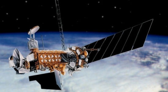
Artist rendering of the Defense Meteorological Satellite Program (DMSP) satellite, carrying the SSMIS instrument (upper-left) since July 1987. The unexpected failure of the F17 and F19 satellites has led to criticisms of the defunding of the final, F20 satellite in the series.

But even once a day is plenty for the purpose (sea ice doesn’t change that fast), and there are other — and better — satellites that can now do the job.

The Decision Was Made On Obama’s Watch

The first point The Guardian got wrong was that Congress’s fiscal decision to dismantle the last remaining DMSP F20 satellite was made by Congress in 2016, when Obama could have done something about it. These satellites do much more than monitor sea ice, and the decision was made knowing that we have more modern satellites that can do these jobs now. The specific sensor on that satellite that monitors sea ice, the SSMIS, is a modified microwave radiometer that was first launched in July, 1987, and was designed in the early 1980s. Because microwaves penetrate clouds, and since the polar regions are often cloudy, these window-frequency microwave radiometers have become the workhorses of sea ice monitoring.

The U.S. Long Ago Decided to Let Other Countries Take Over

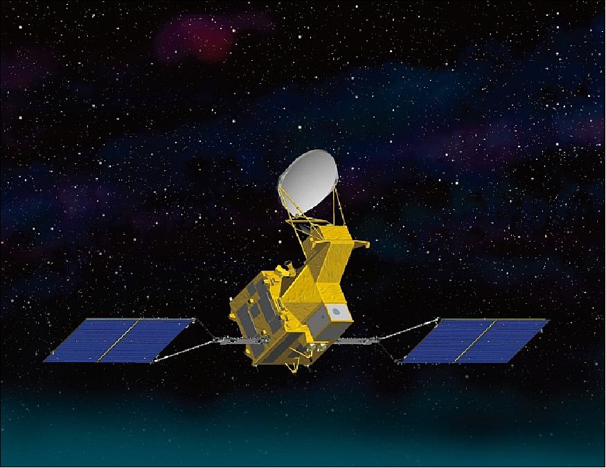
I have worked with satellite microwave radiometers for 30 years now, doing NOAA and NASA sponsored research with them. The U.S. long ago made the decision to help Japan take the lead on this capability. As a result, the Japanese built the AMSR-E instrument with newer technology, more microwave channels, and higher spatial resolution to fly on NASA’s Aqua satellite in 2002. As the U.S. Science Team leader on that instrument, I and others helped Japan become a leader in producing and interpreting this kind of data.

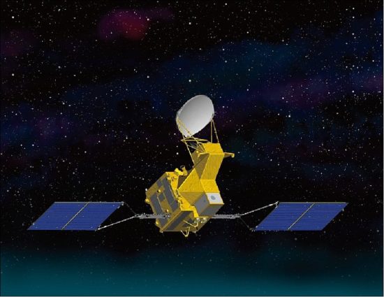
Artist rendering of the AMSR2 instrument on the Japanese GCOM-W satellite, the new generation of climate monitoring with window frequency microwave remote sensing.

After the failure of AMSR-E in 2011, Japan launched an even better version — AMSR2 — on their own GCOM-W satellite. They are currently designing a third one for launch. Everyone in the business knows that these are expected to be the sea ice monitoring workhorses of the future, providing a daily global climate monitoring capability for a wide variety of weather and climate variables.

Other U.S. Satellites Could Help Out as Well

Even without the newer and fancier AMSR series of sea ice monitoring instruments, and even with the complete failure of the old SSMIS series of satellite instruments (many of these last much longer than their design lifetime), in a pinch we could use the window channels of the AMSU sensors flying on the NOAA polar-orbiting satellites, and the newer ATMS instruments flying on the NOAA polar orbiting satellites. The next copy of the ATMS is scheduled to be launched this Friday, November 10 on the first JPSS satellite. These instruments are not ideal for the purpose, though, and the Japanese AMSR series of sensors are expected to be the main sea ice monitoring satellites into the future.

Trump Derangement Syndrome?

One could more justifiably ask why President Obama in his 8-year term could not have asked for a dedicated climate monitoring network of global satellites. Most people don’t realize that our long-term climate monitoring with satellites has always been piggy-backed on either NOAA weather satellites, which are not designed with the stability and lifetimes needed to monitor subtle trends in climate, or on NASA one-off science experiment satellites which provide just enough data to help address specific science questions.

This is why it feels more than a little disingenuous to blame President Trump for the dismantling of a single satellite as if is going to cripple our ability to monitor climate change from space. Quoting from the Guardian article:

President Trump has been accused of deliberately obstructing research on global warming after it emerged that a critically important technique for investigating sea-ice cover at the poles faces being blocked….

This is like throwing away the medical records of a sick patient, said David Gallaher of the National Snow and Ice Data Center in Boulder, Colorado. Our world is ailing and we have apparently decided to undermine, quite deliberately, the effectiveness of the records on which its recovery might be based. It is criminal.

This claim that the Trump Administration is to blame, or that our capability is being blocked or crippled is, quite frankly, silly.

UAH Global Temperature Update for October 2017: +0.63 deg. C

Thursday, November 2nd, 2017

The Version 6.0 global average lower tropospheric temperature (LT) anomaly for October, 2017 was +0.63 deg. C, up from the September, 2017 value of +0.54 deg. C (click for full size version):

Global area-averaged lower tropospheric temperature anomalies (departures from 30-year calendar monthly means, 1981-2010). The 13-month centered average is meant to give an indication of the lower frequency variations in the data; the choice of 13 months is somewhat arbitrary… an odd number of months allows centered plotting on months with no time lag between the two plotted time series. The inclusion of two of the same calendar months on the ends of the 13 month averaging period causes no issues with interpretation because the seasonal temperature cycle has been removed as has the distinction between calendar months.

The global, hemispheric, and tropical LT anomalies from the 30-year (1981-2010) average for the last 22 months are:

YEAR MO GLOBE NHEM. SHEM. TROPICS
2016 01 +0.55 +0.72 +0.38 +0.85
2016 02 +0.85 +1.18 +0.53 +1.00
2016 03 +0.76 +0.98 +0.54 +1.10
2016 04 +0.72 +0.85 +0.58 +0.93
2016 05 +0.53 +0.61 +0.44 +0.70
2016 06 +0.33 +0.48 +0.17 +0.37
2016 07 +0.37 +0.44 +0.30 +0.47
2016 08 +0.43 +0.54 +0.32 +0.49
2016 09 +0.45 +0.51 +0.39 +0.37
2016 10 +0.42 +0.43 +0.42 +0.47
2016 11 +0.46 +0.43 +0.49 +0.38
2016 12 +0.26 +0.26 +0.27 +0.24
2017 01 +0.32 +0.31 +0.34 +0.10
2017 02 +0.38 +0.57 +0.19 +0.07
2017 03 +0.22 +0.36 +0.09 +0.05
2017 04 +0.27 +0.28 +0.26 +0.21
2017 05 +0.44 +0.39 +0.49 +0.41
2017 06 +0.21 +0.33 +0.10 +0.39
2017 07 +0.29 +0.30 +0.27 +0.51
2017 08 +0.41 +0.40 +0.41 +0.46
2017 09 +0.54 +0.51 +0.57 +0.53
2017 10 +0.63 +0.67 +0.59 +0.47

The linear temperature trend of the global average lower tropospheric temperature anomalies from January 1979 through October 2017 remains at +0.13 C/decade.

Why Are the Satellite and Surface Data Recently Diverging?

John Christy and I are a little surprised that the satellite deep-layer temperature anomaly has been rising for the last several months, given the cool La Nina currently attempting to form in the Pacific Ocean.

Furthermore, the satellite and surface temperatures seem to be recently diverging. For the surface temperatures, I usually track the monthly NCEP CFSv2 Tsfc averages computed by WeatherBell.com to get some idea of how the most recent month is shaping up for global temperatures. The CFSv2 Tsfc anomaly usually gives a rough approximation of what the satellite shows… but sometimes it differs significantly. For October 2017 the difference is now +0.23 deg. C (UAH LT warmer than Tsfc).

The following charts show how these two global temperature measures have compared for every month since 1997 (except that September, 2017 is missing at the WeatherBell.com website):

Monthly comparison since 1979 of global average temperature anomalies (relative to the monthly 1981-2010 averages) between UAH LT deep-layer lower tropospheric temperature and the surface temperatures in the CFSv2 reanalysis dataset at WeatherBell.com.

As can be seen, there have been considerably larger departures between the two measures in the past, especially during the 1997-1998 El Nino. Our UAH LT product is currently using 3 satellites (NOAA-18, NOAA-19, and Metop-B) which provide independent monthly global averages, and the disagreement between them is usually very small.

While we can expect individual months to have rather large differences between surface and tropospheric temperature anomalies (due to the time lag involved in excess surface warming to lead to increased convection and tropospheric heating), some of the differences in the above plot are disturbingly large and persistent. The 1997-98 El Nino discrepancy is pretty amazing. As I understand it, the NCEP CFS reanalysis dataset is the result of collaboration between NOAA/NCEP and NCAR, and uses a wide range of data types in a physically consistent fashion. I probably need to bring in one of the dedicated surface-only datasets for further comparison…I don’t recall the HadCRUT4 Tsfc dataset having this large of disagreements with our satellite deep-layer temperatures. Unfortunately, these other datasets usually take a few weeks before they are updated with the most recent month.

…UPDATE…(fixed)…
…the 2nd of the following two plots has been fixed)…

Here’s the comparison between UAH LT and Tsfc from the HadCRUT4 dataset, through September 2017. Note that the difference with the satellite temperatures isn’t as pronounced as with CFSv2 Tsfc data, but the HadCRUT4 data has more of an upward trend:

As in the previous figure, but now CFSv2 Tsfc data has been replaced by HadCRUT4 surface data (with the latter having anomalies recalculated relative to the 1981-2010 base period).

The UAH LT global anomaly image for October, 2017 should be available in the next few days here.

The new Version 6 files should also be updated in the coming days, and are located here:

Lower Troposphere: http://vortex.nsstc.uah.edu/data/msu/v6.0/tlt/uahncdc_lt_6.0.txt
Mid-Troposphere: http://vortex.nsstc.uah.edu/data/msu/v6.0/tmt/uahncdc_mt_6.0.txt
Tropopause: http://vortex.nsstc.uah.edu/data/msu/v6.0/ttp/uahncdc_tp_6.0.txt
Lower Stratosphere: http://vortex.nsstc.uah.edu/data/msu/v6.0/tls/uahncdc_ls_6.0.txt