Archive for April, 2023

Urbanization Effects on GHCN Temperature Trends, Part IV: UHI Effects on Tmax and Tmin

Friday, April 28th, 2023

This is part 4 of my series on quantifying Urban Heat Island (UHI) effects on surface air temperatures as reported in the monthly GHCN datasets produced by NOAA.

In previous posts I showed results based upon monthly-average Tavg, which is the average of of daily maximum (Tmax) and minimum (Tmin) temperatures. Since late 2019, NOAA produces monthly average datasets for only Tavg, but since there are large differences in the UHI effects between Tmin and Tmax (urban warming is much larger at night than during the day, thus affecting Tmin more), John Christy wanted me to compute results for the older Tmax and Tmin datasets archived by NOAA.

As I have discussed previously, our computations of UHI are, I believe, rather novel since we do not classify stations as urban or rural. That is how most researchers have approached the problem. But as I have mentioned before, UHI warming occurs much more rapidly at very low population densities (PD) than it does at high population densities for the same population increase. As a result, a small population increase at a rural station can produce the same spurious warming as a large population increase at an urban station. This means that previous published results showing little difference between rural and urban trends did not actually demonstrate that homogenization methods actually remove UHI effects from temperature trends.

Instead of classifying stations as either rural or urban, we use regression to compute the slope of temperature-vs-population density in many sub-intervals of 2-station pair average population density, from near-zero PD to very high PD values. Then we integrate these regression slopes through the full range of population densities.

Since NOAA’s GHCN Tmax and Tmin dataset (v3) does not have nearly as many stations as their newer (v4) Tavg dataset, I have combined the 2-station matchups for May, June, and July rather than showing results for an individual month. I have used all matchups every ten years from 1880, 1890, 1900,… 2010 that are within 150 km and 300 m elevation of each other. All land stations from 20N to 80N latitude are included. I have computed results for both the unadjusted data as well as the adjusted (homogenized) data.

The results (below) show that the total UHI effect in summer for highly-populated stations averages 3.5 times as large in Tmin as it does in Tmax. Each curve is based upon approximately 300,000 monthly 2-station matchups.

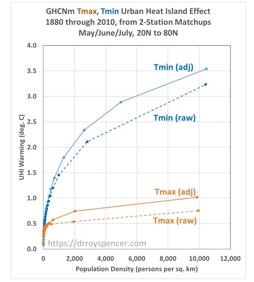
The nonlinearity of the relationship is, as other investigators have found, very strong.

Note that the UHI effect shows up more strongly in the adjusted GHCN data than in the unadjusted data. I cannot explain this. It is not because of the weeding out of bad temperature data, because that only affects regression coefficients if noise is reduced in the independent variable (2-station population density differences), and not in the dependent variable (2-station temperature differences). The 2-station PD differences do not change between the raw and adjusted GHCN data.

As I have mentioned before, the above results do not tell us the extent to which GHCN temperature trends have been affected by urbanization effects. SPOILER ALERT: My preliminary work on this suggests UHI effects are rather large between 1880 and 1980 or so, then become quite small compared to observed temperature trends. But it must be remembered that here we are using population density as a proxy for UHI, which is not necessarily optimum. It is possible for UHI effects to increase as prosperity increases for a population density that remains the same.

CO2 Budget Model Update Through 2022: Humans Keep Emitting, Nature Keeps Removing

Thursday, April 13th, 2023

This is an update of my CO2 budget model that explains yearly Mauna Loa atmospheric CO2 concentrations since 1959 with three main processes:

  1. an anthropogenic source term, primarily from burning of fossil fuels
  2. a constant yearly CO2 sink (removal) rate of 2.05% of the atmospheric “excess” over 295 ppm
  3. an ENSO term that increases atmospheric CO2 during El Nino years and decreases it during La Nina years

The CO2 Budget Model

I described the CO2 budget model here. The most important new insight gained was that the model showed that the CO2 sink rate has not been declining as has been claimed by carbon cycle modelers after one adjusts for the history of El Nino and La Nina activity.

If the sink rate was really declining, that means the climate system is becoming less able to remove “excess” CO2 from the atmosphere, and future climate change will be (of course) worse than we thought. But I showed the declining sink rate was just an artifact of the history of El Nino and La Nina activity, as shown in the following figure (updated through 2022).

The model also showed how the eruption of Mt. Pinatubo caused a large increase in rate of removal of CO2 from the atmosphere (not a new finding) due to enhanced photosynthesis from more diffuse sunlight. This contradicts the popular perception that volcanoes are a major source of atmospheric CO2.

I attempted to get the results published in Geophysical Research Letters, and was conditionally accepted after one review. But the editor wanted more reviewers, which he found, who then rejected the paper. The model is straightforward, physically consistent, and agrees with the observed Mauna Loa CO2 record, as shown in the following plot.

2022 Update: CO2 continues to Rise Despite Renewable Energy Transition

As I have pointed out before, the global economic downturn from COVID had no measurable impact on the Mauna Loa record of atmospheric CO2, and that is not surprising given the large year-to-year variations in natural sources and sinks of CO2. Atmospheric CO2 concentrations continue to rise, mainly due to emissions from China and India whose economies are rapidly growing.

The following plot zooms in on the 2010-2035 period and shows the Mauna Loa CO2 rise compared to my budget model forced with 3 scenarios from the Energy Information Administration (blue lines), and also compared to the RCP scenarios used by the IPCC in the CMIP5 climate model intercomparison project.

The observations are tracking below the RCP8.5 scenario, which assumes unrealistically high CO2 emissions, yet remains the basis for widespread claims of a “climate crisis”. The observations are running a little above my model for the last 2 years, and only time will tell if this trend continues.

But clearly the international efforts to reduce CO2 emissions are having no obvious impact. This is unsurprising since global energy demand continues to grow faster than new sources of renewable energy can make up the difference.

Classifying Land Temperature Stations as Either “Urban” or “Rural” in UHI Studies Proves Nothing about Spurious Temperature Trends

Saturday, April 8th, 2023

As I spend more time working on a research project, the more time I have to reflect on things that others have simply assumed to be true. And in the process I sometimes have an epiphany than clarifies my thinking on a subject.

As I continue to investigate how to quantify urban heat island (UHI) effects for the purpose of determining the extent to which land surface temperature trends have been spuriously inflated by urbanization effects, there is one recurring theme I find has not been handled well in previously published papers on the subject. I’ve mentioned it before, but it’s so important, it deserves its own (brief) blog post.

It has to do with the common assumption that “urban” thermometer sites experience spurious warming over time, while “rural” sites do not.

Obviously, at any given point in time urban environments are warmer than rural environments, especially at night. And urbanization has increased around temperature monitoring sites over the last 50 to 100 years (and longer). Yet, a number of studies over the years have curiously found that urban and rural sites have very similar temperature trends. This has led investigators to conclude that temperature datasets such as the Global Historical Climate Network (GHCN), especially after “homogenization”, is largely free of spurious warming effects from urbanization.

But the conclusion is wrong…all it shows is that temperature trends between rural and urban sites are similar… not that those trends are unaffected by urbanization effects.

Instead, studies have demonstrated that the greatest rate of warming as population increases is for nearly-rural sites, not urban. The one-fourth power relationship found by Oke (1973) and others (and which I am also finding in GHCN data in the summer) means that a population density increase from 1 to 10 persons per sq. km (both “rural”) produces more warming than an urban site going from 1,000 to 1,700 persons per sq. km.

Thus, “rural” sites cannot be assumed to be immune to spurious warming from urbanization. This means that studies that have compared “rural” to “urban” temperature trends haven’t really proved anything.

The mistake people have made is to assume that just because urban locations are warmer than rural locations at any given time that they then have a much larger spurious warming impact on trends over time. That is simply not true.

UAH Global Temperature Update for March, 2023: +0.20 deg. C

Monday, April 3rd, 2023

The Version 6 global average lower tropospheric temperature (LT) anomaly for March 2023 was +0.20 deg. C departure from the 1991-2020 mean. This is up from the February 2023 anomaly of +0.08 deg. C.

The linear warming trend since January, 1979 remains at +0.13 C/decade (+0.11 C/decade over the global-averaged oceans, and +0.18 C/decade over global-averaged land).

Various regional LT departures from the 30-year (1991-2020) average for the last 15 months are:

YEARMOGLOBENHEM.SHEM.TROPICUSA48ARCTICAUST
2022Jan+0.03+0.06-0.00-0.23-0.13+0.68+0.10
2022Feb-0.00+0.01-0.01-0.24-0.04-0.30-0.50
2022Mar+0.15+0.27+0.03-0.07+0.22+0.74+0.02
2022Apr+0.26+0.35+0.18-0.04-0.26+0.45+0.61
2022May+0.17+0.25+0.10+0.01+0.59+0.23+0.20
2022Jun+0.06+0.08+0.05-0.36+0.46+0.33+0.11
2022Jul+0.36+0.37+0.35+0.13+0.84+0.55+0.65
2022Aug+0.28+0.31+0.24-0.03+0.60+0.50-0.00
2022Sep+0.24+0.43+0.06+0.03+0.88+0.69-0.28
2022Oct+0.32+0.43+0.21+0.04+0.16+0.93+0.04
2022Nov+0.17+0.21+0.13-0.16-0.51+0.51-0.56
2022Dec+0.05+0.13-0.03-0.35-0.21+0.80-0.38
2023Jan-0.04+0.05-0.14-0.38+0.12-0.12-0.50
2023Feb+0.08+0.170.00-0.11+0.68-0.24-0.12
2023Mar+0.20+0.23+0.16-0.14-1.44+0.17+0.40

The USA48 region had the 2nd coldest March in the 45-year satellite record, 1.44 deg. C below the 30-year normal. The coldest March was in 1981, at 1.91 deg. C below normal.

The full UAH Global Temperature Report, along with the LT global gridpoint anomaly image for March, 2023 should be available within the next several days here.

The global and regional monthly anomalies for the various atmospheric layers we monitor should be available in the next few days at the following locations:

Lower Troposphere:

http://vortex.nsstc.uah.edu/data/msu/v6.0/tlt/uahncdc_lt_6.0.txt

Mid-Troposphere:

http://vortex.nsstc.uah.edu/data/msu/v6.0/tmt/uahncdc_mt_6.0.txt

Tropopause:

http://vortex.nsstc.uah.edu/data/msu/v6.0/ttp/uahncdc_tp_6.0.txt

Lower Stratosphere:

http://vortex.nsstc.uah.edu/data/msu/v6.0/tls/uahncdc_ls_6.0.txt