Due to a recent hardware failure affecting most UAH users of our dedicated “Matrix” computer system, the disk drives are having to be repopulated from backups. This is now in progress, but I am told it will take from “days to weeks”. Complicating the delay is the fact we cannot do our daily downloads of satellite data files from NOAA, and it will take time to catch up with special data orders. I will post updates here as I have more information.
Since the blogosphere continues to amplify Gavin Schmidt’s claim that the way John Christy and I plot temperature time series data is some form of “trickery”, I have come up with a way to demonstrate its superiority. Following a suggestion by Heritage Foundation chief statistician Kevin Dayaratna, I will do this using only climate model data, and not comparing the models to observations. That way, no one can claim I am displaying the data in such a way to make the models “look bad”.
The goal here is to plot multiple temperature time series on a single graph in such a way the their different rates of long-term warming (usually measured by linear warming trends) are best reflected by their placement on the graph, without hiding those differences.
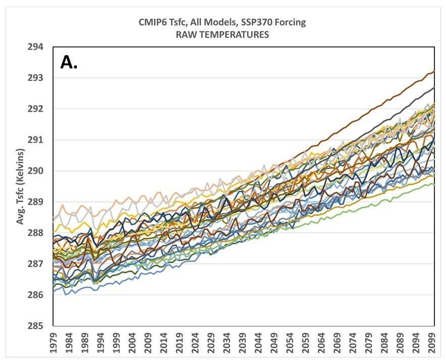
A. Raw Temperatures
Let’s start with 32 CMIP6 climate model projections of global annual average surface air temperature for the period 1979 through 2100 (Plot A) and for which we have equilibrium climate sensitivity (ECS) estimates (I’ve omitted 2 of the 3 Canadian model simulations, which produce the most warming and are virtually the same).
Here, I am using the raw temperatures out of the models (not anomalies). As can be seen in Plot A, there are rather large biases between models which tend to obscure which models warm the most and which warm the least.
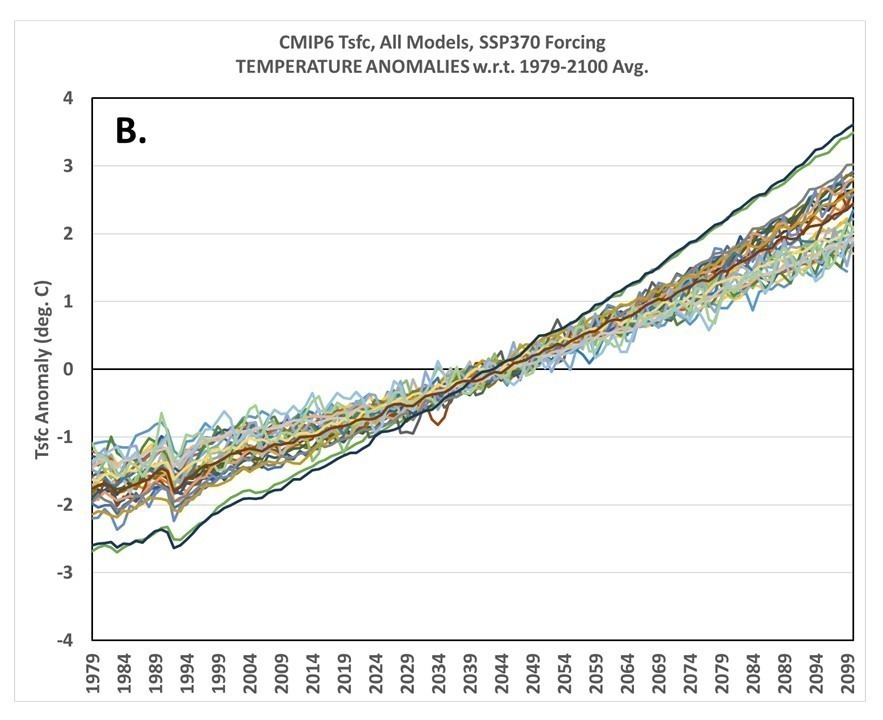
B. Temperature Anomalies Relative to the Full Period (1979-2100)
Next, if we plot the departures of each model’s temperature from the full-period (1979-2100) average, we see in Plot B that the discrepancies between models warming rates are divided between the first and second half of the record, with the warmest models by 2100 having the coolest temperature anomalies in 1979, and the coolest models in 2100 having the warmest temperatures in 1979. Clearly, this isn’t much of an improvement, especially if one wants to compare the models early in the record… right?
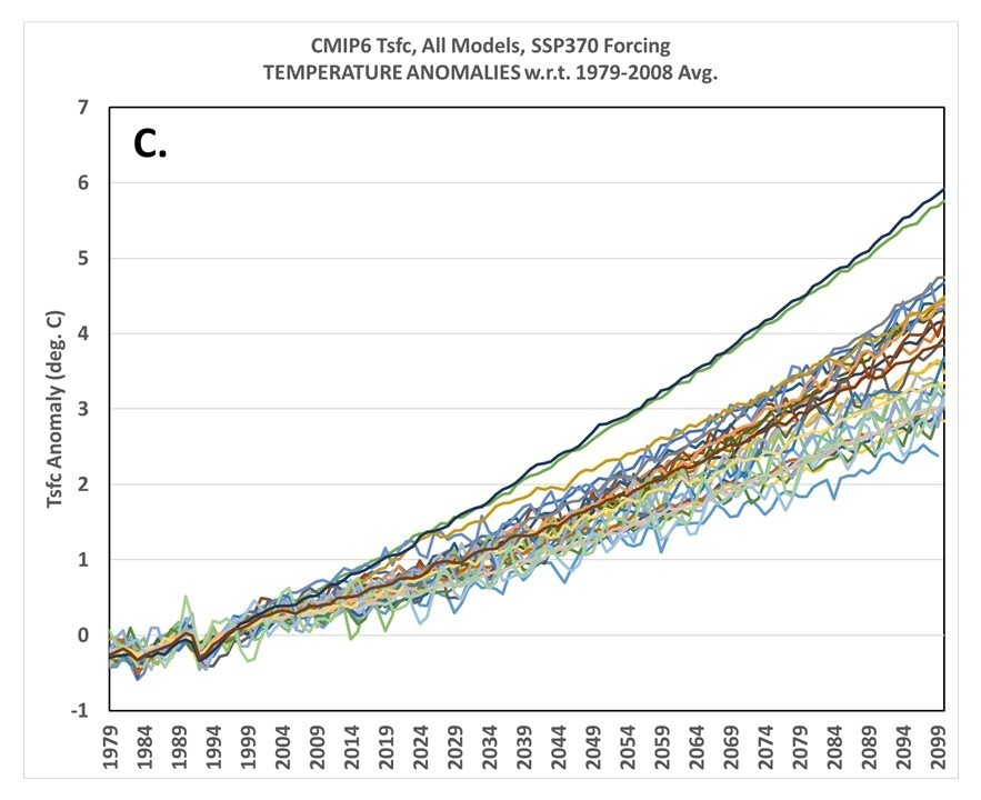
C. Temperature Anomalies Relative to the First 30 Years
The first level of real improvement we get is by plotting the temperatures relative to the average of the first part of the record, in this case I will use 1979-2008 (Plot C). This appears to be the method favored by Gavin Schmidt, and just looking at the graph might lead one to believe this is sufficient. (As we shall see, though, there is a way to quantify how well these plots convey information about the various models’ rates of warming.)
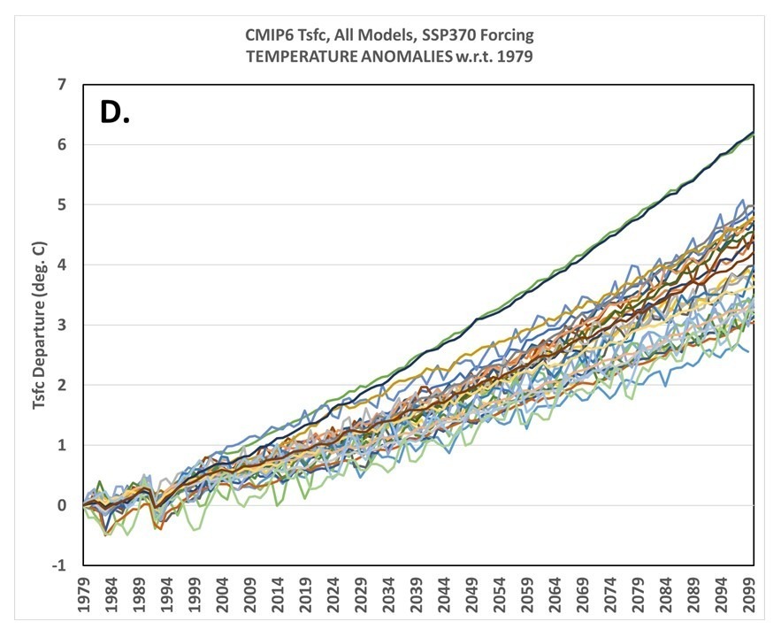
D. Temperature Departures from 1979
For purposes of demonstration (and since someone will ask anyway), let’s look at the graph when the model data are plotted as departures from the 1st year, 1979 (Plot D). This also looks pretty good, but if you think about it the trouble one could run into is that in one model there might be a warm El Nino going on in 1979, while in another model a cool La Nina might be occurring. Using just the first year (1979) as a “baseline” will then produce small model-dependent biases in all post-1979 years seen in Plot D. Nevertheless, Plots C and D “look” pretty good, right? Well, as I will soon show, there is a way to “score” them.
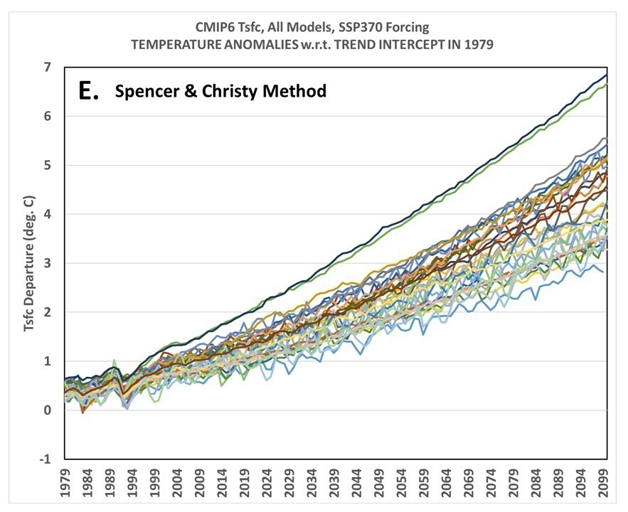
E. Temperature Departures from Linear Trends (relative to the trend Y-intercepts in 1979)
Finally, I show the method John Christy and I have been using for quite a few years now, which is to align the time series such that their linear trends all intersect in the first year, here 1979 (Plot E). I’ve previously discussed why this ‘seems’ the most logical method, but clearly not everyone is convinced.
Admittedly, Plots C, D, and E all look quite similar… so how to know which (if any) is best?
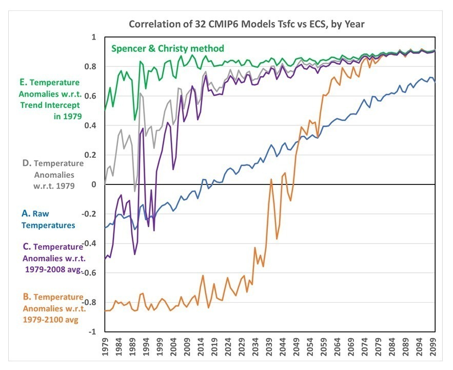
How the Models’ Temperature Metrics Compare to their Equilibrium Climate Sensitivities
What we want is a method of graphing where the model differences in long-term warming rates show up as early as possible in the record. For example, imagine you are looking at a specific year, say 1990… we want a way to display the model temperature differences in that year that have some relationship to the models’ long-term rates of warming.
Of course, each model already has a metric of how much warming it produces, through their diagnosed equilibrium (or effective) climate sensitivities, ECS. So, all we have to do is, in each separate year, correlate the model temperature metrics in Plots A, B, C, D, and E with the models’ ECS values (see plot, below).
When we do this ‘scoring’ we find that our method of plotting the data clearly has the highest correlations between temperature and ECS early in the record.
I hope this is sufficient evidence of the superiority of our way of plotting different time series when the intent is to reveal differences in long-term trends, rather than hide those differences.
When computing temperature trends in the context of “global warming” we must choose a region (U.S.? global? etc.) and a time period (the last 10 years? 50 years? 100 years?) and a season (summer? winter? annual?). Obviously, we will obtain different temperature trends depending upon our choices. But what significance do these choices have in the context of global warming?
Obviously, if we pick the most recent 10 years, such a short period can have a trend heavily influenced by an El Nino at the beginning and a La Nina at the end (thus depressing the trend) — or vice versa.
Alternatively, if we go too far back in time (say, before the mid-20th Century), increasing CO2 in the atmosphere cannot have much of an impact on the temperatures before that time. Inclusion of data too far back will just mute the signal we are looking for.
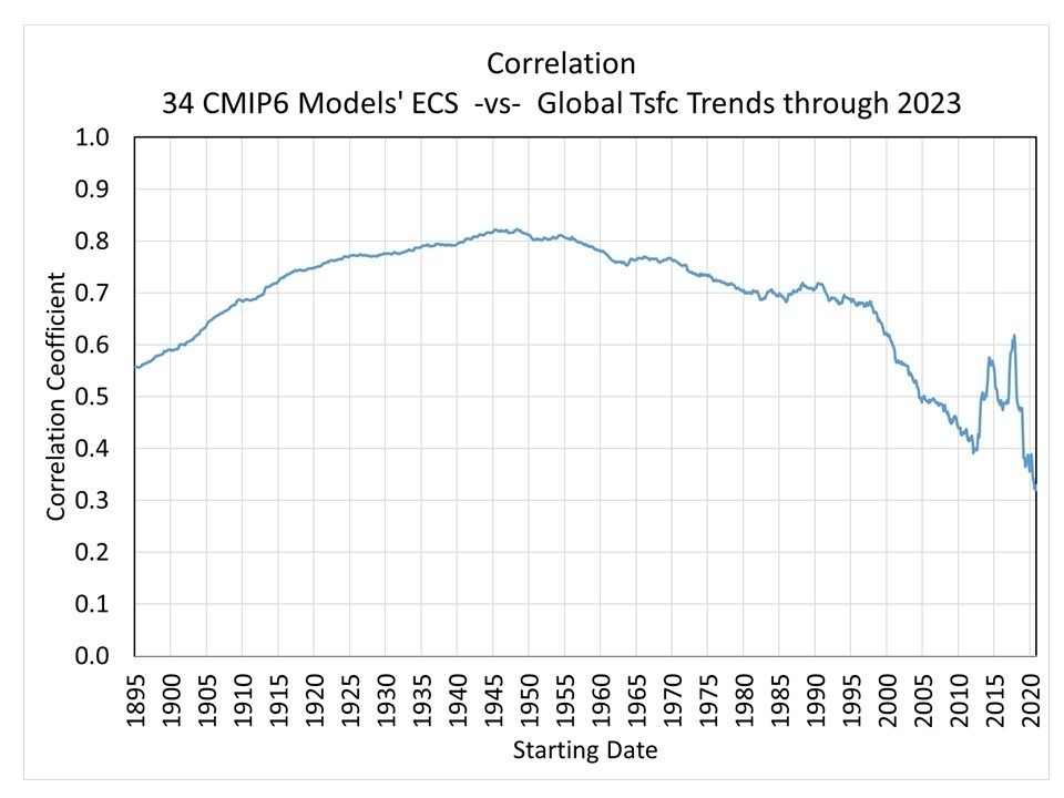
One way to investigate this problem is to look at climate model output across many models to see how their warming trends compare to those models’ diagnosed equilibrium climate sensitivities (ECS). I realize climate models have their own problems, but at least they generate internal variability somewhat like the real world, for instance with El Ninos and La Ninas scattered throughout their time simulations.
I’ve investigated this for 34 CMIP6 models having data available at the KNMI Climate Explorer website which also have published ECS values. The following plot shows the correlation between the 34 models’ ECS and their temperature trends through 2023, but with different starting years.
The peak correlation occurs around 1945, which is when CO2 emissions began to increase substantially, after World War II. But there is a reason why the correlations start to fall off after that date.
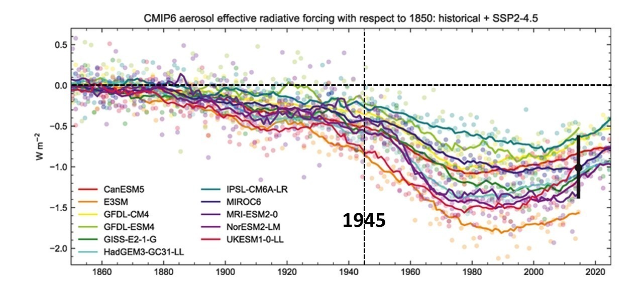
The CMIP6 Climate Models Have Widely Differing Aerosol Forcings
The following plot (annotated by me, source publication here) shows that after WWII the various CMIP6 models have increasingly different amounts of aerosol forcings causing various amounts of cooling.
If those models had not differed so much in their aerosol forcing, one could presumable have picked a later starting date than 1945 for meaningful temperature trend computation. Note the differences remain large even by 2015, which is reaching the point of not being useful anyway for trend computations through 2023.
So, what period would provide the “best” length of time to evaluate global warming claims? At this point, I honestly do not know.
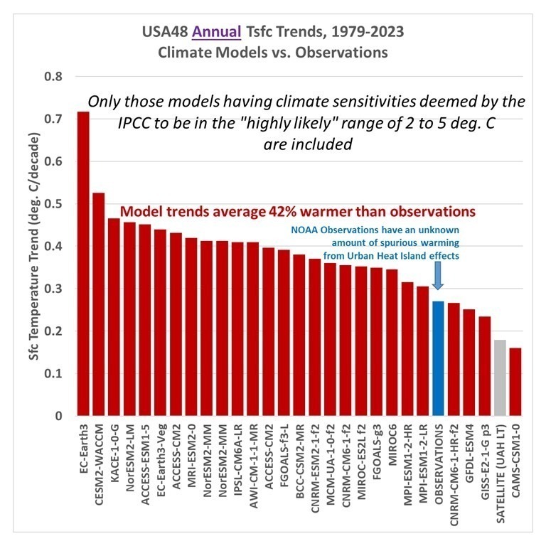
Updated through 2023, here is a comparison of the “USA48” annual surface air temperature trend as computed by NOAA (+0.27 deg. C/decade, blue bar) to those in the CMIP6 climate models for the same time period and region (red bars). Following Gavin Schmidt’s concern that not all CMIP6 models should be included in such comparisons, I am only including those models having equilibrium climate sensitivities in the IPCC’s “highly likely” range of 2 to 5 deg. C for a doubling of atmospheric CO2.
Approximately 6 times as many models (23) have more warming than the NOAA observations than those having cooler trends (4). The model trends average 42% warmer than the observed temperature trends. As I allude to in the graph, there is evidence that the NOAA thermometer-based observations have a warm bias due to little-to-no adjustment for the Urban Heat Island effect, but our latest estimate of that bias (now in review at Journal of Applied Meteorology and Climatology) suggests the UHI effect in the U.S. has been rather small since about 1960.
Note I have also included our UAH lower tropospheric trend, even though I do not expect as good agreement between tropospheric and surface temperature trends in a regional area like the U.S. as for global, hemispheric, or tropical average trends. Theoretically, the tropospheric warming should be a little stronger than surface warming, but that depends upon how much positive water vapor feedback actually exists in nature (It is certainly positive in the atmospheric boundary layer where surface evaporation dominates, but it’s not obviously positive in the free-troposphere where precipitation efficiency changes with warming are largely unknown. I believe this is why there is little to no observational evidence of a tropical “hot spot” as predicted by models).
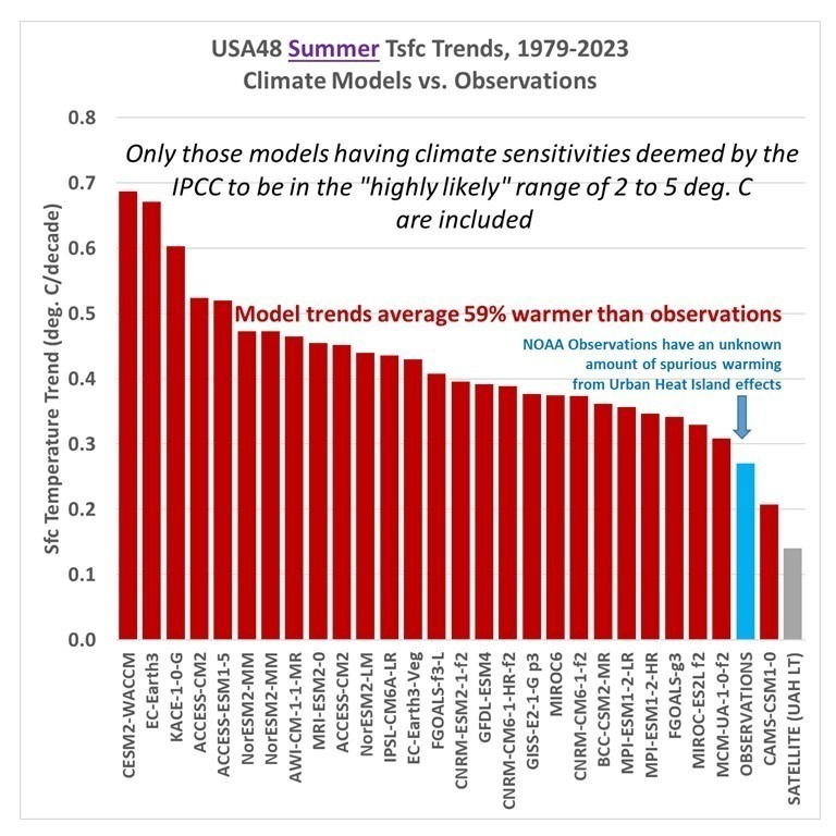
If we now switch to a comparison for just the summer months (June, July, August), the discrepancy between climate model and observed warming trends is larger, with the model trends averaging 59% warmer than the observations:
For the summer season, there are 26 models exhibiting warmer trends than the observations, and only 1 model with a weaker warming trend. The satellite tropospheric temperature trend is weakest of all.
Given that “global warming” is a greater concern in the summer, these results further demonstrate that the climate models depended upon for public policy should not be believed when it comes to their global warming projections.
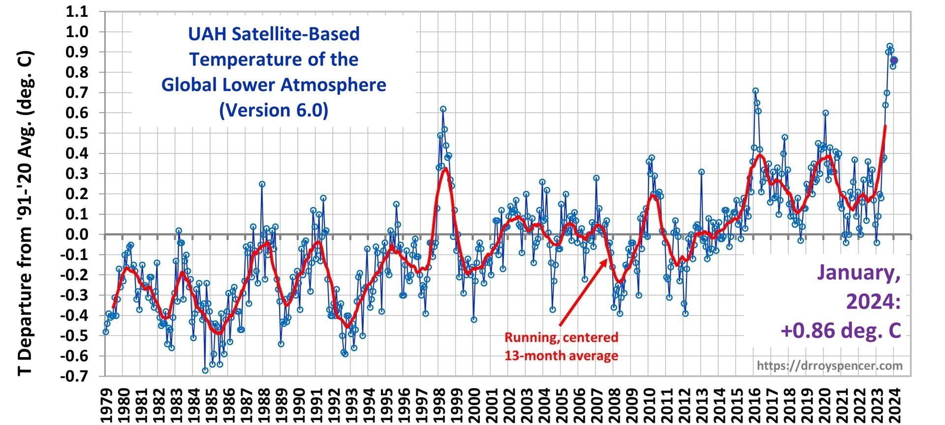
The Version 6 global average lower tropospheric temperature (LT) anomaly for January, 2024 was +0.86 deg. C departure from the 1991-2020 mean, up slightly from the December, 2023 anomaly of +0.83 deg. C.
The linear warming trend since January, 1979 now stands at +0.15 C/decade (+0.13 C/decade over the global-averaged oceans, and +0.20 C/decade over global-averaged land).
New monthly record high temperatures were set in January for:
Northern Hemisphere (+1.06 deg. C, previous record +1.02 deg. in October 2023)
Northern Hemisphere ocean (+1.08 deg. C, much above the previous record of +0.85 deg. C in February, 2016)
Tropics (+1.27 deg. C, previous record +1.15 deg. C in February 1998).
The following table lists various regional LT departures from the 30-year (1991-2020) average for the last 13 months (record highs are in red):
YEAR
MO
GLOBE
NHEM.
SHEM.
TROPIC
USA48
ARCTIC
AUST
2023
Jan
-0.04
+0.05
-0.13
-0.38
+0.12
-0.12
-0.50
2023
Feb
+0.09
+0.17
+0.00
-0.10
+0.68
-0.24
-0.11
2023
Mar
+0.20
+0.24
+0.17
-0.13
-1.43
+0.17
+0.40
2023
Apr
+0.18
+0.11
+0.26
-0.03
-0.37
+0.53
+0.21
2023
May
+0.37
+0.30
+0.44
+0.40
+0.57
+0.66
-0.09
2023
June
+0.38
+0.47
+0.29
+0.55
-0.35
+0.45
+0.07
2023
July
+0.64
+0.73
+0.56
+0.88
+0.53
+0.91
+1.44
2023
Aug
+0.70
+0.88
+0.51
+0.86
+0.94
+1.54
+1.25
2023
Sep
+0.90
+0.94
+0.86
+0.93
+0.40
+1.13
+1.17
2023
Oct
+0.93
+1.02
+0.83
+1.00
+0.99
+0.92
+0.63
2023
Nov
+0.91
+1.01
+0.82
+1.03
+0.65
+1.16
+0.42
2023
Dec
+0.83
+0.93
+0.73
+1.08
+1.26
+0.26
+0.85
2024
Jan
+0.86
+1.06
+0.66
+1.27
-0.05
+0.40
+1.18
The full UAH Global Temperature Report, along with the LT global gridpoint anomaly image for January, 2024, and a more detailed analysis by John Christy, should be available within the next several days here.
The monthly anomalies for various regions for the four deep layers we monitor from satellites will be available in the next several days:
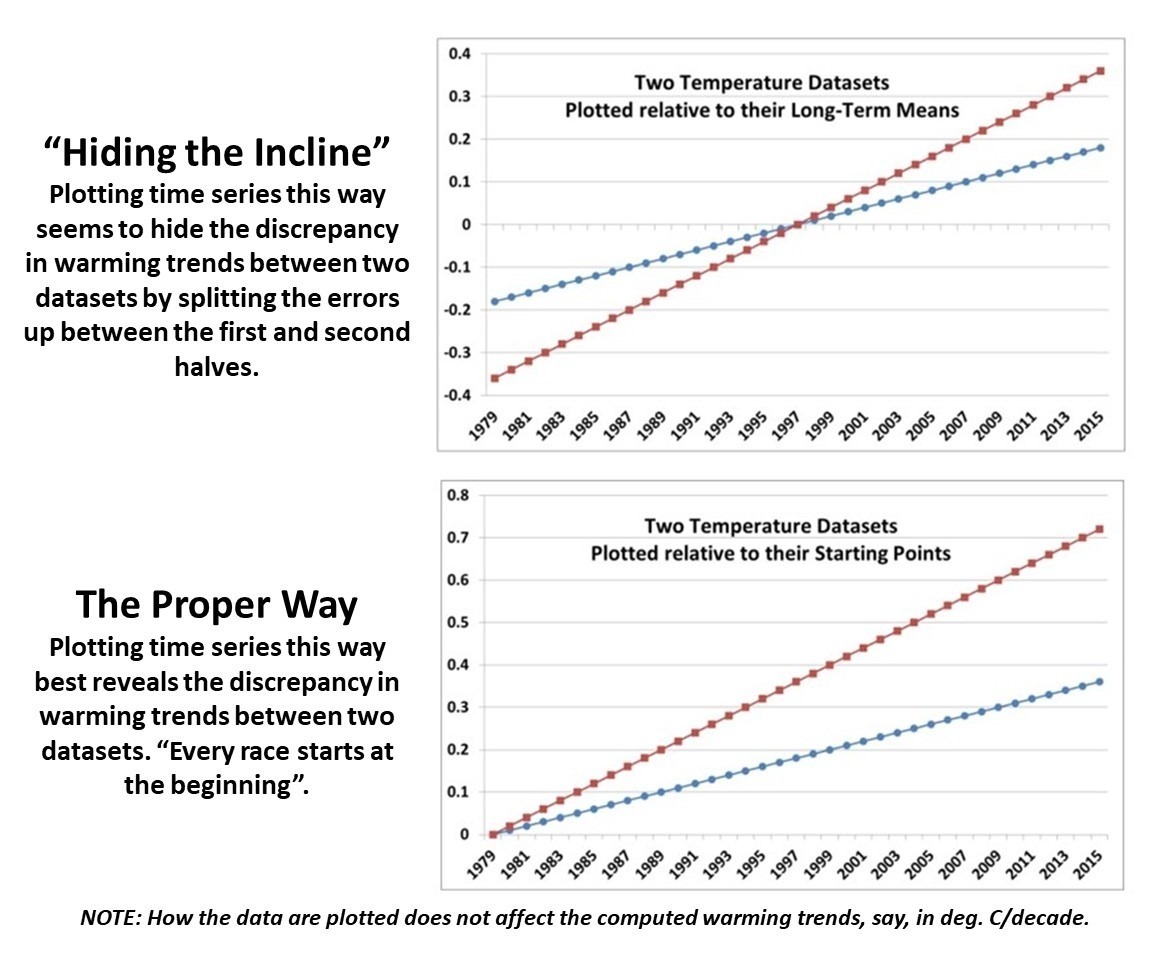
Since Gavin Schmidt appears to have dug his heels in regarding how to plot two (or more) temperature times series on a graph having different long-term warming trends, it’s time to revisit exactly why John Christy and I now (and others should) plot such time series so that their linear trend lines intersect at the beginning.
While this is sometimes referred to as a “choice of base period” or “starting point” issue, it is crucial (and not debatable) to note it is irrelevant to the calculated trends. Those trends are the single best (although imperfect) measure of the long-term warming rate discrepancies between climate models and observations, and they remain the same no matter the base period chosen.
Again, I say, the choice of base period or starting point does not change the exposed differences in temperature trends (say, in climate models versus observations). Those important statistics remain the same.The only reason to object to the way we plot temperature time series is to Hide The Incline* in the long-term warming discrepancies between models and observations when showing the data on graphs.
[*For those unfamiliar, in the Climategate email release, Phil Jones, then-head of the UK’s Climatic Research Unit, included the now-infamous “hide the decline” phrase in an e-mail, referring to Michael Mann’s “Nature trick” of cutting off the end of a tree-ring based temperature reconstruction (because it disagreed with temperature observations), and spliced in those observations in order to “hide the decline” in temperature exhibited by the tree ring data.]
I blogged on this issue almost eight years ago, and I just re-read that post this morning. I still stand by what I said back then (the issue isn’t complex).
Today, I thought I would provide a little background, and show why our way of plotting is the most logical way. (If you are wondering, as many have asked me, why not just plot the actual temperatures, without being referenced to a base period? Well, if we were dealing with yearly averages [no seasonal cycle, the usual reason for computing “anomalies”], then you quickly discover there are biases in all of these datasets, both observational data [since the Earth is only sparsely sampled with thermometers, and everyone does their area averaging in data-void infilling differently], and the climate models all have their own individual temperature biases. These biases can easily reach 1 deg. C, or more, which is large compared to computed warming trends.)
Historical Background of the Proper Way of Plotting
Years ago, I was trying to find a way to present graphical results of temperature time series that best represented the differences in warming trends. For a long time, John Christy and I were plotting time series relative to the average of the first 5 years of data (1979-1983 for the satellite data). This seemed reasonably useful, and others (e.g. Carl Mears at Remote Sensing Systems) also took up the practice and knew why it was done.
Then I thought, well, why not just plot the data relative to the first year (in our case, that was 1979 since the satellite data started in that year)? The trouble with that is there are random errors in all datasets, whether due to measurement errors and incomplete sampling in observational datasets, or internal climate variability in climate model simulations. For example, the year 1979 in a climate model simulation might (depending upon the model) have a warm El Nino going on, or a cool La Nina. If we plot each time series relative to the first year’s temperature, those random errors then impact the entire time series with an artificial vertical offset on the graph.
The same issue will exist using the average of the first five years, but to a lesser extent. So, there is a trade-off: the shorter the base period (or starting point), the more the times series will be offset by short-term biases and errors in the data. But the longer the base period (up to using the entire time series as the base period), the difference in trends is then split up as a positive discrepancy late in the period and a negative discrepancy early in the period.
I finally decided the best way to avoid such issues is to offset each time series vertically so that their linear trend lines all intersect at the beginning. This minimizes the impact of differences due to random yearly variations (since a trend is based upon all years’ data), and yet respects the fact that (as John Christy, an avid runner, told me), “every race starts at the beginning”.
In my blog post from 2016, I presented this pair of plots to illustrate the issue in the simplest manner possible (I’ve now added the annotation on the left):
Contrary to Gavin’s assertion that we are exaggerating the difference between models and observations (by using the second plot), I say Gavin wants to deceptively “hide the incline” by advocating something like the first plot. Eight years ago, I closed my blog post with the following, which seems to be appropriate still today: “That this issue continues to be a point of contention, quite frankly, astonishes me.”
The issue seems trivial (since the trends are unaffected anyway), yet it is important. Dr. Schmidt has raised it before, and because of his criticism (I am told) Judith Curry decided to not use one of our charts in congressional testimony. Others have latched onto the criticism as some sort of evidence that John and I are trying to deceive people. In 2016, Steve McIntyre posted an analysis of Gavin’s claim we were engaging in “trickery” and debunked Gavin’s claim.
In fact, as the evidence above shows, it is our accusers who are engaged in “trickery” and deception by “hiding the incline”

 Home/Blog