
 Home/Blog
Since Gavin Schmidt appears to have dug his heels in regarding how to plot two (or more) temperature times series on a graph having different long-term warming trends, it’s time to revisit exactly why John Christy and I now (and others should) plot such time series so that their linear trend lines intersect at the beginning.
While this is sometimes referred to as a “choice of base period” or “starting point” issue, it is crucial (and not debatable) to note it is irrelevant to the calculated trends. Those trends are the single best (although imperfect) measure of the long-term warming rate discrepancies between climate models and observations, and they remain the same no matter the base period chosen.
Again, I say, the choice of base period or starting point does not change the exposed differences in temperature trends (say, in climate models versus observations). Those important statistics remain the same. The only reason to object to the way we plot temperature time series is to Hide The Incline* in the long-term warming discrepancies between models and observations when showing the data on graphs.
[*For those unfamiliar, in the Climategate email release, Phil Jones, then-head of the UK’s Climatic Research Unit, included the now-infamous “hide the decline” phrase in an e-mail, referring to Michael Mann’s “Nature trick” of cutting off the end of a tree-ring based temperature reconstruction (because it disagreed with temperature observations), and spliced in those observations in order to “hide the decline” in temperature exhibited by the tree ring data.]
I blogged on this issue almost eight years ago, and I just re-read that post this morning. I still stand by what I said back then (the issue isn’t complex).
Today, I thought I would provide a little background, and show why our way of plotting is the most logical way. (If you are wondering, as many have asked me, why not just plot the actual temperatures, without being referenced to a base period? Well, if we were dealing with yearly averages [no seasonal cycle, the usual reason for computing “anomalies”], then you quickly discover there are biases in all of these datasets, both observational data [since the Earth is only sparsely sampled with thermometers, and everyone does their area averaging in data-void infilling differently], and the climate models all have their own individual temperature biases. These biases can easily reach 1 deg. C, or more, which is large compared to computed warming trends.)
Historical Background of the Proper Way of Plotting
Years ago, I was trying to find a way to present graphical results of temperature time series that best represented the differences in warming trends. For a long time, John Christy and I were plotting time series relative to the average of the first 5 years of data (1979-1983 for the satellite data). This seemed reasonably useful, and others (e.g. Carl Mears at Remote Sensing Systems) also took up the practice and knew why it was done.
Then I thought, well, why not just plot the data relative to the first year (in our case, that was 1979 since the satellite data started in that year)? The trouble with that is there are random errors in all datasets, whether due to measurement errors and incomplete sampling in observational datasets, or internal climate variability in climate model simulations. For example, the year 1979 in a climate model simulation might (depending upon the model) have a warm El Nino going on, or a cool La Nina. If we plot each time series relative to the first year’s temperature, those random errors then impact the entire time series with an artificial vertical offset on the graph.
The same issue will exist using the average of the first five years, but to a lesser extent. So, there is a trade-off: the shorter the base period (or starting point), the more the times series will be offset by short-term biases and errors in the data. But the longer the base period (up to using the entire time series as the base period), the difference in trends is then split up as a positive discrepancy late in the period and a negative discrepancy early in the period.
I finally decided the best way to avoid such issues is to offset each time series vertically so that their linear trend lines all intersect at the beginning. This minimizes the impact of differences due to random yearly variations (since a trend is based upon all years’ data), and yet respects the fact that (as John Christy, an avid runner, told me), “every race starts at the beginning”.
In my blog post from 2016, I presented this pair of plots to illustrate the issue in the simplest manner possible (I’ve now added the annotation on the left):
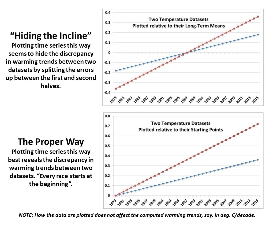
Contrary to Gavin’s assertion that we are exaggerating the difference between models and observations (by using the second plot), I say Gavin wants to deceptively “hide the incline” by advocating something like the first plot. Eight years ago, I closed my blog post with the following, which seems to be appropriate still today: “That this issue continues to be a point of contention, quite frankly, astonishes me.”
The issue seems trivial (since the trends are unaffected anyway), yet it is important. Dr. Schmidt has raised it before, and because of his criticism (I am told) Judith Curry decided to not use one of our charts in congressional testimony. Others have latched onto the criticism as some sort of evidence that John and I are trying to deceive people. In 2016, Steve McIntyre posted an analysis of Gavin’s claim we were engaging in “trickery” and debunked Gavin’s claim.
In fact, as the evidence above shows, it is our accusers who are engaged in “trickery” and deception by “hiding the incline”


And given that, as you state, the choice of baseline does not affect the trends, the only reason for shifting the baseline forward by 10 years is to hide the increase amongst those who CHOOSE to look only at the anomalies without comparing them to the past.
If there is indeed a valid reason feel free to share it.
*********
I have no idea what your point is. Could you rephrase it? -Roy
Alternatively, why wasn’t a 40 year baseline preferable to an arbitrarily shifted 30 year period?
**********
Because in the climate business it is traditional to use a 30-year average as “normal”… it used to be 1981-2010, now it is 1991-2020. But it doesn’t matter to the trends, of course. -Roy
What are you doing editing my posts???
Please remove your editing and post under your own name.
Antonin, please stop trolling.
> Since Gavin Schmidt appears to have dug his heels in
Gavin Made Me Do It.
No mention of SST. Did Gavin made Roy hide the SST too?
Willard, please stop trolling.
Mike Flynn,
You’re in my thread, and you’re supposed to be out of here:
https://www.drroyspencer.com/2019/09/a-stove-top-analogy-to-climate-models/#comment-388226
Cheers.
Dr Spencer,
Did you see Gavin’s Postscript [1/31/2024]?
I also noticed that he has invoked Brandolini’s law.
*****
Gavin is apparently blind to that fact that Law works both ways. He has been falsely calling our plots deceptive and trickery and yet, here I am 8 years later, still debunking him. -Roy
Here is the relevant part of the PS:
Op. Cit.
And that’s just point 1. One way to litigate these issues forever is not to address the points being made. It’d be hard to disagree with the idea of showing the trends with their uncertainty.
Willard, please stop trolling.
Tropical atmospheric river reaches California. Flooding possible in the south of the state.
https://i.ibb.co/nzXrthQ/mimictpw-namer-latest.gif
I would love to hear your thoughts (seriously) on what’s happening here instead..
https://climatereanalyzer.org/clim/sst_daily/
I don’t have a problem with anchoring two series to the starting point of their trends. It’s what I do.
I do acknowledge that this could still create an issue if one series starts low thus augmenting its trend while the other starts high thus attenuating its trend.
There’s no single right way to do it, but like I said I prefer Dr. Spencer’s method the best.
It is important to point out that the surface temperatures trends have an uncertainty of around +/- 0.05 C/decade using an AR(1) evaluation so they are still consistent with most modeling except for perhaps the hot models in CMIP6.
Anyway, here is my own graph of observations plotted with the older CMIP3.
https://i.imgur.com/KroWoiw.png
From the graph I posted an astute observer may notice that the difference between observations and models could be the result of CMIP3 underestimating the effect of Pinatubo. This lends credence to the idea that models overestimate surface warming not because of a deficiency with the handling of the positive components of radiative forcing (like GHGs), but with the negative components (like aerosols).
bdgwx,
An astute observer might wonder why no models reflect the reality that the Earth has cooled over the last four and a half billion years.
bdgwx: I do acknowledge that this could still create an issue if one series starts low thus augmenting its trend while the other starts high thus attenuating its trend.
To illustrate the issue I have plotted CMIP6 vs BEST from 1850 to 2023 with both anchored to their 1851-1880 average.
https://i.imgur.com/YUye7VJ.png
Keep at it Dr Spencer. This kind of work is important. Image a mere climate scientist schooling a mathematician about data analysis.
Gavin Schmidt has an undergraduate degree and a PhD in mathematics.
To the best of my knowledge Roy Spencer has degrees only in climate science.
Imagine a mere climate scientist schooling a mathematician about data analysis.
AQ,
“Imagine a mere climate scientist schooling a mathematician about data analysis.”
This would be the mathematician who declared 2014 the hottest year ever – with his calculated likelihood of 38%, would it?
Or a “modeller” who complained that the reason his “models” failed was peoples’ behaviour?
Or maybe a mathematician who refuses to believe that the future states of the chaotic atmosphere cannot be predicted?
The Clay Institutes million dollar award for a solution to the Navier-Stokes equation relating to fluid dynamics hasn’t been handed out yet. Is Gavin too modest to claim the prize, or not clever enough to solve the problem?
Maybe Gavin could analyse the data relating to the Earth cooling over the past four and a half million years, and correlate it to something?
Who’s sillier – you or Gavin Schmidt?
I guess you are trying to claim that an outcome can’t be most likely if it’s probability is less than 50%. So I guess you also see an issue with a racehorse being the favourite at odds of 3 to 1, meaning a probability of 25%?
Racehorses? Favourites?
Antonin, please stop trolling.
I was making a sarcastic comment to suggest irony. Let me be clear. Dr Spencer is schooling Gavin in data analysis, and that is ironic. It gets back to the question of who is being more honest. It should not matter what “side” you are on. It should be the data that is important. I think Dr Spencer is doing it the right way. Way not start the graphs at the the same point?
How do you determine the same point? In UAH the T can swing wildly from month to month. Start on a high month for UAH, then it will end up dipping below whatever series is being compared to it.
That’s exactly how I plot differing trends, and for the same reason. If I have say 73 years of data, I want to see how much the two datasets have diverged in 73 years.
Any other method masks the difference between the two trends.
Thanks for all your great work, Dr. Roy.
w.
In many areas of chemistry and physics, when confronted with a noisy data stream, the first line of analysis is spectral analysis to see if any information might lie hidden beneath the noise. This is most useful with raw data rather than smoothing deviations from an average computed from an arbitrary portion of the data. A quick google turned up https://arxiv.org/pdf/1702.07048.pdf , suggesting this is not a novel concept, although I’ve not seen its mention by the peerage.
spectral analsysis shows double-sideband suppressed carrier modulation, where the carrier is the seasonal signal.
Paul,
Is this double side band suppressed carrier modulation responsible for the Earth cooling over the past four and a half billion years, or was it the GHE?
Go on, demonstrate your expertise!
I think I will side with Roy Spencer on this issue of Models vs Observation.
https://www.realclimate.org/images//cmp_cmip3_2016.png
This one shows the average matching observations. It has lots of models well below the current observations. These are not good honest science and Dr. Spencer is correct in pointing them out.
Here is the reason models have low projections.
https://scied.ucar.edu/sites/default/files/styles/extra_large/public/images/Global-surface-temperature_6July2022.png.webp?itok=fSsM9h4p
The lower than observation comes from using different emission of CO2 scenarios. The lower than observation (to make the graph fit observations) are included and it looks like the models are working well. The reality is the CO2 emissions are not at the low end but the normal or more emissions.
https://www.statista.com/statistics/276629/global-co2-emissions/
The only models that should be used in comparing Observation with Models are models that include the high emission of CO2.
I think Gavin is the one misleading people in this case.
What would Gavin’s model graph compared to observation look like if he only included the models that used the high CO2 emissions?
Good job Roy Spencer for uncovering the deception.
Gavin use only the higher emission models in your comparison and don’t pretend the models are matching observation.
Doing a bit more research into models.
If you take this information.
https://www.carbonbrief.org/explainer-the-high-emissions-rcp8-5-global-warming-scenario/
In the graphic in this article they have different CO2 emission plots. The RCP8.5 plot is if we keep emitting 30 billon tons of CO2 yearly. Humans are already emitting more than this so the 8.5 model is even exceeded.
https://ourworldindata.org/co2-emissions
This shows humans are emitting 35 billion tonnes (metric) but metric and tons are close in value.
This would mean the only models that should be used to compare to observations are the high end range mean.
https://climatechange.chicago.gov/sites/production/files/2016-07/scenariotempgraph_0.jpg
Norman,
The usual argument is that RCP 8.5 is not business-as-usual, for instance because it projects too much CO2 emissions for our current pathway. You are claiming that the opposite is true. Something’s got to give.
Here’s a primer on “But RCPs”:
https://andthentheresphysics.wordpress.com/2020/02/09/but-rcps/
Four years already. Time flies.
Willard, please stop trolling.
Glad to see you accepting some reality, Norman. Feels good, doesn’t it. Much better than making up nonsense. You even omitted the insults, false accusations, and misrepresentations. Keep it up!
Metric tons (tonnes) are about 10% larger than US tons. So apparently we’ve [luckily] exceeded the RCP8.5 nonsense. The grape vines will love us. We’re taking care of the planet.
Don’t forget to mention CO2 can NOT raise Earth’s temperature. It is NOT a “forcing”. Just in the last year, we’re seen two REAL forcings raise Earth’s temperature — El Niño and HTE. There are things that can raise Earth’s temperature, just not CO2.
Will Tulare Lake permanently return to California?
Another storm in the Gulf of Carpentaria.
From Gavin Schmidt (pretend scientist) –
“Hopefully Roy is happy now.”
Oh dear. Gavin is worried about Dr Spencers’s “happiness”, is he?
What a hypocrite! About as genuine as a three dollar bill!
It’s taken Flynnster only a day to run out of things to say and enter brain-dead copy-paste mode. Not a neuron firing.
Antonin, please stop trolling.
Both sides try to enhance the visual non-overlap or overlap of models and observations.
The point is to look at the trends and uncertainty in them and focus on those.
Gavin argues the trend[trend range] since 1980 from properly selected Models is 0.23C/dec [0.16,0.31].
The observations for GISS shows a trend of 0.19 plus/minus 0.04 degC/dec.
So the observed trend and model trend range certainly do overlap, but one cannot tell that from Roy’s presentation of the results.
So if a model only has a slight chance of being right, it’s still a good model?
What if it’s a model of the atmosphere as shooting cold rays, Puffman?
Willard, please stop trolling.
Define “being right”
Is it the observations = average of models?
That makes no sense, since the observations are ONE realization of the Earth’s weather, ENSO, ocean cycles, etc.
One realization doesnt need to equal the average of the many realizations of those things in the different models.
“Being right” is the opposite of “being wrong”, tr0ll Nate.
IOW, “being right” is the opposite of your cult beliefs.
And what is being wrong, Puffman?
That looks like a good answer!
IOW no science answers from Clint, again.
Science falls on the deaf ears of you cult children, Nate.
Profound…
And yet here you are again spreading fertilizer.
Yes child, you recognize science as fertilizer.
You’ve been well indoctrinated.
Nate says:
”So the observed trend and model trend range certainly do overlap, but one cannot tell that from Roys presentation of the results.”
???? you can’t be seeing it and not seeing it at the same time Nate so what the heck are you talking about?
Nobody knows what stalker Bill is talking about.
thats because nobody knows what you are talking about. . .unless you actually believe you can see it and not see it at the same time which goes along with a number of other illogical conclusions of yours.
> So the observed trend and model trend range certainly do overlap, but one cannot tell that from Roys presentation of the results.
Gill tries to pretend he does not get what everyone with two eyes can see.
Were it not for the gaslighting, it would be funny.
well I am seeing Nate say it overlaps and doesn’t overlap at the same time. He has a tendency to do that. After all he thinks a line drawn between any two particles of the moon both change direction and don’t change direction simultaneously.
Auditors are really sharp at spotting that with their BS detector. Actually Willard it because you didn’t fall for that like Nate did that DREMT and myself noticed you were a closet non-spinner.
Not sure how you managed to avoid noticing it but one way would be if you were lunar centric and thought the earth was rotating around the moon in sync with the moon’s rotation.
Well I see Gill still trying to pretend there’s no difference between these two graphs:
https://www.drroyspencer.com/wp-content/uploads/Hide-the-incline-example-1.jpg
LOL!
Bill, you are just tro.lling, and given that, it seems you dont feel any need to make sense.
Obviously there is a big difference between the two graphs both well explained in the dialogue next to the charts. Thanks Willard for highlighting that.
Nothing to do with my post anymore.
And so Gill now concedes that he understood what Nate meant when he said that the observed trend and model trend range certainly do overlap, but one cannot tell that from Roy’s presentation of the results.
Obviously Willard can’t read the explanations in Roy’s graphic.
Obviously Gill has not read Nate’s comment.
Hi Roy, in case you’ll find it interesting: https://judithcurry.com/2024/02/02/two-model-observation-comparisons-confirm-cmip6-models-run-too-hot/
“It is obvious from the chart that it is the multi model mean (MMM) anomalies”
Obviously, or obliviously?
***
> “The “This is just false” claim”
No “false” in the text. Try again?
***
For more editing services, please send a donation to
https://clownswithoutborders.org/
Thanks!
Thanks, you understood it very well and it seems you have no real argument? For more services: Email me.
The fact that I understood does not make it more legitimate, Frankie dear. You’re stuck with a complex Y-axis, and that’s that. Oh, and you forgot to say how that point is supposed to be irrelevant.
Do you intend to return behind Judy’s doors before acknowledging having put words in Gavin’s mouth?
Ta.
Willard and others really get sensitive when they see their report cards.
Willard, please stop trolling.
Gill and only Gill will suck up to anyone who can help him pay less taxes, including a neurologist from a country he considers socialist, and an accountant with bankruptcy experience.
Nope I just hate to see resources wasted and I am intolerant of incompetence.
That’s why Gill is so upset about the FedSoc:
https://www.politico.com/news/2023/05/02/leonard-leo-federalist-society-00094761
are you trying to stalk me willard?
i can’t make any sense of who this neurologist is, what country i consider having a socialist government, or what accountant with bankruptcy experience you are talking about, and what you are trying to imply about the federalist society of which Merrick Garland is supposedly a member.
and as to the difference between a 501(c)(4) and a 501(c)(3) not for profit is the ‘3’ cannot be politically active or endorse candidates for office, and a ‘4’ can.
thus donations by individuals to a ‘3’ can be tax deductible but not to a ‘4’.
so it seems rather odd to be claiming that barry seid was being deceived about the tax deductibility of his donation to Leo’s ‘4’ organization while also served as an officer of a ‘3’ organization. if that isn’t what you are whining about then i am just chalking up what you say as total mumbo jumbo.
Gill responds to my comment, whines about stalking, and then whines to get room service.
ROFL!
Willard says:
”Gill and only Gill will suck up to anyone who can help him pay less taxes, including a neurologist from a country he considers socialist, and an accountant with bankruptcy experience.”
Again Willard have we talked about any people like this on this board? If we have I don’t recall that. Perhaps you can clarify what you are talking about.
bill…you and I know wee willy lacks the intellect to argue on the basis of science, so he resort to pettiness. He’s not even good at that, however, since he is so easily out-maneuvered.
What the world needs right now is a Gill & Bordo act.
Encore!
He’s a strange, bitter, and twisted GHE cultist, is Willard.
His latest essay at describing the greenhouse effect is about as silly as Ball4’s. He has decided that temperature is really called the greenhouse effect – he writes “By contrast, the average surface temperature of the Earth is 59F (15C). This heating effect is called the greenhouse effect.”
Ball4 had “an earthen GHE”, and a “planetary GHE”, with one having a temperature of 255 K, one of 288 K, and another GHE with unspecified temperature. Rather confused – like the average GHE believer.
Willard just refuses point blank to believe the Earth, the Moon, or a banana, can have a temperature of any sort – without a greenhouse effect!
What a strange loony is Willard!
Oh well.
Gordon Robertson says:
”billyou and I know wee willy lacks the intellect to argue on the basis of science, so he resort to pettiness. Hes not even good at that, however, since he is so easily out-maneuvered.”
Its probably easier to spot a Yeti than a Willard post that even attempts to talk about science.
[ME] The fact that I understood does not make it more legitimate, Frankie dear. Youre stuck with a complex Y-axis, and thats that. Oh, and you forgot to say how that point is supposed to be irrelevant.
[GILL, TEN COMMENTS LATER] Its probably easier to spot a Yeti than a Willard post that even attempts to talk about science.
Willard, please stop trolling.
with regard to clowns without borders…no one wants to see children harmed, or made to suffer. It is the job of the United Nations to bring about their safety and they have failed miserably. Rather, they have created a litany of lies about anthropogeic warming in the hopes of forcing world nations to comply with their collective mental illness.
The kids depicted in the photos at the sight are no doubt children of families who applied legitimately for immigrations or refugee status. The hordes currently charging the US southern borders want to bypass channels and invade the country. Along with legitimate refugees you get scumbag criminals who have already committed heinous crimes in the US.
There is no solution in the current Biden approach of ignoring illegal immigrants and flooding the country with unwanted illegal immigrants. Here in Canada, we are currently feeling the stress of our policies of opening up our borders to legal immigrants and refugees. Our practice is unsustainable.
Children of the illegals in the States will suffer as they are forced into ghettoes. Those sponsoring the illegality will soon abandon them to their fate. Young males will likely join gangs, making life miserable for others.
> with regard to clowns without borders…no one wants to see children harmed
You succeeded with staying on topic for exactly three dots, Bordo.
Well done!
Roy, Because 1979 was the coldest year for 40 years, would it be possible to show as a comparison with current temperatures, the 1940 temperature, as this was the maximum temperature after coming out of the Little Ice age. All graphs are quite alarmist by showing the rise since 1979. It wouldn’t be alarmist if shown from 1940 and it may just shut up the protestors
“The proper way” – yeah nah mate!
Starting both plots on the very first year at zero is mathematically incorrect.
Natural variation occurs in BOTH the observed and modelled data. There is very little chance that BOTH varied together in the same amount PERFECTLY from the start.
This is such a basic error on your behalf.
ant…to Roy…”What are you doing editing my posts???
Please remove your editing and post under your own name”.
***
Are you a complete bumbling ijit? Roy has responded correctly and in the manner we all reply to posts, by quoting the desired content then replying to it. He signed it ‘Roy’ at the end.
Are all you alarmists this stoopid, rude, and inconsiderate?
Besides, this has been explained to you before, about 30 year averages.
> by quoting the desired content
C’mon, Bordo. That’s not what has been done.
Witless Wee Willy,
You wrote –
“Cmon, Bordo. Thats not what has been done.”
Aw, c’mon Willy, don’t keep us in suspense – tell us what has been done. If you can actually figure out what you are burbling about, of course!
You may not be as completely silly as you appear, but on the other hand . . .
Easy, isn’t it?
Mike Flynn,
Thank you for playing dumb.
What has been done is a bit like in one of your old comments:
https://www.drroyspencer.com/2019/09/a-stove-top-analogy-to-climate-models/#comment-387873
But without the brackets.
Cheers.
Witless Wee Willy,
You wrote
“Cmon, Bordo. Thats not what has been done.”
Aw, cmon Willy, dont keep us in suspense tell us what has been done. If you can actually figure out what you are burbling about, of course!
You may not be as completely silly as you appear, but on the other hand . . .
Easy, isnt it?
ant the ijit simply cannot seem to stop himself …
“Gavin Schmidt has an undergraduate degree and a PhD in mathematics.
To the best of my knowledge Roy Spencer has degrees only in climate science.
Imagine a mere climate scientist schooling a mathematician about data analysis”.
***
They both have Ph. Ds. To get a Ph.D you need to first get an undergraduate degree, then a masters degree, then a Ph. D.
No, dumbo, Gavins undergraduate degree + a degree in math does not equate to 2 separate degrees since they are earned consecutively. You can get an undergrad degree in meteorology with a B.Sc. but Roy has a Ph. D. degree in meteorology. From that perspective, he is light years ahead of Gavin, who is only a mathematicians who programs computers.
Gordon,
As far as I am concerned, “climate science” is about as much science as political, social, or domestic science.
Climate is the statistics of historical weather observations. Anybody claiming to be a climate scientists is boasting that they are incapable of obtaining worthwhile employment.
They may be well meaning, or just cynically obtaining money by selling a non-existent future to the gullible, who knows? Either fools or frauds, but who would willingly accept advice from either?
Gee, am I sounding a tad cynical?
I don’t think there is an official degree in climate science. It’s usually under the umbrella of atmospheric physics.
I agree with your assessment. Even geologists like Michael Mann, or mathematicians like Gavin Schmidt, can call themselves climate scientists. An economist can be a climate scientist.