Archive for May, 2023

Americans Increasingly Choose a Warmer Life

Tuesday, May 9th, 2023

We hear that a new El Nino forming in the Pacific Ocean is likely to push global-average temperatures to new record highs in 2023.

Setting aside the fact that we have no idea if current temperatures are warmer than during the Medieval Warm Period of ~1,000 years ago, I have to ask…

So what?

Doing something about global warming depends a lot on how much we are asked to pay to fix it. If it was cheap and practical, we would have already transitioned to renewable energy sources.

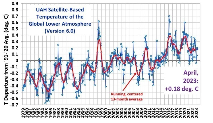
It also depends upon just how much global warming we have experienced, and whether it is enough to be concerned with. For the global oceans, the climate models enlisted to scare us in a steady stream of alarmist news reports over-predict ocean warming by a factor of 2. In America’s heartland during the summer, the discrepancy is a factor of 6(!). So, clearly, public concern is being inflated by factually incorrect information.

What Temperature do Americans Choose?

When it comes to life in these United States, roughly 50% of U.S. residents have at least a moderate worry about climate change and global warming. As mentioned above, I believe this is largely due to their response to what is reported by the news media, which is routinely exaggerated.

An interesting question that the late Dr. Pat Michaels asked about 25 years ago is, what temperature do Americans choose to live with? We have a large country with a wide range of climates, from frigid winters to tropical year-round, so there is considerable choice of what climate we decide to live in.

Dr. Michaels pointed out (most recently in 2013) that over the years, Americans tend to migrate to warmer climates. Some of us might claim to be concerned about global warming, but we increasingly choose to live where it’s warmer. I’ve updated those calculations to 2022, and the results are the same:

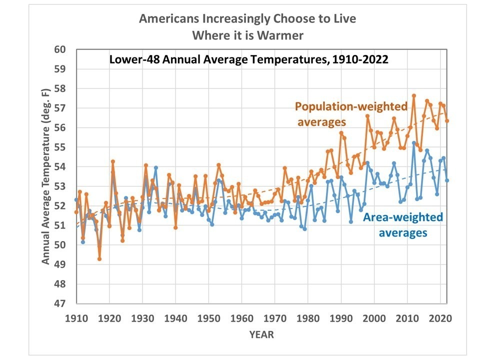
The blue curve is the usual area-averaged temperatures for the Lower 48, while the orange curve is the state population-weighted average. While the area average temperatures have warmed modestly over the last century, the temperatures where people choose to live have increased by twice that amount. (The possibility that Urban Heat Island effects have spuriously warmed these NOAA-reported temperatures is part of a research project we have been involved in).

Some might claim that the migration to states with warmer temperatures has more to do with economic opportunity than with temperature. But who creates economic opportunity? People. And where do people choose to live? Where the weather is warmer.

There’s a reason why people are flocking to Texas and Florida, and not to the Dakotas or Maine. Ultimately, it’s due to the climate. So, while some of us like to think we are Saving the Earth by buying a Tesla, our migration habits are telling a different story.

UAH Global Temperature Update for April, 2023: +0.18 deg. C

Tuesday, May 2nd, 2023

The Version 6 global average lower tropospheric temperature (LT) anomaly for April 2023 was +0.18 deg. C departure from the 1991-2020 mean. This is down slightly from the March 2023 anomaly of +0.20 deg. C.

The linear warming trend since January, 1979 remains at +0.13 C/decade (+0.11 C/decade over the global-averaged oceans, and +0.18 C/decade over global-averaged land).

Various regional LT departures from the 30-year (1991-2020) average for the last 16 months are:

YEARMOGLOBENHEM.SHEM.TROPICUSA48ARCTICAUST
2022Jan+0.03+0.06-0.00-0.23-0.13+0.68+0.10
2022Feb-0.00+0.01-0.01-0.24-0.04-0.30-0.50
2022Mar+0.15+0.27+0.03-0.07+0.22+0.74+0.02
2022Apr+0.26+0.35+0.18-0.04-0.26+0.45+0.61
2022May+0.17+0.25+0.10+0.01+0.59+0.23+0.20
2022Jun+0.06+0.08+0.05-0.36+0.46+0.33+0.11
2022Jul+0.36+0.37+0.35+0.13+0.84+0.55+0.65
2022Aug+0.28+0.31+0.24-0.03+0.60+0.50-0.00
2022Sep+0.24+0.43+0.06+0.03+0.88+0.69-0.28
2022Oct+0.32+0.43+0.21+0.04+0.16+0.93+0.04
2022Nov+0.17+0.21+0.13-0.16-0.51+0.51-0.56
2022Dec+0.05+0.13-0.03-0.35-0.21+0.80-0.38
2023Jan-0.04+0.05-0.14-0.38+0.12-0.12-0.50
2023Feb+0.08+0.170.00-0.11+0.68-0.24-0.12
2023Mar+0.20+0.23+0.16-0.14-1.44+0.17+0.40
2023Apr+0.18+0.11+0.25-0.03-0.38+0.53+0.21

The full UAH Global Temperature Report, along with the LT global gridpoint anomaly image for April, 2023 should be available within the next several days here.

The global and regional monthly anomalies for the various atmospheric layers we monitor should be available in the next few days at the following locations:

Lower Troposphere:

http://vortex.nsstc.uah.edu/data/msu/v6.0/tlt/uahncdc_lt_6.0.txt

Mid-Troposphere:

http://vortex.nsstc.uah.edu/data/msu/v6.0/tmt/uahncdc_mt_6.0.txt

Tropopause:

http://vortex.nsstc.uah.edu/data/msu/v6.0/ttp/uahncdc_tp_6.0.txt

Lower Stratosphere:

http://vortex.nsstc.uah.edu/data/msu/v6.0/tls/uahncdc_ls_6.0.txt

Urbanization Effects on GHCN Temperature Trends, Part V: Tmin Warming at U.S. vs. non-U.S. Stations

Monday, May 1st, 2023

In my last post (Part IV) I showed how urbanization (as measured by population density) affects GHCN monthly-average Tmax and Tmin near-surface air temperatures during the warm season in the Northern Hemisphere. We are utilizing a technique that recognizes rural thermometer sites can experience large spurious warming with very small increases in population density, as has been known for over 50 years.

The urban heat island (UHI) effects on Tmin averaged 3.5 times as large as on Tmax, an unsurprising result and qualitatively consistent with previous studies. Also, I showed that the homogenization procedure NOAA uses to adjust the Tmax and Tmin temperatures caused greater UHI effects compared to raw (unadjusted) data, a result I cannot explain.

Again I will emphasize that these UHI warming results are based upon spatial comparisons between neighboring stations, and do not say anything quantitative about how much urbanization effects have spuriously warmed long-term temperature trends over land. That is indeed the goal of our study, but we have not reached that point in the analysis yet.

Here in Part V of my series on UHI I just want to show the difference between U.S. and non-U.S. stations, in this cased for adjusted (homogenized) Tmin data. This is shown in the following two plots, which are the same except the second plot has a logarithmic scale in population density.

The non-U.S. stations have a more rapid rise in UHI warming at very low population densities than the U.S. stations do, but less rapid warming at high population densities. Possible reasons for this include country differences in thermometer siting and differences in waste heat generation. I’m sure you can think of other possible reasons.

As can be seen most (over 80%) of the GHCN 2-station matchups come from the U.S. Other countries have considerably fewer 2-station matchups, for example Canada (7.8% of the Northern Hemisphere total), Japan (4.7%), Turkey (2.8%), South Korea (1.3%), and China (1.1%). These low totals are not necessarily due to a lack of stations, but to a lack of station pairs within 150 km and 300 m elevation of each other needed for my current method of analysis.