Archive for October, 2016

What Do 16 Years of CERES Data Tell Us About Global Climate Sensitivity?

Friday, October 21st, 2016

Short Answer: It all depends upon how you interpret the data.

It has been quite a while since I have addressed feedback in the climate system, which is what determines climate sensitivity and thus how strong human-caused global warming will be. My book The Great Global Warming Blunder addressed how climate researchers have been misinterpreting satellite measurements of variations the Earth’s radiative energy balance when trying to estimate climate sensitivity.

The bottom line is that misinterpretation of the data has led to researchers thinking they see positive feedback, and thus high climate sensitivity, when in fact the data are more consistent with negative feedback and low climate sensitivity. There have been a couple papers — an many blog posts — disputing our work in this area, and without going into details, I will just say that I am as certain of the seriousness of the issue as I have ever been. The vast majority of our critics just repeat talking points based upn red herrings or strawmen, and really haven’t taken the time to understand what we are saying.

What is somewhat dismaying is that, even though our arguments are a natural outgrowth of, and consistent with, previous researchers’ published work on feedback analysis, most of those experts still don’t understand the issue I have raised. I suspect they just don’t want to take the time to understand it. Fortunately, Dick Lindzen took the time, and has also published work on diagnosing feedbacks in a manner that differs from tradition.

Since we now have over 16 years of satellite radiative budget data from the CERES instruments, I thought it would be good to revisit the issue, which I lived and breathed for about four years. The following in no way exhausts the possibilities for how to analyze satellite data to diagnose feedbacks; Danny Braswell and I have tried many things over the years. I am simply trying to demonstrate the basic issue and how the method of analysis can yield very different results. The following just gives a taste of the problems with analyzing satellite radiative budget data to diagnose climate feedbacks. If you want further reading on the subject, I would say our best single paper on the issue is this one.

The CERES Dataset

There are now over 16 years of CERES global radiative budget data: thermally emitted longwave radiation “LW”, reflected shortwave sunlight “SW”, and a “Net” flux which is meant to represent the total net rate of radiative energy gain or loss by the system. All of the results I present here are from monthly average gridpoint data, area-averaged to global values, with the average annual cycle removed.

The NASA CERES dataset from the Terra satellite started in March of 2000. It was followed by the Aqua satellite with the same CERES instrumentation in 2002. These datasets are combined into the EBAF dataset I will analyze here, which now covers the period March 2000 through May 2016.

Radiative Forcing vs. Radiative Feedback

Conceptually, it is useful to view all variations in Earth’s radiative energy balance as some combination of (1) radiative forcing and (2) radiative feedback. Importantly, there is no known way separate the two… they are intermingled together.

But they should have very different signatures in the data when compared to temperature variations. Radiative feedback should be highly correlated with temperature, because the atmosphere (where most feedback responses occur) responds relatively rapidly to a surface temperature change. Time varying radiative forcing, however, is poorly correlated with temperature because it takes a long time — months if not years — for surface temperature to fully respond to a change in the Earths radiative balance, owing to the heat capacity of the land or ocean.

In other words, the different directions of causation between temperature and radiative flux involve very different time scales, and that will impact our interpretation of feedback.

Radiative Feedback

Radiative feedback is the radiative response to a temperature change which then feeds back upon that temperature change.

Imagine if the climate system instantaneously warmed by 1 deg. C everywhere, without any other changes. Radiative transfer calculations indicate that the Earth would then give off an average of about 3.2 Watts per sq. meter more LW radiation to outer space (3.2 is a global area average… due to the nonlinearity of the Stefan-Boltzmann equation, its value is larger in the tropics, smaller at the poles). That Planck effect of 3.2 W m-2 K-1 is what stabilizes the climate system, and it is one of the components of the total feedback parameter.

But not everything would stay the same. For example, clouds and water vapor distributions might change. The radiative effect of any of those changes is called feedback, and it adds or subtracts from the 3.2 number. If it makes the number bigger, that is negative feedback and it reduces global warming; if it makes the number smaller, that is positive feedback which increases global warming.

But at no time (and in no climate model) would the global average number go below zero, because that would be an unstable climate system. If it went below zero, that would mean that our imagined 1 deg. C increase would cause a radiative change that causes even more radiative energy to be gained by the system, which would lead to still more warming, then even more radiative energy accumulation, in an endless positive feedback loop. This is why, in a traditional engineering sense, the total climate feedback is always negative. But for some reason climate researchers do not consider the 3.2 component a feedback, which is why they can say they believe most climate feedbacks are positive. It’s just semantics and does not change how climate models operate… but leads to much confusion when trying to discuss climate feedback with engineers.

Radiative Forcing

Radiative forcing is a radiative imbalance between absorbed sunlight and emitted infrared energy which is not the result of a temperature change, but which can then cause a temperature change (and, in turn, radiative feedback).
For example, our addition of carbon dioxide to the atmosphere through fossil fuel burning is believed to have reduced the LW cooling of the climate system by almost 3 Watts per sq. meter, compared to global average energy flows in and out of the climate system of around 240 W m-2. This is assumed to be causing warming, which will then cause feedbacks to kick in and either amplify or reduce the resulting warming. Eventually, the radiative imbalance cause by the forcing causes a temperature change that restores the system to radiative balance. The radiative forcing still exists in the system, but radiative feedback exactly cancels it out at a new equilibrium average temperature.

CERES Radiative Flux Data versus Temperature

By convention, radiative feedbacks are related to a surface temperature change. This makes some sense, since the surface is where most sunlight is absorbed.

If we plot anomalies in global average CERES Net radiative fluxes (the sum of absorbed solar, emitted infrared, accounting for the +/-0.1% variations in solar flux during the solar cycle), we get the following relationship:
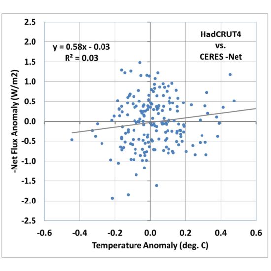
Fig. 1. Monthly global average HadCRUT4 surface temperature versus CERES -Net radiative flux, March 2000 through May 2016.

Fig. 1. Monthly global average HadCRUT4 surface temperature versus CERES -Net radiative flux, March 2000 through May 2016.

I’m going to call this the Dessler-style plot, which is the traditional way that people have tried to diagnose feedbacks, including Andrew Dessler. A linear regression line is typically added, and in this case its slope is quite low, about 0.58 W m-2 K-1. If that value is then interpreted as the total feedback parameter, it means that strong positive feedbacks in the climate system are pushing the 3.2 W m-2 K-1 Planck response to 0.58, which when divided into the estimated 3.8 W m-2 radiative forcing from a doubling of atmospheric CO2, results in a whopping 6.5 deg. C of eventual warming from 2XCO2!

Now thats the kind of result that you could probably get published these days in a peer-reviewed journal!

What about All That Noise?

If the data in Fig. 1 all fell quite close to the regression line, I would be forced to agree that it does appear that the data support high climate sensitivity. But with an explained variance of 3%, clearly there is a lot of uncertainty in the slope of the regression line. Dessler appears to just consider it noise and puts error bars on the regression slope.

But what we discovered (e.g. here) is that the huge amount of scatter in Fig. 1 isn’t just noise. It is evidence of radiative forcing contaminating the radiative feedback signal we are looking for. We demonstrated with a simple forcing-feedback model that in the presence of time-varying radiative forcing, most likely caused by natural cloud variations in the climate system, a regression line like that in Fig. 1 can be obtained even when feedback is strongly negative!

In other words, the time-varying radiative forcing de-correlates the data and pushes the slope of the regression line toward zero, which would be a borderline unstable climate system.

This raises a fundamental problem with standard least-squares regression analysis in the presence of a lot of noise. The noise is usually assumed to be in only one of the variables, that is, one variable is assumed to be a noisy version of the other.

In fact, what we are really dealing with is two variables that are very different, and the disagreement between them cant just be blamed on one or the other variable. But, rather than go down that statistical rabbit hole (there are regression methods assuming errors in both variables), I believe it is better to examine the physical reasons why the noise exists, in this case the time-varying internal radiative forcing.

So, how can we reduce the influence of this internal radiative forcing, to better get at the radiative feedback signal? After years of working on the problem, we finally decided there is no magic solution to the problem. If you knew what the radiative forcing component was, you could simply subtract it from the CERES radiances before doing the statistical regression. But you don’t know what it is, so you cannot do this.

Nevertheless, there are things we can do that, I believe, give us a more realistic indication of what is going on with feedbacks.

Switching from Surface Temperature to Tropospheric Temperature

During the CERES period of record there is an approximate 1:1 relationship between surface temperature anomalies and our UAH lower troposphere LT anomalies, with some scatter. So, one natural question is, what does the relationship in Fig. 1 look like if we substitute LT for surface temperature?
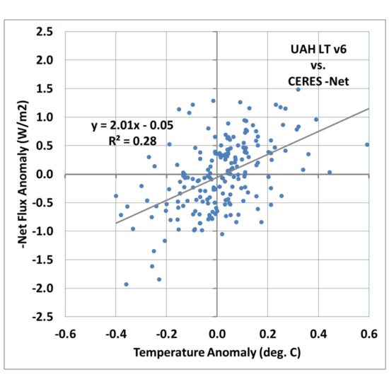
Fig. 2. As in Fig. 1, but surface temperature has been replaced by satellite lower tropospheric temperature (LT).

Fig. 2. As in Fig. 1, but surface temperature has been replaced by satellite lower tropospheric temperature (LT).

Fig. 2 shows that the correlation goes up markedly, with 28% explained variance versus 3% for the surface temperature comparison in Fig. 1.

The regression slope is now 2.01 W m-2 K-1, which when divided into the 2XCO2 radiative forcing value of 3.8 gives only 1.9 deg. C warming.

So, we already see that just by changing from surface temperature to lower tropospheric temperature, we achieve a much better correlation (indicating a clearer feedback signal), and a greatly reduced climate sensitivity.

I am not necessarily advocating this is what should be done to diagnose feedbacks; I am merely pointing out how different a result you can obtain when you use a temperature variable that is better correlated with radiative flux, as feedback should be.

Looking at only Short Term Variability

So far our analysis has not considered the time scales of the temperature and radiative flux variations. Everything from the monthly variations to the 16-year trends are contained in the data.

But there’s a problem with trying to diagnose feedbacks from long-term variations: the radiative response to a temperature change (feedback) needs to be measured on a short time scale, before the temperature has time to respond to the new radiative imbalance. For example, you cannot relate decadal temperature trends and decadal radiative flux trends and expect to get a useful feedback estimate because the long period of time involved means the temperature has already partly adjusted to the radiative imbalance.

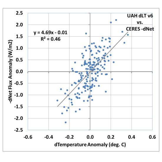
So, one of the easiest things we can do is to compute the month-to-month differences in temperature and radiative flux. If we do this for the LT data, we obtain an even better correlation, with an explained variance of 46% and a regression slope of 4.69 W m-2 K-1.

Fig. 3. As in Fig. 2, but for month-to-month differences in each variable.

Fig. 3. As in Fig. 2, but for month-to-month differences in each variable.

If that was the true feedback operating in the climate system it would be only (3.8/4.69=) 0.8 deg. C of climate sensitivity for doubled CO2 in the atmosphere(!)

Conclusions

I dont really know for sure which of the three plots above are more closely related to feedback. I DO know that the radiative feedback signal should involve a high correlation, whereas the radiative forcing signal will involve a low correlation (basically, the latter often involves spiral patterns in phase space plots of the data, due to time lag associated with the heat capacity of the surface).

So, what the CERES data tells us about feedbacks entirely depends upon how you interpret the data… even if the data have no measurement errors at all (which is not possible).

It has always bothered me that the net feedback parameter that is diagnosed by linear regression from very noisy data goes to zero as the noise becomes large (see Fig. 1). A truly zero value for the feedback parameter has great physical significance — a marginally unstable climate system with catastrophic global warming — yet that zero value can also occur just due to any process that de-correlates the data, even when feedback is strongly negative.

That, to me, is an unacceptable diagnostic metric for analyzing climate data. Yet, because it yields values in the direction the Climate Consensus likes (high climate sensitivity), I doubt it will be replaced anytime soon.

And even if the strongly negative feedback signal in Fig. 3 is real, there is no guarantee that its existence in monthly climate variations is related to the long-term feedbacks associated with global warming and climate change. We simply don’t know.

I believe the climate research establishment can do better. Someday, maybe after Lindzen and I are long gone, the IPCC might recognize the issue and do something about it.

New Santer et al. Paper on Satellites vs. Models: Even Cherry Picking Ends with Model Failure

Tuesday, October 18th, 2016

(the following is mostly based upon information provided by Dr. John Christy)

Dr. John Christy’s congressional testimonies on 8 Dec 2015 and 2 Feb 2016 in which he stated that climate models over-forecast climate warming by a factor of 2.5 to 3, apparently struck a nerve in Climate Consensus land.

In a recently published paper in J. Climate entitled Comparing Tropospheric Warming in Climate Models and Satellite Data, Santer et al. use a combination of lesser-known satellite datasets and neglect of radiosonde data to reduce the model bias to only 1.7 times too much warming.

Wow. Stop the presses.

Part of the new paper’s obfuscation is a supposed stratospheric correction to the mid-tropospheric temperature channel the satellite datasets use. Of course, Christy’s comparisons between models and satellite data are always apples-to-apples, so the small influence of the stratosphere on the MT channel is included in both satellite and climate model data. The stratospheric correction really isn’t needed in the tropics, where the model-observation bias is the largest, because there is virtually no stratospheric influence on the MT channel there.

Another obfuscation is the reference the authors make to previously-published radiosonde comparisons:

“we do not compare model results with radiosonde-based atmospheric temperature measurements, as has been done in a number of previous studies (Gaffen et al. 2000; Hegerl and Wallace 2002; Thorne et al. 2007, 2011; Santer et al. 2008; Lott et al. 2013).”

Conveniently omitted from the list are the most extensive radiosonde comparisons published (Christy, J.R., R.W. Spencer and W.B Norris, 2011: The role of remote sensing in monitoring global bulk tropospheric temperatures. Int. J. Remote Sens. 32, 671-685, and references therein). This is the same kind of marginalization I have experienced in my previous research life in satellite rainfall estimation. By publishing a paper and ignoring the published work of others, they can marginalize your influence on the research community at large. They also keep people from finding information that might undermine the case they are trying to build in their paper.

John Christy provides this additional input:

My testimony in Dec 2015 and Feb 2016 included all observational datasets in their latest versions at that time. Santer et al. neglected the independent datasets generated from balloon measurements. The brand new “hot” satellite dataset (NOAAv4.0) used by Santer et al. to my knowledge has no documentation.

Here is my testimony of 2 Feb 2016 (pg 5):

I’ve shown here that for the global bulk atmosphere, the models overwarm the atmosphere by a factor of about 2.5. As a further note, if one focuses on the tropics, the models show an even stronger greenhouse warming in this layer … the models over-warm the tropical atmosphere by a factor of approximately 3.

Even when we use the latest satellite datasets used by Santer, these are the results which back up my testimony.

Global MT trends (1979-2015, C/decade) & magnification factor models vs. dataset:


102ModelAvg +0.214
___UWein(2) +0.090 2.38x radiosonde
_____RATPAC +0.087 2.47x radiosonde
_______UNSW +0.092 2.33x radiosonde
____UAHv6.0 +0.072 2.97x satellite
____RSSv4.0 +0.129 1.66x satellite
___NOAAv4.0 +0.136 1.57x satellite
________ERA +0.082 2.25x reanalysis

The range of model warming rate magnification versus observational datasets goes from 1.6x (NOAAv4.0) to 3.0x with median value of 2.3x for models warming faster than the observations.

Tropical MT trends (1979-2015, C/decade) & magnification factor models vs. dataset:


102ModelAvg +0.271
___UWein(2) +0.095 2.85x radiosonde
_____RATPAC +0.068 3.96x radiosonde
_______UNSW +0.073 3.69x radiosonde
____UAHv6.0 +0.065 4.14x satellite
____RSSv4.0 +0.137 1.98x satellite
___NOAAv4.0 +0.160 1.69x satellite
________ERA +0.082 3.31x reanalysis

Range goes from 1.7 (NOAAv4.0) to 4.1 with a median value of 3.3 for the models warming faster than the observations.

Therefore, the testimony of 2 Feb 2016 is corroborated by the evidence.

Overall, it looks to me like Santer et al. twist themselves into a pretzel by cherry picking data, using a new hot satellite dataset that appears to be undocumented, ignores independent (radiosonde) evidence (since it does not support their desired conclusion), and still arrives at a substantial 1.7x average bias in the climate models warming rates.

Global Warming be Damned: Record Corn, Soybeans, Wheat

Friday, October 14th, 2016

For many years we have been warned that climate change is creating a “climate crisis”, with heat and drought reducing agricultural yields to the point that humanity will suffer. Every time there’s a drought, we are told that this is just one more example of human-caused climate change.

But droughts have always occurred. The question is: Are they getting worse? And, has modest warming had any effects on grain yields?

We have yet to experience anything like the Dust Bowl drought of the 1930s, or the mega-droughts the western U.S. tree ring record suggests occurred in centuries past.

And even if they do occur, how do we know they were not caused by the same natural factors that cause those previous droughts? While “global warming” must cause more precipitation overall (because there is more evaporation), whether this means increased drought conditions anywhere is pretty difficult to predict because it would require predicting an average change in weather patterns, which climate models so far have essentially no skill at.

So, here we are with yet another year (2016) experiencing either record or near-record yields in corn, soybeans, and wheat. Even La Nina, which was widely feared would cause reduced crop yields this year, did not materialize.

How can this be?

How has Climate Changed in the U.S. Corn Belt?

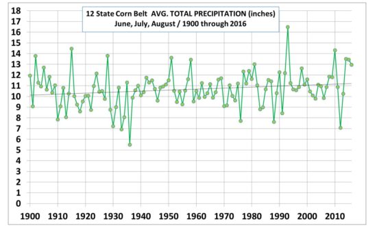
Let’s start with precipitation for the main growing months of June-July-August over the 12-state Corn Belt (IL, IN, IA, KS, NE, ND, SD, MO, WI, MN, MI, OH). All data come from official NOAA sources. Since 1900, if anything, there has been a slight long-term increase in growing season precipitation:

corn-belt-precip-jja-thru-2016

In fact, the last three years (2014-16) has seen the highest 3-yr average precip amount in the entire record.

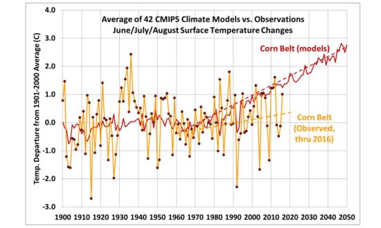
If we examine temperature, there has been some warming in recent decades, but nothing like that predicted for the same region from the CMIP5 climate models:

corn-belt-temp-jja-thru-2016-vs-42-cmip5-models

That plot alone should tell you that something is wrong with the climate models. It’s not even obvious a statistically significant warming has occurred, let alone attribute it to a cause, given all of the adjustments (or lack of proper adjustments) that have been made to the surface thermometer data over the years. Note the models also cannot explain the Dust Bowl warmth of the 1930s, because the models do not mimic the natural changes in Pacific Ocean circulation which are believed to be the cause.

So, has Climate Change Not Influenced Grain Yields?

Let’s assume the temperature and precipitation observations accurately reveal what has really happened. Has climate change since 1960 impacted corn yields in the U.S.?

As part of some consulting I do for a company that monitors grain markets and growing conditions around the world, last year I quantified how year-to-year variations in U.S. corn yields depend on year-to-year changes in precipitation and temperature, over the period 1960 through 2014. I then applied that relationship to the long-term trends in precipitation and temperature.

What I found was that there might be a small long-term decrease in yields due to climate change, but it is far exceeded by technological advancements that increase yields.

In fact, based upon studies of the dependence of corn yield on CO2 fertilization, the negative climate impact is even outweighed by the CO2 fertilization effect alone. (More CO2 is well known to fertilize, as well as increase drought tolerance and make plants more efficient in their water use).

The people I know in the grain trading business do not even factor in climate change…primarily because they do not yet see evidence of it.

It might well be there…but it is so overwhelmed by other positive factors, especially improved varieties, that it cannot be observed in corn yield data. In fact, if varieties can be made more heat tolerant, it might be that there will be no climate change impact on yields.

So, once again, claims of severe agricultural impacts from climate change continue to reside in the realm of science fiction….in the future, if at all.

4,001 Days: The Major Hurricane Drought Continues

Friday, October 7th, 2016

Also, The Hurricane Center Doesn’t Overestimate…But It Does Over-warn

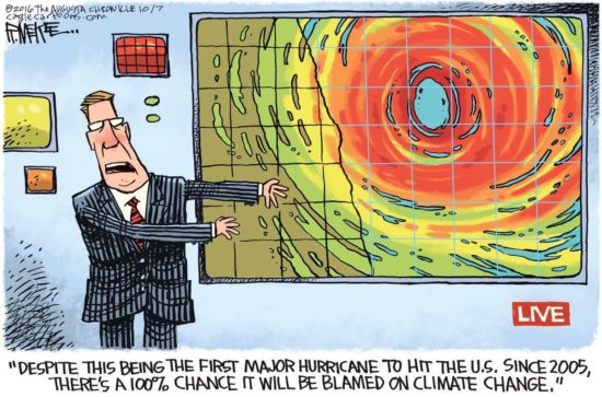
matthew-hype-cartoon

Today marks 4,001 days since the last major hurricane (Wilma in 2005) made landfall in the United States. A major hurricane (Category 3 to 5) has maximum sustained winds of at least 111 mph, and “landfall” means the center of the hurricane eye crosses the coastline.

This morning it looks like Matthew will probably not make landfall along the northeast coast of Florida. Even if it does, its intensity is forecast to fall below Cat 3 strength this evening. The National Hurricane Center reported at 7 a.m. EDT that Cape Canaveral in the western eyewall of Matthew experienced a wind gust of 107 mph.

(And pleeeze stop pestering me about The Storm Formerly Known as Hurricane Sandy, it was Category 1 at landfall. Ike was Cat 2.)

While coastal residents grow weary of “false alarms” when it comes to hurricane warnings, the National Weather Service has little choice when it comes to warning of severe weather events like tornadoes and hurricanes. Because of forecast uncertainty, the other option (under-warning) would inevitably lead to a catastrophic event that was not warned.

This would be unacceptable to the public. Most of us who live in “tornado alley” have experienced dozens if not hundreds of tornado warnings without ever seeing an actual tornado. I would wager that hurricane conditions are, on average, experienced a small fraction of the time that hurricane warnings are issued for any given location.

The “maximum sustained winds” problem

Another issue that is not new is the concern that the “maximum sustained winds” reported for hurricanes are overestimated. I doubt this is the case. But there is a very real problem that the area of maximum winds usually covers an extremely small portion of the hurricane. As a result, seldom does an actual anemometer (wind measuring device) on a tower measure anything close to what is reported as the maximum sustained winds. This is because there aren’t many anemometers with good exposure and the chances of the small patch of highest winds hitting an instrumented tower are pretty small.

It also raises the legitimate question of whether maximum sustained winds should be focused on so much when hurricane intensity is reported.

Media hype also exaggerates the problem. Even if the maximum sustained wind estimate was totally accurate, the area affected by it is typically quite small, yet most of the warned population is under the impression they, personally, are going to experience such extreme conditions.


How are maximum sustained winds estimated?

Research airplanes fly into western Atlantic hurricanes and measure winds at flight level in the regions most likely to have the highest winds, and then surface winds are estimated from average statistical relationships. Also, dropsonde probes are dropped into high wind regions and GPS tracking allows near-surface winds to be measured pretty accurately. Finally, a Stepped Frequency Microwave Radiometer (SFMR) on board the aircraft measures the roughness of the sea surface to estimate wind speed.

As the hurricane approaches the U.S. coastline, doppler radar also provides some ability to measure wind speeds from the speed of movement of precipitation blowing toward or away from the radar.

I don’t think we will solve the over-warning problem of severe weather events any time soon.

And it looks like the major hurricane drought for the U.S. is probably going to continue.

Matthew Could Get Loopy, Hit Florida Twice

Wednesday, October 5th, 2016

(UPDATED 7:25 a.m. EDT Thursday October 6)

Several days ago, it seemed unlikely that Major Hurricane Matthew, now with 125 mph sustained winds, would come close enough to the east coast of Florida to pose a serious threat.

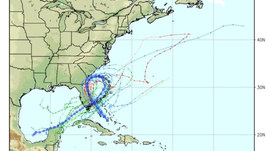
But now many of the recent weather forecast model runs have Matthew possibly hitting the Sunshine State twice, separated by about 4-5 days during which the hurricane does a complete loop and return to the state weaker, probably as a Tropical Storm (model graphic courtesy of WeatherBELL.com):

loopy-matthew-2

This is a large departure from previous forecasts, and the National Hurricane Center’s discussion this morning is still hinting at the new scenario where Matthew does not recurve poleward the way most hurricanes do. It’s possible Matthew will then cross Florida and enter the Gulf of Mexico. Such unusual hurricane tracks are particularly difficult to forecast.

Of course, the worst impacts will be along the eastern shore of Florida tonight and Friday as Matthew is supposed to arrive as an historic Category 4 storm, making landfall 4,001 days after the last major hurricane (Cat 3 or stronger) hit the U.S. (Wilma in 2005).

If “Loopy Matthew” hits Florida twice, I suppose it’s fitting that it affords Florida coastal residents a chance to hold the longest hurricane party ever.

UAH Global Temperature Update for September 2016: +0.44 deg. C

Monday, October 3rd, 2016

September Temperature Unchanged from August

NOTE: This is the eighteenth monthly update with our new Version 6.0 dataset. Differences versus the old Version 5.6 dataset are discussed here. Note we are now at “beta5” for Version 6, and the paper describing the methodology has been conditionally accepted for publication.

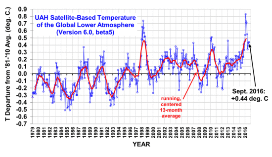
The Version 6.0 global average lower tropospheric temperature (LT) anomaly for September 2016 is +0.44 deg. C, statistically unchanged from the August, 2016 value of +0.43 deg. C (click for full size version):

uah_lt_1979_thru_september_2016_v6

[Note that the August value of +0.43 is changed slightly from its previously reported value of +0.44. This is because inter-satellite calibrations are improved with each additional month of global data, which can change previous months’ results by several thousandths of a degree.]

The global, hemispheric, and tropical LT anomalies from the 30-year (1981-2010) average for the last 21 months are:

YEAR MO GLOBE NHEM. SHEM. TROPICS
2015 01 +0.30 +0.44 +0.15 +0.13
2015 02 +0.19 +0.34 +0.04 -0.07
2015 03 +0.18 +0.28 +0.07 +0.04
2015 04 +0.09 +0.19 -0.01 +0.08
2015 05 +0.27 +0.34 +0.20 +0.27
2015 06 +0.31 +0.38 +0.25 +0.46
2015 07 +0.16 +0.29 +0.03 +0.48
2015 08 +0.25 +0.20 +0.30 +0.53
2015 09 +0.23 +0.30 +0.16 +0.55
2015 10 +0.41 +0.63 +0.20 +0.53
2015 11 +0.33 +0.44 +0.22 +0.52
2015 12 +0.45 +0.53 +0.37 +0.61
2016 01 +0.54 +0.69 +0.39 +0.84
2016 02 +0.83 +1.17 +0.50 +0.99
2016 03 +0.73 +0.94 +0.52 +1.09
2016 04 +0.71 +0.85 +0.58 +0.94
2016 05 +0.55 +0.65 +0.44 +0.72
2016 06 +0.34 +0.51 +0.17 +0.38
2016 07 +0.39 +0.48 +0.30 +0.48
2016 08 +0.43 +0.55 +0.32 +0.50
2016 09 +0.44 +0.50 +0.39 +0.37

The pause in El Nino cooling continues as recent Climate Prediction Center forecasts have been leaning more toward ENSO-neutral condtions rather than La Nina.

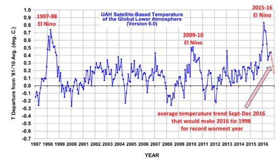
To see how we are now progressing toward a record warm year in the satellite data, the following chart shows the average rate of cooling for the rest of 2016 that would be required to tie 1998 as warmest year in the 38-year satellite record:

uah-v6-lt-with-2016-projection

Based upon this chart, as we enter the home stretch, it looks increasingly like 2016 might be a new record-warm year (since the satellite record began in 1979) in the UAH dataset.

The “official” UAH global image for September, 2016 should be available in the next several days here.

The new Version 6 files (use the ones labeled “beta5”) should be updated soon, and are located here:

Lower Troposphere: http://vortex.nsstc.uah.edu/data/msu/v6.0beta/tlt/uahncdc_lt_6.0beta5.txt
Mid-Troposphere: http://vortex.nsstc.uah.edu/data/msu/v6.0beta/tmt/uahncdc_mt_6.0beta5.txt
Tropopause: http://vortex.nsstc.uah.edu/data/msu/v6.0beta/ttp/uahncdc_tp_6.0beta5.txt
Lower Stratosphere: http://vortex.nsstc.uah.edu/data/msu/v6.0beta/tls/uahncdc_ls_6.0beta5.txt

2+2=4

Sunday, October 2nd, 2016

2+2=4.