Archive for May, 2015

TRMM Satellite Coming Home Next Month

Friday, May 22nd, 2015

Japan's Hayabusa satellite renters the atmosphere in June, 2011.

Japan’s Hayabusa satellite renters the atmosphere in June, 2011.

NASA’s Tropical Rain Measuring Mission, the first satellite to carry a rain radar, has been on-orbit since late 1997, but last year it finally ran out of the fuel required to keep it maintained at its relatively low altitude, 400 km.

So, TRMM is “coming home” after a very successful mission measuring tropical rain systems for over 17 years.

Back when the TRMM concept was being pitched by NASA-Goddard scientists at HQ, I was pitching the competing mission representing NASA-Marshall. In retrospect, John Theon (the Program Manager at the time) made the right decision and gave the go ahead to develop TRMM.

I helped campaign for the design of the TRMM Microwave Imager (TMI), but by the early 1990s our global temperature monitoring work was taking up most of my time and to everyone’s surprise (since my original expertise was rainfall measurement from satellites), I chose not to be part of the TRMM Team.

TRMM also carried one of the CERES Earth radiation budget instrument packages, which allowed researchers to document the diurnal cycle in cloud effects on reflected sunlight since TRMM was placed in a non-sun-synchronous orbit, as well as the Lightning Imaging Sensor (LIS) which was developed here in Huntsville, and a Visible and InfraRed Scanner (VIRS).

I’ve been tracking the fall of the TRMM satellite, and as can be seen it is now descending rather rapidly:

TRMM-altitude-since-Jan-2014

If we zoom in, we get a better idea of it’s trajectory in the last couple months, and Space-Track.org is now calculating a reentry date of June 19:

TRMM-altitude-since-April-2015

Once the satellite reaches about 90 km altitude, it reenters very quickly. Because the rate of descent is nonlinear, and depends upon the satellite orientation, which might be tumbling and causing variable amounts of atmospheric drag, it is almost impossible to determine where the satellite will fall…it could be anywhere between 35N and 35S latitude, as suggested by this single day of TRMM radar coverage:

TRMM-orbits

The June 19 date could also change substantially…it might be many days off. For example, in just one day, the reentry date was moved up by a day by the Space-Track folks.

I’d like to congratulate all of the many engineers and scientists here in the U.S., in Japan (which provided the radar), and throughout the world, who made the TRMM mission such a great success.

New Satellite Upper Troposphere Product: Still No Tropical “Hotspot”

Thursday, May 21st, 2015

One of the most vivid predictions of global warming theory is a “hotspot” in the tropical upper troposphere, where increased tropical convection responding to warming sea surface temperatures (SSTs) is supposed to cause enhanced warming in the upper troposphere.

The trouble is that radiosonde (weather ballons) and satellites have failed to show evidence of a hotspot forming in recent decades. Instead, upper tropospheric warming approximately the same as surface warming has been observed.

It has been also been pointed out, with some justification, that our lower tropospheric temperature product really can’t be used to find the hotspot since it peaks too low in the troposphere, and our mid-troposphere product might have too much contamination from cooling in the lower stratosphere to detect the hotspot.

A recent paper by Sherwood and Nishant in Environmental Research letters presented a reanalysis of the radiosonde data and claims to find evidence of the hotspot. I’ve looked through the paper and find the statistical black box approach they used to be unconvincing. I’ll leave it to others to examine the details of their statistical adjustments, what what the physical reasons for those adjustments might be.

Instead, I want to introduce you to a new product that is made possible by the new methods we now use in Version 6 of our UAH datasets (links at the bottom).

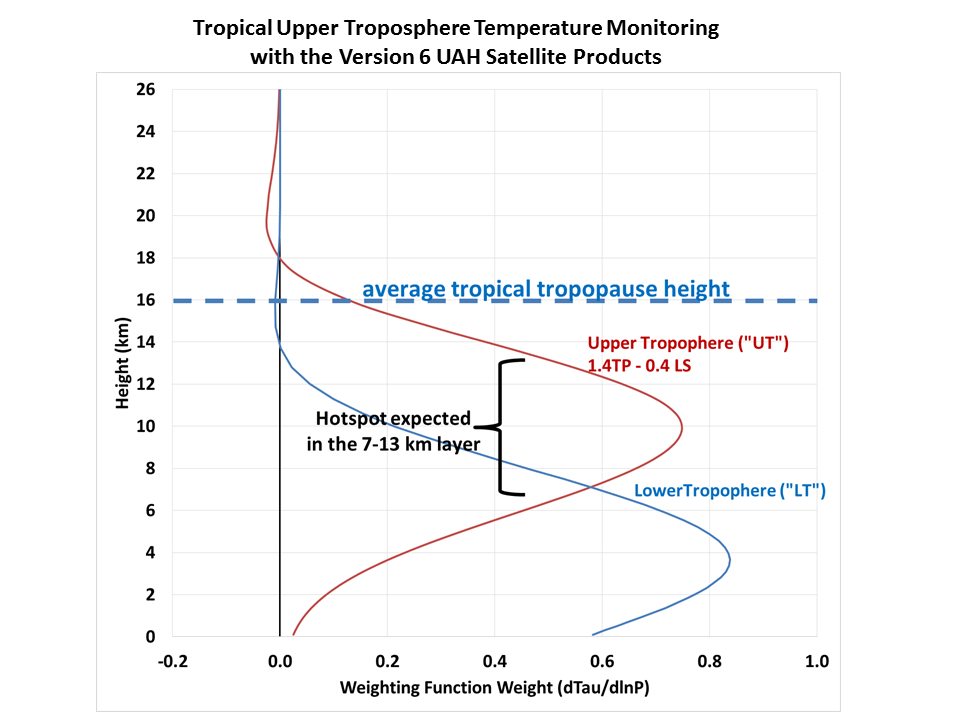
Since we now have a tropopause (“TP”) product, we can combine that with our lower stratosphere (“LS”) product in such a way that we pretty well isolate the tropical upper tropospheric layer that is supposed to be warming the fastest.

The following plot of the satellite weighting functions shows that a simple linear combination of the TP and LS weighting functions (from MSU3/AMSU7 and MSU4/AMSU9, respectively) gives peak weight in the layer where the strongest warming is expected to occur, approximately 7-13 km in altitude:

UT-weighting-function

If we apply the coefficients (1.4, -0.4) to the TP and LS products, the resulting “UT” (upper troposphere) product for the tropical oceans (20N-20S) produces monthly anomalies since 1979 as shown by the bright red line in the following plot (I have added offsets to all time series so their linear trend lines intersect zero at the beginning of 1979):

Upper-troposphere-vs-tropical-SST-sat-vs-CMIP5

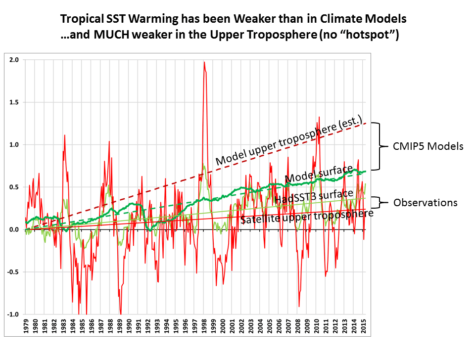
Note that the linear warming trend in the UT product (+0.07 C/decade, bright red trend line) is less than the HadSST3 sea surface temperature trend (light green, +0.10 C/decade) for the same 20N-20S latitude band, whereas theory would suggest it should be about twice as large (+0.20 C/decade).

And what is really striking in the above plot is how strong the climate models’ average warming trend over the tropical oceans is in the upper troposphere (+0.35 C/decade, dark red), which I calculate to be about 1.89 times the models’ average surface trend (+0.19 C/decade, dark green). This ratio of 1.89 is based upon the UT weighting function applied to the model average temperature trend profile from the surface to 100 mb (16 km) altitude.

So, what we see is that the models are off by about a factor of 2 on surface warming, but maybe by a factor of 5 (!) for upper tropospheric warming.

This is all preliminary, of course, since we still must submit our Version 6 paper for publication. So, make of it what you will.

But I am increasingly convinced that the hotspot really has gone missing. And the reason why (I still believe) is most likely related to water vapor feedback and precipitation processes, which largely govern the total heat budget of the free-troposphere (the layer above the turbulently mixed boundary layer).

I believe the missing hotspot is indirect evidence that upper tropospheric water vapor is not increasing, and so upper tropospheric water vapor (the most important layer for water vapor feedback) is not amplifying warming from increasing CO2. The fact that UT warming is indeed amplified — by about a factor of 2 — during El Nino events in the above plot might be related to the relatively short time scales involved, since convective heating and radiative cooling are far out of balance during short term variations, but are much closer to being balanced in the long-term with global warming.

The lack of positive water vapor feedback is an especially controversial assertion to make, given that (1) SSM/I satellite measurements of water vapor have indeed been increasing in lock-step with SST warming, and (2) probably a unanimous opinion in the IPCC climate community that water vapor feedback is positive.

But the SSM/I measurements are largely insensitive to the very low levels of upper tropospheric water vapor, so they can’t tell us anything about upper tropospheric vapor. And while lower-tropospherc water vapor is governed mostly by SST, upper tropospheric vapor is governed by precipitation processes, and we don’t even understand how those might change with warming, let alone have those physics included in climate models.

Instead, I suspect the models have been adjusted so that precipitation systems detrain more water vapor into the upper troposphere with warming, simply because that’s what we see on short time scales, say during El Nino events, and so the convective parameterizations in the models are adjusted to meet that expectation.

As part of a DOE contract we have, we will be examining 183 GHz measurements of upper tropospheric vapor, but those are available only since 1991 from the DMSP satellites, and late 1998 from the NOAA satellites. And from what I’ve read, it might not be possible to get meaningful trends from those data. So, at this point it’s not clear that we can get long term trends from water vapor…although there has been some tantalizing evidence of upper tropospheric drying since the 1950s in radiosonde data.

You can read more about the issues involved in determining water vapor feedback, and why I think it might not be amplyfing global warming, here.

For those interested in combining the TP and LS products themselves, the new Version 6 files (look for “beta2” in the filenames) are located here:

Lower Troposphere: http://vortex.nsstc.uah.edu/data/msu/v6.0beta/tlt
Mid-Troposphere: http://vortex.nsstc.uah.edu/data/msu/v6.0beta/tmt
Tropopause: http://vortex.nsstc.uah.edu/data/msu/v6.0beta/ttp
Lower Stratosphere: http://vortex.nsstc.uah.edu/data/msu/v6.0beta/tls

Iraq’s Largest Oil Refinery Still Burning After 5 Weeks

Tuesday, May 19th, 2015

The latest NASA MODIS satellite imagery from today shows that the huge Baiji oil complex continues to burn as the Islamic State torches the facilities there.

The MODIS thermal infrared sensors first indicated fires there on April 11, and by April 18 the black clouds of smoke had drifted almost 300 miles, well past Baghdad:

Baiji-refinery-fire-MODIS-4-18-2015

To give some idea of the size of the smoke cloud, here’s a wide angle view from April 18 stretching from Israel and the Mediterranean Sea to Baghdad (click image for full-size):

Baiji-refinery-fire-MODIS-4-18-2015-wide

Here’s today’s imagery (May 19, 2015); the size and extent of the smoke cloud changes daily depending mostly on wind conditions:

Baiji-refinery-fire-MODIS-5-19-2015

From what I’ve read, even if Iraqi forces regain control of the refinery, the complex is so expansive that IS can render it largely unusable by continuing to attack critical portions of the complex.

Nearly 3,500 Days Since Major Hurricane Strike… Despite Record High CO2

Friday, May 8th, 2015

Subtropical Storm Ana forming off South Carolina on May 7, 2015 (NASA MODIS image).

Subtropical Storm Ana forming off South Carolina on May 7, 2015 (NASA MODIS image).


As Subtropical Storm Ana churns off the southeast U.S. coast, the global atmosphere has exceeded 400 ppm carbon dioxide content for the first time in…well…who knows?

And also on tap for this month (May 25th, Memorial Day) is another milestone: 3,500 days since the last time a major hurricane (Cat 3 or stronger) struck the U.S., which was Hurricane Wilma in 2005.

Maybe we can all pause to remember the “good old days”, when hundreds or thousands of people died in major hurricanes. /sarc

You remember 2005, right? Hurricane Katrina? So many hurricanes that the National Hurricane Center ran out of names? The next year, Al Gore blamed it all on humanity’s carbon dioxide emissions in his movie, An Inconvenient Truth.

You might not remember that 2 years ago news reports also were reporting we hit record CO2, at 400 ppm. So why the latest report regarding 400 ppm? Well, because now we’ve exceeded 400 ppm, rather than just hitting 400 ppm.

The minor distinction illustrates an important fact: it takes a huge amount of CO2 emissions to raise the atmospheric CO2 concentration by even a tiny amount.

It took nearly a century to raise atmospheric CO2 concentrations from 3 parts per 10,000 to 4 parts per 10,000. That’s right, nearly a century to add 1 molecule of CO2 to every 10,000 molecules of atmosphere.

Most people aren’t aware that the atmospheric concentration would have gone up twice as fast if not for the fact that nature loves the stuff. No matter how fast we produce it with our cars and planes and power plants, nature sucks up half of it, like a starving dog that has just been fed dinner.

In fact, without CO2 life as we know it on Earth would not exist.

More CO2 has led to global greening. Increased agricultural productivity. It probably has contributed to recent warming, in my professional opinion, but that warming has been relatively benign, with no observable increase in severe weather.

Which brings me back to hurricanes. There is a huge amount of natural variability in global hurricane activity from year to year, and even decade to decade. For example, see Dr. Ryan Maue’s charts here.

This extreme variability would happen with or without humans, just like it happens in tornado activity. Yet, many people tend to anthropomorphize everything that happens in nature. Changes in nature are seen as an extension of changes in human behavior, specifically our use of fossil fuels. It really isn’t much different from medieval witches being blamed for bad things that happened.

Eventually a major hurricane will strike the U.S. again. Maybe it will be this year, maybe next year. No one knows.

But you can be sure that when the current drought in U.S. major hurricane strikes ends, that, too, will be blamed on humans.

Mystery Climate Index #2 Explanation

Friday, May 8th, 2015

Yesterday I presented this time series of climate data and asked if anyone could determine any physical causes based upon it’s character:

mystery-climate-index-2

I like the example because it shows realistic variability compared to, say, global average temperature variations.

I created it with a very simple function that actually has some basis in how the real climate system operates. Lance Wallace came closest to the right explanation. Bob Tisdale even gave a prediction of how politicians and environmentalists would have used it to call for energy policy changes. 🙂

But the time series, with its multi-decadal warming trend, was created entirely from a monthly series of random numbers. It’s what I call a “constrained random walk”.

How Does this Relate to the Real Climate System?
If you had random monthly cloud variations over the earth, it would cause a monthly random climate forcing as more or less sunlight was absorbed by the system. That effect is cumulative, since the heat is stored by the land and the ocean. So, every month’s value is just the previous month’s value plus a new random number (I used +/-0.5 as the range of random numbers in Excel). BUT…this would just produce a random walk, which almost always wanders away from the average state over time. This is in contrast to the real climate system, which has net negative radiative feedback (the more it warms, the more infrared energy it loses to space, restoring the system to an average state).

You can mimic this negative feedback by just subtracting off 10% of the previous month’s value from the next month’s value. In other words, instead of each month being the previous month’s value plus a random number (which would produce a random walk), use 0.9 times the previous month’s value instead. This is actually an approximation to the time-dependent energy budget equation in a 1D global energy balance model.

The reason for this example is to show that relatively rapid (monthly) forcing in the form of just random cloud variations can cause low-frequency climate variability…even multi-decadal temperature trends. You don’t need variations in solar activity. The reason why is the climate system’s “memory” — its ability to store energy. Certain preferred time scales of temperature variability tend to show up because of certain characteristics of the system — the depth of the ocean mixed layer, the time it takes the tropical atmosphere to overturn, etc.

This kind of variability is contained, to a lesser or greater extent, in all of the IPCC climate models. The cloud variations aren’t really “random” because they have physical causes, but they can seem random because the causes are myriad and complex. This is also the type of simple climate model forcing we used in our papers demonstrating how cloud feedbacks in the climate system have likely been misinterpreted, because researchers tend to assume cloud variations are caused by temperature variations while ignoring causation in the opposite direction.

Thanks to everyone for offering their ideas. I hope you are beginning to appreciate how some of the structure we see in global temperature variations might simply be just nature flipping a coin.

Magical Mystery Climate Index #2

Thursday, May 7th, 2015

A little over a year ago I posted a climate riddle of sorts: a time series that showed warming, then a “pause”, then warming again, etc.

The point of the exercise was to demonstrate how a natural climate cycle sumperimposed upon a linear warming trend can cause what we have seen in global temperatures. I wasn’t necessarily advocating that’s what’s going on…although it would be at the top of my list of educated guesses.

Anyway, an ongoing e-mail discussion I’ve been having with Lubos Motl about a possible 3.7 year cycle in the satellite-based global temperatures led me to my second Magical Mystery Climate index riddle:

mystery-climate-index-2

My question is this: What, if anything, can you infer about the physical cause(s) of this time series?

All I’ll tell you is that (1) it is “temperature-related”, and (2) the data aren’t “real”…the year labels are only meant to indicate a monthly time series a little over 36 years in length, like the satellite record.

If you feel so inclined, here are the data contained in the graph.

I will post the answer tomorrow.

This EcoNonsense Has To Stop

Saturday, May 2nd, 2015

PF-eco-image1I was watching a Ford commercial last night that highlighted their “EcoBoost” engine technology, which mostly involves turbocharging (nothing new) which allows higher efficiency, and thus greater power output with smaller engine displacements.

That “ecoboost” term sounded familiar, so I went and looked on my washing machine, and found this:
ecoboost

I have no idea what the setting does. I’m pretty sure my washer isn’t turbocharged. And it can’t mean “less water” because the washer already fails to wash my clothes as it is.

I have to wonder how many marketing meetings are now dominated by discussion of how to work “eco” into new (or existing) products. Everyone wants to Save The Earth™, so if we can do that while we are buying more stuff, so much the better.

So, where did all this ecobabble come from? Well, as I recall the first ecoword was “ecology”, which from the Greek root words means “the study of annoying stuff”.

We now have eco-friendly eco-schools with eco-learning for eco-kids. Eco-cars, eco-news, eco-warriors, eco-awards. The list goes on eco nauseum.

The eco-trend does not seem to be nearing its eco-end, either. According to Google Trends, the term “eco” has been at an eco-high for several eco-years now.

The annoying part is that little if any eco-good is done with any eco-product, I suspect. History has shown that if we become less wasteful of some commodity, we will find a way to use more of it. As car engines become more fuel-efficient, we buy cars with bigger engines or we take longer drives.

Money we save on one thing ends up getting spent on something else, which inevitably uses more resources.

British company EasyJet has unveiled a new ecoJet technology to improve the energy efficiency of jet travel. I suppose if rocket engines become sufficiently efficient, we will all be taking eco-tourism trips into low Earth orbit.

Just think of how much energy we will be saving then!

UAH V6.0 Global Temperature Update for April, 2015: +0.07 deg. C

Friday, May 1st, 2015

NOTE: This is the first montly update with our new Version 6.0 dataset. Differences versus the old Version 5.6 dataset are discussed here.

The Version 6.0 global average lower tropospheric temperature (LT) anomaly for April, 2015 is +0.07 deg. C, down a little from the March, 2015 value of +0.14 deg. C (click for full size version):

UAH_LT_1979_thru_April_2015_v6

The global, hemispheric, and tropical LT anomalies from the 30-year (1981-2010) average for the last 4 months for the old Version 5.6 and the new Version 6.0 are:

YR MON GLOBAL NH SH TROPICS
v5.6

2015 1 +0.351 +0.553 +0.150 +0.126
2015 2 +0.296 +0.433 +0.160 +0.015
2015 3 +0.257 +0.409 +0.105 +0.083
2015 4 +0.162 +0.337 -0.013 +0.074
v6.0
2015 1 +0.261 +0.379 +0.143 +0.119
2015 2 +0.157 +0.263 +0.050 -0.074
2015 3 +0.139 +0.232 +0.046 +0.022
2015 4 +0.065 +0.154 -0.024 +0.074

The global image for April, 2015 should be available in the next several days here.

The new Version 6 files, updated shortly, are located here:

Lower Troposphere: http://vortex.nsstc.uah.edu/data/msu/v6.0beta/tlt
Mid-Troposphere: http://vortex.nsstc.uah.edu/data/msu/v6.0beta/tmt
Tropopause: http://vortex.nsstc.uah.edu/data/msu/v6.0beta/ttp
Lower Stratosphere: http://vortex.nsstc.uah.edu/data/msu/v6.0beta/tls

Is North Korea Cutting Down All Its Trees?

Friday, May 1st, 2015

A secretive government can lie about many things, but it can’t hide its landscape from Earth orbiting satellites.

Most people are familiar with the nighttime satellite imagery revealing virtually no lights on in North Korea, presumably due to its extreme poverty. It’s always Earth Hour there.

But MODIS satellite imagery from yesterday shows that North Korea is cutting down its trees at an alarming rate, while South Korea shows about the same level of greenness compared to two years ago:

North-Korea-deforestation-2013-vs-2015

In contrast to PBS’s article on North Korea’s environmental collapse, which makes it sound like a case of simple neglectfulness or poor land management, North Koreans are just trying to stay alive. The poorest countries of the world have the worst environmental records as the land is denuded for firewood.

To get some sense of the North Korean mindset, read this candid, sad, yet humorous Tim Urban article, 20 Things I Learned While I Was In North Korea.

Now you’ll have to excuse me while I go change all of my computer passwords since one thing the North Koreans are good at is hacking the computers of people they don’t like.