Magical Mystery Climate Index #2

May 7th, 2015 by Roy W. Spencer, Ph. D.

A little over a year ago I posted a climate riddle of sorts: a time series that showed warming, then a “pause”, then warming again, etc.

The point of the exercise was to demonstrate how a natural climate cycle sumperimposed upon a linear warming trend can cause what we have seen in global temperatures. I wasn’t necessarily advocating that’s what’s going on…although it would be at the top of my list of educated guesses.

Anyway, an ongoing e-mail discussion I’ve been having with Lubos Motl about a possible 3.7 year cycle in the satellite-based global temperatures led me to my second Magical Mystery Climate index riddle:

mystery-climate-index-2

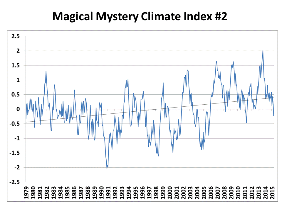
My question is this: What, if anything, can you infer about the physical cause(s) of this time series?

All I’ll tell you is that (1) it is “temperature-related”, and (2) the data aren’t “real”…the year labels are only meant to indicate a monthly time series a little over 36 years in length, like the satellite record.

If you feel so inclined, here are the data contained in the graph.

I will post the answer tomorrow.


26 Responses to “Magical Mystery Climate Index #2”

Toggle Trackbacks

  1. mpainter says:

    I cannot “infer” physical causes but I see two trends : pre 1990 and post 1990 the data of each trend showing a different aspect, therefore I would put that this series could be two separate physical causes (or combinations), each dominating its respective trend. On that basis, I would investigate.

  2. Johan says:

    Every 3.7 years Aliens from the planet Kepler-438b clean up the sensors on your satellites.

    Well, at least it’s physical and not real.

  3. Gordon Robertson says:

    Due to the trend line breaking about halfway through the range from cooling to warming and the anomalies swinging fairly regularly around the trend line, I’d say the physical cause could be something like anthropogenic warming.

    Or… recovery from a cooling event something like the aerosols that affected the first 17 years of the UAH range.

    I am going on what John Christy said about the trend line looking like a see-saw pivoted at 1998, about halfway through the range. The early cooling in the range causes the latter range to tilt upward.

    Looks like possible ENSO (both El Nino and La Nina) activity superimposed on some kind of warming event.

    From 2006 onward the trend seems to be weighted upward by successive El Ninos whereas from 1991 to 2006 the La Ninas are balancing the El Ninos while a recovery warming is tilting the trend upward.

    That’s my story and I’m sticking to it. 🙂

  4. John Smith says:

    please forgive a non-scientist comment
    what interest me is the graphic representation of the relationship between two unrelated things
    passage of time
    and .0 degree C temperature
    the vertical spacial representation is large in relation to the horizontal relationship which is compressed
    if you were to take the monthly temp variance and match it graphically to the monthly time passage horizontal to vertical
    the impression of movement might be different
    and no less arbitrary
    but you would need a wider screen
    or the Bayeux Tapestry
    to me a lot the squiggly line data is misleading in it’s graphic layout
    plus 36 years?
    what if we had 500 years?
    I have trouble thinking that drawing a line that inclines or declines means anything at all

    • Roy W. Spencer says:

      temperature change with time of anything implies a net gain or loss of energy. So, it means quite a lot.

    • Gordon Robertson says:

      @John Smith…”the vertical spacial representation is large in relation to the horizontal relationship which is compressed…”

      Graphs using anomalies actually amplify the vertical axis out of proportion. They tend to give the impression that the few tenths C temperatures they portray are far more significant than what they are.

      You can tell by the vertical axis in 0.5C increments that this fictitious graph represent anomalies, which are variations in temperature over time relative to an average temperature, which is arbitrarily selected depending on who is doing the graph. Although this graph is fictitious, UAH is actually very generous with the baseline average on it’s real graphs but other outfits like Hadcrut and GISS use a horizontal axis based on the average temperature from 1950 – 1990.

      Since 1950 and 1960 were years of relative cooling, that tends to emphasize warming on their graphs.

      On the official UAH graph elsewhere on Roy’s site the horizontal axis is listed as the global average from 1980 – 2010. The record is only 33 years old so that’s a pretty decent baseline for the anomalies.

      If the vertical axis was in absolute temperature, in the 15 C range, the squiggles you see, in fact the entire graph, would appear almost like a straight line across the horizontal axis. The 0.5C gradations would be swamped by an axis that had to indicate +15 C.

      That’s what’s so amusing about people lining up to take the kool-aid over warming that is virtually a flat curve near the horizontal axis, measured in 1/10th of a degree C, when observed against absolute temperatures.

  5. Dale Hartz says:

    I don’t know about a temperature relationship, but the graph is the same if you turn it upside down.

  6. Michal Garbers says:

    Roy,
    There appears to be three Sets of Groupings in the Data.
    1) Noisy Parabolic down trend from 1979 to 1991
    2) Three fluctuations 2.5 Degrees C from -1.5 to + 1 Degrees
    3) Three fluctuations of 1.5 Degrees C From 0 to +1.5 Degrees

    All six fluctuations are approximately 4 years apart with the Fourth and the fifth being only 3 years apart.

    Since you stated the Years are not real;

    Here is my speculation:
    This is a very similar effect an air condition room would have over an 18 hour period.

  7. Scott Scarborough says:

    The graph ends at the same level it started at except it ends going down unlike the start which is going up. I expect it to get cooler! What occurred in between is noise.

  8. Bil Arledge says:

    Looks like a piece of a thirtyfive-ish year sine wave overlayed on a slightly increasing linear trend over the period and with numerous 3 or 4 year noisy chaotic effects of some type

  9. jimc says:

    If I do a Excel Fourier on the time series, it seems to have concentrantions at periods of 5.33 and 2.57 years, but the lines aren’t very pronounced.

    • jimc says:

      I found a sea level record that looks like it has almost the same periods, but none look like this curve.

      • Aaron S says:

        Its possibly a proxy for:a.the Nino index added to b. a pdo trend. Both are quasi periodic but he says he didnt use real data so idk. Maybe also a slight linear warming. I dont have access to a fft right now so im taking your results and assuming the periods for enso are the ones you describe. And the PDO is to long a cycle to produce a peak in 36 yrs. You can define half a cycle but it has to be a clean cycle so no surprise no spectral density there.

        Ive seen this pattern before in lacustrine varves and tree rings. Also when i constructed my own “natural” climate model. The modern ENSO record typically produces a short and longer frequency cluster (just like u describe from the FFT) with a median around 4. Interestingly in the past there are multiple “more periodic” expressions in the literature.

        http://link.springer.com/article/10.1007%2Fs10933-008-9244-0

  10. Malcolm says:

    We can infer that the temperature anomalies over this 36 timescale cannot have been dominated by a variable which has behaved linearly over the same period. Accordingly, it is unreasonable to state that the global mean temperature anomaly is primarily a function of man-made emissions of CO2.
    We can also observe that the data points appear to move within a limited envelope as they go from peak to trough – it’s as though there’s a constraint on the system which keeps the swing to no more than 3 degrees over 3 years eg. from 1991 to 1994. I can only guess that the ~3.7 year pulsing signal could be an indication that the system can display a certain periodicity on short time and space scales. Perhaps the MJO is modulating other key atmospheric and oceanic variables under certain SST and atmospheric height/pressure conditions? And maybe it is of no real influence under other conditions? The data certainly appears to be producing a ‘breathing’ pattern at the intra-decadal timescale.
    Having said all that, there’s probably nothing much that we can reliably infer from this dataset without knowing about error bars!

  11. John Baglien says:

    Dr. Spencer,

    This could easily be a pre-1950 time series from which one might infer primarily natural physical causes of temperature trends that are not much different than the recent trends which the IPCC attributes primarily to man.

    John

  12. I’m trying my hand here …
    I tried 36-year periods with 1910 and 1973 being a little before the midpoint, as in ~1898-1924 and ~1960-1996, with several temperature datasets, at woodfortrees.org. I could not find a dataset giving a very good match, but ~1960-1996 appears to me to have some fair correlation with global and northern hemisphere datasets of overall surface or sea surface temperature, maybe with AMO index. Am I getting warm here?

    As for my attempt to identify the cause of the trend variation: What I am seeing presented shows about 12 years of downward trend followed by about 24 years of roughly equal upward trend. So I doubt this is a global temperature dataset for ~1960-1996, because global surface temperature datasets going as old as HadCRUT3 show a nearly steady trend into the early-mid 1970s, followed by rapid warming that occurred more on/over land than on/over sea. The abrupt turn seems to be caused by a shift of a longer term oceanic oscillation. So if I am guessing correctly for the time period being ~1960-1996, then my guess is that the plot is of some index of an oceanic oscillation or some sea surface temperature dataset.

  13. lemiere jacques says:

    well…is it a curve or a set of points connected for some purpose?
    and..how come there is no error bars?

    if it is an actual curve with acurrate points, the curve is weird…especially it is an actual conservative “things”…and a macroscopic system…

    it look like noise first, then we can guess some fluctuations..with steps..

    if you imagine a mathematical function with very high frequency of variation you can have some weird features if you select points ….

    well no error bars….weird…

    .

  14. Lance Wallace says:

    Since the first value matches exactly your UAH 6.0 beta1 value for the global anomaly, perhaps that is the “temperature-related” part of your clue. Maybe after that you just did a random walk, and this is one result. The first differences ranged between about -0.56 and +0.65, so I guess the unit for the random walk may have been 2/3?

  15. tom harley says:

    Is it an ‘upside down’ Tiljander tree ring series?

  16. Bob Tisdale says:

    Roy, the residents of this mythical world would’ve been complaining about global cooling until 2006, with newspaper headlines proclaiming that we’re headed for a new ice age. The cooling rate is about -0.14 deg C/decade.

    Then there was an unexplained upward shift in temperatures. But as early as December 2008, there was a noticeable long-term warming, about +0.08 deg C/decade. The UN would have formed the IPCC then to blame the warming on manmade greenhouse gases, primarily carbon dioxide.

    Some people would investigate the cause of the climate shift in 2006/2007, noting the pre-2006 negative trend and the fact that period from Jan 2007 to present also shows a negative trend, about -0.33 deg C/decade. In return, they would be called global warming deniers!

Leave a Reply