Archive for April, 2020

March 2020 CO2 Levels at Mauna Loa Show No Obvious Effect from Global Economic Downturn

Tuesday, April 7th, 2020

The COVID-19 disease spread is causing a worldwide shutdown in economic activity as business close, airlines cancel flights, and people shelter in their homes. For example, there was a 28% decline in global commercial air traffic in March 2020 compared to March of last year.

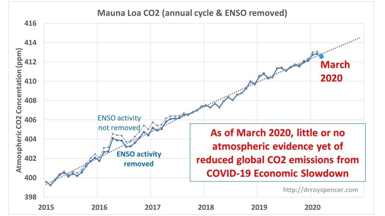
Last month I described a simple method for removing the large seasonal cycle from the Mauna Loa CO2 data, and well as the average effects from El Nino and La Nina (the removal is noisy and imperfect), in an effort to capture the underlying trend in CO2 and so provide a baseline to compare future months’ measurements too.

What we are looking for is any evidence of a decline in the atmospheric CO2 content that would be strong enough to attribute to the economic downturn. As can be seen, the latest CO2 data show a slight downturn, but it’s not yet out of the ordinary compare to previous month-to-month downturns.

I personally doubt we will see a clear COVID-19 effect in the CO2 data in the coming months, but I would be glad to be proved wrong. As I mentioned last month, those who view the economic downturn as an opportunity to reduce atmospheric CO2 would have to wait many years — even decades — before we would see the impact of a large economic downturn on global temperatures, which would occur at great cost to humanity, especially the poor.

Correcting Recent U.S. Weekly Death Statistics for Incomplete Reporting

Monday, April 6th, 2020

I am seeing an increasing number of people on social media pointing to the weekly CDC death statistics which show a unusually low number of total deaths for this time of year, when one would expect the number to be increasing from COVID-19. But what most people don’t realize is that this is an artifact of the late arrival of death certificate data as gathered by the National Center for Health Statistics (NCHS).

This first came to my attention as a tweet by some researchers who were using the CDC weekly death data in a research paper pointing out the downturn in deaths in early 2020 and had to retract the paper because of the incomplete data problem. A disclaimer at the CDC website points out the incomplete nature of recent data. While they say that the new totals could be adjusted either upward or downward, it appears that the adjustments are almost always upward (i.e. recent data have a low bias in reported deaths).

As a first attempt to possibly correct for this under-reporting problem, I downloaded the data two weeks in a row (approximately March 30 and April 5, 2020) to examine how the recent data changes as new death certificate data are obtained. I realize this is only one week’s worth of changes, and each week would provide additional statistics. But the basic methodology could be applied with additional weeks of data added.

I first use the 4.5 years of reported weekly death data to compute an average seasonal cycle in deaths, with the slow upward trend included (red line in the following figure). Also shown are the total deaths reported on 2 successive weeks, showing the increase in reported deaths from late reports coming in.

Although it is not obvious in the above plot, there were new deaths reported as much as 1 year late. If we use the difference between the two successive weeks’ reports as an estimate of how many new reports will come in each week as a percentage of the average seasonal cycle, and sum them up for 52 weeks, we can get a rough estimate of what the totals will look like a year from now (the blue line in the following figure).

The blue line shows behavior quite close to that seen last year at this time. Keep in mind that Week 10 is only through early March, at which point there were only 30 COVID-19 deaths reported, which is too small a number to show up on these plots. I’m posting this as just a suggestion for those who want to analyze recent weekly death data and make some sense out of it.

It is also of interest how bad the 2017-18 flu season was compared to this season. I’m sure many medical people are aware of this, but I don’t recall it being a huge news story two years ago.

Australia Bushfire Smoke Now Warming the Lower Stratosphere? March 2020 Update

Wednesday, April 1st, 2020

Last month I noted how the global average lower stratospheric temperature had warmed considerably in recent months, especially in February, and tentatively attributed it to smoke from the Australian bushfires entering the lower stratosphere. You can read more there about my reasoning that the effect was unlikely to be due to the recent Taal volcanic eruption.

Here’s the March 2020 update, showing continued warming.

The effect cannot be as clearly seen in regional averages (e.g. tropics or Southern Hemisphere) because those regions routinely see large changes which are compensated for by changes of the opposite sign in other regions, due to strong adiabatic warming (sinking motion) or cooling (rising motion) in the statically stable stratosphere. Thus, global averages show the best signal of something new going on, even if that something new is only occurring in a specific region.

UAH Global Temperature Update for March 2020: +0.48 deg. C

Wednesday, April 1st, 2020

The Version 6.0 global average lower tropospheric temperature (LT) anomaly for March, 2020 was +0.48 deg. C, down substantially from the February, 2020 value of +0.76 deg. C.

The northern extratropics (poleward of 20 deg. N) experienced the 12th largest drop in tropospheric temperature out of the 495 months of the satellite record. For those interested in speculating regarding reasons for this, it could not be from reduced CO2 emissions from the response to the spread of COVID-19; to the extent that recent warming has been due to more CO2 in the atmosphere, the radiative forcing from extra CO2 would not change substantially even if all CO2 emissions stopped for a full year.

Another possibility is reduced air travel reducing the amount of jet contrails in the upper troposphere, which I am not going to discount at this point.

The linear warming trend since January, 1979 remains at +0.13 C/decade (+0.12 C/decade over the global-averaged oceans, and +0.18 C/decade over global-averaged land).

Various regional LT departures from the 30-year (1981-2010) average for the last 15 months are:

 YEAR MO GLOBE NHEM. SHEM. TROPIC USA48 ARCTIC AUST 
 2019 01 +0.38 +0.35 +0.41 +0.36 +0.53 -0.15 +1.15
 2019 02 +0.38 +0.47 +0.28 +0.43 -0.02 +1.05 +0.06
 2019 03 +0.35 +0.44 +0.25 +0.41 -0.55 +0.97 +0.59
 2019 04 +0.44 +0.38 +0.51 +0.54 +0.49 +0.92 +0.91
 2019 05 +0.32 +0.29 +0.35 +0.40 -0.61 +0.98 +0.39
 2019 06 +0.47 +0.42 +0.52 +0.64 -0.64 +0.91 +0.35
 2019 07 +0.38 +0.33 +0.44 +0.45 +0.11 +0.33 +0.87
 2019 08 +0.39 +0.38 +0.39 +0.42 +0.17 +0.44 +0.24
 2019 09 +0.62 +0.64 +0.59 +0.60 +1.14 +0.75 +0.57
 2019 10 +0.46 +0.64 +0.28 +0.31 -0.03 +0.99 +0.50
 2019 11 +0.55 +0.56 +0.54 +0.55 +0.21 +0.56 +0.38
 2019 12 +0.56 +0.61 +0.50 +0.58 +0.92 +0.66 +0.94
 2020 01 +0.57 +0.60 +0.53 +0.62 +0.73 +0.12 +0.66
 2020 02 +0.76 +0.96 +0.55 +0.76 +0.38 +0.02 +0.30
 2020 03 +0.48 +0.61 +0.34 +0.63 +1.09 -0.72 +0.17

The UAH LT global gridpoint anomaly image for March, 2020 should be available within the next week here.

The global and regional monthly anomalies for the various atmospheric layers we monitor should be available in the next few days at the following locations:

Lower Troposphere: http://vortex.nsstc.uah.edu/data/msu/v6.0/tlt/uahncdc_lt_6.0.txt
Mid-Troposphere: http://vortex.nsstc.uah.edu/data/msu/v6.0/tmt/uahncdc_mt_6.0.txt
Tropopause: http://vortex.nsstc.uah.edu/data/msu/v6.0/ttp/uahncdc_tp_6.0.txt
Lower Stratosphere: http://vortex.nsstc.uah.edu/data/msu/v6.0/tls/uahncdc_ls_6.0.txt