Archive for April, 2024

Unnecessary Net Zero, Part II: A Demonstration with Global Carbon Project Data

Tuesday, April 23rd, 2024

Some commenters on my previous blog post, Net Zero CO2 Emissions: A Damaging and Totally Unnecessary Goal, were dubious of my claim that nature will continue to remove CO2 from the atmosphere at about the same rate even if anthropogenic emissions decrease…or even if they were suddenly eliminated.

Rather than appeal to the simple CO2 budget model I created for that blog post, let’s look at the published data from the 123 (!) authors the IPCC relies upon to provide their best estimate of CO2 flows in and out of the atmosphere, the Global Carbon Project team. I created the following chart from their data spreadsheet available here. Updated yearly, the 2023 report shows that their best estimate of the net removal of CO2 from the atmosphere by land and ocean processes has increased along with the rise in atmospheric CO2. This plot is from their yearly estimates, 1850-2022.
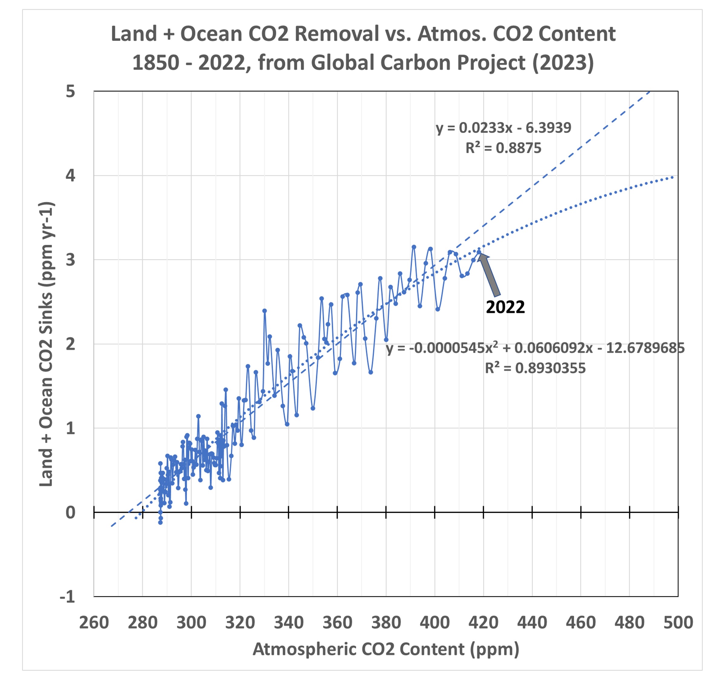
The two regression line fits to the data are important, because they imply what will happen in the future as CO2 in the atmosphere continues to rise. In the case of the nonlinear fit, which has a slightly better fit to the data (R2 = 89.3% vs. 88.8%) the carbon cycle is becoming somewhat less able to remove excess CO2 from the atmosphere. This is what carbon cycle modelers expect to happen, and there is some weak evidence that is beginning to occur. So, let’s conservatively assume that nonlinear rate of removal (a gradual decrease in nature’s ability to sequester excess atmospheric CO2) will exist in the coming decades as a function of atmospheric CO2 content.

A Modest CO2 Reduction Scenario

Now, let’s assume a 1% per year cut in emissions (both fossil fuel burning and deforestation) in each year starting in 2024. That 1% per year cut is nowhere near the Net Zero goal of eliminating CO2 emissions by 2050 or 2060, which at this point seems delusional since humanity remains so dependent upon fossil fuels. The resulting future trajectory of atmospheric CO2 looks like this:
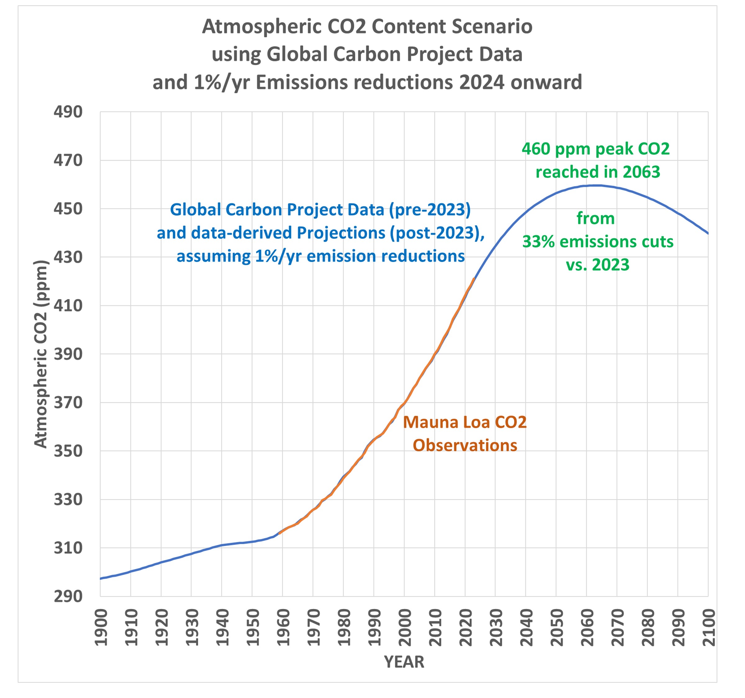
This shows that rather modest cuts in global CO2 emissions (33% by 2063) would cause CO2 concentrations to stabilize in about 40 years, with a peak CO2 value of 460 ppm. This is only 2/3 of the way to “2XCO2” (a doubling of estimated pre-Industrial CO2 levels).

How Much Global Warming Would be Caused Under This Scenario?

Assuming all of the atmospheric CO2 rise is due to human activities, and further assuming all climate warming is due to that CO2 rise, the resulting eventual equilibrium warming (delayed by the time it takes for mixing to warm the deep oceans) would be about 1.2 deg.C assuming the observations-based Effective Climate Sensitivity (EffCS) value of 1.9 deg. C we published last year (Spencer & Christy, 2023). Using the Lewis and Curry (2018) value around 1.6-1.7 deg. C would result in even less future warming.

And that’s if no further cuts in emissions are made beyond the 33% cuts vs. 2023 emissions. If the 1% per year cuts continue past the 2060s, as is shown in the 2nd graph above, the CO2 content of the atmosphere would then decline, and future warming would not be in response to 460 ppm, which was reached only briefly in the early 2060s. It would be a still lower value than 1.2 deg. C. Note these are below the 1.5 deg. C maximum warming target of the 2015 Paris Agreement, which is the basis for Net Zero policies.

Net Zero is Based Upon a Faulty View of Nature

Net Zero assumes that human CO2 emissions must stop to halt the rise in atmospheric CO2. This is false. The first plot above shows that nature removes atmospheric CO2 at a rate based upon the CO2 content of the atmosphere, and as long as that remains elevated, nature continues to remove CO2 at a rapid rate. Satellite-observed “global greening” is evidence of that over land. Over the ocean, sea water absorbs CO2 from the atmosphere in proportion to the difference in CO2 partial pressures between the atmosphere and ocean, that is, the higher the atmospheric CO2 content is, the faster the ocean absorbs CO2.

Neither land nor ocean “knows” how much CO2 we emit in any given year. They only “know” how much CO2 is in the atmosphere.

All that is needed to stop the rise of atmospheric CO2 is for yearly anthropogenic emissions to be reduced to the point where they match the yearly removal rate by nature. The Global Carbon Project data suggest that reduction is about 33% below 2023 emissions. And that is based upon the conservative assumption that future CO2 removal will follow the nonlinear curve in the first plot, above, rather than the linear relationship.

Finally, the 1.5 deg. C maximum warming goal of the 2015 Paris Agreement would be easily met under the scenario proposed here, a 1% per year cut in global net emissions (fossil fuel burning plus land use changes), with a total 33% reduction in emissions vs. 2023 by the early 2060s.

I continue to be perplexed why Net Zero is a goal, because it is not based upon the science. I can only assume that the scientific community’s silence on the subject is because politically driven energy policy goals are driving the science, rather than vice versa.

Net Zero CO2 Emissions: A Damaging and Totally Unnecessary Goal

Thursday, April 18th, 2024

The goal of reaching “Net Zero” global anthropogenic emissions of carbon dioxide sounds overwhelmingly difficult. While humanity continues producing CO2 at increasing rates (with a temporary pause during COVID), how can we ever reach the point where these emissions start to fall, let alone reach zero by 2050 or 2060?

What isn’t being discussed (as far as I can tell) is the fact that atmospheric CO2 levels (which we will assume for the sake of discussion causes global warming) will start to fall even while humanity is producing lots of CO2.

Let me repeat that, in case you missed the point:

Atmospheric CO2 levels will start to fall even with modest reductions in anthropogenic CO2 emissions.

Why is that? The reason is due to something called the CO2 “sink rate”. It has been observed that the more CO2 there is in the atmosphere, the more quickly nature removes the excess. The NASA studies showing “global greening” in satellite imagery since the 1980s is evidence of that.

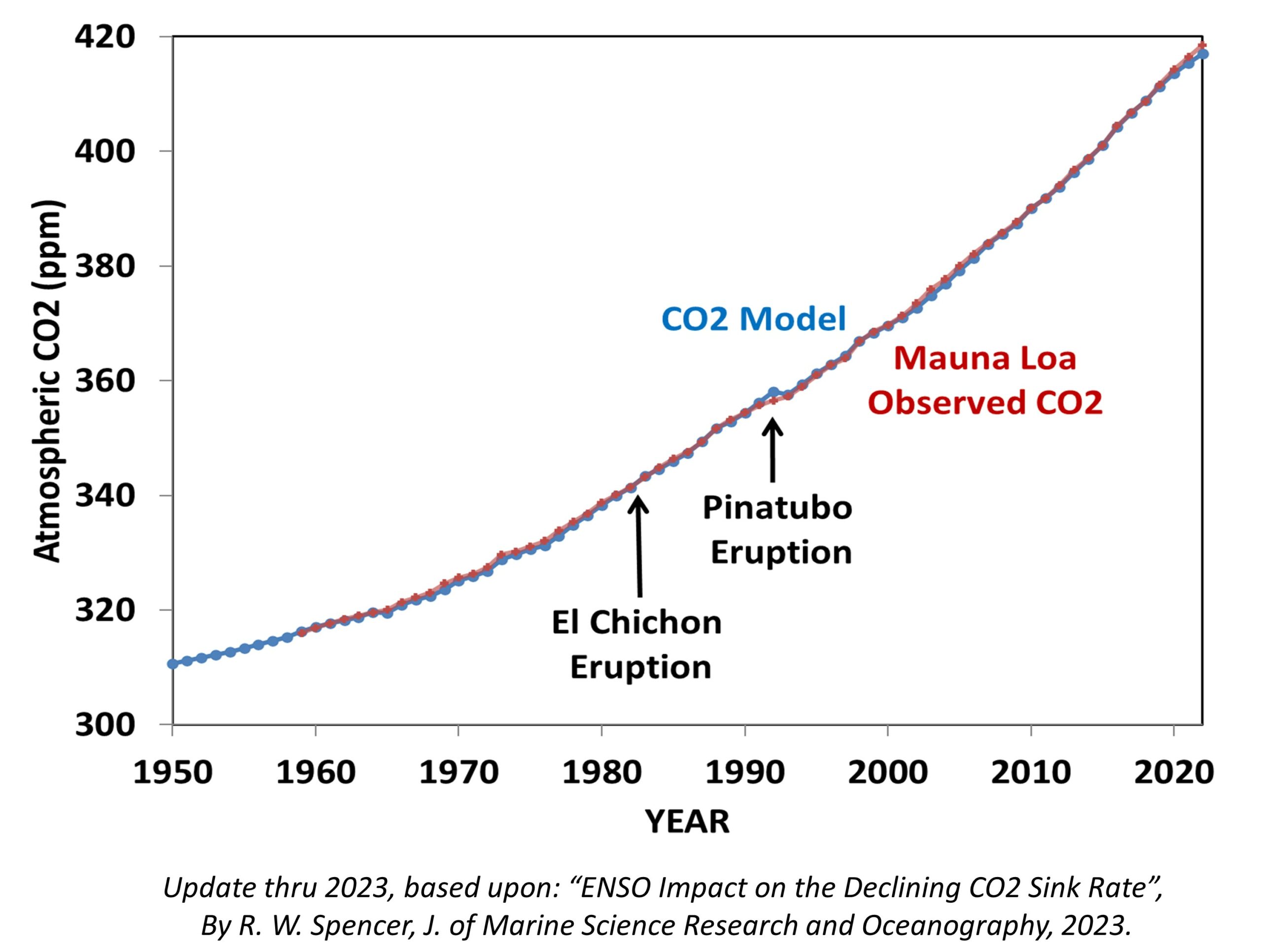
Last year I published a paper showing that the record of atmospheric CO2 at Mauna Loa, HI suggests that each year nature removes an average of 2% of the atmospheric excess above 295 ppm (parts per million). The purpose of the paper was to not only show how well a simple CO2 budget model fits the Mauna Loa CO2 measurements, but also to demonstrate that the common assumption that nature is becoming less able to remove “excess” CO2 from the atmosphere appears to be an artifact of El Nino and La Nina activity since monitoring began in 1959. As a result, that 2% sink rate has remained remarkably constant over the last 60+ years. (By the way, the previously popular CO2 “airborne fraction” has huge problems as a meaningful statistic, and I wish it had never been invented. If you doubt this, just assume CO2 emissions are cut in half and see what the computed airborne fraction does. It’s meaningless.)

Here’s my latest model fit to the Mauna Loa record through 2023, where I have added a stratospheric aerosol term to account for the fact that major volcanic eruptions actually *reduce* atmospheric CO2 due to increased photosynthesis from diffuse sunlight penetrating deeper into vegetation canopies:

What Would a “Modest” 1% per Year Reduction in Global CO2 Emissions Do?

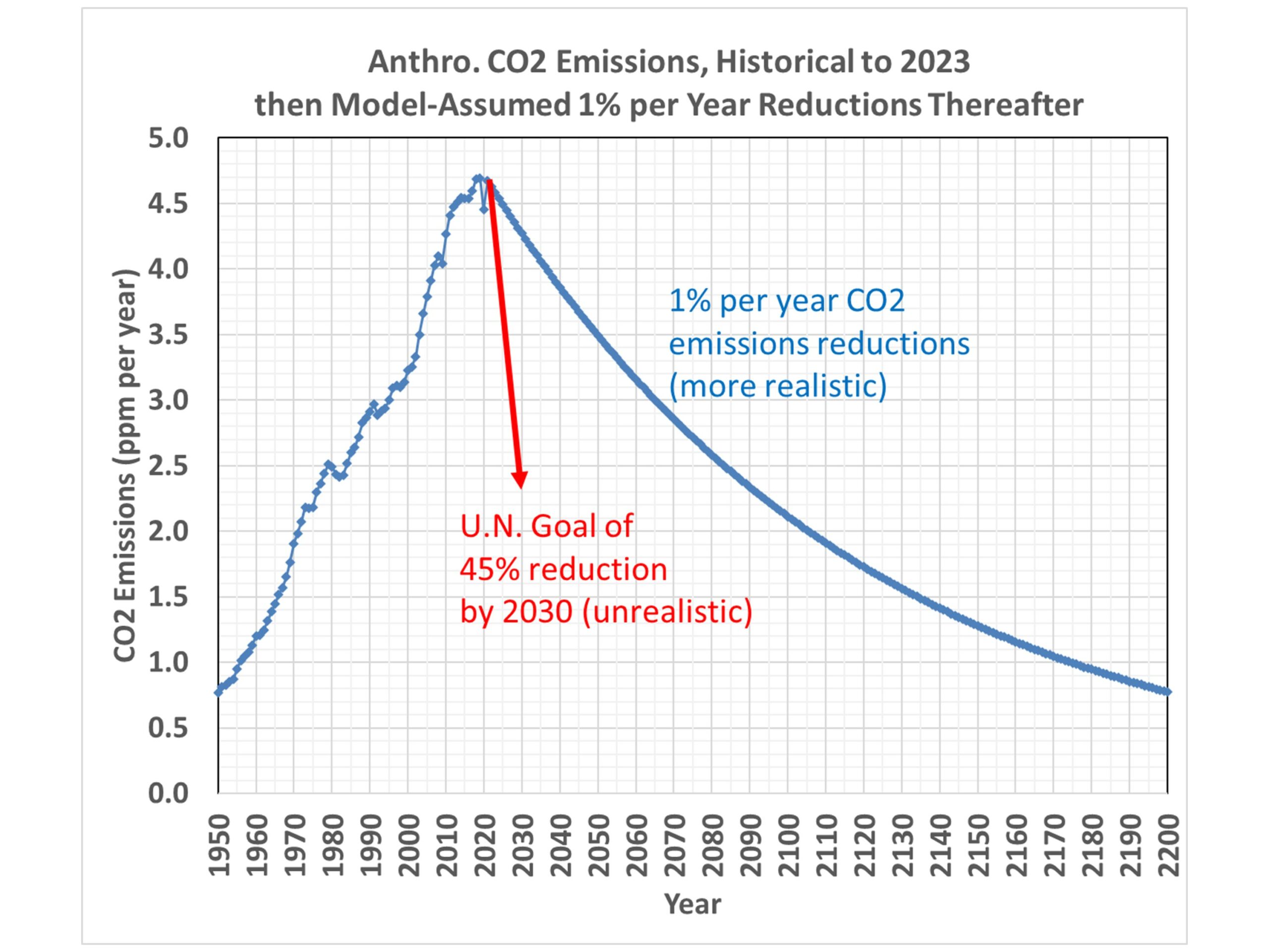
The U.N. claims that CO2 emissions will need to decline rapidly to achieve Net Zero by mid-Century. Specifically, they say 45% reductions below 2010 levels will need to be made by 2030, and Net Zero will need to be achieved by 2050, in order to limit future global warming to the (rather arbitrary) goal of 1.5 deg. C.

But let’s look at what a much more modest reduction in CO2 emissions (1% per year) would do to future atmospheric CO2 concentrations. Here’s a plot of the history of global CO2 emissions, and how that trajectory would change with 1% per year reductions from 2023 onward. (Even this seems optimistic, but we can all agree the U.N.’s goal is delusional),

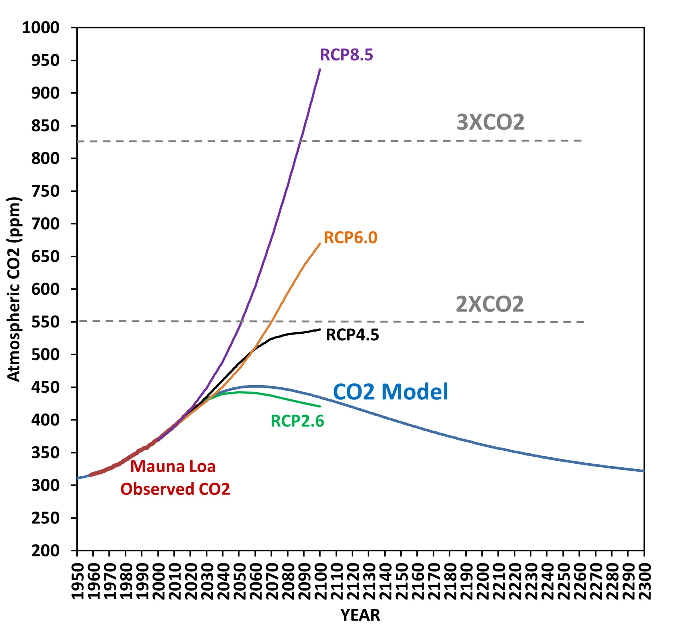
When we run the CO2 model with these assumed emissions, here’s how the atmospheric CO2 concentration responds:

Even though the CO2 emissions continue, atmospheric CO2 levels start to fall around 2060. Also shown for reference are the four CMIP5 scenarios of future CO2 emissions, with RCP8.5 often being the one used to scare people regarding future climate change, despite it being extremely unlikely.

The message here is that CO2 emissions don’t have to be cut very much for atmospheric CO2 levels to reverse their climb, and start to fall. The reason is that nature removes CO2 in proportion to how much excess CO2 resides in the atmosphere, and that rate of removal can actually exceed our CO2 emissions with modest cuts in emissions.

I don’t understand why this issue is not being discussed. All of the Net Zero rhetoric I see seems to imply that warming will continue if we don’t cut our CO2 emissions to essentially zero. But that’s not true, because that’s not how nature works.

The 2024 Solar Eclipse: What’s All the Fuss About?

Wednesday, April 17th, 2024

I feel fortunate to have witnessed two total solar eclipses in my lifetime. The first was at Center Hill Lake in central Tennessee in 2017, then this year’s (April 8) eclipse from Paducah, Kentucky. Given my age (68), I doubt I will see another.

For those who have not witnessed one, many look at the resulting photos and say, “So what?”. When I look at most of the photos (including the ones I’ve taken) I can tell you that those photos do not fully reflect the visual experience. More on that in a minute.

Having daytime transition into night in a matter of seconds is one part of the experience, with the sounds of nature swiftly changing as birds and frogs suddenly realize, “Night sure came quickly today!”

It’s also cool to hear people around you respond to what they are witnessing. The air temperature becomes noticeably cooler. Scattered low clouds that might have threatened to get in the way mostly disappear, just as they do after sunset.

But why are so many photos of the event… well… underwhelming? After thinking about this over the past week, I believe the answer lies in the extreme range of brightness a solar eclipse produces that cameras (even good ones) have difficulty capturing. This is why individual photos you see will often look different from one another. Depending upon camera exposure settings, you will see different features.

This was made very apparent to me during this year’s eclipse. Due to terrible eclipse traffic, we had to stop short of our intended destination, and I had only 10 minutes to set up a telescope and two cameras, so some of my advance planning went out the window. I was watching the “diamond” of the diamond ring phase of totality, as the last little bit of direct sunlight disappears behind the moon. At that point, it is (in my opinion) possible with the naked eye to perceive a dynamic range greater than any other scene in nature: from direct sunlight of the tiny “diamond” to the adjacent night sky with stars. I took the following photo with a Canon 6D MkII camera with 560 mm of stacked Canon lenses, which (barely) shows this extreme range of brightness.

In order to pull out the faint Earthshine on the moon’s dark side in this photo, and the stars to the left and upper-left, I had to stretch this exposure by quite a lot.

From what I have read (and experienced) the human eye/brain combination can perceive a greater dynamic range of brightness than a camera can. This is why photographers have to fool so much with camera settings to capture what their eyes see. In this case, I perceived the “diamond” of direct sunlight was (of course) blindingly bright, while the sun’s corona extending 2 to 3 solar diameters away from the sun was much less bright (in fact, the solar corona is not even as bright as a full moon). But in this single photo, both the diamond and the corona were basically at the maximum brightness the camera could capture at this exposure setting (0.5 sec, ISO400, f/5.6), even though visually they had very different brightnesses.

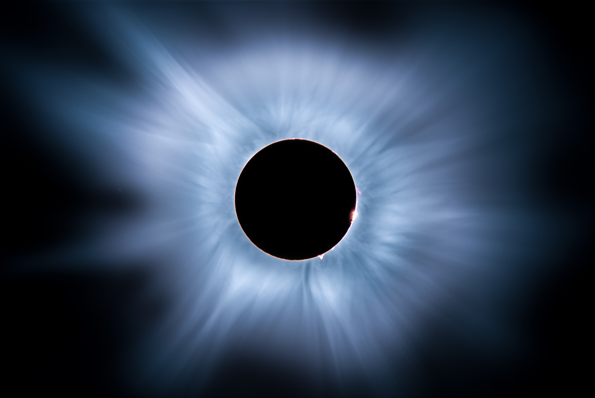
Many of the better photos you will find are composites of multiple photos taken over a very wide range of camera settings, which more closely approximate what the eye sees. I found this one that seems closer to what I witnessed (photo by Mark Goodman):

So, if you have never experienced a total solar eclipse, and are underwhelmed by the photos you see, I submit that the actual experience is much more dramatic than the photos indicate.

Here’s some unedited real-time video I took with my Sony A7SII camera mounted on a Skywatcher Esprit ED80 refractor telescope. We were in a Pilot Travel Center parking lot with about a dozen other cars that also didn’t make it o their destinations due to the traffic. I used a solar filter until just before totality, then removed the filter. The camera is on an automatic exposure setting. I’ve done no color grading of the video. Skip ahead to the 3 minute mark to catch the transition to totality:

UAH Global Temperature Update for March, 2024: +0.95 deg. C

Tuesday, April 2nd, 2024

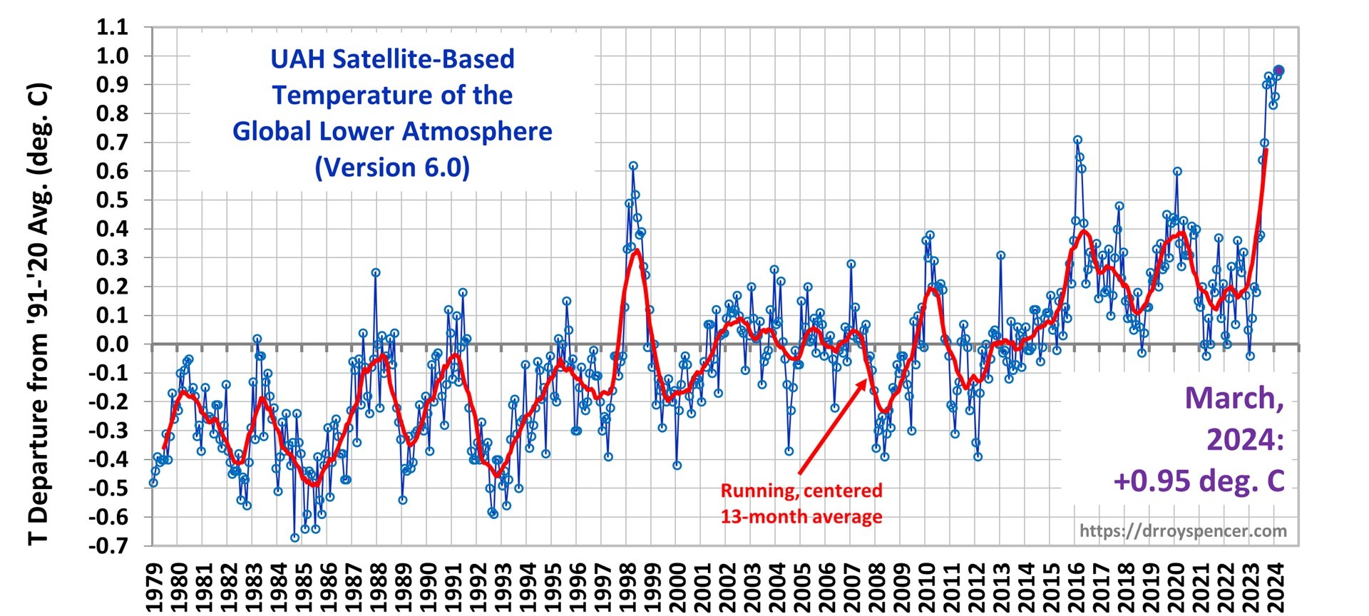
The Version 6 global average lower tropospheric temperature (LT) anomaly for March, 2024 was +0.95 deg. C departure from the 1991-2020 mean, up slightly from the February, 2024 anomaly of +0.93 deg. C, and setting a new high monthly anomaly record for the 1979-2024 satellite period.

New high temperature records were also set for the Southern Hemisphere (+0.88 deg. C, exceeding +0.86 deg. C in September, 2023) and the tropics (+1.34 deg. C, exceeding +1.27 deg. C in January, 2024). We are likely seeing the last of the El Nino excess warmth of the upper tropical ocean being transferred to the troposphere.

The linear warming trend since January, 1979 remains at +0.15 C/decade (+0.13 C/decade over the global-averaged oceans, and +0.20 C/decade over global-averaged land).

The following table lists various regional LT departures from the 30-year (1991-2020) average for the last 14 months (record highs are in red):

YEARMOGLOBENHEM.SHEM.TROPICUSA48ARCTICAUST
2023Jan-0.04+0.05-0.13-0.38+0.12-0.12-0.50
2023Feb+0.09+0.17+0.00-0.10+0.68-0.24-0.11
2023Mar+0.20+0.24+0.17-0.13-1.43+0.17+0.40
2023Apr+0.18+0.11+0.26-0.03-0.37+0.53+0.21
2023May+0.37+0.30+0.44+0.40+0.57+0.66-0.09
2023June+0.38+0.47+0.29+0.55-0.35+0.45+0.07
2023July+0.64+0.73+0.56+0.88+0.53+0.91+1.44
2023Aug+0.70+0.88+0.51+0.86+0.94+1.54+1.25
2023Sep+0.90+0.94+0.86+0.93+0.40+1.13+1.17
2023Oct+0.93+1.02+0.83+1.00+0.99+0.92+0.63
2023Nov+0.91+1.01+0.82+1.03+0.65+1.16+0.42
2023Dec+0.83+0.93+0.73+1.08+1.26+0.26+0.85
2024Jan+0.86+1.06+0.66+1.27-0.05+0.40+1.18
2024Feb+0.93+1.03+0.83+1.24+1.36+0.88+1.07
2024Mar+0.95+1.02+0.88+1.34+0.23+1.10+1.29

The full UAH Global Temperature Report, along with the LT global gridpoint anomaly image for March, 2024, and a more detailed analysis by John Christy, should be available within the next several days here.

The monthly anomalies for various regions for the four deep layers we monitor from satellites will be available in the next several days:

Lower Troposphere:

http://vortex.nsstc.uah.edu/data/msu/v6.0/tlt/uahncdc_lt_6.0.txt

Mid-Troposphere:

http://vortex.nsstc.uah.edu/data/msu/v6.0/tmt/uahncdc_mt_6.0.txt

Tropopause:

http://vortex.nsstc.uah.edu/data/msu/v6.0/ttp/uahncdc_tp_6.0.txt

Lower Stratosphere:

http://vortex.nsstc.uah.edu/data/msu/v6.0/tls/uahncdc_ls_6.0.txt