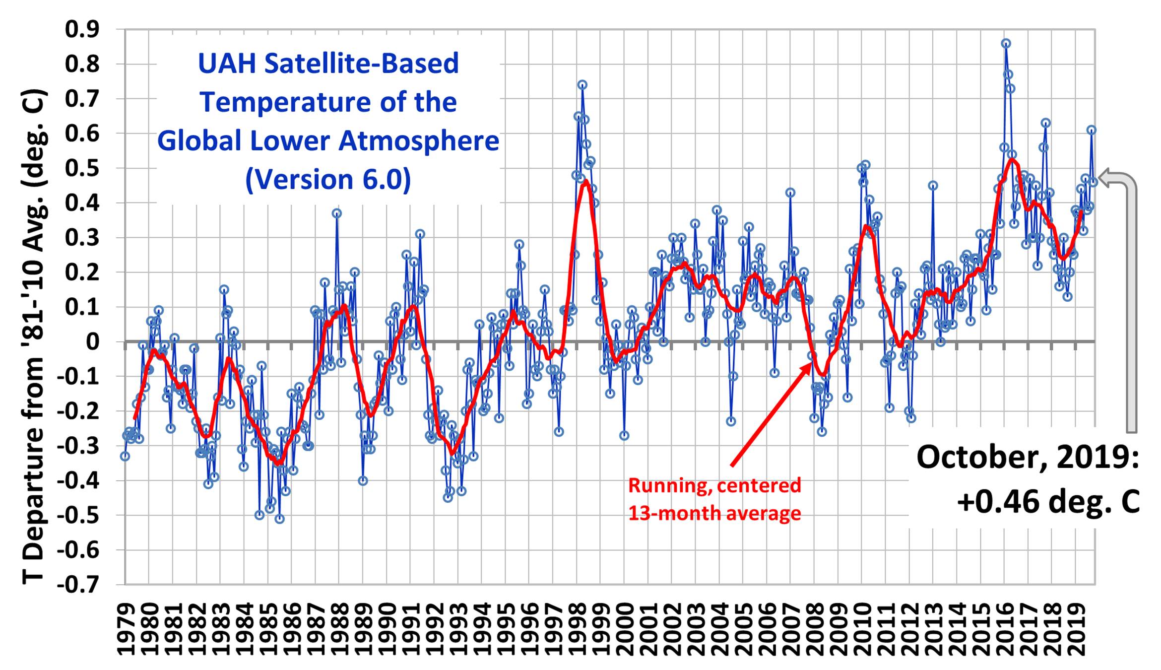
Archive for November, 2019

Climate Extremism in the Age of Disinformation

Monday, November 18th, 2019

Do the global warming wars ever change anyone’s mind?

I suppose there are a few people whose minds have been changed. As I recall, Judith Curry has said Climategate (now “celebrating” its 10 year anniversary) was her wake-up call that institutionalized climate science might not be all it claims to be. She is now a well-informed and unabashed skeptic of the modern tendency to blame every bad weather event on humans.

While I’m sure there are other examples, the unfortunate truth is that fewer and fewer people actually care about the truth.

The journalist who broke the Climategate story, James Delingpole, yesterday posted an article entitled The Bastards Have Got Away with It!, James concludes with,

“Climategate was the event when, just for a moment, it seemed we’d got the climate scamsters bang to rights, that the world’s biggest scientific (and economic) con trick had been exposed and that the Climate Industrial Complex would be dismantled before it could do any more damage to our freedom and our prosperity. But the truth, it would seem, is no match for big money, dirty politics and madness-of-crowds groupthink. We’ve lost this one, I think, my friends. And the fact that all those involved in this scam will one day burn in Hell is something, I’m afraid, which gives me all too little consolation.”

You see, it does not really matter whether a few bad actors (even if they are leaders of the climate movement) conspired to hide data and methods, and strong-arm scientific journal editors into not publishing papers that might stand in the way of the United Nations Intergovernmental Panel on Climate Change (IPCC) mission to pin climate change on humans, inflate its seriousness, and lay the groundwork for worldwide governmental efforts to reduce humanity’s access to affordable energy.

The folks were simply trying to Save the Earth™, and we all know that the ends justifies the means, right? So what if they cheated? Boys will be boys, you know. The science is sound, and besides, 97% of all scientists agree that… something.

The Roots of Polarization

One would think that the practice of science would be objective. I once believed this, too. As a fresh post-doc at the University of Wisconsin, when I discovered something new in satellite data, I was surprised to encounter NASA employees who tried to keep my work from being published because they feared it would interfere with a new satellite mission they were working toward. I eventually got it published as a cover article in the prestigious journal, Nature.

But the subject I was dealing with did not have the profound financial, political, policy, and even religious import that climate change would end up having. Furthermore, 35 years ago things were different than today. People were less tribal. There is an old saying that one should not discuss politics or religion in polite company, but it turns out that social media is far from polite company.

From a practical standpoint, what we do (or don’t do) about human-caused climate change supports either (1) a statist, top-down governmental control over human affairs that involves a more socialist political framework, or (2) an unconstrained individual-freedom framework where capitalism reigns supreme. So, one could easily be a believer (or non-believer) in the ‘climate emergency’ based upon their political leanings. While I know a few socialists who are skeptical of human-caused climate change being a serious issue, this is the exception rather than the rule. The same is true of capitalists who think that we must transition away from fossil fuels to wind and solar energy (unless they stand to make money off the transition through subsidies, in which case they are financially rather than ideologically driven).

Or, on a spiritual level, a human who desires to worship something must ultimately choose between the Creation or the Creator. There is no third option. I find that most Earth scientists are nature worshipers (showing various levels of fervor) and consider the Earth to be fragile. In contrast, those who believe the Earth was created for the purpose of serving humanity tend to view nature as being resilient and less sensitive to lasting damage. Both of these views have equally religious underpinnings since “fragile” and “resilient” are emotive and qualitative, rather than scientific, terms.

So, I would argue it really does not matter that much to most alarmists or skeptics what the evidence shows. As long as 8 billion people on the planet have some, non-zero effect on climate — no matter how small or unmeasurable — the alarmist can still claim that ‘we shouldn’t be interfering with the climate system’. As a counter example, the skeptical environmentalist Bjorn Lomborg actually believes the alarmist science from the IPCC, but claims that economics tells us it’s better to live in and adapt to a warmer world until we have more cost-effective substitutes for fossil fuels. For this stance regarding policy, he is labeled a global warming denier despite fully believing in human-caused climate change.

The Role of the Disinformation Superhighway

Baylor Professor Alan Jacobs has an interesting essay entitled On Lost Causes regarding the tendency for people to believe anything they see on the internet if it supports their biases.

He mentions a recent novel in which a high-tech billionaire, fed up with the disinformation he sees on the Web, concocts an elaborate online story that Moab, Utah has been obliterated by a nuclear explosion. He has CGI video, actors, witnesses, and an elaborate (but fake) social media presence to support the story.

The plan is to then show the world how easily they were duped, so that people would become less credulous when digesting information.

But instead, people cling to their belief. Even after many years, the ‘Moab truthers’ claim that anyone who disputes that Moab was destroyed are trolls or paid shills. People could actually travel to Moab to see for themselves, but virtually no one does.

In the climate wars, I see this behavior from both skeptics and alarmists. The alarmists point to increasing storms, heat waves, wildfires, etc. as evidence that humans are making weather worse. When they are shown evidence from a century of more of data that, no, things are not getting worse, these ‘storm truthers’ still bitterly cling to their beliefs while calling us skeptics “deniers”.

On the flip side, I routinely engage skeptics who claim that there is no such thing as the greenhouse effect, and that it is physically impossible for the cold atmosphere to make the surface warmer by increasing its CO2 content, anyway. No matter how many different ways I try to show how they are wrong, they never change their stance.

As a result, despite being a skeptic on the subject of humans having a serious effect on global climate, I’ve had to block more fellow skeptics from commenting on my blog than I have blocked alarmists. So, I get attacked from people on both sides of the issue.

I partly blame the public education system for the current state of affairs. Students are increasingly taught what to think, rather than how to think. Also to blame is the (probably unavoidable) funding of science by government, which President Eisenhower warned would cause science to become corrupted by a handful of powerful elites who did not have the advancement of scientific knowledge as the central goal.

When politicians have control over the purse strings, is it any wonder that politicians would preferentially fund the science which benefits certain policy outcomes, usually involving more government control over the lives of citizens? There have been innumerable funding programs to explore the human influence on climate (spoiler alert: every change we see is human-caused), yet almost no money goes to understanding natural sources of climate change.

Both Delingpole (describing the failure of Climategate to change attitudes) and Jacobs (describing the tendency of people to believe anything that supports their tribal beliefs) end their articles on a sour note. I have already quoted Delingpole’s conclusion, above. Here’s how Jacobs end his essay:

“..if at this stage of the game, given what we know about how social media work and about the incentives of the people who make TV, you’re still getting your dopamine rush by recycling TV-news clips and shouting at people on the Internet, you’re about as close to beyond hope as a human being gets. There is no point talking to you, trying to reason with you, giving you facts and the sources of those facts. You have made yourself invulnerable to reason and evidence. You’re a Moab truther in the making. So, though I do not in theory write anyone off, in practice I do. It’s time to give you up as a lost cause and start figuring out how to prevent the next generation from becoming like you.”

Delingpole and Jacobs come to sobering — even depressing — conclusions. Unfortunately, like these two authors I do not have much reason to be hopeful that things will get better anytime soon.

Rare frost flowers bloom in Deep South’s deep freeze

Wednesday, November 13th, 2019

With temperatures in the Deep South dipping as low as the 20s in Florida this morning, the early deep freeze provided the best opportunity in several years for frostweed (Verbesina virginica) to bloom. Here in north Alabama the 17 deg. F temperatures so early in the season provided the necessary chill to cause water from the still-warm soil to wick up through the stems and then freeze into cotton candy-shapes. Most people who live here are not even aware of these cold weather creations because they form so rarely.

Here are several photos I took after dawn this morning as these frosty blooms continued to grow.

Comments by Ross McKitrick on the Continuation of Climate Model Failure

Tuesday, November 12th, 2019

The following is a re-posting of an article by Dr. Ross McKitrick, University of Guelph, published yesterday, November 11, 2019. I have a comment that follows his post.

Climate Models vs Observations: 2019 Update

Back around 2014 many people, me included, were commenting on the discrepancy between climate models and observations. In a report for the Fraser Institute I showed the following graph:

The HadCRUT4 series (black) was then dipping below the 95% lower bound of the model distribution. The IPCC itself in the 5th Assessment Report (2013) noted that out of 114 model runs, 111 had overstated observed warming since the late 1990s. That same year, Hans von Storch told Der Spiegel that:

“If things continue as they have been, in five years, at the latest, we will need to acknowledge that something is fundamentally wrong with our climate models. A 20-year pause in global warming does not occur in a single modeled scenario. But even today, we are finding it very difficult to reconcile actual temperature trends with our expectations.”

But before 2018 came along, the modelers were saved by the El.

El Nino, that is. The powerful 2015-16 El Nino caused temperatures to surge, apparently erasing the discrepancy. It was just in the nick of time. In 2018 the US National Assessment came out, using data sets ending in 2017, as did the Canadian counterpart, and they were able to declare that a lot of warming had occurred, more or less in line with model projections. Blog articles about the 30th anniversary of James Hansen’s predictions did the same.

Well it’s a couple of years later and the El Nino heat has mostly gone from the climate system. What does the model-observational comparison look like now?

This graph, like the earlier one above, compares the HadCRUT4 surface temperature average (black line) against the CMIP5 mean (red line). The pink band shows the 1-sigma (67%) distribution and the tan band extends out to the 2-sigma (95%) distribution. The outer yellow bands show the lower and upper 2.5th percentiles. The lines are positioned so all models and observations are centered on a 1961-1990 zero mean. The model runs follow the RCP4.5 scenario and extend out to 2050.

Let’s zoom in on the post-1950 interval.

The HadCRUT4 series ends in 2018, which is the last complete year. Temperatures in 2018 (+0.60C) are back down to about where they were in 2014 (+0.58C). We’ll know in February or March where 2019 ends up.

The worry back in 2014 was that the Hadley (black) line had dropped below the 97.5th percentile envelope of the CMIP5 model runs. The El Nino pushed it almost all the way up to the mean, but only temporarily. It’s now back to the edge of the yellow band, meaning it’s skirting the bottom of the 95 percent confidence interval.

The big issue is not whether warming has “paused” or not, it’s how it compares to model projections. RCP4.5 is considered a medium, plausible projection. But it’s already pulling away from the observations.

I have indicated 2030 on the graph. That’s the year we all die, or something. But I think it’s more likely that will be the year by which the HadCRUT4 line drops out below the bottom of the CMIP5 RCP4.5 ensemble once and for all. The El Nino disguised the model-observational discrepancy for a few years, but it’s coming back.

There are other versions of this graph that don’t show such a discrepancy. Zeke Hausfather, for example, prefers to use a different set of CMIP5 outputs in which water surface temperatures rather than air temperatures from the (modeled) oceans are used to correspond to the sampling method
in HadCRUT4. The result is that the model temperatures tilt down a bit towards observations. That’s fine, but when governments draw scary charts of future warming those aren’t the model runs they show us, instead they show charts like the one I’ve drawn, so I’m more interested in seeing how it compares to observations.

I referred above to the Der Spiegel interview with Hans von Storch back in 2013. I very much appreciate another of his comments:

“Unfortunately, some scientists behave like preachers, delivering sermons to people. What this approach ignores is the fact that there are many threats in our world that must be weighed against one another. If I’m driving my car and find myself speeding toward an obstacle, I can’t simply yank the wheel to the side without first checking to see if I’ll instead be driving straight into a crowd of people. Climate researchers cannot and should not take this process of weighing different factors out of the hands of politics and society.”

That is very well put.

Roy W. Spencer comment: With the new CMIP6 models coming out suggesting even more warming than the CMIP5 models did, I fear we will see continuing “adjustments” of the instrumental temperature record to produce even more warming. This is the only way that the models can retain credibility in the face of real-world evidence that warming has been modest, at best.

On the 1998 Apparent Step-Up in UAH Land-minus-Ocean Lower Tropospheric Temperatures

Thursday, November 7th, 2019

A follower of our UAH global lower tropospheric temperature (LT) dataset named “JJ” emailed me asking about what might be considered a spurious feature in the dataset.

The feature is most easily seen if you plot the monthly global time series of Land-minus-Ocean (hereafter “L-O”) temperature anomalies. The result seems to show a step-up of about 0.16 deg. C in May of 1998.

Fig. 1. Difference between the UAH lower tropospheric (LT) land and ocean temperature anomalies between January 1979 and August 2019, showing an apparent step-up in the difference occurring in May 1998. The dashed lines show the average values before and after that date, while the curve is a 5th order polynomial fit to the data.

The year 1998 is key for our dataset because that is when the first (NOAA-15) Advanced Microwave Sounding Unit (AMSU) came online, which initiated the transition from the older Microwave Sounding Units (MSU, the last of which was on the NOAA-14 satellite).

AMSU did not have exactly the same channel frequency selection as the MSU, so the nominal layers of the atmosphere sensed were slightly different. Most importantly, the AMSU channel 5 has a weighting function that senses somewhat more of the surface and lower troposphere than MSU channel 2. If one did not account for this fact, the AMSU’s greater surface sensitivity would produce higher temperatures over land and lower temperatures over the ocean (after a global-average intercalibration between MSU and AMSU was performed). [The reason why is that these channel frequencies are not sensitive to changes in sea surface temperature, because the microwave emissivity decreases as SST increases. The effect is small, but measurable.]

But since these are through-nadir scanners, each view angle relative to the local vertical measures a slightly different layer anyway, which allows us to match the AMSU and MSU measurements. When we developed Version 6 of the dataset, we found that the 50-60 GHz oxygen absorption theory used to find the view angle from AMSU5 that best matches MSU2, the resulting temperature anomalies over land were still too warm relative to the oceans. This meant that we had to perform an empirical (data-dependent) rather than theoretical matching of the AMSU and MSU view angles.

The way we gauged the match between MSU and AMSU is how the temperature anomaly patterns transition across coastlines: we required that there should be little discernible change in that pattern. Before our optimized matching, the land anomalies were noticeable warmer than the ocean anomalies as features crossed coastlines. But after optimization in our Version 6 dataset, here’s the LT anomaly map for last month (October 2019), which shows no evidence for land-vs-ocean artifacts.

Fig. 2. October 2019 LT temperature anomalies relative to the 1981-2010 average annual cycle. Note the anomalies have a smooth transition between land and ocean, as would be expected for deep-layer tropospheric temperatures (but not necessarily surface temperatures).

Nevertheless, adjustments like these are never perfect. So, the question remains: Is there a spurious change in the L-O temperature difference occurring in 1998?

Evidence that the L-O change in 1998 is real

There are a few lines of evidence that suggest the May 1998 step-up in L-O temperatures is real.

First, if the effect was due to the introduction of AMSU in 1998, it would have occurred in August, not in May (3 months earler). Also, the effect should have been gradual since for almost 4 years after August 1998 the LT dataset is half MSU (NOAA-14) and half AMSU (NOAA-15), after which it becaume 100% AMSU.

But a more important piece of evidence is the effect of El Nino and La Nina on L-O. During El Nino, the ocean airmasses warm more than the land airmasses (especially in the tropics), so that L-O tends to be more negative. Up until the 1997-98 super El Nino a period of greater El Nino activity existed, after which a shift to more La Nina activity occurred. (This is probably also what caused the extended global warming ‘hiatus’ after that El Nino event.)

I statistically regressed the L-O values in Fig. 1 against 3-month running averages of the Multivariate ENSO Index (MEI), and removed that estimate of the ENSO influence from the data. The resulting ENSO-adjusted time series in shown in Fig. 3.

Fig. 3. As in Fig. 1, but with the average influence of El Nino and La Nina (ENSO) subtracted out. Note the evidence for a “break” in 1998 is much weaker.

Note the step-up in mid-1998 is much less evident, and the 5th order polynomial fit to the data is smoother with a more gradual transition in L-O over the 41-year satellite record.

But that’s not the only thing going on during this period that affects the L-O values. There were two major volcanic eruptions (El Chichon in early 1982, and especially Pinatubo in mid-1991) that caused more cooling over land than ocean, causing temporarily enhanced negative values in L-O. Since these events are not as easily correlated with an index like MEI is with ENSO, I simply removed the data from 1982-83 and 1992-93 in Fig. 3 and replotted the results in Fig. 4.

Fig. 4. As in Fig. 3, but with the data influenced by major volcanoes El Chichon and Pinatubo removed.

Now we see that the 5th order polynomial fit to the data comes quite close to the linear trend (dashed gray line), which suggests that the step-up in 1998 in L-O was real, and related mostly to a change in ENSO activity before versus after the 1997-98 super El Nino, and with the major volcanic eruptions in 1982 and 1991 contributing to the seemingly spurious feature.

The remaining upward trend in L-O is simply the land airmasses warming faster than the ocean, as would be expected for any warming trend, whether natural or human-caused.

There remains what might be a spurious feature during 1980-81 in Fig. 4, which would most likely be related to our ad hoc correction for MSU channel 3 drift during that time. This, however, should have little influence on the land and ocean trends as evidenced by the trend line fit (dashed gray line) in Fig. 4.

California Wildfires, Climate Change, and the Hot-Dry-Windy Fire Weather Index

Friday, November 1st, 2019

Summer and early Fall are fire season in California. It has always been this way. Most summers experience virtually no precipitation over much of California, which means that the vegetation that grows during the cool, wet Winter becomes fuel for wildfires in Summer.

When you add the increasing population, risky forest management practices, and lack of maintenance of power lines, it should be little wonder that wildfire activity there has increased.

Few news reports of wildfires can avoid mentioning some nebulous connection of wildfires to human-caused climate change. This is a little odd from a meteorological perspective, however.

First of all, most of the historically significant wildfire events occur when COOL and DRY Canadian high pressure areas move south over the Great Basin region, causing strong downslope easterly winds (Santa Ana winds, Diablo winds). Global warming, in contrast, is supposed to result in WARMER and MOISTER air.

Secondly, the argument I’ve seen that excessive vegetation growth from a previous winter with abundant precipitation produces more fuel is opposite of the observation that fewer wildfires typically follow an unusually wet winter in California. They can’t have it both ways.

You might ask, why do SoCal temperatures sometimes rise so high before wildfire events if the source of the air is “cool” high pressure? It’s because the cooler high-altitude air over the Great Basin warms by compression as the air descends down the mountain slopes. Almost without exception (i.e., a super-adiabatic lapse rate), air at a higher altitude that is forced to descent to a low altitude will have a warmer temperature (and lower humidity) than the air it is displacing at low altitude. (While the warmth and dryness is widespread during these events, the high winds tend to be more localized to canyons and downslope areas.)

The dryness of this sinking air can be seen in this plot of the dewpoint temperature at LAX airport (Los Angeles) as dry air moved in from the east on December 4 with strong high pressure positioned over Nevada, and seven major wildfires developed and spread from the hot, dry, and locally windy conditions.

Hourly dewpoint temperatures at LAX airport from November 1 through December 31, 2017. Rapid drying is seen late on December 4, which is when the first of seven major wildfires (the Thomas fire) ignited.

But have such fire-enhancing weather events increased in, say, the last 50 years or more? And even if they have, was the cause due to greenhouse gas emissions from fossil fuels? While blaming some portion of recent global average warming on increasing CO2 is somewhat easier, blaming a change in regional or local weather patterns on it is much more difficult.

In the process of looking around for an answer to this question, I found some interesting recent work that would allow someone to analyze the appropriate meteorological station data, if it hasn’t already been done.

The Hot-Dry-Windy (HDW) Fire Weather Index

In 2018, a paper was published by a university research meteorologist and U.S. Forest Service (USFS) employees from three different USFS offices that describes a simple meteorological index related to wildfire risk. They call it the Hot-Dry-Windy (HDW) index, which is simply the product of (1) the surface wind speed times (2) the water vapor pressure deficit. The vapor pressure deficit uses the same information as relative humidity (temperature and dewpoint temperature), but it is a difference rather than a ratio, which better measures the potential of air to rapidly remove moisture from dead vegetation. For example a 10% relative humidity at 40 deg. F will have low drying potential, while 10% RH at 100 deg. F will have very high drying potential.

What is especially useful is that they used 30 years of weather forecast model (GFS) data to build a website that gives daily-updated forecasts of the HDW index across the United States. For example, here’s today’s forecast.

Importantly, the HDW index does not measure the actual fire danger, which must include how dry the vegetation currently is. It only shows whether the current weather will be conducive to the rapid spread of fire if a fire is started.

If you go to that website and click on a specific location, you get a time series plot of the HDW index values from 10 days ago up through the forecast for the coming days.

Unfortunately, the website does not provide any time series of the data over the last 30 years. But I can see the technique being applied to weather station data that goes back 50 years or more, for instance the formatted weather station data available here (which is where I got the Los Angeles airport data plotted above).

Until someone does this (if they haven’t already), I think it is a mistake to blame increased wildfire activity on “climate change”, when we don’t even know if there has been a change in the meteorological events most associated with major California wildfires: the intrusion of cool Canadian high pressure areas into the U.S. Southwest.

UAH Global Temperature Update for October 2019: +0.46 deg. C

Friday, November 1st, 2019

The Version 6.0 global average lower tropospheric temperature (LT) anomaly for October, 2019 was +0.46 deg. C, down from the September value of +0.61 deg. C.

The linear warming trend since January, 1979 remains at +0.13 C/decade (+0.11 C/decade over the global-averaged oceans, and +0.18 C/decade over global-averaged land).

Various regional LT departures from the 30-year (1981-2010) average for the last 22 months are:

YEAR MO GLOBE NHEM. SHEM. TROPIC USA48 ARCTIC AUST
2018 01 +0.29 +0.52 +0.06 -0.10 +0.70 +1.39 +0.52
2018 02 +0.25 +0.28 +0.21 +0.05 +0.99 +1.22 +0.35
2018 03 +0.28 +0.43 +0.12 +0.08 -0.19 -0.32 +0.76
2018 04 +0.21 +0.32 +0.09 -0.14 +0.06 +1.02 +0.84
2018 05 +0.16 +0.38 -0.05 +0.01 +1.90 +0.14 -0.24
2018 06 +0.20 +0.33 +0.06 +0.12 +1.11 +0.77 -0.41
2018 07 +0.30 +0.38 +0.22 +0.28 +0.41 +0.24 +1.49
2018 08 +0.18 +0.21 +0.16 +0.11 +0.02 +0.11 +0.37
2018 09 +0.13 +0.14 +0.13 +0.22 +0.89 +0.23 +0.27
2018 10 +0.20 +0.27 +0.12 +0.30 +0.20 +1.08 +0.43
2018 11 +0.26 +0.24 +0.28 +0.45 -1.16 +0.68 +0.55
2018 12 +0.25 +0.35 +0.15 +0.30 +0.25 +0.69 +1.20
2019 01 +0.38 +0.35 +0.41 +0.36 +0.53 -0.15 +1.15
2019 02 +0.37 +0.47 +0.28 +0.43 -0.02 +1.04 +0.05
2019 03 +0.34 +0.44 +0.25 +0.41 -0.55 +0.97 +0.58
2019 04 +0.44 +0.38 +0.51 +0.54 +0.50 +0.92 +0.91
2019 05 +0.32 +0.30 +0.35 +0.39 -0.61 +0.98 +0.38
2019 06 +0.47 +0.42 +0.52 +0.64 -0.64 +0.91 +0.35
2019 07 +0.38 +0.33 +0.44 +0.45 +0.11 +0.33 +0.87
2019 08 +0.38 +0.38 +0.39 +0.42 +0.17 +0.44 +0.24
2019 09 +0.61 +0.64 +0.59 +0.60 +1.14 +0.75 +0.57
2019 10 +0.46 +0.64 +0.27 +0.30 -0.03 +0.99 +0.50

The UAH LT global anomaly image for October, 2019 should be available in the next few days here.

The global and regional monthly anomalies for the various atmospheric layers we monitor should be available in the next few days at the following locations:

Lower Troposphere: http://vortex.nsstc.uah.edu/data/msu/v6.0/tlt/uahncdc_lt_6.0.txt
Mid-Troposphere: http://vortex.nsstc.uah.edu/data/msu/v6.0/tmt/uahncdc_mt_6.0.txt
Tropopause: http://vortex.nsstc.uah.edu/data/msu/v6.0/ttp/uahncdc_tp_6.0.txt
Lower Stratosphere: http://vortex.nsstc.uah.edu/data/msu/v6.0/tls/uahncdc_ls_6.0.txt