UAH Global Temperature Update for October 2019: +0.46 deg. C

November 1st, 2019 by Roy W. Spencer, Ph. D.

The Version 6.0 global average lower tropospheric temperature (LT) anomaly for October, 2019 was +0.46 deg. C, down from the September value of +0.61 deg. C.
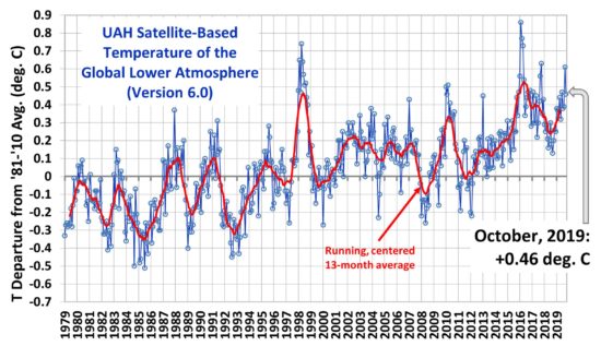
The linear warming trend since January, 1979 remains at +0.13 C/decade (+0.11 C/decade over the global-averaged oceans, and +0.18 C/decade over global-averaged land).

Various regional LT departures from the 30-year (1981-2010) average for the last 22 months are:

YEAR MO GLOBE NHEM. SHEM. TROPIC USA48 ARCTIC AUST
2018 01 +0.29 +0.52 +0.06 -0.10 +0.70 +1.39 +0.52
2018 02 +0.25 +0.28 +0.21 +0.05 +0.99 +1.22 +0.35
2018 03 +0.28 +0.43 +0.12 +0.08 -0.19 -0.32 +0.76
2018 04 +0.21 +0.32 +0.09 -0.14 +0.06 +1.02 +0.84
2018 05 +0.16 +0.38 -0.05 +0.01 +1.90 +0.14 -0.24
2018 06 +0.20 +0.33 +0.06 +0.12 +1.11 +0.77 -0.41
2018 07 +0.30 +0.38 +0.22 +0.28 +0.41 +0.24 +1.49
2018 08 +0.18 +0.21 +0.16 +0.11 +0.02 +0.11 +0.37
2018 09 +0.13 +0.14 +0.13 +0.22 +0.89 +0.23 +0.27
2018 10 +0.20 +0.27 +0.12 +0.30 +0.20 +1.08 +0.43
2018 11 +0.26 +0.24 +0.28 +0.45 -1.16 +0.68 +0.55
2018 12 +0.25 +0.35 +0.15 +0.30 +0.25 +0.69 +1.20
2019 01 +0.38 +0.35 +0.41 +0.36 +0.53 -0.15 +1.15
2019 02 +0.37 +0.47 +0.28 +0.43 -0.02 +1.04 +0.05
2019 03 +0.34 +0.44 +0.25 +0.41 -0.55 +0.97 +0.58
2019 04 +0.44 +0.38 +0.51 +0.54 +0.50 +0.92 +0.91
2019 05 +0.32 +0.30 +0.35 +0.39 -0.61 +0.98 +0.38
2019 06 +0.47 +0.42 +0.52 +0.64 -0.64 +0.91 +0.35
2019 07 +0.38 +0.33 +0.44 +0.45 +0.11 +0.33 +0.87
2019 08 +0.38 +0.38 +0.39 +0.42 +0.17 +0.44 +0.24
2019 09 +0.61 +0.64 +0.59 +0.60 +1.14 +0.75 +0.57
2019 10 +0.46 +0.64 +0.27 +0.30 -0.03 +0.99 +0.50

The UAH LT global anomaly image for October, 2019 should be available in the next few days here.

The global and regional monthly anomalies for the various atmospheric layers we monitor should be available in the next few days at the following locations:

Lower Troposphere: http://vortex.nsstc.uah.edu/data/msu/v6.0/tlt/uahncdc_lt_6.0.txt
Mid-Troposphere: http://vortex.nsstc.uah.edu/data/msu/v6.0/tmt/uahncdc_mt_6.0.txt
Tropopause: http://vortex.nsstc.uah.edu/data/msu/v6.0/ttp/uahncdc_tp_6.0.txt
Lower Stratosphere: http://vortex.nsstc.uah.edu/data/msu/v6.0/tls/uahncdc_ls_6.0.txt


296 Responses to “UAH Global Temperature Update for October 2019: +0.46 deg. C”

Toggle Trackbacks

  1. Steve Harford says:

    A very interesting trend is setting up. The GISTEMP4 annual chart is very likely going to show 3 consecutive years of decreasing global temperatures:

    https://data.giss.nasa.gov/gistemp/graphs_v4/

    This hasn’t happened since 1907, 1908 and 1909 (note that ’48, ’49 and ’50 were close but no cigar).

    • PmhinSC says:

      This is a UAH website and, assuming I plotted the data correctly in Excel, the above shows a consistent 0.0007 deg per month (with an R square of .72) global increase which began about 18 months ago. Interestingly, at least to me, there is a 6 month lag before the US48 increase began. Nothing to indicate anything significant going on including global cooling.

    • Richard M says:

      I suspect if you look at the data as it was published in 2001 you would see 1998 1999 and 2000 also showed a cooling trend. Probably 2010 2011 2012 showed a cooling trend in 2013.

      Wait a few years and this one will disappear too.

    • bdgwx says:

      Steve, what about 54, 55, and 56?

    • Midas says:

      GISTEMP
      Average Jan-Sep 2019: +0.95
      Average Jan-Sep 2018: +0.83
      Average All 2018: +0.85

      Not sure what you’re seeing.

    • barry says:

      “3 consecutive years of decreasing global temperatures.. hasnt happened since 1907, 1908 and 1909”

      Not quite, Steve:

      Happened in 1901, 02, 03 and 04

      4 consecutive years of cooler temps.

      Happened again in 1954, 55, 56

      https://data.giss.nasa.gov/gistemp/tabledata_v4/GLB.Ts+dSST.txt

      Did you check out how many times there were 3 consecutive warm years – to compare?

    • Robert Ingersol says:

      Based on the first nine months of GISTEMPv4 2019 is currently running a the second warmest year on record. It will almost certainly end the year ahead of 2018 and thus will not be 3 consecutive years of cooling. The only way I can reconcile your statement with reality is to interpret ti as saying 3 consecutive years cooler than the one that preceded them. Not sure the significance of that, but it certainly doesn’t prove a cooling trend.

    • Dr Roys Emergency Moderation Team says:

      So…have a discussion about temperature trends. Five years later, it might be worthwhile to discuss it again. Not something that’s worth discussing month after month though…right!?

      • Midas says:

        More worthwhile than saying “please stop trolling” post after post.

      • Dr Roys Emergency Moderation Team says:

        When you finally learn what “tu quoque” means, you’ll realize how worthless 99% of your comments are.

        • Midas says:

          If YOU actually knew what “tu quoque” meant, you would know that it would only apply if I were asserting you had made a false claim. A claim of hypocrisy alone without an assertion that you had made a false statement does not constitute to quoque. But at least you are making an attempt to educate yourself.

        • Dr Roys Emergency Moderation Team says:

          So you go around pointing out what you perceive as hypocrisy for no reason, huh?

          Even more pointless than I thought, then.

          • Midas says:

            How is pointing out the hypocrisy of others ‘pointless’?
            Good to know you now admit to hypocrisy.

          • Dr Roys Emergency Moderation Team says:

            What would the point of it be, then, exactly?

            I don’t agree it’s hypocritical, hence why I said “what you perceive as…”

          • Midas says:

            To point out that you’re a hypocrite – duh!

          • Dr Roys Emergency Moderation Team says:

            In order to achieve what? Do you want to label someone a hypocrite in order that:
            1) Other commenters/readers here take them, and their arguments, more seriously?
            2) Other commenters/readers here take them, and their arguments, less seriously?
            3) Something else happens (if so, what?)

          • Midas says:

            You continuall post “please stop trolling” even when people are posting scientific comments, in order to achieve what? Do you want to post a meaningless, unrelated comment in order that:
            1) Other commenters/readers here take them, and their arguments, more seriously?
            2) Other commenters/readers here take them, and their arguments, less seriously?
            3) Something else happens (if so, what?)

          • Dr Roys Emergency Moderation Team says:

            I write “please stop trolling” because:

            1) It amuses me (especially how seriously people like you seem to take it).
            2) The people I’m asking to stop trolling are actually trolls,, though they can never accept it, and I would prefer it if they would stop trolling.
            3) It’s a comment on the futility of the climate debate.

            There are other reasons, but they will do for now.

            Now you answer.

  2. Scott R says:

    Steve Harford,

    The GISTEMP data is useless. A simple back check of historical NOAA data reveals that the global temperature, arctic ice cover was no where near a record high in 1980 (at that time) and in fact, we had an ice age scare going on. That dataset is most definitely warm biased.

    Anyways, I disagree with you that the annual average for 2019 will be less than 2018. Going by UAH, 2018 was +0.23. This year is +0.41 so far. That is the 3rd warmest year out of the 1980-present dataset behind only 1998 and 2016.

    • The Man says:

      I believe he was referring to the trend only, not the year to year numbers.

      • Scott R says:

        The Man,

        The 12 month running mean topped in 2016, bottomed in 2018, and popped back up in 2019. The annual numbers and the running numbers both say the same thing.

    • Midas says:

      That’s right – a weak El Nino year has been beaten only by two very strong El Nino years. And 2017 & 2018 were the warmest ever La Nina years

      • Dr Roys Emergency Moderation Team says:

        We’re doooooomed…doomed I tells ya…

        • Midas says:

          You’ve certainly blossomed in the void left by your fellow trolls MF & JDH. You should count yourself lucky that you haven’t received the same treatment as them.

        • Dr Roys Emergency Moderation Team says:

          You’ve certainly blossomed in the void left by your fellow troll Da.vid App-ell. You should count yourself lucky that you haven’t received the same fate as him. Especially with your open call for another commenter to commit suicide.

          • Midas says:

            You mean my attempt to make said commentator from repeating the same comment ad nauseum – and it worked.

          • Dr Roys Emergency Moderation Team says:

            No, I mean your open call for another commenter to commit suicide.

            Now Des: please stop trolling.

          • Midas says:

            No, you mean my attempt to make said commentator from repeating the same comment ad nauseum.

          • Dr Roys Emergency Moderation Team says:

            No, I mean your open call for another commenter to commit suicide, you vile little twat.

      • Scott R says:

        Midas,

        There is no reason for me to hide the 1980-2016 warming trend. It fits the AMO cycle perfectly, which has nothing to do with CO2.

        • Craig T says:

          Perfectly?

          The monthly AMO values from 2004 to present has a slight downward linear trend. The TLT for that time is clearly upward.

        • Midas says:

          Following on from Craig T’s comment, it seems you don’t understand the difference between “warming” and “being warm”. The AMO might explain some of the warmth, but it it is not increasing, it doesn’t explain continuing warming.

        • Dr Roys Emergency Moderation Team says:

          Kreg T, Des, please stop trolling.

  3. Ken says:

    Nothing to do but argue about the accuracy of measurements that differ by 10ths of a degree.

    There is still nothing indicates climate emergency or if CO2 is causing any of it. Greta clearly isn’t the 2nd coming.

    • fonzie says:

      (seems that greta is the new brittany)…

    • Midas says:

      That would require a first coming.

    • Dr Roys Emergency Moderation Team says:

      Greta’s just another boring, shrieking, OTT alarmist. Nothing worth bothering with, really. Immature and pointless posturing for the pathetic generation.

    • Robert Ingersol says:

      Tenths of a degree add up to whole degrees. WE are now about 1C warmer than a century ago. Five degrees is the difference between the early 20th Century and a world in which the ice in the Northern US is a mile deep. not trivial and we know for certain it is due to carbon dioxide and other GHGs.

      • charles says:

        I no expert..But what about all the kenetic energy where ATM molecules bang into CO2 molecules at three time the time it take a CO2 ,molecule to absorb a Photon Hey ya? High energy to low energy every hit..But wait H2O absorbs 100% of 3 of the 4 bands of CO2..Band Number 4 call it the 15 Micron band and what H2O captures50 to 60 percent of this CO@ band also…Mr. midas blowing smoke I think

    • Dr Roys Emergency Moderation Team says:

      “…we know for certain it is due to carbon dioxide and other GHGs.”

      That’s it…chant your mantras enough times…and people start to believe it.

    • Craig T says:

      It’s the global averages that differ by tenths of a degree not the individual measurements.

  4. fonzie says:

    Testing…

  5. Dan says:

    I’m very interested in why the Arctic temperature anomaly is significantly larger than the anomaly at lower latitudes.

    I can’t remember where, but I read a paper which described how pollution, particularly from coal burning power plants, contributes to faster and more extensive melting of Arctic sea ice because the soot is black and when it is carried to the Arctic by air circulation patterns moving northward up the coast of North American and Asia and precipitates onto Arctic ice, the ice melts faster because it is slightly darker.

    Sea water absorbs more heat than sea ice, which is highly reflective. So less ice means warmer water and air temperatures.

    Also, the recent (within last 20 years) reduction in Arctic sea ice in the northern hemisphere has largely been in the Bering and Chukchi seas.

    This sounds reasonable to me, especially since China and India have been building dirty coal plants (without the US EPA regulations) by the dozens. Most of China’s development has been along the coast, near the prevailing winds heading northeast.

    When I plot the north polar region against all other regions, it shows +0.2C per decade, while other regions are at or below the +0.13C global number.

    Any other theories?

    • Scott R says:

      Dan,

      In my opinion, the arctic always outperforms… meaning, when we are in a warming phase, the artic warms faster. When we are in a cooling phase, the arctic cools faster. Perhaps it is the sensitivity it has to the north Atlantic that creates this effect.

    • Ken says:

      The incident angle of sun light impacting sea water at arctic latitudes is probably as reflective as ice.

      • E. Swanson says:

        Ken, Yes, it’s well known that water, like any transparent material, becomes a reflector at high angle of incidence. The appearance of “sun glint” in photos taken from high altitude demonstrate this effect. This applies to melt ponds on the surface of the ice, as well as areas of open water within the ice sheet. As a result, when melt ponds are prevalent on the sea-ice, the albedo is lowered. I presented a paper on this effect back in 1992 and more recent research has confirmed it.

      • When the sun is 23 degrees above the horizon, approximately its average elevation above the horizon in the Arctic on the summer solstice, water is 11% reflective. When the sun is 15 degrees above the horizon, water is about 22% reflective. When the sun is 10 degrees above the horizon, water is 35% reflective, still less reflective than sea ice.

        https://en.wikipedia.org/wiki/Albedo#/media/File:Water_reflectivity.jpg

        • E. Swanson says:

          Ken and DL Klipstein, I should have mentioned that I was referring to solar zenith angle (the angle from directly overhead), not elevation. Looking at the Wiki link, the graph for water shows calculated reflectivity vs. zenith angle. That graph shows the reflectivity at 78 degrees to be about 0.3, not 0.11. The reflectivity sharply increases for higher zenith (lower incident) angles, thus averaging may not present a valid result. There’s the impact of waves on the open ocean, a function of wind speed, to consider, but melt ponds won’t be likely to exhibit large waves because of their small dimensions.

          Here are a couple of photos I shot yesterday evening just before sunset at a small lake near where I live. I used a #10 plate from a welder’s shield to reduce the intensity of the scene, thus emphasizing the relative strength of the reflected image vs. the sun without melting my camera’s sensor.
          (1), (2).

    • Richard M says:

      The Arctic temperature in the NH Oct-Apr are mainly warmer due to more open water in the Arctic. If the same areas were covered in ice you’d see very cold temperatures. Now, average that large increase with the rest of Arctic and it looks warmer.

      This appeared to be due to the +AMO pumping warmer water into the Arctic which slowly melted the ice. The AMO went positive in the mid 1990s. The ice loss increased until around 2007 and has been pretty stable ever since.

      Many folks expect the sea ice in the Arctic to start increasing when the AMO goes positive in the 2020s.

        • J Peck says:

          PIOMASS is a calculated number using models not a direct observation. By their own admission they have revised their original estimate of the ice loss anomaly from -3.6 km^3 10^3/decade to -2.8 10^3 km^3/decade with an uncertainty of ± 1.0 10^3 km^3/decade and that is comparing the data to the 1979 to 2018 trend. The comment to which you replied was speaking of the trend since 2007. I know, I know he’s “cherry picking” the time right? Anyways . . .

          In 2010 the U.K. launched the CryoSat which actually measures the volume and thickness with accuracy estimates on the order of +- 0.2%. Here is the first 9 years at the March maximum. All figures are in 10^3 km^3:

          March Arctic Ice Volumes CryoSat Measured versus PIOMASS Estimated:

          2011 – 25.5 – 21.4
          2012 – 25.3 – 21.9
          2013 – 24.5 – 22.0
          2014 – 26.8 – 21.8
          2015 – 25.9 – 23.2
          2016 – 24.5 – 21.5
          2017 – 24.1 – 19.5
          2018 – 24.2 – 20.8
          2019 – 25.5 – 21.8

          The maximum achieved Arctic Sea Ice volume as measured by a satellite with high accuracy is unchanged from the reading taken in 2011. Year over year the PIOMASS estimates do not match the actual measurement trends taken by the CryoSat. When a model does not match observations most scientists throw out the model, but in the fairy tale land of Climatologists it must be the data readings that need “adjustment”.

          • Bondidon says:

            J Peck

            “Year over year the PIOMASS estimates do not match the actual measurement trends taken by the CryoSat. ”

            I partly agree with you, because the same problem appeared when comparing PIOMAS with a monthly average of DMI’s ice daily thickness data (which unfortunately disappeared inbetween).

            I was wondering why PIOMAS had, for 2003-2019, a linear estimate of -3.3 Mkm^3/decade, a huge decrease compared with DMI’s -1.75.

            Here is a graphic comparison of the two, based on absolute values:
            https://drive.google.com/file/d/1dHrpIqTfHm5a_CjxxZcmFzL_9xnVFyqI/view

            But when you switch to departures from the mean of 2003-2017, the situation becomes a bit different:
            https://drive.google.com/file/d/1dPFUzmlDQRNTGT46t2ExxdAupl7yOZed/view

            { The anomaly plots let think of stronger declines when using anomalies, but this is an illusion based on different range values; the estimates are nearly equal to those above, with however far smaller standard error, due to aremoval of the annual cycle. }

            Here we see much better that DMI’s data (btw model-based as well) wasn’t always higher than PIOMAS’. The two plots cross around… 2010/11 (hmmh).

            And when a times series starts lower and ends higher, it’s no wonder that it shows a much lower estimate than the series starting high and ending low.

          • barry says:

            Bindidon, was the DMI data basin wide, or just some of the Arctic sea ice?

      • Midas says:

        It is not possible to predict when the AMO will go positive.

    • DMacKenzie says:

      Dan,
      Sunshine 24 hours per day during summer has a lot to do with it. Also Ferrell cells push warmer Southern air into a Polar region half the size, so it warms more.

  6. Mark Shapiro says:

    Dr. Roy’s data continue to be consistent with warming on a global scale.

  7. Tim Wells says:

    If CO2 is only 0.04 % of a percent and 97% is created by nature. How can CO2 drive climate change. Oxygen is 20% of our atmosphere. Our orbit and sun spot cycles are the driver.

    • Carbon500 says:

      Let’s not forget the oceans and water vapour. From Hawaii Pacific University’s website comes the following:
      The oceans cover 71 percent of the Earth’s surface and contain 97 percent of the Earth’s water.
      Less than 1 percent of the Earth’s water is fresh water, and 2-3 percent is contained in glaciers and ice caps.
      Atlantic Ocean Facts:
      Proportion of world ocean 28%
      Average depth: 12,254 feet (3,872 m)
      Deepest point: 28,374 feet (8,648 m) in the Puerto Rico Trench.
      The Pacific is the largest ocean. This body of water could hold all the continents and almost all the other oceans. It spreads nearly half way around the world, from Asia east to the Americas, and from Antarctica north almost to the Arctic. The Pacific is also the deepest ocean. The world’s highest peak, Mount Everest, would disappear if dropped into the Pacific’s Philippine Trench, which is 32,995 feet deep.
      Pacific Ocean Facts
      Proportion of world ocean: 48%
      Average depth: 13,740 feet (4,188 m)
      Deepest point: 36,200 feet (11,033 m) in the Mariana Trench
      At 39 degrees Fahrenheit, the temperature of almost all of the deep ocean is only a few degrees above freezing.

    • bdgwx says:

      Tim,

      It doesn’t really matter how CO2 gets into the atmosphere. It behaves all the same. And its radiative force is the result of its interaction with the infrared portion of the EM spectrum with a magnitude approximated by 5.35*ln(2) for 2xCO2.

      Question…what do you think the radiative force induced by both solar activity and orbital dynamics has been since 1960?

    • Dr Roys Emergency Moderation Team says:

      Wrong. CO2 has no “radiative force”. The Stupidhouse Effuct is falsified. Time for you to grow up, get over it and move on with your life. Your pathetic religion has been completely annihilated. Please, eternally stop trolling.

      • E. Swanson says:

        DRsEMT, The Greenhouse Effect isn’t based on belief and the theoretical foundation isn’t a “religion”, it’s based on facts.
        https://www.nytimes.com/2019/10/31/opinion/climate-change-evangelical-christian.html

        For one who posts complaining about others trolling this site, you are one of the most prolific trolls, repeatedly throwing out pointless slurs in reply to others who post. I’m surprised that you are allowed to continue, especially as you are misusing Dr. Spencer’s name in your handle.

        • Dr Roys Emergency Moderation Team says:

          More personal attacks and calls for censorship from the Thickhouse Effect Defense Team.

          Time for you to grow up, get over it and move on with your life. Your pathetic religion has been completely annihilated. Please, eternally stop trolling.

        • Lewis guignard says:

          E Swanson,
          The NYT has proven itself completely unreliable as far as facts. They have shown time and again their reporters will distort their stories in favor of their political biases.

          Be assured. I hope AGW is true. If not, it’s going to get cold sooner or later and warm is better than cold.

          In the meantime, turn the thermostat up, I’m back to burning a wood fire in the morning – making my contribution to the atmospheric CO2.

          • E. Swanson says:

            L Guignard, The author of the NYT commentary is a well known professional climatologist and she agrees with the AGW science. The NYT probably had no input to the commentary, so there’s no way that the “facts” could have been misstated.

          • Dr Roys Emergency Moderation Team says:

            (…unless, of course, the climatologist is wrong…)

        • fonzie says:

          Swan Song, Dr Roy is probably considering hiring d.r.e.m.t. (and putting a little teeth in his defacto role as moderator)…

  8. Dirk McCoy says:

    How can arsenic hurt you when its only 100 parts per billion? Because it doesnt take much. And it just does not take much CO2 to affect the suns radiative transfer not affected by water vapor and methane. But… what evidence is there that CO2s effect is asymptotic?

    • Bart says:

      How can 100 mg/L of salt in your drinking water hurt you? Oh, yeah. It can’t.

      This is a dumb analogy. CO2 is not arsenic, and the Earth’s climate is complex, but not on the level of a living organism.

      • Midas says:

        For a photon of IR at 15 microns leaving the earth’s surface, even at a CO2 concentration of 0.04%, how far do you believe it will travel before it interacts with its first CO2 molecule? How many such interactions must the photon deal with in order to escape the atmosphere?

        • I’m getting too old to do this kind of calculation, if I ever could, and links on this site never work for me, but there is a discussion at “biocab.org” called “Determination of Mean Free Path of Quantum/Waves and Total Emissivity of Carbon Dioxide Considering its Molecular Cross Section.” This estimates the mean free path (my Google search term) of an IR photon before encountering a CO2 molecule at 33m.

        • Dr Roys Emergency Moderation Team says:

          That’s correct…and that, again, is a paper from an author who disputes the existence of the Greenhouse Effect.

        • bdgwx says:

          DREMT, What do you think is the relevance regarding the delay in photon escape is for the GHE hypothesis? Or perhaps more succinctly…how do the papers referenced here dispute the GHE?

        • Dr Roys Emergency Moderation Team says:

          Midas requested information. I provided it.

          And I didn’t even cite the second paper.

        • bdgwx says:

          My question was meant as open discussion…to anyone really…I suppose.

        • Dr Roys Emergency Moderation Team says:

          Then please do read the papers, and bone up on the whole “there’s no GHE” position. That’s up to you, to investigate it as you please. There genuinely does seem to be a paper that fundamentally challenges the GHE that gets published every other month. Scott R recently linked to such a paper from September 2019. So, read, and investigate as you wish. The key to understanding why there is no GHE is a path that has to begin under your own steam. In your own time. It is up to you, to learn as much, or as little, as you wish.

          • E. Swanson says:

            DRsEMT, The Nikolov and Zeller poster paper you linked to misses several key points. For example, all the energy which enters the atmosphere and which is not immediately reflected back to deep space eventually exits the Earth to deep space, averaged over time, else the Earth would not exhibit a near constant average. Some of that energy leaves the surface directly in the IR window when there are no clouds, but the rest must be transported to higher altitudes and then converted to IR energy via GHG emissions before it can exit. These GHG’s (and clouds) radiate both upwards and downwards, which moves some portion of the energy flow back downwards towards the surface, (with variations due to seasons, etc).

            They mention convection as the other process which moves energy to greater altitudes. At the bottom of the troposphere, adding water vapor decreases the density, since water vapor is less dense than N2 and O2. As this mix is also being heated, the mass is lifted upwards via gravity, moving the energy higher and warming the upper troposphere.

            It’s well known that convection dominates in the troposphere, but is almost absent in the stratosphere, above which the GHG’s continue the energy flow upwards toward deep space. Having left out this aspect of the energy flow, they are also ignoring the Greenhouse Effect. Not only that, but they leave out the basic physical characteristics of GHGs, including the impact of pressure broadening of the absorp_tion lines for each gas, instead lumping the effects of GHGs into averages.

          • Dr Roys Emergency Moderation Team says:

            I didn’t link to a Nikolov & Zeller paper. That’s such a basic fail right out of the gate that I must admit I stopped reading immediately afterwards.

          • E. Swanson says:

            DRsEMT, The Dai Davies paper references Nikolov and Zeller for support of his hypothesis. But, his notion is not based on the physics of the atmosphere or GHGs, indeed, he incorrectly assumes that their absorp_tion is “saturated” and thus adding more can’t result in an increase in surface temperature. He further claims that the IPCC’s models are “prone to runaway heating”, which no scientist I know of has claimed. However, he does note that the GHG emissions occur both upwards and downwards, but fails to account for the flow of energy downward, which would tend to warm the layer(s) below and that this process would continue all the way to the surface.

            You previously wrote:

            It is up to you, to learn as much, or as little, as you wish.

            Your stated refusal to consider what I wrote tells us that you are following that last path.

          • Dr Roys Emergency Moderation Team says:

            What “stated refusal to consider what you wrote”? You couldn’t even get the author of the paper correct! So I didn’t really see the point of going beyond that.

            …looking at it now, I see that you wasted some time writing out a lengthy description of one of the various iterations of the Greenhouse Effect. I think it is “Greenhouse Effect version #12…or perhaps #7? it’s hard to keep track, you people change it up so many times. You apparently feel that Dai Davies is unaware of GHE v.12/7 or are unhappy that he didn’t bother to write it out in full in the paper. Not sure which. It’s certainly nothing new to me.

            Did you have any specific objections, or just general hand-waving?

            If you do come up with anything, be sure to contact Dai.

          • E. Swanson says:

            DRsEMT, The Dai Davies paper admits that there is downward IR EM radiation from the atmosphere to the surface. That is the essence of the Green Plate Effect, etc. The Nikolov and Zeller poster presents a simple model of the GPE, but goes further to stress problems resulting from averaging the surface flux, etc. They claim that modelers are ignoring the convection path, which is false and they don’t deal with what happens above the tropopause.

            Of course, you don’t have anything to say about these so-called “scientific” papers, ignoring the fact that N & Z’s computation of surface temperatures on other bodies in the solar system do not include anything like the Earth’s troposphere and stratosphere, which is the driving mechanism for convection.

          • Dr Roys Emergency Moderation Team says:

            “…indeed, he incorrectly assumes that their absorp_tion is “saturated” and thus adding more can’t result in an increase in surface temperature.”

            He mentions “saturation”, in passing, at one point in the paper. That doesn’t change his results, as this “saturation” is not a part of his calculations. Red herring.

            “He further claims that the IPCC’s models are “prone to runaway heating”, which no scientist I know of has claimed”

            He doesn’t actually say that, but even if he had, it would still not change his results. Another red herring.

            “..,he does note that the GHG emissions occur both upwards and downwards, but fails to account for the flow of energy downward…”

            Not true. He says, in the paper:

            “Gas molecules emit photons equally in all directions. Half will move upward, and some fraction of these will reach a plane horizontal surface one mfp above the source. This fraction, a specific molecular emission rate (SMER), could be calculated from molecular physics and laboratory measurements, but fortunately we don’t have to rely on totally theoretical calculations because at the Earth’s surface we have direct measurements of the downward radiative flux from the atmosphere…”

            What’s in your next confused collection of ramblings?

            “The Dai Davies paper admits that there is downward IR EM radiation from the atmosphere to the surface.”

            Er…yes. I’m not sure in what sense this is an “admission”.

            “The Nikolov and Zeller poster…”

            What the hell are you talking about!?

            “…presents a simple model of the GPE, but goes further to stress problems resulting from averaging the surface flux, etc. They claim that modelers are ignoring the convection path, which is false and they don’t deal with what happens above the tropopause.”

            Why are we talking about Nikolov and Zeller? I guess this is an attempt to change the subject? Not sure. But I certainly can’t be bothered to get into N & Z with you when you’re struggling this much with the Dai Davies paper…

            “Of course, you don’t have anything to say about these so-called “scientific” papers, ignoring the fact that N & Z’s blah blah blah”

            That’s right, Swanson. Of course I don’t have anything to say about papers other than the one you apparently wanted to talk to me about in the first place. I also don’t currently have anything to say about the various critic’s reviews of the film, “Joker”. But if I feel like spontaneously pontificating on random other topics, I promise you’ll be the first to know.

          • E. Swanson says:

            DRsEMT, As is usually the case, a paper’s author relies on previous work by others. The Dai Davies paper relies on the earlier non-peer reviewed poster from Nikolov and Zeller. As Davies notes, we have measurements, which support the GPE effect, as the downwelling IR EM radiation has been measured. But, you are apparently uninterested in science until someone calls you out, so why should I bother replying to you and your usual insults?

          • Dr Roys Emergency Moderation Team says:

            They’re called “references”, Swanson. It’s not that Davies paper “relies upon” anything by Nikolov & Zeller. In the paper he looks at the delay in the radiative transmission of heat from surface to space, estimates this delay and concludes that its impact on atmospheric temperatures is insignificant. He then notes briefly at one point that this is in line with N & Z’s overall conclusions about there being an “ATE” rather than a “GHE”, and thus references them. The methods used in this paper are not at all influenced by them, though, and so the picture you are trying to paint is entirely misleading, as usual.

            Please do keep on whinging about these imagined “insults” that you think I’ve said to you, whilst maintaining your own belligerent attitude.

          • bdgwx says:

            Arguments that invoke the average delay of photon escape to dispute the GHE are misunderstanding the GHE. It’s not the delay that matters. It’s the quantity or amount of energy that matters. The authors aren’t disputing the GHE.

          • E. Swanson says:

            DRsEMT, The Davies paper is based on his simple spreadsheet model results. As he notes: “To keep things simple, I am ignoring the fact that in the lower troposphere approximately half the upward heat transfer is through latent heat of vaporisation and convection.” But, his assumption of downward radiation is based on measurements in the real atmosphere in which vertical convection dominates the energy transfer to higher levels. If he wants to leave out convection, he needs to begin with the corrected downward IR EM radiation, which he sets as Edown = 340 Wm-2 at the surface. He also uses a lapse rate for the troposphere (airT, K = airT0 – L * h / 1000), not the stratosphere, which impacts the temperature at the tropopause.

            Of course, his model includes that downward component in each layer, which is the basic S-B definition of “back radiation” that tends to warm the surface. That’s the Greenhouse Effect.

          • Dr Roys Emergency Moderation Team says:

            “To keep things simple, I am ignoring the fact that in the lower troposphere approximately half the upward heat transfer is through latent heat of vaporisation and convection. Including these would reduce the role of radiation and the value of the RDE by roughly a factor of two since, as can be seen in Figure 1a, most of the delay occurs below 3km. I am also assuming water vapour saturation at all altitudes, which again overestimates the RDE”

          • E. Swanson says:

            DRsEMT, Yes, that’s the entire quote. But, if Davies used a fixed lapse rate as a boundary condition, he is implicitly including the combination of both convection and radiation energy transfer mechanisms. Roughly 90% of the mass of the tropical atmosphere is in the troposphere below ~100hPa, but much of the GHG radiation process occurs above out to deep space. The positive lapse rate of the stratosphere is one result.

            His claim that the emissions go both upwards and downwards is the basic Green House Effect. He states that this is an observable fact, giving an average value of Edown = 340 Wm-2 at the surface. His “model” uses Edown as a boundary condition whereas it is actually a variable within the atmosphere, the value of which results from energy flowing both in and out of the atmosphere. He doesn’t get into what happens at higher levels/lower pressures and he can’t have a tropopause and stratosphere, etc, above where the lapse rate reverses to positive.

            Davies presents the results of a simple model of a a very complex situation. It’s not up to me to peer review his model, which appears to have significant differences with reality, thus I think his conclusion is likely to be wrong.

          • Dr Roys Emergency Moderation Team says:

            His model makes several simplifying assumptions, all of which serve to increase the radiative effect, and it still comes out as producing an insignificant amount of warming.

            If it’s not up to you to “peer review” the paper, you sure seem to be going to enormous effort to try and pick holes in it! What are we now…Day 3, or 4, of your ongoing attack?

            The author says he has made the spreadsheets/software available, all you would have to do is contact him, raise any objections you might have…try to make some changes and see if it makes any difference…there’s a lot you could do if you are as interested as your continued commenting seems to indicate.

            Can’t think of any positive reasons you would have to talk to me about it rather than the author of the paper. Seems like it’s just another denigrate, dismiss, ignore (the Nahle paper), misrepresent, and falsely accuse session for an avid Greenhouse Effect Defense Team member.

          • E. Swanson says:

            DRsEMT wrote:

            His model makes several simplifying assumptions, all of which serve to increase the radiative effect, and it still comes out as producing an insignificant amount of warming.

            That’s the result of the simplification in his model which excludes the main tropospheric energy transport mechanism, convection.

            DRsEMT wrote:

            Cant think of any positive reasons you would have to talk to me about it rather than the author of the paper.

            Well, you did offer the paper as proof that there’s no AGW. I was just trying to understand that presentation, which I suppose isn’t a “positive reason” from your perspective. If you aren’t willing to discuss your own reference, why present it?

            I don’t know which Nahle paper you are referring to, though I did find several.

          • Dr Roys Emergency Moderation Team says:

            “That’s the result of the simplification in his model which excludes the main tropospheric energy transport mechanism, convection.”

            Which, if he included it, would reduce reduce the role of radiation and the value of the RDE by roughly a factor of two, as he explained. How many times are we going to go over the same thing? Until I give up and stop responding, I guess.

            “Well, you did offer the paper as proof that there’s no AGW”.

            No, actually, I did not. I encouraged someone (other than you) to begin their study of the “no GHE” position. Which involves a whole lot more research than just this one paper. Scroll up for why I linked to it in the first place.

            “I was just trying to understand that presentation, which I suppose isn’t a “positive reason” from your perspective. If you aren’t willing to discuss your own reference, why present it?”

            I’m willing to discuss things, within reason. I’m not willing to go over and over the same things for 5 days straight just because that’s the way you people operate, trying to wear people down until you get the last word.

          • E. Swanson says:

            DRsEMT wrote:

            I’m willing to discuss things, within reason.

            No, you are not. You also wrote:

            I encouraged someone (other than you) to begin their study of the “no GHE” position. Which involves a whole lot more research than just this one paper.

            Well Duh. I’ve been reading research papers on the GHE for more than 40 years. Davies agrees that the GHGs emit in both upward and downward directions. He also based his model on a downward flux of IR EM radiation, which he claims to be a measured value. Both are central features of the Green House Effect, thus his conclusion can not be taken seriously.

            Your refusal to accept scientific reality continues.

        • Dr Roys Emergency Moderation Team says:

          “The authors aren’t disputing the GHE.”

          Dai Davies, Nasif Nahle and N & Z (since they have been dragged kicking and screaming into this discussion) all dispute the current understanding of the GHE. So you would be wrong.

          • bdgwx says:

            They aren’t disputing the current understanding of the GHE. They are disputing their own misunderstanding of the GHE.

          • Dr Roys Emergency Moderation Team says:

            So you’ve decided you don’t like anti-GHE arguments involving delayed escape of energy. Two obvious points, then:

            1) N & Z’s arguments don’t “invoke” that in any case, and both Dai Davies and Nasif Nahle have other anti-GHE papers/arguments besides these particular ones. You will learn this whenever you decide to take the first baby steps on your long, long journey of discovery.
            2) Disputing the GHE is often like shooting a moving target. Right now, you’ve declared that the GHE is “not the delay that matters, it’s the quantity or amount of energy that matters”. So, right now, you’re saying the GHE is not about “trapped/delayed heat”. Next time somebody disputes the GHE, however, in a different way, we might find that we’re back to the “trapped/delayed heat” explanation, again.

            This is what I like about those who dispute the GHE, though…they’re aware that they are challenging something with a deliberately fluid definition, defended on blogs all over the internet by teams of dedicated, professional sophists, so they tend to cover all bases.

          • bdgwx says:

            When I and most others use the word “trap” we are talking about a decrease in egress energy without an equal by opposite magnitude change in ingress energy. That is a different concept than the delay in photon escape. I just want to make sure the two aren’t being conflated. In that context I’m saying the GHE has more to do with “trapped” heat than with “delayed” heat.

          • Dr Roys Emergency Moderation Team says:

            “It’s the quantity or amount of energy that matters”

            Sorry, bdgwx, a quantity or amount of energy is measured in joules. “Radiative forcing” is not measured in joules.

            You are trying to use semantics to get around it. “Trapped/delayed” means essentially the same thing in the context of the GHE. Nobody is talking about “amount of energy” (joules). Rate over area is what gets discussed (radiative flux, power per unit of area).

          • Dr Roys Emergency Moderation Team says:

            I will try that again:

            “It’s the quantity or amount of energy that matters”

            Sorry, bdgwx, a quantity or amount of energy is measured in joules. “Radiative forcing” is not measured in joules.

            You are trying to use semantics to get around it. “Trapped/delayed” means essentially the same thing in the context of the GHE. Nobody is talking about “amount of energy” (joules). Rate over area is what gets discussed (radiative flux, power per unit of area).

          • bobdroege says:

            Keep making a fool of yourself DREMT,

            Watts is joules per second

            So radiative forcing is joules per second per unit area.

          • Dr Roys Emergency Moderation Team says:

            That’s what I said, clown. Power per unit area. Power being a rate, joules per second. Keep making a fool of yourself, blob.

          • bobdroege says:

            DREMPTY

            This are your exact words

            “Nobody is talking about amount of energy (joules).”

            Watts is joules per second

            Go back and find your physics text and study up.

          • Dr Roys Emergency Moderation Team says:

            blob, the point was…bdgwx said it was about the amount, or quantity, of energy. An amount, or quantity of energy, is measured in joules. So I was correcting him, by pointing out that what is relevant is not the amount of joules, but rather the rate (power, joules per second) over area. In other words joules per second per meter squared.

            Please stop making a fool of yourself, and read the conversation you are jumping into before you let the words fall out of your mouth.

          • bobdroege says:

            DREMPTY,

            You are just pointing out to all that you don’t have a clue.

            You correcting someone.

            Yeah Right.

          • Dr Roys Emergency Moderation Team says:

            OK, blob. I’m sorry for whatever it is I did to upset you, and that you can’t follow a simple conversation.

      • barry says:

        It’s a fine analogy to counter someone who is arguing that small amounts couldn’t possibly have an effect because they are small amounts.

        THEN you can get into the weeds.

        • Bart says:

          It’s a Motte and Bailey.

          • Kristian says:

            Hahaha! Hadn’t heard about that one before. Thanks.

            As it turns out, the basic idea of an “enhanced GHE” from an increase in atmospheric CO2 necessarily leading to global warming (“AGW”) is itself and in its entirety a “motte and bailey”: CO2 absorbs IR => more CO2 in the atmosphere strengthens the “GHE”, by necessity leading to global warming.

            From RationalWiki:

            In short: instead of defending a weak position (the “bailey”) [=> more CO2 in the atmosphere strengthens the “GHE”, by necessity leading to global warming], the arguer retreats to a strong position (the “motte”) [CO2 absorbs IR], while acting as though the positions are equivalent. When the motte has been accepted (or found impenetrable) by an opponent, the arguer continues to believe (and perhaps promote) the bailey.

            Note that the MAB works only if the motte and the bailey are sufficiently similar (at least superficially) that one can switch between them while pretending that they are equivalent. There exist a number of common rhetorical ploys and ‘sleights-of-tongue’ which can mask the apparency of such a transition.

            The MAB is a fallacious argument style.

            The “AGW” argument in a nutshell.

            Thanks again, Bart.

          • barry says:

            In short: instead of defending a weak position (the “bailey”) [CO2 can’t have much affect on global temperatures], the arguer retreats to a strong position (the “motte”) [This particular data set actually exists], while acting as though the positions are equivalent. When the motte has been accepted (or found impenetrable) by an opponent, the arguer continues to believe (and perhaps promote) the bailey.

            Of course that isn’t right, because you have done all this hard work, Kristian, to explain why the particular data set you rely on demonstrates the Bailey.

            And… well, you see where this is going.

          • Dr Roys Emergency Moderation Team says:

            Swanson is currently demonstrating another good example of a Motte and Bailey argument here:

            https://www.drroyspencer.com/2019/11/uah-global-temperature-update-for-october-2019-0-46-deg-c/#comment-403870

            Apparently, because Davies agrees that GHGs emit isotropically, thus acknowledging the existence of downwelling IR radiation (the Motte), Davies must accept the Bailey (there is a GHE, and that’s the cause of global warming). Otherwise, his conclusion “can not be taken seriously”.

            Swanson’s refusal to accept scientific reality continues…

          • barry says:

            DREMT, please stop trolling.

          • Dr Roys Emergency Moderation Team says:

            If only I were, barry. If only I were.

        • barry says:

          No it isn’t.

        • Dr Roys Emergency Moderation Team says:

          “Oh, yes it is!”

  9. Richard M says:

    This is about what I was expecting. This includes last effects of the 2018-19 El Nino which should now be over. I expect to see another drop next month.

    The lower Arctic sea ice will keep the anomaly somewhat elevated. The biggest question I see is how much will the Pacific warm blob add and will we see more El Nino conditions in the Tropics. I noticed more warm water is poised to surface soon.

  10. Torbjorn says:

    Open water in Arctic will release more heat in wintertime, since the sun isnt heating and the ice isnt preventing the heatloss.

  11. Svend Ferdinandsen says:

    Dr Roy
    What is the smallest area you can make estimates of.
    You have Australia and USA, but they are pretty large.
    The oceans could be valuable.

    • Bindidon says:

      Svend Ferdinandsen

      “The oceans could be valuable.”

      Ooops? The oceans are far bigger than Australia and USA together…

      But you may have a look at
      https://tinyurl.com/y62sq3xo

      Which smallest area are you thinking of?

    • Roy W. Spencer says:

      We do all calculations on a 2.5 deg lat/lon grid, which is the basis for our global maps. We only produce summaries for several geographic areas of interest. The datasets are available for others to do averages over whatever regions they want.

      • Midas says:

        Where would I find the gridded data?

        • Bindidon says:

          Midas

          You find it in the directory containing the file with the zonal/regional averages:

          https://www.nsstc.uah.edu/data/msu/v6.0/tlt/

          There you see lots of files ‘tltmonamg.year_6.0’, with ‘year’ going from 1978 till this year.

          Each of these files contains a 12 month sequence; each monthly data consists of a grid of 72 x 144 grid cells containing the grid cell anomaly (in 1/100 C) or ‘-9999’ when no data is present.

          The grids start, if I well remember, at 90S-180W.

          No data is available for latitude bands 82.5S-90S resp. 82.5N-90N: you see there lots of ‘-9999’ instead.

          The file ‘tltmonacg_6.0’ contains the 12 month climatology (each grid cell contains here the mean absolute value of 1981-2010).

          The other three atmospheric layers observed by UAH you see in

          https://www.nsstc.uah.edu/data/msu/v6.0/

          are organised in exactly the same manner.

      • Bindidon says:

        Roy W. Spencer

        Hello from Germany…

        Until now I never really missed a land mask allowing me to extract, out an arbitrary region within your grid data set, the land/ocean portion.

        But in rare exceptions it would be nice to have one.

        Do you publish such a 2.5 degree mask somewhere within UAH’s directory tree, giving, for each grid cell, its land percentage?

        I could generate one out of the HadISST1 grid, but it has a resolution of 1 degree, what makes the conversion job to your 2.5 degree data a bit tedious.

        There are some data sets with 0.5 degree or lower, but all are stored in NetCdf format.

        Thanks in advance for info.

        Regards
        J.-P. D.

  12. Bindidon says:

    Dan

    Dan

    “I’m very interested in why the Arctic temperature anomaly is significantly larger than the anomaly at lower latitudes.”

    Your opinion is correct about the causes.

    But what is IMHO more disturbing than Arctic temperatures being higher than elsewhere is the fact that while the Arctic sea ice melt maximum in September surprisingly does not significantly increase, its rebuild maximum in March decreases much faster than most people think, because all imagine the sea ice melt being the major reason for its decrease.

    *
    I couldn’t succeed in posting, so please have a look at
    https://drive.google.com/file/d/1AxBX2VZC3Q3LPkQgIswPhzw8vYj5KkPY/view

  13. Bindidon says:

    I’m LOL-ing all the time about these great prophets who repeatedly predict since about 6-8 months that the current El Nino ‘now soon should be over’…

    When JMA’s ENSO forecast tells us about 50% La Nina probability in 6 months, it will be time to think about that. But…

    http://ds.data.jma.go.jp/tcc/tcc/products/elnino/elmonout.html#fig2

    *
    And the best of all is WUWT’s ENSOmeter which reached zero but now goes up and up since two weeks:

    http://4castwidgets.intelliweather.net/enso/wuwt/elninometer-current.gif

    Prophets are prophets… they are always right.

    • Midas says:

      What do you mean by the “current” El Nino?

      • Bindidon says:

        Midas

        I mean the mini-El Nino shown above by WUWT’s ENSOmeter, and of course not a real one with a level above 1.5

        • Midas says:

          Do you know what they’re even measuring? Because ENSO 3.4 hasn’t had a single day above 0.4 in the past three months.

        • barry says:

          I’d guess they are relying on NINO3.4 SSTs, which have been above 0.5 C for the last couple weeks or so.

          The widget is nominating a current el Nino, but likely a few at WUWT know better than this dumb graphic.

  14. Brent Auvermann says:

    Scott R., could it be that polar air masses, because they are relatively cold, have a far lower absolute humidity and therefore can be warmed and cooled faster than warmer air masses with accordingly greater absolute humidity? Honest question based on the high specific heat of water.

    • bdgwx says:

      That’s a good guess and it is partially correct, but it’s not the dominating factor in determining the diurnal temperature range. WV’s behavior in regards to the near-infrared and infrared parts of the EM spectrum is a big factor.

    • Dr Roys Emergency Moderation Team says:

      bdgwx, please stop trolling.

  15. Frode says:

    According to the graph, this is data from 2003 extrapolated.

  16. Lars H Hatlevik, Norway says:

    Thanks for your tremendous work, Dr Spencer! I have one general question: Do you know any calculations of how much heat that is escaping to space over the polar regions? Both sea currents and weather systems are very effective in transporting heat north and south to the polar regions. The remainings from the hurricanes from the Caribbeans, passes us here in Norway only 1-2 weeks later. For example, hurricane Dorian passed between Iceland and the Faroe Islands just one week after it hit the Caribeeans. And it was then heading straight north. Both Arctic and Antarctic have stable high pressures with few clouds. So the heatloss to space must be substancial there. It doesn’t matter if a house has a tiny little fraction more insulation, if the doors at both ends are open.

  17. Frode says:

    This comment function doesn’t seem to work. My earlier reply was for Rune Valaker.

    • Midas says:

      People have commented before that this happens when using a mobile. I have had it happen after canceling a comment that I decided not to post, then trying to comment elsewhere. So now after I cancel a comment I always refresh the page.

  18. Bindidon says:

    The considerable drop observed in October 2019 by UAH above CONUS (column ‘USA48’) shows us one more time how few this little part of the Globe (6% of its land surface) has in common with the rest.

    Especially at WUWT you see lots of commenters still thinking a la “What’s good for us is good for the rest of the World!”, and therefore guessing that “the Globe is cooling right now”. You can’t get that off their heads anymore.

    *
    But this is only one aspect of this strange behavior I name ‘Coolism’ in opposition to ‘Warmism’.

    One recurrent alarmist claim in the Coolista corner is the pretended huge cooling of the austral circumpolar ocean.

    Here is a comparison of HadSST3 and UAH6.0 LT (ocean) for the latitude bands 60S-90S:

    https://drive.google.com/file/d/17OUC_zAUNYnsz6CBwAP-C5VUzBROTWzV/view

    As you can see, it’s no more than scary material.

    Warmistas aren’t intelligent people; Coolistas are even less.

  19. Eben says:

    A while ago I posted about the deception through optical tricks and illusions in charts and graphs making by alarmists , here is an article on it

    https://notrickszone.com/2019/11/02/u-of-readings-stripe-chart-is-propaganda-but-2000-year-chart-make-todays-warming-look-tame/

    • MikeR says:

      This could be the worst offender.

      https://www.nsstc.uah.edu/climate/2019/september/tlt_201909_bar.png

      Too much red ink.

    • barry says:

      “The above rough stripe chart is based on R.W. Spencer 2007, going back 2000 years…”

      Oh really?

      • Dr Roys Emergency Moderation Team says:

        barry, please stop trolling.

      • barry says:

        There is no such study. “Notrickszone” has completely made that up.

        • MikeR says:

          Barry, are you serious? Completely made up! I am totally shocked. Who would have thought?

          Anyway the site now seems to have been taken over by viral adware. This could only improve the veracity of its content.

        • Dr Roys Emergency Moderation Team says:

          Wrong again, barry. Seems they were referring to this:

          https://www.drroyspencer.com/global-warming-background-articles/2000-years-of-global-temperatures/

          They obviously got the data from that article. Technically I guess Notrickszone should have referenced Craig Loehle 2007, but a little (five minute) research confirmed that they didn’t make anything up.

          • bobdroege says:

            Loehle only goes to 1980, not the present.

          • Dr Roys Emergency Moderation Team says:

            Why are you telling me?

          • bobdroege says:

            DREMPTY,

            Cause you said no tricks zone didn’t make anything up, but their chart based on Loehle goes to the present but Loehle doesn’t go to the present so they made part of their chart up.

            So they made stuff up, you said they didn’t.

            so you were wrong.

            And I like pointing out that fact.

          • Dr Roys Emergency Moderation Team says:

            I was referring to barry’s comment that Notrickszone “completely made up” their chart. barry was wrong. They didn’t make it up. If they added a little extra sliver of red to the end of their chart to get it up to date, then that doesn’t change the point they were making.

            I guess you’re complaining about the words “didn’t make anything up”. I guess I should have said, “they didn’t make the vast majority of it up” (if indeed they did add an extra sliver to the end).

            Thanks for the correction, blob. Super-worthwhile.

          • bobdroege says:

            Drempty,

            Nope they did not add a little extra sliver of red to the end.

            “If they added a little extra sliver of red to the end of their chart to get it up to date, then that doesn’t change the point they were making.”

            They totally changed 1980 to present.

            Which means they lied, pure and simple.

            Also, if they added a little sliver of red to the end, present time, they would have have to have made it redder than the Medieval Warm Period red section. Because by Loehle ending in 1980, it is now 0.5 C warmer than 1980, so they would have to account for that.

            They did not.

            Which means they lied, pure and simple.

            Twice.

            No tricks zone?

            Yeah Right

          • Dr Roys Emergency Moderation Team says:

            That ending sliver is very important to you. Understood.

          • barry says:

            There’s no way to tell which data that chart is based on, but if it’s Loehle 2007, that was corrected by the author the following year. The data only go up to 1935.

            So ‘notricks’ got the author wrong and labels the right hand side of the timeline “present.” What else did he get wrong?

            ‘Notricks’ calls the graph he made “rough.” That might be the astutest comment on that page.

          • Dr Roys Emergency Moderation Team says:

            Like blob, barry apparently wants us to distrust all output from Notrickszone based on a disagreement he has over less than 2% of a random chart they did on a slow news day. Does that ending sliver of the chart, however it’s represented, really make that much difference to the overall point being made? If you really need to, mentally add a tiny extra sliver of dark red to the end of it. Put it in fluorescent pink with a big flashing neon arrow to it saying “look at this!” if you want.

          • barry says:

            No one has said that global temps in the first 3 decades of the 20th century are unusual or signified by AGW. Temps are more than half a degree C warmer in the last few decades than in the 1930s. That chart misses the mark completely.

          • barry says:

            Loehle 2007:

            “The eighteen series used here show a mean difference of about 0.3°C between the MWP and the 20th century”

            Which, when he corrected the paper, means that the MWP was cooler than the last few decades by about the same amount.

            Also, the 2000 yr graph appears to have a lower baseline than the stripe chart for the instrumental record, which is a fine way to get more red in that stripe chart.

            This website is a serial publisher of tricksy stuff like this. Definitely encourage people not to trust it, but by all means investigate critically for yourself.

          • Dr Roys Emergency Moderation Team says:

            OK, barry, I’m going to keep this really simple. Here is where Notrickszone got the data, again:

            https://www.drroyspencer.com/global-warming-background-articles/2000-years-of-global-temperatures/

            This has been up on Dr Roy’s site since 2008, under the “Global Warming Background” section. The graph includes a dotted line going well beyond 1930, and I have no reason to think that dotted line data is not a part of Notrickszone’s chart. Either way, I get the exact same point that Notrickszone are making with their chart simply by looking at that graph. So if you now want to criticize Notrickszone for misrepresenting Loehle, or whatever else, you may as well accuse Dr Spencer of doing the same.

            If you are going to discourage people from trusting a site based on their making mistakes, perhaps people should mistrust you as a commenter based on the fact you made the mistake of claiming Notrickszone completely made up their chart.

          • barry says:

            I’ve done the math. Based on Loehle’s methods and data the present is 0.2C warmer than the MWP (29 yr averages).

            On the stripe chart you’d see much deeper reds in the last 20 years than in the MWP, as temps for that period get more than 0.4C warmer than the MWP.

          • barry says:

            “you made the mistake of claiming Notrickszone completely made up their chart.”

            That’s not what I said.

            I said he made up the name of the study – R.W. Spencer 2007; initials and date to give the impression of a formal, published paper. No link, either.

            No trust.

          • Dr Roys Emergency Moderation Team says:

            OK, making it even clearer…

            …this:

            https://notrickszone.com/wp-content/uploads/2019/11/Temperature-stripes-2000-years-3.png

            Is a reasonably accurate approximation of the graph on Dr Spencer’s site, including the dotted line from 1930 onwards (otherwise the chart would end on a very light pink):

            https://www.drroyspencer.com/global-warming-background-articles/2000-years-of-global-temperatures/

            The chart is blue over the periods the graph goes into negative anomalies, and red over the periods the graph is in positive anomalies, and the shade of the colours appears to correspond with the variations in the values of negative or positive anomalies. So be absolutely clear in who and what you are criticizing, barry.

            1) Are you saying the graph Dr Spencer has had on his website since 2008 is wrong, in any way?
            2) If it is not wrong, and all you are criticizing Notrickszone for is for not putting the last 20-40 years on their chart, (however much is missing from Dr Spencer’s graph, up until the present day), i.e you are making all this fuss about something that would only change 1-2 % of the chart in any case, then you need to get a grip. Talk about being overly critical. Not to mention that you may as well criticize Dr Spencer’s graph for the same reason. He has the data, why has he not added it on to the end of the graph?
            3) If you are saying Dr Spencer’s graph is wrong (compared to Loehle), then your criticism is as much with Dr Spencer’s site as it is with Notrickszone.

          • barry says:

            This is the point that notricks was trying to make. To quote:

            “Todays warming is in reality nothing new.”

            But it is. It’s warmer now than at than any other time using Loehle’s methods and data. Had the stripe chart been extended to the real present, using actual data, that could be seen in the darkest reds at the very right hand side. Yes, a small sliver, but that’s because AGW has upposedly emerged from the background in only the last 50 years or so. That’s 2.5% of the chart.

            None of this is to say that Loehle’s work is accurate. It’s flawed (not global temps, for example) but interesting. There’s no objective reason for Roy to single it out above many other millenial reconstructions. It’s not a strain to figure out why this particular reconstruction is commended on this website.

            Answering your questions:

            1) I’m criticising notricks, not Roy. Notricks graph is not built on actual data (why he calls it “rough”) and doesn’t run to present. Roy has matched Loehle’s proxy period faithfully, but the dotted line at the end is as rough as the stripe chart. That’s ok, as Roy is not making the same point as notricks.

            2) Roy probably didn’t add the temps beyond 2000, because the chart he copied from Loehle is bordered at that year, and would have looked messy with a line going beyond. It doesn’t matter, though, because the point he is making is only that the climate has changed through the period. That’s entirely uncontroversial.

            3) Critical of this “site?” I’m definitely critical of the numerous bugs plaguing this website, and am occasionally critical of Roy’s focus and comments in certain articles here. I think he is as biased as other well-known scientists on the other ‘side’. So what? At the same time I respect Roy’s knowledge and long-term commitment to his work. That’s highly laudable, and I’m not so up myself that I can’t admire that even if our views aren’t aligned.

          • Dr Roys Emergency Moderation Team says:

            Since you don’t have a problem with Roy’s graph compared to Loehle, then you shouldn’t have a problem with the bulk of Notrickszone’s chart, at least up until the last 20-40 years. You seem to forgive Dr Spencer for not updating his graph to present, but not Notrickszone. This, you claim, is because they are not making the same point. As far as I can see, they are. Both are trying to put global warming into the context of the last 2000 years, and both are basing it on data that includes an MWP and LIA. In other words, not a hockey stick. The only difference is, Notrickszone is also making a point about the use and misuse of these “color stripe charts”.

            If you added on an extra dark sliver to the end of the stripe chart, it wouldn’t make much overall visual impact to the chart. If you added on a big upward spike to the end of Dr Spencer’s graph, it might. You could see that difference as part of the additional point Notrickszone is making about the problem with these stripe charts…

          • barry says:

            The only difference is, Notrickszone is also making a point about the use and misuse of these ‘color stripe charts’

            Perhaps you missed notricks point the first time he said it, and the second time when I quoted him in the post above.

            “Todays warming is in reality nothing new.”

            That’s the underlying point to the whole article.

            But today’s warming is indeed new, based on the reference notricks is supposedly relying on.

            I take it that you are fine with notricks guessing the data for the stripe chart. If he’s criticizing the optics, he’s doubled down on the sin with this “rough” effort.

            Notricks return of service would have worked better if he’d done the job properly. But he botched it and was deceptive. R.W. Spencer 2007. Yeahright.

          • Dr Roys Emergency Moderation Team says:

            “Perhaps you missed notricks point the first time he said it…”

            Perhaps you missed what I said. Maybe re-read my previous comment.

            “But he botched it and was deceptive”

            We’re just repeating ourselves, but I don’t agree he “botched it”. It’s rough, as he freely admitted, but gives the same visual impression that you get from Dr Spencer’s graph. That’s just it: it is Dr Spencer’s graph. The graph is not a direct reprint from Loehle, he has obviously drawn it out himself, and the additional dotted line is his. So, in fairness to Notrickszone, referencing it as Spencer rather than Loehle is probably more accurate. A link would have cleared up any confusion, I can certainly accept that criticism. Again, it took me about five minutes to locate it, though. I don’t see the deception, and think you’re being overly critical.

            There’s a further argument to be made about the recent warming, and the stripe chart. Sure, the recent warming would come out darker than the MWP. But, it would still be only a tiny sliver at the end of a very long chart. That’s the other point about putting things into perspective. Whereas you argue that this tiny sliver is important, because it’s where we’re at now, and it could mean the extent of this global warming is unprecedented in the last 2000 years, the other side of the coin is, 40-50 years is little more than a blip in the grand scheme of things. What if, in another 200 years, someone were to continue Loehle’s methods, and the proxies didn’t pick up on the warmest temperature over this recent period? Perhaps temperatures go back down…and the spike is missed…we don’t know!

            Putting “to present” was a mistake; but given he also referenced the year 2007, you’d have to be a bit stupid not to realize that at least some of the recent warming might not be on there.

            Anyway – a minor issue waaaaay over-discussed.

  20. Ivan Toman says:

    Dear Mr. Spencer,

    I’m repeating post because it looks previous comment didn’t succeeded.

    I’m interested in time series of UAH LT data, divided in over land vs over ocean parts. You mentioned anomaly trends in this blog post, but I can’t find that land/ocean data split anywhere published. Can you please point me to that, if those time series exist somewhere?

    Thank you,
    Ivan

  21. ren says:

    Ice in the Arctic is rapidly increasing in the Central Arctic and the East Siberian Sea.

  22. ren says:

    Jet streams in the lower stratosphere indicate the flow of Arctic air to the central US.
    https://www.cpc.ncep.noaa.gov/products/stratosphere/strat_a_f/gif_files/gfs_z70_nh_f00.png

    • Midas says:

      What is preventing you from putting all your spam in one post?

      • fonzie says:

        If he’s having the same problem posting that i am, then sound bites are the answer. i had to do that up top and didn’t actually get to finishing my thought. (Dr. Spencer, we luv you, but your software really stinks… 👎)

  23. fonzie says:

    If he’s having the same problem posting that i am, then sound bites are the answer. i had to do that up top and didn’t actually get to finishing my thought. (Dr. Spencer, we luv you, but your software really stinks… 👎)

  24. Pete B says:

    Yes. That and the northern hemisphere obviously…

  25. Adelaida says:

    Dear Dr. Spencer:
    My name is Adelaida and I am writing from Spain.
    I reach you due to the weather emergency that the media in my country are spreading specifically in:
    – IPCC reports.
    – Publications of The Guardian in June this year, which in turn derive from the publication of the political document of the Australian NGO BT (Advance – National Center for Climate Restoration) of May 2019 Which in turn bases many of its conclusions in the studies of the scientist Veerabhadran Ramanathan (discoverer at the time of the hole in the ozone layer) ….. and the article published by Nature at the end of last year.
    I am a person completely allien to climatological science, but this concern has led me to investigate in all directions and it came to you dr. Spencer that together with Jonh Cristy are deeply revered by the skeptical scientists of the anthropogenic origin of climate change and that I see that they present in their exposition, Jonh Cristy’s tables of evolution of temperature measurements since 1975 compared to the climatic models used by the IPCC, for data that suffer much more moderate anomalies throughout this time and also in future forecasts ….
    That’s why Dr. Spencer would like to ask you the following:
    1) Are the differences in temperatures or anomalies that vary Jonh Cristy’s tables similar to the data provided by the CRU from the University of East Anglia to the IPCC? And if this is not so … I would like to understand, if this is possible, because you are better and more exact measures that you get that are obtained by the CRU.
    2) What do you think about the study of Danish physicist Henrik Svensmark about the incidence of cosmic rays: In his work, the scientist defends the amount of cosmic rays that bombard the Earth greatly influences the formation of clouds, which in turn are the main modulators of global warming ..
    . On which there is new data: The winter monsoons strengthened during the geomagnetic inversion Revealing the impact of cosmic rays on the Earth’s climate. Date: July 3, 2019 Source: Kobe University Summary: New evidence suggests that high-energy space particles known as galactic cosmic rays affect Earth’s climate by increasing cloud cover, causing an ‘umbrella effect’.
    Infinite thanks for your attention Dr. Spencer. It is for me a tremendous honor and existential relief, to be able to raise these issue

    • bdgwx says:

      1. Which graph or table? Is it the graph of the mid troposphere between 20N and 20S?

      2. Svensmark GCR theory does not have a lot of evidentiary support. And I believe his incarnation of it predicted cooling which hasn’t panned out so well.

      • fonzie says:

        We did get a stoppage in warming which will likely return when all this enso noise gets out of the way. We also got a change in the rate of cloud formation circa the year 2000. (those who see a lack of evidentiary support know exactly how not to find it)…

        • bdgwx says:

          Cooling has been right around the corner according to some for over 40 years now and keeps not happening. In the meantime the energy imbalance at the surface is at least +0.6 W/m^2 with the hydrosphere taking up most of that energy. How is the atmosphere going to switch to long term cooling if the hydrosphere is still taking up heat?

          • fonzie says:

            Well… If warming from CO2 is, say, half of recent warming, then we wouldn’t necessarily expect to see any cooling at all. Dr. Roy, himself, has wondered aloud if aco2 is keeping us from cooling. I’m just saying that the data that we are seeing has in no way falsified svensmark’s hypothesis. Sorry about the snark in my comment to you, bdgwx. (i mistakenly thought you were midas… 😉)

          • bdgwx says:

            No worries on the snark…I actually didn’t detect any anyway. Regarding Svensmark…the GCR hypothesis was already on shaky ground and then CERN’s CLOUD experiment dealt it a pretty heavy blow in 2016 saying “They found that nearly all nucleation involves either ammonia or biogenic organic compounds. Furthermore, in the present-day atmosphere, cosmic ray intensity cannot meaningfully affect climate via nucleation.”

    • Dr Roys Emergency Moderation Team says:

      Here’s a link to new data that Adelaida was talking about in 2), for those who are interested to learn rather than dismiss.

      https://www.sciencedaily.com/releases/2019/07/190703121407.htm

  26. Adelaida says:

    In case you don’t understand well, what I wanted to say about Jonh Cristy’s graphics is that: . I see that the skeptical scientists of the anthropogenic climate expose Jonh Cristy’s tables of evolution of temperature measurements since 1975 compared to the climatic models used by the IPCC, since the comparison of the graphs demonstrates a much more moderate temperature evolution throughout this time and also in future forecasts by Jonh Cristy’s graphs regarding the IPCC models.

  27. Bjrn Eriksson says:

    “ice loss anomaly …with an uncertainty of ± 1.0 10^3 km^3/decade”
    Thats a very nice round uncertainty figure, 1.0*10^3.
    Does it really work out like that i statistics or whatever branch of math that supposedly gave that unvertainty, 1.0 1000km^3?
    To me it is a red flag that someone is guessing blindly.

  28. ren says:

    The ice extent in Central Arctic has been growing the fastest in five years.

  29. Rob Mitchell says:

    I have a question for all of the climate scientists on Dr. Spencer’s page. Is it true that the four previous Interglacial Periods were warmer than the Holocene? And if that is true, then why is there so much hysteria about our current Interglacial Period being so excessively warm?

    I understand that some believe that we are in danger of a “runaway global warming” event due to positive feedback – increasing CO2 results in more water vapor, which is a more powerful GHG, and the excess heat will result in a catastrophe. But hasn’t this experiment already happened? I don’t think we would have survived the past if the assumptions of today’s global warming alarmists are true.

    • Svante says:

      Rob Mitchell says:
      “Is it true that the four previous Interglacial Periods were warmer than the Holocene?”
      Yes.

      “, then why is there so much hysteria about our current Interglacial Period being so excessively warm?”

      For example because sea level was 20-30 feet higher in the previous interglacial, and this time it’s too fast for eco systems to adapt.

      “I don’t think we would have survived the past if the assumptions of today’s global warming alarmists are true.”

      We don’t know were this global warming will stop:
      https://tinyurl.com/yyqz4pkn

      • Rob Mitchell says:

        Isn’t that a lot like stating we don’t know when the next giant asteroid will strike the earth? Global temperatures have been going up and down over decades and centuries. To make the assumption that global temperatures are NOT going back down requires a leap of faith does it not?

        Every generation has an apocalypse story to tell. The global warming alarmists are simply spouting off yet another version of that never-ending story since biblical times.

  30. Pft says:

    Any reason why the variance of the USA 48 monthly anomalies are much greater than other areas? At least from whats being shown above

    • Bindidon says:

      Pft

      The reason might be the same as for what is shown at surface.

      Since a few years for example, the surface temperature minima in the northern CONUS states experience strange variations (see the winters in 2009, 2014, 2018 and 2019), probably all due to weakening of polar vertices.

      It seems that above Northern CONUS and Canada, the tropopause becomes leaky, letting very cold stratospheric masses suddenly move down to lower troposphere and the surface.

      It’s no more than a layman’s opinion, of course.

  31. Cow Master says:

    All of this AGW stuff would go away if them there cows would stop shittin’ so much.

  32. Mark E. says:

    I’m still trying to reconcile the UAH October temperature results for USA (lower 48) with the news reports of vast cold temperatures throughout large areas of midwestern states.
    I wonder if Dr, Spencer could comment on this?

    https://electroverse.net/a-staggering-1204-u-s-sites-recorded-their-coldest-october-temperatures-ever-last-month/

    • Midas says:

      He’s commented before. He stated that tropospheric satellite temperatures don’t have to reflect temperatures on the ground. Which makes you wonder what the point of the satellite record is.

      • fonzie says:

        No one lives in the ocean, yet the heat accumulation there is pointed to as the most important gauge of global energy imbalance due to humans. ~dr. spencer 10/4/2019

        (it only makes you wonder if logic ain’t exactly your strong suit)…

        • Midas says:

          A false claim by Mr Spencer. The red flag that warming is human-caused is not in the ocean.
          (And as you couldn’t avoid a personal attack, I will save one up for you at the most opportune moment.)

          • fonzie says:

            The red flag that warming is human-caused is not in the ocean.

            Never said that it was. He stated,…the heat accumulation there is pointed to as the most important gauge of global energy imbalance due to humans. Of course, that would be correct. As surface warming has dwindled, ocean heat content continues increasing unabated. And we have heard this repeatedly by those who do the pointing over the course of the last decade or so.
            i’m not going to rub your nose, here, in yet another dumb comment. i understand that your flustered from the ad hom and thus made another mistake. (happens to me all the time) i’ll just say that i get zealous when i see anyone slapping a blogger across the face with ad homs themselves. (and you were getting a little too close to that vat) My first priority is patrolling the trolls. And only after that, the science…

          • Kristian says:

            Midas says, November 5, 2019 at 2:56 PM:

            The red flag that warming is human-caused is not in the ocean.

            True. And nowhere else to be found either. And there’s a simple reason for it: It isn’t human-caused.

    • bdgwx says:

      UAH went from +1.14 in September to -0.03 in October. Also keep in mind that UAH does not measure the surface temperature. It measures the average temperature over a deep layer of the atmosphere.

    • bdgwx says:

      That’s a graph of the mid troposphere between 20N and 20S. It is a visual representation of what is often called the mid troposphere tropical hotspot. The question being…is this volume warming at the expected rate? The graph is not of the global mean temperature at the surface.

  33. Scott R says:

    The magnetopause location has been moving farther and farther away from the earth for 40 years.

    And recently it’s been around Re = 12. Still climbing…

    Interestingly, a small MP stand off distance coincided with both Pinatubo and El Chichon. Indicating a connection between volcanic activity and small stand off values, which would then suggest that a small stand-off value would cause global cooling (volcanic forced). We haven’t had any monthly values less than 9, or annual values less than 9.5 since Mt Pinatubo, giving us a break from volcanic forcing and possibly contributing to the warming trend.

    I’m still studying if this trend could possibly be influencing our AMO, ENSO, QBO cycles. There are 2 components to the stand off location… earth and sun, complicating my study. If anyone has a direct link to data downloads for Re, please share it. It would be greatly appreciated.

  34. ren says:

    More and more cold air flows from Canada to the Midwest.

  35. Adelaida says:

    This is the view in Spain:
    https://www.elmundo.es/ciencia-y-salud/ciencia/2019/10/25/5db1e30cfc6c837a4a8b4606.html
    I was looking for and I found this:
    https://www.researchgate.net/publication/323644914_Examination_of_space-based_bulk_atmospheric_temperatures_used_in_climate_research
    Satellite estimates of global changes in the temperature of the medium to high troposphere (TMT) are currently available at Remote Sensing Systems (RSS), the Center for Satellite Applications and Research (STAR) and the University of Alabama at Huntsville (UAH )

    https://www.nature.com/articles/s41598-017-02520-7/figures/1
    The p-values ​​for these trends (panel C) are for tests of the null hypothesis that the tropospheric heating observed could be due only to natural internal variability3. The gray shaded box is the rejection region (at a stipulated level of significance of 10%) for the null hypothesis. The p-value calculations are based on estimates of the internal variability of several decades of the climate system from pre-industrial control run models.

    One question about the last:
    UAH is the only absolutely independient organisation in its TMT’s measurements and its TMT’s anlisis of the IPCC?

    A simple curiosity: In Madrid now we’re very warm : 15C…

    • bdgwx says:

      This was a pretty well cited paper at the time. They found that even when using the lower warming trend from UAH that the probability that natural variability could explain the last 20 years was only 6.3%. And when considering the full 38 year record a natural-only explanation for the warming would be a 5.35 sigma event.

    • Bindidon says:

      Adelaida

      “A simple curiosity: In Madrid now we’re very warm : 15C…”

      What does the surface tempin Madrid have to do with a discussion about TMT?

      What you don’t know, Adelaida, is that STAR’s TMT temperature series is nearly identical to UAH’s TLT.

      Do you understand what this means?

      A simple curiositiy: It is currently pretty cool east of Málaga!

    • Dr Roys Emergency Moderation Team says:

      Here’s some more information for you regarding your point no. 2), earlier, from Svensmark himself in 2019:

      https://www.thegwpf.org/content/uploads/2019/03/SvensmarkSolar2019-1.pdf

  36. bdgwx says:

    For comparison purposes…Copernicus released their October 2019 report which showed it as the warmest October in their dataset (1979-present).

    https://climate.copernicus.eu/surface-air-temperature-october-2019

  37. ren says:

    Tomorrow, a snowstorm will attack over the northeast US. It will be a sudden blow.

  38. PhilJ says:

    “Open water in Arctic will release more heat in wintertime, since the sun isnt heating and the ice isnt preventing the heatloss”

    Bingo!

    Now if I were to compare to the so-called GHE , could I say that the winter ice cap ‘warms’ the ocean because it slows its cooling?

    Ridiculous, just like the GHE fantasy…

  39. Adelaida says:

    Bindidon
    I apologize for mixing such different comments, … the surface temperature in Madrid did not come to mind, it is true … (note that the sea water in Malaga is always cold compared to regions further north of Spain)
    TLT of UAH I suppose that they are the series of anomalies of the global average tropospheric temperatures (LT), and that they closely resemble STAR TMT ….. Well, it means that the temperature behavior of the average troposphere measured by STAR is similar to the overall average temperature behavior of the troposphere that measures UAH …… but obviously this is not implied by this ….. and if you can explain it to me, I thank you very much!

    bdgwx Thank you very much for all your answers!
    With respect to: “The probability that natural variability can explain the last 20 years was only 6.3% …..”
    …. Would these variations vary if the following findings were taken into account in your calculation?

    http://iieta.org/sites/default/files/Journals/IJHT/34.Sp2_35.pdf

    About what you said about Svenmark … “The GCR hypothesis was already on unstable ground and then the CERN CLOUD experiment hit it hard in 2016 …”
    The following informative article together with Nir Shaviv is from 2017 and there is also the Japanese study published in July this year that corroborates his thesis …

    https://notaspampeanas.com/post/2017/12/31/vinculan-rayos-cosmicos-al-cambio-climatico/

    bdgwx after this Are you still thinking the same?

  40. Adelaida says:

    Hello everyone!
    I began to look on the AGW skeptical side when I found the analysis on this author’s “Scientific Consensus on Climate Change ‘: https://janovas.unizar.es/sideral/CV/jose-carlos-gonzalez-hidalgo It’s a PDF and the truth is that I don’t know how to send it to you ….
    His last article is “Identify the types of atmospheric circulation climate prone to forest fires in continental Spain. AGRICULTURAL AND FOREST METEOROLOGY. 2019”
    In my country on Sunday November 10 we repeat general elections and for me and for many the most fundamental point that will make us decide for one political party or another is climate change.
    Do we have to be really scared of what is going to happen to us with the weather?
    Is it truly AGW and we have 11 years to somehow counteract its effects and even according to BT Australians much less time?
    I ask everyone who participates in this chat and (obviously you feel like it) to encourage you to share your sincerely opinion ….
    Please!! And thank you a lot!!!!

    • Scott R says:

      Adelaida,

      In my opinion, the most underappreciated natural decadal oscillator is the AMO. It explains the 1970s ice age scare. It explains the 1940s heat. It explains the current heat. It has recently started to decline again after topping close to 1998-2016 depending on what measure of a top that you use. I personally see a rolling over in this data, and recently north Atlantic temperatures have been bouncing back and forward around the 0 line. We know that the arctic ice has been following the AMO from researching historical articles. Note, the arctic ice min in 2012 has not been taken out. There are signs that glaciers are growing again on Greenland. We also see NH snow mass up huge this year.

      http://woodfortrees.org/plot/esrl-amo/from:1850

      • Svante says:

        Yes, the BEST estimate was +/- 0.17 C.

        • Scott R says:

          Svante,

          What are you referring to? The AMO has an amplitude of around 1.1 deg c.

        • Scott R says:

          Svante,

          That article says the land and ocean have a very good match, yet the 0.17 they gave for amplitude is a very poor match for the recorded data

          You can verify the amplitude of the change by checking the HADSST3 data for the north Atlantic yourself. Actually, when you use monthly HADSTT3 readings, the amplitude gets even bigger, between 1.4 deg c -> 2.1 deg c.

          The reason for the AMO having unique waves is that there are 2 cycles competing for control over this time frame and the down beat. The Yoshimura cycle (61 years) and the Gleissberg (84 years).

          The Gleissberg is more of a slow moving, consistent wear you out type of forcer, where the Yoshimura is more of a knock out punch type of forcer.

          You can see the Yoshimura peaks in 1878, 1937, 1998.
          You can see the Yoshimura dips in 1913 and 1974.
          The Gleissberg causes repeating pattern shapes offset by 84 years.

          The reason for these cycles is VERY interesting. The Yoshimura is caused by the 5:2 Jupiter / Saturn relationship… meaning every time Saturn goes around twice, Jupiter goes around 5 times. The Gleissberg is at 84 years because the down beat is astonishingly being controlled by the orbit of Uranus, and the shape of the data in between the period is controlled by Saturn and Jupiter combining or not.

          It is an amazing solar system we have. We have great opportunity to create real models and forecasts because the orbits of the planets are completely predictable.

          • Svante says:

            They averaged out your monthly fluctuations and the match is good, see fig. 6.

            Solar effects are an order of magnitude too small:
            https://tinyurl.com/yceu9pcr
            “Attempts have been made to explain 20th century global warming exclusively by the component of irradiance variation associated with the Gleissberg cycle. These attempts fail, because they require unacceptably great solar forcing and are incompatible with the paleoclimatic records.”

            Jupiter and Saturn, that’s astrology.

          • Dr Roys Emergency Moderation Team says:

            OK, Svante.

  41. ren says:

    Arctic air will hit November 10 in the east of the US at full power.
    http://virga.sfsu.edu/gif/19110712_jetstream_h72.gif

  42. Adelaida says:

    Thanks a lot Mr. Scott!
    I’m going to learn about the AMO to understand as much as possible your explanation!
    My best regards

  43. Bindidon says:

    If somebody wants to compare Oct 2019’s NH snow cover with that in 2018, s/he simply moves to Rutger’s snow cover lab

    https://tinyurl.com/yxnhhw8k

    and clicks on ‘year earlier’.

    Compare all grid cells, if necessary by clicking back and forth.

    Draw your OWN conclusions, and just do not let alarmists of any kind influence you.

    • Scott R says:

      Thanks Bindidon! That goes all the way back to 1966. Interesting data there. We can look at how snow cover might have changed by month, depending on natural forcers like AMO, ENSO, PDO, and how they HAVEN’T changed at all from anything we did with our CO2.

    • Scott R says:

      Bindidon,

      This Rutgers data does not match what NOAA is showing and what actually happened. The Halloween storm that just dropped 2-12 inches of snow on the Midwest is completely missing. How disappointing. I thought I had found some new and useful data, and instead we see another corrupt product.

      NOAA October:

      https://www.nohrsc.noaa.gov/snowfall_v2/index.html?season=2019-2020&date=2018110412&version=3

      Rutgers October:

      https://climate.rutgers.edu/snowcover/chart_vis.php?ui_year=2019&ui_month=10&ui_set=1

      You tell me which is the better, more accurate map to look at.

      • bdgwx says:

        They’re both accurate. I think you may not be fully understanding what each is showing.

        • Scott R says:

          bdgwx,

          I can see why you might say that… the devil is in the details. The Rutgers map isnt showing snow fall, it is showing the % of days for the month that are snow covered. Any snow fall occurring during the last 3 days of the month, will therefore not be included, because white = 0-10%, and 10% of 31 days in October is 3. Also, any snow that falls and melts within 3 days won’t be counted. It is therefore possible that 6 feet of snow can fall during the last 3 days of a month, and not be recorded for that month as it does not meet the 10% threshold. It is also possible that 4 inches of snow can fall and not be counted if it melts in 3 days.

          Anyways, I would definitely argue that the running snow fall total shown for the NOAA map is more valuable. I can see how snow coverage might be useful for long term climate analysis, however, the data is extremely laggy and isn’t much help predicting the next month. You only get monthly reading, and it doesn’t include the last 3 days of the month, or snow that melts in under 3 days. It could be misleading. It is better to have all the snow show up on the map in the month that it fell for data analysis vs ocean currents. This is what actually impacts farmers, and people driving to work in it.

      • Bindidon says:

        Scott R

        “… and instead we see another corrupt product.”

        How is it possible for a nothing-knower like you to pretend that? In my native tongue we use to say

        Arrogance and ignorance go together very well.

    • Bindidon says:

      Last year I generated this graph on Nov 23 out of Rutgers Snow cover data for the NH between 1979-2018:

      https://tinyurl.com/qnblksl

      Nobody, as far as I know, did ever pretend that there would be any proven correlation between snow cover and the increase of atmospheric CO2 concentration.

      Now, one year later, I added by curiosity the data since October 2018, and see that though October 2019 had some higher snow fall, it was still below that of 1979,2002, 2016, 2014.

      But above all, I see that after having added the new data, the snow cover trends since beginning and since 1979 / 2000 all became less than before.

      Simply because during most months before October, 2019 was in the NH good below lots of earlier years.

      What now concerns Northern America: no idea, this 6 % of the Globe’s land surfaces are for me uninteresting. It’s the job of Americans to compute their own data.

      • Scott R says:

        Bindidon,

        We just recorded 8.7 inches in Detroit MI. That is makes this the single snowiest day on or before 11/11 since they started taking records in 1874. It also makes this the snowiest fall season thru 11/11 in 145 years of record keeping. Record cold records are also falling everywhere. Snow has been falling everywhere in the US, and way early. Quit denying reality. It doesn’t serve you well. The snow and cold are back… NH snow mass way above average. The global warming and ice coverage loss trend are broken. This is happening AS the north Atlantic cools. I don’t even need you to believe me about the GSM. Just look at the effect the North Atlantic is having. That blocking high in the Atlantic with it’s clockwise flow just doesn’t have enough strength to keep arctic blasts out of North America. The increased ice and snow coverage is now creating a snow ball effect reflecting sunlight back to space, and the globe will cool in a very predictable way based on the historical data.

  44. ren says:

    A blow of the arctic air will end the growing season in the south of the US.

  45. Mark E. says:

    iI greenhouse gases actually adsorbed and radiated thermal energy (AHA heat) then one would expect that greenhouse gases have exceptionally high heat capacities. Truth be known that greenhouse gases have heat capacities that one would expect for any polyatomic gas i.e. CO2 heat capacity is similar to other triatomic gases. So why the illusion. Well such gases i.e. CO2 adsorb strongly in the visible infra red but the vast majority of thermal energy (probably around 80%) is in the longer wavelength thermal infra-red. And CO2 adsorbs no different in thermal infra-red than other triatomic gases as shown by its heat capacity. So how can CO2 be the climate lever?

    • Ball4 says:

      ..one would expect that greenhouse gases have exceptionally high heat capacities.

      That’s a fair expectation Mark E. 5:28pm. One that really was initially expected in the early 1900s, late 1800s. Gamma was expected to be 1.25 from classical mechanics but measurements showed gamma closer to 1.4 for diatomic atm. gas. This was a conundrum so it was thought maybe the tests proved the molecules were rigid rods to freeze out the vibrational energy, and for diatomic ones rotation about the line joining the two atoms could be ignored which then resulted in agreement with testing.

      However, that was not satisfying playing fast and loose with energies. Many “heated” debates ensued for a couple decades like nowadays on blogs but in papers & specialist meetings.

      Many attempts to come up with better theory failed in the lab until there was no choice but to recognize the new, strange field of quantum mechanics where the vibrational and rotational energies of air molecules were quantized. This field survived all lab & atm. tests by the 1920s and the IR active molecular theory was found to fully explain the spectrometer observations of Earth atm. This conundrum is largely forgotten now but Herzberg’s subsequent treatises on the subject then filled 581 pages for diatomic molecules, 538 pages for polyatomic molecules. More relevant to this blog, Townes and Schawlow devote 648 pages to microwave spectroscopy.

      Many commenters on this blog would suffer from the physical strain of just lifting these 1000s of text pages but that is nothing compared to the mental strain of absorbing them all. Few do, many just comment the details are akin to magic. This somewhat depressing inventory of details, systematized by a theory that, as Richard Feynman has so often been quoted as having said/written “nobody understands” signals that blog discussion here can only scratch the surface of a vast subject.

      • Mark E. says:

        Thanks Balz4. I found this paper for Mayhew which definitely downplay the role of CO2 as a dominant GHG.

        https://www.ejers.org/index.php/ejers/article/view/1432/592

        Diatomic molecules [nitrogen (N2) and oxygen (O2)] make up 90% of our atmosphere. It is accepted that neither nitrogen nor oxygen readily adsorbs infrared energy on a per molecule basis to the same extent as the accepted greenhouse gases do. Interestingly, studies have shown that nitrogen and oxygen & nitrogen mixtures do absorb in the infrared [20,21]. The point becomes that although we have accepted (wrongly?) that neither nitrogen nor oxygen contribute to the greenhouse effect, such theorization should be revisited. Especially, based upon their relative abundances and their heat capacities! Most importantly, logic dictates that if diatomic gases do not adsorb and re-emit thermal energy then this would show up by these gases having exceptionally low heat capacities. Specifically a gas’ measured heat capacity is due to a combination of its translational, rotational and vibrational energies. Therefore, a gas that does not adsorb and then re-emit thermal energy as part of its vibrational energy should have a comparatively low heat capacity! Consider Table 1, which shows the heat capacities of various atmospheric gases(rounded to one decimal place).Clearly the heat capacity of air is similar to that of its main constituent diatomic gases. And these all are a good fit to their theoretical heat capacity values, as based upon this author’s new kinetic theory [7,8]. I.e. their theoretical heat capacities are empirically confirmed! Moreover, they all have vibrational energies as described by eqn 2: kTnEv)1″ Hence they all adsorb and re-emit thermal radiation, therefore will act as a thermal blanket for thermal energy radiating from Earth’s surface.

        • Norman says:

          Mark E

          Whoever you quoted does not understand the basics of emission.

          Yes N2 does have vibrational energy states on a molecular level. These do not emit IR since you need a charge imbalance of some kind to convert the kinetic energy to EMR. There is no charge imbalance in N2 but there are in the triatomic molecules, there are dipoles.

          Read an actual textbook on Chemistry concerning this you will find that author knows nothing on the topic and resorts to making up his own physics. This is what causes no credibly in the skeptic movement. Too much fake made up science.

          https://chemistry.stackexchange.com/questions/73565/why-are-some-molecules-unable-to-absorb-infrared-radiation

          • Ball4 says:

            Mark E. ref.: “intermolecular collisions are inelastic”. Johannes Van der Waals 14th June 1873 Thesis defense: “On the continuity of the gaseous and liquid state” showed molecules do not appreciably penetrate each other because of strong repulsive forces between them at very short distances. The word “appreciably” remarkably accounts at least qualitatively for much of the observed behavior of water. Mark (and the ref. author) needs to catch up on how van der Waals modified the eqn. of state (ideal gas law) for a finite volume of gas molecules.

            —-

            Norman: “N2 does have vibrational energy states on a molecular level. These do not emit IR”

            Norman’s author: “so (N2) absorp_tion in the IR is very small.”
            Norman needs to follow his own ref.

        • Dr Roys Emergency Moderation Team says:

          Mark E, you might find the following to be of interest:

          http://www.drroyspencer.com/2019/10/record-antarctic-stratospheric-warming-causes-sept-2019-global-temperature-update-confusion/#comment-396195

          Just read on from there.

          More for the GHE defenders to ignore, denigrate and/or misrepresent.

  46. Scott R says:

    Folks… cities in California are banning natural gas. That is where we are at today.

    https://www.freep.com/story/news/2019/11/10/climate-change-solutions-more-cities-banning-natural-gas-homes/4008346002?sfns=mo

    These people are trying to take control of the energy sector for the entire country. Basically they are eco fascists that live in warm weather bubbles on the coast of the balmy Pacific ocean. We are getting 6 inches of snow today in SE Michigan… it has been far below average for more than a week now with no hope on the horizon. Low 7 on Wednesday. I can’t find anything like this recently. I will have to go back and check the NOAA data prior to 2008 to find anything like it. This definitely looks like we have started a drop very similar to the 1940-1980 decline. The proof is spread across the US as snow has fallen everywhere way early and the cold has had staying power. The Atlantic has cooled. The +AMO is over. Within 2-3 years, AGW alarmists will look like flat earthers. We don’t even need a GSM to know that this was always a cycle, but the GSM will add insult to injury.

  47. Adelaida says:

    Thank you very much to all for your comments!!!
    I have been able to vote without the tremendous pressure that the AGW is exerting on the global media with an smile….
    I’d like to ask about next link:
    https://scholar.google.es/scholar?hl=es&as_sdt=0,5&as_ylo=2015&q=Rex+fleming#d=gs_qabs&u=%23p%3DmjmXIS5I6JcJ

  48. Adelaida says:

    I can’t see that you say Svante:
    “Retracted book”
    I can’t download the book neither to buy it. It isn’t already exist….but It doesn’t says: “retracted book” but may be it’s the same.. doesn’t It?
    I foud another link relationed:
    https://scholar.google.es/scholar?hl=es&as_sdt=0,5&as_ylo=2015&q=Rex+fleming#d=gs_qabs&u=%23p%3DB5Aqv4qE4vEJ

    Merci beaucoup Bindidon pour votre ffort!

  49. Adelaida says:

    Thank you Dr. Spencer for your last publication today!!!!
    I’m going to show It, including your web to every body who can understand it!!
    🙂

Leave a Reply