Home/Blog
The validity of the satellite record of global temperature is sometimes questioned; especially since it shows only about 50% of the warming trend as do surface thermometers over the 36+ year period of satellite record.
The satellite measurements are based upon thermal microwave emissions by oxygen in the atmosphere. But like any remote sensing technique, the measurements include small contaminating effects, in this case cloud water, precipitation systems, and variations in surface emissivity.
A new paper by Weng et al. has been published in Climate Dynamics, entitled �Uncertainty of AMSU-A derived temperature trends in relationship with clouds and precipitation over ocean�, which examines the influence of clouds on the satellite measurements.
To see how clouds and precipitation can affect the satellite temperatures, here�s an example of one day (August 6, 1998) of AMSU ch. 5 data (which is used in both our mid-tropospheric and lower-tropospheric temperature products), and the corresponding SSM/I-derived cloud water for the same day:
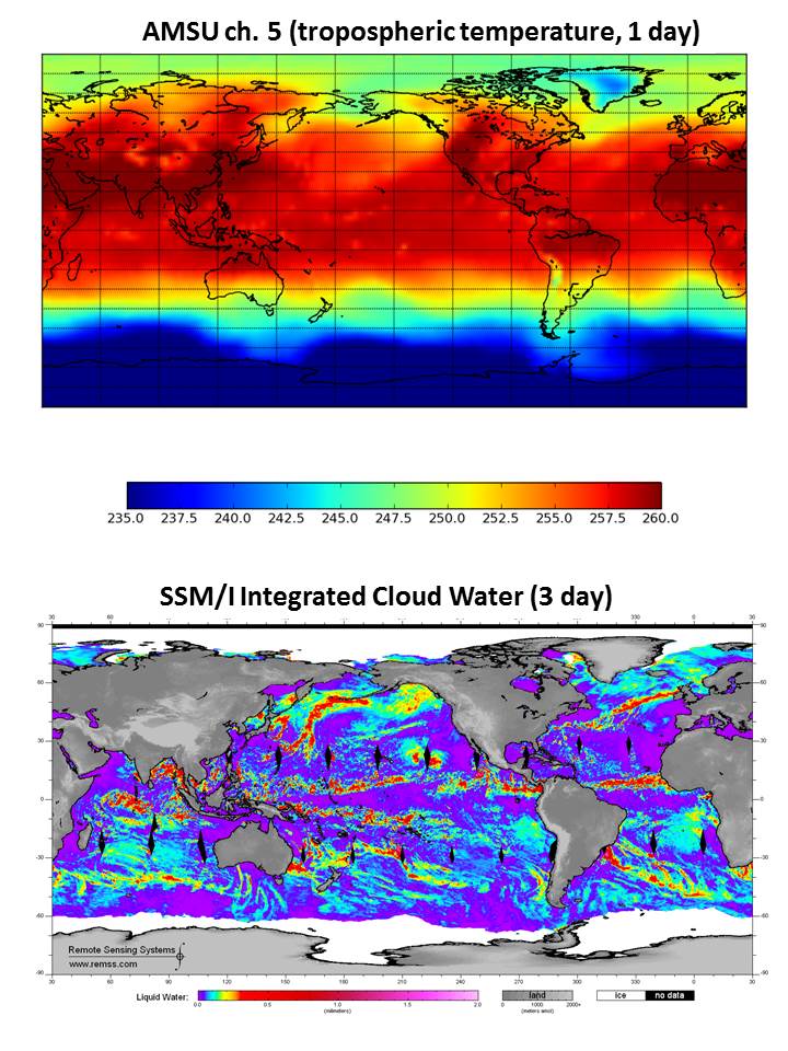
Fig. 1. One day of AMSU limb-corrected ch. 5 brightness temperatures (top), and the corresponding SSM/I cloud water retrievals centered on the same day (August 6, 1998).
As can be seen, the contamination of AMSU5 by cloud and precipitation systems is small, with slight cooling in deep convective areas, and no obvious cloud water contamination elsewhere (cirrus clouds are essentially transparent at this microwave frequency).
And even if there is contamination, what matters for tropospheric temperature trends isn�t the average level of contamination, but whether there are trends in that contamination. Below I will discuss new estimates of both the average contamination, as well as the effect on tropospheric temperature trends.
The fact that our monthly gridpoint radiosonde validation shows an extremely high level of agreement with the satellite further supports our assumption that such contamination is small. Nevertheless, it is probably worth revisiting the cloud-contamination issue, since the satellite temperature trends are significantly lower than the surface temperature trends, and any potential source of error is worth investigating.
What Weng et al. add to the discussion is the potential for spurious warming effects in AMSU ch. 5 of cloud water not associated with heavy precipitation, something which we did not address 18 years ago. While these warming influences are much weaker than the cooling effects of precipitation systems (as can be seen in the above imagery), cloud water is much more widespread, and so its influence on global averages might not be negligible.
The Weng et al Results Versus Ours (UAH)
I�m going to go ahead and give the final result up front for those who don�t want to wade through the details.
Weng et al. restrict their analysis to 13 years (1998-2010) of data from one satellite, NOAA-15, and find a spurious cooling effect from cloud contamination in the middle latitudes, with little effect in the tropics. (They don�t state how they assume their result based upon 13 years, even if it was correct, can be applied to 35+ years of satellite data.) I�ve digitized the data in their Fig. 8, so that I can compare to our results (click image for full size):
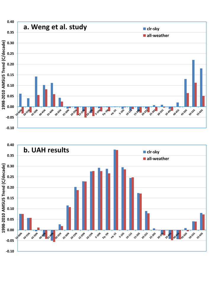
Fig. 2. Oceanic trends by latitude band in AMSU5 during late 1998 to mid-2010 in the Weng et al. study (top) and our own calculations (bottom), for “all-weather” and “clear-sky” conditions.
There are two main points to take away from this figure. First, the temperature trends they get at different latitudes for 1998-2010 are VERY different from what we get, even in the �all-weather� case, which is simply including all ocean data whether cloud-contaminated or not. The large warming signal we get in the tropics is fully expected for this limited period, which starts during a very cool La Nina event, and ends during a very warm El Nino event.
I have spent most of this week slicing and dicing the data different ways, and I simply do not see how they could have gotten the near-zero trends they did in the tropics and subtropics. I suspect some sort of data processing error.
The second point (which was the main point of their paper) is the difference in �clear-sky� versus �all-weather� trends they got in the middle latitudes, which is almost non-existent in our (UAH) results. While they estimate up to a 30% spurious cooling of warming trends from cloud contamination, we estimate a global ocean average spurious cooling of only -0.006 deg. C/decade for 1998-2010 from not adjusting for cloud-contaminated data in our operational product. Most of this signal is probably related to the large change in cloud conditions going from La Nina to El Nino, and so it would likely be even less for the 36+ year satellite record.
While I used a different method for identifying and removing cloud contamination (I use localized warm spots in AMSU ch. 3, they use a retrieval scheme using AMSU ch. 1 & 2), I get about the same number of data screened out (40%) as they do (20%-50%), and the geographic distribution of my identified cloud and precip. systems match known regional distributions. So I don’t see how different cloud identification methodologies can explain the differences. I used AMSU prints 10-21 (like our operation processing), as well as their restricted use of just prints 15 & 16, and got nearly the same results, so that can’t explain the discrepancy, either.
I have many more plots I�m not showing relating to how cloud systems in general: (1) do indeed cause a small average warming of the AMSU5 measurements (by up to 0.1 deg. C); (2) less frequent precipitation systems cause localized cooling of about 1 deg. C; (3) how these effects average out to much smaller influences when averaged with non-contaminated data; and most importantly (4) the trends in these effects are near zero anyway, which is what matters for climate monitoring.
We are considering adding an adjustment for cloud contaminated data to a later version of the satellite data. I�ve found that a simple data replacement scheme can eliminate an average of 50% of the trend contamination (you shouldn’t simply throw away all cloud-influenced data…we don’t do that for thermometer data, and it could cause serious sampling problems); the question we are struggling with is whether the small level of contamination is even worth adjusting for.