Archive for March, 2020

The UAH Global Temperature Dataset at 30 Years: A Look Back at the Early Days

Monday, March 30th, 2020

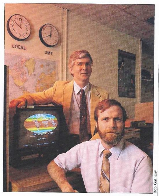
Today (Monday, March 30) is the 30th anniversary of our publication in Science describing the first satellite-based dataset for climate monitoring.

While much has happened in the last 30 years, I thought it might be interesting for people to know what led up to the dataset’s development, and some of the politics and behind-the-scenes happenings in the early days. What follows is in approximate chronological order, and is admittedly from my own perspective. John Christy might have somewhat different recollections of these events.

Some of what follows might surprise you, some of it is humorous, and I also wanted to give credit to some of the other players. Without their help, influence, and foresight, the satellite temperature dataset might never have been developed.

Spencer & Christy Backgrounds

In the late 1980s John Christy and I were contractors at NASA/MSFC in Huntsville, AL, working in the Atmospheric Sciences Division where NASA managers and researchers were trying to expand beyond their original mission, which was weather support for Space Shuttle launches. NASA/MSFC manager Gregory S. Wilson was a central figure in our hiring and encouragement of our work.

I came from the University of Wisconsin-Madison with a Ph.D. in Meteorology, specializing in the energetics of African easterly waves (the precursors of most Atlantic hurricanes). I then did post-doc work there in the satellite remote sensing of precipitation using microwave radiometers. John Christy received his Ph.D. in Atmospheric Science from the University of Illinois where he did his research on the global surface atmospheric pressure field. John had experience in analyzing global datasets for climate research, and was hired to assist Pete Robertson (NASA) to assist in data analysis. I was hired to develop new microwave satellite remote sensing projects for the Space Shuttle and the Space Station.

James Hansen’s Congressional Testimony, and Our First Data Processing

In 1988, NASA’s James Hansen testified for then-Senator Al Gore, Jr., testimony which more than any single event thrust global warming into the collective consciousness of society. We were at a NASA meeting in New Hampshire. As I recall, UAH’s Dick McNider on the plane ride up had just read a draft of a paper by Kevin Trenberth given to him by John Christy (who had been a Trenberth student) that discussed many issues with the sparse surface temperature data for detecting climate change.

During lunch Dick asked, given all the issues with the lack of global coverage and siting issues with surface data sets discussed by Trenberth, if there wasn’t satellite data that could be used to investigate Hansen’s global claims? NASA HQ manager James Dodge was there and expressed immediate interest in funding such a research project.

I said, yes, such data existed from the NOAA/NASA/JPL Microwave Sounding Unit (MSU) instruments, but it would be difficult to access approximately 10 years of global data. Note that this was before there was routine internet access to large digital datasets, and ordering data from the government had a very large price tag. No one purchased many years of global data; it came on computer 6250 bpi computer tapes each containing approximately 100 MB of data, and computers then were pretty slow. The data we wanted was from NOAA satellites, and NOAA would reuse these large (10.5 inch) IBM tapes rather than to keep the old data tapes around using up storage space.

It turns out that Roy Jenne who worked data systems at the NSF’s National Center for Atmospheric Research (NCAR) in Boulder had years before taken it upon himself to archive the old NOAA satellite data before it was lost altogether. He kept the data on a “mass storage system” (very large and inefficient by today’s standards) and I believe it was Greg Wilson who John Christy made the connection to gain us access to those data.

We obtained somewhat less than 10 years of data from NCAR, and I decided how to best calibrate it and average it into a more manageable space/time resolution. I had frequent contact with JPL engineers who built the MSU instruments, Fred Soltis in particular, who along with Norman Grody at NOAA provided me with calibration data for the MSU instruments flying on different satellites.

We enlisted John Christy to analyze those data since he brought considerable experience with diagnosing global datasets for climate purposes. One of the first things John discovered was from comparing global averages from different satellites in different orbits: They gave surprisingly similar answers in terms of year-to-year temperature variability. This was quite unexpected and demonstrated that the MSU instruments had high calibration stability, at least over a few years. It also demonstrated that NOAA’s practice of adjusting satellite data with radiosondes (weather balloons) was backwards: the differences others had seen between the two systems were due to poor spatial sampling by the radiosondes, not due to changes in the satellite calibration stability.

In addition to the critical historical data archived by Roy Jenne at NCAR, we would some of the more recent satellite data that was kept at NOAA. We didn’t have quite ten years of data, and an editor at Science magazine wanted ten full years of data before they would publish our first findings. We were able to order more data from NOAA to get the first 10 years’ worth (1979 through 1988), and Science accepted our paper.

The NASA Press Conference

On March 29, 1990 we held a “media availability” at the communications center at NASA/MSFC. For some reason, NASA would not allow it to be called a full-fledged “press conference”. As I recall, attendance was heavy (by Huntsville standards) and there was no place for me to park but in the grass, for which I was awarded a parking ticket by NASA security. JPL flew a remaining copy of the MSU instrument in as a prop; it had its own seat on a commercial flight from Pasadena.

Jay Leno would later mention our news conference in his monologue, and Joan Lunden covered it on Good Morning America. While we watched Ms. Lunden on a monitor the next morning, a NASA scientist remarked that he was too distracted by her long, slender legs to listen to what she was saying.

Our 1990 Senate Testimony for Gore

After we published our first research results on March 30,1990, we received an invitation to testify for Al Gore in a Senate committee hearing in October, 1990 on the subject of coral bleaching. Phil Jones from the University of East Anglia was also there to testify.

As people filed into the hearing room, I saw a C-SPAN camera being set up, and having noticed that Al Gore seemed to be the only committee member in attendance, I asked the cameraman about the lack of interest from other senators. He said something like, “Oh, Senator Gore likes it this way… he gets all the media attention.”

We still used overhead projectors back then with view graphs, and I thought I’d better check out the equipment. The projector turned out to be seriously out-of-focus, and the focus adjustment on the arm would not fix it. I remember thinking to myself, “this seems pretty shoddy for Congress”.

Senator Gore launched into some introductory remarks while looking at me as I struggled with the projector. From his comments, he was obviously assuming I was Phil Jones (who was supposed to go first, and who Gore said he had previously visited in England). I thought to myself, this is getting strange. Just in time, I realized the projector arm was bent slightly out of alignment, I bent it back, and took my seat while Phil Jones presented his material.

Our testimony, which was rather uneventful, led to the traditional letter of thanks from Gore for supporting the hearing. In that letter, Gore expressed interest in additional results as they became available.

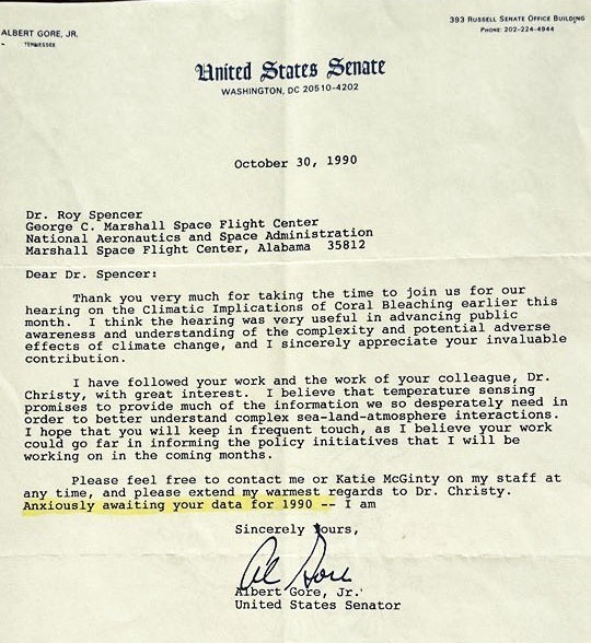
So, when it came time to get the necessary additional satellite data out of NOAA, I dropped Gore’s name to a manager at NOAA who suddenly became interested in providing everything they had to us at no charge… rather than us having to pay tens of thousands of our research dollars.

Hundreds of Computer Tapes and an Old Honda Civic

It might seem absurd to today’s young scientists, but it was not an easy task to process large amounts of digital data in the late 1980s. I received box after box of 9-track computer tapes in the mail from NOAA. Every few days, I would load them up in my old, high-mileage, barely-running 2-door Honda Civic and cart them over to the computer center at MSFC.

NASA’s Greg Wilson had gotten permission to use the computer facility for the task. At that time, most of the computer power was being taken up by engineers modeling the fuel flows within the Space Shuttle main engines. As I added more data and processed it, I would pass the averages on to John Christy who would then work his analysis magic on them.

I don’t recall how many years we would use this tape-in-the-mail ordering system. Most if not all of those tapes now reside in a Huntsville landfill. After many years of storage and hauling them from one office location to another during our moves, I decided there was no point in keeping them any longer.

A Call from the White House, and the First Hubble Space Telescope Image

Also in 1990, John Sununu, White House Chief of Staff to President George H. W. Bush, had taken notice of our work and invited us to come up to DC for a briefing.

We first had to bring the NASA Administrator V. Adm. Richard Truly up to speed. Truly was quite interested and was trying to make sure he understood my points by repeating them back to me. In my nervousness, I was apparently interrupting him by finishing his sentences, and he finally told me to “shut up”. So, I shut up.

The next stop was the office of the Associate Administrator, Lennard Fisk. While we were briefing Fisk, an assistant came in to show him the first image just collected by the Hubble Space Telescope (HST). This was before anyone realized the HST was miss-assembled and was out of focus. In retrospect, it was quite a fortuitous coincidence that we were there to witness such an event.

As the day progressed, and no call was coming in from the White House, Dr. Fisk seemed increasingly nervous. I was getting the impression he really did not want us to be briefing the White House on something as important as climate change. In those days, before NASA’s James Hansen made it a habit, no scientists were allowed to talk to politicians without heavy grooming by NASA management.

As the years went by, we would learn that the lack of substantial warming in the satellite data was probably hurting NASA’s selling of ‘Mission to Planet Earth’ to Congress. The bigger the perceived problem, the more money a government agency can extract from Congress to research the problem. At one point a NASA HQ manager would end up yelling at us in frustration for hurting the effort.

Late in the afternoon the call finally came in from the White House for us to visit, at which point Dr. Fisk told them, “Sorry, but they just left to return to Huntsville”, as he ushered us out the door. Dr. Wilson swore me to secrecy regarding the matter. (I talked with John Sununu at a Heartland Institute meeting a few years ago but forgot to ask him if he remembered this course of events). This would probably be – to me, at least – the most surreal and memorable day of our 30+ years of experiences related to the satellite temperature dataset.

After 1990

In subsequent years, John Christy would assume the central role in promoting the satellite dataset, including extensive comparisons of our data to radiosonde data, while I spent most of my time on other NASA projects I was involved in. But once a month for the next 30 years, we would process the most recent satellite data with our separate computer codes, passing the results back and forth and posting them for public access.

Only with our most recent Version 6 dataset procedures would those codes be entirely re-written by a single person (Danny Braswell) who had professional software development experience. In 2001, after tiring of being told by NASA management what I could and could not say in congressional testimony, I resigned NASA and continued my NASA projects as a UAH employee in the Earth System Science Center, for which John Christy serves as director (as well as the Alabama State Climatologist).

At this point, neither John nor I have retirement plans, and will continue to update the UAH dataset every month for the foreseeable future.

COVID-19 Deaths in Europe: Excess Mortality is – DOWN?

Sunday, March 29th, 2020

Given the global hysteria over the spread COVID-19, you might be excused if you are very surprised to learn that the most recent week of mortality data in the EU shows an actual decline from what is expected for this time of year.

In the coming months there will be an increasing debate over whether the virtual shutdown of our economy was warranted given the threat of the latest form of the coronavirus, SARS-CoV-2. While there are still large uncertainties about how fast it spreads and how lethal it is (statistically, those are inversely related), I suspect we will ultimately realize that our response might well have done more harm than good to society as a whole.

This is mainly because poverty is the leading cause of premature death in the world, and shutting down the economy leads to premature death for a multitude of reasons related to poverty. In the extreme example, you could save lives in the short run by keeping everyone at home, but in the long run we would all starve to death.

But that is not the main subject of this post.

A couple weeks ago I started expressing the opinion on social media that if our reaction to the spread of COVID-19 turns out to be overdone, it might end up having the unexpected consequence of reducing total virus-related mortality.

Let me explain.

As I am sure you are aware, seasonal flu is a global killer, with 300,000 to 650,000 deaths on average each year, mainly among the elderly and those with pre-existing health conditions. At this writing, COVID-19 has killed 10% or less of that number. (Yes, I realize that number might have been considerably higher if not for our response).

Here’s the point: It might well be that the increased level of hand-washing, sanitizing, and social distancing we have exercised might save more lives from reducing influenza-A and -B that were lost to COVID-19, and that net virus-related mortality might go down this season.

I personally became more careful about not spreading germs several years ago. No so much for myself (I have a pretty strong immune system) but so I would not carry disease home to my family members. I carry antibacterial wipes in my car and use them religiously. We are hearing more and more now about how such habits can help prolong the lives of those around us who are elderly or have compromised immune systems.

Now, recent results from Europe suggest that the COVID-19 response might be having the unintended benefit of saving total lives. This is all very preliminary, I realize, and that coming weeks might see some change in that picture. But it is worth thinking about.

Early Results from Europe

Every week (on Thursday) the Euro MOMO project (European MOnitoring of excess MOrtality) publishes a report of mortality statistics across the EU, including stratification by age group. The latest report (which I believe includes data through March 24, but I am not sure) shows (green line) no uptick in total mortality from the assumed baseline (red line). In fact, it’s a little below that line (they also account for missing and late reports).

Amazingly, this flu season is seen to be surprisingly mild compared to previous flu seasons in the EU. On the chart I have also indicated the number of reported COVID-19 deaths in the most recent week, around 7,000.

Why do we not see an uptick on the chart? The charts for individual countries do show an up-tick for Italy (for example), but not unlike what was seen in previous flu seasons.

The report itself provides two or three possible explanations, none of which are particularly satisfying. Read it yourself and tell me it doesn’t sound like the people writing the report are also somewhat mystified. They don’t mention what I am discussing here.

So, the chart begs at least two questions:
1) Are the effects of practicing increased hygiene in response to COVID-19 saving more lives that would have been lost to seasonal flu deaths, than are being lost to COVID-19 itself?
2) Why are we not outraged and deathly afraid of the seasonal flu (-A and -B), given the widespread death that routinely occurs from those viruses that come around each season?

You might claim, “It’s because COVID-19 can kill anyone, not just the elderly.” Well, that’s true of the seasonal flu, as well. The case of an apparently healthy 44-year-old Texas man who recently died of COVID-19 probably scares many people, but according to the CDC approximately 5 “healthy” young people a day in the U.S. under the age of 25 die from sudden cardiac arrest. Maybe that Texas man had an underlying health condition that was previously undiagnosed. Unless they do an autopsy, and the family reveals the results, we will never know.

And, you might well think of other reasons why EU deaths have not experienced an uptick yet. Human behavior involves many confounding variables. I’m just mentioning one potential reason I am not seeing discussed.

I am not trying to minimize the deaths due to COVID-19. I’m trying to point out that if we are fearful of death from COVID-19, we should be even more concerned about the seasonal flu (many people are saying this), and that one benefit of the current experience might be that people will be more mindful about avoiding the spread of viruses in the future.

Is the COVID-19 Economic Downturn Affecting Atmospheric CO2? Mauna Loa Data Say, Not Yet

Sunday, March 22nd, 2020

Some global warming alarmists are celebrating the current economic downturn as just what is needed to avert climate catastrophe. I’ve seen a couple estimates that China’s manufacturing and commerce might have seen up at 40% reduction recently.

The current global crisis will be a test of just how much economic pain is required to substantially reduce CO2 emissions (assuming there is no reasonably affordable and practical replacement for fossil fuels).

I already know that some of my “deep skeptic” acquaintances (you know who you are) who believe the global CO2 increase is mostly natural will claim a continuing CO2 rise in the face of a decrease in economic activity supports their case. I have previously shown that a simple model of the CO2 variations since 1959 forced with anthropogenic emissions accurately explain the Mauna Loa observations (see Fig. 2 , explanation here). It will take considerable evidence to convince me that the long-term rise is not anthropogenic, and maybe the current “coronavirus experiment” will provide some contrarian evidence.

Of course, for anthropogenic CO2 emissions reductions to have any effect, they actually have to show up in the atmosphere. The most widely cited monitoring location for CO2 is on Mauna Loa in Hawaii. It is at high elevation in a persistent subtropical high pressure zone that should be able to detect large emissions changes in several weeks time as weather systems move around the world.

I’ve had several requests, and seen numerous social media comments, suggesting this is something that should be looked at. So, I’ve analyzed the Mauna Loa CO2 data (updated monthly) through February 2020 to see if there is any hint of a CO2 concentration downturn (or, more accurately, reduced rate of rise).

The short answer is: No… at least not yet.

The Mauna Loa Data: Removing Seasonal and ENSO Effects

While an anthropogenic source of CO2 can explain the long-term rise in CO2, the trouble with finding an anthropogenic signal on time scale of a few months to a couple years is that natural variations swamp any anthropogenic changes on short time scales.

The monthly data (arbitrarily starting 1996, below) shows a continuing long-term rise that has been occurring since monitoring began in 1958. Also seen is the strong seasonal cycle as the vegetation in the Northern Hemisphere goes through its normal seasonal variations in growth and decay.

Obviously, not much can be discerned from the raw monthly average data in the above plot because the seasonal cycle is so strong. So, the first step is to remove the seasonal cycle. I did this by subtracting out a 4th order polynomial fit before removing the average seasonal cycle, then adding that statistical fit back in:

Next, there are some wiggles in the data due to El Nino and La Nina (ENSO) activity, and if we remove an average statistical estimate of that (a time lag and averaging is involved to increase signal), we can get a little better idea of whether the most recent month (February 2020) is out of the ordinary. I have zeroed in on just the most recent 5 years for clarity.

The polynomial fit to the data (thin dotted line) shows what we might expect for the coming months, and we can see that February is not yet departing from the expected values.

Of course, there are a variety of natural variations that impact global average CO2 on a month-to-month basis: Interannual variations in wildfire activity, land vegetation and sea surface temperatures, variations in El Nino and La Nina effects, and short-term fluctuations in anthropogenic emissions immediately come to mind. (The Pinatubo and El Chichon volcano eruptions actually caused a reduction in global CO2, probably due to post-eruption vegetation effects from an increase in diffuse sunlight penetration of forest canopies).

I will try to update this analysis every month as long as the issue is of sufficient interest.

Hydroxychloroquine Now Being Advocated to Fight Coronavirus; Trump Supporting?

Wednesday, March 18th, 2020

Now this is getting interesting!

Tucker Carlson is, as I type, interviewing one of the COVID-19 researchers from Stanford, who is quoting the new French study that shows (he says) a 100% cure rate using hydroxychloroquine. (I don’t know if my pestering of my contact at FoxNews helped instigate the coverage, I sent him the earlier Stanford-led research report that use China and S. Korea results with the drug).

The Stanford researcher said that Trump has authorized mass buys (I think that’s what he said) of the drug.

Here’s the website with the latest results. Could be a Big Let-Down for Big Pharma, which I’m sure wants to produce a variety of treatments and vaccines.

I expect this story will evolve rapidly in the coming days.

https://www.covidtrial.io/

Some COVID-19 vs. Malaria Numbers: Countries with Malaria have Virtually no Coronavirus Cases Reported

Wednesday, March 18th, 2020

…and countries with many COVID-19 cases have little to no malaria.

This subject has been making the rounds in recent days, much more in social media and lesser-known news outlets and not so much the mainstream media…

There is now considerable evidence from several countries (China, S. Korea, France, others?) that anti-malarial drugs, especially chloroquine, is effective at greatly reducing COVID-19 symptoms, and possibly preventing infection in the first place.

I downloaded the latest COVID-19 reported cases by country from the WHO as well as the incidence of malaria cases as of 2017. I calculated the COVID-19 incidence as the number per million total population, while the malaria numbers are reported per 1,000 “population at risk”.

It took a few hours to line everything up in Excel because of differences in naming of a few countries, no malaria data for countries where malaria has been essentially eradicated, and many countries where no COVID-19 cases have been reported.

I only have time to give some interesting bottom-line numbers. I encourage others to investigate this for themselves to see if the relationships are real.

If I sort all 234 countries by incidence of malaria, and compute the average incidence of malaria and the average incidence of COVID-19, the results are simply amazing: those countries with malaria have virtually no COVID-19 cases, and those countries with many COVID-19 cases have little to no malaria.

Here are the averages for the three country groupings:

Top 40 Malaria countries:

212.24 malaria per thousand = 0.2 COVID-19 cases per million

Next 40 Malaria countries:

7.30 malaria per thousand = 10.1 COVID-19 cases per million

Remaining 154 (non-)Malaria countries:

0.00 malaria per thousand = 68.7 COVID-19 cases per million

I tried plotting the individual country data on a graph but the relationship is so non-linear (almost all of the data lie on the horizontal and vertical axes) that the graph is almost useless.

This is based upon the total number of COVID-19 cases as of March 17, 2020 as tallied by the WHO.

Comments on Dr. Ollila’s Claims that Greenhouse Effect Calculations Violate Energy Conservation

Thursday, March 12th, 2020

Once again I am being drawn into defending the common explanation of Earth’s so-called “greenhouse effect” as it is portrayed by the IPCC, textbooks, and virtually everyone who works in atmospheric radiation and thermodynamics.

To be clear, I am not defending the IPCC’s predictions of future climate change… just the general explanation of the Earth’s greenhouse effect, which has a profound influence on global temperatures as well as on weather.

As we will see, much confusion arises about the greenhouse effect due to its complexity, and the difficulty in expressing that complexity accurately with words alone. In fact, the IPCC’s greenhouse effect “definition” quoted by Dr. Ollila is incomplete and misleading, as anyone who understands the greenhouse effect should know.

As we will see, in the case of something as complicated as the greenhouse effect, a simplified worded definition should never be the basis for quantitative calculations; instead, complicated calculations are sometimes only poorly described with words.

What is the “Greenhouse Effect”?

Descriptions of the Earth’s natural greenhouse effect are unavoidably incomplete due to its complexity, and even misleading at times due to ambiguous phrasing when trying to express that complexity.

The complexity arises because the greenhouse effect involves every cubic meter of the atmosphere having the ability to both absorb and emit infrared (IR) energy. (And almost never are the rates of absorption and emission the same, contrary to the claims of many skeptics – IR emission is very temperature-dependent, while absorption is not).

While essentially all the energy for this ultimately comes from absorbed sunlight, the infrared absorption and re-radiation by air (and by clouds in the atmosphere) makes the net impact of the greenhouse effect on temperatures somewhat non-intuitive. The emission of this invisible radiation by everything around us is obviously more difficult to describe than the single-source Sun.

The ability of air and clouds to absorb and emit IR radiation has profound impacts on energy flows and temperatures throughout the atmosphere, leading to the multiple infrared energy flow arrows (red) in the energy budget diagram originally popularized by Kiehl & Trenberth (Fig. 1).

Fig. 1. Global- and time-averaged (day+night and through the seasons) primary energy flows between the surface, atmosphere, and space (NASA). If there was no atmosphere, there would be a single yellow arrow reaching the surface, and a single red arrow extending from the surface to outer space, representing equal magnitudes of absorbed solar and emitted infrared energy, respectively.

[As an aside, contrary to the claims of the 2010 book Slaying the Sky Dragon: Death of the Greenhouse Gas Theory, this simplified picture of the average energy flows between the Earth’s surface, atmosphere, and space is NOT what is assumed by climate models. Climate models use the relevant physical processes at every point on three-dimensional grid covering the Earth, with day-night and seasonal cycles of solar illumination. The simplified energy budget diagram is instead the best-estimate of the global average energy flows based upon a wide variety of observations, model diagnostics, and the assumption of no natural long-term climate change.]

If the Earth had no atmosphere (like the Moon), the surface temperature at any given location would be governed by the balance between the rate of absorbed solar energy and the loss of thermally-emitted infrared (IR) radiation. The sun would heat the surface to a temperature where the emitted IR radiation balanced the absorbed solar radiation, and then the temperature would stop increasing. This general concept of energy balance between energy gain and energy loss is involved in determining the temperature of virtually anything you can think of.

But the Earth does have an atmosphere, and the atmosphere both absorbs and emits IR radiation in all directions. “Greenhouse gases” (primarily water vapor, but also carbon dioxide) provide most of this function, and any gain or loss of an IR photon by a GHG molecule is almost immediately felt by the non-radiatively active gases (like nitrogen and oxygen) through molecular collisions.

If we were to represent these infrared energy flows in Fig. 1 more completely, there would be a nearly infinite number of red arrows, both upward and downward, connecting every vanishingly-thin layer of atmosphere with every other vanishingly thin layer. Those are the flows that are happening continuously in the atmosphere.

The most important net impact of the greenhouse effect on terrestrial temperatures is this:

The net effect of a greenhouse atmosphere is that it keeps the lower atmospheric layers (and surface) warmer, and the upper atmosphere colder, than if the greenhouse effect did not exist.

I have often called this a “radiative blanket” effect.

Interestingly, without the greenhouse effect, the upper layers of the troposphere would not be able to cool to outer space, and weather as we know it (which depends upon radiative destabilization of the vertical temperature profile) would not exist. This was demonstrated by Manabe & Strickler (1964) who calculated that, without convective overturning, the pure radiative equilibrium temperature profile of the troposphere is very hot at the surface, and very cold in the upper troposphere. Convective overturning in the atmosphere reduces this huge temperature ‘lapse rate’ by about two-thirds to three-quarters, resulting in what we observe in the real atmosphere.

Dr. Ollila’s Claims

The latest installment of what I consider to be bad skeptical science regarding the greenhouse effect comes from emeritus professor of environmental science, Dr. Antero Ollila, who claims that the energy budget diagram somehow violates the 1st Law of Thermodynamics, i.e., conservation of energy, at least in terms of how the greenhouse effect is quantified.

His article is entitled, How The IPCC’s Greenhouse Definition Violates the Physical Law of Conservation of Mass & Energy. He uses a modified version (Fig. 2) of the Kiehl-Trenberth diagram:

Fig. 2. Dr. Ollila’s version of the global energy budget diagram.

It should be noted that these global average energy budget diagrams do indeed conserve energy in their total energy fluxes at the top-of-atmosphere (the climate system as a whole), as well as for the surface and atmosphere, separately. If you add up these energy gain and loss terms you will see they are equal, which must be the case for any system with a stable temperature over time.

But what Dr. Ollila seems to be confused about is what you can physically and quantitatively deduce about the greenhouse effect when you start combining energy fluxes in that diagram. Much of the first part of Dr. Ollila’s article is just fine. His objection to the diagram is introduced with the following statement, which those who hold similar views to his will be triggered by:

The obvious reason for the GH effect seems to be the downward infrared radiation from the atmosphere to the surface and its magnitude is 345 W/m2. Therefore, the surface absorbs totally 165 (solar) + 345 (downward infrared from the atmosphere) = 510 W/m2.

At this point some of my readers (you know who you are) will object to that quote, and say something like, “But the only energy input at the surface is from the sun! How can the atmosphere add more energy to the system, when the sun is the only source of energy?” My reading of Dr. Ollila’s article indicates that that is where he is going as well.

But this is where the problem with ambiguous wording comes in. The atmosphere is not, strictly speaking, adding more energy to the surface. It is merely returning a portion of the atmosphere-absorbed solar, infrared, and convective transport energy back to the surface in the form of infrared energy.

As shown in Fig. 2, the surface is still emitting more IR energy than the atmosphere is returning to the surface, resulting in net surface loss of [395 – 345 =] 50 W/m2 of infrared energy. And, as previously mentioned, all energy fluxes at the surface balance.

And this is what our intuition tells us should be happening: the surface is warmed by sunlight, and cooled by the loss of IR energy (plus moist and dry convective cooling of the surface of 91 and 24 W/m2, respectively.) But the atmosphere’s radiative blanket reduces the rate of IR cooling from the warmer lower layers of the atmosphere to the upper cooler layers. This alteration of average energy flows by greenhouse gases and clouds alters the atmospheric temperature profile.

A related but common misunderstanding is the idea that the rate of energy input determines a system’s temperature. That’s wrong.

Given any rate of energy input into a system, the temperature will continue to increase until temperature-dependent energy loss mechanisms equal the rate of energy input. If you don’t believe it, let’s look at an extreme example.

Believe it or not, the human body generates energy through metabolism at a rate that is 8,000 time greater than what the sun generates, per kg of mass. But the human body has an interior temperature of only 98.6 deg. F, while the sun’s interior temperature is estimated to be around 27,000,000 deg. F. This is a dramatic example that the rate of energy *input* does not determine temperature: it’s the balance between the rates of energy gain and energy loss that determines temperature.

If energy has no efficient way to escape, then even a weak rate of energy input can lead to exceedingly high temperatures, such as occurs in the sun. I have read that it takes thousands of years for energy created in the core of the sun from nuclear fusion to make its way to the sun’s surface.

Since this is meant to be a critique of Dr. Ollila’s specific arguments let’s return to them. I just wanted to first address his central concern by explaining the greenhouse effect in the best terms I can, before I confuse you with his arguments. Here I list the main points of his reasoning, in which I reproduce the first quote from above for completeness:

[begin quote]

The obvious reason for the GH effect seems to be the downward infrared radiation from the atmosphere to the surface and its magnitude is 345 Wm-2. Therefore, the surface absorbs totally 165 + 345 = 510 Wm-2….

The difference between the radiation to the surface and the net solar radiation is 510 – 240 = 270 Wm-2...

The real GH warming effect is right here: it is 270 Wm-2 because it is the extra energy warming the Earth’s surface in addition to the net solar energy.

The final step is that we must find out what is the mechanism creating this infrared radiation from the atmosphere. According to the IPCC’s definition, the GH effect is caused by the GH gases and clouds which absorb infrared radiation of 155 Wm-2 emitted by the surface and which they further radiate to the surface.

As we can see there is a problem – and a very big problem – in the IPCC’s GH effect definition: the absorbed energy of 155 Wm-2 cannot radiate to the surface 345 Wm-2 or even 270 Wm-2. According to the energy conversation law, energy cannot be created from the void. According to the same law, energy does not disappear, but it can change its form.

From Figure (2) it is easy to name the two other energy sources which are needed for causing the GH effect namely latent heating 91 Wm-2 and sensible heating 24 Wm-2, which make 270 Wm-2 with the longwave absorption of 155 Wm-2.

When the solar radiation absorption of 75 Wm-2 by the atmosphere will be added to these three GH effect sources, the sum is 345 Wm2. Everything matches without the violation of physics. No energy disappears or appears from the void. Coincidence? Not so.

Here is the point: the IPCC’s definition means that the LW absorption of 155 Wm-2 could create radiation of 270 Wm-2 which is impossible.

[end quote]

Now, I have spent at least a couple of hours trying to follow his line of reasoning, and I cannot. If Dr. Ollila wanted to claim that the energy budget numbers violate energy conservation, he could have made all of this much simpler by asking the question, How can 240 W/m2 of solar input to the climate system cause 395 W/m2 of IR emission by the surface? Or 345 W/m2 of downward IR emission from the sky to the surface? ALL of these numbers are larger than the available solar flux being absorbed by the climate system, are they not? But, as I have tried to explain from the above, a 1-way flow of IR energy is not very informative, and only makes quantitative sense when it is combined with the IR flow in the opposite direction.

If we don’t do that, we can fool ourselves into thinking there is some mysterious and magical “extra” source of energy, which is not the case at all. All energy flows in these energy budget diagram have solar input as the energy source, and as energy courses through the climate system, they all end up balancing. There is no violation of the laws of thermodynamics.

Is There an Energy Flux Measure of the Greenhouse Effect?

One of the problems with Dr. Ollila’s reasoning is that there really isn’t any of these unidirectional energy fluxes (or combinations of energy fluxes, such as 155, or 270, or 345 W/m2) that can be called a measure of the greenhouse effect. The average unidirectional energy fluxes are what exist after the surface and atmosphere have readjusted their temperature and humidity structures (as well as after the sensible and latent convective heat transports get established).

Even the oft-quoted 33 deg. C of warming isn’t a measure of the greenhouse effect… it’s the resulting surface warming after convective heat transports have cooled the surface. As I recall, the true, pure radiative equilibrium greenhouse effect on surface temperature (without convective heat transports) would double or triple that number.

If the atmospheric radiative energy flows are too abstract for you, let’s use the case of a house heated in the winter. On an average cold winter day, I compute from standard sources that the heating unit in the average house leads to a loss of energy through the walls, ceiling, and floor of about 10 W/m2 (just take the heater input in Watts [around 5,000 Joules/sec] and divide by the surface area of all house exterior surfaces [ around 500 sq. meters]).

But compare that 10 W/m2 of energy flow though the walls, ceiling, and floor to the inward IR emission by the exterior walls, which (it is easy to show) emit an IR flux toward the center of the house that is about 100 W/m2 greater than the outward emission by the outside of the walls. That ~100 W/m2 difference in outward versus inward IR flux is still energetically consistent with the 10 W/m2 of heat flow outward through the walls.

This seeming contradiction is resolved (just as in the case of Earth’s surface energy budget) when we realize that the NET (2-way) infrared flux at the inside surface of the exterior walls is still outward, because that wall surface will be slightly colder than the interior of the house, which is also emitting IR energy toward the outside walls. Talking about the IR flux in only one direction is not very quantitatively useful by itself. There is no magical and law-violating creation of extra energy.

Concluding Comments

If you have managed to wade through the arguments above and understand most of them, congratulations. You now see how complicated the greenhouse effect is compared to, say, just sunlight warming the Earth’s surface. That complexity leads to imprecise, incomplete, and ambiguous descriptions of the greenhouse effect, even in the scientific literature (and the IPCC’s description).

The most accurate representation of the greenhouse effect is made through the relevant equations that describe the radiative (and convective) energy flows between the surface and the atmosphere. To express all of that in words would be nearly impossible, and the more accurate the wording, the more the reader’s eyes would glaze over.

So, we are left with people like me trying to inform the public on issues which I sometimes consider to be a waste of time arguing about. I only waste that time because I would like for my fellow skeptics to be armed with good science, not bad science.

[I still maintain that the simplest backyard demonstration of the greenhouse effect in action is with a handheld IR thermometer pointed at a clear sky at different angles, and seeing the warming of the thermometer’s detector as you scan from the zenith down to an oblique angle. That is the greenhouse effect in action.]

Australia Bushfire Smoke Now Warming the Lower Stratosphere?

Wednesday, March 4th, 2020
Fig. 1. Bushfire smoke flowing eastward from SE Australia on January 4, 2020 as seen from the International Space Station (NASA).

John Christy pointed out to me that our UAH lower stratosphere (“LS”) temperature product which has peak sensitivity at about 17 km (70 hPa pressure) has increased in the last 2 months to its warmest value since the post-Pinatubo period of warming (1991-93). This can be seen in the following plot of global average anomalies.

Fig. 2. UAH Version 6 global-average lower stratospheric (LS) temperature anomalies for January 1979 through February 2020.

At first I though we might be seeing warming from the mid-January eruption of Taal volcano in the Philippines, but even the much more massive mid-June 1991 eruption of Pinatubo did not show up in the LS temperatures until the month following the eruption, while we see evidence of warming in Fig. 2 in the same month as the Taal eruption.

NASA had previously reported that the smoke from the Australian bushfires had been detected in January as as high as 20-25 km, well into the stratosphere (see here, here, and here). The measurements come from the CALIPSO spacecraft which has a lidar instrument capable of accurate altitude measurements of aerosols.

The mechanism for the warming of the lower stratosphere by the smoke is some combination of direct solar heating of the smoke particles, and infrared (“greenhouse”) warming of the smoke layer, the latter being the mechanism that caused the warming after the eruptions of El Chichon and Pinatubo. The aerosol layer is very cold, and it intercepts infrared radiation from below and so warms slightly.

I will try to examine the specific latitude band (30S-60S) being affected in more detail, including temperature measurements from higher up (which we do not produce official products for). The difficulty is that there is considerable natural variation in the tropical and extra-tropical temperatures in the stratosphere which have a see-saw behavior due to variations in the strength of the Brewer-Dobson circulation. As a result, these stratospheric aerosol effects on temperature tend to show up best in global or nearly-global averages (Fig. 2, above) where such circulation induced changes average out.

UAH Global Temperature Update for February 2020: +0.76 deg. C

Monday, March 2nd, 2020

The Version 6.0 global average lower tropospheric temperature (LT) anomaly for February, 2020 was +0.76 deg. C, up considerably from the January, 2020 value of +0.57 deg. C.

This is the warmest monthly anomaly since March 2016 (+0.77 deg. C), and the warmest February since 2016 (+0.86 deg. C), both due to El Nino warmth. Continuing weak El Nino conditions are also likely responsible for the current up-tick in temperature, as I recently demonstrated here.

The linear warming trend since January, 1979 remains at +0.13 C/decade (+0.12 C/decade over the global-averaged oceans, and +0.18 C/decade over global-averaged land).

Various regional LT departures from the 30-year (1981-2010) average for the last 14 months are:

 YEAR MO GLOBE NHEM. SHEM. TROPIC USA48 ARCTIC AUST 
 2019 01 +0.38 +0.35 +0.41 +0.36 +0.53 -0.15 +1.15
 2019 02 +0.37 +0.47 +0.28 +0.43 -0.02 +1.04 +0.06
 2019 03 +0.35 +0.44 +0.25 +0.41 -0.55 +0.97 +0.59
 2019 04 +0.44 +0.38 +0.51 +0.54 +0.50 +0.92 +0.91
 2019 05 +0.32 +0.29 +0.35 +0.40 -0.61 +0.98 +0.39
 2019 06 +0.47 +0.42 +0.52 +0.64 -0.64 +0.91 +0.35
 2019 07 +0.38 +0.33 +0.44 +0.45 +0.11 +0.33 +0.87
 2019 08 +0.39 +0.38 +0.39 +0.42 +0.17 +0.44 +0.24
 2019 09 +0.62 +0.64 +0.59 +0.60 +1.14 +0.75 +0.57
 2019 10 +0.46 +0.64 +0.28 +0.31 -0.03 +0.99 +0.50
 2019 11 +0.55 +0.56 +0.54 +0.55 +0.21 +0.56 +0.38
 2019 12 +0.56 +0.61 +0.50 +0.58 +0.92 +0.66 +0.94
 2020 01 +0.57 +0.60 +0.53 +0.62 +0.73 +0.12 +0.66
 2020 02 +0.76 +0.96 +0.55 +0.76 +0.38 +0.02 +0.30

The UAH LT global gridpoint anomaly image for February, 2020 should be available in the next few days here.

The global and regional monthly anomalies for the various atmospheric layers we monitor should be available in the next few days at the following locations:

Lower Troposphere: http://vortex.nsstc.uah.edu/data/msu/v6.0/tlt/uahncdc_lt_6.0.txt
Mid-Troposphere: http://vortex.nsstc.uah.edu/data/msu/v6.0/tmt/uahncdc_mt_6.0.txt
Tropopause: http://vortex.nsstc.uah.edu/data/msu/v6.0/ttp/uahncdc_tp_6.0.txt
Lower Stratosphere: http://vortex.nsstc.uah.edu/data/msu/v6.0/tls/uahncdc_ls_6.0.txt