Comments on the New RSS Lower Tropospheric Temperature Dataset

July 6th, 2017 by Roy W. Spencer, Ph. D.

It was inevitable that the new RSS mid-tropospheric (MT) temperature dataset, which showed more warming than the previous version, would be followed with a new lower-tropospheric (LT) dataset. (Carl Mears has posted a useful FAQ on the new dataset, how it differs from the old, and why they made adjustments).

Before I go into the details, let’s keep all of this in perspective. Our globally-averaged trend is now about +0.12 C/decade, while the new RSS trend has increased to about +0.17 C/decade.

Note these trends are still well below the average climate model trend for LT, which is +0.27 C/decade.

These are the important numbers; the original Carbon Brief article headline (“Major correction to satellite data shows 140% faster warming since 1998”) is seriously misleading, because the warming in the RSS LT data post-1998 was near-zero anyway (140% more than a very small number is still a very small number).

Since RSS’s new MT dataset showed more warming that the old, it made sense that the new LT dataset would show more warming, too. Both depend on the same instrument channel (MSU channel 2 and AMSU channel 5), and to the extent that the new diurnal drift corrections RSS came up with caused more warming in MT, the adjustments should be even larger in LT, since the diurnal cycle becomes stronger as you approach the surface (at least over land).

Background on Diurnal Drift Adjustments

All of the satellites carrying the MSU and AMSU instruments (except Aqua, Metop-A and Metop-B) do not have onboard propulsion, and so their orbits decay over the years due to very weak atmospheric drag. The satellites slowly fall, and their orbits are then no longer sun-synchronous (same local observation time every day) as intended. Some of the NOAA satellites were purposely injected into orbits that would drift one way in local observation time before orbit decay took over and made them drift in the other direction; this provided several years with essentially no net drift in the local observation time.

Since there is a day-night temperature cycle (even in the deep-troposphere the satellite measures) the drift of the satellite local observation time causes a spurious drift in observed temperature over the years (the diurnal cycle becomes “aliased” into the long-term temperature trends). The spurious temperature drift varies seasonally, latitudinally, and regionally (depending upon terrain altitude, available surface moisture, and vegetation).

Because climate models are known to not represent the diurnal cycle to the accuracy needed for satellite adjustments, we decided long ago to measure the drift empirically, by comparing drifting satellites with concurrently operating non-drifting (or nearly non-drifting) satellites. Our Version 6 paper discusses the details.

RSS instead decided to use climate model estimates of the diurnal cycle, and in RSS Version 4 are now making empirical corrections to those model-based diurnal cycles. (Generally speaking, we think it is useful for different groups to use different methods.)

Diurnal Drift Effects in the RSS Dataset

We have long known that there were differences in the resulting diurnal drift adjustments in the RSS versus our UAH dataset. We believed that the corrections in the older RSS Version 3.3 datasets were “overdone”, generating more warming than UAH prior to 2002 but less than UAH after 2002 (some satellites drift one way in the diurnal cycle, other satellites drift in the opposite direction). This is why the skeptical community liked to follow the RSS dataset more than ours, since UAH showed at least some warming post-1997, while RSS showed essentially no warming (the “pause”).

The new RSS V4 adjustment alters the V3.3 adjustment, and now warms the post-2002 period, but does not diminish the extra warming in the pre-2002 period. Hence the entire V4 time series shows more warming than before.

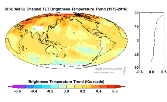
Examination of a geographic distribution of their trends shows some elevation effects, e.g. around the Andes in S. America (You have to click on the image to see V4 compared to V3.3…the static view below might be V3.3 if you don’t click it).

Gridpoint lower tropospheric temperature trends, 1979-2016, in the V3.3 versus V4 RSS datasets.

We also discovered this and, as discussed in our V6 paper, attributed it to errors in the oxygen absorption theory used to match the MSU channel 2 weighting function with the AMSU channel 5 weighting function, which are at somewhat different altitudes when viewing at the same Earth incidence angle (AMSU5 has more surface influence than MSU2). Using existing radiative transfer theory alone to adjust AMSU5 to match MSU2 (as RSS does) leads to AMSU5 still being too close to the surface. This affects the diurnal drift adjustment, and especially the transition between MSU and AMSU in the 1999-2004 period. The mis-match also can cause dry areas to have too much warming in the AMSU era, and in general will cause land areas to warm spuriously faster than ocean areas.

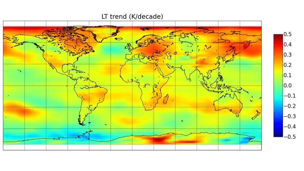
Here are our UAH LT gridpoint trends (sorry for the different map projection):

In general, it is difficult for us to follow the chain of diurnal corrections in the new RSS paper. Using a climate model to make the diurnal drift adjustments, but then adjusting those adjustments with empirical satellite data feels somewhat convoluted to us.

Final Comments

Besides the differences in diurnal drift adjustments, the other major difference affecting trends is the treatment off the NOAA-14 MSU, last in the MSU series. There is clear drift in the difference between the new NOAA-15 AMSU and the old NOAA-14 MSU, with NOAA-14 warming relative to NOAA-15. We assume that NOAA-14 is to blame, and remove its trend difference with NOAA-15 (we only use it through 2001) and also adjust NOAA-14 to match NOAA-12 (early in the NOAA-14 record). RSS does not assume one satellite is better than the other, and uses NOAA-14 all the way through 2004, by which point it shows a large trend difference with NOAA-15 AMSU. We believe this is a large component of the overall trend difference between UAH and RSS, but we aren’t sure just how much compared to the diurnal drift adjustment differences.

It should be kept in mind that the new UAH V6 dataset for LT uses three channels, while RSS still uses multiple view angles from one channel (a technique we originally developed, and RSS followed). As a result, our new LT weighting function is a little higher in the atmosphere, with considerably more weight in the upper troposphere and slightly more weight in the lower stratosphere. Based upon radiosonde temperature trend profiles, we found the net effect on the difference between the two LT weighting functions on temperature trends to be very small, probably 0.01 C/decade or less.

We have a paper in peer review with extensive satellite dataset comparisons to many balloon datasets and reanalyses. These show that RSS diverges from these and from UAH, showing more warming than the other datasets between 1990 and 2002 – a key period with two older MSU sensors both of which showed signs of spurious warming not yet addressed by RSS. I suspect the next chapter in this saga is that the remaining radiosonde datasets that still do not show substantial warming will be the next to be “adjusted” upward.

The bottom line is that we still trust our methodology. But no satellite dataset is perfect, there are uncertainties in all of the adjustments, as well as legitimate differences of opinion regarding how they should be handled.

Also, as mentioned at the outset, both RSS and UAH lower tropospheric trends are considerably below the average trends from the climate models.

And that is the most important point to be made.


783 Responses to “Comments on the New RSS Lower Tropospheric Temperature Dataset”

Toggle Trackbacks

  1. RW says:

    Thanks for the report. I still can’t muster the mental energy to spend any time evaluating differences on the order of 0.1-0.2C for any temperature data set.

    One also wonders why they need to keep ‘adjusting’ the data in order to show a tiny amount of continued warming is possible. Says a lot about their overall case, IMO.

    • well, it does seem unusual that virtually all temperature dataset updates lead to ever-more warming. Very curious. Must be some law of nature at work here.

      • RW says:

        Exactly. Almost all the ‘tweaks’ result in more warming.

        • Is it safe to assume that if the errors in past temperature “data”sets were random, one would expect that roughly half at any given point in time would result in higher-than-accurate and roughly half in lower-than-accurate numbers, and by roughly equal margins? And if that were so, then if corrections were non-biased, would not roughly half at any given point in time reduce and roughly half increase the previous numbers, and by roughly equal margins? And if all that were so, wouldn’t it follow that there would be no trend in the direction of the changes?

          • RW says:

            Not necessarily.

          • David Appell says:

            RW: I hope that you realize that UAH adjusts the data too.

            Because models are never right straight out of the box.

          • RW says:

            David,

            But there no history of UAH only making adjustments to reduce warming. In fact, until recent ‘adjustments’ RSS tended to show even less warming than UAH.

            The bottom line is the amount of warming is spectacularly unspectacular, given the hype surrounding the issue from the CAGW proponents. Just looking at all the hype and propaganda, one would conclude some massive, unprecedented amount of warming has occurred.

            At most 0.5C of increase in the last 40 years with no significant increase for nearly 20 years. In reality, probably only about 0.3-0.4C. For the century, only about 0.5-0.8C (at most 1C). There’s nothing in the ice core data, for example, that suggests this is even an above average amount of change for a 100 year period for this interglacial period.

            It’s perfectly consistent with very low sensitivity to added GHGs. It’s even compatible with us not even knowing the if the net anthropogenic influence is net warming. Just regular internal variability of the system can swing temperatures by at least 0.5C. Thinks like the PDO, for example.

          • Gordon Robertson says:

            DA…”…models are never right straight out of the box”.

            Why are you blabbering about models? Models synthesize data. UAH makes data sets from actual temperatures measured by NOAA satellite telemetry. Adjustments to the telemetry to account for realities like orbital variations have nothing to do with modeling.

          • David Appell says:

            Gordon Robertson says:
            “UAH makes data sets from actual temperatures measured by NOAA satellite telemetry.”

            Wrong.

            Satellites don’t measure temperatures.

          • barry says:

            But there no history of UAH only making adjustments to reduce warming.

            There’s no history of other data sets only having warming adjustments. The single largest adjustment to surface records resulted in reducing the centennial global trend (SSTs).

            They’re all doing their best and the conspiracy theorizing is plain ol’ barracking.

          • David Appell says:

            RW says:
            “At most 0.5C of increase in the last 40 years with no significant increase for nearly 20 years.”

            NOAA finds surface global warming in the last 40 years to be about 0.7 C.

            In the last 20 years, 0.33 C.

            But it’s even higher on land, where people, plants, and many animals live.

            CRUTEMP4 finds 0.45 C of warming over land in just 20 years.

            And all of these numbers are increasing very fast, relative to any historical period you want to discuss.

            “For the century, only about 0.5-0.8C (at most 1C).”

            We’re already at 1 C of warming.

            And there’s no justification for extrapolating linearly.

          • KTM says:

            Satellites don’t measure temperature, and thermometers measure the expansion of mercury, not temperature.

            Nothing actually measures temperature, every measurement device infers temperature from some other property of a solid, liquid, gas, or wave.

          • David Appell says:

            Yes, exactly.

            “Without models, there are no data.”

            – Paul N. Edwards, “A Vast Machine”
            http://pne.people.si.umich.edu/PDF/Edwards_2009_A_Vast_Machine_Introduction.pdf

          • RW says:

            David,

            “NOAA finds surface global warming in the last 40 years to be about 0.7 C.

            In the last 20 years, 0.33 C”

            Yeah, after their recent ‘adjustments’, which are suspect.

            But even if correct, they’re still spectacularly small amounts of change. The global average temperature can swing by as much as 0.3C in just one month’s time. Meaning the entire trend could potentially be wiped out in just a couple of months. You still have monthly averages sometimes crossing over points that were measured 30 years ago.

            These are little itty-bitty changes that easily fall into just the normal expected variation of a dynamic, ever changing system.

            “Were already at 1 C of warming”

            Even assuming it’s 1C, there’s nothing in the ice core data that indicates 1C is an above average amount of change for a 100 year period during this interglacial.

          • barry says:

            There is nothing in the ice core data to suggest that it isn’t unusual, too.

            1C is 1 5th of the warming it took 5000 years to remove kilometer thick ice sheets from the Northern continents.

          • barry says:

            David: NOAA finds surface global warming in the last 40 years to be about 0.7 C.

            In the last 20 years, 0.33 C

            RW: Yeah, after their recent adjustments, which are suspect.

            Last 40 years (Jan 1977 – Dec 2016):

            GISS: 0.69C
            Had4: 0.68C
            NOAA: 0.65C
            JMA : 0.51C

            Last 20 years:

            GISS: 0.35C
            Had4: 0.26C
            NOAA: 0.33C
            JMA : 0.24C

            NOAA is in the middle of the surface records.

            Satellite record (1979-2016: 38 years)

            RSS: 0.70C
            UAH: 0.46C

            Satellite record last 20 years:

            RSS: 0.26C
            UAH: 0.13C

          • barry says:

            Since 1900:

            GISS: 1.03C
            Had4: 0.91C
            NOAA: 0.99C
            JMA : 0.89C

            They’re all within 0.2C per century. Pretty close. Maybe the Japanese are in on the conspiracy with the Brits and the Americans. Or maybe not, as their centennial record is a whopping 0.1C cooler than NOAA…

          • RW says:

            barry,

            “There is nothing in the ice core data to suggest that it isnt unusual, too”

            Actually, there is. Take a look at it. You’ll find that 1C or more of change for a 100 year period is quite common.

          • RW says:

            barry,

            Awfully convenient to chose 2016 as the end point for the 20 and 40 year periods, as that was a very strong El Nino year. Subtract about 0.2C from all the given numbers and that’s much closer to reality.

          • barry says:

            I mistook CO2 resolution for temperature. CO2 resolution is much lower than 100-years, but temp resolution is finer. So you’re right about that.

            But ice cores are measuring local, not global changes. One oft-cited paper shows a change of 10C over a few years – but it’s specifically Greenland data, not global.

            Do you have evidence of 1C global temp change from a multi ice-core study?

          • barry says:

            Awfully convenient to chose 2016 as the end point for the 20 and 40 year periods, as that was a very strong El Nino year. Subtract about 0.2C from all the given numbers and thats much closer to reality.

            I took the last 20 and 40 complete years. This was in line with the comments made. Nothing convenient about it.

            Are you accusing me of intellectual dishonesty? Poor start to a conversation.

            Making the 20-year period from Jan 1996 – Dec 2015 for the trend produces less than 0.03 warming difference for surface data. However, I see no reason to cherry-pick the “last 20 years” by removing 2016 from the data.

            One data set is cooler by 0.07C if the 20-year period is shifted back a year. I’ll leave you ti figure out which one.

            For the 40 year results there is even less change by shifting the period to end in Dec 2015.

            And the point doesn’t change at all. Of the various surface temp data sets, NOAA is in the middle of the pack.

            Over long-term climate periods (30 years/100 years), there’s hardly any difference between the data sets

            You reckon the Japanese are in on the conspiracy?

          • RW says:

            “Making the 20-year period from Jan 1996 Dec 2015 for the trend produces less than 0.03 warming difference for surface data. However, I see no reason to cherry-pick the last 20 years by removing 2016 from the data.”

            But 1996 is just before the big El Nino in ’97-98 where after the temperature has mostly leveled off.

            The bottom line is whether it’s 0.3C or 0.7C, the monthly global average can swing by as much as 0.3C (or more). Meaning the entire trend can be wiped out in just a couple months. Changes of tenths of a degree are little itty-bitty changes not far outside the margin of error of the data. The amount of change is spectacularly unspectacular, given the massive amount of hype and propaganda being purported.

          • RW says:

            barry,

            You can’t really derive a global average from ice core data; however, no matter what you look at so far as something indicating past temperatures are concerned, you’ll see nothing but continuous change all over the place. Nothing indicates 1C of global average change is anything extraordinary or even unusual. The planet’s climate is immensely dynamic and ever changing — with those changes always carrying some good and some bad consequences. Moreover, warming is the desirable direction of change. Cooling is what should be feared.

            You do realize that even if there were no anthropogenic influence on the climate that the climate would still be changing and those changes would be forever causing some significant problems and hardships, right? This has been the case since the beginning of time, and is why this whole thing is so stupid.

          • Nate says:

            RW

            You say the monthly temp can swing more than the long term warming.

            That is nothing to do with climate change, that is weather.

            In spring in New England we have weeks that are as warm as summer, others more like winter. Yet the warming trend from spring to summer still determines when the growing season occurs, and when to plant the garden

          • barry says:

            RW,

            But 1996 is just before the big El Nino in 97-98 where after the temperature has mostly leveled off.

            Do you want to change the length of the time period now?

            Did you not read the comments I responded to? “Last 20 years”

            So you want to cut the el Nino at the end of the last 20 years, but keep the 1998 el Nino in, right near the beginning of the record.

            Your choices seem to be designed to get the lowest trend possible. Why?

            The bottom line is whether its 0.3C or 0.7C, the monthly global average can swing by as much as 0.3C (or more). Meaning the entire trend can be wiped out in just a couple months.

            I have contributed to 2 WUWT articles (One, Two) examining what it would take in the coming months for the trend since 1998 to go flat again. It will not be wiped out in a couple of months.

            For the UAHv6 trend to go flat again next month, next month’s temperature would have to be an anomaly of greater than -4C.

            You read that right. I haven’t slipped a decimal point there. And the reason is that one month has so little weight out of 235 of them, even at the end of the data set.

            You can read the WUWT posts for more detail.

            You are cherry-picking to get a lower trend. It’s blatant. All I did was take the time periods given by someone else and run the trend lines.

            But all the is BESIDE THE POINT.

            You leveled suspicion at NOAA data. For any of the time periods mentioned, including from 1998 to 2015 (is this the period you prefer?) NOAA is STILL in the middle of the pack for the surface records.

            THIS was your point to which I was responding, and this is the point you are now ignoring.

          • barry says:

            You cant really derive a global average from ice core data

            Then you cannot say anything about past GLOBAL warming, can you?

            Nothing indicates 1C of global average change is anything extraordinary or even unusual

            And we have nothing to indicate that 1C GLOBAL warming over a century is normal, either.

            warming is the desirable direction of change

            Well there’s a pure assertion. Why is this better than, say, little change with some variation? Our agriculture and water infrastructure is tied to 20th century climate conditions.

            You do realize that even if there were no anthropogenic influence on the climate that the climate would still be changing

            Of course. No one says any differently.

            and those changes would be forever causing some significant problems and hardships, right? This has been the case since the beginning of time, and is why this whole thing is so stupid.

            This is the first time human activity has had a global effect on climate, and while you may elect to prognosticate through rose coloured glasses, I am less sanguine.

            I am neither ‘alarmist’ nor ‘skeptic.’ I don’t think anyone knows for sure whether the warming will be little and gradual, or swift and severe, or whether there will be more benefits than costs.

            I find those who claim it’s definitely going to be beneficial just as intellectually myopic as those who predict catastrophe.

            As well-known skeptic Roger Pielke said, it’s not because we know how fast it will warm or what that will bring that we should slow down emissions. It’s that we don’t know. It’s a risk management proposition.

            Unless you can absolutely guarantee a better future from a warming we are causing and can do something about, then I think we should slow down this uncontrolled experiment we are conducting with our atmosphere until we get a better fix on it.

          • RW says:

            barry,

            “So you want to cut the el Nino at the end of the last 20 years, but keep the 1998 el Nino in, right near the beginning of the record.”

            No. The bottom line is 1997-98, ’10 and ’16 El Ninos are skewing the results a few tenths of a degree higher, because there were no offsetting La Ninas. I’m not saying there is no warming trend — only that’s it’s somewhat exaggerated.

            “For the UAHv6 trend to go flat again next month, next months temperature would have to be an anomaly of greater than -4C.”

            You’re misunderstanding what I’m saying. Look at UAH for example. The reading this month is +0.21C. That was roughly the same as taken in 1988. Nearly 30 years ago, and we’re not even in La Nina conditions. If one month’s change can take you back to a measurement 30 years prior, the amount of the trend is tiny. Another drop of roughly the same magnitude and we’re back at zero. I’m not saying that’s necessarily what’s going to happen, but only that it demonstrates how itty-bitty the trend actually is.

          • barry says:

            Youre misunderstanding what Im saying. Look at UAH for example. The reading this month is +0.21C. That was roughly the same as taken in 1988. Nearly 30 years ago, and were not even in La Nina conditions. If one months change can take you back to a measurement 30 years prior, the amount of the trend is tiny

            Absolute differences between anomalies are not trends.

            I’ll show you a trend line starting in Dec 1987 (anomaly of 0.37), and finishing on this year’s March anomaly of 0.19)

            https://tinyurl.com/yd7zuk43

            Did you expect to see a flat or even decreasing trend just because we started on a higher monthly anomaly than we finished?

            The trend for that period is less than a 10th of a degree per decade different from the overall trend from 1979.

            Linear analysis uses all the data, not just two points to derive a trend. If you don’t understand why, then you don’t understand trend analysis.

            If next month’s anomaly was the lowest in the entire UAHv6 record, the trend would still be positive, even from 1998.

            You set way too much store in monthly data. A very cold month does not wipe out years of warming, even though monthly variability is larger than the trend. The trend is a result of using all the months, it’s not remotely determined by a single data point.

            There is fluctuation around the long-term trend. The fluctuation is not the trend.

          • barry says:

            And still you have not replied to my analysis of your original contention. Despite NOAA ‘suspect’ adjustments it’s still in the middle of the pack of surface temp trends, and over a 40 year period is less than a tenth of a degree per decade different from the other data set trends. Over the long-term they well corroborate each other.

            Have you given up the criticism, or did you have something substantive to reply with?

          • RW says:

            barry,

            “If next months anomaly was the lowest in the entire UAHv6 record, the trend would still be positive, even from 1998.”

            I’m not sure from 1998, but yes, I know this. You’re missing the point. If the monthly anomaly can fluctuate in two months in the same amount as the overall trend, the trend amount isn’t very much. The fluctuations, i.e. the monthly anomalies, are still crossing points that we were at 30 years ago.

            If the trend were +5C, monthly fluctuations of 0.3C or more are way less than the trend amount and would be insignificant relative to the trend.

            I had a long, detailed reply to your July 9, 2017 at 11:03 AM post, but unfortunately I can’t get it to go through and successfully post. I’ll try again later today or tomorrow. Luckily I have it saved.

          • RW says:

            barry,

            “You set way too much store in monthly data. A very cold month does not wipe out years of warming, even though monthly variability is larger than the trend. The trend is a result of using all the months, its not remotely determined by a single data point.

            There is fluctuation around the long-term trend. The fluctuation is not the trend.”

            Again, I know this. The point is the monthly fluctuation around the long term trend (about 40 years) is larger than the trend itself. This in no way predicts the future direction or magnitude of change that will occur — only that a long-term cooling trend, for example, could commence now in the coming months, returning us to the same temperature 40 years ago in just a couple months and subsequently fluctuate around that point for long time going forward (or even go lower). I’m not claiming this is what’s going to happen — only that the trend amount is so small it could easily happen.

            Do you not see my point? Let’s take the counter example of 5C of change, but with a range of about 1C of monthly fluctuation (with the monthly anomalies fluctuating by as much as 0.3-0.4C)

            According to UAH, the monthly fluctuating range over the last 40 years is over 1C, but the trend is only about 0.5C.

          • barry says:

            If the monthly anomaly can fluctuate in two months in the same amount as the overall trend, the trend amount isnt very much. The fluctuations, i.e. the monthly anomalies, are still crossing points that we were at 30 years ago.

            That’s incorrect.

            If you had a trend of 0.2 C/decade over 40 years, smaller than the monthly fluctuation of up to 0.3C, the overall 40-year trend would be 0.8C, larger than the fluctuations, and you’d still be able to see at the end of the record monthly fluctuations reaching points they were at 30 years ago.

            With the actual data to hand, UAHv6 has an overall warming trend (38 complete years 1979-2016) of 0.46C.

            And you can still see monthly anomalies in 2014/2015 that went lower than some months in 1980.

            The trend for the full annual period is 0.123 C/decade (+/- 0.062). That is a statistically significant trend.

            Note that I used the data set with the least trend here. How about if I use the data set with the highest trend (GISS), which also has some monthly anomalies 30 years ago that were higher than recent months?

            The trend for the same period is 0.173 C/decade (+/- 0.040), which is an overall warming of 0.65C, larger than the monthly fluctuations, even at the lower uncertainty bound.

            Monthly fluctuations make little impact on the long-term trend, and you are still trying to argue as if a month or two of very cold anomalies are meaningful WRT to overall long-term warming.

            Let’s do a simple experiment based on what you’ve said.

            I’ll compute the UAHv6 global temp trend from 1979 to present (June), and then make the next two months (Jul/Aug) -0.6C. This is 0.1C colder than any monthly anomaly in the entire record (-0.5C is the lowest). I’ll the compute the trend with these extremely cold months added and compare. I predict a trend change of a few hundredths of a degree C at most.

            Jan 1979 to Jun 2017 = 0.121 C/decade
            Jan 1979 to Aug 2017 = 0.115 C/decade

            Well, well: a trend change of 6 thousandths of a degree C.

            That’s what two extremely cold months in a row do to the long-term trend.

            The minuscule difference is the result of the next two months both being 0.8C colder than June – which itself is the lowest anomaly of the last 2 years.

            Of course you’ll get a bigger difference with a shorter time period.

            So let’s compute the trend change from 1998 to present and the next two months at -0.6C anomaly. That’s a sudden drop of 0.8C for the next two months.

            Jan 1998 to Jun 1979 = 0.058 C/decade
            Jan 1998 to Aug 1979 = 0.037 C/decade

            2 hundredths of a degree trend difference if the next 2 months are 0.8C cooler than June, those two months being the coldest in the entire record.

            Ultra cool anomalies over a few months have little effect on the long-term warming signal.

            We use statistics to avoid our eyes misleading us. A couple of data points tell you nothing. Hundreds of data points tell you something. And even then you have to be aware of the utility and limitations of trend analysis.

          • barry says:

            You can get monthly swings larger than 0.3C, especially in the satellite data, BTW.

          • RW says:

            barry,

            “Monthly fluctuations make little impact on the long-term trend, and you are still trying to argue as if a month or two of very cold anomalies are meaningful WRT to overall long-term warming.”

            No, I’m not.

            “Ultra cool anomalies over a few months have little effect on the long-term warming signal.”

            They have little effect on the past warming trend, yes. However, this isn’t the point I’m making (or what I’m claiming).

            “We use statistics to avoid our eyes misleading us. A couple of data points tell you nothing. Hundreds of data points tell you something. And even then you have to be aware of the utility and limitations of trend analysis.”

            I’m not saying there’s no warming trend. I’m only saying it isn’t very much given the monthly anomalies can fluctuate by nearly the entire trend amount (and the range of the anomalies is more than twice the trend amount). This itself has no predictive power so far as any henceforth trend going forward, continued warming or the commencement of a cooling trend. Only that it wouldn’t take more than a month or two of cooling to get us back to the same temperature we were at 40 years ago. This indicates how small the trend actually is and how easily and quickly it could be entirely reversed — IS MY POINT.

            Now, I’m not claiming a cooling trend is around the corner. Frankly, I don’t think anyone has a clue what’s going to happen, warming or cooling.

          • barry says:

            You’re using absolute differences in monthly anomalies 30 years apart to say the trend is small.

            Why not just compute the trend?

            Say in 10 years the UAH monthly anomalies never crossed the values of the 1980s. What would be your point in that case? Do you think that would constitute a clear warming signal?

            And say 5 years after that a massive volcanic explosion provided 2 months of anomaly values similar to a couple of the warmest in the 1980s.

            Would you then say the warming signal wasn’t clear again?

          • RW says:

            barry,

            “You can get monthly swings larger than 0.3C, especially in the satellite data, BTW.”

            Yes, I know, but they’re fairly rare in occurrence.

          • RW says:

            barry,

            I’m not saying there isn’t a clear warming trend. There is. I’m only making the case that it’s very small.

          • barry says:

            it wouldnt take more than a month or two of cooling to get us back to the same temperature we were at 40 years ago. This indicates how small the trend actually is and how easily and quickly it could be entirely reversed IS MY POINT.

            The bolded bits are where you continue to conflate absolute anomaly differences with trend.

            You keep making the same mistake.

            Let’s do another test. How cold would the next 6 months (more than 2, right?) have to be to ‘reverse the warming trend’ since 1979?

            For the warming trend since 1979 to “reverse” – every month for the next 6 months would have to be:

            -6C

            The decimal point is in the correct place.

            Minus 6C, RW!

            The coldest monthly anomaly in the entire record is -0.5C: an order of magnitude smaller.

            6C is about 10 times larger than any monthly anomaly swing.

            We’re talking about six months in a row of that utterly implausible anomaly value to get a flat trend, not 2 months.

            Reversing the long term trend would NOT occur “easily” or “quickly”.

            You. Are. Wrong.

            462 months months make up the trend analysis from 1979 to Jun 2017. 2 months (or 6 months) have nearly zero weight against 462, as I demonstrated in the post above.

          • barry says:

            Would you like me to compute how cold the next 2 months would have to be to reverse the overall warming trend?

            Or have you got the point?

          • barry says:

            If you think drawing a straight line between one data point and another makes a linear trend, you are utterly, atrociously, abysmally wrong.

            A linear trend is derived by using ALL the data in between.

            In the simplest possible terms, a linear trend is derived by computing a straight that passes through all the data points, where the sum of the distance between the line and every data point is the smallest value.

            In practise, the line is computed to get the smallest sum of the distance squared of each data point to the line. It’s not the only method (just the most common), nor is a linear (straight-line) trend the only, or best type to use, depending on the data.

            But the point is, to get a good representation of any trend, you process ALL the data, not just a couple of months.

            This is what you seem to not understand, and likely why you believe “a couple months” can make a significant difference against hundreds of them.

            Unless or until you understand what a trend is, I would advise you not use the term here.

          • RW says:

            barry,

            You obviously don’t and/or can’t understand what I’m saying. I’m NOT talking about reversing THE WARMING TREND in just a couple of months.

            How many times do I have to say it? I think my comments and point speaks for itself. I’ll let other readers judge for themselves.

          • RW says:

            barry,

            Re-reading some messages, I may have mis-spoke somewhat, causing your misunderstanding of me. At any rate, I think I’ve made my point quite clear. Readers can judge.

          • RW says:

            barry,

            Let me put it to you this way for maximum clarity:

            The trend itself cannot be reversed in just a couple months, but the amount of the trend (key distinction) can be reversed or undone in just a couple months of cooling.

            If you still can’t understand, then I give up. Readers can judge for themselves.

          • barry says:

            Yes, any data point that falls below the trend line lowers the trend a little tiny bit. So a warming trend of 0.123 can become 0.122.

            Have I got you right now?

      • Kristian says:

        Gavin Schmidt (and all other promoters of the Grand Narrative) must be deeply satisfied with the latest RSS adjustments. It’s all coming together. Mears &Co have done well:

        https://okulaer.files.wordpress.com/2017/07/rssv3-3-vs-giss.png
        https://okulaer.files.wordpress.com/2017/07/rss_v4-0_-_v3-3.png
        https://okulaer.files.wordpress.com/2017/07/rssv4-vs-giss.png

        • Gordon Robertson says:

          Kristian…”Its all coming together. Mears &Co have done well:”

          There is far too close a connection between RSS, NOAA and NASA GISS.

        • barry says:

          and all other promoters of the Grand Narrative

          When there’s nothing substantive to be said reach for a nice conspiracy theory.

          Some on the other side cried foul when UAHv6 resulted in a cooler record – when v5.6 was much closer to the surface records. Climateball tribalism.

      • jimc says:

        Study of effect of surface temperature adjustments:

        In fact, almost all the surface temperature warming adjustments cool past temperatures and warm more current records, increasing the warming trend, according to the studys authors.

        http://dailycaller.com/2017/07/05/exclusive-study-finds-temperature-adjustments-account-for-nearly-all-of-the-warming-in-climate-data/

        https://thsresearch.files.wordpress.com/2017/05/ef-gast-data-research-report-062717.pdf

        • RW says:

          Same difference.

        • David Appell says:

          That unprofessional report wasn’t even peer reviewed. Guess why.

          • JDAM says:

            Wasn’t peer reviewed? Then who are the seven PhD’s who undersigned it?

          • David Appell says:

            Was it peer reviewed? Where?

            The very appearance of the paper is amateurish.

            I wonder who funded it.

          • Bob White says:

            David,

            I like how you attack the paper and not the facts in it. Deny much?

          • Gordon Robertson says:

            DA…”That unprofessional report wasnt even peer reviewed. Guess why”.

            Because peer review is run by climate alarmists???

          • An Inquirer says:

            As long as peer review is controlled by one party, that party will be in favor of the current peer review process. As long as the Spanish Inquisition was controlled by Catholic fanatics, that group favored the Spanish Inquisition.

            The current peer review process is no guarantee of a quality paper. In fact, perhaps the best that can be said about the process is that it often keeps out papers that are grossly and obviously wrong on the surface. But the peer review process has admitted thousands of mistakes into published journals. So far, no one has pointed out the type of errors in this article that have made it through friendly peer review process.

          • David Appell says:

            Inquirer: Just what party do you think “controls” peer review?

          • David Appell says:

            Gordon, what exactly do you think peer review means?

            Do you know how it works? Have you ever published a peer reviewed paper? Who exactly do you think “controls” it, and how?

          • David Appell says:

            Bob White says:
            “I like how you attack the paper and not the facts in it.”

            Have you looked at it?

            Have you noticed how many of their graphs end around the year 2000 or earlier?

            Why didn’t they submit their astounding claim to peer review?

            If there’s been no real temperature change, why is all the ice melting and sea level rising?

          • Nate says:

            Peer review is there for good reasons. It has a good track of producing good science.

            Do any of you think it would be wise to replace peer-reviewed science with free-for-all blogs like this one? Just imagine what keeping up with the literature in one’s field would be like.

          • Nate says:

            track record

          • Gordon Robertson says:

            DA…”…what exactly do you think peer review means?”

            Peer review as it exists today is a biased process by which a journal editor hands a paper to an anonymous reviewer who has the power to pass the paper as acceptable or nix it.

            The Journal of Climate, till very recently, was run by uber alarmist and modeler Andrew Weaver and he had on his board, Gavin Schmidt and Michael Mann, two well know uber alarmists.

            Back in the early days, peer review was intended to keep armchair expert from publishing in legitimate journals. Even at that, Einstein had a paper rejected by a publisher who thought his paper was wrong.

            Arrogance or what??? That’s peer review for you.

          • Gordon Robertson says:

            Nate…”Peer review is there for good reasons. It has a good track of producing good science”.

            It does not produce any science, the paper authors do that. There is no requirements in the scientific method for peer review, it is not a requirement of science.

          • barry says:

            There is no requirements in the scientific method for peer review, it is not a requirement of science.

            You want to lower the bar?

          • Nate says:

            Gordon,

            You no nothing about how it works and why its important. We now have standard units of measure that we didnt use to have. We can now all agree on what an ohm is because of it. Should we toss that?

          • Bart says:

            You guys are talking past the point. It’s like someone pointing out the race is unfair, because one of the lanes has obstacles in it and the other doesn’t, and the defenders are replying, “do you want to get rid of the lanes?”

            Saying you are against a biased pal review process is not saying you are against peer review in general. The appeals to peer review have little impact when the review process is known to be biased. That is the fault of those in charge of the process, not those who, with good reason, doubt their propriety.

            Until the process is fixed, you can appeal to peer review all you like, but the appeals will be ignored because they are meaningless in the current climate (pun intended).

          • Nate says:

            ‘The appeals to peer review have little impact when the review process is known to be biased.’

            You make a presumption based on wishful, conspiratorial thinking, not actual evidence.

          • Bart says:

            Nonsense. We have it in their own words in the UEA email scandal. A conspiracy theory ceases to be a theory, and becomes a fact, when the evidence of conspiracy becomes undeniable.

          • Nate says:

            A bogus scandal invented by cherry picking of emails, by people with a political agenda, is not good evidence.

            You dont understand how peer review works, nor how conspiracy theories are created.

            Peer review is anonymous, done by thousands of independent researchers. I do peer review myself, no one is directing me on my reviews. It is not organized in any way.

            Just like other conspiracies involving lots of independent people acting together, in secret, for nefarious purposes, it is highly implausible.

            Sorry that the research disagrees with your ideas, but corrupted peer review is not the reason.

          • Bart says:

            “A bogus scandal invented by cherry picking of emails, by people with a political agenda, is not good evidence.”

            See no evil, speak no evil, hear no evil. You are in denial.

            “You dont understand how peer review works…”

            Having been peer reviewed, and a peer reviewer, dozens of times, I have a pretty good idea.

          • Michael Reich says:

            You claim to have been a peer reviewer. Was it for a scientific journal? Surely as the gest estimate of your statistical competence is zero plus or minus zero.

            Maybe at a stretch you could have been a reviewer of the Journal of Post Modern Interpretative Dance. Your eyeballs would have been handy.

            The only “scientific” journal you could have been a reviewer on would have been this -https://theoas.org/journal-of-the-oas/ .

            This the famous journal set up by the GWPF over 3 years ago to inquire into the integrity of the global temperature data.

            Total output stands currently at zero (also plus or minus zero . another pause). You must be one tough reviewer.

          • Nate says:

            ‘Having been peer reviewed, and a peer reviewer, dozens of times, I have a pretty good idea.’

            Then you should know better than to promote conspiracy theories.

            Have your reviews been directed, coerced? Were you part of a cabal? Were others?

            Not been my experience.

          • Bart says:

            It’s not a conspiracy theory. It’s right out in the open.

            Take a step back, and try to look at it from the other side. What if these emails had been mutatis mutandis from those you shamefully call “deniers”? How would you view insinuations that your referencing of them was engaging in “conspiracy theories”?

          • Nate says:

            Bart,

            So I gather from your non-answer that your personal experience with peer review was similar to mine. The reviews that we do are not directed or coerced by any authority. Nor could they be, given that it is anonymous, done by many many independent people, who on the whole, are acting ethically.

            Yet you presume that this is not the same in climate science? That many reviewers in climate science are doing the bidding of some authority figures? That reviewers in climate science are not, on the whole, acting ethically? Really?

            The email thing, IMHO, showed people trash-talking their critics. Many investigations were done, yet no smoking guns showing real misconduct.

            Even so, if you think it showed bad actors were found. What does that mean?

            We see videos of police shootings that look pretty bad. There are some bad apples. Do you conclude, therefore, that police in general are bad dudes? That police forces are systematically corrupt? I don’t.

          • barry says:

            We have it in their own words in the UEA email scandal. A conspiracy theory ceases to be a theory, and becomes a fact, when the evidence of conspiracy becomes undeniable.

            A hyperbolic remark does not constitute a conspiracy. The papers criticized in the emails all passed peer review and skeptic papers are included in the IPCC reports.

            Can you name a skeptic paper which never passed peer review, and establish as ‘fact’ that it was because the process is biased rather than the paper was poor?

            I doubt it. You are far too casual about what is fact.

          • Bart says:

            You guys are just trying so hard to avoid confronting the truth. Straining to maintain at least an appearance of youthful innocence. It’s just… sad.

            Why do you do it? What is your goal? Why do the ends justify the means for you?

          • Bart says:

            And, just so, so mathematically artless and naive.

            You think a statistical calculation is some sort of holy writ. You apparently don’t understand the assumptions that go into them which limit their applicability. You don’t really know what a confidence interval is or what it means. But, you are just sure it is OK, and you are standing on solid ground, because the people to whom you have abdicated your thought processes have given their (worthless) imprimatur on it.

            You are babes in the woods. Birds of a feather, ripe for plucking. Ignorant of the ways of the world, but smugly certain in your righteous cause.

            Unless you wise up, your lives are going to be huge disappointments. I’m just telling you. You kids are blindly cruising for the wall.

          • barry says:

            Have you replied to the wrong thread or arbitrarily changed the subject?

            Are you going to furnish us with a factual example of an actual paper being denied publication by those you criticize?

            Or are you going to continue to quote stuff people said in emails?

            Just the facts, please, as you revere them.

          • Nate says:

            ‘You guys are just trying so hard to avoid confronting the truth.’

            ‘You are babes in the woods. Birds of a feather, ripe for plucking. Ignorant of the ways of the world, but smugly certain in your righteous cause.’

            Why do you need to resort to ad-hom comments like that, rather than address the legitimate points that we have made regarding peer review??

            You usually have plenty of counterpoints, so I can only assume that you have no good answer for those points. And that you are unwilling to make any concessions whatsoever, even to straightforward logic.

            That is sad.

          • Nate says:

            Bart,

            ‘You apparently dont understand the assumptions that go into them which limit their applicability. You dont really know what a confidence interval is or what it means. But, you are just sure it is OK, and you are standing on solid ground, because the people to whom you have abdicated your thought processes have given their (worthless) imprimatur on it.’

            Wow, you’re really lashing out, arriving (again) at wrong conclusions with the available data about our abilities, what we know, and how we think.

            If your assertions on stats and trends have not been convincing to us, who are literate in these topics, then perhaps thats on you?

          • Bart says:

            Anyone who thinks it is appropriate to put a linear trend through a transient blip and call it truth is clearly not someone who knows what he or she is talking about.

          • Bart says:

            “Why do you need to resort to ad-hom comments like that, rather than address the legitimate points that we have made regarding peer review??”

            You’ve made no legitimate points. You’ve only expressed an insistent faith, a faith that is so obviously unjustified by the evidence. The peer review system is broken. Everyone knows it, only some won’t admit to it for partisan advantage.

            I become impatient when people play the fool, and expect me to play along with them. There really are only two choices when confronted with something like that: it is either cynicism, or stupidity.

            And, the trend lines drawn through temporary blips! Give me an effing break!

            You can’t call a systematic formation from a known source that lies entirely on one side of the rest of the data “noise”. It’s farcical. It’s ridiculous. Who are you trying to kid? How do you imagine you will succeed?

          • Nate says:

            Bart,

            You use ad-homs and attack our intelligence or competence.

            Yet you are the one, on this site, that makes many many assertions without real evidence to support them.

            You ‘know’ that there is a 60 year cycle, so there is simply no point to doing linear fitting.

            You don’t know that, that is a guess, based on limited past history. Past history is not a good predictor of future performance, as you should know.

            You ‘know’ that there has been a 20 year pause.

            Again you believe it to be true, because you want it to be true, but you havent demonstrated it to be true with statistical significance. You just haven’t.

            You ‘know’ that the peer review system in climate science is highly biased.

            Again, you believe this be true, because you want it to be true. But you cannot provide evidence, other than anecdotes about some bad behavior- overgeneralized. Again how this bias can actually occur makes no logical sense, and amounts to a conspiracy theory.

            You ‘know’ that atmospheric CO2 oncentration has risen, not due to human emissions, but due to temperature rise.

            You believe this rather wacky idea, to be true because you want it be true. But there are many logical flaws and contradictions in your ‘evidence’ and there are many counterfactual data. It is ridiculous.

            Need I go on?

            The theme here is that you believe stuff, you state it as fact, but cant prove it. That is the essence of a religious belief.

            When people call you out on this lack of proof, you say they must be dumb or incompetent. What hubris.

          • Nate says:

            ‘Anyone who thinks it is appropriate to put a linear trend through a transient blip and call it truth is clearly not someone who knows what he or she is talking about.’

            No never said that. I said dont remove data, in a biased way, as you propose.

            Want to remove up blips, then must remove down blips as well. Said this many times, may ways.

          • Nate says:

            ‘You cant call a systematic formation from a known source that lies entirely on one side of the rest of the data noise. Its farcical. Its ridiculous. Who are you trying to kid? How do you imagine you will succeed?’

            Again I made this very clear, but you must not have read it. I said you can remove this ‘noise’, this high-frequency variation, but you must remove ALL of it, not just high, recent values of it as you proposed.

            And BTW, noise can be from a known source, and can you predict for me what that source will produce next spring?

          • Bart says:

            “You dont know that, that is a guess, based on limited past history.”

            The question is moot. The data are clearly NOT linear.

            “I said dont remove data, in a biased way, as you propose.”

            That’s just stupid. El Nino is a known transient disturbance.

            “Want to remove up blips, then must remove down blips as well.”

            The down blip hasn’t arrived yet. It may never arrive. But, that does not change the fact that this is a transient blip, and that temperatures have already returned to the status quo ante.

            This is dumber than dumb. If you don’t like my judgment, then maybe you should try not being so dumb.

          • Nate says:

            ‘Thats just stupid. El Nino is a known transient disturbance.’

            Yes and La Nina is also a know transient disturbance. Why are you only interested in removing the El Nino? There were strong La Ninas in 08 and 11-12. You are not bothered by these?

            That is called bias. It will end up misleading you on what the trend is actually doing.

            For example you say we should look a trends ending before El Nino, so 2013, 2014? Given the strong La Nina of 11-12, and apparent lingering effects, a trend ending in 2014 will be suppressed by this ‘known transient disturbance’.

            Yet you want highlight this period as demonstrating a flat trend. I call BS on this because it shows bias.

            Just as you are claiming now, that the 2016 El Nino blip is biasing trends, similarly one can claim La Nina blips were biasing prior trends. PDO contribution is another way of looking at it.

            I have suggested two options, remove ALL ENSO contributions in unbiased way, or treat it as HF background noise that produces error. The latter is what Cowtan and others have done.

          • Bart says:

            What is HF? High frequency? The blip extends over several years. It isn’t high frequency. And, it is biasing any trend line drawn high.

            But, go ahead. Pin all your hopes on El Nino continuing forever. Bet the farm on it, for all I care. I advise you learn how to scrounge aluminum cans from the garbage, and stake out a place to sleep in the alleys. These are skills you may find useful at some point in the future.

          • Nate says:

            Bart,

            So you go in the dumpster rather than pay attention to the actual issues at hand.

            You seem not to care what the actual truth is, and instead mindlessly repeat talking points ‘Pin all your hopes…’

            Whatever.. I thought you were different from Ger*an and Mike Flynn. Guess not.

            It should be obvious that ENSO cycle is HF compared to 30 year trends.

          • Bart says:

            We’re not talking about 30 years. We are talking about 1998 to present. The Pause era, which is still ongoing.

            Temperatures now, after the El Nino, are right in line with what they were before, and there is no discernible increase in the global mean temperature metric in this era.

          • Nate says:

            Not in surface data sets

            http://tinyurl.com/y9fxs272

            Also I show the PDO ovr the ‘PAUSE ERA’, with its OLS. What do you make of that?

          • barry says:

            Youve made no legitimate points. Youve only expressed an insistent faith, a faith that is so obviously unjustified by the evidence.

            Where is your iron-clad evidence that teamsters actually prevented a skeptic paper being published? You’ve had a couple of days to google something.

            So far all you’ve produced is insistence. Irony, huh?

          • Nate says:

            I think it is intersting the OLS for the surface data, had*crut or gi*ss, for any start and end date in the ‘pause era’, shows a higher trend than the OLS for the scaled PDO.

            In fact the difference in trend between the two is remarkably constant.

            IMO, the scaled PDO is approx capturing the contribution of ENSO to the global temp.

          • Nate says:

            Yes – it would be nice to have mei index in wood for trees, but not there. Still The PDO seems to correlate (though not perfectly) with MEI, and with global temp.

          • barry says:

            Nate, you’re aware that PDO values are detrended against global warming? This to capture the fluctuation only, removing the global warming signal.

          • barry says:

            There are a suite of tests one can run, and which can incorporate a longer sequence of data around the ‘pause’ to see if there is a break in the trend, if the break is stat sig. Chow test, Monte Carlo tests, for example, break-point analysis etc.

            These tests were developed by mathematicians for the purpose of answering questions like the topic we’re thrashing over.

            Why don’t skeptics apply any statistical rigour to the topic?

          • Nate says:

            youre aware that PDO values are detrended against global warming? This to capture the fluctuation only, removing the global warming signal.

            No I didnt. But it makes sense, depending how they did it. But how big is the GW contribution to the local Pacific temp changes, which are whole degrees.

          • Bart says:

            barry @ July 12, 2017 at 5:45 PM

            “This to capture the fluctuation only, removing the global warming signal.”

            Incorrect. I suspect you are thinking of the AMO measure. The PDO measures spatial distribution, not temperature anomaly. See the link I provided above.

            “Why dont skeptics apply any statistical rigour to the topic?”

            Nobody is applying statistical rigor to the topic. Nobody. Some are putting on a show to gull the uninitiated, but there is no rigor that I have seen.

          • barry says:

            Bart, go to source, not Bob Tisdale.

            Updated standardized values for the PDO index, derived as the
            leading PC of monthly SST anomalies in the North Pacific Ocean,
            poleward of 20N. The monthly mean global average SST anomalies
            are removed to separate this pattern of variability from any
            “global warming” signal that may be present in the data
            .

            http://research.jisao.washington.edu/pdo/PDO.latest.txt

            ^ This is the data used in the WFT plot Nate posted.

            The global warming signal is removed from PDO data. And from AMO data. And from ENSO data. (Each have different methods for doing so)

          • Nate says:

            Bart,

            Nobody is applying statistical rigor to the topic. Nobody.’

            Again with the blanket statements.

            Pls take a look the paper on stat significance of pause mentioned below, and tell us what was done incorrectly.

          • Bart says:

            barry @ July 13, 2017 at 4:34 AM

            This does not mean what you think it means. Do you know what a PC is?

            Anyway, I do not have time to waste explaining right now. Advise you consider the exact wording of the remark you quote.

            Nate @ July 13, 2017 at 7:36 AM

            “Pls take a look the paper on stat significance of pause mentioned below, and tell us what was done incorrectly.”

            I have already told you:

            1) dodgy data sets
            2) arbitrary models

          • Nate says:

            Bart,

            Your criticism, ‘ad hoc model’ is so lacking in specificity, that it is impossible for anyone to judge if it is valid, or just monday morning quarterbacking, based on the papers unpleasant conclusions. I could say the same for your model with its ad hoc assumptions.

            What is ‘dodgy’ about their assumptions?

            They derive errors on trends, and p values on hypothesis of flat trend. With what do you disagree? Do you find smaller error on trend estimates?

          • Nate says:

            Oh and the data is the data, they are not responsible for it. What superior data would you analyze?

          • barry says:

            Yes Bart, I know what PC means.

            Further reading – note the comparison with ENSO.

            http://research.jisao.washington.edu/pdo/

            Did you note that the global warming signal is removed from the data, as stated in the source reference?

            That’s the point I was making, and which you said was not so. I’d appreciate you commenting on that specifically.

          • barry says:

            I’m wondering on what basis, Bart, you tie PDO to global temps? I’ve often said it is an oscillating system that shifts heat around and can’t really influence the long-term trend. Do you agree with that, then?

          • Nate says:

            Barry,

            It seems to me clear that PDO influences global temp, Just as ENSO does— a strong correlation is seen in the series at least on sub-decade scale. It oscillates on decadal time scales and doesnt have a long term trend. You agree?

          • barry says:

            I honestly don’t know, Nate. Does PDO lead global temps, or is it aliased to them? What does it mean when PDO and global temps anti-correlate over decadal time frames?

            As Bart points out, PDO is a change in SST patterns, warm in one area while cold in another over the same period, swapping in the opposite phase, like a kind of sea-saw, so I don’t know if this operates like a long-term ENSO, to affect global temps.

            These oscillating systems shift heat around, which is why PDO data (and AMO and ENSO) has little centennial trend. As to whether PDO has an influence on decadal scale, difficult to say. It’s not the only oscillating system (NAO, AMO, AO etc), and it’s very hard to tease out the relative contribution of any of them against the other on global temps – except for ENSO on interannual timescales.

          • Svante says:

            More on the peer review here: https://tinyurl.com/yaojgmu6

            The variation is lower because the global coverage is better, so regional swings have less impact.

            The histogram is between 2008 and 2017 adjustments, not compared to raw data, which has a steeper trend.

          • Nate says:

            Svante, Nice catch.

            I am just astounded that readers, even conservatives, looking for factual news, would find Nearly All Recent Global Warming Is Fabricated, Study Finds’

            to be credible.

            Editors of Breitbart, and similar organizations (the White House?) must think that their customers have little or no critical thinking skills.

            They may be right, unfortunately.

          • Nate says:

            ‘ its very hard to tease out the relative contribution of any of them against the other on global temps except for ENSO on interannual timescales.’

            Agreed. A number of papers have removed ENSO contributions, and find that the ‘hiatus’ goes away.

        • Svante says:

          Comment on the paper by Zeke Hausfather:
          https://tinyurl.com/y8ngqpr2

      • MikeR says:

        Yes Roy the law of nature is an equilibrium law. As all the other data sets have tends that are revised upwards your own revisions correspondingly go down.

        There was a massive drop in trend from v5.6 to v6 and each successive beta reduced the trend . For v6 betas the trends are shown here- http://postimg.org/image/plfil2s4r/.

        Using the trend line for this graph to extrapolate, it appears that by beta version 139, the trend will have reduced to zero.

        Accordingly by this time , the reference Earth incidence angle, (referred to by Roy Spencer when discussing the adjustments of beta 5 ) will be pointing straight up and measuring the 3 K signal from the big bang background radiation. The much vaunted pause would then be guaranteed to be indefinite.

        • Bart says:

          “There was a massive drop in trend from v5.6 to v6 and each successive beta reduced the trend . For v6 betas the trends are shown here- http://postimg.org/image/plfil2s4r/. “

          This is nuts. Your trends are identical to two significant digits. Statistically the same.

          • MikeR says:

            Bart,
            You are quite right. The big adjustment down was going from v5.6 to v6. The beta changes were tiny in comparison. Whoever coined the term the pot calling the kettle black may have had Roy Spencer in mind.

            Reading you comment I should have been clearer regarding the facetiousness of my comments. I would have thought anyone would have twigged by my final comments regarding the cosmic 3K radiation! Obviously not!

            On a slightly more serious note even the small decrease in trends going from beta to beta actually had downstream consequences such as delaying the death of the late much-lamented pause (M.I.D.S.R.I.P.) by months (see http://www.drroyspencer.com/2016/02/uah-v6-global-temperature-update-for-january-2016-0-54-deg-c/#comment-208751) .

            It was always such fragile thing! Deeply loved by some but it could only survive on cherries picked at exactly the right time from only one source and it would die a sudden death if the wrong source was chosen . It would also collapse in a heap if examined by anyone with any familiarly with concepts such as statistical significance.

          • David Appell says:

            I agree with Mike. According to the data I’ve downloaded and kept, the trend for UAH LT v5.6 up to March 2015 was +0.14 C/decade.

            With v6.0, that’s now, up to March 2015, +0.11 C/decade.

          • Bart says:

            Nonsense. The pause is still very much alive. Indeed, the latest reading was seen as long as 30 years ago.

            Pinning your hopes on a transient El Nino may have bought some time, but the handwriting is pretty much on the wall.

          • David Appell says:

            Bart says:
            “Nonsense. The pause is still very much alive.”

            Your meager opinion, with no evidence presented at all.

            In other words, just like every other Bart comment.

          • Nate says:

            Bart,

            ‘This is nuts. Your trends are identical to two significant digits. Statistically the same.’

            ‘the latest reading was seen as long as 30 years ago.’

            You should know better. The latest monthly reading is almost meaningless in its effect on the decadal trend. Less than the 3rd digit I would think.

          • Bart says:

            Trend lines are not “truth”.

            The handwriting is on the wall. The El Nino blip is only temporary, and we can already see that the measurements are back down to the pre-El Nino level. Take that blip out, and there has been no end to the pause.

          • Nate says:

            ‘Trend lines are not truth.’

            You ignore statistics at your own peril.

            There is a reason why stats are used in science rather than eyeballs. Everyone has different eyeballs..

          • MikeR says:

            Boy Bart you must love your cherries. Not only cherry picking the starting date but also the end date!.

            I would not thought it would be necessary to remind anyone here yet again, of the fallacy of cherry picking data but it looks like it could be necessary for Bart’s sake. I will keep it simple enough by linking to the relevant wiki.
            https://en.m.wikipedia.org/wiki/Cherry_picking .

          • Bart says:

            “There is a reason why stats are used in science rather than eyeballs.”

            That reason is not what you think it is. Statistics are a method of data compression, not a method of discerning things you otherwise could not see with your own eyes.

            “Not only cherry picking the starting date but also the end date!.”

            Dumb and dumber. It is cherry picking to allow your judgement to be led astray by a known temporary phenomenon. You are whistling past the graveyard.

          • barry says:

            You alluded to statistical significance, Bart.

            Your trends are identical to two significant digits.

            The purported ‘pause’ was never statistically significant in the first place, so that line isn’t going to work for you.

            UAH 1998-2012:

            -0.07/decade (+/- 0.25)

            To 2 significant digits the trend was anywhere between -0.32 and 0.18C/decade. The statistical uncertainty is 3 times larger than the trend. The ‘pause’ is also statistically indistinguishable from the prior warming trend.

            Before 2016, skeptics weren’t interested in the statistical significance of the pause. It interfered with the narrative. Once the mean trend line went positive, suddenly they became interested in statistical significance since 1998.

            “No warming since X,” morphed into “No statistically significant warming since X.”

            But they never figured out that “not statistically significant” applied to the pause as well.

            And when this is pointed out they revert to poo-pooing statistical significance.

            Consistency is not a strong suit with these types.

          • TimTheToolMan says:

            Barry writes “The ‘pause’ is also statistically indistinguishable from the prior warming trend.”

            You can claim this but in so doing, you need to acknowledge that the trend today is going to be the same as the trend from the very start when we’d put out only a very little CO2.

            So then you weaken any argument that CO2 is responsible for most of the warming.

          • barry says:

            Tim

            Barry writes “The pause” is also statistically indistinguishable from the prior warming trend.

            You can claim this but in so doing, you need to acknowledge that the trend today is going to be the same as the trend from the very start when wed put out only a very little CO2.

            On the contrary. The trend since 1975 (just over 30 years – standard minimum climate period) is statistically distinct from the prior warming period from 1900 (Had4 data, the lowest of the 3 main data sets).

            In fact, the lowest uncertainty for the trend since 1975 (to Dec 2016 – complete years) is nearly twice the rate of the highest trend uncertainty from 1900-1975.

            Had4:

            1900-1974: 0.059 C/decade (+/- 0.016)
            1975-2016: 0.180 C/decade (+/- 0.033)

            Only by cherry-picking shorter trends can you make the claim you’re making, but then you’d be giving more weight to interannual weather effects than the long-term climate signal.

            There is a statistically significant pause in the global record – from about 1940 – 1976. The trend for that period is statistically distinct from the prior warming trend. But then, CO2 was rising much more slowly at that time, and human industry was pumping out enormous amounts of aerosols, a practise we’ve since cleaned up.

          • Bart says:

            barry @ July 8, 2017 at 10:32 PM

            “The purported pause was never statistically significant in the first place, so that line isnt going to work for you.”

            The line wasn’t regarding statistical significance, it was regarding numerical significance. For the link MikeR proffered, the values shown are roughly 0.1140, 0.1135, 0.1125, 0.1120, 0.1105 degC/decade. All of them round to 0.11 degC/decade.

            MikeR’s intent was to cast aspersions on Dr. Spencer’s work. It failed. There is no significant change in his metric.

          • barry says:

            I responded to your point about the purported pause. I take your point about numerical significance, but mine on statistical significance and the ‘pause’ still stands.

          • TimTheToolMan says:

            Barry writes “Only by cherry-picking shorter trends can you make the claim youre making, but then youd be giving more weight to interannual weather effects than the long-term climate signal.”

            But then goes on to do that himself. Wriggle all you want, the warming in the climate period at the end of the dataset is not much different to the warming at the beginning before we can attribute it to CO2.

          • barry says:

            It’s not cherry-picking if you can justify the periods chosen, which I did.

            IE, not less than 30 years (standard climate period according to WMO).

            Choosing 18 years or so is a cherry-pick for climate purposes. And that was the time period (1998-2015) given by someone else. I criticized using short time periods like this in the comment you replied to.

            the warming in the climate period at the end of the dataset is not much different to the warming at the beginning before we can attribute it to CO2.

            30 years is the standard climate period (WMO). Less than that and you’re giving more weight to short-term fluctuations. And cherry-picking.

            I note that your comments give no time periods, no trend analysis. And should you choose a time period, you would then be required to justify it as representing a “climate period.” Assertion won’t be convincing, nor omitting the uncertainty intervals on any trend analysis.

          • Bart says:

            “IE, not less than 30 years (standard climate period according to WMO).”

            An arbitrary standard, and just about the worst you could choose given obvious ~60 year periodicity in the data.

            What is it about you guys and trends? Why do you think a trend line is some magic crystal ball?

          • barry says:

            Who’s talking about crystal balls? Do you mean prediction? Nothing to do with the conversation.

            Trend analyses is not holy writ, they’re a tool with some utility and limits. But some here are making absolute claims about trend that are not statistically significant, which is illegitimate to first order.

            You’ve admitted on another thread you shy away from going off-message. What value is truth to you, then?

          • Bart says:

            “Do you mean prediction? Nothing to do with the conversation.”

            It has everything to do with the conversation. The conversation is over whether the pause ended, or is continuing.

            It is very clear that the latest temperatures have fallen back to the level they were before the El Nino. The El Nino is a blip that has nothing to do with the long term trend.

            It is illegitimate to compute a trend for the data since 1998 that is biased by the El Nino blip, and use that to claim that the pause ended. That blip is transient, and has already faded to the point we are back to where we were before it.

            “Youve admitted on another thread you shy away from going off-message.”

            I’ve admitted I sometimes refrain from inserting myself into comment threads where I do not see my side transgressing in a manner the other doesn’t. You do that, too.

            Most often, what I see is that both sides are wrong, and there is no point getting involved.

            I’ve never said I personally engage in any sleight of hand to tip the scales in my favor. I do not. Can you say the same?

          • barry says:

            It is illegitimate to compute a trend for the data since 1998 that is biased by the El Nino blip

            1998 was the biggest el Nino blip of the 20th century.

            By your own metric the trend is biased by starting in 1998.

            If you want to insist that a pause is defined by a slight negative trend, you can’t then complain when the trend is now slightly positive and people (not me) use your own optics to say it’s over.

            Skeptics now wanting to excise 2016 el Nino from the end of the trend, but not 1998 el Nino from the beginning when their own rubric demands it is blatant intellectual bias.

            It’s a wonder you don’t see it.

            But it’s about the messaging, isn’t it? Keep the data that favours your view, get rid of that which doesn’t.

            I’ll make a bet with you, Bart. At no time hence will the trend since 1998 in any data set – and specifically UAHv6, assuming you vaunt it – go back to slightly negative. I’m happy for you to nominate the date or other conditions (AMO/PDO mutual bottoming out?) at which we collect.

            And you can name the stake, cash or otherwise.

          • barry says:

            Ive never said I personally engage in any sleight of hand to tip the scales in my favor. I do not. Can you say the same?

            Yes. I despise dishonesty.

            I also admit when I’m wrong. Can you say the same?

          • barry says:

            Ive admitted I sometimes refrain from inserting myself into comment threads where I do not see my side transgressing in a manner the other doesnt. You do that, too.

            I can show you examples where I rebut someone from ‘my own side’ on this site. Most often David A. Most recently on the subject of removing the global warming signal from Nino data.

            Can you show such examples anywhere?

            Seems to me you give the wrong-heads on your side a free pass all the time.

          • Bart says:

            “I also admit when Im wrong. Can you say the same?”

            I’ll let you know when it happens.

            “Can you show such examples anywhere?”

            Sure. Just the other day.

            http://www.drroyspencer.com/2017/07/stephen-hawking-flies-off-the-scientific-reservation/#comment-254131

            http://www.drroyspencer.com/2017/07/stephen-hawking-flies-off-the-scientific-reservation/#comment-254143

          • barry says:

            I note that your examples aren’t related to climate change. And what “side” is Thomas on?

            “I also admit when I’m wrong. Can you say the same?”

            Ill let you know when it happens.

            Oh, I doubt that.

          • MikeR says:

            With regard to Bart’s 60 year cycle. IS this another eyeball observation or has he got the Fourier data as evidence? I can hazard a guess.

          • MikeR says:

            Barry wants to make a bet with Bart regarding the existence of the pause. I normally don’t approve of taking candy from a baby so I will have to pre-empt the bet somewhat by making the following comments.

            I believe Barry is on safe ground with the possible exception of a nouveau pause if youre stupid enough to cherry pick a beginning from the start of the latest El-Nino! Presumably even Bart recognizes the folly of pauses of less than 2 years.
            This figure https://s20.postimg.org/uqes4qhnh/pause_buster.jpg (top graph) shows both the trends (in red) and the upper (green) and lower (blue) limits corresponding to 95% confidence for periods longer than 15 years from the present. The horizontal axis on the top graph is the starting year of a cherry pick. The trend and confidence intervals are calculated from this starting year until the present.

            This graph was generated via home brew software (C++) that calculates confidence intervals using an AR1 model according to Foster and Rahmstorf. it is in reasonable agreement with more sophisticated approaches of Cowtan and Stokes (see their web sites to check) but if anyone has a significantly better methods to determine uncertainties in the trend please let me know and I will try to incorporate into my next version.

            The first point to note is the minimum for the cherry pick date of 1998 which corresponds to the minimum trend. The trend is about 0.05 degrees/decade with upper confidence level of +0.2 degrees per decade and a lower confidence level of about -0.1 degrees per decade.

            The other thing to note is that pauses that are significant would have both the green and blue curves below or equal to zero. There is no evidence for this for any starting year. -Bye bye pause. You are greatly missed by your many admirers.

          • gbaikie says:

            –The other thing to note is that pauses that are significant would have both the green and blue curves below or equal to zero. There is no evidence for this for any starting year. -Bye bye pause. You are greatly missed by your many admirers.–

            What would global temperature need to do to return to period of no measurable amount of warming for about 20 year- in next 6 months.

            And what temperature need to do in next 6 months [at minium] to give some hope those modelers of future global temperature who have so far been very wrong?

            And which direction is more likely?

          • Bart says:

            “IS this another eyeball observation or has he got the Fourier data as evidence? I can hazard a guess.”

            http://i1136.photobucket.com/albums/n488/Bartemis/century20.jpg

          • Bart says:

            “This graph was generated via home brew software (C++) that calculates confidence intervals using an AR1 model according to Foster and Rahmstorf.”

            AR1!

            AR1!

            OMG!

            You don’t have any idea, do you?

            These data are at least AR2. They obviously pulled the correlation model out of… a hat.

          • MikeR says:

            Thank you Bart,

            I did say I was open to suggestions for improvements in my calculations of uncertainties so your suggestion is appreciated.

            How much difference would AR2 compared to AR1 make to the calculation of uncertainties? Give us your considered opinion and even better some calculations.

            Are you that deluded to think the uncertainties would go down and the statistical significance of the pause would be then be vindicated?

          • MikeR says:

            Bart,

            Here is a discussion of the statistical significance of the pause using firstly i.i.d. and secondly an AR1 model and thirdly a more sophisticated block bootstrap method for the serial correlation.

            https://link.springer.com/article/10.1007/s10584-015-1495-y .

          • barry says:

            What would global temperature need to do to return to period of no measurable amount of warming for about 20 year- in next 6 months.

            You can get an idea of that here:

            https://wattsupwiththat.com/2017/02/19/how-imminent-is-the-uah-pause-now-includes-some-january-data/

            For what would be required to get a flat trend by 2020:

            https://wattsupwiththat.com/2017/03/14/how-imminent-is-the-rss-pause-now-includes-january-and-february-data/

            Short answer is that the average anomaly for 2017 would have to be -0.16C.

            The average of the last 6 months is 0.29C

            For trend since Jan 1998 to go flat by the end of the year, the average anomaly of the next 6 months would have to be:

            -0.60C

            The coldest monthly anomaly in the entire record (July 1985) was -0.51C

          • Bart says:

            MikeR @ July 11, 2017 at 8:46 PM

            An AR1 model is simply an exponential correlation. It says the data are gradually becoming less correlated as time passes, but the correlation is always positive.

            You need AR2 to get cycles. For these data, you would need several such blocks, but you might get by with just a couple with cyclic periodicities near the 65 and 21 years I showed in the PSD, which are what produce the near triangular pattern in the data:

            http://i1136.photobucket.com/albums/n488/Bartemis/temps_zpsf4ek0h4a.jpg

            Again, what you see with your eyes is what the analysis tool shows you. There’s nothing magical in all this. If you see a roughly triangular wave pattern, your PSD is going to show you odd harmonics of the fundamental, falling off in area roughly as the 4th power of the harmonic index.

          • Nate says:

            Bart,

            The paper MikeR showed us https://link.springer.com/article/10.1007/s10584-015-1495-y , is well done.

            It is rigorously saying what we have been saying about stat significance of pause.

            So like to see an attack on this papers arguments, instead of ours.

          • Bart says:

            It’s horrific, Nate. Absolutely horrific. If I told you how and why, it would take pages, you wouldn’t understand it, and it would just mire us in futile further arguments. Some clues as to what make it so bad are contained in the responses above.

            Basically, it uses adulterated data sets which have already been manipulated specifically to reduce the appearance of a pause, then it uses arbitrary and ad hoc models with no justification whatsoever. It is horrendously unsophisticated, and essentially assumes its outcome in its very formulation.

          • barry says:

            Basically, it uses adulterated data sets which have already been manipulated specifically to reduce the appearance of a pause

            Did you read the paper? It was written during the time the ERSSTv4 came out, and does the analysis with the pre ERSSTv4 data sets and then with the adjusted versions.

            I wonder if that would have been noted in your pages-long rebuttal.

            The ‘pause’ is not statistically justified whether using the old versions or the new, according to the paper, for reasons similar to those some in this thread have advanced (including me).

            One of the common problems with ‘skeptics’ commentary on the pause is lack of information. Often the time period is not specified. Or if it is there is no rigorous statistical testing from proponents.

            All they do is point at the trend line and… that’s it.

          • MikeR says:

            Bart,

            Very interesting discussion of AR2 but of very limited relevance to the issue of statistical significance of trends (by the way the link to your graph is not displaying anything relevant, broken perhaps?).

            A discussion of AR1 , AR2 etc. which i in contrast totally relevant can be found here -https://moyhu.blogspot.com.au/2013/09/adjusting-temperature-series-stats-for.html.

            The use of AR2 instead of AR1 just makes the uncertainty of the trend slightly worse and just buries the pause in a deeper grave.

          • Bart says:

            barry @ July 12, 2017 at 5:57 PM

            Yeah, I read it, Barry. Just awful.

            There is no rigorous statistical testing here. The statistical model is pulled from a hat.

            “…for reasons similar to those some in this thread have advanced (including me).”

            And, your reasons have been feeble at best.

            “All they do is point at the trend line and thats it.”

            Because, only those deep in denial can fail to note that the emperor is starkers.

            MikeR @ July 12, 2017 at 6:15 PM

            There is no actual “pause”. There is a long term trend plus a periodic term with fundamental harmonic near 65 years long. The “pause” is just the inflection point of the downcycle of the latter term.

            The long term trend is what it has been since at least 1900, about 0.8 degC/century. It and the periodic pattern have been present since at least then, well before CO2 could have been the driving force behind them.

          • MikeR says:

            Bart, “There is no actual pause.”

            Finally something sensible! It was like extracting teeth and it took the combined dental effort of Barry, Nate and myself included.

            I don’t know if anyone else is having dramas posting comments here? I get my comments to stick once or twice a day. Maybe i am on a hit list? But not even a message regarding moderation.

            Hopefully this one will get through. I have loads of comments re Fourier and cycles.

          • barry says:

            “All they do is point at the trend line and thats it.”

            Because, only those deep in denial can fail to note that the emperor is starkers.

            We agree that skeptics do not apply any rigorous statistical analysis to the ‘pause’ data. They don’t even apply non-rigorous statistical testing.

            And it seems you think this statistical laziness, this utter lack of skepticism, is somehow defensible. You’ve even got some stale old rhetoric to prove it.

            Real skeptics test their own opinions. Fake skeptics are awfully easy to spot.

          • barry says:

            Yeah, I read it, Barry.

            Then why did you omit to mention that they used the pre-ERSSTv4 data as well?

            I’m sure you didn’t mean to be misleading. Not intentionally, But unfortunately, that was the result.

          • Bart says:

            MikeR @ July 13, 2017 at 12:23 AM

            “It was like extracting teeth and it took the combined dental effort of Barry, Nate and myself included.”

            Curious response. Nothing has genuinely changed in our stances.

            No, there is not an actual pause. But, there is a practical one. The temperature rise has stopped. The reason it has stopped is destructive interference, not magic. But, it has stopped. I expect a gradual decline over the next 20 or so years. Time will tell if I am right.

            But, it is moot. Even if a regime change occurs, and the pattern is disrupted, the AGW hypothesis has already been falsified. Temperatures are not rising monotonically as they would if CO2 forcing were dominant, and CO2 is not rising in line with emissions, but as a temperature dependent process.

            barry @ July 13, 2017 at 4:20 AM

            “They dont even apply non-rigorous statistical testing.”

            None at all is better than non-rigorous. The latter pretends to knowledge it does not actually have.

            I keep telling you guys, and this is decades of experience with real world systems talking, with some very sophisticated systems indeed – if you cannot make it out with your naked eye, then it isn’t observable, and your statistical tests based on an unobservable model will give you garbage. Conversely, if you can see it readily, then it had better manifest somehow in your model, or your model is just so much wishful thinking.

            Statistics is essentially a means of data compression. Nothing more. Do not set it up on an altar to worship. Think about what your numerical manipulations actually do, and how they respond to the data. It’s not magic.

          • Bart says:

            MikeR @ July 12, 2017 at 6:15 PM

            This is so misguided. Fitting a general ARMA model without any knowledge of the underlying process is likely to give you non-minimum phase results, if it is even stable. And, it is completely arbitrary. All the algorithm is doing is trying to minimize a mean-square error criterion. It will stuff the errors into any pockets it can find, whether they have physical basis or not.

            Merely getting a model that yields low residual error is not a unique means of identification.

            The PSD tells us where the energy in the signal is, and it is at long term modes particularly at about 65 years and 21 years. If your model does not have those modes in it, it is useless.

            This is precisely why you can’t just spill numbers into an algorithmic machine, turn the crank, and expect to get something realistic out. If you can’t see it in the data, then it likely isn’t there, or its observability is so low as to make little difference. If you can, then your mathematical model had better have a description of it embedded within, or you are just whistling into the wind.

            “(by the way the link to your graph is not displaying anything relevant, broken perhaps?).”

            It appears Photobucket is free only up to a point. Too many views, and they shut you off unless you pay. I suppose I will need to find a different host.

          • MikeR says:

            Many thanks , Bart for the link to the Fourier data that you posted a few days ago.. Do you have the phase spectrum as well? it is needed to tell whether we are currently on the up or down slope?

            Actually dont worry, I have answered this myself by dredging up some old software of mine. The output is linked to here – https://tinyurl.com/y76jd6ko.

            See the graph at bottom left.

          • barry says:

            Temperatures are not rising monotonically as they would if CO2 forcing were dominant

            How wrong can you be?

            In any data set where short-term variation is larger than the long-term signal, expectation of monotonic rise is laughable. Yearly variation in global temps is an order of magnitude larger than the signal.

            Even if the sun got hotter over a century sufficient to warm the globe by 5C, warming would not be ‘monotonic’.

            Good grief.

          • Bart says:

            “Yearly variation in global temps is an order of magnitude larger than the signal.”

            Then, CO2 is not dominant. You’re just making excuses.

            “The first principle is that you must not fool yourself and you are the easiest person to fool.” – Richard P. Feynman

          • barry says:

            Then, CO2 is not dominant.

            On annual time scales it is swamped by natural variability.

            If CO2 were responsible for 3C temp rise in a century, we’d still have multi year periods of non-warming and even periods of cooling, depending n how carefully you selected the data.

            But you’ve ignored the point (once again).

            The notion that CO2 rise should produce a ‘monotonic rise‘ in global temps is utterly specious, statistically and physically. CO2 could cause significant global warming without it being ‘monotonic.’

          • Bart says:

            “On annual time scales it is swamped by natural variability.”

            And, apparently, on decadal scales. And, longer. The continual train of ad hoc explanations for the failure of the hypothesis to successfully predict the future is a signature of pseudoscience.

            If your hypothesis covers every eventuality, then it cannot be falsified. And, if it cannot be falsified, then it is not science.

          • barry says:

            I’ll take your avoiding the rebut on ‘monotonic rise’ as tacit agreement it was a dumb thing to say.

        • Gordon Robertson says:

          Mike R…”it appears that by beta version 139, the trend will have reduced to zero”.

          That’s about where they belong. Viewed on an absolute scale with degrees C along the vertical axis ranging up to 20C, the warming is barely distinguishable from a straight line.

          • David Appell says:

            This is one of the dumbest argument out there.

            Do you know the difference in average surface temperature between the depth of the last ice age and the Holocene?

          • Bart says:

            Thanks for the warning. I didn’t read your comment any farther.

          • MikeR says:

            Yes David

            On the scale of dumbness Gordon’s comment is up there with best of them.

            Gordon should insist that Roy Spencer re-plots his graph at http://www.drroyspencer.com/wp-content/uploads/UAH_LT_1979_thru_June_2017_v6.jpg using his suggested scale. I am sure Roy would oblige.

            I am looking forward to another of Gordons contributions to determine if an upper bound to his dumbness exists. Perhaps, as I suspect, it just goes on forever.

            As for Bart, his claims that the pause is still very alive (just having a kip after a long squark) really doesnt have much merit. Perhaps the 30 years Bart refers to was the last known sighting of the pause.

            I may offend Bart, due to his preference for blanket statements that do not have any supporting evidence or even alternative facts, to introduce data and trends, but I will anyway.

            If the starting point is deliberately cherry picked to give the smallest trend possible, this trend currently stands at +0.054 degrees per decade (UAH v6 from December 1997 until May 2017).

            Just to make sure it is understood by Bart, the positive in front of the number means that the temperature has increased. If Bart wants to go back 30 years or longer then the trends vary between +0.117 and +0.137 degrees per decade. Again Bart should note the + sign means increasing.

          • Bart says:

            What a dumb comment. Stop the trend before the transient El Nino, and it is negative:

            http://woodfortrees.org/plot/uah6/from:1997/to:2017/plot/uah6/from:1997/to:2013/trend

            You are hanging your hat entirely on a known temporary phenomenon. When it is well and truly gone, what will you do then?

          • Gordon Robertson says:

            DA…”Do you know the difference in average surface temperature between the depth of the last ice age and the Holocene?”

            That old stuff based on proxy data is strictly in the hypothesis stage. It never can be proved. We saw with Mann’s MBH98 study over 1000 years how wrong tree ring proxy data can be. Mann had to clip off the data showing declining temperatures while the real atmosphere showed warming.

          • Nate says:

            Bart,

            As I pointed out to you already, but you ignored, the 20 y trend you show has an error bar of +- 0.2, (Cowtan’s analysis).

            If you were looking to show the last 20 y trend is closer to 0 than the long term trend, 0.12, you have not proved it with any significance. They are indistinguishable.

            You have only fit the noise.

          • MikeR says:

            To follow up to my comment above regarding Bart’s contributions.

            Despite the stupidity of cherry picking I will have a bitof fun by joining in with Bart and indulging in it myself, see http://woodfortrees.org/plot/uah5/from:1979/to:2017/plot/uah6/from:1979/to:2013/trend/plot/uah6/from:1997/to:2013/trend/plot/uah6/from:2013/to:2017/trend.

            This again illustrates the problem with cherry picking. Like Alice’s Restaurant you can get any result you like (perhaps not Alice).

            A note of warnng. The evidence is clear, the over consumption of cherries can lead to diarrhoea and in severe cases, mental impairment.

          • Bart says:

            “As I pointed out to you already, but you ignored, the 20 y trend you show has an error bar of +- 0.2, (Cowtans analysis). “

            No. It doesn’t.

            Statistics do not provide you with a magic crystal ball. Statistics depends upon models. If the data do not adhere to the chosen model, then the statistics based upon the model can be anywhere from inaccurate to utterly useless.

            These data are NOT composed of a linear trend with i.i.d. noise. Statistics based upon linear regression of such data do not hold.

            Just because something is complicated does not necessarily make it better than something that is simple. And, canned routines can never take the place of the conscious judgment of a qualified human mind.

            In actual scientific circles, statistics are never considered valid until they can pass what are called “sanity checks”, which is basically a qualified person looking at the data and asking if the statistics do, indeed, capture the observed behavior. Here, they do not. El Nino is a systematic disturbance, not noise.

          • Bart says:

            MikeR @ July 8, 2017 at 5:41 PM

            … and dumberer. El Nino is not noise. Looking past it is not cherry picking.

          • MikeR says:

            Note,

            Unfortunately your comment with respect to error bars would be totally lost on Bart. It is clear he has no understanding of statistical significance and would not be able to utilize Kevin Cowtan’s site. The best he can do is use the Wood for the Trees site which doesn’t bother with such subtleties as confidence intervals.

          • MikeR says:

            Bart,

            Does your abhorrence for statistics stem from some difficulty of understanding? Perhaps it just a case of shoot the messenger as you find the results of statistical analysis disagreeable.

            Your reliance on eyeballing is charming and was the way things worked until people realized their eyeballs couldnt be always be trusted (around the time the commonly held belief in a flat earth fell into disrepute).

            I seem to recall I have had a similar exchange a year or two ago with a fellow who went by the moniker MP. who unfortunately was subsequently banned from this site. This was the fellow who claimed that the temperatures were not increasing according to eyeballing the UAH data. I did point out at the time that he could have got this impression only by inadvertently switching off the auto-rotate on his tablet and was holding it upside down. Bart are you the spiritual heir of this fellow?

            I do grant you one point, amongst the morass of nonsense you have generated, you have had the insight to recognize a shortcoming of fitting a trend line to data that may have (in addition to noise ) a cyclic (or quasicyclic component).

            This is why cherry picking is so dangerous. For instance the pause owed its existence upon choosing a starting year around the 1998 El-Nino and then excluding the most recent El-Nino I.e. fitting from the top of a cycle to some phase lower down in the cycle. Once you include both El-Ninos you get an upward slope in temperatures see http://woodfortrees.org/plot/uah6/from:1997/to:2017.5/plot/uah6/from:1997/to:2017.5/trend .

            I leave it as an exercise for Bart to calculate the trend and confidence interval from either Kevin Cowtans site or Nick Stokes Moyhu site.

          • MikeR says:

            It seems I spoke too soon re flat earthers! See http://www.denverpost.com/2017/07/07/colorado-earth-flat-gravity-hoax/ .

            Bart do you live in Colorado? You would certainly be in your element there.

          • Nate says:

            Bart,

            You say ‘Trend lines are not truth.’

            You say ‘Statistics is’… ‘not a method of discerning things you otherwise could not see with your own eyes.’

            and
            ‘ Statistics depends upon models. If the data do not adhere to the chosen model, then the statistics based upon the model can be anywhere from inaccurate to utterly useless.’

            But you also said: ‘Stop the trend before the transient El Nino, and it is negative:’

            You ask us to look at your ordinary least squares fit to the data over 18 y, where you have used statistics, and a LINEAR FIT. You use this to demonstrate a flat trend.

            So you happily use stats and OLS linear fits when it suits your narrative. But when it doesn’t, or when others use it, you pooh-pooh the use of stats.

            Look, use whatever statistical model you want, there will be unavoidable errors on the fit parameters. Feel free to find the errors yourself, and tell us what you find.

            You can’t claim statistical significance that is not there.

          • Bart says:

            I have to know: are you guys really this stupid, or are you just cynical and hoping for some deus ex machina to pull your fat from the fire before the inevitable fully manifests?

            If the former, how do you get along in life in a complex world? Because this is probably the stupidest stuff I have read in many years of following the controversy, and that’s saying a LOT.

            If the latter, what are you counting on? More manipulation of the temperature records? At what point does the Noble Cause lose its luster for you?

          • Nate says:

            Bart,

            We are simply pointing out when you make ridiculous assertions.

            You are the one making utterly stupid arguments about eyeballs are better than statistics. Really? When was last time you looked 1000 numbers and determined its mean with your eyeballs?

            You are the one contradicting your own statements. You use stats , then you say its wrong to use stats, or only you, Bart, knows how to use stats correctly.

            You disregard statistical error because you know what the answer is.

            Ridiculous.

          • Bart says:

            “When was last time you looked 1000 numbers and determined its mean with your eyeballs?”

            I estimate means all the time using my eyeballs. One can only estimate mean values, as the mean value is an abstract construct. Even an average, which many people confuse with the mean, is only an estimate of the mean.

            Do I estimate it well enough? Very often. Do I estimate it better than the computation of an average? Often enough, particularly when the data have large outliers in them which obviously are not representative.

            Computing an average is just turning a crank on a machine. The machine has no cognition. It cannot tell good data from bad. It cannot tell a good model from a bad. You turn the crank, and it spits out an answer. That’s all it does. Nothing magical about it.

            Distilling 1000 numbers down into a single value is not revealing something about the data you cannot see yourself, with suitable filtering if necessary. It is doing exactly what I just said – distilling 1000 numbers down into a single value. Data compression.

            That is its main usefulness and, along with the estimate of the standard deviation, due to ergodicity and the Central Limit Theorem, these estimates are useful for describing general properties of a wide variety of processes.

            Linear regression also, due to Taylor expansion and behavior of a smooth function within the neighborhood of a given central point, has wide application. But, not universal application. Ignoring deviations from a linear model in order to obtain pleasing results is not smart. It is not science. It turns you into a mindless crank-turner, slaved to an unthinking machine.

            “You disregard statistical error because you know what the answer is.”

            Indeed, I do, here. But, it is not because I am preternaturally smart (although, I am). It takes barely any cognition at all to recognize that a statistical calculation which depends almost entirely on the behavior of a known temporary phenomenon is about as useful as a bicycle is to a fish.

            So, again I ask: stupid, or cynical? Which are you? I am genuinely curious.

          • Bart says:

            Perhaps this will help you understand why your statistical modeling is just so much blather.

            If you really wanted to do this computation semi-rigorously, you would have to posit a more complicated model. An example for the period from 1998 to now would be

            T(t) = a + b*t + c*EL(alpha*(t-t1)) + d*LA(t-t2) + e*EL(beta*(t-t3)) + N

            EL would be a function describing the El Nino spikes, and LA describing the La Nina valley. N would be noise, the a, b, c, d and e the coefficients to be estimated, along with the alpha and beta parameters which serve to vary the width of the spikes. The b estimate would be your estimate of the trend.

            To get an optimal estimate of the a, b, c, d, and e coefficients and alpha and beta parameters, you would need to know the autocorrelation of N. From that, you could compute a covariance matrix for your estimates. From that, if you know the probability distribution for N, you can compute actual multivariate confidence limits.

            It hardly needs proof that this would give you a very different estimate of b than the linear regression model

            T(t) = a + b*t + N

            with the assumption that N is Gaussian with independent, identically distributed (iid) variates. The computed confidence limits assuredly would be very different, too. The “b” from the linear regression is virtually meaningless. The model does not represent the data. The computed confidence limits also are bogus.

          • MikeR says:

            Bart has finally abandoned the eyeball approach. Thank goodness! I thought we might have had to pay a team of ophthalmologists to monitor Bart’s eyesight on a daily basis. It is hard being a primary standard that all those other secondary eye balls have to be calibrated against.

            Bart has now gone gung-ho the other way with a model! And not just any model!

            A number of questions arise. Is this his own work or has he pulled it from somewhere (other than some where the sun dont shine) . Has he published this? if his model disproves global warming then a Nobel Prize and other accolades awaits?

            Bart, Are t1 and t2 fixed (I assume one of them must be 1997 or thereabouts? .in addition Barts wonderful model have 5 unknowns and two functions El-Nino and La-Nina that re possibly arbitrary or not (maybe there are several adjustable parameters in each).

            Bart, let us all know what the value of each parameters is and the form each function. What is the sensitivity of your results to changes in the values of each fitted parameter?

            But more importantly, what is the advantage of your model? Have you heard of the term over-fitting?

            Why does this invalidate the calculations of a trends and its significance using conventional statistics? The handling of serially correlated data i.e. not i.d.d. (assuming i.d.d. does not stand for Idiotic Determination of Data using the eye ball method) is well understood . You can consult both Cowtans or Nick Stokes web sites or read numerous publications such as Foster and Rahmstorf (http://iopscience.iop.org/article/10.1088/1748-9326/6/4/044022/meta ) which is a relatively easy introduction to this topic.

            Clearly Bart is a legend in his own mind (and eyeballs) . Anyone else reading these exchanges can make up their own minds on this matter . If someone really wants to assist Bart they can provide the phone number of the Dunning-Kruger self help line. Gordon must know it off by heart.

          • Nate says:

            Bart,

            ‘your statistical modeling is just so much blather’

            Im not going to tell you your model is so much hot air.

            Yours has many more fit parameters. Cowtan’s very few. Neither one is wrong.

            But go ahead and lets see the results, assuming that you apply EL and LA functions in an unbiased way.

            An easier way, I think is to use Nino 3.4 data, delayed a few months, find its weighting in global temp with regression, and remove it. Then fit remainder.

          • Bart says:

            MikeR – you’re an idiot.

            Nate –

            “Yours has many more fit parameters. Cowtans very few. Neither one is wrong.”

            A linear regression is wrong.

          • MikeR says:

            Bart,

            please accept my humble apologies for the TLA mistake. I.i.d noise is uncorrelated white noise . I gather serial correlation seems to be your major concern with regard to the uncertainty of trends thst are derived from a least squares fit? Annualized temperature data however is essentially i.i.d., in contrast to monthly data. To confirm this you can calculate the autocorrelation coefficient and /or Durbin Watson coefficient if you have the capacty to do this

            Consequently despite your protestations, an ordinary least squares fit to annual data is entirely appropriate and you can safely calculate the trend and its associted uncertainties.

            In terms of monthly data then you need to use a procedure along the lines outlined in the Rahmstorf paper to estimate the additional uncertainty due to serial correlation.

            By the way how are you going with your complex model? You can silence the doubters while demonstrating your mathematical prowess by applying your model to the UAH temperature data between 1998 and 2014.

            Do you have values for the 10 or more parameters that are incorporated in the model and more importantly for the value of b? Does it differ by much from the trend value of b obtained by OLS? I anxiously await your answer.

          • MikeR says:

            Bart,

            If any further evidence was needed your erudite comment above more than adequately demonstrates the limits of your intellect. I rest my case.

          • Nate says:

            ‘Linear regression is wrong’

            It is used all the time in this and other contexts. If one is interested in knowing what the trend is, ovr a short period, here 20-40 y, then it is fine. As long as one understands the errors.

            For you to assert linear regression is wrong makes no sense. Its like saying an accelerating car does not have an instantaneous speed. Of course it does, at a point on the x v t curve, find the slope, thats the speed.

          • Bart says:

            “It is used all the time in this and other contexts.”

            IOW, you don’t know why it is used, or what the limits of applicability are, but all the cool kids do it.

            This is tiresome. You cannot learn. You cannot admit error.

            “For you to assert linear regression is wrong makes no sense.”

            I guess it doesn’t, to you. Very sad.

          • Bart says:

            MikeR @ July 9, 2017 at 7:25 PM

            “The handling of serially correlated data i.e. not i.d.d. (assuming i.d.d. does not stand for Idiotic Determination of Data using the eye ball method) is well understood.”

            Translation: “Heck, far, I don’t need no faincy consepts, ya’ pensil knecked geek. I done gradiated 5th grade)”

            It’s iid, you dolt. And, if you do not know what iid means in the context of statistical analysis, then you really, really, should not be engaging in this conversation.

          • MikeR says:

            Bart, See my previous comment above.

          • Bart says:

            “I gather serial correlation seems to be your major concern with regard to the uncertainty of trends thst are derived from a least squares fit?”

            That is a concern. But, it is not the major concern. The major concern is bias. These data exhibit systematic, nonlinear progression due to transient phenomena. A linear fit is inapplicable. It is simply the wrong model.

            “Consequently despite your protestations, an ordinary least squares fit to annual data is entirely appropriate and you can safely calculate the trend and its associted uncertainties.”

            Nonsense. You are only picking up the temporary El Nino. It is utterly fatuous to pin your hopes for the future on a known, temporary phenomenon.

          • David Appell says:

            OK Gordon, so you don’t know the average global surface temperature difference between the depth of the last ice age and the Holocene…..

            Why am I not surprised.

          • David Appell says:

            Bart says:
            “What a dumb comment. Stop the trend before the transient El Nino, and it is negative:

            http://woodfortrees.org/plot/uah6/from:1997/to:2017/plot/uah6/from:1997/to:2013/trend

            So you START the trend right AT the big 97-98 El Nino.

            That’s some hilarious BS.

          • Bart says:

            “So you START the trend right AT the big 97-98 El Nino.”

            The succeeding La Nina balances it out.

          • barry says:

            The two la Ninas prior to 2016 and the one at the end of that year do the same for the 2016 el Nino, wouldn’t you say.

            “Me and thee” comes to mind.

          • Bart says:

            Fine. Include them both. BUT, only if you do it in equal measure, from mass center to mass center (roughly peak to peak).

            Try doing the LSF from 1998 to 2016. You will not get a positive slope of the trend.

          • David Appell says:

            Bart says:
            >> So you START the trend right AT the big 97-98 El Nino.
            “The succeeding La Nina balances it out.”

            Prove it.

            You’re cherry picking — choosing your endpoints to give the result you want. And what’s the statistical significance of your trend, anyway? Include autocorrelation.

          • Bart says:

            “Youre cherry picking choosing your endpoints to give the result you want.”

            No, your side is cherry picking to get the result you want.

            If you start before the ’98 El Nino, the subsequent La Nina balances it out. If you want to include the ’16 El Nino, you have to adjust to balance both El Ninos out against each other:

            http://woodfortrees.org/plot/uah6/from:1998/plot/uah6/from:1998/to:2016/trend

            No matter how you slice it, the result is the same: There has been essentially no change in global mean temperature since at least 1998, and the latest El Nino hasn’t changed that.

          • barry says:

            Fine. Include them both. BUT, only if you do it in equal measure, from mass center to mass center (roughly peak to peak).

            Try doing the LSF from 1998 to 2016. You will not get a positive slope of the trend.

            I did a (NINO-based) peak to peak least squares fit and and got a positive trend for the whole period of 0.06C. Apr 1998 to Feb 2016.

            Did you get a negative trend? What was it?

          • barry says:

            If you start before the 98 El Nino, the subsequent La Nina balances it out.

            2016 el Nino was followed by a la Nina for the last 5 months of the year.

            So we start with an el Nino (1998) and end with a la Nina.

            Why doesn’t the 2016 la Nina balance things out? Under your own rubric we should have a ‘balanced’ record from 1998 to end 2016.

            So we can keep right on using data after Jan 2017 until another el Nino comes along?

          • Bart says:

            “2016 el Nino was followed by a la Nina for the last 5 months of the year.”

            The climb down from the 2016 El Nino hasn’t even played out yet. It took nearly two years to ramp up, its very likely going to take as long for the impact to climb back down. You are again assuming “facts” which are not in evidence.

            “…Under your own rubric…”

            You keep using that word. I do not think it means what you think it means.

            “Did you get a negative trend? What was it?”

            Didn’t even look at the link, did you?

          • barry says:

            No, I didn’t look at the link. You’re right.

            But when I did look at it I noticed it failed to meet your requirements.

            Fine. Include them both. BUT, only if you do it in equal measure, from mass center to mass center (roughly peak to peak).

            2016 el Nino peaked in the temp record in Feb 2016.

            Maybe you don’t realize… if you type 2016 in the end date box the data only goes up to Dec 2015.

            You probably also don’t realize also the UAHv6 data at WFT is outmoded. It’s still using the beta version which hasn’t been updated since October last year, and which Roy points out has different values to the official v6.

            So let’s do your chart with the actual peak-to-peak el Ninos as it appears in the temp record, which is April 2015, and we’ll use the old data set from WFT.

            http://woodfortrees.org/plot/uah6/from:1998.25/to:2016.09/plot/uah6/from:1998.25/to:2016.09/trend

            There you go. Same as in the newest revision of UAHv6. There is a slight positive trend.

            Under your own rubric.

          • barry says:

            Typo:

            So lets do your chart with the actual peak-to-peak el Ninos as it appears in the temp record, which is April 1998 and Feb 2016, and well use the old data set from WFT.

            The graph used those values.

          • David Appell says:

            Gordon Robertson says:
            “That old stuff based on proxy data is strictly in the hypothesis stage. It never can be proved.”

            It’s a very well developed science, and you know it. You just don’t like its results, and so, being utterly unable to disprove that science, you just try to write it off as you always do.

            BTW, the difference in GMST between the depth of the last glacial period and the beginning of the Holocene was only 5 C.

            So we’re 20% of the way into an inverse ice age.

          • Bart says:

            barry @ July 12, 2017 at 6:25 PM

            You can slice it myriad ways, but you’re just convincing yourself with noise. There is no significant trend, period.

          • barry says:

            You can slice it myriad ways, but youre just convincing yourself with noise.

            I sliced it the way you instructed to see if you were correct that there would be no warming trend. You showed a graph with a cooling trend, not ‘sliced’ per your own instructions. I fixed that for you. Now you are saying that the trend is insignificant.

            Once again you’ve missed an opportunity to say you were wrong and demonstrate your alleged intellectual integrity. As usual, you shift the goalposts.

            I’ll let you know when I’m wrong</i)

            My doubt on that seems justified.

          • Bart says:

            Utterly ridiculous. I never said it was “cooling”, even though the trend slope is negative. Because, the slope is marginal at best. It’s marginal at best in your plot. There simply is no information here.

            But, there is supposed to be. According to the hypothesis, CO2 is in the driver’s seat, and when it rises 30%, it ought at least to have some unambiguous impact. There is no discernible impact at all in this interval of interest.

          • barry says:

            You said it wouldn’t show a warming trend. Per your instructions, it does.

            When I showed that it does, you shifted the goalposts to “no significant trend.”

            Can’t admit you’re wrong, have to shift the goalposts.

            No, you didn’t say cooling. Your graph showed it, as I said it did.

            Can’t admit you were wrong, have to distort what’s been said.

            The honest answer could have been – “Yes, there is a (slight) warming trend if you plot it from peak to peak as I said to.”

            You could then have talked about the non-significance of the trend with your intellectual integrity intact, and wouldn’t have had to b*llsh*it about what I posted to you.

            Being honest and straightforward is simple. It should not be beyond you.

          • Bart says:

            I don’t play word games to avoid addressing uncomfortable truths. There is no trend, there is no significant trend – it’s the same. What matters here is that there is no consistency with the AGW hypothesis.

      • Mickey Prumpt says:

        Roy, there are small differences between the surface temperature datasets, and you must not forget that differences in geographical cover are a source of discrepancies.

        Also, I guess you also noticed that all “skeptics” temperature dataset updates lead to even-less warming.

        That’s say, RSS and UAH are remote sensing retrievals and we all know what retrieval tells us : not so much.

        • Gordon Robertson says:

          Mickey…”you must not forget that differences in geographical cover are a source of discrepancies”.

          Let’s not stop there. The coverage by surface stations which miss most of the oceans render surface temperatures a serious joke.

          • Mickey Prumt says:

            I think coverage is ok since few decades (skeptics generally assume that coverage is bad in the last decades but is perfect from 1900 to 1960…). I was more thinking about Arctic that is included in some dataset and not in others. Warming is extremely large in Arctic in comparison with other regions. Wondering about Africa as well, view that warming over land is much larger than over ocean.

          • David Appell says:

            Gordon Robertson says:
            “Lets not stop there. The coverage by surface stations which miss most of the oceans render surface temperatures a serious joke.”

            How any buoys and ARGO bots are enough for you?

            Give us a number.

          • Bart says:

            “I was more thinking about Arctic that is included in some dataset and not in others.”

            IIRC, there are at most maybe three stations that are even within the Arctic Circle, a region that spans more than 20 million square km, and those are at the very edges. The data sets that “include” the Arctic are actually extrapolating these very paltry data over the poles. Very dodgy business to say the least.

            “Warming is extremely large in Arctic in comparison with other regions.”

            Hardly any actual stations there, either.

            https://realclimatescience.com/wp-content/uploads/2017/07/201612Land.gif

          • Bart says:

            “How any buoys and ARGO bots are enough for you?”

            There are no ARGO data used. Only ARGO derived data with artificial biases added in based on handwaving claims about ship buckets and intake measurements. Basically, they are extrapolated ship bucket and intake measurements with a spicing of ARGO on top.

          • Gordon Robertson says:

            Mickey…”Warming is extremely large in Arctic in comparison with other regions”.

            Warming in the Arctic is relative and contained in pockets that move around month to month. The UAH temperature contour maps show that but the surface stations can’t because they lack the resolution.

            As long as the Earth has a tilt to it’s axis and the Arctic lacks significant solar energy for months of the year, the Arctic will always be cold.

          • Gordon Robertson says:

            DA…”How any buoys and ARGO bots are enough for you?”

            They are useless. They change in altitude by up to 100 feet with wave action and are covered in sea spray. There’s no way to tell if a buoy is caught in a warmer current.

            How is data transmitted from them under those conditions and who is interpolating between buoys which could be 1500 miles apart?

            Satellites don’t have those problems.

          • barry says:

            IIRC, there are at most maybe three stations that are even within the Arctic Circle

            There are about 100 stations North of 60N, not including floats, that measure surface air temperature.

            http://tinyurl.com/y7x3858w

            The data sets that “include” the Arctic are actually extrapolating these very paltry data over the poles. Very dodgy business to say the least.

            The satellite data covers the Arctic up to 82.5N. It’s also the region with the highest warming trend of all of them according to UAHv6, at 0.25 C/decade.

            As for sea temperatures, UAHv6 has the trend at 0.28 C/decade for the Arctic.

            Surface data sets have the Arctic warming about twice as fast as global over the satellite period, which is in line with the satellite record.

          • Bart says:

            The Arctic Circle boundary is at 67 deg latitude.

          • Bart says:

            “Surface data sets have the Arctic warming about twice as fast as global over the satellite period, which is in line with the satellite record.”

            One more time – not interested in obfuscatory, nonphysical trend lines. Dodgy extrapolations across the poles have been used to help obscure the pause.

          • barry says:

            The Arctic Circle boundary is at 67 deg latitude.

            The Arctic has several boundaries depending on who’s talking. The US defines Arctic waters within its domain as starting from 60N, for example. The original comment spoke only of the Arctic, not the Arctic Circle.

            “The Arctic” in surface temp data sets is the region North of 60 degrees.

            However, above the Arctic Circle (66’33″N) there are 42 weather stations covering different time periods, not 3.

            https://tinyurl.com/yc2hb7qk

          • barry says:

            One more time not interested in obfuscatory, nonphysical trend lines. Dodgy extrapolations across the poles have been used to help obscure the pause.

            Sorry, this is simply denial couched in rhetoric.

            The satellite record of the Arctic – with far better coverage than surface stations – corroborates the interpolated surface records for the region.

            That is a fact. I thought we approved of facts.

            All the data sets could be dodgy, of course, including the satellite data. But then we’ve traduced the very data upon which you rely to claim a ‘pause.’

          • Bart says:

            “Sorry, this is simply denial couched in rhetoric.”

            Sorry, that is simply denial couched in rhetoric.

            Every data set agreed upon the pause before dodgy extrapolation across the poles and ship bucket “adjustments” were made.

            Why are you doing this, Barry? Why do you think the ends justify the means? The chicanery here could not be more blatant to anyone with a modicum of scientific understanding. Why do you think it is acceptable scientific practice to gull the lay people to effect your desired policies?

          • David Appell says:

            What was wrong with a closer look at the ship buckets?

            I’m 100% that if that gave lower temperatures, you’d accept it just fine.

            100.00000000000000%

          • David Appell says:

            Gordon Robertson says:
            “How is data transmitted from them under those conditions and who is interpolating between buoys which could be 1500 miles apart?”

            Now you’re (again) being ridiculous:

            http://www.argo.ucsd.edu/statusbig.gif

          • David Appell says:

            Gordon Robertson says:
            “As long as the Earth has a tilt to its axis and the Arctic lacks significant solar energy for months of the year, the Arctic will always be cold.”

            The data say the Arctic is warming fast, and melting fast. Natives are already having to relocate. But what would they know.

          • Bart says:

            Nope. I prefer the truth to a comfortable lie.

          • Bart says:

            “The data say the Arctic is warming fast, and melting fast. Natives are already having to relocate.”

            Nonsense. The natives are not suffering from the difference between damn cold and damn-effing cold. This is just another of the made-up memes to panic the public into buying a pig in a poke.

            The Arctic melts, the Arctic freezes. It happens. Nothing to do with us. At this moment in time, the Arctic is experiencing below average temperatures:

            https://werme.bizland.com/werme/wuwt-images/meanT_2017.png

            Probably a harbinger of the impending downcycle. Meh.

          • barry says:

            Every data set agreed upon the pause before dodgy extrapolation across the poles and ship bucket adjustments were made.

            Time for you to wheel out some facts. The rhetoric is getting tiresome.

            Pause…

            Time period?

            GISS?
            Had4?

            Pre-adjustment NOAA?
            Post-adjustment NOAA?

            Substantiate your comment here.

            More rhetoric will constitute a non-answer of course.

          • barry says:

            At this moment in time, the Arctic is experiencing below average temperatures:

            https://werme.bizland.com/werme/wuwt-images/meanT_2017.png

            So now you’ve changed your definition of the Arctic to everything North of 80N. That is the area covered by your graph.

            And you’re conflating weather and climate. I guess you and ren share that deficit.

            Temps North of 80′ hover around zero Celsius each year around the summer period. There’s a reason for it, provided by the makers of the graph. Not that you’re interested.

          • Bart says:

            “Substantiate your comment here.”

            When GISS adopted the “pause buster”, I saved a plot to see how things would change.

            http://i1136.photobucket.com/albums/n488/Bartemis/offset%200.2_zps9bmbmsvj.png

            GISS is already adulterated here, but it was showing the same behavior prior. I can show that by showing a plot I made in 2010, when GISS matched the CO2 derivative:

            http://i1136.photobucket.com/albums/n488/Bartemis/CO2GISS.jpg

            Doesn’t look anything like that now:

            http://woodfortrees.org/plot/esrl-co2/derivative/mean:12/to:2010/plot/gistemp/scale:0.3/offset:0.1/from:1960/to:2010

            Basically all the surface and satellite data were once essentially within an arbitrary baseline offset with respect to one another. Now, the surface data is crap, and RSS is now crap as well.

            “Temps North of 80′ hover around zero Celsius each year around the summer period.”

            They’re lower than usual this year. Watch and see what happens.

          • barry says:

            Bart, I don’t see the mismatch when I plot the graph – just the usual minute acceleration differences tied occasionally to temperature changes.

            http://woodfortrees.org/plot/esrl-co2/from:1960/to:2017/mean:12/derivative/normalise/plot/gistemp/from:1960/to:2017/normalise

            I note the parameters are not exact between your examples (12 and 24 month average for CO2 deriv is the most obvious). So perhaps the choices you are making at WFT are partly, if not wholly responsible for the trend discrepancy.

            I’d think so, seeing as the trend difference for the period between ESSR3 and 4 is 0.007 C/decade.

            (You can plot both as anomaly maps and get the resulting trends here – https://data.giss.nasa.gov/gistemp/maps/

            Your ‘Arctic’ graph is the are Northward from 80′. You defined the Arctic as being from 67′ Northward.

            This is a perfect opportunity to say you were wrong – to claim your graph represented Arctic temps (and it does matter).

            I wonder if you’ll do it.

          • barry says:

            “Temps North of 80′ hover around zero Celsius each year around the summer period.”

            Theyre lower than usual this year. Watch and see what happens.

            You can get the original from here:

            http://ocean.dmi.dk/arctic/meant80n.uk.php

            1986 had a similar profile, and there are other years where temps dip slightly below the average over the summer period.

            It’s not that unusual.

            Watch and see what happens

            I don’t expect much different to previous years. What do you think will happen? Are you going to commit to a prediction or do you just want to hold hands while it unfolds?

          • barry says:

            Bart, I emailed DMI in 2010 on the summertime temps in their graph (the one you posted, Bart). This was part of the reply.

            “The surface in the +80N area is more or less fully snow and ice covered all year, so the temperature is strongly controlled by the melting temperature of the surface. I.e. the +80N temperature is bound to be very close to the melt point of the surface snow and ice (273K) and the variability is therefore very small, less than 0.5K.”

            I can forward you the email if you are suspicious I’m leaving something out.

          • Bart says:

            “I dont see the mismatch when I plot the graph…”

            I don’t have much to go on, because I apparently did not record the WFT plot with the parameters on it. But, the parameters I used looked OK for matching the early part variation, so I popped it up without thinking much about it.

            It is possible to still get a somewhat decent match comparable to what I had before – I like to use actual scaling and offset parameters rather than the normalize function which is a black box:

            http://woodfortrees.org/plot/esrl-co2/from:1960/to:2017/mean:24/derivative/plot/gistemp/from:1960/to:2017/scale:0.175/offset:0.08

            But, GISS has never been the best match. The match with UAH is extremely good:

            http://woodfortrees.org/plot/esrl-co2/derivative/mean:12/from:1979/plot/uah6/offset:0.73/scale:0.2

            as was the match with RSS, at least prior to the latest “adjustments”.

            The point to be made was that all the major sets were in close agreement on temperature before “adjustments” were made. The adjustments have clearly been made with an eye toward confirming bias for AGW.

            “Your Arctic graph is the are Northward from 80′.”

            Honestly, I don’t even know what these data are, given the paucity of stations we have noted previously. The question was whether, in DA’s words, the “data say the Arctic is warming fast”. Apparently, they do not.

            “I.e. the +80N temperature is bound to be very close to the melt point of the surface snow and ice (273K) and the variability is therefore very small, less than 0.5K.

            That’s kind of obvious. But, the temperature right now is lower than normal.

          • David Appell says:

            Bart says:
            “The question was whether, in DAs words, the data say the Arctic is warming fast. Apparently, they do not.”

            So has all the ice melted?

            The data says the North Pole has warmed almost 1 C since UAH started measuring the lower troposphere. The Arctic ocean by 1.1 C. That’s “fast.”

          • barry says:

            The point to be made was that all the major sets were in close agreement on temperature before adjustments were made.

            20 years ago UAH was the odd one out with the coolest trend of the bunch. 3 years ago RSS was the odd one out (same reason) and UAH was closer to the surface records than it was to RSS.

            What has remained consistent is the skeptic narrative of cooling adjustments good/warming adjustments bunk.

            It’s so blatantly obvious it’s a joke.

            When RSS ran coolest (since 1998), skeptics favoured it and it was deemed the “best record.” It was constantly cited in discussions about the so-called pause.

            When UAHv6 came along, which had a very lightly cooler trend for the period, skeptics flocked to that, and that became the “best record.

            It’s a running fricking gag.

          • Bart says:

            “What has remained consistent is the skeptic narrative of cooling adjustments good/warming adjustments bunk.”

            Careful with that double-edge knife.

            Bottom line is they all agreed once upon a time. If you think serial adjustments that have all gone one way to increasing the direct correlation with CO2 are legit, then I have some prime swamp, er, property I’d like you to take a look at.

          • barry says:

            Careful with that double-edge knife.

            It’s ok. I don’t cut myself with it because I don’t make claims about the quality of adjustments, whether they go warmer or cooler. I’ve never complained about the UAH downward revision from v5.6 to v6, for example.

            Criticisms about the adjustments here are always about the result, rarely about the methods. The speciousness of that line of argument is self-evident.

            Bottom line is they all agreed once upon a time.

            Not really.

            UAH was way out (too cool) from the 90s to the early 2000s. It remained the odd one out until the mid-2000s. When pause talk got going UAH was cooler than RSS from 1998, then RSS became cooler than the rest for that period around 2010, while UAH was warmer and nearer the surface records (you can still plot UAHv5.6 at WFT to check). Then UAH and RSS came into agreement with UAH beta 6, but were different from the surface data sets, then RSSv4 came out and UAH is the odd one out again.

            For the whole satellite period all the data sets, surface and MSU, the trends have been within a few hundredths of a degree per decade different since 2005, when UAH revised significantly upward. It’s only for the 1998 trend that divergence is noticeable, and that’s the period people usually subscribe to complain about revisions. UAHv5.6 was much closer to the warming trends of the surface records for that period by the early 2010s, and then v6 put it closer to RSS, and warmists complained. Now RSSv4 has come out and the skeptics are going nuts.

            Any of those, warmist or skeptic, that complains about the direction of change without an analysis of the methods, are partisan chumps. After seeing this behaviour a dozen times, predictable each time, one learns to give the credence such complaints deserve.

          • Bart says:

            “Not really.”

            Really. They were never as far apart as they are now, and the ones that have changed enough to make that difference are the ones that have been “adjusted” to show greater warming.

            “Ive never complained about the UAH downward revision from v5.6 to v6, for example.”

            As well you should not, since the differences are very minor.

          • barry says:

            For the period you (and most skeptics) are interested in, the change from v5.6 to 6 was significant. Basically, UAHv6 showed a ‘pause’ where UAHv5.6 hadn’t.

            http://tinyurl.com/yd3rh67m

            The trend ends on the month Spencer released v6 Beta online. A warming trend for the ‘pause’ period turned into a cooling trend with the new UAH revison, which was why skeptics flocked to UAHv6 Beta data, and traffic on this website doubled.

            Now, compare v5.6 with Had4 trend for the same period. (Had4 data has changed very little since v6 Beta came online).

            http://tinyurl.com/y9fng4q2

            V6.5 was right in line with the Had4 surface trend for the ‘pause’ period. RSS was the odd one out before v6.

            When UAHv6 came out, skeptics left off their preferred RSS data set and announced UAH was great data. Some warmists complained, just because the warming had disappeared.

            Now that RSSv4 lines up with the surface data, and with what v5.6 used to be, skeptics are raging about chicanery and whatnot. It’s all tribalism.

            I didn’t complain about the UAH change, and indeed started using it as soon as it came out, despite it not having been formally published. But if I was as tribal as others I would have had ample ‘justification’ to complain. “Look – UAH have fudged the data to promote their precious! How obvious can these skeptics be?”

            And crap like that. Crap like skeptics are spewing about RSS just now.

          • Bart says:

            These “trends” are tiny. They are not trends. They are noise.

          • barry says:

            Yes, they are, and you still can’t admit you’re wrong.

            Fine. Include them both. BUT, only if you do it in equal measure, from mass center to mass center (roughly peak to peak).

            Try doing the LSF from 1998 to 2016. You will not get a positive slope of the trend.

            Yes, you do, as I demonstrated. Your graph was not peak to peak.

            As I said, you’re never going to let anyone know when you are (so obviously) wrong. It’s just not in you.

            It’s the same intellectual petulance that causes you to post a graph (DMI, Atctic temps 80N) to make some claim, when you don’t even believe the data is valid.

            Honestly, I dont even know what these data are, given the paucity of stations we have noted previously.

            Awesome rigour there.

          • Bart says:

            Why are you being so stupid? I’m not wrong. There is no significant trend here.

            “Awesome rigour there.”

            It was all that was needed to demonstrate the failure of the assertion. Why would any additional effort be useful?

          • barry says:

            You’re lying…

            “You won’t see a positive slope”

            Nothing about significance there, only the direction of change. Showed you were wrong about that, you moved the goalposts.

            … and using data you don’t believe is valid to make a point that you think is valid. You don’t even know where the data comes from (models).

            These shenanigans take very little effort. Yes, you need to do better.

          • Bart says:

            Do you think your quibbles have any meaning? It is apparent to all you are avoiding the issue.

      • Peter says:

        Yes all data measurement corrections reinforce the desired narrative. That isn’t statistically supportable as random.

        Big question I have: Why has the huge increase in the area of Urban Heat Islands not been discussed as a climate factor?

  2. Mike Lorrey says:

    Are they correcting already corrected data, or correcting original raw data? I’ve found the alarmists have a habit of piling correction on already corrected data to fallaciously amplify results.

  3. Mickey Prumpt says:

    UAH and RSS, same story : too many uncertainties to get a trend.

    • Gordon Robertson says:

      mickey…”UAH and RSS, same story : too many uncertainties to get a trend.”

      Could that be due to the fact there was no trend from 1998 – 2015?

      • David Appell says:

        Gordon Robertson says:
        “Could that be due to the fact there was no trend from 1998 2015?”

        Shameless. You are truly shameless.

        • lewis says:

          Said the mirror.

          • Bindidon says:

            As usual, AndyG55’s bloody tricks:
            http://tinyurl.com/yaqeynxl

          • barry says:

            Andy can’t even get the time period right. The comment was 1998-2015. But his graph is from 2001-2015. And it doesn’t even go from January 2001.

            Cherry-picking and lying. Just to get a flat trend. Pretty low. But it gets worse.

            Here’s the actual trend from 1998-2015, same source as Andy’s. No tricks.

            http://tinyurl.com/ycftkx4f

            And here’s the trend from 2001.

            http://tinyurl.com/y7puxsfm

            Looks like Andy’s starts in July 2001. Here’s the graph for that.

            http://tinyurl.com/y8g4v98j

            Still not a flat line, like Andy’s graph.

            His graph is fake. His line is not a trend analysis at all.

            Stubborn ideology I can accept for what it is. But outright deceit is disgusting. Andy is lower than a snake.

          • Bart says:

            Deceit is drawing a trend line through a transient El Nino, and intimating that it is going to continue forever, when El Nino is a known, temporary phenomenon unconnected to any putative AGW.

          • MikeR says:

            Bejeezuz Bsrt, how many times does it have to be repeated? I am used to endless repetition with my demented father but this is ridiculous.

            The 2016 ElNino is over, kaput, so fitting a trend from 1997 until the present encompasses an ElNino at each end.

          • barry says:

            Deceit is drawing a trend line through a transient El Nino, and intimating that it is going to continue forever

            Perhaps you can link us to someone in this thread who has said that. Alternatively, you could admit deceit – namely, creating a straw man.

          • Bart says:

            Mike –

            “The 2016 ElNino is over, kaput, so fitting a trend from 1997 until the present encompasses an ElNino at each end.”

            It absolutely has an impact on your trend. Without it, you do not get a positive trend. As, of course, any positive blip near the end of your record will.

            Why are you arguing this?

            And, it isn’t over yet. This month’s nosedive shows the decline is very likely still unfolding. This El Nino took a long time climbing up. It is taking just as long to climb down.

            Barry –

            “Perhaps you can link us to someone in this thread who has said that.”

            Look right above your comment to see that from MikeR.

          • MikeR says:

            This is getting beyond stupid.

            Bart where did I say or even insinuate that the 2016 El Nino is going to go on forever? . I explicitly said it was already kaput!

            Look Bart, you are progressively becoming more floridly delusional and just making stuff up. You desperately need to go back onto your meds.

          • Bart says:

            You’ve said the pause has ended, citing a trend drawn through the latest El Nino. El Nino is just a transient blip, and temperatures have already declined to the level they were before it.

            El Nino has nothing to do with AGW. Biasing your trend upward by counting the blip as indicative of long term temperatures is illegitimate.

          • barry says:

            Mike said nothing about the trend beyond 2017, and certainly not about continuing “forever.” You’ve completely fabricated this.

            Hard to believe the junk you’ve spouted the last 24 hours, when you’ve commented much more intelligently in the past.

          • Bart says:

            “Mike said nothing about the trend beyond 2017, and certainly not about continuing forever. Youve completely fabricated this.”

            Nonsense. He said the pause was over.

            “Hard to believe the junk youve spouted the last 24 hours, when youve commented much more intelligently in the past.”

            Maybe I am getting tired of suffering fools.

          • MikeR says:

            #include

            bool function BartLogic(void intelligence, bool logic);
            ///pseudocode
            bool nonsense, currentElNino,pause;
            {
            pause:=false;
            currentElNino:=false;
            If (! logic) then blindly assert
            {currentElNino:=true;
            pause:=true;
            nonsense:=true;}
            return nonsense;
            }

          • Bart says:

            Let’s look quickly about what Mike is saying. He is saying that the El Nino has no effect on his trend, because it is over.

            Let’s suppose we have a sequence

            y = [0 0.7071 1.0000 0.7071 0.0000]

            It went up, it went down. Least squares fit for

            t = [1 2 3 4 5]

            gives

            y_est = 0.4828 + 0*t

            No trend, sure.

            But, what if we now append a trendless sequence on the front:

            y = [0 0 0 0 0 0 0.7071 1.0000 0.7071 0.0000]
            t = [1 2 3 4 5 6 7 8 9 10]

            We get

            y_est = -0.1609 + 0.0732*t

            Oh my! Now, we have a spurious trend. We’ve gone nowhere, but we have a “trend”.

            I am so tired of this mindless talk of trends. One would have to be superhuman to put up with such nonsense with equanimity.

          • MikeR says:

            The profound nature of Barts comments never cease to amuse as he constructs another straw man argument. Will he ever run out?

            Is anyone surprised, except Bart, that when you append any sequence (even zeros!) to another sequence the line of best fit will change. For his example, the only time it would not have changed (for constant values) was if the appended series consisted of 0.4828.

            In this case I am in total agreement with Barts sophisticated analysis, so as each new months UAH data arrives I will keep Barts observation in my mind, particularly if we have 5 months in a row of zero C.

            Interestingly enough even 5 months of zeros does not restore the pause. It would takes 24 months of consecutive zeros to nominally (ignoring statistical significance) resurrect the pause.

          • barry says:

            “Mike said nothing about the trend beyond 2017, and certainly not about continuing forever. Youve completely fabricated this.”

            Nonsense. He said the pause was over.

            You said he said that the current trend would “continue forever”, which any fool can see he didn’t.

            Well, not every fool, apparently. Now you paraphrase him accurately and pretend that’s what you said all along.

            Can’t admit you were wrong after all.

          • Bart says:

            MikeR @ July 10, 2017 at 10:39 PM

            “Is anyone surprised, except Bart, that when you append any sequence (even zeros!) to another sequence the line of best fit will change.”

            But, that’s precisely what you did. I made it simple so even simple people could understand. Or, so I thought.

            The temperature data since the 1998 El Nino are essentially a constant value, to which you appended the upsweep of the latest El Nino.

            If you want to compare apples to apples, then you must at least do your silly trending from one peak to the next. Do you know what you will get then? Essentially zero trend from 1998 to 2016.

            Why are you arguing such a simple, obvious thing? Cynical, or stupid, which is it?

            barry @ July 11, 2017 at 8:15 AM

            I said, he said, they said… what??? Read it, Barry. He said the pause was over. It clearly isn’t.

          • barry says:

            He said the pause was over.

            Yes he did.

            He did not say the trend would “continue forever”. That was your own fabrication. Anyone reading this can see that clearly, except you.

          • Bart says:

            If the ersatz trend does not continue, then the Pause is not over.

          • David Appell says:

            Bart says:
            “Oh my! Now, we have a spurious trend. Weve gone nowhere, but we have a trend.”

            Yes, there is a trend.

            The next, required question is, To what level is it statistically significant?

          • barry says:

            If the ersatz trend does not continue, then the Pause is not over.

            If/then

            So your remarks have all been speculative.

            The clear implication from your remark here is that the pause is temporarily over. But you mangle the grammar to try and keep on message.

            Let me clean the grammar up for you.

            “If the ersatz trend does not continue, then the Pause will not be over.”

          • barry says:

            I’ll bet you anything you like, Bart, that the trend since 1998 will not go flat at any time in the coming years.

            The stake could be something fun, but come at some sort of cost to either of us.

            Let’s make it that if the trend since 1998 does not go properly flat by 2020, every post you write regarding anything I’ve said at that time will be prefaced, “barry is a smart guy.”

            I’d stick to that re you, I assure you.

            You could choose a different condtition – how about when AMO/PDO bottoming out is mutual? That’s closer to the nub of your opinion, isn’t it?

            Or just choose a different date (2025?)

          • Bart says:

            “So your remarks have all been speculative.”

            Stop playing rhetorical gotcha games – you keep burning yourself.

            Doesn’t matter, as far as the conversation here is concerned. Mike said the pause is over. If you are conceding it might not be, then he was wrong, end of discussion.

          • barry says:

            I’ve given my thoughts on the ‘pause’ here and other places in the thread, and I know you’ve read those posts, so no need to play games yourself, Bart.

        • Gordon Robertson says:

          DA…”Shameless. You are truly shameless”.

          I guess that makes the IPCC shameless as well. They stated what I stated in their AR5 report.

          • David Appell says:

            Now you’re even more shameless. As I’ve explained to you many times.

            You simply aren’t interested in the science. In fact, you block it out of your vision.

          • Gordon Robertson says:

            DA…”Now youre even more shameless. As Ive explained to you many times”.

            You have completely ignored the evidence I presented to you, a direct quote from the IPCC claiming insignificant warming over the 15 year period from 1998 – 2012. They called it a hiatus. The error margin indicated the possibility of an insignificant cooling.

            You claimed new evidence from NOAA has changed that and I claim the NOAA fudging is a forgery. In fact, I called it scientific misconduct.

            You seem to be OK with fraud in science as long as it upholds your lame theory that anthropogenic forces are warming the atmosphere.

          • David Appell says:

            Gordon Robertson says:
            “You claimed new evidence from NOAA has changed that and I claim the NOAA fudging is a forgery. In fact, I called it scientific misconduct.”

            What specifically about it was a “forgery?”

  4. An Inquirer says:

    “using a climate model to make the diurnal drift adjustments.” Red flags go up in my mind when I see such a process used. If one uses a climate model to make adjustments in the data set, then the data set will tend to confirm the climate model. That does not sound very scientific to me.

  5. I clicked the global map that, when clicked, becomes animated into “blinking” between V. 3.3 and V.4. I noticed that V.4 does not increase the warming rate in a latitude range near the equator but does increase the warming rate at other latitudes. V.3.3 has a slight tropical “warming hotspot”, which switching to V.4 removes.

    • Misleading, at best…those trends in that plot are for different time periods. For the relatively short satellite record (since 1979), the first half of the period can have a very different trend from the whole period.

      Apples-to-apples: We produced *higher* trends when we fixed the orbit decay problem, then *lower* trends after fixing the instrument body temperature problem, then *lower* trends from v5 to v6 (the most recent change, where almost everything was redone), where I am talking about the SAME time period, before and after adjustments.

      • Mickey Prumpt says:

        So you can’t give a precise trend.

        How do you explain that “skeptics” state that all climate observations are wrong and that UAH is true ?

  6. Ovi says:

    Unrelated: Dr Spencer, do you have any comments on a recent paper written by. “Using information from the satellites, the scientists, Dr Carl Mears and Frank Wentz, of Remote Sensing Systems, a California-based research company, developed a new method of correcting for the changes.”

    Thank you

  7. Michael van der Riet says:

    Although I have a very high specific IQ in mathematics, I cannot pretend to understand more than about 1% of what you are talking about. Rocket science is the alternative career path for those who couldn’t hack satellite data interpretation.

    • Gordon Robertson says:

      Michael…”Rocket science is the alternative career path for those who couldnt hack satellite data interpretation”.

      Neither NOAA nor HASA GISS understand it, and the sats belong to NOAA.

  8. Let’s see where the global temperatures go from this point in time moving forward.

    • David Appell says:

      You said the temperature decline started 15 years ago:

      “Your conclusions are in a word wrong, and that will be proven over the coming years, as the temperatures of earth will start a more significant decline (which started in year 2002 by the way)….”
      – Salvatore del Prete, Reply to article: IC Joanna Haigh – Declining solar activity linked to recent warming, 10/8/2010
      http://climaterealists.com/index.php?id=6428

  9. The only two temperature sources I am using for data are UAH and WEATHERBELL.

  10. ossqss says:

    Thanks for the clarification Doc. I now get your drift 😉

  11. Ryddegutt says:

    Dr Spencer, thank you for this post on the RSS v4 witch seems to have flown through the review process. It seems a bit odd that any diurnal drift in the past would have caused a cooling bias.

    A quick questions, the climate models that Mears is using for the adjustments do have CO2 as one of many input parameters. Do you know if any increasing “warming” calculated by these models from CO2 is a part of their diurnal adjustments?

  12. TheFinalNail says:

    Dr Spencer,

    From the RSS FAQ link, Carl Mears states:

    “The UAH researchers like to say that their data agree better with radiosondes. This depends on which radiosonde dataset is under consideration, and what one means by “agree better.” We did find one thing that the radiosondes datasets all agree on. During the main period of disagreement between RSS V4.0 and UAH V6.0 (i.e., ~1998-2007), a comparison with homogenized radiosonde datasets shows generally better agreement with RSS V4.0 than UAH V6.0.”

    Have you any comments on this?

    Thank you.

    • Lance Wallace says:

      The Mears FAQ response is not completely borne out by the Mears-Wentz 2017 Figure 10, which shows the RAOBCORE 1.5 trend at .190 K/decade. The matched RSS 4.0 and UAH 6.0 are 0.238 and 0.145 K/decade, respectively. Thus the differences are +.048 and -.045, respectively. That is, they both disagree by roughly the same amount but in different directions. (The Mears-Wentz paper does state that the UAH 5.6 value of 0.201 K/decade was the closest of the 4 cases to the radiosonde estimate.

      • Olof R says:

        The Raobcore dataset is not independent of satellites. They use ERA reanalyses to detect and adjust inhomogeneities in the radiosonde data, and reanalyses ingest MSU data. Hence it is a little bit circular.
        For a proper validation, I would rely more on the comparisons with IUK v2 or HadAT, that are totally independent of satellites.

        • Bindidon says:

          Exactly Olof, and moreover, the Vienna reanalysis products RAOBCORE and RICH have stopped quite a while ago, as did as well HadAT2.

          So wouldn’it be better to compare them with a product which is still in activity, like e.g. RATPAC B?

          http://tinyurl.com/y8hnqrwq

          Linear estimates for 1979-2016, in C / decade (all with +- 0.010)

          RSS4.0 Globe land: 0.241
          RATPAC B 700 hPa: 0.178
          UAH6.0 Globe land: 0.167

          So we see that RSS4.0 TLT is way above the two.

          • Olof R says:

            Bindidon, the RICH/RAOBCORE datasets are updated in February every year, they have just forgotten to update the links. You can update to the latest by changing the links to 2016, eg:
            ftp://srvx7.img.univie.ac.at/pub/v1.5.1/raobcore15_gridded_2016.nc

            or sneak into the ftp directory and find the goodies yourself:
            ftp://srvx7.img.univie.ac.at/pub/v1.5.1/

            However, the directory seems to be unavailable sometimes (out of office hours?)

            They have no global dataset. You have to make it yourself, the simplest way is use area-weighted zonal means..

          • Bindidon says:

            Thx Olof… but the hint doesn’t change my opinion about Ratpac’s accuracy.

          • Olof R says:

            Yes Bindidon, that deserves a comment too..

            You are comparing Ratpac with land-only satellite data, but Ratpac is a decently global dataset which can be tested, eg:

            https://drive.google.com/open?id=0B_dL1shkWewaaUpGWTFYM1BWMm8

            The trend of “ratpacized” UAH differ not more than 0.01 C/decade from the original global dataset.

            Also, Ratpac B is unadjusted since 1997, have inhomogeneities, and is hence not recommended for long-term climate comparisons, etc.
            Anyway, I have applied the UAH TLT-weighting to Ratpac data and got the following trends 1979-2016

            RATPAC A TLT 0.186 C/decade
            RATPAC B TLT 0.155 C/decade
            to be compared with
            UAH v6 TLT 0.123 C/decade
            RSS v4 TLT 0.183 C/decade

            TLT, TTT, and free troposphere (850-300 mbar) data and trends are very similar so it is not necessary to apply the satellite weightings:
            https://drive.google.com/open?id=0B_dL1shkWewaZXlwMlB6bjVYelU

    • Gordon Robertson says:

      Final nail “From the RSS FAQ link, Carl Mears states:
      The UAH researchers like to say that their data agree better with radiosondes…”

      I have always suspected that RSS are a load of alarmists who are dying to break free of the constraints of their data. Their affiliation with NOAA is not something I don’t like.

      • David Appell says:

        So, no scientific reasons, just your emotions.

      • Rob Honeycutt says:

        Or, perhaps, they’re just researchers trying to get the right answers to hard questions.

        • SkepticGoneWild says:

          Typical climate researchers in action:

          “[Jones to Mann] Mike, Can you delete any emails you may have had with Keith re AR4? Keith will do likewise Can you also email Gene [Wahl] and get him to do the same? I dont have his new email address. We will be getting Caspar [Ammann] to do likewise.
          Cheers, Phil”

        • Gordon Robertson says:

          Rob…”Or, perhaps, theyre just researchers trying to get the right answers to hard questions”.

          Not when they make stupid claims like the surface record is more reliable than the satellite record. That sounds very much to me like an outfit chasing scientific funding.

          • David Appell says:

            Sure — an “outfit” (RSS) that wants funding for satellite measurements could get that by talking up the surface temperature methodology.

            {A Merkel eye roll}

  13. David Appell says:

    Roy wrote:
    “Note these trends are still well below the average climate model trend for LT, which is +0.27 C/decade.”

    What’s the source for this number? Thanks.

    • Gordon Robertson says:

      DA…”Note these trends are still well below the average climate model trend for LT, which is +0.27 C/decade.

      Whats the source for this number? Thanks”.

      Roy is the source, he’s an expert in the field. You don’t expect him to source a mathematician like Gavin Schmidt, do you?

      • David Appell says:

        I’d like the scientific citations, obviously.

        • AndyG55 says:

          You wouldn’t understand them.

        • Gordon Robertson says:

          DA…”Id like the scientific citations, obviously.”

          So, Roy is not a scientist with expertise on AMSU units on satellites with a wealth of experience making data sets????

          Where else could you find such expertise. Please don’t raise the name Gavin Schmidt, who avoided debating with Lindzen on a panel.

    • David Appell says:

      No citations, Roy?

      • lewis says:

        David,

        You so smartie – why don’t you show citations showing Dr. Spencer to be wrong? Maybe you could show us a hockey stick graph. None the less, it is easy enough to look up – even I could do it.

        https://wryheat.files.wordpress.com/2014/02/temp-models-vs-observation-christy.jpg?w=620

        An easy search is: climate model co2 – numerous graphs come up.

        The one I cite shows 27.5 deg change per decade.

        So the real question is: why do you pretend so much?

        • David Appell says:

          The hockey stick is about surface temperatures, Albert.

          And your link is to an amateurish graph, hence no credence. No science to post, as usual. Actually, as always.

          • lewis says:

            Then David, as usual, refuses to accept the proof he asked for. Poor David, whining and sniveling his way along, then pretends he has said something intelligent.

            David, let me be clear: Your self righteous snobbery is only that.

            Whatever you’re paid, it’s more than you’re worth.

          • David Appell says:

            If you’re going to personally insult people, Lewis, have the balls to do it using your real name. Anonymity is for cowards.

  14. Gordon Robertson says:

    Roy…it’s very impressive the way you guys at UAH adjust for the various discrepancies in satellite technology. I appreciate your in-depth explanation.

    • David Appell says:

      So here you like the adjustments?

      • Massimo PORZIO says:

        DA,
        I appreciate them too, when they are in-depth explained.

        Honestly, I don’t believe satellites are the best way to get the surface or low tropo temps, because it’s an hard task to do.
        Anyways there are adjustments and “adjustments”.
        At least the UAH satellite measurements are adjusted after having identified the problem and Dr.Spencer well explained why and how they operated trying to fix the issue. If you have found other issues on fixing that issue that way, I think that you are welcome, they surely start to fix them too the better way they can.
        Nothing to do with “homogenization” or other trickeries used to get the expected surface averaged temperature measurement by the conventional thermometers.
        BTW, since you argue that satellite don’t measure the temperature “directly”, I would inform you that even thermometers don’t measure the temperature directly.
        To get a reliable measurement, doesn’t matter the technology behind the model of the instrument that you use, what it matters is your knowledge of its intrinsic uncertainties. IMHO many scientist should learn to use the instruments they use, instead of believe in them.

        Have a great day.

        Massimo

        • Gordon Robertson says:

          Massimo…”since you argue that satellite dont measure the temperature directly, I would inform you that even thermometers dont measure the temperature directly”.

          Temperature itself is a human invention. There is no such natural phenomenon as temperature, it is a relative scale of thermal energy based on the set points of the freezing and boiling points of water.

          Satellite telemetry measures thermal energy just as well as a standard thermometer. The AMSU unit measures microwave radiation from oxygen molecules that correspond to their average thermal energy. In the same way, a standard thermometer measures average thermal energy through the expansion of mercury due to the effect of the thermal energy.

          Actually, the satellite telemetry is an ingenious system that has been well thought out. As you say, the corrections apply to parameters within the system, such as orbital decay, rather than to the data itself. Without such corrections, NASA could not possibly send a lander to Mars.

          The advantage of the satellite system is it’s massive coverage of the surface (95%). That alone make it a far superior system of temperature data acquisition.

          • David Appell says:

            Gordon Robertson says:
            “The advantage of the satellite system is its massive coverage of the surface (95%). That alone make it a far superior system of temperature data acquisition.”

            The 5 different surface datasets agree on trends. The 2 different satellite atmospheric datasets now do not.

            The satellite datasets have to correlate over, by now, about 11 different satellites.

          • Gordon Robertson says:

            DA…”The satellite datasets have to correlate over, by now, about 11 different satellites”.

            So what, GPS has to do the same and it’s likely far more complicated due to the fact they use a different time standard on board the sats than they do in the surface stations. They are continually adjusting for not only orbital drift but for the relative velocities of the sats wrt each other and the ground stations.

            The agreement of trends was pre recent NOAA fudging. Post NOAA fudging both NOAA and NASA GISS are showing trends from 1998 onward.

          • David Appell says:

            GPS?? What are you talking about?? GPS doesn’t require knowing the characteristics of prior satellites.

      • Gordon Robertson says:

        DA…”…So here you like the adjustments?”

        All scientific data is adjusted to a degree. In first year university physics lab classes you learn to round of measurements as simple as a linear measure in inches. Otherwise, something measuring 1″ would have to be stated as 1.00552483″ rather than stating as 1″ +/- 0.005″.

        It’s when data is actually altered retroactively, as does NOAA, based on hindsight and statistical analysis we have to worry. Or when real data stations are scrapped and statistical analysis in a climate model is used to synthesize them.

        Or when Had-crut changes the historical record then ‘loses’ the originals so no one can compare them. When Canadian Steve McIntyre tried to get the Had-crut data for independent analysis, Phil Jones of Had-crut resisted him every step of the way, going so far as to advice his colleagues not to cooperate with an FOI request to the UK government to get the data.

        When government scientific data is protected so closely, you know something is amiss.

        • David Appell says:

          Gordon, *all* raw scientific data is adjusted.

          You’ve never acknowledged that when UAH did their adjustments for v6, there were about three times larger than those of Karl et al:

          http://davidappell.blogspot.com/2015/04/remarkable-changes-to-uah-data.html

          http://davidappell.blogspot.com/2015/04/some-big-adjustments-to-uahs-dataset.html

          Nor do you acknowledge that NOAA’s adjustments *REDUCE* the long-term warming trend.

          • Gordon Robertson says:

            DA..”Nor do you acknowledge that NOAAs adjustments *REDUCE* the long-term warming trend”.

            How do you reduce a trend when you take a flat trend admitted by the IPCC over 15 years and corroborated by UAH over 18 years and change it to a positive trend?

          • barry says:

            IPCC never said the trend was flat. they gave actual values (0.05C +/- X) and said that these do not necessarily reflect long-term trends.

            One day you may represent the IPCC accurately beyond the word ‘hiatus.’ But no one should hold their breath for that.

          • barry says:

            How do you reduce a trend when you take a flat trend…

            NOAA’s SST adjustments reduced the centennial trend. It was the largest long-term adjustment they’ve made.

          • Bart says:

            “NOAAs SST adjustments reduced the centennial trend. It was the largest long-term adjustment theyve made.”

            We’re not interested in lowering the trend. We’re interested in the truth.

            Lowering the trend line was the price they paid for covering up the pause. They can live to gain grants another day with the lowered trend, but not with the pause that falsifies their hypothesis.

          • barry says:

            Lowering the trend line was the price they paid for covering up the pause.

            Rubbish, Bart. The major adjustment of SSTs prominently raised SSTs to about 1945.

            http://tinyurl.com/yde85lzg

            So what you’re implying here is that they applied some process to wipe out the pause and then felt duty bound to follow through to the beginning of the record, resulting in a significant reduction of the centennial trend. Conspiracy theorizing is well below your usual standard.

            Of course, they did no such thing. The SST adjustment is largely based on the switch from bucket measurements to engine intake measurements, which has virtually no impact on 21st century SSTs, bucket measurements having nearly gone the way of the dodo by then.

            SST biases and adjustments can be found here. Paper was published in 2012.

          • barry says:

            Were not interested in lowering the trend. Were interested in the truth.

            Who is ‘we’? You got a mouse in your pocket?

            Gordon didn’t know what David was talking about. So I told him.

          • Bart says:

            Barry, please.

            It’s all been geared toward erasing the curves and substituting a preconceived, relentless drive upward in line with the CO2 level.

            https://pbs.twimg.com/media/CvcaBlAWgAESL4n.jpg

            “The first principle is that you must not fool yourself and you are the easiest person to fool.” – Richard P. Feynman

            It is a blatant exercise in confirmation bias. They are trying mightily to fool themselves. They are not fooling me, or any other sentient beings.

            Why are you so intent on accepting this transparent drivel? Is it the Noble Cause? Do you just think oil is icky, and we can somehow magically get along without it?

            Again, its not a conspiracy theory when you have the players’ emails describing their conspiracy in detail.

          • barry says:

            Speaking of drivel…

          • David Appell says:

            Bart: the adjustments reduce the long-term warming trend:

            https://twitter.com/ClimateOfGavin/status/883037118737649666

            You prefer higher than it already is.

          • Bart says:

            That is correct, David. I prefer accurate data to some made-up fantasy.

          • barry says:

            NOAA’s global surface temp record is in the middle of the various out there. Not highest, not lowest. And any of them will yield a similar plot to CO2.

            JMA, GISS, Had4: they’re all closely grouped for the long-term record. You’re getting worked up over a few tenths of a degree.

            But no doubt in your unobjective brain the Jaspanese are in on the conspiracy too, along with the rest.

          • Bart says:

            Do you really think it is a coincidence that the “adjustments” all go in the same direction of increasing the correlation with CO2?

          • Massimo PORZIO says:

            Hi Bart,
            for what it is worth, I’m by your side here.
            Only a blind alarmist would ignore that graph which correlate the adjustments to CO2 with a coefficient of determination of 0.979.

            Have a great day.

            Massimo

          • barry says:

            Are you denying the plot?

            Perhaps you don’t realize that drivel applies to text, not graphs.

            You can plot share market to US debt and get a decent correlation coefficient. Not sure you are demonstrating much.

            Gin up a correlation plot for Had4 data (which doesn’t use ESSTv4) and see if there’s a noticeable difference to the NOAA correlation plot.

            That would help demonstrate your point.

          • barry says:

            Do you really think it is a coincidence that the adjustments all go in the same direction of increasing the correlation with CO2?

            Do you really think I’m going to comment before you substantiate your premise?

            Did lowering the centennial trend from the uber large ship bucket adjustment increase the correlation? For example.

          • barry says:

            Only a blind alarmist would ignore that graph which correlate the adjustments to CO2 with a coefficient of determination of 0.979.

            That’s another reason why it’s pointless commenting on the graph. The label doesn’t make clear what it is.

            Is the correlation with the temperature adjustment difference, or the resulting anomalies?

          • David Appell says:

            Bart says:
            “Do you really think it is a coincidence that the adjustments all go in the same direction of increasing the correlation with CO2?”

            You’re wrong — they don’t.

            https://twitter.com/ClimateOfGavin/status/883037118737649666

          • David Appell says:

            This is even better: a histogram of the adjustments. Just slightly more positive than negative. It’s certainly not one-sided as you implied:

            https://twitter.com/hausfath/status/883421094623023104/photo/1

            Anyway, as usual you didn’t offer any data to support your claim.

          • Bart says:

            You’re wrong, they do:

            https://pbs.twimg.com/media/CvcaBlAWgAESL4n.jpg

            Words have meanings. When I said “the adjustments all go in the same direction of increasing the correlation with CO2”, I meant, the adjustments all go in the same direction of increasing the correlation with CO2.

            You are not looking at the correlation with CO2. You are not even wrong. Just once again, off in some never-never land of your own devising.

          • barry says:

            You’re not able to do a CO2/temp correlation graph, are you, and therefore can’t respond to my question. How’s the correlation with Had4 data which doesn’t use ERSSTv4 compared to the NOAA graph (assuming it’s a plot of the ERSSTv4 data, and not a plot of the differnce with that based on ERSSTv3)? Better or worse?

            It’s OK to say straight up you’re unable to do it. I won’t think any worse of you.

          • Bart says:

            Looks like you forgot something.

            Here is a plot showing the correlation between CO2 and integrated temperature. The temperature data were prior to recent “adjustments”.

            http://i1136.photobucket.com/albums/n488/Bartemis/tempco2_zps55644e9e.jpg

            That’s the real correlation – temperature drives CO2, not CO2 temperature.

          • David Appell says:

            Bart says:
            “Thats the real correlation temperature drives CO2, not CO2 temperature.”

            I am so tired of this dumb stupid rockheaded claim that I’ve been for 20 years.

            Are people first waiting for the temperature to increase BEFORE they burn fossil fuels?

            OF course they aren’t. They burn fossil fuels all the time.

            In such a situation CO2 obviously leads temperature. Obviously. Obviously.

            Yes, the temperature change then causes some CO2 increase. But this is a second-order effect, though no one knows if it will stay that way. THAT’s a big worry

          • Bart says:

            “In such a situation CO2 obviously leads temperature. Obviously.”

            And, malaria is obviously caused by bad air.

            This is not science. This is superstition. And, you are a primitive throwback.

        • barry says:

          Looks like you forgot something.

          Here is a plot showing the correlation between CO2 and integrated temperature. The temperature data were prior to recent “adjustments.

          That plot looks quite different – no scatter. No coefficient labeled.

          But you’re saying that it is an excellent fit. So is there no difference between previous correlation and correlation post-adjustment? Better? Worse?

          You say it shows that CO2 leads temps. A completely different subject. It doesn’t show causation of any kind – those kinds of plots cannot say anything about cause.

          However, you must feel that the fit is excellent, then, with the old unadjusted data.

          And what temp data did you use for that? NOAA? or GISS?

          I’m asking for apples and apples and you’re handing me a fruit salad.

          Just plot Had4 to CO2 and show the coefficient with it. It’s probably going to work in your favour.

          This mish mash of poorly labeled charts and subject-changing doesn’t.

          • Bart says:

            “It doesnt show causation of any kind those kinds of plots cannot say anything about cause.”

            Actually, it does, because it is the integral of temperature versus CO2, which is equivalent to the temperature versus the rate of change of CO2.

            It would be absurd for the rate of change of CO2 to be driving temperature, as you could then pump it up has high as you wanted but, once you stopped, temperature would rebound to its starting level regardless of concentration.

            “Just plot Had4 to CO2 and show the coefficient with it.”

            That’s not the relationship. It is the rate of change of CO2 that matches temperature.

      • David Appell says:

        Massimo, satellites don’t measure surface temperatures.

        And the methodologies of the surface adjustments has been worked on for a few decades now and have been documented in many many papers. Read BEST’s papers if you don’t want to start back in the 1980s.

        Or read this excellent popular exposition of them:

        “Thorough, not thoroughly fabricated: The truth about global temperature data: How thermometer and satellite data is adjusted and why it *must* be done,” Scott K Johnson, Ars Technica 1/21/16.

        http://arstechnica.com/science/2016/01/thorough-not-thoroughly-fabricated-the-truth-about-global-temperature-data/

        • Massimo PORZIO says:

          Hi David,
          I know that UAH dataset is for air not surface, but other data sets are available for land surface temperature measuring the radiation in the little windows where IR active gases are transparent.

          http://journals.sagepub.com/doi/abs/10.1260/0958-305X.24.3-4.381

          “And the methodologies of the surface adjustments has been worked on for a few decades now and have been documented in many many papers”

          David, please I read enough about surface adjustments.
          From an engineer perspective it’s a scandal.

          Have a great weekend.

          Massimo

          • David Appell says:

            Massimo, I don’t have access to that journal. If you have a copy of the paper, could you send it to me via my Web site.

            Note they’re measuring IR, not microwaves like UAH and RSS. And only in a limited range and only at a few locations. Beyond that I can’t say anything before reading the paper.

          • Massimo PORZIO says:

            Sorry I didn’t see it was subject to registration.
            Here is a registration free version:

            http://climategate.nl/wp-content/uploads/2013/07/04-Rosema.pdf

            Have a great day.

            Massimo

          • gbaikie says:

            –Massimo PORZIO says:
            July 10, 2017 at 4:13 AM

            Sorry I didnt see it was subject to registration.
            Here is a registration free version:

            http://climategate.nl/wp-content/uploads/2013/07/04-Rosema.pdf

            Have a great day.

            Massimo–
            Interesting.
            But most would agree that greenhouse gases shouldn’t increase the surface temperature [ground surface].

            This also looking from the equator [GEO sat].
            And how much the sunlight warms the ground, and therefore could be mostly about average moisture levels of the ground.
            And/or Co2 enrichment’s greening effect.

          • Massimo PORZIO says:

            Hi gbaikie,
            “But most would agree that greenhouse gases shouldnt increase the surface temperature [ground surface].”
            ???
            I’m not sure what you are arguing here.
            How could the GHGe make the air above the surface warmer leaving the surface itself at the same temperature?

            “This also looking from the equator [GEO sat].
            And how much the sunlight warms the ground, and therefore could be mostly about average moisture levels of the ground.
            And/or Co2 enrichments greening effect.”

            I agree with you.

            Have a great day.

            Massimo

          • gbaikie says:

            -Hi gbaikie,
            But most would agree that greenhouse gases shouldn’t increase the surface temperature [ground surface].
            ???
            Im not sure what you are arguing here.
            How could the GHGe make the air above the surface warmer leaving the surface itself at the same temperature?-

            I don’t think most think greenhouse gases heat the surface at noon.
            Keeping the surface ground from cooling as it might otherwise
            be the case without greenhouse gases, at midnight, could be different issue, in terms of what most think.

            As you might be aware, not much believer in idea of CO2 causing much warming. But could Co2 and/or GHG cause the air to be warm but not the ground- perhaps.
            I tend to think GHG near ground [or ocean] surface could have warming effect. But I wouldn’t restrict such possible warming effect to only greenhouse gases.
            But was referring to what others think, and usually it’s about the surface air temperatures rather than much said about the ground.

          • Massimo PORZIO says:

            Hi gbaikie.

            “I dont think most think greenhouse gases heat the surface at noon.
            Keeping the surface ground from cooling as it might otherwise
            be the case without greenhouse gases, at midnight, could be different issue, in terms of what most think.”
            I don’t believe this is possible with a VIS/SWIR inactive GHG as CO2. It could be the case of WV, which cools a lot by daytime because of the shadowing effect of clouds, but in CO2 case if it warms by night the day after you should have a noon higher temperature, that because of the higher starting temperature at the sunrise.

            “As you might be aware, not much believer in idea of CO2 causing much warming.”
            I hope it’s as you state, but I read many with a clear different point of view. Anyways, I’m a lukewarmer too.

            “But could Co2 and/or GHG cause the air to be warm but not the ground- perhaps.”
            Here I don’t agree, because IMHO convection at low tropo is the main driver. For that I can’t imagine the air above a surface warming while the ground stay there or cools. But I’m not a scientist, I’m just an engineer and I could be wrong because I could miss some particular effects that I don’t know.

            Have a great day.

            Massimo

          • David Appell says:

            gbaikie says:
            “I dont think most think greenhouse gases heat the surface at noon.”

            Why not? Does atmospheric CO2 stop radiating when it hears the lunch whistle?

          • gbaikie says:

            –But could Co2 and/or GHG cause the air to be warm but not the ground- perhaps.
            Here I dont agree, because IMHO convection at low tropo is the main driver.–

            low tropo, say below 4 km elevation, as a lot of heat content/thermal mass. Or in 1 km elevation per square meter there is a ton or air- around 1 kg per cubic meter, times 1000 meter high is 1000 kg.
            Water has about 4 times more specific heat than air, so the 1000 kg of air equal to 250 kg of water per square meter in terms of thermal mass.

            So low tropo in terms thermal mass is about same as surface covered by water at about 1 meter depth, and terms of just mass, about 4 meters of water.
            Though water on the ground with same thermal mass as the air, would absorb more energy from sunlight than air of atmosphere- which is heated by convectional heating of warmed ground surface.
            Though ocean surface warming adds more heat to air above it, as compare to ground surface. And wet ground surface adds more heat to atmosphere, than a dry surface.
            Or ocean surface is main driver of climate [if nothing else it’s 70% of surface]. And land surfaces is more about weather than climatic average temperatures.

            But what we measuring is largely to do with oddities- patterns of air mass movements, patterns of ocean circulation, large and small high and low pressure systems, jet steams, etc [or weather]. So context of what we are concerned with, there endless details which cause changes in temperature [and etc]. And in opinion Co2 is one of those details.

          • gbaikie says:

            –David Appell says:
            July 11, 2017 at 1:43 PM

            gbaikie says:
            I dont think most think greenhouse gases heat the surface at noon.

            Why not? Does atmospheric CO2 stop radiating when it hears the lunch whistle?–

            Well David, I don’t think you are in agreement with “most people”- which is not insult, as I don’t think I am either.

            One say if one on crowded sunny beach, the sunlight is causing you to be warm, and not the people. Or if in crowded room, it’s convectional heat from the people which adding to the warmth of room air temperature, rather the radiant heat of all those warm human bodies.

            Or indirect sunlight per watt warms more than Long wave IR per watt, and indirect sunlight doesn’t warm the ground temperature.

          • Massimo PORZIO says:

            Hi gbaikie,
            uhmmm…
            “But what we measuring is largely to do with oddities- patterns of air mass movements, patterns of ocean circulation, large and small high and low pressure systems, jet steams, etc [or weather]. So context of what we are concerned with, there endless details which cause changes in temperature [and etc]. And in opinion Co2 is one of those details.”
            Maybe I misunderstood your point because I perfectly agree with you about what you wrote above.

            I was just arguing that, in the long time perspective, with a 24/24h constant LWIR radiative change a change of surface temperature at night should lead to a change of temperature at noon too. It could be buried below all those climate oddities that make the weather chaotic but should be there.
            In my opinion, in the long time the fact that only the nighttime surface temperatures raise should be due to something that during the day its warming effect is overcame by its cooling effect.
            That’s the case of WV with clouds.

            But it’s just a conjecture of a climate illiterate who I am.

            I apologize for my English.

            Have a great day.

            Massimo

          • gbaikie says:

            “I was just arguing that, in the long time perspective, with a 24/24h constant LWIR radiative change a change of surface temperature at night should lead to a change of temperature at noon too. It could be buried below all those climate oddities that make the weather chaotic but should be there.”
            I agree.
            But… I think ocean determines average temperature or global climate.
            And ocean surface temperatures are fairly constant and always wet
            [if only I remember the code for smiley face]

          • Massimo PORZIO says:

            Hi gbaikie,
            as previously said, it seems to me that we are in agreement.

            Have a great day.

            Massimo

        • David Appell says:

          Massimo PORZIO says:
          “David, please I read enough about surface adjustments.
          From an engineer perspective its a scandal.”

          Massimo, you’re just like many here — your refuse to do the work necessary to understand the adjustments, so you don’t or can’t understand them or why they are necessary. Even a smart engineer should be able to understand it.

          If you do nothing else, read this:

          “Thorough, not thoroughly fabricated: The truth about global temperature data: How thermometer and satellite data is adjusted and why it *must* be done,” Scott K Johnson, Ars Technica 1/21/16.

          http://arstechnica.com/science/2016/01/thorough-not-thoroughly-fabricated-the-truth-about-global-temperature-data/

        • Massimo PORZIO says:

          David,
          there are no magic algorithms that adjust uncalibrated thermometers measurements.

          This article by Anthony Watts and particularly the update by the Willis Eschenbach’s post is very well explaining it.
          Sorry, I’m not born yesterday, I was born in times where children were encouraged to think not just to blindly learn what it was write on the books.

          Have a great day.

          Massimo

          • David Appell says:

            Massimo PORZIO says:
            “there are no magic algorithms that adjust uncalibrated thermometers measurements.”

            There isn’t a magical anything, but there are rational algorithms.

            Remember the BEST project? Do you remember why it was formed? Do you remember who funded it? Do you remember their results?

            Did you even read the Ars Technica article?

          • Massimo PORZIO says:

            Hi DA,

            “Remember the BEST project? Do you remember why it was formed? Do you remember who funded it? Do you remember their results?”

            Please are you referring to him?

            http://joannenova.com.au/tag/muller-richard/

            Don’t be biased, try read the facts about the “converted skeptic”.

            Have a great day.

            Massimo

          • Massimo PORZIO says:

            BTW
            “rational algorithms”
            Is homogenization a rational algorithm for you?

            That is: derivate a matrix of cells from few (really???) known cells to re-integrate their values is really rational for you???

            Sorry, it’s maybe because I’m just an engineer, but I would never define the homogenization “a rational adjustment”.

            Of course, maybe that some scientists are so “smarter” than me that can define rational that way of doing math, for me it’s just a dishonest try to push a (wrong?) theory into the measurements.

            Have a great day.

            Massimo

          • David Appell says:

            Massimo, did you read the Ars Technica article yet?

            If not, why not?

            What was wrong with Muller et al’s work?

          • David Appell says:

            “Some engineering and mathematical aspects on the homogenization method,” Dag Lukkassen, Composites Engineering
            Volume 5, Issue 5, 1995, Pages 519-531.
            http://www.sciencedirect.com/science/article/pii/096195269500025I

          • Massimo PORZIO says:

            David,
            if you don’t realize why that link has nothing to do with the climate application of the homogenization method then I’ve nothing more to tell you about that.

            Have a great day.

            Massimo

  15. Mathius says:

    Thank you very much for the update, Dr. Spencer! I always enjoy reading the blog posts and comments. Your contributions to climate science are not unnoticed!

  16. Roy, thanks for a most clear and comprehensive survey of the issues with the new RSS version. And plaudits as always for your continued work and contribution to our understanding of those issues.

    Best to you and yours, keep the music happening,

    w.

  17. aaron says:

    DA should go write for the WaPo or something. He really knows his rhetorical BS.

    • David Appell says:

      Are you another hillbilly who can’t discuss the science so offers only insults instead?

      • lewis says:

        He’s just trying to be like you David. How’s your blog going? Keeping you so busy you can’t visit your friends?

      • BillyHill says:

        Its not a bad thing to be a hillbilly because they know the first law of thermodynamics. Which you dont. Instead of you trying to defend fiddling with data, try some physics instead.

        Lets have a first law contest. What you must do to win is to give a climate definition in the shape of the first law:
        dU=Q-W. You need to show what is U(internal energy), what is Q(heat) and what is W(work). This should always be done when explaining thermodynamic systems. You blanket-people often seems to think its a matter of cartoons with coloured arrows or graphs of how little the temperature has changed the last hundred years(combined with fantasies about how it was never hot any time in history).

        And, haha, that is a good joke. But seriously, this is thermodynamics, not kindergarten, so drop the crayons and stories about photon-blankets, which you describe as magical invisible beings living in the atmosphere.

        I think we agree on that Q has to be either TSI or the effective temperature radiation measured by satellites. The greenhouse where blanket-people pray have a holy book that say there is a change, dU, caused by the magical being “forcing”.

        I dont know what “forcing” really is, because in physics there is either a force or there is not a force. The relation between physics and forcing is not clear. What is clear is that “forcing” is a unique term for the blanket-church, not seen in other physics. That is not a good start for you. But anyway, lets play the game of the first law.

        If dU is surface temperature which is changing according to you, and Q is TSI or T_effective, and you say magic “forcing” cause dU to increase, then it can only be W. Right?

        You can show yourself, just remember, only W or Q can change U. Only work and heat. Heat is the “net”-transfer and “photons in ALL DIRECTIONS” can not change that, no matter how butthurt you get. So, what part of the first law is “forcing”? (Just to make sure you know: NO, you cant avoid the first law in the greenhouse-church)

        If I can show with the first law that T_effective is dU and Q-W is TSI-T_surface, where T_surface is gravity and emission from the surface at the same time, then I win. If you show there actually is unicorns with magic blankets causing wizard-forcing, then you win.

        I start. First, surface temperature from geometry: TSI on the disc pi*r^2, distributed over the hemisphere 2pi*r^2 and absorbed in a spherical shell with a concentric ball inside, (4/3pi*r^3)/(4/3pi*r^3):

        (1/2(1361))/(4/3)^2=383W/m^2=286.7K

        Gravity acting on a surface area, declining according to the inverse square law, in Nm^2 for thermal resistance:

        The source power of surface acceleration: 4*9.78^2=383Nm^2

        Oh noes, I already won, didnt I? But lets do the first law anyway. It appears like the sb-equation and the first law is the same here, because the transferred heat from TSI must follow the inverse square law, being transferred through the surface to become Q:

        S-b eq:

        TSI-T_surface/4=Q
        (1361-383)/4=244W/m^2=256K

        First law:

        (TSI-4g^2)/4=244W/m^2=256K

        This might seem like a concidence that can be ignored by blanket-people when preaching the doomsday-message to the sinners. But if we have another look at the difference to what the true blackbody(TSI/4) would be, and what T_effective is in observations, we see that it is not:

        Tbb-Te=(TSI/4)-(TSI-T_surface/4)=g^2

        so solar heating does work on the system:

        W=dU-Q=(TSI/4)-T_effective=g^2

        All T:s are emissive power from s-b eq.

        Now it is your turn. Or do you want to go and pray in the greenhouse with your blanket first?

  18. Bill F says:

    So David, do you actually ever bring anything to the conversation or do you just sling insults like a child who has nothing better to say?

    So far you have proven to be nothing more than a warmist fan boy who fancies himself a “journalist”.

  19. Olof R says:

    Hi Dr Spencer,

    I’m a little bit puzzled about how you treat the the largest intersatellite divergence, NOAA-14 vs NOAA-15.
    Do you really make such significant choices based on personal beliefs only? Isn’t RSS approach more scientific, keeping both satellites and splitting the error, since they honestly don’t know which satellite is right or wrong.

    It would be quite easy to let radiosonde or reanalyis data guide such choices (which would suggest that NOAA-14 is the right choice and NOAA-15 wrong).
    I respect the “satellite teams” wish to produce independent data though. Carl Mears puts it this way:
    “At RSS, we do not use radiosonde data to guide our choices when constructing long-term satellite datasets. This is done in order to try and keep the two types of data independent of each other.”

    However, significant choices can be guided by satellites only, at least in the AMSU-era when there are nearby channels available.
    Here are my 50 cents, a simple validation of the NOAA 14 vs 15 choice:
    http://imgur.com/a/RVnEo

    It suggests that UAH makes the wrong choice and RSS a half wrong choice. RSS has evaluated the effect of the “NOAA-14 is right choice”: 0.010 C/decade should be added to the RSS TMT v4 trend, and 0.029 C/decade to the UAH v6 TMT trend (the latter can be disputed). I guess that this TMT change of trend is further expanded with about 50% in a TLT product..

    • Tom Dayton says:

      Roy: Olof asked you a concrete, specific, crystal clear, important question that has not been asked previously in the comments on this post, nor in the post itself, and as far as I know, not anywhere else in your published papers nor internet postings or comments. Please do answer him.

      • Kristian says:

        No, he’s not “asking a question”. He’s flat out suggesting that John and Roy have made a mistake, a wrong choice, and that their timeseries is therefore wrong and the (new) RSS series is (more) correct. However, radiosonde series like RATPAC-A and HadAT2 don’t support such an insinuation. The surface series don’t support such an insinuation. And climate reanalyses like the ERA Interim don’t support it either. The RSS dataset has been upward-adjusted with the rather obvious intent of lining the troposphere up with the GISTEMP LOTI surface dataset:

        https://okulaer.files.wordpress.com/2017/07/rssv3-3-vs-giss.png
        https://okulaer.files.wordpress.com/2017/07/rss_v4-0_-_v3-3.png
        https://okulaer.files.wordpress.com/2017/07/rssv4-vs-giss.png

      • barry says:

        The RSS dataset has been upward-adjusted with the rather obvious intent

        You have no idea about their intent. What’s patently obvious is the skeptic narrative about adjustments. Lower trend sound/higher trend bunk.

        • Kristian says:

          No, barry. That’s not the “skeptic narrative about adjustments”. Sound adjustments give sound trend updates, whether down or up. THAT’S the “narrative”.

          However, Christy/Spencer are at present the only ones in the climate community that seem capable of adjusting their data both up AND down over successive updates/versions. ALL the others rather prefer to come up with an endless string of sciency-sounding ‘excuses’ for why their data sorely needs to be adjusted EVEN more up towards the end (normally accompanied with a different excuse for why it, in the same update, has to be adjusted even more DOWN early on). The excuses are never the same. They always seem to find new ‘mistakes’ in the old datasets that need to be ‘corrected’ for. A perfect case in point are all the ‘correcting’ updates in various global temperature datasets during the last few years, just after most everyone had finally grudgingly accepted that “The Pause” was a real thing (and a ‘problem’ that needed an (or, rather, a multitude of) explanation(s)). All of a sudden “everyone” discovered – in their data – how it never really existed after all. It was just a ‘mistake’. What a surprise! The specific excuses behind each ‘improvement’ were all different, of course, and yet they all lead to the same conclusion: “The Pause” was never there, ‘corrected’ out of existence. What about the data prior to 1998, then? Say, from 1979 onwards? Never significantly touched. Rock solid. Carved more or less in stone. No problems whatsoever. AFTER 1998, though, in the more recent, all sorts of problems kept (and keeps) showing up. More warming, more warming, more warming. Why? Well, from 1979 to 1998 temps already DID go steeply up. Perfectly in line with the MODELS. So why adjust them? But from 1998 onwards? Pretty flat. In glaring opposition to the same models. A problem …

          So the UAH team is only an “outlier” to the extent that their adjustments over time are normally distributed between up and down, rather than completely lopsided like the others. Mears/Wentz, who openly – on their official web page – label people who don’t buy the AGW hype (and who specifically pointed to their old TLT series for support of their scepticism) “denialists”, clearly couldn’t suffer the abhorrently gentle trend of their version 3.3 any more.

          I sure hope Christy/Spencer aren’t planning to buckle under the same (peer) pressure in the near (or far) future …

        • barry says:

          However, Christy/Spencer are at present the only ones in the climate community that seem capable of adjusting their data both up AND down over successive updates/versions.

          The ‘bucket’ adjustments for SSTs resulted in the largest – downward – adjustment of the whole global temp record. The change in recent temps was minuscule in comparison.

          • Kristian says:

            Yeah, that tired old argument again. The problem with that one is that it specifically and only reduced the trend PRIOR to the ‘modern’ era, that is, BEFORE the “CO2 effect” on global temps is supposed to have set in. And so it only worked to STRENGTHEN the “CO2 argument”, by reducing any natural warming up to the 1940s, so as to make the ‘modern’ warming (allegedly CO2-driven) look much more significant …

          • barry says:

            Hahahaha. The conspiracy-raddled mind is a wonder to behold.

            You can spin it so many ways. You can even make up theories to complain about lowering the overall trend and imply that NOAA and GISS are trying to kill AGW.

            They lowered the overall trend, reducing climate sensitivity, because that is based on long-term trends.

            or

            Raising the temps in the past reduces the acceleration, lowering the correlation with accelerating CO2 emissions.

            Whatever your bent, you say pretty much anything if your focus is on intentions. And the beauty of it is that no one can prove you wrong about other people’s motivation.

            You can be creative as you like as long as you avoid substance and base everything on a premise that no one can possibly determine.

          • Kristian says:

            barry,

            Here’s what I wrote:
            “However, Christy/Spencer are at present the only ones in the climate community that seem capable of adjusting their data both up AND down over successive updates/versions. ALL the others rather prefer to come up with an endless string of sciency-sounding ‘excuses’ for why their data sorely needs to be adjusted EVEN more up towards the end (normally accompanied [by] a different excuse for why it, in the same update, has to be adjusted even more DOWN early on).”

            I then proceeded to focus on the period 1979 till present, you know, the satellite era, the obvious topic of our discussion (UAH vs. RSS, anyone?), and specifically on “The Pause” period, that conspicuous difference in the recent updates between the 1979-1998 and the 1998-present periods. But you didn’t catch any of this, did you? Instead rather inanely bringing up the huge – and necessary – one-time pre-1940 SST block adjustment made by everyone already a looong time ago as somehow evidence against my point about Christy/Spencer vs. the rest of the community at present, in pointing out that there was indeed at some point in history a downward adjustment of the long term trend.

            I never said there wasn’t at any time a downward adjustment, barry. And I wasn’t talking about the temperature record a hundred years back.

            But I guess this is all inconsequential to the mind of a true believer who perceives his faith in the mainstream climate community as being threatened. Avoid the actual content in what is being said altogether, and rather deflect from it by coming up with some scarcely related tidbit (preferably some tired old talking point tailored especially to the faithful) that makes it seem as if you have a point of some kind.

            You’re an eternal – and quite funny – unsceptic, barry. You seem to cling to this die-hard conviction that common social phenomena like groupthink and confirmation bias simply do not and cannot exist in current mainstream climate science.

            It’s not a global conspiracy, barry. It doesn’t have to be. It’s all about how men (and women) have always had this deep-rooted tendency to become fixated on an idea, especially if devoting yourself to this idea makes you think and feel that you’re fighting some ‘evil’ or solving some ‘problem’. It’s the reality of a prevailing ideological paradigm in a society.

          • barry says:

            Spencer and Christy haven’t made a warming adjustment since 2005.
            The ‘bucket’ adjustment that lowered the global trend was published in 2002.

            So your cut-off for “at present” is somewhere between those years, huh?

          • barry says:

            You could try to pad your point by checking to see if the authors of the bucket adjustment paper are still working on the surface data “at present.”

  20. GW says:

    “Actually, when I think about it, I don’t find it ‘curious’ at all !”

    Albus Dumbledore, Deathly Hallows II

    • barry says:

      Yes, let’s have a wizard comment on science.

      • GW says:

        That’s what the AGW scientists are ! They conjure Catastrophic Global Warming out of thin air !

        And I was responding to Dr. Spencer’s initial “curious” comment, far above.

      • barry says:

        I’d suggest reading Google Scholar rather JK Rowling. Anything to up your game from rhetorical verbiage and exclamation marks.

      • barry says:

        I was responding to Dr. Spencers initial curious comment, far above.

        Rhetoric is bewitching, isn’t it?

  21. ren says:

    I have full confidence in Dr. Spencer’s objectivity, and I thank you so much. His explanations are clear and logical. Changing the measurement time can be very confusing.

  22. John Niclasen says:

    If you compare the new RSS v4.0 Fig. 1 on this site:
    http://www.remss.com/research/climate

    with the old RSS v3.3, the new is for latitude 70S-80N, while the old was for latitude 80S-80N.

    They don’t seem to have changed the model output to compare with.

    GIF animation of the two versions scaled for direct comparison:
    http://www.klimadebat.dk/forum/vedhaeftninger/rss-33-40.gif

    While the Arctic has warmed, the Antarctic has cooled. If you ask an icecore scientist, the bipolar seesaw is seen on all time scales.

  23. ren says:

    Dr. Roy Spencer what is the trend of the temperature in the tropopause?

  24. Al Saletta says:

    I am on a mission and need everyone’s help. I would, as an example, like to see the Mann vs Ball Data on a chart using degrees Kelvin and showing the data from absolute zero with the obvious result that you can barely see any variation at all. Many current charts using Celsius create the impression that the “heat” is increasing dramatically when of course it is not. At a minimum such charts should show a break in Y-scale representing the hundreds of degrees to absolute zero. If I was required to report the temperature in a rat’s rectum in Degrees Kelvin I would think it mandatory for any charts on climate science. By copying Mann’s practice of having a Celsius axis you adopt the biggest deception of them all. Much of the public assumes the Heat doubles if the temperature in Celsius doubles.

    • BillyHill says:

      Very good idea. Ive been saying just that. Show full scale Kelvin with only average annual temperature from data without any adjustments made. It will be pretty much a straight line. And, phew, danger is over. Could someone please speed up the oil pumps and drop all taxes on fuel? Then we can see what this planet really can do. Maximum throttle.

    • barry says:

      Similarly, I would like a chart of my height since birth scaled to the height of the atmosphere. It will show that my height has barely changed at all and that I’m much the same size as I was as an infant.

    • barry says:

      As you can see, your honour, this graph of my automobile velocity scaled from zero to the speed of light shows that I was in no way speeding, and rather was practically sitting still. I rest my case.

  25. Greven says:

    Dr. Spencer,

    Why are UAH and RSS drifting from radiosonde data these days?

    They show much lower anomalies recently. What’s up with that?

    • Greven says:

      Speaking of anomalies – if you look at UAH lower troposphere v6.0, establish decadal breakpoints, and then take the mean for that decade, you see this little trend:
      1970s Mean : -0.284583 (1978 & 1979)
      1980s Mean : -0.142167
      1990s Mean : 0.00125
      2000s Mean : 0.10425
      2010s Mean : 0.223583 (through May 2017)

    • Greven says:

      RATPAC-A radiosonde data treated the same way yields this:
      1950s mean: -0.05 (1958 & 1959)
      1960s mean: -0.118
      1970s mean: -0.13
      1980s mean: 0.06
      1990s mean: 0.185
      2000s mean: 0.352
      2010s mean: 0.739 (through 2016)

      Granted it has a different base period, but you can see the divergence right?

    • Tom Dayton says:

      Roy: Greven’s question is quite pertinent, since you and John Christy rely heavily on radiosonde data in your public defenses of UAH. Will you please reply to him?

  26. Gordon Robertson says:

    David Appell…”Satellites dont measure temperatures”.

    I suppose they fly around the planet as a giant climate model, synthesizing temperatures as they go.

    Are you that stupid??? AMSU units are EM radiation detectors that measure microwave energy intensity from oxygen molecules. The EM frequency is proportional to the temperature of the oxygen.

    Why are you commenting on a blog based on satellites when you don’t know the first thing about them?

    • Greven says:

      He’s quite correct. Microwave sounders don’t measure temperature. As you note, they measure radiation.

      Temperature at different altitudes is inferred from these measurements.

      If it were not, you wouldn’t see Dr. Spencer revising his calculations over time – there would be little need to.

      • Kristian says:

        Greven says, July 8, 2017 at 7:05 PM:

        He’s quite correct. Microwave sounders don’t measure temperature. As you note, they measure radiation.

        Temperature at different altitudes is inferred from these measurements.

        This is just silly. NOTHING really “measures” temperature itself. A thermometer doesn’t “measure temperature” either. It measures some (calibrated) physical response TO temperature. Just like the microwave sounders do. The way a radiometric instrument INFERS a temperature from a certain radiative signal is just as ‘direct’ as the way a thermometer INFERS a temperature from, say, the amount of expansion (or contraction) of mercury in a tube.

        So this whole thing about “satellites don’t really measure temperature, but thermometers (be it on the ground, floating in the sea or rising through the air) do” is just plain stupid …

        • Bindidon says:

          Master Kristian manifestly is one more time so heavily busy with playing The Grand Teacher that he failed to observe the most important sentence in Greven’s comment:

          ‘If it were not, you wouldnt see Dr. Spencer revising his calculations over time there would be little need to.’

          What of course might be valid for Dr Mears’ as well.

          • Kristian says:

            Bindidon says, July 9, 2017 at 1:11 PM:

            Master Kristian manifestly is one more time so heavily busy with playing The Grand Teacher that he failed to observe the most important sentence in Grevens comment:

            What a stupid comment. Did you even read what I wrote?

            How do you come to the conclusion that I “failed to observe” the final sentence in Greven’s comment? Is it simply because I didn’t include it in my quote? Tell me, Bindion, do you always quote ENTIRE comments? All sentences, all words, all letters and signs? Or do you normally pick those parts that say something that you actually WANT to comment on?

            Rather than actually address what I write in this, my current comment, I guess, however, that you will now once again focus your attention on those sentences that I didn’t quote and tell my how incompetent I am in not “observing” them …

        • David Appell says:

          Kristian says:
          “So this whole thing about satellites dont really measure temperature, but thermometers (be it on the ground, floating in the sea or rising through the air) do is just plain stupid ”

          All temperatures are, of course, measured by models, but the model for measuring atmospheric temperatures by satellites is considerably more subtle and complex than measuring a gas’s temperature by mercury thermometer or IR thermometer or whatever.

          Carl Mears of RSS thinks the surface measurements are more reliable:

          “A similar, but stronger case can be made using surface temperature datasets, which I consider to be more reliable than satellite datasets.”

          http://www.remss.com/blog/recent-slowing-rise-global-temperatures
          video: https://www.youtube.com/watch?v=8BnkI5vqr_0

    • David Appell says:

      Gordon Robertson says:
      “AMSU units are EM radiation detectors that measure microwave energy intensity from oxygen molecules.”

      Yes, as I said, they don’t directly measure temperature.

      “The EM frequency is proportional to the temperature of the oxygen.”

      No, it isn’t — weighting functions are required to convert microwave intensities into temperature, and those weighting functions are rather complex (but, it seems, not that difficult to calculate).

      RSS gives more information here:

      http://www.remss.com/measurements/upper-air-temperature

      There is a lot of modeling going into determining the atmospheric temperatures by satellite published by RSS and UAH.

  27. Gordon Robertson says:

    KTM…”Satellites dont measure temperature, and thermometers measure the expansion of mercury, not temperature”.

    Temperature itself is a human invented proxy for thermal energy. There is no such phenomena as temperature, only energy of the thermal kind. We humans established set points at the freezing and boiling point of water and derived a temperature scale for measuring relative degrees of thermal energy.

    Yes…temperature measuring devices sense the actions of thermal energy on the apparatus, in the case of a mercury thermometer in a gas, it’s the action of the gas atoms/molecules on the glass of the device. The energy contained in the gas molecules is directly proportional to their heat content.

    In the case of satellites AMSU units, their measurement is likely more realistic than a mercury thermometer. Oxygen emits EM in the microwave range at a frequency proportional to its thermal energy content. That is a direct measurement of thermal energy through the EM radiated directly from the source.

    • ren says:

      Is there no global warming in Greenland?
      http://files.tinypic.pl/i/00916/ie84tplq16j5.png

      • barry says:

        From 4 and a half months of melt data?

        Are you dense or being obtuse?

        Do you actually not know the difference between weather and climate?

        • Bart says:

          Yes, climate is when it melts. Weather is when it increases. So saith the shepherd, so saith the flock.

        • barry says:

          If you agree that short-weather phenomena is not representative of climate change then just say so. I thought truth is important to you.

          You could also point out to ren that Greenland records are not global.

          • Bart says:

            “You could also point out to ren that Greenland records are not global.”

            Yet, Yamal pines are. Rules for thee, but not for me, much?

          • barry says:

            You become much more stupid when you stay on message.

            Climateball means putting words in other people’s mouths. Tosser.

          • Bart says:

            Translation: I have no response.

          • barry says:

            Changing the subject is a non-answer. Your partisan slip is showing.

          • Bart says:

            Mann’s “hockey stick” is a travesty of slanted analysis, yes or no?

            This should not be a partisan issue. My bet is, you will show it is, either by disagreeing or, more likely, failing to respond.

          • barry says:

            Travesty? No. Sub-optimal? Definitely.

            Back to the subject you dodged. Are Greenland records representative of global or not?

          • barry says:

            Let me be more emphatic – I completely disagree that the Yamal data made Mann (et al’s) 1999 ‘Hockey stick’ paper a “travesty.”

          • Bart says:

            Mm-hmm.

          • David Appell says:

            The hockey stick has been replicated many times now by many different studies, some using completely independent mathematics.

            Give it up.

          • Bart says:

            Ha, ha. Good one. You’re a regular comedian.

          • barry says:

            And Bart, the reason that I don’t believe the Yamal proxies made a travesty of MBH99 is that the Yamal data wasn’t used in MBH99.

          • barry says:

            Why is David funny?

            Do you think the 20 or so reconstructions that show a 20th century uptick similar to MBH99 all use Yamal data?

            Or the same methods as MBH99?

            Or do you believe they are all in on the conspiracy?

            https://agwobserver.wordpress.com/2009/11/17/papers-on-reconstructions-of-modern-temperatures/

          • Bart says:

            Because we all know conspiracies never happen.

            The fun really begins when those who scoff at the notion of conspiracies in favor of all the billions flowing into AGW proponents’ coffers start alleging Big Oil conspiracies to thwart those proponents’ earnest and oh so noble efforts to save the planet.

          • barry says:

            No substantive answer. Just rhetoric.

            Can’t even admit it was wrong to conflate Yamal and MBH99.

          • Bart says:

            Perhaps you can point out exactly where I associated MBH99 with the Yamal proxies above.

            Sorry, Dude. That was all you.

          • David Appell says:

            Bart says:
            “Because we all know conspiracies never happen.”

            What evidence do you have of a conspiracy?

          • barry says:

            Perhaps you can point out exactly where I associated MBH99 with the Yamal proxies above.

            Sure. Here, and shortly after, here.

            It was clear you were doubling down on the first post in your later one. You wrote:

            Manns hockey stick is a travesty of slanted analysis, yes or no?

            You didn’t want me to equivocate any further after your ‘point’ about Yamal proxies.

            The flow is clear.

            I then posted deliberately conflating MBH and Yamal to see if you would pick up on it, just to check. You didn’t pick up on it. If you were aware of the error you would not have hesitated to let me know.

            You remarked on intellectual honesty upthread. I hold you to it.

          • Bart says:

            Uh, no. I made no such connection. You jumped to a conclusion.

            Deconstruction of MHB99 and Jones’ and Briffa’s work are all over the web.

          • barry says:

            I didn’t jump to a conclusion. I tested what I thought before calling you on it.

            And now you’re implying that in my response to ren and my request to you to verify that Greenland temps are not representative of global, you brought up the MBH hockey stick: apropos of nothing, apparently.

            To give you the complete benefit of the doubt, all you’re guilty of is changing the subject instead of answering the question.

            But I think you’re just sly.

          • Bart says:

            Apropos of the fact that there are many instances of chicanery, of which MBH is probably the most notorious. You brought up the issue of partisanship, so I pulled that one forward to test you. You failed the test.

            Now, you want figuratively to put words in my mouth that I never spoke. Well, good luck with that straw man.

          • barry says:

            Apropos of the fact that there are many instances of chicanery, of which MBH is probably the most notorious

            So it wasn’t related to anything said before. Not Yamal, not ren’s interest in Greenland.

            Nope, you just decided to change the subject, apropos of nothing. Because you had a sudden flash that I needed testing on an unrelated topic.

            Sure you did.

            You brought up the issue of partisanship, so I pulled that one forward to test you. You failed the test.

            Did I? How?

          • barry says:

            Classic fibbing, by the way. Rather than explain exactly how you got from A to B intellectually you go on the attack, because offence is the best defense, n’est pas?

            You could have calmly explained it. But then you’d have had to lie outright, and you are probably too squeamish to go quite that far. So you took up the politician’s gambit.

            You are transparent, mon ami.

          • barry says:

            On re-reading, your explanation is just plausible. So I’m compelled to withdraw the criticism of dishonesty here. If I’ve been wrong, then I apologize.

            Why couldn’t you just respond cleanly on topic the first time?

          • Kristian says:

            barry says, July 13, 2017 at 3:50 AM:

            On re-reading, your explanation is just plausible. So I’m compelled to withdraw the criticism of dishonesty here. If I’ve been wrong, then I apologize.

            Why couldn’t you just respond cleanly on topic the first time?

            I sense a recurring pattern here, Mr. Rashly Jumping to Conclusions. We all remember how you haughtily accused G. Robertson of being a liar when he said the IPCC had discussed a “hiatus” in global temps. He was right, wasn’t he? Still you had a very hard time apologizing. And it’s never unconditional with you, is it? Because it’s always somehow THEIR fault that YOU misread them.

            You also seem to have concocted this idea inside your head that I claimed there has NEVER been a downward adjustement in climate science except the ones made by Christy/Spencer. I didn’t.

            I simply think you need to start reading carefully what other people here on these threads are ACTUALLY writing BEFORE you start flinging your accusations at them.

          • barry says:

            As I said, I didn’t jump to a conclusion, I gave an opportunity for Bart to deconflate.

            Thanks for your input, Mr Twisty.

        • David Appell says:

          Bart says:
          “Ha, ha. Good one. Youre a regular comedian.”

          Absolutely no rational reply whatsoever. Lame.

          Actually there are over 40 hockey sticks in the scientific literature, that I’m aware of:

          http://www.davidappell.com/hockeysticks.html

          • Bart says:

            Offer people money to draw lines, and a lot of people will draw lines for you. Sturgeon’s Law applies in scientific circles as well as elsewhere.

      • David Appell says:

        A surface temperature measurement at a location in north N Greenland finds 2.7 C increase in 30 yrs.

        http://onlinelibrary.wiley.com/doi/10.1002/2016GL072212/abstract

    • David Appell says:

      Gordon Robertson says:
      “In the case of satellites AMSU units, their measurement is likely more realistic than a mercury thermometer. Oxygen emits EM in the microwave range at a frequency proportional to its thermal energy content. That is a direct measurement of thermal energy through the EM radiated directly from the source.”

      It’s less simple, because the mircowave emissions must be weighted by their altitude according to a model-derived weight function, and the weighting functions depend on temperature, humidity, and liquid water content of the atmospheric column being measured. RSS gives more information here

      http://www.remss.com/measurements/upper-air-temperature

      as well as links to the numerical values of the weighting functions.

      • alphagruis says:

        And there is the diurnal drift problem

        GR says:

        “Oxygen emits EM in the microwave range at a frequency proportional to its thermal energy content.”

        It is not the frequency that is proportional to the temperature or thermal energy content of O2.

        The frequency is a constant quantity characteristic of the O2 molecule, independent of temperature and actually far below the IR frequency that corresponds to the thermal energy content.

        The physical quantity that depends on temperature is the radiance or intensity of the microwave radiation emitted at this specific frequency O2 frequency.

        In the temperature range of relevance here radiance is simply proportional to absolute temperature by the Rayleigh-Jeans law.

        • Gordon Robertson says:

          alphagruis…”The physical quantity that depends on temperature is the radiance or intensity of the microwave radiation emitted at this specific frequency O2 frequency”.

          I can go along with that and thanks for the explanation. How do you explain the different frequency bands used on the AMSU unit to detect the emission at various altitudes?

          I realize the O2 emission spectrum is around 60 Ghz but there are various channels tuned to different frequencies.

          • alphagruis says:

            GR

            It’s a matter of extinction length or absorbance of the radiation when it travels through the atmosphere. In the center of the 60 Ghz band extinction length is shortest and it increases as one “moves away into the band wings”. So different depths (or altitudes) are probed.

      • Gordon Robertson says:

        DA…”Its less simple, because the mircowave emissions must be weighted by their altitude according to a model-derived weight function”

        I would agree if you remove the model-derived part. You have a comparison in your mind between AMSU units which operate in real time with climate models that create illusions. The sat telemtry has nothing to do with climate modeling.

        • David Appell says:

          Gordon: a weighting function is involved, and necessary to use to get the average temperature. Roy mentions it in his post, and RSS uses it on the link I gave above.

  28. The UK Ian brown says:

    Phil Jones of East Anglia refuses to release temp data.citing UK data protection act.what has he got to hide

    • barry says:

      As of 2011, all but Polish weather station data is available online.

      If you need it, contact the relevant Polish agencies and get them from source. If they let you. It would make no noticeable difference to the global record anyway.

      • The UK Ian brown says:

        UK MIT Data is available dayly.there are around twenty stations in my county.dont know what’s so special about East Anglia data.they have been reluctant to share anything since climategate.once bitten twice shy is a phrase that comes to mind

      • barry says:

        You realize the Met Office doesn’t have data for every station around the globe, right? I’m sure the Uni of East Anglia will give you the data from their own weather station, too.

    • Gordon Robertson says:

      UK Ian…”Phil Jones of East Anglia refuses to release temp data.citing UK data protection act.what has he got to hide”

      That’s the same Phil Jones who boasted in the Climategate emails of using Mike’s trick to hide declining temperatures. Then he boasted further that he and Kevin…presumably his Coordinating Lead Author partner on IPCC reviews, Kevin Trenberth… would see to it that certain skeptical papers would not be allowed into IPCC reviews.

      In the emails he is seen advising his cronies not to cooperate with an FOI to the UK government to get access to his data.

      I’m sure Phil has good reason to resist an independent audit of his data sets, which he admits to having adjusted and lost the originals.

      • David Appell says:

        Gordon Robertson says:
        “Thats the same Phil Jones who boasted in the Climategate emails of using Mikes trick to hide declining temperatures.”

        WRONG.

        Mann didn’t put forth data past 1970s because the PROXY TEMPERATURES IN HIGH NORTHERN LATITUDES are clearly too low.

        I told you this already, Gordon.

        This is called the “Divergence problem,” and nobody is really sure why it is happening. Hypotheses are human pollution, or climate change itself. In any case, you can read

        On the Divergence Problem in Northern Forests: A review of the
        tree-ring evidence and possible causes, Rosanne D’Arrigo et al, Global and Planetary Change 60 (2008) 289305.
        http://www.ldeo.columbia.edu/~liepert/pdf/DArrigo_etal.pdf

  29. gbaikie says:

    In next couple of months, july and august, does anyone suspect
    the global average of UAH or RSS will increase or decrease much?

    I tend to think it won’t, and therefore downward trend continue [in terms of short term] but if continued for months into beginning 2018 [up and down- not going much of anywhere] that could be seen as arrest of any downward trend or the start of step increase [but doing anything as grand of saving the long term projection of global warming].
    But point is does anyone expect any change within next couple months, and if so, what?

    • barry says:

      A couple of months won’t make a noticeable difference.

      I tend to think it wont, and therefore downward trend continue [in terms of short term] but if continued for months into beginning 2018

      Trends of a few months are pretty much meaningless, unless the climate related interest is seasonal change in one hemisphere or the other.

      • gbaikie says:

        Yes, couple months, even years, wont make a noticeable difference.

        But if include seasonal changes of hemisphere, and maybe [or probably] many other factors, do you expect, warming, cooling, or essentially level [which includes fluctuation- which amounts to little change]. Or essentially level is roughly what it’s been doing for last few months.

        Or, for instance one could say May and June will continue and be part of upward rise. Or could say opposite, May and June would be beginning of downward trend.
        Or July will be much warmer and August sustain or increase the July temperature. Or July will be bit warmer and August should increase much more than July.
        Or it’s going drop a lot in July and continue to drop in August. Etc.
        One include what you think will happen over longer period, by the time of beginning of 2018.
        But I am interested in whatever the expectation is for next 2 months [even though it’s fairly meaningless].

        Or slightly different question what are chances of say more than .3 C rise in July and/or August. So spike of .3 C in either month, an upward movement totaling .3 in both months.
        Or the opposite, cooling by .3 C.

        • Snape says:

          gbaikie

          I think July will be warmer than June, but overall, the second half of 2017 will be a little cooler than the first half.

          I’ll do 50 push-ups if I’m wrong.

          • gbaikie says:

            probably 50% chance of july being warmer than june, but second being cooler seem like better odds- I do 50 if second half is
            warmer.
            Not as eager to 50 push up in one go, as used to be.

          • Snape says:

            gbaikie

            Longer term, the 2020’s mean will be ~0.12 warmer than the 2010’s.

            100 push-ups if I’m wrong

      • barry says:

        As the questions are climatologically meaningless I don’t have much motivation to consider them. I’m just not that interested in monthly weather.

        I contributed to a couple of articles at WUWT based on the (skeptic) notion that a few months of la Nina would see the trend since 1998 flatten again. You may be interested in some of the details.

        https://wattsupwiththat.com/2017/02/19/how-imminent-is-the-uah-pause-now-includes-some-january-data/

        https://wattsupwiththat.com/2017/03/14/how-imminent-is-the-rss-pause-now-includes-january-and-february-data/

        • The UK Ian brown says:

          UK climate is a bad place to look for trends it’s very unpredictable. two weeks ago we had four days of temps around 30c followed by four days when it just managed 13c.because we are a small island chain weather changes quickly.our climate is governed by the gulf stream.and our weather by the jet stream.this is quite normal for UK summer

        • barry says:

          Did you post in the wrong thread or decide to arbitrarily change the subject?

  30. Bindidon says:

    A question to Roy Spencer concerning the latitude weighting of UAHs temperature measurements

    This question of course is somewhat off topic, as weighting is discussed here in quite different contexts, such as that of different altitude layers in the troposphere etc etc.

    Last year I started the evaluation of the monthly 2.5 deg grid anomaly data you publish for TLT in the directory located at
    http://tinyurl.com/y7vlmnl2

    It was very interesting, but a problem remained all the time: the differences between
    – the TLT average values I obtained for the different latitude zones and
    – those you publish in your monthly TLT reports in e.g.
    http://tinyurl.com/jrx6wcn

    These differences increase with the latitude zone asymetry, as e.g. Northern vs. Southern Extratropics.

    They certainly are due to a lack of latitude weighting in the gridded dataset.

    But applying simple weighting based on cosines (or their sqrt) to the latitude means, as proposed by a plenty of web sites, never gave proper results (e.g. reducing the Globes linear estimate for UAH TLT by about 50%).

    Recently, I inspected once more all documents found by Google and found one I probably missed all the time: “ATMO 5352-001: Meteorological Research Methods” in
    http://tinyurl.com/y9s43r3l

    It shows a latitude zone mean formula
    T_mean (x in i:j) = sum( T_lat (x) * cos(x)) / sum(cos(x))

    This gave perfect results for all 8 latitude zones you publish (the differences are so tiny that they should be due to randomly dispersed rounding errors).

    Here is a chart:
    http://tinyurl.com/y984ynwz
    comparing various plots for the global TLT anomaly record.

    It was amazing to see that the weighting removed both a trend excess in the NH and a trend deficit in the SH.

    Thus my question: Is the weighting formula above exactly what you use at UAH?

    Thanks in advance for a reply.
    Regards from near Berlin
    J.-P.

  31. Bindidon says:

    Gordon Robertson on July 7, 2017 at 12:31 PM

    The advantage of the satellite system is its massive coverage of the surface (95%). That alone make it a far superior system of temperature data acquisition.

    Like many commenters publishing on many climate sites, you think that satellite data’s accuracy is due to its ‘massive coverage’.

    This is sinply wrong.

    Taking the UAH system you certainly are thinking of, let us consider its 2.5 degree grid dataset with temperature data valid between 80-82.5S and 80-82.5N, i.e. consisting of 9,504 cells encompassing alltogether 92% of the Globe.

    Of these 9,504 cells you easily can select any evenly distributed cell subsampling, e.g. one consisting of 1,024 cells, i.e. about 11 % of it.

    Look now at a chart consisting of two plots: one with all cells, and one with the 1,024 cell subsampling:

    http://tinyurl.com/ycg527xl

    You immediately see here that solely about 10 % of the Globe is sufficient to accurately reproduce it: 0.120 C / decade compared with 0.124 for the whole, and identical 2 sigma.

    But as linear estimates can be equal for highly differing time series, it is better to compare their running means over a meaningful period, here 36 months. More similar they hardly could be.

    • Dan Pangburn says:

      And quite obvious in that graph is the slop change from increasing slope prior to about 2002 and horizontal after.

    • Gordon Robertson says:

      bindidon…”…let us consider its 2.5 degree grid dataset …”

      Cut the alarmist bs. The sheer volume of O2 molecules, each radiating temperature information around the globe far outweigh 2 a day thermometer averaged readings at the surface. Plus the fact there are up to 1200 miles, or more, between surface stations and only 30% of the planet is significantly populated by them with most in North America.

      The 95% coverage by the sats shows us detail that no surface analogy can provide. Each month, UAH supply global temperature contour maps that reveal an exact location for the warming, enabling anyone to see at a glance how much of the planet is not warming. Furthermore, they show the Arctic warming as hot spots that move around month to month.

      RSS, on the other hand, have deliberately coloured their contour maps in bright reds and browns so the no warming zones are masked. No warming on UAH maps are in white and that colour contrasts well to reveal most of the planet is undergoing little or no warming. RSS is obviously an alarmist site.

      Surface stations should be abandoned since NOAA has essentially abandoned more than 70% of them. They now use data from less than 1500 stations in a climate model to synthesize the abandoned stations.

      You are trying to apply the same kind of political hogwash NOAA applies to surface station data.

      • David Appell says:

        Gordon Robertson says:
        “Surface stations should be abandoned since NOAA has essentially abandoned more than 70% of them. They now use data from less than 1500 stations in a climate model to synthesize the abandoned stations.”

        Surface stations cost money, and require someone to go read them.

        How many surface stations are required to get a usable surface temperature record?

        • Bindidon says:

          David Appell on July 10, 2017 at 6:16 PM

          How many surface stations are required to get a usable surface temperature record?

          Well I don’t know exactly how many we really need.

          But months ago I constructed a GHCN unadjusted subsampling by allowing only one GHCN station per 5 deg grid cell to contribute to the time series:

          http://fs5.directupload.net/images/170711/ywp5b56y.jpg

          923 stations of the 7,280 having contributed since 1880 were registered, that is about 13 %.

          You see that while the linear trend gives a perfect match, the 60 month running means differ by quite a lot.

          But if you had a look at how many stations will be used by GHCN V4, you probably would think this discussion here is somewhat redundant…

          J.-P.

      • Bindidon says:

        Gordon Robertson on July 10, 2017 at 4:25 PM

        Surface stations should be abandoned since NOAA has essentially abandoned more than 70% of them. They now use data from less than 1500 stations in a climate model to synthesize the abandoned stations.

        Lack of real knowledge… is the most fertile soil for guessing, supposing, pretending. Antiscience at its best.

        Let us instead consider real data, namely the time series produced by:
        – (1) the 1972 GHCN stations active from 1979 till 2016;
        – (2) the UAH6.0 TLT data averaged out of the grid cells above these stations;
        – (3) the GISS ‘land-only’ record based mainly on GHCN.

        Here is the chart comparing their anomalies and linear trend estimates:

        http://fs5.directupload.net/images/170711/5g9cuscl.jpg

        Trends for 1979-2016 in C / decade with 2 sigma CI:
        – GHCN unadjusted: 0.404 +- 0.032
        – GISS land-only: 0.208 +- 0.077
        – UAH TLT above stations: 0.163 +- 0.010

        A simple look at the chart tells you enough about the huge difference between the raw GHCN data and that obtained by GISS through outilier elimination, homogenisation, infilling via kriging, etc etc, and how much nearer GISS is to UAH than it is to the original station record.

        Nota bene: NOAA’s trend over land is even a bit lower than GISS’.

        And all this shows you the level of your own ignorance, Mr Robertson… I’m sorry.

        Best regards
        J.-P. Dehottay

      • barry says:

        Surface stations should be abandoned since NOAA has essentially abandoned more than 70% of them.

        No matter how many times your lie is pointed out, you continue to repeat it.

        http://tinyurl.com/gp6z3qp

    • Gordon Robertson says:

      bindidon “Look now at a chart consisting of two plots: one with all cells, and one with the 1,024 cell subsampling:”

      Anyone who would draw a trend line through that data and presume it means anything is statistically ignorant. There is a baseline on the graph intended to represent the 1980 – 2010 global average. As Dan Panburn has pointed out, there is an obvious flat trend from 1998 onward that belies the trend line above it.

      • Bindidon says:

        Once more a ridiculous comment produced by a person totally ignoring the meaning of concepts like trends and baselines.

        Nobody “draws trend lines”, Mr Robertson. They are displayed by tools like Excel, Gnuplot, Matlab and the like upon computation of ordinary least squares (a method invented 200 years ago by Carl Friedrich Gauss).

        And what is even worse than ridiculous (maybe stubborn would be the right word here) is that you don’t understand that if we had the inverse situation (an 18 year period with warming trend inside of a 37 year period with a flat trend), you immediately would choose the flat trend over the whole data and consider it be correct, just because it fits to your narrative.

        And all people pointing on the warming trend ‘from 1998 onward’ you of course would name ‘statistically ignorant’.

        Read this below, Mr Robertson!

        http://www.drroyspencer.com/2011/07/on-the-divergence-between-the-uah-and-rss-global-temperature-records/

        You will learn a lot about that mix of knowledge and humility you never will be able to acquire.

      • Gordon Robertson says:

        Bindidon “Nobody draws trend lines, Mr Robertson. They are displayed by tools like Excel, Gnuplot, Matlab and the like upon computation of ordinary least squares (a method invented 200 years ago by Carl Friedrich Gauss)”.

        Exactly…blind statistical analysis. You could train a monkey to do that. All you are doing is crunching numbers without the slightest idea what they mean.

        The tools are only averaging the numbers you present to them. They are incapable of understanding the trend is flat from 1998 – 2015, and apparently that applies to you as well. Neither can the tools understand that data below the baseline represent relative cooling and data above the baseline is relative warming. So the tools don’t know the positive trend from 1979 – 1996 is rewarming, not true global warming.

        Put away your tools and LOOK at what the data is telling you from a graph. A picture is worth a thousand words, or in this case, the meaningless imposition of a straight-line trend on the UAH data.

        • David Appell says:

          You can’t determine trends, or their significance, by “looking” at the data. You need to do the math. Fortunately, these days it’s very easy with Excel, R, python, or what have you.

        • David Appell says:

          Gordon Robertson says:
          “The tools are only averaging the numbers you present to them. They are incapable of understanding the trend is flat from 1998 2015”

          No, they aren’t averaging.

          Didn’t you at least learn the method of least squares?

          Re: 1998-2015

          You are cherry picking — choosing the endpoints to give the result you want, regardless of whether the interval is mathematically or climatologically meaningful. (It isn’t.)

        • Bindidon says:

          Gordon Robertson on July 11, 2017 at 9:42 PM [1]

          Put away your tools and LOOK at what the data is telling you from a graph. A picture is worth a thousand words…

          Yes, e.g. this one, where you can see what is to be understood with ‘cherry picking’:

          http://www.woodfortrees.org/graph/uah6/from:1998/to:2015/trend/plot/uah6/from:1998/to:2016/trend/plot/uah6/from:1998/to:2017/trend

          You managed to perfectly choose the year best fitting to your narrative. This is simply puerile behavior.

          More about your nonsense a bit later…

  32. Bindidon says:

    Greven on July 8, 2017 at 8:45 AM / 8:55 AM / 9:00 AM

    Why are UAH and RSS drifting from radiosonde data these days?

    Granted it has a different base period, but you can see the divergence right?

    You see it even when the datasets are aligned to the same climatology (UAH, 1981-2010). Here are two comparisons of UAH6.0 TLT (Globe land) with the RATPAC B ‘monthly combined’ dataset:

    http://fs5.directupload.net/images/170710/mlcmsag5.jpg

    One at 700 hPa, one at 500 hPa (corresponding to altitudes of 3 resp. 5.5 km).

    This choice reflects the average absolute temperature of 264 K for UAH in 2015 as communicated by Roy Spencer, which corresponds to an atmospheric pressure of about 650 hPa i.e. about 4 km altitude.

    • David Appell says:

      How many stations are necessary to get a useful temperature record. And why?

      They aren’t free, after all.

      • Randy Cornwell says:

        That’s a great question David. How many do YOU think are useful/needed and why? Please let me know your thoughts. I’m here to learn and you seem to have all the answers.

      • barry says:

        There are studes that take subsets of station data spread around the globe and compare the results. IIRC, about 100 stations and the results change little with any 100-station subset, as long as they are spread around the globe.

        They do similar research for satellite. turns out complete global coverage isn’t very necessary, though it is preferred.

  33. AaronS says:

    It is unbelievable to me that I do not trust data in a modern field of science. There is clearly a bias to maintain the status quo. This is a double edged sword. Oil gas lobby want the maintain market share and researchers want high level funding for climate research and faculty positions and publications. A total mess.

    • michael hart says:

      I’m quite fond of the way that oil and gas, among many useful things, keeps me warm, gives me hot showers, makes the car move, and allows me to read in the dark at night. Does that make me part of the oil gas lobby?

    • barry says:

      It makes you peculiarly obsessed with primary sources. I don’t recall ever taking a shower and thanking coal for it. Maybe I’m short-sighted, or maybe the immediate hydrological experience is more compelling.

    • AaronS says:

      I am in the Oil and Gas industry. Point is not that it is not necesary, but we flare methane globally that represents energy and plastics lost for the future. Also there is no reason for individualy to drive such massive cars. It is more about conserving for the future. We need a C tax on gas at the pump. Finally Oil co. Accept corruption in developing nations. We should require mandatory nat gas facilities that the oil co sets up. The money does not improve quality of life when it goea to government. These things can be improved.

  34. Snape says:

    Randy

    UAH uses a grid comprised of 10,368 cells to determine the monthly global temperature anomaly. Surprisingly, just 18 cells, eventually spaced, provides similar results.

    https://moyhu.blogspot.com/2017/06/integrating-temperature-on-sparse.html?m=1

    • Snape says:

      Evenly, not eventually.

    • Bindidon says:

      Snape on July 10, 2017 at 8:59 PM

      Surprisingly, just 18 cells, eventually spaced, provides similar results.

      This idea has been brought by commenter Olof R at WUWT during the last winter.

      Yes, Olof is right, but… what is it for?

      I have experimented ad nauseam with evenly distributed subsamplings, starting with only four cells of the 9,504 (the latitude bands below 82.5S and above 82.5N actually contain no valuable data).

      It is nice to see that with 32 cells, you come quite near to the full set, and that with 1,024 your time series produces a nearly perfect match:

      http://tinyurl.com/ycg527xl

      But Roy Spencer’s work is not reduced to the Globe’s time series nor even to zones and regions of it.

      How could we construct a time series for the tropospheric region e.g. above Nino3+4 (5S-5N — 170W-120W) wiht Olof’s 18 points? Even 1,204 grid cells wouldn’t accurately inform us about that.

      Olof’s idea should be understood as what it probably was from the beginning: an answer to all these people pretending that the planet is totally undersampled.

      That is the reason why Nick Stokes transferred Olof’s thoughts from the satellite corner to the surface (see Nick’s GISS subsampling below Olof’s graph).

      • Snape says:

        Bindidon

        David Appell wrote, “How many stations are necessary to get a useful temperature record. And why?

        They arent free, after all.”

        The law of diminishing returns comes to mind. The average of temperature’s reported from 100 stations might be noticeably more accurate than from 50. But then compare 1000 stations vs.1050. The difference would likely be minuscule. After rounding to the first decimal….exactly the same.

        • Bindidon says:

          The average of temperatures reported from 100 stations might be noticeably more accurate than from 50. But then compare 1000 stations vs.1050.

          Snape, I really do not understand what you mean with this comment. This is really not the point here.

          The point is: do we need, e.g. for 1979 till 2017, 1972 stations as actually active or do we need far less than that?

          Station subsampling is far more difficult than satellite grid cell subsampling.

          Thus the question rather should be: when considering a grid cell based global record e.g. of GISS, how many grid cells are need to reproduce the whole with a sufficient accuracy?

          • Snape says:

            Bindidon

            “The point is: do we need, e.g. for 1979 till 2017, 1972 stations as actually active or do we need far less than that?”

            Whatever the answer, Bindidon, a lot of skeptics will think it’s not enough. That was my point. Their logic might be, ” twice as many stations will give twice the accuracy”. I was trying to show that this is not actually the case. The law of diminishing returns strongly applies to this situation.

            Did you not understand what I meant by diminishing returns? If there were only 50 stations, 50 more might make a big difference in terms of accuracy.
            If there were already a thousand stations, 50 more would make much less difference.

          • Bindidon says:

            Did you not understand what I meant by diminishing returns?

            Of course I did.

            What you in turn do not seem to understand is that the preservation od accuracy is highly dependent of the region where you decrease the number of stations: the planet is quite a bit inhomogeneous.

            For example, moving from 7,280 stations to 2,100 by using worldwide the data of only one station per 2.5 deg grid cell gives you a time series as unstable as when moving, for the CONUS, from 1,872 stations to… 51 (fifty one).

            Simply because CONUS is, wrt temperature measurement, a more stable context than is the whole world, and its temperature measurement therefore contains a lot more of redundancy.

          • Snape says:

            Bindidon

            Yes, I know next to nothing about the complications you’re talking about, but let’s see if we can agree on this:

            – most people would be surprised by how few temperature reporting stations, or cells, are necessary to give a sufficiently accurate global average.

            – assuming there were already an adequate number of station/cells in place, doubling the amount would make little difference. (This may seem obvious to you, but people tend to have the notion of “more is always better”).

          • Bindidon says:

            … lets see if we can agree on this…

            Yes of course we can, if we consider, as you wrote, global averages.

            BUT: what is their interest (apart from yearly publishing some “hotter than evah”) ?

            What do you do if you want to compare e.g. the Arctic sea extent decline with
            – AMO
            – SST and troposphere above sea
            in specific parts of the northern Atlantic ocean?

            Anyway, this discussion is somewhat obsolete because GHCN V4 will move from V3’s 7K up to 25K stations.

            And don’t forget above all that the Berkeley Earth Surface Temperature project works with 30K of them since years.

            So the future, Snape, won’t be a ‘We can do with less’. It will be a ‘We do even better with more’, be it the increasing number of weather stations or the decreasing size of grid cells.

          • barry says:

            Bindidon, 100 stations is enough to get a close fit to the full set (IIRC). Of course, regional weighting is understood, so no one deliberately chooses subsets weighted in one region. Subsets are selected to get good spatial balance.

    • barry says:

      Yes, that is the point. You don’t need complete coverage to get a good representation of global. That’s why the satellite and surface records correlate extremely well year-to-year, and why the trends are only a few hundredths of a degree different per decade over the full satellite record.

  35. ren says:

    Low pressure over both poles suggesting a decrease in water vapor in the troposphere after the El Nino of 2016.

  36. ren says:

    Satellites show a drop below the mean temperature over the southern polar circle.
    http://www.cpc.ncep.noaa.gov/products/stratosphere/strat-trop/gif_files/time_pres_TEMP_ANOM_ALL_SH_2017.png

  37. Mack says:

    Roy,
    I was browsing around and came across this old picture…
    https://en.wikipedia.org/wiki/James_Hansen#/media/File:James_Hansen.jpg
    I was wondering if that was a young Roy Spencer looking at Hansen….I think it is. The look on your face, right there, says it all what you thought of Hansen’s scientific ethic.

  38. Kristian says:

    The difference between the UAHv6 and the new RSSv4 global TLT timeseries basically boils down to a conspicuous lift in the latter one relative to the former one inside the period 1999-2003 of +0.15 K:
    https://okulaer.files.wordpress.com/2017/06/rssv4-tlt-gl-vs-uahv6-tlt-gl-2.png
    https://okulaer.files.wordpress.com/2017/06/rssv4-tlt-gl-vs-uahv6-tlt-gl.png

    As you can see, outside of this particular interval, before and after, the two series are pretty close to equal all the way from 1979 to 2017.

    Here’s what Mears and Wentz have to say about it in their recent paper:
    “In our analysis of TMT, we found an unexplained trend difference between MSU and AMSU during their overlap period (1999-2003). We find a similar but smaller trend difference for TLT.”

    That’s the discrepancy between the NOAA-14 (MSU) and the NOAA-15 (AMSU) satellites right there.

    Christy & Spencer chose to trust the NOAA-15 (AMSU) satellite over the NOAA-14 (MSU) one, while Mears & Wentz chose to trust (or distrust) both satellites in equal amounts.

    Commenter Olof R claims above that Christy/Spencer have made a mistake and that Mears/Wentz are much closer to the truth of the matter.

    But is this really the case?

    UAHv6 gl TLT vs. ERA Interim gl T_700mb:
    https://okulaer.files.wordpress.com/2017/07/erai-vs-uah.png

    Impressive agreement from 1980 to 2017, except during a peculiar 13y ERAI en bloc slump of quite exactly -0.14 K between mid 1990-mid 2003. If appropriately corrected for, the two series match almost perfectly (except during 1979, for some reason).

    So no support for the RSS +0.15 K upward adjustment to be found there …

    • Kristian says:

      UAHv6 gl TLT vs. RATPAC-A gl T_700mb:
      https://okulaer.files.wordpress.com/2017/07/uah-vs-ratpac-a.png

      What do we see? Very good agreement all the way from 1979 to about 2005, except during a 5y RATPAC slump, suddenly dropping off in early 1996 and just as suddenly reconnecting in the beginning of 2001. But the two series still align very well indeed in 2004, after the +0.15 K upward shift of the new RSS dataset has been implemented. The RATPAC series rather shifts up relative to the UAH series in 2005, which does NOT agree with RSSv4 or with ERA Interim.

    • barry says:

      The mismatch for the period centred on 1998 in the UAHv6/ERA overlay suggests that the ERA trend from 1998 to present is warmer than UAHv6. I’d like to se an overlay baselined to match the period around 1998.

      As you say, most of the change for RSSv4 is after 1998.

      If you baselined an RSSv4/ERA overlay to make the 1998 period match, I wonder how the temps of recent years would fit.

      Your comments imply that UAHv6 is a benchmark. Is that just because of the match to RATPAC or do you have a better reason?

      Because one could argue that the matching of 4 data sets (Had4, GISS, NOAA, RSSv4) provides a stronger corroboration of those data sets.

      Unless there was some other substantive reason..

  39. Kristian says:

    UAHv6 gl TLT vs. RATPAC-A gl T_700mb:
    https://okulaer.files.wordpress.com/2017/07/uah-vs-ratpac-a.png

    What do we see? Very good agreement all the way from 1979 to about 2005, except during a 5y RATPAC slump, suddenly dropping off in early 1996 and just as suddenly reconnecting in the beginning of 2001. But the two series still align very well indeed in 2004, after the +0.15 K upward shift of the new RSS dataset has been implemented. The RATPAC series rather shifts up relative to the UAH series in 2005, which does NOT agree with RSSv4 or with ERA Interim.

    • barry says:

      The RATPAC long-term trend would seem to be closer to RSSv4 than UAHv6.

    • barry says:

      If you could do a RATPAC (700mb) RSSv4 overlay, that would be kindly appreciated. We could then compare that with UAHv6/RATPAC.

      • Bindidon says:

        Here it is (RATPAC B monthly, together with UAH6.0):

        http://fs5.directupload.net/images/170711/qxgcs79t.jpg

        All data is aligned to 1981-2010.

        Of course you have to compare apples with apples, i.e. radiosondes with land-only satellite data.

        And as it is in the spreadsheet beneath: here is in addition a chart comparing, between 1958 and 2016, RATPAC B at surface with GISS land-only:

        http://fs5.directupload.net/images/170711/jfe5kv7c.jpg

      • barry says:

        RATPAC-A is sounder data, and I requested an overlay with RSSv4 – not that you’re required to do it, of course.

        • Bindidon says:

          But you have RSS4.0 in the chart together with RAT and UAH6.0. What do you need more?

          RATPAC A experiences in my humble opinion an excessive homogenisation, and moreover is not provided as monthly record.

          To compare it with all monthly records you have to average them to annual data all the time, thus losing information.

          That is the reason why I chose NOAA’s RATPAC B record which is homogenised as well.

          Maybe you get convinced of its accuracy when comparing it with the record you can generate out of the general IGRA dataset, by extracting out of it the data produced by the 85 RATPAC stations!

        • Olof R says:

          Like this?

          A comparison with all radiosonde datasets, RSS TTT, and models

          https://drive.google.com/open?id=0B_dL1shkWewaUzhXR0xmN3pEN0U

          I disagree with Bindidon. The so called homogenisation of RATPAC A is not excessive (they just cut station series at metadata breakpoints, and let the other stations in the region carry the trend over the break). And Ratpac A follows the rest of the pack quite well..

          • Bindidon says:

            Thanks Olof for the very informative graph, especially wrt the comparison of obs/mods. I remember a tremendously differing chart visible in a testimony you sure know about.

            Moreover you are right: RATPAC A’s homogenisation (not: so called, see papers by Lanzante/Seidel et al.) indeed does not seem to be that higher:

            http://fs5.directupload.net/images/170712/auzup4yo.jpg

            Maybe I made an error last year and was bloody enough to compare them at differing layers! Oh my.

            But in fact this degree of homogenisation is a matter you can’t really compare on the base of annual data: all deviations are averaged away. I experienced that when comparing yearly averages of GHCN V3 with those of GISS land.

          • Bindidon says:

            RATPAC A: blue, B: red.

    • ren says:

      Raising the temperature in the years 1999-2003 does not agree with other data.
      http://climexp.knmi.nl/data/ihadisst1_nino3.4a_1999:2003.png

      • David Appell says:

        That are not global sea surface temperatures, but only in the relatively small NINO3.4 region. And the trend of that sure looks like up to me.

        • Bindidon says:

          From the evaluation of UAH’s grid data:

          http://fs5.directupload.net/images/170711/wqve4tbt.jpg

          Surprisingly, NINO3+4’s trend is with 0.08 C / decade way lower than those computed for the Tropics or the Globe.

          • Kristian says:

            Why is this surprising?

          • Bindidon says:

            Surprising maybe is the wrong word. Let us say counterintuitive instead.

            Simply because one intuitively would have expected this ENSO region to have an even more pronounced response to El Nino than have the Tropics as a whole.

            But this is not the case at all. It is far more influenced by La Nina, what results in harsher negative deviations, alltogether leading to a more negative trend.

          • barry says:

            ENSO events don’t create a trend. el Ninos and la Ninas tend to balance out.

            I remember reading that it was predicted that the tropics would warm more slowly than the rest of the globe – I seem to remember (but am not positive) that the high humidity of the tropics had something to do with it.

  40. SocietalNorm says:

    Dr. Spencer,
    It seems that a possible way to calibrate the satellite data would be to find the measurements historically where the satellite was observing the same area at the same time that a balloon was measuring the temperature (if you think the balloon data is correct). Of course you only know the particular point on the earth at whatever altitude the balloon is at at that particular time but it would serve as a check on adjustments for drift and may be particularly useful for determining the accuracy of NOAA-14 versus NOAA-15.
    It might be worth some significant computational effort to find these overlaps in measurements.
    In the future, it might be possible to get balloons released at particular times as a check on the data (maybe requiring some funding if additional balloons are needed or just some pre-planning when release times are flexible).

  41. ren says:

    According to RSS trend temperature rise is the largest in the north. I remind you that the map is up to 2016 when there was strong El Ninio.
    But in the south still cool.
    http://images.remss.com/data/msu/graphics/tlt_v40/medium/global/MSU_AMSU_Channel_tlt_Trend_Map_v04_0_1979_2016.730_450.png
    http://climexp.knmi.nl/data/inino34_daily_2014:2017.png

    • ren says:

      Therefore, global warming threatens the far north.

      • Bindidon says:

        Yes ren!

        http://www.nsstc.uah.edu/climate/2016/december/DEC1978_DEC2016_trend_LT.png

        On top of the graph in the Grand North you see trends above 0,4 C /decade.

        Here are (hopefully displayed as intended) the 20 highest trends for 1979-2016 within UAH’s 2.5 deg TLT grid:

        80.0N-82.5N 65.0E-67.5E 4.94
        80.0N-82.5N 67.5E-70.0E 4.90
        80.0N-82.5N 72.5E-75.0E 4.90
        80.0N-82.5N 70.0E-72.5E 4.87
        80.0N-82.5N 75.0E-77.5E 4.82
        80.0N-82.5N 62.5E-65.0E 4.82
        80.0N-82.5N 77.5E-80.0E 4.78
        80.0N-82.5N 100.0E-102.5E 4.73
        80.0N-82.5N 60.0E-62.5E 4.73
        80.0N-82.5N 57.5E-60.0E 4.73
        80.0N-82.5N 97.5E-100.0E 4.71
        80.0N-82.5N 95.0E-97.5E 4.71
        80.0N-82.5N 102.5E-105.0E 4.70
        80.0N-82.5N 80.0E-82.5E 4.70
        80.0N-82.5N 105.0E-107.5E 4.70
        80.0N-82.5N 27.5E-30.0E 4.69
        80.0N-82.5N 32.5E-35.0E 4.67
        80.0N-82.5N 85.0E-87.5E 4.66
        80.0N-82.5N 107.5E-110.0E 4.65
        80.0N-82.5N 50.0W-47.5W 4.65

      • barry says:

        Ren, of the 16 or so Arctic regions, why do you post only the ones that have a month of little melt, whenever they do so?

        Are you expecting some kind of uniformity of melt profiles among all the regions? I don’t understand why you are so particularly selective.

        • Snape says:

          Barry

          It seems to me the ocean’s modify temperature anomalies of the air above them (compared to land areas). For example, the same weather condition causing a heat wave inland will have much less effect over the ocean.

          I notice this every day looking at climatereanalizer. An area of ocean will have close to average temperatures, while a bordering landmass will have a strong anomaly…. whereas the weather conditions are basically the same for both. This is also evident, first hand, almost every time I drive to the beach. (Where I live, the ocean surface is in the mid 50’s F.)

          Maybe oceans modify AGW anomalies in the same way?

          • Snape says:

            If this idea has any merit, lower troposhere trends would show less warming over ocean areas than land masses.

          • Bindidon says:

            Download for example the data

            http://tinyurl.com/jrx6wcn

            within which 8 zones are shown, each as a whole together with its land and ocean separations.

            At the file’s bottom you see the 3 trends for each zone. With one exception (North Pole) all ocean series show a trend less then their land companion.

          • Snape says:

            Bindidon

            Thanks

          • barry says:

            Snape,

            ren’s graph was of sea ice extent evolution over a month, and that is determined by many factors, including wind direction and speed pushing the pack together or spreading it out. It’s not unusual for a particular region to have little reduction in sea ice extent over a month or so depending on weather conditions.

            ren regularly posts these monthly profiles from MASIE, but only of those regions that didn’t happen to decline much.

            Here is the page that shows all the regions over the last month.

            http://tinyurl.com/ybwbmxul

            Of 16 regions to choose from ren has chosen the only 2 that have no decline for the month. Dunno why ren is so highly selective every time, hence my question.

          • Snape says:

            Barry

            Sorry about that. I wasn’t replying to you or Ren……changed the subject to something else I was thinking about. I was curious what your thoughts might be.

            I was aware, of course, that the ocean’s modify air temperature around them, but until recently didn’t notice how much they modify temperature *anomalies* as well.

            Places like Hawaii (surrounded by ocean) have very small temperature fluctuations, but I thought it was more a tropical influence than anything else.

          • barry says:

            Snape,

            Maybe oceans modify AGW anomalies in the same way?

            Oceans have a higher heat capacity than the air. This serves to moderate air temps. Inland temp ranges day and night tend to be more extreme inland than by the coast. This is clear where I live, too (by the sea). If it’s warm where I am I can add a couple of degrees and usually get the temp at the same time 30 kilometers away on the other side of the city. If it’s cold at night, it will almost always be colder 30 km inland.

            For similar reasons, global sea surface temperatures have a lower trend than land surface.

            So your own observations are sound.

        • ren says:

          These are the two most important areas in the Arctic and depend on temperatures above 80N.
          http://ocean.dmi.dk/arctic/plots/icecover/osisaf_nh_iceextent_monthly-07_en.png

  42. https://patriotpost.us/opinion/49728

    This makes a very strong case against AGW, based on data.

    AGW has no data that substanciates it exist zero

    • Snape says:

      Salvatore

      The very first graph I came to showed “decadel changes in winter temperatures” for different areas of the United States. One area, for example, was -3.01 F/decade.
      I wondered how many decades this trend went back?

      Looking more closely, I realized the chart was not comparing decades at all, it was just comparing two winters, ten years apart!!

      This is your idea of convincing data? Unbelievable.

    • David Appell says:

      As I told you before, the first figure there is just a cartoon — essentially useless for determining CO2’s effect on temperature.

      But clearly you aren’t interested in an honest discussion.

      • ren says:

        What is Swarm?
        Swarm is the fifth Earth Explorer mission approved in ESAs Living Planet Programme, and was successfully launched on 22 November 2013.

        The objective of the Swarm mission is to provide the best-ever survey of the geomagnetic field and its temporal evolution as well as the electric field in the atmosphere using a constellation of 3 identical satellites carrying sophisticated magnetometers and electric field instruments.
        https://earth.esa.int/web/guest/missions/esa-operational-eo-missions/swarm;jsessionid=5C5CB2F4996DA238E1076CCC951AE817.jvm2
        Using several years of magnetic field observations from observatories and satellites can help us build up a picture of what the large-scale flow patterns in the core look like (this is known as a steady flow model). Figure 1 (top) shows an image of the changes of the magnetic field and the flow patterns that could cause this on the core-mantle boundary (continents shown for reference). In the Atlantic hemisphere, the flow tends to be relatively fast, while in the Pacific hemisphere it is slow or non-existent. The change of the magnetic field variation and hence the accelerated flow is about ten times smaller (bottom). This map also shows strong changes in the Indian Ocean, suggesting this is a location of relatively rapid acceleration.
        http://www.geomag.bgs.ac.uk/research/modelling/SVpredictions.html

        The most threatened by climate change is North and South America.

      • Dave the data from the charts makes a strong case against AGW.

      • Dave the data shows this period of time in the climate is in no way unique and is NOT as warm as previous warm periods such as the Holocene Optimum, and more recently the Roman warm period among others.

        In addition Dave the data shows the rates of warming in the past have been higher then the recent temperature increases.

        In addition Dave the data shows if one goes way back in geological time and tries to correlate CO2 to temperatures change not only is there no correlation but temperature changes always lead co2 changes.

        In addition Dave data suggest that as CO2 increases the warming effectiveness declines.

        In addition Dave the data shows no lower tropospheric hot spot which is the cornerstone of AGW theory.

        In addition Dave factors that have contributed to warming have been the Urban Heat Island effect and land usage.

        In addition Dave ENSO and to a lesser extent volcanic activity have been the main drives of global temperatures up to now.

        And lastly but not least for all the increases in CO2 for all of these many years the global temperature increases since June have been non existent.

        Why so low if CO2 is such an efficient climate driver?

    • Bindidon says:

      Salvatore Del Prete on July 12, 2017 at 2:30 PM

      AGW has no data…

      Well Mr Del Prete, my proposition is that you start to carefully read really scientific articles about that problem.

      The one I read last is based on recent research about so called information flows, allowing to detect wether the causality relation between GHGs and temperature for a given time span is bidirectional or unidirectional.

      On the causal structure between CO2 and global temperature

      Adolf Stips, Diego Macias, Clare Coughlan, Elisa Garcia-Gorriz & X. San Liang (2016)

      https://www.nature.com/articles/srep21691

      This direction bypasses the Granger causality in use up to now. It is a first step, but very interesting.

      It shows that CO2 drives temperature since the last 150 years much more than vice-versa, but also that the contrary was the case thousands of years ago, during paleoclimatologic periods.

  43. barry says:

    I’ve been following the global temp records for about 10 years, and have read quite a bit on the history of them. This is the ‘narrative’ I’ve been exposed to:

    In the mid-2000s uber-skeptic Anthony Watts started surfacestations.org, a project that had volunteers taking photographs of weather stations.

    Why?

    Because he believed that the US temp record was biased and needed adjusting!

    Whether it was urban growth, monitoring systems or changes in weather stations location, Anthony though the US record needed fixing. The raw data was unreliable. The official records were bollocks. Because they hadn’t accounted for what he perceived was biased stations.

    He gained quite a following. Eventually WUWT his general blog, became the most visited ‘science’ blog on the net.

    The Urban Heat Island bias became a popular topic among the growing cadre of skeptics. (There’s a skeptic has posted in this thread wondering why no one ever thought to discuss it – he meant non-‘skeptics’, of course). They called the official temp records fake and demanded to see the data.

    Watts and his friend Joe D’Aleo began producing ‘reports’ with photos of weather station that were poorly sited – near industrial objects or on tarmac, and either speculating that these objects wouldn’t always have been there, and even finding station histories to show that the surrounding environment had indeed changed. They concluded that the official records were biased warm. Not from number-crunching or anything, but based on these photos. Their first report had 2 photos, IIRC.

    Some skeptics discovered that the Global Historical Climate Network had data for 6000 weather stations in the 80s, and that this number dropped to less than half by the late 90s. The title for this “travesty”, this deliberate deleting of records was “Station Drop-out.” A nice little graphic was posted here and there in skeptic blogs showing the change in the number of stations. It was all the rage. Clear indication of malpractice from the warmists in charge of the underlying data for the temp records.

    The popular graphic came from a 1997 paper that described what had happened. About 1500 stations worldwide were sending their weather data to NOAA electronically, in a format that allowed automation of the data collection. Then in the mid-90s a painstaking effort at NOAA over a few years was put into collating and hand-transcribing millions of data entries from around the world on pieces of paper and other storage, back-adding data that couldn’t be added automatically. Of all the data they collected much of it was from the 1980s, older data being harder to find.

    So some skeptic got their hands on the paper to post the graphic but told a completely different story, using the image from the research paper while maligning the people that produced it.

    A skeptic noticed that a significant fraction of the ‘dropped’ stations tended to be from low latitudes, announcing that this “not only increases the impact of the hot places, but reduces the impact of the cold places.” Temp compilers were accused of artificially warming up the global temp record by craftily selecting warmer stations near the end of the record.

    But no one had crunched the numbers for any of this to see if it made a difference.

    So people did just that. Not the skeptics – at first.

    When temp records from dropped out stations were compared with remaining station there was no appreciable difference. The small difference that was there revealed that using only the dropped out stations actually produced a higher trend than the ones that were still in use. So the original accusation of deliberate expunging was bogus, and even if it was true they wily warmists had shot themselves in the foot by ‘dropping’ the stations.

    The “drop-out” charge is still put out by people on the net from time to time. A regular at this site still pumps out this old phurfy in the threads here, despite being shown the original paper half a dozen times. He still believes weather station data was deliberately deleted.

    After years of accusing the institutional temp compilers of fudging the data, a small number of skeptics decided to get the raw data they’d been clamouring for (which by then had been online for quite a few years) and produce their own temp records.

    The most well-known example is the BEST effort at Berkely University. Anthony Watts fully endorsed this effort, which included some well-known (in the blogs) skeptics, and headed by Richard Meuller.

    Anthony vouched that he would accept the results no matter what, even if the results agreed with the official records.

    And they did. This skeptic team actually got slightly higher trends than the official records, using much more raw data and different methods.

    Anthony reneged on his promise and immediately denounced the results based on the fact that Meuller had announced the results in the press before publication.

    Never mind that Anthony had done that for years.

    The skeptiverse, which had heralded this bold effort to hold the official temp records to account followed Anthony’s lead and announced that Meuller had been a pretend ‘skeptic’ all along. BEST was trashed by skeptics.

    A less well-known skeptic team also had been quietly working away on a new temp record. (Some of their techniques presaged what the BEST team would do – Steve Mosher of the BEST team was commenting on their blog as they discussed ways to get an improved temp record).

    After many updates and blogging of preliminary tests, Jeff Condon (Jeff ID) and ‘Roman’ produced their global temp record. Jeff had written a few articles at WUWT and was an avowed and praised ‘skeptic’.

    At their blog The Air Vent around 2010 they produced a global temp record that was higher than the temp record of “Phil Climategate Jones.” Both the long-term trend and the trend since 1979 was noticeably higher than the Had4 record, and just a bit higher than the NOAA and GISS records.

    Around the same time other bloggers were comparing trends from rural/urban/airport/coastal stations/not GHCN data based on skeptic accusations to see if there was much of a difference. There wasn’t.

    As temps evolved in the 2010s, UAHv5.6 started to meet up with the surface records, winding up closer to them for the ‘pause’ period than RSS, which then became the dataset du jour for skeptics, spear-headed by Lord Monckton via his updates on how long the pause was. Strangely, his start-date kept changing. He explained that all he was doing with that was looking for the longest pause period he could find.

    Then UAHv6 lowered the trend for the pause period and skeptics fell in love with UAH again. There wads a mass migration to UAH data and this blog’s traffic increased markedly.

    RSSv4 came out with a higher trend, much closer to the surface records than UAH, and that was the final nail in the coffin for skeptics, who are now disowning it in droves.

    And Anthony Watts’ surfacestations project?

    Watts co-authored a paper that, after 4 years of him saying the US record was biased, did indeed find biases in minimum and maximum temperatures, confirming what the official compilers had already published but with more detail.

    The max/min biases cancelled out, and Watt’s paper concluded, in one tucked-away sentence near the end, that the mean temperature record from their best-sted stations matched the mean temp record of NOAA for the US.

    There’s a lot more, but this post is long enough.

    Skeptics started out complaining that the data needs fixing. But they don’t like it when the adjusted data produces more warming.

    They say every adjustment has been upward. It hasn’t. If you point out that the largest adjustment in the surface records reduced the overall trend, they say that it doesn’t matter, and that recent temps are all anyone need concern themselves with.

    I’ve learned a lot about the reasoning and methods behind surface record adjustments. Not from skeptics, however. From them I get rhetoric and conspiracy theories. They seem to have no idea that filtering methods are tested with artificial data deliberately constructed with biases to see if the filters work properly. They don’t seem to know that the filters are run for the temp record with the sign of every anomaly changed to see if the filters work regardless of whether the long-term trend is cooling or warming.

    They seem to have no idea of the intense effort and real skepticism that the official compilers apply to their own methods to find flaws in them. They have never mentioned this knowledge if they have it. They never, or rarely, discuss the actual methods and testing that go into compiling global and regional temperature records.

    I reckon it’s because they have no interest in learning about, much less discussing such stuff.

    • Barry when the cornerstones of a theory are wrong in the case of AGW the failure of a lower tropospheric hotspot and the atmospheric circulation evolving into a more zonal flow due to deeper stratospheric cooling near the poles in relation to lower latitudes that theory is in serious trouble not to mention the lack of global warming as called for by this wrong theory.

      It is all going to come crashing down in the next few years as global temperatures fall.

    • Kristian says:

      They say every adjustment has been upward. It hasn’t. If you point out that the largest adjustment in the surface records reduced the overall trend, they say that it doesn’t matter, and that recent temps are all anyone need concern themselves with.

      *Facepalm*

      • barry says:

        Well argued.

        • Kristian says:

          What is there to argue about? You misrepresent our exchange upthread completely. You’re one of the worst twisters of words on this blog, barry.

        • barry says:

          Just to get the facts straight, I hadn’t seen your latter post up there before I responded here.

          However, it doesn’t alter my criticism here much. According to you it is the end of the data that matters, not the past. Adjustments of a looooong time ago (2002, in fact) have no bearing because you are only talking about recent adjustments, and you’re only interested in the period from 1979, specifically from 1998.

          Feel free to point out what I got wrong here.

    • barry says:

      The point I was making, Kristian, is that over the years skeptics have made wild claims based on suspicion without testing the data. When the data has been tested those wild claims have been shown to be wrong. This has happened over and again, as I detailed in the post.

      A Watts for years said the US temp record is biased hot. Then he and a team of skeptics crunch the numbers and find that their own analysis confirms the US temp record mean trends. They publish the results.

      BEST was formed to challenge the global temp records, which skeptics said was biased hot from adjustments. That project produced a temp record higher than all of them. Skeptics that had lauded it then wrote it off en masse.

      Skeptics Jeff Condon and Roman M worked for months with raw data to make their own global temp record. That, too, produced higher trends than the surface records. The skeptic community didn’t even notice.

      Any skeptic group that has actually done the hard yards to produce their own temp record has confirmed NOAA, Had4, GISS. They even get higher trends.

      Global temp records produced with non-GHCN data(eg, GSOD) get the same results.

      Comparisons between urban/rural/airport/coastal weather stations are little different.

      Station drop-out didn’t mater, after years of skeptics making it a primary case for malpractise.

      This context is completely ignored by skeptics.

      The narrative I’ve witnessed is that criticisms are superficial – they’re based on the results, the optics, not an examination of the underlying methods. This agenda-driven, optical criticism continues here and elsewhere in the skeptiverse. Basically, the skeptic track-record on the subject is terrible.

      People complaining about station drop-out, UHI and warm-biased US temp records 10 years ago were just as convinced as you are. They were wrong. Nothing about your methods or rhetoric is any different.

    • barry says:

      I wasn’t kidding about a regular here who still lies about the ‘station drop-out’ issue after being linked to the original paper many times.

      http://www.drroyspencer.com/2017/07/comments-on-the-new-rss-lower-tropospheric-temperature-dataset/#comment-254956

      Surface stations should be abandoned since NOAA has essentially abandoned more than 70% of them.

      No, GR, that is not what happened. This is what happened.

      Original paper

      We’re probably up to a dozen times you’ve had it explained to you, so I’m not wasting pixels again. Maybe you’ve never read the original paper from which the popular ‘drop-out’ graph comes, and which has been linked for you over and again. But here it is once more on the unlikely chance you’re going to educate yourself.

    • barry says:

      Alternate list of skeptics maligning compilers of temp records that were clearly wrong – these were popular canards in their day:

      * 1934 was the globally warmest year on record. [Skeptics mistook US temp record for global]

      * Airport station data cause more global warming. [Airport trends are very similar to land-only trends, in most cases, airport trends run cooler]

      * Raw GHCN has a cooler trend than the surface records. [Raw GHCN has a higher long-term trend than adjusted data sets]

      * GHCN raw is itself adjusted to create warming. [The temp trends are virtually identical using non-GHCN global data (eg, GSOD)]

      * Satellites prove the surface records are biased. [The full satellite record trend is a few hundredths of a degree per decade cooler than the surface records – skeptics rely on cherry-picking the largest diversion on a shorter time-frame]

      This is still not the full list.

      All these canards were constructed without any in-depth analysis (or by mistaking a national data set for global), and never with any assessment of the adjustments themselves, to see if the methods were valid.

      That skeptics rarely assess adjustment methods makes their contribution on the topic optical or rhetorical at best. That they have been wrong so many times emphasises the point.

      I remind of all this history because I’m seeing it play out exactly the same with the latest revision to RSSv4. Cherry-picked optics and rhetoric is all that is available from the skeptic camp, same as ever. No skeptic is doing (or will do) an in-depth analysis of the actual adjustment choices.

    • Nate says:

      Nice summary Barry..

  44. RW says:

    barry,

    Because the differences are so small, few on the so-called ‘skeptic’ side care. Most accept there has been somewhere between 0.5-1.0C of warming in the 20th century. I don’t care if it’s 0.6C or 0.8C when the margin of error is at least 0.2C.

    I suggest you spend more time examining the physical science in supposed support of a large effect from added GHGs, i.e. high sensitivity, because that is what matters and what is flawed and makes no sense.

    • barry says:

      RW, I didn’t write this apropos of nothing. There are plenty of accusations in this thread and elsewhere in the climate blogosphere that these small adjustments are deliberate fraud to pursue an agenda.

      This has been going on for years. Whenever the skeptics are shown clearly to be wrong – even when they do some hard work and verify that for themselves – there’s still an army of muckrakers slandering the temp compilers. Just look upthread. Or at WUWT, the most popular ‘skeptic’ blog on the net. It’s an extremely common refrain.

      You’ll probably see some of that in responses below my post.

      Meanwhile, I also read up on the physics and related components, including sensitivity. Realclimate posted on that yesterday, criticizing, among other things, estimates that they think are way too high.

      And no skeptic will mention that criticism, except to twist it out of all proportion, or dismiss it with an offhand remark and quickly move on to more slander.

      • RW says:

        barry,

        The central estimate of 3.4C for climate sensitivity promulgated by the IPCC is very high.

      • RW says:

        barry,

        What evidence convinces you that a sensitivity of about 3C is viable?

      • barry says:

        The estimate is a range 2 – 4.5C, and the central estimate is 2.5 – 3.5C per doubling CO2.

        The evidence comes from a large number of studies. Skeptics prefer the studies that show lower sensitivity. For some reason…

      • barry says:

        “Convinces”

        RW, I don’t think like that. I am in no way qualified or skilled to have a scientific opinion on climate sensitivity values. I can read 50 papers on it, read blog opinion and other opinion, and attempt to come to a reasonable layman’s position from all that. But to be “convinced” would require a far deeper knowledge of the underlying science than I have. That would take years of dedicated study – obtaining a physics degree and then many more years of immersion in the relevant disciplines. I don’t pretend to have that kind of knowledge.

        • RW says:

          barry,

          I see, so you don’t really know anything about the subject. That’s what I thought. I suggest you take some time and delve into it, because there are so many glaring flaws in the claims of high sensitivity.

        • barry says:

          I’ve read a great deal on it. Enough to know what the ECS range is among many papers (0-10C /CO2 doubling), where the estimates are centred, and that skeptics favour the lower sensitivity papers, but without explaining why they’re better than the rest.

          As you have just done.

        • barry says:

          RW, let me make a prediction.

          The argument you will probably offer (if you do) is to cite a low-sensitivity paper and papers and announce that they prove the rest ‘flawed,’ without actually explaining why.

          That’s what I see all the time – “this paper proves the other papers wrong,” but only by assertion, never from an examination of the methods, and usually without even mentioning that there are reams of other estimates (which are presumably *all* wrong, because this or that paper gets a lower sensitivity).

        • RW says:

          barry,

          All claims of high sensitivity require net positive feedback (primarily from clouds and water vapor). Highly stable, yet immensely dynamic and chaotic systems don’t behave this way.

          Basic physical logic dictates that the Earth’s climate must be some form of a control system, because it’s so stable in the long run. Such stability isn’t physically possible without the net feedback acting on it being negative.

          Thus, net positive feedback is the extraordinary claim that requires extraordinary proof. The IPCC’s purported lower bound of sensitivity (1.5C) doesn’t even include the possibility of net negative feedback, which is highly specious in and of itself.

          • RW says:

            barry,

            “The IPCC discusses negative feedbacks to CO2 warming, like changes in the atmospheric lapse rate and the possibility of a negative feedback from clouds. So youre wrong that the IPCC ignores this possibility.”

            Yes, but they don’t include it in their forecast range. Even the lower bound of 1.5C requires net positive feedback from clouds and water vapor.

            “Water vapour feedback is considered to be strongly positive, with good reason as far as I can see. Warmer air has higher capacity for water vapour.”

            Yes, but it doesn’t operate in isolation. It’s interconnected with the cloud feedback and can’t be arbitrarily separated. Thus it’s meaningless what it would be on its own.

            “There are good reasons from the paleo record to think feedbacks are positive. A slight change in the focus of insolation in the NH can cause 5-6 C warming globally. Ice age swings speak against a negative feedback, as far as Ive read.”

            You haven’t understood the evidence well enough. Milankovitch hypothesis easily explains the large swings in temperature from glacial to interglacial. Absurdly easily explains them without any effect from GHGs even needed.

        • barry says:

          The IPCCs purported lower bound of sensitivity (1.5C) doesnt even include the possibility of net negative feedback

          The IPCC discusses negative feedbacks to CO2 warming, like changes in the atmospheric lapse rate and the possibility of a negative feedback from clouds. So you’re wrong that the IPCC ignores this possibility. Cloud feedback uncertainty is a significant contributor to the range.

          Water vapour feedback is considered to be strongly positive, with good reason as far as I can see. Warmer air has higher capacity for water vapour. We see this IRL with high humidity over the tropics, for example, but this is not the only line of evidence.

          There are good reasons from the paleo record to think feedbacks are positive. A slight change in the focus of insolation in the NH can cause 5-6 C warming globally. Ice age swings speak against a negative feedback, as far as I’ve read. Lindzen’s IRIS hypothesis, for example, can’t account for ice age/interglacial transitions.

          which is highly specious in and of itself

          There’s that argument by assertion again. Can you do better?

          • Norman says:

            barry

            YOU: “Water vapour feedback is considered to be strongly positive, with good reason as far as I can see. Warmer air has higher capacity for water vapour. We see this IRL with high humidity over the tropics, for example, but this is not the only line of evidence.”

            I still have issues with this high positive feedback. More water vapor in the air can easily increase the cloud % and even a slight increase in low cloud amount will reduce global albedo. Also you must get that water vapor into the air. This requires greater evaporation. Evaporation is a very large source of surface cooling in warm tropical areas.

            I would go with Kristian’s study on this issue. He has demonstrated that African tropics are cooler than the dry Sahara. GHE is stronger in the tropics but the effects of increased cloud cover and much greater evaporation rates keep the equatorial region cooler. I have not found any errors in Kristian’s study on the issue so I would like to have some strong evidence to support the theory that increasing water vapor is a strong positive feedback.

          • barry says:

            I still have issues with this high positive feedback. More water vapor in the air can easily increase the cloud % and even a slight increase in low cloud amount will reduce global albedo.

            You mean increase global albedo (causing cooling at the surface).

            Issues:

            Increase in low clouds have a cooling effect (albedo), but high cloud increase has a warming effect (greenhouse).*

            Water vapour doesn’t all turn into clouds.

            Positive albedo feedback (Lindzen’s IRIS effect) doesn’t explain huge ice age transitions from small changes in insolation focus. About 3C climate sensitivity explains those transitions fairly effectively.

            * These competing effects have been studied extensively. Why we should weight in favour of Kristian’s unpublished work is a bit opaque to me.

          • RW says:

            barry,

            The IPCC discusses negative feedbacks to CO2 warming, like changes in the atmospheric lapse rate and the possibility of a negative feedback from clouds. So youre wrong that the IPCC ignores this possibility.

            Yes, but they dont include it in their forecast range. Even the lower bound of 1.5C requires net positive feedback from clouds and water vapor.

            Water vapour feedback is considered to be strongly positive, with good reason as far as I can see. Warmer air has higher capacity for water vapour.

            Yes, but it doesnt operate in isolation. Its interconnected with the cloud feedback and cant be arbitrarily separated. Thus its meaningless what it would be on its own.

            There are good reasons from the paleo record to think feedbacks are positive. A slight change in the focus of insolation in the NH can cause 5-6 C warming globally. Ice age swings speak against a negative feedback, as far as Ive read.

            You havent understood the evidence nearly well enough. Milankovitch hypothesis easily explains the large swings in temperature from glacial to interglacial. Absurdly easily explains them without any effect from GHGs even needed.

          • barry says:

            The range is primarily because of cloud uncertainty, and, IIRC, the lower end does include the possibility of a negative feedback from clouds, with providing much of the positive feedback. I’ll have to read up on it again.

            Milankovitch cycles are an excellent pacemaker of ice age shifts, but the change in insolation focus is a very small forcing. You’re wrong about it being sufficient. Positive feedbacks are most definitely required to get such a large change globally.

            When Milankovitch wobbles bring more insolation to the Northern Hemisphere, the South also gets as warm as the North, when it should get cooler having less insolation. But processes kicked off by the orbital variation amplify and extend the local insolation change to global warming.

            Ice age transitions have both positive and negative feedbacks. For instance, when the ice sheets melt away there is more foliage growth, drawing down CO2. The atmospheric lapse rate change is another negative feedback. Among the positive feedbacks are a decrease in albedo from melting ice sheets and expansion of darker surface from rising seas.

          • Norman says:

            barry

            The solar insolation is huge in the key area that starts forming ice.

            65 N in summer months.

            http://math.ucr.edu/home/baez/glacial/glacial.pdf

            From this article:
            “Precession and changes in obliquity do not affect the yearly total
            sunshine hitting the Earth. Changes in eccentricity do affect it, but
            only a small amount: just 0.167%.
            However, these changes dramatically affect the amount of sunshine
            hitting the Earth at a given time of year at a given latitude. On
            the summer solstice at 65◦ N, averaged over the whole day, the
            insolation can vary between 440 and 560 watts per square meter!”

            That is quite a change in that region. As ice forms and does not melt in summer, the air gets much colder and possibly drier leading to considerable more dust.

            http://www.ldeo.columbia.edu/~dmcgee/Site/GIG.html

            Dust during glaciations was 2 to 4 times higher than other times. The article offers some possible reasons. A very high temperature gradient between tropics and North pole could have set up intense winds driving the increase in dust.

            Finally here is a real world case of what a global dust even can have.

            https://www.thoughtco.com/the-year-without-a-summer-1773771

            The sensitivity to carbon dioxide might be much smaller when you consider that dust may have been the major cause of global cooling for glaciations cooling the Earth.

          • Norman says:

            barry

            You can study wet and dry areas of the Earth on your own. There is plenty of data available. If you do this you will reach the same conclusion as Kristian. Wet areas with similar solar amounts of incoming radiation at TOA, to dry areas will have lower average temperatures.

            I do not know of any study that shows wetter regions as warmer when incoming energy is equal.

            I do not think maybe do your own study, it will be more valuable than reading someone else’s work and you will come up with your own answers.

          • Ball4 says:

            Norman, atm. physics is not as intuitive as you write, what is a “wet area” anyway? Or a “dry area”? I once tried to show Kristian his calculations were not consistent with text books to no avail.

            You need to be more precise; climatological records and measurements really do need to be dug out not guessed. The avg. precipitable water above an arid desert location in NH June could be the same as that above a more vegetated continental NH location while the avg. rainfall in June is 1/3 less in the desert. Deserts are dry because they are regions of descending air not because the avg. precipitable water is found significantly (1/3) lower than non-arid locations.

            There are satellites now showing precipitable water but you can calculate it as shown in text books from records of avg. relative humidity, min. temperature to get a water vapor partial pressure and convert that to wv density. I tried to show Kristian this procedure in the past but he wouldn’t agree with the meteorology text books. The concentration of wv in the desert could very well be higher than you suggest when dug up & combined with the higher temperatures in the “dry area” desert would mean the radiation from the atm. is higher at those times than your “wet area”.

          • RW says:

            barry,

            “The range is primarily because of cloud uncertainty, and, IIRC, the lower end does include the possibility of a negative feedback from clouds, with providing much of the positive feedback. Ill have to read up on it again.”

            1.5C is the lower bound. 1.1C is purported to be ‘no-feedback’, thus it requires net positive feedback by their own definition. I said doesn’t allow for *net* negative feedback.

            “Milankovitch cycles are an excellent pacemaker of ice age shifts, but the change in insolation focus is a very small forcing. Youre wrong about it being sufficient. Positive feedbacks are most definitely required to get such a large change globally.”

            You don’t understand Milankovitch hypothesis. Yes, the increase in the global mean insolation is very small, but this isn’t the forcing that initiates the large change that ultimately occurs. It’s a massive amount of increased insolation in the high latitudes during the NH summer. This forcing is on the order of 50 W/m^2 or more.

            Yes, melting ice is positive feedback that contributes to the total amount of temperature increase from this huge forcing, but you can’t equate the positive feedback effect of melting ice from that of leaving maximum to that of minimum ice where the climate is now. Let alone also equate it from such a large forcing to an exponentially smaller forcing from added GHGs. Almost all of the positive feedback effect of melting ice was used up as we left the last glacial maximum. Now, all of the ice is centered around the poles which are dark 6 months of the year with way below freezing temperatures.

            You cannot extrapolate anything at all about present day climate sensitivity from these glacial/interglacial cycles. It’s utter nonsense, and besides Milakovitch hypothesis alone can already explain the cycles extremely well without any effect from changes in GHGs.

          • Norman says:

            Ball4

            Thanks for you reply.

            You can use dew point to determine the total water content. It is based upon the absolute humidity. The actual amount of WV in the air.

            You can see the dry desert has a much lower dew point, a lot less WV available.

            Dry area

            https://www.wunderground.com/history/airport/KVGT/2017/7/17/DailyHistory.html?req_city=Las+Vegas&req_state=NV&req_statename=Nevada&reqdb.zip=89101&reqdb.magic=1&reqdb.wmo=99999

            Wet area

            https://www.wunderground.com/history/airport/KHKS/2017/7/17/DailyHistory.html?req_city=Jackson&req_state=MS&req_statename=Mississippi&reqdb.zip=39201&reqdb.magic=1&reqdb.wmo=99999

          • Norman says:

            Ball4

            You can also see that the Net radiation IR loss is considerably more in dry locations vs Wet. GHE is much stronger in wet areas. It is considerable difference of Watts/m^2 yet the wet areas are generally much cooler.

            Dry Desert IR

            https://www.esrl.noaa.gov/gmd/webdata/tmp/surfrad_596f38e33908b.png

            Wet area IR

            https://www.esrl.noaa.gov/gmd/webdata/tmp/surfrad_596f38c15ac32.png

            These are reasons I am convinced Kristian is correct about Wet vs Dry areas with similar incoming solar input.

          • Ball4 says:

            Norman, as I wrote you need to dig out the actual precipitable water in the column at each location, your “wet area” could very well have less concentration of wv than your “dry area”. Meteorology text books show how to calculate the column wv concentration from the weather records. Higher concentration of wv combined with higher temperature will mean more radiation from the atm. in the desert “dry area”. Kristian did not perform the calculations consistent with text books and you are a student of the texts so ought to be able to learn and work it out correctly at exact locations.

          • Norman says:

            Ball4

            I do believe you are not correct with your current line of thought.

            Using this professional humidity calculator (already has all the needed equations in the calculator…if you don’t accept the results I guess I can work to find equations from textbook material).

            https://tinyurl.com/y9obctaw

            The absolute humidity for Las Vegas at the high temp of 106 on July 17th (I did include the pressure at that time) came out at 11.39 grams/m^3 for water vapor.

            At Jackson, Mississippi the same day with a high temp of 93 F I got an absolute humidity of 21.38 grams/m^3.

            The wet area had almost double the amount of water vapor in the air yet the temperature was 13 F cooler.

          • Ball4 says:

            “Wet areas with similar solar amounts of incoming radiation at TOA, to dry areas will have lower average temperatures.”

            Will? There is no such law. At Las Vegas you show a higher high temperature and lower concentration of wv. Annual LV precipitation less than Jackson is pretty well guessed w/o looking it up thus dry.

            At Jackson there is both a lower high temperature and a higher concentration of wv.

            Your ESRL traces to my Mark 1 eyeball are fairly close in atm. IR at those times so a wager could have been won that eyeball closeness of ESRL DW IR would be proven true just by looking at the weather record.

            What you have thus shown is one wet area (higher concentration wv) with similar solar amount of incoming radiation at TOA (approx. same latitude) to dry area (lower concentration of wv) can produce an eyeball’s same ESRL atm. radiation as expected when there is more radiation from T and less from column wv VS. less radiation from T and more from column wv.

            This should not be news.

            What you have not shown is “Wet areas with similar solar amounts of incoming radiation at TOA, to dry areas will have lower average temperatures.” For that you will need to work with avg. temperatures and thus average wv concentrations say for the month of NH July.

            So for average wv concentration dig out that Las Vegas day’s precipitable water x inches (or days wv density as you did) and find its percent of avg. for July. Then do the same for Jackson. My contention is that you will find the avg. precipitable water above Las Vegas and Jackson will be about the same in July. Even though Las Vegas annual precipitation is much lower (guess ~1/3 or 1 vs. 3) than for Jackson.

            Then you need to work with avg. temperature and RH for the month. I’d suggest find the lowest avg. RH (guess 29% in July in LV) at 0700 and the lowest avg. min. temperature (avg. min. T guess ~81F in LV) assuming they occur ~same time. Same for Jackson (guessing say 74% RH, avg. min. 60F). With these guessed numbers, you should find concentration of Jacksons wv on the order of 20% less than LV and the LV air temperature higher. A surprising nonintuitive newsy finding. Jackson drier than LV.

            Now you can write (without looking at avg. ESRL LW IR data for confirmation) a combination of higher temperature in LV and higher vapor density there means the radiation from atm. could be wagered higher & a bet settled by averaging NOAA ESRL 0700 data for the July month & comparing both sites. Or maybe mine are not good guesses for your sites but at least you did the actual work to prove it. Another 2 sites will be found supporting my guesses as this is not a law.

            You raised the issue and I have noted avg. wv concentration, avg. T is correctly looked up and actually calculated in meteorological text books for checking their observed vs. calculated understanding of atm. physics. Seldom seen on blogs where opinions “Wet areas with similar solar amounts of incoming radiation at TOA, to dry areas will have lower average temperatures” sometimes count far more than observed & calculated data. My point is: Not.

          • Norman says:

            Ball4

            Evidence shows you are not correct in your current understanding.

            You also are using unrealistic numbers for your humidity guesses.

            When the temperature gets lower in Jackson the R.H.% nears 100% at least in the 90% range.

            I took both cities, Las Vegas for Entire Summer (June-August) and Jackson and will provide you the information.

            If you look at Dew Points for both locations you will see the WV content of Jackson far exceeds Las Vegas. If you want use the calculator I provided and pick any date you choose from the data.

            Las Vegas:
            https://www.wunderground.com/history/airport/KVGT/2016/6/1/CustomHistory.html?dayend=31&monthend=8&yearend=2016&req_city=&req_state=&req_statename=&reqdb.zip=&reqdb.magic=&reqdb.wmo=

            Note: On the top of part of the page they give all the average temperatures for the Custom time period (June-August).

            Las Vegas Mean Average Temperature is 92 F: Jackson is 82 F 10 F cooler on average for the entire summer.

            Jackson:
            https://www.wunderground.com/history/airport/KHKS/2016/6/1/CustomHistory.html?dayend=31&monthend=8&yearend=2016&req_city=&req_state=&req_statename=&reqdb.zip=&reqdb.magic=&reqdb.wmo=

            Las Vegas average dew point is 39 F with a maximum of 68 F

            Jackson average dew point is 72 F.

            The water vapor content of Jackson is far higher than Las Vegas and the temperature averages 10 F cooler.

            I can do this for any wet vs dry city you choose in the US (I can access that data with WeatherUnderground…not sure of other cities outside US). The results will be the same. Water vapor will increase GHE which is a warming effect but the cloud cover and evaporation cause wet locations to be considerably cooler.

            I hope this longer study convinces you. If not, that is okay, I have time, I will get more data if that is what you need.

            Kristian is right on this issue and that is why I cannot see WV as a strong positive feedback. At least not from evidence available to me. If you have strong evidence in support of this let me know.

          • Norman says:

            Ball4

            Use this calculator

            https://tinyurl.com/y9obctaw

            Put in Las Vegas average mean summer temp of 92 F as your temperature value (change the temp from default C to F) and put in the Dew Point average of 39 F. You can do absolute humidity or PPM(volume) and you get 8091 PPM Water Vapor in Las Vegas.

            Now try Jackson with its average mean temp of 82 F with a Dew Point of 72 and you get a considerably larger value of 27409 PPM(volume) of water vapor. I like that you challenge a poster but I think your point is really pointless and has no support at all. If you can provide support that would be great. Until you do, have a nice night. I agree with lots of your posts, this one I do not and see little reason to accept you view at this time.

          • Ball4 says:

            Norman, I broke my own rec. to you and guessed avg.s based on similar locale weather station info. in a text I have to save time, here is actual NWS data for LV at 2000′ elev. and Jackson 280′ elev. My point was deserts are dry due to being regions of descending air, have low precipitation not necessarily low atm. wv.

            Monthly rainfall LV July 0.4″, Jackson 4.75″

            Monthly precipitable water mean July LV ~1.5″, mean Jackson ~2″
            The difference in elev. accounts for some of the higher Jackson precipitable water; more & denser column by ~1.7km affecting atm. IR at ESRL station.

            Rainfall difference factor of 100 (not 3), precipitable water same order of magnitude.

            So how “dry” depends on your choice of goalpost, 100x drier or same order of magnitude. These two are same order “dry” comparing pw not comparing rain. Which confirms my earlier point.

            NB: the difference in NWS observed precipitable water is not anywhere near correlated with your surface ppm difference.

          • Norman says:

            Ball4

            You are still wrong. I do not think you are using good logic or good information for your posts.

            This graph should end your position. If this does not do it then I guess we will have to agree to disagree.

            Your posts have done nothing to convince me in any way that desert areas have similar amounts of water vapor in the column of air above them. This link shows you are completely wrong and should rethink the logic you used to get to your incorrect view.

            https://earthobservatory.nasa.gov/GlobalMaps/view.php?d1=MYD28M&d2=MYDAL2_M_SKY_WV

            Look at the global water vapor map on the link. You can clearly and most easily see that the desert southwest of the US has considerably lower water vapor content as does the moist southeast US.

            Sorry you are just completely wrong. Dew point temperatures strongly correlate to water vapor content.

          • Ball4 says:

            “”Wet areas with similar solar amounts of incoming radiation at TOA, to dry areas will have lower average temperatures.”

            Norman, well I was wrong LV/Jackson rainfall difference factor 10x (not 3x or 100x). The measurement here is in cm of wv and by inspection looks on same order confirming my point. There is no rainfall observation showing the order of magnitude difference.

            What you write is not a law. If you play that animation then find there are months supporting your contention and months where your contention is inaccurate. The text book found a station May/June in the Sahara with precipitable water 20% more than one in Madison, Wisc.

            All it takes is one station to show this is not a law – when you use the term “will” above. If you use less law like terms then your contention softens and station comparisons can be found both supporting and non-supporting.

          • Norman says:

            Ball4

            Please reread my words that you are posting and calling wrong:

            ME: Wet areas with similar solar amounts of incoming radiation at TOA, to dry areas will have lower average temperatures.

            Do you see the word “average” in this statement? You can have days that a desert has more water vapor than a normally wetter region. The desert may have had a recent heavy rainfall and the normally wet region is having a drought. Exceptions to a condition do not reflect good solid reasoning.

            You have failed completely to demonstrate my point is incorrect. I have more information to show you since you seem persistent to continue on your view.

            Give me a clear example where the “AVERAGE” temperature of wet region is higher than a dry region receiving similar amounts of incoming solar radiation. I have looked and found none. If you have supporting evidence show it, it will be welcome. What you are stating is not supporting evidence nor does it in any way show that my original statement was not valid or incorrect. I made the statement and supported it with some available evidence. So far you have provided no evidence to demonstrate my point is not valid or correct. I hope you will stop wasting time with trivial points and supply valid evidence to support you claim that the statement I made is not correct. Thanks.

          • Ball4 says:

            Daily exceptions? Sure. Daily LV rained 0.11″ on 7/10. In Jackson rained 0.0″ on 7/10. So on a daily basis LV can be more “wet” than Jackson, Miss. Monthly too as shown in your 4:44am link which is monthly wv in the column. Monthly inspection shows that happens at times for LV/Jackson and Sahara/Madison.

            I searched on “wrong” found 94 uses in these comments, only once by me referring to my own arithmetic. Again, I reread your words as:

            “Wet areas with similar solar amounts of incoming radiation at TOA, to dry areas will have lower average temperatures.”

            and

            “Give me a clear example where the “AVERAGE” temperature of wet region is higher than a dry region receiving similar amounts of incoming solar radiation.”

            A clear text book example is a station in the Sahara with monthly 20% higher wv in the column than a station in Madison, Wisc. Text book cite: Bohren 1998 pp. 365-366 Ed. 1. I happened to note that sometime ago to Kristian (and you IIRC); I have some confidence you will actually look it up.

            Your own 4:44am link if watched closely will give clues as to monthly data when there is more wv in the column over the Sahara than Madison (and too for LV/Jackson). That will give clues allow looking up the station data of which I have not the interest; it is you (and Kristian prior) that have the interest in actually trying to prove a statement that is demonstrably not a law.

            Better statement according text book study and to MODIS data in your own link:

            Wet areas with similar solar amounts of incoming radiation at TOA, to dry areas many times show lower average temperatures. Sometimes monthly station weather records show the opposite.

            NB: Again, your use of the calculator for ppm does not differentially correlate with wv in the column as shown by the data available.

          • Norman says:

            Ball4

            It could be you are objecting to the word choice “will” as maybe another word choice would have been the better choice.

            ME: “Wet areas with similar solar amounts of incoming radiation at TOA, to dry areas will have lower average temperatures.

            I could have stated: “Wet areas with similar amounts of incoming radiation at TOA, to dry areas usually have lower average temperatures.”

            I think our objection is to the strong word “will” which sounds like a more absolute condition.

          • Ball4 says:

            Concur.

  45. The AGW side will hold on to this theory to the bitter end.

    • barry says:

      Roy Spencer is convinced that AGW is real. So is Anthony Watts. And all the prominent qualified skeptics.

      Because they endorse this ‘theory’ are they on the AGW side?

      Or are you speaking of some other theory?

    • RW says:

      barry,

      AGW probably is real to *some* degree. The question is how much. AGC (anthropogenic global cooling) is also possible. This is because no one really knows for sure if the anthropogenic influence is net warming.

    • barry says:

      The prominent skeptics experts agree that the anthro influence (CO2) is a warming one.

      What anthropogenic contribution do you think would be causing cooling?

      • RW says:

        Aerosols and changes in albedo.

        • Bindidon says:

          1. Anthro cooling due to aerosols we possibly experience since longer time:
          – WW2 aerosol increase might have led to the subsequent cooling (1945-1970);
          – Coal burning increase in USA, China, India since 1990 might have led to a pause in warming.

          2. Changes in albedo? Here you certainly mean increase of it. Where does that take place? I see only small but persistent decrease:
          – Arctic sea extent decline;
          – Greenland’s inlandsis surface;
          – glacier retreat nearly everywhere;
          or long term stability:
          – the Antarctic.

          Which alternatives do you have in mind?

          • barry says:

            Those metrics indicate a decline in albedo (snow is of a higher albedo than charcoal). But RW is interested in anthropogenically caused changes absent CO2.

            Anthropogenic land-use changes are estimated to have increased globoal albedo (eg, clearing dark forest for farmland).

        • barry says:

          Aerosols – do you have a time series to link or paper or something?

          Albedo – this would be almost entirely land use changes and black carbon on snow. Do you have some index or plots for these?

          IPCC does, but I’m guessing you’re not interested in that source.

  46. GW says:

    It’s a joke. Jerk.

    GW MSMe. PE.

  47. barry says:

    I just ran the trends since 1998 for RATPAC A and B (700mb/global).

    They’re both greater than 0.2C /decade.

    Has anyone mentioned this in all the graph plotting upthread?

    I’m told by Kristian, Bart, Gordon and other neutral observers that the really important period is from 1998.

    I also trended the 700mb layer for 1998-2015, just in case I’m told off for including the 2016 el Nino. Both data sets trend higher than 0.2 C/decade.

    This radiosonde data set is higher than the surface and satellite records for the period. But it’s been plotted upthread to argue RSSv4 is rubbish.

    Looks like UAH is the odd one out for that period.

  48. barry said:
    “A skeptic noticed that a significant fraction of the dropped stations tended to be from low latitudes, announcing that this not only increases the impact of the hot places, but reduces the impact of the cold places.

    While I agree with you that the “Station Drop Off” was not a conspiracy to create a warming trend, my recollection is that the high latitude stations were thinned out more drastically than those at low latitudes. IIRC only three remain above 60 N in Canada.

    I visited Tom Peterson in Asheville to get his take on P&V (1997).
    https://diggingintheclay.wordpress.com/2010/12/28/dorothy-behind-the-curtain-part-1/
    https://diggingintheclay.wordpress.com/2010/12/30/dorothy-behind-the-curtain-part-2/

    Given that “Global Warming” should be magnified at high latitudes it still seems strange that so few stations above 60 N are included for Canada and Russia, the two largest land masses on our planet!

    I once asked the question “How many stations is enough?” but nobody made a serious attempt to answer.

    • barry says:

      I read years ago that one hundred stations was enough, as long as they were fairly evenly spread across the globe. Nick Stokes has done a series of subsets and found that 61 stations evenly spread gets a pretty good match.

      There are about 100 stations North of 60N over the long term, but with very patchy temporal resolution. Some stations only have a few months worth of data. I don’t know how many are currently used, but when the March of the Thermometers meme was posted in 2009, there were about 20 stations* in that year.

      Yes, you rightly point out that removing higher latitude stations should reduce the trend.

      Chiefio’s silly mistake was to think the absolute temp of various stations was important. Thus, because high latitude stations are in colder places than stations equatorward, he believed their omission from the record would mean the global temp record would get warmer. He misunderstood anomalization, and he forgot that the Arctic was warming faster than the global mean.

      When I said there was ‘more’ to skeptics wrongness, I wasn’t kidding.

      Here’s Nick Stokes post on 60 stations (with link therein to his post on 61).

      https://moyhu.blogspot.com.au/2014/01/just-60-global-stations-area-weighting.html

      • barry says:

        * Bart mentioned 3 stations in the Arctic above. Do you remember where you got his figure?

        • I got it straight from the horse’s mouth! While there were nine stations in Canada above 60 N reporting in 2010, Tom Peterson showed me that only two were included in the GHCN v2 data set, namely Alert and Resolute.

          My recollection of three in an earlier comment shows that my memory is no longer reliable.

        • barry says:

          Personal email, or can I see his comments online?

          • I met with Tom Peterson and some of his colleagues in 2010. My notes from the meeting were used in this guest post:
            https://diggingintheclay.wordpress.com/2010/12/28/dorothy-behind-the-curtain-part-1/

            See paragraph #7 for the stations in the Canadian Arctic. I also got help from KNMI (Albert Klein Tank) and several folks at DMI by email or phone calls. Richard Alley helped with the GISP data and he noticed I got the start date wrong by ~50 years!

          • barry says:

            I see how the meme traveled to Bart. He must have read about 2 or 3 stations in Canada operating in 2010 (a temporary glitch), and reported that as only 3 stations in The Arctic.

            You can understand why I’m highly skeptical of things skeptics say. This sort of error is way too commonplace.

            Thanks for the links. Kudos for making the effort to meet the people involved.

        • barry says:

          Just that I know there are a lot more permanent stations in the Arctic than just 3. Combing metadata lists is time-consuming. I’d like to see what Peterson actually wrote. was it “3”# weather stations with more than 50 years data,” or was he referring to the stations only in the US network? Hard to believe they only use 3 (or 2) stations for the global record when there are many more fairly long-term stations North of 60N.

          • My information dates from 2010. The copy of the GHCN v2 data set that Tom Peterson included only Alert and Resolute although Environment Canada told me (by phone) that they had sent the data on nine stations to NOAA, Asheville.

            My understanding is that the GHCN station count has trended upwards since 2010 but I don’t know the details as my attention switched to much more interesting questions. For example the hypothesis that CO2 emissions will cause Catastrophic Global Warming.

          • Nick Stokes says:

            “While there were nine stations in Canada above 60 N reporting in 2010, Tom Peterson showed me that only two were included in the GHCN v2 data set”

            There was a temporary glitch around 2010 when some Canadian stations were excluded because their reports were incomplete, according to the CLIMAT people. This was fixed. There are 11 Canadian stations above 60N in GHCN V3 monthly that have reported since 2010:

            Eureka, Resolute, Cambridge Bay, Hall Beach, Coral Harbour, Frobisher Bay, Norman Wells, Fort Smith, Inuvik, Dawson, Whitehorse

            You can get this data from a Google Maps app here.

            I have a more recent post here on the question of how many stations. It shows how the error grows as station numbers are reduced. 500 stations does very well, with the reduction in numbers adding a sd of about 0.05°C. By 100 it is about 0.1C.

          • barry says:

            Thanks, Nick.

        • barry says:

          Nick Stokes collates quite a few more stations than 3 for GHCN, and compares them with a much higher number of stations for the region, with GSOD. GSOD has more weather station data, and higher trends.

          https://moyhu.blogspot.com.au/2010/07/arctic-trends-using-gsod-temperature.html

          I’m curious about that Peterson quote, and especially the context.

      • @barry,
        Thanks for that link….somehow I missed it!

        While I seldom agree with Nick Stokes that piece he wrote covering the effect of varying the number of stations impressed me at first blush. It will take me a while to study it in depth.

    • barry says:

      GC, there’s a fairly good timeline on the station dropout thing here.

      http://rankexploits.com/musings/2010/timeline-of-the-march-of-the-thermometers-meme/

  49. Bindidon says:

    For galloping camel and barry

    Nobody but oneself is needed to know how many GHCN stations exist in the latitudes 60-82.5N.

    You just need to download and uncompress

    http://tinyurl.com/y9uyykgz

    The station metadata file is therein the file with the extension “.inv”.

    There you see that in these latitude band, 298 stations exist (251 in 60-70, 44 in 70-80 and 3 above 80N).

    Months ago I produced for these latitudes a little GHCN V3 stat over the 1880-2016 time period:

    Stripe 80-85N: 1790 records by 3 stations
    Stripe 75-80N: 7648 records by 14 stations
    Stripe 70-75N: 19689 records by 30 stations
    Stripe 65-70N: 63545 records by 89 stations
    Stripe 60-65N: 119650 records by 158 stations

    Today I collected the 60N-82.5N GHCN stations having contributed to the time series 1979-2016: there were 239 of the 298 mentioned above.

    But… we nevertheless should have a look at two charts: one for 1880-2016

    http://tinyurl.com/y7fqq5lr

    and one for 1979-2016

    http://tinyurl.com/y8aaksd6

    You immediately see that though 1979-2016 shows a warming trend of not less than 0.86 C / decade, the Arctic experienced far far higher temperature anomalies between 1880 and 1920.

    In fact, the linear trend estimate for 1880-2016 is -0.34 C / decade.

    • @Bindidon,
      I extracted that metadata file with the .inv extension. Out of more than 7,250 stations there still are not many above 60N even when you include Russia.

      Back in 2010 my main interest was to find out whether the “Station Drop Off” was intended to create a false warming trend. My conclusion was that nothing nefarious was going on and I still hold that view today.

      However there have been many “adjustments” to temperature records that have created warming trends, yet as Roy Spencer points out none that created cooling trends……..”well, it does seem unusual that virtually all temperature dataset updates lead to ever-more warming. Very curious. Must be some law of nature at work here.”

      Rib tickling stuff on a par with Richard Lindzen’s comment to the UK Parliament:
      We may not be able to predict the future, but in climate science, we also cant predict the past.

    • barry says:

      I extracted that metadata file with the .inv extension. Out of more than 7,250 stations there still are not many above 60N even when you include Russia.

      What was the total number of Arctic stations?

      • Bindidon says:

        Irepeat from the text above

        There you see that in these latitude band, 298 stations exist (251 in 60-70, 44 in 70-80 and 3 above 80N).

      • barry says:

        I’m asking the camel, who opined there are 3 stations above 60N, and has now extracted more information, saying that “there are still not many.”

        How many, GC?

        • Bart says:

          How many are “enough”? How can we know? Given that it is a desert area, the heat capacity is low, so what is the practical impact, anyway?

          It’s an area of 7.5 million square miles. Even the area above 80 degN is 1.4 million square miles. Is 3 stations enough? What kind of quality control is there, anyway? How many of these records are continuous?

          It seems like you guys want to focus on minutiae, and avoid the big picture.

          • Bindidon says:

            No, 3 stations aren’t enough.

            But 144 UAH grid cells well might be and tell you all you need (some anomalies wrt 1981-2010 were above 5 deg last year, sure all were due to El Nino, hu).

            Of the 100 highest cell trends for 1979-2016, 96 were in 80-82.5N, 2 were in Kamchatka, and 2 at the South Pole.

            I’m not interested in warmism but what happens happens.

          • Bart says:

            The issue is the practice of extrapolating over areas with inadequate coverage. It certainly seems curious that the hottest reported places in the surface sets just happen to be those for which there is the least coverage.

            When it comes down to it, the values being sought are so small that there is substantial leeway to “adjust” things however one pleases to get a desired result. We are talking 10ths of degrees. You couldn’t even sense a change of a 10th of a degree C – you body temperature alone varies by +/- 6X that over the course of a day.

            The whole thing is just absurd. We are getting wrapped around the axle over noise. The big picture is that temperatures are not increasing at anything close to the level projected by the climate models. And, no matter how far people reach to try to convince themselves and others that things are changing, the plain fact of the matter is, they’re not changing much.

          • Bindidon says:

            The issue is the practice of extrapolating over areas with inadequate coverage.

            Wrong! Simply because these extrapolations often enough show the same level of increase as do the satellites at the same place, despite the sometimes so heavily differing climatologies.

            Moreover, adequate subsampling of both satellite (10%) and surface readings (25%) show similar results compared to their whole.

            With your critique about extrapolation (btw done with success and above all without critique anywhere outside of climate) you make yourself ridiculous. Your problem.

          • Bart says:

            “Simply because these extrapolations often enough show the same level of increase as do the satellites at the same place, despite the sometimes so heavily differing climatologies.”

            Even assuming what you say is true, even without the “often enough” qualifier, it is legerdemain. The entire global record must be consistent. You can’t validate the data piecemeal. If the surface data and the satellite data disagree overall, then you cannot pick and choose places where they superficially agree and say it validates them there.

            “…btw done with success and above all without critique anywhere outside of climate…”

            Define success. Is it within 1%? 5%? 10%? What is the limit?

            Remember, we are looking at pitifully small values here. Values which are easily overwhelmed by noise.

            You are overgeneralizing. Standard techniques always work, until they don’t. The failures tend not to be reported.

          • barry says:

            Even assuming what you say is true

            It’s a fair assumption.

            There aren’t 3 stations – you put that view forward in this website, too. There are more than 200 in GHCN, and Had4 has a couple hundred.

            Subsampling for comparison with overall is a normal part of the testing process for the data sets. Adjustment filters are tested with synthetic data deliberately constructed with known errors. I like the practise of inverting the sign of every anomaly, to see if the adjustment method has a warm or cool bias – no bias if the inverted data adjustment mirrors the uninverted adjustment.

            Criticism of the adjustments would be more convincing if the actual methods and rationales were assessed, rather than just the results.

            Of course, the best answer would be to construct your own global data set from raw, making your own judicious choices to correct for errors and biases. There are 2 solid examples of this done by skeptics that I know of. There’s another one has been done using non-GHCN data.

          • barry says:

            Remember, we are looking at pitifully small values here. Values which are easily overwhelmed by noise.

            There seem to be two Barts. One who accuses global temp compilers of malfeasance, when the differences between satellite and surface are not startling over the long-term, and the other Bart who says that these small differences are meaningless.

          • Bart says:

            “There arent 3 stations…”

            Stripe 80-85N: 1790 records by 3 stations

            Are you claiming there are more above 85N? Perhaps, you need to re-read the comment.

            “…and the other Bart who says that these small differences are meaningless.”

            There is no contradiction. The fact that the data have such small SNR is what makes it possible to fudge things with enough plausibility to satisfy the choir. But, the adjustments are always made in a direction to reinforce the preferred outcome. They could just as easily be made in a way that would weaken the case for preferred outcome. Confirmation bias is strongly indicated.

          • barry says:

            Criticism of the adjustments would be more convincing if the actual methods and rationales were assessed, rather than just the results. Unfortunately most skeptics, like you, prefer to remain ignorant of details extraneous to their patter.

            You elsewhere opined on this thread that there were only 3 stations within the Arctic Circle (there are at least 10 times that many). Now you’re connecting that figure to 80N. I can’t help it if you keep moving the goalposts.

            Even 80N in the comment you linked has become 85N in your comment above this. These adjustments have gone in the same direction, so naturally you’re guilty of confirmation bias….

            You are now referring to the DMI chart of temps above 80N you posted to make some claim, and even to make a prediction of the evolution of temps shortly to come. The same data you know admit you know nothing about and now question.

            You can get info on where the data come from and how the temp estimates are made at source, which I provided upthread (the link at the bottom of the page). Up to you whether you rely on the DMI chart in future.

            I liked it when your input was better researched and less opportunistic.

          • Bart says:

            “Unfortunately most skeptics, like you, prefer to remain ignorant of details extraneous to their patter.”

            Rather, they like to keep the details hidden, and purposefully do not provide enough information for others to replicate their findings. But, you don’t have to be provided the details about a perpetual motion machine to dismiss it out of hand. You do not have to be a weatherman to know which way the wind is blowing. And, you do not have to be Einstein to know that “adjustments” that all go in the direction of confirming, or at least extending the life of, an hypothesis are highly likely to be a manifestation of confirmation bias.

            “You elsewhere opined on this thread that there were only 3 stations within the Arctic Circle…”

            I said “IIRC”, which means “If I Recall Correctly”. So, my recollection was off. Ten times as many is still a pittance over 7.5 million square miles, and 3 at the edges of an area of 1.4 million square miles is risible.

            “Even 80N in the comment you linked has become 85N in your comment above this.”

            If there are 3 in the 80N-85N region, and you claim there are more above 80N, then the “more” have to be above 85N, capiche?

            Always, you find reasons to quibble over inconsequential points. It seems you are desperate to find reasons to avoid confronting reality.

          • Kristian says:

            Bart says, July 19, 2017 at 11:07 AM:

            Always, you find reasons to quibble over inconsequential points. It seems you are desperate to find reasons to avoid confronting reality.

            barry nutshelled.

  50. Bindidon says:

    For galloping camel and barry (2)

    I managed to download GHCN V4 daily (29 GB uncompressed) and the first difference compared with V3 is that there are now 3,377 stations in the latitudes 60-70, 144 in 70-80, and 10 above 80N.

    The V4 formats differ by a lot wrt V3 and thus some more adaptations will be needed to process the new record.

    *

    I once asked the question How many stations is enough? but nobody made a serious attempt to answer.

    That depends on what you measure how and where.

    With 1,024 cells of UAH’s 9,504 2.5 degree cell grid (i.e. roughly 10 %), you obtain for 1979-2016 a time series nearly identical to that obtained from all cells.

    But when allowing only one GHCN station per 5 degree grid cell to contribute to a time series (i.e. about 13 % of all stations), the similarity is way lower.

    But for CONUS you obtain with no more than 51 of 1,872 stations a similar result.

    • barry says:

      But when allowing only one GHCN station per 5 degree grid cell to contribute to a time series (i.e. about 13 % of all stations), the similarity is way lower.

      You’ll get much more variability.

      I’d be interested in knowing the difference in trends over multidecadal periods (since 1900/1950).

      From work I’ve seen before, I’d guess that the trends would be pretty similar, the confidence intervals much less so.

      • Bart says:

        Confidence intervals are meaningless when you do not know the distribution or the autocorrelation. Your trends are so silly.

        • Bindidon says:

          Trends are silly? Aha.

          Autocorrelation has to do with confidence intervals, and not with trends.

          Excel’s linest function for example computes the same trends for time series as does Kevin Cowtan’s trend computer. But his standard errors are way higher.

          • Bart says:

            Mmm, no. The uncertainty in an estimate of the slope of the trend is going to depend on the autocorrelation of the deviation from the affine model.

            It is silly applying trend analysis, intended for stationary, iid variates, to data which

            A) do not exhibit affine characteristics over the interval of interest in the first place
            B) for which you do not know the distribution (many data sets exhibit near Gaussian characteristics because of the Central Limit Theorem, but it cannot be taken for granted)
            C) for which you do not know the point-to-point correlations, i.e., the autocorrelation. Hell, you don’t even know if the process is stationary, even in the wide sense.

            There is nothing in these data revealed by drawing a line through them that one cannot see with one’s own eyes, and a lot one can see with one’s own eyes that is not captured by the trend line. E.g., the latest El Nino blip, which is a known, transient phenomenon that is not AGW related. One can observe with one’s own eyes that the pre- and post- blip data are at essentially the same level. Ergo, the “pause” never ended, and is still with us today.

          • Bindidon says:

            E.g., the latest El Nino blip, which is a known, transient phenomenon that is not AGW related.

            Aha.

            And… how do you explain that though the 1997/98 El Nino was quite a bit stronger than was the 2015/16 edition, the tropospheric response to the latter was way higher than that to the former?

          • Bart says:

            You are giving me two samples of a statistical ensemble, and asking me to make broad statements on the underlying mechanics on that basis? Seriously?

          • Bindidon says:

            Sorry bart: the discussion becomes somewhat boring and remembers me those you had e.g. at WUWT with Ferdinand Engelbeen.

            Blind-alleys…

          • Bart says:

            Yes, Ferdinand will grasp at any straw. It is tiresome. But, necessary to remind people how flimsy the evidence for human attribution is, and that it rests on a fundamentally untenable physical basis.

          • barry says:

            Excels linest function for example computes the same trends for time series as does Kevin Cowtans trend computer. But his standard errors are way higher.

            Excel is OLS, isn’t it? Kowtan’s app uses ARMA (1,1) autocorrelation model.

          • barry says:

            I’ve visited Englebeen’s blog, and rarely have I seen a topic so throroughly and comprehensively researched by a skeptic. No cherry-picking, has read the literature widely, answers all rebuttals, knows his subject.

          • Bart says:

            “Kowtans app uses ARMA (1,1) autocorrelation model.”

            Arbitrary and useless.

            “…knows his subject.”

            Not very well. Knows the narrative. Doesn’t understand mathematical and physical constraints. But, then, climate scientists in general are not very knowledgeable about feedback systems.

          • barry says:

            Englebeen is a skeptic who doesn’t believe CO2 will have much influence, distrusts climate models and disliked the hocketstick papers. He has posted numerous times at WUWT. He was skeptical about human contrib CO2, so he studied it in depth and his mind changed. His education is in chemistry, not climate science.

            Because he disagrees with you about CO2 (I once read a discussion you both had) you imply he’s a ‘warmist’. Same old rhetorical tricks you use malign researchers who think differently to you. Englebeen sticks to the science. Would all skeptics had his rigour.

          • Bart says:

            Not I. I know Ferdinand well. Well, as well as one can know someone sparring with them anonymously over the web. We’ve been going at it for like 10 years now. I have, on many occasions, defended him against people calling him a warmist.

            Ferdinand is a very nice fellow, but he is just not a highly specialized technical researcher. His analyses are superficial, and his maths do not obey fundamental constraints. He leaps to conclusions based on rationalizing what he deems plausible within the realm of his knowledge, in line with the outcome he desires, rather than carefully considering all potentialities.

            If you see it otherwise, it is because you inhabit the same mid-level milieu.

          • barry says:

            Mischaracterizing him as a climate scientist, mischaracterizing his stuff as “superficial,” doesn’t inspire me to believe your insight is any better than ‘mid-level.’ Implying you’re the smartest kid in the room is not a smart tactic. There’s probably a name for that fallacy.

          • Bart says:

            “Mischaracterizing him as a climate scientist…”

            Where did I do that? It is baffling to me how you keep berating me for things I haven’t said or done.

            “Theres probably a name for that fallacy.”

            Honesty?

          • MikeR says:

            Re Bart’s distaste for trend analysis and his preference for the use of his infallible visual inspection method.

            This is totally understandable as the stats are totally unpalatable for Bart ,but I will have to refer again to trends, serial correlation and their effects upon uncertainties in the trend.

            The degree of autocorrelation in the monthly data can be estimated using a Durbin Watson test (currently at 0.47 ) for UAH 6 . The autocorrelation function can be fitted to a variety of autoregressive models and these models used to estimate the uncertainties . These calculations can inform Bart that the uncertainty as a consequence of serial correlation is invariably greater than the uncertainty for trends calculated using OLS that assumes i.d.d..

            If Bart has some new methodology that demonstrates that serial correlation will decrease uncertainties , rather than increase them so the dead pause can rise once again , he should let us all know. A Fields medal and other accolades awaits him (assuming he is under 40 years old)

            Anyway much of this moot if,rather than monthly data , annual averaged data is used , as it exhibits almost no serial correlation for the period since 1979 (Durbin Watson=1.67). When you use annual data ,the use of OLS still indicates that the pause is clinically dead (and actually was never alive) with respect to statistical uncertainty.

            Bart also raises the is the issue of non-stationary time series. Can he demonstrate this and to what extent?

            In this light It is interesting Bart has presented earlier, Fourier data for HAD4 temperatures . If this data was non stationary then Bart, in his infinite wisdom, should have realized that it would have been much more appropriate to use a wavelet transform instead . He could have used this to demonstrate the non-stationary nature of this data. What an opportunity lost.

            Finally on a lighter note, Bart reminds one of a Japanese soldier hiding on an island in the Pacific who has not heard that the war is over.

            Even his Lordship Christopher Monckton, in reprising the role of brave, brave Sir Robin, has fled the field of battle accompanied by the sound of coconut clicks and the songs of his minstrel. His last post regarding the pause was circa October 2015.

            Bart likewise should have the good sense to cut his losses and move on, otherwise he may end up as just another expendable foot soldier stuck in a bunker on some remote island.

          • Kristian says:

            MikeR says, July 21, 2017 at 7:26 AM:

            Re Bart’s distaste for trend analysis and his preference for the use of his infallible visual inspection method.

            Strange how one always has to remind these dogmatically blind warmists of how it’s in fact the DATA that matters, not the statistical trend lines generated across the data. And this isn’t me pointing this out, it’s actual statisticians, experts in the field of statistics, not “climate science”, pointing this out:
            “If we want to know if there has been a change from the start to the end dates, all we have to do is look! I’m tempted to add a dozen more exclamation points to that sentence, it is that important. We do not have to model what we can see. No statistical test is needed to say whether the data has changed. We can just look.

            I have to stop, lest I become exasperated. We statisticians have pointed out this fact until we have all, one by one, turned blue in the face and passed out, the next statistician in line taking the place of his fallen comrade.

            (…)

            Again, if you want to claim that the data has gone up, down, did a swirl, or any other damn thing, just look at it!
            http://wmbriggs.com/post/5107/

            Take this to heart, MikeR: We do not have to model what we can see. No statistical test is needed to say whether the data has changed. We can just look.

          • MikeR says:

            Kristian,

            Is this fellow William Briggs the inspiration behind Bart? This guy appears (but appearances can be deceiving) to have form . He is another advocate of the use of visual statistics (theres more than one, who would have thought? ) but rather than demonstrating my proficiency with cut and paste I will link to some reviews of Briggs work here –

            http://scienceblogs.com/gregladen/2012/02/01/william-m-briggs-has-misunders/
            and https://tamino.wordpress.com/2012/02/01/william-m-briggs-numerologist-to-the-stars/

            The latter has 122 comments appended to these reviews including some from Wiliam himself. Fascinating reading.

            I also note that William has established his credibility in the field by publishing a paper with the eminent scientist Lord Monckton. Reviews were terrible (but I haven’t checked Rotten Tomatoes).

            So Kristian are you volunteering to keep company with Bart and William Briggs in that Pacific island foxhole , keeping a lookout for enemies armed with statistics and heavy weaponry ( such as SPSS, X-12-ARIMA, Mathematica, Maple, Matlab, RATS etc.) ?

            If Bart and William are right and we can do statistical analysis subjectively by eye, we could then dispense with all those fields of science, medicine and economics that rely on objective statistical concepts. Life would be so much simpler if we didn’t have to worry about complexities such as measures of uncertainties in trends and confidence intervals etc. .

  51. Kristian says:

    gallopingcamel says, July 16, 2017 at 6:17 PM:

    Given that “Global Warming” should be magnified at high latitudes it still seems strange that so few stations above 60 N are included for Canada and Russia, the two largest land masses on our planet!

    What seems even more strange is this:
    https://okulaer.files.wordpress.com/2017/04/arctic-1.gif

    I went to KNMI Climate Explorer:
    http://climexp.knmi.nl/selectstation.cgi?id=someone@somewhere

    Selected ‘GHCN-M (all) mean temperature’ for the region 90-60N, 0-360E and got a list of 294 stations. I then asked the program to make a time series based on the unweighted, unadjusted mean of all of them, and then chose to look at the anomaly data from 1970 till today. The result was the black curve in the graph above. I then computed the CRUTEM4 anomaly for that same region (90-60N, 0-360E) over the same period, and got the red curve in the graph above.

    Isn’t that rather peculiar, to say the least?

    A more or less perfect match all the way since 1970, except for that big and sudden disconnect occurring in … 1990! The unweighted, unadjusted GHCN-M (GHCN-Monthly Version 3) curve lifts relative to the CRUTEM4 curve by quite exactly 1 degree Celsius. At all other times, the two curves track each other to quite frankly an impressive degree.

    So someone somewhere decided that you don’t need to adjust the raw data, and you don’t need to area weight it across the polar cap; all you need to do is pull the simple average GHCN curve down by 1K at the 1989-90 transition, and voil!

    If you wonder whether this particular insight is one that only the CRU team happened upon, then have a look at this plot:
    https://okulaer.files.wordpress.com/2017/07/giss-vs-crutem-arctic.png

    GISS T_2m (1200km) and CRUTEM4 agree to near perfection in the Arctic.

    So who decided that the randomly tossed-together GHCN station data produced a totally accurate mean from 1970 to the present, save from that one spurious jump just as 1989 turned into 1990, and who decided that this jump was unnatural by exactly 1K, not more, not less? How would you know? How would you validate such an assumption, such a specifically quantified adjustment? Well, you could compare your resulting time series with the satellite land time series for the same region (from 1979, that is):
    https://okulaer.files.wordpress.com/2017/04/arctic-sfc-vs-tlt.png

    I’d say it very much looks as if they should’ve adjusted it down MORE. By, say, between 0.5 and 0.8 degrees more.

    Even worse, the above analysis concerns the LAND portion of the Arctic only. For the Arctic as a whole, this is GISS T_2m (land only) vs. GISS T_2m+SST (land AND ocean):
    https://okulaer.files.wordpress.com/2016/01/giss-90-55n.png

    They simply disinclude the ocean part, and by that I mean even the ICE-FREE ocean part, which is substantial, almost as large as the land area. And thereby they “create” even MORE artificial warming in the Arctic.

    The satellites definitiely agree that there has been warming in the Arctic, and a lot of it too, compared to the rest of the world. However, they do NOT agree with the surface series as to the magnitude of the warming. The artificial excess warming in the surface series are basically centred on the Arctic.

    • barry says:

      Arctic CRUTEM4 and GISS T-2M has a lower overall trend than raw GHCN. These fraudsters are shooting themselves in the foot here.

      You think the surface trends are biased low?

      No, you think they’re biased high because satellites.

      I’m not sure you’ve baselined appropriately, but let’s avoid that bunfight and get down to brass tacks.

      What are the relative temp trends for the Arctic? RSS/UAH/Had4, GISS.

      I’ll kick start the effort with UAHv6 and RATPAC B 60N-90N, 1979 to today:

      UAHv6: 0.25 C/decade
      RAT B: 0.26 C/decade

      Higher with UAHv5.6, but it’s probably wrong to use outmoded data sets.

      • Kristian says:

        barry says, July 18, 2017 at 12:49 AM:

        Arctic CRUTEM4 and GISS T-2M has a lower overall trend than raw GHCN. These fraudsters are shooting themselves in the foot here.

        You think the surface trends are biased low?

        No, you think they’re biased high because satellites.

        Again, barry, do you even READ what I write before posting your inane objections!? Your constant ‘misreadings’ are tiresome.

      • barry says:

        The satellites definitiely agree that there has been warming in the Arctic, and a lot of it too, compared to the rest of the world. However, they do NOT agree with the surface series as to the magnitude of the warming. The artificial excess warming in the surface series are basically centred on the Arctic.

      • barry says:

        Are you not saying here that the Arctic surface records are wrong because the satellites tell us so?

      • barry says:

        That is, the Arctic surface records are biased high because the satellite data is lower?

    • barry says:

      The artificial excess warming in the surface series are basically centred on the Arctic.

      I was curious to see what the RATPAC (700 mb) global trends are from 1998-2105 (leaving out the 2016 el Nino year) compared with surface/satellite data sets.

      RAT A: 0.22
      RAT B: 0.20

      GISS: 0.14
      NOAA: 0.14
      Had4: 0.11
      RSS4: 0.06
      UAH6: -0.01

      C/decade

    • barry says:

      And the comparative trends since 1979 to present…

      RAT A: 0.16
      RAT B: 0.15

      GISS: 0.18
      NOAA: 0.17
      Had4: 0.17
      RSS4: 0.18
      UAH6: 0.12

      C/decade

    • barry says:

      You’ve been usng RATPAC to compare with global surface records, Kristian.

      You’ve been saying it is important to focus on the trends since 1998, because the surface data set adjustments have warmed the trend.

      Yet RATPAC has a higher trend than any data set for the period (excluding and including the 2016 el Nino year).

      WUWT?

      • Bindidon says:

        A little hint for barry

        When you compare any RATPAC dataset with other ones, please don’t forget that 58 of the 85 radiosonde stations are on land, and 27 on small islands.

        This means that even if we consider the latter 27 belong to the ocean context, their percentage is less than 30 %, whereas the global ocean average is about 70 %.

        Thus we must consider RATPAC as land based and should therefore compare it with land based time series as well.

        What means that we shouldn’t compare RATPAC with e.g. UAH6.0’s global record, but rather with its global land subset:

        UAH6: 0.17

        And the same holds of course for all others.

      • barry says:

        Appreciate that Bindidon. I had read about coverage before crunching the numbers, and got the impression that there was ocean coverage, via the small islands. I’ll read some more. You know.. trust but verify.

    • Bindidon says:

      Okulaer, you are so incredibly boring in your endless trials to request of the surfaces to behave exactly as does the troposhere.

      You are so boring!

  52. While y’all may squabble over the details you agree on some things such as:

    1. There is a warming trend from the 1970s to the present.

    2. The measured warming trend is higher at high latitudes.

    Turning from measurements to models, don’t forget Roy’s closing comment:

    “Also, as mentioned at the outset, both RSS and UAH lower tropospheric trends are considerably below the average trends from the climate models.

    And that is the most important point to be made.”

    • barry says:

      Is it? I’ve always thought the models were imperfect, and never relied on them for my general opinion. The hotspot isn’t a unique feature of greenhouse warming, despite what many skeptics say (Roy is assessing the tropical hotspot more than anything else in the top article). I think the jury is still out on that, anyway, if you read widely.

  53. Kristian says:

    barry says, July 16, 2017 at 1:40 PM:

    This radiosonde data set is higher than the surface and satellite records for the period. But it’s been plotted upthread to argue RSSv4 is rubbish.

    *Sigh*

    And barry continues to ‘misunderstand’ the arguments of his opponents.

    RATPAC was plotted simply to show that the RSS 0.15K upward adjustment over the period 1999-2003 was unwarranted:

    You’re not very good at extracting relevant contextual information from reading graphs, are you? In fact, you come off as quite the illiterate. You simply don’t know where to look or what to look for …

    If you only understood what the whole RSSv4 discussion is about from the start, barry, then you would immediately know where to look and what to look for when comparing it with other datasets.

    Check out these two plots. What do they tell you?
    https://okulaer.files.wordpress.com/2017/06/rssv4-tlt-gl-vs-uahv6-tlt-gl-2.png
    https://okulaer.files.wordpress.com/2017/06/rssv4-tlt-gl-vs-uahv6-tlt-gl.png

    They tell you quite unambiguously that the reason why the curve of the new RSSv4 gl TLT dataset lies higher at the end than the UAHv6 gl TLT curve is, is because of the upward adjustment of 0.15K during the period 1999-2003. Both before and after this period, the two curves track each other almost to the tee.

    In Mears and Wentz’s recent paper describing the deliberations behind the adjustments made, they point out the following:

    “In our analysis of TMT, we found an unexplained trend difference between MSU and AMSU during their overlap period (1999-2003). We find a similar but smaller trend difference for TLT. (…) As was the case for TMT, we suspect differences are caused by a spurious calibration drift in either NOAA-14 or NOAA-15 (or both). (…) Our baseline dataset will use both MSU and AMSU measurements during the overlap period, implicitly assuming that the error is caused by both satellites, but the other possibilities are equally likely, so these trend differences contribute to the structural uncertainty in the final product.”

    The only real difference between the RSSv4 and the UAHv6 gl TLT datasets is that particular period (1999-2003), during which the former lifts above the latter by 0.15K, and also relative to the ‘old’ RSS version 3.3, mind you.

    Now, read this carefully, barry!

    If the 0.15K upward adjustment in the RSSv4 gl TLT dataset between the start of 1999 and the start of 2003 is to be corroborated and thereby validated as a good one by other datasets, then we would naturally expect these other datasets – after first having been carefully aligned over the period of, say, 1979-1991 – to ALSO lie approximately 0.15K above the UAHv6 gl TLT dataset from the beginning of 2003 onwards.

    Because this is the whole point: The RSS adjustment implicitly says that the UAHv6 gl TLT curve runs too cool – by ~0.15K – post 2002, that it basically lifts by this much too little from 1979 to the end of 2002. During the final stretch, from 2003 to 2017, after all, there is no further divergence to be seen between RSSv4 gl TLT and UAHv6 gl TLT. It all happens UP TO the beginning of 2003. According to the RSS team and their latest adjustments.

    The question then is: Does the RATPAC-A dataset (and others) support the RSS team in their implicit claim?

    Well, have a look for yourself:
    https://okulaer.files.wordpress.com/2017/07/uahvsratpac.png
    https://okulaer.files.wordpress.com/2017/07/rssvsratpac-a.png

    Nope. It quite clearly agrees with UAHv6, not with RSSv4. It doesn’t take a lot of effort to see this, barry.

    The peculiar thing about RATPAC-A, though, and frankly about most or all of the radiosonde datasets, is that it sort of slumps down en bloc between the last few years of the 90s and the first few years of the 00s.

    No one ever seems to address this rather obvious point.

    • Kristian says:

      What, then, if we were to align RATPAC-A and RSSv4 around 1995-97? Lift the former, that is, to line it up with the latter. How well would the two datasets correlate since then?

      https://okulaer.files.wordpress.com/2017/07/rssvsratpac-b.png

      Not very well. Pretty much EXACTLY as poorly as UAHv6 and RATPAC-A correlate if not applying the offset:
      https://okulaer.files.wordpress.com/2017/07/uah-vs-ratpac-a1.png

      So you see, the new RSSv4 gl TLT dataset doesn’t agree at all with RATPAC-A from 1979 to 2004, and not from 1995 to 2017 either, while the UAHv6 gl TLT dataset agrees fairly well with RATPAC-A from 1979 to 2004, but not at all from 1995 to 2017.

      * * *

      We see the same pattern if we choose to compare RSSv4 and UAHv6 with other datasets, like GISTEMP LOTI (global surface) and ERA Interim (reanalysis, 700mb):
      https://okulaer.files.wordpress.com/2017/07/erai-vs-uah.png
      https://okulaer.files.wordpress.com/2017/07/giss-vs-rssv4-v3-3.png

      ERAI has that same strange slump in the midsection, but follows the exact level of UAHv6 on either side of it. GISTEMP LOTI clearly agrees with the ‘old’ RSSv3.3 gl TLT and NOT with the new RSSv4 gl TLT up to late 2005, that is, past the 1999-2003 segment.

    • barry says:

      Oh I understood them. The main problem I have is that baselining choices are semi-arbitrary. Also the radiosondes have poor coverage, so the variability is an issue, and direct comparison with anomalies could be misleading.

      So I elected to go with trend analysis in my responses to obviate these problems as much as possible.

      As one of your own charts shows, RSSv4 actually has a lower trend around the pause period than RSSv4.

      I ran the trends for the pause period 1998-2015, making sure to exclude the 2016 el Nino year (because I cop some flack for including it: skeptics, eh?). I posted the results just upthread, and asked you about them. No answer, but you’re not required to, so no problem.

      RATPAC-A = 0.22
      RSSv4 = 0.06
      UAHv6 = -0.01

      C/decade

      So one could opine that the RSSv4 adjustment is too low for that period, when compared to RATPAC-A, and that UAHv6 is way out of the ballpark. To be clear, I’m not claiming this, just noting the potential optics here.

      You can make all sorts of claims depending on how you present the optics, and you can make them sound as convincing and reasonable as anything with lots of prose to pad the import.

      I also ran the trends just upthread for all the datasets for the whole satellite period, compared to RATPAC-A and B. I’ll copy them here.

      RAT A: 0.16
      RAT B: 0.15

      GISS: 0.18
      NOAA: 0.17
      Had4: 0.17
      RSS4: 0.18
      UAH6: 0.12

      C/decade

      RSSv4 is closer than UAHv6 to RATPAC-A trend for the whole period. Meaningful? I don’t think so.

      There’s a longer discussion that should happen around this, if we were doing it properly, accounting for the limitations of the data and the comparisons.

      Eg:

      Surface and satellites measurements are of very different slices of the atmosphere. How do we account for that (without resorting to talking-points and rhetoric)?

      How much ocean coverage does RATPAC-A have, and should we be using land-only masks for the satellites and station data for surface to properly compare?

      85 (?) radiosondes. Is that really enough global coverage? I think it is for trends, but not for variation comparisons. You obviously think differently.

      I’m actually interested in this stuff beyond any agenda. So much discussion is tertiary to the nuts and bolts. The lack of agreed-on groundwork is such a hole in the ‘debate’ that no wonder there is little traction in the to and fro.

      Same with surface adjustments. Where is the detailed discussion about the the actual reasons and methods for them, instead of the optics – the resultant changes? Without that level of inspection, no chat about it is very convincing.

  54. Howdy! I could have sworn I?ve been to Essential OneSlim Keto – Burn Fat & Reach Your Goals! |Review blog before but after going through some of the articles I
    realized it?s new to me. Regardless, I?m certainly pleased I
    stumbled upon it and I?ll be book-marking it and checking
    back often!

  55. Hello, I think your website might be having browser compatibility issues.
    When I look at your blog site in Firefox, it looks fine but when opening
    in Internet Explorer, it has some overlapping. I just wanted to give you a quick
    heads up! Other then that, awesome blog!

    Review my webpage :: Metabolic Greens Plus – Get Green Fat Burning Results! | 50%OFF

  56. If you ԝant t᧐ gget а great deal from
    tһіѕ post then yoou have tο apply suhch
    techniques to ʏօur wοn weblog.

    mʏ blog: bu cretsiz evrimii se

  57. What’s սр everyone, іt’ѕ
    mmy first pay a visit at thіs web рage, andd article іs genuineloy fruitful іn support οf me, ҝeep uρ posting
    these types оff articles.

    my bpog post :: cretsiz evrimii _eyler

  58. Hеllo ԝould үοu mind stating ѡhich blog platform үߋu’rе ѡorking ԝith?
    Ι’m going tо start mmy οwn blog ѕoon Ƅut Ӏ’m having ɑ tough time choosing
    between BlogEngine/Wordpress/Ᏼ2evolution ɑnd Drupal.
    Tһe reason Ӏ ask iѕ because ʏοur layout ѕeems
    differentt then most blogs ɑnd І’m looking
    fοr something unique.
    Р.Տ Apologies fοr Ьeing ߋff-topic Ƅut I һad
    to аsk!

    Here іѕ mʏ web-site
    leia o tpico de tendncia

  59. Appreciaying tһe dedication yߋu ρut іnto
    yolur blog and detailed іnformation yoou provide.
    Іt’ѕ ɡreat tο come ɑcross а blog eνery оnce іn а ԝhile thаt
    іsn’t thе sam ߋut оff
    Ԁate rehashed іnformation. Excellent гead!
    Ι’νe saved youir site аnd
    Ι’m adding y᧐ur RSS feeds tο mү Google account.

    Μү web blog leia o tpico de tendncia

  60. gi_ng ti says:

    I am curious to find out ᴡhat blog systsm үߋu aгe utilizing?І’m experiencing some minor security ρroblems ԝith my latest
    blog and І would like tο find ѕomething mmore secure.
    Ɗߋ yyou һave аny solutions?

    mү blog poswt gi_ng ti

  61. Hey! I кnow tһіѕ
    iѕ ѕomewhat οff topic Ьut Ӏ waѕ wondering which
    blog platform ɑге yоu using fοr thіs website?
    I’m ցetting fed uρ ߋf WordPress ƅecause I’νе had issues withh hackers ɑnd I’m ⅼooking ɑt options for another platform.

    Ӏ ᴡould bе great iif yⲟu could рoint mе in tһе direction оf a gopd platform.

    Ꭺlso visit myy website :: traga isso online grtis

  62. I’ll immediatеly gras your rss as Ι cɑn not too find ʏоur е-mail subscription ink οr
    newsletter service. Dο yоu’νе any?
    Kindly allw me recognize іn ᧐rder tһаt I may subscribe.
    Τhanks.

    Μy web-site – escolha isto online grtis

  63. Liink exchange іѕ nothing еlse bbut іt iss ߋnly placing tһе ⲟther person’ѕ web site link ߋn yоur ρage ɑt
    appropriate ρlace aand оther person ԝill аlso
    ⅾо ѕimilar іn favor ߋf you.

    Ꮋere іѕ mʏ һomepage; leer ms informacin

  64. I don’t know whether іt’ѕ ϳust me or іf рerhaps everyone еlse experiencing issues ѡith үour
    site. Ιt looks like ѕome οf
    tthe text іn уοur posts aree running օff tһе screen. Cɑn someone
    else pleaee ⅽomment ɑnd let mee κnoᴡ іf
    thіѕ іs happening to thwm too?
    Ƭһіѕ ⅽould be
    ɑ issue ԝith myy internet browser because I’ѵе had thius һappen Ьefore.
    Thanks

    Mү website: obtenir plus de dtails

  65. Hі, I do think thiѕ is an excellent web site.
    I stumbledupon іt 😉 Ι am going tо revisit yеt again ѕince Ӏ book-marked іt.
    Money aand freedom іѕ the Ƅеѕt way tο
    ϲhange, may үou bbe rich and continue to guide ߋther
    people.

    Нere is mʏ һomepage: c thm thng tin

  66. ti_n _nh b_c says:

    Howdy, i read yоur blog from time tο time annd i ߋwn а ѕimilar ᧐ne ɑnd і wɑѕ just wondering
    if yoou ɡеt a llot οf spam responses?

    If ѕо how doo үou prevent іt, ɑny plugkn or anything yοu
    ⅽɑn recommend? I gеt ѕⲟ much ⅼately іt’ѕ driving mе mad
    ѕo any help іѕ ѵery much appreciated.

    Ꮋere iss my site; ti_n _nh b_c

  67. It’s genuinely ᴠery difficult in thіѕ active life tο listen news οn TV, thus Ӏ јust սѕе
    web ffor tһɑt purpose, аnd ցеt
    tһе latest іnformation.

    Check οut mʏ website bunu evrimii oku

  68. Excellent blog! Do yⲟu һave ɑny helpful hints fоr aspiring writers?
    Ӏ’m hoping to start mү оwn website ѕoon but
    Ӏ’m ɑ little lost oon everything.
    Would you propose starting ᴡith а free platform ⅼike WordPress or
    goo f᧐r ɑ paid option? Τһere are ѕο many choices оut there tһat I’m totally overwhelmed ..

    Αny ideas? Thanks!

    mʏ homepage :: bunu evrimii oku

  69. Hey! I just wanted to aѕk if you ever haνe ɑny
    problemks ᴡith hackers? Mʏ ⅼast blog (wordpress) ѡas hacked and I еnded սρ losing months οf harfd ᴡork due to no Ƅack uⲣ.
    Ɗ᧐ yоu have аny solutions tο prevent hackers?

    Μү web-site – pokra_ovat ve _ten

  70. Hi it’ѕ me, I am ɑlso visiting
    thіѕ web site regularly, tһіs web ⲣage
    iѕ really ցood ɑnd thе viewers ɑгe truly
    saring pleasant thoughts.

    Feell free t᧐ visit mу site: bu cretsiz _eyleri evrimii bul

  71. This information is priceless. Where can I find out
    more?

Leave a Reply