
 Home/Blog
Since few people who visit here will actually download and analyze data, I present some imagery of the new Urban Heat Island (UHI) dataset we have developed, at their full (~9×9 km or better) spatial resolution.
A Review: The Method
(Skip this section if you just want to see the pretty pictures, below).
To review, the dataset is based upon over 13 million station-pairs of monthly average air temperature measurements at closely-spaced GHCN stations between 1880 and 2023. It quantifies the average *spatial* relationship between 2-station differences in temperature and population density (basically, quantifying the common observation that urban locations are warmer than suburban, which are in turn warmer than rural). The quantitative relationships are then applied to a global population density dataset extending back through time.
The quantitative relationships between temperature and population are almost the same whether I use GHCN raw or adjusted (homogenized) data, with the homogenized data producing a somewhat stronger UHI signal. They are also roughly the same whether I used data from 1880-1920, or 1960-1980; for this global dataset, all years (1880 through 2023) are used together to derive the quantitative relationships.
I use six classes of station-pair average population density to construct the (nonlinear) relationship between population density and the UHI effect on air temperature. To make the UHI dataset, I apply these equations (derived separately in 7 latitude bands and 4 seasons) to global gridded population density data since 1800.
As I previously announced, our paper submitted for publication on the method showed that UHI warming in the U.S. since 1895 is 57% of the GHCN warming trend averaged over all suburban and urban stations. But because most of the U.S. GHCN stations that go into the CONUS area average are rural, the UHI warming trend area averaged across all GHCN stations is only 20% of that computed from GHCN data. Thus, there is evidence that GHCN warming trends for the U.S. as a whole have been inflated somewhat (20% or so) by the urban heat island effect, but by a much larger fraction at urban station locations. The UHI contamination of the area average trends could be larger than this, since we do not account for some regions possibly having increased levels of UHI contamination as prosperity increases (more buildings, pavement, vehicles, air conditioning, and other waste heat sources) increases but population remains the same.
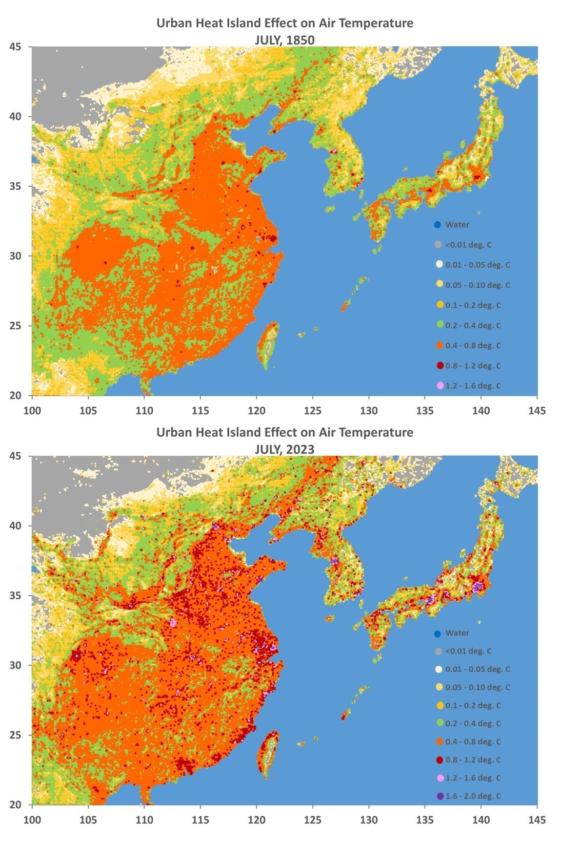
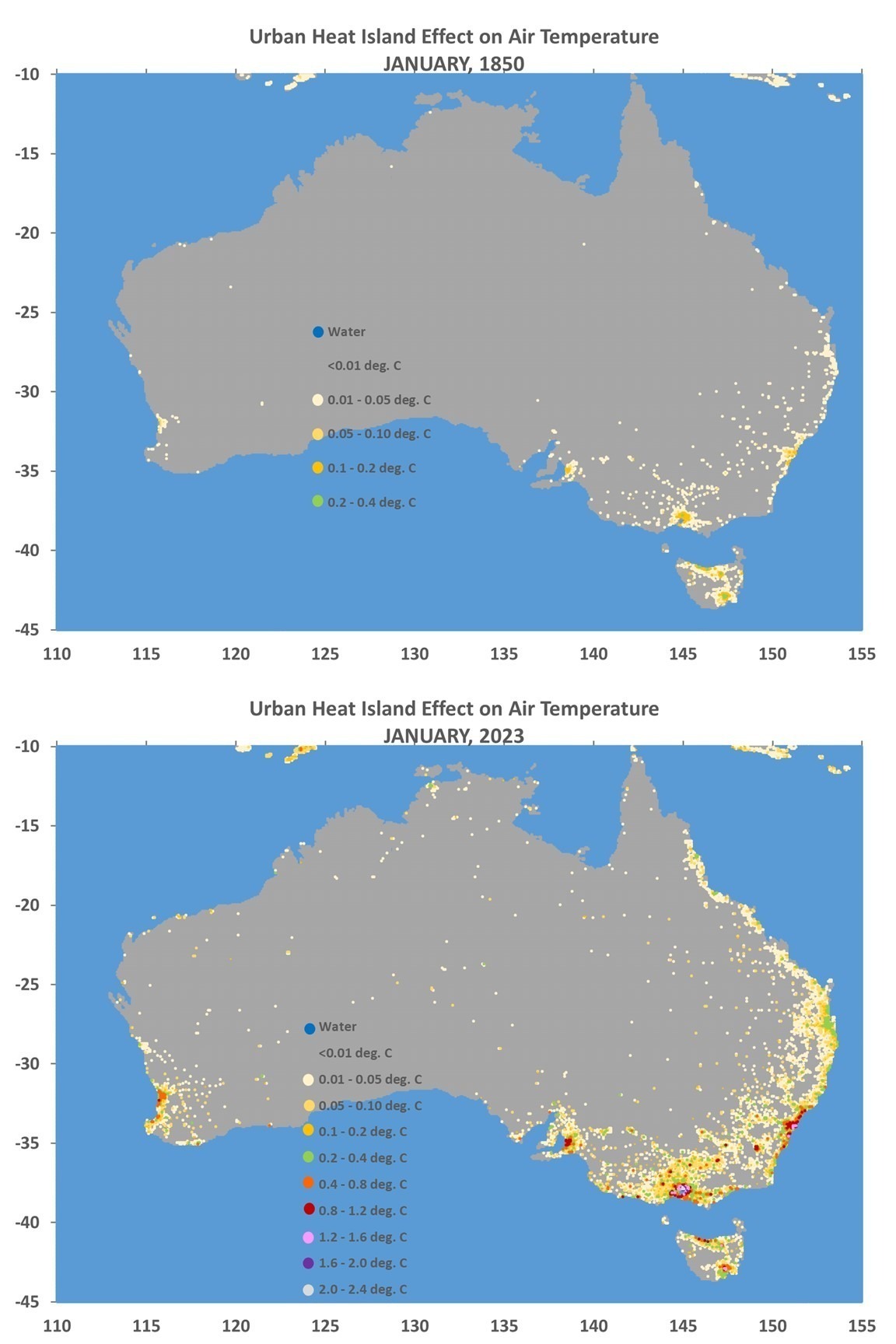
Some Dataset Examples
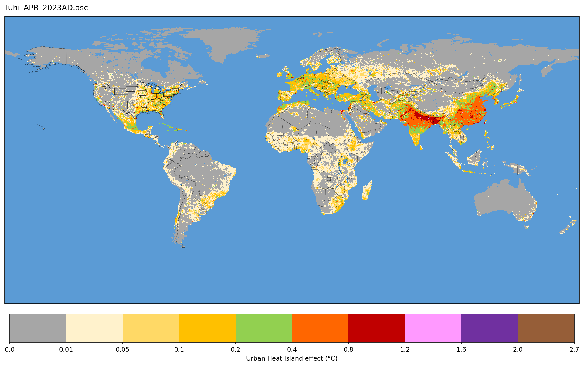
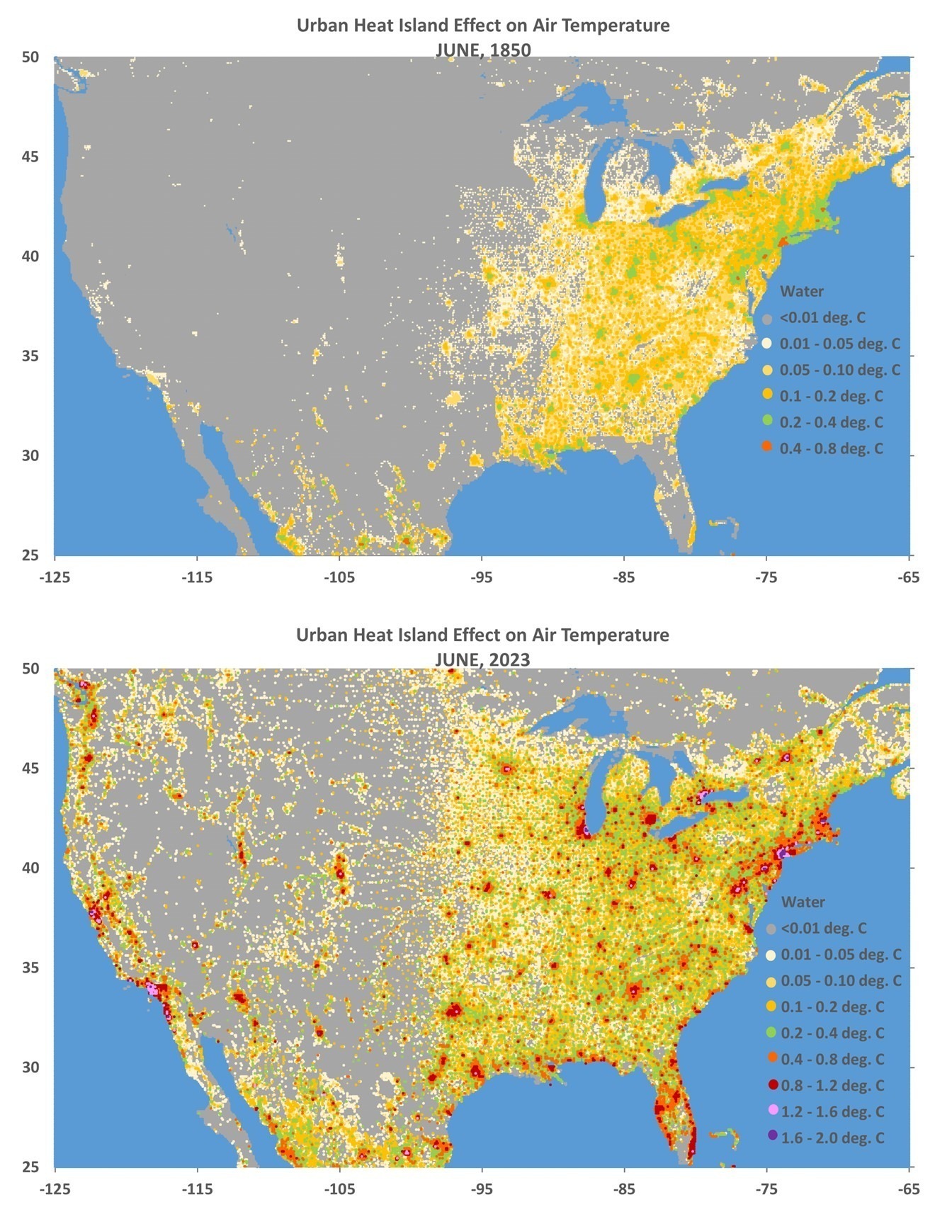
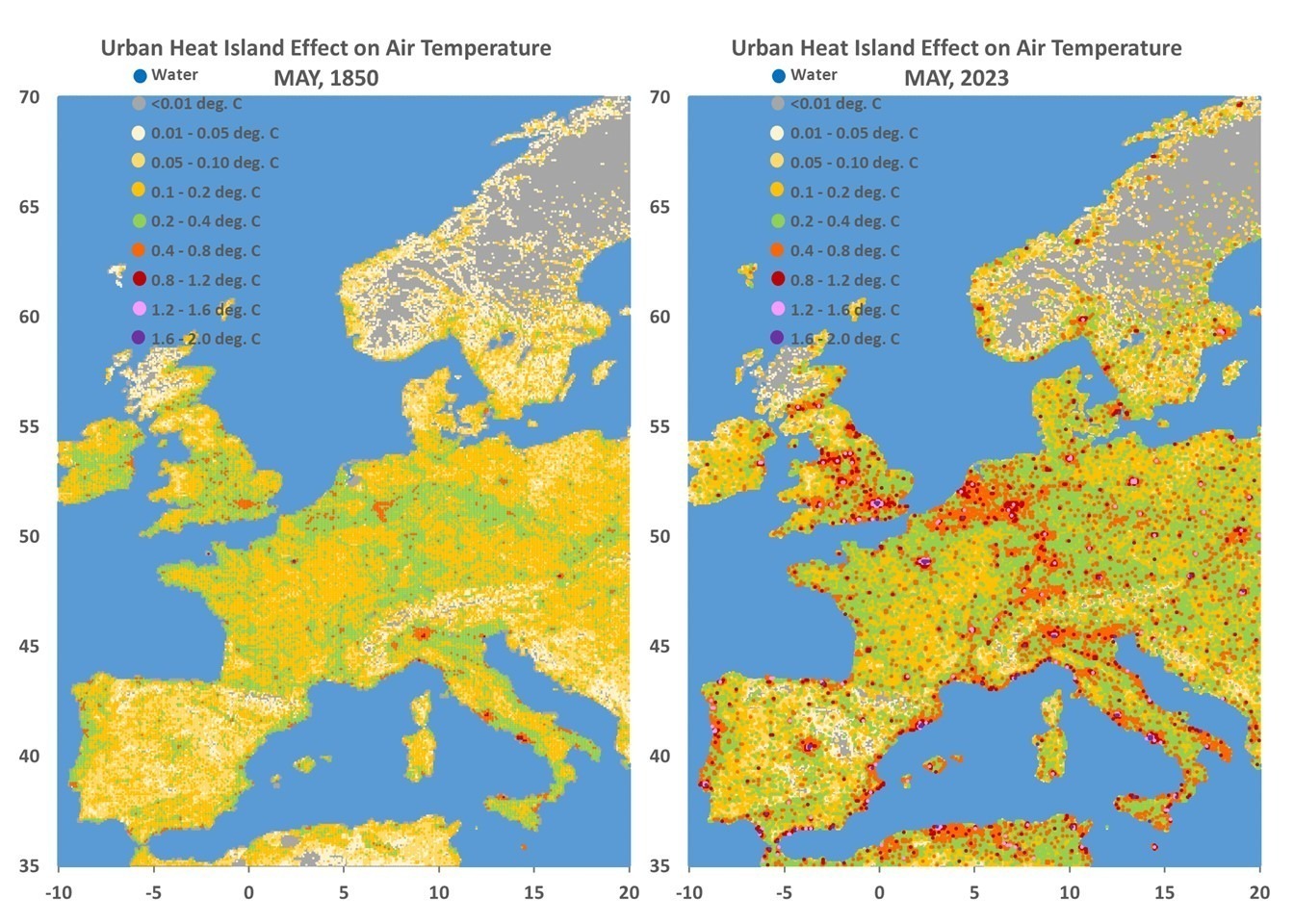
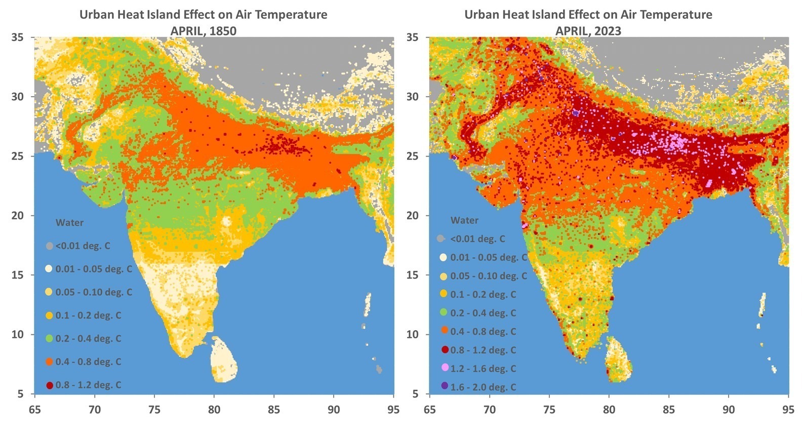
Here are some examples of the UHI dataset for several regions, showing the estimated total UHI effect on air temperature in the years 1850 and 2023 (I have files every 10 years from 1800 to 1950, then yearly thereafter). By “total UHI effect” I mean how much warmer the locations are compared to wilderness (zero population density) conditions. I emphasize the warm season months, which is when the UHI effect is strongest.
Remember, these quantitative relationships hold for the *average* of all GHCN stations in 7 separate latitude bands. It is unknown how accurate they are at individual locations depicted in the following imagery.
First let’s start with a global image for April, 2023 that Danny Braswell put together for me using mapping software, for April of 2023 (click on the image for higher resolution… and if you dare, here is a super-duper-hi-res version):
And here are some regional images using my crude Excel “mapping” (no map outlines):
In my next post I will probably do some graphs of just how many people in the world live in various levels of elevated temperature just because the global population is increasingly urbanized. Over 50% of the population now lives in urban areas, and that fraction is supposed to approach 70% by 2045. This summer we have seen how the media reports on temperature records being broken for various cities and they usually conflate urban warmth with global warming even through such record-breaking warmth would increasingly occur even with no global warming.
Again, all of the ArcGIS format (ASCII grid) files are located here (public permissions now fixed).


Great work, Roy!
Hilarious cover photo!
Red = scary and used extensively by TV weather presenters as subliminal reinforcement of the ‘we’re all gonna fry’ message.
Dr. Spencer, please do not underestimate photosynthesis mass and heat balance in your analysis of Urban Heat Island. When vegstation is cleared, land temperature increases. The heat balance now adds solar heat that is equal to the heat (chemical energy) of the biomass removed.
I agree. Population density just happens to be the most extensive global dataset we have that extends back centuries.
Yes, I agree. But do you have a global dataset of land use changes for the last 100+ years?
I did quite a bit of research on the subject and published papers, which may be a good starting point:
[1] “Deforestation and land farming as regulators of population size and climate” https://doi.org/10.1016/j.chnaes.2019.12.003
[2] Thermodynamic Analysis of Climate Change
https://doi.org/10.3390/e25010072
If you want to use the record of biomass, there is a reasonable and sufficient information in the references of the first paper [1]. Some basic calculations may be required.
An easier way is to use carbon dioxide, which has been increasing. With that the seasonal efficiency of photosynthesis has been increasing as well. For instance, it has increased from 0.67% in 1750 to 0.8% in 2020. Or by nearly 20%, which has resulted in nearly 3.0% of surface greening per decade at the present time. The UHI does not see surface greening, because photosynthesis has been removed. However, undeveloped areas, whether natural or farm land, see the cooling by surface greening. UHI temperature anomaly inherently adds a temperature difference. This is the easiest way to remove the noise of photosynthesis.
In the upper Midwest, the UHI is even more pronounced in winter. I compared the monthly temperatures prior to 1980 to after 1980.
Are the comparison dates on the maps really 1850 vs 2023 instead of 1950 vs 2023?
yes
Roy Spencer
Thank you for this very impressing work.
J.-P.
Comparing Roy’s global Tuhi_APR_2023AD to the 2m Temperature Anomaly 1979-2000 base, it appears that, for the most part, the observed global warming is not influenced by the UHI effect.
2m Temperature Anomaly 1979-2000 base: https://imgur.com/a/XzJnNnX
Tuhi_APR_2023AD: https://www.drroyspencer.com/wp-content/uploads/tuhi_apr_2023.150dpi.png
My bet is that if you look at the charts of the areas where there is no UHI and compare them to the areas impacted by the UHI effect, the diference will be the amount of warming claimed by the alarmists. They simply attribute the UHI to CO2. It is that simple.
Great work!
Your efforts in honest climate science are so greatly appreciated!
Same can be said about your work Jim. You and Roy are a rage breed.
You may have meant a rare breed.
SkyDragon cultists are more a “rage breed”.
LOL…yep. Rare Breed.
Good work! It should be published.
Mann’s “Dirty Laundry”
“As the date approached for the Mann-Steyn/Simberg libel trial, Ive been reviewing my files on MBH98 and MBH99. Its about 15 years since I last looked at these issues”
https://climateaudit.org/2023/11/07/manns-dirty-laundry/
https://climateaudit.org/2023/11/08/dirty-laundry-residuals/
From https://www.youtube.com/watch?v=wJlCqofaldM
Wow fantastic work – thanks!! This was also evident from Ross R. McKitrick and Patrick J. Michaels (2007) where they looked at the impact of various measures of Population, GDP etc. on temperature etc.. https://agupubs.onlinelibrary.wiley.com/doi/pdf/10.1029/2007JD008465 and https://www.int-res.com/articles/cr2002/cr2004/27/c027p265.pdf
There is another similar paper from that era that I cannot find now; it showed the importance of Electric Power usage within the geographical-grid.
From memory, it explained more than half the variance that would be attributed to AGW.
Cities must use gigawatts of power, and this will heat the air irrespective of season. Nearly all electric power that is used, will end up as heat. One thing that is certain, electricity usage has soared in urban areas. In some rural areas recently, industry and miners could also be using more electricity.
The independent Berkeley Earth Surface Temperature project started by sceptic Dr Richard Muller in 2010 (funded partly by the Koch Bros) to examine all the temperature data (including the UHI effect), disagree:
“Our UHI paper analyzing this indicates that the urban heat island effect on our global estimate of land temperatures is indistinguishable from zero”
https://berkeleyearth.org/archive/faq/#question-15
Paper:
https://www.scitechnol.com/2327-4581/2327-4581-1-104.pdf
the Berkeley Earth effort assumed that UHI was related to population rather than population growth as apparently they skipped over reading Oke, 1973: https://www.patarnott.com/pdf/Oke1979CitySizeAndHeatIsland.pdf
Complete nonsense, published in a predatory journal.
Even Berkeley Earth is is misleading, and has nothing to do with UC Berkeley. It even had Steven Mosher listed as a Berkeley Earth “scientist”.
Looks more like a Muller initiative to get funds donated so the Mullers can fiddle about appearing important.
Correct me if I’m wrong.
I do suspect that wealth is a significant factor here. The average home in India is 500sf, and home to 4.4 inhabitants – 114 sf/person.
In the United States, 2164 sf and 2.6 inhabitants – 832 sf/person, more than 7x more than in densely populated India. That’s a lot more thermal mass, and roof coverage, especially since Americans tend to live in single family homes while Indians are more likely to live in apartments (at least those living in cities).
India also has much lower car ownership, and consequently, much fewer road miles per capita and narrower streets and much fewer driveways and parking lots.
It has very low rates of air conditioning use as well, even though India could benefit from it, considering it has the worst summer heat of any non-desert country.
I’m sure Delhi, Mumbai and Dhaka have very pronounced heat islands, at least on par with Los Angeles, considering they have population densities on par with Manhattan or greater, and are very heavily paved over. However, in an average swath of rural India in the Ganges Plain (ex Uttar Pradesh & Bihar), population densities may be be comparable to those of suburban Nashville, but the majority of land use is agricultural, it’s just that you have a lot of compact little villages throughout.
All this applies to 1850 too. No cars or air conditioning back then. Households in America were also larger, homes were not that small, at least the ones still standing from that area include some generously proportioned farm houses, but I suspect there were still many shanties that were smaller and failed to stand the test of time.