
 Home/Blog
Summary: The monthly anomalies in Australia-average surface versus satellite deep-layer lower-tropospheric temperatures correlate at 0.70 (with a 0.57 deg. C standard deviation of their difference), increasing to 0.80 correlation (with a 0.48 deg. C standard deviation of their difference) after accounting for precipitation effects on the relationship. The 40-year trends (1979-2019) are similar for the raw anomalies (+0.21 C/decade for Tsfc, +0.18 deg. C for satellite), but if the satellite and rainfall data are used to estimate Tsfc through a regression relationship, the adjusted satellite data then has a reduced trend of +0.15 C/decade. Thus, those who compare the UAH monthly anomalies to the BOM surface temperature anomalies should expect routine disagreements of 0.5 deg. C or more, due to the inherently different nature of surface versus tropospheric temperature measurements.
I often receive questions from Australians about the UAH LT (lower troposphere) temperature anomalies over Australia, as they sometimes differ substantially from the surface temperature data compiled by BOM. As a result, I decided to do a quantitative comparison.
While we expect that the tropospheric and surface temperature variations should be somewhat correlated, there are reasons to expect the correlation to not be high. The surface-troposphere system is not regionally isolated over Australia, as the troposphere can be affected by distant processes. For example, subsidence warming over the continent can be caused by vigorous precipitation systems hundreds or thousands of miles away.
I use our monthly UAH LT anomalies for Australia (available here), and monthly anomalies in average (day+night) surface temperature and rainfall (available from BOM here). All monthly anomalies from BOM have been recomputed to be relative to the 1981-2010 base period to make them comparable to the UAH LT anomalies. The period analyzed here is January 1979 through March 2019.
Results Before Adjustments
A time series comparison between monthly Tsfc and LT anomalies shows warming in both, with a Tsfc warming trend of +0.21 C/decade, and and a satellite LT trend of +0.18 C/decade:
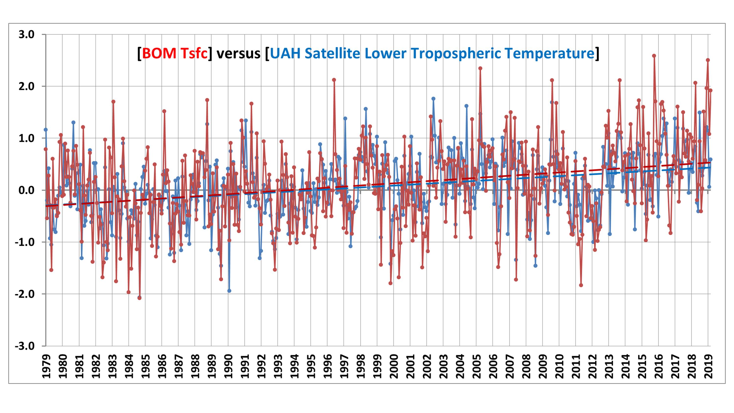
The correlation between the two time series is 0.70, indicating considerable — but not close — agreement between the two measures of temperature. The standard deviation of their difference is 0.57 deg. C, which means that people doing a comparison of UAH and BOM anomalies each month should not be surprised to see 0.6 deg. C differences (or more).
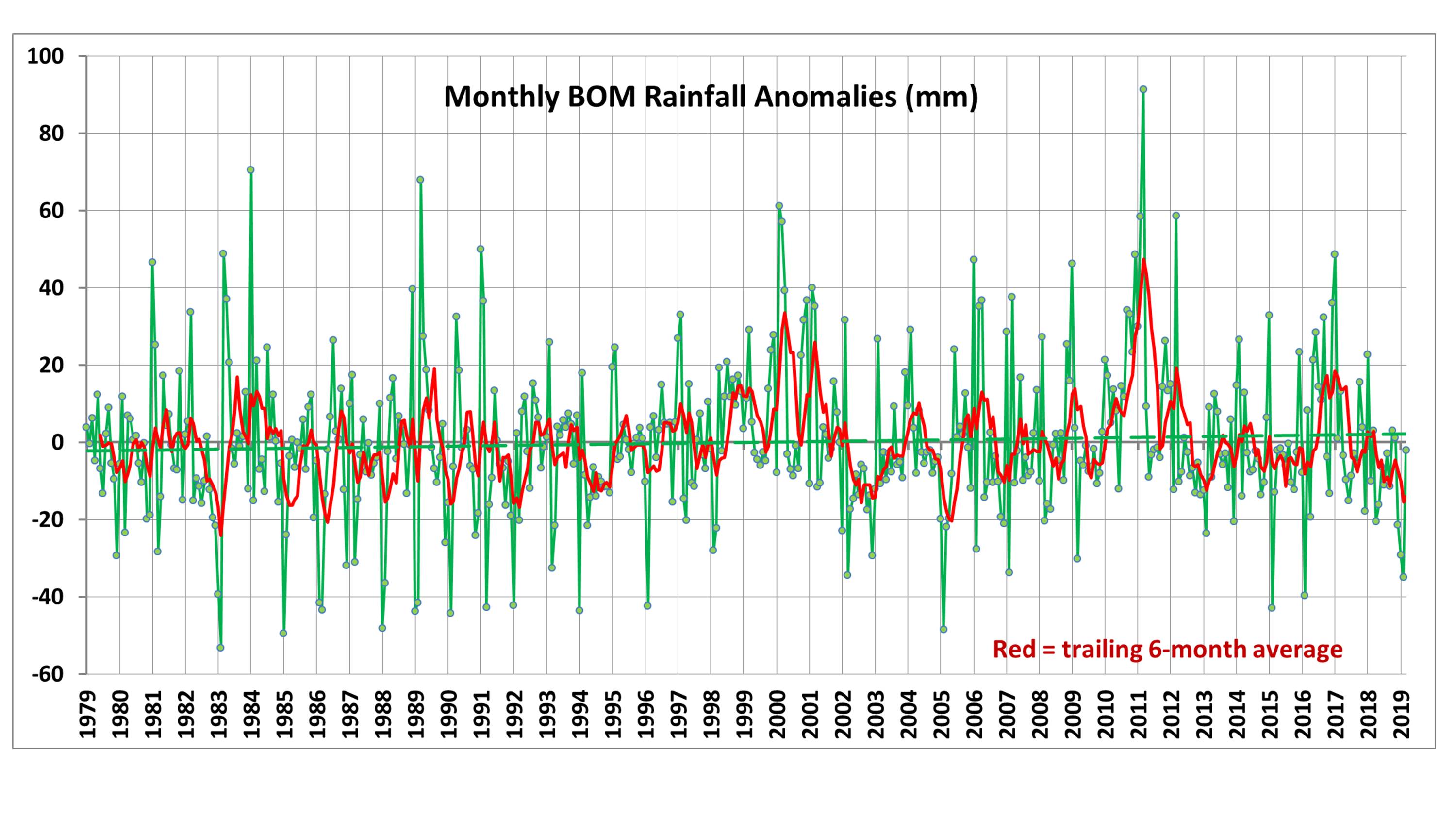
Part of the disagreement comes from rainfall conditions, which can affect the temperature lapse rate in the troposphere. For reference, the following plot shows Australian precipitation anomalies for the same period:
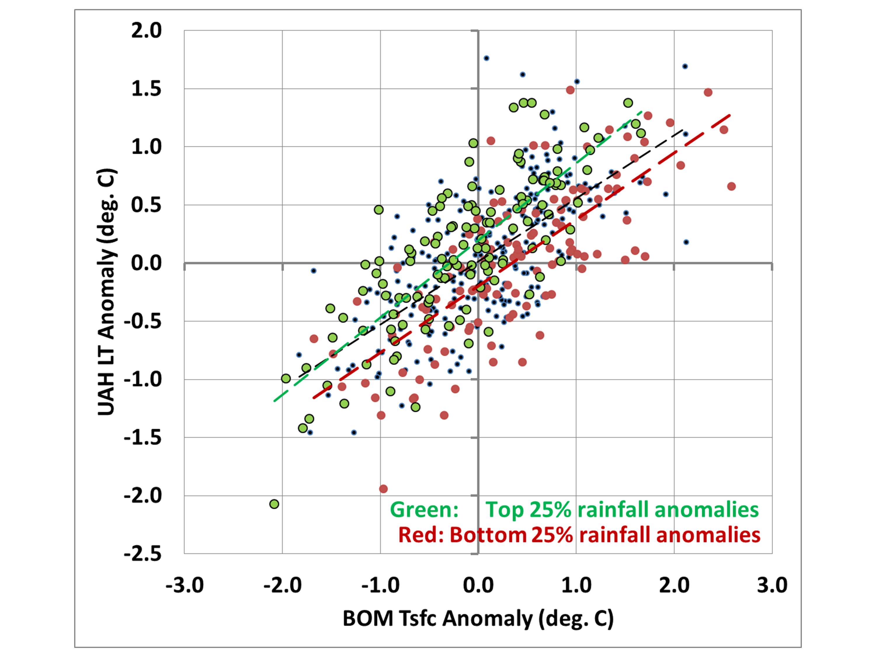
If we take the data in Fig. 1 and create a scatter plot, but show the months with the 25% highest precipitation anomalies in green and the lowest 25% precipitation in red, we see that drought periods tend to have higher surface temperatures compared to tropospheric temperatures, while the wettest periods tend to have lower surface temperatures compared to the troposphere:
A More Apples-to-Apples Comparison
Comparing tropospheric and surface temperatures is a little like comparing apples and oranges. But one interesting thing we can do is to regress the surface temperature data against the tropospheric temperatures plus rainfall data to get equations that provide a “best estimate” of the surface temperatures from tropospheric temperatures and rainfall.
I did this for each of the 12 calendar months separately because it turned out that the precipitation relationship evident in Fig. 3 was only a warm season phenomenon. During the winter months of June, July, and August, the relationship to precipitation had the opposite sign, with excessive precipitation being associated with warmer surface temperature versus the troposphere, and drought conditions associated with cooler surface temperatures than the troposphere (on average).
So, using a different regression relationship for each calendar month (each month having either 40 or 41 years represented), I computed a satellite+rainfall estimate of surface temperature. The resulting “satellite” time series then changes somewhat, and the correlation between them increases from 0.70 to 0.80:
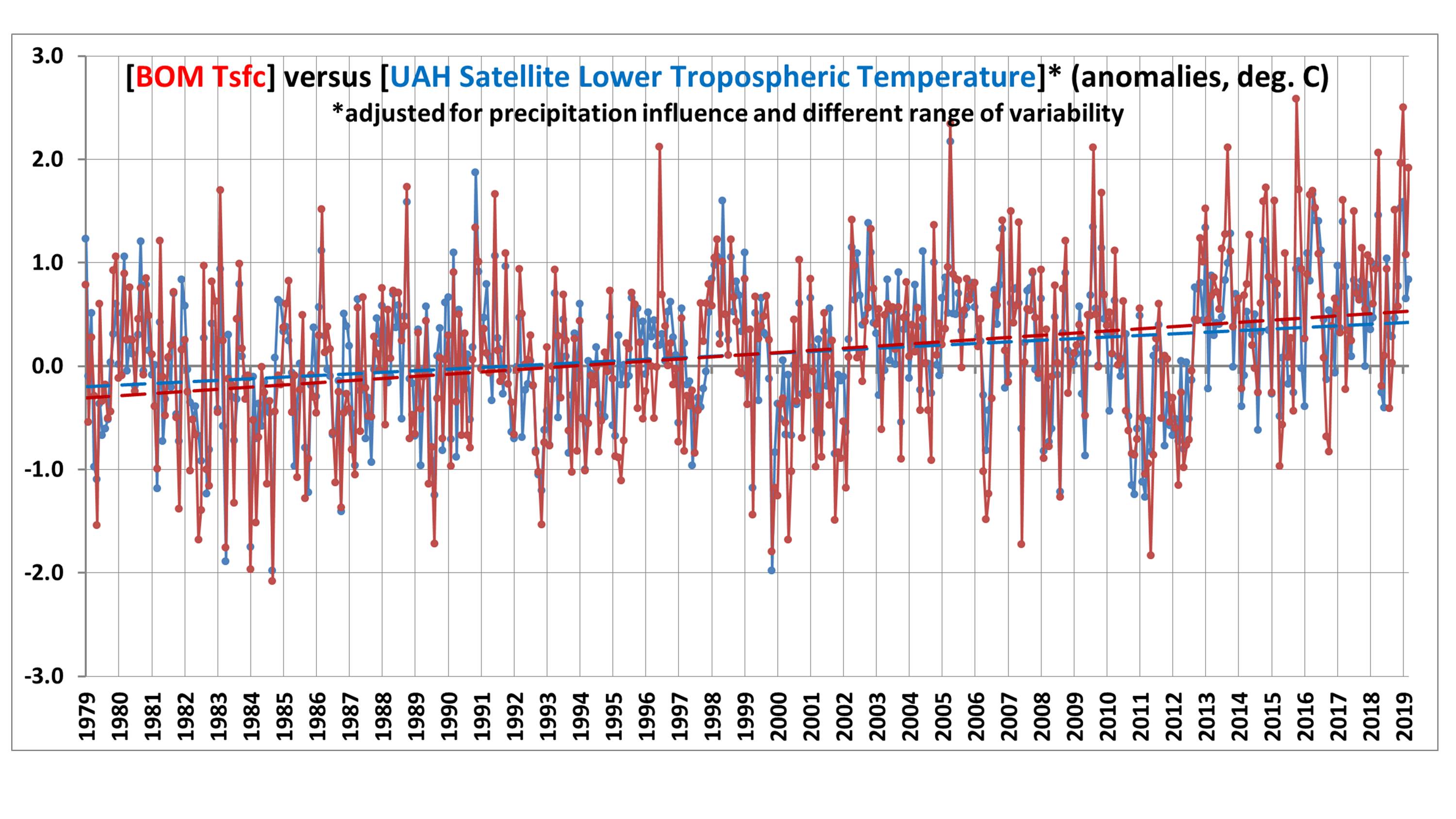
Now the “satellite-based” trend is lowered to +0.15 C/decade, compared to the observed Tsfc trend of +0.21 C/decade. I will leave it to the reader to decide whether this is a significant difference or not.
To make the differences in Fig. 4 a little easier to see, we can plot the difference time series between the two temperature measures:
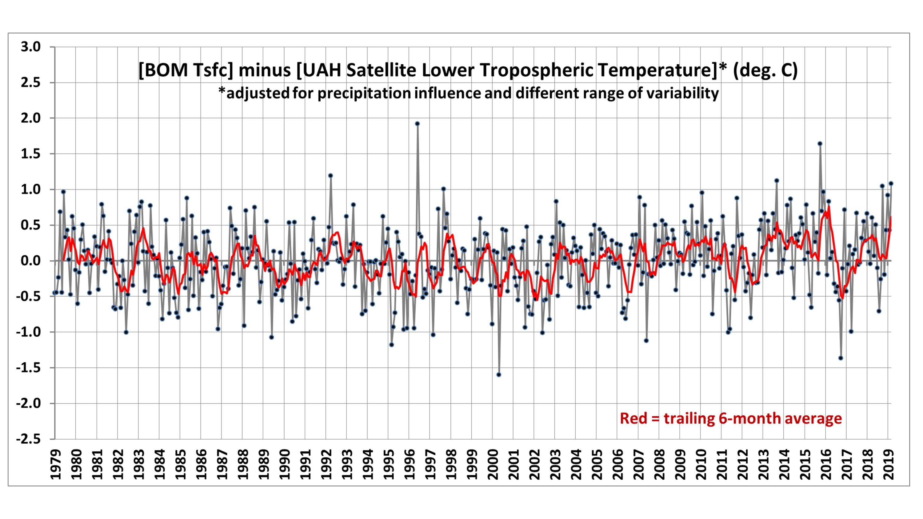
Now we can see evidence of an enhanced warming trend in the Tsfc data versus the satellite over the most recent 20 years, which amounts to 0.40 deg. C during April 1999 – March 2019. I have no opinion on whether this is some natural fluctuation in the relationship between surface and tropospheric temperatures, problems in the surface data, problems in the satellite data, or some combination of all three.
Conclusions
The UAH tropospheric temperatures and BOM surface temperatures in Australia are correlated, with similar variability (0.70 correlation).
Accounting for anomalous rainfall conditions increases the correlation to 0.80. The Tsfc trends have a slightly greater warming trend than the tropospheric temperatures, but the reasons for this are unclear. Users of the UAH data should expect monthly differences between the UAH and BOM data of 0.6 deg. C or so on a rather routine basis (after correcting for their different 30-year baselines used for anomalies: BOM uses 1961-1990 and UAH uses 1981-2010).


