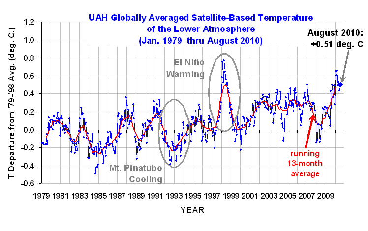
August 2010 UAH Global Temperature Update: +0.51 deg. C

September 2nd, 2010 by Roy W. Spencer, Ph. D.


YR MON GLOBE NH SH TROPICS
2009 1 0.251 0.472 0.030 -0.068
2009 2 0.247 0.565 -0.071 -0.045
2009 3 0.191 0.324 0.058 -0.159
2009 4 0.162 0.315 0.008 0.012
2009 5 0.139 0.161 0.118 -0.059
2009 6 0.041 -0.021 0.103 0.105
2009 7 0.429 0.190 0.668 0.506
2009 8 0.242 0.236 0.248 0.406
2009 9 0.505 0.597 0.413 0.594
2009 10 0.362 0.332 0.393 0.383
2009 11 0.498 0.453 0.543 0.479
2009 12 0.284 0.358 0.211 0.506
2010 1 0.648 0.860 0.436 0.681
2010 2 0.603 0.720 0.486 0.791
2010 3 0.653 0.850 0.455 0.726
2010 4 0.501 0.799 0.203 0.633
2010 5 0.534 0.775 0.292 0.708
2010 6 0.436 0.550 0.323 0.476
2010 7 0.489 0.635 0.342 0.420
2010 8 0.511 0.672 0.349 0.362
UAH_LT_1979_thru_Aug_10
(NOTE: 9/9/10, fixed 13-month running avg…it was 2 months behind)
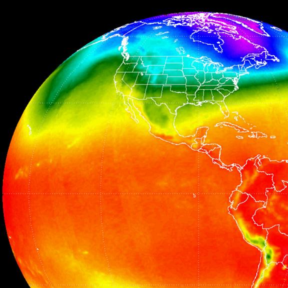
While the global-average lower tropospheric temperature remained high, +0.51 deg. C in August, 2010, monitoring of the daily Aqua Ch.5 data at the Discover web site suggests that the cooling of global average sea surface temperatures that started several months ago is now causing the troposphere to cool as well. I will probably provide an update of that plot tomorrow.


As of Julian Day 243 (end of August), the race for warmest year in the 32-year satellite period of record is still too close to call with 1998 continuing its lead by only 0.06 C:

YEAR GL
1998 +0.61
2010 +0.55

As a reminder, six months ago we changed to Version 5.3 of our dataset, which accounts for the mismatch between the average seasonal cycle produced by the older MSU and the newer AMSU instruments. This affects the value of the individual monthly departures, but does not affect the year to year variations, and thus the overall trend remains the same as in Version 5.2. ALSO…we have added the NOAA-18 AMSU to the data processing in v5.3, which provides data since June of 2005. The local observation time of NOAA-18 (now close to 2 p.m., ascending node) is similar to that of NASA’s Aqua satellite (about 1:30 p.m.). The temperature anomalies listed above have changed somewhat as a result of adding NOAA-18.

[NOTE: These satellite measurements are not calibrated to surface thermometer data in any way, but instead use on-board redundant precision platinum resistance thermometers (PRTs) carried on the satellite radiometers. The PRT’s are individually calibrated in a laboratory before being installed in the instruments.]

WeatherShop.com Gifts, gadgets, weather stations, software and more...click here!


28 Responses to “August 2010 UAH Global Temperature Update: +0.51 deg. C”

Toggle Trackbacks

  1. Brego says:

    Dr. Spencer, a curiosity question:

    Insomuch that the Aqua satellite is a nice stable space platform possessing thrusters to maintain its orbital position, and the NOAA-xx satellites do not and are subject to orbital drift and decay which affects the data, why is the data from the NOAA-xx satellites used at all? Isn’t the data from Aqua the more reliable?

  2. wayne says:

    Dr. Spencer, am I reading these data points correct on the AMSU channels? For instance, when the AMSU readouts from channel 5 show an above normal temperature (really brightness), is that not saying that the satellite is seeing above average W/m2 coming up from that level which should, in a contrary manner, say that with all else held constant the temperatures at that level should then begin in a downward slide. That is, more coming upward radiation is going to, in time, cool where that reading is read. Is that correct? That is what I gather from your simple GCM of a few months ago on feedbacks.

    BTW: great paper.
    -wayne

    • Anonymous says:

      Oh, and if I can insert this before you reply, I was not speaking of across multi-year scale, just on a more monthly basis. The longer term might have other long-term forcings involved, aerosols, albedo, gases, volcanoes, etc. I was just trying to clarify the sign and would think the deviations would be mainly cloud and water vapor based.
      -wayne

    • yes, what you said is correct’ Assuming all else remains the same, an increase in temperature causes an increase in outgoing IR radiation, which means the rate of cooling has increased.

  3. Anonymous says:

    Will you update the 13-month running average someday too?

    • the 13-month running average is centered, not trailing, so that it matches the average of +/-6 months around the month it is plotted for. So it is always 7 months behind the current month.

      • Anonymous says:

        That may be so, but it does seem to have got stuck where it was about 3 months ago, i.e. over the December position, instead of February, where it should be. It also looks too low. I believe it should be 0.482, i.e. nearer to the mid-point between the 0.4 and 0.6c, not about 0.44c, where it appears at the moment. I do think this needs checking.

  4. Bob Tisdale says:

    Roy: Somewhat on topic. Do TLT anomalies reflect the 2009/10 upward shift in the South Atlantic SST anomalies (dataset is Reynolds OI.v2?
    http://i37.tinypic.com/21l7dj6.jpg

  5. Fred from Canuckistan says:

    another question if you could help Dr. Spencer

    When you say “lower troposphere” . . . how thick/high is the lower tropo. i.e. what region of the atmosphere are you measuring?

    Also . . . since the tropo varies in thickness form Pole to Equator, does your lower tropo definition stay the same or is a dynamic value “lower xx% of the troposphere” at any given latitude.

    Thnx . . . .

  6. Ray says:

    Dr. Spencer, I do think the 13 month moving average is wrong. It seems to have got stuck where it was 3 months ago, i.e. over the December position, rather than February,where it should be. I also think it should be 0.482c, and therefore nearer the centre point between the 0.4c and 0.6c lines, not where it is at the moment, at about 0.44c. I tried to post this as a reply to your reply on the subject but it posted it as from anonymous, which may cause confusion, as I am not the same anonymous as the original poster.

  7. Catrun J says:

    I think Ray is correct. I have posted the update plots here. http://picasaweb.google.com/lh/photo/6ZpEovq9DrZJ5G6JbtA2CZmOPIXQOqWV92eIiYdtQu0?feat=directlink

    Dr. Spencer, why is it that folks plot the 13 month average anyway? Since the ENSO cycles are the largest obvious variations, and they typically last at least a year, isn’t it more meaningful to look at a longer average to illuminate if there is any long term trend? In my plot I include a 37 month average too.

    I wonder if one reason that one doesn’t see more long term temporal averages is that the period around the 1998 El Nino loses it’s distinction as the “hottest year in the record”.

  8. Ray says:

    While according to your figures, temperatures during late 1998 did fall quickly, resulting in the final average of
    about 0.52c, since the figure for 2010 is already at 0.55c, it would only take an average of 0.45c for the remainder of the year for 2010 to be about the same as in 1998. How likely is it that temperatures for the remainder of the year will remain that high?

  9. Catrun J says:

    Ray, you are right about the 13 month average. It
    is not up to date. I posted a reply with a link to
    an updated plot, but my reply
    disappeared shortly after I posted it.

    Nobody knows how likely it is that 2010 will end
    up warmer than 1998, but I think the obsession with
    yearly averages is a bit myopic. If you plot a 3 year
    moving average of the data which smooths out the El Nino
    oscillations, things look much different,
    i.e. the moving average in the middle of the last decade
    is higher than any time before.

    • Anonymous says:

      J Catrun, thanks for your reply. I am not clear whether you are connected with UAH, or not, but I suspect that Dr Spencer may be jumping to the conclusion that those mentioning the fact that the 13 month average is not up to date, were not aware that the plot is centred on a point 7 months ago.
      Regarding the obsession with the annual figure, you are no doubt correct, but it is the “climate change” lobby who have set this agenda, with recent claims that 2010 would be warmer than 1998, and therefore a “record” year. I am not sure about UAH, but this is certainly the case with respect to the HadCRUT3 measurement. Of course, if 2010 fails to be higher than 1998 by any measure, no doubt the rules will be changed, and it will be the 3 year averages which will determine whether temperatures are rising or falling. When the 3 year average starts to fall, it will become the 5 year average and then the 10 year, etc etc.

      • “were not aware that the plot is centred on a point 7 months ago.”

        As commenters have mentioned, the 13-month running average plot hasn’t been updated – 7 months ago was February, while the plot stays centered at the beginning of 2010.

  10. Ray says:

    J Catrun, that last reply was from me. Unfortunately it appears that if you reply to another post, rather than to the blog in general, it seems to default to “anonymous”, that is I haven’t found a way of avoiding that.

  11. Catrun J says:

    Hi Ray,

    I am not affiliated with UAH. I just plotted the data
    from the vortex website and confirmed what you said.

    As to changing the rules, the longer the period over which
    one averages the more the data look like a steadily increasing line. If you look at the very bottom of the
    vortex page with the raw data, Dr. Spencer computes the
    “Trend” which is currently +0.14 degrees per decade. This
    trend is easier to see in longer term averages. If and when
    the 5 or 10 year averages decline for a while, so will
    the trend that Dr. Spencer computes from his data.
    Then everybody can celebrate that the warming has stopped.

    Unfortunately, the trend has been holding steady since 1998
    even if it is still the warmest on record.

    So again, I don’t see why everyone obsesses about 1998 vs 2010.

    • Juho says:

      The obsession from 1998 vs 2010 comes from the media – if we break a new record it is and will be a good weapon for the mainstream propaganda. Therefore also many skeptics are taking part on the discussion and like to point out that according to the satellite data 2010 is still on the race to break a new record even though that doesn’t either confirm nor debunk man made global warming.

  12. I would like to add this about the “changing of the rules” alluded to above. First of all, with respect to Hadcrut, the 1998 anomaly was 0.548. To the end of July 2010, it was slightly lower at 0.531. However I read that some want to take the highest 12 month average and not necessarily a January to December average. But two people can play this game as well. Using the Hadcrut data for the period from September 1, 1997 to August 31, 1998, the anomaly rises to 0.577.

  13. Ray says:

    Juho, It isn’t just the media who are responsible for the obsession with annual figures. In the case of HadCRUT, the UK Met. Office issued a press release saying that 2010 was likely to be warmer than 1998, so naturally everyone, including the media, is interested to see if that proves to be correct.
    Werner, I have been calculating rolling 12 month averages for some time, and I believe they are a useful, (if short-term), measure of change, which is often missed by the restricted use of “artificial”, calandar year measures. For example, the UK CET 12 month rolling average reached 11.63c in April 2007, while according to the M.O. the “highest annual mean CET ever recorded”, was 10.82c (calendar year 2006). I believe that they are a useful predictor of future changes in longer term averages.
    Also, your HadCRUT comparison isn’t strictly correct. While it is true that the average figure to Aug. 1998 was 0.577c, the M.O. annual figure isn’t calculated from the monthly figures. The actual method is more complicated than that and isn’t easily replicated (see M.O. website FAQ).
    http://hadobs.metoffice.com/indicators/index.html
    (look for Q. How do you obtain a global annual average temperature from the monthly data?)
    Using the monthly figures, the annual figure for 1998 works out at 0.548c, while the “real” annual figure is 0.517c, so the Aug. 98 figure of 0.577c (based on monthly figures) seems likely to be too high. Oddly, the CRU do seem to calculate their annual figure from monthly figures, so according to CRU the calendar 1998 figure was 0.548c, but you have to compare like with like. Interestingly since 1998, the differences between the M.O. annual figures and the CRU figures seems to have declined, but I don’t know why. It doesn’t seem to be generally known that the M.O. and CRU annual figures are different.
    Based on monthly figures, the linear trend in HadCRUT3 for 2000-2010 is actually slightly lower than for 1900-1949 (0.06c per decade compared to 0.096c). Clearly while the absolute figures are higher (due to earlier increases), I don’t believe that temperatures are rising any faster now than 100 years ago. While other factors (e.g. El Nino & solar activity), will result in short term increases and falls, I believe that the PREDICTIONS of much higher temperatures are based on excessive assumptions for the feedback from water vapour in the models.

  14. John says:

    Dr. Spencer –

    Any thoughts on when the LT will start responding to lower SST? The LT temps for Sept to date have all been ticking up, which is both against the SST changes and normal seasonal patterns.

    Is this a situation where cooling SST temporarily warms up the LT due to heat transfer?

  15. Catrun J says:

    Doh! Censored again. I don’t really know why
    this time. I guess that quote from FoxNews
    about the 1998 record global temperature
    must have doomed me. What was that about
    “Don’t shoot the messenger”?

    No email from the censors either to explain why.

    I thought this was a place where one could
    discuss the real data about climate change
    and how that data gets distorted by the media,
    the Gore zombies, and the the staunch deniers.
    But I guess only if you adhere to some (unwritten)
    talking points.

    Oh well. At least the data seems clean.

  16. Thank you for that Ray. No wonder one site gives an anomaly of 0.548 and the other of 0.52 for the same year. Of course the 0.577 is compared to 0.548. I just averaged the 12 months without giving February a lower weighting since it only had 28 days. Presumably the relative rankings could change if the numbers were close enough. So compared to the “real” value of 0.517 for January to December 1998, would you happen to know the “real” value for September 1, 1997 to August 31, 1998 compared with January 1, 2010 to July 31, 2010?

    While I am at it, do you know how I could use the daily global sea surface temperature and others to get a rough estimate for the UAH anomaly for that day?

    John, I also was wondering about that recent spike. It seemed to start and end at the same time that Hurricane Earl was active. I realize that as large as Hurricane Earl was, it still occupied a very small area of the globe. But I wonder if the area was large enough and if the area was hot enough due to all the water vapor condensing to have accounted for some of that spike. A few months ago, Dr. Spencer had an article as to how the SST spiked in those areas which were covered with oil. Now I am wondering how much hotter the troposphere was in those areas where Hurricane Earl was prevalent.

  17. Ray says:

    Thanks to Dr. Jones for correcting the 13 month moving average!
    Werner, my apologies for not replying earlier. I had typed out a reply but accidentally pressed went back a page and lost everything I had typed.
    As I mentioned, the relationship between the “real” (i.e. Met. Office), annual figure, and the C.R.U. (i.e. calculated from the monthly averages), figure,
    has changed over the years. Generally, the C.R.U. figure was above the M.O. figure from 1850-1863 (+0.154c in 1861), below from 1864-1909, above again from 1910 to 1974, and below again, but increasing from 1975 to 2000 and above but decreasing since 2001. For some reason, the years 1998-2000 showed a relatively large difference of over 0.03c (C.R.U. higher), but recent years have shown differences of less than half of that. For some recent years (1997 & 2006), the C.R.U. figure was slightly lower than the M.O. one.
    It is entirely possible that based on the M.O. figure, 2010 will be warmer than 1998, while based on the C.R.U. figure, it will be cooler than 1998, which will be confusing, and difficult to explain. It is an interesting exercise to compare the M.O. annual figures with the C.R.U. annual figures graphically. It should be remembered that while the ANNUAL figures in the data sets are different, the MONTHLY figures are usually identical. Any minor differences in monthly figures seem to originate from lack of synchronicity in the
    timing of of routine adjustments to the monthly figures.
    I am afraid that I don’t know the “real”, figure for the September 1st 1997 to August 31st. 1998, since the M.O. don’t publish annual figures
    other than for the calendar year, and the method of calculation is too complex for me. One of these days I intend to try and find out the exact method used
    by the M.O. and attempt to replicate their figures, but I haven’t found time to do that yet. I suspect that NOBODY knows what that figure is.
    Unfortunately, I can’t help you regarding the estimation of a daily UAH anomaly from the global sea surface temperature, as it isn’t an area I am familiar with.
    What I do know, is that since UAH is relative to the 20 years 1779-1998, and HadCRUT3 is relative to the 30 years 1961-90, a “correction” must be done
    in order bring the two in line. I have calculated that 1.47c must be added to UAH to make the two figures comparable. Presumably some sort of similar
    “correction” would be required to convert sea surface temp. to UAH (assuming they were based on different periods).

  18. Thank you again Ray. If it turns out that 2010 is cooler than 1998 according to Hadcrut according to both methods, then I would not be too interested in the details. But if one method is higher and the other lower, I think many would want to know why. But should it happen that 2010 is warmer with both methods, then I would be very interested if the 12 month period of September 1, 1997 to August 31, 1998 was beaten according to Hadcrut by any other 12 month period. You talk about these swings at various times. I almost got the impression from the web site you alluded to that the swings one way or the other depended on whether the northern hemisphere or the southern hemisphere was warmer in any given year. Is there anything to this?

    As for the UAH averaging, when I see numbers for the month April of 2010 like globe 0.50, land 0.63, ocean 0.42, it seems as if the ocean is given a higher weighting which makes perfect sense since the ocean covers more area than the land, but when I see that the ocean for July 2009 is given as 0.46 and the ocean for July 2010 is given as 0.52, I am totally confused as to what I am supposed to be seeing since the sea surface graph for July 2010 is completely and well below that of July 2009. Or are the “ocean” and “sea surface” two different things with one number a metre below the ocean surface and the other three metres above the ocean surface?

  19. Martin C says:

    Dr. Spencer,
    Just saw a post by Joe Romm ( ugghh, and he has a few disparaging comments about you and John Crist) about Jan to Aug temps tying for hottest on record . . .

    http://theenergycollective.com/josephromm/43283/nasa-reports-hottest-january-august-record-august-tied-hottest-uah-satellite-record

    . . if you might care to comment, that would be great.

  20. not telling says:

    Spencer

    Most scientist think that global warming effect will start many years from now but I think it might happen faster than that!

Leave a Reply to Brego