YR MON GLOBE NH SH TROPICS
2009 1 0.251 0.472 0.030 -0.068
2009 2 0.247 0.565 -0.071 -0.045
2009 3 0.191 0.324 0.058 -0.159
2009 4 0.162 0.315 0.008 0.012
2009 5 0.139 0.161 0.118 -0.059
2009 6 0.041 -0.021 0.103 0.105
2009 7 0.429 0.190 0.668 0.506
2009 8 0.242 0.236 0.248 0.406
2009 9 0.505 0.597 0.413 0.594
2009 10 0.362 0.332 0.393 0.383
2009 11 0.498 0.453 0.543 0.479
2009 12 0.284 0.358 0.211 0.506
2010 1 0.648 0.860 0.436 0.681
2010 2 0.603 0.720 0.486 0.791
2010 3 0.653 0.850 0.455 0.726
2010 4 0.501 0.799 0.203 0.633
2010 5 0.534 0.775 0.292 0.708
2010 6 0.436 0.550 0.323 0.476
2010 7 0.489 0.635 0.342 0.420
2010 8 0.511 0.674 0.347 0.364
2010 9 0.603 0.556 0.651 0.284
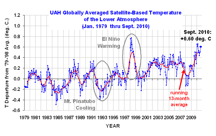
Despite cooling in the tropics, the global average lower tropospheric temperature anomaly has stubbornly refused to follow suit: +0.60 deg. C for September, 2010.
Since the daily global average sea surface temperature anomalies on our NASA Discover web page have now cooled to well below the 2002-2010 average, there remains a rather large discrepancy between these two measures. Without digging into the regional differences in the two datasets, I currently have no explanation for this.
For those following the race for warmest year in the satellite tropospheric temperature record (which began in 1979), 2010 is slowly approaching the record warm year of 1998. Here are the 1998 and 2010 averages for Julian Days 1 through 273:
1998 +0.590
2010 +0.553
[NOTE: These satellite measurements are not calibrated to surface thermometer data in any way, but instead use on-board redundant precision platinum resistance thermometers (PRTs) carried on the satellite radiometers. The PRT’s are individually calibrated in a laboratory before being installed in the instruments.]
![]() |
A severe cold hitting earth?
http://discover.itsc.uah.edu/amsutemps/execute.csh?amsutemps+001
“The temperature on 10.03.2010 is 529.48 deg F cooler than this day last year”
Brrrrr…;-)
Tipping point?
Maybe Hansen was right after all 😉
I notice that the main reason the global anomaly has increased in September, is the large increase in the S.H. anomaly. Is there any doubt that the S.H. figure is correct, and if correct, is there an explanation for this?
I had the same immediate thought. The increase in the SH is relativly a large change. While it indeed might be correct it certainly bears investigation and explaination.
I’m currently having a look at a comparison between UAH S.H. anomalies and other measures. Initially it doesn’t look like previous S.H. extremes (positive and negative) are usually reflected in HadCRUT3.
(Ray)
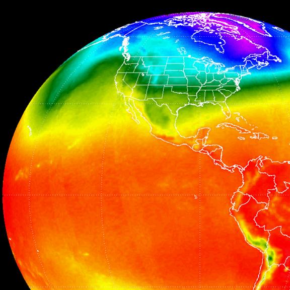
The rise in the lower troposphere in September is definitely caused by warm anomaly in SH in the first half of September. I looks like very localised and not uncommon event in UAH record. I would like to ask Dr Spencer whether he can pinpoint exact location where this event occured. Does your team plan to publish some monthly anomaly map for the UAH? It doesn’t need to be so perfect as the picture at the top of this page.
S.H. had very strong drop in ice extent anomaly during September, that should have something with rising temperature anomaly there. But, I presume this will go again in normal during October, as it looks from S.H. ice extent that just have recovered to common anomaly values during much of the year. I predict global temperature anomaly for October between +0.3 and +0.5 °C, of course, I can also be very wrong here…
Dr. Spencer,
Maybe I missed it, but I find it troubling that you failed to mention to your readers that September 2010 was the warmest September in the satellite record…..
oops, my bad. John Christy didn’t mention it, and I didn’t think to check it.
@Maple, If you missed it, how could you be troubledby its absence?
the colour anomoly chart is illustrative, right? it doesn’t show negative nina3.x i fink?
There was an even more extreme jump in the SH anomoly in July 2009 followed by a sharp drop in August 2009. Could there be a common reason for the peak then and in September 2010?
Maybe all the CO2 migrates south for the winter.
Stop sniggering at the back please …
Test post
OK, so my links are what are getting the posts held up in WordPress. Another try this time with no links:
Reposted without link to Woodfortrees graph.
“Uh, huh….big oops.
And you still have not mentioned it, choosing instead to redirect your readers’ attention to the short-term noise in the system (i.e., cooling of ocean temperatures in the last 7 months or so), instead of long-term, and statistically significant trends in global SSTs for the last 20-years:
20-yr trend for HadSST2 (global) is ~ +0.15 C/decade”
I might also add that your SST data only go to 60 N, thereby excluding the rapid warming evident in the northern oceans. See the ESRL SST anomaly plots from NOAA.
Dr. Spencer,
I searched around your site and missed a piece of data that I was after. For your monthly global UAH atmosphere temperature updates, what is the actual average temperature that anomalies are derived from?
Your chart clearly states that 1979 thru 1998 is the actual base period, but I can’t seem to find the actual temperatures used to calculate the anonmalies.
Thanks in advance.
Art
Up until now, the other main S.H. anomaly figures (HadCRUT, NOAA & GISS), for this year, have generally agreed with UAH figures (after adjustment for different base periods). HadCRUT and NOAA have shown very similar downward trends, while GISS, which started the year similar to HadCRUT and NOAA, is now lower. While UAH has been generally higher than the others, it has shown a similar downward trend, until September. In the recent past (since 1998), there have been similar upward “spikes” in the UAH S.H. anomaly, which do not appear to have been replicated in the other anomaly figures. This pattern does not seem to be present in relation to N.H. anomalies, although there have been instances of low N.H. anomaly figures which have not been replicated in the other measures.
Hurricanes and other major weather systems activity seems to have been lower than normal so far this season. These systems cool the air above oceans. Can this be an explanation for the greater than normal lag in troposphere temperature compared to sea surface temperature?
I don’t understand why the temperature value of AMSU ch04 is -15°C (and ch04 around -20°C) and not around +15°C which is supposed to be the earth temperature average near the surface layer?
Roy, why are you using 13 month average?
The GISS SH anomaly figure shows an increase in September, from 0.28c to 0.46c, while the NH anomaly is down from 0.79c to 0.65c. Although the GISS SH anomaly is up, it is not relatively as high as the UAH figure, being only the hottest since May 2010, whereas the UAH figure is the hottest since July 2009. This seems to reflect previous patterns, in which UAH anomalies have shown greater volatility than other measures.
Is it possible the stubborn LTT anomaly is due to latent heat from a cooling ocean?
MrC
The NOAA/NCDC anomaly figures have now been published and the SH anomaly shows only a slight increase from 0.389c to 0.425c. While this does confirm the general increase in SH temperatures, it is not as extreme as the increase in the UAH SH figure and is still lower than every other month this year, apart from August. The NH figure shows a fall from 0.778c to 0.5835c and the global figure is down from a revised 0.585c to 0.50c. The latter is equivalent to a HadCRUT3 figure of about 0.37c and seems to confirm the start of a downward trend in global temperatures although the September figure does not include data from China, which may result in an upward revision at some stage. The global figure for August is revised down from 0.6c to 0.585c but it isn’t clear if that includes China or not.
The HadCRUT3 N.H. and S.H. anomaly figures for September have now been published by C.R.U. The N.H. anomaly is down from 0.713c in August, to 0.547c in September. This is broadly in line with the UAH, NOAA/NCDC and GISS N.H. anomalies. However, the HadCRUT S.H. anomaly is almost unchanged, at 0.235c, compared to 0.236c in August, while the UAH S.H. anomaly was up from 0.347c to 0.651c, as a result of which, the global UAH figure is up from 0.511c to 0.603c, while the HadCRUT3 global figure was down from 0.475c to 0.391c. I would be grateful to know if Dr Spencer has an explanation for this, since the difference in the S.H. anomalies results in a completely different trend in the global anomay figures. I appreciate that there will always be differences in the anomalies for individual months, but this difference seems to require explanation. It also raises the question of which of the two S.H. anomaly figures is correct, and which measure of global temperatures we can trust.
Ray, HadCRUT is only sampling regions that have exhibited less change http://www.metoffice.gov.uk/corporate/pressoffice/2009/pr20091218b.html
Xela,
Thanks for the link.
It’s amazing the spin that the M.O. put on those findings, i.e. not that the HadCRUT3 figures are wrong, but that the findings confirm that the warming is taking place but is higher than the HadCRUT3 figures suggest.
Even so, I am not sure that this explains a difference of 0.356c in the global figure and 0.553c in the SH figures for September, (both after adjustment to the same time period).
Especially since that news release specifically mentions that the “data-sparse” regions are in Russia, Africa and Canada, most of which are in the N.H. In fact, the difference between the UAH and HadCRUT3 N.H. figures for September were only 0.17c (after adjustment).
At the least this indicates a lack of consistency between the two measures of warming. Given the importance being placed on this matter, we should at least have a reliable method of measuring the temperature.
If one disregards ’98 el-nino and draws peak-to-peak line one’ll get nice linear trend that doesn’t seem to turn down =)
coturnix19,
In fact, the linear trend for global UAH over the last 10 years is about 1.06c per century, compared to a peak of 4.09c in 2002.
There has been much discussion as to why the SH anomaly was so high in September. I believe GregM raises a valid point regarding the lack of hurricanes. Is our cyclone activity not now at a 30 year low? Ted Maley mentioned the peak in July 2009 and asked if there was a common reason. I thought I would see what I could find and found rather interesting numbers which seem to contradict each other. The four highest numbers since July 2009 for the SH anomaly were in July 2009, November 2009, February 2010, and September 2010. But the most puzzling part was that for 2 of these dates, September 2010 and November 2009, the ocean temperatures were coldest according to the chart on falling sea surface temperatures. But for the other 2 dates, February 2010 and July 2009, the sea surface was warmest.
Here are my thoughts as to the reasons. As we know, the southern half of the globe is mostly ocean. So when the ocean is very warm, much water evaporates and when this water condenses in the troposphere, the troposphere gets very warm. That explains 2 of the points. But what about the other 2? Normally, the sun heats the ground and the warm air above the ground rises and cooler air comes in to take its place. But what happens when the ocean is very cold? I believe that normal convection is hindered since there seems to be warmer air higher up so there just isn’t the mixing of air that normally occurs. This also relates to the lack of hurricanes mentioned above.
I know there are other spikes that do not fit this picture, but I think it may be worth exploring further.
On a related note, see the following website:
http://climatechangedispatch.com/behind-the-science/7926-britain-less-windy-so-lets-put-up-more-wind-turbines
Among other things: “According to an astonishing new study, the weather has got noticeably less windy over the last few decades. Since the 1970s, the average near surface wind speeds across Europe have dropped by between 10 to 15 per cent.” I would be interested to know if this is also true in the southern hemisphere.
I haven’t got any answer on my question above so I am asking it again. My question was – Roy, why are you using 13 month average?
If not Roy can answer why he is using 13 month average instead of, for example 12 months, maybe someone else can answer. 😉
Thanks in advance!
Hello Xela,
In case you do not get a better answer, I will take a stab at it. I have also seen 37 month averages instead of 36 month averages. There is a certain rational for averages over different time periods to even out the peaks. An odd number such as 13 or 37 allows you to take the 7th or 19th month and then calculate the averages for 6 or 18 above and below that month. This way you have as many months above as below the month in question.
Xela,
I have asked the same question myself in a past blog, but I am not sure which one. I think that the use of an even period, e.g. 12 months creates difficulty in that there is no central point against which to plot a moving average, and the use of an odd number of points, allows a central point to be used, with an equal number of points on either side. This is primarily of concern to those who believe that the moving average should be plotted on the central point of the average, which is strictly the correct approach, although I personally find this confusing and limiting, since the average always appears to be out of date. Often the weighting of each point is varied, to give a higher weighting to be given to the central point. This is often referred to as a N-point binomial filter, which apart from anything else, “sounds” more scientific than a “smoothed moving average”. There is an explanation of such a filter used by the UK Met. Office here:
http://hadobs.metoffice.com/hadcrut3/smoothing.html
In this case, the problem of lack of data has been solved by assuming “continuing the series by repeating the final value”, which due to the weightings, in effect, doubles the weight of the final value. Personally, I find this an over complicated approach and only adds to the confusion. In the case of the UAH 13 month moving average, each point is given the same weight, which means that in every 13 month period one month always appears twice, which I think may result in seasonal bias, since there is a bias towards N.H. temperatures in the global figures, a calculation done in say July, will tend to be higher than one done in December.
Since “real” data is always used, the sole purpose of the 13 month average is to establish a central point for plotting the graph, i.e. the problem of where to plot a 12 month average calculated at the end of December (June or July) is solved, at the expense of a slight seasonal variation. With a 13 month average, calculated from December to December, the plot position is easy to establish, i.e. June, with 6 months on either side. However I prefer the plot to be at the end of the period in question, i.e. in the above example, December, which I personally find less confusing, and avoids the need for an odd number of points. Indeed, as far as I know, if you use the automatic calculation of a moving average, (e.g. in Excel, rather than in the actual spreadsheet), the plot is always at the end of the period in question, not in the centre. Indeed I believe it is impossible to plot in the centre period using the automatic calculation method.
Thanks a lot Werner and Ray for your explanations!
Hi,
Dr Spencer, is there any chance that there will be implementet a max, min. and average curve for channel 13 on on the NASA Discover webpage ?
Thank you for your considerable effort and also for providing some of the relevant data.