In my continuing efforts to use satellite observations to test climate models that predict global warming, I keep trying different ways to analyze the data.
Here I�ll show how the global oceanic radiative budget changes during warm and cool events, which are mostly due to El Niño and La Niña (respectively). By �radiative budget� I am talking about top-of-atmosphere absorbed sunlight and emitted infrared radiation.
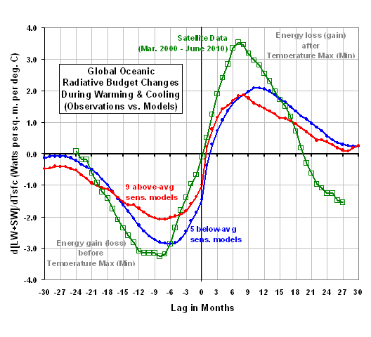
I�ve condensed the results down to a single plot, which is actually a pretty good learning tool. It shows how radiative energy accumulates in the ocean-atmosphere system during warming, and how it is then lost again during cooling.
[If you are wondering how radiative �feedback� fits into all this — oh, and I KNOW you are — imbalances in the net radiative flux at the top of the atmosphere can be thought of as some combination of forcing and feedback, which always act to oppose each other. A radiative imbalance of 2 Watts per sq. meter could be due to 3 Watts of forcing and -1 Watt of feedback, or 7 Watts of forcing and -5 Watts of feedback (where �feedback� here includes the direct Planck temperature response of infrared radiation to temperature). Unfortunately, we have no good way of knowing the proportions of forcing and feedback, and it is feedback that will determine how much global warming we can expect from forcing agents like more atmospheric carbon dioxide.]
But for now let�s ignore that conceptual distinction, and just talk about radiative imbalances. This simplifies things since more energy input should be accompanied by a temperature rise, and more energy loss should be accompanied by a temperature fall. Conservation of energy.
And, as we will see from the data, that is exactly what happens.
We analyzed the 20th Century runs from a total of 14 IPCC climate models that Forster & Taylor (2006 J. Climate) also provided a diagnosed long-term climate sensitivity for. In order to isolate the variability in the models on time scales less than ten years or so, I removed the low-frequency variations with a 6th order polynomial fit to the surface temperature and radiative flux anomalies. It�s the short-term variability we can test with short term satellite datasets.
I�ve already averaged the results for the 5 models than had below-average climate sensitivity, and the 9 models that had above-average climate sensitivity.
The curves in the following plot are lag regression coefficients, which can be interpreted as the rate of radiative energy gain (or loss) per degree C of temperature change, at various time lags. A time lag of zero months can be thought of as the month of temperature maximum (or minimum). I actually verified this interpretation by examining composite warm and cold events from the CNRM-CM3 climate model run, which exhibits strong El Niño and La Niña activity.
Also shown are satellite-based results, from detrended HadSST2 global sea surface temperature anomalies and satellite-measured anomalies in radiative fluxes from the Terra CERES instrument, for the 10-year period from March 2000 through June 2010.
The most obvious thing to note is that in the months running up to a temperature maximum (minimum), the global oceans are gaining (losing) extra radiative energy. This is true of all of the climate models, and in the satellite observations.
The above plot is a possibly a more intuitive way to look at the data than the ‘phase space’ plots I’ve been pushing the last few years. One of the KEY things it shows is that doing these regressions only at ZERO time lag (as Dessler recently did in his 2010 cloud feedback paper, and all previous researchers have tried to do) really has very little meaning. Because of the time lags involved in the temperature response to radiative imbalances, one MUST do these analyses taking into account the time lag behavior if one is to have any hope of diagnosing feedback. At zero time lag, there is very little signal at all to analyze.
So, What Does This Tell Us About the Climate Models Used to Predict Global Warming?
Of course, what I am ultimately interested in is whether the satellite data can tell us anything that might allow us to determine which of the climate models are closer to reality in terms of their global warming predictions.
And, as usual, the results shown above do not provide a clear answer to that question.
Now, the satellite observations DO suggest that there are larger radiative imbalances associated with a given surface temperature change than the climate models exhibit. But the physical reason why this is the case cannot be determined without other information.
It could be due to a greater depth of water being involved in temperature changes in the real climate system, versus in climate models, on these time scales. Or, maybe the extra radiative input seen in the satellite data during warming is being offset by greater surface evaporation rates than the models produce.
But remember, conceptually these radiative changes are some combination of forcing and feedback, in unknown amounts. What I call forcing is what some people call �unforced internal variability� � radiative changes not due to feedback (by definition, the direct or indirect result of surface temperature changes). They are probably dominated by quasi-chaotic, circulation-induced variations in cloud cover, but could also be due to changes in free-tropospheric humidity.
Now, if we assume that the radiative changes AFTER the temperature maximum (or minimum) are mostly a feedback response, then one might argue that the satellite data shows more negative feedback (lower climate sensitivity) than the models do. The only trouble with that is that I am showing averages across models in the above plot. One of the MORE sensitive models actually had larger excursions than the satellite data exhibit!
So, while the conclusion might be true�the evidence is not exactly ironclad.
Also, while I won�t show the results here, there are other analyses that can be done. For instance: How much total energy do the models (versus observations) accumulate over time during the warming episodes? During the cooling episodes? and does that tell us anything? So far, based upon the analysis I�ve done, there is no clear answer. But I will keep looking.
In the meantime, you are free to interpret the above graph in any way you want. Maybe you will see something I missed.

 Home/Blog


