UAH Global Temperature Update for August, 2011: +0.33 deg. C

September 2nd, 2011 by Roy W. Spencer, Ph. D.

NOTE: Updated with tropical sea surface temperatures.

The global average lower tropospheric temperature anomaly for August, 2011 retreated a little, to +0.33 deg. C (click on the image for a LARGE version):
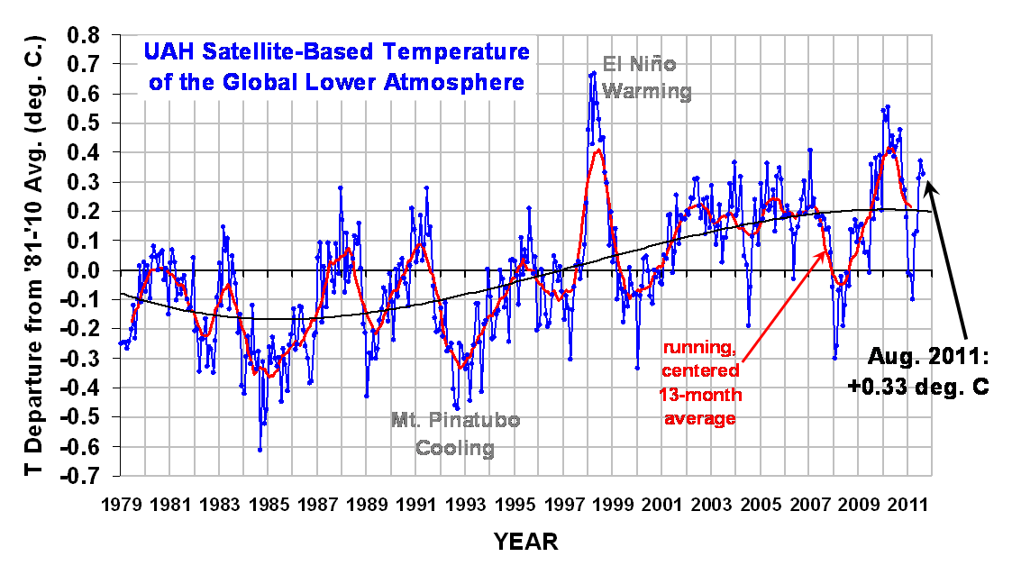
Note that this month I have taken the liberty of adding a 3rd order polynomial fit to the data (courtesy of Excel). This is for entertainment purposes only, and should not be construed as having any predictive value whatsoever.

Here are the stats…we are beginning to see cooling in the tropics from La Nina conditions which are re-emerging there:

YR MON GLOBAL NH SH TROPICS
2011 1 -0.010 -0.055 +0.036 -0.372
2011 2 -0.020 -0.042 +0.002 -0.348
2011 3 -0.101 -0.073 -0.128 -0.342
2011 4 +0.117 +0.195 +0.039 -0.229
2011 5 +0.133 +0.145 +0.121 -0.043
2011 6 +0.315 +0.379 +0.250 +0.233
2011 7 +0.374 +0.344 +0.404 +0.204
2011 8 +0.325 +0.323 +0.327 +0.157

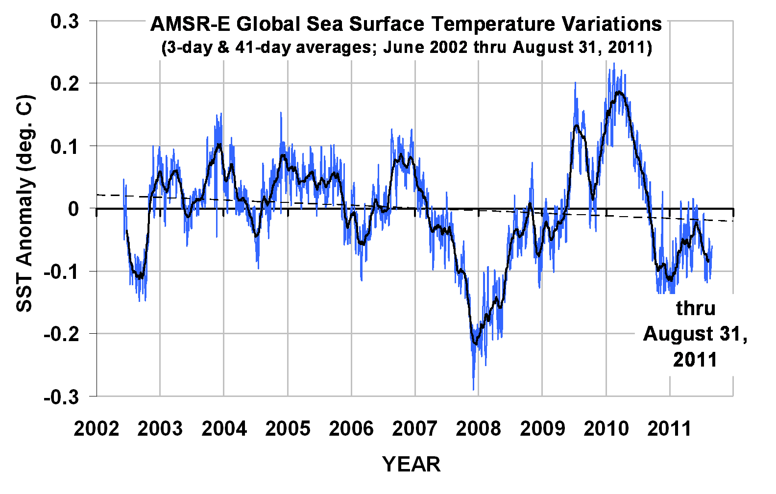
The global sea surface temperatures from AMSR-E through the end of August are shown next. The trend line is, again, for entertainment purposes only:
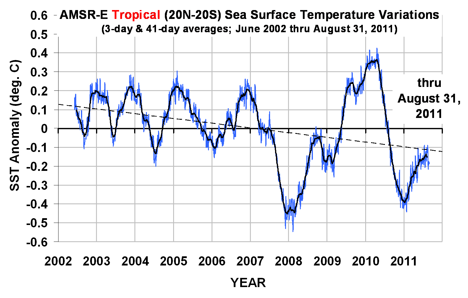
The tropical SST data, of course, show the coolness of La Nina (and previous warmth of El Nino) more clearly, since they are events which have their maximum temperature signature in the tropics:

30 Responses to “UAH Global Temperature Update for August, 2011: +0.33 deg. C”

Toggle Trackbacks

  1. David Pruett says:

    Do you have error statistics for this data?

  2. Tilo Reber says:

    I still think the numbers are too high, Roy. They no longer have a balanced swing around the ENSO cycles. They respond strongly to the El Nino and weakly to the La Nina. Also, they are much further above the trend line than HadCrut. And they continuing to diverge from RSS.

  3. HenkL says:

    Perhaps Roy can explain why the graphs with SST show recent anomalies below zero, while the ocean data are above zero in the data published at:
    http://vortex.nsstc.uah.edu/data/msu/t2lt/uahncdc.lt

  4. Christopher Game says:

    Response to the post of David Pruett of September 2, 2011 at 2:33 PM.

    The data here are of specific particular kinds. There are other data of different kinds.

    Error statistics are about modeling data with particular models, usually models of central tendency and scatter. A common measure of central tendency is an arithmetic mean. Other models of central tendency include other means, the mode, and the median. There are also various models of scatter, such as standard deviation, interquartile range, and so on.

    It would be of interest to compare the data shown here with strictly comparable data from another satellite source, but such strictly comparable satellite sources are not available so far as I know.

    To assess the accuracy of data, one needs to consider many factors. The term ‘error statistics’ is not uniquely defined, and does not cover all factors that are involved in the assessment of accuracy of data.

    Perhaps David Pruett would say exactly what he is looking for when he asks for “error statistics”. Christopher Game

  5. Salvatoro del Prete says:

    NOTE: THE FOLLOWING COMMENT IS A TROLL PRETENDING TO BE SALVATORE
    This latest temperature report further confirms my theory that I have established for the last several years. My theory stands as the only one that actually agrees with both historical and current observations. The IPCC and their so called “models” have greatly underestimated the extremely damaging temperature changes that my theory says will come in the next decade because they ignore natural variations. Even worse are the people that only try to look at the past to predict the future. The past can’t tell us anything because there was no human C02 then. The fact that the current temperature remains historically high despite a double dip El Nino and a prolonged solar minimum and the phasing of AO, PDO, AMO, and EIEIO confirms my theory that manmade CO2 forced temperature change will be much higher than predicted. It is the only thing that can explain the difference in the past 20 years compared to the Maunder minimum, the Dalton minimum, the MWP, and all the other dramatic climatic shifts of the past.

    The IPCC with their bullshit models, and Dr. Spencer with his “low sensitivity” are following the stupidest theories that I have ever heard. It is 100% nonsense, driven by political extremists. My theory shows that all the oscillations, PDO, AO, ENSO, cosmic rays, and especially solar which has the lowest effect of all and can’t make the changes that are happening unless you ADD in CO2. The IPCC tries to “model” this, but they are worthless. For example, they are seriously underestimating the loss of sea ice in the artic. All the denialists and IPCC warmists are just trying to get their money from government research or FoxNews or Exxon and won’t admit what is going on. The sceptics are all just libertarian tools that don’t understand climate.

    There are many natural variations in climate:

    SOLAR: The sun is still shining and intensity is growing, but the effect is small.

    AO: positive, then negative, sort of oscillates. The climate models
    say it should oscillate, but they don’t mention ‘sort of’

    PDO: Like I said, PDO! Really important, or else it would be pdo. But it can’t warm the planet.

    AMO: Exactly as important as PDO, but with an A. Also can’t warm the planet.

    ENSO: This is like El Nino/La Nina, but more scientific with fewer letters and definitely more important than PDO or AMO because it allows people to do linear fits to temperature data and find whatever they want.

    EIEIO: Important for ocean/land/farm/animal interaction. Definitely in cold phase now. When it shifts to warm phase, watch out.

    All these factors cause variations, but the temperature keeps going up! The only reason possible is extreme global warming due to CO2.

    Did you know it was about 111 degrees in Texas for a record number of days this spring? This is the PD0/AMO/AO/EIEIO offesetting the ENSO/CO2 signal as my theory explains. The EIEIO won’t stay like that for long. Just look at what happened in the Medieval warm period.

    I challenge anyone to prove me wrong! Look back at historical records, and you will see my theory is correct. The IPCC cover up the Medieval Warm period, but it happened! Al Gore doesn’t even know which part of Alaska the Canadian Rockies are in.

    My theory is the only explanation, and will be proven right as the planet warms during the next decade more than expected. The following ten years will put the nails in the coffee of all the moderate warmists and so called “sceptics” out there with their stupid b.s. models and lack of alarm. Save this. Pin it to your ice core data, so you see how dumb you will all look soon.

    • Ronald says:

      Based upon some historic and written records the severe drought in Texas and Oklahoma is not unheard of. The 1930s have had similar records and similar conditions. Texas has many more lakes (only 1 natural lake exists in Texas), irrigation/watering than it did previously so if we are looking for a culprit then why not point to the release of water vapor caused by these actions rather than CO2.

      Also 2000 was pretty notorious for high temperatures, but it had an even greater drought. The 1950s had a terrible drought. I dubious of picking a single location and trying to show an extreme condition by pointing to a single record. The difference between 99 and 100 is psychological especially when you work outside.

      At the end of the day screaming the temperatures will go up means very little unless you can give me some real predictive capability with the weather. Will next year be wet or dry? What crops are worth planting? This is real actionable information, but not a single model tells me anything useful other than it could be wetter, drier, colder or hotter (but nothing specific about where I live).

  6. Sam says:

    I think you mean double-dip La Nina.

  7. Sam says:

    After this weak La Nina re-emerges, I predict the global temperature will end up settling lower than it did with the previous year’s La Nina since it has less of a fall to achieve that this time. Bastardi believed it would go lower last year, but I think this is the year we see it drop to a -0.2C. I think it will at least be the same as last year’s drop.

  8. Andrew says:

    HenkL-Okay A)The LT data over oceans are atmospheric temperatures and B) the anomalies are with respect to different base periods. Roy shows the anomalies of the SST record relative to the short period since about 2003. The LT data cover thirty years and are anomalies with respect to a much longer period. So part of the difference is because of global warming, during the 1990’s anyway.

  9. Ray says:

    Tilo Reber,
    I agree with you on this point.
    Since about February, the UAH global anomaly has been approximately 0.1c higher than would be expected from the historical (2003-2010) relationship between AQUA CH5 and UAH.
    In July, the UAH global anomaly was 0.374c, while that for RSS was 0.328c, but since the UAH base period is 1981-2010 and that for RSS is 1979-98, one would expect the UAH anomaly to be lower.
    Not only is UAH currently diverging from RSS, but also HadCRUT3, GISTEMP and NOAA/NCDC.
    However, since UAH seems to exaggerate trends, compared to other anomaly series, I expect that this divergence will be lower, if/when temperature anomalies fall.

  10. Darren says:

    You can’t tell anything from anything less than a 30 year chart.

    Look it up. No point even looking at this useless info. It doesn’t meet well accepted standards to conclude anything at all. NOTHING.

  11. SBVOR says:

    Salvatoro del Prete:

    Here’s a dose of reality for you:
    http://sbvor.blogspot.com/2010/12/how-amo-killed-cagw-cult.html

    • Salvatoro del Prete says:

      NOTE: THE FOLLOWING COMMENT IS A TROLL PRETENDING TO BE SALVATORE.

      SBVOR,

      This is not reality. It is a dose of denial. The AMO is one of the factors I talked about. You must not have understood the my meaning.

      All these factors like AMO/PDO solar, ENSO, EIEIO cause variations, but CO2 has to be added in. You can’t argue
      CO2 versus natural cycles, you have to have both.

      We are currently at the highest
      temperature outside of El Nino years, and that can’t be explained by only variations.

  12. SBVOR says:

    Darren:

    How about 10,000 years of data compared to current data?
    Does that work for you?
    http://1.bp.blogspot.com/-DaJRd7_9-_M/TjhahILuBeI/AAAAAAAACXk/dHPA27-f7WQ/s1600/Vostok-10Ke.jpg

    Yeah, I know…
    Now you’ll complain that we didn’t have satellites providing global data 10,000 years ago. Your sort always has an excuse for denying anything that does not comport with the dogma of your religious cult.

  13. Tilo Reber says:

    Salvotoro: “The fact that the current temperature remains historically high despite a double dip El Nino and a prolonged solar minimum”

    I think you mean La Nina instead of El Nino. And it hasn’t double dipped yet. The solar minimum is not at a minimum. Solar cycle 24 is scheduled to reach it’s maximum next year. Since 98 there have been six El Ninos and five La Ninas and temperatures have been flat.

  14. Tilo Reber says:

    Ray: “However, since UAH seems to exaggerate trends, compared to other anomaly series, I expect that this divergence will be lower, if/when temperature anomalies fall.”

    That’s where one of the problems is, Ray. UAH is responding with strong swings for El Nino, which I expect, but it’s not responding much to La Nina at all lately. Go back 10 years and UAH seemed to be swinging with the ENSO cycles in a very balanced way. Or look at the way the HadCrut3 trend goes throught the ENSO cycles – it is still slicing through them with balance.

  15. SBVOR says:

    Salvatoro del Prete (September 4, 2011 at 6:30 AM),

    1) Sorry, Roy’s “Reply” button never works on my system.

    2) If you had bothered to examine the entire post, you would know there are two primary factors described:

    A) A very gradual on-going warming trend beginning with the emergence from the Little Ice Age.

    B) AMO cycles (embedded within the on-going, centuries old, very gradual warming trend).

    The data are very clear and very compelling. AGW has probably played a role as well. But, in the big picture, an utterly inconsequential role.

    Directly cited and directly linked to peer reviewed science suggests the global temperature trend (flat since at least 1998) will remain flat through about 2018. The AMO cycles suggest another 30 year cooling trend will begin around 2018.

    Now, try reading the entire post and each substantiating link:
    http://sbvor.blogspot.com/2010/12/how-amo-killed-cagw-cult.html

    • Salvatoro del Prete says:

      NOTE: THE FOLLOWING COMMENT IS A TROLL PRETENDING TO BE SALVATORE.

      SBVOR,

      You are falsely projecting your ignorance on me.

      I bet you didn’t even know that the AMO graph you
      linked to on your website has been DETRENDED to remove
      the increase in temperatures due to CO2. OOPS, forgot to mention that didn’t you? That’s right, you are
      making the same mistake in your links to stuff you probably
      don’t understand as you do when you type. The AMO is an oscillation which effects the global temperatures a small amount, but to get a consistent match with all historical data, you need to factor in CO2.

      Look at your 10,000 year record you told Darren to look at.
      DO YOU SEE ANY PRONOUNCED SIGNAL WITH THE PERIOD OF AMO?

      I’ll answer for you: NO! NO AMO signal for 10,000 years!
      But now you claim it is the dominant process that has a regular oscillation and can cool and heat the entire planet at will. Why are things suddenly different now compared to what happened for 10,000 years? It is because you have to add in the amplifying effects of C02 now.

      Instead of linking to patsies of the Heartland Inst. and Exxon shills why don’t you do some science for yourself?

    • Salvatoro del Prete says:

      NOTE: THE FOLLOWING COMMENT IS A TROLL PRETENDING TO BE SALVATORE.

      And as if I need to mention more reasons why your AMO post actually supports my theory that you need oscillations AND C02 to match both the current and past climate record, I will point this out.

      Look at your second “graph”, which is really just a cartoon of temperature drawn by hand. Everything is supposedly set on top of a linear “gradual” recovery from the little ice age, but if you project that line backwards, you see that it has a slope that would make the little ice age about 10 times more below average than it actually was. You had to use a slope to fit the data that can’t be explained by natural variation. The recovery was actually gradual and natural until recently when it became not gradual and not natural.

      So, SBVOR, you run into the truth again. You can’t cook up consistent oscillations that match the true temperature record without resorting to cherry picking intervals or misrepresenting magnitudes. You need to include both natural variation and CO2 to get the full story.

      My theory is the only explanation, and will be proven right as the planet warms during the next decade more than the IPCC predicts.

  16. SBVOR says:

    Salvatoro del Prete,

    I have comprehensively responded to your most recent two comments. But, the response contains multiple links and is, therefore, awaiting moderation.

    Meantime, I will excerpt perhaps the most important point and the single link associated with that point:

    Contrary to your false assertion, the slope emerging from the Little Ice Age (in the Arctic) is very similar to a linear representation of the slope of the (two phased) warming of the last 100 years:
    http://sbvor.blogspot.com/2009/10/recent-hysteria-arctic-now-warmest-in.html

    I would expect AGW to have increased the slope a bit. Perhaps it has. But, if so, it is — at best — barely perceptible. Why? Because CO2 is a very tiny bit player among a whole host of far more powerful natural cycles.

  17. Northern says:

    La Nina seems to be coming back. Take a look at the Pacific Ocean sub surface temperature anomaly update from August 11th 2011:

    http://www.bom.gov.au/climate/enso/sub_surf_mon.gif

  18. SBVOR says:

    Salvatoro del Prete (disingenuously) asks:

    “Why are things suddenly different now compared to what happened for 10,000 years?”

    There is nothing about ANY of the current trends or ANY of the current metrics which is even remotely close to falling outside the bounds of natural variation – not over the last 10,000 years, not over the last 140,000 years, not over the last 423,000 years and not over the last 600,000,000 years:

    http://sbvor.blogspot.com/2009/10/climate-change-science-overview.html

  19. ALL THOSE POST THE LAST FEW DAYS WERE NOT BY ME. SOMEBODY WAS PRETENDING TO BE ME. I NEVRR POSTED ON THIS PARTICULAR TOPIC UNTIL JUST NOW.THANK YOU.

  20. If you want to see my real latest thoughts reasd the message board uner Dr. Spencer’s latest topic. I had not made any post sine Friday, and again all these post were not made by me. I hope we can find out who has done this, and take appropriate action.

  21. I bet it was OBSCURITY ,who pretended to be me.

  22. Ray says:

    I would be grateful if Dr. Spencer could explain why he added a 3rd order polynomial fit to the UAH anomaly graph, rather than a simple linear trend, or a 2nd, 4th, 5th or 6th order polynomial (all available in excel).

  23. barry says:

    Ray, it says quite clearly in the post that the trend lines are for “entertainment purposes” only. Whatever that means.

  24. Ray says:

    barry,
    That is true, but it doesn’t explain why a 3rd order polynomial was chosen over the others.
    Is a 3rd order polynomial inherently more “entertaining” than the others?
    Personally, I find the 6th order polynomial more “entertaining”.
    I am genuinely interested to know what the logic was in deciding to use the 3rd order polynomial.

  25. Jim says:

    Two comments:

    a) Would it be possible in future months to label all of the El Nino / La Nina excusions?

    b) The “amusing” 3rd order polynomial looks by eye very amusingly like a sinusoid with a period of about 44 years…

    In comparison of some of solar cycle/terrestrial climate correlation graphs I’ve seen at various places over the web, the next 24 months should offer a significant drop in temperature over and above the La Nina pattern. If that occurs, it should resolve the climate issue dramatically.

Leave a Reply