UAH Global Temperature Update for February 2012: -0.12 deg. C

March 2nd, 2012 by Roy W. Spencer, Ph. D.

The global average lower tropospheric temperature anomaly cooled a little more in February, 2012, again not unexpected for the current La Nina conditions in the tropical Pacific Ocean (click on the image for the full-size version):
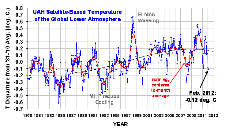
The 3rd order polynomial fit to the data (courtesy of Excel) is for entertainment purposes only, and should not be construed as having any predictive value whatsoever.

Here are the monthly stats:

YR MON GLOBAL NH SH TROPICS
2011 1 -0.010 -0.055 +0.036 -0.372
2011 2 -0.020 -0.042 +0.002 -0.348
2011 3 -0.101 -0.073 -0.128 -0.342
2011 4 +0.117 +0.195 +0.039 -0.229
2011 5 +0.133 +0.145 +0.121 -0.043
2011 6 +0.315 +0.379 +0.250 +0.233
2011 7 +0.374 +0.344 +0.404 +0.204
2011 8 +0.327 +0.321 +0.332 +0.155
2011 9 +0.289 +0.304 +0.274 +0.178
2011 10 +0.116 +0.169 +0.062 -0.054
2011 11 +0.123 +0.075 +0.170 +0.024
2011 12 +0.126 +0.197 +0.055 +0.041
2012 01 -0.090 -0.057 -0.123 -0.138
2012 02 -0.116 -0.014 -0.217 -0.281

Progress continues on Version 6 of our global temperature dataset, which will have a better adjustment for drift of the satellites through the diurnal cycle, and an improved calibration procedure for the older MSU instruments (pre-1998).


100 Responses to “UAH Global Temperature Update for February 2012: -0.12 deg. C”

Toggle Trackbacks

  1. John W. Christensen says:

    The coldest month in almost four years; no wonder my cold wouldn’t go away..

    With the significant high pressure over Western Siberia in early February, the arctic wind pattern changed resulting in a considerable compression of arctic sea ice towards NA, leaving the Eurasia arctic area almost ice free. This time of year that should result in a massive heat exchange between the warm water and cold air, but this phenomenon would probably still be insignificant in the bigger picture, as the NH temperature stayed quite low.

    Any comment on that?

    Thanks,
    John

    • Dave in Canmore says:

      The Barents and Kara Sea where the open water has been has a surface temperature of around zero degrees C according to DMI while the air temperature above it has been not much cooler this winter so I suspect there hasn’t been that much heat transfer.

      (error bars not included!)

  2. I have been saying for a year, the temperature is where it was 20 years ago. I am still saying it.

    • David Appell says:

      Not true at all; the 20-yr linear trend for the UAH LT is a statistically significant +0.20 +/- 0.04 C/decade (uncertainty is the 95% confidence level).

      And, as expected by greenhouse theory, the LS has cooled over this period (though this is complicated by ozone loss): -0.26 +/- 0.06 C/decade.

      • Sundance says:

        A2 David Appell

        David by starting your linear analysis 20 years ago, you start at a period cooled by Mt. Pinatubo eruptions. Was it your intention to suggest that you were making a fair assessment of actual warming?

      • Sundance says:

        David UAH reports monthly with an update on long term decadal trend. It has been at +.14 C/decade for quite some time according to the reports.

        http://nsstc.uah.edu/climate/2012/january/january2012_GTR.pdf

        • David Appell says:

          That’s the trend for the full 34-yr UAH record. The trend for the last 20 yrs (i.e 240 months) is what I gave. It’s easy to calculate for yourself.

          • Sundance says:

            Dave – So which do you think is a more scientifically accurate reflection of a decadal trend, your 20 year period which starts at the coldest time in the last 20 years due to volcanic influence, or the 34 year record? What would teach children the UAH decadal trend is?

          • David Appell says:

            Sundance: Again, I only chose “20 years” because that’s what Huffman chose.

            Most climate scientists believe an interval of at least 30 yrs is necessary to discern AGW at the surface.

    • David Appell says:

      And, of course, the oceans have warmed strongly over this time (http://www.nodc.noaa.gov/OC5/3M_HEAT_CONTENT/), which is the real sign of heat being added to the system.

      The upper 700 m of the oceans have gained about 1e23 J in 20 yrs — an average rate of 160 trillion Watts, or 0.44 W/m2.

      • Ocean warming is pretty flat since we’ve been able to measure it more accurately. Treat the data prior to 2000 with a great deal of caution.

        • David Appell says:

          The *rate* of warming has been flat; the oceanic heat content itself has not. As shown in graph #2 here:
          http://www.nodc.noaa.gov/OC5/3M_HEAT_CONTENT/

          the yearly average of the top 2000 meters has warmed by about 2.5e22 J since the end of 2007, when Argo was fully deployed. That’s 260 terawatts, or 0.7 W/m2.

          • Yeap, way below certain model forecasts. Nothing to worry about. That’s very likely the rate of warming for the last 300 years or so since the little ice age.

          • David Appell says:

            260 TW of ocean warming is “nothing to worry about,” because, you know, heat has this nasty tendency of flowing from hot to cold….

            What is your reference for this rate of warming being “very likely the rate of warming for the last 300 years or so since the little ice age?” Where does that result come from? You earlier implied we couldn’t accuracy measure ocean heat before Argo, so I’m wondering what proxies your statement relies on.

          • Jack Simmons says:

            What’s the total heat content of the oceans?

          • Jack Simmons says:

            Never mind. Found it http://i47.tinypic.com/20kvhwn.png

  3. As we can all see ,no global warming is taking place.

    If the sun can register solar flux readings of 100 or lower for the balance of this decade temperatures will be going down.

    Past history has always shown this to be the case, this time wil be no different.

  4. Jean-Charles Jacquemin says:

    Thanks for all Dr Spencer

  5. David Appell says:

    Dr Spencer: Why do you give these figures to 3 significant figures here, but only 2 on pages like http://vortex.nsstc.uah.edu/data/msu/t2lt/uahncdc.lt ?

  6. Ray says:

    David Appell,

    “Dr Spencer: Why do you give these figures to 3 significant figures here, but only 2 on pages like ”
    I would be interested in an answer to that question too.
    Regarding Harry Dale Huffman’s comment, aren’t you confusing the trend with the current temperature?
    Since the current temperature is lower than the 1981-2010 average, isn’t he currently correct, although given the trend, that might not be the case in a few months.

    • David Appell says:

      He’s technically correct — for the lower troposphere, at least, but not the oceans — but short-term fluctuations are irrelevant to climate debate, which is really about an energy imbalance that leads to heat buildup.

      • If climate scientists really thought “short term” (15 years) was “insignificant” there wouldn’t have been a rush of papers published recently trying to explain where the heat went to. (Chinese aerosols, deep ocean, etc.) Obviously, climate scientists are starting to scratch their heads, even if your own faith in them remains unshaken. 😉

        • David Appell says:

          The papers are trying to understand the shorter-term energy imbalances and how heat is distributed and flows through the ocean-atmosphere system given the many factors on it, not whether there is, in fact, a long-term energy imbalance due to the buildup of greenhouse gases.

          Santer et al. argue that “…temperature records of at least 17 years in length are required for identifying human effects on global-mean tropospheric temperature” (Santer, B. D., et al. (2011), “Separating Signal and Noise in Atmospheric Temperature Changes: The Importance of Timescale,” J. Geophys. Res., v116, D22105, 19 pp.)

  7. I have been corresponding with John Christy at UAH and more recently, also Roy Spenser, for years. When will the media and the public realize that their data are the only data which are to be trusted.

    It is ironic that they never make attention grabbing predictions.

    • David Appell says:

      Wayne: Why is UAH data the only data that can be trusted?

      • It’s not corrupted by land thermometer corruption issues. That doesn’t mean the thermometer data is useless, it isn’t. But there is a case to be had for it being possibly worse than RSS or UAH. The UAH guys also might argue that RSS is an inferior product because of the way in which temperature readings are calculated. RSS might disagree however. 😉

  8. Pasgetty says:

    This question must have been asked before, but why is the above February posted anomaly only -0.12 when the AMSU channels 5,6,7,8 all show that it is considerably below the 2008 February anomaly of -0.3 by about 0.1 or so?? Why isnt it -0.4?

  9. tadchem says:

    Dr. Spencer –
    Rather than the Excel 3rd-order fit (which I have never found useful in any context) I would like to see the data compared to a Linear Least-Square estimate that provides the FULL statistical power of a regression analysis, including a slope, intercept, number of degrees of freedom, square of the correlation coefficient, standard error of the Y-estimate, standard error of the slope, and the 95% confidence range (plus and minus) of the estimates – a statistical result that puts ‘guard rails’ on the regression line that confines 95% of the raw data, and gives a graphic depiction of the uncertainty associated with the ‘trend’ that results.

  10. Turnedoutnice says:

    Substantial North Atlantic cooling: http://bobtisdale.files.wordpress.com/2012/01/figure-102.png

    This proves that net CO2-AGW in this regions <<natural cooling, also that natural heating occurred in the 1990s.

    In turn CCO2 climate sensitivity is probably much lower than the IPCC claims.

  11. John says:

    I’m curious what ARGO has to say about Ocean heat content.

  12. Jack Foster says:

    So I would love to have an explanation of why the graphs seem to be so different.

    http://assets.nybooks.com/media/graphics/graph/image/Nordhaus-graph-032212_jpg_450x498_q85.jpg

    I’m just a layman who has been talking about global warming and climate change on facebook. (I tend to be more skeptical than my cohorts.) Other than the obvious scale manipulations, why do the graphs reflect such different messages?

  13. Steve Hempell says:

    David,

    For the past few years I have been watching the RSS TLS numbers. It seems evident from this data that the two volcanoes had a significant effect on this data.
    To draw a straight line though this data is nonsensical and so is saying that the TLS temperature trend is -0.3 deg/decade. It seems very possible that the volcanoes caused a jump shift in the TLS temperatures. Taking the straight line trend between the two volcanoes and after Pinatubo gives a very different picture).
    The 6yr trend between is +0.23 and the post Pinatubo 18yr (meets someones criteria) trend is -0.04. Hardly significant.

    Looking the same way at the TLT UAH data (ie there is possibly a step jump in temperature). Lets see what happened before and after the “great” warming event of 1997/8. To do this lets use ONI data. Take the last 0 ONI point before the event (March 1997) and take out the entire El nino/La Nina cycle ie. until the ONI index has passed 0 (June 2001). Trying to avoid cherry picking here.

    The 17 yr trend pre EL Nino – .04 deg/decade. The trend afterward 10+yrs and counting – 0.01 deg/decade. The straight line trend through all the UAH global data 0.13 deg/decade. ie the trend is largely from the effects of the 1997/8 El Nino. There seems to be more going on here than CO2. Just another way of looking at the data.

    It will be interesting to see how things might change in Version 6. Roy – do you have any ideas about the above?

    • David Appell says:

      Steve: temperature doesn’t just “jump” for no reason. If it increases there is a net increase of heat into the system. If it stays at a new elevated level, it’s because there is more heat in the system. Where did this heat come from — that’s the question.

      The changes in oceanic heat content show that the heat increase is rather steady (with allowances for the current work on “missing heat” in recent years, which now seems not to be missing — see Loeb et al, Nature Geosciences, 1/27/12). That’s meaningful, because the oceans hold much more heat than the atmosphere. In fact, except for the fact that we live on the surface, it’s a bit silly to diagnose an energy imbalance by looking only at the lowest few kilometers of the atmosphere — let alone the surface, which is only 2-dimensional and so really doesn’t hold any heat at all. This is from the recent paper by Douglass and Knox:

      “Using surface temperature as the best indicator of warming has been questioned by Pielke [2,3], who says “Unlike temperature at some specific depth in the ocean or height in the atmosphere, where there is a time lag in its response to radiative forcing, no time lags are associated with heat changes, since the actual amount of heat present at any time is accounted for. Moreover, because the surface temperature is a massless two-dimensional global field while heat content involves mass, the use of surface temperature as a monitor of climate change is not accurate for evaluating heat storage changes”
      (Phys Lett A, 2012)

      • I’m not sure what you mean by “energy imbalance” – that seems to imply a problem when there might be none. If the extra heating caused by CO2 ends up in the deep ocean, or the coldest parts of the north or south pole warm (so it’s -40C there instead of -60C) or it gets dramatically warmer 1KM up in the atmosphere, honestly, who then cares? It becomes yet another non-problem people have wasted time worrying about. If there is any case for concern, it needs to be where humans live and where the biosphere resides. How will these regions of the planet be effected? If that wasn’t true, nobody would care about this subject at all.

  14. John says:

    Jack Foster,

    Your raise a good question. The Nordhaus global temperature data claims extends back to 1880. The problem is humanity has only had instruments (satellite data) capable of indirectly measuring global temperature since 1979 when MSU satellite data became available. More than likely the Nordhaus data is derived from estimates based on isolated surface thermometers and perhaps other sources such as balloon data but they are not mentioned. Isolated surface thermometers can be located close to urban areas and other heat sinks which very likely will show temperature increases over time due to urban growth. Your website mentions three sources of temperature data:

    “The three series are produced by the UK Hadley Center, the US Goddard Institute for Space Studies ( GISS ), and the US National Climatic Data Center ( NCDC ). For those who question whether the series on global mean temperature are themselves products of a scientific conspiracy, here is yet a further check. Together with my colleague Xi Chen, I constructed yet another index of global mean temperature. We did this by getting grid-cell temperature data and aggregating these into a global average using land-area weights from our own research. To be even more conservative, we also did an audit of the grid-cell data by going back to station data selected quasi-randomly for selected grid cells around the world (such as Dakar, Albuquerque, Casablanca, Llasa, Yinchuan, and Yellowknife). The historical temperature series we constructed behaved very similarly to the ones constructed by the climate scientists.”

    What is grid-cell data? Land-area weights and quasi-randomly selected data from various surface locations are mentioned, which seems to indicated the date was obtained from surface thermometers. It’s unclear from your attached website where or how the data was obtained. In any case, the Nordhaus data differs strikingly from the UAH satellite data Roy posted above and shows dramatically greater warming. Satellite measurements have the advantage of being actual global data instead of projections made from isolated surface sources.

    • Jack Foster says:

      Thanks John.

      It seems like the manipulation of graphs is expected behavior from both sides in the debate. I notice that Steven Goddard over at Real-Science.com has called out the same graph as misleading:

      http://www.Real-Science.com/new-york-times-trusted

      Without reading a word, one can often tell alarmist from skeptic by which graphs they use.

      • David Appell says:

        Jack: Nordhaus’s graph is a depiction surface temperatures. Goddard compares it to a plot of lower tropospheric temperatures. Do you see the difference?

        • Jack Foster says:

          Hi David:

          If we’re talking about AGW, shouldn’t we be talking about the troposphere?

        • John says:

          Hi David,

          Just a point of clarification. Atmospheric temperature data from the earth’s surface is by definition lower tropospheric temperature data since the troposphere extends from the surface up to about 10 – 13 kilometers. In addition, the Nordhaus data is a combination of three data sets one of which is the US Goddard Institute for Space Studies ( GISS ). The data Jack provided compared Nordhaus data with RSS satellite data.

  15. Steve Hempell says:

    OOPS

    “– .04 deg/decade. The trend afterward 10+yrs and counting – 0.01 deg/decade”

    Those are not minus signs but dashes. Poor choice of punctuation!!

  16. “Jack Foster says:
    March 2, 2012 at 2:57 PM”

    Take a close look at the graph and note that the 1940 temperature was not reached again until about 40 years later. We are at the same point again since there seem to be cycles of 60 years and we can expect cooling or at least no warming until 2040. So considering the cyclic nature, there is no need to panic. Furthermore, due to what happened between 1940 and 1980, what proof is there about a huge net effect of CO2? (Note that UAH starts in 1979.)

    • David Appell says:

      Curve-fitting is not science, let alone claiming a 60-yr cycle based on 160-yrs worth of surface data.

      There is a lot of direct evidence of CO2’s role, such as:

      “Increases in greenhouse forcing inferred from the outgoing longwave radiation spectra of the Earth in 1970 and 1997,” J.E. Harries et al, Nature 410, 355-357 (15 March 2001).

      “Comparison of spectrally resolved outgoing longwave data between 1970 and present,” J.A. Griggs et al, Proc SPIE 164, 5543 (2004).

      “Spectral signatures of climate change in the Earth’s infrared spectrum between 1970 and 2006,” Chen et al, (2007).

      “Radiative forcing – measured at Earth’s surface – corroborate the increasing greenhouse effect,” R. Phillipona et al, Geo Res Letters, v31 L03202 (2004).

      “Measurements of the Radiative Surface Forcing of Climate,”
      W.F.J. Evans, North West Research Associates, Bellevue, WA; and E. Puckrin.

      Some of these papers are linked here:
      http://agwobserver.wordpress.com/2009/08/02/papers-on-changes-in-olr-due-to-ghgs/

      • David you seem agitated… all the papers you’ve cited are also “curve fitting” of one type or another. You can’t exactly run a laboratory experiment on the climate system. So you find correlations and try to explain them using hypothesis and theory.

        Here is one on the PDO by a favourite researcher of yours no doubt, Davis & (Michael E.) Mann:

        http://journals.ametsoc.org/doi/pdf/10.1175/JCLI3367.1

        • David Appell says:

          Will, measuring differences in observed levels of radiation is certainly not “curve fitting.”

          Even if there is a 60-yr cycle, what is causing the underlying upward trend? Moreover, any dataset of finite duration will have apparent cycles in it, simply as a artifact of Fourier analysis….

          • Probably the same underlying cause that has caused the underlying upward trend for the last 300 years or so. It’s a non sequitur to claim it’s all caused by CO2. CO2 plays it’s role but it seems like a minor one at this point in time, and whatever contribution it makes might well turn out to be positive.

            While measuring radiation is not curve fitting, it’s disingenuous to suggest that there is some simple relationship between that radiation and catastrophic global warming (or just a particular pattern of temperature increase over certain time frames). There are both positive and negative feedbacks at play in the climate system. To draw the sort of conclusion seem to imply is rather silly.

          • Mike Blackadder says:

            “Even if there is a 60-yr cycle, what is causing the underlying upward trend?”

            The underlying trend could be due entirely to CO2, or part of it could be a natural restoration following the little ice age. Secondly, if we suppose there could be a 60 year cycle, it would be incorrect to try to extract an independent upward trend over a 100 year timescale without properly accounting for this 60 year pattern in the model. I’m sure you see why this would be a problem.

  17. nige cook says:

    Has the extra evaporated water from the anthropic CO2 warmed oceans (above the thermocline depth) absorbed IR, and buoyantly risen to increase the amount of CLOUD COVER, and with it the earth’s albedo?

    Also, is this satellite UAH lower tropospheric temperature data biased by what the satellite measures? What are the measurements of? (Microwave emissions from oxygen molecules?)

    For instance, the tops of clouds will be hotter than the land and sea under the clouds (simple shadowing due to cloud cover). If this data is simply an average over all altitudes, it will be biased against cloud cover (shadowing) effects, and won’t accurately indicate the mean surface temperature.

    Is there any reliable satellite data on the variation of the mean cloud cover over the earth over the years?

  18. nige cook says:

    Phil Jones, Michael Mann et al. used tree ring proxies up to 1960, direct temperature station data from 1960-80, then satellite data after 1980. The splicing together of different data sets into the “hockey stick” graph is not the only problem.

    First, anyone can see that temperature only one variable determining the tree growth rate; others are cloud cover (photosynthesis), and rainfall. Second, direct temperature data from 1960-80 was biased by expanding “heat islands” (cities) for many weather stations. Third, satellite Planck radiating spectrum data can’t determine surface temperatures directly through cloud cover, so microwave air emission data for the troposphere is used, which is biased. Melting ice caps, sea levels, etc depend on surface air temperature, not the temperature average throughout the lower troposphere.

    The H2O positive feedback assumed in all IPCC models seems at odds with NOAA humidity data: http://vixra.org/pdf/1104.0013v1.pdf

    I think Dr Spencer needs to make the basic physical principles of cloud data on negative feedback crystal clear, because it’s as clear as mud to the popular media at present. It seems as if the IPCC models assume that the additional humid air over oceans (due to CO2 temperature rise) is able to absorb IR and get hot, without buoyantly rising to form cloud cover which shadow and cool the altitudes below the clouds. How exactly is the positive feedback from H2O vapor treated in all the IPCC models? How do those models predict H2O vapor, and how well do those predictions compare with the NOAA mean tropospheric humidity data? Do the IPCC models predict cloud cover responses to temperature changes? It is intuitively obvious that if you evaporate large amounts of water, you get more cloud cover. The vapor absorbs sunlight IR, heats up, expands, rises like a hot air balloon, then condenses into clouds at cooler altitudes. Is this process included or omitted from the IPCC doomsday prediction models?

  19. Thanks Dr. Spencer,

    I have updated your graph at http://www.oarval.org/ClimateChangeBW.htm and other pages.

  20. Jonah says:

    Good work Dr. Spencer! Not surprised that February was much colder than January due to the European Cold snap, and the ongoing Asian cold snap.

  21. Chris Wallace-Thompson says:

    I would like to second the question. Some indication of the mix used to calculate the global average would be appreciated. At the moment it’s a little bit hard to reconcile the trends of the UAH data with the monthly result.

    Otherwise I think Dr. Spencer is doing a magnificent job.

  22. -hv says:

    I think that we actually have only one global temperature record, which is accurate enough to see temperature variations of a few decimals. That temperature record is published here.

    The estimates of the temperature variations of the past 120 – 140 years are simply not global neither accurate. So in reality we know of the real ‘global trends’ from 1979 only. And we see actually no change at all, some little natural variance only.

    I think that after about few years more the talk about ‘global warming’ will die. People will have more important things to think about. People paid for ‘global warming’ gossiping will hopefully find other jobs, (paid by nuclear industries as before or by other sources).

  23. Turnedoutnice says:

    Reply to David Appell 1.55 pm:

    The North Atlantic is key because it is the sink for the warmed melt water from the Arctic region, also the near Arctic part of that ocean has been warmed by the temporary reduction of cloud albedo which caused Arctic melting.

    The Arctic is now on the freeze track as shown by the rise in Arctic sea ice extent, a 7 year high soom: http://ocean.dmi.dk/arctic/icecover.uk.php

    The mechanism of cloud albedo reduction can be determined quite easily once you correct the broken aerosol optical physics in the climate models. There is a second optical process which has been observed by many and affects nearly half low level clouds.

    Because of this the cooling by polluted clouds supposed to hide high feedback CO2-AGW is imaginary; no IPCC climate model can predict climate.

    • David Appell says:

      This is exactly the kind of cherry picking that gives “skepticism” a bad name — a couple of week’s worth of fluctuation in Arctic sea ice is absolutely no indication of anything, except that things fluctuation.

      A real analysis of Arctic sea ice in relation to climate would look at the long-term trends, which are strongly downward:

      http://nsidc.org/data/seaice_index/images/daily_images/N_stddev_timeseries.png

      http://psc.apl.washington.edu/wordpress/research/projects/arctic-sea-ice-volume-anomaly/

      • Bob G. says:

        Reply to David Appell 11:33 AM March 3,

        David,

        With respect to “Cherry picking” data, during the Medieval period, most indications including Viking Greenland settlements, Naval data and etc., indicate that there was less arctic sea ice in the Medieval warm period.

        The long term trend appears to be that sea ice has varied quite a bit during the Holocene with periods of time where there is less to periods of time when there are more. Unfortunately, there is no way to judge exactly how much the sea ice levels have changed due to the lack of good data.

        Putting the current situation in context, sea ice levels seem to have gradually dropped during our current warm period from levels that they were at in the Little Ice Age. I think anyone would expect that.

        Given the very short period of time where there are accurate measurements of arctic sea ice, it does not make much sense to use arguments about arctic sea ice to support the views of warmists or skeptics.

        The real question really is how much of the warming over the last few decades are caused by man and whether or not man will cause enough warming in the future to be a problem.

        The science on this is uncertain. What is known is that man is certainly responsible for some of the warming and changes in the sun are responsible for the rest. Going back over hundreds of millions of years, the correlation between changes in CO2 and average world temperature are not very well correlated. Within the Holocene, changes in world temperature are not well correlated with changes in CO2 nor are they in the last few glaciations and interglacials. However, changes in the sun are well correlated with the temperature changes.

        For CO2 to have a major impact on temperature changes, then there must be positive feedback with CO2. My take on the research is that it is still in the early stages. So far, the evidence and research tend to be that strong positive feedback is getting more and more ruled out all the time. This of course could change with some new study. But at the current time, it is not scientifically valid to say that on balance, climate research shows strong positive feedback. Without strong positive feedback, the AGW alarmist argument fails. There is more evidence that there is negative feedback than there is strong positive feedback.

        One of the interesting things about our current time period is that the solar cycle 24 appears as if it is going to be much smaller than predicted by many alarmist scientists. However, those who have been studying the link between the climate and the sun have been predicting a small solar cycle 24 for a few years. Which means that in the next few years, the earth will be the laboratory. Will the earth begin to cool? If so, then the link between the sun and climate will be demonstrated.

  24. Dan Pangburn says:

    Is it unclear that regression analysis uses historical data and has no prediction capability?

    A simple equation that has accurately predicted average global temperatures since 1990 is in a pdf made public 11/24/11. Google my name and “solar cycle 25” to find the equation and much more.

  25. Jonah says:

    One thing the global warming alarmist say that is pretty nonsensical. “The world has warmed 1.5 celsius since 1850” 1850 was a cold spell global warming alarmist! And 1890 to 1940’s the global temperature rose just like this, and back then there were no cars till the 1930’s.

  26. Bill A says:

    Dr Roy

    AMSU Aqua satelite atmospheric temperature anamolies on multipe channels all seem to show that this February is colder than in 2008 when the anomaly was -0.25. I check that data often and as several unanswered people above, I was anticipating a much lower temp for February. Can you please give me an idea of what data is used to come up with the -0.12 figure in your February UAH lower atmosphere temperature graphic above or why it doesn’t appear to correlate to the satelite data. Thank You for your work.

  27. GSW says:

    I’m unhappy with the 3rd order fit also. The fit ‘suggests’ a sinusoidal behaviour to the data – which is more an artifact of the 3rd order polynomial, than anything present in the measured data.

    I think it would be helpful to regularly plot the 10,20,30yr OLS trend, with uncertainties, instead. ‘Visual’ conclusions drawn from that may be more meaningful. (only a suggestion)

    Hope your daughter is well on the road to recovery now. Best wishes to her and the family.

  28. From Peru says:

    Bob G: Are you ready for the global heatwave that is on course for the next few years?

    We must remember that 2010 was the hottest year of the hottest decade on record (the 2000s) , showing that the warming that suffer the Earth since the 1970s is still happening. And this despite that:

    1)The sun showed little or no trend in the same period (1970s-2000s) and ended in the deepest solar minimum in a century (2008-2010)

    See these graphs:

    http://www.climate4you.com/Sun.htm
    http://www.woodfortrees.org/plot/sidc-ssn/from:1950/to:2012/plot/sidc-ssn/from:1970/to:2012/trend

    2)Since ENSO is the dominant driver of year to year temperature variation, we must compare Niño years with other Niño years, and Niña years with Niña years.

    The El Niño episodes that were significant (moderate or strong) in the last two decades were 1982-83, 1987-88, 1992-93, 1997-98, 2002-03 and 2009-10.The 1982-83 was a Super El Niño, but the warming effect was offset by the El Chichon volcanic eruption; for 1992-93, that was a moderate to strong El Niño that was however dwarfed by the Pinatubo eruption cooling.

    This leaves us with 3 El Niños. This El Niños were of different sizes (is remarkable the 1997-98 monster El Niño event, called by some “El Niño of the century”)so making a comparison is difficult.However, one should remember that 2010 and 1998 were tied as the warmest years in the satellite record, despite the moderation of the 2009-10 El Niño and the fact that we were in the bottom of the deepest solar minimum in a century.

    To compare La Niñas is easier. In the last 20 years we had only 4 significant events: 1988-89, 1998-2000, 2007-2008 and 2010-2011. And we have that during the 2010-2011 the planet was warmer than during the 2007-2008 event, during 2007-2008 event we were warmer than during 1998-2000 event and during 1998-2000 we were warmer than in 1988-89 event.Could the trend be more clear?

    So there is something that warmed the Earth despite the cooling influence of the sun and ENSO(with this last I mean the series of La Niñas since 2007). Now the conclusion of my analysis: if we warmed all those years straight to the present, despite the cooling sun and ENSO, there must be some warming effect that is very strong.

    Now that the sun is becoming active again and ENSO will likely shift to an El Niño (is difficult to predict when, but the long term trend of ENSO is flat so and El Niño is expected from the continuation of that trend), we will have both the well known natural variations(Sun and ENSO) and that misterious warming effect in (warming)phase to bring us a memorable planetary heatwave in the coming years.

    I end with your own words:

    “Which means that in the next few years, the earth will be the laboratory. Will the earth begin to cool? If so, then the link between the sun and climate will be demonstrated”

    My answer : quite the opposite, unless we have a series of huge Pinatubo-like volcanic eruption that are well known to fill the stratosphere of cooling sulfate aerosols.

    This is a prediction. In a few years we will know who is right and who is wrong.

  29. What’s the 30 year global trend right now? About .14C per decade. In the last couple of days the temperature in my local area has varied from a max of 24C to 33C in a 24 hour period. I think if it’s going to get 1.4C warmer on average, and that will take 100 years from now to happen, then somehow, I’ll manage to cope. I know it will be tough though… 😉

  30. Dan Pangburn says:

    From Peru,
    A predictive equation (using thermodynamics) has already been derived. It has accurately (std deviation less than 0.1°C) predicted average global temperatures for over 20 years. See my March 3 post.

  31. Steveta_uk says:

    To those who are questioning the 3rd order polynomial:

    The 3rd order polynomial fit to the data (courtesy of Excel) is for entertainment purposes only, and should not be construed as having any predictive value whatsoever.

    Which is these words from Dr. Spencer do you not understand?

  32. GSW says:

    Thanks Steve,

    I know the standard caveat. It would also be entertaining to have polar bears, maybe even a Santa at Christmas, but that in itself isn’t a good reason for them being in the graphic.

    So why a 3rd order polynomial?

  33. “So why a 3rd order polynomial?”

    I expect for the obvious reason that it really really annoys certain idealogical bully’s out there. 😉

  34. GSW says:

    Will,

    Ah, I understand know. Makes sense. Not above of idealogical taunting myself every now and then.

    So yes, it’s for entertainment purposes.;-)

  35. GSW says:

    Apologies to all for the english in that last post. Attrocious.

  36. Andrejs Vanags says:

    I would like to se an alternate ‘global temperature’ calculated as follows: covert all temps to heat flux as H = sigma*T^4, before interpolating for missing values etc. Then calculate the global average of H for that day, then convert back to a Temp as T_ave = (H_ave/sigma)^1/4, plot the trend over a few years, and see what happens.

    Warming or cooling of th earth owuld resutl in a change in the average H not T, and zero change in H is equal to zero warming or cooling. But if calculated as T then temperature fluctuations across latitude and longitude and from nigth to day introduce an error in delta Temperature. If this error were constant it would be no problem and the average T cahnge would track the heating or cooling of the earth, but I can see a situation in which (for whatever reason) heat is re-distibuted with no change in the average H, but the delta T error would change, seemingly indicating an average increase (or decrease) in the average temperature, where none has happened just spatial heat redistribution.
    Would calculating the global temperature as decribed above be possible?

  37. “From Peru says:
    March 4, 2012 at 6:00 PM
    Are you ready for the global heatwave that is on course for the next few years?…In the last 20 years we had only 4 significant (La Niña) events: 1988-89, … 2010-2011.”

    Let us take a look at these. According to the Hadcrut3 data set, the coldest anomaly between 1988 and 1989 was 1989 at 0.102. Also, according to the Hadcrut3 data set, the coldest anomaly between 2010 and 2011 was 2011 at 0.339. According to my calculations, that means an increase of 0.237 over 22 years comparing apples to apples. This works out to be an increase of 0.0107 C/year. Would you call that a heat wave?

  38. John says:

    Hi David,

    Just a point of clarification. Atmospheric temperature data from the earth’s surface is by definition lower tropospheric temperature data since the troposphere extends from the surface up to about 10 – 13 kilometers. In addition, the Nordhaus data is a combination of three data sets one of which is the US Goddard Institute for Space Studies ( GISS ). The data Jack provided compared Nordhaus data with RSS satellite data.

  39. Santer et al. argue that “…temperature records of at least 17 years in length are required for identifying human effects on global-mean tropospheric temperature”

    I wonder if he is starting to get worried. RSS for February just came out at woodfortrees. It came in at -0.121 C. So the combined January-February average is -0.09 placing it the 26th warmest so far. (UAH was also 26th warmest on its set after February.) For RSS, it is now 15 years and 3 months, since December, 1996, that the slope has no trend. (slope = -0.000234717 per year) See
    http://www.woodfortrees.org/plot/rss/from:1994/plot/rss/from:1996.9/trend

  40. Watchman says:

    “Why a third order polynomial?”

    Because linear and quadratic fits have positive
    slope at the end which makes the eye think warming
    will continue. Obviously that has no entertainment
    value.

    You have to go to cubic to get something that trends down
    in the future (at least for now). Dr. Spencer did cubic fits when he first started this blog, but then quit for a while, then started again recently. Any guesses why?

    Polynomial extrapolation of higher order will always
    show either rapid cooling or warming going forward
    since as time gets larger, the higher order term will
    dominate. If you set up the fit so that the sign on
    the highest order term is negative, you get “cooling”.
    Otherwise, you get “warming”. A fifth order fit will
    show “warming” for example. If you let you eyes wander
    back in time, the cubic fit suggests the 1970’s must have been warmer than the 1980s, and the 1960s must have scorching. Very entertaining.

  41. From Peru says:

    Werner Brozek:

    “According to my calculations, that means an increase of 0.237 over 22 years comparing apples to apples. This works out to be an increase of 0.0107 C/year. Would you call that a heat wave?”

    That’s just the global AVERAGE. Look how that looks like on a map:

    http://data.giss.nasa.gov/cgi-bin/gistemp/do_nmap.py?year_last=2012&month_last=1&sat=4&sst=1&type=anoms&mean_gen=0112&year1=2011&year2=2011&base1=1951&base2=1980&radius=1200&pol=reg

    All that red area are places with more than 2ºC warming. Not good for the Arctic sea ice and the polar ice sheets.

    And there is all that orange area more than 1ºC anomalously warmer in North America, Europe, Siberia and North Africa. This load the dice towards more hot extreme weather on these places, with the toll in human lifes and wildfires that result from the favored heat waves.

    And this happened during the so-called “no-warming” or “cooling” decade of the 2000s, that was by the way the hottest decade on record and ended with 2010, the hottest year of that decade (and tied for hottest year ever in UAH and GISTEMP data).

    If during this warming “pause” all that was observed, that is, despite the predominance of La Niña in the last years of the decade and the deepest solar minimum in a century, just imagine what will happen when natural variability shifts again towards a warming influence…

    …the sun has done it already and ENSO will likely be either neutral or El Niño for the rest of the year…

  42. From Peru says:
    March 6, 2012 at 11:16 PM
    Thank you for your reply.
    That Mercator projection looks very deceptive by making the poles look much larger than they are. However it looks to me more like polar warming than global warming. And compared to 1951 to 1980, most areas will show warming. Since different areas seem to be affected differently, any money that is spent should be spent to adapt to what that region is experiencing. For example, why should northern Australia, which is cooling, spend huge amounts of money on a carbon tax so the north pole does not get too hot? Australia needs to spend money on its own problems whether it is drought or floods.
    And as warm as 2010 was, it was still at least 0.07 C colder than 1998 on both RSS and Hadcrut3, so why should we expect the next El Nino to be larger than 1998? Here in Canada, we survived 1998 very nicely. And a few extra hundredths of a degree would not kill us either.

  43. GSW says:

    A couple of days ago I asked over at realclimate, if there was no further warming, how close were we to the CO2 AGW AR4 2007 models being falsified. I got a response from gavin.

    http://www.realclimate.org/?comments_popup=10475#comment-229792

    I have to concede that gavin is actually growing on me; his rc putdowns are less sarcey than they were, he recognizes there is a higher obligation of truth/integrity To Science (his Gleick comment) than To the “cause” and he often gives back of the envelope calculations for things in his arguments i.e. he’s a real deal scientist.

    Needless to say looking forward to 2015 and 2020!

  44. Steveta_uk says:

    “That Mercator projection looks very deceptive by making the poles look much larger than they are.”

    It also makes it look like there is a reasonable population of temperatures readings from those regions, where there are not. It is almost entirely extrapolated.

  45. Jonah says:

    Global temperatures peaking? It hasn’t moved much since 1998. Himalayan glaciers melting little now, now the only thing left is the arctic’s quick melt to stop.

    • david says:

      I agree (but also somewhat disagree 😉 ). Using NASA giss data, linear regression of the monthly anomalies shows the following slopes, for the following time scales (with slopes expressed as Celcius/month):

      * last 5 yrs (starting Febr 2007): slope of +0.0046
      * last 10 yrs (starting Febr 2002): slope of -0.0014 (if one starts the time series 1 month later, the slope is -0.0006, but to compare 10 yrs on a monthly basis one should start and end with the same month)
      * last 14 years (Starting Febr 1998): slope of +0.0086 (if one starts the time series 1 month later, the slope changes to +0.0095)
      * last 15 yrs (Starting Febr 1997): slope of +0.0090
      * last 20 yrs (Starting Febr 1990): slope of +0.0169
      * last 40 yrs (Starting Febr 1970): slope of +0.0158
      * last 60 yrs (Starting Febr 1951): slope of +0.0153 (if one starts the time series 1 month later, the slope is +0.0112)

      Hence, different time frames have different slopes and are (even over a 60 yr time frame) often sensitive to which exact start and end points are used, showing one has to be very careful with which length of data set one chooses (to argue in his/her favor…).

      However, except for the last 10yrs, all slopes are +. But, the r-squares for the last 5, 10, and 15 yrs are all low (0.35; simply more data!). In addition, the 5, 10 and 15 yr long trend lines are not statistically significant (p>0.05) thus there is no (up or down) trend over the past 5, 10 or 15 yrs in global temperature anomalies.

      In other terms:

      * over the past 15 yrs (1997-2012) monthly global temperature anomalies have not increased, while CO2 levels have increased by ~8%
      * over the past 20 yrs (1992-2012) monthly global temperature anomalies have increased, while CO2 levels have increased by ~10%

      Hmmm, am I missing something??? since based on this linear regression study all actual warming over the past 20 yrs occurred between 1992 and 1997, with CO2 levels increasing only ~1.5% in that time frame…. what happened then with that 8%???… weird….

      • david says:

        rephrase: “But, the r-squares for the last 5, 10, and 15 yrs are all low (<0.1) whereas those for the last 20, 40 and 60 yrs are higher (0.35; simply more data!)." somehow this got omitted…

  46. Projections are 1 sigma outside the forecast and getting close to 2 sigma. Given this situation I would be trying to cover my arse too. I don’t have an issue with people like Gavin pushing their theories. The wider problem is that there are large numbers of people who wish to believe these speculations before they even get tested.

  47. david says:
    March 9, 2012 at 6:28 PM

    David, for a different way of looking at the data:

    Following is the longest period of time (above10 years) where each of the data sets is at least slightly negative (or flat for all practical purposes). NOTE: There are no February values yet for 2, 5 and 6. Once these are in, I expect AT LEAST one month to be added to each of the times below.

    1. RSS: since December 1996 or 15 years, 3 months
    2. HadCrut3: since March 1997 or 14 years, 11 months
    3. GISS: since May 2001 or 10 years, 10 months
    4. UAH: It never quite reaches a negative value but I expect it to with the March numbers.
    5. Combination of the above 4: December 2000 or 11 years, 2 months
    6. Sea surface temperatures: February 1997 or 15 years, 0 months

    See the graph below to show it all.

    http://www.woodfortrees.org/plot/hadcrut3gl/from:1997.16/trend/plot/gistemp/from:2001.33/trend/plot/rss/from:1996.9/trend/plot/wti/from:2000.91/trend/plot/hadsst2gl/from:1997.08/trend

    By the way, your number for 60 years (actually 61) just did not look quite right to me, so I double checked them. Here are my numbers for the slopes for 1951, January, February and March: 0.0112861, 0.0112659 and 0.112345. See:
    http://www.woodfortrees.org/plot/gistemp/from:1951/plot/gistemp/from:1951.08/trend/plot/gistemp/from:1951/trend/plot/gistemp/from:1951.16/trend

    • david says:

      werner, you are correct. I re-checked and a slope of 0.0112 for the last 60yrs is what I have too, apologies for the little error. Glad to see consensus though!

  48. Doug Cotton says:

    I often make the point that the use of relative surface areas for land v. sea (roughly 30:70) is not appropriate. The amounts of thermal energy are in the ratio of more like 6:89 I believe. Whatever ratio is estimated ought to be used to assess so called “global temperatures” because it is total thermal energy we are needing to measure. I know temperatures are not a direct measure, but weighting this way is at least better than 30:70. Clearly a square km of deep ocean has more thermal energy than an equivalent land area.

    We nearly always seem to see slower rates of increase in the underlying 1,000 year cycle when we consider sea surface temperatures. Obviously any gradient should be calculated over a 60 year (perhaps 59.6 year) period so as to eliminate the effect of the 60 year cycle. When you do this, say from March 1952 to Feb 2012 I believe you will find a trend gradient of only about 0.05 to 0.06 C degrees per decade. Even if you then bring in land temperatures with about 6% weighting it obviously won’t make much difference.

    I would further suggest that 0.06 C degrees per decade is more in keeping with the variations from the mean of the 1000 year cycle, giving us a total variation in 500 years between maxima like MWP and minima like LIA of 3 C degrees. At the most, I suggest that history shows no more than plus or minus 2 C degrees above or below the level trend of that 1000 year sinusoidal-like cycle. So, a mean rate of increase of 0.08 C / decade seems likely. The fact that the current rate is lower (and perhaps only 0.05 C / decade) indicates an approaching maximum probably within 50 to 200 years.

    My point is, of course, that there is no evidence of any effect at all from CO2 if you agree with my estimate of 0.05 C deg / decade in the last 60 year period.

    The reason carbon dioxide has no significant effect on the rate of radiative cooling of the surface is that it has a limited number of frequencies “standing up against” the full Planck spectrum radiated by the surface. Furthermore, it cannot affect the rate of cooling by evaporation and diffusion (followed by convection) and these rates will increase to compensate.

    The rates of warming are shown in a plot at the foot of my Home page http://climate-change-theory.com and the physics is covered in my peer reviewed paper Radiated Energy and the Second Law of Thermodynamics being published within the next 12 hours at http://principia-scientific.org/

  49. Doug Cotton says:

    In my paper Radiated Energy and the Second Law of Thermodynamics I accept that, technically, “points” are dimensionless and I used the term colloquially in the Abstract for the paper, but I would also say that what I am talking about can be physically a very small volume of matter. I suggest, some such volume with only perhaps a million molecules would be quite sufficient for the Second Law of Thermodynamics to be applicable.

    Wikipedia puts it this way: In classical thermodynamics, the second law is a basic postulate applicable to any system involving measurable heat transfer …

    It is all based on probabilities, of course, but we just need radiation with the full range of frequencies indicated by the Planck curve in order for temperature information to be conveyed. In reality, molecules react to frequencies and it is all to do with frequency distributions, not any characteristic of an individual photon or molecule.

    At the outset, let me be honest and say that I too do not necessarily agree with everything that every author in Slaying the Sky Dragon has written. There are some subtle contradictions in fact between authors. I do however, agree with Prof Claes Johnson’s general concept that radiation from a cooler blackbody merely resonates with molecules in a warmer blackbody, without any of its energy being converted to thermal energy. And Claes also read my paper prior to publication and commented that I was one of only a few who understood his Computational Blackbody Radiation and that he fully endorsed my paper. (I understand that Claes is not a member of the Slayers.) But I chose Principia Scientific International because they have a growing number of scientists joining their ranks who participate in “open review” of the papers they publish on their site – six in total now. PSI comprises many more scientists than the few authors of the book.

    May I ask that people do in fact read the paper before commenting. You will find, for example, that I explain why lasers, microwave ovens and microbolometers do not disprove the hypothesis. Whilst I don’t mention it, I anticipate that there will be experiments published later this year using spectrometers to demonstrate that warm gases do not absorb emission from cooler sources.

    It is not appropriate to assume, for example, that I am discussing thermal energy accumulating in the atmosphere somehow warming the whole Earth system. That concept, I understand, has been dismissed by the IPCC who now argue that it is all about “backradiation” slowing the rate of cooling of the surface. Thermal energy is not transferred from a cold atmosphere to a warmer surface (nor to warmer layers of the lower atmosphere where we live) by any physical process. Thus the slowing of the cooling process is not due to the addition of thermal energy to the surface. Rather, it is due to resonance of the radiation itself, which does not involve absorption in the usual sense involving conversion of radiated energy to thermal energy.

    Radiation from a cooler source merely undergoes what I call “resonant scattering” when it strikes a warmer target. As I have said, there is no conversion of its radiated energy into thermal energy, which is quite a different thing. If the radiation from the cooler (macro) source is (close to) that of a blackbody it will have frequencies across the appropriate Planck curve. Most radiation from the atmosphere will not have all these frequencies, but it will (to some extent) oppose equivalent radiation from the warmer surface while it experiences resonant scattering by the surface.

    When it is scattered by the surface, it becomes a part of the emission of the surface, but, because it already has its own energy, it does not need energy from the surface itself. Thus it slows the rate of cooling of the surface because it “uses up” some of the potential radiation frequencies which the surface would otherwise have used to dispose of its own energy.

    However, carbon dioxide does not radiate like a blackbody, so its few spectral lines are relatively ineffective compared with even water vapour radiation, let alone a blackbody.

    So water vapour is the major contributor, having probably at least 100 times the effect of carbon dioxide when you take into account its greater presence and greater effectiveness per molecule.

    Even so, only the radiative cooling process is affected by radiation from the atmosphere, not all of which is actually “backradiation” as such, because it may have originated from energy carried up by convection.

    Now, there are other processes, mostly evaporative cooling and diffusion (sometimes called conduction) which involves molecular collision between surface and atmospheric molecules.

    These other processes are not affected by radiation from the atmosphere. Yet they probably account for more than half the thermal energy transfer between surface and atmosphere, and they will tend to compensate by increasing their rate if the radiation rate decreases.

    There are reasons for this explained in the Appendix.

    Now, some don’t realise just how much of the incident solar radiation is actually in the near infra-red. Some of this is absorbed by water vapour and, to a small extent, also by carbon dioxide. This SW-IR radiation has much more energy per photon than does the LW-IR radiation from the surface. Some will be absorbed and this helps explain why the thermosphere gets very hot, often well above 400 degrees K in fact.

    By sending backradiation to space a cooling effect results, which is almost certainly greater than any warming effect due to carbon dioxide.

    Temperatures on the Moon (without an atmosphere) vary from about -153°C at night to +107°C during the lunar day. Over 40% of solar insolation is either reflected or absorbed by the Earth’s atmosphere, so our atmosphere keeps the surface cooler than the Moon’s in daylight hours, by reducing incident solar radiation. Then, both day and night, the atmosphere slows the rate at which solar radiation (which was absorbed by the surface) then exits back to into the atmosphere and to space.

    What does not happen is any transfer of thermal energy from cooler regions of the atmosphere to warmer regions on the surface, for any such heat transfer would violate the Second Law of Thermodynamics. For example, radiation from the atmosphere does not penetrate even 1cm below the surface of warmer water and add thermal energy to that sub-surface water. If it did, such warmer water could then rise to the surface by convection and its thermal energy could then get back into the atmosphere by evaporative cooling. Hence we would have had a stand-alone process transferring thermal energy from a cooler atmosphere to a warmer sub-surface layer of the water and warming it even more. Such a process would violate the Second Law.

    Over the course of 4 billion years an approximate equilibrium point has been reached at any particular location on the Earth’s surface. Even though the atmosphere is roughly similar at the South Pole, the equilibrium temperature is very different from that at the Equator, due to different mean solar radiative flux over the course of each year. This clearly indicates that the temperature is mostly determined by the Sun’s radiation, not so much the properties of the atmosphere.

    In regard to experiments, some are being arranged. My own “backyard” experiments with sand and soil in wide necked vacuum flasks indicated no difference in cooling rates between the contents of the flask which was shielded from backradiation at night, and that which was not. Try it yourself using a digital meat thermometer and a sheet of plate glass with an additional shield on top of it, all about 20cm above one flask and at a 10 degree angle to the horizontal to allow convection.

    I suggest the onus should have been upon the IPCC to produce evidence to the contrary with a similar obvious experiment. I suspect it has been tried and failed, thus never being published. Correct me if I’m wrong anyone, and link me to any experiment showing backradiation warms anything.

    I am the first to agree that it can slow that component of the surface cooling which is by radiation. However, in the context of anthropogenic effects, the role of carbon dioxide is minuscule because of its limited radiation frequencies and the fact that it is only one molecule in over 2,500 other molecules. Because it also has a cooling effect radiating energy to space, it is highly improbable that it causes any net warming at all.

    It would be appreciated if people would actually read the paper and this comment in full.

    Even though many clearly believe what has been the “usual” explanation involving heat transfer in both directions, it should be apparent that Prof Claes Johnson and myself disagree with this and are putting forward a hypothesis that there is another mechanism that explains what actually happens and yet still gives the same quantitative result as does application of SBL.

    I really do not need to hear again the “standard” explanation of photons supposedly transferring thermal energy to everything they collide with – and “not knowing” the temperature of the source. You will find all these matters are addressed in the paper.

    But, as I politely asked above, either please read the paper and all of this comment before commenting, or otherwise consider refraining from joining the discussion herein. I believe the paper itself, (perhaps with the additional explanation in this comment which may help some to understand) covers all the objections anyone has thus far raised, both here and on other forums as well.

    My paper will now be subjected to “open peer review” by dozens of members of Principia Scientific International (PSI) who will shortly receive an email from the organisation.

    http://principia-scientific.org/publications/psi_radiated_energy.pdf

    Also: http://tallbloke.wordpress.com/

  50. Pete Ridley says:

    I see that Doug Cotton i spushing his pseudo-scientific article wherever and whenever he can but shies away from tryin g to get it published in a proper scientific journal where it will be reviewed by scientists who know what they are talking about. Instead he has had to resort to having his article published by the nondescript publishing company Principia Scientific International.

    Anyone interested can find out more about this on Professor Judith Curry’s “Letter to the dragon slayers” thread (http://judithcurry.com/2011/10/15/letter-to-the-dragon-slayers/#comment-184339).

    Best regards, Pete Ridley

  51. Christopher Game says:

    Responding to the post of Doug Cotton of March 13, 2012 at 10:42 PM.

    Dear Doug Cotton, it is good that you intend to oppose the IPCC rubbish, but the way you go about it destroys your own credibility. Your insistence that “there is no conversion of its radiated energy into thermal energy” is the most obvious way in which you destroy your own credibility. Your insistence on this shows that you have not remotely understood the basic physics of Planck’s law. No competent physicist will take you seriously till you make yourself familiar with that basic physics.

  52. You have uploaded a fantastic website.

  53. Pete Ridley says:

    Douglas Jeffrey Cotton’s arrogance is beyond belief. On the thread that Roger Tattersall dedicated to his nonsense (http://tallbloke.wordpress.com/2012/03/13/doug-cotton-radiated-energy-and-the-second-law-of-thermodynamics) he has had detailed explanations from contributors of the flaws in his understanding (based upon Professor Claes Johnson’s simplistic model), particularly from individuals using the false names Tor and br1. Despite their efforts, on this A p r i l F o o l’s day Doug declares “ .. Every relevant equation in “standard physics” is based on a false assumption .. don’t tell me yet again that I need to read physics textbooks. I have been helping university students learn their physics ever since I majored in it .. I know what the books say, but such is in error because the early scientists were mistaken .. they were obviously wrong .. You cannot argue successfully against this point, but it is not in textbooks yet.
    .. So please don’t respond yet again with “standard physics” which is the very thing I am refuting .. ”.

    (http://tallbloke.wordpress.com/2012/03/13/doug-cotton-radiated-energy-and-the-second-law-of-thermodynamics/#comment-21719 and #comment-21733 #comment-21734)

    Although he has been trying very hard recently to prove otherwise, Doug is not a complete idiot. He does at least now “ .. acknowledge that the radiation from the cooler body does slow the radiative component of cooling of the warmer target .. ”. Hallelujah, he accepts that the “greenhouse effect” is real. Now all that he needs to acknowledge is that with that constant source of energy coming from the Sun there has to be a compensating increase in the temperature of the Earth until balance is restored – ignoring the many other processes that also contribute to the distribution of energy within the global system of atmo/aqua/cryo/litho/bio/spheres.

    Finding that he was taking a pounding over his blog article posted on the blog of the virtually unknown science-fiction publisher Principia Scientific International started by John O’Sullivan and his “Slayers” it seems that Doug has had to call up reinforcements – Professor Claes Johnson has come to his aid (http://tallbloke.wordpress.com/2012/03/13/doug-cotton-radiated-energy-and-the-second-law-of-thermodynamics/#comment-21742). Strange that he chose to enter the fray there on A p r i l F o o ls’ Day. Maybe he’s getting worried that Doug will be awarded that Nobel Prize for Physics instead of himself.

    It should be interesting following the responses to his comment.

    Back in October Professor Johnson declared “ .. I am not a member of any group subject to group thinking,
    in particular not the slayers group .. ” (http://judithcurry.com/2011/10/15/letter-to-the-dragon-slayers/#comment-122522) but I wonder if he has rejoined the “Slayers” gaggle as a member of PSI.

    Best regards,
    Pete Ridley

Leave a Reply