UAH Global Temperature Update for March 2012: +0.11 deg. C

April 4th, 2012 by Roy W. Spencer, Ph. D.

The global average lower tropospheric temperature anomaly jumped up in March, 2012, to +0.11 deg. C. as La Nina conditions in the Pacific Ocean waned (click on the image for the full-size version):
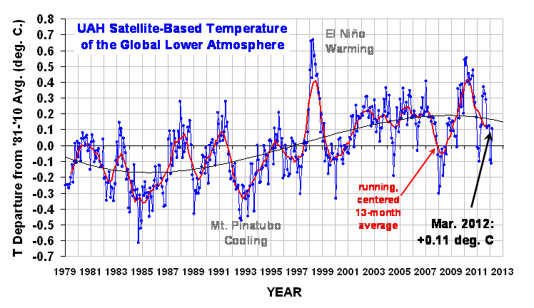
The 3rd order polynomial fit to the data (courtesy of Excel) is for entertainment purposes only, and should not be construed as having any predictive value whatsoever.

Here are the monthly stats:

YR MON GLOBAL NH SH TROPICS
2011 1 -0.010 -0.055 +0.036 -0.372
2011 2 -0.020 -0.042 +0.002 -0.348
2011 3 -0.101 -0.073 -0.128 -0.342
2011 4 +0.117 +0.195 +0.039 -0.229
2011 5 +0.133 +0.145 +0.121 -0.043
2011 6 +0.315 +0.379 +0.250 +0.233
2011 7 +0.374 +0.344 +0.404 +0.204
2011 8 +0.327 +0.321 +0.332 +0.155
2011 9 +0.289 +0.304 +0.274 +0.178
2011 10 +0.116 +0.169 +0.062 -0.054
2011 11 +0.123 +0.075 +0.170 +0.024
2011 12 +0.126 +0.197 +0.055 +0.041
2012 01 -0.090 -0.057 -0.123 -0.138
2012 02 -0.112 -0.013 -0.212 -0.277
2012 03 +0.108 +0.128 +0.089 -0.108

As a reminder, the most common reason for large month-to-month swings in global average temperature is small fluctuations in the rate of convective overturning of the troposphere, discussed here.


53 Responses to “UAH Global Temperature Update for March 2012: +0.11 deg. C”

Toggle Trackbacks

  1. Doug Cotton says:


    There’s a discussion of the trend in the rate of increase of temperatures in the Appendix of this paper in which I show that such is declining since 1900.


  2. Dikran Marsupial says:

    Dear Dr Spencer, please could you omit the polynomial fit from the diagram in future. I know you have given the caveat that it is of no predictive value and is for entertainment purposes only, but that does not stop others from reproducing your graph without the caveat as if the curve-fit was actually meaningful. For example, see climate-change-theory.com (scroll down to the bit where it says “Decide for yourself if the trend should be curved … “, where your plot is used to suggest that the downward curvature of the last decade is meaningful).

    I know it is a shame that communication of science has to be concerned with how the message may be misused, but there is so much misinformation out there already that the entertainment value is outweighed by the potential for misinformation.

    • David Appell says:

      I agree with Dikran, especially if the caveat isn’t included on your other graphs.

      Also, can you please tell us why the anomaly here has 3 significant digits, but only 2 on the more official(?) page at
      http://vortex.nsstc.uah.edu/data/msu/t2lt/uahncdc.lt

      (I know this has been asked several times before, but if it was answered I missed it.)

    • Kasuha says:

      I find it being a good counterweight to the same graph being presented with a linear fit by certain people. It helps us understand that predictive value of both is equal.

      • Paul K2 says:

        Worse than that; over a longer timeframe the UAH data agree well with other temperature data sets that precede the early 1980s. Over the earlier periods, the third order polynomial curve shown doesn’t fit the data well at all. Looking at curve, it purports to show a declining trend in the mid-80s, yet that isn’t what the data sets show. Since the curve doesn’t predict past temperatures well at, why even show it? The linear trend is quite consistent (for now) and fits all available prior data for the timeframe that anthropogenic factors could have been a significant forcing on the global anomaly.

        The curve is entertaining in the same way that LSD is entertaining… just don’t make the mistake that the curve means anything and is real; just like an acid trip, its just a delusion.

        • David Appell says:

          Not only that, the 3rd-order fit “predicts” the anomaly will be -9 C in the year 2050.

          The linear fit “predicts” it will be about 0.7 C.

          Which seems more realistic?

  3. Dikran Marsupial says:

    Further to my previous message, I note the caveat is missing from http://www.drroyspencer.com/latest-global-temperatures/.

  4. As to be expected. Stil no warming ,and there wil not be any warming due to co2 .

    • Scott Basinger says:

      This is an incorrect statement. The only thing that you can assert is that nature appears to be in disagreement with what the models have predicted. When there’s a discontinuity between results and expected results is when science really gets exciting.

  5. Thanks, I have updated my pages with your new graph.

  6. Joe Bastardi says:

    why the big difference from CFSR in march, which wound up about .05 warmer than Feb at Minus .09. Interesting

  7. Bill A says:

    With all the various screwball warming alarmist trends fitted to the temperature data accepted lock stock & barrel by the IPCC and the MSM, I find this one not only refreshing but on the short list of those approaching a realistic possibility.

    • David Appell says:

      It’s not “screwball” to fit data to a linear trend.

      All functions can be approximated, to first order, by a constant + their linear trend — they’re simply the first two terms in the function’s Taylor series expansion. It is justified for “small” intervals around any point, where “small” means that the first derivative is not “rapidly” changing, where the subjective terms get their meaning from the calculus of the expansion.

      • Wayne says:

        David Appell: Your statement about linear fits is technically correct, but misleading. I’ve seen peer-reviewed papers which correctly start by acknowledging that a linear fit of a time series is only an approximation over a limited time, but end up extrapolating this linear trend and making claims like “[The linear trend’s] unabated increase is powerful evidence that we can expect further temperature increase in the next few decades…”.

        When even professionals make the Excel-spreadsheet-like mistake of extrapolating linear fits of time series, your observation is splitting hairs.

        • David Appell says:

          So Wayne, in your expert opinion the 3rd-order polynomial fit is one of the most realistic? How about, then, projecting it to 2050 for us? I find it “predicts” the average global LT temperature anomaly will be about -9 C. In 2115 it will be about -90 C.

          How realistic does that sound, Wayne? In what year will it be below absolute zero? I hope I’m not around for *that* violation of the fundamental laws of thermodynamics.

  8. P. Solar says:

    >> It is justified for “small” intervals around any point, where “small” means that the first derivative is not “rapidly” changing

    dT/dt is ALWAYS changing rapidly in climate , just look at the graph.
    So now we are agreed , it is screwball.

    Those incapable of doing anything more complicated that clicking on “fit a trend” in excel should desist from doing anything.

    The quicker we stop trying fit a “linear trend” to something that patently does not have one, the quicker we cant stop arguing about which year it should start and end.

  9. Dikran Marsupial says:

    The more complex the statistical model you want to fit, the more data you need to estimate the coefficient. While the satelite record has enough data to fit a linear model, it is unlikely to have enough to reliably fit a cubic, given the level of noise. This is why when a statistical model is fit to some data a set of regression diagnostics should be performed to check that the model is reasonable given the data. At the very least this needs to include an analysis of the statistical significance of the model parameters, which in this case would be highly likely to show that a cubic model is not justifiable. I suspect that is why Dr Spencer gave the caveat.

  10. Stephen Richards says:

    Keep it in Roy. Dikran Marsupial indeed !!

  11. Brian D says:

    Just curious, but what would be the percentage of the area mapped in the average, above, and below average zones?

  12. P. Solar says:

    Marsupial, given the level of noise in your comments, it is unlikely you have enough knowledge to reliably tell Dr Spencer how to fit a curve.

  13. Riccardo says:

    There are several more robust smoothing techniques than a cubic fit, they would be more entertaining.

  14. P. Solar says:

    Brian, since the zero is totally arbitrary , the areas are also.

    One interesting point: the time between the trough and the peak, about 31 to 32 years by eye. Now if I was interested in cycles I could suggest that was half a 64 year cycle. But if Dr Spencer fitted cosine he’d probably get howling abuse. That is probably why he fits a cubic with a note that it has no predictive capability.

    A cubic only has two turns and we know temperature was not perpetually higher the further back you go and is not likely going to be perpetually lower in the future. So he is correct.

    However, which ever way you shake it the does seem to be a circa 64 year repetition in the data as can be seen here:

    http://judithcurry.com/2012/03/15/on-the-adjustments-to-the-hadsst3-data-set-2/

    I think Dr. Spencer’s cubic characterises the shape of the data over the range it covers. In thirty years he may need to make it a quartic 😉

  15. sillyfilly says:

    What was that about La Nina years? The 2011/12 La Nina was one of the strongest recorded in the last century (courtesy Australian Bureau of Meteorology) and temperatures are plummeting as a result?

  16. sillyfilly says:

    @Doug Cotton:

    Here’s another look at long-term data trends that may point you to an alternate view:

    http://www.woodfortrees.org/data/hadcrut3vgl/mean:13/plot/hadcrut3vgl/from:1860/to:1880/trend/plot/hadcrut3vgl/from:1910/to:1940/trend/plot/hadcrut3vgl/from:1975/to:1998/trend/plot/hadcrut3vgl/from:1881/to:1909/trend/plot/hadcrut3vgl/from:1941/to:1974/trend/plot/hadcrut3vgl/from:1999/to:2011/trend/plot/hadcrut3vgl/trend

    Trends (accelerated warming periods)
    1860-1880: 0.163 c/decade
    1910-1940: 0.15 c/decade
    1975-1998: 0.166 c/decade

    Each intervening period should show equivalent cooling to the warming if it’s all natural and there no long term warming trend from GHG’s.

    The intervening trends:

    1881-1909: -0.06 c/decade
    1941-1974: -0.01 c/decade
    1999-2011: 0.08 c/decade

    Alas the empirical evidence shows that the intervening periods are gradually getting warmer.

    Any comments?

    • My comment would be that you’re confused. The climate system “shouldn’t” necessarily do anything according to arbitrary time periods you pick out of the air.

  17. crakar24 says:

    One comment sillyfilly,

    What was the co2 levels way back in 1881 -1909 and 1941 – 1974 as compared to today? if you wish to assert (without evidence) that CO2 is the cause of this increase then so be it but you must then acknowledge that the CO2 increase has had very little effect on the temps and therefore this is a non problem………..agreed?

  18. sillyfilly says:

    @ crackar24,

    So I can demonstate it’s not natural can you demonstate it’s not GHG’s. Current trends as discussed on a previous blog put the temperature trend around 2DC/century.

    So what are you then saying, that the planet isn’t warming?

    Moncktonesque type sensitivities are a fallacy!

  19. Doug Cotton says:

    Dikran Marsupial

    In that you mention my site may I mention the plot of 30 year trend gradients at the foot of the Home page – which very clearly shows a cyclic pattern (about 60 years) without any artificial curve fitting.

    Absolutely all climate change can be explained as being due entirely to natural cycles. The rate of increase in temperatures has been declining, at least since the year 1900, if not sooner, because we are getting close to a maximum in the ~1,000 year cycle.

  20. Doug Cotton says:

    SillyFilly

    The long-term warming you speak of is a 500 year rise in a 1,000 year natural cycle, Silly. As you can see in the plot at the foot of my http://climate-change-theory.com the rate of increase has reduced from about 0.06 C degree per decade around 1900 to 1930 to only 0.05 C degree per decade in recent years. Note that here I am speaking of the gradient of the gradient of monthly moving 30 year trends.

  21. Brian D says:

    P Solar I understand that. Changing of a baseline would completely change those types of percentages. And says nothing of longer term trends. But it would be an interesting figure to see in relation to the baseline being used. If 40% of the globe was warmer, and the rest average to cooler, yet the anomaly was positive, it would give some perspective on how strong anomalies in either direction can effect them. I believe Dr. Spencer has posted decadal trend charts before, and that might be useful for percentages of area being affected by significant warming or cooling or not in the period of record.

  22. Doug Cotton says:

     
    Roy and others:

    It really is time that you all spent an hour of your life reading http://tallbloke.files.wordpress.com/2012/04/the_model_atmosphere.pdf

    Note especially pp 15 ff
     

    • Mario Lento says:

      Interest stuff on that link. I particularly never thought of the ironic findings that “Certainly the proxy records indicate that the planet tends to re-enter ice-ages after the atmospheric CO2 content is driven upwards by previous interglacial temperature increase (CO2 concentration is driven upwards by oceanic outgassing).

      Excellent stuff here.

  23. crakar24 says:

    Sillyfilly,

    Let me try to explain.

    You give us 3 periods of warming (4:58PM)

    1860-1880: 0.163 c/decade
    1910-1940: 0.15 c/decade
    1975-1998: 0.166 c/decade

    Obviously these trends are almost identical so therefore regardless of how much CO2 has increased it would appear that CO2 plays no role in the observed warming trend since 1860.

    You give us 3 periods of intervening periods where the warming slows/stops

    1881-1909: -0.06 c/decade
    1941-1974: -0.01 c/decade
    1999-2011: 0.08 c/decade

    Once again the first two periods show a cooling trend albeit small therefore CO2 (ever increasing) plays no part in any warming.

    The third period is only 12 years long so it cannot be included for study.

    So once again here is my previous post

    “One comment sillyfilly,

    What was the co2 levels way back in 1881 -1909 and 1941 – 1974 as compared to today? if you wish to assert (without evidence) that CO2 is the cause of this increase then so be it but you must then acknowledge that the CO2 increase has had very little effect on the temps and therefore this is a non problem………..agreed?”

    Please try and respond to my comments this time rather than resorting to insults and defamatory comments.

    • Elliot Vance says:

      @crakar24:

      I can’t understand why you’re even trying to comment Sillyfilly. His amateurish attempt to provide an evidence of warming caused by GHG was apparently based on “visual analysis”. This “scientific” method is obviously pure crap and has no value at all.

  24. Mario Lento says:

    The implied question is not, “is it warming?” It has warmed more than it has cooled somewhat for quite some time (I’m talking since the little ice age… The question is, “Is increased CO2 the cause of some, all or none of the warming?”

    Anyone with any credibility would say that probably, some of the warming is due to CO2…

    Based on many hours of seeking the truth, my belief is that very little warming can be attributed to the seemingly significant CO2 increases. If it cools for the next 20 to 40 years, it will surely quell the energy from the folks that suggest that Climate variation is largely a function of CO2.

    There I said it.

  25. D.C. says:

    With El Nino looking likely to develop by mid-summer, it looks like global temps might start to climb well above the values predicted by the 3rd order polynomial. I wonder if Dr. Spencer will keep it in, even if it starts performing poorly.

  26. sillyfilly says:

    @Will Nitschke:
    “You seem to be confused over what ENSO is, which is a measure of air pressure differences. The cooling or warming effects are only indirectly related”

    Sorry, I think that both you and the following are confused:

    It’s El Niño
    “Three Australasian researchers have shown that natural forces are the dominant influence on climate, in a study just published in the highly-regarded Journal of Geophysical Research. According to this study little or none of the late 20th century global warming and cooling can be attributed to human activity. The close relationship between ENSO and global temperature, as described in the paper, leaves little room for any warming driven by human carbon dioxide emissions.” (Climate Depot)

    Noting of course that one of the author’s is Prof. Bob Carter, favoured son of the Galileo Movement in OZ, the Heartland Institute and of course, heading up the ignoble NIPCC

    So if’s it all about ENSO and TSI, with an historically strong Ian Nina and low TSI, why then is there no cooling?

    If we ignore the anthropogenic influences then we can’t model the temperrature rise, pretty simple really!

  27. Doug Cotton says:


    Mario

    Excellent stuff here

    You will find all the publications (six so far) on the website for Principia Scientific International quite informative I believe, even if I say so myself.


    • David Appell says:

      Your link is to a fake journal, dressed up (and not very well) to resemble a real journal.

      There are certainly many interesting things to discuss and debate about climate science. What’s in that fake-journal isn’t part of it.

  28. What your critics would argue is that around 20-50% of the land temperature changes are spurious due to corruption caused by urban heat island as populations have grown. Several published papers in the peer reviewed literature have reached that conclusion. Dr Spencer also did a posting here recently suggesting a similar finding. The second part of the argument would be that the PDO flip around 2008 starts a new 60 year cycle which will lead to a little bit of gradual cooling. (Due to atmospheric circulation changes, which also influence cloud cover.) And superimpose on top of that a tiny CO2 warming signal, of course. If you’re dealing with two 60 year cycles then it can be misleading to only look at a 100 year period. On top of all this, other things are going on because the climate system is complex and there are more cycles than just 60 year ones.

    Now do I believe this is a good explanation? (Shrugs) Maybe, maybe not, but it’s certainly less silly than the extreme AGW theories that the media and some from the IPCC believe in.

    As for what you believe in Silly, I am very sure that you can’t divine the influence of CO2 just by looking at wiggles on a graph, or by reading tea leaves, or whatever it is you think you’re doing.

  29. Bevan says:

    Regarding the supposed relationship between atmospheric temperature and CO2 concentration, monthly temperature data from 1971 onwards is available from the Australian
    Bureau of Meteorology Web site at Marrawah, north-west Tasmania, which is the closest weather recording station to the CSIRO atmospheric gases recording station at Cape Grim, 25 km to the northwest. Monthly data for the CO2 concentration at Cape Grim is available from the CSIRO Web site from 1976 onwards.

    Linear regression analysis of the annual increments in temperature and CO2 concentration gives a correlation of 0.089 between temperature and CO2 increments with a t statistic of 0.5 with 32 degrees of freedom giving a probability for the null hypothesis that there is no
    relationship between annual temperature changes and annual CO2 concentration changes of 62%.

    Annual increments are necessary to eliminate the seasonal variation in both data lists and to minimise the instrumental reading noise with respect to the amplitudes being compared.

    At most, these results indicate that one hundredth of the temperature variation may be accounted for by the changes in CO2 concentration. Not a resounding affirmation for the
    claims by the IPCC and their climate models.

  30. Well that’s silly Bevan because one should not assume that CO2 will warm the entire planet evenly everywhere…

  31. Rob says:

    Hmm, is it just me, or do the last 12 months seem to be more volatile? Over 0.4 degrees trough to peak and back again in less than 12 months. I realize that this is the anomaly and not the absolute temperature, but even so this is a big transfer of energy and I am not sure the SST (which presumably is where the energy is transferred to/from) shows the same change.

    Just a thought.

  32. Scott Supak says:

    Physics is so much fun!

    I wonder how many deniers would be willing to put their money where their mouths are?

    https://www.intrade.com/v4/markets/?eventId=91252

    GTAs are based on this table:

    http://data.giss.nasa.gov/gistemp/tabledata_v3/GLB.Ts+dSST.txt

    Will the GTA for March be +.45C or higher? .55C or higher?

    As Neil Degrasse Tyson said on the Bill Maher show: Go bet on it.

  33. Roger Wilson says:

    Please keep the 3rd-order polynomial, Dr. Spencer. It serves a purpose beyond ‘entertainment’ value. It is a classic demonstration of how far some will go to make their point, despite ever-mounting evidence to the contrary.

  34. Bob Droege says:

    I like the 3rd degree polynomial fit because it predicts that the Medieval Warm Period would have been warmer than today and we all know that, that is true.

  35. LazyTeenager says:

    I agree the cubic fit should be kept.

    Because I am betting it will eventually turn into a quartic fit.

    That will be very entertaining indeed, because the people here arguing that it should be kept so as to mislead others will then be whining to have it removed.

  36. Hello, everything is going perfectly here and ofcourse every one is sharing data, thats in fact good, keep up writing.

  37. I truly enjoy looking at on this internet site, it contains good articles.

Leave a Reply