UAH Global Temperature Update for June, 2012: +0.37 deg. C

July 6th, 2012 by Roy W. Spencer, Ph. D.

The global average lower tropospheric temperature anomaly for June (+0.37 °C) was up from May 2012 (+0.29 °C). Click on the image for the super-sized version:
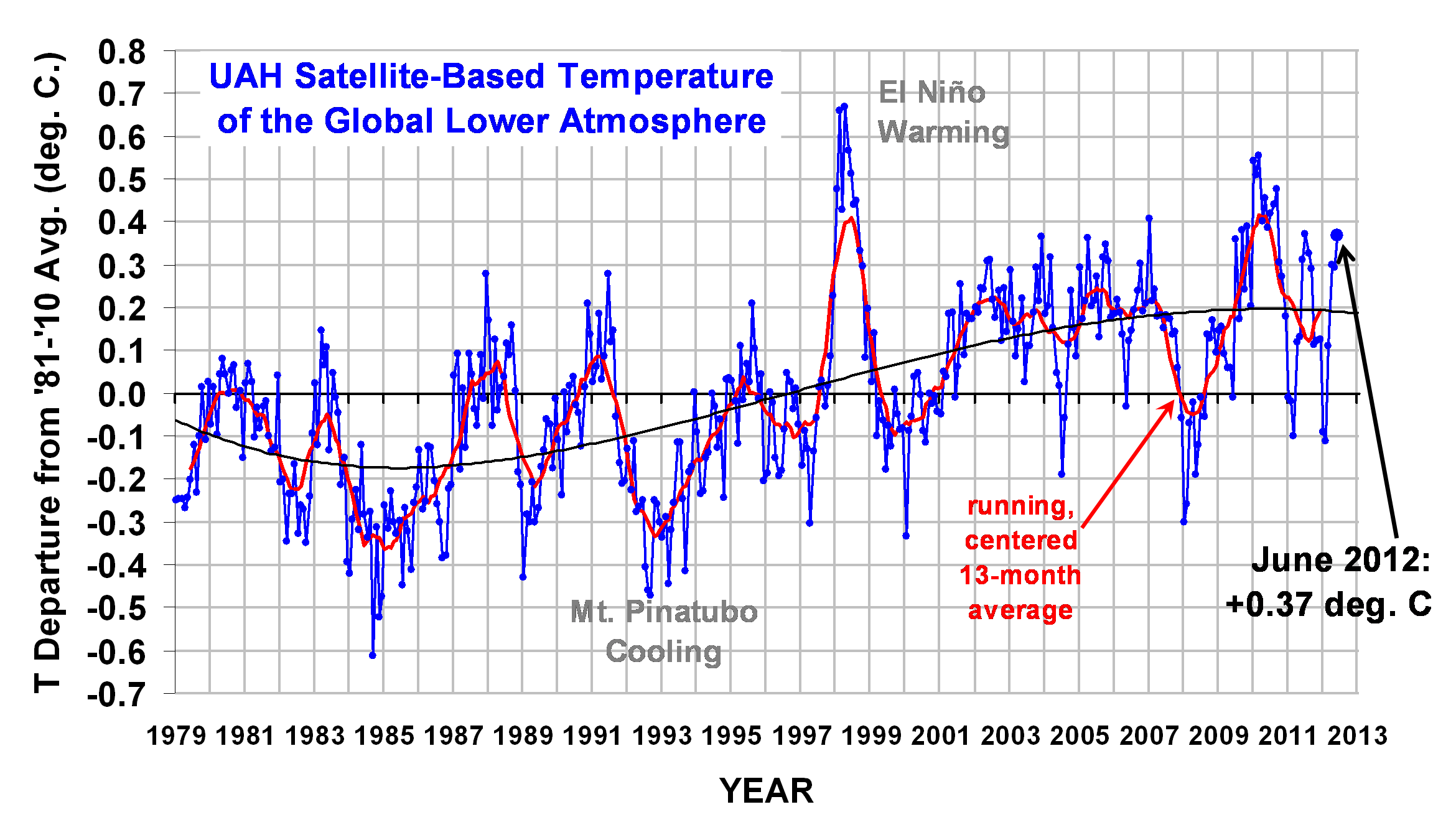
The 4th order polynomial fit to the data (courtesy of Excel) is for entertainment purposes only, and should not be construed as having any predictive value whatsoever.

Here are the monthly stats:

YR MON GLOBAL NH SH TROPICS
2011 01 -0.010 -0.055 +0.036 -0.372
2011 02 -0.020 -0.042 +0.002 -0.348
2011 03 -0.101 -0.073 -0.128 -0.342
2011 04 +0.117 +0.195 +0.039 -0.229
2011 05 +0.133 +0.145 +0.121 -0.043
2011 06 +0.315 +0.379 +0.250 +0.233
2011 07 +0.374 +0.344 +0.404 +0.204
2011 08 +0.327 +0.321 +0.332 +0.155
2011 09 +0.289 +0.304 +0.274 +0.178
2011 10 +0.116 +0.169 +0.062 -0.054
2011 11 +0.123 +0.075 +0.170 +0.024
2011 12 +0.126 +0.197 +0.055 +0.041
2012 1 -0.089 -0.058 -0.120 -0.137
2012 2 -0.111 -0.014 -0.209 -0.276
2012 3 +0.111 +0.129 +0.094 -0.106
2012 4 +0.299 +0.413 +0.185 -0.117
2012 5 +0.292 +0.444 +0.141 +0.033
2012 6 +0.369 +0.540 +0.199 +0.140

As a reminder, the most common reason for large month-to-month swings in global average temperature is small fluctuations in the rate of convective overturning of the troposphere, discussed here.


47 Responses to “UAH Global Temperature Update for June, 2012: +0.37 deg. C”

Toggle Trackbacks

  1. salvatore del prete says:

    July 6, 2012 at 8:46 AM

    GLOBAL WARMING MODELS ARE USELESS

    The hot spot in the tropics is no where to be found. There is no sign of it. First blunder.

    The atmospheric circulation has been tending toward a more negative AO. Second blunder.

    Extremes in climate have increased since 2009 due to a more -AO, the models predicted LESS EXTREMES, due to a more +AO prediction(by the models) ,associated with their so called global warming. Third big blunder.

    Stratosphere if anything is warming, or at least warming more near the poles compared to lower latitudes. Fourth big blunder for the models, which predicted stratospheric cooling especially near the poles.

    Models were thinking more El Ninos associated with a warm PDO, wrong again. Fifth big blunder.

    Long wave radiation being emitted by earth to space no change, esssentially since 1979. Sixth big blunder.

    There are so many more, but as one can see from the above the models BASIC atmospheric forecast in regards to circulation and temperature patterns is not even close to being correct.

    The models will forever, NEVER be able to give an accurate climate forecast, because the data they are fed to begin with is not accurate, not complete ,and not comprehensive enough.

    In addition there are to many feedbacks ,and thresholds from these feedbacks, that the models can’t even begin to imagine ,or I should say account for.

    Also the state of the climate to begin with has to be accurately accounted for.

    It is time to start using our brains again when it comes to the climate, and looking at past history.

    It starts and it ends with solar changes, and all the secondary effects associated with the solar changes. This wil be proven before this decade ends, due to the significant solar change that took place in Oct.of 2005, which will exert more and more influence over the climate as this decade goes on, and the present weak solar max of sunspot cycle 24 passes by. At which time ,the worst of this prolong solar minimum will be upon us, which should last until 2030 or longer.

    Temperatures have been steady now, for at least the past 10 years or so, that is about to end. The globe will be in a cooling trend.

    SOLAR CHANGE WHAT DOES THIS MEAN

    1. LESS UV LIGHT ,LESS OZONE, CHANGES ATMOSPHERIC CIRCULATION ,MORE -AO. MORE CLOUDS, PRECIP,SNOW COVER, HIGHER ALBEDO. RESULT COLDER.

    2. WEAKER SOLAR WIND, MORE COSMIC RAYS MORE CLOUDS.RESULT COLDER.

    3. SOLAR MINIMUM EQUATES TO MORE VOLCANIC ACTIVITY. MORE SO2 ,WARMER STRATOSPHERE. RESULT COLDER.

    4. SOLAR MINIMUM EQUATES TO COLD PDO ,MORE LA NINAS. RESULT COLDER.

    5. AMO WILL ALSO BE IN COLD PHASE. RESULT COLDER.

    6. SOLAR IRRADIANCE CHANGES BY MORE THEN .1 ESPECIALLY DURING PROLONG SOLAR MINIMUMS. (.6 IS A COMMON ESTIMATE) RESULT COLDER.

    7. IONOSPHERE,THERMOSPHERE, MESOSPHERE, IN ADDITION TO THE LOWER LEVELS OF THE ATMOPSHERE ALL SHOW SIGNIFICANT CHANGES ASSOCIATED WITH SOLAR ACTIVITY CHANGES. RESULT IS CLIMATE CHANGE.

    Those are just some of the changes ,the sun exerts on our climate, and if the positive feedbacks from these reach a certain degree of magnitude /duration of time they might be able to over come the inherent negative feedbacks in our climatic system and bring the climate to some sort of a threshold or a series of thresholds, each time resulting in a drop in the temperature to another range,. It coud be as small as maybe just -.2c ,or much larger depending on how this evloves.

    Further, last century’s solar activity is not the kind of solar activity that is going to change the climate. Last century’s solar activity simply maintained our climate in the same regime it went to after the DALTON MINIMUM ended, in 1850 or so. The solar activity last century was a steady rhythmic 11 year sunspot cycle ,against a strong background of high solar activity. (will not change the climate)

    All the variations in the climate since 1850- present have all been in the same climatic regime. Some warm periods ,some cold periods ,due to AO,PDO, etc etc, but all in the same regime. This is going to change this decade.

    THE SUN IS THE SOURCE THAT DRIVES THE CLIMATIC SYSTEM /OCEANIC SYSTEMS OF EARTH TO BEGIN WITH ,THEREFORE ANY CHANGE IN THE SUN IF LARGE ENOUGH, HAS TO HAVE AN EFFECT ON THOSE SYSTEMS, SINCE IT IS THE SOURCE THAT DRIVES THOSE SYSTEMS TO BEGIN WITH.

    Since 1850 ,versus 1790-1850, the solar changes between those two time periods brought us out of the DALTON MINIMUM, to what we have now.

    This however is about to end due to the SIGNIFICANT SOLAR CHANGE ,that took place Oct. 2005 ,in my opinion.

    Time wil tell, as they say.

  2. As Dr. Spencer says convective over turning in the trop. accouts for much of the month to month temperature variations. I would also venture to say the weak El Nino probably had some impact.

    All that is in the same climate regime. I am talking about something different in the previous post. We are in the same climatic regime since the DALTON MINIMUM ended.

    Variations yes, but no thresholds. Not even close.

    Since 2005, I think for the first time since 1850, a SETUP is in place to change that. The potential is there, time will tell.

  3. David Appell says:

    Salvatore Del Prete, December 8, 2010:
    “In closing I am confident if solar activity stays as is, this wil [sic] be the decade of global cooling. Only time will tell who is right and who is wrong.”
    http://www.drroyspencer.com/2010/12/nov-2010-uah-global-temperature-update-0-38-deg-c/#comment-6505

  4. Dikran Marsupial says:

    I have a prediction, before too long, the cubic fit will no longer suggest future cooling, at which point it will no longer be entertaining and will disappear from the plot. ;o)

  5. David Appell says:

    Dikran, the 3rd-order polynomial fit implies that all atomic motion ceases around January 2171:
    http://davidappell.blogspot.com/2012/04/roy-spencers-entertaining-polynomial.html

  6. Dikran Marsupial says:

    :o)

    I’ve noticed it has also changed from being a cubic to a quartic for some reason.

  7. David Appell says:

    Perhaps it’s because the 4th-order polynomial fit goes asymptotically to positive infinity, whereas the 3rd-order fit goes asymptotically to minus infinity.

    The 4th-order fit has a local minimum of about -7 C in the year 2084, then starts to increase. It reaches 0 C again around the year 2113, then shoots up to positive infinity.

  8. Dikran Marsupial says:

    LOL, it appears my prediction was actually a hindcast, the cubic no longer suggests future cooling and had already been removed from the plot, … and replaced by a quartic!

  9. Dikran Marsupial says:

    Actually, double checking suggests I may be wrong about that one, appologies.

  10. oliv says:

    “For entertaintment purposes only or “for deceiving purposes only” ?

  11. oliv says:

    “For entertaintment purposes only” or “for deceiving purposes only” ?

  12. P. Solar says:

    It appears that for the last two years now the monthly temps have been diviating significantly from the average months of the reference period.

    There is a clear annual cycle in the “anomalies” that shows increased seasonal variation in the NH is dominating the global mean. The lesser inertia of NH would probably cause its changes to be larger and to dominate any such change in behaviour.

    In particular cooler winters make deep troughs. Since most of the warming was caused by warmer winters I would suggest this probably a clear sign that we are entering actual cooling returning to a pattern that predates the satellite record shown here.

    This is what is found by looking at rate of change of SST in ICOADS
    http://curryja.files.wordpress.com/2012/03/icoads_monthly_adj0_40-triple1.png?w=600&h=620

    Part of this article of the questionable Hadley adjustments
    http://judithcurry.com/2012/03/15/on-the-adjustments-to-the-hadsst3-data-set-2/#comment-188237

    The middle plot of that panel of three shows rate of change fitted to three cyclic terms plus a linear rate of change.

    Once the cyclic nature is accounted for the linear increase is about 0.4 K/century not the more usual 0.7 K/c

    The fit shows rate of change crossed zero in about 2008 and has a small negative value (cooling) for the last few years.

    Perhaps Dr Spencer could comment of whether the strong cycles in the anomalies could be an indication of cooling as I hypothesised above.

  13. Andy says:

    *Shrugs* I’m fine with the “for fun” 4th order polynomial as long as the disclaimer is there. Of course that doesn’t prevent some people from showing the chart elsewhere without the disclaimer so that part can be problematic if nobody is correcting faulty claims made using the for fun line on these charts. Maybe if there were a way to unobstructively put the disclaimer on the chart then there wouldn’t be any problem at all.

  14. 2012 in Perspective so far on Five Data Sets

    2012 started off rather cold but has warmed up since then. So the present rank is not the most meaningful number. Therefore I will also give the ranking by assuming the latest month’s anomaly will continue for the rest of the year.

    With the UAH anomaly for June at 0.369, the average for the first six months of the year is (-0.089 -0.111 + 0.111 + 0.299 + 0.289 + 0.369)/6 = 0.145. If the average stayed this way for the rest of the year, its ranking would be 10th. This compares with the anomaly in 2011 at 0.153 to rank it 9th for that year. On the other hand, if the rest of the year averaged at least the June value, which is more likely if the El Nino gets stronger, then 2012 would come in at 0.257 and it would rank 3rd. (1998 was the warmest at 0.428. The highest ever monthly anomalies were in February and April of 1998 when it reached 0.66.) In order for a new record to be set in 2012, the average for the last 6 months of the year would need to be 0.71. Since this is above the highest monthly anomaly ever recorded, it is virtually impossible for 2012 to set a new record or to even come in second.

    With the GISS anomaly for May at 0.65, the average for the first five months of the year is (0.34 + 0.41 + 0.47 + 0.55 + 0.65)/5 = 0.484. If the average stayed this way for the rest of the year, its ranking would be 10th. This compares with the anomaly in 2011 at 0.514 to rank it 9th for that year. 2010 was the warmest at 0.63. The highest ever monthly anomalies were in March of 2002 and January of 2007 when it reached 0.88. If the May anomaly continued for the rest of the year, 2012 would end up 4th.

    With the Hadcrut3 anomaly for May at 0.474, the average for the first five months of the year is (0.217 + 0.194 + 0.305 + 0.482 + 0.474)/5 = 0.3344. This is about the same as the anomaly in 2011 which was at 0.34 to rank it 12th for that year. 1998 was the warmest at 0.548. The highest ever monthly anomaly was in February of 1998 when it reached 0.756. If the May anomaly continued for the rest of the year, 2012 would end up 9th.

    With the sea surface anomaly for April at 0.292, the average for the first four months of the year is (0.203 + 0.230 + 0.242 + 0.292)/4 = 0.242. If the average stayed this way for the rest of the year, its ranking would be 14th. This compares with the anomaly in 2011 at 0.273 to rank it 12th for that year. 1998 was the warmest at 0.451. The highest ever monthly anomaly was in August of 1998 when it reached 0.555. If the April anomaly continued for the rest of the year, 2012 would end up 12th.

    With the RSS anomaly for May at 0.233, the average for the first five months of the year is (-0.058 -0.121 + 0.074 + 0.333 + 0.233)/5 = 0.0922. If the average stayed this way for the rest of the year, its ranking would be 16th. This compares with the anomaly in 2011 at 0.147 to rank it 12th for that year. 1998 was the warmest at 0.55. The highest ever monthly anomaly was in April of 1998 when it reached 0.857. If the May anomaly continued for the rest of the year, 2012 would end up 11th.

    So on all five of the above data sets, for their latest anomaly average, the 2012 average so far is close to that of 2011. If present trends continue, 2012 will be warmer than 2011, but a record is out of reach on all sets.

    On all data sets, the different times for a slope that is flat for all practical purposes range from 10 years and 9 months to 15 years and 7 months. Following is the longest period of time (above 10 years) where each of the data sets is more or less flat. (*For any positive slope, the exponent is no larger than 10^-5, except UAH which WAS 0.00103655 per year or 0.10/century in May, but the June value is not on WFT yet, however it will definitely go up and while it will not be flat, the slope will not be statistically significant.)

    1. UAH: since October 2001 or 10 years, 9 months (goes to June, but note * above)
    2. GISS: since May 2001 or 11 years, 1 month (goes to May)
    3. Combination of the above 4: since October 2000 or 11 years, 6 months (goes to March) (Hadcrut3 is SLOW!!)
    4. HadCrut3: since January 1997 or 15 years, 3 months (goes to March)
    5. Sea surface temperatures: since January 1997 or 15 years, 4 months (goes to April)
    6. RSS: since November 1996 or 15 years, 7 months (goes to May)
    7. Hadcrut4: since December 2000 or 11 years, 6 months (goes to May using GISS. See below.)

    See the graph below to show it all for #1 to #6.

    http://www.woodfortrees.org/plot/hadcrut3gl/from:1997/trend/plot/gistemp/from:2001.33/trend/plot/rss/from:1996.83/trend/plot/wti/from:2000.75/trend/plot/hadsst2gl/from:1997/trend/plot/uah/from:2001.75/trend

    For #7: Hadcrut4 only goes to December 2010 so what I did was get the slope of GISS from December 2000 to the end of December 2010. Then I got the slope of GISS from December 2000 to the present. The DIFFERENCE in slope was that the slope was 0.0046 lower for the total period. The positive slope for Hadcrut4 was 0.0041 from December 2000. So IF Hadcrut4 were totally up to date, and IF it then were to trend like GISS, I conclude it would show no slope for at least 11 years and 6 months going back to December 2000. (By the way, doing the same thing with Hadcrut3 gives the same end result, but GISS comes out much sooner each month.) See:

    http://www.woodfortrees.org/plot/hadcrut4gl/from:2000/to/plot/hadcrut4gl/from:2000.9/trend/plot/gistemp/from:2000/plot/gistemp/from:2000.9/to:2011/trend/plot/gistemp/from:2000.9/trend

  15. Jim Cripwell says:

    Werner, What your analysis clearly shows that there is no CO2 signal in any of the temperature/time graphs, which can be shown to be caused by adding CO2 to the atmopshere, and from which a value of the total climate sensitivity can be easily measured. If CAGW is right, and the effects are going to be as dangerouse as the proponents of CAGW claim, then surely by this time there ought to be a strong and recognizable CO2 signal in the temperature/time graphs.

    The 64 trillion dollar question is, how long do we wait for a CO2 signal to appear, and no signal occurs, before we conclude that no CO2 signal is EVER gong to appear?

  16. David Appell,thanks for posting that give and take I had with Dylan, a very intelligent person, although we don’t agree.

    I want to be held to what I say, and if I am wrong so be it. I am not going to make any excuses if all my predictions turn out to be flat out wrong. No spin.

    The only condition is ,I need (according to my way of thinking, and who knows for sure if it is correct) ) is for solar activity to go back to, and stay near typical solar minimum conditions or even lower ,once this cycle max., of solar cycle 24 passes by.

    I like to use the solar flux,as a guide to monitor
    solar activity. Using that, I say I need that reading to be 90 or lower ,95% of the time going forward, in order to see if what I say is right or wrong.

    If this happens, and the conditions I suggested don’t materialize to some degree, then I will admit to being wrong.

  17. David Appell says:

    Jim, do you know of the multiregression analysis of Foster & Rahmstorf?

    “Global temperature evolution 1979–2010,” G Foster and S Rahmstorf, 2011 Environ. Res. Lett. 6 044022
    http://iopscience.iop.org/1748-9326/6/4/044022/pdf/1748-9326_6_4_044022.pdf

    • mike maguire says:

      David,
      I read their paper and understand their reasoning for this:

      “We analyze five prominent time series of global temperature (over land and ocean) for their
      common time interval since 1979”

      It turns out to be quite convenient that their analysis just happens to cover the time frame of greatest warming.

      Let me ask you what you think the results would have been if they did the same analysis(with all data available then) for the prior 30 years?

      As you know, the effects of CO2 are logarithmic, meaning that increases should be more powerful when they are added to atmospheric levels that are lower, as they were in the 50’s, 60’s and 70’s.

      The effect of increasing CO2 during the prior 30 year period should have been even greater than the period of they analyzed which is in stark contrast to what actually happened.

  18. Met Office – No warming in the past 15 years

    We could even be headed for a Dalton or Maunder-type minimum, the coldest part of the Little Ice Age.

    “The supposed ‘consensus’ on man-made global warming is facing an inconvenient challenge after the release of new temperature data showing the planet has not warmed for the past 15 years,” says this article in the Daily Mail.

    “The figures suggest that we could even be heading for a mini ice age to rival the 70-year temperature drop that saw frost fairs held on the Thames in the 17th Century.”

    “Based on readings from more than 30,000 measuring stations, the data was issued last week without fanfare by the Met Office and the University of East Anglia Climatic Research Unit (of Climategate fame). It confirms that the rising trend in world temperatures ended in 1997.”

    Read that again. “Based on readings from more than 30,000 measuring stations, the data … confirms that the rising trend in world temperatures ended in 1997.”

    Not only has the warming trend ended, it looks like we could now be headed in the other direction.

    According to leading climate scientists, “after emitting unusually high levels of energy throughout the 20th Century, the sun is now heading towards a ‘grand minimum’… threatening cold summers, bitter winters and a shortening of the season available for growing food.”

    “There is a 92 per cent chance that both Cycle 25 and those taking place in the following decades will be as weak as, or weaker than, the ‘Dalton minimum’ of 1790 to 1830,” said a paper issued last week by the Met Office. “In this period, named after the meteorologist John Dalton, average temperatures in parts of Europe fell by 2C.”

    “However, it is also possible that the new solar energy slump could be as deep as the ‘Maunder minimum’… in the coldest part of the ‘Little Ice Age’ when, as well as the Thames frost fairs, the canals of Holland froze solid.”

    “Meanwhile, since the end of last year, world temperatures have fallen by more than half a degree, as the cold ‘La Nina’ effect has re-emerged in the South Pacific.”

    http://www.dailymail.co.uk/sciencetech/article-2093264/Forget-global-warming–Cycle-25-need-worry-NASA-scientists-right-Thames-freezing-again.html

    Thanks to William Dugan for this link

    Here’s a link to a University of Reading press release concerning this (the Maunder Minimum part):
    http://www.reading.ac.uk/news-and-events/releases/PR428852.aspx

    The press release includes a link to the Journal of Geophysical Research paper: http://www.agu.org/pubs/crossref/pip/2011JD017013.shtml

    ——————————————————————————–

    I originally posted an article about this on January 30, 2012. With the current heat wave in parts of the United States, and the mainstream media screaming ‘global warming,’ I thought it worthwhile to bring it up again.

    http://iceagenow.info/2012/01/headed-mini-ice-age/

  19. Jim Cripwell says:

    David, your reference makes a classic error. I quote from the astract “When the data are adjusted to remove the estimated impact of known factors.” However, they have not, and they cannot, allow for unknown factors. In order to actually detect a CO2 signal, it is necessary to prove that the signal was caused by adding CO2 toi the atmosphere. This paper does not do this.

    • amblin says:

      “However, they have not, and they cannot, allow for unknown factors.”

      Doesn’t matter. Just by allowing for known factors they show the warming continuing.

      The burden is on others to show that unknown factors change that.

      As it stands with ENSO and the solar cycle corrected there’s no slowdown in warming since 1979.

  20. “Jim Cripwell says:
    July 7, 2012 at 6:07 AM
    The 64 trillion dollar question is, how long do we wait for a CO2 signal to appear, and no signal occurs, before we conclude that no CO2 signal is EVER gong to appear?”

    They are just getting more desperate all the time. When we had 10 years of no warming, they said that happens 1 in 8 runs. However apparently no runs had 15 years of no warming. But now that we have passed that on at least 3 of the data sets, Ben Santer says we need 17 years to detect a signal. Then there is Foster & Rahmstorf. In 1996, the GISS anomaly was 0.30. According to my calculations below, under the same circumstances, a La Nina 15 years later should have had an anomaly of 0.39 higher or 0.69 and the super El Nino mark of 1998 should have been beaten by a La Nina 15 years later, but that was not the case in 2011.

    Right now, the ppm is about 390 and it went up from 280 to 390 and it is going up at about 2 ppm per year. At that rate, the doubling for another 170 ppm would occur in 85 years or around 2100. Since it is presumed the temperature went up by 0.8 C already, it would have to go up by another 2.2 C in 88 years assuming 3 C for a doubling of CO2. This amounts to 0.25 C per decade or about 0.39 C in 15 years and 7 months. But look at what happened to the RSS temperatures in the last 15 years and 7 months.

    http://www.woodfortrees.org/plot/rss/from:1996.83/plot/rss/from:1996.83/trend

    OK. I cherry picked that one. But the maximum slope that Phil Jones found was 0.166 C per decade. This is by “cherry picking” the best possible slopes of the last 100 years and it is still way short of 0.25 C/decade.

    http://news.bbc.co.uk/2/hi/science/nature/8511670.stm

    • amblin says:

      The 1996 La Nina was weaker than the 2011 La Nina.

      Just look at FR11, they correct temperature for ENSO depending on it’s strength.

  21. Jim Cripwell says:

    Unfortunately my computer does not allow me to put this in the “Reply” slot. amblin writes “Doesn’t matter. Just by allowing for known factors they show the warming continuing.
    The burden is on others to show that unknown factors change that.”

    Nonsense. Global temperaturs have been rising since the end of the LIA at the beginning of the 18th century. There is every sign that this natural rise is still continuing, though doubtless it will not continue into the indefinite future. What the proponents of CAGW need to show is that a rise, different from and more pronounced than, this natural rise has come as a result of adding CO2 to the atmosphere. This is what the CO2 signal is; a rise in temperature that is different from the natural one. This signal is not present in any temperature/time grpah of data from the 20th and 21st centuries.

    The propnents of CAGW need to show that an unusual temperature rise is resulting from adding CO2 to the atmopshere. No-one has been able to show that this CO2 signal exists, and that any form of unusual rise in temperature has resulted from adding CO2 to the atmopshere.

  22. Eileen Kinley says:

    Jim –

    You state “There is every sign that this natural rise [since the end of the LIA] is still continuing,”

    What is this sign?

    Why would current warming due largely to additional CO2 need to be more pronounced than previous warming caused strictly by natural factors? Are you claiming that natural factors do not vary? Or are you simply setting up impossible goalposts – aka a logical fallacy?

    Meehl 2004 examined the effect that volcanic activity and solar activity had on global temperatures since the LIA. A summary is available at http://www.skepticalscience.com/What-ended-the-Little-Ice-Age.html

    Lean and Rind 2008 performs an analysis similar to Foster & Rahmstorf 2011 but starting in the late 1800s. Of course there are fewer datasets available over that timeframe.

    http://pubs.giss.nasa.gov/abs/le08200o.html

    In order to reject warming caused by additional CO2 in the atmosphere, you must explain what happens with the extra energy being retained in the system – as indicated by observed increased in DLR and decreases in OLR at CO2 wavelengths.

  23. Jim Cripwell says:

    Eileen, you write “What is this sign? ”

    http://www.woodfortrees.org/plot/hadcrut3vgl/compress:12/plot/gistemp/compress:12/detrend:0.1/offset:-0.075/plot/hadcrut3vgl/scale:0.00001/detrend:-0.83/offset:-0.35/plot/hadcrut3vgl/scale:0.0001/detrend:-0.83/offset:-0.9/plot/hadcrut3vgl/scale:0.0001/detrend:-0.83/offset:-0.64/plot/hadcrut3vgl/scale:0.00001/offset:2/plot/hadcrut3vgl/scale:0.00001/offset:-2

    This plot shows the same pattern of warming since good data became available aroubd 1850. There is no sign that adding CO2 makes any difference.
    You also write “Are you claiming that natural factors do not vary?”. Of course natural factors vary. However, the graph I have referenced shows that there are no obvious changes to the effect that natural factors have on temperature over the time period for which we have good data.

    You alos write “In order to reject warming caused by additional CO2 in the atmosphere, you must explain what happens with the extra energy being retained in the system – as indicated by observed increased in DLR and decreases in OLR at CO2 wavelengths.:

    My understanding is that this is at the root of the controversy between Roy Spencer and Andy Dessler. I suspect you are, in effect, claiming that Dessler is correct. I suggest that your statement has not been proven to be accurate.

  24. Eileen Kinley says:

    Jim –

    If your only evidence that the warming is strictly due to natural forcing is a plot of temperature data – with no indication of the variation in natural factors – while disregarding multiple studies that do quantify natural factors then it is obviously a waste of time to attempt a discussion with you. Mind you, that should have been obvious from your ‘unknown unknowns’ rationalization.

    And no, I was not referring to the Dessler / Spencer to-and-fro regarding clouds.

    I was referring to changes in measurements of longwave radiation that were reported years before Dessler and Spencer’s papers. I’m sure you can find them.

  25. Jim Cripwell says:

    Eileen, you write “I was referring to changes in measurements of longwave radiation that were reported years before Dessler and Spencer’s papers. I’m sure you can find them.”

    I am sure these measurements exist. However, so far as I can gather no-one has been able to use this data to MEASURE the change in radiative forcing for a change in concentration of CO2 in the atmosphere. So, I do not regard these measurements as having actually proved anything. Show me a measurement of radiative forcing from empirical data, and then let us talk. Just like there is no empirical data that can be used to MEASURE climate sensitivity. Which is what my discussion is all about.

    I am never convicned by any discussion of analysing temperature data until we know all the details of all natural effects. I rely on the measured temperature/time graph. And if you think this is the wrong approach, then I am sure we can agree to differ. One of these days the temperature/time graph has to show a CO2 signal, or else CAGW is just plain wrong.

  26. Eileen Kinley says:

    Well Jim, of course you’d never be convinced since you do not want to be convinced. Enjoy your view of the sand.

  27. Jim Cripwell says:

    Thank you, Eileen, for those very kind words. I will indeed enjoy my view of the sand. I will look over the desert where we are supposed to find the science that allegedly supports the hypothesis of CAGW, and see – absolutely nothing whatsoever. I will recite to myself the last lines of Ozymandias by Shelley

    “Boundless and bare, the lone and level sands stretch far away”

  28. Simon says:

    The UAH data is of course, incredibly useful, but I consider the presentation of it here horrendous.

    The 4th order curve for “entertainment” purposes is unscientific – it has no real purpose and only serves to confuse those who look at the data; as previous commenters have stated “deceiving purposes?”. Furthermore, the tags on the 1998 El Nino and Pinatubo cooling are unecessary. Especially in the case of the former, because tagging only one of the many El Nino events is not “fair”, especially since the much weaker 2009-10 El Nino rivalled 1998’s temperatures: a result of CO2 induced warming!!!

  29. Simon says:

    Further to my last comment and my continued aggravation at the polynomial curve, surely a linear trend line – which IS representative – or just the moving average are more than sufficient!?

  30. Abrupt climate change if one notices is NEVER addressed in the many climate predictions that keep coming out.

    Everyone addresses or tries to address,the cycles the climate goes through when it is in a particular regime, but no one addresses why at times positive feedbacks become so strong that it causes the climate to flip , into another regime.

    That must be solved, that is my focus, and I believe it is a combination of many things that must come together in order to create a positive feedback strong enough to accomplish that feat.

    It is likely a myriad of things,lead by solar changes, which most likely is the route cause behind the abrupt climatic changes.

    THEY PHASE IN A PARTUCULAR DIRECTION, DEGREE OF MAGNITUDE DEEP ENOUGH ,DURATION OF TIME LONG ENOUGH, which brings about a POSITIVE FEEDBACK STRONG ENOUGH , to bring the climate to certain THRESHOLDS, hence the abrupt change.

    These one item explanations, ranging from co2 increases from this level, to an asteriod ,to the thermohaline circulation shutting down, etc etc., to me are not the correct path to take.

    I close in saying, any climate forecast that does not address abrupt climatic change, should not be taken seriously.

  31. Tim says:

    I am across in the UK, it is one of the worst summers I can remember. We haven’t had a decent summer since 2006. I believed in Global warming by man, but when I left a Carbon Management company in 2006, I realised it was a big scam. I have concerns that we are not planning for a colder world, where food won’t grow as quickly, which could lead to social unrest. It is about $10 a gallon across in the UK, 70% of the purchase price is tax and the worst roads we have driven on in 30 years.

  32. David Appell says:

    Re: mike maguire says (July 7, 2012 at 10:41 AM)

    They address your question in their paper, 2nd paragraph: “We focus on the period since 1979, since satellite microwave data are available and the warming trend since that time is at least approximately linear.”

    Of course, their method doesn’t work without the assumption of linearity. So I can’t speculate on what it would give without that assumption.

    Their calculation (like all calculations) is a model. The question is, are their assumptions good ones, for the time period in question? What factors do you think are missing from their model?

  33. David Appell says:

    mike maguire (July 7, 2012 at 10:41 AM) wrote:
    >> As you know, the effects of CO2 are logarithmic, meaning that increases should be more powerful when they are added to atmospheric levels that are lower, as they were in the 50’s, 60’s and 70’s. <<

    Not if atmospheric CO2 level is increasing exponentially, which it more or less is. In that case the forcing is constant.

    And there can be higher order terms in the forcing relation as a function of CO2. For example, Hansen 1988 take (on the basis of a 1D radiative model)

    dT ~ ln(1 + aC + bC^2 +cC^3)

    where a, b, c are constants and C is the CO2 level in ppm.

    Pierrehumbert givers similar polynomials in his textbook.

  34. David Appell says:

    salvatore del prete says:
    >>Abrupt climate change if one notices is NEVER addressed in the many climate predictions that keep coming out.<<

    Are you serious? Scientists do try to understand abrupt climate change. But it's a hard problem (as most nonlinear problems are). You might read:

    Abrupt Climate Change: Inevitable Surprises (2002)
    National Academy of Sciences
    http://www.nap.edu/openbook.php?isbn=0309074347

  35. David Appell says:

    Jim Cripwell (July 8, 2012 at 9:59 AM): You might look at

    “Increases in greenhouse forcing inferred from the outgoing longwave radiation spectra of the Earth in 1970 and 1997,” J.E. Harries et al, Nature 410, 355-357 (15 March 2001). 

    “Comparison of spectrally resolved outgoing longwave data between 1970 and present,” J.A. Griggs et al, Proc SPIE 164, 5543 (2004).

    “Spectral signatures of climate change in the Earth’s infrared spectrum between 1970 and 2006,” Chen et al, (2007)

    “Observed changes in top-of-the-atmosphere radiation and upper-ocean heating consistent within uncertainty,” N.G. Loeb, et al, Nature Geosciences 1/22/12

    More papers on this subject are listed here:

    http://agwobserver.wordpress.com/2009/08/02/papers-on-changes-in-olr-due-to-ghgs/

  36. Jim Cripwell says:

    David Appell says:
    July 12, 2012 at 9:34 PM
    Jim Cripwell (July 8, 2012 at 9:59 AM): You might look at

    Let me guess. None of these references actually MEASURES radiative forcing. Am I correct?

  37. David Appell says:

    Jim, so you won’t even read the papers to see what they say?

  38. Jim Cripwell says:

    David Appell says:
    July 13, 2012 at 9:59 AM
    Jim, so you won’t even read the papers to see what they say?
    @@@@
    David, I have chased many irrelevant references that I have been given over the blogosphere for years. It almost inevitable that it is a complete waste of time. I have taken to asking for references for the other party to provide a little bit of the relevant text so that I can see that it is worthwhile finding the reference. So, no, before I waste any time it would be nice to know whether the papers actually MEASURE anything useful. If they do, I will most certainly chase them down. So, yes, if the reference has empirical data that actually MEASURES radiative forcing or a CO2 signal, I will get it as fast as possible. But if all it does is to provide data that is “consistent” with what the “Team” demands, then , no, I am not interested in wasting my time.

  39. David Appell says:

    Jim, you can’t even take 30 seconds to read the abstracts?

  40. Jim Cripwell says:

    David, With these sorts of papers, the devil is in the details. The abstracts dont tell me what I need to know. That is why I ask for some words from the text to show that the reference actually MEASURES things like radiative forcing, climate sensitivity, or a CO2 signal.

  41. David Appell says:

    Jim, it’s interesting that you have lots of time to read this site and type all your comments, but can’t spare a minute or two to read some abstracts and understand some papers. (Yes, the devil *is* in the details. That’s precisely the power, and glory, of science.)

    Clearly you’re more interested in having your existing views validated and arguing with those who think otherwise. I’ve learned to avoid such people.

  42. Jim Cripwell says:

    On the contrary, David, this site provides a lot of useful information. And yes I have learned quite a bit from typing comments. But you have obviously given me references that are irrelevant, since you cannot take the trouble to show me that they do, in fact, measure something useful. If they did, you would provide a few words from the text. I am glad I didn’t waste any time.

  43. David Appell says:

    Yes, Jim, the papers measure useful things. But if you can’t even be bothered to spend a couple of minutes looking at them, I’m not going to waste my time spoonfeeding you. This is a site about science.

  44. RW says:

    David Appell,

    Maybe you can provide a cogent answer to a question that no warmist I’ve come across ever seems to be able provide.

    How can watts of GHG ‘forcing’ have a 3x times greater ability to warm the surface than watts forcing the system from the Sun?

Leave a Reply