
 Home/Blog
 My research field of satellite passive microwave remote sensing took off like a rocket (pun intended) when the first Special Sensor Microwave/Imager (SSM/I, built by Hughes Aircraft) was launched in mid-1987 on the DoD series of weather satellites (DMSP).
We SO anticipated that first instrument…good calibration, and high frequency channels to estimate precipitation over land. The previous NASA instruments (ESMR-5, -6, and SMMR) were a good start, but had limited channel selection and less than optimal calibration strategies.
The SSM/I instrument series was later redesigned to incorporate the temperature sounding channels (SSMIS, built by Aerojet). (By the way, we don’t use these in our UAH global temperature monitoring work, since we receive very little money to produce the UAH datasets and incorporating an entirely new series of instruments would be a major effort).
But the real benefit of the SSM/I series of satellite sensors was the production of the “ocean suite” of products: integrated water vapor, surface wind speed, integrated cloud water, and rain rate. These continue to be produced by several investigators, and I use those produced by Remote Sensing Systems (RSS).
To help interpret the SSM/I measurements, let’s start with the HadSST3 sea surface temperatures (SSTs) measured since July, 1987, which is when SSM/I data first became available. (All of the following time series are monthly global anomalies since July, 1987; some have trailing 6-month averages plotted as well). It shows the well-known warming up until the 1997/98 El Nino, then roughly level temperatures since then.
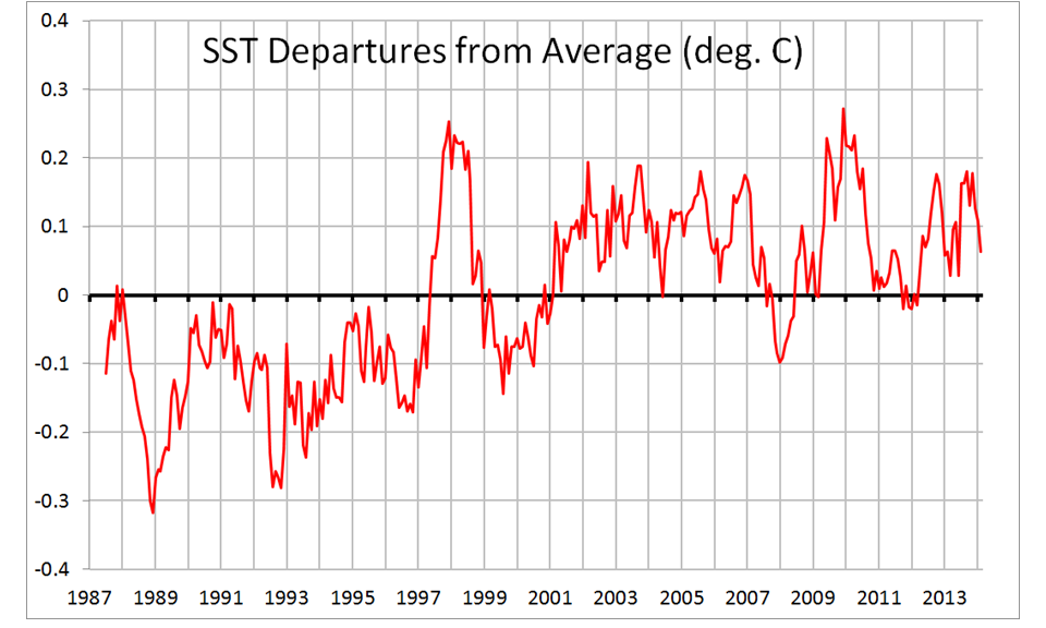
Fig. 1. Monthly global oceanic HadSST3 anomalies from July 1987 thru Feb. 2014.
The first SSM/I field to address is total vertically-integrated water vapor, which closely follows the SST variations:
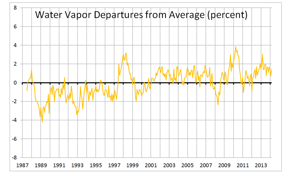
Fig. 2. Monthly global oceanic anomalies in SSM/I total integrated water vapor.
The water vapor variations lag the SST variations by an average of one month. A regression relationship reveals an average 10.2% increase in vapor per deg. C increase in SST. This is larger than the theoretically-expected value of 6.5% to 7% increase, a discrepancy which can be interpreted in different ways (more evaporative cooling of the ocean stabilizing the climate, or more water vapor feedback destabilizing the climate — take your pick).
Next, let’s examine the surface wind speed variations from SSM/I. These have been compared to literally millions of buoy wind measurements, and are quite accurate. In fact, I would wager these are by far the best estimate of changes in global ocean wind speed we have:
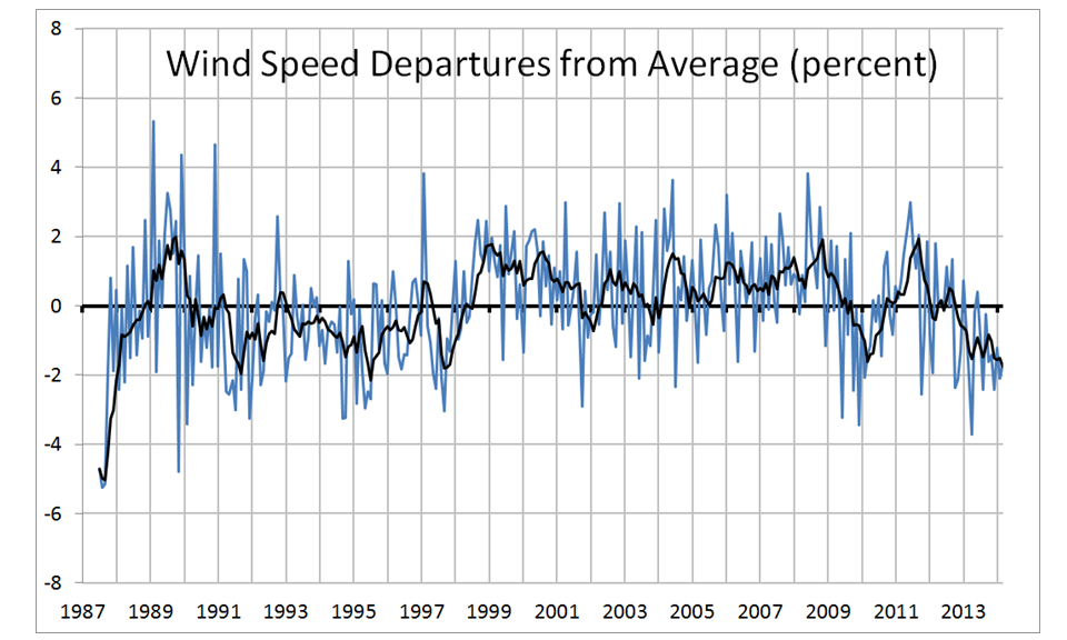
Fig. 3. Monthly global oceanic anomalies in surface wind speed from SSM/I.
We see there was a slight (1-2%) increase in ocean wind speed from before the 1997/98 El Nino to after, which at least qualitatively might be supportive of Trenberth’s claim of increase ocean heat storage and surface cooling temporarily cancelling out anthropogenic global surface warming. I have not looked into whether a 1-2% change in wind speed could have such an effect, so feel free to comment on this. Note also that the last year or so hints at a reversal of this increase back to pre-1998 wind speeds. If wind speeds remain at the lower level, it will be interesting to see if surface warming resumes. I’m making no predictions on this.
The SSM/I rain rate variations are always quite noisy. Warm conditions tend to show more rainfall, but the strong 1997/98 El Nino curiously shows little effect, and there is a hint of increasing ocean rainfall in recent years:
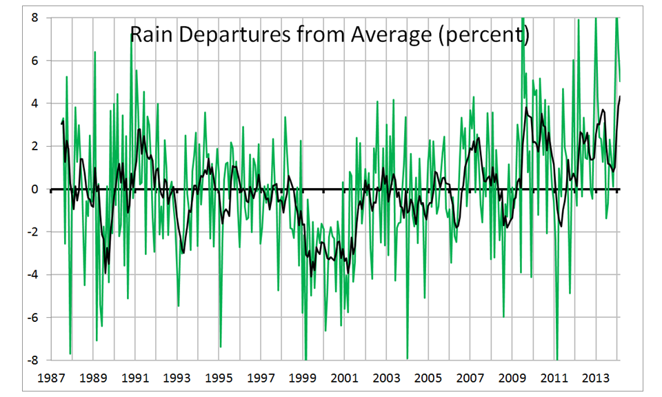
Fig. 4. Monthly global oceanic anomalies in rainfall from SSM/I.
Finally, let’s look at what I think is the most interesting SSM/I variable from a climate change standpoint, total integrated cloud liquid water (CLW):
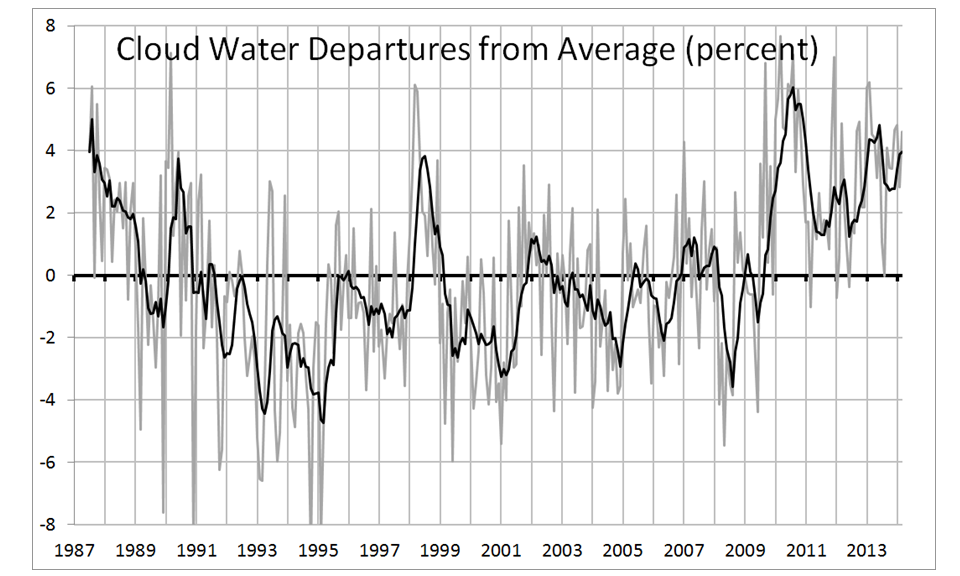
Fig. 5. Monthly global oceanic anomalies in integrated cloud water from SSM/I.
The variations in cloud water show some interesting low-frequency behavior. I have previously discussed the fact that these cloud water variations are correlated with CERES-measured net radiative flux, and so provide a proxy measurement for the net radiative imbalance over the ocean which suggest some portion of recent warming was simple due to a natural decrease in cloud cover.
The updated regression relationship I get is 0.24 W/m2 loss in Net (solar plus IR) radiative energy for each percent increase in SSM/I cloud water, a scale factor we can then apply to the cloud water graph to get a Net radiative flux graph:
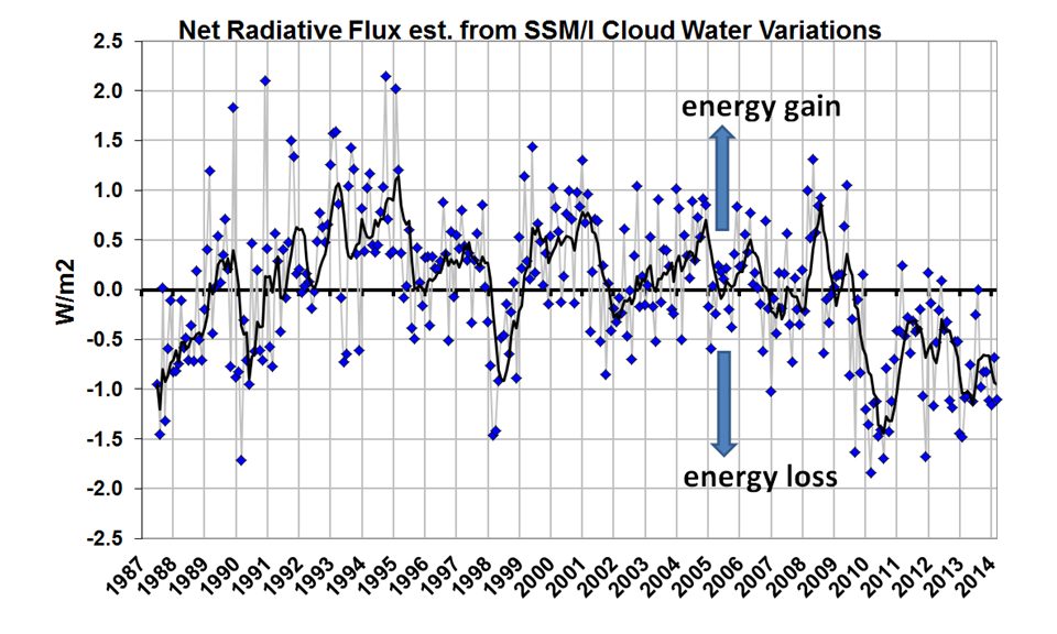
Fig. 6. Monthly global oceanic anomalies in Net radiative flux estimated from SSM/I cloud water variations, using a CERES-based scale factor of 0.24 W/m2 per percent cloud water change.
Why use an SSM/I estimate of CERES Net radiative flux, instead of CERES directly? Mostly because CERES is available only since 2000, whereas SSM/I is available since 1987. But also, the CERES measurements are very difficult, with the reflected solar flux (which dominates the CERES-SSM/I relationship) having a strong angular dependence. The SSM/I measurements are instead thermally-based (microwave emission) and have no such angular dependence. Finally, radiative fluxes are so important (e.g. being the basis for global warming theory) that any independent means of estimating them are worth looking into.
Be careful in interpreting the estimated radiative fluxes in Fig. 6 because they could have an offset. Since the anomalies I compute (by definition) sum to zero over the entire time series, that means the total time-integrated radiative energy flux also sums to zero. So, while the graph in Fig. 6 suggests energy loss by the global oceans over the last 5 years, it could be the whole curve needs to be shifted upward. There is no way to know. The CERES fluxes have already been adjusted to match the increase in oceanic heat content, which was a logical thing for the CERES Team to do since the absolute accuracy of CERES is ~10 W/m2, whereas the increase in ocean heat content in recent years (IF you believe the warming estimates) correspond to only a few tenths of a W/m2 imbalance. The main value in the graph is to identify possible changes over time.
Others might see some relationships in the above plots that I haven’t noticed; I’ve made the Excel spreadsheet available for those who want to play with the data.
(Note that a possible El Nino this year would temporarily dominate everything else, as would any La Nina afterward. I’m instead talking about the longer term evolution of the cloud cover of the global oceans and what it might mean for global temperatures on decadal time scales.)


