UAH Global Temperature Update for June, 2014: +0.30 deg. C

July 1st, 2014 by Roy W. Spencer, Ph. D.

The Version 5.6 global average lower tropospheric temperature (LT) anomaly for June, 2014 is +0.30 deg. C, down slightly from May (click for full size version):
UAH_LT_1979_thru_June_2014_v5

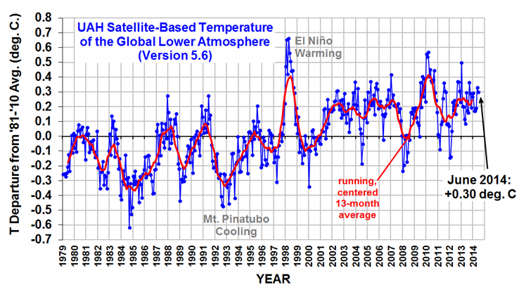
The global, hemispheric, and tropical LT anomalies from the 30-year (1981-2010) average for the last 18 months are:

YR MON GLOBAL NH SH TROPICS
2013 1 +0.497 +0.517 +0.478 +0.386
2013 2 +0.203 +0.372 +0.033 +0.195
2013 3 +0.200 +0.333 +0.067 +0.243
2013 4 +0.114 +0.128 +0.101 +0.165
2013 5 +0.082 +0.180 -0.015 +0.112
2013 6 +0.295 +0.335 +0.255 +0.220
2013 7 +0.173 +0.134 +0.211 +0.074
2013 8 +0.158 +0.111 +0.206 +0.009
2013 9 +0.365 +0.339 +0.390 +0.190
2013 10 +0.290 +0.331 +0.249 +0.031
2013 11 +0.193 +0.160 +0.226 +0.020
2013 12 +0.266 +0.272 +0.260 +0.057
2014 1 +0.291 +0.387 +0.194 -0.029
2014 2 +0.170 +0.320 +0.020 -0.103
2014 3 +0.170 +0.338 +0.002 -0.001
2014 4 +0.190 +0.358 +0.022 +0.092
2014 5 +0.327 +0.325 +0.328 +0.175
2014 6 +0.303 +0.315 +0.290 +0.509

The global image for June should be available in the next day or so here.

Popular monthly data files (these might take a few days to update):

uahncdc_lt_5.6.txt (Lower Troposphere)
uahncdc_mt_5.6.txt (Mid-Troposphere)
uahncdc_ls_5.6.txt (Lower Stratosphere)


116 Responses to “UAH Global Temperature Update for June, 2014: +0.30 deg. C”

Toggle Trackbacks

  1. One item to remember is this period of below normal solar activity started in 2005 so the accumulation factor is coming into play.
    Secondly it is not just solar activity within itself but the secondary effects associated with solar variability which I feel are extremely hard to predict as far as how strongly (to what degree)they may change and thus effect the climate in response to long prolonged minimum solar activity.
    I strongly suspect the degree of magnitude change of the prolonged minimum solar activity combined with the duration of time of the prolonged minimum solar activity is going to have a great impact as to how EFFECTIVE the associated secondary effects associated with prolonged minimal solar activity may have on the climate. An example would be an increased in volcanic activity.To make it more complicated could thresholds come about? An example would be a changing atmospheric circulation pattern which may promote more snow cover/cloud cover and thus increase the earth’s albedo. How will the initial state of the climate play into it? An example of this would be the great amounts of excess Antarctica Sea Ice the globe has presently and how this might play out going forward under a very long period of prolonged minimum solar activity. Will climatic outcomes unknown come out of this?

    Then one has to consider where the earth is in respect to Milankovitch Cycles (favorable )and how the earth’s magnetic field may enhance or moderate solar activity.

    Given all of that I think at best only general trends in the climate can be forecasted going forward. I am confident enough to say in response to prolonged minimum solar activity going forward the temperature trend for the globe as a whole will be down. The question is how far down /how rapid will the decline be? I really do not have the answer because there are just to many UNKNOWNS. Further when you have unknowns in a system like the climate which is non linear, random and chaotic expect surprises.

    NOTE: Ocean heat content could slow down the temperature fall at first. In regards to that I look first for more extremes in the climate due to low solar activity followed by a more pronounced drop in temperature as time goes by.

    Still I believe year 2014 is the turning point for global temperatures as the maximum of solar cycle 24 comes to an end.

    It can be shown that a strong correlation exist between sunspot numbers and ocean heat content. When the SIDC sunspot count is well over 40 (the long term average) like it was from 1934-2003 the energy gained from solar to the oceans is positive hence ocean heat content rises.

    This is now changing with the exception of the maximum of solar cycle 24(2011-2014 early) which is on it’s way out.

    • Fonzarelli says:

      Salvatore, don’t forget that a weak solar maximum is also a prolonged solar maximum… Even with it being a weak one, the sun has still been warmer than average for a longer period of time. So we may have to wait a while before we see any downturn in global temps. (So hold yer horses there Bassman!)

  2. Dr. Spencer I am surprised that the large anomaly of S.H sea ice is not impacting S.H. temperatures more. Surely the albedo has to be higher. Maybe the critical mass in sea ice has not been reached and thus the added sea ice although much above average has yet to exert much of a climate influence.

    Any thoughts on this? There must be some x critical mass which would start effecting S.H temperatures. If so what would that value be?

    • Thomas says:

      Salvatore, it’s winter down there, not much sun to reflect.

      • bernie says:

        “…it’s winter down there…”

        The anomaly was there during the Southern Summer, if not so large. Perhaps 500 thousand extra sq km of reflecting ice, instead of the killingly-cold but light-absorbent, open water, for six months*.

        The reason that the anomaly has little impact on measured “SH temperatures” is that the satellites do not cover beyond 85 S.

        There MAY be a reduction in absorbed solar input, for the Earth, as a result. But since the South Polar region is so physically isolated from the rest of the world, it will take a much larger and a much more prolonged Summer feed-back effect to matter in the slightest.

        By comparison, the surface of the earth is more than 500 million sq km.

        • bernie says:

          The last line is meant to be a starred footnote.

          Of course, it is still the case that there is more ice in the World than ever (well, since 1978) – taking the North and the South together.

          • David A says:

            it is still the case that there is more ice in the World than ever (well, since 1978) – taking the North and the South together.

            Untrue. Arctic sea ice is disappearing 10 times faster than the Antarctic is gaining sea ice. The world is now losing over a trillion tonnes of ice a year; here are the numbers:

            http://davidappell.blogspot.com/2014/05/how-fast-is-planet-losing-ice.html

          • TedM says:

            David A a link to your own blog? Talk about swallowing camels and straining at gnats.

            Global sea ice was in a downtrend from 1979 to 2007. The trend since 2007 is up.
            http://arctic.atmos.uiuc.edu/cryosphere/iphone/images/iphone.anomaly.global.png

            My bet is that there is a sixty something year cycle with current Antarctic sea ice being near a maximum, and the Arctic ice being around a minimum. That is, the cycles being approximately antiphase.

          • calculator says:

            The context of the discussion was the Albedo. Area during Summer is the relevant measure here.

          • David A says:

            Ted: My blog post merely adds up the numbers from 5 different sources, all of which I listed. Is there something there you disagree with?

            The trend since 2007 is up.

            This is a classic cherry pick: picking the starting date to give the result you want, while ignoring all the rest of the data. You get a yellow card.

          • Colin Fenwick says:

            David A, the McMillan study you quote from only covers 3 years of data and states the Antarctic is losing ice at around 0.0006% p.a.

            Sorry if I’m not rolling around on the ground clutching my shin over this.

  3. Werner Brozek says:

    The drop was not much. However with every month that is below the 1998 average of 0.419, it is that much harder to break a record. In the case of UAH version 5.6, the average after six months is 0.242. So to break a record in 2014, the average for each of the next six months needs to be 0.596. In other words, every monthly record from July to December needs to be smashed to set a record. The same applies to RSS.
    However GISS is different. After five months, its average is an extremely small and statistically insignificant 0.001 C above its all time high average so it is in first place after five months.

    • David A says:

      The last 5 years (60 months) are the warmest 5 year period in the UAH LT record. So are the last 10 years. So are the last 17 years. So are the last 20 years. So are the last 30 years.

      • Fonzarelli says:

        David, I agree with all that, HOWEVER, temps are really no higher than they were a decade ago…

        • David A says:

          Yes they are. The 10-yr moving average has changed by +0.12 C in the last 10 years.

          • Fonzarelli says:

            David, the ten year average would take us back TWENTY YEARS ! I’m just talking about TEN YEARS ago. And it’s clear that current temps are no higher…

      • Werner Brozek says:

        That may be true, however the 16 year old record from 1998 will not be beaten this year. So nothing catastrophic is going on.

        • David A says:

          Both GISS and HasCRUT4 have a higher average global surface temperaure in 2010 than 1998.

          • Werner Brozek says:

            True, but UAH versions 5.5 and 5.6 and RSS and Hadcrut3 and Hadsst2 and Hadsst3 still have 1998 as the highest.

          • David A says:

            They are all measuring different things. And you aren’t looking at trends.

            I believe that some people will never accept that the world is warming until every possible metric — surface temperatures, lower tropospheric temperatures, ocean heat content, their backyard — increases monotonically day-by-day, every day, every month, every year.

            Until then, someone will always be saying, but it was colder in Nowhere, Minnesota yesterday — global warming is falsified!

          • Werner Brozek says:

            I am not denying some global warming, but the models are way off according to NOAA:
            ”The simulations rule out (at the 95% level) zero trends for intervals of 15 yr or more, suggesting that an observed absence of warming of this duration is needed to create a discrepancy with the expected present-day warming rate.”

          • Kristian says:

            David A says, July 2, 2014 at 3:04 PM:

            “Both GISS and HasCRUT4 have a higher average global surface temperaure in 2010 than 1998.”

            That’s because they’ve been specifically adjusted to show just that. When you have an agenda to show that global temps follow the increase in atmospheric CO2 content, then real data doesn’t matter.

            No question 1998 is still the warmest year globally by far.

          • Kristian says:

            David A says, July 2, 2014 at 7:31 PM:

            “And you aren’t looking at trends.”

            Good on him! Only fools and rabid agenda-driven warmists throw out the data and keep only the linear trend line to ‘explain’ the world. The ‘trend’ tells you nothing without the data behind it, David. The data behind without the ‘trend’ tells you everything you need to know. The ‘trend’ doesn’t tell you anything about why and how the data has evolved. The data does.

            This is weekly SST anomalies from 97/98 to the first week of June 2014, global (blue) compared directly with NINO3.4 (red):

            http://i1172.photobucket.com/albums/r565/Keyell/SSTaglvsNINO_zps6f6b9aa7.png

            You need to pay attention to what the data actually tells you. Plastering a couple of purely statistically generated trend lines across these plots would only confuse your data analysis.

  4. CC Squid says:

    Dr Spenser, With the latest revelations by Steve Goddard which are documented here at WUWT
    http://wattsupwiththat.com/2014/06/29/noaas-temperature-control-knob-for-the-past-the-present-and-maybe-the-future-july-1936-now-hottest-month-again/. Respectfully, since the basis of your report is generated by the NCDC, how much can we trust these figures?

    1/2013 is the last time, in this chart, that the tropical temperature was this high and at that time the NH and SH temperatures were much higher. Does the current high tropical temperature indicate that
    Oceans are rapidly releasing their heat and the earth is going to get much colder?

    • geran says:

      “Respectfully, since the basis of your report is generated by the NCDC, how much can we trust these figures?”
      >>>>>>
      We can’t.

      • CC Squid says:

        Dr. Spenser explained a couple of years ago that he is being funded to provide these reports. This is a contractual commitment I believe.

        The first question was in-artfully asked so I will try it again. Have these values been changed in the same manner as the data reported by Steve Goddard? The answer from Dr. Spenser might violate the contract so does anyone out there have the answer?

        I really am interested in the second half of the question and I will search the web to determine if the values in these reports have changed over the years. The web does not forget.

        Since Alaska has been added to the 48 states figures, and Australia has been added to the report how has this affected the values displayed?

      • David A says:

        Tony Heller (aka “Steve Goddard”) has been shown to be wrong in his claims time after time — even the WUWT crowd has skinned him. So why would anyone now believe anything he says? (I mean, literally, anything.)

    • ray says:

      “…Spenser…”

      Spencer.

      “Oceans are rapidly releasing their heat…”

      It is true that the elevated temperature anomalies shown during the El Nino phase show the top of part of the Pacific Ocean releasing a burp of heat, rather than being a symptom of cumulative heating of the whole World Ocean. But “rapidly” is perhaps not a proper description of anything involving the enormous heat-sink of the Oceans*. The top third of the Oceans have warmed about 0.4 C in the 130 years since the Challenger voyages in the reign of Queen Victoria.

      *The heat capacity of the Oceans is 1,600 times that of the Atmosphere.

      • sky says:

        The whole idea that “elevated temperature anomalies shown during the El Nino phase show the top of part of the Pacific Ocean releasing a burp of heat” is physically misguided. Anomalies show only the thermal state, not the heat transfer. In fact, the oceans are always thermally stratified and are incapable of “hiding” heat below the surface, to be “released” later, as some amateurs conjure. The warm-surface El Nino phase is primarily the result of slackened trade-winds producing less downward mixing and less surface cooling by evaporation.

        • bernie says:

          During an El Nino phase there is a (small) suppression of up-welling of cool water in the Eastern Pacific which allows the surface waters (just a superficial skin, really) to be a bit warmer for a while.

          The whole issue is moot for now, since the up-welling is not suppressed at present. Notice this announcement – yesterday – from the Australian Bureau of Meteorology:

          “Tropical Pacific Ocean waters below the surface have cooled in recent weeks.”

          I agree that nobody should think the heat transferred to the upper third of the Ocean, over the last 130 years, will
          “change its mind and come back”. Mixing with cold (2 C) bottom water is its fate.

          • sky says:

            A fully-developed El Nino completely suppresses upwelling off the coast of Peru, replacing surface waters with a poleward-setting warm tongue of the ECC. The effect is by no means confined to the surface skin, nor is it fleeting. While we’re not at that stage at present, let’s see what happens around Christmas–from which El Nino got its name.

    • MarkB says:

      CC Squid says:
      July 1, 2014 at 2:10 PM

      . . . Respectfully, since the basis of your report is generated by the NCDC, how much can we trust these figures? . . .

      This report is based on the UAH’s team’s processing of NASA satellite measurements using their own algorithms. The NCDC data set is based on NCDC’s processing of surface temperature measurements. The raw measurements and data processing are entirely independent. In both cases, the reported product may be subject to revision as improvements and/or corrections to the processing algorithms are implemented.

  5. bernie says:

    Thanks to the UAH team for the quickly produced June number.
    We can go back to sleep now.

  6. ray says:

    “…quickly produced June number.”

    Unfortunately, the regional breakdown is always somewhat delayed.

    The tropics are warmer – because of the minor El Nino developing? – but I guess the Northern and Southern Extensions must have cooled down a bit, since the overall Hemispheric figures are little changed from May.

    Swings and Roundabouts, i.e. natural variability.

  7. As each month goes by and temperatures continue to remain steady only makes AGW theory weaker.

    The solar theory I am promoting says when solar parameters reach certain values the primary effects and secondary effects will cause the climate to change in two ways. More blocking and cooler temperatures.
    Ocean Heat Content might temper cooling at first but still will not stop it , while blocking of weather patterns will pick up again as they did with the last severe although short lull in solar activity 2008-2011 approximately.

    This time should feature at least as much blocking as the last time while the trend in temperatures should start to decline this time due to the accumulation factor of sub-solar activity in general.

    Solar Cycle 24 maximum is now in the process of winding down so the moment of truth is coming in the near future.

    Which models or theories will be correct? Those calling for falling temperatures from now to 2020 and beyond due to low solar activity or those in favor of AGW calling for a continuation of a temperature rise for the foreseeable future.

    It is great that the contrast between the two sides could not be more stark.

    This in turn should make it easy to clarify which side will be correct and which side will be wrong in the very near future.

  8. bernie says:

    “…those calling for…or those in favour of AGW…”

    Or those who are NOT in favour of AGW but think the connections between solar activity and climate take time (decades?) to show themselves.

  9. ____________ says:

    Hi, i believe that i saw you visited my weblog so i came to go back
    the desire?.I am attempting to to find issues to enhance my site!I suppose its ok to
    make use of a few of your ideas!!

    my webpage: ____________

  10. First of all thank you very much for sharing your work with us Dr. Spencer. There does not seem to be any “Catastrophic Runaway Temperature” (CRT) in the offing. But then again we (I hope I can say we) do not expect anything of that sort to happen anyway.

    And then;
    Salvatore Del Prete says on July 1, 2014 at 5:04 PM
    “As each month goes by and temperatures continue to remain steady only makes AGW theory weaker.”

    = = = = = = = =

    Do you mean all of them Salvatore – or is it just the CAGW that is getting weaker?

    I have heard people say, and have seen it written down too, that “many experiments show that CO2 is a GHG”. However when I ask to be referred to one such experiment they either mention John Tyndall’s (JT) experiment back in 1859 or some other kind of “Light Vanishing” (through a container filled with CO2) trick.

    Well, so long as people do not know the difference between the meanings of the words “Absorption” and “Opaqueness”, then there isn’t much hope.

    Some years ago “Wikipedia” had an article describing the JT experiment in detail – and I, in comments on various blogs, referred people to that particular “Wiki article” asking if anybody could spot any “Back-radiation” from the CO2 filled container.

    The last time I said something like that over on WUWT, the ever awake Pamela Gray informed us that Wikipedia had taken that part of their article away. And sure enough. – – – – There it was – gone.

      • A bit like Mike’s nature trick. You know we use the word “Trick” to explain things “Scientifically”

        • David A says:

          Trick is a often used word in science — it means a clever method or a shortcut.

          I still don’t see what the “trick” is about videos like this:

          https://www.youtube.com/watch?v=Rt6gLt6G5Kc

          • geran says:

            David has no idea why his “science” is so funny to us. I am tempted to NOT tell him. But, knowing that he won’t understand even if I do, there is no risk. So, here goes:

            David one of the give-aways in the video is when the speaker mentions he can feel the heat from the candle, with his hand. You will not get it, but the candle is warming his hand. It is call infrared heat transfer. It is well established science. It’s been well documented and studied, well before your birth, and before your dad’s birth. Nothing new. No harm to the environment.

            Later, he shows that the candle can also warm CO2 molecules. Solid science, no more harm to the environment than warming yourself in front of a fireplace. Nothing new.

            So, the video takes established science and makes the HUGE jump in logic so that Warmers, like yourself, can claim the oceans are going to boil.

            Ask yourself why you are not trying to ban candles….

            There is much more, of course, but now we await more of your humor.

          • David A says:

            So you agree the video shows that CO2 traps heat. Then the only question is how much will atmospheric CO2 trap? That’s determined by measuring the absorption coefficient of CO2 and doing the physics — something scientists have really sunk their teeth into for over a hundred years: before feedbacks they find 1.2 C for 2xCO2.

            Is there some part of that calculation you disagree with?

          • geran says:

            No, David, once again, you get the science wrong. Your “trapped heat” is a problem to you only because you do not understand the science. Go back to the video. Blow out the candle. Now, can the “trapped heat” in the CO2 melt the candle?

            (You better answer “yes”, cause otherwise, your fear of CO2 goes “poof”.)

            You see, David, if CO2 “back radiation” were really a problem, it should be able to melt the candle all by itself. Heh, the “oceans are going to boil”, right?

            Oh, since you think this “experiment” is somehow meaningful, what is the CO2 “ppm” in the video? Clearly, based on the pressurized balloon, it is well over 90%, i.e., 900,000 ppm, as compared with 400 ppm in atmosphere.

            Poof!

          • geran has said it all really but I would like to add that “the Trick” is to make some ‘suckers’ believe that the temperature (T) of IR radiation from the earth’s surface can be equaled to T of the flame from the burning of fossil fuels. (On this occasion it is “just” a small candle)

  11. I mean the theory as a whole which says the temperature trend for the globe will increase due to CO2 increases which in turn can be tied to man’s activities.

    I say the trend in temperatures for the globe will be lower due to very low solar activity going forward.

  12. The anomaly was there during the Southern Summer, if not so large. Perhaps 500 thousand extra sq km of reflecting ice, instead of the killingly-cold but light-absorbent, open water, for six months*.

    It is over 2.0 million sq km above normal.

  13. As one can from cryosphere today data global sea ice is well above normal and this trend is likely to continue going forward.

    • Fonzarelli says:

      Salvatore, do you have any idea why there are such differences of opinion on global sea ice?

    • David A says:

      When you buy ice, is it priced by the pound, or by the square-foot?

      • Norman says:

        David A,

        I think I know what you are asking. The sea ice volume has been decreasing. But isn’t it the extent that is important for albedo equations? Would if matter if ice was a foot thick or 9 feet for its reflectability? The theory on Arctic warming is that the extent of the ice is reduced allowing more sun to penetrate Arctic ocean in summer months and causing an overall warming ocean. I can’t see how the equation would care if the ice was a foot or 9 feet thick. I think the thinner ice would allow more heat to leave the system in the long winter (ice is an insulator and thicker ice would mean more insulation from the warmer water below). During winter a thicker ice would keep the Arctic ocean warmer than thin ice I would think. I could be wrong.

        • David A says:

          If all you’re talking about is albedo, then extent is what matters. But then, land-based glaciers are melting too, which decreaes albedo. The planet is greening, which also decreases albedo. I don’t know what the net change is.

          But if you want to know about the planet heating up, then the relevant quantity is ice volume, not surface area.

        • David A says:

          By the way, there may be a problem with the data model that is used for Antarctic SIE:

          http://www.the-cryosphere-discuss.net/8/273/2014/tcd-8-273-2014.html

          • Norman says:

            David A,

            There is another mechanism to consider for melting of Northern ice (glaciers could be affected as well as sea ice).

            Before 2012 the 2011 low extent Arctic sea ice was the used by this sight.

            http://nsidc.org/arcticseaicenews/

            Here is an interesting development in 2011.
            http://news.discovery.com/earth/weather-extreme-events/gulf-stream-moved-north-121016.htm

            I have been watching the Arctic sea ice for a few years now. The area that stays ice free the longest is the Barents sea.
            http://worldatlas.com/aatlas/infopage/barentssea.htm

            In the winter months when the sun has set (or nearly so)and the land of Novaya Zamlya is well below zero on the F scale, the water in the Barents sea is well above freezing. It only cools near the end of winter enough to ice over. Would not that make more sense as warm water flowing into the region (since the low ice is regional in winter) than the increased carbon dioxide in the atmosphere in this area? Afterall the land is getting super cold, why not the water unless warm water is moving in to replace the cold. Just a thought, something for you to think about if you wish.

  14. 1.Gail Combs says:
    2.
    June 25, 2014 at 12:56 am

    3.Salvatore,
    On your first question I could not say without doing a bit more reading. Obviously this is NOT a subject the Warmists want to get into too deeply.
    4.On the second question –
    What Cook was pointing out was:
    5.1. Antarctic is LAND at the pole therefore Sea Ice is much closer to the equator.
    Because it is much closer to the equator it is going to reflect more sunlight.
    6.2. the Arctic is a land locked OCEAN.
    The critical point is that when the Arctic sea Ice has melted and the sea Ice is at minimum it is in September just as we are hitting the fall equinox.
    http://ocean.dmi.dk/arctic/icecover.uk.php
    7.So what is happening to the sun? 1.September Equinox (approximately September 22-23)
    2.This day begins fall in the Northern Hemisphere and spring in the Southern Hemisphere. There are twelve hours of daylight and twelve hours of darkness at all points on the earth’s surface on the two equinoxes. Sunrise is at 6 a.m. and sunset is at 6 p.m. local (solar) time for most points on the earth’s surface.
    3.North Pole: The sun is on the horizon at the North Pole on the September Equinox in the morning. The sun sets at the North Pole at noon on the September Equinox and the North Pole remains dark until the March Equinox.
    4.Arctic Circle: Experiences 12 hours of daylight and 12 hours of darkness. The sun is 66.5 degrees off of the zenith or 23.5 degrees above the horizon.
    http://geography.about.com/od/physicalgeography/a/fourseasons.htm

    8.Cook gives you the solar insolation values for all latitudes for the actual radiation on to a horizontal surface at 12:00 … for a day in mid-September, near that “average” value on the equinox at time of minimum Arctic sea ice extents….”
    The column “Direct Radiation Horizontal Surface” is the radiation received on the equinox for solar radiation at each latitude at noon.
    9.http://wattsupwiththat.com/2014/02/17/crises-in-climatology/#comment-1571641
    10.The “edge” of the Arctic sea is a tiny ring about latitude 78 -82 north in mid-September.
    11.In October of 2013, the Antarctic sea ice extents was at a record high maximum at right at 19.5 Million square kilometers.
    . ALL of this “excess” sea ice was between latitude 60 south and latitude 59 south.
    12.So reading from Cook’s table:
    RADIATION ……LAT 80N…EQUATOR..Lat 60S
    Direct perp. surf …..540……….1150……….980
    direct horiz. surf……92………..1150………..492
    13.Direct ocean albedo..0.343…0.025……..0.077
    direct ocean Absorb…….61….1121………..454
    Direct ocean reflect……..32……..29………….38
    14.direct Ice Absorb………19…….231……………99
    Direct Ice reflect……….74……..920………….393
    ………..
    You can see that when the Arctic sea has the least amount of ice, the ocean is barely absorbing any energy from the sun or the ice reflecting any energy. Instead it is actually radiating away energy. Yet at the same time the Antarctic sea ice extent because it is much closer to the equator is reflecting FIVE times as much energy as Arctic sea ice or if there is no ice, absorbing SEVEN times as much energy.
    15.Remember at the equinoxes, both Arctic and Antarctic are both hit by the same solar intensity, so you can see how much more important the Antarctic is.
    16.

    • David A says:

      If you want to discuss the “amount” of sea ice, you want to know its volume (or mass), not its area (or extent).

      Yes, the extent is currently back near levels of the late-80s/early-90s, though the long-term trend is still very much downward. But the volume of sea ice is not increasing, it’s decreasing.

      • geran says:

        See, in climate “science”, new sea ice has a measurable area, but negative thickness. So, since volume is “area” (A) times “thickness” (t), the new sea ice is A*(-t) = -V. In other words, “negative” volume has been added, or total volume has decreased.

        (Folks like David actually believe this!)

        • David A says:

          I have no idea what your point is.

          Ice has both an area and thickness. Both determine volume.

          • geran says:

            You have no idea what YOUR point is!

            If sea ice extent (area) is growing, and you claim volume is decreasing, you need to show how that is possible. (Oh, and we can’t measure thickness accurately. But you probably knew that, just forgot to mention.)

          • David A says:

            Because the average thickness of ice is decreasing. That’s not “negative thickness.”

            The average thickness of Arctic sea ice (=volume/SIE) has dropped by about 50% since 1980: from 3 meters to 1.5 meters.

            I don’t know what it’s doing for Antarctic sea ice, because I don’t know of any time series on Antarctic SI volume.

          • geran says:

            David, David, David.

            If you add more “area”, and, as you claim, the “volume” is decreasing, then the area you have added must have a negative thickness.

            Not only are you confused with the science, now you are confused with the math!

            (I know folks, you are thinking there is no way David can understand how absurd this is, but I don’t mind trying to help him.)

          • JohnKl says:

            Hi David,

            “Ice has both an area and thickness. Both determine volume.”

            Only in concert with DENSITY which can vary in ice ~1.4% based on temperature and pressure.

            Have a great day!

          • JohnKl says:

            Hi David,

            “Ice has both an area and thickness. Both determine volume.”

            However, mass can only be determined in concert with DENSITY which can vary in ice ~1.4% based on temperature and pressure.

            Have a great day!

        • JohnKl says:

          Hi Geran,

          You stated:

          “…in climate “science”, new sea ice has a measurable area, but negative thickness.”

          Not to be a curmudgeon but their exists no such thing as “NEGATIVE THICKNESS.” If as you later assert “total volume has decreased” (presumably ice-thickness) then your equations should use delta signs and you should be calculating rates of change (i.e. calculus)! Like David I your post doesn’t resonate with me.

          Have a great day!

          • geran says:

            Hi JohnKl, I didn’t use the “sarc” tag because I was tweaking the “Warmists”….

        • Jason says:

          geran,

          It appears you are an expert on thickness (oops, did I forget the sarc tag?) but I’m sure you can get through this:

          http://psc.apl.washington.edu/wordpress/research/projects/arctic-sea-ice-volume-anomaly/

          • geran says:

            Jason, it appears you are NOT an expert on sea ice thickness. So, let me see if I can help.

            The “volume” is “measured” by computer modeling! (“Sea Ice Volume is calculated using the Pan-Arctic Ice Ocean Modeling and Assimilation System…”) Translation: We do not know sea ice volume. We only know what someone WANTS it to be.

            And, anyway, your link is Arctic only.

            Now, you are on your way to becoming a sea ice thickness expert!

          • Massimo PORZIO says:

            geran is right,
            Grace satellites pretend to measure the sea ice volume by its mass, but it’s more like 99.9% modelling than true measurements.

            Have a nice day.

            Massimo

          • Fonzarelli says:

            Geran, thanks for explaining all that… By the way, dr spencer seemed to reveal your true identity back in April. (“stupid skeptic arguments” post) Is that true?! Just say “thumbs up fonz” in some future reply to me, would you? ( I’m assuming that you wish to keep it a secret) Thanx and always thank you for your comments. I’ve learned so much…

          • Jason says:

            geran,

            Please debunk the CryoSat-2 method of measuring ice volume (and please throw in another negative thickness references to show off your self perceived brilliance) before I waste everyone’s time in posting the data from CryoSat that strangely mirrors those silly modeled values that people have wasted their real world time validating.

          • Fonzarelli says:

            Jason, I think geran is merely stating that it’s impossible for sea ice to be shrinking in thickness all the while that it is growing in extent. (and stating it with fine flair) And by the way, geran’s brilliance may well be a bit more than just “self perceived”. I believe his true identity is Dr. Lindzen…

          • Kristian says:

            Hehe, they absolutely insist on ‘misunderstanding’ what geran is getting at, of course.

            We’re talking about ANTARCTIC sea ice extent, not Arctic.

            Antarctic sea ice has increased in extent, but DavidA wants to argue that it is still shrinking in volume.

            So I second Fonzarelli in stating: “I think geran is merely stating that it’s impossible for sea ice to be shrinking in thickness all the while that it is growing in extent.”

            Arctic sea has been shrinking in extent. Therefore it’s natural to assume it’s also been shrinking in volume. Antarctic sea ice has been growing in extent. Therefore it is NOT natural to assume its volume has been shrinking parallelly. That is completely stupid and counter-intuitive.

  15. the link I wanted is in the commentary section. Look at my post and you will see the links.

  16. Rob says:

    Remarkable straight line this century.

    Guess we are now fighting “Climatic Invariability”.

  17. bw says:

    The change in “Tropics” from May to June is from 0.175 to 0.509, for a net increase of +0.334

    On the real planet Earth, the entire tropics do no change by 0.334 degrees in one month. The values given in the table must have around 0.2 degrees of monthly noise to explain those measurements.

  18. bassman says:

    bw, It is likely a delayed response to changes in the pacific (warmer water coming to the surface). Although there is certainly a lot a variation (sloshing around) of heat that gives you such dramatic changes. That is why it makes sense to average decades and ignore shorter trends as some on here are tempted to do (myself included).

    By the way June came in as the 4th hottest June for RSS. It was behind 2010, 2002 and 1998. It is still the data set I think is the least representative of heat gain on the planet but worth paying attention to. See the link below.

    http://data.remss.com/msu/graphics/TLT/time_series/RSS_TS_channel_TLT_Global_Land_And_Sea_v03_3.txt

    Also remember that UAH and RSS have around a 5 month lag in response to MEI (a measurement that NOAA uses for research purposes). The MEI value didn’t really start to rise until April/May so we may have to wait a long time to see the full response to this El Nino (if it really forms). NOAA and NASA have a 2-3 month lag in response likely explaining why May was a record breaker.

    • bw says:

      Yes, the real tropic temps will have real temp variations on all kinds of time scales. I’m assuming that the June tropics value is some kind of “average” of all June data for however the “tropics” are defined. I’m not concerned about methodology over time scales greater than a month.
      However, the overall appearance of the long term time plots look too “spiky” to be real. The resolution implied is just not there. The real temps may actually change by about the amount interpolated from a 12 or 13 month running average.
      The real world anomaly just does go up 0.2 degrees in a month, then the next month go back down the same 0.2 or 0.3 degrees.

      An hour of reading the methodology papers Christy, et al 2003 and Uddstrom 1988 I would guess that the June tropics anomaly of 0.5 has an error of AT LEAST plus or minus 0.1 degrees. If the methodology produces data with standard errors of 0.2 degrees, then I don’t believe the real tropics change from May 2014 to June 2014 was really 0.3 degrees. In fact it MIGHT have really been 0.3 degrees but that history would say that such a large change for the entire planetary tropical lower troposphere is rare in one month.

      At least drop the 3rd decimal in the tables. The casual observer needs to know the values are assumed to have some error and the range of that error.

      • bw says:

        Typing fast, I meant “The real world anomaly just does NOT go up 0.2 degrees in a month, then the next month go back down the same 0.2 or 0.3 degrees.”
        It boils down to that the monthly data needs some kind of buffer, or just stop showing the monthly spikes and just show the 13 month running plot.

        • spawnofbender says:

          “…just show the 13-month running plot…”

          Or use an exponential-moving-average which updates conservatively, e.g.

          this month’s average is .99 x last month’s average
          + 0.01 x this month’s actual.

          But, can’t do that. The Media would never report anything so boring and truthful.

        • JohnKl says:

          Hi bw,

          Thank you for reiterating the problem with analyzing data too finely with such significant .1 deg C apparent error margins. This rings especially true when one considers the fact that the entire average warming supposedly observed by UAH satellites since inception (1979) proves less than .4-.5 deg C. Skepticism should only rise further given (according to Wikipedia) that at least 10 adjustments to the generously called data have been made including a (as I’ve mentioned on Roy’s blog threads many times) a .1 deg C temp increase in the 1990’s due to orbital decay! Even ASSUMING the adjustments they list prove to be the only ones the data-set becomes a menage of EXPECTATIONS and mental MANIPULATION rather than an EMPIRICAL DATA SET.

          “It boils down to that the monthly data needs some kind of buffer, or just stop showing the monthly spikes and just show the 13 month running plot.”

          Frustration seems normal given the situation faced. However, I think you make the wrong call. Simply stop adjusting/massaging the data period. Everyone can make their on time constrained moving averages provided any given data-set. Leave it alone spikes and all. Human psychology being what it is and given the nature of MSU satellite observation and numerical conversion of frequency data to correlated temperatures someone’s projection will almost inevitably impinge upon the data. REDUCING the frustration of interpreting and analyzing data sets by SMOOTHING IT ALL OUT with any given averaging procedure CLOAKS MORE THAN IT REVEALS and only ends up REDUCING THE CREDIBILITY OF THOSE PROVIDING THE INFORMATION.

          Datasets as raw and unfiltered as possible allow for the greatest possible range of debate and input from observers. Contrived averages absent the data-sets that drive them only produce what any rational person will expect…indifference and disgust.

          Have a great day!

          • bw says:

            I did not intend to suggest any change to the established methodology or scientific protocol.
            Only the web/blog display of the plot was so spiky that many people would think the monthly noise was real. Along with the table values to three decimal places, where the underlying error is at least 0.1 degrees.
            In that sense, the web/blog display has no indication whatever of any range of error, so it is impossible for the casual observer to determine the quantitative accuracy of those numbers.

            Having slept on this, I agree with you 100 percent. Keep the display as is. The blog belongs to Spencer, so he calls the shots on his own blog.

  19. David when it comes to climate, surface area extent of sea ice is 1000x more important then volume.

    That said there is much doubt about the volume of sea ice which is present.

    Then again when you have sea ice anomalies running over 2.0 million square km. above average I doubt very much that volume is much less if at all. Which is the present situation in Antarctica.

  20. http://tallbloke.wordpress.com/2014/07/02/why-my-approach-is-by-far-the-best-approach/

    Great video showing how climate and solar variation correlate with one another while CO2 just follows the temperature.

    It is in the commentary section about three post down.

    A MUST WATCH! GREAT VIDEO- EXPLAINS THE SOLAR POSITION ALONG WITH DATA.

  21. As has been pointed out ANTARTIC SEA ICE is a more important player when it comes to global temperatures then ARCTIC SEA ICE.

  22. Baseman let us see what happens to global temperatures once the maximum of solar cycle 24 ends for good, and solar activity stays very low for the foreseeable future.

    Then we will know who is on the correct path.

    • Fonzarelli says:

      Salvatore, ten years ago two Russian solar scientists put out a paper predicting the current weak solar cycle. They said statistically the sun can’t maintain the high output of the twentieth century. They expected to see the same for years to come…

      • spawnofbender says:

        I had heard of this CryoSat 2 instrument but never looked into how it “works” – I rather assumed it was the real deal. It is, actually, sublimely silly.

        The instrument measures sea-ice thickness by measuring the time delay between radar pulses reflected from the top surface of sea-ice, and the surface of the sea detected in between patches of floating ice. Allowing for the fact that a chip of ice floats a bit proud in the water, you can estimate the thickness of the ice thereby.

        BUT:

        It can’t measure thickness where the ice is continuous – i.e. most of it!

        If anybody believes in this junk, I have some old mining stock certificates I would like to discuss with them.

  23. spawnofbender says:

    ESA’s explanatory booklet makes it sufficiently clear in its diagrams that it is only MEASURING ice thickness directly, at the edge of the ice-pack. They do not claim to make any measurement of total ice-volume in the continuous interior, but they do claim they can extrapolate from an “average” change in distance down to the ice to some sort of an “average” thinning or thickening of total ice. Hm.

    Recently, the team announced their machinery/computers/fudging had detected an INCREASE in the volume of Arctic sea-ice between October 2011 and October 2012 of 50%,i.e. 3,000 cu km, i.e. 2.7 trillion tons.

    The satellite mission is pretty well over now. No more info.
    Back to “area of ice” as all we can know.

  24. ray says:

    An increase of 50% in a year? There is a lot of natural variability about, isn’t there?

  25. ray says:

    ESA has got dozens of poor sods walking about the Arctic trying to confirm everything.

  26. Norman says:

    David A and bassman,

    I can understand your position on climate science. My problem is not with a pro or con position it is the obvious propoganda techniques used by CAGW crowd that are disturbing in a scientific debate. I can see how emotion is evoked within your mind, if you feel the Earth is at peril do to carbon dioxide (even if I cannot understand what drives this state, knowing that atmospheric CO2 was up to 6000 PPM in the past without massive plantetary destruction). My problem is that this issue is a scientific one. Science only has value if the participants within have integrity (something my Chemistry teacher had strong feeling about).

    CAGW group will use every weather related disaster and link it to climate change to try to emotionally activate the public to respond. Even if no linking mechanisms are found, even when no valid studies of weather related events have been carried out, the CAGW is claiming climate change is the cause. Later it is proved that this is not the case but it does not matter, the public has been dosed to connect horrible weather to climate change. Even if the motive may seem justified, bending and twisting science is totally wrong (political candidates use these techniques to win office and they work but science should never, ever be tempted to go there).

    If climate change is a reality the evidence will be there. Only argue the facts and what is known. Saying a blizzard or heavy rain is the result of climate change is dishonest and the CAGW crowd is losing influence using these false manipulative tactics. The public is getting less interested in the debate and looking at the CAGW claims as ridiculous.

    You can fool people for a short period and get them excieted but they burn out. The slow but accurate methods of honest science will always reveal the truth.

    • JohnKl says:

      Hi Norman,

      The most truly astounding paranoia displayed by the CAGW community revolves around temperature itself. We KNOW global temperatures have been SIGNIFICANTLY WARMER THAN TODAY in the not too distant past. A few thousand years ago the PERMAFROST and likely the POLAR ICE-CAPS themselves DID NOT EXIST!!! As revealed by the EMPIRICAL presence of PERMAFROST REMAINS, such as Mastadons, Mammoths, woolly rhinoceros, Dyre wolves, etc.. The LIFE FORMS NOW ENTOMBED IN ICE ONCE ROAMED THE ARCTIC AND LIKELY THE ANTARCTIC MUNCHING ON WHAT WE NOW CONSIDER TROPICAL VEGETATION!!! These facts seem to have little impact on the collection of dullards now patronizing many of the largest faux welfare communities known academic institutions. Btw, it should be remembered lest some CAGW alarmists claims otherwise those permafrost remains fall within a few thousands of years. How do we know! Their carbon 14 datable!!! Last I checked Willard Libby’s carbon dating technique centers on the OBSERVATION that the carbon 14 half life falls around 5700 years and the claim that after 5-6 half-lives the entire sample of carbon 14 becomes to small to measure.

      Oh! Norman I am curious as to the source of your claim that CO2 levels once fell over several thousand ppm. Thanks!

      Have a great day!

      • MikeB says:

        JohnKL, I hope you realise that by asserting facts and other nonsense that only you know in capital letters, you put yourself high up the crackpot index
        http://math.ucr.edu/home/baez/crackpot.html

        • John K says:

          Hi Mike B (for brain fogged – hopefully not dead),

          You bizarrely asserted without evidentiary or rational foundation:

          “JohnKL, I hope you realise that by asserting facts and other nonsense that only you know…”

          Hmmh! It seems you believe facts to be nonsense! Truly amazing, but it does explain why you would find anyone who presents them to you to be a crackpot. It proves more than obvious that you failed to disprove any statement I made! For the record, lets consider the facts that I related.

          First as to my claims regarding permafrost you may wish to ask your soulmate Al Gore or even view his alarmist film “An Inconvenient Truth” (definitely inconvenient for you!) where he talks about permafrost. You may also wish to look the term up in any common dictionary and or encyclopedia. It’s not as though the existence of permafrost and/or it’s contents is any kind of secret! You may do well to consider why, for example, Russia remains one of the world’s largest exporters of ivory even though no elephants have resided their for thousands of years. In the meantime do your own research. It only required a moments research on the internet to uncover the following:

          http://dwb.unl.edu/teacher/nsf/C10/C10Links/ericir.syr.edu/Projects/Newton/11/prmfrost.html

          https://nsidc.org/cryosphere/frozenground/methane.html

          Second if you truly know nothing about Carbon 14 and it’s decay rate you may wish to examine any decent college archeology and or physics textbook on the subject, look up Willard Libby and carbon 14 in Wikipedia or most any internet search or you may do well to consider the book “Shattering the Myths of Darwinism” by Richard Milton. Reading is fundamental and should (as it seems) you begin the research process you might find it enjoyable.

          Have a great day!

          • John K says:

            To give Mike B a point he may not have intended, I did write:

            “…OBSERVATION that the carbon 14 half life falls around 5700 years..”

            Scientists can only determine rates of carbon 14 decay based on current testing and conditions which can vary over time and then extrapolate it. Somehow I doubt that was his objection though! Somehow I don’t think he’ll want to admit that all dating systems based on the decay of elements involve many assumptions many known to be false. Willard Libby assumed that atmospheric carbon levels remained steady over time. Richard Lingenfelter discovered other wise.

            Have a great day!

  27. Norman says:

    http://www.google.com/url?url=http://www.atmosedu.com/Geol390/articles/RoyeretalCO2GSAToday'04PhanerozoicClimate.pdf&rct=j&frm=1&q=&esrc=s&sa=U&ei=GPi1U-C0Dqed8gH1_IDYBQ&ved=0CFIQFjAO&usg=AFQjCNEUSNbLalVFXC8zky4TaJ4SWn9iow

    JohnKl

    If the link above works it will lead you to a .pdf file that shows the levels of CO2 in the long past atmosphere and the methods they used to arrive at these numbers.

    Your point is about the animal life is interesting. This article demonstrates that Arctic Sea ice is far from stable and has shown large variations in recent times.
    http://www.sciencedaily.com/releases/2011/08/110804141706.htm

  28. greg says:

    “…global temperature [charts]…”

    Dumped that dog from my portfolio ten years ago!

  29. ray says:

    I understand that the Executives all have private jets.

  30. greg says:

    The name of the company is:

    “The Joke’s On You”

  31. ray says:

    “The Joke’s On You!”

    A wholly owned subsidiary of the

    “We Say So Corporation!”

  32. david dohbro says:

    Roy,

    the following UAH dataset has 3-decimals: http://vortex.nsstc.uah.edu/public/msu/t2lt/tltglhmam_5.6

    whereas the dataset you refer to in your update has 2-decimals:
    http://www.nsstc.uah.edu/data/msu/t2lt/uahncdc_lt_5.6.txt

    which one is derived from which, and which one should be used?

    thanks!

    david

  33. JohnKl says:

    Hi Roy,

    So apparently in 2005 NOAA set up a network of 114 temperature monitoring stations to determine temperature changes within the U.S. and now reports a temperature decline of .4 degrees centigrade since the stations began operation. A Forbes article states:

    “Responding to widespread criticism that its temperature station readings were corrupted by poor siting issues and suspect adjustments, NOAA established a network of 114 pristinely sited temperature stations spread out fairly uniformly throughout the United States. Because the network, known as the U.S. Climate Reference Network (USCRN), is so uniformly and pristinely situated, the temperature data require no adjustments to provide an accurate nationwide temperature record. USCRN began compiling temperature data in January 2005. Now, nearly a decade later, NOAA has finally made the USCRN temperature readings available.”

    “According to the USCRN temperature readings, U.S. temperatures are not rising at all – at least not since the network became operational 10 years ago. Instead, the United States has cooled by approximately 0.4 degrees Celsius, which is more than half of the claimed global warming of the twentieth century.”

    One should be able to finish the article by reading the link below.

    http://www.forbes.com/sites/jamestaylor/2014/06/25/government-data-show-u-s-in-decade-long-cooling/

    Apparently, NOAA managed to do what few skeptics have done. Provide measured supposedly unadjusted data correlating rising CO2 growth with cooling temperatures! An image comes to mind of some C-SPAN climate policy wonk stating: “Quick someone adjust the data! We don’t want the public to get the wrong idea!”

    Have a great day!

  34. JohnKl says:

    My statement above:

    “One should be able to finish the article by reading the link below.”

    Should have read:

    “One should be able to finish the article by using the link below.”

  35. ray says:

    “We don’t want the public to get the wrong idea!”

    The public already has the wrong idea.

    “Never put an idea in that head; because, once there, you will never get it out.”

    • JohnKl says:

      Hi ray,

      You make a fair point. Once the public gets it into their head that the spoon-fed, adjusted data sets may be good for little else than amusement bearing little if any significance to their lives, the CAGW alarmist meme will hit a possibly incurable snag. Once blind trust in contrived blather begins to fade it will likely be difficult to ever recover completely. Thank God!

      Have a great day!

  36. Kehpas says:

    I tend to believe that the satellite data is more accurate than the surface based measurements. Even if you throw out 1998, any warming since then has been relatively flat. But everyone forgets one thing. Even if you can positively trace CO2 to warming; who or what is going to force China, Russia, Brazil, Mexico, Indonesia, and other countries to reduce their emissions? These countries would never follow the U.S. in reducing their CO2 emissions. They will always look out for themselves first. And having visited some of these countries, trust me, they do not care what America thinks or says. So you people are just wasting your time with this crusade. Just live your life. Remember, the earth has been around for billions of years. 137 years of surface based records and 35 years of satellite records tells us hardly anything.

Leave a Reply