
 Home/Blog
by Roy W. Spencer, John R. Christy, and William D. Braswell
(a PDF version of this post is available here. Monthly updates will use Version 6 starting with the April update.)
Abstract
Version 6 of the UAH MSU/AMSU global satellite temperature dataset is by far the most extensive revision of the procedures and computer code we have ever produced in over 25 years of global temperature monitoring. The two most significant changes from an end-user perspective are (1) a decrease in the global-average lower tropospheric (LT) temperature trend from +0.140 C/decade to +0.114 C/decade (Dec. �78 through Mar. �15); and (2) the geographic distribution of the LT trends, including higher spatial resolution. We describe the major changes in processing strategy, including a new method for monthly gridpoint averaging; a new multi-channel (rather than multi-angle) method for computing the lower tropospheric (LT) temperature product; and a new empirical method for diurnal drift correction. We also show results for the mid-troposphere (�MT�, from MSU2/AMSU5), tropopause (�TP�, from MSU3/AMSU7), and lower stratosphere (�LS�, from MSU4/AMSU9). The 0.026 C/decade reduction in the global LT trend is due to lesser sensitivity of the new LT to land surface skin temperature (est. 0.010 C/decade), with the remainder of the reduction (0.016 C/decade) due to the new diurnal drift adjustment, the more robust method of LT calculation, and other changes in processing procedures.
1. Introduction & Some Results
After three years of work, we have (hopefully) finished our Version 6.0 reanalysis of the global MSU/AMSU data. Many procedures have been modified or entirely reworked, and most of the software has been rewritten from scratch. (Please, before you ask a question, read the following to see if your question has already been answered.)
The MSU and AMSU instruments measure the thermal microwave emission from atmospheric oxygen in the 50-60 GHz oxygen absorption complex, and the resulting calibrated brightness temperatures (Tb) are nearly equivalent to thermometric temperature, specifically a vertically-weighted average of atmospheric temperature with the vertical weighting represented by �weighting functions�.
One might ask, Why do the satellite data have to be adjusted at all? If we had satellite instruments that (1) had rock-stable calibration, (2) lasted for many decades without any channel failures, and (3) were carried on satellites whose orbits did not change over time, then the satellite data could be processed without adjustment. But none of these things are true. Since 1979 we have had 15 satellites that lasted various lengths of time, having slightly different calibration (requiring intercalibration between satellites), some of which drifted in their calibration, slightly different channel frequencies (and thus weighting functions), and generally on satellite platforms whose orbits drift and thus observe at somewhat different local times of day in different years. All data adjustments required to correct for these changes involve decisions regarding methodology, and different methodologies will lead to somewhat different results. This is the unavoidable situation when dealing with less than perfect data.
After 25 years of producing the UAH datasets, the reasons for reprocessing are many. For example, years ago we could use certain AMSU-carrying satellites which minimized the effect of diurnal drift, which we did not explicitly correct for. That is no longer possible, and an explicit correction for diurnal drift is now necessary. The correction for diurnal drift is difficult to do well, and we have been committed to it being empirically�based, partly to provide an alternative to the RSS satellite dataset which uses a climate model for the diurnal drift adjustment.
The following plot (Fig. 1) shows the variety of satellites making up the satellite temperature record and their local solar time of observation as the satellites pass northbound across the Equator (ascending node).
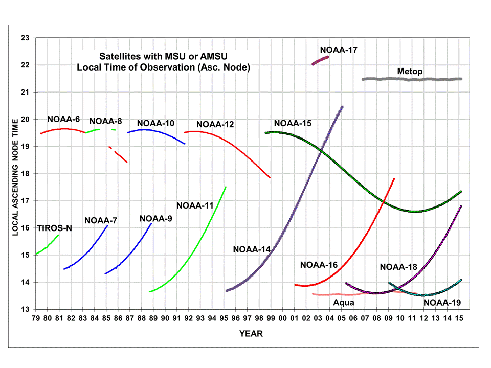
Fig. 1. Local ascending node times for all satellites in our archive carrying MSU or AMSU temperature monitoring instruments. We do not use NOAA-17, Metop (failed AMSU7), NOAA-16 (excessive calibration drifts), NOAA-14 after July, 2001 (excessive calibration drift), or NOAA-9 after Feb. 1987 (failed MSU2).
Also, while the traditional methodology for the calculation of the lower tropospheric temperature product (LT) has been sufficient for global and hemispheric average calculation, it is not well suited to gridpoint trend calculations in an era when regional — rather than just global — climate change is becoming of more interest. We have devised a new method for computing LT involving a multi-channel retrieval, rather than a multi-angle retrieval.
The MSU instrument scan geometry in Fig. 2 illustrates how the old LT calculation required data from different scan positions, each of which has a different weighting function (see Fig. 2 inset). Thus, only one LT �retrieval� was possible from a scan line of data. The new method uses multiple channels to allow computation of LT from a single geographic location.
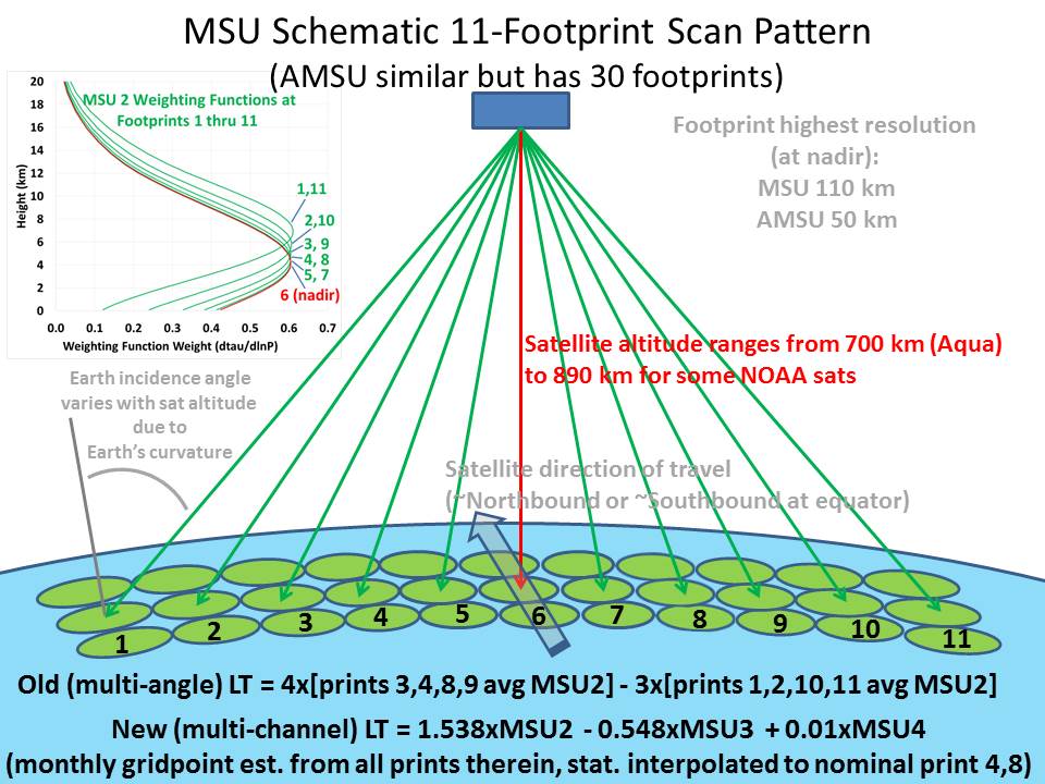
Fig. 2. MSU scan geometry, MSU2 weighting functions at different footprint positions and the basis for the old LT and new LT computation.
The LT retrieval must be done in a harmonious way with the diurnal drift adjustment, necessitating a new way of sampling and averaging the satellite data. To meet that need, we have developed a new method for computing monthly gridpoint averages from the satellite data which involves computing averages of all view angles separately as a pre-processing step. Then, quadratic functions are statistically fit to these averages as a function of Earth-incidence angle, and all further processing is based upon the functional fits rather than the raw angle-dependent averages.
Finally, much of the previous software has been a hodgepodge of code snippets written by different scientists, run in stepwise fashion during every monthly update, some of it over 25 years old, and we wanted a single programmer to write a unified, streamlined code (approx. 9,000 lines of FORTRAN) that could be run in one execution if possible.
Before addressing details of how the new Version 6 processing is different from the old (Version 5.6) processing, let�s examine some results. First let�s look at time series (Fig. 3) of the global average lower tropospheric temperature (LT), and how it compares to the old (Version 5.6) LT:
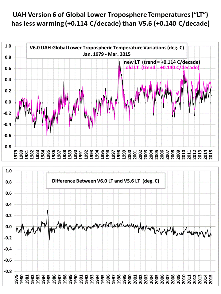
Fig. 3. Monthly global-average temperature anomalies for the lower troposphere from Jan. 1979 through March, 2015 for both the old and new versions of LT (top), and their difference (bottom).
Note that in the early part of the record, Version 6 has somewhat faster warming than in Version 5.6, but then the latter part of the record has reduced (or even eliminated) warming, producing results closer to the behavior of the RSS satellite dataset. This is partly due to our new diurnal drift adjustment, especially for the NOAA-15 satellite. Even though our approach to that adjustment (described later) is empirical, it is interesting to see that it gives similar results to the RSS approach, which is based upon climate model calculations of the diurnal cycle in temperature.
The next plot we will examine (Fig. 4) is the gridpoint LT trends during 1979-2015. Version 6 has inherently higher spatial resolution than the Version 5 product, which had strong spatial smoothing as part of the data processing and through the nature of how LT was calculated:
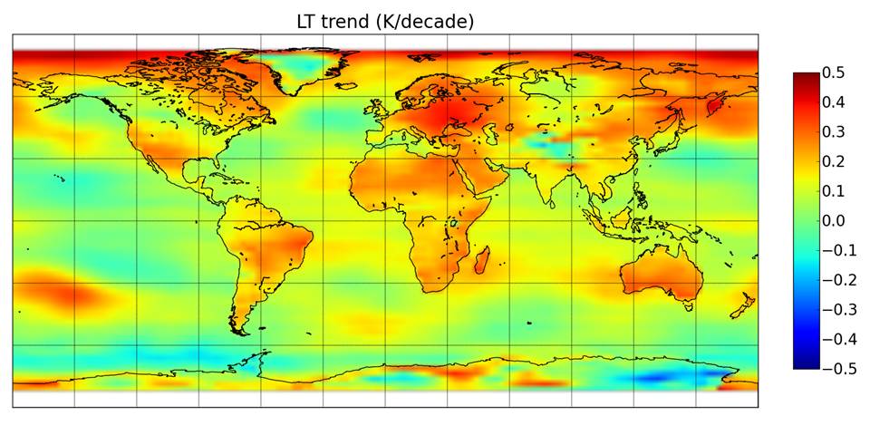
Fig. 4. New LT gridpoint temperature trends, Dec. 1978 through March 2015.
The gridpoint trend map above shows how the land areas, in general, have warmed faster than the ocean areas. We obtain land and ocean trends of +0.19 and +0.08 C/decade, respectively. These are weaker than thermometer-based warming trends, e.g. +0.26 for land (from CRUTem4, 1979-2014) and +0.12 C/decade for ocean (from HadSST3, 1979-2014).
The gridpoint trends for LT in Fig. 4 are very difficult to measure accurately over land, primarily due to (1) the diurnal drift effect, which can be at least as large as any real temperature trends, and (2) how LT is computed, which in the old LT methodology required data from different view angles, and thus different geographic locations which can be from different air masses and over different surfaces (land and ocean).
As a result, users can expect that there will be differences between old and new LT trends on a regional basis. Differences are also attributable to our use of a new, more accurate land mask in Version 6. For example, going from Version 5.6 to 6.0 the Australia trend increased from +0.17 to +0.24 C/decade, but the USA48 trend decreased from +0.23 to +0.17 C/decade. The Arctic region changed from +0.43 to +0.23 C/decade. Note that trends are noisy over Greenland, Antarctica, and the Tibetan Plateau, likely due to greater sensitivity of the satellite measurements to surface emission and thus to emissivity changes over high altitude terrain; trends in these high-altitude areas are much less reliable than in other areas. Future changes, probably minor, can be expected as we refine the gridpoint diurnal drift adjustments and other aspects of our new processing strategy.
Fig. 5 illustrates the changes from v5.6 to v6.0 for a variety of regions of interest:
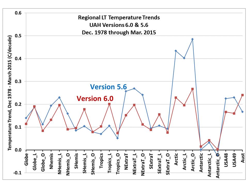
Fig. 5. Regional lower tropospheric (LT) temperature trends in Versions 6.0 and 5.6. �L� and �O� represent land and ocean, respectively.
Notice the trends decreased the most over the Northern Hemisphere extratropics, especially the Arctic, while tropical warming trends increased somewhat, especially over land. Near-zero trends exist in the region around Antarctica.
We want to emphasize that the land vs. ocean trends are very sensitive to how the difference in atmospheric weighting function height is handled between MSU channel 2 early in the record, and AMSU channel 5 later in the record (starting August, 1998). In brief, the lower in altitude the weighting function senses, the greater the brightness temperature difference between land and ocean, mostly because land microwave emissivity is approximately 0.90-0.95, while the ocean emissivity is only about 0.50. As a result, if the AMSU channel 5 view angle chosen to match MSU channel 2 is too low in altitude, the net effect after satellite intercalibration will be a spurious warming of land areas and spurious cooling of ocean areas (at least when intercalibration is performed with land and ocean data combined). We were careful to match the MSU and AMSU weighting function altitudes based upon radiative transfer theory, and are reasonably confident that the remaining land-vs-ocean effects in the above map are real, that is, the land areas have warmed faster than the ocean regions. This is consistent with thermometer datasets of surface temperature, although our warming trends are weaker. Given the importance of the microwave oxygen absorption theory to the land-versus-ocean trends, we hope to update that portion of our processing for a future version update.
2. Major Changes in Processing Procedures with Version 6
The following is meant to provide a general introduction to the new processing steps in Version 6, emphasizing departures from past practices, and not to provide exhaustive detail. It will likely be close to two years before a peer reviewed paper with greater detail gets published in a scientific journal.
2.1 LT Calculation
We have fundamentally changed the calculation of the lower tropospheric temperature product, LT, from a multi-angle method to a multi-channel method. The main reason we changed methods for LT calculation is the old view angle method had unacceptably large errors at the gridpoint level. While the errors cancel for global averages on a monthly time scale, on a regional or gridpoint basis they can be large. The errors arise because the different view angles necessary to calculate a single LT �retrieval� sample different geographic locations, for instance radiometrically colder ocean and warmer land (see Fig. 2, above).
This would not present as big a problem if the data from the different regions were simply averaged together, but instead they are differenced. The problem is further magnified (literally) because the old LT required a weighted difference between view angles (and thus regions) with large weights (+4, -3 for the MSUs), which amplified any regional Tb differences. Compounded with the need to do diurnal drift adjustments, which can vary substantially from land to ocean, the problems with the old LT were deemed to be too large to continue the old LT calculation methodology.
So, instead of the past method of calculating LT as a weighted difference between different view angles of MSU2 (or AMSU5), we are now calculating it as a weighted difference between MSU channels 2, 3, and 4 (or AMSU channels 5, 7, and 9) at a constant Earth incidence angle. This has the very important advantage that all satellite data necessary for the LT retrieval come from the same location.
This required a correction for calibration drifts in MSU channel 3, especially during 1980-81, which was the original stated reason why a multi-channel retrieval method was not implemented over 20 years ago. That correction is made based upon regression of global monthly anomalies of MSU3/AMSU7 data against MSU2/AMSU5 and MSU4/AMSU9 during 1982 through 1993 (a 12 year period exhibiting two large volcanic eruptions with differential responses in the different altitude channels). We then apply the resulting regression relationship to the entire 1979-2015 period to estimate MSU3 (AMSU7) from MSU2,4 (AMSU5,9), and compare it to the raw intercalibrated global MSU3/AMSU7 time series. A difference time series of the regression estimated and the observed MSU3/AMSU7 time series is fitted with a piecewise linear estimator to give a time series of adjustment which are then applied to the MSU3/AMSU7 monthly anomaly fields. The resulting corrections cause a few hundredths of a degree per decade increase in the MSU3/AMSU7 trend (1979-2014), which ends up being very close to zero.
The following graph (Fig. 6) shows the resulting time series of LT, MT (mid-troposphere, from MSU2/AMSU5), TP (our new �tropopause level� product, from MSU3/AMSU7) and LS (lower stratosphere, from MSU4/AMSU9):
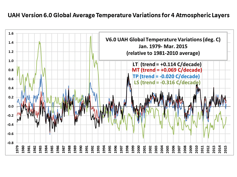
Fig. 6. Monthly global-average temperature variations for the lower troposphere, mid-troposphere, tropopause level, and lower stratosphere, 1979 through March 2015.
The LT computation is a linear combination of MSU2,3,4 or AMSU5,7,9 (aka MT,TP, LS):
LT = 1.538*MT -0.548*TP +0.01*LS
As seen in Fig. 7, the new multi-channel LT weighting function is located somewhat higher in altitude than the old LT weighting function. But if global radiosonde trend profile shapes (dashed line in Fig. 7) are to be believed, the net difference between old and new LT trends should be small, less than 0.01 C/decade. This is because slightly greater sensitivity of the new LT to stratospheric cooling is cancelled by even greater sensitivity to enhanced upper tropospheric warming.
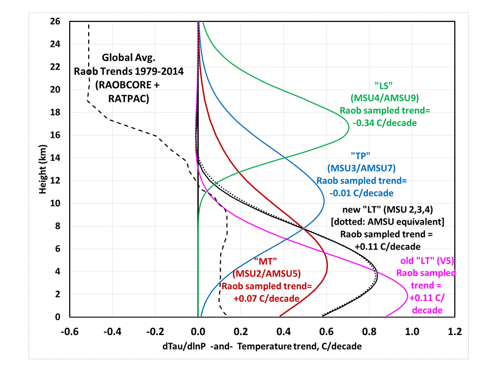
Fig. 7. MSU/AMSU weighting functions which define the sensitivity of the various channels to temperature at different altitudes. Also shown is the vertical profile of the average trends from two radiosonde datasets during 1979-2014, and the weighting function-sampled trends that would result from hypothetical satellite measurements of those radiosonde trends.
Specifically, we see from Fig. 7 that application of the old and new LT weighting functions to the radiosonde trend profiles (average of the RAOBCORE and RATPAC trend profiles, 1979-2014) leads to almost identical trends (+0.11 C/decade) between the new and old LT. These trends are a good match to our new satellite-based LT trend, +0.114 C/decade.
The new LT weighting function is less sensitive to direct thermal emission by the land surface (17% for the new LT versus 27% for the old LT), and we calculate that a portion (0.01 C/decade) of the reduction in the global LT trend is due to less sensitivity to the enhanced warming of global average land areas. The same effect does not occur over the ocean because all of these channels� microwave frequencies are not directly sensitive to changes in SST since ocean microwave emissivity decreases with increasing SST in such a way that the two effects cancel. This effect likely also causes a slight enhancement of the land-vs-ocean trend differences. Thus, over ocean the satellite measures a true atmosphere-only temperature trend, but over land it is mostly atmospheric with a small (17%, on average) direct influence from the surface. One might argue that a resulting advantage of the new LT is lesser sensitivity to long-term changes in land surface microwave emissivity, which are largely unknown.
The rest of the reduction in the LT trend between Versions 6.0 and 5.6 (-0.016 C/decade) is believed to be partly due to a more robust method of LT calculation, and the new diurnal drift adjustment procedure, described later. It is well within our previously stated estimated error bars on the global temperature trend (+/- 0.040 C/decade).
2.2 Monthly Averaging Methodology
In order to compute gridpoint values of LT, we must first compute gridpoint averages of the three channels used to compute LT. We have a new methodology for computing monthly gridpoint averages from MSU channels 2, 3, 4 (AMSU ch. 5, 7, 9) which is based upon initially computing monthly gridpoint averages from all channels� view angles separately: 6 view angles from 11 footprints of MSU, or 15 view angles from 30 footprints of AMSU, which are separately averaged in 2.5 deg. lat/lon bins during the month.
The resulting monthly Tb gridpoint averages for each of the three channels are then fitted as a function of Earth incidence angle with a second order polynomial. The Tb for any desired Earth incidence angle is then estimated from the fitted curve, rather than from the raw view-angle averages.
An example of this fit is shown in Fig. 8, for AMSU channel 5 for a single gridpoint for a single month from a single satellite (NOAA-15):
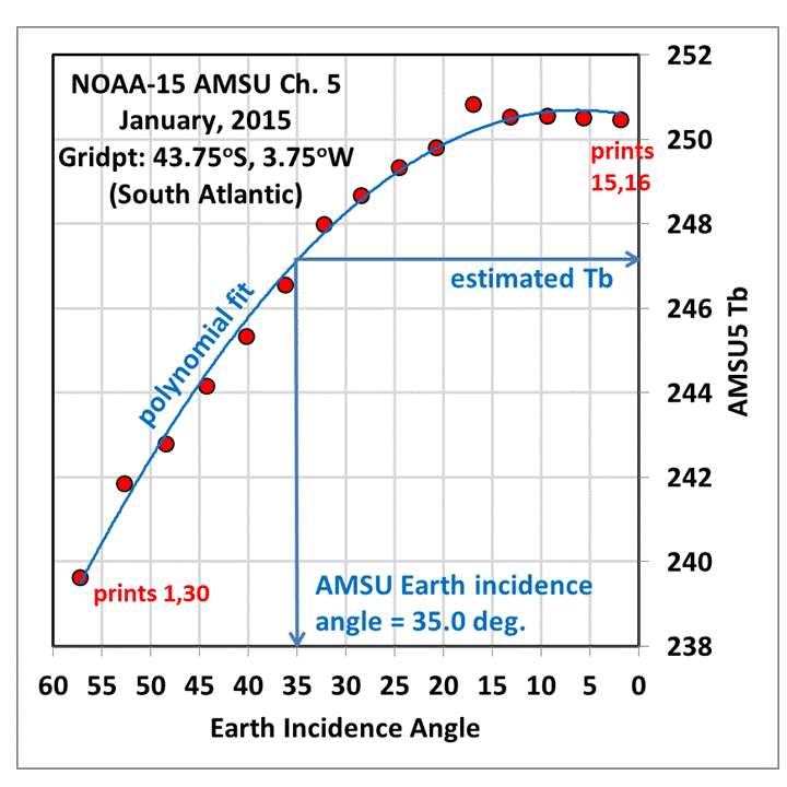
Fig. 8. Example of how monthly gridpoint averages of AMSU ch. 5 Tb from separate footprints are fitted as a function of Earth incidence angle so Tb can be estimated from the smooth functional fit to the data.
This new averaging procedure has the following advantages:
1) All of the different view angle Tb measurements are included in the optimum estimation of the Tb at the desired Earth incidence angle, reducing sampling noise.
2) The resulting average calculation for a gridpoint location is based only upon data from that location, a new feature that avoids sampling noise inherent in the old calculation of LT from geographically different areas.
3) The orbit altitude decay effect (which has been large only for calculation of the old LT), as well as different satellites� altitudes, is automatically handled since we use routine satellite ephemeris updates to calculate Earth incidence angles, which are the new basis for Tb estimation, not footprint positions per se.
4) Working from monthly grids of separate view angle averages allows rapid reprocessing of all of the data from 1979 forward, allowing us to efficiently test the use of different nominal view angles for the products, matching of the MSU and AMSU view angles, changes in diurnal drift estimation, etc.
The nominal footprint position we use for all MSU channels (see Fig. 2) is footprint position 4 and 8 (Earth incidence angle 21.59 deg), rather than nadir position 6; and nominal footprint position 6.33 and 24.66 for AMSU channel 5 (Earth incidence angle 34.99 deg.); and Earth incidence angles 13.18 deg. for AMSU7 and 36.31 deg for AMSU9. The choice of MSU prints 4,8 is because the resulting sampling at those footprint positions gives approximately 28 measurements evenly distributed in longitude around the Earth twice a day, rather than only 14 samples if the nadir position (MSU print #6, or AMSU print #15,16) was used as the reference. We find this greatly reduces sampling noise in the middle latitudes caused by coincidental phasing of moving weather systems with the satellite orbital sampling patterns.
Nevertheless, a few months in the record still exhibit mid-latitude striping patterns (especially over the southern oceans) when the precession of satellite orbits combined with warm and cold air mass movements happen to lead to non-random sampling patterns, even with as many as three satellites operating. So, we apply a +/- 2 gridpoint smoother in the east-west direction for the monthly gridded anomaly grid fields, which is applied over land and ocean separately to prevent �bleeding� of signals between land and ocean.
2.3 Diurnal Drift Calculation
As the 1:30 satellites drift to later local observation times (an indirect result of orbit decay), the MSU2 (AMSU5) Tb tend to cool, especially over land in certain seasons, due to the day-night cycle in temperature. As the 7:30 satellites drift to earlier observation times, the Tb tend to warm for the same reason. These average relationships change at very high latitudes because the ascending and descending satellite passage times converge — while they are ~12 hours apart at the equator, they approach the same local time at high latitudes.
These diurnal drift effects are empirically quantified at the gridpoint level by comparing NOAA-15 (a drifting 7:30 satellite) to Aqua (a non-drifting satellite), and by comparing NOAA-19 against NOAA-18 during 2009-2014, when NOAA-18 was drifting rapidly and NOAA-19 had no net drift. The resulting estimates of change in Tb as a function of local observation time are quite noisy at the gridpoint level, and so require some form of spatial smoothing. Since they also depend upon terrain altitude and the dryness of the region (deserts have stronger diurnal cycles in temperature than do rain forests), a regression is performed within each 2.5 deg. latitude band between the gridpoint diurnal drift coefficients and terrain altitude as well as average rainfall (1981-2010) for that calendar month, then that relationship is applied back onto the gridpoint average rainfall and terrain elevation within the latitude band. Over ocean, where diurnal drift effects are small, the gridpoint drift coefficients are replaced with the corresponding ocean zonal band averages of those gridpoint drift coefficients.
Fig. 9 shows an example of the diurnal drift coefficients (in deg. C per hour of ascending node time drift) used for MSU ch. 2 at nominal footprint 4 (and for AMSU ch. 5, a nominal footprint position between #6 and #7) for the month of June:
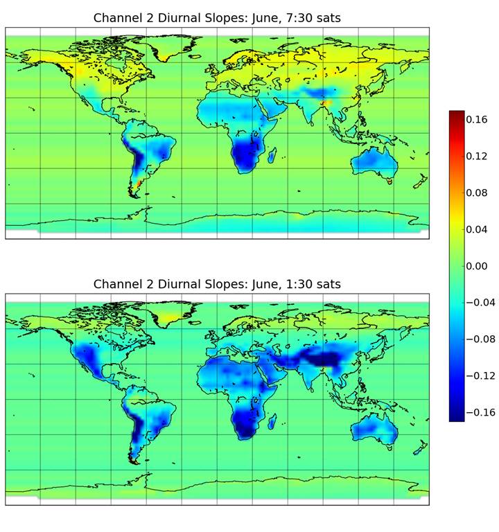
Fig. 9. Example diurnal drift coefficients (deg. C/hr) for MSU2/AMSU5 for the month of June for adjustment of the afternoon (�1:30�) satellites.
The reason why the drift coefficients change sign at high northern latitudes is a combination of early sunrise time in June, late sunset time, and the fact that the ascending and descending orbit satellite observations at high latitudes approach the same time, instead of being 12 hours apart as they are at the equator.
We also compute and apply diurnal drift coefficients for MSU channels 3 and 4 (AMSU channels 7 and 9), but the drifts and resulting adjustments are very small.
3. Final Comments
This should be considered a �beta� release of Version 6.0, and we await users� comments to see whether there are any obvious remaining problems in the dataset. In any event, we are confident that the new Version 6.0 dataset as it currently stands is more accurate and useful than the Version 5.6 dataset.
The new LT trend of +0.114 C/decade (1979-2014) is 0.026 C/decade lower than the previous trend of +0.140 C/decade, but about 0.010 C/decade of that difference is due to lesser sensitivity of the new LT weighting function to direct surface emission by the land surface, which surface thermometer data suggests is warming more rapidly than the deep troposphere. The remaining 0.016 C/decade difference between the old and new LT product trends is mostly due to the new diurnal drift adjustment procedure and is well within our previously stated range of uncertainty for this product�s trend calculation (+/- 0.040 C/decade).
We have performed some calculations of the sensitivity of the final product to various assumptions in the processing, and find it to be fairly robust. Most importantly, through sensitivity experiments we find it is difficult to obtain a global LT trend substantially greater than +0.114 C/decade without making assumptions that cannot be easily justified.
The new Version 6 files are located here:
Lower Troposphere: http://vortex.nsstc.uah.edu/data/msu/v6.0beta/tlt
Mid-Troposphere: http://vortex.nsstc.uah.edu/data/msu/v6.0beta/tmt
Tropopause: http://vortex.nsstc.uah.edu/data/msu/v6.0beta/ttp
Lower Stratosphere: http://vortex.nsstc.uah.edu/data/msu/v6.0beta/tls


