November Temperature Up a Little from October; 2016 Almost Certain to be Warmest in 38 Year Satellite Record
NOTE: This is the twentieth monthly update with our new Version 6.0 dataset. Differences versus the old Version 5.6 dataset are discussed here. The paper describing the methodology has been accepted for publication.
The Version 6.0 global average lower tropospheric temperature (LT) anomaly for November 2016 is +0.45 deg. C, up a little from the October value of +0.41 deg. C (click for full size version):
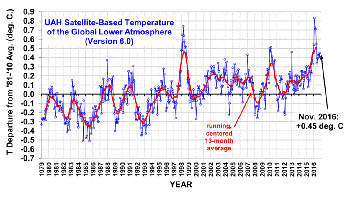
The global, hemispheric, and tropical LT anomalies from the 30-year (1981-2010) average for the last 23 months are:
YEAR MO GLOBE NHEM. SHEM. TROPICS
2015 01 +0.30 +0.44 +0.15 +0.13
2015 02 +0.19 +0.34 +0.04 -0.07
2015 03 +0.18 +0.28 +0.07 +0.04
2015 04 +0.09 +0.19 -0.01 +0.08
2015 05 +0.27 +0.34 +0.20 +0.27
2015 06 +0.31 +0.38 +0.25 +0.46
2015 07 +0.16 +0.29 +0.03 +0.48
2015 08 +0.25 +0.20 +0.30 +0.53
2015 09 +0.23 +0.30 +0.16 +0.55
2015 10 +0.41 +0.63 +0.20 +0.53
2015 11 +0.33 +0.44 +0.22 +0.52
2015 12 +0.45 +0.53 +0.37 +0.61
2016 01 +0.54 +0.69 +0.39 +0.84
2016 02 +0.83 +1.17 +0.50 +0.99
2016 03 +0.73 +0.94 +0.52 +1.09
2016 04 +0.71 +0.85 +0.58 +0.94
2016 05 +0.55 +0.65 +0.44 +0.72
2016 06 +0.34 +0.51 +0.17 +0.38
2016 07 +0.39 +0.48 +0.30 +0.48
2016 08 +0.43 +0.55 +0.32 +0.49
2016 09 +0.44 +0.49 +0.39 +0.37
2016 10 +0.41 +0.42 +0.39 +0.46
2016 11 +0.45 +0.41 +0.50 +0.37
To see how we are now progressing toward a record warm year in the satellite data, the following chart shows the average rate of cooling for the rest of 2016 that would be required to tie 1998 as warmest year in the 38-year satellite record:
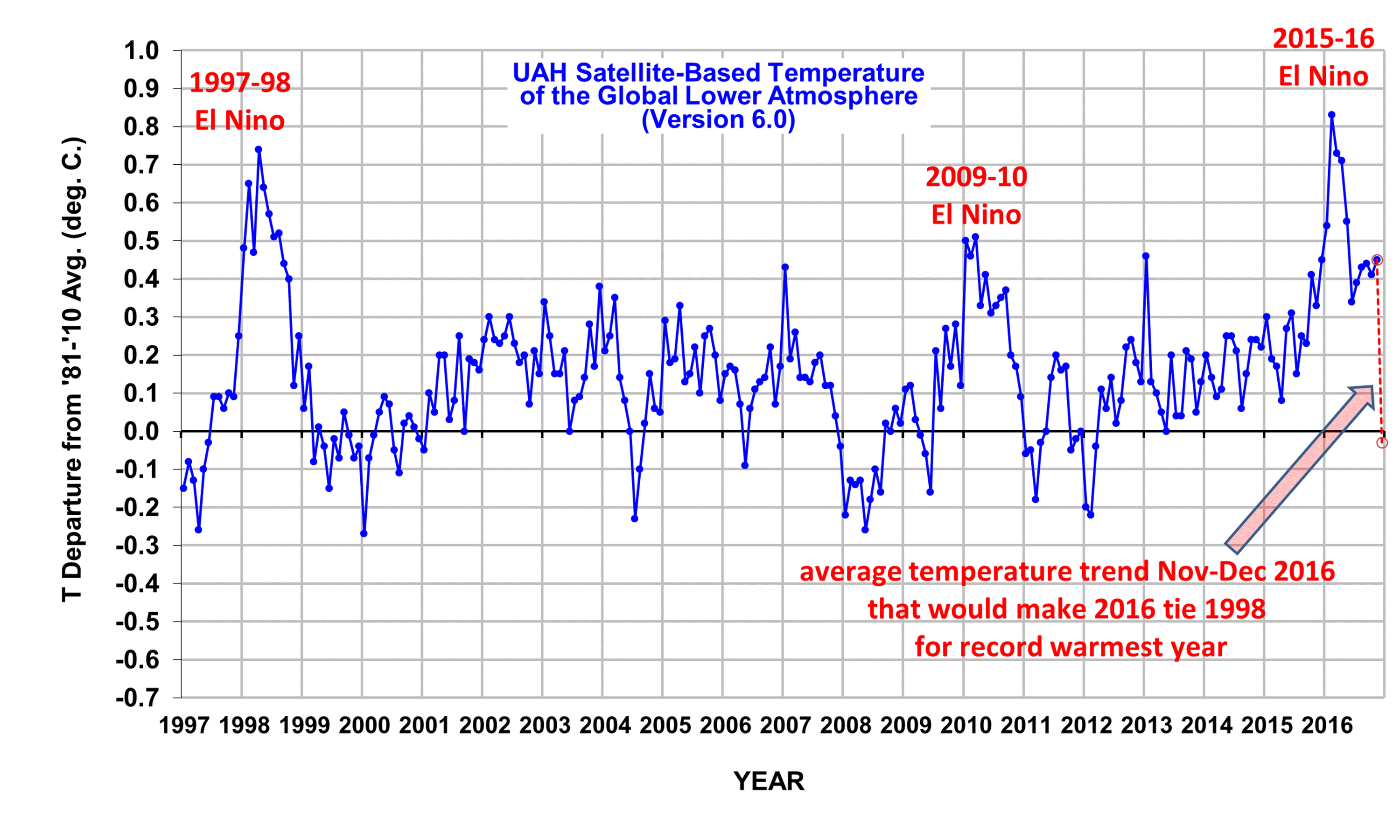
Based upon this chart, it now seems virtually impossible for 2016 to not be a record warm year in the UAH dataset.
UPDATE: It should be pointed out that 2016 will end up being 0.03-0.04 deg. C warmer than 1998, which is probably not a statistically significant difference given the uncertainties in the satellite dataset adjustments.
The “official” UAH global image for November, 2016 should be available in the next several days here.
The new Version 6 files (use the ones labeled “beta5”) should be updated soon, and are located here:
Lower Troposphere: http://vortex.nsstc.uah.edu/data/msu/v6.0beta/tlt/uahncdc_lt_6.0beta5.txt
Mid-Troposphere: http://vortex.nsstc.uah.edu/data/msu/v6.0beta/tmt/uahncdc_mt_6.0beta5.txt
Tropopause: http://vortex.nsstc.uah.edu/data/msu/v6.0beta/ttp/uahncdc_tp_6.0beta5.txt
Lower Stratosphere: http://vortex.nsstc.uah.edu/data/msu/v6.0beta/tls/uahncdc_ls_6.0beta5.txt
Thank you, Dr. Spencer. I am amazed at how quick you report the monthly information.
Wow. It looks as though the global warming signal is finally overwhelming even ENSO.
You mean the 300 year slight warming trend might possibly become visible over 38 years of sat data assuming a La Nina doesn’t kick in next year and the ‘trend’ disappears again.
What is your definition of the term “slight”?
All warming that is beneficial or subjectively undetectable. I.e., like what’s been happening for the last 300 years. And as opposed to cooling, which is deadly. I.e., compare hospital death rates in winter versus summer months.
will nitschke…”All warming that is beneficial or subjectively undetectable”.
Or warming that is the result of a recovery from a 1C cooling due to the Little Ice Age.
Astronomer Syun Akasofu has already pointed out the obvious. The LIA cooled the globe from 1400 AD – 1850 AD, and the IPCC erred by blaming the rebound warming on anthropogenic causes.
Akasofu claims the atmospheric temperature should rebound at about 0.5C/century. That accounts for most of the warming leaving a slight warming on top of it.
It also explains why glaciers have receded. During the LIA, glaciers advanced across the planet. In France, one glacier advanced across a valley and wiped out a village.
The cooling would also explain lower concentrations of CO2 in the atmosphere since cooler oceans absorb CO2 from the atmosphere.
You didn’t answer my question! OK I will try another way, are you calling around 1C of warming in the Global Mean Temperature “slight”?
It is only significant (1SD) in a short data set. Late Tertairy was much warmer.
Twinotter you’re engaging in a basic logical fallacy known as begging the question. Given the lack of any measurable consequences to date, a better question to ask is why do YOU consider it significant?
Not really. ENSO spikes happen on top over the overall trend in global warming.
Can I ask about the temperature only over the land?
Global land is +0.48 for Nov., NH land is +0.38.
Thank you very much.
Roy: Do you have ideas why there was the big drop in RSSv3.3 TLT land in October? Not seen in RSS v3.3 TMT or TTT nor in UAH TLT v5.6 and v6.
we think that the RSS diurnal cycle adjustment, which is largest over land, is biased. That would be my first guess.
Whether it concerns the decrease in temperatures in the mid northern latitudes (25 to 60 degrees)?
Why not. Makes med wonder how that adjustment can make such a big difference between TLT vs TMT and TTT. Strange.
http://data.remss.com/msu/graphics/TLT/plots/RSS_TS_channel_TLT_Northern%20Mid%20Latitudes_Land_And_Sea_v03_3.short.png
@ ehak: Perhaps you should read their paper on RSS V4.0? The V3.3 TLT data referred to are already flagged by the RSS team as not accounting adequately for diurnal drift. Their V4.0 TTT data use a new method (different to UAH V6.0, but attempting to deal with similar issues) and also have a similar weighting profile with respect to altitude as UAH V6, so you really should be comparing UAH 4.0 TLT to RSS 4.0 TTT, not the outdated 3.3 TLT data or UAH 5.6 – both of which include errors in accounting for diurnal adjustment (as acknowledged by authors of both data sets)
Apologies: UAH V 6.0 TLT (not 4.0) to RSS 4.0 TTT….
RSS 3.3 TLT doesn’t include 70-82.5 S unlike the other satellite datasets.
If we assume that RSS thereby miss 8% of the global land area with an anomaly of +2 C in October, that would explain an extra drop of about 0.16 C.
The different base period of RSS may also contribute to an extra large October drop, at least vs non-RSS products..
Dave:
I compared RSSv3.3 TLT with RSSv3.3 TMT og TTT. Significantly bigger drop in TLT than TMT/TTT. The drop in RSSv3.3 TMT/TTT vs RSSv4 TMT/TTT are actually quite similar. So what is going on with RSS TLT?
Can I also ask why the large varations in the Australian anomalies which have recently been added?
In May, June, july this year 2016 it was over 1.00C and now in Nov 2016 down to 0,01. Another odd one was Dec2015 at 0.21 then Jan 2016 -0.65 followed by Feb 2016 at 0.35. Surely the anomaly can not move so much in one month. I suggest that the anomalies figures for 2016 are mainly in error and that the true figure should be close to zero. Australia as a whole has received more rain than average ( there has been some in land flooding during winter)and that has kept temperatures low.
People on the coast of Queensland are reporting lower than normal sea surface temperatures with overturning of the normal warm surface current.
Even if this year is the warmest in the sattelite record. The early 1930s during the dust bowl era were still well warmer
No they weren’t.
BBCM’s
It’s in the Big Book of Climate Myths Simon.
And facts will never erase them from certain *sceptics* minds.
Simon, you probably know that actual recorded temperatures were higher in the U.S. in the 1930s than they are now. For the rest of the world, the record is not as clear, but from what I have seen, the situation seems to hold also for ROW. However, adjustments to actual temperatures take them warmer now. The rationale for adjustments is understandable, but the precise methodology is to do so is controversial. What has been sorely lacking in the adjustment process is a verified match between adjusted temperatures and known weather phenomenon. Concerning adjusted 1930s versus current temperatures, the retreat of glaciers, reports on Arctic ice, heat waves, etc. suggest that the adjustment process is suspect. I think one would be on shaky ground to claim that the country’s temperatures are higher now than the 1930s — unless you blindly accept the adjustments made by politically motivated individuals.
No – they were not.
http://data.giss.nasa.gov/gistemp/graphs_v3/Fig.D.gif
Hard to say with GISS. The historical temperatures have been so heavily modified in recent years that this data set is now basically useless. (It’s showing greater warming trends on land than in the upper troposphere, which is opposite of theoretical expectations. More likely the theory is fine, and the last decade of adjustments to this data set are garbage.)
Not so fast Toneb. See the following:
http://www.giss.nasa.gov/research/briefs/hansen_07/
The graph you posted contains significant adjustments. Compare 1934 and 1998. Your graph indicates 1934 to be 1.19 C and 1998 to be 1.31 C The 1999 Hansen graph shows 1934 to be almost 1.5 C and 1998 to be 0.9 C. That is a HUGE adjustment!
The adjustments are needed to control for biases.
How would you prefer to attend to them?
Appell,
What happened to the 97 98 el nino in GISS. I can not imagine that being a valid eatimate for the event. It looks horrible.
I don’t have to worry about GISS or that smug-ass smile on Gavin’s face. He’s a side-note now. He should never have been appointed to the position. Why do we have a mathematician in charge of NASA GISS? He is severely underqualified. At least Hansen had a MS in Astronomy and a PhD in physics. Might as well have some clown in cosmetology in charge of GISS.
The adjustments are needed to reinforce biases, I suspect. If a “skeptical” (skeptical = fair) scientist made such drastic adjustment to historical records, no consensus scientist would consider the data set as valid. The other way around, these dubious practices are hand waved away.
Toneb, you are not showing any understanding of my post. You linked a graph that is full of adjustments. The adjustments themselves are bigger than the upward trend.
“Toneb, you are not showing any understanding of my post. You linked a graph that is full of adjustments. The adjustments themselves are bigger than the upward trend.”
I, of course, expected that reply.
It’s the usual “with bound he was free” myth from the Big Book of Climate Myths.
I suggest you go and look at the lack (sarc) of “adjustments” to the Sat temp data record.
Choose any you like….
Versions UAH V1.0 to V6.0 (beta5)
Or you may care to peruse the “adjustments” in RSS all the way through to V4.0.
And then you could go here …..
http://berkeleyearth.org/understanding-adjustments-temperature-data/
For instance
TOBS
US observers used to read the maximum thermometer (and reset it to the temp at time of reading – they have an indicator that gets pushed along by the mercury).
During the evening.
So what happened?
If the next day should be colder.
Well, surprise surprise, that temp at reset the evening before was record again as the max. Twice then.
Makes great sense but that’s what they did for a time.
And correcting that inherent warm bias is *deceptive*?
Only if you’re invested in ideological bias it does.
Oh, and meanwhile, this homogenisation of US temps makes not a whit of difference to the global mean temp record.
IOW: Don’t be a hypocrite.
Will,
The adjustments made to satellite LT data have had much larger impacts on trends (e.g. negative to positive) than any of the adjustments made to GISS. So I dont understand why you would say GISS is useless while UAH is useful. The long term trends in GISS differ only slightly from the other surface datasets.
In the most recent update (6.0) of UAH, the Arctic trend went from 0.44 to 0.23 C/decade and Australia from 0.16 to .24. What are we to make of this?
Toneb. Your last post was more responsive to my post, but I do not get the feeling that you have a deep understanding of the adjustment process.
Yes, both surface-measured and satellite-measured temperature records have adjustments. They are adjusted for different reasons, and my impression for years was that the satellite were more rigorous — and for most part they have been more transparent. Also, RSS and UAH had a series of collegial exchanges a while ago where they both helped each other, remarkably helping each other move in directions opposite of the helper’s biases! Nevertheless, my confidence is a little less sure now that both have recently revised their records in opposite directions — in the direction of the researcher’s bias.
The satellite covers a shorter period of time, and the farther you get back in history for surface temperatures, the more tenuous will be the assumptions made in the adjustments. As has been mentioned several times, I would be more comfortable if the adjusted temperatures are verified through known physical evidence. The fact that they do not undermines their credibility.
Your description of TOBS is consistent with a shallow understanding of the issue. Perhaps you have a better grasp than displayed, but do not be quick to say TOBS justifies the adjustments. Not all US observers recorded the temperatures in the evening. And TOBS assumes that the observers recording the evening were oblivious to the possibility that they were recording a single high temperature for two different days. That assumption is not necessarily true. Analysis has been performed on the differences between those observers who recorded in the morning versus those who recorded in the evening. The analysis showed little and insignificant difference between the two sets. Apparently, the evening recorders took steps — simple steps — to insure that they did not record the same high temperature over two different days.
Bias? Did someone say “Bias”?
“From: Tom Wigley
To: Phil Jones
Subject: 1940s
Date: Sun, 27 Sep 2009 23:25:38 -0600
Cc: Ben Santer
It would be good to remove at least part of the 1940s blip, but we are still left with why the blip.”
Of course all the previous people that recorded and tabulated those temperatures were incompetent boobs who didn’t know that those temperatures needed to be adjusted until AFTER that e-mail.
Nuff said.
“The adjustments made to satellite LT data have had much larger impacts on trends (e.g. negative to positive) than any of the adjustments made to GISS.”
Depends what you mean by “adjustment” and the context, which you don’t specify, so your statement may either be wrong or irrelevant. Here is some examples of adjustments made over just a 3 year period up to 2010:
https://climateaudit.org/2010/12/26/nasa-giss-adjusting-the-adjustments/
Nothing like that has occurred historically to the sat data sets, as far as I am aware.
Doesn’t mater if you choose global data sets created by ‘skeptics’ or the official ones, the 30s globally were not warmer than the last few decades.
Ten years since the mistake was first made, some ‘skeptics’ still confuse the US temp record for the global record.
Here is Japan’s global temp record, seeing as no one’s bothered to traduce that one.
http://ds.data.jma.go.jp/tcc/tcc/products/gwp/temp/ann_wld.html
Barry, Although you appear to have a good handle on many data sets, I see CAGW alarmists do much more confusion on data sets than do Skeptics.
There is little doubt that globally that global temperatures are higher now than 300 years ago. the physical evidence supports temperature data sets that show such an increase.
it is not as obvious that global temperatures are higher now than 60 to 70 years ago. they could be, but the physical evidence gives ambiguous support.
inquirer…”There is little doubt that globally that global temperatures are higher now than 300 years ago”.
I would hope so, 300 years ago was 1716 and right in the middle of the Little Ice Age. Global temps were 1C lower back then.
Unless I’m very much mistaken, some of the people confidently saying temps were much cooler 300 years ago (I agree) are the same ones that rubbish the temperature records.
If I may inquire, which data do you esteem that gives you confidence in temps 300 years ago? I would like to refer to it as a source to avoid the usual muckraking about fudged data. Is there a link to this vaunted data set?
Barry, you made me chuckle — and that is a welcomed respite from the typical emotional & bitter exchanges that often occur on his blog. Your wit with a bit of light sarcasm was effective — not offensive, but humorous.
I am sorry. I do not have a vaunted data set to give you. The reason for trust in data sets that show colder temperatures 300 years ago is based in their match with physical evidence. I think we have had discussions in the past on the physical evidence, so I will not repeat that here. There are literally thousands of studies that show the MWP and the LIA in temperature proxies, and the physical evidence matches those proxies.
One proxy that seems to be problematic is dendrology effort. There just are so many other factors — and some of them are monotonic — that can affect the size of tree rings. And you are probably aware that there has been a disconnect between some dendrology studies and recent measured/adjusted temperature trends.
Some advocate taking an average of RSS and UAH data sets. I can see the rational since both of them of headed by individuals with opposite biases. However, that suggestion is not scientifically satisfying.
🙁
Barry…”If I may inquire, which data do you esteem that gives you confidence in temps 300 years ago?”
Same proxy data sets as used in the IPCC’s methods of establishing temps for the pre Industrial Era. Also, eye-witness accounts of glaciers expanding across a valley in France and wiping out a village.
During the LIA, ice skating started in Holland and the Thames was frozen solid.
One of many links. Seeks and ye shall find:
https://www.eh-resources.org/little-ice-age/
I’d really love a data set that covers the confident views of the LIA that is up to date.
Which data set would that be?
average UAH/RSS
Not sure why we’d average two data sets when there are about a dozen. But maybe there’s a good reason for focusing on a 4 kilometer depth of the atmosphere while excluding global temperatures at the surface where we live.
BTW, An Enquirer, that was a genial comment. Cheers.
I believe Japan attributes that trend to urbanization? Was that adjusted?
Of course the data are cleaned up. The Japanese do not posit that the global warming for the last 100 years is due to urbanization. (How many cities are on the sea surface, anyway?)
Here is another global temp record made by pure skeptics who are dedicated to preventing carbon mitigation policies. They got a higher trend than Had4.
https://noconsensus.wordpress.com/2010/03/24/thermal-hammer/
They started with raw data and made their own choices about weighting etc.
David Appell, Mmmmmmmmm. Control for biases. (I know that you mean TOBS, etc.) However, I am not sure that the adjustments control for biases or introduce more biases — such as the bias of the analyst.
Here is my bottom line: there are ways to check whether the end product of adjustments matches available physical evidence. And in places where that match has been examined, they do not. The fact that adjusters have been not willing to methodically or critically examine that match should set off warning bells.
SkepticGoneWild cites a Hansen et al. publication from 1999 that shows a cooling trend in the USA.
Were they lying then or are they lying now?
“were still well warmer”…for a few years in the United States. You cannot extrapolate less than 2% of the Earth’s surface to the entire globe. No reasonable data set shows the global temperatures to be cooler today than in the 1930’s.
climatechage….”The early 1930s during the dust bowl era were still well warmer”
To be fair, the 1934 record only applies to North America. 1934 was warmer in NA than 1998 but you can’t really compare that to the sat temps which are based on a different baseline.
At least in surface measurements
I wonder if I might ask Dr Spencer at what point he might concede that climate sensitivity is somewhat higher than the relatively low figure he has been arguing for?
It’s a serious and genuine question. How many months/years of satellite data and at what anomaly level would start to make him review his position, as any professional scientist might in the face of steadily accumulating new data?
Its a fair question. Do you ask IPCC same? I dont know Dr. Spencers exact figure (1.1C per doubling?) But the trend is not anywhere near the 3C IPCC base case and La Nina is here. So the hiatus will likely continue another 2 yrs.
>Do you ask IPCC same?
Well, absolutely I wouldn’t be averse to doing so in principle. But it’s hugely simpler to ask a specific individual in a specific place (ie here) than of the IPCC. How would one ask a diffuse body like the IPCC?
So you demand answers for an alleged far lesser margin of error and dismiss a much larger on account of what again?
To play a bit of devil’s advocate here, your question appears to assume a simple system rather than a complex, chaotic system. Increased temperature does not necessarily equate to high climate sensitivity to CO2 levels. The analysis is more complex than that.
I don’t see any reason to change my views on climate sensitivity. The warming trend is still only about half that of the average of the climate models. A single warm El Nino year should definitely not impact conclusions about long-term climate sensitivity.
Hi, Doctor Roy. Strictly speaking, that does not answer the question. (In fact, not even loosely speaking.) Might I reinforce: What anomaly level would start to make you review your position? (Or other quantitative threshold, such as perhaps a trend rate.) Any strictly scientific answer must pretty-much by definition commit one in advance to a quantitative standard, which can be measured and assessed by others.
I would say a linear warming trend exceeding 0.2 C/decade in our satellite data.
Thank you. I find 0.12K/decade based on your current dataset. However, you are perhaps being slightly too generous, as even at a lower sensitivity the rate will rise if emissions continue to rise. I would place a time-limit on that stipulation, if I were you!
P.S. The exponential trend line is obviously steeper at the end, but still below 0.2K/decade. I haven’t tried to prise out the differential because I’m getting too old for maths and it’s obviously still well below your threshold.
So 0.27 C/decade warming in the free troposphere (850-300 mbar) might be enough to reconsider..?
In a “balanced” period, from Nino to Nino, without disturbing volcanoes, like the last 20 years?
http://postmyimage.com/img2/845_RecentRatpacvs_CMIP5.png
Global trend 850-300 mbar: Ratpac 0.27 C/dec, CMIP5 0.28C/dec.
Tropics 850-300 mbar: Ratpac 0.30 C/, CMIP5 0.29 C/dec.
Eliot Bignall…”I find 0.12K/decade based on your current dataset….”
You don’t seem to have read the UAH 33 year report where that trend was better explained.
Drawing best fit curves through the data will certainly produce a trend similar to the one you quote but you are completely ignoring the context.
The first 18 years of the satellite record shows anomalies below the baseline. Any trend in that data is a recovery from cooling, not true warming.
UAH has stated that true warming the past 35 years did not begin till the 1998 El Nino drove the global average 0.8C above the baseline. Since ’98, the trend has been flat till 2015.
The IPCC admitted to that from 1998 – 2012, calling it a warming hiatus.
“Drawing best fit curves through the data will certainly produce a trend similar to the one you quote but you are completely ignoring the context.”
You’re quite right, of course. The dataset only covers 37 years, and that trend rate would yield 0.47K increase across that time.
All the longer-term datasets show a total temperature increase to date of about 0.8-0-9K, putting us well within range of a 2K increase by the end of the century based on only a factor of 1.4 increase in CO2 to date. This, needless to say, would suggest that sensitivity can already be pegged at well over 2K.
As you say, context is everything. But actual data delivers actual numbers.
Dr. Roy – This is your field rather than mine, and I probably couldn’t work through the residence times and latencies to get an accurate figure, but a trend rate of 0.12K/decade for an increase in CO2 of 40% looks to me to be pretty close to the consensus sensitivity of about 2.5K. It would take about another 43% increase in CO2 from today’s level to reach a doubling. Taking the maximally naive approach of multiplying up, this would yield a new trend rate of about 1.7K/decade. Assuming a flat rate to end-of-century and then the immediate decay of all the new CO2, again maximally naive, that would yield an increase of 1.43 in 84 years. Add this to the increase to-date of about 0.8K and you get 2.2K of increase for a doubling of pre-industrial CO2 levels.
Given the crudity of this calculation surely that’s close enough for discussion.
“nt” is my brother. He got out of his cage for a couple of minutes.
Gordon,
‘The first 18 years of the satellite record shows anomalies below the baseline. Any trend in that data is a recovery from cooling, not true warming’
Ahh, it is recovery from cooling rather than true warming. Huh??
Please explain..
Nate…”Ahh, it is recovery from cooling rather than true warming. Huh??
Please explain..”
It’s explained in the UAH 33 year report. There was volcanic activity between 1979 and 1997 that cooled the planet slightly. Any trend from 1979 – 1997 was a recovery from cooling.
NOAA has explained on their site that anomalies below the baseline represent cooling. If you have a trend in a cooling region of anomalies it has to be a recovery from cooling.
In the UAH 33 years report it states that ‘true’ warming, based on the 1980 – 2010 global average (baseline) did not begin till the El Nino of late 1997 which drove the global average into the positive anomaly region.
The global average has remained above the baseline since 1998 but the trend has been flat at around 0.25C. The IPCC admitted the trend had been flat (hiatus) from 1998 – 2012.
I have been asking the question as to how the flat trend got to around 0.25C in one sudden step circa 2001. Global warming cannot account for that and the 98 EN can’t either, that we know of.
Gordon,
I agree that there were some big volcanoes that caused cooling. One in 82 and one 91. I think we understand that these dips in temperature recovered in ~ 3-4 years. You can see these dips on the graph.
Surrounding these dips regular periods with no volcanic cooling. If the effect of the middle 1990s volcanic cooling were removed, I think that your 1990s to 2000s ‘step-up’ would be less apparent.
I dont think the baseline has any special significance. Different data sets use different baseline periods.
Climate sensitivity quoted in terms of degrees/doubling of CO2 is a nonsense concept. Natural effects overwhelm whatever tiny contribution CO2 makes to global temperature.
http://notrickszone.com/2016/12/01/new-paper-human-climate-forcing-below-detection-deep-oceans-warm-by-2c-within-200-years-100-naturally/
In a nutshell the effect of CO@ on ocean temperatures is below our ability to detect it.
Having to cite a denier’s blog means you’re peddling junky science.
You can’t cite any real science?
The trend in the satellite data is very consistent with other measures of climate change, such as those reported by NASA – slightly over .1 degree C per decade. Even if this rate does not accelerate, we are on track to reach two degrees C of warming by around the end of this century.
We now know we have a problem. It is past time to start working on meaningful solutions.
Roy, thanks for the prompt update. The latest preliminary NCEP CFSR global surface temperature anomaly estimates from the University of Maine Climate Change Institute (UM CCI) and from WeatherBELL also show a very similar slight rise from October to November. I’m amazed how closely the UAH and RSS TLT anomaly estimates track the GST estimates in recent years as can be seen in this graph of monthly estimates since 2014:
https://oz4caster.wordpress.com/2016/12/01/global-temperature-november-2016-preliminary/
The latest UM CCI CFSR trend graphs through November can be seen here:
https://oz4caster.wordpress.com/monthly-trends/
And the 12 month running mean ticks up by 0.01 C.
I guess that this is the peak, December will probably not be (much) warmer than last year…
Well done, Dr. Spencer. November’s barely been over for a couple of hours in the far time zones of the central Pacific, and already we have the monthly anomaly.
The 12-month, 60-month and 120-month running means are all at their highest in the 37 year record.
We always work on Greenwich time. The new Ver6 processing is streamlined, so it goes pretty fast.
Richard barraclough…”The 12-month, 60-month and 120-month running means are all at their highest in the 37 year record”.
Nonsense. The running average since 1998 and before shows a flat trend. The IPCC admitted to a flat trend from 1998 – 2012 calling it a warming hiatus.
Are you by any chance using the woodfortrees site?
Gordon:
The 12 month running mean goes back 12 months. 1998 was 18 years ago.
Gordon Robertson says:
“Nonsense. The running average since 1998 and before shows a flat trend.”
Typical Gordon Robertson nonsense.
UAH LT v6beta5 warming from 1/1999-present = +0.21 C
From 1/1989-present = +0.36 C
From 1/1979-present = +0.47 C
Hi Gordon,
No – it’s not nonsense – just a simple statement of fact.
I have taken the figures from the dataset referred to by Dr. Spencer in this article. Note that I referred to running means, and said nothing about trends.
Some more details for you.
12-month running mean (before this year)
Previous high 0.483 from Dec 1997 to Nov 1998
Current value to Nov 2016, is 0.522
60-month
Previous high 0.166 from Apr 2001 to Mar 2006
Current value is 0.226
120-month
Previous high 0.155 from Nov 1997 to Oct 2007
Current value 0.167
I’ve updated the post to reflect that fact that even if 2016 is warmest, it probably won’t be statistically different from 1998.
I can see why that would be necessary, since it now looks like it’s going to be a record year after all. 🙂
A perfect example of how people see what isn’t there so long as they believe it’s there.
Eliott Bignell…”it now looks like its going to be a record year after all”
By what margin…0.01C??? You could not read that on a room thermometer.
Yes, if you use statistically small samples then you get statistically insignificant outcomes. This is why I have said in the past that Dr. Roy shouldn’t make so much of calendar years in the first place. But since whether or not it will be a record has been so widely discussed, I thought it would be a poor time to forget about it just as it turns out to be a record after all.
So far it looks like exceeding 1998 by 0.3-0-4K, which you could actually read on a room thermometer. Fortunately, however, climate science no longer relies on people holding room thermometers. Dr. Roy has a fleet of satellites at his disposal.
Much more informative.
Eliott…”So far it looks like exceeding 1998 by 0.3-0-4K…”
Look at where it started compared to 1998. The latter started at the baseline and went over 0.8C. 2016 started on a plateau of about 0.25C.
If you are looking solely at the data, there’s no argument that 2016 is as warm as 98 or slightly warmer, but where did the 0.25C plateau come from?
Following the 98 EN, one might think that the pattern would drop back to the pattern pre 98. It did for a few months, dropping below the baseline. However, circa 2001 the average shot up about 0.25C.
BTW…a similar unexplained warming occurred in 1977…called the Great Pacific Climate shift. God may not play dice with the universe as Einstein claimed but God certainly seems to be messing with us when it comes to the global average.
How do you explain that? If it’s an after-effect of the EN we might expect it to dissipate but it has not in 18 years. If it does, suddenly or eventually, do we then subtract 0.25C from the 2016 average?
Ah, science by tea-leaf reading. Well, as Dr. Roy said last month, if I remember correctly, all you are really doing when you just compare two peaks is comparing which el Nino event is the larger. Which doesn’t actually tell you anything about the climate at all.
But if you are determined to fool yourself, don’t let me stand in your way. I can plot the trend rate myself. It’s 0.12K/decade for the whole dataset.
What is your definition of “statistically significant” in this context?
Personally I am not too fussed about the statisitical outliers (although they make good media headlines). The annual average has not dipped below the zero baseline for 5-6 years now, I am more interested in the trend.
Statistically significant is usually being outside the 95% uncertainly limits.
I’d probably annoy people if I mentioned again that mpainter forbade this to happen, right? Nice work on the response time, Dr. Roy. I presume you have a fully-automated workflow now, as the last couple of months have been ready almost instantly. Kudos.
I’m interested to see where the moving average eventually peaks. It may not be a statistically significant increase in the year-to-year scores for 1998 and 2016, but the 13-month slice could yet end up higher still. We’ll have to wait and see.
Eliott Bignell…”Im interested to see where the moving average eventually peaks”.
It will be a moot point if a La Nino comes along producing the cooling of 2008.
Yes, that’s what mpainter said, more or less, several months ago. Haven’t seen him for a while. I wonder why?
Elliott…”thats what mpainter said, more or less, several months ago. Havent seen him for a while. I wonder why?”
I doubt if it’s related to the current EN dragging on.
The major ENs in 98 and 2010 were followed by significant LNs that offset them. I don’t see why this one should be different. May even get a major LN as in 2008. Or, whatever is behind these major ENs, maybe the PDO, or AMO, may act up and plunge us below the baseline.
I don’t know if you’ve read the paper by Tsonis et al in which they studied the major ocean oscillations over a century. They concluded that when oscillations like the PDO and AMO are in phase the global average rises and when out of phase the global average drops.
Who knows what’s going on right now with warm blobs of water in the Pacific and stalled jet streams? I think the natural effects are far more interesting than humans being behind it.
I banned mpainter a couple months ago. I don’t recall why, but I don’t ban people without good reason.
I bet it was quite good enough!
“I dont see why this one should be different.”
Well, I could offer one suggestion: If you look at the record of ENSO events, not every el Nino is followed immediately by an equal and opposite la Nina. I lack the skills these days to compare the variation to pure chance, but it is clearly not a straightforward periodic oscillation, and ENSO can hang around in a neutral state for months on end. Forecasts are given in terms of probability. I saw one event that looked as though it went positive, went neutral for a while and then went positive again.
As I said, I lack the maths skills these days to say anything useful about this, but the ENSO forecasting page shows lots of detail.
Why 13 months instead of 12?
Lol. There is no climate sensitivity! Japan just recorded its first accumulating snowfall since the 1840s! This year isn’t the warmest ever even if sattelite date suggests it is! The sun is and will always be the main driver of climate sensitivity whether this year is the warmest year on sattelite era or not! Sattelites such as the UAH only record a small fraction of the earth at any given time. Since the jet stream is so out of wack this is causing the sattelite data to become more glitchy therefore it can’t record as well anymore since weather can be so variant at any given time at any given day more then ever before!
Translation: “Duh!”
Decrease in temperatures in the northern mid latitudes.
http://images.remss.com/data/msu/graphics/tlt/medium/n_pole/ch_tlt_2016_10_anom_v03_3.png
Yes, that would be the breakdown in the polar vortex. For the whole globe, see Dr. Roy’s graph at the top of the page.
ren: That’s a one-month graph. It can’t show a decrease or increase in temperature.
There may be a climate sensitivity (measured in milli-Kelvin/doubling of CO2) but it is below our ability to quantify with our blunt tools.
Meanwhile our climate is being controlled by natural processes that we don’t understand very well.
“it is below our ability to quantify with our blunt tools.”
Actually, the consensus is about 2.5K. And we can measure temperatures to millionths of a degree.
Climatechange4realz
“The early 1930s during the dust bowl era were still well warmer”
You are confusing contiguous United States data with global data.
You mean the Arctic?
Right. Thank you for the correction
Whatever happened to the “rapid cooling” that Dr. Roy predicted following the end of El Nino? Could it be that Global Warming has caught up with this skeptic?
How do you think that these anomalies show global warming?
https://weather.gc.ca/data/saisons/images/[email protected]@sd_000.png
ren says:
“How do you think that these anomalies show global warming?
https://weather.gc.ca/data/saisons/images/[email protected]@sd_000.png”
How can a plot of just one day show a trend??
It’s hiding in an isolated corner laughing at your stupidity
La Nia just started. It’s not supposed to peak until next year. Temperature adjustments a few months in a row especially very small ones is nothing unusual.
La Nina has not started. The criteria is 5 or more months with an NINO3.4 anomaly <= -0.5 C.
Last week's anomaly was -0.4 C, as was the previous week's.
Source:
http://www.cpc.ncep.noaa.gov/data/indices/wksst8110.for
we will know better in a year or two. Making “Global Warming” conclusions based upon a few months of data would seem a bit premature.
Right. The overall trend is downward from February of this year though.
i wouldn’t look forward to a warming trend though
Exactly the trend has been down overall and if I am correct this is just the start of a very long term down trend.
My theory in a nutshell is a weak solar magnetic field enhanced by a weak geo magnetic field will drive the terrestrial items that control the climate into a cooling mode..
The climate would cool due to the terrestrial items moving in directions which would increase the albedo of the earth, and reduce incoming solar radiation.
In addition less solar radiation would be coming from a quiet sun. If solar irradiance were off by say 0.15% this in itself would reduce global temperatures by .1 to .2c
Of course the bulk of the decline would be from secondary solar effects effecting the terrestrial items that govern the climate.
Well it appears You know the facts my friend. The brainwashed will learn with time and that’s a promise! a bunch of scientists already predicted a little ice age while making an excuse that co2 will eventually catch up and global warming will strike again and kill us all. Of course the media covered up most of it as they usually do.
Sad world we are living in my friend.
The decrease EUV radiation by 4 percent and a decrease in the density of the thermosphere 30 percent.
Such small changes in sunlight to affect changes in the atmosphere.
http://www.tinypic.pl/2wk4pp6o8fjm
“if I am correct”
Unfortunately, you aren’t.
Salvatore Del Prete says:
“Exactly the trend has been down overall and if I am correct this is just the start of a very long term down trend.”
Salvatore, you have a long history of beind the opposite of correct.
You never learn from it, making the same old tired claim every month.
Climatechange4realz says:
“The overall trend is downward from February of this year though.”
And its statistical significance is near zero.
Great: so if you find the peak of the response to a significant El Nino event and plot the temperature trend until 8 or 9 months later you find its negative. Wow. The earth must be cooling eh?
That trend is in no way statistically significant. Go calcalute it and tell us what you get.
Yes in a few years especially if solar conditions are very quiet we will know to a much greater degree what is what with the climate.
I say before 2020 we will know much more then we know now.
I am not I am right or wrong because the answer is elusive as of today.
There is no significant man made global warming. It is a fact that cannot be denied. The sun is and will always control the climate and there’s nothing we can do about it to change that except maybe add a few hundredths of a degree to the minimal climate sensitivity there already is.
See Murray Salbys latest vid on YouTube for more details
With El Nio during a bicentennial global warming peak I could understand why this year maybe the warmest on record. However, it has 99.99% nothing to do with us.
Wait until La Nia really kicks in and we start to feel the true affects of this grand solar minimum. You may want to rethink on this discussion we are having. Just a thought not a request. Your your own person you form your own conclusions. I can only present the facts not force anyone to believe them
Remember it’s always warmest before the cold
Global cooling has started, and it will be here for sometime to come. All the factors that control the climate are now in, or going toward a colder phase
– Salvatore del Prete, December 31, 2010
http://www.drroyspencer.com/2010/12/dessler-and-spencer-debate-cloud-feedback/#comment-8257
David continuously miss represents what I have said.
He forgets that the cooling I predicted back then was based on solar minimum conditions which did not materialize but do appear to be doing so now.
If the solar conditions materialize then David expect global cooling.
David likes to quote the parts that suit him. To be accurate would defeat his purpose.
Salvatore, see your own like. You wrote “Global cooling has started, and it will be here for sometime to come.”
There were no caveats. Nor here:
Your conclusions are in a word wrong, and that will be proven over the coming years, as the temperatures of earth will start a more significant decline (which started in year 2002 by the way).
– Salvatore del Prete, Reply to article: IC Joanna Haigh – Declining solar activity linked to recent warming
– http://climaterealists.com/index.php?id=6428
Salvatore, you make absolute statements, most without caveats. For example
“Global cooling has started, and it will be here for sometime to come. All the factors that control the climate are now in, or going toward a colder phase.”
– Salvatore del Prete, December 31, 2010
http://www.drroyspencer.com/2010/12/dessler-and-spencer-debate-cloud-feedback/#comment-8257
I have indeed marked your words.
Shapiro…”Whatever happened to the rapid cooling that Dr. Roy predicted following the end of El Nino?”
As Roy’s partner at UAH, John Christy explained, the atmosphere is far too complicated to be predictable. Roy is a meterologist, if he thinks cooling will follow he’s likely basing it on a hunch from experience. These events don’t happen on anyone’s schedule and the cooling will likely be there.
The past two El Ninos were averaged by following La Ninas, why should this one be special? Anthropogenic warming could not happen that fast. It hasn’t happened much in the past 35 years and it certainly won’t happen to the degree this EN has warmed the planet.
It’s scientifically implausible that the present warming will be sustained.
John Christy is a realist. He knows those wackos with their CMIP models can’t explain the past and predict the future.
“Hunches” aren’t science.
Gordon Robertson says:
“The past two El Ninos were averaged by following La Ninas, why should this one be special? Anthropogenic warming could not happen that fast. It hasnt happened much in the past 35 years.”
In the last 35.0 years, UAH LT v6beta5 warming = 0.47 C.
Hmmm, basic climate science says it’s very plausible. The Greenhouse Effect (GHE) is real – controlled by trace gases – any of those increase their concentrations – then the GHE will increase – period. It’s plausible – period. What relative contribution? is the uncertain question.
Dr. Roy has repeatedly stated that he thinks agw may be keeping the world from global cooling in recent years. So why don’t you go annoy someone else?
The La Nia we were all expecting continues to sputter. It will come along eventually. When it does, a big drop in global temps will follow.
What happens afterwards is the interesting part.
There is no La Nina occurring yet. At this point in 1998, the NINO3.4 anomaly was less than -1.5 C. Today it hovers around -0.4 C.
Source:
http://www.cpc.ncep.noaa.gov/data/indices/wksst8110.for
We were seeing temps below the enso neutral range for a few weeks. But yeah, not even close to a true La Nia.
Even if this year ends up being “the warmest ever” after various adjustments, the question people ought to be asking is how much warmer. If you plot it on the IPCC’s comparison of models and temperatures since 2000, it doesn’t rise enough to notice on that scale.
The standard models continue to be a far more embarrassing exhibition on that scale than anything you can point to in Roy’s work.
Context and comparison help to clarify a lot.
Roberto…”Even if this year ends up being the warmest ever”
I have questioned that is a previous comment. Following the 1998 El Nino, there was a dip in the global average then the global average rebounded some 0.25C circa 2001. That warming makes no sense based on the previous UAH record dating back to 1979.
A sudden warming of 0.25C in a year cannot be explained by anthropogenic warming, it happens far slower than that. The 1998 EN cannot explain it either. The only thing that can explain it is a natural event we know nothing about.
A similar 0.2C warming occurred in 1977 and it became known as the Great Climate Shift. It was later identified as the Pacific Decadal Oscillation. The sudden warming has never been explained. That’s nearly 0.5C that has never been explained in the past 40 years.
The 2016 EN is built on that 0.25C plateau making it less effective than the 1998 EN. Without that mysterious 0.25C warming following the 1998 EN, we’d like have a negative trend from 1998 – 2016.
Gordon wrote:
“A sudden warming of 0.25C in a year cannot be explained by anthropogenic warming, it happens far slower than that.”
For the exp(N)th time, N>>1, natural variablity still exists. So with AGW, some years are going to be cooler than others. Perfectly compatible with AGW science.
Why do so many people get this wrong?
Thanks David, so why so many comments about comparing 1998 with 2016…. it’s the long term trends and wider data sets that matter – that all point in same direction. These in turn support basic physics that tells us that if certain GHGs increase in concentration, then the GHE will increase, ALL ELSE BEING EQUAL. This is not difficult to understand. So, the hard part is knowing if the AGW component is significant enough to warrant action. Long term accurate data from various sources is what we need….. currently we see the risk. As a risk management person, I see this as a big deal! We pay huge premiums for managing risk in other walks of life, where chances of happening are quite low.
I notice that the running, centred 13 month mean is now above 0.5C for the first time in the UAH record.
Hiatus, anyone?
Good observation, I had not spotted that.
We need a couple more years data to be able to tell if 2016 is a statistical outlier like 1998. My guess is it will be because of regression to the mean.
Entropic man…”I notice that the running, centred 13 month mean is now above 0.5C for the first time in the UAH record.”
If you are referencing that to anthropogenic warming, did you account for the mysterious 0.25C that occurred following the 1998 EN circa 2001.
Can you give me an explanation for why the average suddenly rose 0.25C in one year without an EN driving it? Anthropogenic warming could not act that quickly.
If that 0.25C warming cannot be accounted for, wrt anthropogenic warming, should it not be subtracted from the running average?
‘If that 0.25C warming cannot be accounted for, wrt anthropogenic warming, should it not be subtracted from the running average?’
Gordon,
You are not making a heck of a lot of sense.
The data is the data. We can’t arbitrarily subtract amounts that we find ‘mysterious’ from it.
The point of science is to work to understand the data we are seeing.
Gordon wrote:
“Can you give me an explanation for why the average suddenly rose 0.25C in one year without an EN driving it?”
Because during an El Nino, an immense amount of heat comes out of the ocean, which AGW has been warming up all this time.
For this El Nino it was 300-400 Zettajoules that came out of the 0-2000 m section of the ocean.
Source:
http://preview.tinyurl.com/o9bt9r5
Wow! How is this possible?
Climatechange4realz again here despite his permanent insults with fascist background?
NO THANKS.
No thanks what? Look pal, even if I was wrong which is like a once in a trillion chance you would have been prepared even if the opposite extreme which in your case would be catostrophic man made global warming were to Godforbid happen I would be prepared because I’ve been on that side of the debate before. You on the other hand would have never been prepared for this little ice age because you didn’t have an open mind to except the fact that history repeats itself and there’s a good chance it might happen again! Have an open mind and don’t expect a single shred of forgiveness or sympathy when you coming crying to me 5-10 years from now saying that I was right all along and you should have listened but you didn’t. You know why? That is for you to answer. Just some advice for you pal! Have a nice day!
“You on the other hand would have never been prepared for this little ice age because you didnt have an open mind to except the fact that history repeats itself and theres a good chance it might happen again!”
Climate science by prognostication.
PS: Predicting you’ll be right in 10 years and won’t give forgiveness is plain loopy.
How many billion tons of CO2 have been emitted from burning fossil fuels since the last El Nino? 100 billion? 150 billion. More than that? Yet the average temp this year will not be significantly different from 1998.
Exactly!
Comparing two specific years is, of course, a massive cherry pick.
The UAH LT trend from 1/1999 to 11/2016 = +0.12 C/decade.
And starting in the year 1880 is a massive cherry pick as well. Why not start during the the Holocene Optimum? Your 0.12 goes out the window.
Skeptic:
Because there was little CO2 release up to the Holocene Optimum, that’s why. It started only with the industrial era.
Unless you agree with William Ruddiman.
Picking 30 years, just because you now have satellite data, is also a massive cherry pick.
Good think UAH has 38 years of data.
30-years is the WMO’s minimum period suggested.
The point is that the Keeling curve seems to be driven by burning fossil fuels and it is rising monotonically.
If there was a shred of truth in the 1896 Arrhenius theory we would be noticing an sharp uptick in temperature. Instead the global temperature has flat lined since 1998 in spite of Gavin and his “Warmest Year Evah!”.
While I love Richard Alley, his idea that “CO2 is the Control Knob for Temperature” is absurd.
No, it hasn’t “flatlined” since 1998. Learn to calculate.
What specific parts of this paper do you disagree with?
Atmospheric CO2: Principal Control Knob Governing Earths Temperature, Lacis et al, Science (15 October 2010) Vol. 330 no. 6002 pp. 356-359
http://pubs.giss.nasa.gov/abs/la09300d.html
PS: If we ever try to terraform Mars, melting its CO2 icecapes will be the very first thing we try.
It has flatlined and you are still peddling BS like that Lacis paper.
If you compare statistical outlier to outlier you may well miss the overall trend, as David Appell points out.
harry…”If you compare statistical outlier to outlier you may well miss the overall trend, as David Appell points out”.
Appell conveniently misses the subtlety of the point being made. It has nothing to do with 1998 as an outlier it has to do with the trend from 1998 INCLUDING ’98 as an outlier.
The IPCC is on record of admitting a warming hiatus from 1998 – 2012 and the UAH record extends that hiatus till late 2015.
Appell claims a UAH trend of 0.12C/decade since 1999 which the IPCC did not see using 2500 reviewers.
I have mentioned several times a sudden rise of 0.25C circa 2001. That is an outlier which could be used to suggest a trend when there is no trend. A sudden step or a spike over a range can be absorbed into the average, showing no trend overall.
No, you do not get away with that one. You are clearly referring to the 1998 temperature as some sort of baseline. You then attempt to distract by bringing in the IPCC when what we are all talking about here is the UAH data set.
“Yet the average temp this year will not be significantly different from 1998.”
One thing that is obvious about the UAH data set it is noisy.
Gordon says:
“The IPCC is on record of admitting a warming hiatus from 1998 2012 and the UAH record extends that hiatus till late 2015.”
Please stop pretending I havne’t told you a million times that the data has gotten better since then (Karl et al 2015).
“Appell claims a UAH trend of 0.12C/decade since 1999 which the IPCC did not see using 2500 reviewers.”
That’s what UAH themselves say. See the bottom right-hand corner of their data page where it says “0.12”
Need to have a contact with reality. It is already visible decline in water vapor over the continents.
http://pamola.um.maine.edu/fcst_frames/GFS-025deg/5-day/GFS-025deg_ARC-LEA_T2_5-day.png
That plot is of a 5-day average of temperature, not water vapor.
Polar vortex over the North America.
https://earth.nullschool.net/#2016/12/06/1200Z/wind/isobaric/10hPa/orthographic=-103.23,53.37,786
Ren said: already visible decline in water vapor over the continents.
He then linked to an air temperature model, not water vapor. Who is it that needs contact with reality?
Where the cold is a lot of CO2 and little water vapor.
https://earth.nullschool.net/#current/chem/surface/level/overlay=co2sc/equirectangular
My contact with reality is perfect.
http://pamola.um.maine.edu/fcst_frames/GFS-025deg/5-day/GFS-025deg_ARC-LEA_PMSL_5-day.png
Snape says:
“Ren said: already visible decline in water vapor over the continents.”
Your source?
Here’s the evidence for an increase in atmospheric water vapor:
IPCC 5AR WG1 Ch2 Figs 2.30 & 2.31 documents positive trends in water vapor in multiple datasets.
“Attribution of observed surface humidity changes to human influence,”
Katharine M. Willett et al, Nature Vol 449| 11 October 2007| doi:10.1038/nature06207.
http://www.nature.com/nature/journal/v449/n7163/abs/nature06207.html
“Identification of human-induced changes in atmospheric moisture content,” B. D. Santer et al, PNAS 2013.
http://www.pnas.org/content/104/39/15248.abstract
“Analysis of global water vapour trends from satellite measurements in the visible spectral range,” S. Mieruch et al, Atmos Chem Phys (2008), 8, 491504.
http://www.atmos-chem-phys.net/8/491/2008/acp-8-491-2008.html
David,
Ren made a claim about water vapor but when I clicked on his link I got the 5 day air temperature forecast from climate reanalyzer. Was your question directed toward me or Ren?
Have not you noticed Pressure?
ren. His maine.edu link is for a single day only.
You have to watch him — he very often tries to sneak in links that are irrelevant to the subject of climate change.
Ren,
Climate Reanalyzer does have a 2-7 day water vapor forecast. This, however, tells us nothing about a long term trend. Again, who is it that needs contact with reality?
The trend is this:
https://earth.nullschool.net/#2016/12/06/1800Z/wind/isobaric/500hPa/overlay=temp/orthographic=-105.29,45.82,639
Ren,
Now your link is to a map of today’s winds!
These are the winds on December 6.
What does a wind forecast for December 6 have to do with water vapor?
ren is a walking haiku. Let it be.
See what I mean, Snape? (Good catch.) You really can’t trust any link ren posts; always examine them for yourself.
I try to keep an open mind track opposing opinions from John casey adapt 2030 to guy mcpherson nature bats last to roy spencer.
So 2016 will slightly edge out 1998 in tropospheric temperature by a statistically insignificant margin. This means that the global warming pause will now have gone on for an incredible 18 consecutive years straight! Where’s the beef alarmists?
Mind the myopia. There’s many global temp data sets, and many other indicators of global temperature. One has to squint very hard to manage to avoid all that information.
barry…”Theres many global temp data sets, and many other indicators of global temperature”.
For example Hadley CRU where the keeper of the data, Phil Jones, was a principle focus of the Climategate email scandal. When asked to release the data for independent analysis by Steve McIntyre he refused, claiming Mac would use it against him.
In the emails Jones was seen urging peers not to cooperate with an FOI request submitted by McIntyre to the UK government.
Duh!!! That’s what science is about. If Had crut cannot be verified it is unvalidated and worthless.
Then there’s NOAA who tried to erase the hiatus by slashing 5000 surface stations from a global pool of 6500. They synthesized the 5000 missing stations using a climate model via interpolation and homogenization. In doing so, they made sure major cooling centres were omitted so that the homogenization algorithm would show record warming.
Note to Roy…your system does not like the word H-a-d-c-r-u-t.
It accepts Hadley CRU and Had crut but not the latter as a full word.
You reckon the Japanese are in on the conspiracy? Here is their global temperature record.
http://ds.data.jma.go.jp/tcc/tcc/products/gwp/temp/ann_wld.html
barry says, December 2, 2016 at 7:53 AM:
Yes, and have you noticed the following?
https://okulaer.files.wordpress.com/2016/12/jma.png
The “agreement” between JMA and GISTEMP LOTI since 1970 isn’t that spectacular, is it?
The following image is of Met Office and JMA global surface temps, both baselined to 1891-2011.
http://tinyurl.com/j5nf69q
Your graph is a little crude. Could you please indicate what baseline you used for the three data sets?
Here is Met Office and GISTEMP baselined from 1981 to 2011.
http://tinyurl.com/zd8fujx
Not much deviation from the 70s, although temps are lower for GISS in the first half of the 20th century.
The surface data sets seem fairly well corroborated against each other from the 1970s onwards.
barry, did you notice I used Had CRUt 3, and not 4? Also that it is adjusted down -0.064K from Jan’98 on. Watch, then, how well it correlates with the JMA curve from 1970. The GISTEMP LOTI global mean curve is aligned with the other two in 1970-1971. The divergence after that is quite striking indeed.
Also, take a closer look at your first link, top diagram, global H4 vs. gl JMA (to 2010 only):
https://okulaer.files.wordpress.com/2016/12/h4-vs-jma.png
It’s pretty evident from 1970 on that the blue JMA curve is trending far less steeply than the red H4 one, isn’t it?
Baselines.
GISTEMP LOTI: 1951-1980
Had CRUt3: 1961-1990
JMA: 1981-2010
So not the same baselines used. If you think it makes a world of difference, however, then please do correct me by producing an apple-apple graph showing how, all of a sudden, they all match up …
Annual means:
https://okulaer.files.wordpress.com/2016/12/giss-vs-h3-h4.png
GISTEMP LOTI (green) vs. Had CRUt4 (red) vs. Had CRUt3 (blue+purple), the latter adjusted down 0.064K from 1998. As we already know, the JMA curve would fit the adjusted H3 curve far more tightly than it would the GISTEMP one.
So you’re sort of picking and choosing the datasets you like, even out of date ones. No doubt you have a narrative in your mind that explains why the former is more accurate. Probably something that involves malfeasance on the part of the compilers.
Right. So the Japanese are part of the world wide conspiracy to make the global surface temperature records warmer than they should be. Yes, you said.
Two skeptics – who hate Phil Climategate Jones and are dedicated to stopping CO2-mitigating policies – constructed their own global surface temperature record. They came up with a higher trend than Phil Jones – as they said.
https://noconsensus.wordpress.com/2010/03/24/thermal-hammer/
I’ll be looking at your links further on wiggle matching and the East Pacific.
I ask that you examine this link, and tell me why 2 skeptics have corroborated the official temp records?
barry says, December 3, 2016 at 8:19 PM:
Mmm, not really. I didn’t need to include H3 at all. It just happened to be included in the plot I had made some time ago, that of the JMA, GISTEMP LOTI and H3 adjusted.
What I wanted to show you is how poorly JMA agrees with GISTEMP LOTI (and you followed up by showing how this poor agreement also applies when comparing it with H4).
Which sort of puts your original comment (which I responded to) about the Japanese being “in on the conspiracy” in sort of a strange light. Because, what conspiracy are you talking about? The one that plots to make the surface temp series strikingly diverge?
You appeared to be affirming that the Japanese were part of a ‘conspiracy’ in your first reply.
http://www.drroyspencer.com/2016/12/uah-global-temperature-update-for-november-2016-0-45-deg-c/#comment-230691
The global temp record I linked made by skeptics Roman M and Jeff Condon at the Air Vent is a very close match for Had4. When they posted the results in 2010 it had higher trends than Had3.
BEST (yep, the one admired then rubbished by skeptics) also came up with higher trends than the ‘official’ records.
The problem is that skeptics have twice now made their own global temp records and come up with virtually identical results to the records put out by the institutes. After years of slagging the official records skeptics finally – FINALLY – did their own work with raw data and look what happened.
Of course there are small differences. These are estimates using different methods.
So the sniping about the records seems pretty hollow to me.
Just to check, I’ll look now at the trend results for Roman’s temp record, Had4 and GISS.
The per decade trends given by skeptics Jeff Condon and Roman M (JCRM) are for the periods 1900 to 2010, and 1978 to 2010. I’ll compare with Had4, GISS, NOAA and BEST.
1900-2010
JCRM = 0.078
Had4 = 0.072
GISS = 0.082
NOAA = 0.079
BEST = 0.079
1978-2010
JCRM = 0.248
Had4 = 0.155
GISS = 0.170
NOAA = 0.155
BEST = 0.182
I recommend reading the work behind JCRM global temp record. It predates BEST.
https://noconsensus.wordpress.com/2010/03/24/thermal-hammer/
You can get the other trend results from here.
Yes, matching baseline matters a great deal if you want to compare visually. JMA, NOAA and Had4 are well aligned, while GISS has lower temps in the first half of the 20th century and has more divergence there.
I tend to use Had4 because it has lower trends than the other surface data sets, and I assume any skeptic familiar with the topic will know that and appreciate the conservatism. Of course, there’s no pleasing some people.
2 ‘skeptics’ – the kind that don’t like Phil Climategate Jones – made their own global temperature series from raw data. Here is the result.
https://noconsensus.wordpress.com/2010/03/24/thermal-hammer/
They got a warmer trend than the Met Office.
Seems Jones didn’t fudge the data hard enough…
barry…”Seems Jones didnt fudge the data hard enough”
I said nothing about Jones fudging data I said his data is unvalidated hence meaningless. Steve McIntyre wanted to take the data and validate it but Jones put up a real stink about him having the data because it might make him look stupid. Jones actually implied that.
Jones went so far as to advise his cronies in the Climategate emails to throw up obstacles to an FOI request submitted by McIntyre to get the data via the UK government.
Even at that, the IPCC uses his data and they admitted a flat trend from 1998 – 2012. I have posted the link several times in which they called it a hiatus. The numbers they posted for the trend, with the error margin range between -ve and +ve values suggest statistically insignificant warming/cooling from 1998 – 2012.
Although you have claimed 15 years is too short a period, some scientists think it is significant. Certainly, 15 years with increasing CO2 and no warming is significant.
There is no evidence other than the EN warming of February 2016 that the trend is still not flat.
You miss the point. Skeptics have constructed their own surface temp records from raw data and wound up with trends higher than the Met Office temp record.
The Japanese have a global surface temp record that validates the Met Office, too.
All the data sets corroborate each other. Skeptic, US, UK, Japanese and European global surface temp records are all incredibly similar.
If there’s any fudging going on it’s lost in the weeds. And the skeptics efforts show more warming than the official estimates.
This is one of the points at which skeptics stop being skeptics and deliberately avoid acknowledging the facts.
Just watch…
Phil Jones understands that it is not about science. So called “Climate Science” is about politics and money.
barry
This information would suggest that if the globe is still warming (which is debatable) then the cause of the warming would not be AGW or increasing amounts of carbon dioxide caused by human burning of carbon based fuels. The measured increase of Carbon Dioxide (about 8% since 2000). Some other factor besides radiant energy must be looked into (changes in evaporative cooling or decrease in thermal cooling). The amount of radiant energy hitting the surface has not changed since 2000 so it could not be the cause for a warming surface (the energy for warming is not available).
https://ceres-tool.larc.nasa.gov/ord-tool/jsp/EBAFSFCSelection.jsp
Click “Visualize Data” at bottom left of link to bring up graph of Surface Net flux. It clearly shows that radiant energy to the surface has not increased, hence warming from radiant energy could not be the cause of any warming.
Norman…” Some other factor besides radiant energy must be looked into…”
Or a lingering El Nino. Or as Lindzen points out convective currents. There is no reason to focus on radiant energy from the surface playing a factor in global warming.
As Woods pointed out circa 1909, the loss in radiant energy per surface area diminishes markedly with the distance from the point of radiation. By the time surface radiation reaches a few feet above the surface it becomes essentially useless as a warming agent.
As I have pointed out before you can test that for yourself. Turn on the large 1500 watt ring of an electric stove till it is glowing red and try to hold your hand over it. If you get close enough without touching it, the IR radiation will slowly cook your flesh. A few inches away there is little effect and a foot away the heat is felt but barely. Four feet away it is not felt at all directly even though convection may warm the air.
That’s 1500 watts of power concentrated in a 1 foot diameter. What effect do you think a far lower concentration of infrared energy per square metre would have at 4 feet?
Leave it on the whole the whole day. I think you’ll feel something anywhere in the room.
But more to the point (sorry) neither the sky nor the earth surface are point sources, or even localized sources, of radiation. So does not diminish as you are suggesting
nate…”Leave it on the whole the whole day. I think youll feel something anywhere in the room”.
I acknowledged that but the room warming is not from direct radiation but from N2/O2 molecules being heated directly by conduction, and convection carrying the warmed air molecules around the room.
A radiant electric heater in a room does not warm the room directly by radiation. If you stand a foot in front of one the radiant energy will warm your skin but at 10 feet the radiation has no effect.
It’s absurd to think that the 0.04% of CO2 in the room air is warming the room, it is the 99%+ of N2/O2 molecules heating the room by convection. You could filter out the CO2 in the room and it would still warm fine. You would not notice the difference.
With standard baseboard electric heating the heating elements are behind sheet metal which would block IR. There is a vent left at the top of the heater so N2/O2 molecules can transport heat by convection once the gases are heated by conduction at the surface of the electric element.
nate…”But more to the point (sorry) neither the sky nor the earth surface are point sources, or even localized sources, of radiation. So does not diminish as you are suggesting”
Seems to me you must treat them as point sources since the radiation is coming from valence electrons in individual atoms. I realize it is far too complex to comprehend at the atomic level so we deal in an averaged macro world to do measurements. Even at that, Woods, a scientist, claimed the radiation drops off with the distance from the source.
Even though the electric ring on the stove is an amalgamation of point sources, it’s 1500 watts of power at the surface of the ring dissipates over 4 feet to the point where it cannot be felt.
I think Woods was right. Ten feet above the ground the IR would be ineffective. That also lends credence to the argument by Lindzen that surface heat is moved high into the atmosphere by thermal convective current where it is dissipated to space.
Gordon,
Consider a point charge. Field falls off as 1/r^2. Not so for a sheet of charge. Infinite sheet of charge- field is constant with distance.
Norman says, December 1, 2016 at 11:44 PM:
Correct.
It sure can. Although not since 2000, but in the decade, decade-and-a-half leading up to it. We after all know perfectly well what caused the current imbalance at the ToA. It’s in the radiation flux data (ERBS, ISCCP). A distinct increase in the mean level of ASR …
If you ignore the first 20 years of satellite data, then yes, you can claim a pause.
Ignore the first 21 years of data, you’ll find 0.12 C/decade warming.
Ignore the first 36 years and you will notice HUGE warming.
Ignoring information is nonsense. We should use ALL the available data.
These data are clear. Solar activity is very low.
https://cosmicrays.oulu.fi/
The thermosphere ranges in altitude from 90 km to 600+ km. It is a realm of meteors, auroras and satellites, which skim through the thermosphere as they circle Earth. It is also where solar radiation makes first contact with our planet. The thermosphere intercepts extreme ultraviolet (EUV) photons from the sun before they can reach the ground. When solar activity is high, solar EUV warms the thermosphere, causing it to puff up like a marshmallow held over a camp fire. (This heating can raise temperatures as high as 1400 Khence the name thermosphere.) When solar activity is low, the opposite happens.
Lately, solar activity has been very low. In 2008 and 2009, the sun plunged into a century-class solar minimum. Sunspots were scarce, solar flares almost non-existent, and solar EUV radiation was at a low ebb. Researchers immediately turned their attention to the thermosphere to see what would happen.
https://smd-prod.s3.amazonaws.com/science-green/s3fs-public/mnt/medialibrary/2010/07/15/graphs_circle.jpg
https://science.nasa.gov/science-news/science-at-nasa/2010/15jul_thermosphere
Snape…”Ignore the first 21 years of data, youll find 0.12 C/decade warming”.
That is all based on a sudden step warming of ~0.25C circa 2001 that is unexplained. That step should not be there based on the previous 21 years of the UAH record.
The hiatus is based around that 0.25C warming step.
The amount of water vapor after the El Nino had to be reduced.
http://www.cpc.ncep.noaa.gov/products/analysis_monitoring/enso_update/heat-last-year.gif
That is all based on a sudden step warming of ~0.25C circa 2001 that is unexplained
The ‘jump’ is a statistical artefact arising from the period selection. It’s not a physical reality. For example, in this chart, we see temperature “jump” suddenly by -0.4C from Dec 31 1991 to Jan 01 1992.
http://www.woodfortrees.org/plot/uah6/plot/uah6/from:1985/to:1992/trend/plot/uah6/from:1992/to:1999/trend
That’s nonsense, of course. It’s simply a result of picking two short time periods, and also of beginning and/or ending the linear trends on a particularly high or low anomaly.
1998 was the largest anomaly in the satellite record. If you make this the cut-off for trends before and after, you are going to get a ‘jump.’ But the jump is a statistical result, not a reflection of the physical world.
For instance, sea level rose at a fairly steady rate before and after 1998 – we don’t see any jump or slowdown in sea level for the same period/s.
We don’t see a jump or slowdown in ocean heat content from 1998, either.
We see no slowdown in the decrease of Arctic sea ice from 1998. We see the opposite.
What we see in all these other data – indicators of warming – are fluctuations on annual, interannual and decadal scales, but no uniformity around 1998 of a jump or following slowdown. We see what appears to be a slowdown in air temps from 1998/2000, but it is well shown that this cannot be validated statistically.
(The usual gimmick is to appeal to authority – I trust no one is going to commit that fallacy…)
barry says, December 2, 2016 at 8:17 AM:
Quite the opposite! This doesn’t have ANYTHING to do with statistics. And this is what the warmists seem to ‘forget’ on a regular basis. The temperature curves specifically represent specific physical processes in the Earth system and how these drive the temperatures, both in the short term and in the long term.
The significant upward shift in mean global temperature level occurring in 1998 is a physical reality, barry. (We can track the heat. In time and space. We can see it spread and take hold.) So was the one in 1979 and in 1988 before it. It’s in the data. Right there in front of you.
How do we know this? We start by comparing the global temp anomalies with the NINO3.4 ones:
https://okulaer.wordpress.com/2014/06/17/how-the-world-really-warmed-between-the-70s-and-the-00s-part-i/
This doesnt have ANYTHING to do with statistics.
I can’t believe the stupidity of this statement. The claims about slowdowns, pauses, jumps etc, are all derived from examining data and subjecting it to statistical analysis. Statistical analysis is how we determine if a) there is a trend, b) what the likeliest slope is c) the uncertainty of the trend estimate, d) whether two trends are statistically distinct from each other, etc.
We’re analyzing data. That IS statistical analysis.
Dictionary definitions:
The mathematics of the collection, organization, and interpretation of numerical data, especially the analysis of population characteristics by inference from sampling….
the classification and interpretation of such data in accordance with probability theory and the application of methods such as hypothesis testing to them…
the science that deals with the collection, analysis, and interpretation of numerical data, often using probability theory…
You wrote:
The temperature curves specifically represent specific physical processes in the Earth system and how these drive the temperatures
This is utter nonsense. The temperature data by itself tells you precisely nothing about causes, only if there has been change. And the curves are not ‘specific’, they are the most probable curve given the data.
Trend analysis is probabilistic, not determinate. A vital component is the uncertainty analysis, and its omission is a sign of incompetence, laziness or deception.
barry says, December 2, 2016 at 10:45 AM:
I can’t believe the stupidity of this statement. No, barry. They are all derived from simply LOOKING at the data. It is YOU, the warmists, abhorring the mere notion of a halt in the temperature rise, that introduce these endless rounds of “statistical analysis” in order to AVOID having to just look at the data itself to see what it actually visibly tells us.
‘Statistician to the Stars’, William M. Briggs:
http://wmbriggs.com/post/5107/
“If we want to know if there has been a change from the start to the end dates, all we have to do is look! I’m tempted to add a dozen more exclamation points to that sentence, it is that important. We do not have to model what we can see. No statistical test is needed to say whether the data has changed. We can just look.
I have to stop, lest I become exasperated. We statisticians have pointed out this fact until we have all, one by one, turned blue in the face and passed out, the next statistician in line taking the place of his fallen comrade.
(…)
Again, if you want to claim that the data has gone up, down, did a swirl, or any other damn thing, just look at it!“
Well, here is what the DATA does when you simply LOOK AT IT (note that when I choose to move the one curve up in steps relative to the other, barry, this is not equal to a “statistical analysis” of the data; it is merely done so as to show more clearly WHAT exactly it is that the data does from 1981 to 2012):
https://okulaer.files.wordpress.com/2016/12/trinn1-1.gif
No, YOU do this. Not “we”. A TRENDLINE is something you generate mathematically by analysing the data statistically. The data, however, doesn’t somehow FOLLOW the trend. The trend follows the data, whatever the data ‘decides’ to do from point A to point B. And you see what the data does by simply LOOKING AT IT. If the data shifts up in clear-cut steps, like it does at three distinct instances from 1970 to ~2013, then generating a linear trend line across and on top of this data will make you lose these steps out of sight. You will fool yourself into thinking that they’re not there, because all you see is the smooth linear rise of the “trend”. Which is YOUR artificial creation, not Nature’s own. The data progresses in a very particular fashion, following a consistent – and completely physically based – pattern through time. By concentrating on the trend alone, convincing yourself that it is somehow more “real” than the data behind it, makes you ignore (and thus miss out on) this all-important information.
Hare and Mantua (the original ‘discoverers’ of the PDO pattern) provide a definition of how to detect and describe a climate “regime” and a climate “regime shift” in their paper from 2000, “Empirical evidence for North Pacific regime shifts in 1977 and 1989.” It is very much worth noting, especially for those people who insist that sudden shifts in mean temperature levels (like the three between 1970 and ~2013) is simply explained by random fluctuations around a perceived (postulated) rising “background trend”:
http://www.o3d.org/web_db_data/articles/2000/Hare-2000.pdf (p.105)
“There is no common definition of a regime shift, but certain aspects are generally agreed upon. A regime implies a characteristic behavior of a natural phenomenon (sea level pressure, recruitment, etc.) over time. A shift suggests an abrupt change, in relation to the duration of a regime, from one characteristic behavior to another. Although climate variability occurs across a broad spectrum of spatial and temporal scales, in the context of the current discussion a regime spans a decade or more, whereas a shift occurs within a year or so. There is also an important distinction between regime shift and random walk type variability. In a random walk model of climate variability, which involves gradual random change over time, there is no mean (average) state and, in the absence of negative feedback, variance increases with time.“
(My emphasis.)
There is much written in the scientific litterature about distinct climate regime shifts occurring in the Pacific Basin in 1976/77, 1988/89 and 1998/99, the first one of course being the rather famous “Great Pacific Climate Shift”, kick-starting the modern era of global warming (all natural, of course).
*Sigh*
Er, yes, of course you’re right, barry. In a pettifogging kind of way. However, a plain visual investigation of the data coupled with a general knowledge of physical processes operating in the Earth system is all you need to “see” what it “tells” us about causes and drivers. Like the ENSO process and global temps.
Kristian, you have just posted a load of drivel.
Go back to school and learn something about mathematics, statistics and science.
Drivel indeed. The argument appears to be that we should trust our eyes to recognize patterns and NOT subject what we think we see to any formal testing. Anti-science screed.
Not to mention the irony that the data itself is a product of statistical procedures – or perhaps Kristian doesn’t understand how global temperature anomalies are derived.
barry “I cant believe the stupidity of this statement. The claims about slowdowns, pauses, jumps etc, are all derived from examining data and subjecting it to statistical analysis”.
The fact that you believe the 1998 El Nino spike, that reached 0.8C, was a statistical anomaly lends credence to the fact that you are hopelessly lost in the math. Getting lost in math has lead to illusions like space-time curvature, string theory, and the Big Bang.
The truth is, according to UAH, there was an 18 years period from 1979 – 1997 with little or no warming followed by a sudden period of true warming that began with the 98 EN. The global average should have stabilized around the baseline at best following that spike but it did not. It shot back up about 0.25C and stayed there.
Kristian …”If we want to know if there has been a change from the start to the end dates, all we have to do is look!”
It’s so simple it’s silly. When I studied engineering, which is essentially problem solving, the first thing we were taught to do was make a drawing that described the problem. If you handed in an exam where you had incorrectly applied a formula, but you had made a correct drawing, they would give you partial marks.
Visualization is everything. In certain engineering applications we were taught to do a visual inspection for the simply reason such an inspection often gave the answer or at least lead to it. If you simply applied equations, or statistics, you could get seriously wrong answers.
I noticed the shift circa 2001 by inspection of the graph Roy has on this site. You likely would not see it if you simply worked with the numbers but the red running average reveals a lot the numbers don’t convey. I don’t know what Roy was thinking when he added the running average but it’s extremely important to visualization.
The shift made no sense based on the years before it. The data suddenly surges in 1998 to over 0.8C, drops back below the baseline the following year, and within another year it surges again to about 0.25C without an El Nino driving it.
Global warming cannot raise global temps that high in such a short period.
BTW…Linus Pauling once reached a conclusion by inspection. When asked why he had not submitted his work to a double-blind study, he asked why he would do that when the outcome was so obvious.
There is a serious danger in learning math and relying on it solely. Physicists David Bohm once remarked that an equation without a reality to back it is garbage.
barry…”The argument appears to be that we should trust our eyes to recognize patterns and NOT subject what we think we see to any formal testing”.
No one is suggesting that, you do both. Your eyes, via a graph, tell you if you’re in the ball park, and they reveal contexts related to real events that belie the statistics alone.
Statistics are invaluable for finding averages but once you find them you should verify them to ensure they fit into reality. Averages can be very deceiving when calculated directly and in our engineering probability and statistics course we were advised strongly never to trust an average without submitting it to rigourous analysis.
A linear trend line is the lowest of lows when it comes to inferring an average unless the data is clear understood and the forces driving the data are known.
In calculus, especially calculus of three dimensions, one is well advised to make a drawing of the problem. In engineering it was essential. You needed in many cases to see what you were dealing with before trying to solve a problem.
I am not comfortable unless I can see a graph or a drawing. In problems where graphs are not applicable, we were taught in engineering to always included parameters for each element in an equation and ensure they cancelled. Also, we were taught to break numbers down into their decimal equivalents with exponents and ensure they cancelled. That way, you could visually follow along with the more difficult calculations to ensure you were in the ballpark with the real answer.
Chu…”Kristian, you have just posted a load of drivel”.
You are likely trying to rile Kristian, a tactics of those proved wrong. I thought K’s reply was spot on based on the engineering studies I have done involving statistics.
Meteorologists sometimes use the same visual principle. When they are calculating the weather for a region, and one region doesn’t look right, it’s not beyond one of them to call a meteorologist in that region and ask him/her to look out the window and see what’s going on.
Gordon, Kristian is definitely saying we should only LOOK at the data, and not do any of that fancy statistical analysis stuff.
One can slice the data any way one chooses. There are mathematical tools to gauge how meaningful (statistically) those choices are. This component of analysis is something many skeptics – including Kristian – deride without seeming to even understand.
Everyone should demand rigour of scientific assessments. A fundamental question any decent skeptic should ask is, “how probable is it that this conclusion is correct?”
If you’re not asking questions like that and trying to answer them, You. Are. No. Skeptic.
“My eyeballs tell me what i need to know!”
This is Kristian’s whole argument just upthread, for Pete’s sake. It’s beyond naive, but he’s selected a quote from a statistician saying the same thing, apparently.
But if one clicks on the link one discovers the author and I are making the same point. The author says:
Do you get it? This is the whole trick! Nobody ever asks why you chose a particular starting point.
As I put it:
The jump is a statistical artefact arising from the period selection. Its not a physical reality.
That is exactly the point that the author is making. He even shows you the results of slight changes in the period selection.
Kristian doesn’t realize that his statistician and I are singing from the same sheet.
barry says, December 3, 2016 at 2:14 AM:
barry, don’t be a moron.
It’s bad enough you’ve made a habit out of not reading what I’m actually writing before somehow responding to it. If you’re gonna be a moron about it as well, then it’s just sad.
You don’t know what I’m talking about, so you play the “statistics” card: ‘It’s all statistics. All about statistical analysis. Nothing’s real here. Nothing physical. Your eyes are fooling you. They should look at the (mathematically generated) TRENDLINE and not the data behind it. Nothing else, in fact. Only the trend matters.’
This is the position of a climate dimwit. Who doesn’t understand anything – and doesn’t care – about how the global climate or the Earth system works, about what physical processes are in operation. Who thinks that a “trend” itself somehow represents a physical process, the only one worth considering at that, who thinks it is somehow what ‘drives’ the data forward, the data just tagging along, randomly; no physical reality behind them, only noise, statistical noise. The “trend” is all that matters …
Yeah, you keep telling yourself that, barry. I’m sure it brings comfort to a restless mind …
In the meantime, this is how global temp anomalies have ACTUALLY progressed since ~1970:
https://okulaer.files.wordpress.com/2016/12/1.gif
You will notice that there is a lag issue between NINO3.4 SSTa and global T_2m+SSTa data; the NINO lead varies from 0-1 month to about 4 months, so I’ve set the average to 2 months.
Also, the Had CRUt3 data includes 29-30% land data (T_2m) and so the overall fit with the NINO curve isn’t as tight as with the pure 70-71 % ocean data (SSTa).
Note also the two volcanic eruptions – El Chichn, March-April 1982, and Pinatubo, June 1991 – and their significant impact on the global mean temp anomaly in the years following, an impact which isn’t seen in the NINO3.4 region.
What you see is basically 4 different (decadal) regimes separated by abrupt (annual) upward steps in the global mean temp anomaly (relative to NINO3.4) during distinct (Pacific) regime shifts taking place in 1) 1979, 2) 1988, and 3) 1998.
We know how these steps came in place, because it’s all in the data; regional data. As I said, we can track the heat, we can see how it builds, spreads and lingers during the three distinct shift events.
The first one came on the heels of the “Great Pacific Climate Shift” of 1976/77, basically a “phase shift” in the general Pacific climate state, and was basically an “East Pacific Step”. The two steps that followed, however, were mere “regime shifts” occurring inside the new (positive) phase. They were both basically “West Pacific + North Atlantic Steps”.
You can (you won’t, but you could) read more about them here:
https://okulaer.wordpress.com/2014/06/23/how-the-world-really-warmed-part-ii-step-1/
https://okulaer.wordpress.com/2014/07/11/how-the-world-really-warmed-part-iii-steps-2-3/
https://okulaer.wordpress.com/2014/07/30/modern-global-warming-in-three-steps-the-fairly-short-version/
Finally, here’s Had CRUt3gl (-0.064K from Jan’98) vs. gl SSTa:
https://okulaer.files.wordpress.com/2016/12/h3-vs-ssta.png
vs. gl TLTa:
https://okulaer.files.wordpress.com/2016/12/h3-vs-tlta.png
and vs. gl TLTa and gl OLRa:
https://okulaer.files.wordpress.com/2016/12/h3-vs-tlta-vs-olr.png
You’ve discovered that ENSO and volcanoes have short-term impact on global temps, have you Kristian? Congratulations.
Here is fabricated data of annual cycle + 6.5 year cycle (nominal el Nino, say) and a rising linear trend.
http://www.drroyspencer.com/2013/11/the-magical-mystery-climate-index-luis-salas-nails-it/
Periodic fluctuations can make it look like there are ‘step-ups’ or ‘jumps’. They can make it look like the fluctuations are responsible for the jumps.
But they aren’t in this example. Without the linear trend you don’t get a succession of jumps.
Look at the graph in the link. You see a bunch of jumps, right? But they’re not real, just an artefact of various fluctuations over a rising trend. We know this because the model is designed that way.
So what do we do to make sure our eyes are not deceiving us?
I believe this is where you say, “nothing!”
Strange. It’s like talking to a wall.
I’ll try again:
We know how these steps came in place, because it’s all in the data; regional data. As I said, we can track the heat, we can see how it builds, spreads and lingers during the three distinct shift events.
The first one came on the heels of the “Great Pacific Climate Shift” of 1976/77, basically a “phase shift” in the general Pacific climate state, and was basically an “East Pacific Step”. The two steps that followed, however, were mere “regime shifts” occurring inside the new (positive) phase. They were both basically “West Pacific + North Atlantic Steps”.
You can (you won’t, but you could) read more about them here:
https://okulaer.wordpress.com/2014/06/23/how-the-world-really-warmed-part-ii-step-1/
https://okulaer.wordpress.com/2014/07/11/how-the-world-really-warmed-part-iii-steps-2-3/
https://okulaer.wordpress.com/2014/07/30/modern-global-warming-in-three-steps-the-fairly-short-version/
If you read, barry, not just post back right away, then you might figure out what I’m talking about.
Now you’re just coming off as a raving climate clown.
The ENSO process isn’t equal to the NINO3.4. It is more. Read.
And then, barry, of course you also didn’t read what Hare and Mantua wrote about regimes and regime shifts vs. random walk variability:
“There is no common definition of a regime shift, but certain aspects are generally agreed upon. A regime implies a characteristic behavior of a natural phenomenon (sea level pressure, recruitment, etc.) over time. A shift suggests an abrupt change, in relation to the duration of a regime, from one characteristic behavior to another. Although climate variability occurs across a broad spectrum of spatial and temporal scales, in the context of the current discussion a regime spans a decade or more, whereas a shift occurs within a year or so. There is also an important distinction between regime shift and random walk type variability. In a random walk model of climate variability, which involves gradual random change over time, there is no mean (average) state and, in the absence of negative feedback, variance increases with time.”
(My emphasis.)
This isn’t just random (statistical) fluctuations around a trend, barry. The upward steps MAKE the rising trend, barry. Without them, no rising trend. The trendline is based on the data behind, it doesn’t drive them forward.
The steps are physical. Because we SEE how (when and where) they become established globally as the ENSO process plays out. The NINO3.4 index doesn’t catch this accumulation of residual heat, because the residual heat accumulates ELSEWHERE, as a result of how the ENSO process spreads it globally.
So it’s all about the East Pacific yielding up heat in a few sudden spurts. Is that a concise way of putting it?
Because we can look at even more data to test how valid that is. Like ocean heat content and sea level data. Regional OHC and sea level.
Let’s take the alleged regime shift 77-76 mentioned in the blog entries.
Supposedly a portion of the Pacific Ocean yielded up enough heat to account for a ‘jump’ in air temperatures in the year from 1976 to 1977. There should be a corresponding drop in ocean heat content.
The OHC for the top 300 metres Pacific Ocean around that period goes like this, annual data centred mid-year, Joules 10^22.
1974.5 = 1.054
1975.5 = 1.093
1976.5 = -0.212
1977.5 = 2.192
1978.5 = 1.979
1979.5 = 1.584
OHC jumped markedly upwards in 76/77, and stayed higher than the few years previous.
Let’s look at the top 700 metres of the Pacific Ocean.
1974.5 = 2.885
1975.5 = 2.972
1976.5 = 0.851
1977.5 = 3.695
1978.5 = 3.071
1979.5 = 2.974
The Pacific Ocean as a whole is not losing heat at the time of the ‘regime shift’, it is gaining heat. Where from? Perhaps from lower down? Let’s look at 0-3000 metres.
1974.5 = 0.985
1975.5 = 1.617
1976.5 = 1.970
1977.5 = 1.697
1978.5 = 1.979
1979.5 = 2.418
There is a small lowering at 76/77, but negligible compared to the heat gained in the top 700 metres, where heat energy is transferred more readily to the atmosphere in any case.
If the Pacific Ocean is yielding heat to the atmosphere 76/77, the sub surface data are not supporting that notion.
http://tinyurl.com/hc4upql
Next thing I would examine, is sea level change at these alleged jumps.
Trenberth 2000 (not 2002)
We have shown here that 0.06C of the warming from 1950 to 1998 can be accounted for by the increased El Nino phase of ENSO.
Total warming for that period was about 0.5C. Trenberth calculates that el Nino changes account for 10% of the warming for that period.
(Used Had3, although it is out of date)
Ok, so we’re finally moving away from the offhand dismissal and verbal abuse. Good. Then we can possibly get somewhere …
barry, you ask:
No, that is not a concise way of putting it.
The first step was NOT similar to the two that followed. The first one was distinctly an “East Pacific Step”, the next two were just as clearly “West Pacific & North Atlantic Steps”.
Global SSTa OUTSIDE the East Pacific did NOT shift upward at all relative to NINO3.4 during the first step (1979), only the East Pacific did:
https://okulaer.files.wordpress.com/2014/06/rest-1.png
https://okulaer.files.wordpress.com/2014/06/rest-5.png
https://okulaer.files.wordpress.com/2014/06/real-e-pac-vs-nino3-4.png
https://okulaer.files.wordpress.com/2014/06/ab.gif
In the final animated plot above you can also clearly see that the East Pacific SSTa did NOT shift upward relative to NINO3.4 during the 1988 and 1998 steps in global temps. IOW, those two steps distinctly originated elsewhere, in the West Pacific and the North Atlantic (the former ‘forcing’ the latter through so-called “atmospheric bridges”):
https://okulaer.files.wordpress.com/2014/06/wphs-steps.png
https://okulaer.files.wordpress.com/2014/06/nvsrw-1.gif
https://okulaer.files.wordpress.com/2014/06/nh-map-3-anim.gif
https://okulaer.files.wordpress.com/2014/06/amo-vs-nino-1.gif
You go on to say, barry:
Why? The steps we’re talking about here are specifically seen in SSTs and TLTs (surface and troposphere), NOT necessarily in the OHC (and sea level). In fact, the overall rise in OHC (and sea level) follows quite a different course over time than what the SSTs and TLTs do. Which makes sense – there is no inherent reason why there should be a direct linear relationship between the temperature evolution of the full 3D volume of the ocean and that of its 2D surface facing the atmosphere.
Let’s be clear here, barry. The ocean isn’t able to magically create “extra energy” (OHC) on its own. And no one claims that it does. The Sun provides the energy. Period. However, the ocean CAN make the solar energy pile up (accumulate), both in the short term (interannually) and in the longer term (decadally-multidecadally). How? Ocean dynamics. The ocean is NOT a static entity, like a bathtub passively soaking up the heat from above and just as passively releasing it back out, 1:1 all the time.
No, cloud cover determines how much solar heat is being absorbed in the first place. And ocean currents and winds determine how effectively the absorbed solar heat is then stored in the ocean rather than just released back out. The ocean currents can take the heat 1) out of the tropics, and 2) away from the surface, down into the deep, both processes slowing down the release. The winds strongly affect evaporation (and upwelling) rates. Which also significantly affects the release of heat from the ocean.
The only part of the OHC that affects Earth’s surface and troposphere temps is … the surface part. The OHCs at 100, 300, 700, 1000, 2000 or 4000 metres make no difference to surface temps.
The only thing we can say is that, if OHC goes up, then it means that the ocean absorbs more heat than it releases over time.
And so, if the ocean surface releases more heat into the atmosphere (as would be the case if it’s warmer, thus making the troposphere warmer as well), and OHC still goes up overall at the same time, then we know that there must be a positive energy imbalance in the Earth system, where more energy (heat) is absorbed than released, even as the surface (and the ToA) releases more heat than before.
Yup, and this is what we see. In the radiation flux data. ERBS+CERES, ISCCP FD, HIRS. The cause of the positive imbalance is an increase in ASR (solar input), NOT a decrease in OLR (Earth output).
What happened from 1976 to 1980 in the Pacific basin was the OHC being redistributed via the flattening of the east-west thermocline (the drop in SOI), so that a portion of the “western” OHC, to a larger extent stored at depth, ‘crossed over’ to become part of the “eastern” OHC instead, to a larger extent lying close to the surface, thus creating a situation where the OHC – but NOT the SST – in the West went significantly down, while in the East both the OHC and the SST went significantly up.
And THAT’S the PDO “phase shift” explained right there.
This large-scale change in Pacific OHC distribution (directly associated with the drop in SOI and thus the flattening of the east-west thermocline) is outlined in a paper by Stephens, Levitus et al. from 2001 (GRL): “On the Pacific Ocean regime shift” (not allowed to link, but it’s easy to find):
“Abstract. The temporal variability of Pacific Ocean upper ocean heat content is examined for the 1948-1998 period using gridded, objectively analyzed temperature anomaly fields. Results indicate a “regime shift” in upper ocean temperature structure occurred in conjunction with the atmospheric shift in sea level pressure around 1975 leading to warming (cooling) in the eastern (western) equatorial Pacific. The shift is a basin-wide phenomenon affecting the thermal structure from 60S to 70N. EOF analysis of the Pacific Ocean heat content (0-125 m) shows a shift from a relatively cool to a warm state in the equatorial Pacific during the mid 1970s. Further analysis of the gridded temperature anomaly fields shows equatorial warming to be as much as 1.5 C and a cooling in the North Pacific of 1 C, down to 250 meters, after the mid-1970s. Overall, the analysis indicates the “regime shift” continues through 1998 with no signs of returning to a cooler phase.”
and:
“The decrease (increase) of heat content in the western (eastern) tropical Pacific after the mid-1970s regime shift is consistent with a decrease in the east to west downward tilt of the tropical thermocline. Clarke and Lebedev (1997) estimated zonal wind stress as a function of year for the equatorial Pacific Ocean based on atmospheric sea level pressure differences (to avoid biases in winds from ship data). Their work shows a sudden decrease in the westward wind stress in the mid-1970s consistent with our results that show a decrease in the westward, downward tilt of the equatorial and tropical thermocline.”
The “sudden decrease in the westward wind stress in the mid-1970s” corresponds to the drop in SOI, the pressure difference from east to west across the tropical/subtropical Pacific basin.
barry says, December 4, 2016 at 4:00 AM:
No, here’s what he says (full paragraph):
Trenberth et al., 2002, “Evolution of El Nino-Southern Oscillation and global atmospheric surface temperatures” (JGR).
“The main tool used in this study is correlation and regression analysis that, through least squares fitting, tends to emphasize the larger events. This seems appropriate as it is in those events that the signal is clearly larger than the noise. Moreover, the method properly weights each event (unlike many composite analyses). Although it is possible to use regression to eliminate the linear portion of the global mean temperature signal associated with ENSO, the processes that contribute regionally to the global mean differ considerably, and the linear approach likely leaves an ENSO residual. We have shown here that 0.06 C of the warming from 1950 to 1998 can be accounted for by the increased El Nino phase of ENSO. The lag of global mean temperatures behind N3.4 is 3 months, somewhat less than found in previous studies. In part, this probably relates mostly to the key ENSO index used, as the evolution of ENSO means that greater or lesser lags arise for alternative indices that also vary across the 1976/1977 climate shift.”
(My emphasis)
What we are doing (and the data allows us to do it fairly easily) is tracking Trenberth’s “ENSO residual”, the result of ENSO-related oceanic/atmospheric processes operating and contributing regionally to global mean temps outside the “key ENSO index” region in the equatorial East Pacific (the NINO3.4), and that evidently (according to the data) differ considerably in their effects (contributions) from some ENSO events to others. This extra-NINO part of the ENSO process clearly lies behind the overall rise in global temps between 1979 and 2013, contained in its entirety within TWO STEPS only, one in 1988 and one in 1998. This is not a claim. It’s a simple observation.
In order to ‘see’ the physics at work, I’d need to see a corresponding loss in heat content for the amount added to the atmosphere. If it’s not from beneath the surface of the ocean (which is suggested by the commentary on changing thermocline), then t is coming from the surface. Do we see a corresponding loss of heat content from the surface waters for the ‘jumps’?
As far as I can make out, the papers you’ve referred to discuss the changing behaviour of Nino events, referring mostly to differences pre and post 76/77 in how and where heat is exchanged. I didn’t see much evidencing ‘jumps’ in the amount of heat going into and staying in the atmosphere. This is what you have come up with yourself, by wiggle-matching the Nino spikes with the well-known corresponding spikes in global temperature and then claiming or inferring that the activity in between is a series of plateaus.
The physical reality of spikes in global temperature following strong el Ninos is not disputed. What is less convincing is that these constitute ‘regime changes’ in terms of a sudden shift of heat to the atmosphere, rather than, as your references papers describe it, a regime change in terms of the manner/s of heat distribution.
To quote you:
The Pacific Ocean did it.
I expect to see corresponding heat loss in the Pacific Ocean over time. What I see is accumulating heat through the 70s to present in the Pacific Ocean. Or if surface waters, then I expect to see declining SSTs, whether in jumps or what have you for the same period we see warming in the atmosphere. But we don’t. The warming of the atmosphere is not coming from the Pacific Ocean.
The last could have been more precisely put. Refer here…
The physical reality of spikes in global temperature following strong el Ninos is not disputed. What is less convincing is that these constitute regime changes in terms of a sudden shift of heat to the atmosphere which sustains until the next el Nino, rather than, as your references papers describe it, a regime change in terms of the manner/s of heat distribution.
Another point: I’ve seen this argument made before, a bit more simplistically. That el Ninos provide a burst of heat to the atmosphere which sustains, and can entirely explain the rise of temps in the last 50 years or so.
The problem with this hypothesis is immediately obvious. Run the scenario backwards and we see that we are in an ice age a few thousand years earlier than we know to be the case.
I suspect the hypothesis at the links (yours?) is more sophisticated, which brings me to my point.
Is there a predictive model? Is there any way we can test this hypothesis to break it? I see little of that kind of language or indeed undertaking at the links you supplied. How would you suggest we test this theory beyond the assertions at the blog you directed me to?>
Test.
‘stronger warming (1976-2000) and weaker warming (1950-1975; 2003-2013).’
Should say for completeness:
stronger warming(1930-1940; 1976-2000) and weaker warming (1950-1975; 2003-2013).
I do not understand what I’m doing wrong here. I’m at a loss. My comment simply isn’t allowed to go through, no matter what revisions I make. I’m sorry, barry, but I will have to take screenshots and post them as image links down below for you to read/view:
https://okulaer.files.wordpress.com/2016/12/a.png
https://okulaer.files.wordpress.com/2016/12/b.png
https://okulaer.files.wordpress.com/2016/12/c.png
https://okulaer.files.wordpress.com/2016/12/d.png
Almost I wrote at the end of one of my recent posts, the one where I quoted you as;
The Pacific Ocean did it
that there being no corresponding heat loss from the 1970s to present of heat loss in any part of the Pacific Ocean to account for the heat added to the atmosphere, you would require another cause. And you have supplied it – the sun.
The Pacific Ocean did not do it. The PO at all strata has gained heat, so something is supplying (quite a lot) of heat to that body of water. The amount it has accumulated since the 1950s is roughly equivalent to 30C in the atmosphere (if you took all that accumulated heat out of the ocean and instantly distributed it to the atmosphere).
Now, we know that solar activity has been nil trend or even slightly declining since the mid-50s.
So now we are talking about cloud cover.
Your position would seem to be that changes in cloud cover has allowed more sun to reach the oceans since the 1950s, supplying a great deal of accumulated heat, and that this heat energy has been released to the atmosphere in stages, or brief but powerful spurts, between which there were plateaus in global surface temperatures.
Now you must marry cloud indices to your hypothesis and check the timing.
The radiative trend anomaly graphs are unclear. Why are we looking at the net of outgoing LW and SW radiation, but not including incoming SW? Incoming SW is a major term. I see you’ve noted that you haven’t included TSI, though I have to wonder why not?
Ground-based (global) measurements of incoming SW would give some idea – though not perfect – of what role clouds have played in insolation. There is also the understanding that high and low clouds yield different (anti-signed) radiative effects at the surface.
And here is where we run into our immovable stumbling block.
You don’t believe in the theory that greenhouse gases can warm the surface if their concentration is thicker in the atmosphere.
This impasse pretty much renders the rest of our conversation a waste of time, sadly. But I was curious, at last, to see how you explained your wiggle-matching in physical terms.
Kristian,
We started talking about ‘jumps’. Another ‘skeptic’ brought up the topic at the top of this thread. Here’s the quote.
That is all based on a sudden step warming of ~0.25C circa 2001 that is unexplained.
That’s what I replied to. Can you help Gordon out about the jump’circa 2001′, which is going to be 2000-2002?
That’s the jump that I said was a statistical artefact, and which doesn’t appear to be covered in any of the blog entries you’ve sported.
barry says, December 5, 2016 at 5:01 PM:
Yes, the Pacific Ocean sure “did it”, barry. Ocean+Sun. The Sun is of course always the energy provider, but whether solar heat is piling up inside the Earth system or not over some period of time, whether we’re talking one year to the next or several decades, is hardly a simple matter of solar activity alone. It’s all to do with “ocean dynamics”. The ocean itself – tightly coupled with the troposphere above, especially in the tropics and subtropics – to a large extent is what determines how much solar heat is taken up on average, and at the same time how much of it is released back out relative to surface temperatures:
http://www.drroyspencer.com/2016/12/uah-global-temperature-update-for-november-2016-0-45-deg-c/#comment-230869
This is basically what the 1976/77 Pacific Climate Shift did: It somehow changed the balance between incoming and outgoing heat to the Earth system, by letting more solar heat enter than ‘earth heat’ exit.
Yes, the Pacific Ocean clearly did it. But naturally it couldn’t do it without the Sun …
barry says, December 5, 2016 at 5:59 PM:
Well, global temps obviously went considerably up between 2000 and 2002 simply because the ENSO state changed from relatively deep La Nina conditions (2000) towards moderately warm El Nino conditions (2002->03). Global temps simply track NINO (except the peak of the 2002-03 El Nino, which is strangely all but non-existent). But the reason they so clearly rise above the 90s level (87-97) is of course because they didn’t drop as much after the great 1997/98 El Nino as NINO itself did. And so they started from a higher (or “not as deep”) level. The piling up of “extra-NINO” (global) surface heat happened during the transition between the great El Nino and the deep La Nina directly following it. In 1998.
THAT’S the actual physical ‘step’.
So in that sense you’re right. The upward shift did NOT occur in 2000-2002. It occurred just prior to it.
The ocean itself tightly coupled with the troposphere above, especially in the tropics and subtropics to a large extent is what determines how much solar heat is taken up on average, and at the same time how much of it is released back out relative to surface temperatures
What I’m looking for from you (unable to discover it myself) is an accounting of the heat budget between sun-ocean-atmosphere.
Energy is not created or destroyed. We have monitoring systems that measure changes in heat content in various parts of the biosphere and heat energy coming from the sun, and insolation hitting the surface. Have you figured the balance sheet? What are the values? So far I’ve seen none of that – not just a lack of accounting, but also of the actual amounts to be tallied against each other.
Here’s the data I ‘see’.
Pacific OHC for the period 1970 to 2015 – gaining
Pacific SSTs for the period 1970 to 2015 – gaining
Global surface temps period 1970 to 2016 – gaining
If the ocean is yielding up heat to the atmosphere – whether in jumps or prolonged – this data does not show it.
So we invoke the sun.
Solar activity for the period 1970 to 2015 – flat or declining
TSI is not providing the extra energy.
Now we must invoke another mechanism that is supplying warming to the surface of the oceans (and the depths and the atmosphere).
I’ve assumed you mean an increase in the amount of sunlight hitting the surface of the Earth, determined largely by clouds and aerosols.
One could glean this from cloud cover and aerosol indices, and from combining ground based measurements of insolation at the surface to estimate a global time series.
I’m not seeing in any of the graphs and data you’ve supplied such indices showing us where the extra energy from the sun comes from.
Energy is not created or destroyed. The oceans can’t just yield some up and end up with more than before. So the sun is supplying more energy, or something else.
Heat budget is not accounted for.
It is accounted much better with increased warming from GHGs factored.
Other indications of GHG warming lend credence to this contribution – cooling lower stratosphere, global winters warming faster than summers (from 1950s to now), shrinking thermosphere, and we see darkening in the spectral bands associated with CO2 from satellites over time.
More surface insolation (globally) over time would result in summers warming faster than winters.
I give credit to the work in the blog entries, but I’m not convinced.
I see what we had before. ‘Regime shifts’ is a changing distribution pattern, but does not equate to significantly more heat transfer ocean to atmosphere. It is an assumption (according to the blog entries) that this is so, not borne out by a well-accounted heat budget over the period mentioned. We see wiggles, but not the complete or even quasi-complete flow of energy. (Trenberth’s cry for better monitoring systems comes to mind).
We know that the ocean atmosphere systems move heat around the system, whether PDO, ENSO, AMO, ETCZ, AMOC etc, but they can’t be responsible for adding heat to the biosphere – they are internal to it.
We have more than a century of warming, with a mid-century flat period and fluctuation throughout. I don’t see how the ocean/atmosphere systems mentioned thus far can explain centennial warming. They are all sub-centennial in their cycles.
I guess we could try to explain the evolution of global surface temperatures by the extraordinary coincidence of early 20th century solar increase, and then some aerosol/cloud change that brought more insolation with a waning TSI, and the oceans controlled the timing of the release of this extra energy.
But I don’t think the numbers stack up. And it looks like a herculean effort to say ABC.
The optics are suspicious. I’ve been reading that the PDO/AMO/ETCZ/AMOC/AO/DEFGHILK ocean atmosphere oscillating system dunnit for 10 years. It looks like people WANT to ‘prove’ it’s not CO2 at all, and ferret out whatever info that will bolster that take, but not subject their own hypothesis to rigorous testing.
I asked before for a falsifiable hypothesis. Something we could test on this Pacific/sun theory causing the warming post 1970. You did not provide.
Can’t help thinking a lot of effort has gone into trying to prove a preferred point of view without ever applying the kind of skepticism to the hypothesis that would be axiomatically applied for an opposing view.
How do we falsify this Pacific Ocean/regime shift/sun hypothesis, Kristian? You’d demand no less of any other hypothesis offered you (I hope).
barry,
Slightly upthread you asked me:
Now you’re basically asking me again. Which is fair enough.
However, I’m not sure you quite realise what I’m actually doing here. It seems you think I’m proposing some kind of NEW “hypothesis” or “model” to somehow explain the warming. I’m not.
I’m DESCRIBING the warming. Its PROGRESSION through time. The way in which it progresses.
I’m OBSERVING data, barry. Comparing data. Global and regional. Different parameters. In order to look for patterns. Significant, consistent patterns.
We all KNOW how the ENSO process directly and indirectly affects global temps. And because of this (observationally) well-established link it shouldn’t be too far-fetched an operation to try and correlate the NINO3.4 index and global temps to see what we can find. I’m certainly not the first person to have done this.
And what do we find? We find those three steps, barry. Simple as that. 1979, 1988 and 1998. They’re right there. They are not an artefact of anything. They’re there.
And they’re not just there. We can tell exactly how they came about. Simply by tracking the excess/residual heat (expressed by higher temps) through the Earth system. In the data.
When exactly did the excess heat accumulate? And where exactly did it accumulate?
In 1979, in 1988 and in 1998, and ONLY in those three years between 1970 and 2013, not at any other time, excess heat accumulated at the surface of the globe somewhere OUTSIDE and AWAY FROM the NINO3.4 region, the one whose SST anomalies track the ENSO states. Meaning, during these three particular years, and ONLY then, the “Rest of the World” warmed (or ‘cooled less’) RELATIVE TO the scaled NINO3.4 index. The rest of the time, the “Rest of the World” simply obediently follows it more or less in lockstep, barring the effect of a couple of stratospheric volcanic eruptions plus some inconsequential ‘noise’ here and there.
Which is a pretty intriguing circumstance in and of itself. It goes to show how powerful the ENSO process really is. Pulling all the other regions of the world along with it, or if not, just completely drowning their signals out. Simply out of sheer magnitude, the amount of energy handled.
So what happens at those three specific instances when the “Rest of the World” does NOT follow suit? The ENSO process all of a sudden loses its grip? Its power? Not at all. There are simply OTHER regional effects of the overall ENSO process working outside the equatorial parts of the central and eastern Pacific (as described in Trenberth et al., 2002). These are always contributing to the total effect, but are usually relatively hidden in the noise, simply because the NINO3.4 (tropical central/eastern Pacific) generally produces such an overwhelming signal. In 1979, 1988 and 1998, however, some of those other SO/ENSO-related effects all of a sudden swell up, their contribution inflates, thereby substantially upsetting the regular tight association between the total ENSO signal and the NINO part of it – “ENSO” no longer equals “NINO3.4”.
So how do we see this? Where and when?
Well, again, it’s in the data. Right there in front of us. We only need to look! We only need to take the time. To bother. If we only want to make this into a statistical exercise, if we argue that this is only about statistics and mathematics, we will never see it. Because we won’t look for it. We won’t have the motivation to. We won’t care anyway. We will only care about the overall TREND. ACROSS those steps. Mathematically derived. Smoothly rising. Tricking us into thinking that this story is all about a rising trend that just happens to be embellished by all this randomly fluctuating noise. When in fact the physical reality of things is exactly the other way around …
Track the heat, barry. Try it.
* * *
On to actually explaining the warming.
If I were to suggest a “predictive model” in all this, it could only be the most basic of all “weather models” there is: When the Sun shines, it gets warmer. Whatever increases the ASR (“absorbed solar radiation”, solar heat) will induce warming (temps go up). Whatever reduces the ASR will induce cooling (temps go down). Simple as that. Do you somehow doubt this? Do you not consider this a thoroughly empirically established physical relationship?
So what is the biggest regulator of Earth’s solar input? You guessed it. Clouds. Cloud cover. Global albedo.
And that’s it. Reduce cloud cover and you get net warming. Increase cloud cover and you get net cooling. Overall. Over time. This is one of the more uncontroversial statements you can ever make in climate science and meteorology.
Moreover, we KNOW this happened from the late 80s to the late 90s. We know it because we have observational DATA showing us it happened:
http://tinyurl.com/j8y8mdw
And so this is apparently how the climate system regulates itself, its “thermostat”, so to say. If it happened like that over the most recent 30+ year period, and it did, then why should it be completely different prior to this. Admittedly, we have no hard data shedding light on this matter before this time, but we have absolutely NO reason whatsoever to assume that something so obviously climatically influential only started working post 1985 …
Also, where’s the observational evidence for an “enhanced GHE” as the cause of ‘global warming’ …?
I’ve read the blog posts, and your ‘descriptions’ here. I’ve explained what I think is missing.
You are unwilling or unable to furnish a some way in which we could falsify your hypothesis. This is a gigantic red flag.
Your response is to assert it’s all observation? No hypothesis necessary?
I’m unconvinced. It’s not an ideological disposition. It’s pure skepticism. The kind that is regularly applied by skeptics to theses they don’t like. Millions of word written on the hockeystick, the various temperature records, the tropical tropospheric hotspot, the lag of temps to CO2 in paleoclimate records, the issues with ice coring, the carbon cycle and accumulated CO2….
I’ve waded through this stuff over the last 10 years. When that kind of rigour is not applied to pet theories promulgated by skeptics, that’s worse than unpersuasive.
I see no evidence of that questioning, doubting rigour applied to this contention you’ve been explaining. Only assertion followed by assertion. I don’t recognize it as honest, self-testing science. I’ve read thousands of papers and know what caveats, honest uncertainties, recognition of opposing data and views look like.
It doesn’t look like what you’ve promulgated. You don’t see that? Or are you too welded to this view?
barry says, December 7, 2016 at 8:12 AM:
Because this ISN’T a hypothesis being promulgated, barry. These are observations …
And this is what you cannot seem to accept. That this is something that we can simply see. It is not something we have to speculate about (like with the AGW “hypothesis”). This is what Mother Nature actually reveals to us. It’s right there. In the data, barry.
I’m aware that you’re conditioned to assume that data for some reason is restrained from telling its story all by itself. That you somehow MUST use statistical tools in order to “make it talk”.
Well, if that’s your hell-bent opinion, then I guess there’s not much more for us to discuss. You will never believe what your eyes are telling you anyway …
That’s because it IS all observation. The ability to read graphs. Of course, you need some prior knowledge of the physical processes operating in the Earth system. But other than that, you just need eyes. And a logical mind.
No, because a “hypothesis” would require some kind of prediction to be made and tested. But since I’m just DESCRIBING what I see, backwards in time, from 1970 till today, there’s nothing in that alone that allows me to magically know what the future will bring. If anything, it would be a guess. All I can say (and this is not MY hypothesis) is: When the Sun shines, it gets warmer. Whatever increases the ASR (“absorbed solar radiation”, solar heat) will induce warming (temps up). Whatever reduces the ASR will induce cooling (temps down). One word: clouds.
I couldn’t possibly tell what the dynamic ocean/troposphere processes are up to in the near or far future. All I can say is what they’ve been up to since ~1970. “The Blob” phenomenon popping up in the NE Pacific around mid 2013 is something that no one could’ve predicted. Me or anyone else. So who’s to tell what the future will bring? The Blob’s gone. Will it return? Or will something different happen …? I don’t have a “hypothesis” on this, barry. No “prediction” to be verified or falsified. I’m sorry if this to you is a “red flag”.
I don’t have a “hypothesis” on why Earth’s overall cloud cover dropped between the late 80s and the late 90s. I simply point out that it DID. And that this drop correlates quite perfectly with the substantial increase in ASR over that same period.
I also don’t have a “hypothesis” on why the “Great Pacific Climate Shift” happened in 1976/77. But it DID.
You see where I’m going with this …?
Yes, I realise that. Data doesn’t convince you. Statistics does. People saying that “Statistical analysis shows this and that”. Or so I will have to assume …
Because you ARE – apparently – convinced by the AGW hypothesis. With NO data supporting it. In an actual, scientific way. ‘Ah, look, CO2 is going up, and so are temps. Gotta be the CO2, then.’
I’m sorry, barry. Your “scepticism” doesn’t convince me.
I think this exchange has reached its natural end …
Yep, if not earlier and we missed it.
I have looked at the data. The numbers don’t add up. You’ve not provided a heat budget, not in terms of accounted data, even though you say you’ve tracked the heat.
I don’t see that at all. From the 1950s or 1970s, the whole system has warmed – sea surface, subsurface, land surface and atmosphere. Solar intensity has flatlined or ebbed.
This leaves insolation changes at surface to account for more warming. And the data is not there. You haven’t provided it, and what I know of doesn’t supply the missing heat over these time periods.
Look at the data, you said. Well yes. Look at all of it. Provide the source of the extra heat. It aint the sun by itself. The didn’t get hotter over these time frames. So what is the source of the heat? Can’t be the oceans because they (and Pacific) gained heat while the atmosphere did. Something else warmed them. According to you.
What happened from 1976 to 1980 in the Pacific basin was the OHC being redistributed via the flattening of the east-west thermocline (the drop in SOI), so that a portion of the “western” OHC, to a larger extent stored at depth, ‘crossed over’ to become part of the “eastern” OHC instead, to a larger extent lying close to the surface, thus creating a situation where the OHC – but NOT the SST – in the West went significantly down, while in the East both the OHC and the SST went significantly up.
And THAT’S the PDO “phase shift” explained right there.
This large-scale change in Pacific OHC distribution (directly associated with the drop in SOI and thus the flattening of the east-west thermocline) is outlined in a paper by Stephens, Levitus et al. from 2001 (GRL): “On the Pacific Ocean regime shift” (not allowed to link, but it’s easy to find):
“Abstract. The temporal variability of Pacific Ocean upper ocean heat content is examined for the 1948-1998 period using gridded, objectively analyzed temperature anomaly fields. Results indicate a “regime shift” in upper ocean temperature structure occurred in conjunction with the atmospheric shift in sea level pressure around 1975 leading to warming (cooling) in the eastern (western) equatorial Pacific. The shift is a basin-wide phenomenon affecting the thermal structure from 60S to 70N. EOF analysis of the Pacific Ocean heat content (0-125 m) shows a shift from a relatively cool to a warm state in the equatorial Pacific during the mid 1970s. Further analysis of the gridded temperature anomaly fields shows equatorial warming to be as much as 1.5 C and a cooling in the North Pacific of 1 C, down to 250 meters, after the mid-1970s. Overall, the analysis indicates the “regime shift” continues through 1998 with no signs of returning to a cooler phase.”
and:
“The decrease (increase) of heat content in the western (eastern) tropical Pacific after the mid-1970s regime shift is consistent with a decrease in the east to west downward tilt of the tropical thermocline. Clarke and Lebedev (1997) estimated zonal wind stress as a function of year for the equatorial Pacific Ocean based on atmospheric sea level pressure differences (to avoid biases in winds from ship data). Their work shows a sudden decrease in the westward wind stress in the mid-1970s consistent with our results that show a decrease in the westward, downward tilt of the equatorial and tropical thermocline.”
The “sudden decrease in the westward wind stress in the mid-1970s” corresponds to the drop in SOI, the pressure difference from east to west across the tropical/subtropical Pacific basin.
You may be interested in the later works from these authors. OHC values are revised.
http://onlinelibrary.wiley.com/doi/10.1029/2004GL021592/full
http://onlinelibrary.wiley.com/doi/10.1029/2012GL051106/full
Eh, ok. So what has changed, barry? How does this affect their conclusions from 2001? No Pacific Climate Shift 1976/77 all of a sudden?
The papers are about global and basin wide ocean heat content, though the most recent paper mentions the late 70s ENSO pattern shift.
Both papers attribute the long-term trend to AGW, and none of the papers from these authors suggest that the contribution to atmospheric warming from the oceans is very significant. Where the contribution of AGW is mentioned, this is considered the primary cause of long-term atmospheric warming. Nothing in their figures demonstrates a significant contribution from the oceans over the long-term.
And looking at various data sets, I can find no long-term heat loss in any part of the Pacific Ocean that is sufficient to account for the warming in the atmosphere. At all strata from 2000 metres to the surface, the Pacific Ocean has been warming since the mid 50s.
Where is the loss of heat from the oceans/ocean surface that accounts for atmospheric warming over the long-term?
Heat can’t be created or destroyed, so it looks like the Pacific Ocean is not responsible for heat gained in the atmos. Where is the heat being lost from the Pacific Ocean over time? Where’s the data? For us to ‘look at.’
Kristian,
The PDO does seem to correlate with periods of stronger warming (1976-2000) and weaker warming (1950-1975; 2003-2013). See here.
http://tinyurl.com/gothjp5
So I can be persuaded that PDO contributes to global temperature variation.
But I see no reason to conclude that PDO is sufficient to explain the overall 100 y upward TREND in temperature.
Without another mechanism, such as AGW, we should have see decadal periods of rising and falling temperature.
We only see rising and flattish periods.
stronger warming (1976-2000) and weaker warming (1950-1975; 2003-2013).
Should say for completeness:
stronger warming(1930-1940; 1976-2000) and weaker warming (1950-1975; 2003-2013).
Amen to that.
Kevin, the TREND is what’s relevant, not the difference between two cherry picked months.
Snap I agree that’s what makes climate so hard to pin down
My basic case for why global cooling may set if the solar criteria I have called for is attained.
First I want to state my bottom line is each of my solar parameters if reached should effect the amount of radiation reaching the earths surface and or change the albedo, modified by the geo magnetic field of the earth.
Remember only a very small change in albedo is needed to have major climatic impacts.
SOLAR PARAMETERS VERSUS CLIMATIC IMPACT.
SOLAR IRRADIANCE at times of prolonged solar minimums this value declines maybe as much as .2 to .4 % in extreme cases such as the Maunder Minimum . Even a .1 % drop would equate to a global temperature drop of .1c to 2c, due to less overall solar radiation reaching the earths surface.
UV light – the light just below the visible light wavelength does penetrate the ocean surface to considerable depths which would suggest if there is a decline in UV light that the amounts of energy penetrating the oceans would subside which should result in oceanic cooling. In addition greater sea ice extent would come about resulting in an increase in albedo.
EUV light these wavelengths being very short which have been shown to effect not only the amounts of ozone which are created in the atmosphere but the distribution as well. This in turn has been shown to effect the atmospheric circulation by a weakening of the polar vortex which in turn effect both cloud coverage and snow coverage.
A greater meridional atmospheric circulation resulting from the above causing both global cloud coverage / snow coverage to increase which if indeed is the case would increase the albedo of the earth.
Note , once the cooling becomes established I believe the atmospheric circulation several years forward evolves to a zonal flow.
SOLAR WIND when this becomes very low galactic cosmic rays increase and there are studies that suggest this will enable global cloud coverage to increase and if true would again cause the albedo of the earth to increase. There are also studies that suggest an increase in galactic cosmic rays combined with a very low AP index seems to correlate with an increase in major volcanic activity . If true this would cause less solar radiation to reach the surface of the earth and in turn cause periods of rapid cooling.
AP INDEX a measure of geo magnetic activity if very low months on end if interrupted with a sudden spike studies have shown this could trigger an increase in geological activity(volcanic) which again would cause cooling. The strength of the geo magnetic field in general being a factor in that the weaker that field is the greater will be the impacts of given solar events.
SOLAR FLUX which measures the energy being emitted from sun if below 90 has a climatic cooling effect which is in evidenced during past prolonged solar minimum periods when this value was sub 90 and general global cooling took place.
To sum it up I came up with solar parameters which are at or just below typical solar lulls in the 11 year sunspot cycle and reasoned if they persist as is the case with a prolonged solar minimum periods of time would cause the earth to cool because this is what the historical climatic record indicates.
The geo magnetic field being a relevant player in present times because it is in sync with the weakening solar magnetic field which should cause given solar effects to be magnified to some degree.
I gave the reasons as to why my solar parameters would effect the climate. You may not agree with what I have suggested but that does not take away from the fact that I gave the reasons and in addition I have come up with specific solar parameter values which I think are needed to accomplish this , along with a duration of time.
As of today the sun has already started to reached much of my criteria with the exception of the solar wind speed/ AP index which should come about once coronal hole activity subsides which it will if sunspots stay very low going forward which is likely.
you are dreaming again.
Not so. He is pointing out that there are many natural influences on climate that we don’t understand.
What natural influences don’t we understand?
“Dont you realize that, the warming that has now ended, that took place last century was one of the weakess warming periods the earth has undergone ,lets take a time period ,of the last 20,000 years.”
– Salvatore del Prete, April 7, 2011
https://bbickmore.wordpress.com/2011/04/05/roy-spencers-non-response/
The GISS graph you posted is the altered “adjusted” graph that first Hansen and recently Schmidt have altered several times since 1999 in an effort to make the recent temperatures appear warmer than the 1930’s. GISS. Also disappears the older versions so newbies do not know and can not find the true history. Fortunately, the Internet remembers, fit those who choose to look, and people like Tony Heller aka Steven Goddard regularly post the older data and graphs and historical information and newspaper articles.
Review Tony Hellers site realclimatescience and you’ll learn a lot.
Goddard is a specialist in representing flawed data.
One of his best known ‘productions’ you can see here:
https://wattsupwiththat.com/2016/11/28/steepest-drop-in-global-temperature-on-record/#comment-2357741
The claim about the 1930’s being warmer than today is a similar flaw, propagated by several instances, e.g. Ole Humlum’s climate4you.
All use carefully chosen special temperature subsets instead of monthly averages, for example maximal temperatures between june and september or the like, or minimal temperatures (which were indeed very high in the 1930’s).
Moreover, it is evident that over decades, temperature data changes, e.g. when old data of stations not yet included is added (see the transition from CRUTEM3 to CRUTEM4, where hundreds of land stations were added, most of them in the russian Arctic region).
The same happened many times for satellite data as well, even for UAH data. Sometimes with a warming effect (see UAH in 2011), sometimes with a cooling effect (see UAH in 2015).
Bindidon:
Looking at that graph you reference and your objections suggest to me that my grandmother who is in heaven and a warmer has special tele-connection to the data set and just smooths it so that it achieves a 0.98 R2 between CO2 levels and T data adjustments.
Alternatively mere mortals have that tele-connection capability and use it.
No amount of squirming can explain that so, so near perfect R2 relationship.
Some “expert.” Here’s one embarassing retraction:
http://www.theregister.co.uk/2008/08/15/goddard_arctic_ice_mystery/
I love ending threads on this site.
GW…”Review Tony Hellers site realclimatescience and youll learn a lot”.
Thanks for link. Alarmists hate facts.
https://climateaudit.org/ is good as well. They were the first to expose GISS tampering with the 1934/1998 records and forced GISS to replace 1998 with 1934 for North America. Of course, GISS has likely changed it back.
Steve McIntyre of climateaudit also helped destroy the hockey stick graph with his statistics partner Ross McKittrick. That’s likely why Phil Jones at CRU was so paranoid about Mac having his data.
Gordon wrote:
“Steve McIntyre of climateaudit also helped destroy the hockey stick graph with his statistics partner Ross McKittrick.”
Completely wrong. Again.
In fact, paleoclimate data has been analyzed by a completely different mathematical method, and the same hockey stick result was found:
Tingley, Martin P. and Peter Huybers. A Bayesian Algorithm for Reconstructing Climate Anomalies in Space and Time. Part 1: Development and applications to paleoclimate reconstruction problems. Journal of Climate, 2010.
Tingley, Martin P. and Peter Huybers. A Bayesian Algorithm for Reconstructing Climate Anomalies in Space and Time. Part 2: Comparison with the Regularized Expectation-Maximization Algorithm. Journal of Climate, 2010.
and a popular article here:
http://www.scientificamerican.com/article.cfm?id=still-hotter-than-ever
A Reconstruction of Regional and Global Temperature for the Past 11,300 Years, Marcott et al, Science v339 n6124 pp 1198-1201, March 8, 2013.
A huge collaboration of several dozen scientists:
“Continental-scale temperature variability during the past two millennia,” PAGES 2k Consortium, Nature Geosciences, April 21, 2013.
Also, the hockey stick is required by the laws of physics. The math is trivial:
http://davidappell.blogspot.com/2015/09/an-even-easier-way-to-get-hockey-stick.html
McIntyre’s work never went anywhere. Mann is now a world famous, honored climatologist
David Appell…”McIntyres work never went anywhere. Mann is now a world famous, honored climatologist”
The IPCC dropped the hockey stick like a hot potato. They replaced it with the spaghetti graph which re-instates the LIA and MWP that Mann tried to wish away in the Climategate emails. The IPCC also dated the graph from 1850 onward, not 1000 AD.
The National Academy of science was asked to investigate MBB98. They did and told Mann et al they could not claim 1000 years based on their proxy data. Your world famous, honoured climatologist, who is actually a geologist, had used one tree to cover an entire century.
NAS also told Mann et al that they could not use pine tree bristlecone in the 20th century. That’s all they had and it started showing cooling in the 60s while the atmosphere was warming. Your world famous, honored geologist snipped off the declining proxy temps and spliced in real temps.
That became known as Mike’s trick and Phil Jones of CRU bragged about using it in the Climategate emails.
Then there was Wegman, an expert in statistics also called to investigate MBB98. He agreed with McIntyre and McKittrick that the statistical methods used were incorrect. He also lambasted section 9 of the IPCC review, directly associated with Mann, for being nepotic. They were only citing references from friends.
Rather than go after Wegman for being wrong, Bradley of MBB sued him for plagiarism.
Honourable??? You don’t know the meaning of the word and your behavior on this site proves that.
Gordon:
“The IPCC dropped the hockey stick like a hot potato.”
That’s an outright lie, and I’m not going to let you get away with it.
It’s slightly depressing to show unequivocally that someone is wrong on a point only to have them repeat the falsehood later.
The ‘Hockeystick’ Graph that was in the 2001 IPCC report was also in the 2007 report. The potato couldn’t have been too hot.
MBH98/99 didn’t appear in the 2013 report, but 2 other Mann reconstructions did, as well as a few others. None of the millenial reconstructions used were published before 2004, which is understandable. They’ve got new improved reconstructions.
The essential understanding from IPCC 2001 has not much changed. Here’s the latest text:
..the mean NH temperature of the last 30 or 50 years very likely exceeded any previous 30- or 50-year mean during the past 800 years. NH reconstructions covering part or all of the first millennium suggest that some earlier 50-year periods might have been as warm as the 19632012 mean instrumental temperature, but the higher temperature of the last 30 years appear to be at least likely the warmest 30-year period in all reconstructions (Table 5.4). However, the confidence in this finding is lower prior to 1200, because the evidence is less reliable and there are fewer independent lines of evidence.
All that’s different is that there is slightly less confidence (but still held likely) that 30-year periods a thousand years ago were cooler than the last 30.
barry says:
“MBH98/99 didnt appear in the 2013 report, but 2 other Mann reconstructions did, as well as a few others.”
Yes. In the reference section for IPCC 5AR WG1 Ch5, I find 20 references to Mann’s work, as a lead author or coauthor. Including
Mann, M. E., Z. H. Zhang, M. K. Hughes, R. S. Bradley, S. K. Miller, S. Rutherford, and F. B. Ni, 2008: Proxy-based reconstructions of hemispheric and global surface temperature variations over the past two millennia. Proc. Natl. Acad. Sci. U.S.A., 105, 1325213257.
One of the problems in talking about the IPCC is a vagueness of what part of the IPCC is under discussion. There is a phase where scientists are in control, and there has been some reasonable and scientific valid conclusions at that point in time. However, policy makers come in later and are able to not only write the conclusions but also rewrite the scientific discussion. That has happened a couple of times where there has been a significant divergence when policy makers take over.
Some scientists complain the wrangling with the gov reps dilutes the science, makes it more conservative. Others appreciate the nexus between science and politics (the art of the possible).
Working Group 1 is the most well-referenced – mainly because impacts, mitigation and adaption research is less voluminous. I refer mostly to that unless someone draws me to the other groups. The scientific basis is the keystone. The politics (to me) is meta.
Yeah yeah, it’s all politicised. Blah blah. I’m not big on the post-fact bollocks. Reading wisely is the cure.
Your delusions are laughable.
You will never be confused by facts nor would you recognize truth if it got up and bit you.
GW: The adjustments (done in all datasets, satellite included) are necessary to correct biases.
How would you prefer to correct those biases?
Goddard knows this too, but gets a lot of attention out of pretending he doesn’t.
“Thorough, not thoroughly fabricated: The truth about global temperature data: How thermometer and satellite data is adjusted and why it *must* be done,” Scott K Johnson, 1/21/16
http://arstechnica.com/science/2016/01/thorough-not-thoroughly-fabricated-the-truth-about-global-temperature-data/
i love ending threads on this site.
It is indeed a goal to love, a goal that clearly establishes the real scope of “climate warming”.
Dr.Spencer, I hit reply intending to address a specific post by a specific individual and the link took me to and placed the post at the very bottom of the current posts. That pretty much negated the purpose of it; it was also impractical to scroll around to try to find that post to review the posters name to include it in my response.
Just sayin; maybe that can be addressed at some point.
And thanks for all your fine efforts. I sincerely hope you and/or Dr.Christy will trace out to the Trump administration to present your databases and science before they start forming any sort of climate/environmental policies as well as addressing the Paris Treaty and dealing with the UNFCCC and IPCC.
Best Regards,
HE
I am very much looking forward to the global LT anomaly map, when posted. I expect to seed pattern by which El Nio heat has migrated further to both poles, and am especially interested to see how that combines with Spring SH warming.
I also like comparing these with the analogous GISS global charts.
Very interesting indeed.
Maybe Nick Stoke’s globe tool would interest you as well:
https://s3-us-west-1.amazonaws.com/www.moyhu.org/maps/webgl/grid.html
You can even process own data end let the tool display it! Amazing.
Steven Fraser…”I am very much looking forward to the global LT anomaly map…”
The thing I like about the maps is how they expose the myth that global warming is uniform around the planet. It would be extremely difficult to make maps like that using surface data.
http://www.nsstc.uah.edu/climate/
Click on the maps for Jan 2016 and October 2016 and see how much the EN has affected global temps. On the October 2016 map there is a cold spot parked over Russia that has cooling typical of Antarctica, which is showing relative warming.
There’s another cooling spot over the Canadian Arctic parked between large swaths of warming. There is still large swaths of the planet in white which are showing no warming at all.
It’s plain that most warming is in the northern part of the northern hemisphere, right over Arctic regions.
Lots of fierce debate on this blog!
Has anyone ever decided they were wrong and changed their position…about anything?
That is not going to happen.
Just as no amount of reason can change the opinion of a member of the liberal block vote (4 justices) on the Supreme Court.
On this blog we are preaching to the converted while having a little fun at the expense of trolls like David Appell.
gallopingcamel says:
“On this blog we are preaching to the converted while having a little fun at the expense of trolls like David Appell.”
Ha.
Did you ever find your missing 150 W/m2 in the Earth’s energy balance?
https://diggingintheclay.wordpress.com/2013/02/16/unified-theory-of-climate-revisited/#comment-4701
https://diggingintheclay.wordpress.com/2013/02/16/unified-theory-of-climate-revisited/#comment-4870
https://diggingintheclay.wordpress.com/2013/02/16/unified-theory-of-climate-revisited/#comment-4706
Thanks for linking those comments. Hopefully someone will read the entire dialog.
Snape…”Has anyone ever decided they were wrong and changed their positionabout anything?”
The alarmists all know they are wrong but they have dug in firmly in their denial. Barry is in steadfast denial about the hiatus. David Appell is in just plain denial.
☺
I trust the people that predicted a strong la Nina this year that would return the trend since 1997/98 to negative are letting go of that assumption…
Why do so many people in here warship 1998
Snowready…”Why do so many people in here warship 1998″
It represents a remarkable transition from little or no warming to a state of true warming (above the baseline).
Once the 98 EN drove temps above the 1980 – 2010 average (baseline) they have remained there. The transition to a fairly steady state true warming, which has stabilized as a flat trend around +0.25C, began with the 98 EN.
I have claimed there is no scientific sense to the flat trend at 0.25C or so. Something is obviously up although alarmists disagree. It’s not anthropogenic warming, it does not raise temps 0.25C in a year and maintain them there for over 10 years with no trend.
So the current trend in the 38 year UAH record is about +0.12 C/decade.
Can someone tell me what the trend was in various past years? Has it changed a lot or stayed about the same?
Test
Starting with january 1989 for the Globe:
1989 0.108
1990 0.067
1991 0.118
1992 0.134
1993 0.061
1994 0.039
1995 0.052
1996 0.080
1997 0.087
1998 0.100
1999 0.163
2000 0.146
2001 0.136
2002 0.142
2003 0.154
2004 0.157
2005 0.151
2006 0.153
2007 0.149
2008 0.143
2009 0.126
2010 0.124
2011 0.130
2012 0.119
2013 0.115
2014 0.111
2015 0.111
2016 0.114
Bindidon: thank you very much! Very interesting! Only time will tell where it goes from here.
Snape…”Can someone tell me what the trend was in various past years? Has it changed a lot or stayed about the same?”
There is no trend “line” that fits the entire range of data. The 0.12C/decade trend is nothing more than a number which is averaged from the data alone.
You can’t have a trend line that rises till 1998 then flattens out for close to 18 years. The trend preceding the 1998 EN was a result of a recovery from cooling.
Of course, with anomalies like those represented by the graph, there could be a slight warming trend inherent in the average from 1980 -2010, like the 0.09C/decade trend mentioned in the 33 year UAH report. However, it includes the flat trend after 98 which incorporates a sudden shift of about 0.25C in one year.
That 0.25C shift in a year would represent a trend of 2.5C/decade had it carried on. It didn’t. It leveled off into a flat trend. You can’t have a flat trend and a trend of 0.12C/decade existing at the same time.
Not in reality but maybe in the illusions that often accompany pure statistical analysis.
Gordon,
Dr. Spencer provided a graph showing 38 years of monthly temperature anomalies. For someone skilled at making graphs, presenting a trend line for this dataset is very straightforward.
It was a simple request. Not sure what your babbling about.
Years ago I used to include the trend line. I got so much criticism, I stopped including it. You can’t make everyone happy.
Dr. Spencer:
It’s no big deal, I was just curious.
I really appreciate the information you provide.
Dr. Spencer:
No big deal about the trend line.
I really appreciate the information you provide here.
Oops…. I thought my first response to Dr. Spencer had disappeared!
Roy, that criticism was about your “entertaining” 3rd-order polynomial fit. It gave temperatures below absolute zero in the year 2171.
http://davidappell.blogspot.com/2012/04/roy-spencers-entertaining-polynomial.html
Snape…”It was a simple request. Not sure what your babbling about”.
That’s the point. You can’t even begin to understand why a trend over 38 years on the UAH data has no meaning.
You and Appell and the rest of the alarmists who sit there with calculators, refusing to look at what it means or what caused it, are dabbling in pseudo-science.
If you would take some time to study the UAH graph presented by Roy, you might start to see what I am allegedly babbling about. It’s as plain as day but you can’t see it because your head is stuck in a calculator and likely somewhere else where it’s dark.
Kristian provided excellent references from an expert in statistics who urges people to look visually at the data. Put your calculator away and ‘LOOK’ at the graph. Study it and look at the nuances of the red running average. It tells the tale, not a linear trend.
Gordon wrote:
“You cant even begin to understand why a trend over 38 years on the UAH data has no meaning.”
So what is the big problem?
You ranted, but you didn’t actually say what the problem is or support your claim.
Gordon:
You crack me up…..I didn’t make any comment on the 38 year trend other than I was curious to see it!
What do I think about the warming “pause” you talk about since 1998?
I think without AGW we would have had 18 years of cooling!
Just a guess, of course….don’t make me prove it! 😊
In 1/2011 it was +0.13 C/decade.
1/2001, +0.14 C/decade.
1/1999, +0.12 C/decade.
1/1989, +0.11 C/decade.
There have, of course, been a lot of adjustments over the years.
Also, could someone show a graph that includes the 38 year trend line?
Thanks
I could of course… but Roy Spencer’s site won’t accept the link to the graph I want to show you. None of my comments containing such links were published 🙁
Bindidon,
Go to tinyurl, put your link in the dialog box and transform it to a shorter url. This site accepts tinyurls easily. It’s a good workaround for any linkage.
Snape…”Also, could someone show a graph that includes the 38 year trend line?”
The ‘trend’ has been listed in the 33 year report as 0.14C/decade. However, that was explained subjectively throughout the report and it’s apparent it is a number derived from the numbers alone without recognizing the physical reality driving the warming.
A trend line on a graph is represented by the equation y=mx+b, where y is the value on the y-axis, x is the value on x-axis, m is the slope of the line and b is the y-intercept where the line cross the y-axis.
Actually y is the range y-y0 and x is x-x0. They are both ranges along the y and x axis that form a triangle with the actual line. y-y0 is the amount of rise of the line along the y-axis while x-x0 is the run along the x-axis.
Any point (x,y) which fits that equation must be on the line. However, you can take a set of data points from 1979 – 2016 representing the temperatures over that range and visually draw a straight line through the data that best fits the data. There are also algorithms in statistics which do that for you.
In really simple cases, it’s a matter of visually rotating the line till there’s an equal number of data points above and below the line. However, that line must satisfy the equation above. Once it’s drawn, you get it’s slope (the trend) by applying the equation. You do that by seeing where it cuts the y-axis and by observing the ratio of y-elements to x-elements.
It’s simply not possible to draw such a line over the 35+ years of the UAH data and have it be meaningful. If you want to try it yourself, pick a point near the 1979 year and a point near the 2016 year and draw a straight line between them. That’s a trend line of one sort but it tells you nothing of interest.
That’s because it crosses the x-axis somewhere between 1995 and 1998, say at 1995. In that case, where the line is below the x-axis it represent cooling. Beyond 1995 it represents true warming. The trend line before 1995 means you are warming from cooling while the trend line after 1995 means you have a true warming situation.
As they say in some Infomercials, “but wait”. The IPCC claims there was a flat trend from 1998 – 2012 and if you look at the UAH graph it is apparent, unless you are an alarmist with your hands over your eyes. So now you have a straight line trend (no trend) somewhere parallel to the x-axis around +0.25C and another trend line you just drew between data end points.
The one you drew is a trend line but it is a false trend line. If someone asked you, based on the data from 1979 – 2016, what the trend was, you’d be perfectly correct in telling them 0.14C/decade. But you’d be misrepresenting the actuality and the forces that affected the warming/cooling.
That 0.14C/decade cannot represent a trend ‘LINE’ that represent the data meaningfully. You would need to use a series of trend lines while explaining that part of the trend is below the baseline (cooling) and part is above the baseline (warming) and ‘FLAT”.
You have to be seriously careful with averages and a trend line is a form of average. Alarmist like to throw the trend of 0.14C/decade around as proof of significant warming. UAH is perfectly correct in claiming that trend over the range but in the 33 year report they have gone to lengths to explain it. Alarmists simply read till they see the number and leap to conclusions.
Subjectively, John Christy of UAH has said more than once that little or no warming occurred between 1979 and 2015. He has also made it clear that of the warming that did occur, most of it was in the northern part of the Northern Hemisphere. There was little or none in the Tropics.
I’m not a math guy, Gordon. Just curious about a graph.
Gordon, if you can’t calculate a trend itself, and its uncertainty, you have no business opining on the subject.
“There was little or none in the Tropics.”
Wrong yet again.
In fact, the warming since 1979 of UAH LT v6beta5 in the tropics is +0.45 C.
For the global LT, it’s +0.47 C.
David Appell…”Gordon, if you cant calculate a trend itself, and its uncertainty, you have no business opining on the subject”.
I would not have passed my probability and statistics course in engineering if I could not do that. First, I’d have to get several layers of rust out.
The problem I am trying to point out is trying to calculate means and trends by statistics alone without understanding the contexts in which the data applies.
I might say the same to you. If all you do is apply UAH data to a statistical algorithm without examining the underlying contexts then you have no business opining on the subject.
As it stands. I have sufficient skill to visually examine Roy’s graph, which presumably accurately represents the UAH data. I don’t presume to offer a detailed analysis. I offer a ballpark analysis which is all that interests me. I leave the details to the experts.
If you can calculate trends, then start doing it. Your comments lack anything quantifiable and as a result you make all kinds of claims that are wrong.
Did someone say we are at temperature not seen in 115,000 years? Is that an act of desperation? I am not a scientist but I know for a fact a professional scientist will not use fear to punctuate his position. As we all know a scientist uses a point of fact professional decorum? Fear is typically used in manipulation by Alarmists, Activists and the media. The sad thing about this is people died as a direct result. Here in Alberta we are to expect a clash of protesters over pipelines. When it becomes clear to all this is a hoax I would suggest to all those in the carbon camp had better run. Just a word of caution.
Sorry for my comment. It was out of line.
Fox: scientists have considered co2 a greenhouse gas for many decades. Long before the alleged AGW hoax. It is estimated humans are releasing 40 billion tons of it into the atmosphere every year. That’s about 2.4 million pounds per second.
You think it’s a hoax that scientists would think this is a problem?
Maybe the world’s physicists and chemists and biologists are wrong and all this carbon is no big deal. Maybe the climate isn’t nearly as sensitive as they think. But a hoax? You must have really low regard for scientists to believe that.
Snape,
The “logic” which pervades much of what is posted in the comments here is as follows, the data does not agree with my beliefs, therefore the data must be false, therefore those supplying the data are either incompetent or perpetrating a hoax.
What amazes, amuses, and confounds me is that many of the aforementioned posters continue to believe (or at least pin their beliefs on) models that have proven flat-out wrong time and time again while railing against models that, while not perfect, at least point in the same direction as reality.
Slipstick
You post: “The logic which pervades much of what is posted in the comments here is as follows, the data does not agree with my beliefs, therefore the data must be false, therefore those supplying the data are either incompetent or perpetrating a hoax.”
I have posted this link to all the posters I find that support the AGW hypothesis (Whereas I do support the GHE). I do not find the two of identical science.
So far only David Appell has responded (not sure if he looked at the data), his point was that he would not take his science from a blog.
I emailed the same graph to a UNL climate scientist but did not get a reply.
Maybe you will supply me with a valid explanation of how the data still supports the AGW hypothesis.
My point, if there is not an increase in Net radiant energy hitting the Earth’s surface, how is it possible for radiant energy to be causing warming?
The data comes from CERES. Click the virtual button “Visualize Data” at the lower left (the graph address gives an error message so you have to build your own graph) of the link and it will bring up the surface Net radiation. Since 2000 it has not shown any increasing trend, UAH has a flat temperature trend during this time outside of El Nino events.
LINK:
https://ceres-tool.larc.nasa.gov/ord-tool/jsp/EBAFSFCSelection.jsp
I hope you have the time to look at the graph and then explain to me how AGW is supposed to be currently, and into the future, warming the Earth’s surface where we live. Thanks.
What models have proven flat-out wrong time and time again?
Norman,
Unfortunately, the link you provided shows me an error of uninitialized parameters when I click the visualize button, so I can’t see the graph you cite or know the parameters used.
David Appell,
Pretty much any model other than CO2-driven has predicted cooling to begin at some point in the last decade or so. Given the last two years, it is clear that no such cooling has occurred or, if it did occur, it was swamped by the warming signal (perhaps explaining the so-called “pause”).
Slipstick
Sorry the link I posted is not working for you. It works okay when I click on it. Maybe change the email to your email and try the Visualize Data it might bring up the graph. It is graph of Net flux to the surface from 2000 to 2016 (Feb). I think you might find it interesting.
Slipstick says:
“Pretty much any model other than CO2-driven has predicted cooling to begin at some point in the last decade or so.”
Which are those?
Be specific. Name these models, and provide proof of what you claim.
Norman says, December 3, 2016 at 10:36 PM:
Norman,
Can you please clear up something for me? I seem to remember very distinctly you claiming – on several occasions and quite consistently – that increasing the amount of CO2 in the atmosphere will “enhance the GHE”, I guess meaning that it will generate more surface warming. Well, THAT is basically what the hypothesis of “AGW” is all about: We put more CO2 into the atmosphere, this “enhances the GHE”, which in turn produces extra surface warming. Do you now agree we don’t see any of this?
Kristian
I would agree that the available evidence (provided it is valid) CERES suggests that the amount of CO2 being added to the atmosphere is not causing much of an effect on the radiation budget at this time. It is possible the CERES data is not correct and the CO2 is causing some enhancement of the GHE. It is clearly not so obvious as to call AGW a certainty.
Can you let me know if this link works for you. It works for me but Slipstick only got a parameter error.
https://ceres-tool.larc.nasa.gov/ord-tool/jsp/EBAFSFCSelection.jsp
Norman says, December 7, 2016 at 12:26 AM:
It sure does. And if Slipstick really wanted to see the plots you’re referring to, he would’ve found them. He doesn’t, though …
I suggest you do what I do – make your own image files of the plots and post them as independent links …
Kristian
Thanks for checking it out. Maybe Slipstick clicked on the parameter box and changed the setting.
Absolutely. We need to raise the CO2 concentration that has been dangerously low over the last one million years.
https://wattsupwiththat.files.wordpress.com/2015/10/benefits-of-co2.pdf
Gallopingcamel: the article you linked to was mostly about the benefits increasing levels of co2 has on the environment. Basically, the “greening of the planet”. There were chapters on plant biology, marine biology, ecosystems, crops…stuff like that.
Here’s where it gets weird: the author doesn’t have a background in ANY of those fields! His degree is in electrical engineering and his profession is PUBLIC POLICY. Lol!
You ignore the opinion of actual biologists and trust this guy instead? Really?
Snape…”His degree is in electrical engineering…”
Do you have any idea what kind of in-depth problem solving you must master to earn a degree in electrical engineering? Many engineers are hired in fields that have nothing to do with engineering for their problem solving skills alone.
By the time you get a degree in engineering you have developed an innate ability to quickly assess problems and reach a solution. Any kind of problem.
Furthermore, as an engineer you are not hampered by illusions and fiction. You learn to see a problem directly and address it. Theoretical physicists have the luxury of speculating but engineers don’t Speculate on a problem and you could blow up circuits and have bridges and buildings collapse on you.
You have to be absolutely sure of your science in engineering and that’s why so many engineers are against the anthropogenic theory. It simply makes little scientific sense.
Gordon:
-Not saying electrical engineers aren’t smart. But would definitely want my surgeon to have a medical degree.
-didn’t say anything about theoretical physicists
“…and you could blow up circuits and have bridges and buildings collapse on you” I’m guessing your not an engineer.
Engineers should stick to building bridges and leave science to the scientists.
My degrees are in physics and electrical engineering so don’t be surprised that I find Indur Golklany convincing. I am in good company as you will find if you check the people who run the GWPF:
DIRECTOR….Benny Peiser
TRUSTEES….Lord Lawson (Chairman), Charles Moore, Lord Donoughue, Baroness Nicholson, Lord Fellowes, Sir James Spooner, Dr Peter Forster, Bishop of Chester, Graham Stringer MP, Sir Martin Jacomb
Lord Turnbull, Peter Lilley MP
ACADEMIC ADVISORY COUNCIL……Professor Ross McKitrick(Chairman),
Professor Deepak Lal,Adrian Berry, Professor Richard Lindzen, Sir Samuel Brittan, Professor Robert Mendelsohn, Sir Ian Byatt, Professor Ian Plimer, Professor Robert Carter, Professor Paul Reiter
Professor Vincent Courtillot, Dr Matt Ridley, Professor Freeman Dyson, Sir Alan Rudge, Professor Christopher Essex, Professor Nir Shaviv, Christian Gerondeau, Professor Philip Stott, Dr Indur Goklany
Professor Henrik Svensmark, Professor William Happer, Professor Richard Tol, Professor David Henderson, Professor Fritz Vahrenholt
Professor Terence Kealey, Dr David Whitehouse
You can’t refute anything in Goklany’s paper so you attack him personally. “Ad hominem” attacks are commonly used by intellectual bankrupts. Prove that you are not one of those by showing where Goklany is wrong. In such a broad ranging paper there has to be something you can refute.
Galloping camel:
i have great respect for both public policy and engineering.
Just strange that a “public policy” guy, not a biologist, is the author of such an important paper on biology.
Gallopingcamel:
“I am in good company”
as in “here’s a bunch of other people with no background in biology”
Professor Ian Plimer and Professor Robert Carter are a couple of eccentric well known deniers from Australia
According to leaked documents, Indur Goklany receives $1,000 per month from the Heartland Institute, an organization at the forefront of climate change.
Thats enough information for me to decide on the worth (lessens) of the paper in question.
Chu, nice find.
I wonder how much Roy receives from the Marshall Institute?
Define “dangerously low.”
Snape…”Long before the alleged AGW hoax. It is estimated humans are releasing 40 billion tons of it into the atmosphere every year”.
They have been doing that for a long time and the concentration of ALL CO2 in the atmosphere has not exceeded 0.04% (4/100ths of 1%). When you talk about those billions of tons you fail to understand the incredible size of the atmosphere.
You also fail to point out that half of the emissions disappear into the ocean, forests, and plant life. The IPCC admitted in one report (TAR, 2001) that based on 390 ppmv, anthropogenic emissions of CO2 are only a small fraction of the natural CO2 in the atmosphere. The US Department of Energy used to supply a table based on that statement that showed the percentage at around 4% of natural CO2.
What you don’t seem to understand is that natural CO2 from the oceans and vegetation far outweigh anthropogenic emissions.
Gordon: Co2 only makes up 0.04% of the atmosphere so therefore it’s effects must be small? Is that your logic?
Iron makes up only 0.008% of the human body. Without it we would not survive.
Let scientists debate the climate’s sensitivity to co2. Not hacks like us.
The people who claim that CO2 drives climate are not scientists. Real scientists scrap or modify any hypothesis that does not agree with observations.
The argument over CO2 and the “Mitigation of Carbon” is political rather than scientific. “Climate Science” is just a fig leaf used to cover the nakedness of power grabbing politicians:
https://diggingintheclay.wordpress.com/2014/12/16/countering-consensus-calculations/
“The people who claim that CO2 drives climate are not scientists. Real scientists scrap or modify any hypothesis that does not agree with observations.”
You’re not qualified in any way to make such an arrogant statement.
Snape…”Iron makes up only 0.008% of the human body. Without it we would not survive”.
If you are going to use analogies like that you need to put them in context. Iron in the body is vital because cells need it to make blood. You can easily prove that and measure the iron required before anemia sets in. Any good scientist can reproduce the observation that low levels of iron lead to anemia.
You cannot do that with seriously low levels of CO2 in the atmosphere. There’s nothing to measure that can relate the concentration of CO2 to global warming. If it was there it would have been done already.
You can’t prove it in a lab other than to demonstrate CO2 absorbs IR. In a lab, you cannot re-produce the relationship of surface IR to CO2 in the atmosphere. You can only do it using a model but then you have to guess at the effect of CO2 in the atmosphere.
All that’s available is consensus and the inference that it must be CO2 causing the warming. That theory is as yet not reproducible therefore it’s an unvalidated theory.
Based on such models that are not validated, the IPCC was forced to change their terminology from ‘prediction’ to ‘projection’. A prediction is a definite statement while a projection is a guess.
The notion that the 0.04% of the atmosphere made up of CO2 is warming the atmosphere is nothing more than a guess, and a wild guess at that.
Gordon:
A lot of people dismiss co2’s relevance as a greenhouse gas because it’s such a small part of our atmosphere.
My problem is with this logic. It assumes that if something’s small it must be insignificant.
My analogy to iron (0.008% of the human body) was just showing that small things can sometimes be VERY important.
Sorry, I’m not qualified to debate the science of co2
Gordon wrote:
“The notion that the 0.04% of the atmosphere made up of CO2 is warming the atmosphere is nothing more than a guess, and a wild guess at that.”
What do you think of the evidence?
Or would you rather not deal with it?
Gordon wrote:
“What you dont seem to understand is that natural CO2 from the oceans and vegetation far outweigh anthropogenic emissions.”
Gordon:
1) How much CO2 is emitted by the ocean?
2) How much is emitted by vegetation?
3) How much is absorbed by the ocean?
4) How much is absorbed by vegetation?
Then tell us the net balance.
I love ending threads here.
Gordon wrote:
“…and the concentration of ALL CO2 in the atmosphere has not exceeded 0.04% (4/100ths of 1%). When you talk about those billions of tons you fail to understand the incredible size of the atmosphere.”
Gordon, atmospheric ozone never exceeds 36 Dobson units per km. About 5 ppm.
Yet without it, you’d be dead.
Speaking of trace gases, explain that one to us….
Snape says:
“Fox: scientists have considered co2 a greenhouse gas for many decades.”
Yes — at least since 1896:
http://www.davidappell.com/EarlyClimateScience.html
The Arrhenius (1896) hypothesis is rubbish. Unfortunately for you Alarmists it is all you have got. CO2 drives temperature:
https://diggingintheclay.wordpress.com/2013/05/04/the-dog-that-did-not-bark/
Ha.
Did you find that missing 150 W/m2 yet, from your crappy model of climate?
Fox:
I don’t find you out of line in the least for indeed there is too much fear promulgated in the name of science.
People have certainly died as a direct consequence of this scam whether it be by asphyxiation when using free, cheaper fuel (wood etc) or simply hypothermia from not being able to use the now more expensive fuels or Govts not providing cheaper carbon based power where feasible and leaving less for essentials. Third world countries will certainly feel it if not allowed to industrialize with carbon.
Scientists no longer function as scientists if they never question their work or are incapable of it or of contemplating alternative hypotheses for the observations.
Post normal science is indeed a scam and a way to obviate the rigors of the scientific method. This is aptly exemplified by Mann when he says proofs are for spirits and geometry. If you feel it is right then that is good enough as he says. So after a hangover or a tiff with the wife it is fine to change your position too!
Witness the hockey stick IPCC tour de force front cover rivaling Liberty leading the French. One certainly is blindsided dishonesty.
I won’t go so far as to say that all or even many scientists are deliberately dishonest. It is more a combination of peer and political pressure at Govt and NGO levels which result in a genuine bending of the mind. Why would any scientist chase testing alternatives if there are no grants available? After all they are not meant to be dumb! Hopefully that is still true and will continue to be true or the West is lost. Lysenkoism is the next stop.
Susuki came out to Oz and made a complete fool of himself when displaying his lack of knowledge of this subject. Yet he and his wife cry themselves to sleep over these issues by his own admission. I don’t wish to take away anything from his undoubted brilliant career but he has nothing to offer on CO2 other than an obvious lack of knowledge. Yet he genuinely believes! No question about that!
I don’t know where to classify the Lewandowsky/Cook garbage (ie is it science study or just crap) but peers have simply described it as dishonest.
Even so, scientists are just pawns in a political game to do the bidding of the masters. Just look at the difference in advisors to the Presidents in the US. Here’s hoping it is a practical change. Start to shunt the money around to real focus on the science and the CO2 alarmist conjecture will die a natural death leaving only the Europeans, Canada and maybe Oz in its clutches for a while.
tonyM…”Scientists no longer function as scientists…”
That was a fear expressed by President Eisenhower back in the 1950s when his government started funding scientists. He felt the funding could adversely affect science.
Seems he was right.
With regard to Suzuki, it is plain to me that he is amping up propaganda on anthropogenic emissions to draw attention to his real agendas on environmentalism. He’s really badly informed on the science and I wonder sometimes if he is doing it on purpose.
He was a renowned biologist at one time and I actually respected him. I find it hard to accept that a scientist of his stature could be so blind to the skeptical side of the debate.
Every time I listen to one of his programs on the environment, he always manages to fit the climate change scare in there whether it is in context or not.
“That was a fear expressed by President Eisenhower back in the 1950s when his government started funding scientists. He felt the funding could adversely affect science.”
Was the funding of scientists to develop the atomic bomb a mistake?
Scientists no longer function as scientists – be afraid of engineers who try and function like scientists.
Especially retired engineers with their slide rules.
As someone who fed at the public trough for 12 years I am all too familiar with the concept of singing for one’s supper. It is not that research scientists like me are intrinsically dishonest………..yet we are corrupted by the funding process. We tell the funding agencies (DARPA, DoE, NRL AFOSR etc.) what they want to hear. To do otherwise puts one’s project (job) at risk.
The climate hoax will continue until the priorities of the funding agencies and the politicians who control them change. My hope is the Trump administration will indulge in cost/benefit analysis. That kind of thinking will make it less likely that money will be spent on ideas that make energy more expensive.
Well said there, Galloping Camel. Honest stuff. May you keep galloping.
GC: Did you ever find your missing 150 W/m2?
https://diggingintheclay.wordpress.com/2013/02/16/unified-theory-of-climate-revisited/#comment-4701
The words ‘Trump’ and ‘analysis’ do not go together.
Tonym wrote:
“Third world countries will certainly feel it if not allowed to industrialize with carbon.”
Not necessarily. Much like the African phone system where wiring up networks lost to cell towers and cell phones, Africa is already seeing rooftop and community solar going in where fossil fuels aren’t deliverable.
Besides, none of those countries want the pollution of carbon-based fuels. Look at China’s problems, and India’s.
tonym:
“Post normal science is indeed a scam and a way to obviate the rigors of the scientific method. This is aptly exemplified by Mann when he says proofs are for spirits and geometry.”
Tony, are you aware that quantum field theorists routinely find “infinity” as the result of their calculations?
They’ve devised methods to effectively subtract infinity from infinity and get a finite answer.
These finite answers, which no mathematician would every accept, give accurate predictions, including the anomalous magnetic moment of the electron (g-2) to something like 10 significant pictures.
So, indeed, mathematical rigor does not exist in some physical theories. But they still give amazingly good answers.
David Appell:
Totally irrelevant to the issues.
Engineers find the use of Sq root of -1 or (i) very useful.
How do your views valididate post normal science which has nothing to show for its garbage claims.
Tony, it’s quite relevant. Remember, you wrote, “Post normal science is indeed a scam and a way to obviate the rigors of the scientific method.”
You don’t know what you’re talking about — engineering is not physics.
PS: Physicists use i far more than any engineers. All of quantum mechanice an quantum field theory depend on it.
Did you look at the data?
The Eemian ended 115,000 years ago. 25 kya the earth’s temperature temperature bottomed out, and it’s been rising since. Now we’re surpassed even the Holocene Optimum.
Making up your own facts again I see.
You are a funny guy. I really love your delusions.
I made up nothing — which is, of course, why you couldn’t show that I did.
You, too, seem that you have to revert to personal insults. I like that. And that you still can’t find your missing 150 W/m2.
Ozone depletion in the north. This is only the beginning of anomalies associated with low solar activity.
http://www.cpc.ncep.noaa.gov/products/stratosphere/strat_a_f/gif_files/gfs_toz_nh_f00.png
http://data.remss.com/msu/graphics/TLT/plots/RSS_TS_channel_TLT_Northern%20Mid%20Latitudes_Land_And_Sea_v03_3.short.png
Guys, if you are going to come up with looney ideas about solar activity, you have to show that they predict the current warming trend BETTER than GHG concentrations.
Indeed, in North America it was warm in November.
http://images.remss.com/data/msu/graphics/tlt/medium/n_pole/ch_tlt_2016_11_v03_3.png
Brightness temperatures are adjusted to correspond to a local time of midnight using our monthly diurnal cycle climatology.
Elliott Bignell
Any thing would be better at predicting than models based on GHG…………. 100 plus so far all hopeless, maybe they should just guess (oh they are already)
HC
Explain this graph:
https://www.climate-lab-book.ac.uk/comparing-cmip5-observations/
David
why ? don’t you understand it
HC
I didn’t think you could explain it.
QED
still waiting
HC
Harry: Don’t avoid — explain the graph in light of the claims.
Elliott Bignell…”Guys, if you are going to come up with looney ideas about solar activity, you have to show that they predict the current warming trend BETTER than GHG concentrations”.
The GHG concentration theory is based on the premise there is no better explanation. That’s hardly scientific, especially when we have abundant proof that the Little Ice Age cooled the planet up to 2C in places on and off for 400 years. It takes time for the planet to warm up again and astronomer Syun Akasofu offered a figure of 0.5C/century.
You need to prove that CO2 has anything to do with the warming. The IPCC has been trying to do that since 1998 and the best they can do is proclaim it ‘most likely’ based on a convoluted and biased scale they invented.
Here is typical IPCC logic. In 2013 they admitted no warming from 1998 – 2012, some 15 years. Then they raised their confidence level from 90% t0 95% that humans are ‘likely’ causing the warming? Huh???
BTW…Astronomer Syun Akasofu is an expert on the solar wind. He did pioneer work studying it. In one of his books he describes how the plasma that is the wind interacts with the Earth’s magnetic field, producing electrical currents that circulate through the atmosphere and through the surface and oceans.
It is known that the solar wind interacts indirectly but strongly with the planet and those electrical currents could be related to global temps and climate.
Gordon Robertson says:
“It is known that the solar wind interacts indirectly but strongly with the planet and those electrical currents could be related to global temps and climate.”
And how has this interaction changed since the beginning of the industrial era?
Unless you backup and cite your claims, they are meaningless here.
Gordon wrote:
“You need to prove that CO2 has anything to do with the warming.”
Gordon, I’m sure you will ignore this because it’s inconvenient to you, but here is just a subset of the evidence:
Radiative forcing measured at Earths surface corroborate the increasing greenhouse effect, R. Philipona et al, Geo Res Letters, v31 L03202 (2004)
http://onlinelibrary.wiley.com/doi/10.1029/2003GL018765/abstract
“Observational determination of surface radiative forcing by CO2 from 2000 to 2010,” D. R. Feldman et al, Nature 519, 339343 (19 March 2015)
http://www.nature.com/nature/journal/v519/n7543/full/nature14240.html
Press release for Feldman et al: “First Direct Observation of Carbon Dioxides Increasing Greenhouse Effect at the Earths Surface,” Berkeley Lab, 2/25/15
http://newscenter.lbl.gov/2015/02/25/co2-greenhouse-effect-increase/
David Appell
Not sure if this link works for you. Slipstick reported it did not work for him.
On the link I have selected all surface fluxes for graphs.
Click “visualize data” to bring up the graphs. I can’t link directly to the graph as it gives an error message.
https://ceres-tool.larc.nasa.gov/ord-tool/jsp/EBAFSFCSelection.jsp
I will provide a link to the graphs directly but I think it returns an error message if you click on it.
https://ceres-tool.larc.nasa.gov/ord-tool/srbavg
If you look at the NET longwave flux (clear sky or all sky) the graph is very erratic between -51 W/m^2 and -56 W/m^2. I am not sure any pattern could be found in this type of information and in the last few years the NET longwave has become more negative (greater loss of energy).
I can see that it looks like the Longwave Net clear sky did trend upward from 2000 to 2010 but that would not help the AGW debate since clear sky NET in the -82 W/m^2 range while All-Sky is in the -53 W/m^2 range. If the sky is clear you lose about 30 more W/m^2 than in All-Sky conditions. The studies were done in Clear-Sky conditions but the actual globe is all-sky and the All-Sky does not show the upward trend from 2000 to 2010.
Really do not know how valuable the studies you linked to are.
Norman: I’ve told you more than once — I do not believe you have the understanding necessary to interpret raw sattelite data. Adjustments are always necessary — UAH is still working to get this right, after all this time.
Get your claims published in a real, peer reviewed journal, and I will definitely take a seroius look at them. Please email me when this happens.
David Appell
You state: “I do not believe you have the understanding necessary to interpret raw sattelite data.”
First it is not “raw” satellite data. It is calculated means that are graphed from taking all the raw data collected from all parts of the Earth.
What understanding to you think I lack? What understanding would you consider necessary to correctly interpret the graphs that are created by the CERES tool?
Do you look at the graphs yourself or are you making statements that you really do not understand yourself. At least take a look to see what I am talking about.
I really do not need to publish anything as the CERES tool has already done it. They are not “my claims”, the data is not mine nor did I collect it nor do I know how it was collected or calculated.
The point is that Climate Scientists use the CERES data to create their global energy budgets so they seem to consider it a valid resource.
From Orbital song Meltdown: “Try again. Try again. Try again.”
https://ceres-tool.larc.nasa.gov/ord-tool/jsp/EBAFSFCSelection.jsp
I copy my response from the previous thread:
http://www.drroyspencer.com/2016/11/global-warming-policy-hoax-versus-dodgy-science/#comment-230321
You don’t get it, do you, Appell?
We need GLOBAL data, not data from a couple of LOCAL sites.
We need ALL-SKY data, not CLEAR-SKY data, which unrealistically excludes clouds from the overall picture.
We need TOTAL DWLWIR, not just radiation emitted within narrow segments of the full spectrum.
AND we need direct correlations with temperature (of air and surface) at the specific sites over time to see whether we can establish any kind of causality in either direction.
[IOW, t]hese ‘studies’ tell us absolutely nothing of [relevance].
When I try to use the squiggly line over the n in the word Nina, the n disappears and I’m left with Nia.
Does anyone else have that problem on this blog?
Maybe it’s my device.
Snape
Nia (knee-uh)An open minded person that has a deep insight on the personalities of others. Highly respected and adored, a Nia could rule the masses. Always having something new and exciting to do, one can never get sick of a Nia.
Regards
HC
Interesting. Wish I were a Nia.
Speaking of nia if u look at climate reanalyzer nia seems to getting overwhelmed by warm water Dec 3 2016
Winter is back. Here in Vancouver on the west (wet) coast of Canada we have a cooling trend advisory to expect temperatures below 0C with snow. Quite uncommon for our neck of the woods but it’s caused by Arctic air pushing down from the Arctic.
We are scorned by people elsewhere in Canada where temps regularly are below -20C in winter. Then again, we don’t have to shovel rain.
https://www.theweathernetwork.com/ca/alerts/high-alert/british-columbia/vancouver
That puts a different slant on Arctic warming. It’s currently -22C in Inuvik and heading down to -31C in the next few days. Inuvik is near the Arctic Ocean in the vicinity of the Mackenzie River where it reaches the Arctic Ocean. The town at the mouth of the river is Tuktoyaktuk and it’s at a balmy -21C.
Having worked night shifts at -25C, that’s about as cold as you want it to get while you’re working outside. Even well-bundled up it requires frequent visits to a warming station to keep comfortable. By -35C, you don’t want to be outside if you can help it as the skin starts to freeze, eyelids freeze shut, and frostbite is an issue. On sites where I worked they sent you home if the temperatures dropped that low.
The Arctic may be warming in places but it’s from -40 C to -35C.
Gordon wrote:
“The Arctic may be warming in places but its from -40 C to -35C.”
That’s a huge amount of warming in such a short time.
Thanks for confirming AGW.
David Appell earlier cited a paper by Marcott et al which claims to have supported the debunked hockey stick (MBH98) featuring Michael Mann.
Appell claimed Mann is honourable. Here’s a good article disputing that.
https://judithcurry.com/2015/08/13/mark-steyns-new-book-on-michael-mann/
Here’s another disputing the Marcott et al study.
http://rogerpielkejr.blogspot.ca/2013/03/fixing-marcott-mess-in-climate-science.html
quote from a study author:
“. . . the 20th century portion of our paleotemperature stack is not statistically robust, cannot be considered representative of global temperature changes . . .”
In other words there’s no blade on their hockey stick.
Why do people like Appell continue to prop up Mann and the hockey stick? It was debunked thoroughly and subsequently rejected by NAS, statistician Wegman, and the IPCC, who replaced it in a subsequent reviews. The hockey stick no longer exists in IPCC annals.
Wrong. Just plain wrong.
“Since the hockey stick paper in 1998, there have been a number of proxy studies analysing a variety of different sources including corals, stalagmites, tree rings, boreholes and ice cores. They all confirm the original hockey stick conclusion: the 20th century is the warmest in the last 1000 years and that warming was most dramatic after 1920.”
http://www.skepticalscience.com/broken-hockey-stick.htm
You cite Skeptical Science??? ROTFLMAO. That explains everything.
SkS is right. You laugh only because you can’t offer anything better than them.
SkS is an embarrassment to science. These are the clowns who thought it would be fun to photoshop themselves as [email protected] soldiers. If you want to associate with them, be my guest.
Talk is cheap. Show me where their communication of the science is wrong.
David Appell, Again, you often share valid insights, but I would join the warning about SkS. It is a politically motivated site that will readily sacrifice science in order to make a political score. Years ago, I was discussing with John Cook the problem of using observations that were not independent in statistical tools that assumed independence. Rather than showing any understanding, he became more shrill and shifted the discussion to the degree of evil lurking in anyone who disagreed with him.
Naturally, I lost much respect for him and his site then, and then his paper on 97% consensus has sealed the decision not to got to his site for information or analysis.
SKS is an Alarmist echo chamber which explains why nobody goes there any more.
They only get a few more comments per post than your Quark Soup.
Two of the SkS guys now publish in The Guardian.
A tough gig to get.
The hockey stick had become so hyper-politicized by conservative politicians, and denialist bloggers.
How ridiculous was it for politicians to think that they could and should weigh-in on scientific questions and try to pick winners and losers in what was a scientific debate. You had Bush Administration officials, prompted by oil industry, and republican members of congress, essentially saying such-and-such paper was right and another one is wrong.
This would be as ridiculous as me (not and MD) going to a liver-disease conference, hearing the talks and deciding which papers were right and which were wrong.
In actual fact, there were legitimate scientific issues that were resolved in the normal way. Mann had competitors studying paleoclimate, who had legit criticisms of Mann et al. They published their own hockey sticks. Now there are numerous improved versions. This is how science is supposed to work.
BTW the stick shapes are very similar to the original.
“This would be as ridiculous as me (not and MD) going to a liver-disease conference, hearing the talks and deciding which papers were right and which were wrong.”
Does Mann have a degree in biology? No
Does Mann have a degree in dendrology? No.
Does Mann have a degree in Botany? No.
Does Mann have a degree in statistics. No.
Does Mann have a degree in palaeontology? No.
Yet he’s somehow a paleo expert on trees and statistics. Go figure.
First of all statistics is used by most scientists. You dont need a degree in it to use it, just as you dont need a degree in calculus to use it. During PhD work you learn and become expert at using certain types of statistics that you need for your field of study.
Yes what they were doing was interdisciplinary science and I am sure that Mann and his collaborators are not experts in all the areas that you mention. But they can read papers and learn and use data sets collected by others who presumably are experts in tree rings, etc.
If they have done things wrong wrt to botany or dendrology, then they could and should be critiqued for any errors by experts in these areas, as Im sure they were. This is how science works…
One of Mann’s coauthors was Malcolm Hughes, who IS a expert on tree rings.
It’s easy enough to look up the credentials.
Degrees in Mathematics and Physics (which very probably included stats), Master of Science in Physics, PhD in Geology and Geophysics.
has published more than 200 studies.
http://www.meteo.psu.edu/holocene/public_html/Mann/about/index.php
Gordon, if all you can cite are blog posts, you comment is already unscientific.
Show me where in the scientific literature Mann et al has been proven wrong — compared to all the real papers I’ve posted showing their confirmation.
Everyone having trouble posting links, there is an answer.
Go to
http://tinyurl.com/
Paste your link in the box
Copy the resulting smaller link
Paste it here
I’ve had no posts rejected with tinyurl (not counting spam words)
Barry, Thanks! Will try it.
Very helpful, thanks!
Dr. Roy Spencer look at the forecast ozone.
http://images.tinypic.pl/i/00847/l4x5m9p2uwbt.png
Very high pressure from the Alaska moves to above the Canada.
http://pamola.um.maine.edu/fcst_frames/GFS-025deg/DailySummary/GFS-025deg_NH-SAT4_PMSL.png
Again extremely high ionizing radiation at very low speed solar wind.
http://images.tinypic.pl/i/00847/8lrm5y7ikxnn.png
Again, ren posts data for just one day.
It’s completely irrelevant to climate change. Why can’t he understand this?
Ren is very satiated today, therefore there is no hunger in the world by his logic.
We are going to get snow tonight in vancouver wa tonight. Abrupt cooling from alaska. Does not snow much near sea level in the pacific northwest
Weather and climate are a passionate hobby of mine. I am new to Dr spencers forum.
Snowready:
I’ve been checking the UAH temperature report for several years, but this is my first time making comments as well.
Roy, your website sections need updating. I watch the monthly data updates (and really value your contribution to the overall climate science database), but your other parts of the site are quite outdated, plus technically incorrect.
Keep up the great work.
Dr. Spencer:
I disagree with Tony. I have no problem with your website other than the mysterious disappearing squiggly “n” when I type the word Nina. Lol
TonyM Real
What nonsense is going on?
I did not post the above about Dr Spencer’s site. His site is perfectly fine the way it is and I have no issues with validity or any other matter. I have utmost admiration for all of Dr Spencer’s efforts and his site.
Someone is mischievously using my posting name. I wonder what depths of despair and gutlessness is needed to hide behind my pen name to voice such criticism.
Snape, clearly I concur with your views here.
I should clearly stated TonyM real HERE… responding!!
I am sure my meaning is clear…
I’ve got a probable ID for the other TonyM. Looks like that’s his real name.
It’s a good site generally, but it often blocks replies, seemingly at random.
And it’s be nice to get an email when one’s comment is replied to.
You seem to have plenty of time to look and see.
I suggest finding a more constructive way to spend your time.
I’m fine with my time. Worry about yourself.
Following on from my earlier comment about the state of science two posts at WUWT have shown up. Do I detect a sea change post Trump election or is it just my imagination? :):)
Worth reading:
https://wattsupwiththat.com/2016/12/04/roger-pielke-jr-my-unhappy-life-as-a-climate-heretic/
https://wattsupwiththat.com/2016/12/03/shock-the-father-of-global-warming-james-hansen-dials-back-alarm/
Love it!! Pielke able to vent his grievances in the Wall Street J! Amazing!
tonyM:
I find the timing of James Hanson’s comments odd given this year’s record warmth and the current record low sea ice extent.
Would have made more sense a few years ago.
That is the point is it not?
His view today is at odds with his view just two months ago despite your observations.
It suggests this is about politics and little to do with science. I guess he did not anticipate a Trump victory; the “consensus” certainly didn’t.
Pielke Jr dishes it out, but he can’t take it.
David Appell:
Seems to me that you are the one who can’t take it when obvious truths are presented.
Your comment has no relevance to the veracity of Pielke’s statements and the clandestine, gutless manner in which people in power and influence have treated scientists with questioning views.
I said earlier in a comment that I would not go so far as to say that many scientists are dishonest from this field. There may not be many but there are sufficient who lack integrity in any sense of the word. Go and read Feynmann on what is meant by scientific integrity. It seems you don’t understand or in anyway share those values. That is your problem in following this saga.
Appell is a shill and a troll. I usually skip his comments, but find he is a fairly easy target, so…..
Are personal insults all you have?
Seems so. I take that as a victory,
Tony, I’ve read far far more Feynman than you, so abandon your high horse.
Pielke Jr has written egregious things. His accusations about Marcott et al were way way out of bounds. Inexcusable. Trying to destroy them on specious grounds, when no complaints of their paper ever appeared in the published literature as far as I know.
Do you know of any?
RPJr can dish out such judgementalism, but he whines when the same is given to him. That’s cowardly. To whine about it in the WSJ is even worse.
I’ve interviewed Roger a few times for articles I’ve written. I never will again.
David Appell:
It is hardly a high horse when I reflect the views of a highly respected scientist in Feynman. You may indeed have read more of Feynman than I have but it is clear to me you don’t understand him from your comments and the few times I have gone to your site.
Even on this thread I will pick you up on Marcott where you elide the obvious: Marcott’s own statement on the inappropriateness of comparing his results with modern instrumental measures which cannot be used to splice onto his data. Yet you merrily go about pretending it is confirmation of Mann Hockey sticks: what garbage you sprout!
Talking about splicing inappropriate data it seems a Mannian trait. One of his claims was that it was too expensive to go do more research and complete his graph with tree ring proxies. Strange, McIntyre completed the task in one weekend without a grant. Yet Mann seems to be one of your heroes!
I could go on. The list is long, my time is short. A riposte to you not wanting to interview Pielke again is simply that I don’t know why he even bothered to give you the time of the day. I am not being unkind here but your idee fixe with your warmist predilections disqualify you from ever being a good interviewer. I’ll leave it there.
Love it that your hero Mann can go whining to all and sundry using the whole media kaleidoscope without approbrium from you but you wish to lambaste Pielke for his comments. There is an ancient aphorism that I suggest you contemplate: Know Thyself !
Good for you! It is good to know that you are such an expert on Feynman….too bad you did not learn anything from him.
For example why don’t you understand that when a prediction does not meet the facts the theory is wrong. Feyman explains:
“It doesn’t matter how beautiful your theory is, it doesn’t matter how smart you are. If it doesn’t agree with experiment, it’s wrong.”
You Alarmists predicted that temperatures would follow CO2 but they have not. Your theory has no predictive skill……because it’s wrong.
Temperature isn’t correlated to CO2????
http://www.drroyspencer.com/wp-content/uploads/engelbeen-1.jpg
http://zfacts.com/p/226.html
tonyM says:
“David Appell:
Seems to me that you are the one who cant take it when obvious truths are presented.”
So what you claim are “obvious truths?”
That’s a joke. Let me know when you want to really debate, without resporting to such ridiculous retorts.
David,
You must have been asleep these last twenty years to be so oblivious to what has been going on in this field. The very objectives of the IPCC tell you there is no interest in science meaning the scientific method.
It may be hard for you but truly it is sound advice to “Know Thyself” – made famous by Plato.
Tony, you’re just not worth replying to.
Tap, tap .. hint hint David, you have replied!!
Perhaps you might try to Know Thyself.
RSS shows a very large drop in temperature on land at El Nnio.
http://woodfortrees.org/plot/rss-land/from:1998
http://woodfortrees.org/plot/uah6-land/from:1998
So arctic air spills into the United States.
http://cci-reanalyzer.org/wxmaps/#CONUS-HRRR.T2
Irrelevant to considerations of climate change.
This means that a large amount of CO2, which is now above the United States will protect from frost?
ren: you need to read some textbooks on climate science.
Have you ever done that? If so, which?
Will be today, a large increase in the speed of the solar wind, causing further disruption of the polar vortex. Significant are jumping the solar wind.
http://services.swpc.noaa.gov/images/animations/enlil/latest.jpg
Frosts are going to happen due to advection of cold air and it is local event. Ren, you totally don’t understand climate science. You wishfull thinker. Sorry.
Space weather is not local. After Asia, the time came to North America.
http://www.cpc.ncep.noaa.gov/products/stratosphere/strat-trop/gif_files/time_pres_WAVE1_MEAN_OND_NH_2016.png
http://pamola.um.maine.edu/fcst_frames/GFS-025deg/DailySummary/GFS-025deg_WORLD-CED_PMSL.png
http://www.cpc.ncep.noaa.gov/products/stratosphere/strat-trop/gif_files/time_pres_HGT_ANOM_OND_NH_2016.png
Temperature over the North Pole systematically declining.
http://ocean.dmi.dk/arctic/plots/meanTarchive/meanT_2016.png
“Temperature over the North Pole systematically declining.”
It is almost like we are approaching winter or something.
Ren, perhaps you should write your finding up for publication.
There may even be a medal in it for you.
RSS likewise have a bump up in global temps from last month to this.
ftp://ftp.remss.com/msu/monthly_time_series/RSS_Monthly_MSU_AMSU_Channel_TLT_Anomalies_Land_and_Ocean_v03_3.txt
Anomalies between RSS and UAH don’t always track perfectly. This time they did.
Barry, in fact, UAH LT global for November was +0.16 C above RSS LT global.
Last month, it lead by +0.15 C.
Surely there’s a very obvious and undeniable set of circumstances which is at play in this debate about climate change.
In all walks of life, and in all institutions, whether corporate businesses institutions, religious institutions, scientific research institutions, or tribal communities, there is a strong emphasis that the overall ethos of the institution has to be maintained.
Government-funded Climate Research Centres continue to get government support and funding because of a perception among the public at large, that anthropogenically induced climate change is a potential danger for the future of humanity, and that we have the power to do something about it.
Views which are contrary to this, whether supported by sound scientific evidence or not, will be vilified in the interest of maintaining the ‘ethos’ of the institution.
We know what happens to ‘Whistle blowers’. There are many grades or levels of whistle blowing, and the extreme examples which are widely advertised, such as the predicament of Julian Assange, give ‘pause for thought’ to all those ordinary but honest workers who may witness in their workplace or institution dishonest activities, whether in finance, politics, or scientific research.
It’s a moral dilemma.
There’s a lot of vitriol both ways in the blogosphere and in the political arena. But robustly argued views routinely get published regardless of the conclusions.
Eg, the papers criticising the ‘Hockeystick’ (MBH 98/99) were not only published but highlighted in the following IPCC report (AR4).
Our host – clearly on the skeptical side of the binary debate (there’s a hell of a lot more going on than the political binary, though) – has just recently had his latest paper accepted for publication. What’s the problem?
Barry: 4AR is old news — now we’re on 5AR, and the science is even outstripping that.
You might as well cite the Saturday Evening Post.
Vincent, it’s not so one-sided.
Corporate interests are invested (literally) in squashing dissent and stuff that hurts their profit. Companies funding science that supports only their interests (well documented in the tobacco wars) is obvious for the business model.
The idea that climate scientists emphasising worst case scenarios and favouring emissions reductions are acting on petty self-interest is a caricature.
A good proportion of the concern is genuine. It’s easy to read. Most of these boffins are luvvies, not machiavellian, and if people can’t see that they are truly blind. A lot of the concern is sincere.
If this was recognized it just might change the tenor of the debate. The conspiracy theorizing and cynicism about motives is largely fictional. Climategate was a hell of a beat-up. Most of these people are actually worried.
I’m not claiming it’s one-sided. I’m claiming it’s wide-spread and normal. It’s normal to be biased and to give priority to one’s own interests, and the interests of one’s family and grand children.
My post was in part a response to the Roger Pielke situation. A major fear component of the AGW alarmism is the concern that increased CO2 levels will lead to more frequent and more severe storms, floods and droughts. This mantra has been repeated by many ‘so-called’ climate experts, but even my own research into historical statistics available from the Australian Bureau of Meteorology has frequently confirmed that whenever we have a major flood or devastating storm which is often attributed to AGW and described as the worst event on record, or in living memory, the claims are simply not true.
After everything has settled down and the flood levels are examined, I find that the claimed ‘worst flood ever recorded’ is in fact only the 2nd, 3rd or 4th worst flood in the past 150 years. One wonders how severe the floods or storms would have been before records were kept.
The most recent IPCC report now admits that the evidence for increased extreme weather events resulting from increased CO2 levels is not sound.
The Hockeystick fiasco is in a similar category. A failure of the IPCC to admit that such a graph was misleading would have led to a complete loss of credibility.
Vincent:
If the evidence for increased extreme weather events is not sound, it’s probably because the historical record is not sound.
A hundred years ago, reports of tornadoes, hurricanes and blizzards, for example, were often anecdotal – if they were reported at all.
Computer models suggest AGW is causing an increase in severe weather events. This is enough for me to think we should take action.
IMO, we don’t have the luxury of waiting until the science on this is more robust. The stakes are too high.
If there was just a 1% chance that the road ahead of you had a buried explosive, you would take a different route, even if it was much longer.
Why is this argument for switching to clean energy not totally obvious?
We can’t wait for 200 years of satellite data.
Is switching to clean energy too expensive? Would we lose jobs?
Consider this:
WorldWar2 required massive government spending, but put nearly every able-bodied American to work.
And what happened after the war?….25 years of economic prosperity and growth.
The children of the poor must continue to die so the children of the rich inherit a better world. Just in case the models are “right”.
Roger Pielke Snr consistently gets his stuff published and has participated in many climate conferences and group publications, as well as being an author on the IPCC. His latest research paper was published last month.
The narrative of monolithic self-interest is not credible. There are too many things against it.
The methodology and ethos of the scientific endeavour is geared towards truth as few other large-scale enterprises are.
Science is competitive. Upending a consensus view is a ticket to personal advancement.
Saying the ‘science is settled’ and vouching emissions reductions are absolutely necessary regardless of uncertainties is not a good strategy to elevate the importance and utility of continued climate research. Rather, emphasising uncertainty and risk would be the best strategy in shoring up climate research.
No, researchers advocating immediate and strong emissions reductions are not padding the case for more research. They are – quite obviously – more concerned about the consequences of AGW.
More straightforwardly, the genuine concern is simply clear to any neutral observer.
The understanding about millennial temps has changed only slightly since the ‘hockey stick’, which was the only millennial scale reconstruction in 2001, and which was presented with caveats in any case in the IPCC report of that year. MUCH more was made of it in the ensuing brouhaha, which was led in part by the press and then by scathing skeptics on blogs.
IPCC can’t win. If they amend or resile a position based on new research, the narrative from skeptics is that they lied and then ‘admitted’. Hindsight, however, is 20-20 vision. This view is so jaundiced it misses the simple truth that the IPCC bears testimony on better understanding. If the IPCC were a vehicle simply to shore up government-funded research, it would not resile from things that work towards such an imperative.
It is a feature of ‘skeptic’ criticism that a change in understanding is often leaped upon as evidence of an ‘admission’ (there’s an oft-used weasel word) of the truth. It seems that jaundiced types cannot conceive that changing views are simply progress in understanding, but must continually weave a story of malfeasance and exposure. That’s a sad habit.
RP Sr is retired now. On Twitter he has a habit of daily attacking his colleagues over basically everything.
Barry,
Well said.
‘The narrative of monolithic self-interest is not credible. There are too many things against it.
The methodology and ethos of the scientific endeavour is geared towards truth as few other large-scale enterprises are.’
On the other side you have large-scale enterprises (fossil fuel (FF) corporations) geared toward profits. That these enterprises would spend $$ to promote doubts about the science of climate change is not at all surprising, is easy to trace, has numerous precedents (eg big tobacco) and has been effective.
Vincent says:
“The most recent IPCC report now admits that the evidence for increased extreme weather events resulting from increased CO2 levels is not sound.”
Let’s see you cite that in the 5AR. I don’t think you can.
Vincent says:
“The Hockeystick fiasco is in a similar category. A failure of the IPCC to admit that such a graph was misleading would have led to a complete loss of credibility”
I don’t like using extreme language, but here it’s necessary — Vincent is just ignorant.
Mann et al’s work is cited heavily in the IPCC 5AR WG1, especially Ch 5. It’s cited many times in other chapters too.
Mann et al is now standard accepted physics. It’s even easy to show it’s *required* by basic physics.
You need to retract your statement.
And still, nobody has yet caused a thermometer to get hotter by surrounding it with CO2.
Hence, no falsifiable GHE hypothesis involving CO2 needed to explain something which has never happened.
No GHE. No CO2 heating.
Cheers.
1856
Circumstances affecting the Heat of the Sun’s Rays, Eunice Foote, The American Journal of Science and Arts, November 1856, pp. XXXI.
– For more information, see Eunice Foote’s Pioneering Research On CO2 And Climate Warming, Raymond P. Sorenson, Search and Discovery Article #70092 (2011).
Why are you still so scared of confronting the evidence of the GHE? You have been avoiding it for months.
“And still, nobody has yet caused a thermometer to get hotter by surrounding it with CO2.”
What part of that statement are you disagreeing with? You claim to have a PhD in Physics – what instrument did you use to measure temperatures? Tree rings?
Tyndall actually measured such things. Reducing the amount of an IR opaque substance like CO2 results in more heat reaching the thermometer.
More CO2 – lower thermometer reading. Simple, really. A bit of shade, and the thermometer cools down.
Cheers.
Why are you terrified of confronting the evidence for the greenhouse effect?
Mike:
A heat source is needed to raise the temperature of a thermometer. Co2 is not a heat source.
It acts something like a blanket….slowing the rate of heat loss.
If you put a blanket over a person it helps keep the person warm. If you put a blanket over a thermometer, it does nothing.
Snape,
Exactly so. CO2 between a heat source and a thermometer reduces the temperature that can be attained.
Foolish Warmists, on the other hand, believe that temperatures are actually raised. As in “hottest year EVAH”, global warming, increasing temperatures, and so on.
Silly, isn’t It?
Cheers.
Mike Flynn wrote:
In cold conditions, I wear clothes to reduce the rate of heat loss.
http://www.drroyspencer.com/2016/08/uah-global-temperature-update-for-july-2016-0-39-deg-c/#comment-219326
David Appell,
If you don’t realise that putting clothes on a thermometer doesn’t cause its temperature to increase, you’re even dimmer than you appear.
Surrounding a thermometer with CO2 does not cause its temperature to increase.
No GHE. An object on the Earth’s surface heats when exposed to sunlight, loses all that heat during the night. The Earth has been absorbing sunlight for four and a half billion years. The surface has cooled from its molten state.
Slowly.
It has cooled, not increased in temperature. Just physics.
Cheers.
Mike Flynnda says:
“Surrounding a thermometer with CO2 does not cause its temperature to increase.”
Prove it.
David Appell…”Mike Flynnda says:
Surrounding a thermometer with CO2 does not cause its temperature to increase.
Prove it.”
There’s nothing to prove. If there is no incident IR on the CO2, why should it warm, unless the gas is warmed in another manner?
A corollary to that is as follows. Removing all the CO2 in a room heated by a radiant heat source will not cause the room to cool. The room warms because the air in the room is 99%+ N2 and O2 and it warms due to N2 and O2 molecules conducting heat from the heater elements and moving it around the room by convection.
Gordon, I asked you to prove it.
Instead, you’re trying to wiggle out of doing so.
Prove it.
Mike:
I think I understand your logic! You think co2 helps insulate the earth from the suns warmth and actually helps keep our planet from getting too hot, right? As in, people in the desert insulate their homes to keep them cool?
Mike:
So more co2 would provide even more insulation and keep the planet even cooler, right?
Mike:
The percentage of co2 in the atmosphere has increased significantly in recent years.
Now look at the UAH’s 38 year temperature record. Is it trending warmer or cooler?
Mike:
I think I’m following your logic. Am I missing something?
Mike:
This might help clarify the effects of co2 in our atmosphere. (It’s the shortest, most basic explanation I could find):
Co2 is nearly transparent to the solar radiation emitted from the sun.
Co2 is partially opaque to the
thermal radiation emitted by the earth.
I can see how analogies to blankets, clothes and home insulation could be confusing. These things are not transparent to solar radiation.
snape “It [CO2} acts something like a blanket.slowing the rate of heat loss”.
Bullfeathers. Heat is related to atoms, it is the kinetic energy of atoms. To trap heat or slow it down you have to trap the atoms, as the glass does in a greenhouse, or slow down the means of escape for the atoms.
In a heated room, heat can escape by radiation, conduction, or convection. As valence electrons in an atom radiate IR, the electron’s energy level drops and the atom cools. With conduction, the barrier atoms can be slowed down by insulation and heat loss via convection could be slowed by plugging leaks in the walls/insulation.
If you have a concrete wall, you could heat one side with a torch and it will take time for the thermal energy to move atoms to atom in the concrete and work it’s way through. Same with insulation. CO2 as a gas has no such properties unless it’s crammed into a container under high pressure.
It’s all about atoms. It has nothing whatsoever to do with CO2 atoms since the heated atoms would collide with them and go on their way. If you had an equivalent number of CO2 atoms as the radiation coming from a heated source you might have a point but that is not the situation in the atmosphere or anywhere near it.
Atmospheric CO2 cannot trap heat, that is a ridiculous assumption. All the CO2 can do is absorb a tiny fraction of surface IR but not anywhere near enough to make a difference. IR is not heat. It has no thermal properties.
In the atmosphere, atoms of hot air rise naturally and the number of CO2 atoms available to oppose them are negligible.
Gordon,
You say many contradictory and confusing things.
You say “To trap heat or slow it down you have to trap the atoms”
Then you say heat can pass through a concrete wall as it surely does. Well the atoms are certainly trapped in the wall. Yet the heat gets through? How does that work?
You seem to understand heat transfer by conduction but then you seem to dismiss radiation. “IR is not heat. It has no thermal properties”
Then you say “All the CO2 can do is absorb a tiny fraction of surface IR”. Well that is pretty much acknowledging that radiation can transfer heat.
Then you seem to say its about the amount being too small compared to other mechanisms. But you never give numbers or calculations, rather you just have a gut feeling.
In science, or engineering, a gut feeling is not good enough.
+1, Nate.
Gordon Robertson says:
“Heat is related to atoms”
Radiative heat isn’t.
“To trap heat or slow it down you have to trap the atoms, as the glass does in a greenhouse, or slow down the means of escape for the atoms.”
Let’s hear more about the last part of this sentence.
(Though the atmosphere is about molecules, not “atoms.”)
Snape says:
December 6, 2016 at 1:15 PM
“If there was just a 1% chance that the road ahead of you had a buried explosive, you would take a different route, even if it was much longer.
Why is this argument for switching to clean energy not totally obvious?
We cant wait for 200 years of satellite data.”
————————————
Let’s expand upon your analogy of the buried explosives and make it more relevant. Let’s say buried explosives in the road are a natural phenomenon that always present a risk, and that historical data shows that vehicles, horse buggies, carts and people travelling along such roads, throughout the history of mankind, have frequently lost their lives.
In our modern era we now have options that were not available to those people riding on ox-drawn carts. Modern technology allows us to build extra strong vehicles that can withstand those occasional explosions in the road.
In other words, we can calculate the risk from the historical records, of the particular types of extreme weather events which can affect particular areas in particular countries. We have the technological means to largely protect ourselves from such events, but we often ignore these risks, which is a form of denial.
We insist on building houses below the level of known, previous flood levels, and we build sub-standard houses in areas which are occasionally affected by category 4 cyclones.
We take a risk in the interest of economic development. Two shoddy houses are preferred to one robust house that can withstand hurricanes and floods. Agreed so far?
Now, economic development is fundamentally dependent on energy supplies. No matter how clever a person, or a company, or a government, or a country is, no energy supplies equates to no development. One can’t even walk down the road without indirectly consuming a certain amount of oil, gas or coal that was used to produce, transport and market the food one ate for breakfast which provides the energy to walk.
The dilemma we are now facing with regard to AGW is in deciding on the best and most sensible apportioning of available resources to secure our future.
We can’t spend money (representing resources) twice. It’s an ‘either/or’ situation. We can spend our resources strengthening our dwellings so that they will withstand extreme weather events, or we can spend our resources developing various types of renewable energy supplies, which have the effect, at least temporarily, of increasing the cost of energy, which in turn makes the construction of more robust dwellings more expensive and less likely to happen.
Of course, some folks will argue that it’s not either/or, and that we can do both. That is, simultaneously change over to renewables whilst also building more secure dwellings, flood-mitigation dams, elevated highways in flood-prone areas, and so on.
However, I would argue if one splits one’s resources in such a way to deal with such massive projects, neither project is going to be successfully completed.
Since energy supplies are at the very foundation of our prosperity and well-being in a modern society, I think it’s only sensible that all sources of energy should be on the table. With cheap and abundant energy supplies we have the means to develop new forms of energy supplies that are both cleaner and renewable, as well as being able to afford the construction of safer dwellings and infrastructure.
Vincent:
I’ll admit my analogy is a bit extreme.
I think you’re main point is that with the help of modern technology, we will likely be able to cope with whatever climate change dishes out.
I have a couple thoughts about this:
1. Nations like the US might be able to adapt to a rapidly changing world, but what about places like Sudan?
2. Even if there’s a 99% chance you’re right,
that’s still a 1% chance we will face a global catastrophe (I.e. getting blown up).
IMO, It’s not worth the risk.
This is a bit off topic, but a lot of people think that more fracking, off shore drilling and tar sand production will lower the price of oil.
In theory that’s true
But actually, these sources are costly to produce, and oil companies are waiting for oil to get more expensive
before they increase production.
So basically, cheap oil and increased production don’t mix
What! A 1% chance of something happening is not worth the risk? You want to spend trillions of dollars tackling a risk which has a 1% probability of happening?
My sensible policy would be to first tackle the issues that have a much greater than 1% chance of occurring, such as the flooding in areas that have an historical record of a major flood every 20 years or so. If a person builds a house in such an area that was flooded 15 years ago, the chances of a re-occurrence of the flooding within the next 10 years is very high. Make sure the house can withstand it, ie, is built above previous flood levels.
After fixing all the 50%, 30%, 10% and 5% chances of things going wrong, then let’s direct our attention to the 1% chances. Okay?
Vincent:
You’re not following. I didn’t say a 1% chance of “something” happening. I said a 1% chance of something “catastrophic” happening.
Vincent:
When I say catastrophic, I don’t mean things that building a stronger house will fix. Here’s a few of the things climate scientists think are possible (maybe not likely) in the coming years:
Increased drought
More frequent crop failure
Famine
More frequent and severe forest fires
More frequent and severe flooding events
Stronger typhoons and hurricanes
Coastal cities swamped by rising sea levels
Wars resulting from nations afflicted with some of the above
Vincent,
We seem to believe that spending trillions on a strong military is a good idea.
They spend time and money on catostrophic events that have low probability. Yet I don’t think we want them to stop.
For example, a nuclear strike from Russia is probably > 1%
sorry should have said 1% chance:
http://tinyurl.com/zqqprhw
Damn not displaying what I wrote:
sorry should have said less than 1% chance, and yet we spend trillions maintaining a nuclear arsenal, a submarine fleet, NATO, and missile defense.
And military considers climate change a threat with much greater than 1% chance
http://tinyurl.com/zqqprhw
God URL, Nate. We need to consider if high-ranking climate deniers are actually threats to our military readiness. And/or traitors.
Snape,
What about places like the Libyan or Gobi deserts? Or Antarctica or Siberia? Do I care?
I’ve always assumed that commercial aircraft on which I fly have 100% certainty of getting me to my destination in one piece. Many, many flights later (almost invariably thousands of kilometres at a time), my assumption has proved correct. So much for probabilities of severe personal injury in realistic situations.
The climate has always changed. If you don’t like heat, don’t live in a hot place – stay away from Death Valley or the Libyan Desert. If you live in hot conditions like the Berbers, you may find the following peer reviewed paper published in Nature useful “Why do Bedouins wear black robes in hot deserts?”
Or conside an old desert dweller saying “If I had known it was going to be this hot, I would have worn a thicker robe.”
I wear clothes in the blazing Sun to keep cool.
I wear clothes when it’s freezing cold to keep warm.
The rest of the time, it’s for reasons of culture, pockets, and preventing small injuries.
Nothing to do with any GHE.
There is no CO2 GHE effect. It’s the product of delusional psychotics like Hansen, Schmidt and Mann, lapped up by the gullible, the ignorant, and the mentally lazy.
Cheers.
Flynn, still afraid to look at the evidence for the greenhouse effect.
Cowardice.
David Appell,
Which are you – gullible, ignorant or mentally lazy? Maybe you’re all three, but one will do.
Cheers.
I like to quantify things. Consensus scientists say that the global average temperature is 288 K while the temperature “sans atmosphere” would be 255 K. Thus they tell us that the GHE is 33 K.
Do you agree or disagree?
It is easy to agree that the earth is warmer with atmosphere than without. More accurately, it is much more moderate. It is also true the H20 is far and away the most contributory of the GHG’s. It is also true that the earth is a bit warmer now than it was at the start of the satellite instrument era. It is also true that we are still in an ice age, although 20,000 years ago there was much more ice.
To remove to the analogy of either Vincent or Snape – the highways. Driving a car has a defined risk of accident and death. World wide the death rate per 100,000 ranges from 1 to 43 with the US at 10. This were real people. Yet, knowing this is a real risk to life and property, we do not fix it. Why? 2 basic reasons: material costs and time costs. The fix is easy: Govern vehicles to a 25 mph speed. It’s only expensive in time. That, we find, is not acceptable. A probability of death is more acceptable.
People also know that building on the coast is a bad idea yet the barrier islands (in the US) are covered with housing. Why, the cost is too low – the insurance costs, by law, are transferred to people other than the home owners. Please note – coastal dwellers vote overwhelmingly for the political party which wants to dictate an AGW agenda, but use government to defray their own costs of where they live. A bit hypocritical you might say, but the saying goes: To anger a conservative: lie to him. To anger a liberal tell him the truth (See David A)
The point here is that AGW events are esoteric in nature. Further, people prefer warmer to colder, so warming is a good thing. Then, those who pretend concern don’t live according to their own lights, they, like most progressives, want government to dictate to the non-believers. They want the force of government used to dictate the behaviors of their RELIGIOUS BELIEFS to the non-believers.
Is Michael Mann the Muhammed of this new religion?
Lewis:
My analogy was that people wouldn’t drive on a road if there was only a 1% chance of that road having a buried mine.
That’s 1 in a 100 chance of getting blown up on 1 particular road.
With regard to this analogy, your driving statistics are nonsensical
Mike Flynn…”David Appell,…Which are you gullible, ignorant or mentally lazy?”
I’d say, all three.
https://arxiv.org/PS_cache/arxiv/pdf/0707/0707.1161v4.pdf
Gordon, Gerlach has been disproved and discredited so many times it’s impossible you could know that.
Start researching and reading, instead of believing every piece of cow pattie that blows across your field.
Lewis wrote: “It is also true the H20 is far and away the most contributory of the GHGs….”
So suddenly you’re believing what the scientists say….
Lewis wrote:
“Further, people prefer warmer to colder.”
Says who? People who live in moderate climates?
3 B people live in the tropics….
More or less. (That calculation is just an estimate, because at 255 K the Earth could have a significantly different albedo. Same with a differental continental configuration.) But see especially Lacis et al 2010:
Atmospheric CO2: Principal Control Knob Governing Earths Temperature, Lacis et al, Science (15 October 2010) Vol. 330 no. 6002 pp. 356-359
http://pubs.giss.nasa.gov/abs/la09300d.html
Here’s much better evidence:
http://www.giss.nasa.gov/research/briefs/schmidt_05/curve_s.gif
Mike Flynn: What I am is not afraid to consider and discuss the evidence.
David Appell says:
December 6, 2016 at 7:37 PM
Vincent says:
The most recent IPCC report now admits that the evidence for increased extreme weather events resulting from increased CO2 levels is not sound.
Lets see you cite that in the 5AR. I dont think you can.
—————————————————
You’re quite right. I don’t have a copy of the full 5AR report. I’m relying upon the quotes of others who claim that they are quoting from the IPCC report. I could have been misled.
For example, following is a quote from Roger Pielke. I’ve assumed that his description, ‘compiling some key statements from the IPCC AR5’, does not mean inventing the statements, but rather ‘selecting’ the statements. But I could be wrong. I’m definitely ignorant, but at least I know that I am ignorant, and I’m quite amazed that so many people seem not to realize they are ignorant. (wink)
“In the process of updating Senate testimony given back in July (here in PDF) I did compile some key statements from the IPCC AR5 WGI Chapter 2 on extremes.
Here are a few:
Overall, the most robust global changes in climate extremes are seen in measures of daily temperature, including to some extent, heat waves. Precipitation extremes also appear to be increasing, but there is large spatial variability”
“There is limited evidence of changes in extremes associated with other climate variables since the mid-20th century
Current datasets indicate no significant observed trends in global tropical cyclone frequency over the past century No robust trends in annual numbers of tropical storms, hurricanes and major hurricanes counts have been identified over the past 100 years in the North Atlantic basin
In summary, there continues to be a lack of evidence and thus low confidence regarding the sign of trend in the magnitude and/or frequency of floods on a global scale
In summary, there is low confidence in observed trends in small-scale severe weather phenomena such as hail and thunderstorms because of historical data inhomogeneities and inadequacies in monitoring systems
In summary, the current assessment concludes that there is not enough evidence at present to suggest more than low confidence in a global-scale observed trend in drought or dryness (lack of rainfall) since the middle of the 20th century due to lack of direct observations, geographical inconsistencies in the trends, and dependencies of inferred trends on the index choice.
Based on updated studies, AR4 conclusions regarding global increasing trends in drought since the 1970s were probably overstated. However, it is likely that the frequency and intensity of drought has increased in the Mediterranean and West Africa and decreased in central North America and north-west Australia since 1950
In summary, confidence in large scale changes in the intensity of extreme extratropical cyclones since 1900 is low
Vincent: I didn’t think you could cite it.
And I was right.
David,
Please advise what I actually have cited, so we can all learn something. Is Roger Pielke being dishonest when he writes: “I did compile some key statements from the IPCC AR5 WGI Chapter 2 on extremes. Here are a few.”
Do those statements he quoted actually not exist in the IPCC report? Are they all his own creation?
We’re all here to learn something, aren’t we?
Vincent: I’m saying nothing anything about quoting from the IPCC. Presumably any monkey can do that.
David
Now that the US has a new President with a complete change of direction (and a very sensible one) do you not think climate fundamentalists like yourself and a few others on this site are out there franticly trying to rearrange the deck chairs while the titanic is sinking.
HC
Scott Pruitt will be a refreshing change agent.
Yes refreshing,
Pruitt is going to rename EPA the Fossil Fuel Industry Protection Agency, or possibly the Guys That Gave Me Tons of Cash Protection Agency.
Harry: The laws of physics didn’t change on election day.
Harry.
You’re right about the sinking ship.
I’m just having some fun with debate. Weather/climate change is a hobby.
Hi Vincent,
even if I don’t share your optimism in “renewables” (and sincerely I would be optimist like you, but for what I know at the moment I can’t, indeed), reading your last posts I see that you are a smart man, who digs inside the issues.
So follow my advice, don’t waste your time with people like those who look to your finger tip when you pointed out them the Moon.
😉
Have a great day.
Massimo
Massimo PORIZIO
Bruce Lee in Enter the Dragon!
Hi Norman,
I was unaware of that Bruce Lee saying.
Anyways here in Italy we often use a chinese saying which could be translated as “when the finger points at the moon the foolish man stares at the finger”.
Maybe Bruce Lee taken it by his wise ancestors.
We also use to add: “don’t spend your time with that kind of guys”.
😊
Have a great day.
Massimo
Massimo PORZIO
Clip from “Enter the Dragon”
https://www.youtube.com/watch?v=4O9o4CKTGzQ
Vincent wrote:
“I dont have a copy of the full 5AR report.”
They easily available for free, online, at http://www.ipcc.ch.
I’m thinking of the IPCC SREX, not the 5AR. http://www.ipcc-wg2.gov/SREX/
Snape says:
December 7, 2016 at 2:51 AM
Vincent:
“When I say catastrophic, I dont mean things that building a stronger house will fix. Heres a few of the things climate scientists think are possible (maybe not likely) in the coming years:”
———————————————
Snape,
We can protect ourselves from all those events you’ve listed with sensible planning, provided we have the energy supplies to do what is required.
For example, alternating droughts and floods can be managed through increased construction of dams to reduce flooding, construction of desalination plants to provide water during long periods of drought if the dams dry up, and construction of long-distance water pipes to transport water from where it’s plentiful to where it’s scarce.
Coastal cities that are vulnerable to rising sea levels can be protected by dykes, as they’ve been doing successfully in Holland for many years, long before climate change became an issue.
In areas subject to hurricanes and cyclones, the building codes should include appropriate measures to ensure all dwellings can withstand the forces of previous cyclones that have been recorded in the general area.
Events which are more difficult to protect ourselves from, are the natural catastrophic events such as earthquakes and tsunamis, but those have nothing to do with AGW.
A third world war is a worry, but I would guess such an event would have more to do with religion than climate change, unless it were the case that certain nations were forced into increased poverty as a result of increased energy costs and a lack of demand for petroleum.
Have I addressed all your concerns?
+1
As ever, it is not the fact of climate change, which is inevitable with or without CO2, it is the pace that is the concern.
There is now quite a lot of research of cost/benefit mitigation/adaption under the general topic. It is the risks that the cost of doing nothing will be far more than the costs of doing something that drives the concern. And not just monetarily.
But I’m not here to proselytise. Just to point out that these concerns have quite a library addressing them. Go forth and google – with neutral search terms. Read, learn, avoid biased searches.
Barry:
Your comment about the pace of climate change is important. For example, the planet is warming and headed for an ice age at the same time! The warming is just happening a lot faster.
This can freak people out, but here’s a simple way of seeing it:
If you drive west out of Denver, you will be climbing up into the Rocky Mountains and at the same time are headed towards the beaches of California (sea level).
barry…”As ever, it is not the fact of climate change, which is inevitable with or without CO2, it is the pace that is the concern”.
What is it that forces you to make such stupid statements? There is no pace, we have been having a global warming hiatus since 1998.
I sent you a direct quote from the IPCC to that effect and you diverted their admission of a global warming hiatus to an obfuscation about short term trend being meaningless.
In other words, you are in deep denial about an 18 year warming hiatus while you rave on about the accelerating pace of some imagined climate change.
In case this is lost on you, one of the governing factors of large scale climate change has to be global warming. I understand that climates can change due to other forces such as wind and ocean currents but those changes are normally not catastrophic. Neither do they have anything to do with humans.
Gordon, you filthy lying hound. You purveyor of falsehood. You intellectual muck-spewer.
There is no statement in the IPCC that mentions the word “hiatus” re temps from 1998. I’ve quoted the relevant passages before. For you. Here again, for the fifth time:
In addition to robust multi-decadal warming, global mean surface temperature exhibits substantial decadal and interannual variability (see Figure SPM.1). Due to natural variability, trends based on short records are very sensitive to the beginning and end dates and do not in general reflect long-term climate trends. As one example, the rate of warming over the past 15 years (19982012; 0.05 [0.05 to 0.15] C per decade), which begins with a strong El Nio, is smaller than the rate calculated since 1951 (19512012; 0.12 [0.08 to 0.14] C per decade)…
Smaller rate of warming. No mention of hiatus or pause.
This is the quote from the Summary for Policy Makers, virtually identical to the quote in the main chapter on observations, 2013 IPCC report. Neither mention hiatus or pause.
You are in deep denial about what the IPCC actually said. Read it again. That’s a direct quote.
No point addressing your other rubbish until you stop lying in every thread about the IPCC’s comments on temperatures from 1998.
In any case, new & better data has come in since the 5AR, which Gordon wants desperately to ignore.
It will be included in the 6AR.
barry…”There is no statement in the IPCC that mentions the word hiatus re temps from 1998″.
I just supplied the reference in another reply and here it is again. Read it carefully and see the word hiatus.
Taken from page 6 on the IPCC link below:
“Despite the robust multi-decadal timescale warming, there exists substantial multi-annual variability in the rate of warming with several periods exhibiting almost no linear trend including the warming hiatus since 1998. The rate of warming over 19982012 (0.05C [0.05 to +0.15] per decade)…”
http://www.climatechange2013.org/images/uploads/WGIAR5_WGI-12Doc2b_FinalDraft_Chapter02.pdf
I apologized to you before because I did not realize your citation existed. Now that I have provided the citation with reference to the hiatus, you’d be a complete idiot not to at least acknowledge it exists.
They called it a hiatus because 0.05C/decade with an error margin of -0.05C to +0.15C is simply not significant nor is it definite whether it is a cooling or a warming.
Why your citation does not have the negative sign on the 0.05C error margin is either a type or the 50 lead authors who write the Summary have amended it. They are the lying hounds, not me.
Ask yourself, why are these reports, both from the IPCC, worded so differently.
Gordon,
Here’s the final quote, from the official IPCC Assessment Report 5, “Technical Summary”, TS.2.2.1, p.37 (p.5 in the pdf):
http://www.ipcc.ch/pdf/assessment-report/ar5/wg1/WG1AR5_TS_FINAL.pdf
Compare this to ‘yours’:
So the reference to a “warming hiatus” is kept, but the statement’s content and relevance as a whole is definitely watered down.
Either way, you’re not the liar that barry makes you out to be. And so he should do the decent thing and apologise.
Thanks, Kristian. I see the word ‘hiatus’ is indeed in the technical summary. For this I apologise to Gordon. (I hardly think draft versions count)
The trends listed are all positive, though all are, of course, statistically non-significant at such short time period.
Once again, I apologise to you, Gordon.
Vincent:
Thanks. You make a lot of good points. They seem very well thought out. And I agree that the United States will be able to cope with most of the threats I listed.
My real concern is with the people who live in underdeveloped nations. They are very vulnerable and may pay the price of our comfort and prosperity.
People who live in undeveloped lands need the benefits of cheap energy in order to come out of their poverty.
The oceans have been rising for 20,000 years. If they continue to rise they will come up another, I believe, 50 feet. Those who object to warming have the idea that rise can be controlled, that we, humans, can force the oceans to stay at the same level. The only way to do that is to have more ice and snow, thereby reducing the ability to grow food, thus causing more death and starvation than the AGW they use to instill fear.
Developed nations have by far the biggest carbon footprint and we have the means to change.
Lewis:
When did I say poor countries with tiny carbon footprints need to switch to clean energy?
It’s the rich countries with big carbon footprints that need to switch.
What was the average annual rate of sea level rise over the past 20,000 years?
Lewis:
“The oceans have been rising for 20,000 years” .
Not exactly. 20,000 years ago was the last ice age maximum. There followed a long period of melting. Sea levels increased by an estimated 130 meters.
For the past 3000 years, however, sea levels have been remarkably stable
Lewis:
Here’s a more accurate statement:
Sea levels rose for 17,000 years following the last ice age. They were then relatively stable for the next 3000 years.
Now they’re rising again.
Snape:
First, I made a statement, never using your name.
Still: You fail to address the salient point while meandering about on a 3,000 year hiatus.
Do you believe mankind has the ability to control the climate?
Lewis
Snape,
Beyond that, you used the term last ice age. More accurate would be last ice age maximum. We still live in an ice age.
I believe we should embrace warmer weather. If, as you say, the past 3,000 years have shown the oceans to be relatively stable, then that tells us the ice has stopped melting. Is this a precursor to renewed accumulation? (See Salvatore) Im afraid so and so would err on the side of doing anything we can to forestall same.
Merry Christmas
Lewis:
Notice I first used the term “ice age maximum” . Then abbreviated next time to just Ice age which as you noted is incorrect.
it should be obvious that I believe in AGW and that glacial melt and sea level rise are amoung the consequences. Do you consider this “controlling the climate”? You tell me.
I mentioned 3000 years of relative stable sea levels and then wrote: “and now they’re rising again”. By that I mean recent decades.
Yes, you’re right, we are still in part of a roughly 2.6 million year ice age. Just googled it.
Let’s not play games:
You think the recent glaciel melt and retreat, loss off sea ice and rising sea level can be attributed to natural variation.
My opinion is based on what most researchers in the field believe.
Or maybe you believe in AGW and think it’s great?
Lewis:
We may very well be headed into the next ice age or a new maximum within the current ice age. I actually mentioned this yesterday in a response to Barry.
Climate scientists tell us this is inconsequential in relation to the fast pace of the current warming/glacial retreat.
Snape: We aren’t entering the next ice age. The next ice age is toast.
David:
2 million years from now, who knows?
David:
The earth’s orbit wobbles.
David:
It was dumb of me to present it as a fact. Just thought it was theoretically possible.
Feel free to correct me anytime, in fact I would appreciate it.
Snape: You seem like an intelligent guy who asks good questions. I’m sorry if I jumped on you.
Probably the ice age in ~2M years will be back on schedule. But the next one scheduled, for (IIRC) about 50,000 yrs from now, will not happen — our warming will linger that long.
Again, IIRC, it would only have taken about 300 ppm CO2 to stop that ice age. We had a long, long time to figure out if that’s what we wanted to do. Instead we have vastly overshot the mark and swung steeply in the other direction, changing climate for the next 100,000 years.
David:
Thanks, nice to get intelligent feedback once in a while…lol
lewis says:
“We still live in an ice age.”
And notice how low our atmo CO2 is, compared to most of the last 0.5 Myrs.
“I believe we should embrace warmer weather.”
Why?
What latitude do you live out?
How would you answer differ if you lived at different latitudes?
“If, as you say, the past 3,000 years have shown the oceans to be relatively stable, then that tells us the ice has stopped melting.”
Clearly not. Try this heretical act: look at the data.
lewis says:
“Do you believe mankind has the ability to control the climate?”
Easily, as we’re seeing.
Just keep emitting CO2. Warming.
On Mars, if we decide to terraform the planet, the very first thing we will try is to melt its CO2 polar icecaps.
To cool, just spray about 10 Mt/yr SO2 into the stratosphere.
We’re good, huh?
Lewis says:
“People who live in undeveloped lands need the benefits of cheap energy in order to come out of their poverty.”
But the US is exceedingly rich. Why do *we* need cheap energy and why can’t *we* afford clean energy now?
barry says:
“As ever, it is not the fact of climate change, which is inevitable with or without CO2….”
Why?
Polar vortex is blocked in two places. Over eastern Siberia and northern Canada.
http://www.cpc.ncep.noaa.gov/products/stratosphere/strat_a_f/gif_files/gfs_toz_nh_f00.png
Hi Ren,
I have never considered this information about the ozone. What is your explanation for the localized high concentrations?
Have a good day, Jerry
Hi Ren,
I have tried to find how to access the previous days maps I cannot find how to access even the map to which you referred me to. Any help?
Have a good day, Jerry
Solar wind at speeds over 500 km / s (about) causes the acceleration of the polar vortex, which hinders the accumulation of ozone. To vortex accelerated solar wind must be strong for a long time (about a week).
Of course, all the time we talk about the winter.
http://services.swpc.noaa.gov/images/animations/ovation-north/latest.png
Ozone is diamagnetic and is repelled in a magnetic field.
http://www.cpc.ncep.noaa.gov/products/stratosphere/strat_a_f/
Hi ren,
Thank you for replying but it has confused me. You refer to a hindering of the accumulation of zone, and I asked how the high density accumulated. But I see that density is a wrong term in that it seems it is the total ozone in a vertical atmospheric column so the depth of the column containing the ozone seems to be the factor I should consider?? Do see (understand) my confusion?
While I waited for your replied and believed I had discovered what you answered about this issue.
Have a good day, Jerry
Note that the stratospheric polar vortex develops in the area of the ozone. Ozone is formed not only in the stratosphere, but also in the mesosphere. In the mesosphere temperature decreases with height. The total column ozone shows good the accumulation of ozone.
You think very well, because the accumulation of ozone causes a local change in air density.
Look what is happening in the stratosphere.
http://www.cpc.ncep.noaa.gov/products/intraseasonal/temp10anim.shtml
I was watching a program on the Knowledge Network about China and global warming/climate change. It was rife with propaganda about effects of fossil fuels emissions on atmospheric warming.
In 2013, the IPCC declared a 15 year warming hiatus. UAH data has extended that hiatus to 18 years.
NOAA, a US government agency under the control of the uber-climate alarmist Obama government have retroactively fudged the historical record in an attempt to erase the record.
This is no longer a debate, the data plainly shows the dangers posed by catastrophic warming has ended.
On the TV series House, the acerbic Dr. House refers to everyone who is stupid as an idiot. That’s the way I feel about alarmist, each and every one is an idiot.
Correction: ‘erase the record’ should read ‘erase the hiatus’.
Obviously I’m an idiot too for my typo but not nearly as much an idiot as a climate alarmist.
In 2013, the IPCC declared a 15 year warming hiatus. UAH data has extended that hiatus to 18 years.
Nope. Lie. IPCC said no such thing.
Here for the 6th time is the actual quote.
In addition to robust multi-decadal warming, global mean surface temperature exhibits substantial decadal and interannual variability (see Figure SPM.1). Due to natural variability, trends based on short records are very sensitive to the beginning and end dates and do not in general reflect long-term climate trends. As one example, the rate of warming over the past 15 years (19982012; 0.05 [0.05 to 0.15] C per decade), which begins with a strong El Nio, is smaller than the rate calculated since 1951 (19512012; 0.12 [0.08 to 0.14] C per decade)
SPM and Chapter on Obs in 2013 IPCC report say same thing, and do not mention hiatus or pause.
Stop. Lying. Gordon.
barry…and here is the quote I supplied to you from the IPCC.
Taken from page 6 on the IPCC link below:
“Despite the robust multi-decadal timescale warming, there exists substantial multi-annual variability in the rate of warming with several periods exhibiting almost no linear trend including the warming hiatus since 1998. The rate of warming over 19982012 (0.05C [0.05 to +0.15] per decade)…”
http://www.climatechange2013.org/images/uploads/WGIAR5_WGI-12Doc2b_FinalDraft_Chapter02.pdf
The difference between our citations is the inclusion of ‘including the warming hiatus since 1998’ in mine.
The IPCC admit a 15 year warming hiatus between 1998 and 2012. Note as well in my quote the error margin is -0.05C to +0.15C not the positive range quoted in yours. The negative portion of the range suggests a possible insignificant cooling while the 0.05C/decade warming suggests an insignificant warming.
If you are going to continue denying the IPCC said that, or that 0.05C/decade with those error margins is significant, after I have given you a direct quote, then you truly are an idiot.
You may be quoting from the Summary which is a doctored form of the main report. Even so, you are an idiot for not informing yourself of the political games that exist within the IPCC.
The Summary is written by 50 politically appointed lead authors who have the mysterious power to rewrite anything in the main report.
Gordon:
We agree on natural variations in global temperatures, right?
So…we have seen recent decades with warming trends and decades with “hiatus” in warming.
When was the last time we saw a decade with a cooling trend?
Maybe what would have been a period of natural cooling has, because of AGW, instead turned into a pause in warming.
Gordon:
Last month was the warmest November in the UAH record. 2016 will be the warmest year. 2015 – 2016 the warmest 24 months. The 38 year trend shows warming.
And you think the “warmists” are idiots?
snape…”Last month was the warmest November in the UAH record.”
By what, 1/100th of a degree C? That was the first sign of warming since 1998 and it was produced by an El Nino.
We are still waiting to see if a following La Nina will even out that warming, giving us 20 years with no average warming.
There a plenty of decade long ‘cooling trends’ in the instrumental record, satellite and surface. But none of them are statistically significant. Same with decade long warming trends. It takes time for the trend to emerge from the noise. 30 years is a safe minimum.
Barry,
You’re right.
Just trying to point out that the “hiatus” might have been a period of cooling were it not for increased GHG’s.
Gordon wrote:
“In 2013, the IPCC declared a 15 year warming hiatus.”
This is one of the main characterists of deep deniers — they refuse to consider new evidence regarding their old claims. Gordon exhibits this is spades.
“UAH data has extended that hiatus to 18 years.”
Gordon claims he can calculate trends. But clearly he cannot —
Warming of UAH LT v6beta5 over last 18 years = +0.21 C/dec, statistically significant.
It would embarrass me no end to be corrected time and time and time again, as Gordon has been. Gordon, don’t you have the least bit of pride?
Gordon’s statement isn’t even accurate to begin with. And it’s been demonstrated to him many times – with the actual IPCC quotes.
And he can’t admit when he is wrong.
barry…”Gordons statement isnt even accurate to begin with. And its been demonstrated to him many times with the actual IPCC quotes”.
I gave you a direct quote to the IPCC statement that called 1998 – 2012 a ‘warming hiatus’ and you ignored it. You’re not only an idiot, you’re a liar to boot.
DA…”This is one of the main characterists of deep deniers they refuse to consider new evidence regarding their old claims”.
There is no evidence that a 15 year warming hiatus existed between 1998 and 2012. You can’t even cite the new evidence because you know I’ll demolish it by revealing how NOAA came by the alleged new evidence.
You cannot slash 5000 surface stations from a global pool of 6500 and synthesize the slashed stations with a climate model. That’s not science for the simple reason the models are not validated. Besides, it’s absolute scientific misconduct to do that just so you can try to erase a real hiatus.
The fact you buy into such chicanery lends credence to my claim that alarmists are idiots.
Hey Kristian.
I guess you’re not able to predict whether we have a new ‘step up’ before us?
If by observing sun and ocean patterns you know why and how temps rose for the last 40 years….
and because the response lagged the drivers by some months according to you….
Surely you can tell us a few months ahead how temps are going to go?
Or do your observations about the 40 years tell you so little about how heat is distributed that you can’t observe the patterns you’ve described and confidently state what that will mean when the lagged effect arises?
I’m guessing that you don’t think these so-called ‘steps’ or ‘jumps’ can keep going upward, and that we should soon see some downward steps.
Can you predict that little, at least?
Top 5 warmest Novembers in the UAH record:
1. 2016 +.45
2. 2015 +.33
3. 2009 +.28
4. 2014 +.23
5. 2005 +.20
Sorry, need to correct my list. Was a little sloppy.
Top 5 warmest Novembers in UAH record:
1. 2016. +.45
2. 2015. +.33
3. 2009. +.28
4. 1990. +.25
5. 2002. +.21
Geez. 2014 was number 5. +.23
Embarrassing!
barry says, December 8, 2016 at 7:20 AM:
That’s right. I can’t. Can you?
Yes, but things are not playing out since 2013 the way they did between 1970 and 2013 I’m afraid. So no, can’t say.
Why do you even find this interesting, whether I’m able (or willing) to predict the future (near or far), barry? Why this obsession?
Yup. Because things evidently … CHANGE from time to time. There was a sudden Pacific climate phase shift in 1976/77 that no one could’ve predicted. The climate did NOT operate in the same manner after that shift as it did before it. THAT’S why, barry.
Again with this obsession. No, I can’t predict anything about the future based on what I’ve observed in the past.
I can make a wild GUESS, though. Just like any other person. Just like you …
Let me try a top 10 list, with no mistakes this time:
Top 10 warmest Novembers in the UAH record (lower troposphere)
1. 2016. +.45
2. 2015. +.33
3. 2009. +.28
4. 1990. +.25
5. 2014. +.23
6. 2002. +.21
7. 2005. +.20
8. 2001. +.18
2012. +.18
10. 2003. +.17
Notice 9 of the top 10 warmest Novembers have been in the last 15 years
They’ll find an excuse for this, Snape — don’t worry.
Snape,
Before you get too far into statistical analyses –
“Her Majestys Government does not rely upon any specific statistical model for the statistical analysis of global temperature time series.
Global temperatures, along with many other aspects of the climate system, are analysed using physically-based mathematical models, rather than purely statistical models.”
The Met Office was eventually forced to admit that their firmly held, dogmatic, beliefs were based on nonsense, statistically speaking. The physical models are just as useless, of course.
As to warmest years, assuming your figures are supposed to support the bizarre hypothesis that CO2 causes increased temperatures, was there a sudden CO2 drop in 2002 compared with 1990?
Correlation with CO2 is sloppy at best. How many other explanations have you looked for? Those based on current physics knowledge will do.
No GHE. Not Even a falsifiable GHE hypothesis involving CO2. Ignoring facts won’t make them disappear.
Cheers.
Snape: Just ask Mike Flynn to examine the evidence. He will run away screaming with his hair on fire.
Mike:
What sort of model is the UAH satellite data?
Ups and downs in global temperature anomalies are the result of natural variation. The effects of rising co2 levels will be apparent in the long term trend.
Comparing 38 Novembers, UAH data shows a strong warming trend. I’m too lazy to figure out the math.
Mike
Not sure if presenting some numbers from high to low would be considered statistical analysis.
Maybe the warming trend for Novembers is about the same as the other months. Not sure😏
As it turns out, the trend for all Novembers is the same as the global trend, +0.12 C/dec.
Thanks
I found the average of the first 10 Novembers( -.164 ), then realized that was to be about expected.
Yes; but then, I’m presenting the trend, not the average.
David
Understood.
barry wrote:
“Im guessing that you dont think these so-called steps or jumps can keep going upward, and that we should soon see some downward steps.”
Why should we expect downward steps going forward?
David:
Trying to find an analogy for how co2 works in the atmosphere:
A greenhouse is flawed because the glass impeads the free flow of air and radiation (my simple understanding)
A blanket is flawed because it’s not transparent
Any ideas for a better way for non-scientists to understand co2?
The glass and blanket are just metaphors. (But they also emit IR.)
CO2 and other greenhouse molecules absorb some IR given off by the Earth and by the atmosphere. They then emit that in a random direction. Half of that re-emmision has a downward component, back toward the surface.
That the simpliest I know how to make it without a metaphor.
Thanks
I just thought you might know of a better metaphor
No, I don’t. But, I don’t really consider the “greenhouse” effect that bad — it captures the essence.
Snape,
I agree. Scientists express science in a scientific manner.
Climatologists can’t.
Try and get one to provide a falsifiable GHE hypothesis involving CO2. Everything but.
Still no GHE. Cargo Cult Scientism. Assertions, flawed and irrelevant analogies – just no actual science. Deny, divert, confuse – the Warmist mantra (or should that be Manntra)?
Cheers.
Mike Flynn wrote:
“What he doesnt mention is that when IR is given off by the Earth and by the atmosphere, the temperature of both falls. Now, GHGs cannot emit more than they absorb, and so the temperature of both the Earths surface and the atmosphere fall, unless there is an energy source to make up for the energy lost.”
So why isn’t the temperature of the Earth’s surface continually falling?
Snape,
You’re asking the right questions.
Warmists have to resort to flawed analogies because they can’t express their belief in a scientific manner. For example, there is no stated falsifiable GHE hypothesis involving CO2, because there’s no way of even composing such a thing without involving magic.
David Appell’s “explanation” is nonsense, of course.
He states “CO2 and other greenhouse molecules absorb some IR given off by the Earth and by the atmosphere.”, which is both true and completely misleading.
What he doesn’t mention is that when IR is given off by the Earth and by the atmosphere, the temperature of both falls. Now, GHGs cannot emit more than they absorb, and so the temperature of both the Earth’s surface and the atmosphere fall, unless there is an energy source to make up for the energy lost.
This is what happens at night, for example. Or in winter, although to a lesser degree. Less insolation means lower temperatures.
As to models, models have been shown to be completely useless to date. The quote I provided was the UK Government acknowledging that the Met Office procedure of using statistical analysis of data to support increasing surface temperature by correlation with CO2 levels was simply bizarre, although appearing reasonable to climatologists.
You may not be aware that the BBC, a UK Government QUANGO, abandoned the Met Office as an offical provider of forecasts etc., partially because its atrociously poor forecasting record. Thousands of staff, access to the finest models, enormously expensive supercomputers – but hopeless when its results were assessed against naive persistence forecasts.
MeteoGroup are the new providers of weather services. However, MeteoGroup decline to provide any forecast accuracy figures on their web site – don’t try to sue them if they lead you astray – it wasn’t their fault that the weather didn’t perform as predicted!
So analysis of the past doesn’t predict the future. Flawed physical models won’t and can’t predict future states of a chaotic system such as the atmosphere.
Wrapping a thermometer in CO2 won’t raise its temperature, rather the opposite. Filling a room with CO2 won’t make its temperature increase, and gas bottles full of CO2, O2, and N2 cannot be distinguished by temperature. GHE? Complete nonsense!
Cheers.
Mike
Scientists are comfortable expressing their views in a scientific manner. Finding a perfect analogy is another matter.
Mike
I had some earlier comments about your views on co2. Not sure if you saw them.
For instance, I found this short/simple explanation:
Co2 is nearly transparent to radiation emitted from the sun.
Co2 is partially opaque to the thermal radiation emitted from the earth.
Snape,
Unfortunately, when a body emits thermal radiation it cools – the Earths surface, for example.
Sorry, your simple explanation doesn’t account for GHE supposedly increasing temperatures.
Try something else. The Earth’s surface has cooled since it was molten, it seems.
The hottest places on Earth are also those with the least amount of GHGs – a Global Cooling Effect?
Cheers.
Mike
“partially opaque to the earth’s thermal radiation” means Co2 SLOWS the rate at which the earth loses heat.
“nearly transparent to the sun’s radiation” means Co2 DOES NOT SLOW
the rate at which the sun warms the earth.
It’s this difference between the RATE of warming and cooling that Co2 influences.
When the earth was in a molten state, the rate of heat lost to space would have been far greater than the rate of solar heating. Massive levels of GHG’s would have been necessary to change this. In actuality, the atmosphere was very thin if it existed at all.
Mike
So the sun is warming faster than the earth is cooling. Global temperatures will continue to rise until an equilibrium is reached.
Mike Flynn says:
“Unfortunately, when a body emits thermal radiation it cools the Earths surface, for example.”
So why, in 4.5 Byrs of cooling, isn’t the Earth’s temperature near the temperature of empty space, 3 K?
For intuition about the GHE, I would suggest a simple simulation like this:
https://phet.colorado.edu/en/simulation/greenhouse
Yes, it is over simplified, but it shows the basics. Some of the outgoing IR gets blocked by the atmosphere (or by sheets of glass if you go to the second tab). When this re-emitted IR returns, it helps warm the surface. No violations of conservation of energy occur. No violations of the 2nd Law fo Thermodynamics occur.
One insight to note from the simulation. If you suddenly get rid of all the GH gases, there is a sudden flood of IR leaving. The net energy flow is outward and the earth cools. If you suddenly add lots of GH gases, there is a sudden darthof IR leaving. The net energy flow is inward and the earth warms.
Thanks, I’ll check it out.
David Appell,
Better to ask a foolish question . . .
According to geophysicists, the amount of mass converted to energy (that e=mc2 stuff, you know), has decreased as the shorter half life isotopes have been used up, so to speak.
So the cooling of the Earth has not followed Kelvin’s trajectory. He was unaware of e = mc2.
In any case, the isothermal black body temperature of the Earth cannot be absolute zero. That is just foolishness, and I’m sure (well, reasonably sure) that you know it.
The current rate of cooling is around two millionths of a Kelvin per annum, from measurements. Not linear, of course.
At least you are talking science now, not unsubstantiated assertions. Thanks.
If you have any other quantifiable questions, feel free to,ask.
Cheers.
Snape,
You say the Sun is warming the Earth faster than it is cooling. Complete nonsense. Winter is cooler than summer, night is cooler than day.
Four and a half billion years of sunlight have not resulted in the Earth heating up. Rather the opposite.
As to Tim Folkert’s misleading link, all of this Warmist foolishness completely ignores the physical fact that a body emitting IR cools. That’s what emitting IR means.
Even if 100% is returned, the best that can occur is that the body does not cool – say in the case of a perfect insulator (which of course doesn’t exist, anyway)
This is why the Earth’s surface cools at night – its temperature falls, regardless of the amount of GHGs in the atmosphere. Fact. Just brightly coloured cartoon foolishness.
As for removing GHGs resulting in cooling, if you remove CO2 from a room, temperatures change not at all. On the other hand, arid tropical deserts which are notoriously lacking in the most “important” GHG, (H2O), are the hottest places on Earth.
People have believed in all sorts of strange things – phlogiston, luminiferous aether, indivisible atom, the GHE. None of them exist, but the gullible and easily lead can’t be bothered thinking for themselves. They are likely to believe Gavin Schmidt is a scientist, rather than an undistinguished mathematician, or that Michael Mann is a Nobel Laureate. Nonsensical, I know, but some people love to believe in miracles.
Cheers.
Mike
I give up. feel like I’m talking to a log
Mike
Your observation about hot deserts having very little water vapor is surprisingly intelligent. I need to revisit “weather 101” . Guessing to find a different explanation than “no such thing as GHE”
“As to Tim Folkerts misleading link, all of this Warmist foolishness completely ignores the physical fact that a body emitting IR cools. Thats what emitting IR means.”
No. Simply “no”. It ignores no such thing, as is obvious if you actually pay attention.
The simulation does indeed include cooling from the IR photons leaving the surface. (I would ignore the first few seconds as the program initializes all the flows, but after that it is fine.)
The warmer the surface, the more IR photons it emits. Count them for a minute for a warm surface and a cold surface. See for yourself. Or email the coders and ask what formulas are used to determine the outflow of IR from the surface.
Same thing for the earth as a whole. When there are excess IR photons leaving, the earth as a whole cools. When there are fewer IR photons leaving the earth as a whole cools.
The fact that you choose to misunderstand the simulation at such a fundamental level suggests you are not really trying to understand. :-/
Tim Folkerts,
When a body emits more energy than it receives, it cools. Its temperature drops. Any simulation showing otherwise is just as silly as the brightly coloured graphics supported by NASA which show the Sun shining on all the continents simultaneously.
An object on the surface of the Earth will generally warm to its maximum temperature during the day, and cool at night. Winter is generally colder than summer.
The length of direct exposure to the Sun in any 24 hour period varies from zero to 24 hours – both extremes occurring at the poles at different times of the year – hence the term “land of the midnight Sun”.
There is no GHE. Claims by self appointed climatologists that an object on the Earth’s will increase its temperature day by day, year by year, and decade by decade, due to the presence of CO2 in the atmosphere are just nutty. Do you really believe that a lump of stone, say, left in the Sun for 10 years will warm up by 0.2 K? The Earth has been bathing in sunlight for four and a half billion years, and has actually cooled.
Geophysicists generally assume the early atmosphere was close to 100% CO2, at up to 100 bars pressure. The surface cooled, regardless.
As to computer coding, you might care to check out the heap of rubbish masquerading as a useful computer program, administered by one Gavin Schmidt, of NASA. Gavin Schmidt is an undistinguished mathematician, who claims to be a scientist. Maybe he fancies himself as a computer programmer – he seems to take personal credit for alterations to the computer code, which was pretty dreadful in the first place. The original programmers were poorly briefed, and it looks as though the initial design was based on some pretty dreadful assumptions, if one was hoping for realistic outputs.
You don’t have to take my word, of course. You could always look for yourself.
Still no GHE. Not even a falsifiable GHE hypothesis involving CO2 to be found. Cargo Cult Scientism – lead by a motley crew of self appointed climatologists, who seem to share a common fantasy.
Such is life!
Cheers.
Mike Flynn says:
“When a body emits more energy than it receives, it cools.”
Then the opposite must be true, since the Earth’s surface is warming.
Where is this additional coming from?
I know — afraid to answer.
Mike Flynn says:
“In any case, the isothermal black body temperature of the Earth cannot be absolute zero.”
No one ever said it would. You get more ridiculous ever single day.
And the root cause is you’re afraid to look at any evidence.
The original programmers were poorly briefed, and it looks as though the initial design was based on some pretty dreadful assumptions, if one was hoping for realistic outputs.”
Such as?
MF wrote:
“As to Tim Folkerts misleading link, all of this Warmist foolishness completely ignores the physical fact that a body emitting IR cools.”
Then why is the Earth now warming?
Mike Flynn says:
“For example, there is no stated falsifiable GHE hypothesis involving CO2”
There certainly is, but you’re afraid to consider it.
MF wrote:
“The Earths surface has cooled since it was molten, it seems.”
So why has it warmed in the last 150 years?
Mike Flynn says:
“Sorry, your simple explanation doesnt account for GHE supposedly increasing temperatures.”
Another statement from MF that shows he doesn’t understand the science, but trolls as if understands everything.
Comical.
MF says: “When a body emits more energy than it receives, it cools. Its temperature drops. Any simulation showing otherwise is just as silly as the brightly coloured graphics supported by NASA which show the Sun shining on all the continents simultaneously.”
1) How fortunate that the simulations does indeed show exactly that — that when a body emits more energy than it receives, it cools, 🙂
2) The illustrations shows no such thing. Assuming you are referring to the Trenberth energy flow diagram, it simply shows global averages — averaged over annual time frames. ANd last I checked, over he course of the year, the sun does indeed shine on all the continents.
“An object on the surface of the Earth will generally warm to its maximum temperature during the day, and cool at night. Winter is generally colder than summer.”
You say that as if it is new or surprising. Your claim refutes neither anything I said nor anything in the simulation nor the theory describing how GHGs warm the surface.
“Your observation about hot deserts having very little water vapor is surprisingly intelligent. I need to revisit weather 101 . Guessing to find a different explanation than no such thing as GHE”
Nope.
Just visit a meteorology text-book.
Here I’ve done it for you …
(BTW: the Troll has been told this, not lest by me)
http://www.weatheronline.co.uk/reports/wxfacts/Anticyclone.htm
“The subsiding air compresses as it descends, causing adiabatic warming. The eventually warmer and drier air suppresses cloud formation and thus anticyclones are usually associated with fine weather in the summer and dry, cold, and sometimes foggy weather in the winter.”
http://journals.ametsoc.org/doi/pdf/10.1175/JAMC-D-13-0208.1
“Most of the year, the Sonora is dominated by the
North Pacific subtropical high to the west (Fig. 1, bottom).
It blocks low pressure systems from reaching the
west coast and the large-scale subsidence suppresses the
development of local convection. ”
http://www.goes-r.gov/users/comet/tropical/textbook_2nd_edition/print_1.htm
“Temperature variation is more moderate in humid environments because water vapor is a good absorber and emitter of longwave radiation. Water vapor also absorbs in the near infrared part of the solar radiation, which reduces the energy reaching the surface during the daytime. Therefore, daily maximum temperatures are lower in humid environments and higher in dry environments. Furthermore, where the land surface is dry and the air is dry, the conductive capacity is reduced and the diurnal temperature range is greater. The near surface air responds to the rapid heating and cooling of the surface. Thus, the Sahara desert, for example, has a large diurnal temperature range while the Indonesian rainforest has a small diurnal temperature range.”
http://stormbruiser.com/chase/2013/08/29/death-valleys-134f-record-temperature-study-part-one/
“Temperatures from about the 850-millibar level up to the 650-millibar level govern ambient surface air temperature during the afternoon in the desert basins. In other words, the temperature of the air aloft effectively limits the extent to which the ambient surface air can warm during daytime heating (or during any time of the day, for that matter).”
Hot air aloft in deserts casued by anticyclonic subsidence suppresses convection (the literal GHE).
CO2 not involved.
Again, no answers from MF.
David Appell,
Foolish Warmist.
Two points –
You ask why is the Earth getting warmer? I assume you are asking why some surface thermometers record higher temperatures when exposed to increased levels of heat. The answer is simple – hotter thermometers show increased temperatures. When exposed to sunlight, for example. At night, they absorb less energ than they emit.. This is evidenced by what is known as cooling.
You present an assumption that the Earth is getting warmer as a fact, whereas it’s an unsubstantiated claim. If you don’t understand the relationship between heat and thermometers, no explanation is possible. If you do, no explanation is necessary.
You claim there is a falsifiable GHE hypothesis involving CO2. You’ve made similar bizarre claims before. I know, you can’t actually lay your hands on it just now. Maybe it’s hidden with Trenberth’s missing heat, or lost with Phil Jones’ missing data.
Or maybe it vanished at the same time as Michael Mann’s Nobel Prize.
Still trying for a gotcha? Good luck with that.
Maybe you share the undistinguished mathematician Gavin Schmidt’s fantasy that expensive toy computer games have provided any benefit at all to humankind in general. A pointless waste of money to date.
Even a semblance of science might suit you better than your overcoat fixation. And before you start frothing at the mouth with indignation, yes, like everybody else, I don clothes to avoid heatstroke when exposed to strong sunlight. Go naked if you wish – desert dwellers and people like myself prefer to cover up.
No, CO2 doesn’t work all that well as an insulator.
Cheers.
MF wrote:
“You claim there is a falsifiable GHE hypothesis involving CO2. Youve made similar bizarre claims before. I know, you cant actually lay your hands on it just now.”
I’ve presented it to you many times, as you know.
You ignore all of it.
Why?
Kristian – here’s my prediction.
The global surface/tropospheric temperature will continue to rise over the long term.
Here’s another prediction. Doesn’t matter how long this continues to happen, the fact that the trajectory is a series of wiggles instead of a dead straight line will inspire people who reject AGW to promulgate ABC ideas which they are unable to turn into any kind of prediction.
You’ve said that the emerging patterns of ENSO warming presaged warmer temps. You described how and why. You stated that there was a lagged effect with global temperature.
We have monitoring systems in place to observe the patterns (obviously – or you wouldn’t be able to describe them) in near-real time.
If you believe the specific change in patterns (East/West heat transport el Nino tropics) causes warming/cooling with several months lag, then why can you not predict based on current patterns ensuing during the current el Nino?
One more prediction. If the global temperature keeps rising over the next 40 years you will still ascribe it to anything but carbon. I predict this because you will not expound your view as a falsifiable proposition.
You are no skeptic.
barry says, December 9, 2016 at 6:01 AM:
Ok. Good for you. So may I ask: On what empirical observations from the real Earth system are you basing this claim?
Yes, for the nth time, barry: SINCE 1976/77. Clearly not between 1940 and 1976.
Again for the nth time, barry: BECAUSE SOMETHING NEW IS HAPPENING SINCE 2013.
barry, we already KNOW that it is not CO2 that has caused ‘global warming’ over the past 32 years. It’s all in the radiation flux data. Which you have now seen. So why would you still believe that CO2 is the culprit?
Could it have something to do with the fact that you clearly are no true sceptic to the “AGW hypothesis”?
Amusing coming from a guy who’s quite obviously uncritically gobbling up everything coming from the “CO2 did it!” camp! No scepticism in sight …
Kristian wrote:
“On what empirical observations from the real Earth system are you basing this claim?”
Climate science isn’t an empirical science.
Like geology, medicine and evoluntion, climate science isn’t an empirical science.
You simply can’t restore the system to hit initial state and try the experiment again.
Until you understand this, you are sunk.
David Appell says:
December 8, 2016 at 7:00 PM
Vincent: Im saying nothing anything about quoting from the IPCC. Presumably any monkey can do that.
——————————————————–
David,
You are not making sense. I responded to your request: “Lets see you cite that in the 5AR. I dont think you can.”
Isn’t the 5AR an IPCC document?
However, I understand that 5AR can also stand for “5 Alpha Reductase” which is an enzyme involved in steroid metabolism. Would you prefer if I discussed that issue?
Vincent: Again, let’s see you cite that from the 5AR. Stop playing games.
There’s a lot of nit-picking bickering on this site involving disputes about issues such as the length of a particular, perceived pause in warming or the accuracy and relevance of a particular record-high temperature in a particular year, within the context of just a few decades, or since accurate temperatures were recorded, which is not very long.
I recently came across the following article from Stanford University which gives a very impressive, rational and sensible overview of climate change throughout human history, from the perspective of geologists, paleontologists, archaeologists, anthropologists and economists.
It’s a long article but well worth the read. However, I should warn the AGW alarmists, that it might be better not to read this article. Doing so might drastically reduce your alarmism, which could have serious consequences for your mood and mental health, which I don’t want to be responsible for. (wink)
https://stanford.edu/~moore/Boon_To_Man.html
Here’s an extract from the summary:
“If mankind had to choose between a warmer or a cooler climate, humans, most other animals and, after adjustment, most plants would be better off with higher temperatures. Not all animals or plants would prosper under these conditions; many are adapted to the current weather and might have difficulty making the transition. Society might wish to help natural systems and various species adapt to warmer temperatures (or cooler, should that occur).
Whether the climate will warm is far from certain; that it will change is unquestionable. The weather has changed in the past and will no doubt continue to vary in the future. Human activity is likely to play only a small and uncertain role in climate change. The burning of fossil fuel may generate an enhanced greenhouse effect, or the release into the atmosphere of particulates may cause cooling. It may also be simply hubris to believe that Homo Sapiens can affect temperatures, rainfall and winds.
As noted, not all regions or all peoples benefit from a shift to a warmer climate. Some locales may become too dry or too wet; others may become too warm. Certain areas may be subject to high pressure systems which block storms and rains. Other parts may experience the reverse. On the whole, though, mankind should benefit from an upward tick in the thermometer. Warmer weather means longer growing seasons, more rainfall overall, and fewer and less violent storms. The optimal way to deal with potential climate change is not to strive to prevent it, a useless activity in any case, but to promote growth and prosperity so that people will have the resources to deal with any shift.
Should warming become apparent at some time in the future and should it create more difficulties than benefits, policy makers would have to consider preventive measures. Based on history, however, global warming is likely to be positive for most of mankind while the additional carbon, rain, and warmth should also promote plant growth that can sustain an expanding world population. Global change is inevitable; warmer is better; richer is healthier.”
Vincent:
Hope you’re right about benefits of warming. But based on my reading, the negative effects will completely overwhelm the positive.
Vincent
I would agree that a little warming, occurring slowly enough to allow people, plants and animals to adapt or relocate, might be beneficial.
That’s not what’s happening! it’s too much, too fast.
We could relocate the population of Sudan to Montana….help them to flourish.
Of course, not going to happen. They will just starve (already are).
Snape, in an earlier post you say the oceans haven’t risen in 3,000 years, then you say the ice is still melting. “look at the data” you say.
Ok, tell me, if the ice is melting, where is the water going.
Then you ask me: where do I live? What difference does that make? Is this a discussion of personal interests? If so, then that tells us that your position is one of personal interest, not otherwise? Put it this way: people move south from the north to go where it is warmer. Very few people move to where ice and snow are permanent year around. You say it is warming too fast. That, sir, is a scare tactic. Can you not walk faster than the oceans rise? Tsunamis don’t count.
No, your entire argument requires frightening the people into following your desire. It is the method of a cult religion. Emotional threats, and anyone who doesn’t follow obediently is berated.
Who are you sacrificing to your god: the poor who need the cheap energy available from fossil fuels.
It is mankind who made the decisions to build on coastal flood plains. Bad decisions begat bad results. It is not the fault of the hurricane that they flood. Neither it is terribly difficult to move.
As it gets warmer, hopefully, the prairies of northern Canada and Russia will become arable. This is a good thing.
For me, I cut trees and use the wood to heat my house.
Merry Christmas
Lewis
I thought I made it clear that the sea’s haven’t risen much in 3000 years…… until recently! As in recent decades. Pay attention.
Never asked where you live
Never said “look at the data”. (But you should, BTY)
people moving from hot, drought stricken countries like Sudan – to cooler/wetter places……is a lot different than Canadians moving to Florida!!
Lewis
People are pretty stubborn. I really don’t expect to change anyone’s mind.
Just enjoying the debate.
Lewis says:
“As it gets warmer, hopefully, the prairies of northern Canada and Russia will become arable. This is a good thing.”
Accompanied by many US farmers going bankrupt.
David Appell,
As to American farmers going bankrupt – boo hoo. Farming’s a tough life. Probably more vocation than business. Battling Nature all the time. If you have a poor crop, you lose. If you have a good crop, and so do other farmers, prices are crap – you still lose. I respect farmers – everything that goes down my gullet involves farming of on sort or another. All the computers in the world cannot make a single grain of rice!
Easier to call yourself a climate scientist – steady income, and the only people who lose are the foolish funders – taxpayers. Food? Buy it at a supermarket, and whine about how expensive it is!
But anyway, the US has 5% of the population, but wants power over the 95% of the world that isn’t American, it seems from time to time. Good luck with that. The 95% majority might not worry too much about the US in general.
Mahatma Ghandi was once asked what he thought of American culture. He replied that he thought it would be an excellent idea.
Emotional blackmail only works if the other person gives a crap. You might have already worked out that I don’t care what you think. I respect facts. Fantasy is fun, but not practically useful. Cargo Cult Scientism (Climatological) gives fantasy a bad name – takes all the fun out of it.
Cheers.
MF, still afraid to look at the data for the GHE.
He’ll ramble about ANYTHING else, just not that.
“Whether the climate will warm is far from certain”
Typical pap — it is quaranteed.
How many times now have you people said warming has stopped? From Spencer and Christy in the 1990s, hiatus-people last decade, to deniers today who now makes claims based on no evidence whatsover.
Wrong, all along, at each and every step. Utter laughble. And not one of you can overcome your tribalism and rethink your many wrong predictions. Not one.
“Global change is inevitable; warmer is better; richer is healthier.”
Why, why, and why?
Let’s see your evidence.
“Climate change could render Sudan ‘uninhabitable’,” Bianca Britton, CNN, December 8, 2016.
http://www.cnn.com/2016/12/07/africa/sudan-climate-change/index.html
David,
To find out why, you have to read the article. But since you are an AGW alarmist, I cannot recommend that you read the article because it might cause some trauma. (wink).
Warning. Exploding Warmist heads may be dangerous to your health!
Particularly Warmist Watermelon heads. (Green outside, red on the inside).
Messy.
Cheers.
MF: When will you get up the courage to confront the data?
You didn’t present any link in this subthread.
Vincent: 3 billion people live in the tropics.
Who/what says they want more warming?
I’d really be interested to know. Thanks.
If 3 billion live in the tropics, then 4 billion do not live in the tropics. To the extent that the 3 billion suffer from global warming, the 4 billion benefit.
We’re now in a global economy. A 4 billion benefit might outweigh a 3 billion loss. Got it?
So because you think you are in a slight majority, we should ignore all other people?
That’s absolutely insane and immoral and borders on advocating for genocide.
David Appell,
Removing all CO2 from the atmosphere will result in the extermination of the human race. Fact. You may claim you only support the removal of a portion – thus killing or condemning to slow starvation a smaller number.
Are you quite mad, or just totally unconcerned about the rest of humanity? Would I be right in assuming that you are prepared to sacrifice not one scrap of your food to go with your insane proposal to starve future generations?
For what benefit? To demonstrate your unflinching devotion to the likes of Gavin Schmidt, Michael Mann, and James Hansen?
You might not be required to be quite unbalanced, but it would probably help to totally ignore reality! Good luck with the pursuit of world wide genocide. Ah well, Svante Arrhenius was a member of the Swedish Society for Racial Hygiene. I believe he rose to a fairly high position.
Do all Warmists follow Arrhenius’ beliefs, or just some? The world wonders?
Cheers.
Mike Flynn says:
Again ignoring the evidence for the GHE. Why?
“Removing all CO2 from the atmosphere will result in the extermination of the human race.”
Idiot. No one is suggesting that be done.
When and are you to confront the evidence for the GHE, instead of hiding?
David Appell,
First you need a falsifiable GHE hypothesis involving CO2. Then you need to devise a reproducible experiment capable of falsifying your hypothesis. Real science, not RealClimate pseudo-science.
Correlation and wishful thinking is not evidence of anything in particular.
You keep claiming you have a hypothesis, but you can’t actually produce it. Maybe your unicorn ate it.
I don’t believe in unicorns, either.
No GHE. None. Nobody ever increased the temperature of a thermometer by putting CO2 between it and a heat source. Ever. Not even you. Certainly not pseudo-scientists like Gavin Schmidt (undistinguished mathematician) or self proclaimed Nobe Laureate and mighty warrior, Michael Mann.
Keep up with the rather stale Warmist tactic of deny, divert and confuse. Maybe it will work someday. Shortly before or after Hell freezes over, do you think?
Cheers.
Mike Flynn says:
“Nobody ever increased the temperature of a thermometer by putting CO2 between it and a heat source.”
____________________
That’s because the effect of doing so should be to reduce the temperature of the thermometer, not increase it.
The CO2 would absorb and re-radiate the heat in all directions, including back towards its source.
https://www.youtube.com/watch?v=SeYfl45X1wo
MF says: No GHE. None. Nobody ever increased the temperature of a thermometer by putting CO2 between it and a heat source.
Stop us whenever you think there is an error
Consider a blackbody, high thermal conductivity sphere in the depths of space. Shine a uniform 240 W/m^2 of visible light onto it. The temperature will be 255 K.
Now surround the sphere with a layer of N2 gas (sealed in by something like saran warp that is transparent to the incoming visible light and to the outgoing IR light.) The surface temperature will again be 255 K.
Now surround the sphere with a layer of CO2 gas (sealed in by something like saran warp that is transparent to the incoming visible light and to the outgoing IR light.) The surface temperature be …. significantly above 255 K!
******************
Certainly for practical purposes in most situations in a lab or a factory or a home, the IR-blocking properties of CO2 would be a poor way to try to raise a temperature. The effect is only really important with the object being heated (and the ‘atmosphere’) the is much warmer than the surroundings. A room full of CO2 at the same temperature as the walls would provide no warming effect.
But for the situation I described (or for the earth as a whole), CO2 makes a difference. I could build an experiment to show the effect.
Though revolting, this is one of the few honest replies I’ve read.
You think we should ignore the suffering of 3/7ths of the world, just so you cn have cheap gas and air conditioning?
Yes, I can see how you find that revolting.
Massimo PORZIO says:
December 7, 2016 at 3:07 AM
Hi Vincent,
even if I dont share your optimism in renewables (and sincerely I would be optimist like you, but for what I know at the moment I cant, indeed), reading your last posts I see that you are a smart man, who digs inside the issues.
So follow my advice, dont waste your time with people like those who look to your finger tip when you pointed out them the Moon.
——————————————————–
Hi Massimo,
I’ve been deliberating for some time on your statement: “I dont share your optimism in renewables (and sincerely I would be optimist like you, but for what I know at the moment I cant.”
Let me explain my view. Societies are generally short-sighted. We have governments who serve a very short term of 3 or 4 or 5 years. It’s not long enough to put in place long-term policies to address long-term issues. Many people are more concerned with their current well-being and prosperity, which is quite natural and understandable.
I always try to initially focus on issues that we understand with a high degree of certainty, and then progress from that position to issues of less certainty.
We know with certainty that the use of fossil fuels produces emissions that are toxic to some degree, and that affect human health in a manner which is sometimes incalculable in economic terms. How can one put a price on a human life?
One might be able to get a rough estimate of the additional hospital costs of treating people with lung problems, and other health problems, due to smog, car exhaust fumes, and the ‘black lung disease’ of coal miners, and so on. One might also be able to get a rough estimate of the value of the agricultural land destroyed as result of coal mining and fracking, and the occasional oil spills due to the malfunctioning of oil rigs or tankers traversing the oceans. But the economic value of a human life is incalculable.
If one has an optimism that eventually the whole world will enjoy a standard of living comparable to what we have in Australia (I’m implying that the US has some adjustments to make before it reaches Australian humanitarian standards) (wink), then that scenario will require an enormous increase in the continuing use of energy, world-wide.
If such energy sources are based on fossil fuels, then at some point in the future, despite increasing discoveries of new reserves of oil, gas and coal, we are going to eventually meet an energy crisis.
Some people respond to this argument by proposing greater use of atomic power stations. But that raises new problems and potential disasters.
A society based upon clean renewables is ideal. However, if it’s not possible and there is some insurmountable technological limitation or barrier to meeting, or exceeding, the efficiency of fossil-fuel-generated power, then my ideal might be slightly marred.
I’m basing my optimism on the history of the remarkable achievements that have been made so far, in many fields. For example, who would have thought, 25 years ago, when the first digital cameras were developed and sold at ridiculously high prices (like $50,000), that in 25 years time, a $500 compact camera or iPhone would exceed the capabilities of that $50,000 prototype?
Vincent,
I would like to address one issue you raise: the value of a human life.
First I would ask that you read Jack London’s “The Sea Wolf”. It is Wolf Larsen holds forth about the value of a life. It is of immense value to itself but not to others. Further, when it is extinguished, the value it held of itself is also extinguished.
For us to place values on life is an impossible undertaking, but too often we value it at more than it could possibly be worth: $1,000,000,000 settlements to people who might earn $1,000,000 in a lifetime. Spending $100,000 per week to keep people alive 2 months at the far end of their time here.
An easy way to value life would be to take the total income of the country or, more accurately, the world, then divide by the number of people, then multiply by average lifespan.
My point is not to value life but to show how ridiculous we are in how we pretend to value life. The values we would place on life would far outstrip the values of entire economic structure. That is obviously wrong, so what is right?
The fact is life is valueless in itself, it is only to ourselves that it is worth anything, but we ask others to pay us at those rates. That is fine in a rich society, but even there, those who actually pay are losing from their own lives to subsidize those who receive.
So while you say it is impossible, it is only impossible if you ask the wrong question.
Fundamentally it is not wise for humanity in general, or any specific nation, to rely upon one, or a limited few, sources of energy, such as fossil fuel or atomic energy.
Development of renewables raises the potential for every nation, tribe, group or family, to become independent and self-sufficient with regard to its energy requirements.
If there’s a war and supplies of petroleum are cut off, there’s no problem for a nation that has developed alternative energy supplies.
Solar power, specifically, is a fantastic resource. Let’s develop it for goodness sake, regardless of issues to do with the greenhouse effect of CO2.
Correct but follow the money and see what happens
HC
As I mentioned earlier in the thread, money represents energy, which is essential for a modern society to function.
Developing efficient, clean and sustainable methods of producing energy has to be of benefit to the whole of humanity. But deliberately excluding relatively clean methods of producing energy from fossil fuels, such as the use of ultra supercritical coal-fired power stations simply because they still emit that clean and odorless gas called carbon dioxide, is not very rational.
Hi Vincent,
I sincerely would be in full agreement with your points, and only in part I am indeed.
IMHO the problem in your reasoning arise when the optimisms is not due to knowledge of the state of the art in the matter, but it’s due to the simple expectation that what we can dream one day will be be reality just because we had imagined it.
I could agree to financing some ways research on new “renewable energies”, but I don’t agree about funding the mass production of not reliable (and sometimes unusable) “renewable energies” as some countries like Italy are doing today.
Have a great day.
Massimo
Vincent, fossil fuels aren’t relatively clean, as you claim. Especially coal. This report
Hidden Costs of Energy: Unpriced Consequences of Energy Production and Use
National Research Council, 2010
http://books.nap.edu/catalog/12794.html
found the cost from damages due to fossil fuel use to be $120B for 2005 (in 2007 dollars — about $200 B today), a number that does not include climate change and that the studys authors considered a substantial underestimate. For electricity generation by coal the external cost was 3.2 cents/kWh ($32/MWh), with damages due to climate change adding another 3 cents/kWh (for CO2e priced at $30/tonne). Transportation costs were a minimum of 1.2 cents/vehicle-mile, with at least another 0.5 cents/VM for climate change. Heat produced by natural gas caused damages calculated to be 11 cents/thousand cubic feet, with $2.10/Kcf in damages to the climate. They found essentially no damage costs from renewables. (Yes, some bird deaths but fossil fuels kill far more birds than wind turbines.)
This is money were all paying in medical costs (and bad health), and US governments now pay about half of all medical costs.
Also note that this EIA report found $4.2 B in federal subsidies for coal, oil, and natural gas in FY2010 (http://is.gd/ajcsv3).
On Sunday, a powerful snowfall in the Great Lakes region.
How is this relevant to climate change, the subject of this blog?
What is a “climate change”? Is frost in Florida is also the climate?
Is this climate change?
“This year, Antarctic sea ice reached its annual maximum extent on August 31, much earlier than average, and has since been declining at a fairly rapid pace, tracking more than two standard deviations below the 1981 to 2010 average. This led to a new record low for the month of November over the period of satellite observations (Figure 5a). Average extent in November was 14.54 million square kilometers (5.61 million square miles). This was 1.0 million square kilometers (386,000 square miles) below the previous record low of 15.54 million square kilometers (6.00 million square miles) set in 1986 and 1.81 million square kilometers (699,000 square miles) below the 1981 to 2010 average.”
“In November 2016, Arctic sea ice extent averaged 9.08 million square kilometers (3.51 million square miles), the lowest November in the satellite record. This is 800,000 square kilometers (309,000 square miles) below November 2006, the previous lowest November, and 1.95 million square kilometers (753,000 square miles) below the 1981 to 2010 long-term average for November. For the month, ice extent was 3.2 standard deviations below the long-term average, a larger departure than observed in September 2012 when the Arctic summer minimum extent hit a record low.”
No, it is the polar vortex.
http://pamola.um.maine.edu/fcst_frames/GFS-025deg/DailySummary/GFS-025deg_WORLD-CED_T2.png
http://www.esa.int/Our_Activities/Observing_the_Earth/Swarm/Earth_s_magnetic_heartbeat
Greg…”Antarctic sea ice reached its annual maximum extent on August 31, much earlier than average…”
It’s also called an El Nino. The EN from earlier this year is still hanging on.
Don’t worry, Antarctica will be back to normal soon. There has been no average warming around the entire planet for 18 years.
Gordon:
El Nino reached its peak about a year ago. We have seen enso nuetral or weak La Nina conditions for many months.
Try a little harder to get your facts straight.
DA…”How is this relevant to climate change, the subject of this blog?”
Climate is weather, there is a one to one relationship. Weather describes actual here and now forces while climate is an averaging of the daily weather.
The point is that global warming since 1988 has supposedly changed the climate to the extent where we should have less snow in snow belts due to warming. The opposite is happening, we’re getting seriously cold weather as normal.
Here on the west coast of Canada, where it is normally raining this time of year, we are getting sub-zero temps and snow.
Gordon:
Do some research. Western Canada has been unusually warm in recent years.
Is the polar vortex is local? No, it affects the entire hemisphere. The stratosphere, mesosphere and upper layers of the atmosphere above the polar circle depend on solar activity, such as on solar activity depends the amount of ozone in the atmosphere.
http://www.atoptics.co.uk/highsky/hozon.htm
In 2015 magnetic activity the sun was high in the south; polar vortex strong and that is why the ozone hole was larger.
http://www.cpc.ncep.noaa.gov/products/stratosphere/polar/gif_files/ozone_hole_plot.png
This year the ozone hole maximum was significantly smaller than last year:
Source:
http://ozonewatch.gsfc.nasa.gov/statistics/annual_data.html
Geomagnetic activity in 2015.
http://services.swpc.noaa.gov/images/solar-cycle-planetary-a-index.gif?time=1480918805000
Anomalies of decomposition of ozone are already visible at the upper boundary of the stratosphere.
http://www.cpc.ncep.noaa.gov/products/stratosphere/strat_a_f/gif_files/gfs_o3mr_01_nh_f00.png
David Appell says:
December 9, 2016 at 5:38 PM
Vincent, fossil fuels arent relatively clean, as you claim. Especially coal. This report
Hidden Costs of Energy: Unpriced Consequences of Energy Production and Use
National Research Council, 2010
http://books.nap.edu/catalog/12794.html
—————————————————–
David,
Try to be more objective. I was referring to the burning of coal using the latest (high temperature) ultra supercritical coal fired power stations which reduce harmful emissions to negligible levels and increase the efficiency of the electricity production in the process.
The problems of air pollution in China and India are not simply due to the use of fossil fuels, but the manner in which the fossil fuels have been used. These countries have been burning fossil fuels in the cheapest manner, without sensible emission controls, in their efforts to raise themselves out of poverty.
Check out the following website for recent developments on coal-fired power plants. Research is now going beyond the Ultra-supercritical (USC) variety. We’re apparently now developing Advanced Ultra-Supercritical systems(AUSC).
http://cornerstonemag.net/setting-the-benchmark-the-worlds-most-efficient-coal-fired-power-plants/
“With USC well established, R&D is underway to increase steam temperatures to 700C and beyond, which could achieve coal-fired efficiencies as high as 50%. Known as advanced ultra-supercritical technology (AUSC), such high pressures and temperatures will require more advanced (nickel or nickel-iron) superalloys that are expensive and currently present fabrication and welding challenges. In early 2014, Alstom and Southern Company (U.S.) announced a milestone in the development of AUSC, with steam loop temperatures maintained at 760C for 17,000 hours during a trial at Plant Barry Unit 4 in Alabama. The loop contained an array of different superalloys and surface coatings that enabled it to withstand the exceedingly high temperatures within the boiler.13 Further advances in HELE technology, material science, and emissions control will enable coal-fired power to retain a primary role in future power systems.”
Now your point about taking into consideration all the additional external costs of using fossil fuels, when pricing the resulting electricity and energy, is very sensible. However, when you do that, it is essential to be objective and not ‘cherry pick’ the data in order to support your particular belief.
For example, the fertilizer effect of increased CO2 levels is well known. It’s not just speculation and hypothesis largely based upon computer models. It can be clearly demonstrated in a controlled environment.
I’ve seen calculations claiming that, during the next 40 years the increased agricultural production resulting from present levels of CO2 (as compared with pre-industrial levels) will be of the order of $14 trillion, world-wide.
If you are going to include the negative externals in the cost of energy from fossil fuels, then please don’t exclude the positive externals. That would not be good science.
Vincent wrote:
“For example, the fertilizer effect of increased CO2 levels is well known. Its not just speculation and hypothesis largely based upon computer models. It can be clearly demonstrated in a controlled environment.”
We, or plants, don’t live in a controlled environment.
Higher CO2 tends to inhibit the ability of plants to make protein And this explains why food quality seems to have been declining and will continue to decline as CO2 rises because of this inhibition of nitrate conversion into protein. Its going to be fairly universal that well be struggling with trying to sustain food quality and its not just protein its also micronutrients such as zinc and iron that suffer as well as protein.
– University of California at Davis Professor Arnold J. Bloom, on Yale Climate Connections 10/7/14
http://www.yaleclimateconnections.org/2014/10/crop-nutrition/2014
Total protein and nitrogen concentrations in plants generally decline under elevated CO2 atmospheres. Recently, several meta-analyses have indicated that CO2 inhibition of nitrate assimilation is the explanation most consistent with observations. Here, we present the first direct field test of this explanation.. In leaf tissue, the ratio of nitrate to total nitrogen concentration and the stable isotope ratios of organic nitrogen and free nitrate showed that nitrate assimilation was slower under elevated than ambient CO2. These findings imply that food quality will suffer under the CO2 levels anticipated during this century unless more sophisticated approaches to nitrogen fertilization are employed.
— Nitrate assimilation is inhibited by elevated CO2 in field-grown wheat, Arnold J. Bloom et al, Nature Climate Change, April 6 2014.
http://www.nature.com/nclimate/journal/vaop/ncurrent/full/nclimate2183.html
Arnold Bloom wants to turn good news into bad news. He can’t deny that CO2 has “Greened” our planet and increased the amount of food available, so he says that the food is of poorer quality because it contains less protein.
For a more rational analysis please read this:
https://www.nasa.gov/feature/goddard/2016/carbon-dioxide-fertilization-greening-earth
GC: You have no f**king idea what Bloom wanted do to.
Have to make up lies about him just shows what a pathetic person and denier you are.
No wonder you’re afraid to comment using your real name.
Just read that the CEO of Exxon is the top contender for Secretary of State.
guessing oil will be $100/barrel by summer! (it’s around $50.00 now)
David Appell
Homo sapiens has smoke in the genes, because millions of years lived near the fire.
The presence of Carbon dioxide gives rise to the release of oxygen from hemoglobin. The first way it does this is that at high concentrations the carbon dioxide reduces the pH. This occurs due to the fact that carbon dioxide reacts with water and forms carbonic acid, and carbonic acid dissociate to release proton H and bicarbonate ion, so it will decease pH. This reaction is sped up very quickly with a enzyme present in red blood cells, Carbonic anhydrase. Carbonic acid is a relatively strong acid, so it tends to dissociate causing an increase in hydrogen ion presence. This results in a decrease in pH. The second way it aids in releasing oxygen from hemoglobin is that there is a direct interaction that carbon dioxide has with the hemoglobin itself. What occurs is that carbon dioxide stabilizes the deoxyhemoglobin form by reacting with the terminal amino groups. It basically forms a carbamate group which is negatively charged. These negatively charged groups participate in salt bridges. Due to this the deoxyhemoglobin or T state is stabilized pushing for oxygen to be released from hemoglobin.
https://en.wikibooks.org/wiki/Structural_Biochemistry/Protein_function/Heme_group/Hemoglobin/Bohr_Effect
David Appell
Are these “climate change”?
https://www.ccin.ca/home/sites/default/files/snow/snow_tracker/nh_sce.png
David Appell…”Have to make up lies about him just shows what a pathetic person and denier you are”.
Your immaturity reveals itself more and more. You are quick to ad hom anyone with whom you don’t agree without so much as a qualifying argument as to why.
gallopingcamel:
I don’t eat wheat leaves so that part would not worry me.
Bloom et al say that an increase in N fertilizer results in “..elevated CO2 increased grain yields about 16% (Pinter et al., 1997), but had an insignificant effect on grain protein concentrations (Kimball et al., 2001), and so grain protein yields increased about 16%, ”
Further they comment:
“..breeding crops for enhanced root NO3- and NH4+ assimilation has the potential to compensate for lower shoot NO3- assimilation rates and likely losses in food quality as atmospheric CO2 rises,”
Seems like Bloom would agree that there is huge potential with increased atmospheric CO2 to increase plant protein output. Else we had better tell all the glass house food growers that they are wasting their time and money on increasing CO2 levels to around 1000ppm.
Adults only need about 30g of protein daily; we tend to overdo it. Talking of wheat we have a range of requirements such that high protein type say desirable for pasta (12% protein durum semolina) would be useless for say cakes which need lower protein levels.
Most people deprived of food are not simply deficient in protein but the quantity and balance of food itself. The greening of the planet is evidence of an easier path in addressing this need.
I agree with you; seems all positive to me 🙂
Moreover a multitude of animal species thrived on this planet during millions and millions of years and fed on plants grown in atmospheres much much much richer than today in CO2.
So this protein and mineral reduction “fear” is quite laughable and obviously essentially bullshit.
Actually a quite similar “reduction” that took place when humans switched to agriculture some 10000 years ago with cultivated plants replacing progressively their wild counterparts didn’t by no means prevent them to adapt and thrive.
While CO2 might possibly turn out to be a real threat because of his GHE, its quite ridiculous from a scientific point of view to even deny its by far most obvious effect on this planet, namely its strong enhancement of photosynthesis.
Alpha
“Ridiculous from a scientific point of view”
This is an epidemic – ignoramuses presuming to speak for, or no more than scientists.
Alpha, if you’re really a physicist, I apologize for calling you an ignoramus. I still wonder how many biologists/biochemists/climate scientists would support your viewpoint that enhanced photosynthesis far outweighs the negative effects of global warming.
Snape
The “ignoramus” is not “presuming to speak for”, heis a scientist (physicist).
Now a scientist who does happen to tell you things you’re not pleased with can’t speak as a “scientist”, can he ?
Snape
That’s not my “viewpoint”. As you and Appel were already told by others my point was just to emphasize that you can’t stubbornly ignore or downplay the most obvious and nevertheless positive effect of anthropic CO2.
Whether it far outweighs or not the possible adverse effects of the CO2 enhanced GHE depends on climate sensitivity, whose precise magnitude is largely unknown and by now still an open question.
If it happens to be in the lower range about 1.5 C per CO2 doubling the whole thing might well be globally positive in every respect. (Humans would then still face many other threats but not this one)
At any rate I’m just curious: Do you know of any serious reason why the pre-industrial level of about 270 ppm of CO2 might ever have been an optimum for sustaining a biosphere in general and a human civilization in particular ?
Obviously it must be in some way in your opinion. Scientific basis ?
Alpha
I really like your question about why 270 ppm CO2, or thereabouts, would be considered an optimum level.
A long time ago, I heard a physicist relate this analogy:
You build an engine to run on a certain type of fuel.
It’s humming along just fine. Then you suddenly, randomly change that fuel. Would you expect the engine to run the same or better? Nope, It’s much more likely the engine will have serious problems.
So basically, the 270ppm may not be optimum, but it’s what life on earth had become accustomed to. Change will likely be very painful.
First as I mentioned depending on the yet unknown climate sensitivity the change involved here will not even necessarily be painful.
Now, with a little bit more hindsight, for a multitude of reasons change in general necessarily takes place anytime anywhere since the planet exists. It is an unescapable feature of our biosphere and living creatures have to cope with it, evolve with it, adapt or disappear.
Moreover, since we are at the origin of the change in question here (again quite a common occurrence in the biosphere) the idea that we might be seriously able to prevent it and curb rapidly and massively our CO2 emission so that it has a sizable effect on climate is particularly naive and pretentious. It is impossible in fact without doing more harm than good and so just a delusion.
Let me quote this from a recent comment by Vincent:
I couldn’t agree more.
David Appell…”I was referring to the burning of coal using the latest (high temperature) ultra supercritical coal fired power stations …”
It’s great how alarmists can buy into propaganda about coal when it suits them. You obviously saw the propaganda in the documentary about greening China.
It’s all nonsense. The Tar Sands sites Syncrude and Suncore use natural gas fired power plants to produce power for their plants yet that form of energy marks the oil produced as ‘dirty’. Natural gas is far cleaner than coal even if the coal is burned with high tech processes.
David Appell says:
December 9, 2016 at 8:51 PM
“Higher CO2 tends to inhibit the ability of plants to make protein And this explains why food quality seems to have been declining and will continue to decline as CO2 rises because of this inhibition of nitrate conversion into protein. Its going to be fairly universal that well be struggling with trying to sustain food quality and its not just protein its also micronutrients such as zinc and iron that suffer as well as protein.”
——————————————————-
I thought you might raise this issue, and it’s a valid point which should not be ignored. Nutrition is a very important issue.
Fortunately, modern dietary science has understood for many decades the nature and consequences of nutritional deficiency and the types of food which are healthy and not healthy.
For example, if one lives in a poor country and one is deficient in protein and certain minerals because one doesn’t have access to foods with a high protein content, such as meat, fish, chicken, eggs, legumes, beans, and so on, but one does have access to lots of rice, then one would be advised to eat brown rice, which has a higher protein, mineral and fibre content than heavily processed white rice.
White rice processed from grains grown in a low CO2 environment will have less protein and mineral content than unprocessed (or less processed) brown rice grown in elevated levels of CO2.
From Wikipedia: “White rice is often enriched with some of the nutrients stripped from it during its processing. Enrichment of white rice with B1, B3, and iron is required by law in the United States.”
Another aspect, often not clearly specified in the research, which often seems to be presented in such a manner as to create maximum alarm, is the fact that the increase in nutrient and protein content of certain crops grown in elevated CO2 levels, simply doesn’t quite keep pace with the increase in carbohydrates, but in relation to the total biomass that would have resulted in a low CO2 environment, there’s still an increase in total protein and mineral content, it’s just not as great a percentage as the increase in carbohydrates.
I think if one were living in a desperately poor country, a 30% increase in crop yield due to a doubling of CO2 levels, which crop contained only a 20% or 25% increase in protein and mineral content, would be preferable to the lower crop yield resulting from pre-industrial CO2 levels.
Regarding mineral and micro-nutrient content of food grown in elevated CO2 levels, more research needs to be done on the effects of adding more minerals to the soil. For example, many crops are deficient in Selenium simply because the soil is lacking in Selenium.
Some people in poor countries suffer from goiters as a result of a lack of iodine in the soil, and/or a lack of iodine in the salt they use to add to their food.
Trying to solve food scarcity and nutritional deficiency by reducing CO2 levels sounds a crazy idea to me.
Vincent
North Africa has been suffering from terrible droughts. Scientists believe climate change has been a contributing factor, and probably more so in the future.
If you’re talking about this part of the world, claiming “crops do better with higher Co2 levels” is moronic. The main problem is NOT ENOUGH RAIN.
This is a perfect example of how the negative effects of elevated levels of GHG’s will likely overwhelm any positive benefits.
Snape,
You seem to have missed the point about the effects of elevated levels of CO2 on plant growth. The essential and amazing point is that many types of crops increase their growth WITH THE SAME AMOUNT OF WATER. This is because the stomata or pores in the plant leaves become smaller and less evaporation takes place, allowing the plants to grow more vigorously with the same amount of water.
Generally, a doubling of CO2 levels results in a 30% increase in plant growth, within a certain range of CO2 levels, up to around 1,000 or 1200 ppm.
The fact that certain plants might not contain the same percentage of protein and minerals as the lower-productive plants grown in lower levels of CO2 and in the same soil conditions, is a concern. But such concerns can be addressed through the use of good farming techniques which do not result in a depletion of carbon, minerals, soil microbes and worms etc, in the soil.
It’s well known that modern farming techniques, with their emphasis on tilling the soil, use of toxic chemicals, weed-killers, specific types of fertilizers, removal of biomass residue after harvesting, and so on, results in a poor quality soil.
In developed countries we can address such deficiencies in our diet with vitamin pills. In undeveloped countries, poor people would be healthier if they were to adopt a more natural style of ‘organic’ farming or ‘permaculture’.
If the soil in a particular region is lacking in certain minerals essential for human health, then that should be addressed by the governments of such countries, or the World Health Organisation. For example, it is well known that the soil in Bangladesh is lacking in Iodine, and a malfunctioning thyroid gland, or goiter, is a common complaint there. This has nothing to do with CO2 levels. Goiters have been a common occurrence throughout history, long before the industrial revolution.
Climate is always changing, as you should know, regardless of miniscule changes in CO2 levels. 9,000 years ago the Sahara Desert was a rich grassland. Throughout the history of mankind, civilizations have flourished and collapsed due to changes in climate.
Sometimes such changes are very rapid, as was the case in the relatively recent collapse of the Khmer Empire in Cambodia at Angkor Wat. This collapse occurred around the same time that Europe was changing from the Medieval Warm Period to the Little Ice Age.
Vincent
You think I missed your point? Lol!
Notice the words I emphasized, “NOT ENOUGH RAIN”. Now think about what you emphasized, “THE SAME AMOUNT OF WATER”
You’re argument is absurd. North Africa is not lacking CO2, it’s lacking H20
Vincent
I wouldn’t argue that my garden has benefited from more CO2. It’s a mute point if I fail to water it.
Moot not mute😏
Snape
Your point “North Africa has been suffering from terrible droughts. Scientists believe climate change has been a contributing factor, and probably more so in the future”
You select the word choice “believe”. Religion thrives on belief. Science thrives on evidence. What evidence do you possess to turn the belief into an established proven fact?
Maybe read this article on the region before believing something.
https://www.newscientist.com/article/dn16967-africa-trapped-in-mega-drought-cycle/
Quote from article: “But Reindert Haarsma, a meteorologist at the Royal Netherlands Meteorological Institute, points out that there is still disagreement among climate scientists on whether the Sahel will become wetter or drier with climate change. African weather is among the least studied globally, so forecasts are extremely uncertain.”
Or this Quote: “The most recent mega-drought was just 500 years ago, spanning 1400 to 1750 and coinciding with Europes Little Ice Age. At the time, Lake Bosumtwi dropped so low for so long that a forest sprouted on the craters edges. Those trees now stand in 15 to 20 metres of water (see images, right).”
Norman:
Yes, scientists believe things based based on evidence. Does this mean everything they believe is “an acknowledged proven fact”? Of course not.
Thanks for the link, looks interesting.
Norman:
Your argument regarding North Africa is at least rational. Maybe this area will get more rain, right?
Vincent’s argument was that more CO2 in the atmosphere would help the plants grow better. He completely missed the point that the problem is drought.
Snape,
It might not be relevant, but if you burn a hydrocarbon with sufficient O2, you get CO2 and H2O.
For example, CH4 + 2O2 -> CO2 + 2H2O.
The atmosphere acts chaotically. Even the IPCC agrees.
Guessing benefits or harms from changing its composition is fine, but remains a guess. I’ll point out that there is no minimum input required to result in an arbitrarily large output, of unknown sign. A random change in the position or velocity of one electron is sufficient to induce a completely unexpected output.
I hope that tomorrow will be much the same as today in relevant respects. The Sun will come up, the atmosphere will still be there, I’ll still be alive, and so on. No guarantees though, are there? Maybe I’ll be wrong.
All part of the rich tapestry of life.
Cheers.
The north polar vortex acts in accordance with the magnetic field.
https://earth.nullschool.net/#current/wind/surface/level/overlay=temp/orthographic=-92.00,87.34,342
http://www.geomag.bgs.ac.uk/images/charts/jpg/polar_n_f.jpg
NASA probably knows this, but may not want to frighten the inhabitants of North America?
Next week, another stronger attack arctic air in North America.
https://earth.nullschool.net/#2016/12/13/0000Z/wind/isobaric/500hPa/orthographic=-110.78,56.01,903
barry…I have posted this elsewhere but I am posting here again for your benefit.
from barry…”There is no statement in the IPCC that mentions the word hiatus re temps from 1998″.
I just supplied the reference in another reply and here it is again. Read it carefully and see the word hiatus.
Taken from page 6 on the IPCC link below:
“Despite the robust multi-decadal timescale warming, there exists substantial multi-annual variability in the rate of warming with several periods exhibiting almost no linear trend including the warming hiatus since 1998. The rate of warming over 19982012 (0.05C [0.05 to +0.15] per decade)…”
http://www.climatechange2013.org/images/uploads/WGIAR5_WGI-12Doc2b_FinalDraft_Chapter02.pdf
I apologized to you before because I did not realize your citation existed. Now that I have provided the citation with reference to the hiatus, you’d be a complete idiot not to at least acknowledge it exists.
They called it a hiatus because 0.05C/decade with an error margin of -0.05C to +0.15C is simply not significant nor is it definite whether it is a cooling or a warming.
Why your citation does not have the negative sign on the 0.05C error margin is either a typo or the 50 lead authors who write the Summary have amended it. They are the lying hounds, not me.
Ask yourself, why are these reports, both from the IPCC, worded so differently.
Oct 2016 Arctic temperature anomaly:
version 6.0: +1.63C
version 5.6: +2.53C
That’s uh… quite a difference there, Dr. Spencer.
ftp://sidads.colorado.edu/DATASETS/NOAA/G02186/plots/4km/r11_Central_Arctic_ts_4km.png
Snape says:
December 10, 2016 at 6:22 PM
Vincent
You think I missed your point? Lol!
Notice the words I emphasized, NOT ENOUGH RAIN. Now think about what you emphasized, THE SAME AMOUNT OF WATER
Youre argument is absurd. North Africa is not lacking CO2, its lacking H20
——————————————————
Snape,
Why are you having so much difficulty in understanding the benefits of CO2 for crop growth?
If your garden is suffering from a lack of water, you can increase plant growth by either applying more water or applying more CO2, and of course applying both, which will likely increase plant growth even more.
Of course it’s a bit difficult to apply more CO2 in an open environment, but gardeners have been doing this in greenhouses for ages.
The fact that increased CO2 levels increase plant growth for many types of crops has been verified with certainty. It’s sound science which can be verified with repeated experiments in real time, unlike many of the predictions relating to changes of climate which might result from increased levels of CO2.
Vincent:
Oh my gosh! I do understand the benefits more CO2 may have on crops, but again you totally miss the point!
If the plants in my garden were grown with the much lower CO2 levels we had 100 years ago, they would do just fine.
If my plants don’t get watered enough, they shrivel and die. Doesn’t matter how much more C02 they get.
Vincent
This is kinda like what you’re saying:
(Speaking to a child dying of thirst) “here’s a jar of protein powder, it will help you grow big and strong”
Snape
No one predicts the Earth will become a global desert from climate change, the debate is who will get the rain or drought. I would think it would still cycle as it always has so Vincent’s argument is quite valid. On a global scale the Carbon Dioxide fertilization will be a benefit to plants since all areas will not be dry.
https://www.e-education.psu.edu/earth103/node/902
Norman
Of course I’m not saying the earth will become a desert. Quite the opposite, the amount of water in the atmosphere is increasing. And people are actively researching “who will get the rain or drought”.
lately, North Africa has been suffering from drought. For this area at least, talking about the benefits of carbon fertilization is ridiculous.
Notice how the conversation among skeptics is starting to change:
1. No such thing as global warming.
2. Global warming is the result of natural variation.
3. Global warming is the result of elevated levels of GHG’s, but it’s good for us!
Global warming depends on the amount of energy that is delivered to the system, the surface of the Earth-atmosphere system.
Vincent:
Agree with all of what you say. May I add some points to help flesh out the picture.
An assumption that all or any part of the earth should not change by natural variation runs contrary to all observations of earth history. Even the most recent recorded history via proxies show major changes. These include major regions becoming arid ; the Egyptian civilization is thought to have come from further west as it desertified. Major rivers have dried up totally. This is only in the last 10K years.
The Great Barrier Reef, over 2000km of magnificent coral reef, did not exist 10K years ago; it was dry sand there then. It is claimed to be under threat due to hotter water. Really? Amazing that corals are healthy around New Guinea and Persian Gulf with T up to 6C higher!! Darwin talked of adaptation and natural selection. Takes time or we simply introduce hardier coral species in the far north. Nothing stands still!
If Somalia becomes more arid there is no evidence of a CO2 footprint causing this. Beliefs by scientists are of no consequence; none! The scientific method does not yield to opinion or consensus and I don’t care who makes claims. This is a well trodden path from Galileo to other giants of science. The science giant Newton believed in alchemy! Einstein assumed a constant universe. Scientists believed in the ether and so on.
The CO2 conjecture without feedback is believed to be able to cause about a 1 C increase in T for a doubling of concentration. The alarmist conjecture of much greater T increase depends solely on increases in water vapour. More water vapour in the atmosphere will result in more rain. Although this could not guarantee more rain for Ethiopia there would be more fresh water falling on the planet. If Ethiopia missed out then so what? That is change. People move! We help them move or build desal plants.
I could go on and describe the official orthodoxy of climatologists in viewing the reduced rainfall of south west of Australia as due to CO2 so called climate change. Compare this to a peer study incorporating over twelve other studies which found that tree felling of our giant karri and jarrah forests in this region up to 1980 contributed about 70% to this rainfall reduction.
Events in this field can be quite misleading if viewed with one lens only.
As an aside NOAA decided to go its merry way and use this SW Oz drying as the basis to model California along the CO2 route; I scratch my head at this myopia!
I think one fights a losing battle with warmists; ideology can never be changed by logic or pointing out the science deficiencies. PEOTUS Trump is the only hope of balancing the scientific endeavour! The recent Willis Eschenbach article on WUWT is a very promising start! Love it!
tonyM
It’s us warmists who are losing the battle. Co2 levels are rising faster than ever. Looks like that’s not going to change anytime soon.
Snape:
What battle would that be? There is certainly no actual science meaning following the scientific method that you can show?
Can you name any deleterious effects that have actually occurred as a result of CO2 increases? Please don’t just speculate but show us the scientific method used to identify a CO2 cause for any actual effect you wish to name.
Whatever caused the earth to come out of the Little Ice Age has not been shown to have stopped its warming effect. No one can even tell us why earth cooled from the Mediaeval Warm period to the depths of the LIA either.
Earth geologic history shows these variations and much more to have occurred over the last 500 million years. In fact T at one stage was no higher than today but CO2 was over ten times the concentration. What do you suggest happened then to the warming power attributed to CO2? Kryptonite for CO2 won’t suffice as it was invented in the 20th century.
CO2 is a two bit player in the highly buffered earth/ocean/atmosphere system. But you are free to tell us exactly when natural variation stopped playing a role and CO2 took over.
When alarmist activists like Hansen, whose predictions have all failed, changes his tune from the strident urgency calling for extracting CO2 from the atmosphere this last October to now saying it is not so urgent after all I smell fish… and it isn’t the fish going past office windows in Manhattan, another of his failed predictions. Rather it seems the strong putrid stench of the politics he has played this last thirty years.
tonyM
Never mind smart phones, self driving cars, satellites…….scientists are a bunch of boneheads. They don’t know what they’re talking about.
BTY
David Appell and others have provided hundreds of links to scientific studies that show evidence of AGW and the risks it poses.
These seem to have fallen on deaf ears.
Snape
Maybe you will look and consider the available evidence. Others will not look or ignore it. David Appell pretends to look but makes post that demonstrate he did not look at all but wants to criticize what he does not even know.
https://ceres-tool.larc.nasa.gov/ord-tool/jsp/EBAFSFCSelection.jsp
Maybe you will look at this and then again you might choose not to.
If you click on the link then click the “Visualize Data” tab at the bottom left of the link. It will bring up a graph (I have selected only Net surface flux All-Sky, you can select other fluxes if you like to see more).
This will generate a graph of Global mean radiant net energy on a monthly mean cycle. This is all the energy at the surface (shortwave down and up, longwave down and up). The graph shows no increase in Net radiant energy at the surface since the year 2000.
How does AGW pose risks when there is no strong evidence it is currently doing anything?
Norman, thanks
Norman:
“Here we present observationally based evidence of clear-sky CO2 surface radiative forcing that is directly attributable to the increase, between 2000 and 2010, of 22 parts per million atmospheric CO2. The time series of this forcing at the two locationsthe Southern Great Plains and the North Slope of Alaskaare derived from Atmospheric Emitted Radiance Interferometer spectra3 together with ancillary measurements and thoroughly corroborated radiative transfer calculations4. The time series both show statistically significant trends of 0.2 W m−2 per decade (with respective uncertainties of 0.06 W m−2 per decade and 0.07 W m−2 per decade) and have seasonal ranges of 0.10.2 W m−2. This is approximately ten per cent of the trend in downwelling longwave radiation5, 6, 7. These results confirm theoretical predictions of the atmospheric greenhouse effect due to anthropogenic emissions, and provide empirical evidence of how rising CO2 levels, mediated by temporal variations due to photosynthesis and respiration, are affecting the surface energy balance.”
http://www.nature.com/nature/journal/v519/n7543/full/nature14240.html?cookies=accepted
Toneb
Thanks for this link. David Appell had already posted this one above and I had responded to him.
Here is the CERES data on Longwave down for the time frame (and beyond) of the Nature study.
https://ceres-tool.larc.nasa.gov/ord-tool/jsp/EBAFSFCSelection.jsp
Click Visualize Data to see graphs.
I have selected graphs for both All-Sky and Clear-Sky longwave downwelling IR.
The Clear-Sky shows a slight upward movement from 2000 to 2010 but then a decline after that. The point is that the All-Sky does not show this increase. Also the difference in downwelling flux between All-Sky and Clear-Sky is at least 25 W/m^2 or more. The All-Sky condition is what the surface is actually experiencing. Clear-Sky will not tell you what the actual ground energy budget is and if you just used it the surface would be considerably colder than current temperatures so any extremely slight gain in Clear-Sky (which is not evident after 2010) would not explain any warming of the Earth’s surface
Toneb
I added the NET longwave flux to the original choice as it shows it even better. The Clear-Sky Net does shows a decrease in energy loss for the surface from 2000 to 2010 but if the scientists would have continued their study after that they would have seen it drop back down from 2010 to 2016. Also the Net Longwave All-Sky (conditions that would actually effect the radiation budget to the surface) show no increase from 2000 to 2010.
https://ceres-tool.larc.nasa.gov/ord-tool/jsp/EBAFSFCSelection.jsp
Thanks for at least checking on it. This data is making me strongly question the data showing continued warming. The satellite data with a flat-line temperature for this time frame seems more valid as it agrees with the radiation flux data of CERES.
Snape:
I have asked you some specific questions and you come back with the pea and thimble trick of argumentum ad verecundiam, the old appeal to reverence or authority.
You talk about about Appell and his references. I have responded to him on this thread so go look. I have been to his site as well. There is little he offers me.
I am not in the business of denigrating science, real science as in the scientific method not Mannian pseudo science or consensus science which is an oxymoron. But you are entitled to whatever beliefs you may wish to have.
tonyM
“The old appeal to reverence or authority”
That’s not how I see it. To me it’s more an acknowledgment of expertise. For example, I’ve read many, many books trying to improve my chess. The authors are always renowned masters, experts in their field. I trust and respect their opinions.
On the other hand, I wouldn’t pay any attention to what a novice writes about chess.
I gained a lot of respect for math and science when I was in college. Not easy to get even an undergraduate degree in majors like chemistry or physics. You’ve got to be really bright.
Most scientific studies I’ve seen are by folks with Phd’s. Credentials matter.
A lot of skeptics act like they’re smarter than researchers. I wonder how many could get through second year calculus or molecular biology?
Snape:
It might not seem to you as appealing to authority but your comments just dig a deeper grave; you address no question put to you. Yours is a belief system based on reverence in your eyes. There is no such thing in orthodox science or it would have collapsed long ago. The only thing that matters is empirical evidence on testing of hypotheses. This goes right back to Galileo.
Until you do grasp these principles I suspect you will find it hard to understand what I or indeed what most skeptics say. Opinions in scientific work mean little until put to the test.
In science we are entitled to imagine anything we wish. Indeed it is highly desirable that scientists have a great capacity for creativity and imagination. The difference between science and any other creative field is that it then needs to be put to controlled testing. That’s why nations spent some $12 billion building the Large Hadron Collider as an example!
In your eagerness to trust in the scientists promoting the warmist cause it has not dawned on you that most skeptics are trained in science or engineering. On this site alone I can name a stack for you including myself. Dr Spencer is skeptical of the alarmist (extreme) conjecture. Clearly no one is questioning quantum physics.
May I suggest you look up Richard Feynman. Bill Gates has a special site just for his work so it is an endorsement of the calibre of this giant. Somewhere you will find an article titled Cargo Cult Science. Somewhere you will also find reference to the scientific method. Feynman is just brilliant and adds humour (well except for his heavy lectures). I feel you would benefit but feel free to ignore my suggestion.
tonyM
I can see how you think I revere authority. But I don’t do it blindly. There’s a big difference.
Let’s go back to my chess analogy. It’s true I have great reverence for chess masters. Why? Because I’ve played quite a few – and was completely destroyed! They were so much better it was a joke.
That’s why chess books are written by experts and not amateurs like me.
I’ve also come across hacks that believed they were better, smarter than everyone else. It was easy to change their mind. This isn’t usually the case in the real world.
tonyM
I didn’t mean to imply that there aren’t really smart, well educated skeptics.
I was talking about the people with little or no background in science who nevertheless act like they’re experts.
Scape:
Let’s put your claim that you don’t revere blindly to the test.
Kindly list all the predictions made in this field and show the successful predictions. That is the test of whether you are dealing with gurus as in your chess games or just hacks.
You may find it difficult to actually find clear, quantifiable and falsifiable hypotheses that are readily identified other than say via Hansen’s predictions in his 1980’s papers or the FAR model predictions. They both fail.
CO2 doubling is claimed to only cause about 1 1.2 C increase without feed-backs (and that is a max I suggest). This is standard climatology. The only hope for alarmist warming comes from water vapour feedback as reflected in the predicted tropical hot spot. It has never been found; missing in action!
So tell us of the gurus in this field that have so impressed you to justify your reverence.
Thus far you have not answered any questions I have asked. Perhaps you might at least address this but it is of no importance if you don’t wish to so.
Have a nice day.
TonyM
I mostly browse the studies on websites sites like “Nature Climate Change” and NASA’s “Vital Signs of the Planet”. Just about every study has a different author or team of authors. Usually part of a university.
Never paid attention names. So, sorry, no particular guru’s.
The last few years, I’ve mostly followed sites that provide current climate observations (like this one) .
New research is being reported almost every day. Why are people on this site so fixated on Hanson and Mann?
TonyM
Also should note that most of what I read are summaries of studies written by science reporters. The studies themselves are pretty dry reading.
Also like to browse Moyhu, Neven, Tamino and Bob Tisdale blogs. Are you familiar?
Forgot to mention David Appell’s blog too.
Correction:
Should read:
CO2 doubling is claimed to only cause about 1C to 1.2 C increase without feed-backs (and that is a max I suggest).
Snape:
You do it again: no answer to questions actually put to you.
I did not ask about any guru names. Mine was a simple request to name the successful predictions as an indicator of the relevance to your chess analogy and posing a test for your claims of not basing your views on “reverence.” Chess masters are experts because they keep winning!
As I said it is of no importance whether you answer but it is an indicator, at least to me, of your sincerity in engaging particularly so when it is repetitive behaviour.
The sites you mention suggest to me that you are more than familiar with this field and overall understand the skeptic issues far more than you care to admit.
Have a nice day.
TonyM
You mean like who predicted 2014, ’15 and ’16 would be record warm? Or who predicted global sea ice would be this shockingly low? I’m afraid most of my sources were probably too conservative.
TonyM
Looking at it that way, I guess you make a good point.
Snape:
Sure you can do it that way and seems typical of what alarmists do no surprises here.
Now go on and count all the failures. Perhaps start with Wadhams if you are going to talk about sea ice. I think 2013 was his first Arctic ice free year prediction! Perhaps the consternation at Antarctica predictions over time might also be included.
And here I thought all along that you were looking at chess masters, the classy champions, not the average player who wins no more than, well, average players.
Now I will remind you of my original question which does not get expunged simply because I did not repeat it in full:
“Kindly list all the predictions made in this field and show the successful predictions. That is the test of whether you are dealing with gurus as in your chess games or just hacks.”
TonyM
I understand you’re point, and I have to admit I’m not interested enough to go back and research predictions. So you win.
Then again, a lot of research doesn’t involve making predictions(studies of ice core samples, as just one example). But I guess that doesn’t help with my chess analogy.
On a side note, I’ve come across Wadham’s name quite a few times on Neven’s blog and his views are generally considered pretty extreme.
TonyM
I should confess this is my first time contributing to a blog. I still haven’t tried posting a link. My teenage son might be able to help with that.
It’s funny how conservatives who have no care for the environment suddenly become greenies of convenience and take an interest in plants when it suits their argument.
Speculate on CO2 is pointless when the sun goes to sleep.
http://www.solen.info/solar/images/AR_CH_20161210_hres.png
http://services.swpc.noaa.gov/images/solar-cycle-sunspot-number.gif
Tell me – what it the percentage reduction in solar energy received by the earth when the sun goes ‘spotless’. Counting spots says nothing – give me an insolation figure.
Snape says:
December 10, 2016 at 7:50 PM
Vincent:
“Oh my gosh! I do understand the benefits more CO2 may have on crops, but again you totally miss the point!
If the plants in my garden were grown with the much lower CO2 levels we had 100 years ago, they would do just fine.
If my plants dont get watered enough, they shrivel and die. Doesnt matter how much more C02 they get.”
—————————————————————
Snape,
Perhaps the problem here is that you are used to seeing plants respond quickly to watering or to a shower of rain, whereas CO2 in the atmosphere doesn’t come and go. It’s relatively constant, usually changing very slowly at a rate of perhaps 1 ppm per year, very approximately.
In order to see the results of changing CO2 levels as an individual gardener you’d have to pump CO2 into a greenhouse, and compare the growth of the same type of plants grown in a different greenhouse at the same temperatures, containing the same quality of soil, exposed to the same amount of light, and using the same amount of water.
It’s true that plants will shrivel and die if they don’t get enough water, obviously. However, the point you seem to have failed to grasp, is that they will also shrivel and die if they don’t get enough CO2. Just as plants cannot grow without water, they also cannot grow without CO2, no matter how much more water they receive.
Whilst increases in CO2 cannot compensate for a complete lack of water, they can compensate for a condition of water-stress, that is, plants that are barely surviving because of insufficient water.
The following article makes the very relevant point in this context, that the growth of plants already receiving adequate water may increase by only 31% as a result of a doubling of CO2 levels, but the growth of the same plants which were water-stressed in low levels of CO2, can increase by as much as 62% when CO2 levels are elevated. In other words, increasing CO2 levels can have the same effect as providing more water.