The Version 6.0 global average lower tropospheric temperature (LT) anomaly for July, 2017 was +0.28 deg. C, up a little from the June, 2017 value of +0.21 deg. C (click for full size version):
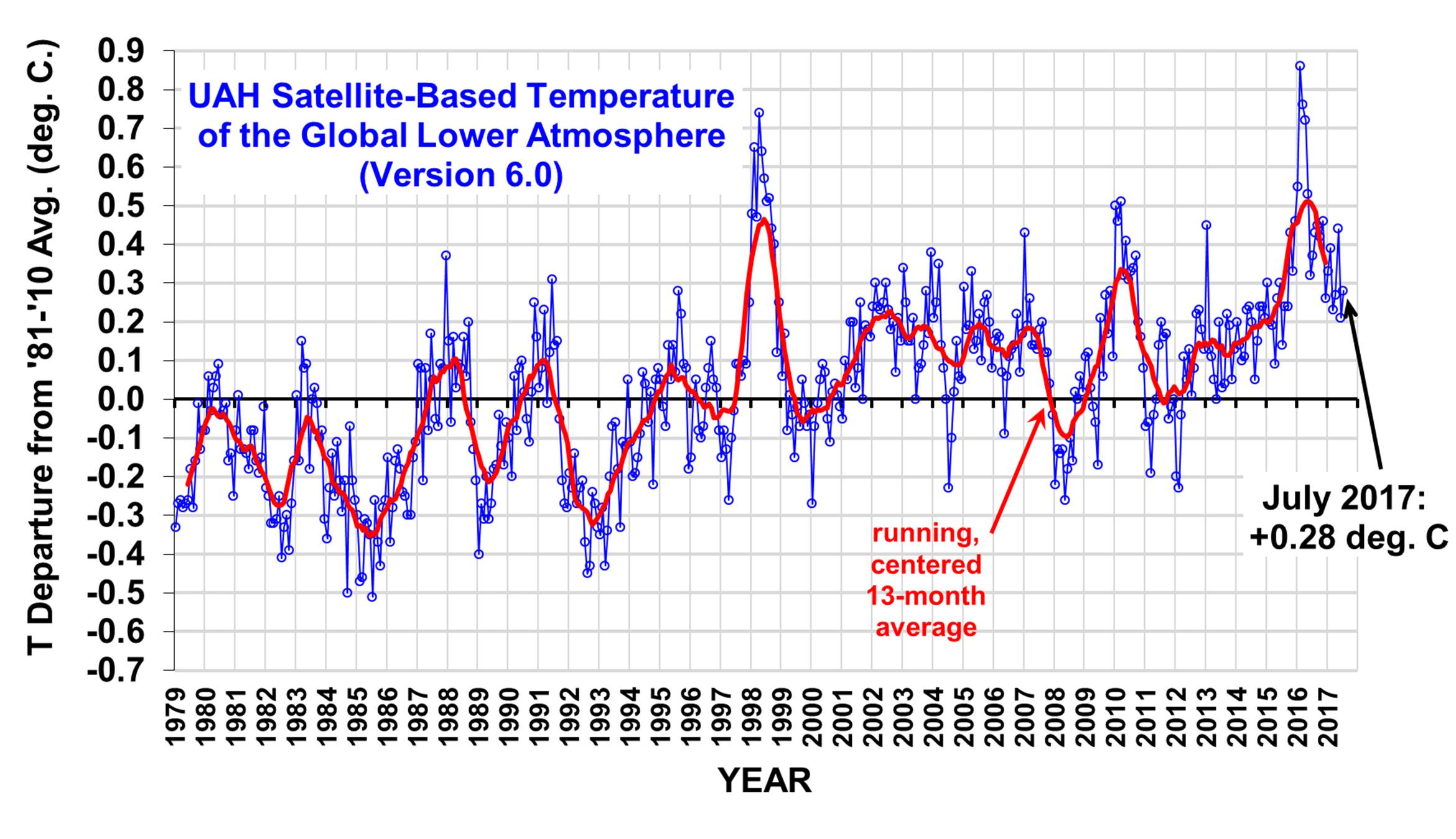
The global, hemispheric, and tropical LT anomalies from the 30-year (1981-2010) average for the last 19 months are:
YEAR MO GLOBE NHEM. SHEM. TROPICS
2016 01 +0.55 +0.73 +0.38 +0.84
2016 02 +0.86 +1.19 +0.52 +0.99
2016 03 +0.76 +0.99 +0.54 +1.10
2016 04 +0.72 +0.86 +0.58 +0.93
2016 05 +0.53 +0.61 +0.45 +0.71
2016 06 +0.32 +0.47 +0.17 +0.38
2016 07 +0.37 +0.43 +0.30 +0.48
2016 08 +0.43 +0.53 +0.32 +0.50
2016 09 +0.45 +0.50 +0.39 +0.38
2016 10 +0.42 +0.42 +0.41 +0.46
2016 11 +0.46 +0.43 +0.49 +0.36
2016 12 +0.26 +0.26 +0.27 +0.23
2017 01 +0.33 +0.32 +0.33 +0.09
2017 02 +0.39 +0.58 +0.19 +0.07
2017 03 +0.23 +0.37 +0.09 +0.06
2017 04 +0.27 +0.29 +0.26 +0.22
2017 05 +0.44 +0.39 +0.49 +0.41
2017 06 +0.21 +0.32 +0.09 +0.39
2017 07 +0.28 +0.29 +0.27 +0.51
The linear temperature trend of the global average lower tropospheric temperature anomalies from January 1979 through July 2017 is now +0.13 C/decade.
NOTE: In June 2017 we added the Metop-B satellite to the processing stream, with data since mid-2013. The Metop-B satellite has its orbit actively maintained, so the AMSU data from it does not require corrections from orbit decay or diurnal drift. As a result of adding this satellite, most of the monthly anomalies since mid-2013 have changed, by typically a few hundredths of a degree C.
The UAH LT global anomaly image for July, 2017 should be available in the next few days here.
The new Version 6 files should also be updated in the coming days, and are located here:
Lower Troposphere: http://vortex.nsstc.uah.edu/data/msu/v6.0/tlt/uahncdc_lt_6.0.txt
Mid-Troposphere: http://vortex.nsstc.uah.edu/data/msu/v6.0/tmt/uahncdc_mt_6.0.txt
Tropopause: http://vortex.nsstc.uah.edu/data/msu/v6.0/ttp/uahncdc_tp_6.0.txt
Lower Stratosphere: http://vortex.nsstc.uah.edu/data/msu/v6.0/tls/uahncdc_ls_6.0.txt
Still high but in the range with still no signs of a breakout to the upside which has now been going on for some 20 years.
If AGW was real and the true climate driver the global temperature average at this late date would be higher then .28c ,and this is against the backdrop of a neutral Enso much less no La Nina.
On the other hand global temperatures for what I am saying are still high and the low solar conditions(although they just started this year) have yet to have a impact.
Again my low solar/climate play is low solar will result in a higher albedo/lower sea surface temperature scenario, hence lower global temperatures.
Global ocean temperatures still high .326c last check.
One item I am not sure of is, are there low average solar average parameter values that will bring the climate to some sort of threshold?
If true the global cooling IF it comes as a result of low solar will be more in a step like fashion rather then a slow gradual cooling fashion.
I would say thus far the climate is not cooperating with the views of either side that being steady global warming or global cooling. It is neutral.
Time I hope will tell.
For broader audience it would be more convincing to present two additional diagrams:
A) departures from monthly means 1998-2017
b) departures from monthly means 1979-1997
Namely, between the 1979-1997 and 1998-2017 intervals there is an obvious “physical phase transition” (of unknown origin ?) so there is an argument for separate consideration of these two intervals.
What is the linear temperature trend for 1998-2017 from diagram A? It is much smaller than 0.13 C!
Vladimir Paar says:
“Namely, between the 1979-1997 and 1998-2017 intervals there is an obvious physical phase transition (of unknown origin ?)”
I don’t see anything obvious, except the existence of a large El Nino. What are your criteria for a “physical phase transition?” How do you define that?
vladimir paar…”between the 1979-1997 and 1998-2017 intervals there is an obvious physical phase transition (of unknown origin ?)”
Thank you. I have been trying to point that out. To me it is obvious since I was trained extensively in engineering to do visual analysis of graphs.
It’s obvious (using the red running average curve) that following the 1998 EN, there was a sudden, unexplained surge in average global temps of about 0.2C beginning around 2001. The same phenomenon occurred in 1977 when the Pacific Decadal Oscillation was first observed.
If both those surges are unknown then 0.4C of the claimed global warming is unknown. Combine that with the 0.5C which Akasofu claimed as re-warming from the Little Ice Age and you have explained all current global warming.
Post 1998, almost everything is above the baseline and pre 1998 almost everything is below the baseline. Temps above the baseline are largely centred on the 0.2C of unexplained warming.
Gordon Robertson says:
“To me it is obvious since I was trained extensively in engineering to do visual analysis of graphs.”
The funniest thing is that you appear to be proud of this.
Trends can only be determined mathematically.
David,
“Trends can only be determined mathematically”
Correct. BUT, trend per decade is about as useful as seeing the physicality of the real world trends in a time series of stochastic data as getting a child to get a ruler a stencil a line from point A to point B. But you’re all crazy mad on trend per decade that doesn’t tell you WHEN the warming occurred. i.e the step change warming Post 1998 (delayed in its appearance in the forward moving time series due to the strong La Nia post the 97/8 El Nio.
Can you tell me what physical insights into the actual observed anomalies of a chaotic open thermodynamic system governed by simultaneous non linear equations of unknown formula is provided by the mathematical concept of TREND PER DECADE?
GC,
First, David, most likely, will ignore your request, as the answer is political.
Second, the answer has to do with providing evidence that government should take over the economy before we hurt ourselves.
You know, don’t play with matches.
Third, What an excellent question. I thank you for it.
GC: I think you don’t understand trends, which are not based on just a decades worth of data, but several (>= 3, usually) even when the trend is expressed in C/decade.
David,
You didn’t answer the question. Therefore I reasonably assume it to be you that does not understand trends in stochastic data and your reply to be nothing but mere projection as distraction.
lewis says:
“Second, the answer has to do with providing evidence that government should take over the economy before we hurt ourselves.”
Absurd.
Name one way you would be impacted if the energy from a coal plant would be replaced by same-price solar energy.
“Name one way you would be impacted if the energy from a coal plant would be replaced by same-price solar energy.”
Why does China use coal for 80% of electrical needs when they could use same-price solar energy for 80% of electrical needs?
balkie: you didn’t answer my question.
Name one way you would be impacted if the energy from a coal plant would be replaced by same-price solar energy.
(My first reply here was deleted.)
–David Appell says:
August 5, 2017 at 10:24 PM
balkie: you didnt answer my question.
Name one way you would be impacted if the energy from a coal plant would be replaced by same-price solar energy.
(My first reply here was deleted.)–
I know how we could get same-price solar energy as compared to coal and be would better than Coal power. Cheaper, infinite supply, and more “portable” [available anywhere on Earth surface and anywhere in the Earth-Moon system].
But harvesting solar energy on the Earth surface doesn’t work.
Harvesting solar power on the Earth’s surface is not a global solution, nor could be viable as primary electrical power source for any ideally situated nation on Earth.
Lewis failed to name one way he would be impacted if the energy from a coal plant would be replaced by same-price solar energy.
gb, why do you think coal power is cheaper than renewable electricity?
What are the health care costs created by that coal plant?
Gordon Robertson says:
“If both those surges are unknown then 0.4C of the claimed global warming is unknown. Combine that with the 0.5C which Akasofu claimed as re-warming from the Little Ice Age and you have explained all current global warming.”
Hilarious, since you just claimed there were “unexplained” surges.
So if you include the unexplained, you can explain global warming. Brilliant.
The problem with your argument is that what is observed in the satellite data is a step change in temperature (of around a little under +0.3degC) centred around the 1997/98 Super El Nino.
One of the so called basic physics of the CO2 molecule is not that it causes El Ninos. There is no physic text book that cites this as a property of the gas.
AGW should result in a broadly logarithmic response, not a series of step changes. But we do not see that in the satellite data (nor in the land thermometer data).
Whilst on the subject of ENSO, following the strong El Nino of 2015/16, there has not been a complete ENSO cycle with a La Nina.
Salvadore mentions that it has been ENSO neutral, whilst technically correct, this does not mean that ENSO has been reading zero. It has not. It has tracked around the +0.5 degC anonaly mark for the best part of a year, sometimes a little less, sometimes a little more, and that is why so many organisations predicted a double (a second) El Nino in 2017.
Throughout 2017 El Nino has been an on/off affair. Presently, it is tracking around the +0.5degC mark. A few days ago when I checked, It was tracking at +0.4degC. If we were to have a La Nina, then it appears that the satellite temperature anomaly would drop below the zero mark.
Whilst it is presently premature to judge, it appears that the 2015/16 El Nion was a strong El Nino like the 2010 El Nino, but not a Super El Nino like the 1997/98 El Nino. I say that the 1997/98 was a Super El Nino since there has been a step change in temperatures coincident upon it.
There was no step change coincident with the 2010 strong El Nino, and it appears likely (at this stage) that there will be no step change in temperatures coincident with the strong 2015/17 El Nino. Final judgment on that will not be possible for several years and we will need first to see a La Nina, and to see what happens once that has dissipated. I expect that we will be in a position to draw better conclusions around 2020.
Richard,
‘Step-change’ is a popular talking point, but this feature is exactly what you’d expect to see in noisy data with occasional bumps from some intermittent events – like el Ninos. It does not mean that there is a physical step-jump.
According to the ONI metric there was a la Nina at the end of 2016.
http://www.cpc.ncep.noaa.gov/products/analysis_monitoring/ensostuff/ensoyears.shtml
Different ENSO monitoring groups come to different conclusions, so your remark on the same should not be so… conclusive. While temps have hovered near Nino thresholds recently, they were at Nina thresholds throughout the latter part of 2016.
A lot of importance seems to be attached to near-ENSO events re the global temp record recently, mostly, I’m sure, due to what the 2016 el Nino did to the pause. I think it’s over-analysing. More than ENSO influences global temperature variation in the short term.
Of course CO2 doesn’t cause ENSO events. No one says differently. That comment is redundant.
AGW should result in a broadly logarithmic response…
With no feedbacks and if there was no weather, such as ENSO. But we certainly have ENSO events and other weather variability causing ups and downs in global temperature. We’ll never see a smooth curve, if that’s what you’re implying we should be seeing with CO2 warming.
I expect that we will be in a position to draw better conclusions around 2020.
The odds of a return to the so-called pause are very slim indeed at this point. We’d need to see temps (in the UAH record) over the next few years hovering around what they were in the 1984-86 period. Not even the double la Nina 1999/2000 produced such cold temperatures. The best hope for a flat/negative trend since 1998 is a volcanic eruption next year that pumps out more global dimming aerosols than Pinatubo. Even if we had the kind of cool temp deviation that event brought to global temperatures, it would not be enough. A Krakatoa-like event might do it.
richard verney says:
“AGW should result in a broadly logarithmic response, not a series of step changes.”
No Richard.
CO2’s forcing is logarithmic, but its increase in the atmosphere is exponential. These combine to give a linear change in temperature — before feedbacks. Feedbacks will make the trend greater than linear for many decades to come.
You are imaging “step changes” where there are only natural variations, mostly El Ninos. There is certainly no scientific reason to justify claims of a “step change.”
“CO2s forcing is logarithmic, but its increase in the atmosphere is exponential.”
Nonsense. Atmospheric concentration has been nothing like exponential. At most, it has been quadratic, and is currently very nearly linear. It has not tracked emissions with any consistency.
Bart says:
“Atmospheric concentration has been nothing like exponential.”
Wrong. The global economy is increasing exponentially. Hence so are global CO2 emissions.
Bart says:
“Atmospheric concentration has been nothing like exponential. At most, it has been quadratic, and is currently very nearly linear.”
Any exponential function is linear over short periods of time! See: Taylor series.
CO2 is clearly exponential over relevant periods of time. See the Keeling Curve.
Facts are facts. It is at most quadratic, it doesn’t match the emissions, and the rise is essentially linear since the pause started.
Facts are facts. But you are not really stating facts.
The log(CO2) for the mauna loa co2 is increasing a bit FASTER than linearly since 1957.
year log (c02) change
1957 2.498 0
1977 2.522 .024
1997 2.561 .039
2017 2.608 .047
The second difference of your data shows
year log (c02) change changeofchange
1957 2.498 0 —
1977 2.522 .024 —
1997 2.561 .039 0.150
2017 2.608 .047 0.0080
i.e., a deceleration. The log of an exponential rise would not be decelerating.
Bart says:
“Facts are facts. It is at most quadratic”
Prove it.
Your portray yourself as Mr Big-Shot Mathematician. So prove this.
Prove something. Prove anything.
‘change of change’
I think you are over analyzing.
The point is the forcing, logCO2, has been increasing since 1960s.
The rate of increase has been increasing (change each period is increasing). It has been accelerating. Just what was needed to explain increase in warming TREND since 1960s.
Sorry, the rise is not exponential, and the rest does not follow.
“I was trained extensively in engineering to do visual analysis of graphs. ”
That’s great.
Now you have to train to understand what you see and what you really learn from that.
UAH and RSS model-observation based calculations are very uncertain. Just compare last and new version of each calculation.
UAH and RSS calculations are also very sensitive to variability.
Then compare them with radiosonde and USNCRN data and you get a significant degree of confidence in them.
Are radiosondes used in a way or another for calibration of satellites retrievals ?
Radiosondes show more warming. So you think previous UAH version was better ?
It doesn’t change large sensitivity to variability.
Mickey Prumt says:
“UAH and RSS calculations are also very sensitive to variability.”
What does this mean????????
Scientists usually use 30-yr trends (or more) to identify changes in climate.
gbaikie says:
“Why does China use coal for 80% of electrical needs when they could use same-price solar energy for 80% of electrical needs?”
You didn’t answer my question.
Neither did lewis.
Jan 1979 to Dec 1997 trend is 0.09 C/decade (+/- 0.16)
Jan 1998 to Jul 2017 trend is 0.06 C/decade (+/- 0.18)
Jan 1979 to Jul 2017 trend is 0.13 C/decade (+/- 0.06)
All values rounded to the nearest hundredth of a degree
Barry are you saying
Jan 1979 to Dec 1997 trend is 0.09 C/decade (+/- 0.16)
Trend is -0.07 to +0.25 and anywhere in between?
Same for the two below trends?
Jan 1998 to Jul 2017 trend is 0.06 C/decade (+/- 0.18)
Jan 1979 to Jul 2017 trend is 0.13 C/decade (+/- 0.06)
Same for the two below trends?
Jan 1998 to Jul 2017 trend is 0.06 C/decade (+/- 0.18)
Jan 1979 to Jul 2017 trend is 0.13 C/decade (+/- 0.06)
The long-term trend is different, in that it is the only trend among them that is statistically significant.
It would be a mistake to think that this is a predictor for long-term temps in the future.
That’s right.
Thanks Barry for the clarification, I have always suspected this debate is for the stats guys what seems to be lost in all the noise generated is the insignificantly small numbers being debated.
regards
Crakar24
Here’s some stats on the ‘pause’ period/s.
Jan 1998 to Dec 2012 trend is -0.07 C/decade (+/- 0.25)
Jan 1998 to Dec 2015 trend is -0.04 C/decade (+/- 0.20)
The uncertainty is much larger than the trend. Renders the analysis pretty much meaningless WRT absolute claims regarding.
Your error bars have to also consider autocorrelation.
barry…”All values rounded to the nearest hundredth of a degree…”
barry, you need to get your head out of your calculator. There was no trend from 1998 – 2015, you are skewing the flat trend to positive using the 2016 EN.
The IPCC has admitted there was no trend from 1998 – 2012 yet you continue to deny that even though I have pointed you to the page explaining it. Even the page you supplied in rebuttal shows no trend. Why are you in such deep denial?
From 2012 – 2015 the trend was flat as well, till NOAA in cahoots with the alarmists Obama admin re-wrote the historical record using blatant scientific misconduct. NOAA and NASA both use deeply deflated confidence levels to claim record warming years. For 2014, they used a confidence level of 48%.
There was no trend from 1998 2015, you are skewing the flat trend to positive using the 2016 EN.
The ‘pause’ was never statistically valid in the first place, but if you insist on saying that it is, then it’s now a historical event. 2016 ended on a la Nina and has been neutral ever since, so the Nino spike is pretty much canceled out. Also, the Nina values are the latest. If that’s not good enough, then it’s not good enough to use 1998 el Nino as a starting point.
You can repeat your mantra til you’re blue in the face. The ‘pause’ isn’t coming back. It is statistically extremely unlikely. You can hope for a Krakatoa-like volcanic eruption to get it back.
barry…”2016 ended on a la Nina and has been neutral ever since, so the Nino spike is pretty much canceled out”.
barry…you are the one who is always on about short term trends. Why are you commenting on an EN induced max that is a bit over a year old?
The data was valid from 1998 – 2012 when the IPCC announced no trend from 1998 – 2012. How do you suddenly turn a range with no trend into one showing a remarkable positive trend?
There’s only one way, adding outlier data at the end of the trend.
What do you mean “The pause isnt coming back”?
Are you claiming it existed at all, against all predictions… err, apologies Appell, against all projections?
Speaking of Appell and his juvenile sleight of hand, I am still waiting for links to your (Appell’s) exchanges with Obama, Gore, and the Nobel committee (to list a few) where you (Appell) relentlessly criticize them for their predictions. Failing that, please provide exchanges where you criticize them for claiming their predictions are scientific.
Laura:
It’s not possible to make predictions in climate science.
David
barry…”The pause isnt coming back”.
I don’t regard it as a pause, I think global warming is finished…kaput!!
You have it entrenched in your mind that the trend has to continue. You have been conditioned by unvalidated model theory to accept that and you are looking for it.
Since 1996, the only warming we’ve had has been in relation to El Ninos. Furthermore, I accept Syun Akasofu’s assessment of the problem. When the IPCC began tracking global warming it was in the middle of a phase of the Little Ice Age when the global average was 1 to 2C below normal. We have been rewarming since then and the rewarming has about finished.
Coupled with what Salvatore suggests about the Sun it makes sense that we may be facing a cooling period soon.
Gordon Robertson says:
“Since 1996, the only warming weve had has been in relation to El Ninos”
Why did the 2015-16 El Nino peak at a higher temperature than the 1997-98 El Nino?
David,
“Why did the 15/16 El Nio peak higher temperature than the 97/98 El Nio?”
From a purely statistical point of view, it peaked higher because the 15/16 El Nio began from a higher baseline anomaly relative to 97/98. But that baseline for the 15/16 El Nio was a flat trend all the way back to the 97/98 El Nio step change (evident in 2001 in the forward moving data due to the La Nia cooling post the 97/98 El Nio).
*I’m typing El Nino and keeps coming out as El Nio*
And yet, Appell, important individuals and institutions continue to make predictions.
Thus, my request for links to your exchanges with Obama, Gore, and the Nobel committee (to list a few) where you relentlessly criticize them for making predictions. Failing that, please provide exchanges where you criticize them for claiming their predictions are scientific.
No running around, Appell, no pretending you don’t understand. Just the links. Thank you.
“2016 ended on a la Nina and has been neutral ever since.”
There was NO La Nina in 2016. There was a very brief period (about 1 month) when ENSO tracked slightly negative.
ENSO has been neutral ever since the strong 2015/16 El Nino dissipated, but for the main part, it has tracked positive around the +0.5degC but has not tracked above +0.5degC for 3 consecutive months.
Most official/government organisations have predicted an El Nino this year because ENSO has been tracking positive for almost the entire period since the 2015/16 El Nino dissipated. Further, it is because of the positive ENSO anomaly that the satellite data does not show a month or more with a negative anomaly.
I emphasise that we have yet to see an officially declared La Nina following the strong 2015/16 El Nino.
Gordon,
you are the one who is always on about short term trends
Not really. I usually describe them as meaningless – as I did above in reply to the person who asked for the trends from x to y. You have a problem with the time frame, talk to Vladimir.
I also provided, provided, unasked, the trend rates for the ‘pause’ period.
Why are you commenting on an EN induced max that is a bit over a year old?
I didn’t ‘comment’ on any such thing. No trend I provided was less than 18 years.
Theres only one way, adding outlier data at the end of the trend.
Finally we are in agreement! 1998 was most definitely an outlier.
I prefer using longer trends that cancel out these short-term outliers. It’s you who is in love with them.
Laura,
What do you mean “The pause isnt coming back”?
Are you claiming it existed at all, against all predictions err, apologies Appell, against all projections?
I put the word ‘pause’ in quotes for a reason. As in – alleged. I don’t think the ‘pause’ is a statistically valid phenomenon.
There was NO La Nina in 2016. There was a very brief period (about 1 month) when ENSO tracked slightly negative.
http://www.cpc.ncep.noaa.gov/products/analysis_monitoring/ensostuff/ensoyears.shtml
@barry
“I dont think the pause is a statistically valid phenomenon.”
So the phenomenon did occur but there exist ways to deny it occurred… thus no need to worry about the failure of the models to predict it, err, project it.
One can only wonder how many future phenomena will need to be denied in order to pretend the models do work.
So, so many failed predictions, err, projections.
I describe the ‘pause’ period as “an apparent slow-down in global mean temps at the surface and lower troposphere.” Apparent as in ‘seeming’, rather than ‘obvious’.
Here’s the history of the talking point as I understand it:
Skeptics began to talk about a ‘pause’ (the wording was often “global warming stopped in 1998”) from the mid-2000s – a 7-year stretch of data. This was laughed off (rightly), because the global record is full of such ‘pauses’ and they are statistically meaningless, a sign of weather variability, rather than an actual trend. It was noted that the start point was the year of the largest el Nino of the 20th century. Skeptics persisted, because it was a great, if invalid, talking point. A strong la Nina came in 2008, extending the pause, and the skeptic clamour grew.
The satellite data sets have larger variability around el Nino, so when the surface data sets started to show a steeper positive slope as the years progressed, the satellite data prolonged the flatline, particularly RSS – UAHv5.6 started to slope up through the 2010s. Chris Monckton posted updates on the length of the ‘pause’ based purely on RSS data and ignoring the rest. Tamino and others tested the statistical validity of the ‘pause’ and found it wanting – there were several ways to look at it.
This skeptic-pushed ‘pause’ was picked up by the news media and became such a popular talking point that it was mentioned in government hearings. It even made its way into the IPCC for a brief menton, where it was described as a slowdown, (or hiatus in one section), and that it was not indicative of longer-term trends. The trend rate for the period 1998-2012 was given as 0.05 C/decade with large uncertainty, based on the surface records.
Then UAH revision 6 came out in 2015, and skeptics jumped ship and started using that data instead of RSS, because the revision lowered post-2000 temps quite a bit, and UAH trend was now lower than RSS. This blog site’s traffic tripled.
Several ways of testing for a pause include simply noting the statistical uncertainty, comparing the uncertainty in the trend for the ‘pause’ period with prior warming trend to se if there was a statistically significant change, comparing the trend uncertainty against the whole record, and applying various other statistical analyses (like break-point analysis), to see where distinct changes in trend occur in the record. None of these corroborated the view of a pause. Papers were written on it, and some spoke of an “apparent slowdown” in global temps, and various theories were put forward as to what was happening.
Skeptic sites (like this one) began showing graphs of divergence between observed temps and models, with various choices in baselining the data, or displaying the mean of model ensembles instead of the spread, to emphasise the divergence. realclimate posted comparisons that showed surface temps right at the lower end of the mdel ensembles in latter years, and of the satellite record falling just under the model spread. From this (based on graphs produced by skeptics) the skeptical community repeatedly posted that “models have failed.”
I took a broader view. If global warming is truly global – not just the thin slice of the atmosphere these datasets were representing – I checked out ocean heat content for the period/s, global sea ice, sea level, glaciers. Did they mirror the notion of a slowdown or ‘pause’ in global surface/tropospheric temperatures? No, those observations continued in the direction of warming. So global warming hadn’t stopped, but temps had been depressed in the slice of the atmosphere being measured for a decade, leading to only slight warming trends (or slight negative/flat trend is you looked at only one data set).
The take-home for me is that models don’t capture interannual/decadal variability very well, and/or that climate sensitivity may be in the lower range, or that interannual variation coincided over the period to depress temps in an extended, low-probability manner.
In 2016 the ‘pause’ as described by Monckton ended and some skeptics accepted it, while others convinced themselves otherwise, or changed the metric/wording to prolong the talking point. Most seem to have believed at the time that a la Nina always follows el Nino, and that the ‘pause’ would return by the end of 2016. Or 2017. Or 2020. Or sometime in the future. This notion is still played out here.
I’ve crunched some numbers to have a stab at guessing the likelihood of the RSS/UAH ‘pause’ returning. Some of my results got posted at WUWT. The prospects are very dim for a return by 2020, and I seriously doubt the ‘pause’ since 1998 will ever return in the satellite data set. Hence my remark above.
Barry
There was no La Nina in 2016. As the page you refer to notes:
Whilst SST were negative in some regions, the required coupled ocean-atmosphere phenomenon did not accompany the cold SSTs.
BOM had regular alerts on the 2016 ENSO conditions. This is now in their historic archive http://www.bom.gov.au/climate/enso/wrap-up/archive.shtml
You will note:
2017
28 February El Nio WATCH: likelihood of El Nio in 2017 increases
14 February El Nio or ENSO-neutral for 2017
31 January El NioSouthern Oscillation remains neutral
17 January Tropical Pacific Ocean remains ENSO neutral
3 January El NioSouthern Oscillation remains neutral
2016
20 December El NioSouthern Oscillation likely to remain neutral through summer
6 December La Nia no longer likely in the coming months
22 November Negative Indian Ocean Dipole ends, while central tropical Pacific Ocean warms
8 November Some La Nia indicators strengthen; negative IOD nears end
25 October Negative IOD continues as tropical Pacific remains ENSO neutral
11 October Negative Indian Ocean Dipole eases; continued impacts likely
27 September Strong negative Indian Ocean Dipole continues to dominate
13 September Negative Indian Ocean Dipole dominates Australian climate
30 August Negative Indian Ocean Dipole influencing Australia’s climate, while Pacific remains ENSO-neutral
16 August La Nia WATCH remains; negative Indian Ocean Dipole weakens
2 August La Nia WATCH remains, while strong negative Indian Ocean Dipole continues
In 25th October 2015, ENSO was listed as neutral, in November La Nina indicators strengthened but La Nina was not declared, and by 6th December it was all over, with ENSO neutral being forecast.
La Nina nearly happened but in the event itw as a little on/off in late October through November but by December it was fully off. La Nina nearly happened, but never quite did.
If there had been a full blown La nina, whilst the satellite is not as sensitive to cold oceans as to warm oceans (hot air rises whereas cold air does not such that the troposphere appears less sensitive to underlying La Nina conditions as compared to El Nino), it would nonetheless be seen in the satellite data which ist is not.
@barry
So an ultimately imaginary ‘pause’ manufactured by skeptics nonetheless leads you to the conclusion that…
“…models dont capture interannual/decadal variability very well, and/or that climate sensitivity may be in the lower range, or that interannual variation coincided over the period to depress temps in an extended, low-probability manner.”
Who could’ve guessed that models are so sensitive to fiction.
(enjoyed the narration, btw, always fun stuff, thanks)
It appears you didn’t understand my post, Laura, but I did enjoy your fictional account. I admire your adroitness at falsely compressing the chronology.
Richard,
I see the ONI-based record hasn’t encumbered you with any doubts whatsoever. Would you describe yourself as a skeptic?
The 1995/6 la Nina also did not show up in the satellite record, and the the la Nina that ran from mid-1998 to early 2001 created only a small depression relative to 1997. Generally la Ninas don’t have as much impact as el Ninos. So I wouldn’t rely on the global temp record to display a strong signal during every la Nina event.
There are other non-correlational events between global temps and la Nina when using the MEI index. Same with BoM and JMA. These indexes differ between them on weak la Ninas and when they occur. They concur more often on strong la Ninas, and I believe you would be on firming footing if you’d qualified thus from the get-go.
Barry
I am a sceptic which to me is a two way street, ie., I am sceptical of almost all claims in favour of AGW, and sceptical of all claims against AGW.
The satellite appears less sensitive to a cooling ocean, eg., La Nina conditions, than it is to a warming ocean, eg., El Nino conditions.
I have pointed this out many times. I do not know the reason why, but have speculated that it is due to convection. In ENSO conditions with warm ocean anomalies, the warms powers convection and the warm air rises to the the height in the troposphere where the satellite takes its measurements. In contrast, with a cool ocean, there is less energy powering convection, and cool air (relatively speaking) does not rise as high and therefore may not reach the heights at which the satellite takes its measurements.
This could explains why La Ninas are not so clearly represented in the satellite data unless they are significant La Ninas.
Laura says:
“And yet, Appell, important individuals and institutions continue to make predictions.”
Really? Who do you think is making predictions?
GC says:
“Why did the 15/16 El Nio peak higher temperature than the 97/98 El Nio?
“From a purely statistical point of view, it peaked higher because the 15/16 El Nio began from a higher baseline anomaly relative to 97/98.”
And why is that?
Global warming!!!!!!!!!!!!
@barry
What chronology? Do tell.
All we’ve learned this far is that claims of models correctly predicting, err, projecting future climate systematically fail against the unfolding of reality.
What chronology? Do tell.
I already did.
http://www.drroyspencer.com/2017/08/uah-global-temperature-update-for-july-2017-0-28-deg-c/#comment-257454
Laura: Models don’t predict.
Period.
I have not checked your numbers, but something seems strange to me. In the first half of the journey the speed was 9; in the 2nd half, the speed was 6; but the overall speed was 13. I wonder how the speed can fall by 33% in the 2nd half, and yet the overall speed be 44% faster than the first half’s speed.
The differences are to do with the variation in the data. Generally, short-term trends don’t reveal any underlying signal. The shorter the sample, the more it reflects variability than any trend. Look at the uncertainty intervals for the 18-year trends. They’re huge!
barry, your intervals are too short to expect statistical significance at the 95% confidence level.
As I’ve already said.
It is delightful to envisage a hypothetical entity we might call Nature awaiting the release of the daily prognosticated predicted projections, replete with statistical terminology to convince the innoncent.
Nature laughs. Geoff
In what way have the projections been wrong?
Geoff??
“The long-term trend is different, in that it is the only trend among them that is statistically significant.”
You are, again, misusing statistics. You cannot claim statistical significance without a validated statistical model upon which to base it.
You were already informed about the underlying model.
temperature change is proportional to the forcing changing.
raditive forcing of CO2 increases like its logarithm.
Atmo CO2 is increasing exponentially.
=> temperature is a linear function of CO2.
(Until feedbacks kick in.)
That is not a statistical model.
Why not?
Namely, between the 1979-1997 and 1998-2017 intervals there is an obvious “physical phase transition.”
You see this sort of thing in any noisy data set, depending on how carefully you select. It’s easily over-interpreted.
barry…”You see this sort of thing in any noisy data set, depending on how carefully you select. Its easily over-interpreted”.
The abrupt transition is obvious on the red running average curve which has no noise in it.
No it’s not. Noisy data will always give what looks like “step-jumps,” even if it is known for a fact that the underlying signal is constant. Such a hypothesis needs a lot more rigour than eyeballing graphs.
barry…”Noisy data will always give what looks like step-jumps,”
That’s what the running average curve does, it smooth out the noise. Noise is fairly instantaneous over a range and when it’s averaged you get a smoother curve representing the average.
Besides, what do you mean by noise?
Variation.
You know – signal/noise.
Not familiar with the term?
http://www.statistics4u.com/fundstat_eng/cc_signal_noise.html
If ‘noisiness’ is low, a signal is easy to extract. If ‘noisiness’ is high it’s harder to extract the signal. Statistics attempts to do this. Basically, the more data you have (as long as the noice/variation is of a fairly constant bandwidth), the less uncertainty you have around the signal.
Check the uncertainty on these two times series.
Jan 1979 to Jul 2017 trend is 0.13 C/decade (+/- 0.06)
Jan 1998 to Dec 2015 trend is -0.04 C/decade (+/- 0.20)
Trend uncertainty is less for longer period of time.
The character of the noise (how much variation) across the signal (mean trend) is such that a clear signal is not resolved for a period of 16 or so years, but evident for a period of 39 (ish) years.
If we write the trend as a function of uncertainty interval, we get:
1979 to 2017: trend is anywhere between 0.07 and 0.19 C/decade
1998 to 2015: trend is anywhere between -0.24 and 0.16C C/decade
The first, longer trend has a clear warming signal.
The second, shorter trend has no clear signal.
The first trend is statistically significant.
The second trend is not.
What I like to do is test the prior trend and see if there is a statistically significant deviation – IOW, is there a statistically significant change in prior warming trend (ie, a ‘pause’?)
Turns out there is not. A statistically significant change in trend would look like this.
Prior trend: 0.16 (+/- 0.05)
Following trend: -0.02 (+/- 0.05)
Written as function of uncertainty:
Prior trend: anywhere between 0.11 and 0.21
Following trend: anywhere between -0.07 and 0.03
The uncertainty intervals are statistically distinct – they don’t overlap. I would say this was excellent evidence of a pause, or change in trend.
This is not the case for the pause period, because the uncertainties overlap each other.
Here’s an example based on the previous.
Prior: 0.16 (+/- 0.06)
Following: -0.02 (+/- 0.2) [!]
Translates to:
Prior: anywhere between 0.11 and 0.21
Following: anywhere between -0.22 and 0.18
In this example, the uncertainty in the trends overlap, which means the change in trend is not statistically significant. Both trends are possibly the same – factoring statistical uncertainty.
“low solar conditions(although they just started this year) have yet to have a impact.”
Solar activity has been low throughout the entire cycle. If you believe there is a noticeable solar forcing you need to look for what is preventing temnps from dropping with such a low solar cycle.
Gordon Robertsson,
I had a spelling error here:
http://www.drroyspencer.com/2017/08/uah-global-temperature-update-for-july-2017-0-28-deg-c/#comment-258483
‘tour Link’ should be ‘your link’.
Can you look at it again please?
And when did a trend of 0,11 C/decade become neutral?
Where did you get 0.11C per decade? Spencer clearly writes 0.13C per decade.
I slip in memory.
Thomas…”Where did you get 0.11C per decade? Spencer clearly writes 0.13C per decade”.
I am not trying to speak on behalf of Roy but I’d guess he has to present the mathematical trend, not the actual trend, which cannot be expressed using a trend line from 1979 – 2017.
There was no trend from 1998 – 2015 and 15 years of that flat trend has been confirmed by the IPCC. The trend from 1979 – 1997 was a rewarming curve not true global warming.
Look at the graph and follow the red running average curve, it’s quite obvious.
Gordon Robertson says:
“There was no trend from 1998 2015 and 15 years of that flat trend has been confirmed by the IPCC….”
Gordon is lying again.
DA…”Gordon is lying again”.
David Appell accepts fudged data from NOAA. He doesn’t care that they use data from less than 1500 stations out of 6500 and synthesizes the 5000 stations using a climate model that interpolates and homogenizes the data from less than 1500.
Then they apply a diminished confidence level to their synthesized statistical data to make years appear as record warming years. 2014 is a record with the 48% confidence level supplied but drops to 4th place with a 90% confidence level, where UAH have it listed using data from NOAA satellites.
Why does David Appell fall for this chicanery? Why does DA not question NOAA using a 48% confidence level and NASA GISS using confidence levels even lower at times. The standard CL for statistics is 90%.
Gordon Robertson says:
“David Appell accepts fudged data from NOAA.”
Another lie. The data are adjusted to remove biases. You’ve never indicated how you would do that otherwise.
“He doesnt care that they use data from less than 1500 stations out of 6500 and synthesizes the 5000 stations using a climate model that interpolates and homogenizes the data from less than 1500.”
Nothing at all to back up your claims and numbers. Typical of you — you just talk off the top of your head, and never provide evidence for your claims.
Your comments are based on emotions, not on rationality.
Gordon Robertson says:
“2014 is a record with the 48% confidence level supplied but drops to 4th place with a 90% confidence level, where UAH have it listed using data from NOAA satellites.”
It’s like you don’t understand a single thing. Not one.
https://www.iceagenow.info/climate-fraud-century-video/
Her is the AGW fraud we are up against. Vey good video explaining the situation.
This is why I only use data from Dr. Spencer and Weather bell.
All other data is false.
Well, Dr. Spencers data still show a trend of 0,11C/dekade, and I even think that july 2017 is abow the trendline, so nonsens from Tim Ball would not change that.
Spencer (in the top post):
Se above, not I slip in memory, but a slip in memory.
David A on measurement error declining with more samples.
The more important point is that a bias diverging from a best value increases with more samples in a time series.
Climate work places too little light on accuracy and too much on precision, to use long-standing terminology. Geoff
Right you are, Geoff.
Geoff: Homogenization is done specifically to correct for systemic biases.
What variables do you think are not being measured accurately enough, and why?
David
You ignore my point that the principle only applies when you repeatedly measure the SAME sample.
Say you are tasked with ascertaining whether the average height of English men changes over a 4 year period. You start your experiment/evaluation in year 1 in England measuring the height of 100 Englishmen and averaging the result. In year 2, you cannot get to England but instead you are in Finland where you measure the height of 20o Finnish men who happen to speak English and average the results. In year 3, you are stuck in Italy and measure the height of 300 Italian men who happen to speak English and average the results, and in year 4 you are stuck in the Netherlands and measure the height of 500 Dutch men who happen to speak English and average the results.
How has the increased sampling reduced the errors in ascertaining how the height of Englishmen have changed over a 4 year period?
As I pointed out, in the land based thermometer record, the sample is never the SAME over a 10 year period, let alone over a 150 year period. As such any comparison over any extended period of time is meaningless.
This is very basic statistics. The principle to which you refer does not apply since the sample is continually changing and one is not repeatedly measuring the SAME sample.
Kristian…”The linear temperature trend of the global average lower tropospheric temperature anomalies from January 1979 through July 2017 is now +0.13 C/decade”.
Of course it is, for anyone who doesn’t have a clue about data acquisition and analysis. UAH has to state a mathematical trend from 1979 – 2017 of 0.13C/decade but in their 33 year report they explain it. It’s not good enough to claim 0.13C/decade without explaining that your calculations come from plugging numbers blindly into a calculator.
There needs to be at least two trend lines to accurately explain the temps from 1979 – 2017. The first, from 1979 – 1997 is in a negative anomaly region, meaning it represent re-warming from a cooling process.
UAH explains the cooling process as volcanic aerosols and they point out that true global warming over the range did not appear till the 1998 EN. Following the obvious spike in 1998 there was a mini spurt in 2001, then the global average leveled off.
Post 1998, the trend is flat and the IPCC confirmed that for 15 years between 1998 – 2012. Only the year 2016 shows an abrupt trend from an extreme El Nino. Including that and claiming a positive trend from 1998 onward is ingenuous.
Gordon Robertson says:
“UAH explains the cooling process as volcanic aerosols and they point out that true global warming over the range did not appear till the 1998 EN.”
More lying bullsh!t.
UAH LT v6.0 data shows a trend of +0.09 C/dec from 12/1978 to 1/1997.
Gordon Robertson says:
“Post 1998, the trend is flat….”
Still more lies and bullsh!t from Gordon Robertson.
The UAH LT v6.0 linear trend from 1/1999 to present is +0.13 C/decade
“…and the IPCC confirmed that for 15 years between 1998 2012.”
And out-of-date statement, as you’re been told many times.
Yet you continue to lie about it anyway. You clearly have no regard for knowledge or the truth.
DA…”UAH LT v6.0 data shows a trend of +0.09 C/dec from 12/1978 to 1/1997″.
The period in question was largely in a negative anomaly region meaning the data represented a relative cooling from the 1980 – 2010 average. That cooling has been explained by UAh has being caused by volcanic aerosols.
The trend to which you refer is a recovery from cooling not true global warming.
Gordon Robertson says:
“The period in question was largely in a negative anomaly region meaning the data represented a relative cooling from the 1980 2010 average.”
That’s not the relevant question. The question is about the trend.
“That cooling has been explained by UAh has being caused by volcanic aerosols.”
Really? Cite?
Gordon Robertson says:
“The trend to which you refer is a recovery from cooling not true global warming.”
Truly hilarious.
Warming is warming. It doesn’t matter where it starts, and in fact there is no UAH data prior to Nov 1978, so you can’t say there was “cooling” before.
David/gordon
It is possible to draw trend lines, but when one takes account of the error bounds of the equipment and data collection, there is no statistically significant trend either before the Super El Nino of 1997/98, or after it. The only statistically significant event in the satellite data is the temperature step change coincident with the Super El Nino of 1997/98.
We do not know whether it warmed between 1979 to the run up to the Super El Nino of 1998. The trend line suggests slight warming but it is not statistically significant.
Likewise following the Super El Nino of 1998, we do not know whether temperatures were flat or have warmed because once again there is no statistically significant trend.
Gordon is quite right that the IPCC in AR5 acknowledged the pause. This was discussed, and of course climate scientist proposed more than 50 reasons for the pause.
Until the recent 2015/16 El Nino, Nick Stokes (a well known warmist but for a change mathematically literate) analysed the various data sets, and demonstrated that some of these showed no statistically significant warming for as much as 23 years!
The satellite data only shows statistically significant warming if one ignores the fact that the data clearly shows a step change in temperatures (of a little under 0.3 degC) coincident with the Super El Nino of 1997/98 which is a discreet and one off event.
The only statistically significant event in the satellite data is the temperature step change coincident with the Super El Nino of 1997/98.
A bold claim. How do you demonstrate this statistically? Only attempts I’ve seen are distinctly non-statistical.
richard verney says:
“It is possible to draw trend lines, but when one takes account of the error bounds of the equipment and data collection, there is no statistically significant trend either before the Super El Nino of 1997/98, or after it.”
No Richard.
You need to study how the measurement uncertainty declines as a function of the number N of data points.
For example, if each temperature station has a monthly uncertainty of U, then the uncertainty of their average is U/sqrt(N). That’s very small.
Measurement uncertainities don’t matter much for trends (like the 30-yr trends we should be using). What’s significant are the statistical trends, which also decline with N.
David
You are deluding yourself. There are huge error bounds within our data sets. For a variety of reasons, none are fit for the purpose to which they are being put, and none are capable of withstanding the rigours of serious scientific scrutiny
Whilst the repeated measurement of the SAME sample can reduce errors, this principle does not apply when you continually measure different samples.
So take the land based thermometer data set for example.
The sample used in 1880, is not the same sample as used in 1900, which in turn is not the same sample used in 1920, which in turn is not the same sample used in 1940, which in turn is not the same sample used in 1960, which in turn is not the same sample used in 1980, which in turn is not the same sample used in 2000, which in turn is not the same sample used in 2016. One is never comparing apples with apples when looking at the land thermometer data set such that we cannot say whether the temperature today is warmer than it was in say 1940 or 1880. If you wanted to make that comparison, one would need to isolate the weather stations that were reporting data in 1940 use only those weather stations retrofit them with the same LIG thermometers as used in 1940 and taken measurements in accordance with the practices used in 1940. You would also need to remove from such a review, any weather stations that had undergone a significant change (eg., station moves, change of nearby land use, urbanisation etc)
Further, even within the sub sample set, the nature of the constituent parts of the sub sample set have changed. So the weather station in what was a village, is not the same as the village becomes a town and then a city, or a weather station at an airport in the 1930s in nothing like a weather station at the same airport in 2010 (when in 1930 the airport had a grass runway and all but no terminal building, no cargo buildings etc).
Then there are all the adjustments. Those adjustments potentially could be right, or wrong, or partly right in the right direction, or partly right but in the wrong direction etc. Every adjustment, therefore adds to the error bounds of the data set.
Without any honest acceptance of the wide error bounds, no legitimate science can be conducted.
richard verney says:
“There are huge error bounds within our data sets. For a variety of reasons, none are fit for the purpose to which they are being put, and none are capable of withstanding the rigours of serious scientific scrutiny”
Prove it.
Present your evidence.
Do SOMETHING to justify your claims.
Richard:
It is a fact that the summation of measurement errors decreases like 1/sqrt(N).
It’s simply mathematics.
Gordon Robertson says:
“The period in question was largely in a negative anomaly region meaning the data represented a relative cooling from the 1980 2010 average.”
Wrong.
How is it you never were taught how to calculate linear trends?
Is that part of a typical Canadian education?
That should have been, the uncertainty of the *average* decreases like 1/sqrt(N).
My comment has been posted in the wrong place so I re-post.
David
You ignore my point that the principle only applies when you repeatedly measure the SAME sample.
Say you are tasked with ascertaining whether the average height of English men changes over a 4 year period. You start your experiment/evaluation in year 1 in England measuring the height of 100 Englishmen and averaging the result. In year 2, you cannot get to England but instead you are in Finland where you measure the height of 20o Finnish men who happen to speak English and average the results. In year 3, you are stuck in Italy and measure the height of 300 Italian men who happen to speak English and average the results, and in year 4 you are stuck in the Netherlands and measure the height of 500 Dutch men who happen to speak English and average the results.
How has the increased sampling reduced the errors in ascertaining how the height of Englishmen have changed over a 4 year period?
As I pointed out, in the land based thermometer record, the sample is never the SAME over a 10 year period, let alone over a 150 year period. As such any comparison over any extended period of time is meaningless.
This is very basic statistics. The principle to which you refer does not apply since the sample is continually changing and one is not repeatedly measuring the SAME sample.
David
Further the principle to which you refer only helps where the errors are random. It does not reduce errors where there is a systemic bias operating only in one direction.
The “nonsense” you refer to isn’t in conflict with the 0.11 C/decade, and even if July 2017 is above the trend-line, that wouldn’t be in conflict with Tim Ball’s work either. Tim Ball’s work is based upon real and known data, unlike that of Mann’s, and it merely points out that the rate and the degree of temperature change that we have been seeing over the last several decades is well within that which has occurred over the last couple thousand years (well in advance of mankind’s consumption of hydrocarbons). His work also shows that temperature change precedes CO2 concentration change which is quite the opposite of Mann’s “insinuation”.
Russ says: “quite the opposite of Manns insinuation.”
These are two separate ideas — not opposite insinuations.
1) Yes, when the climate has warmed in the past, it is driven increased CO2.
2) On the other hand, we now have an increase in CO2 that is NOT driven by climate.
The past records of climate-driven CO2 increases are not predictive for current human-driven CO2 increases.
“On the other hand, we now have an increase in CO2 that is NOT driven by climate. “
Yes, it is.
https://tinyurl.com/muo5shh
Pure B.S., for which you have no proof whatsoever. Which is typical for you.
It’s right in front of your eyes. You are in denial.
I think you are looking at the natural carbon cycle, which has a massive turnover and depends heavily on el Nino.
https://tinyurl.com/ybq8ka3y
CO2 forcing operates on a on a longer time scale because of earths great inertia (we may have 0.5 degrees C in the pipe line).
Tim Ball has never done any “work” in climates science. He’s a pusher of crackpot ideas.
https://judithcurry.com/2011/10/15/letter-to-the-dragon-slayers/
emeritus…”Tim Ball has never done any work in climates science. Hes a pusher of crackpot ideas”.
What does that link have to do with Tim Ball? It’s a rant by people quoted by Judith Curry. I have read a good deal of the work of Claes Johnson and he is a top notch mathematician. He has presented an explanation for the quantum levels found by Planck using Newtonian principles by applying the analysis of the EM spectrum mathematically as harmonic oscillators.
Johnson is no dummy.
As for Ball, there is nothing crackpot in his skepticism of AGW. I don’t fully agree with his approach but he is no crackpot. Maybe to an alarmist he is but I regard most alarmists as crackpots.
Ball published just 4 peer reviewed paper in his entire career, not one of consequence.
Tim Ball is not a climate science expert, and this has been admitted in a court of law.
After the Calgary Herald published an op-ed by Ball on April 19, 2006, whom the newspaper identified as the first climatology PhD in Canada and a climatology professor at the University of Winnipeg for 28 years, they published a letter on April 23, 2006 from Dr. Dan Johnson, a professor at the University of Lethbridge, who pointed out that neither of those descriptions is true; that Dr. Ball’s credentials were being seriously overstated. Ball later threatened Johnson and the Herald and ultimately sued for defamation.
In their Statement of Defense filed in Court, the Calgary Herald submitted the following:
1. “…that the Plaintiff (Ball) never held a reputation in the scientific community as a noted climatologist and authority on global warming.
2. “The Plaintiff has never published any research in any peer-reviewed scientific journal which addressed the topic of human contributions to greenhouse gas emissions and global warming
3. “The Plaintiff has published no papers on climatology in academically recognized peer-reviewed scientific journals since his retirement as a Professor in 1996;
4. “The Plaintiff’s credentials and credibility as an expert on the issue of global warming have been repeatedly disparaged in the media; and
5. “The Plaintiff is viewed as a paid promoter of the agenda of the oil and gas industry rather than as a practicing scientist.”
Ball dropped his lawsuit.
Source: The Calgary Herald, Statement of Defense paragraph 50, Dr Tim Ball v The Calgary Herald, In the Court of the Queens Bench of Alberta Judicial District of Calgary, Dec 7, 2006 (http://is.gd/brO4uO).
More at:
http://www.desmogblog.com/tim-ball-vs-dan-johnson-update-0
http://www.desmogblog.com/tim-ball-vs-dan-johnson-lawsuit-documents
DA…”Tim Ball is not a climate science expert, and this has been admitted in a court of law”.
Neither are any of the climate modelers who persist in programming their models with trash physics. Ball makes more sense than the lot of them, including NOAA and NASA GISS who have resorted to chicanery to produce warming.
And are you serious, quoting from desmogblog?
http://leftexposed.org/2016/08/desmogblog/
According to the article at the link above, the guy who runs the site is a public relations expert and its co-founder has been convicted of a crime. The site operator also sits (or sat) on the board of the David Suzuki Foundation.
Gordon Robertson says:
“Neither are any of the climate modelers who persist in programming their models with trash physics”
You’re unqualified to write that.
You don’t even understand radiative transfer. So your opinion on the physics of climate models is completely useless. You science is so bad you don’t even get an opinion.
Gordon, those links merely point to the evidence admitted in a court of law.
Tim Ball is not an expert in any way. He never was before retirement, and is not afterward.
In fact, Tim Ball lied about his credentials, claiming that he was the first person to receive a PhD in climatology in Canada. He was not.
https://en.wikipedia.org/wiki/Timothy_Ball#Controversies_and_lawsuits
“In the ensuing court case, Ball acknowledged that he had only been a professor for eight years, and that his doctorate was not in climatology but rather in geography,[41] and subsequently withdrew the lawsuit on June 8, 2007.”
DA…”Youre unqualified to write that.
You dont even understand radiative transfer”.
That’s odd, I could have swore I just wrote it. I have qualified it in the past and I am eminently qualified on the subject I wrote about, positive feedback. I am just as qualified or more qualified on the subject than anyone in climate science. In fact, I have built positive feedback devices called oscillators.
The positive feedback claimed by climate modelers is trash physics. They are trying to claim that feedback from GHGs can warm the surface to a higher temperature than it is warmed by solar energy. Not only trash physics a contradiction of the 2nd law.
Modelers have also pulled the warming ability of CO2 in the atmosphere out of a hat. They are claiming a warming effect of 9% to 25%, complete and utter trash physics.
As far as radiative transfer is concerned, someone like you who cannot tell the difference between IR and heat should not be commenting on my understanding of the subject.
Gordon Robertson says:
“Thats odd, I could have swore I just wrote it. I have qualified it in the past and I am eminently qualified on the subject I wrote about, positive feedback. I am just as qualified or more qualified on the subject than anyone in climate science. In fact, I have built positive feedback devices called oscillators.”
You are completely and utterly delusional.
What does an “oscillator” have to do with radiative transfer?
Gordon Robertson says:
“Modelers have also pulled the warming ability of CO2 in the atmosphere out of a hat.”
Simple question: Does CO2 absorb infrared radiation?
Russ says:
“Tim Balls work is based upon real and known data”
Where has it been published? Anywhere besides a blog?
“…unlike that of Manns”
It certainly is — proxy data.
“…and it merely points out that the rate and the degree of temperature change that we have been seeing over the last several decades…”
Mann’s result stops in about 1960. It also says absolutely nothing about the cause of the warming.
Clearly you don’t understand Mann et al’s work.
“(well in advance of mankinds consumption of hydrocarbons). His work also shows that temperature change precedes CO2 concentration change which is quite the opposite of Manns insinuation.”
We’re transferring carbon from the Earth to the atmosphere regardless of the temperature. It’s bloody obvious that in such a situation CO2 leads temperature.
Of course its bloody obvious DA, tell me DA are you one of the “CO2 floating blanket” people or do you actually have some vague idea as to why its bloody obvious.
Don’t bother to reply unless you can explain in detail why it is “bloody obvious”
Are we waiting for temperature to increase before we emit CO2?
Once again DA fails to produce evidence to backup his alarmist rants
DA…”unlike that of Manns…It certainly is proxy data”.
Proxy data that began showing warming near the end of the series when actual temperatures were rising. Proxy data that used 1 tree to cover an entire century circa 1400 AD. Proxy data using pine tree bristlecone to cover the 20th century which a National Academy of Science panel dismissed as unacceptable.
Gordon Robertson says:
“Proxy data that used 1 tree to cover an entire century circa 1400 AD.”
Another lie.
Read the bloody papers.
Gordon Robertson says:
“Proxy data using pine tree bristlecone to cover the 20th century which a National Academy of Science panel dismissed as unacceptable.”
Pure bullsh*t.
And you can’t cite any such NAS report. You just make things up. You lie.
Gordon has made a slight error in his comment “Proxy data that began showing warming near the end of the series when actual temperatures were rising.” what he meant to say was proxy data that showed cooling….
The CORRECT POSITION is as follows:
It was proxy data that showed that the 1990s temperatures were no higher than 1960, and it was for this reason that Mann truncated the plot, cutting off the proxy data at 1960 and splicing on the thermometer record as from 1960 through to the 1990s.
I emphasise that Mann had to disregard the proxy data for the period 1960 to 1990s since it did not show overall a net warming.
This was not surprising since the Northern Hemisphere (we have no proper sampling of the Southern Hemisphere) cooled by between 0.5degC to 0.7deg C (depending upon source (NCAR, NAS, Hansen 1991 paper in Science, Jones & Widgley 1980 paper)from 1940 through to the early 1970s, and whilst there was some warming from then on through to the 1990s, all that had happened was that the temperatures had recovered.
The only warming that took Northern Hemisphere temperatures above the 1940 temperatures was the 1997/98 Super El Nino, but that warming was too late for Mann’s study and was not in his tree ring data.
Further, one has to bear in mind that Mann spliced on the adjusted thermometer record. It should be recalled that the thermometer temperature data under went much adjustments during the 1980s and onward. This adjusted record was very different to the thermometer record that existed in the 1980s, or even at the beginning of the 1990s.
Russ, I suspect that if you produce that Tim Ball reference we’ll find it was a couple of years ago, when the trend was 0.11 C/decade. It’s different now that there is more data.
No, it isn’t. Your calculation is just biased by the El Nino blip.
Hmm, perhaps I should be addressing Emeritus. Anyway, the trend he gives is out of date.
Se, above, a slip in memory. But my point was how can a trend of 0,11/decade be seen as neutral in regard of cooling or warming? 0,13/decade only makes the question even more relevant.
Spencer,
The v6 data from your link is apparently “as of April 2015”. And then you mention the (minor) changes to the dataset resulting from the late inclusion of the Metop-B satellite. When will the most current edition – including these updates – of your v6 dataset be published? Or is it already to be found somewhere?
Thanks.
“When…?”
Dr Spencer said:
“…within the next few days.”
Er, yes. But as you may have understood, I specifically WASN’T asking for the data on the linked page, which seems to be of an edition current as of April 2015, but for the same data only AFTER the most recent changes to the data, a consequence of the inclusion of the stable Metop-B satellite, have been incorporated …
The links provided are to the most up-to-date data. The 2017 adjustment is included. It wasn’t a major revision, so didn’t rate a paper on it.
Are you sure about this? I would prefer to get it straight from the horses mouth …
Sorry, figured it out myself:
https://okulaer.files.wordpress.com/2017/08/uah-2eds.png
Wayback Machine.
Sorry, could have given you a link to save you the trouble. It was mentioned in last month’s update.
http://www.drroyspencer.com/2017/07/uah-global-temperature-update-for-june-2017-0-21-deg-c/
OMG, an upward adjustment. How the mighty have fallen.
I expected a little rebound from the June “plunge”, something like “+0.34”. So the +0.28 makes me believe we are seeing a healthy decline, back to 0.0.
We’re coming out of the “pause”, but going in the wrong direction! (sarc)
Exactly and they always use year 1979 to determine the exaggerated temperature rise they come up with, which I think is ending.
Year 2017 being a transition year.
Salvatore: “they always use year 1979 to determine the exaggerated temperature rise they come up with……”
Going out on a limb here…. but I read somewhere that 1979 is when satellites started tracking global temperature. Could there be a connection?
Satellite data starts in December 1978, to be precise.
barry…”Satellite data starts in December 1978, to be precise”.
barry…the NOAA sats were launched in 1978 and the data had been accumulating when UAH approached NOAA for the data.
Why did NOAA not use their own sat data which contradicts their surface data?
Good question. I’d be curious to know what you find out.
Gordon Robertson says:
“Why did NOAA not use their own sat data which contradicts their surface data?”
What prior-1978 data?
Surface and tropospheric temperatures aren’t expected to be the same.
Salvatore Del Prete says:
“Year 2017 being a transition year.”
How is this transition year different from all the other transition years you’ve claimed before: 2002, 2010, 2011, 2012, 2013, 2015, and 2016?
It is different David because this time UNLIKE the other times solar parameters are going to hit my criteria for cooling this year following 10+ years of sub solar activity in general.
In the meantime global temperatures are showing NO signs of a breakout on the warm side of things leaving the climate in neutral for now.
Good luck Salv!
You’ve written that before, Salvatore.
“Global cooling has started, and it will be here for sometime to come. All the factors that control the climate are now in, or going toward a colder phase.”
– Salvatore del Prete, December 31, 2010
http://www.drroyspencer.com/2010/12/dessler-and-spencer-debate-cloud-feedback/#comment-8257
“Your conclusions are in a word wrong, and that will be proven over the coming years, as the temperatures of earth will start a more significant decline (which started in year 2002 by the way)….”
– Salvatore del Prete, Reply to article: IC Joanna Haigh – Declining solar activity linked to recent warming, 10/8/2010
– http://climaterealists.com/index.php?id=6428
So what’s different this time?
No answer, Salvatore?
Good chance of cooler temperatures starting in fall. This is what I wrote on Monday:
“Trade winds (east to west) continue to be strong in the central and western equatorial Pacific. This suggests La Nina conditions in the coming months. For now though, water temperatures are still warm, even subsurface. Ocean is doing one thing, atmosphere another.”
http://www.cpc.ncep.noaa.gov/products/analysis_monitoring/lanina/enso_evolution-status-fcsts-web.pdf
Forgot to consider the ~ 3 to 4 month delay between ocean and air temperatures. Maybe the cooler temps are more likely for winter
http://www.bom.gov.au/climate/enso/monitoring/soi30.png
ren and snape….thanks for info and data. The graph supplied by ren does seems to indicate the SOI is trending downward.
ren, I think it’s better to show the explaining context:
http://www.bom.gov.au/climate/enso/index.shtml#tabs=SOI
Oh yes, curse ‘them’ for using all the data. You’re supposed to cherry pick some section of it to say what you want.
In reply to Salvatore.
“they always use year 1979 to determine the exaggerated temperature rise they come up with“
+1
For the ‘pause’ (flat or negative trend since 1998) to return by the end of the year, anomalies will have to be about the -1C mark for the rest of the year. That’s not going to happen. It has never been that cold in the satellite record.
We’d need to see temps hovering lower than in 1992-1994 up to 2020 for the ‘pause’ to resume by then. Check the graph at the top and place your bets. I’ll lay 6 to one it aint gonna happen. Any takers?
Two Tambora type eruptions might do the trick, but your odds are not enough.
your odds are not enough.
6 to 1 in your favour not enough? Or do you think I’ve got a good chance of winning?
I was going to caveat that all bets are off if there is a super massive volcano before Jan 2019, but I think even a Pinatubo sized eruption wouldn’t make it happen.
Barry, Pinatubo lowered temps by 0.5 deg C, and the effect does not last. Your odds are way too low, I’m not taking the bet.
Ah, you think I’ve too good a chance of winning. Naturally, I agree with you.
Why would 2002 to 2006 not be a return to pause.
I tend to think of “the pause” as no measurable increase which probable from increasing CO2 levels.
Or narritive going from CO2 warming from 1950 to present, to Co2 warming from the time China was emitting twice as much CO2 as the US to the present.
Or finally coming to the conclusion that Europe and US were irrelevant in regards to CO2 emissions.
Though I tend to think China’s global pollution is more important than it’s CO2 emissions.
gbaikie says:
“Or finally coming to the conclusion that Europe and US were irrelevant in regards to CO2 emissions.”
Not at all — they’ve emitted far more CO2 than has China, and they emit much more per capita still.
As of 2014, the US has emitted 2.1 times more CO2 than has China.
data via WRI CAIT:
http://cait.wri.org/
“As of 2014, the US has emitted 2.1 times more CO2 than has China.”
The year is 2017.
Is Co2 emission so unimportant that we can’t discuss current estimates?
Why do lefties always [as in constantly, without exception] make excuses for tyrannical regimes?
gbaikie says:
“The year is 2017.
“Is Co2 emission so unimportant that we cant discuss current estimates?”
If you’d have looked at the data, you’d know that such data doesn’t yet exist.
But it makes no difference. Up through 2014, here are the cumulative national emissions:
US: 380 Gt CO2
China: 180 Gt CO2
With the US emitting about 5 Gt CO2 annually and China about 10 Gt CO2 annually, it will be a long time before they catch up.
And we still emit twice per capita what they emit.
gbaikie says:
“Why do lefties always [as in constantly, without exception] make excuses for tyrannical regimes?”
Laughable.
This is about CO2 emissions. It is America that is the fossil fuel hog, not China.
wiki 2015
China 10,641,789
United States 5,172,338
European Union 3,469,671
Just as I wrote. Thanks.
Well just 40 years on the figures cited by you (380 – 180 = 200/(10-5) = 40 years).
But is is probable that the US will continue with its decarbonisation as it uses ever greater mix of shale gas which is a proven CO2 reducer, whereas China are committed to more than doubling their CO2 emissions within the next 10 years. Thus it will take China probably only around 20 to 25 years to catch up with the US.
Of course India is committed to tripling its CO2 emissions and will very soon become the no.2 CO2 emissions.
The planet does not care what the per capita CO2 emissions are. The only factor (according to the GH theory) is the total CO2 emission that are in the atmosphere.
richard verney says:
“Well just 40 years on the figures cited by you….”
Wrong.
Look at the data, for crying out loud. It begins in 1850.
richard verney says:
“The planet does not care what the per capita CO2 emissions are. The only factor (according to the GH theory) is the total CO2 emission that are in the atmosphere.”
But nations care. Politics cares. People care.
You or I have no more right to emit copious CO2 than does any other person, whether they are Chinese or Indian or whatever.
We’re the energy hogs, not them.
David
I do not understand why you question the point that I made, ie, that it will take less than 40 years.
You stated:
“Up through 2014, here are the cumulative national emissions:
US: 380 Gt CO2
China: 180 Gt CO2
With the US emitting about 5 Gt CO2 annually and China about 10 Gt CO2 annually, it will be a long time before they catch up.”
These are your figures not mine. So since 180 to date, the US has emitted 380 GT and China just 180 GT, which means that the US has since 1950 to date emitted some 200 GT (ie., 380 -180) more CO2 than China.
You state that China is now emitting some 5GT per year more than the US. It follows that over the next 40 years China will emit an extra 200 GT than the US, thereby meaning that within 40 years both countries will have emitted, since 1850, the same amount of CO2 as each other.
But of course, China is committed to doubling its CO2 emissions over the near future whereas the US with shale will cut back its emissions. It is clear that on present projections, within about the next 25 years China will have emitted about the same amount of CO2 emissions as has the US.
This is not rocket science, and it clearly shows what is wrong with teh Paris Accord and why Trump was right to pull out.
A couple of typos in my above commnet.
The reference to 180 should have been 1850.
The reference to 1950 should have been 1850.
I’m basing it on the skeptic narrative via Monckton, which is clearly G’s reference point. One thing I did credit skeptics with was saying the ‘pause’ was over when the trend went above 0.0. The ‘pause’ had always been statistically non-significant, and the slight positive mean trend was also, so neither was statistically verified, but at least they (well, not of all them) were consistent on their metrics when the time came.
A few skeptics simply changed from “no warming since 1998,” to “no statistically significant warming since 1998,” which made me grin, because the pause wasn’t statistically significant in the first place. They just don’t know how the null hypothesis works. The change from previous trend was not statistically significant, either.
barry…”Im basing it on the skeptic narrative via Monckton…”
You would draw from the bottom of the barrel, wouldn’t you? I regard Monckton as the clown prince of skepticism. He doesn’t have much of a clue of what’s going on.
Of course that observation leaves me wide open to flames from the alarmists on the blog. Go ahead, take your best shots.
” barry says:
August 1, 2017 at 6:44 PM
Im basing it on the skeptic narrative via Monckton, which is clearly Gs reference point. One thing I did credit skeptics with was saying the pause was over when the trend went above 0.0. The pause had always been statistically non-significant, and the slight positive mean trend was also, so neither was statistically verified, but at least they (well, not of all them) were consistent on their metrics when the time came.”
Ok and true enough.
I like Monckton, he is one of those mad Brits that I like.
And Monckton made it clear that he was cherry picking and his his point didn’t really mean much. Though despite being selective point [by taking the current temperature and calculating it back to point time where no significant warming occurred] it was mathematical “proof” of the pause.
But thing is, the pause was already known- years before Monckton’s mathematical proof was made public.
Though I wouldn’t surprised that within few months Monckton revisits it.
But then again he also has patience so he could wait longer “for the stars align more properly”.
Obviously, Monckton is politician- a very traditional English politician [weird and pompous isn’t vaguely, a disqualification- and it’s pity America doesn’t some politicians like him]
You would draw from the bottom of the barrel, wouldnt you? I regard Monckton as the clown prince of skepticism.
Me too. Unfortunately, many skeptics still go by his metrics (like g*e*r*a*n), which is at least consistent. And because of g*e*r*a*n*’s consistency, I know the parameters for the bet.
Re Christopher Monckton.
If you have spoken to him for more than a few minutes, you will realise that he has an exceptional brain. Words like “polymath” come to mind. Once, he sang for me the whole of Tom Lehrer’s chemical table of the elements, verbatim, correct, without any preparation. That is impressive, displays a good memory at least.
So when I read people dissing him, I think “Could the writer do a similar feat? Can you, Gordon?
Chris is careful to qualify his writing. Counting back from now until a temperature/time series starts to deviate from a defined norm is a cautious approach that at least avoids cherry picking of end points, better than many others have done. Geoff
jbaikie…”Why would 2002 to 2006 not be a return to pause”.
I don’t like the word pause because it’s an alarmist denial that global warming may have stopped altogether. Hiatus suggest the same thing.
The 2002 – 2008 seems to be visually where the flat trend is centred.
I dont like the word pause…. hiatus
Aaaaaahahahahahahaahahahahahhahahahaha!
It’s statistically invalid, but you complain about the politics of usage while deploying the terms yourself month after month. You are great value, sunshine.
It’s the same addled beat with claiming the surface temp records are fraudulent, while using them to prop up your claim of pause/hiatus/preferred political term.
Whatever promotes the cause, eh comrade?
Gordon Robertson says:
“The 2002 2008 seems to be visually where the flat trend is centred.”
No 6-year trend is statistically significant.
Gordon Robertson says:
“I dont like the word pause because its an alarmist denial that global warming may have stopped altogether.”
That’s dumb. As long as the ocean keeps warming strongly, as it has been doing for decades, global warming is here. And there’s no theoretical reason to expect it to stop as long as we keep emitting GHGs into the atmosphere.
gbaikie on August 1, 2017 at 3:52 PM
Though I tend to think Chinas global pollution is more important than its CO2 emissions.
I agree.
And cumulative CO2 emissions are under this pollution aspect totally irrelevant:
https://de.statista.com/statistik/daten/studie/179260/umfrage/die-zehn-groessten-c02-emittenten-weltweit/
We see from this german stat page that China is heading for 2016; it was already heading the chart years ago.
The clear relation between CO2 emissions and SO2 aerosol pollution is known ad nauseam.
*
Moreover, it is ridiculous to take per capita stats into consideration, as do some commenters, as the vast majority of Chinese and Indian people aren’t consumers of what caused the CO2 emissions in the two countries.
The only really valuable statistics about CO2 is imho one showing world-wide the consumption of goods whose production led to CO2 emissions.
We then indeed would see, in such a consumption based chart, for example USA and Germany associated to way way higher CO2 values!
“We then indeed would see, in such a consumption based chart, for example USA and Germany associated to way way higher CO2 values!”
Though factor in this could be the USA [and perhaps Germany] does a better job of accounting [or measuring] of CO2 emission.
Or China is quite famous for causing tens millions of it’s citizens to starve, due to inaccurately reporting the amount food the country had.
Which isn’t to claim that USA or Germany are particular exceptional about matters of transparency, but rather it’s mostly about the hideous amount of corruption not only in China, but it’s a global issue.
In terms of pollution, it’s how many people are caused to be sick and/or die because of it.
The political answer is not to cause pollution to generated elsewhere [so that local politicians can claim to be doing something about]. Or California can claim to have fairly low CO2 emission, but California isn’t “self sufficient” in terms it’s energy needs [and there is no good reason for this- other than political factors which inhibit local energy production. But most adults should be aware of nature
of politician- assuming they were vaguely educated.
Though there is a more valid way of removing activity locally which cause pollution, but requires intelligence and long term planning.
More access to “space environment” can be such a pathway.
The existent access to the space environment, has already had many beneficial aspect. But dramatically lower the costs to get into space, will dramatically increase it’s value.
Oh, this is roughly what I mean:
http://iisc.im/portfolio-items/creating-a-courageous-21st-century-space-policy/
I guess a difference, could be I would want US government to lead the world in terms of doing proper exploration of space.
In terms of using space resources it would a more global effort [or international market approach].
The idea that US government could get it’s act together in terms of doing useful exploration is quite optimistic.
In fact one probably make a case that other nations have been more practical in terms of their space exploration as compared to the US, but no nation spends as much on what is called “space exploration” as compared to US.
And it’s largely about “changing minds about what is important in terms what to explore [and how to do it best]”.
And largely this “change of mind”, is that exploring space could have practical value. Or simply following NASA’s charter.
The US got rich by burning fossil fuels. Countries like China and India naturally and obviously want the same opportunity.
What’s the margin of error for the temperature readings? Also, what do you use for an experimental control and for spot-checking the readings? Radiosondes?
Thomas says:
“Whats the margin of error for the temperature readings?”
Based on past questions, it is apparently top secret.
The margin of error must be at least the size of adjustment made. after all the adjustment made can be either right or wrong (or somewhere in between if one assumes that the adjustment was in the right direction merely wrong in amplitude).
So with GISS, the margin of error must be something in excess of 1 degC.
1c of adjustments? What does that even mean?
Another numbers-free numerical claim.
richard verney says:
“The margin of error must be at least the size of adjustment made”
No.
The various factors that go into the adjustment each have their uncertainty, but those do not put a lower bound (= adjustment made) on the adjusted temperatures.
Since it is well within the range of natural variability and the error band.
It’s been more like winter through July in the UK. August isn’t looking much better.
Thurday’s high in Salem Oregon is predicted to be 106 F, against a normal high of 84 F. Over 3-sigma higher.
David Appell
Here is why I do not get alarmed by record high temperatures in some location or city as a predictor of bad things to come.
Here is Salem, Oregon in 1981 which set the record for all time hottest August temperature at 108 F.
https://infoseek.wunderground.com/history/airport/KSLE/1981/8/1/MonthlyHistory.html?req_city=Salem&req_state=OR&req_statename=Oregon&reqdb.zip=97301&reqdb.magic=1&reqdb.wmo=99999
The History shows 7 hot days in a row then temperatures go back to normal.
Not much to get excited by.
Here shows all the record temps for August in Salem
Look how the dates are scattered around.
http://www.intellicast.com/Local/History.aspx
Not even one in the 2000’s. If you make a record with that temperature that will be the first one for the 21st Century.
Norman says:
“The History shows 7 hot days in a row then temperatures go back to normal.
Not much to get excited by.”
It is if you suffer in the heat.
A better question is, are “heat waves” becoming more frequent? I don’t know the answer to that for Salem, OR, but for the entire US more record highs are occurring than record lows:
http://assets.climatecentral.org/images/uploads/gallery/2015AnnualRecords.jpg
Does that chart remove records that only go back to 1950 and/or urbanized areas? I have looked at records for many rural areas that have temperature data going back to at least 1920. The majority of maximum temperature records for these are prior to 1950. It would not surprise me if an area only has data to 1950 or is in a growing urbanized area to have a max temperature record post 1980 since the 50’s – 70’s were for the most part below 0C anomoly.
David Appell
Those graphs are nice but they do not really describe the misery index. The 5:1 ratio does not indicate at all if there are more hot records than before (at least in the US which has good coverage), it could just be a reflection of fewer cold records. You could even have both records going down and still have a greater ratio if the cold records are going down at a faster rate.
In 1936 you had a very high misery index. It was a year of super cold winter with massive snow, followed by lots of flooding and tornadoes with one of the hottest summers ever recorded in the US. Also a super strong hurricane struck Florida and was one of the most powerful.
I think your graph would be a far better indicator if they did not have a ratio of records (between high and low) but rather a straight graph of record high temperatures. This would be a much better metric to indicate if there are more high temperature records today than in the past.
I could do it myself using the NOAA tool but they have a vastly lowering of data points over the years so I am unable to construct a valid trend line from that data source. I could look a the cities from all major regions of the US (maybe 20) and look at the Intellicast record high temperatures to see if there is some upward trend.
David Appell
Here is the true misery index of 1936
http://iagenweb.org/humboldt/1936blizzard.htm
Again, it’s not single occurrences, but whether heat waves are more frequent now than in the past. There are, at least, more record highs being set than record lows.
1936 was certainly an anomalous year in the US, and it retains the record for the warmest July in the records. But it has only the 6th warmest August, and the 13th warmest June.
But 1936’s annual average is in the middle of the pack. 1934 is 7th highest, but the years 1998, 2006, 2012, 2015, 2016, and 2017 (YTD) are all warmer.
Norman says:
“The 5:1 ratio does not indicate at all if there are more hot records than before (at least in the US which has good coverage), it could just be a reflection of fewer cold records.”
Of course. But fewer cold records is also a sign of warming.
norman….”In 1936 you had a very high misery index. It was a year of super cold winter with massive snow, followed by lots of flooding and tornadoes with one of the hottest summers ever recorded in the US”.
1934 is still the hottest year in the US, and likely Canada as well.
Gordon Robertson says:
“1934 is still the hottest year in the US, and likely Canada as well.”
Gordon, you’re a liar.
And one who repeats his lies after they have been proven wrong.
Why do you do this?
David Appell
It may not be fair to call Gordon Robertson a liar when he states 1934 as the hottest year on record.
The ranking of the hottest years is complex and fuzzy. 1934 was definitely one of the hottest. It also had a very cold winter so the extremely hot summer overcame the super cold winter.
This article from a professional journal AMS shows how difficult it is to actually determine the hottest year in the US.
http://journals.ametsoc.org/doi/full/10.1175/JCLI-D-12-00760.1
Lake Ontario actually was completely frozen during the winter of 1934.
http://www.nytimes.com/1996/02/06/nyregion/but-what-about-february-9-1934.html
David Appell
You state: “Of course. But fewer cold records is also a sign of warming.”
Except for a fringe group, I would think most intelligent people agree the world is warming.
Even Roy Spencer’s graph above shows the world has warmed. A warmer world would seem to produce less record lows as the coldest air would be a little warmer than in earlier years so it is less likely to set records. I am not sure records set is a really good metric of what is going on. If your record cold for Omaha, NE is -32 F but you get a -31 F temperature some year you still have a super cold dangerous condition but it won’t give you a record.
A globe that has warmed 1 or 2 F in 100 years does not mean that the misery index will shoot up. I think you did some math on your blog about the probability of hotter weather increasing. I do not know if extreme heat would increase, I would agree you would get warmer temperatures but how much that adds to a misery index I am not sure of.
Norman
If you’re talking only of summer (June-August), then 1936 is the hottest year in the continental US, 1934 is 4th. If we’re talking of a calendar year, 1936 was 50th, 1934 was 6th.
Those figures are for daily averages.
For daily maximums the ranks are 1st, 2nd, 37th and 2nd resp.
For daily minimums the ranks are 10th, 15th, 89th and 14th resp.
But as we take longer intervals, the rank falls. Considering 5 year intervals centered on years ending in 5 or 0, 1933-37 ranks only 8th (out of 24). The heat was not sustained as it is now.
Ultimately though, this is meaningless. The USA comprises only 0.7% of the earth’s surface. This heat was not felt globally. The globe experienced its little peak in the 1940s, not the 1930s. And that peak was well below today’s values.
Norman says:
“I am not sure records set is a really good metric of what is going on.”
I never said it was.
But it’s indicative. If you’re going to talk about heat waves, like the one I’m not experience in Salem, OR, then the appropriate question, AGW-wise, is not if such a heat wave has occurred before, but if they are getting more frequent.
Norman says:
“I think you did some math on your blog about the probability of hotter weather increasing.”
Yes — I showed that the probability of extreme temperatures increases exponentially when the overall temperature trend is increasing linearly:
http://davidappell.blogspot.com/2015/07/why-very-warm-events-are-much-more.html
Norman,
Do you think Gordon had that AMS article in mind when he wrote 1934 was the warmest year in the US?
Of course he didn’t!
It’s a lie he’s repeated for a long time, one of may lies he continually repeats, despite being corrected many times, despite never even showing the data he’s basing his claims on.
PS: USA48 2016 was 0.81 F warmer than 1934, according to NOAA data.
It’s going to be tough for uncertainties to cover that up.
And 2017 is, so far, 1.3 F warmer than 1934.
Here are the top 20 abolute temperatures measured for CONUS in C by the GHCN V3 stations (monthly unadjusted variant):
1901 | 7 | 25.55
1936 | 7 | 25.31
2012 | 7 | 25.26
1934 | 7 | 25.09
2011 | 7 | 24.86
2006 | 7 | 24.85
1931 | 7 | 24.70
1980 | 7 | 24.68
2002 | 7 | 24.63
1881 | 7 | 24.50
1935 | 7 | 24.50
1954 | 7 | 24.50
1983 | 8 | 24.43
1966 | 7 | 24.36
1998 | 7 | 24.36
1955 | 7 | 24.35
1930 | 7 | 24.30
1921 | 7 | 24.29
1936 | 8 | 24.27
1999 | 7 | 24.25
And here are the yearly averages of all monthly records:
2012 | 13.16
1998 | 13.03
2016 | 12.91
1953 | 12.86
1921 | 12.82
1881 | 12.77
1931 | 12.76
1990 | 12.75
1934 | 12.75
1954 | 12.74
1882 | 12.73
2006 | 12.67
1880 | 12.65
1999 | 12.63
1890 | 12.60
1991 | 12.57
2015 | 12.54
1938 | 12.52
1889 | 12.52
1939 | 12.47
1934 the hottest year in the USA? It seems to rather belong to some common narrative than to the reality.
Maybe some days of that year were at top in some parts of CONUS. If I have time enough, I’ll manage to get some data out of the GHCN V4 daily data.
Hottest days could be different than warmest average daily temperature.
The world record for consecutive hot days (ie., days above 100 degF) was set in Marble bar Australia in 1924.
That year there was a staggering 160 consecutive days over 100degF at one location, ie., a sustained period of warmth lasting the best part of half a year.
Marble bar averages 154 days a year above 100F. It often has more than 160 days above 100F in a twelve month period centering on summer. The consecutive record is a fluke of weather.
Polar vortex over Australia.
https://earth.nullschool.net/#2017/08/01/2100Z/wind/isobaric/10hPa/orthographic=-220.40,-35.82,903
I don’t need to follow your link to know that colder than a witches tit here.
Hmmm … here in Sydney on July 30 we had our warmest July day on record … 26.5 degrees C. That is higher than the long-term average for January (though lower than the January average in the 2000s).
Yeah, weather is.. variable.
Operational SST Anomaly Charts for 2017.
http://www.ospo.noaa.gov/data/sst/anomaly/2017/anomnight.7.31.2017.gif
Wrong yet again, ren — those data are for a single day only.
Why do you keep making this mistake? Is it on purpose?
Do you consider that the surface temperature of the sea changes after one day?
In contrast, the temperature of the air can change very quickly in a few hours.
ren
Yes, you have shown that on July 31 2017 we were in an ENSO neutral state. Your point??
I can answer that Des
Rens point was
On July 31 2017 we were in an ENSO neutral state
So
(i) why did he claim that the chart was for all of 2017
(ii) given that we have indeed been in an ENSO neutral state all year, I guess he must have been commenting on the significance of the fact that we have had the warmest 7-month start to an ENSO-neutral year in the UAH record.
Sea Surface Temperature Anomaly Image Animation (Full)
over the past six months.
http://www.ospo.noaa.gov/Products/ocean/sst/anomaly/anim_full.html
That doesn’t explain what your point is.
About the anomaly of sea surface temperatures in medium latitudes.
You DO realise that the baseline for these charts is reset every five years, don’t you? Their purpose is NOT to assess global warming, only to assess where we are in the ENSO cycle (which depends only on the RELATIVE temperature distribution across the equatorial Pacific).
Due to the continually reset baseline, you can’t compare this year’s charts to those of a decade ago in order to judge a long term trend.
Do you think the operational data is false?
http://www.ospo.noaa.gov/Products/ocean/sst/anomaly/index.html
Operational Coral Bleaching HotSpots for 2017.
http://www.ospo.noaa.gov/Products/ocean/cb/hotspots/anim.html
False?? Where did I say that?
And again – I have no idea what purpose you have in giving me more links to the same site.
The New York Times has just reported:
“In a major blow to the future of nuclear power in the United States, two South Carolina utilities said on Monday that they would abandon two unfinished nuclear reactors in the state, putting an end to a project that was once expected to showcase advanced nuclear technology but has since been plagued by delays and cost overruns.
The two reactors, which have cost the utilities roughly $9 billion, remain less than 40 percent built. The cancellation means there are just two new nuclear units being built in the country both in Georgia while more than a dozen older nuclear plants are being retired in the face of low natural gas prices.”
Florida beaches have a rip alert today.
Forgot the link: http://www.intellicast.com/Storm/Severe/Bulletins.aspx?state=FL&county=12089
Is the +0.28 anomaly for July a reflection of nino-region conditions during March and April?
More than ENSO influences monthly variability. It’s the primary, but not the only short-term signal behind monthly temps. Persistent high ENSO values affect the record, but I’m not sure that intermittent semi-high values have such an impact.
Wife hit me with a question I couldn’t answer.if we stopped using instruments that measure temperature in 100s of degrees.and still used Old mercury thermometers would we still ba talking global warming.or would nobody notice
If we use enough of them all over the world, I think we would still see a clear warming signal.
Possibly but 1 degree per 100 yrs .would hardly cause a panic.
Maybe, maybe not. But we’ve really had 1 degree C warming since 1970.
0.1 C/decade is a high rate of change, geologically speaking. But what’s really worrisome is what’s expected to happen this century, when the surface trend is projected to be higher (in fact, it already is higher — it’s been 0.3 C/decade since about 1990).
No 1C warming since 1970, 1C since 1920 I agree on;
http://berkeleyearth.org/land-and-ocean-data/
According to NO.AA data, warming since 1/1970 is 0.83 C, since 1/1920 is 0.92 C.
The point is, most of the warming has happened since 1970.
It is more accurate to say that most of the warming has occurred since 1976.
It is more accurate to say most of the adjustments have occurred since 1970
Adjustments are necessary to correct for biases.
How would you prefer to do that?
crakar24
It is more accurate to say that most of the ADJUSTMENTS were applied to pre 1940 data:
https://drive.google.com/file/d/0B0Nxj0NIDJliMXNoT3RsMVBsWk0/view?usp=sharing
Yes, thanks. Adjustments REDUCE the long-term warming trend.
David Appell
Hmmm … I think you read the graph incorrectly. Adjustments definitely increase the trend, but there is practically no effect after 1980 and only a minor effect between 1940 and 1980.
What IS true is that the adjustments reduce the warming trend in SEA SURFACE temperatures. When you look at the same graph for just the USA, the effect of the adjustments is greater due to the fact that no ocean is included.
BUT … the land-only temperatures have increased by significantly more than the global temperature, and the extra adjustment of the land-based temperatures don’t go close to making up that difference.
Des, in that case your graph isn’t correct. It’s very well known that adjustments reduce the long-term warming trend.
See the graph in Karl et al, Figure 2b (“With Corrections Versus Without Corrections”) for the temperature data with and without adjustments. Compare the trends corrections REDUCE the long-term global warming trend.
“Possible artifacts of data biases in the recent global surface warming hiatus,” Thomas R. Karl et al, Science 26 June 2015: Vol. 348 no. 6242 pp. 1469-1472.
DOI: 10.1126/science.aaa5632
https://www.nas.org/images/documents/Climate_Change.pdf
Des, your graph appears to have the data labels mixed-up.
Yes it does seem that the graph is wrong.
But I stand by my claim that adjustments increase the trend over LAND. Clearly that is not enough to offset the reduction in the trend caused by adjustments to sea surface temperatures.
I find it amusing that that has-been Ivar Giaever complains about including sea surface temperatures in the global record when that inclusion is decreasing the trend.
I’m not sure there are many instruments that measure at such resolution in the GHCN database. The law of large numbers is what gives us finer detail than the 1C increments of a thermometer.
I would have stopped at “Wife hit me” nah just joking the real question here Ian is not what type of thermometers we use by the type of computer programmes we use to adjust the raw data.
The BOM here in OZ has a terrible reputation with cooking the books, just recently they have been caught with software that sets a lower limit on raw data temps ergo if the temp in Goulburn -10.4C (raw data) the software would adjust it UP to -10.0C, there is another recent example at Thredbo.
Their problem here is they have run out of excuses to adjust the raw data post reading they are now so desperate to show a warming trend they are adjusting the raw data prior to recording it.
Is there any act more unscientific that to adjust raw data?
How long has this fraud been happening?
The BOM claim it has no effect on trends, what they don’t divulge is the homogenisation practices mean it has a rather large effect on trends.
Corruption is rife in Oz.
How long has this fraud been happening?
Exactly as long as since skeptics started claiming that.
+1
Well my comment ruffled two moron responses, perhaps these morons can explain why a government department bestowed the responsibility of producing and maintaining an accurate temp record for the country would install software that reduces the cold temp readings straight off the thermometer rather than recording the true (RAW)temp and then applying an appropriate and justifiable adjustment after the fact for all to see?
Obviously these morons cant or they would have already done so, instead they respond with sarcasm cos that’s all they got.
Logic defeats them
Science defeats them
Math defeats them
Physics defeats them
But good old sarcasm never lets them down.
Pathetic, absolutely pathetic.
When you can ask politely, you might get an answer.
Ha that’s funny DA, we all know you don’t have answer beyond DENIER. People like you condone the fraudulent manipulation of data to support the hypothesis.
perhaps these morons can explain why a government department bestowed the responsibility of producing and maintaining an accurate temp record for the country would install software that reduces the cold temp readings straight off the thermometer rather than recording the true (RAW)temp and then applying an appropriate and justifiable adjustment after the fact for all to see?
Could you explain which particular revision, what the method was in some detail, and perhaps point to a paper or two describing it?
Familiarizing yourself with the underlying methods may render second-hand explanations unnecessary. It looks like you’re complaining about the result without checking the rationales and methods for yourself, which is skepticism 101.
Doing so would also demonstrate that it’s worth responding to your screed. “Morons” isn’t exactly the most inviting language, is it?
crakar, I see you’re unable to ask politely.
When you learn to control your emotions, come back and ask.
In the meantime you should learn about adjustments. These two articles explain adjustments in easily understood ways:
“Thorough, not thoroughly fabricated: The truth about global temperature data: How thermometer and satellite data is adjusted and why it must be done,” Scott K. Johnson, Ars Technica 1/21/16.
http://arstechnica.com/science/2016/01/thorough-not-thoroughly-fabricated-the-truth-about-global-temperature-data/
“Understanding Time of Observation Bias,” Zeke Hausfather, 2/22/15.
https://judithcurry.com/2015/02/22/understanding-time-of-observation-bias/
Think you hit the nail on the head when you said we have to adjust the data.if the new instruments need adjustments continually then maybe we need a system the doesn’t need adjustments and not subject to fraud.if you adjust your oven temp to suit your mood you would spoil your cake.
The instruments do NOT need adjustments.
The adjustments are made to correct for conditions that have changed over the the past century+ and are now beyond our control.
For example, time of reading, urban heat island effect (YES, the correct for that), method of measuring sea surface temperatures, …).
What about some exactexplanations concerning what you pretend, crakar24?
http://www.bom.gov.au/climate/averages/tables/cw_070263.shtml
Show us what you mean here, I would be really, really interested!
So now apparently a computer glitch is “corruption”.
UK ian…”Wife hit me with a question I couldnt answer.if we stopped using instruments that measure temperature in 100s of degrees.and still used Old mercury thermometers would we still ba talking global warming.or would nobody notice”
I was alarmed there for a minute when you said your wife hit you. Glad it was with a question rather than a rolling pin or a frying pan.
Surface stations still use mercury-type thermometers. Of course, you can’t view hundredths of a degree on such a thermometer so the 100ths likely come from averaging, which is actually a no-no when your data has a +/- error margin in the tenths of a degree range.
I think your wife’s insight is dead on. Look at this curve of global warming superimposed on a larger vertical scale:
look down the page to figure 5, where you can see current warming on a scale using 2C vertical intervals.
https://web.archive.org/web/20100430000147/http://www.ianschumacher.com/global_warming.html
Gordon Robertson says:
“Surface stations still use mercury-type thermometers”
I doubt it. What’s your proof?
“… the 100ths likely come from averaging, which is actually a no-no when your data has a +/- error margin in the tenths of a degree range.”
Incorrect. When you SUM n data points with the same potential error, the error increases with the square root of n. When you divide by n to find the AVERAGE, the potential error DECREASES with the square root of n.
Averaging just 100 data points adds one order of magnitude to the accuracy. Averaging 10000 data points adds two orders of magnitude.
Even if each thermometer could be read only to the nearest degree, the average of 10000 of them is accurate to the nearest HUNDREDTH of a degree.
smart
You would consider Des smart wouldn’t you DA, I suggest you take a closer look at what he said.
Even if each thermometer could be read only to the nearest degree, the average of 10000 of them is accurate to the nearest HUNDREDTH of a degree.
Yeah right he is smart DA and if you think he is then what does that make you?
Looks like I have to paste my reply here since you are in the habit of duplicating your BS claims:
Youve never done a course in statistics have you?
http://virgo-physics.sas.upenn.edu/uglabs/lab_manual/Error_Analysis.pdf
Read the sections Statistical Analysis of Small Data Sets and Statistical Analysis of Large Data Sets, particularly the part called uncertainty in the mean.
Not that I should need to provide a link the concept is damn obvious to anyone who has the remotest experience of dealing with large data sets.
Thanks for the link – take note of this quote:
The average value becomes more and more precise as the number of measurements N increases. Although the uncertainty of any single measurement is always [delta]x, the uncertainty in the mean [delta]x avg becomes smaller as more measurements are made.
Yes, that is the message I am trying to get through to this guy. He doesn’t get it – either through lack of intellect or by choice. Personally, I think the concept should be damn obvious (at least qualitatively) without having to give him a link.
I can get it with little math background. It’s not hard to conceptualize.
The slight fluctuation is indicative that the atmospheric temperature is relatively stable for the time being and it now appears that it will remain so for a long time to come given that ENSO neutral conditions will prevail well into 2018.
In ENSO neutral conditions there are many factors that can significantly affect climate. Basically, El Nino is the slider, La Nina is the screwball, and ENSO neutral is the knuckleball – free to be taken by the breeze.
Climate for now neutral.
“Neutral” is a meaningless term to describe the climate.
The word you are looking for is STABLE.
Stable at the highest NON EL NINO level in the UAH record.
Average for first 7 months of every year which had less than 4 El Nino months:
1. 2017 0.293
2. 2002 0.256
3. 2007 0.210
4. 2014 0.174
5. 2003 0.169
6. 2013 0.136
7. 1991 0.129
8. 2004 0.114
9. 2006 0.090
10. 2001 0.087
11. 1988 0.087
12. 1995 0.051
13. 2009 0.031
14. 1980 0.013
15. 2011 -0.003
16. 1999 -0.007
17. 1990 -0.017
18. 2012 -0.024
19. 2000 -0.027
20. 1996 -0.044
21. 1994 -0.090
22. 1997 -0.094
23. 1981 -0.104
24. 2008 -0.166
25. 1986 -0.216
26. 1984 -0.227
27. 1993 -0.247
28. 1979 -0.264
29. 1989 -0.277
30. 1985 -0.389
Years which didn’t qualify because their first 7 months included 4 or more El Nino months (based on ONI data):
1982, 1983, 1987, 1992, 1998, 2005, 2010, 2015, 2016
No sign of cooling there – only warming. It seems some people are seeing phantoms.
Here is the list when we demand NO El Nino months in the first 7 months of the year:
1 … 2017 … 0.293
2 … 2007 … 0.210
3 … 2014 … 0.174
4 … 2013 … 0.136
5 … 2006 … 0.090
6 … 2001 … 0.087
7 … 2011 … -0.003
8 … 1999 … -0.007
9 … 1990 … -0.017
10 … 2012 … -0.024
11 … 2000 … -0.027
12 … 1996 … -0.044
13 … 1994 … -0.090
14 … 1981 … -0.104
15 … 2008 … -0.166
16 … 1986 … -0.216
17 … 1984 … -0.227
18 … 1993 … -0.247
19 … 1979 … -0.264
20 … 1989 … -0.277
21 … 1985 … -0.389
No contest.
https://wattsupwiththat.com/2009/04/06/mt-redoubt-eruptions-%e2%80%93-what-effect-if-any-on-the-summer-winter/
Des leaves this out of his data . Look at the volcanic optical thickness values which have been much lower this century versus last century.
And here’s what you get when you demand no El Nino months AND no La Nina months:
1 2017 0.293
2 2007 0.210
3 2014 0.174
4 2013 0.136
5 2006 0.090
6 1990 -0.017
7 1994 -0.090
8 1981 -0.104
9 1986 -0.216
10 1984 -0.227
11 1993 -0.247
12 1979 -0.264
I remember a paper written by Santer & alii in 2014:
https://dspace.mit.edu/handle/1721.1/89054
perfectly confirming what Des explains uns here.
In the paper they extracted all ENSO and volcano signals out of the RSS3.3 TLT temperature record and onbtained a residual warming of about 0.085 C / decade for the period 1979-2012:
http://fs5.directupload.net/images/170802/hg8oryhw.jpg
Des, you might want to factor a 5-month lag in those calcs, as peak temps occur a bit after peak ENSO events.
Actually my correlation analysis suggests a 4 month lag between the ONI and UAH for El Ninos, 5 months for La Ninas, and 7 months in neutral conditions. So 5 months sounds like a good average. Allowing for the lag actually makes things easier because the period I am looking at now pretty much aligns with the La Nina/El Nino “season”.
Allowing for the lag also gives the first 7 months of 2017 five La Nina months. Firstly: Removing all El Nino years, and all La Nina years EXCEPT 2017:
1 … 2017 … 0.293
2 … 2002 … 0.256
3 … 2014 … 0.174
4 … 2013 … 0.136
5 … 1991 … 0.129
6 … 2004 … 0.114
7 … 2006 … 0.090
8 … 2009 … 0.031
9 … 1990 … -0.017
10 … 1994 … -0.090
11 … 1997 … -0.094
12 … 1981 … -0.104
13 … 1986 … -0.216
14 … 1984 … -0.227
15 … 1993 … -0.247
16 … 1979 … -0.264
17 … 1982 … -0.299
Now comparing 2017 to only La Nina years, where it technically belongs:
1 … 2017 … 0.293
2 … 2001 … 0.087
3 … 2011 … -0.003
4 … 1999 … -0.007
5 … 2012 … -0.024
6 … 2000 … -0.027
7 … 1996 … -0.044
8 … 2008 … -0.166
9 … 1989 … -0.277
10 … 1985 … -0.389
Given the weakness of the La Nina, the true comparison lies somewhere between the two.
Hey Des a bit further up you had the audacity to claim 10000 thermometers with an accuracy of 1 degree when averaged together gives up an accuracy in the hundredths of a degree. Lets suppose you are wrong I wonder what your temp data above would look like, lets see shall we?
1 2017 0.000
2 2001 0.000
3 2011 -0.00
4 1999 -0.000
5 2012 -0.000
6 2000 -0.000
7 1996 -0.000
8 2008 -0.000
9 1989 -0.000
10 1985 -0.000
Ah now we see why you talk so much smack
You’ve never done a course in statistics have you?
http://virgo-physics.sas.upenn.edu/uglabs/lab_manual/Error_Analysis.pdf
Read the sections “Statistical Analysis of Small Data Sets” and “Statistical Analysis of Large Data Sets”, particularly the part called “uncertainty in the mean”.
Not that I should need to provide a link – the concept is damn obvious to anyone who has the remotest experience of dealing with large data sets.
You talking to me Des? Perhaps you will now stop abusing Salvatore for the same crime?
Now onto your “I dun a course wuntz you didunt” bullshit.
Imagine we have ten thermometers that have an accuracy of 0.1 +/- 0.1.
The thermometers are located in various localities. The actual temp is 11.245c each thermometer will measure 11.2 +/- 0.1 they will not measure 11.245. Still with me Des?
OK so the average of those thermometers will be 11.2 not 11.200000 just 11.2 because they don’t have the ability to measure beyond the first decimal. Still with me Des?
OK so let’s say each thermometer measures something different.
1, 9.6
2, 11.7
3 7.8
4 12.9
5, 24.6
6, 19.4
7, 15.6
8, 3.8
9, 37.8
10, 17.1
The total of these numbers is 160.3 ergo the average is 16.03. This numerical value is the average of the numbers not the temp, the ave of the temp is 16.0, the reason why is because the thermometer cannot measure temp of 0.03.
You can do all the courses you like manipulating temps but once the number goes beyond the capability of the thermometer your work is no longer relevant.
You really have no idea. We are talking about averaging DIFFERENT readings, not taking the same reading over and over.
If the actual average of 10000 thermometers, each measuring a different temperature, is 11.245, and each thermometer is accurate to 0.1 degree, you are not going to get 10000 readings of 11.2. Assuming a symmetrical distribution for convenience, you are going to get SLIGHTLY more than 5000 readings of 11.2 and below, and SLIGHTLY less than 5000 readings of 11.3 and above, giving an average at or very close to 16.45.
You don’t get to invent your own mathematics.
So the AVERAGED temp is 16.4 the number you produced is 16.45.
Thank you for demonstrating my point so succinctly
For a start, it should be clear I had either a typo or a brain fade – I clearly meant 11.245, so I’m going to assume the numbers you gave were 11.2 and 11.245.
Yes – the number I produced was 11.245.
NO – I clearly stated that the actual average temp was 11.245.
For the temp record, 60 measurements a month of any one thermometer, 1600+ thermometers around the globe to get a monthly global average. Areas are 5 degree lat/lon, with varying numbers of weather stations within to give an average for the area. Some areas have more thermometers than others so they weight accordingly to give equal weight to all, rather than clumping the record in a few packed locations. Every weather station data is anomalised by month over a 30-year base line.
1600 thermometers taking 2 readings a day for a year gives more than a million temp readings for a yearly average.
You can’t evaluate it that way Des.
So I can’t evaluate the earth’s average temperature by taking averages. Interesting.
It’s much worse than that. Deniers say the data are all fraudulent — unless the data say what they want them to say. Then those data are just fine.
Salvatore is a prime example.
des…”No sign of cooling there only warming. It seems some people are seeing phantoms”.
des…you are looking at numbers, stand back and look at the overall picture. Including two major ENs, 1998 and 2010 there was no average warming.
By focusing ONLY on two El Nino events, it is YOU who is not looking at the overall picture.
You are trying to say it is due to AGW which it is NOT.
Why do you have so much difficulty adding your comments to the end of a thread? Do you have learning issues?
Des your point what ever it is ,is not very good.
Wow – you learned!! Any chance you can keep it up?
Des,
Bad etiquette. Did your mother abandon you at birth?
No – my mother abandoned me BEFORE I was born.
Volcanic optical thickness values stack up quite well against the data you have presented.
Do you have any actual data? The WUWT link is all anecdotes.
The GISS data seems to end in 2012. Here is a scatter plot of UAH anomaly vs optical thickness:
https://drive.google.com/file/d/0B0Nxj0NIDJlieTZpUlVDZ1RXaEU/view?usp=sharing
Now … what was this pattern you were seeing?
Based on NCEP/NCAR reanalysis data, my estimates for how the UAH anomaly varied over the course of July:
July 1-10 …. +0.20
July 11-21 … +0.22
July 22-31 … +0.42
Does that provide daily data? If so, I’d love a link to it.
Yes it does, though it’s always a couple of days behind. I estimated the value for July 31 in order to come up with the figures above. I’ll see in a couple of hours how close I was.
This is where I get the daily update:
https://s3-us-west-1.amazonaws.com/www.moyhu.org/pages/latest/NCEP/GLncep.html
Note that this is done by an amateur who has the right software and tech skill to read and assemble the NOAA data.
The daily contribution is in the top left. You can scroll through the days using the arrows on the top right. You can also rotate the globe by dragging.
They use the same baseline as UAH. What I’ve noticed is that for many months in a row it is very consistent with UAH. Then for a couple of months they will diverge wildly, such as January/February this year. I suspect the problem lies with UAH data.
Here is a direct download link to the excel files going back to 1994:
https://s3-us-west-1.amazonaws.com/www.moyhu.org/data/ncep/1994-2015.zip
The data is split over two files.
Thanks Des, Nick is known to many of us.
But an amateur he only is wrt climate…
What is his profession?
Nick gave some info on a blog far, far away. Mathematician scientist:
I started out in ordinary differential equations, with an interest in complex analysis, but became more numerical, moving to pde and then computational fluid dynamics.
Now retired.
Should have known to check his site for that stuff.
Climate is not his qualified specialty, but he’s devoted much of his retirement studying it and applying his areas of expertise to it. When it comes to data and trend analysis, he’s miles ahead of most of us in the blogmire.
Thanks, Des. Appreciate it.
Meanwhile,
“Australia has had its warmest July on record, the Bureau of Meteorology (BOM) has said.
A BOM report released today shows the country’s average July temperature was at its highest in more than 100 years of weather recording.”
http://www.abc.net.au/news/2017-08-01/australia-records-hottest-july-on-record-bom-says/8762560
and in a non-El Nino year!
LOL, its been quite cold in Adelaide which of course triggers the usual crap ” it might be cold where you are but trust us its hotternhell everywhere else’
July 4, over 2500 solar hot water systems freeze and then burst due to “cold snap”.
Of course when the BOM adjust the raw data from -10.4 to -10 and then claim this to be the raw data and then adjust it again I suppose you can make up any bullshit story you want.
The article states clearly this is all mans fault but just to be sure we need more money, lovely, lovely money by claiming “more research is needed”.
Welcome to the adjustocene
NZ is having a very cold record breaking in many places winter
HC
NIWA will take care of the problem for a sum of research grants.
Where are the record-breaking cold places in NZ?
NIWA posted a coldest ever June minimum for Kaikora.
https://www.niwa.co.nz/files/Climate_Summary_June_2017.pdf
Crakar:
“LOL, its been quite cold in Adelaide which of course triggers the usual crap it might be cold where you are but trust us its hotternhell everywhere else”
Or the opposite crap from skeptics, “It’s cold where I am so it must be cold everywhere.”
Snape, all I know is the BOM are guilty of obtaining financial benefits by deception. The latest bombshell to rock that institution is thredbo. The software is set to reject any temp measured within 5c of the lowest ever recorded temps. This is the raw data Snape, this is scientific fraud, I want to know where the 1 million of tax payers money per day is spent on.
So forgive me Snape for not trusting the BOM as far as I can spit.
I suggest you drop the sarcasm and religious belief and open your agw blinded eyes
Crakar24 on August 2, 2017 at 3:38 AM
The software is set to reject any temp measured within 5c of the lowest ever recorded temps. This is the raw data Snape, this is scientific fraud, I want to know where the 1 million of tax payers money per day is spent on.
What about presenting an undoubtable proof of your bad claim?
You aren’t at Jo Nova’s, Marohasy’s or Heller’s sites here!
Crakar24,
Where did you get that load of codswallop from?
You can download the minimum temperature data for Thredbo AWS from here https://tinyurl.com/y8yj9njg
Just download (top right- all years of data) , unzip and load into your spreadsheet.
To help you out ,
The average minimum temperature at Thredbo AWS during July has been increasing at 0.3C per decade
All the coldest values are of course congregated at the earlier part of the record so the paucity of minimum temperatures during the last decade in July simply reflects the increasing trend.
So In Mythbusters terminology this is busted (and is utter unadulterated bulls..t.(
https://wattsupwiththat.com/2017/08/02/australia-weather-bureau-caught-tampering-with-climate-numbers/
Yes – his confirmation bias won’t permit him to see he is doing exactly the same thing.
Des respond with meaningful comments or suffer the Appell effect
Confirmation bias is not a meaningful concept for you? It goes deeper than I thought.
http://dailycaller.com/2017/07/31/australia-weather-bureau-caught-tampering-with-climate-numbers/
Yes – they had a technology malfunction. And?
Barry
“More than ENSO influences monthly variability. Its the primary, but not the only short-term signal behind monthly temps. Persistent high ENSO values affect the record, but Im not sure that intermittent semi-high values have such an impact.”
I agree with this and is why I speculated that the distribution of global cloud cover (favoring warming or cooling) must be another driver of short-term temperature variability.
I couldn’t find any information about this on google. The question could also be stated as, “what causes the noise in daily/weekly/monthly global temperature?”
The factors are a) numerous, b) incompletely understood, c) limited understanding on just how much impact each (known) component has.
Impact of ENSO is fairly well known because of high correlation of events with global (and regional) temperature variation. Smaller influence from other short-term components are too hard to pick out from regular variation – correlation isn’t evident.
I reckon you won’t be able to find out more about what causes short-term wiggles in global temp variation. it’s an interesting question, but may be unanswerable for a long time. I’d imagine we’d need a global monitoring system with greater coverage and precision several orders of magnitude greater than current. That would take more money and political will than we’ll probably see in several lifetimes, if ever. And I don’t see the need for it, to be honest – not to rain on your curiosity.
But I’m curious… why do you want this sort of information?
Barry
Global temperature tend to fluctuate more in a few days than they do in a year. And nobody knows why?
Can’t resist speculating.
Global temperature tend to fluctuate more in a few days than they do in a year.
Apart from the absolute evidence that every averaging from one period of time up to the next encompassing one will let sudden ups and downs in the level below all disappear: do you have any real example in mind?
Bin
I find it odd that science doesn’t know what causes these “sudden ups and downs”. Fluctuations are lost in an average, but they still exist.
Snape, I guess you mean in fact:
Local temperature tend to fluctuate more in a few days than they do in a year’.
Anyway, what you think is interesting enough to motivate me to globally average the GHCN V4 daily record, in order to see wether or not these sudden ups and downs ‘in a few days’ really exist at the planet’s level.
But first I have to write a couple of lines to do this little job…
Oooops?! You might be right with daily ups and downs at planetary level… Look at
https://moyhu.blogspot.de/2017/08/july-ncepncar-up-0058.html
Bin
I look at climatereanalyzer (based on GFS) and choose the 2 meter anomaly option. Global average is constantly jumping up and down. That’s what I’m curious about. Weird nobody knows why.
Obviously has to do with weather, but that’s not an answer.
http://cci-reanalyzer.org/wx/fcst/#GFS-025deg.ARC-LEA.T2_anom-MSLP
Weird nobody knows why.
I don’t think so. There’s enormous chaotic variability in weather fluctuation. Absolute resolution would be to track the position of every atom, the effect of every butterfly flapping its wings. It’s way beyond current technology, and may always be, to account for every cause/effect on weather across the globe.
Barry
You might be right, but consider this simple investigation:
Develop a model that tracks global cloud cover…..percentage of clouds over land versus ocean. Then look for a correlation with temperature anomalies.
Barry
You could come up with similar experiments WRT precipitation, atmosphere pressure and other stuff involving with weather.
Onced asked at realclimate if anyone had tried to remove the long-term cycles from the temp records like they do with ENSO, volcanic aeorosols and solar fluctuation. Maybe they’d find a reallt stright line (or not) that was the underlying signal.
No one answered. After many months of reading about stuff I came to the understanding that there was still too much interference, and that presuming these cycles led global temps rather than aliased them or had any kind of impact, was just curve-fitting with sketchy physical basis.
Average global temperature roughly is the heat content of the world’s oceans. And daily temperature is weather.
gbaikie
You are right, but my question is what sort of weather (from a global perspective) makes it hotter or colder?
Heat is transported via ocean and global atmospheric conventional cells from tropics towards poles. Oceans warm the world.
Warm wet air is less dense. Dry air (and colder air) is denser. Such factors cause air masses to move- get winds. Wind is also caused by the rotation of earth gravitational effect upon colder denser air flowing into warmer air masses. Pole ward towards equator.
Then have basic weather of high pressure systems and low pressure systems which affect large portions of globe.
Cool air can created by wind over water, cold air is generally created in area or transported to area by lack air being warmed by sunlight and/or heat transported to region. And of course heat radiated into space.
Hot air is created by the sun heating land surface to higher temperature than temperature of the air.
Snape
You didn’t mean, what kind of weather increases or decreases global average temperature?
Or assumed you meant what causes daily swings in global temperature [though possible that one might consider it as same question as “what kind weather increases or decreases global average temperature?”]. Or could ask what kind of weather changes the heat content of ocean on daily basis- and what are largest scale effects on short timescale of heat content of the ocean?
I believe the main reason for short-period changes in atmospheric heat content is changes in water vapour and cloud distribution. Although the global water vapour concentration is pretty much constant over the course of say a month, it’s DISTRIBUTION is not. And due to the fact that solar irradiance is not distributed evenly over the earth’s surface, changes in water vapour and cloud distribution lead to changes in the earth’s energy budget.
I’m sure it is much more complicated than that – it always is.
I see that July was the warmest month in the UAH record for the tropics, outside El Ninos or the month immediately following an El Nino.
Right. It will be interesting to look at the land and sea surfaces, when
http://tinyurl.com/y9uyykgz
and
http://tinyurl.com/yc4xzofm
will contain the July values.
Of course one might also have a look at
http://tinyurl.com/yao6k25s
but it’s 29 GB unpacked…
I’m in my 50s and low on tech skills. How do I read these files?
What kind of explanation do you exactly expect, Des?
As I said – how do I open these files? What software do I need. It doesn’t appear that Excel is sufficient.
I don’t like to produce doctoral answers lying a mile near what the other side expects.
The first file ends in ‘gz’, i.e. it is a compressed format using the zip/unzip method.
Once it is uncompressed using e.g. winzip on Windows, you see indeed data which is not pretty good “excel-able’. I process it using own software used for different purposes (JMA, IGRA radiosondes, UAH 2.5 deg, Land or Sea Ice, etc etc).
The file’s formats are desccribed in a read.me file I can#t find again!
If you had access to a UNIX-like system (one of the Linux variants for example), you might find help in using
https://www.nu42.com/2015/11/ghcn-climate-files.html
The second file (ERSST) is of simpler access; you can copy/paste it into Excel.
The third file is hopeless, nobody needs such huge data.
One that makes sense?
China drought threatens not.
http://pics.tinypic.pl/i/00922/unguv5i7vka6.png
Forsooth, sirrah?
I nie rozumiem ren!
HUAI ren,
Tell me … when you pick out single locations on the globe to make some sort of point, are you being impartial? For example, when the situation reverses itself in any of the places you have cherry picked in this month’s thread, will you be providing us with links to let everyone know about the reversal?
Having been around a while, I’d politely advise that you will get no satisfaction talking to ren, Des.
It seems his fellow believers-in-nonsense don’t talk to him much either.
The “as yet unidentified factor” I referred to at https://judithcurry.com/2016/06/04/week-in-review-energy-and-policy-edition-26 is the continuing rise in global atmospheric water vapor. It shows an increasing trend of about 1.5% per decade (8% since 1960). It is countering the average global temperature decline that would otherwise be occurring.
So far (thru June 2017) the warming effect of WV increase appears to still be prevailing. My plot of UAH data from mid 2002 thru July 2017 shows an uptrend of 1.26 K/century but net effect of ocean cycles and net effect of the SSN anomaly time-integral proxy for most of planet energy change will continue to decline for at least a decade.
Meanwhile, humanity needs to get serious about attending to the increased risk of precipitation related flooding.
“It is countering the average global temperature decline that would otherwise be occurring.”
Water vapour levels are rising BECAUSE the earth’s temperature is rising.
That statement gets you partial credit.
Water vapor is increasing more than twice as fast as it would be based on the temperature increase of the water (AKA feedback).
Ironically, skeptics have been disputing that water vapour is on the rise, because that is a prediction from warming surface. Here a skeptic says its on the rise, but inverts cause and effect.
Group coherence = 0
NASA/RSS reports on line the water vapor (TPA, Total Precipitable Water) monthly starting Jan, 1988. They determine it using satellite sensing. I have graphed their numerical data thru June 2017 in Fig 3 of my blog/analysis and describe how to get to it (they change their link monthly). Latest one that worked for me is http://data.remss.com/vapor/monthly_1deg/tpw_v07r01_198801_201706.time_series.txt (the last two digits are the month). WV has been increasing at 1.5% per decade since Jan 1988. WV has apparently increased about 8% since 1960.
Well whaddaya know? The latest NOAA ERSST revision has lowered the recent trends.
https://moyhu.blogspot.com.au/2017/07/noaas-new-ersst-v5-sea-surface.html
There goes that talking point.
That’s solely due to people a la Robertson claiming them all the time to be corrupt, I’m sure.
Nota bene: I hope that in a near future such people will have to pay say $ 100,000 when pretending such nosense without any consistent proof.
People often tend to be more alarmist about global warming in times of prolonged heat waves and warm years. During colder than average or average years people are more likely to dismiss climate change.
SNOWREADY on August 2, 2017 at 11:52 AM
The contrary is the case as far as I’m concerned.
Over 15 years ago, NOAA oceanographers were wondering about an increasing loss of salinity at the surface of the Northwestern Atlantic.
They soon identified the source: an increase of glacier calving on Greenlands Eastern coasts.
They put that in relation with the Younger Dryas during which, as they supposed, the Thermohaline Circulation was disturbed by a similar situation, and a southward shift of the Gulf Stream let Western Europe experience siberian winters down to Northern Morocco.
I was 1,000 % more impressed by this tremendous cooling perspective than by what happens today (although it perfectly might be the prelude of what they told).
Snowready
I was getting alarmed about the long drought in California and the Pacific NW (where I live), thinking it was a direct result of climate change. Now, happily, I’m not so sure.
Polar vortex over Australia.
http://pics.tinypic.pl/i/00922/fn55bcrbost0.png
Strong blockade of the polar vortex in the stratosphere.
http://files.tinypic.pl/i/00922/wpcnai7g62k3.png
Solar activity is weakening.
http://www.solen.info/solar/images/comparison_recent_cycles.png
Concordia Station
Now
Passing clouds.
-72 C
Feels Like: -86 C
What about showing us the whole Antarctic, ren?
http://www.wetteronline.de/?daytime=day&diagram=true&fcdatstr=20170803&iid=0025&pid=p_city_local&sid=Pictogram
A WAYWARD sea lion caused a kerfuffle in a South East coastal town this morning after the confused animal found itself at a residents doorstep.
The sea lion had managed overnight to make its way from the beach at Port MacDonnell into the small town of 600 residents, settling in the driveway of Kirby Carrisons house.
Mrs Carrison said their dogs alerted them to their uninvited house guest at 10pm last night, much to their surprise.
http://www.perthnow.com.au/news/curious-sea-lion-hits-the-streets-in-south-australian-coastal-town-of-port-macdonnell/news-story/cc4ce4d8ff4d033e254ee585c6a2d164
“Some 15 million people in the Pacific Northwest are under excessive heat warnings and advisories. That creates “a dangerous situation in which heat illnesses are possible,” the National Weather Service said.
Dozens of records could be broken over the next two days, CNN meteorologists said. Seattle could see 100 degrees, which would be only the fourth time in recorded history. Other cities will likely see temperatures hit the triple digits.”
Gordon, Gordon – are you ok?
A handy hint for you – head off to your nearest air-conditioned shopping mall. You can sit/doze there all day in comfort. Along with all the other senior citizens.
I look forward to hearing how you coped with the (“AGW does not exist”) conditions.
https://s.w-x.co/unusal.jpg
Right now ocean sea surface temperatures .352c warm
Right now global average global temperatures today over +.4c again warm
Unlike the other side AGW which spins everything every which way to make it seem like they are correct I will not do it.
Now if the above situation is still present by next summer or even warmer , assuming very low solar activity which is very likely is still present I will have to admit to being wrong in my solar/climate connections.
I am not going to make excuses.
We shall see.
Well Salvatore, I’m absolutely not a fan of these SkS guys but their graphics nevertheless show it pretty good:
https://skepticalscience.com//pics/TvsTSI.png
A more serious source would be for example:
http://tinyurl.com/yc6z4hlh
but I’m afraid you won’t accept it.
No what I have said in order for solar to have a cooling effect it has to reach certain low average value solar parameters following 10+ years of sub solar activity in general.
This has not happened until this year, and up to year 2005 solar was strong and should have caused global warming.
But now cooling should come about and if by next summer we are still where we are now or higher it will not be looking good for my thoughts.
Volcanic activity is part of my solar /cooling scenario just to clarify.
I had a friend in college who was a grad student in chemistry. Smart guy. Nevertheless, he believed we were being watched by aliens. He said the government knew all about it, , but was part of an international cover-up.
No amount of argument could change his mind. Any evidence to the contrary he said was “manufactured” to hide the truth.
Reminds me of Crakar, Salvatore, etc.
I just said if global temperatures are still this high a year from now I will be wrong.
Salvatore
Posted this as a general comment at the bottom of the blog. Not meant to be a response to what you had just written…… even though you are mentioned.
Des is right, though. I would admit I’m wrong if the numbers change.
(+0.13/decade significantly lowers)
and how about you Snape what would it take for you to say you are wrong?
Daring to answer for him, ANY evidence that we are significantly colder than pre El Nino temperatures, by more than the natural month-to-month variation, for a number of months. Bar raised (lowered??) if we have a La Nina.
I would say the mainstream view of climate change would be severely tested if the (classic) trend since 1998 returned to extend for 25 years in the surface data sets, or for 30 in the satellite data sets. So I could be “proved wrong” by 2022. And would happily admit to it.
barry says, August 2, 2017 at 6:02 PM:
I’m afraid “the mainstream view of climate change” can’t rely on temperature readings alone, as the claim is about a specific CAUSE of temperature change, noe about temperature change itself …
Kristian,
Surely if temperatures continue to rise despite reduced solar intensity then there would be no other explanation. Unless you want to come up with more BS like Salvatore, who is claiming that volcanoes actually RAISE temperatures.
We are living in a period of time, when the oceans are cold and we have polar ice caps.
One could say we are within an ice age which has been happening for millions of years. One can also call the global climate, an icebox climate and the human species evolved within this icebox climate.
Anyhow, a cold ocean refers to the entire ocean, rather just the surface of the ocean.
The ocean surface warms or cools over time periods of decades or centuries, whereas the bulk of the ocean warms or cools over periods of thousands to ten thousands of years.
If the entire ocean was 1K warmer this would be a massive increase of the heat content of the ocean. And within your icebox climate, the entire ocean has been a couple of K warmer than our present ocean temperature.
And at times when Earth wasn’t in an icebox
the entire oceans have been more than 10 K
warmer.
Now when just considering the surface of ocean (100 meter depth) one has a lot heat content and this surface water determines or is, Earth’s average temperature.
Now in terms of solar cycle, mainly it’s a change in the magnetic output of the sun.
The solar minimum has less sunspots and less solar magnetic strength. It’s effect upon earth is to reduce the density of the high atmosphere. And it increases the amount of cosmic radiation reaching earth.
Actually – what I should have said is that Salvatore claims that volcanoes either raise or lower temperatures, depending on what mood he is in.
Kristian, as I’m of the opinion that CO2 increase causes warming, and CO2 is increasing, I would be convinced I was wrong after a long enough period of no warming – a statistically significant deviation from prior trend. That could become apparent as early as 2022.
I am fully aware that, should arming continue, there will be all manner of alternative theories put forth form the skeptical milieu, all remaining quite different, each postulator as convinced as another that his/hers solves the riddle.
Des says, August 3, 2017 at 1:10 AM:
The elimination method. Really?
Des, you need to show how YOUR proposed physical mechanism is actually causing the observed warming. You can’t just go “then there would be no other explanation”. Why not? Do you know of ALL possible explanations? That’s not how science work. At least, it’s not how science is MEANT to work.
My proposed physical mechanism is the sunlight warms the transparent ocean surface.
Why our current global climate has always remained at least 5 K cooler than other earth climates for last few million years, is not as simple to understand.
barry says, August 3, 2017 at 8:02 AM:
I’m fully aware of the fact that you’re “of the opinion that CO2 increase causes warming”, barry.
The problem is, though, that there are absolutely NO observations available from the real Earth system to back up such an opinion. Nothing to provide any kind of evidence for the following causal relationship: +CO2_atm => +T.
And thus you have no scientific REASON to assume that more CO2 in the atmosphere would necessarily cause net warming inside the Earth system. This relationship has to be physically, empirically established first, as an operative process in the real Earth system. And only THEN could it be a valid premise on which to build an hypothesis about “anthropogenic global warming”. But is has never been established, barry. Not even remotely so. It is all theoretical claims and assumptions. Nothing else. No actual evidence. Still to this day …
I would say AGW was all washed up if
There were trends in two of the data bases, one satellite and one like GISS, where the trend was less than 0.05 C per decade and the uncertainty was less than 0.05.
Summer sea ice extent greater than 7 million square kilometers.
Or any other metric that indicated climate conditions have returned to those of the period 1940 to 1980.
Kristian,
‘Nothing to provide any kind of evidence for the following causal relationship: +CO2_atm => +T.’
Usually in science, the most convincing evidence is when detailed predictions are made, and then they are confirmed, such as when Einstein predicted the stars’ positions would shift near a solar eclipse. This was observed. As were several other predictions over decades.
Same with AGW. Detailed predictions were made in the late 70s. A period the Earth’s temp had been flat and wiggly for several decades. The prediction was that rising CO2 would cause temps to rise up over next several decades by nearly 1 C, clearly out of the background wiggles. There would arctic amplification. There would be faster N. Hemisphere rise. There would faster rise over land. There would be diminishing arctic sea ice. There would be sea level rise. There would be warming in West Antarctica. See e.g. here https://pubs.giss.nasa.gov/abs/ha04600x.html
All of these predictions have been confirmed, even the amount of warming, within errors. By the usual standards of science, these results are convincing.
Since then, there have been many additional lines of evidence, such as ocean warming and stratospheric cooling.
Kristian,
‘Nothing to provide any kind of evidence for the following causal relationship: +CO2_atm => +T.
Let me add that we unfortunately dont have an alternate Earth with all else equal but without added CO2.
All we have available is Earth prior to, and after, the rise in CO2. And of course, simulations.
Question for Des, maybe a little off topic, but since you seem to be pretty comfortable with statistics maybe you can help clarify a point of confusion. In reference to the UPenn manual, the final answer to the solutions on the final page are what I find troubling. The first solution produces a delta P of 0.14 (as I was trained, that 4 would be subscripted to indicate that it’s the first insignificant digit), which is then rounded DOWN. To my mind, if the first insigfig is any value other than zero the value should be rounded UP, because the value should never be MORE precise than the solution to delta P indicates it to be …..
Yes? How can we improve how much trust we have in numbers due to, what amounts to, arbitrary rounding principals.
Thoughts? Is there a statistical principal which governs this math? It’s a curiosity which has bothered me …….
Firstly – I’ve never seen this subscript thing you speak of. Perhaps it’s an American thing. Then again – I’m not a professional statistician.
Secondly, I don’t see a need to round at all. The concept of significance is not as set in stone as these textbook rules seem to suggest. It can be argued that the 4 in 0.14 is more significant than the 4 in 0.94.
Also, unlike most simplistic textbooks, the quoted error is not half the limit of reading, it is a standard deviation. If you don’t know what standard deviation is I’m afraid you’ll have to look that up for yourself, but let’s just say that it is a number which gives an indication of the error, but in a probabilistic way. As a rule of thumb, about 68% of scores lie within one standard deviation of the mean, 95% within two standard deviations, and 99.7% within three standard deviations.
So if it is determined that the standard deviation of each thermometer reading is say 0.3 degrees, then the standard deviation of an average of 100 such readings (often instead called the standard error) will be 0.03 degrees. This means that there is a 68% chance that the actual mean lies within 0.03 degrees of your calculated mean, a 95% chance that the actual mean lies within 0.06 degrees of the calculated mean, and 99.7% chance that it lies within 0.09 degrees of your mean. If you average a million scores, those probabilities are associated with errors of 0.0003 degrees, 0.0006 degrees and 0.0009 degrees respectively.
This is the main reason I wouldn’t round the 0.14. If I want a 95% confidence interval for the mean (ie. two standard deviations), I would want to double the unrounded 0.14 before I even think of rounding.
All this assumes that we are playing with a NORMAL distribution. There are a number of reasons why this distribution is not normal. One is that the distribution is discrete and not continuous. But the number of data points is so high that the error due to this is imperceptible. A second reason it is not Normal is that temperatures on successive days are not independent. Again, the sheer number of data points all but removes that error.
Des, thanks for the response. Actually, that particular nuance came out of a British Quant Chem book, a method for signifying that a number was insignificant but carried along in a series of calculations to help eliminate rounding error. I have found it very useful, and have also noted it’s something a couple of very good physicists I know have done as well.
I understand why the average of a large group of values gains precision, and cringe when folks start ranting about that statistical consequence here. They don’t seem to understand that there is an improved confidence in the average, not the temperature.
That’s not really where my question was directed. My complaint with statistics has always been that the numbers are lost in a sea of equations and there is a lack of qualitative understanding what the final value represents. In propagating two numbers with uncertainties, the answer must be one with less precision, that’s logical. The final uncertainty should contain only one digit, that’s only logical. The whole concept would be express a value with some range of possible error. Why round down, and express the value as better than the statistics says it should be? Seems counterintuitive ….
As I said – I wouldn’t be rounding at all.
First Week of August Forecast
Below-average temperatures will spread across the northern Plains on Wednesday and into the central Plains and upper Midwest on Thursday.
High temperatures will be up to 25 degrees colder than average for early August, which corresponds to temperatures topping out in the 60s and 70s. A few areas in northern Wisconsin and Minnesota may see highs only in the 50s Thursday.
https://www.wunderground.com/news/cool-mild-start-august-2017-plains-midwest-south-east
A fair good answer Des.
To what? As usual I have no idea what comment you are replying to.
I’ll ask again – why do you keep starting new threads instead of replying to the thread you are replying to??
To what I had asked Snape.
test
fail
Link for all the deniers
http://www.theaustralian.com.au/national-affairs/climate/bureau-of-meteorology-opens-cold-case-on-temperature-data/news-story/c3bac520af2e81fe05d106290028b783
Remember this is just the tip of the ice berg
One commenter summed it up nicely
Extraordinary!
We are now to believe that past records are correct but there has been equipment failure at a number of sites, when the BOM was quite prepared to list inaccurate figures until challenged.
We can no longer trust the BOM to impartially record temperatures.
Des/Barry/Snape your response to temp averaging is in on its way
Cheers
Take your time. A decent amount of thought and effort is laudable, even if we disagree.
Ha yeah you just sit there in your ivory tower ready to pass judgment LOL
Put my hand out to shake hands, got a slap in the face. Ah well.
I work in different dungeons, while you hand-wave from your ivory window.
Ha put your hand out to shake hands, I don’t mind if someone disagrees, if they do they can show reasons why they don’t. When people respond with abuse and sarcasm I know they have nothing to respond with.
If you want to reach out and shake hands then I suggest you treat your opponents with respect regardless of their position.
Should not be too long now before Godwins law is invoked and I am called a denier again………….
If you want to reach out and shake hands then I suggest you treat your opponents with respect regardless of their position.
I try, as I did above. Despite you calling me a moron upthread after I’d been civil. I tend to go by the silver rule.
Hard to take your invitation seriously after the earlier ‘respect’. Maybe we can improve things.
I thought obtaining the manufacturer and model number of the thermometers used by the BOM would be a simple task but no, that information is not available
You’d have to seek it from the individual weather stations. BoM doesn’t own the thermometers.
“BoM doesnt own the thermometers.”
But they sure know how to adjust the data.
But they have been SPRUNG.
GET OVER IT !!
AndyG
It’s funny how you people believe tabloid news over science. Unless of course you deem it to be “fake news”.
You know best.
LOL yeah right Barry whatever
Do I take this to mean you believe BoM owns all the thermometers at the weather stations they get data from? Or were you trying to convey something else?
Have you considered writing to the Bureau for the information you want, or for them to point you in the right direction for it? BoM has standards for weather stations and probably has that information.
http://www.bom.gov.au/climate/change/acorn-sat/documents/ACORN-SAT_Observation_practices_WEB.pdf
Have a read of this, and then explain to me how through statistical manipulation you can get a thermometer with a resolution of 0.1c to produce a measurement with a resolution of 0.001c
There are FORTY pages. Name your pages.
Why don’t you read the whole thing Des, however you are particularly lazy I will give you page numbers if you want
What reason would I have for reading the whole thing?
Ummmm lets see maybe expansion of your knowledge on a subject? things like that you know normal stuff for those that dont know everything
So you’re into expanding your knowledge on climate?
I suggest you watch this playlist on how climate actually works:
https://www.youtube.com/playlist?list=PL902AF247F4163F61
Unless you understand the workings of climate, you can’t possibly understand how climate CHANGES.
When your finished watching that, watch this playlist before you try to talk to me about statistics:
https://www.youtube.com/playlist?list=PL10921DED3A8BFF53
I have watched them all because I actually have an interest in the subjects. Despite your last comment, you will come up with an excuse as to why YOU are exempt from getting an education.
And honestly …. do you really expect me to believe that YOU read all 40 pages. No – you skimmed to the section that provided what you thought was a denial opportunity. That’s all you guys ever do.
This may come as a suprise Des but i am edumucated
What i read shocked but alas you feel you already know what needs to be known so decided not to read it.
For example did you know the BOM have no idea if thier thermometers are reading the correct temps?
Thats right they get them out of the box from the supplier and put them in the screen, they dont calibrate them in any way on arrivel nor do they calibrate them in the screen nor do they ever calibrate them them during the life of the thermometer.
The PRT thermometer works on resistance, they dont plug them in to the screen and then calibrate so they have no idea if they are reading the correct temp.
But of course you already knew that so no need to read the PDF, the biggest joke of all is they pretend a thermometer with a resolution of 0.1 C that is not and never will be calibrated can now suddenly produce temp data to the accuracy of 0.001C
I suggest you read it and get edumucated Des
That’s right. The BOM doesn’t need to calibrate them. They are calibrated by the manufacturer.
With all this talk about precision, you are yet to attempt to explain how averaging a million readings each year would cause a steady rise over decades. Why a rise? Why not a fall?
Come on Des you would demand Roy calibrate his SATs at every opportunity but yet to protect the bom you now claim there is no need to cal the thermometers even after years of service. Your dishonesty is appallingly
That’s right. Roy calibrates the satellite sensors by hand pre-launch…
WTF are you talking about Barry please stop the rubbish, the SATs are calibrated regularly how dishonest can one possibly be
So where are those page numbers you promised, crakar?
Is the delta of the Colorado River is green?
http://www.weatherplaza.com/en-US/sat/?region=usa.ir
In Sydney and Melbourne also you do not run out of the rain.
Well I certainly don’t stand in the rain just because I live in Sydney.
I congratulate.
http://files.tinypic.pl/i/00923/6uusx27xpi1v.png
Purpose of link???
Leave it. You’ll get nowhere.
Bit chilly tonight here in Bondi, but no doubt colder further inland.
Oh no – you’re not a Roosters supporter I hope.
Rugby players: no-neck bum-tappers.
I was born in Adelaide, so I prefer the game played by the skinny hair-dos. I tend to support the Swans, but that’s just to be sociable. I usually barrack for the underdog in any match, and can swap sides at any point if they get ahead. I’d rather watch a close match than a trouncing.
Hmmmm …. Rugby LEAGUE.
Heh! I may not stop teasing you. Feel free to join in.
Yes, Rugby LEAGUE is not just rugby. It’s more. Not more neck, though.
The typhoon will hit southern Japan.
http://www.ssd.noaa.gov/jma/twpac/h5-loop-wv.html
This is NOT the weather channel.
This is not your blog
Correct. Now … if only 坏人 would make the same admission we can get back to discussing CLIMATE.
It is good to be in touch with reality.
OK Des you kick off the discussion and explain to all us DENIERS how a blanket of co2 can warm the earth, take your time mate
Crakar
Hasn’t this topic already been discussed Ad nauseam?
Crakar
I’m guessing you don’t understand how a blanket keeps a PERSON warm!
crakpot
I gave you a link to those climate videos. They explain everything. Have you looked at them yet?
Des wanted to discuss climate, I gave him an opportunity to discuss climate with me and in response he points to a youtube vid and he changes my username to a childish smear.
This is a very good example as to why the climate debate has reached an impasse. People like Des talk a big game but when the opportunity arises to debate an issue they baulk at it and simply reduce the debate to an abusive rant.
Its so sad the reputation of science is being trashed right before our very eyes.
Snape I have never discussed this issue with you
Sorry snape I forgot to add, I am well aware of how a blanket keeps a PERSON warm however I fail to see how this relates to CO2.
Do you seriously think it is possible to provide an answer to that question in a blog post? If you were at all serious about getting an answer you would watch the videos. The fact is – you don’t want to know.
I already know Des however I suspect your version is not only different but also completely flawed. I was asking for your view on how it all works not the view of your currently favoured authority figure
-crakar24 says:
August 3, 2017 at 5:35 AM
OK Des you kick off the discussion and explain to all us DENIERS how a blanket of co2 can warm the earth, take your time mate-
I am not warmist believer, which makes me heretic or denier
to the Marxist globalize/homogenize religion.
But I am a lukewarmer [most hated by leftists which of course makes me feel all warm and fuzzy]. And lukewarmers generally think CO2 might cause some warming- though lukewarmer can tend to be overly timid and may accept the pseudo science of “global warming” or “climate change” or latest invented trademark of the religion. But I would also say that lukewarmer also seemed to find some courage when attacked by the crazy Lefties [or they had not realize how completely irrational they were- and are educated by the response], Anyhow.
CO2 could warm by blocking some of the IR spectrum from leaving Earth.
The usual way radiation is blocked is by some reflective material and/or things which could absorb the radiation but are the same temperature. Or radiation is a cooling process- it’s transfer energy by electromagnetic energy. Or if preventing something by cooling via electromagnetic energy it doesn’t lose energy or retains that energy. Or the heat is trapped. Though everything “traps heat” to some extent, or we all be at absolute zero temperature.
Now the believers have wide range of crazy ideas which involves the idea that CO2 can add energy- or make something hotter.
And this due to the idea that since earth radiate on average 240 watts, some reason must to found to explain that since a perfect blackbody radiating 240 watts in vacuum would be -18 C, something must making Earth not be -18 C average temperature and instead about 15 C. Some think CO2 is the prime mover in causing Earth not to be -18 C.
gbalkie: What do lukewarmer models project for the temperature in 2100?
And then, some of us denier / lukewarmers don’t care if the CO2 is making the atmosphere retain a least bit more heat. In fact, it wouldn’t bother me if all the glaciers melted. I much prefer warmer to colder. So, if mankind is warming the atmosphere by adding co2, then I think that is a good thing.
BECAUSE: if it’s not getting warmer, it will probably get colder and I can tell you this: if it snows in the upper Midwest and that snow doesn’t melt off in the spring so that grain might be grown, then that chapter in history will be a lot more interesting than if NYC and Miami flood.
Thanks, that completes the list.
It’s not happening.
If it was happening we couldn’t tell.
Even if it’s happening it’s so slow it makes no difference.
Even if it’s happening there are more important things.
If it happens it will be good.
Bring it on, I’ll like it.
It is rather interesting that 15 C [59 F] is considered warm, and that most of the people which would be enslaved with excessive taxation aren’t even living where there is even an average temperature of 15 C.
If people want to be cooled by air conditioner they might want 72 F degrees [22 C] but I generally don’t like it that cold.
Though I like beer or ice cream to be colder.
And 15 C is too cold for the homeless, and US average temperature is about 12 C.
Now, there is element of racism connected to average temperature, the pseudo science of racism thought that it was the temperature of living in the tropics which made people lazy.
Or the frigid temperatures of Germany or Soviet Union helped
people become more civilized.
Of course, this quite ignorant of history.
Maybe the element of cold made them fanatically warlike- so as to get somewhere warmer [kidding- mostly].
Christmas has more meaning if it generally snows.
So all the goodwill and peace to Earth stuff [because it’s cold and one can thankful to have a warm hearth].
And isn’t bringing Christmas [in a hideous form] what Leftism is about?
lewis says:
“In fact, it wouldnt bother me if all the glaciers melted. I much prefer warmer to colder.”
Lewis again narcistically thinking only of himself.
More about this:
“Though everything traps heat to some extent, or we all be at absolute zero temperature.”
A volume of mass zillions of atoms, a rock, traps heat due to the lack of surface area in comparison to it’s amount of atoms. Or rock as sand spread out so has more surface area to radiate, will radiate more energy- though pile of sand, though every grain may have huge amount surface area, has limited surface area which lose heat via radiation [a pile sand traps heat]. Or since gravity clumps matter together, it’s causing universe not to at absolute zero [of course another aspect is gravity also causes stars to exist which convert mass into energy [fusion].
In terms of universe, most of it’s mass is not formed into masses by gravity- it’s mostly atoms of hydrogen and helium and this mass doesn’t have heat or temperature. Gas has temperature due it’s velocity which involves collision [lot’s of collisions] and most of this mass isn’t having much interaction or collisions with other atoms. Anyways gravity creates [around planets] an atmosphere of gas and atmospheres of gas don’t loss energy by radiating it. So atmospheres trap heat, in sense that what gives them a temperature is collisions of lots of molecules, but no energy is lost between gas molecules colliding with each other. What occurs with these collision is transfer of velocities of gas molecules. Or a gas molecule going 100 mph and hits another gas molecule going 10,000 mph, and 10,000 mph molecule slows and the 100 mph molecule goes faster.
So with zillions of collision within say cubic centimeter of volume the gas one gets an average velocity- and this has temperature relative to non gases- liquids or solids. And if liquid or solid has same temperature as gas, the gas doesn’t lower it’s average velocity, but if liquid or solid is a cooler temperature, then gas will lower it’s average velocity. Or if object is warmer than the gas, the gas will increase it’s average velocity [gas gets warmer].
And roughly most of molecules of atmosphere are colliding with each other and could say the process of gas molecule only colliding with itself, “traps heat”.
Now in terms of the pseudo science, trapping heat is term, they only want to apply to trapping radiant energy. Atmospheres of gases don’t trap radiant energy very well, but this is the focus of this religion. Clouds work fairly good in regards to trapping radiant energy- but clouds aren’t gases.
gbaikie says:
“In terms of universe, most of its mass is not formed into masses by gravity- its mostly atoms of hydrogen and helium and this mass doesnt have heat or temperature.”
Of course it has a temperature. Same as any gas.
BTW, most of the universe (74%) is dark energy. 21% is dark energy. Things like hydrogen and helium make up only 5% of the universe.
Meant that 21% is dark *MATTER*
Well dark matter [or energy] means undetected, and once they find some, they give it some goofy name.
Meanwhile, things are moving forward:
“They also calculated that a typical galaxy has 10 to 100 times more cold gas than astronomers had suspected. That could account for the missing mass.
We were surprised by how much cold gas there was, Werk told Science News.
Chris Churchill told Science News that the new data have almost convinced him that that a halos cool gas can make up a galaxys missing matter. An astronomer at New Mexico State University in Las Cruces, he did not work on the new study. Churchill says he wants to better understand how Werk knew the hydrogen gas she was looking at was cool, not hot. Only then, he says, will he truly be convinced.
But, he adds: I think shes probably right.
https://www.sciencenewsforstudents.org/article/galaxies-stash-mass-clouds-gas
I would guess, that the females are always right.
Des- in regard to volcanic activity versus the climate.
I say major volcanic activity lowers the surface global temperatures for a year or so after the occurrence on balance.
In addition since 1600 ad over 80% of major volcanic eruptions have been associated with minimum solar activity periods of time.
DES- since we are entering a minimum period of solar activity I think there is a good chance of increasing geological activity.
Time will tell.
Katla is ready to explode.
http://en.vedur.is/earthquakes-and-volcanism/earthquakes/
ren,
http://icelandmonitor.mbl.is/news/nature_and_travel/2017/08/01/no_eruption_alert_code_for_katla_changed_back_to_gr/
Salvatore,
Following is a list of all eruptions since 1600 of VEI 5 or higher, as supplied by the Smithsonian Global Volcanism Program. They have 11000 eruptions in their records – if they don’t know about a volcano, no one does.
I have included only VEI 5+ because they are the only ones which are powerful enough to cause global dimming. There is one exception – the 1783 Laki eruption. This is a completely different type of eruption to all the others – an ultra-miniature version of the eruption that caused earth’s greatest mass extinction in the late Permian. Despite being technically only a VEI 4, it probably released more SO2 than Tambora.
1600-1644
Huaynaputina (1600)
Katla (1625)
Furnas (1630)
Vesuvius (1631-32)
Hokkaido-Komagatake (1640)
Parker (1640-41)
1645-1715 (MAUNDER MINIMUM)
Sheveluch (c1652)
Long Island (1660)
Toya [Usu] (1663)
Shikotsu [Tarumai] (1667)
Gamkonora (1673)
Tangkoko-Duasudara (1680)
Fujisan (1707-08)
1716-1789
Katla (1721)
Shikotso [Tarumai] (1739)
Katla (1755-56)
Grimsvotn [Laki] (1783-85)
1790-1830 (DALTON MINIMUM)
Mount St Helens (1800)
Unknown eruption (1808)
Tambora (1815)
Galungung (1822)
1831-
Cosiguina (1835)
Agung (1843)
Sheveluch (1854)
Askja (1875)
Krakatoa (1883)
Okataina [Tarawera] (1886)
Santa Maria (1902)
Ksudach (1907)
Novarupta [Katmai] (1912)
Colima (1913)
Cerro Azul (1916-32)
Kharimkhotan (1933)
Bezymianny (1955-57)
Agung (1963-64)
Mt St Helens (1980-86)
El Chichon (1982)
Pinatubo (1991)
Mount Hudson (1991)
Puyehue-Cordn Caulle (2011-12)
That makes 11 major eruptions during the 110 years of minimums (one per decade) and 29 major eruptions during the remaining 307 years (one per 10.6 years). Barely a difference.
Now of course there will almost certainly be other historical eruptions which were never recorded. But if the Smithsonian doesn’t know about them then neither do you. So where exactly do you pull this 80% figure from?
Hopefully you will start to understand why people here take your claims with a grain of salt, when you continue to come up with these unresearched, unsourced, nonsense claims. It seems you are prepared to say whatever thought enters your head – let’s call that the Trump Syndrome. (Although there are clearly countless maladies that could take that name.)
Trump may spout off, like many people, but Obama takes the cake for plain old ordinary lying.
Ha!
“Trump’s lies: The Definitive List,” NY Times
https://www.nytimes.com/interactive/2017/06/23/opinion/trumps-lies.html
Ah, irrelevant political comment. Hello again. See you tomorrow.
Cracker we need to see global oceanic sea surface temperatures now +.358c and global temperatures some +.4c above 30 year means to start to come down sooner rather then later given the very low solar activity.
Salvatore,
You are basing your hypothesis on the temp data you are fed from the likes of the BOM, i strongly suggest you de couple your hypothesis from this.
Instead look at the world around you, for signs of whether your hypothesis is correct or not.
The BOM in OZ has run out of excuses to adjust the raw data after it is recorded so they are now resorting to adjusting the raw data before it is recorded.
Whats that Barry/Des/Snape/various acolytes? you think i am a denier?
OK then explain this.
http://joannenova.com.au/2015/07/scandal-bom-thermometer-records-fiddled-by-month-mysterious-square-wave-pattern-discovered/
Please stats gurus explain how this adjustment is all above board
http://models.weatherbell.com/climate/cdas_v2_hemisphere_2017.png
This is from WEATHERBELL very accurate not biased temperature data.
Salvatore,
Well well well … you accept a site that says we have had even more warming than does UAH.
I’m so glad that you accept a site that uses data from NCEP.
The NCEP website is http://www.ncep.NOAA.gov/
Yes … NOAA …. hahaha
I’m sure they will be glad to hear of your endorsement.
So Des you accept the data from Weatherbell I assume.
Speaking for myself, Weatherbell’s products seem to be ok, despite the company being run by raving skeptics.
But I don’t see why you need to elevate them over everyone else.
Heh, it’s hilarious. Ryan Maue has said a few things skeptics like and bingo – his data is best! But he relies on NOAA data. You can make this stuff up, but with skeptics, you don’t need to.
What you are missing is NOAA does not agree with their own data!!! As is being put forth by Weatherbell.
Barry NOAA does not agree with their own data, which by the way runs very close to Dr. Spencer’s data , when the NOAA data is put forth through Weatherbell.
So …. what are you saying?
That Weatherbell is doctoring the NOAA data?
Is weatherbell taking NOAA data and… adjusting it??
Seriously, though, look at their data sources.
http://models.weatherbell.com/
They take data from the mainstream services and image them, including NOAA surface and satellite data. UAH provide sat data for NOAA, so perhaps this is what Salvatore is thinking of.
They also use data from (drumroll, please) the European Centre for Medium-Range Weather Forecasts, which subject to reanalysis modeling to produce their product. Weatherbell is getting data from models.
But hey, the site admins are top-flight skeptics Joe D’Aleo and Joe Bastardi, so the usual caveats don’t apply!
crakar24…”The BOM in OZ has run out of excuses to adjust the raw data”
So BOM is taking lessons in scientific misconduct from NOAA. Will alarmists stop at nothing to spread their religion?
“Thorough, not thoroughly fabricated: The truth about global temperature data: How thermometer and satellite data is adjusted and why it must be done,” Scott K. Johnson, Ars Technica 1/21/16.
http://arstechnica.com/science/2016/01/thorough-not-thoroughly-fabricated-the-truth-about-global-temperature-data/
“Understanding Time of Observation Bias,” Zeke Hausfather, 2/22/15.
https://judithcurry.com/2015/02/22/understanding-time-of-observation-bias/
That’s strange no explanation yet.
Apart from the 2015 El Nino, absolutely no measureable change since 2001. Still within any possible error margin, no matter what others imagine.
Thanks for that Roy.
Except for ANY El Nino year, the average for the first 7 months of 2017 are the warmest on the UAH record. Try again.
Within margin of error, 2001-2014 is either strongly cooling, warming or flat. In short – too little data to say anything about long-term trend.
Not that this stops a whole bunch of spin.
Ah yes but Barry has a magical number in mind that makes it a meaningful trend based on the price of cherries
No, he doesn’t. Andy has no numbers but plenty of cherries.
No NOAA is ignoring their own data that is what I am saying which is amazing but true.
What is your opposition to AGW based on? Your repeated predictions aren’t convincing in any way — so why would you oppose the fact of AGW? What’s driving that.
I am going to send over Weatherbell data for June and July which came from NOAA.
Show me NOAA data, from them as the source. It won’t match because they do not use their own data.
The NCEP/NCAR package is a REANALYSIS package. I suggest you research what that is. The monthly NOAA temperature anomalies are strictly thermometer readings from official weather stations, NOT reanalysis data.
But your trusted buddy is not the only person who has published NCEP data. But his data stands out as vastly different to the rest. So I think you need to explain what methodology (doctoring) he uses that makes his data so different from the others (eg. Moyhu).
And once you’ve researched reanalysis data, please respond to my earlier post(s) concerning volcanoes.
Des if you want to believe NOAA fine. I don’t.
Yet you never give a reason.
Clearly what you don’t like is the conclusion of the data. For some reason you’re opposed to the facts that humans are now changing climate. What is your opposition to that? Have you ever thought about it?
You have no idea what you are saying (read below). Weatherbell use NOAA data that has been reanalysed by NOAA – its a model output. NOAA typically headline the thermometer-based record.
barry…”NOAA typically headline the thermometer-based record”.
Using a climate model to synthesize 70% of the temperatures.
They have several data streams, some based on model output (which Salvatore prefers) and one based on the thermometers that is not reanalysed (not modeled). This is the one they headline.
http://revelado.org/geophysicalevents.pdf
Here you go Des the data showing a solar/volcanic correlation.
We will agree to disagree on this as well as what temperature data is accurate which is not.
Time nevertheless will tell if AGW is real or not and just how much influence does very low solar activity have on the climate.
Do you even read your links to check for credibility?
The last period of reduced solar activity was the Dalton minimum, and your link says this ran from 1793 to 1830 (I am not disputing this).
They then go on to say that of the 31 volcanoes on their list (which comes from the same source I quoted) since 1650, that 25 occurred in one of the periods of reduced solar activity (Maunder and Dalton minimums).
But their list of 31 includes 17 volcanoes SINCE 1830.
Please explain what inspired piece of mathematics Casey used to take 31 volcanoes, and subtract not only the 17 post-Dalton volcanoes but also those between the Maunder and Dalton minimums, and come up with 25.
I am dying to hear what creatively twisted logic you will use to explain this away.
He explains quite well in my opinion.
He shows through the data that most of the volcanic eruptions with VEI of 5 or greater occurred when the solar output was low rather then high.
This is not the only study that is out there with these conclusions.
I’m waiting for YOUR explanation.
HOW can you start with 31 eruptions, subtract the 17 eruptions on that list that have occurred since the last minimum, and get 25.
If he “explains quite well”, feel free to quote the part where he explains SPECIFICALLY THAT CALCULATION.
“I am waiting for your explanation” that’s gold Des pure gold, give him a couple of you tube links Sal
https://www.researchgate.net/publication/234022172_Explosive_volcanic_eruptions_triggered_by_cosmic_rays_Volcano_as_a_bubble_chamber
Another study Des.
Please ANSWER the question to prove that your belief is not a religious one. Or are you now admitting that the calculation makes absolutely no sense?
Also, would you please point out where in your second link they claim that “since 1600 ad over 80% of major volcanic eruptions have been associated with minimum solar activity periods of time”. I can’t seem to find mention of any eruptions outside Japan.
http://models.weatherbell.com/climate/ncep_cfsr_t2m_anom_072017.png
http://models.weatherbell.com/climate/ncep_cfsr_t2m_anom_062017.png
My case.
http://www.noaa.gov/news/june-marks-14-consecutive-months-of-record-heat-for-globe
My case forgot to add link.
NOAA does not use their own data which does not show 14 consecutive months of record heat for the globe.
So what data do NO-AA use?
Groan. Salvatore, you’ve linked to Weatherbell’s anomaly maps for Jun and July 2017 (which don’t give any information on ranking). Then you link us to the NOAA press page for June 2016.
For Pete’s sake. Not even the same year.
And yes, there were many record-breaking months in the global surface data sets for the 2015-16 el Nino period.
There were several record-breaking months in the satellite record over that period, too.
What on Earth do you mean NOAA don’t even use their own data? NOAA publish the thermometer record. Weatherbell uses modeled NOAA data (reanalysis).
Please check your sources more carefully.
So the Satellite data and Weatherbell’s data according to you Barry are both wrong.
While the biased NOAA data is correct.
Go with it, I will never accept it .
If however Dr. Spencer’s data and Weatherbell’s data still show temperatures this high a year from now I will have to say I am wrong.
That is as fair and objective as I can be.
Salvatore…”If however Dr. Spencers data and Weatherbells data still show temperatures this high a year from now I will have to say I am wrong”.
Salvatore, don’t give up on yourself so easily. The alarmists have been moving the goalposts since 1988.
We all know the atmosphere-surface interface is extremely complex (except for alarmists) and we still know very little about the Sun and it’s cycles.
The PDO was only discovered in 1977 and Tsonis et al discovered a symbiotic relationship between the phases of the PDO, AMO, ENSO, and other oscillations that affects warming/cooling. There was supposed to be another change in global warming circa 2000 when the PDO changed phase but not much appeared to happen. However, we’ve had little or no global warming since.
Of course, alarmists have retroactively adjusted temperatures to make it appear as if it has warmed significantly. They not only move goalposts they rewrite the historical record to suit their theories.
Your casual slander is tiresome.
I agree. Gordon’s slander is just a coverup for his lack of knowledge and inability to understand the science.
barry…”Your casual slander is tiresome”.
I am sure Jehovah’s Witnesses feel the same when they knock on a door and are met with POVs based on logic. That’s the way you alarmists strike me. You have your little manual with its propaganda and when someone points out your belief system you find it tedious.
I’ve invited Jehova’s witnesses in for a debate and a cup of teas. They don’t fare well in the debate and resort to repeating their mantra – politely of course.
Minus the politeness, you look a lot like them.
Salvatore Del Prete says:
If however Dr. Spencers data and Weatherbells data still show temperatures this high a year from now I will have to say I am wrong.
Ha!
Of course you won’t.
Just like you always do, you’ll make up some excuse about why you were wrong — Jupiter didn’t align properly with Mars, or a three-legged dog walked in front of you on the way to the bus stop. Something.
So the Satellite data and Weatherbells data according to you Barry are both wrong.
They’re not ‘wrong,’ they’re estimates.
Rather than barrack for a favoured data set, I familiarize myself with their strengths and shortcomings, each of which has plenty.
barry…”Rather than barrack for a favoured data set, I familiarize myself with their strengths and shortcomings, each of which has plenty.”
And your expertise is based on….?
barry…”So the Satellite data and Weatherbells data according to you Barry are both wrong.
Theyre not wrong, theyre estimates”.
So, AMSU instruments don’t measure temperature data from oxygen molecules, they just estimate them??? If that’s the case, thermometers do the same.
I think the word you want is ‘average’, not ‘estimate’.
Gordon Robertson says:
“So, AMSU instruments dont measure temperature data from oxygen molecules, they just estimate them???”
They measure radiation from oxygen atoms in the atmosphere. A model is used to convert radiation intensities to temperature. It’s not a simple model. UAH won’t even share their code.
DA…”A model is used to convert radiation intensities to temperature. Its not a simple model. UAH wont even share their code”.
It’s not a model, it’s a computer program. Roy has revealed that he wrote a program in Fortran. Models synthesise data in a virtual world, computer programs, in the case of UAH, analyze real data.
Big difference.
Gordon Robertson says:
“Its not a model, its a computer program.”
Computer programs *are* models, ding dong.
In fact, *every* scientific calculation is a model, D-D.
No, Gordon. The processes to derive temps from multiple different satellites over time, from multiple channels to vector in on the lower troposphere (or middle troposphere), to account for satellite drift and orbital decay, and to winnow out the difference between sea surface and sea ice for SSTs….
These judgments and more are what makes them estimates. Averaging is only one part of that processing. The surface data also has a range of different challenges.
They. Are. All. Estimates.
If you think the satellite temp data sets are somehow perfect, you are either completely ignorant or utterly deluded. Or have you missed the fact they undergo periodic adjustments, too? No, you haven’t, and you’re blathering as usual.
barry…”These judgments and more are what makes them estimates”.
A thermometer in a room is an estimate. A thermometer on a wall estimates the temperature in a room based on the air molecules in its vicinity. It’s even worse when that thermometer is in a box in a field at variable altitudes.
It depends on the error level you are willing to live with. I don’t think the UAH data sets are any further off than a thermometer in a box at different elevations spaced up to 1200 miles apart. In fact, I think they are superior.
A temperature in a box measures a high and a low each day and the two are averaged, no matter how far apart they may be. The sat scanners sample bazillions of O2 molecules in any one position of the scanner and they sample 95% of the planet.
The adjustments to which you refer are minor and likely account for no more than a fraction of a tenth of a degree. However, any good scientist is committed to including all variables that might affect the outcome.
The orbital error fixed circa 2005 was well within the declared error margin.
When those temps align favourably with radiosonde data, I think they have the accuracy to be a reasonable estimate.
So now you agree that they are estimates.
Progress.
So the Satellite data and Weatherbells data according to you Barry are both wrong.
You still don’t notice, after I pointed it out, that the anomaly maps at Weastherbell you linked are for Jun/July 2017, and the NOAA article was about the anomaly for June 2016. Different years, Salvatore.
Were you trying to link those things together? If not, I can’t figure out what point you were trying to make by posting them.
I made a mistake
Ok.
barry…”What on Earth do you mean NOAA dont even use their own data?”
NOAA imports it data from independent temperature collectors from around the world then they discard over 70% of it while synthesizing that missing data using less than 1500 stations. They admit that and I have posted a link to that admission.
I think what Salvatore means is that NOAA does not use their own satellite data, which, of course, is analyzed by UAH.
“NOAA does not use their own satellite data”.
Wrong again. It is called NOAA STAR.
But what exactly do you mean by “their own”? The data for ALL satellite records comes from NASA, not NOAA.
NOAA uses satellite data as part of their reanalysis package, a process that combines many components to produce a modeled output of combined observations.
This is the source that Salvatore seems to prefer. Modeled observations.
NOAA publishes UAH satellite data and anomaly maps. They also use NESDIS Starr satellite data for mid-troposphere, and provide time series for RSS, NESDIS and UAH at their website.
And Salvatore compared June/July anomaly map 2016, with Jun anomaly map for 2017.
This point is getting lost in the ‘skeptic’ overdrive to bash something.
yes correct
Gordon Robertson says:
“NOAA imports it data from independent temperature collectors from around the world then they discard over 70% of it while synthesizing that missing data using less than 1500 stations. They admit that and I have posted a link to that admission.”
Time to post that link again.
Has he ever?
What on Earth do you mean NOAA dont even use their own data? NOAA publish the thermometer record. Weatherbell uses modeled NOAA data (reanalysis).
Which is not accurate, Barry. You made my point.
“Which is not accurate.”
Huh???
The thermometers which are subject to all kinds of errors and do not have adequate global coverage.
How one can go with that is beyond comprehension given satellite data and the other NOAA data.
Please show your understanding of reanalysis by explaining how the “other NOAA data” is arrived at. You don’t like thermometers, and the reanalysis package doesn’t use satellite data, so please explain what measurement tool you believe the reanalysis data is based on that makes it better.
DES…”Please show your understanding of reanalysis by explaining how the other NOAA data is arrived at”.
Please…allow me.
NOAA has access to nearly 6500 surface stations globally. They have slashed the reporting stations to less than 1500 stations and they apply the latter data to a climate model where it is interpolated and homogenized to SYNTHESIZE the data from the slashed 5000 stations.
Of course, the result is a statistical analysis therefore it requires a confidence level. Not to be outdone, NOAA lowers the confidence level to the neighbourhood of 50% then claims record warming.
NASA GISS gets their data from NOAA and does the same, sometimes using confidence levels below 50%.
NOAA is absolutely corrupt. They are politicians who represent climate alarmists.
They have slashed the reporting stations
You have repeated this lie dozens of times. It’s despicable.
Salvatore Del Prete says:
“The thermometers which are subject to all kinds of errors”
Such as?
Let me get this straight, Salvatore. You prefer global temperature data that is produced by models.
Why?
Not biased covers the whole globe as does satellite.
Thermometers just do not cut it to much latitude as to where they are ,coverage etc.
Little to no faith from that source.
UAH’s and RSS’s models are complicated. Far more so than the models that homogenizing surface temperature data.
Even Carl Mears of RSS thinks surface data are superior:
Carl Mears, Senior Research Scientist, Remote Sensing Systems (RSS)
“A similar, but stronger case can be made using surface temperature datasets, which I consider to be more reliable than satellite datasets.”
http://www.remss.com/blog/recent-slowing-rise-global-temperatures
video: https://www.youtube.com/watch?v=8BnkI5vqr_0
DA…”Even Carl Mears of RSS thinks surface data are superior:”
What else would you expect from someone who set out to prove UAH wrong, only to corroborate them. Mears strikes me as a sore loser.
RSS does science. Just like UAH.
I realize their point of view is inconvenient for you. But Carl Mears knows infinitely more about all this than you do.
Extremely high temperatures at the top of the stratosphere over the Antarctic Peninsula.
http://files.tinypic.pl/i/00923/0dke8wcx8qq4.png
In the lower layers is the opposite.
http://files.tinypic.pl/i/00923/js1pavwzssjq.png
Has anyone noticed what temps do in relation to humidity from water being dumped on forest fires? Here in AK it was colder than normal for much of the summer until there were several large fires being fought. The humidity shot up and so did temps. There was a doused fire smell accompanying the humidity despite being several hundred miles away. Since fighting forest fires is a relatively new phenomenon might this be a factor? Until relatively recently fires were allowed to burn themselves out whereas now they are extinguished mostly w/water via crew and aircraft. For those seeking to explain such tiny changes in temps perhaps millions of gallons of water being added into the atmosphere is a factor? Granted rain far eclipses man.
The amount dropped by planes is miniscule compared to the atmosphere.
Every square meter of Earth has an average of 25 kg of water vapor above it. Probably higher in Alaska.
“Probably higher in Alaska.”
??
An average of 2.5 cm or 25 kg, with vast majority in tropics.
I was driving out of LA, and got to pass of about 3000 meters, and went from hot day, to big drops of rain, a lot of it, and lightening.
It was like, why is ground wet [not cloudy], then traffic comes to crawl, mins later dumping rain, and quite air cool. Then getting out of high pass, 15 to 30 mins later, warm weather again [though windy and higher elevation]].
Or about 1/4″ of rain in that spot.
Rainfall is not the same as water vapor.
https://www.iceagenow.info/ice-arctic-now-1971/
more Arctic ice now then in 1971.
Oh yes, with pretty good faked chart superpositions…
Look here, Salvatore:
http://neven1.typepad.com/.a/6a0133f03a1e37970b01b7c809c471970b-800wi
Hahahaha! The Nat Geo map is an idealized Atlas picture. It doesn’t represent the actual size of sea ice in the Arctic in 1971, or any other year. Furthermore, there is no date attached to the Nat Geo map. Is it meant to represent daily sea ice minimum? Yeahright.
It was probably intended to show “permanent” sea ice or generally what area could roughly be traveled during late summer months. Or Nat Geo has been an explorer club for more than century. So a useful map in general for summertime exploring in the arctic. Of course explorer would get actual weather reports rather depended on that map- other than a general idea.
wiki:
“The National Geographic Society (NGS), headquartered in Washington, D.C., United States, is one of the largest non-profit scientific and educational institutions in the world. Founded in 1888, ”
https://en.wikipedia.org/wiki/National_Geographic_Society
I wasn’t sure when started and wanted to check it- and also might have been somewhat confusing it with:
“The Explorers Club is an American-based international multidisciplinary professional society with the goal of promoting scientific exploration and field study. The club was founded in New York City in 1905, and has served as a meeting point for explorers and scientists worldwide.”
https://en.wikipedia.org/wiki/The_Explorers_Club
And some reason I thought it was started by the Brits [which neither of these were]
gbakie – I think it’s far more likely that they drew the sea ice to allow clear labeling and geographical divisions on the map.
One text of the map says, “This map shows the North-West passage as charted in 1955-7…”
I think in 1970s NGS considered themselves fairly competent
cartographers.
I’m sure they were. I’m sure that their portrayal of the North West passage in 1955-7 is fairly accurate. But it’s not a representation of the sea ice in 1971, then, is it?
Unlike the rest of the world, arctic sea ice is a formation that changes by millions of square km every year. There was no satellite data to map it, only information from ships passing the edges at various times and places and land sightings from places that could see it. So they could chart it in whatever way made the map clearest.
It’s bonkers to believe this atlas is a true representation of the actual concentration in (some unspecified date in) 1971.
There are long-term records of overall concentration collated from ships and land-sightings as mentioned above, dedicated to precision rather than cartographical needs. 1971 has a much greater area than recent years.
salvatore…”more Arctic ice now then in 1971.”
Salvatore, fact and reality don’t impress alarmists. They are true believers and nothing short of sub-zero temps on the Equator in summer would impress them. Even at that, they’d claim it was predicted by global warming theory.
More desperation.
Oh, you reckon the Nat Geo atlas of sea ice is based on actual data, do you?
Or did you comment off-topic just so you could say, “alarmists” and “believers?”
OMG – they think a 1971 printed map contains actual ice data. I suppose they believe that the National Geographic published an update to this map with every issue. Do they ANY sense of judgement whatsoever?
… HAVE … any sense of judgement
No, they do not. They’ll snatch at any old bollocks, unchecked, as long as it feeds their needs. It’s utterly brainless.
Baloney, Sallvatore.
For 20th century Arctic sea ice extent, see Figure 2a and 2b in this paper:
“History of sea ice in the Arctic,” Leonid Polyak et al, Quaternary Science Reviews 29 (2010) 17571778.
http://research.bpcrc.osu.edu/geo/publications/polyak_etal_seaice_QSR_10.pdf
Monthly values can fluctuate through a wide range. But, as long as global anomalies fail to remain consistently below ~0.25K and the tropics manifest considerably higher values, there is no evidence of any impending secular cooling.
sky…”But, as long as global anomalies fail to remain consistently below ~0.25K and the tropics manifest considerably higher values…”
Show me this Tropical warming.
http://www.nsstc.uah.edu/climate/2017/june/JUNE_2017%20map.png
While you’re at it, besides the warming produced by the 2016 El Nino, where are there consistent average temps in excess of 0.25C since 1979?
Gordon, you survived the heat wave!
But judging by your recent comments, it may have exacerbated your deteriorating brain function.
dr no..”But judging by your recent comments, it may have exacerbated your deteriorating brain function.”
I’ve noticed, I have deteriorated from Mensan level to merely brilliant. ☺
Same with my looks, I have deteriorated from devastatingly handsome to plain handsome.
“Oh, Lord it’s hard to be humble,
When you’re perfect in every way” ….Mack Davis
Another part of song:
Now, some folks say I’m egotistical,
Hell, I don’t even know what that means,
It must have something to do with the way,
That I fill out my tight new blue jeans.
or something to that effect.
Show you the tropical warming? Just look at this month’s UAH anomaly for the tropics. It is the highest in the record outside El Nino and the first month of the lag period after El Nino.
Gordon Robertson says:
“Show me this Tropical warming.”
A map of a single month isn’t going to show you warming!
Just for once, LOOK AT THE DATA.
UAH LT v6.0 for the tropics shows a trend of +0.12 C/decade, the same as the global trend.
PS: This blog no longer accepts links to UAH’s own data. Brilliant.
http://tinyurl.com/
Use tinyurl, David. A child could do it. Stop complaining and use the workaround like everyone else.
No, I won’t stop complaining. It is absurd for a science blog not to accept links to their own data. I wonder why Roy does this.
DA…”A map of a single month isnt going to show you warming!”
Every month has looked the same for the past several years at least. The UAH 33 year report indicates little or no warming in the Tropics.
Every month has looked the same for the past several years at least
Then why do you want to exclude 2016 from trend analysis?
Because people with an agenda tend to contradict themselves.
Want a visual centred on the tropics?
Global anomaly Feb 2017
Global anomaly Jan 2017
Or you could check the perfect estimates in the UAH data. Handily, Roy has provided monthly data for the tropics in the article at the top of this thread.
Mar 2016: 1.10 C
Feb 2017: 0.07 C
Every month the same for the last several years. In the tropics. Yeahright.
Here’s a linear trend analysis of UAHv6 tropics from 1979 to 2015.
UAH tropics
I excluded all data after December 2015, just for you, Gordon.
Gordon Robertson says:
“Every month has looked the same for the past several years at least.”
Stupid.
Just look at Roy’s chart at the top of this post.
Reading comprehension:
sky says, “as long as global anomalies fail to remain consistently below ~0.25K…”
… speaking of the future.
Gordon says, “where are there consistent average temps in excess of 0.25C since 1979?”
Speaking of the past.
Gormlessly helping sky’s point. Because if past temps are lower than future temps…
Not that such a short time frame means much, the anomalies since the end of the 2016 el Nino have failed “to remain consistently below ~0.25K.” One month out of the 14 following the el Nino has been below that mark.
sky, temps into the future would have to be below -0.15 K (UAH anomaly data) a month for several years to show a change to cooling.
http://www.drroyspencer.com/2017/08/uah-global-temperature-update-for-july-2017-0-28-deg-c/#comment-257604
The model-3 looks awesome. Other auto makers will be scrambling to catch up!
http://www.motortrend.com/cars/tesla/model-3/2018/exclusive-tesla-model-3-first-drive-review/
Not a coincidence that model-t and model-3 rhyme.
What will you think if temperature anomalies don’t fall rather fluctuate between .19 and .45c ?
For the last 5 years, 0.19 to 0.45 is only the 35th through 90th percentile.
So we would expect 45% of months to lie outside that range.
The median for the last 5 years is 0.230.
Some confidence intervals are:
50%: 0.14 to 0.34 (meaning every second month has been outside)
80%: 0.08 to 0.45
90%: 0.05 to 0.55
95%: 0.04 to 0.72
But we haven’t had a strong La Nina in that 5 years (or even a moderate one). If we did, I would expect some negative months. Of course, when that happens the cooling freaks will forget the La Nina and claim an ice age has begun.
Des
Given a moderate to strong la nina, I would expect some negative months as well, but think it’s possible the 13 month mean will never again dip below average.
I think there’s a good chance that a repeat of the 73-74 La Nina would do that.
And one thing I’ve wondered … since the record began in 1950, we’ve had three El Ninos rated ‘very strong’, but we have not had a single La Nina with that rating. I’m wondering if they are supposed to be rarer that very strong El Ninos, or if we have just been “unlucky” not to have had one in that time. If we got one of those we would surely get the sort of monthly anomalies which would send the likes of Salvatore into a mouth-watering frenzy.
Oh, my gosh, he would be insufferable!!
Not really, if temperatures drop associated with a La Nina I would have to reserve judgement as to if solar was some of the cause of the temperature drop.
What I am looking for to see if solar is in play is an increase in albedo, major volcanic activity ,lower overall sea surface temperatures and a more meridional atmospheric circulation.
Des says on August 4, 2017 at 3:13 AM
since the record began in 1950…
Des, you mean this or similar I guess:
https://www.esrl.noaa.gov/psd/enso/mei/table.html
But there is also an historic MEI record starting 1871:
https://www.esrl.noaa.gov/psd/enso/mei.ext/table.ext.html
Here is an update of a comparison I made last year:
http://fs5.directupload.net/images/170804/8dgxjhbs.jpg
It is interesting to see that 2015/16 differs from all El Ninos before: it is the first time we notice temperature anomalies way above the El Nino signal. (We should exclude 1981/82 as comparison date because of the overlay by St Helens & El Chichon.)
” Salvatore Del Prete says:
August 4, 2017 at 5:33 AM
Not really, if temperatures drop associated with a La Nina I would have to reserve judgement as to if solar was some of the cause of the temperature drop.”
How can you tell if La Nina wasn’t caused by the solar minimum, or if we were approaching solar max, we could get double peak of El Nino [or both are currently expected by some].
Bindidon
Mt St Helens would not have had an effect on global climate. It was too far from the equator. It is generally agreed that the last three eruptions to affect global climate were Pinatubo, El Chichon and Agung.
If did this until Dec 2017, it would be an up uptrend and keeping with my idea of about 1 C increase by end of Century.
If it did this until Dec 2018, it would be a return to the pause- but still the same of about 1 C increase by end of century is possible. Though it would be weird if continue within such a tight range for so long.
Oh if did that until Dec 2017, I suppose Salvatore Del Prete
would say he was wrong, but it wouldn’t change my view that this solar cycle could cause cooling and if continue to Dec 2018, I would see it as confirmation of the solar cycle’s cooling effect.
Average temperature 60S-90S.
http://ds.data.jma.go.jp/tcc/tcc/products/clisys/STRAT/gif/jikei_tep_sh.gif
Visible temperature jump in the upper stratosphere.
Sudden spikes density or speed of the solar wind can cause a volcanic eruption.
http://files.tinypic.pl/i/00923/7jws15c1vjgo.gif
http://www.isthisthingon.org/Yellowstone/wrapper.php?file=YML_EHZ_WY_01-20170804.png
“Sunspot AR2670 (the remains of old sunspot AR2665) has a stable magnetic field that poses little threat for solar flares.”
http://www.spaceweather.com/
As you may or may not recall AR2665 was rather nasty sunspot, and rotated with solar surface, and now a more modest sunspot- which could fade before passes beyond sight [again]. Also it maybe have been doing a lot when on backside of the sun [they were detected large eruptions and thought it might return as nasty as it left us. Anyways, AR2665/AR2670 and some other little sunspot has prevented streak of spotless days.
Now last time we got almost a year of spotless sun [last minimum] we had stage dancing line near sun’s equator before it when spotless. And was said to be expected. So should it be expect this time around?
“This is a coronal hole (CH), a region where the sun’s magnetic field peels back and allows gaseous material to escape. The resulting solar wind is traveling toward us faster than ~600 km/s. Geomagnetic storm levels could reach G2-category (moderately strong) during the late hours of Aug. 4th, subsiding to G1-category (minor) on Aug. 5th. High-latitude sky watchers should be alert for auroras mixed with waxing gibbous moonlight.”
A small amount of spots mainly causes a decrease EUV radiation.
http://www.iup.uni-bremen.de/gome/solar/mgii_composite_2.png
It can be seen that the shortest UV radiation is much lower than in cycle 23 at the same phase of the cycle.
Radiation changes have to be seen in percentage. Such a look says something about possible changes in the temperature and density of the upper atmosphere.
Joe Bastardi of Weatherbell predicted in 2009 we’d be experiencing temps like the 1970s by 2030. We’re halfway there. How well do you think his prediction is going?
It is to early Barry, but my prediction was based on very low solar parameters following 10+ years of sub solar activity in general which has not taken place until year 2017.
Sub solar activity in general did not start until year 2005.
.
Another point I want to make is I think the cooling if it comes will not be slow and gradual but more in a step like fashion because I think if solar is low enough and long enough in duration it will drive the terrestrial items that control the climate to some sort of thresholds.
In addition the cooling if it does occur will not be in a straight slope down it will be irregular.
But if satellite data and Weatherbell data which show the same results more or less(odd is it not, I wonder why)show global temperatures as they are now a year from now and solar is in the tank I will be very worried about my prediction.
My low solar/climate play again is a slight increase in albedo, lower sea surface temperatures will result in lower global temperatures.
Sea surface temperatures +.352c which is high I want to see at least a +.20 c deviation or less.
“Dont you realize that, the warming that has now ended, that took place last century was one of the weakess warming periods the earth has undergone ,lets take a time period ,of the last 20,000 years.”
– Salvatore del Prete, April 7, 2011
https://bbickmore.wordpress.com/2011/04/05/roy-spencers-non-response/
I really appreciate that you commit to a prediction. So, what happens will be interesting.
Thanks and I like the give and take with you.
Barry: Salvatore has made a nearly endless number of predictions. All of them have been wrong. All of them.
Yet he never once stops to question why all his predictions have been wrong and what about the science he has misunderstood.
If I were you fellows, I would not predict. The average for the nineties does not have a average fall in thermal citing, only a indirect heat induction from nowhere, stating this,’cool me down’.
If this heat induced by thermal raising in radar, radium and volcanic activity raised this anomality, is it due to a lack of electrical volition movement of our earth? So called, running out of power to turn on axis’?
I am raising the question of, have we killed our earth already with too much industry?
If so we could be getting a heatwave raise the the earth stops turning and a frozen earth appears in 30 seconds.
Some do see this, some do not.
Oh definitely, Deb.
Our negative escalation of the barometric tension has impacted Earths ability to hyper-synthesize the parabolic reluctance effect. You probably agree it is like a buoyant capillary undulating in a transitory vector field. And, that is compounded by the magnetic stress moment tangent to the angular polarity. And, this has yet to be modeled!
This, as you know, is unprecedented.
ger* “You probably agree it is like a buoyant capillary undulating in a transitory vector field”.
Are you referring to the curl or the gradient?
Reminds me of Monty Python in the Holy Grail when King Arthur was asked the question, ‘What… is the air-speed velocity of an unladen swallow?” Arthur replies, ‘What do you mean? An African or European swallow?”. The troll get chucked into the abyss because he couldn’t answer the question.
The curl of the gradient, of course.
Pseudoscience if fun, but the funding is going away–something about “draining the swamp”.
☺
Um, no.
Pseudoscience. And not even good pseudoscience.
Deb’s or mine?
I thought my pseudoscience was pretty good. Almost like your hero, who claims the Sun can heat Earth to 800,000K.
Now, that’s some REAL pseudoscience!
This is a calculation a baby could do.
Do you need helpful hints? Besides what I’ve given you already?
Great reply to Deborah, G. An e-folding temporal flux transgraph would be the perfect visual.
Thanks, barry. Unfortunately my electro-magnetic quadsponder super-collider oscillator is in for calibration.
Maybe next time.
“I am raising the question of, have we killed our earth already with too much industry?”
No.
Too much industry really is about the industrial revolution, which is roughly doing more useful work in a shorter time period, which created economic growth or increased the general wealth.
Or I could remind you, that when you die, you can’t take the wealth with you [though funerals try to give the impression that this is not true [though funerals are actually for the living, I will note].
Or Human have always had industry, but humans only recently would more efficient industry. Or our cities without modern vehicles and if instead used horses, would have huge problem with a vast amount of horse manure- they were many written tracts describing a future of cities getting unbearable amount of horse manure and having no solution for this impossible future problem.
Now one could religious problems with having our current large cities [which would be impossible with horses trying to drag in all the needed freight]. Now older technology could have had cities with canals to handle transportation- perhaps someone should point this out to the people of New Orleans which is sinking fast. But they probably think you were insulting them and/or ignoring their problem. Or canals might seem romantic if you stuck with Venice, but there isn’t a great desire to depend upon them, everywhere. And paddling and sailing has it’s problems. Anyhow there nothing particularly non toxic about piles of horse manure and not everyone wants to smell it.
deb…”If so we could be getting a heatwave raise the the earth stops turning and a frozen earth appears in 30 seconds”.
One side may get frozen but the other would be extremely hot, like the Moon.
Re industry, I don’t think industry is the problem, it’s the greed factor. The corporate mentality is about maximizing profits at the expense of treating workers fairly and keeping the environment as clean as possible.
CO2, the basis of many debates on these blogs, is an odourless, invisible gas which is portrayed by alarmist photographers as a black, smoggy emissions, most of which is steam. CO2 in it’s current concentration is harming no one and has the benefit of increasing crop yields.
Gordon Robertson says:
“CO2 in its current concentration is harming no one and has the benefit of increasing crop yields.”
Prove it.
Des wrote:
“And one thing Ive wondered since the record began in 1950, weve had three El Ninos rated very strong, but we have not had a single La Nina with that rating. Im wondering if they are supposed to be rarer that very strong El Ninos, or if we have just been unlucky not to have had one in that time. If we got one”
I’ve wondered about this too. Emily Becker would be a good person to ask.
https://www.climate.gov/news-features/blogs/enso/butterflies-rounding-errors-and-chaos-climate-models
Snape, this is an interesting link. Thx.
I just assumed that la Ninas were generally weaker in strength than their brothers.
Ah, butterflies replacing God.
Mysticism is always a good addition to a religion.
Sort of like we don’t know what the ax-murdering Dear Leader will actually do- butterflies!
Ah, butterflies replacing God.
Imagination replacing insight.
Yes, that too.
Also SNAPE AND DES and BINDINON make for good give and take.
We need opposing view points to keep us all in check. lol
I agree, Salvatore. But what I don’t accept is injury against institutions and btw their collaborators.
bindidon…”what I dont accept is injury against institutions and btw their collaborators”.
That has more to do with butt-kissing to authority rather than being scientific and skeptical. It’s a rather peculiar teutonic characteristic.
The US government has no problem investigating them and NASA GISS for retroactively manipulating the surface record.
It’s very selfish to cause injury while butt-kissing.
Robertsons repeated injuries concerning NOAA being ‘corrupt’ are simply disgusting, especially because this person never would be able to present any legally usable proof of what he pretends.
I hope one day he and others pretending similar garbage will be punished for such basely, unfair behavior.
A good way to show Robertsons thorough incompetence in NOAA’s domains is for example to compare NOAA with UAH in the satellite reading context.
NO.AA does not publish TLT time series; so the comparison is made here using TMT (mid-troposphere) published by both institutions:
http://fs5.directupload.net/images/170804/d39xgc9j.jpg
The sum of all monthly differences between NOAA STAR and UAH for the period 1979-2017 is equal to… 0.0004.
A very similar chart could be shown when comparing STAR and UAH at TLS (lower stratosphere) level.
But in fact, the degree of NOAA’s “corruption” is best detectable when having a look at its comparison with Had.CRUT4.5:
http://fs5.directupload.net/images/170804/3oyfzwgj.jpg
And since according to people a la Robertson Had.CRUT is “corrupt” as well, let us have a closing look to both when compared with their common source, the GHCN stations:
http://fs5.directupload.net/images/170804/ve2dtygt.jpg
The red/blue plots are of course exactly identical to those in the previous chart but were subject to a quite different scaling due to the huge GHCN anomaly deviations.
You literally “see” here the huge amount of work needed to homogenise GHCN data into a valuable time series.
Data sources:
– NOAA STAR TMT:
http://tinyurl.com/yckymxbt
– UAH6.0 mt:
http://tinyurl.com/ya47bsob
– NOAA global:
http://tinyurl.com/hglcz3g
– Had.CRUT4.5 global:
http://tinyurl.com/h7l6jab
– GHCN V3 adjusted:
http://tinyurl.com/y7v27t5e
— Bindidon says:
August 4, 2017 at 1:00 PM
Robertsons repeated injuries concerning NOAA being corrupt are simply disgusting, especially because this person never would be able to present any legally usable proof of what he pretends.
I hope one day he and others pretending similar garbage will be punished for such basely, unfair behavior.
A good way to show Robertsons thorough incompetence in NOAAs domains is for example to compare NOAA with UAH in the satellite reading context.–
Well problem is Robertson is Canadian and he lot’s Canadian bureaucracies to address in terms of their vast levels of corruption. Of course, NOAA is corrupt. What bureaucracy isn’t?
Your desire to punish Robertsons reminds of Canadian obsessive to limit free speech.
Of course, NOAA is corrupt. What bureaucracy isnt?
That’s a bit simple-minded, gbaikie. You keep here off the main problem: NOAA isn’t only a bureaucracy.
It is an institution where lots and lots of persons do serious work and didn’t merit to be injured / harassed by people like Robertson – or trolls like g*e*r*a*n etc etc.
Bin, by attempting to insult me, you just lost another “debate”.
Maybe cool off a little and try again.
I’m here to help.
— Bindidon says:
August 4, 2017 at 3:10 PM
Of course, NOAA is corrupt. What bureaucracy isnt?
Thats a bit simple-minded, gbaikie. You keep here off the main problem: NOAA isnt only a bureaucracy.
It is an institution where lots and lots of persons do serious work and didnt merit to be injured / harassed by people like Robertson—
Ah, but the people ensnared in bureaucracy, have more a personal experience- and know how hopeless it is.
Giving them some hope, would be a good thing.
How about a fairly good definition of corruption:
“Corruption is the abuse of entrusted power for private gain. It can be classified as grand, petty and political, depending on the amounts of money lost and the sector where it occurs.”
https://www.transparency.org/what-is-corruption/
Or NASA “lost” about 4 billion dollar over some particular time period- one could put that under the heading of corruption
Oh, and NASA always highly rated as bureaucracy [by govt and by outside groups].
gbaikie…”Well problem is Robertson is Canadian and he lots Canadian bureaucracies to address in terms of their vast levels of corruption”.
Actually I’m Scottish by DNA which you can’t change with a legal document. As far as corruption in Canadian bureaucracies I have no idea what you mean. Unless you are a raving right winger who cannot stand ordinary people and poor people benefiting from government social programs.
Personally, I like the fact I can be seriously ill and have all my hospital bills covered. I have nothing against government pensions, unemployment insurance, and workers’ compensation either.
See above for def of corruption.
I guessing you can’t define a free press.
“Actually Im Scottish by DNA which you cant change with a legal document. As far as corruption in Canadian bureaucracies I have no idea what you mean. Unless you are a raving right winger…”
Scottish, Canadian and right winger.
Sounds like you might put Mark Steyn in that group.
Or I know no other name that comes to mind at the moment.
I don’t think he is right winger, but I think others could think so. But Canadian and I guessing he has Scottish somewhere in DNA. And has written books. And frequently discussed his various ordeals with a Canadian governmental commission.
” barry says:
August 4, 2017 at 6:00 PM
limit free speech
Oh rubbish. Telling someone to shutup because theyre an idiot/slimeball/whatever is not censorship.”
Of course not, you, slimeball.
Roy could ban your speech on his blog- still not censorship.
But govt are servants, and should shut up mind their
own business.
[then you mindless bots [something it didn’t like, part 1}
“limit free speech”
Oh rubbish. Telling someone to shutup because they’re an idiot/slimeball/whatever is not censorship. It’s a lame political argument to make when some disagrees with someone. Some actual instrument of force is needed to make the charge. The only thing like that possible in this environment is a host banning a participant.
Part two:
Or censorship can only done by a government:
censorship, def:
“The suppression or prohibition of any parts of books, films, news, etc. that are considered obscene, politically unacceptable, or a threat to security.”
Or:
“The use of state or group power to control freedom of expression or press, such as passing laws to prevent media from being published or propagated.
I think that censorship is an admission that you have lost an argument”
http://www.yourdictionary.com/censorship#3WXprKBfFUB4KLUR.99
hmm, didn’t like three, chop it smaller:
Or in other words the state is granted the power to use force.
Or non government can’t legally, imprison you.
And using this granted power for censorship is another example of common corruption of government.
test.
If works, I give up
What has that got to do with Bindidon?
“I hope one day he and others pretending similar garbage will be punished for such basely, unfair behavior.”
???
Maybe God is suppose to do the punishing.
All I know, is Canada is famously punishing, and we got US pol expressing such desires in that direction.
And of course Europe been doing this sort of thing for quite some time.
Though not claiming it doesn’t happen is the US.
Gagged by hope of punishment. Oh it all makes sense now.
Bin, with all your adoration of NOAA, you should also mention that they said 2014 was the “warmest year ever”.
Then, after the 2015 SOTU speech, they qualified with the “48% probability” nonsense.
Harm done, then cover your rear.
Nothing to see here, move along….
Unlike you I use to respect the work of others.
Move along!!!
Well, if you choose to ignore the facts, you’re not alone. There are several willing to jump in your sinking boat.
Bin, a little “physics” for you. “Work” is force multiplied by distance. So when NOAA says one thing, and then says something else to negate what they said earlier. The “distance” is ZERO.
So, their “work” is zero.
But, they weren’t interested in positive accomplishment. They were interested in “agenda”.
You just don’t see that as “corruption”.
But, I’m here to help.
Then, after the 2015 SOTU speech, they qualified with the 48% probability nonsense.
No, the 48% thing was shown in press briefings before the SOTU.
Gordon only says NO.AA (etc) is corrupt because he can’t disprove their data, and the easy and lazy way out is just to call them fraudulent.
Doing this is actually a sign of desperation, an indication one can’t show the science is wrong. It doesn’t accomplish a thing except label the claimant as incompetent and desperate.
Thanks Mr Appell, but… incredible but true: I am able to think by my own.
I wasn’t writing about you.
Davie pontificates: “Doing this is actually a sign of desperation, an indication one cant show the science is wrong. It doesnt accomplish a thing except label the claimant as incompetent and desperate.”
Yes Davie, I was reminded of your inability to show the calculations as to how the Sun could heat the Earth to 800,000K. Surely, you’ve done the calculations by now. All you have to do is show us.
(I won’t hold my breath.)
dT = dQ/mc
I get dT = 760,000 K.
You still struggling with this simple calculation?
DA…”he cant disprove their data, and the easy and lazy way out is just to call them fraudulent”.
I have explained over and over why they are corrupt. They have taken real data from 6500 global surface stations, discarded 77% of the real data then synthesized the discarded 77% using lest than 1500 stations in a climate model.
Why would anyone do that when they already have the real data? It’s fraudulent to do such a thing but you think it’s OK.
The only possible reason they would do it is to manipulate the temperature record to show a warming that is not there. By weeding out stations showing cooling and retaining stations showing warming they can find a warming trend, but that’s not good enough to show record warming so they manipulate the confidence level downward till a year shows record warming.
How you can sit there and accept such chicanery as science is totally beyond me.
NOAA IS CORRUPT I WOULD NEVER USE THEIR DATA.
But you ARE using their data, Salvatore… don’t you use Ryan Maue’s Weatherbell?
Exactly.
Salvatore, give up on Weatherbell. They don’t make their own data. The use – directly use – NOAA data.
Salvatore, where do you think Weatherbell’s data comes from?
Huh?
Gordon Robertson says:
“I have explained over and over why they are corrupt. They have taken real data from 6500 global surface stations, discarded 77% of the real data then synthesized the discarded 77% using lest than 1500 stations in a climate model”
You have not proved this.
So your “explanation” is meaningless. Prove it.
bindidon…”A good way to show Robertsons thorough incompetence in NOAAs domains is for example to compare NOAA with UAH in the satellite reading context”.
Your cherry-picking and mathematical obfuscations are not necessary. NOAA shows a trend 1998 – 2015, UAH does not. NOAA lists several recent years as warming records, UAH does not.
No comparison.
BTW…NOAA did not initially show a trend from 1998 onward, the trend appeared when they devised new ‘statistical’ methods for examining the data retroactively.
Until you can explain why NOAA feels it is necessary to discard 77% of it’s surface global data and synthesize the discarded data in a climate model using data from less than 23% of the data it retains, you should stifle yourself.
NOAA is corrupt and they are currently being investigated by a US senate committee. In your appeal to authority you are unwilling to do good science and consider that obvious fact.
In fact, I don’t think you’d recognize good science if you saw it. Have you ever heard of the scientific method?
Blah blah blah.same old. same old same old …
I suppose your recent heat wave was fake.
I suppose the recent record temperatures for Australia were fake.
I suppose the current heat wave in Europe is fake.
“Swathes of southern and eastern Europe have sweltered in temperatures above 40 degrees Celsius in a heatwave nicknamed “Lucifer”, which has killed at least two people across the region.”
Honestly, as the pile of evidence becomes genormous, it is a continuing source of amazement to me to still deniers digging their holes. And Gordon is one of the busiest.
Gordon Robertson says:
“NOAA is corrupt and they are currently being investigated by a US senate committee.”
THey’re being “investigated” by one of the biggest climate deniers in the US, who has received lots of campaign money from the oil and gas industry.
One of the reasons I came to Dr spencers is to hear different views on climate science
Nah, we don’t have different views.
We all agree that AGW is a hoax. It’s one big happy “family”!
☺
One big sweltering family.
Using thermometers which don’t cover the globe and are location dependent is a ridiculous way to come up with a global temperature average.
How many thermometers do they have in Antarctica and the Arctic ,over the oceans ,mountains etc etc?
NOAA data from this source is ridiculous.
As I said Weatherbell’s data , satellite data and radiosonde data are the data I will use.
Please, Salvatore!
How many thermometers do they have in Antarctica and the Arctic ,over the oceans ,mountains etc etc?
1. Did you ever read UAH’s readme file concerning the loss of accuracy of UAH data
– below 82.5S and above 82.5N;
– over mountains like Himalaya and the Andes;
– over plateaux like e.g. the Thibetan region?
The file warns every user about problems above 1.5 km…
2. Why do you persist in thinking that NOAA has no ocean data? What, do you think, is ERSST for? Did you ever ask Ryan Maue about his oceanic temperature data source?
3. Which radiosonde data do you use for recent temperature measurements, i.e. e.g. 2016? Tell me everything…
It is what it is.
I will continue to use and base global warming or cooling based on satellite data and Weatherbell’s data while ignoring NOAA data.
No confidence in themselves and the way they do it which is piecemeal at best.
Weatherbell has the best global temperature data especially over the polar regions by far.
Cherry picker.
Salvatore Del Prete says:
“Weatherbell has the best global temperature data especially over the polar regions by far.”
What temperature stations do they use that NO.AA doesn’t?
Salvatore, how does Weatherbell get ocean surface temperature measurements?
Do you even know?
http://joannenova.com.au/2017/08/scandal-australian-bureau-of-meteorology-caught-erasing-cold-temperatures/
Typical and this is what climate science is up against this kind of fraud.
the word with NOAA is accurate. Accurate data.
Well it’s about 01:45 am here, time to sleep a little while.
Before doing, I recall the statement of one of the most stubborn commenters I ever encountered:
NOAA shows a trend 1998 2015, UAH does not. NOAA lists several recent years as warming records, UAH does not.
No comparison.
Some people never, never will be able to understand that there is no reason for surface and tropospheric temperature measurements to show the same behavior.
It is exactly the same nonsense as if you would request troposphere and stratosphere to behave the same:
http://fs5.directupload.net/images/170805/s4cd467l.jpg
And such persons lacking even the simplest knowledge really ask you:
Have you ever heard of the scientific method?
Cela fait bien longtemps que je n’avais plus autant ri, Robertson. Merci beaucoup!
Bin, I don’t recommend you use your French at this point. Someone might think that you are getting ready to surrender.
I could just imagine where NOAA has their thermometers. A joke.
Science isn’t based on your imaginings.
this argument you put forth is ridiculous.
Id satellite data shows warming I will be the first to accept it, but not the garbage NOAA puts out.
Cherry picker.
They have taken real data from 6500 global surface stations, discarded 77% of the real data then synthesized the discarded 77% using lest than 1500 stations in a climate model.
If Robertson was an scientifically educated, honorary man, he would
– run over the entire GHCN dataset
– register all those stations which still exist but no longer contribute to the dataset
– reintegrate them into the contributing station set
– collect the data they produced
– reintegrate that data into the whole data stream
– compute the new time series resulting out of the new stream
– compare it with the existing one.
Unfortunately, he is neither.
Bin, he has repeated that lie over and over. He’s been shown the truth a dozen times and never commented on it. Just keeps repeating the canard.
Deceitful and wilfully blind. Sad.
you are unwilling to do good science
Says GR. The irony.
What’s his idea of good science? A senate committee.
The latest NOAA revision (ERSSTv5) lowered recent temps.
The biggest adjustment they made in the noughties lowered the whole global temp trend.
They’re not quite perfect at being corrupt. Maybe some adroit skeptic can rationalize these facts for us within the fraud narrative.
“Maybe some adroit skeptic can rationalize these facts for us within the fraud narrative.”
You already did that for us–“Theyre not quite perfect at being corrupt.”
Oh I have more. I have become quite good at emulating the vapid nonsense skeptics produce. I’m not quite perfect at it, though. Hopefully there will be more entertainment from the experts.
BARRY , they have adjusted up much more then down. They are frauds sorry but that is how I see it.
Wrong, Salvatore.
Adjustments REDUCE the long-term warming trend.
See the graph in Karl et al, Figure 2b (“With Corrections Versus Without Corrections”) for the temperature data with and without adjustments. Compare the trends corrections REDUCE the long-term global warming trend.
“Possible artifacts of data biases in the recent global surface warming hiatus,” Thomas R. Karl et al, Science 26 June 2015: Vol. 348 no. 6242 pp. 1469-1472.
DOI: 10.1126/science.aaa5632
https://www.nas.org/images/documents/Climate_Change.pdf
Salvatore, that’s right. The overall effect of all adjustments still leaves the adjusted long-term record running a bit cooler than the raw record.
Gordon’s repeated lie about NOAA ‘slashing’ weather station data is a prime example of how the skeptical community get it arse-backwards, and how the casual slander is based on total ignorance. In Gordon’t case, it is willful ignorance.
NOAA didn’t ‘slash’ several thousand weather stations from the data base. They added them. Meticulously. In a large-scale collation project in the 1990s.
Once again (iteration 24), here are the facts. Gordon has been shown this many times, and has never commented, and repeats his baseless, slanderous lies.
This is the original study that describes what happened.
http://tinyurl.com/gp6z3qp
Because numerous institutions operate weather stations and because no single repository archives all of the data for all stations, we employed five acquisition strategies to maximize the available pool of data: 1) contacting data centers, 2) exploiting personal contacts, 3) tapping related projects, 4) conducting literature searches, and 5) distributing miscellaneous requests…
3. Duplicate elimination
A time series for a given station can frequently be obtained from more than one source. For example, data for Tombouctou, Mali, were available in six different source datasets. When merging data from multiple sources, it is important to identify these duplicate time series because 1) the inclusion of multiple versions of the same station creates biases in areally averaged temperature analyses, and 2) the same station may have different periods of record in different datasets; merging the two versions can create longer time series….
GHCN version 2 contains mean temperature data for a network of 7280 stations and maximumminimum temperature data for 4964 stations. All have at least 10 yr of data. The archive also contains homogeneity-adjusted data for a subset of this network (5206 mean temperature stations and 3647 maximumminimum temperature stations). The homogeneity adjusted network is somewhat smaller because at least 20 yr of data were required to compute reliable discontinuity adjustments and the homogeneity of some isolated stations could not be adequately assessed….
the period of record for these stations is highly variable. For example, some of the station data were digitized by special projects during the 1970s and therefore have no later data….
And following is the main reason there are fewer weather stations in the GHCN data base after this collation project ended in the 1990s.
Thirty-one different sources contributed temperature data to GHCN. Many of these were acquired through second-hand contacts and some were digitized by special projects that have now ended. Therefore, not all GHCN stations will be able to be updated on a regular basis. Of the 31 sources, we are able to perform regular monthly updates with only three of them
Completely contradictory to Robertson’s lie, NOAA undertook various projects to recover weather station data from around the world – millions and millions of records mostly on paper – that do not supply their data in the GHCN format, or even electronically. This was done mostly by hand, copying numbers from pieces of paper to a computer data base.
IOW – NOAA didn’t ‘slash’ stations, they added historical records that were not part of the automatic process they received electronically from around the world. Once the project ended, the number of stations automatically reporting continued to report. The large number of stations prior to that is a result of hard labour, not, as Gordon lies, because they summarily ‘slashed’ them.
This is just one example of skeptics making accusations without checking anything.
Observe, Gordon will say nothing of the substance of this post or the study cited. He will continue to lie in ignorance. As many skeptics do, having read some ill-informed blog screed and swallowed it whole with no evidence of any genuine skepticism to show for it.
barry, see if this simple example helps:
Suppose I offer you a 10-fold return on an investment. You invest 1000 with me, and I will return 10000 next week. Pretty good investment, right.
But, next week comes and you want your money. I tell you there was only a 48% chance you would get your money back.
Are you ready to invest with me again?
I’m ready for an example that fits the facts.
barry, are you in denial that NOAA claimed 2014 was the “warmest year”, then after the SOTU address, they came out with the 48%?
All warmest year claims have an associated probability attached to them — that’s simply good science.
Those who don’t understand that don’t understand mathematics.
Why are you changing the subject?
When did you stop beating your wife?
BTW, NOAA presented the 48% thing before the SOTU in press briefings. Someone’s been telling you porkies.
I can prove that, too.
I’m talking about this release: “Annual Global Analysis for 2014”.
What date do you show it was made public? I remember it coming out the next day or two after the SOTU.
They showed slides in the press briefings before the SOTU, and it was posted online the day before.
Here are Wayback Machine snapshots of the slides from the 18th and online web page from the 19th of January 2014. SOTU was Jan 20.
You can see the dates in the web address. We know the press saw the slides because the Daily Mail put out an article mentioning the 48% thing on the 18th.
barry, thanks for all the research.
Now it gets even more interesting. So both the press AND the president knew that it was “more unlikely than likely” that 2014 was the warmest year. Yet, it was presented in the SOTU, and reported in the press, as FACT!
Looks like some collusion to me.
Maybe the 48% thing is overblown, G. It was then the highest ranked annual anomaly in the record. Twice as likely as any other year to be the warmest. They could have said, “most likely,” to be perfectly precise.
I also doubt the Pres went web surfing in the days before the SOTU. Likely someone advised him; who knows if they went into mathematical detail. When you make a speech, you don’t say that employment is up “5% (+/- 0.3%).” You just give the round figure.
But the point is, NOAA didn’t hide the fact, they just didn’t headline it. The press were fully briefed, and NOAA has no control over how they report it. David Rose in the Daily Mail chose to emphasise it.
The polite term is “spin”.
To claim that 2014 was the “warmest year”, when the reality was “more unlikely than likely”, is
“spin”.
But, that’s one of the ways to keep the AGW hoax alive.
barry…”They could have said, most likely, to be perfectly precise”.
What is precise about ‘most likely’?
Why would NOAA claim that when their own sat data claims 2014 was the 4th warmest?
Why does NOAA completely ignore their own sat data? NASA and the American Meteorological Society awarded medals for excellence to UAH for their data sets made from NOAA sat data.
The fact NOAA used a 48% confidence level is a testament to their corruption.
g*r…” So both the press AND the president knew ”
Obama hid his climate action plan from Congress. Someone that nefarious would most definitely see to it that NOAA put out fudged data to show warming. The US Environmental Protection Agency was staffed with the most extreme climate alarmists.
To claim that 2014 was the warmest year, when the reality was more unlikely than likely, is
spin.
What does it mean when the second highest anomaly – 2010 – has an 18% chance of being the warmest year?
That to me makes 2014 ‘most likely’ warmest year (back then). To you it would seem that no year in the record is more likely than another to be the warmest, because 48% isn’t greater than 50%
?
g*e*r*a*n says:
“To claim that 2014 was the warmest year, when the reality was more unlikely than likely, is
spin.”
Since all measurements have an associated uncertainty, so do all conclusions.
The scientifically accurate statement is that a certain year has a certain percentage possibility of being the warmest year. Even the coldest year in a record has some positive nonzero probability of being the warmest year, though in practice it’s extremely small.
That’s simply what science provides. Those who don’t understand that are ignorant — and not interested in the science at all.
Gordon Robertson says:
“The fact NOAA used a 48% confidence level is a testament to their corruption.”
All results — ALL — have a confidence level.
To assert otherwise is unscientific. It shows you don’t understand mathematics and science.
Even the coldest year in a record has some positive nonzero probability of being the warmest year
Maybe if the confidence limit is something like 99.9999% instead of 95%. But for an in-depth analysis you’d use more than just surface temperature data, rendering the uncertainty virtually, if not completely, non-existent.
The second link comes from a link that was/is on the main page of the NOAA State of the Climate 2014 (global) report that was posted on the 19th. You can see the date in the address bar.
Sorry, “Global Analysis – Annual 2014” is the title of the main page, as you said.
Here’s one for you.
You are the government supplying grants for science projects. NOAA asks for a large sum to pay interns, students and staff to collect historical records from around the world and collate it by hand. You ask why. More data is better, they say.
You’re feeling generous, so you give the grant and get a 4-fold increase in historical weather station data as your return.
NOAA puts out a report saying they discovered that using the online data only gives almost exactly the same result as using the larger data set data you paid for.
Does it make economic sense to give them more money for the same purpose?
That “fits the facts”?
Yep.
barry…”NOAA puts out a report saying they discovered that using the online data only gives almost exactly the same result as using the larger data set data you paid for”.
That’s a testament to NOAA corruption, not the relative size of databases.
Dogma. No test, no insight, no explanation, no numbers. Just dogma.
You’re like a broken record.
barry, here is a kind of zeroeth step in a direction showing how ridiculous Robertsons claim about weather station slashing by NOAA in reality is.
You select out of GHCN’s metadata file all CONUS stations and generate two temperature time series:
– one with all 1,852 stations having contributed between 1880 and 2017;
– one by allowing per 5 degree grid cell only one randomly chosen station (there were only 51).
http://fs5.directupload.net/images/170805/pjg8iwuk.jpg
What a tremendous discrepancy!
Doing the same at global level gives 923 of all 7,280 stations:
http://fs5.directupload.net/images/170805/zghzdl74.jpg
Of course CONUS is in comparison with the whole Globe a very stable piece of land wrt climate, so you need far less stations to obtain a good fit.
You could also select the data of all GHCN stations having contributed up to right now in June 2017:
http://fs5.directupload.net/images/170805/ds6t7jd7.jpg
and compare the stuff with the entire record.
binidon….”showing how ridiculous Robertsons claim about weather station slashing by NOAA in reality is”.
https://web.archive.org/web/20130201082455/http://www.noaa.gov/features/02_monitoring/weather_stations.html
If you take the time to go through this site it’s all explained in detail:
https://chiefio.wordpress.com/gistemp/
Here again you show that you do not want to understand anything here.
The point, Robertson, is not how many GHCN stations no longer contributed with their readings to the temperature record.
The points are:
– how many of them became simply redundant, because they measured nearly the same as their neighbours?
– how many stations does a landscape really need to have a consistent record?
It seems that you were not able to grasp the meaning of the two GHCN graphs in my comment above. They were discussing that exactly.
Moreover: did you ever hear about GHCN V4 daily? About 6,000 of about 100,000 stations there contribute actually to the daily TAVG temperature record.
You know nearly nothing, Robertson. That makes you a pretty good follower for Goddard, McIntyre, Gosselin, WUWT, the 3rd viscount of Brenchley etc etc.
Go for them!
I will really enjoy you stopping to pin your rubbish behind my comments all the time.
Thanks, Bin.
There have been quite a few amateur tests comparing ‘dropped’ stations with those that haven’t been dropped, and it was found that removing them made a very slight difference. Keeping the dropped stations made the record slightly warmer. So if NOAA was trying to jimmy the climate record to be hotter, they shot themselves in the foot with this so-called ‘slashing.’
barry…”There have been quite a few amateur tests comparing dropped stations with those that havent been dropped, and it was found that removing them made a very slight difference”.
Your alarmist propaganda has reached the level of religious dogma. Dropping 77% of the stations in a data base will most certainly affect the outcome especially when applied to a climate model programmed by alarmists.
You are in such deep denial but from what I have experienced with ‘certain’ Australians, that’s typical.
Gordon Robertson says:
“Dropping 77% of the stations in a data base will most certainly affect the outcome….”
What “affect?”
Let’s see your calculations and numbers….
[Of course, I realize you have no calculations or numbers, but it’s fun to reveal that you have no science at all.]
Gordon, what effect, in your opinion?
Show your math.
Gordon, you’re simply wrong about this.
Whenever it’s explained to you, you do not respond to the explanation, just repeat the same stuff over and again like you never saw the information.
THAT is dogma in the truest sense.
Your alarmist propaganda has reached the level of religious dogma. Dropping 77% of the stations in a data base will most certainly affect the outcome especially when applied to a climate model programmed by alarmists.
Please explain how this is so. With some detail.
Explain how these ‘models’ are put together.
Stop repeating the mantra and make some kind of substantial point.
Barry,
Actually, reading back through the previous 30 or so posts, you make it clear you have a bias towards warmist ideology. This is to be differentiated from a bias towards only the facts.
Lewis
Thanks for the review.
I am a sceptic about anything to do with climate change wether it be agw natural warming impending ice ages or anything to do with climate. It seems the more data we get the more questions we get. I do find it all very interesting.
I’ve noticed that lately there has been growing doubt that the world is spherical rather than flat. You can get a huge amount of information on you tube.
I’m a sceptic of the sceptics. What mean is I’m not 100 percent sold on any climate theory.
That’s great. You must be very smart.
Can you explain us again what is the skeptics’ climate theory ?
Yes, I want to know it.
I can explain my theory if you want.
My “theory” is that Warmists, Alarmists, and Lukewarmers all have differing levels of confusion about climate science, leading to the mis-informed position that “CO2 produces warming”, with some kind of nebulous, undefined, ever-changing “greenhouse effect”.
But, the evidence is so strong, pervasive, and well-documented, maybe it is more than a “theory”.
My theory is that Warmists, Alarmists, and Lukewarmers all have differing levels of confusion about climate science, leading to the mis-informed position that CO2 produces warming, with some kind of nebulous, undefined, ever-changing greenhouse effect.
Well, greenhouse gases might prevent Earth from cooling as fast as it might without them. It seems evident to me that clouds can prevent nights from getting as cold as they would other otherwise.
Without using sun shade or without blocking the sunlight, I think I know how to make Venus cooler. And I think without increasing the amount of sunlight reaching Mars [such reflecting additional sunlight from orbit] I think I know how to increase Mars average temperature [though I don’t think warming Mars requirement for settlements on Mars, nor is cooling Venus a requirement for settlements on Venus].
And what think could cool Venus is not by removing CO2 gas, nor would warming of Mars include adding CO2 gas [or “super greenhouse gases or any greenhouse gases [because I think such things would create at most an insignificant effect- maybe a few degrees].
Of course also I don’t think there any need to cool Earth or prevent it from getting warmer. I do think being able to prevent Earth from becoming cooler [anything more 1 degree cooler] is important to do. And don’t have any particular idea of how to make Earth warmer, if we need it to be warmer.
So guess first question is does anyone know how we could warm Earth if Earth become cooler?
Albebo rules the climate world along with the oceans and if extreme solar can influence them then you have the solar climate tie in.
“Albebo rules the climate world along with the oceans and if extreme solar can influence them then you have the solar climate tie in.”
I wrote one post and it ate, so make it shorter.
To cool venus I would somehow get rid of it’s acid clouds-
mine them or add water to dilute the acid and replace with
water clouds. Either could increase the amount of sunlight
reflected. But what thinking is getting rid of convectional
heating at the high elevation of Venus
Oh that worked.
With Mars I would add a “tropical ocean” to warm the planet.
gbaikie says:
“To cool venus I would somehow get rid of its acid clouds-
mine them or add water to dilute the acid and replace with
water clouds.”
Any added water would immediately boil, adding to the planet’s greenhouse effect.
Those sulfuric acid clouds are there for a reason. So is the lack of water — a runaway greenhouse effect.
“gbaikie says:
To cool venus I would somehow get rid of its acid clouds-
mine them or add water to dilute the acid and replace with
water clouds.
Any added water would immediately boil, adding to the planets greenhouse effect.”
Water at 1 atm pressure boils at 100 C. And at 1 atm of pressure on venus, the air temperature is about 70 C- or
70 C water at elevation where it’s 1 atm of pressure, wouldn’t boil. Though the water would evaporate.
At 55 km elevation Venus atmospheric pressure is .53 atm
and the temperature is about 27 C, see table at:
https://en.wikipedia.org/wiki/Atmosphere_of_Venus
Such pressure and air temperature occurs on Earth.
Or 1/2 atm is roughly 5.5 km in elevation. Or:
“La Rinconada is a town in the Peruvian Andes located near a gold mine. At 5,100 m above sea level, it is the highest permanent settlement in the world.”
Which has low average temperatures but daytime highs can have air temperatures above 27 C.
“Those sulfuric acid clouds are there for a reason. So is the lack of water a runaway greenhouse effect.”
Another option is to mine the clouds for the Hydrogen and oxygen for rocket fuel. So from the H2SO4 one gets H2 + O4 + the sulfur
gbaikie
“I can explain my theory if you want.”
No, it’s ok.
The skeptics theory would be enough.
Well I would say the “greenhouse effect theory” has an enough
vaqueness about it to allow many ideas about how climate
works. For example even though it’s irrationally concise about idea of greenhouse effect adding 33 K and only greenhouse gases causing this increase- it allows many factors to be connected or identified as a greenhouse gas.
As example Ozone [O3- or oxygen] is counted as greenhouse gas- and it doesn’t absorb long wave IR. Likewise clouds are “counted” and clouds are droplets and particles of water.
And wiki:
By their percentage contribution to the greenhouse effect on Earth the four major gases are:
water vapor, 3670%
carbon dioxide, 926%
methane, 49%
ozone, 37%
That is quite vague, but a large sect of the religion, is agreeable to idea that CO2 is rather unique. Or some claim that without CO2 in the atmosphere [which is impossible, but it is said] there would be no warming form other greenhouse gases- or Earth’s average temperature would be -18 C rather than 15 C.
And despite the whole idea began from an idea of what causes glacial and interglacial period was that it’s Earth’s CO2 concentration- there isn’t any evidence to support the idea.
Or though it’s also vague on details, most accept milankovitch cycles cause glacial and interglacial periods.
Or one could say the theory skeptics support is the theory of Milankovitch cycles. But also widely accepted by supporters of greenhouse theory.
Or broadly both skeptics and believer accept Milankovitch theory and the greenhouse theory.
Or similar to Nazis and Soviets, both supported some kind of totalitarian government to control the world- and both called it socialism.
water vapor, 36-70%
carbon dioxide, 9-26%
methane, 4-9%
ozone, 3-7%
And since here:
The Milankovitch Theory:
http://academic.emporia.edu/aberjame/student/howard2/theory.htm
Or here:
https://en.wikipedia.org/wiki/Milankovitch_cycles
Greenhouse effect theory:
https://en.wikipedia.org/wiki/Greenhouse_effect
Oh and [Milankovitch Theory]:
“His theory concludes that ice caps at the poles increased and decreased in size as a reflection of the insolation at high latitudes. Specifically, he used calculations from the 65N to develop his model.”
Is wrong.
Oh, if you think it’s wrong to say something is wrong.
Science is mostly about finding out what is wrong.
Or only reason I would want to provide a theory, is so you [all] might have the capacity to determine if it’s wrong.
And there is vast ocean of wrong in this world.
Or idea the science is ended, is wrong.
We are using climate data from 1981 to 2010 and trying to draw conclusions about the climate our planet has a billion years pluss of undocumented climate history.
Global temp record starts in 1850. BEST have a longer thermometer record.
Northern America was covered in a kilometers thick ice sheet 20,000 years ago. So presumably that could happen again any day because we don’t know enough to say otherwise.
Off topic but fun:
I was thinking about what might happen if you touched an 800,000 K planet that couldn’t rid itself of heat.
My best guess is your finger would freeze.
hmm. if finger freezes, why wouldn’t the ocean and skies freeze. Or I started by wondering how how one touches a planet with a finger.
My first inclination is to try to think of something with a lot of gravity [though touching with you finger is also problematic]. So let’s see something almost a blackhole- like a neutron star: wiki:
“Neutron stars that can be observed are very hot and typically have a surface temperature around 600000 K.” Continuing:
“They are so dense that a normal-sized matchbox containing neutron-star material would have a mass of approximately 3 billion tonnes, or a 0.5 cubic kilometre chunk of the Earth (a cube with edges of about 800 metres). Their magnetic fields are between 10^8 and 10^15 times as strong as that of the Earth. The gravitational field at the neutron star’s surface is about 210^11 times that of the Earth.”
Can’t see why it’s not a sphere- let’s make it sphere.
So 1 lb of butter weighs 2x 10^11 lbs: 200,000,000,000 lbs
or 100 million tons. Or put nail on surface, it flatten to some microscopic thinnest- or fingers are not safe anywhere near this.
Oh, was reading that wrong, so, want chunk about about 100 meter radius or less- make around mass of Earth.
And all have to do is get km cubic volume of earth:
1.0810^12 so 2.16 x 10^12 “matchboxes”.
Or double check Earth mass should be 2.1610^12 times
3 billion tonnes: 3 x 10^12 kg. Or 6.48 x 10^24 And earth is
5.9723 x 10^24 kg. Well, somewhat close.
Now what is volume of normal “matchboxes”- apparently 15 cubic cm. So 32.4 x 10^12 cubic cm.
And cubic km is how many cubic cm- billion cubic meters and 100 x100 x100 = 1 x 10^15 cubic cm. Or somewhere around 100 meter radius which has 4.1910^6 cubic meter which is 4.18 x
10^12 cubic cm vs 32.4 x 10^12. Or 200 meter is 3.3510^7
3.35 x 10^13 vs 3.24 x 10^13
So slightly less than 200 meter in radius. And because smaller [denser] it will have more gravity than Earth though it has same mass. And forget figuring that out. Though there calculator which I might even have bookmarked [somewhere].
Anyhow, can touch it with a finger.
But what about the 800,000 K part.
Well if it was 800,000 K it might not vaporize.
But I will leave it there.
gbaikie
Planets aren’t nearly as dense as neutron stars or black holes, so I don’t think gravity would be a problem. And yes, much too hot for an ocean to freeze.
gbaikie
Nobody else seems interested, so I’ll end the suspense…lol.
If your finger got burned, the planet would have rid itself of a small amount of heat via conduction, right?
Next thought, “what sort of object doesn’t emit any heat?” Well, it definitely would be really cold. Absolute zero, as far as I know. That’s why I think a person’s finger would freeze.
snape…”Next thought, what sort of object doesnt emit any heat?”
No object emits heat, they all emit infrared energy. Heat cannot be emitted, it is a property of mass and in order to move heat you have to move the mass.
Gordon Robertson says:
“Heat cannot be emitted, it is a property of mass and in order to move heat you have to move the mass.”
Boneheaded and absolutely stupid.
I really don’t understand why you take pride in being stupid. Care to explain that?
So have 200 meter diameter neutron star.
It’s around Earth’s orbit when sun is forming. And it gets the great bombardment- huge space rocks smashing into it but with a rain of smaller rocks [small in terms dino killer rocks- and lots of even smaller ones.
Now, what happens when space rocks hit 200 meter diameter neutron star- or since it’s smaller, one can think of it as neutron star hitting the space rocks.
So take say the Moon [1/80th of mass of earth] and 200 meter neutron stars same mass as Earth hitting which hitting the Moon at 20 km/sec.
Not sure, but things are going to get very hot.
Could it “tunnel” thru the Moon?
Would stick into the moon and the Moon vaporizes?
Oh anyhow, it could be encased within the core of the Moon, and lunar surface can cool- and it could be around 800,000 K and not loses much heat.
Let me recommend the book “What if” by Randall Munroe of xkcd fame.
barry…”Northern America was covered in a kilometers thick ice sheet 20,000 years ago”.
You observed that directly I presume? How exactly did that kilometre thick sheet form?
Milankovitch factors.
Why don’t you go learn how scientists determine the past? It’d be a better use of your time than your lies and nonsense here.
So David, you believe the Milankovitch theory?
When does the ice start accumulating again?
Mo, researchers worked that out by noticing how mountaintops had been carved by something through Northern Europe, Russia and America/Canada, as well as other geological formations. They figured it must be ice producing the same carved patterns. This was verified by independent observations of evidence that sea level had been much lower at the time.
https://history.aip.org/climate/cycles.htm
Where do you think skeptics get the idea that ‘climate has always changed’? They rely on the paleo record. Which everyone agrees on. Except maybe you, perhaps.
snowready…”We are using climate data from 1981 to 2010 and trying to draw conclusions about the climate”
No one is talking climate based on the UAH data, we are talking global warming, which is a meaningless number related to the averaging of temperatures around the globe.
The climate focus came into it when alarmists could not see the global warming they had predicted so they changed the focus to a fictitious generic climate which allegedly spans the globe. No one can really offer a rebuttal against something that is pseudo-science.
BTW, the UAH record ranges from 1979 – 2017. You have lost 7 years.
Having said all that, 18 years with no warming is significant. It’s enough to determine that CO2 has essentially no effect on atmospheric temperatures.
Gordon Robertson says:
“Having said all that, 18 years with no warming is significant.”
Gordon lies again.
linear trend of UAH global LT v6.0 over last 18.0 yrs = +0.12 C/dec
Barry
You are a very smart dude but mate you got to open both eyes
1. what is a skeptics theory There isn’t one that why they are skeptics
2. When did they start using .000 was that in 1850 or 1853
3. When you collect data from the 3rd world and pay them for it they will give you all the data you want
HC
The opposing side is smart the likes of Barry etc
Operational 50 km Nighttime SST Charts for 2017.
http://www.ospo.noaa.gov/data/sst/50km_night/2017/sstnight.8.3.2017.gif
Here you can see where the temperature is going down in the south.
http://files.tinypic.pl/i/00923/jhqs7tt6cyd1.png
I find that the night temperature best shows the actual sea surface temperature.
Typhoon causes a drop in sea temperature south of the Korean Peninsula.
http://files.tinypic.pl/i/00923/na0al2tae1mj.png
South Korea, Japan and the east coast of China are threatened.
ren, these anomaly maps are interesting of themselves, I suppose.
Could you provide a link to the source page for each when you post them?
Please.
http://www.ospo.noaa.gov/Products/ocean/sst/50km_night/index.html
https://www.wunderground.com/wundermap
Thank you.
Animation of SST & anomalies: http://www.cpc.ncep.noaa.gov/products/analysis_monitoring/enso_update/gsstanim.shtml
Looks like fairly neutral ENSO lately.
Really? MEI usually zooms a bit deeper into ENSO:
http://fs5.directupload.net/images/170805/bydudwzn.jpg
(I apologize: I couldn’t manage to move to Klaus Wolter’s site at NOAA, I was redirected to a generic NOAA search page instead.)
Hmmm, quite a few pages aren’t loading, not just Wolter’s pages. Looks like the site is being revamped. The home page is new.
Where are you getting your data from, then?
ONI index for July was at 0.03.
BoM NINO regions are all near the zero line over the last week (except NINO4), so that dovetails with the animated graphic Dan posted.
“Damn right we worry, and maybe us doing it will save a few skeptics’ lives someday because of the warning we’ll provide. So stop trying to keep us from saving you, because the experts won’t. Their role, it seems, will be to prevent panic, and no warnings will be forthcoming from them even when it actually happens. (It’s not their fault, of course; they can only do as they’re told by the Interior Department.) Your best hope is to watch this space and spaces like it for the only warning you’re likely to get, and try to enjoy life in the meantime. There won’t be much enjoyment afterwards.”
http://www.isthisthingon.org/Yellowstone/archive/2017/08/YML_EHZ_WY_01-20170805.png
Sorry.
http://www.isthisthingon.org/Yellowstone/index.php
Thanks for the link to the source, ren.
Gbaikie says on August 2, 2017 at 10:10 PM
Heat is transported via ocean and global atmospheric conventional cells from tropics towards poles. Oceans warm the world.
This is nothing new, Gbaikie is right! A look at the Global ocean heat content chart for the period 1950-2016, published by JMA, the Japanese Meteorology Agency
http://www.data.jma.go.jp/gmd/kaiyou/english/ohc/ohc_global_en.html
is eloquent enough.
An interesting point however is this: though JMA is not at all known to rely on so called pause buster data, I miss exactly that wonderful 18-year-pause on their chart!
Maybe the oceans don’t like pauses nor hiatuses.
Today I downloaded JMA’s OHC dataset:
http://www.data.jma.go.jp/gmd/kaiyou/english/ohc/ohc_data_en.html
and tried, though it was clear that the exercise wouldn’t have any real value, to superpose ocean heat content and sun spot number plots in a common chart, by shifting & scaling here and there:
http://fs5.directupload.net/images/170805/yb2bcdfg.jpg
It was just for fun, Salvatore!
Data source for the Sun Spot Numbers:
http://tinyurl.com/yc8zhpvg
http://www.cpc.noaa.gov/products/analysis_monitoring/enso_update/heat-last-year.gif
bindidon…”I miss exactly that wonderful 18-year-pause on their chart!”
sorry to rain on your parade but a quote from your link states: “It is virtually certain that globally integrated upper ocean (0 700 m) heat content (OHC) rose between 1950 and 2016…”
Virtually certain??? What kind of pseudo-scientific gibberish is that? Either you are certain or you are not. This virtual data obviously came from a model projection not actual measurement.
Gordon Robertson says:
“This virtual data obviously came from a model projection not actual measurement.”
Wrong.
It comes from the ARGO buoys.
No that can’t be right DA, argo was rejected as being inaccurate so we went back to hauling bucket and ship intake temps and thus the 18 year pause/call it what you want never actually existed
As usual, you behave as what you are, Robertson: superficial, arrogant.
You, raining on any parade? For that to do you lack everything necessary.
Learn to read before you write, Robertson: so you will avoid to disturb other persons having to reply to your thoroughly redundant garbage.
On the page
http://www.data.jma.go.jp/gmd/kaiyou/english/ohc/ohc_data_en.html
you immediately see:
Data description
…
The analysis is based on in situ observations only.
…
*
A hint which might help you in trying to escape out of your simple-minded, primitive way of thinking:
The persons writing on these web pages are Japanese.
Thus when they write: ‘It is virtually certain that…’, so it might be possible that they translated something out of their native tongue that had originally a slightly different meaning.
Until now I really thought that to such things only teenagers would need to be pointed out.
— Bindidon says:
August 5, 2017 at 9:50 AM
Gbaikie says on August 2, 2017 at 10:10 PM
Heat is transported via ocean and global atmospheric conventional cells from tropics towards poles. Oceans warm the world.
This is nothing new, Gbaikie is right! A look at the Global ocean heat content chart for the period 1950-2016, published by JMA, the Japanese Meteorology Agency
http://www.data.jma.go.jp/gmd/kaiyou/english/ohc/ohc_global_en.html
is eloquent enough.
An interesting point however is this: though JMA is not at all known to rely on so called pause buster data, I miss exactly that wonderful 18-year-pause on their chart!
Maybe the oceans dont like pauses nor hiatuses.–
But ocean do have large mixing events. Short terms mixing ocean cools in terms of air temperature, long terms it warms [increases heat content of ocean]. Though bringing more surface water poleward [which might call mixing] releases more heat in atmosphere [warms air] and could have net loss of ocean heat content.
Hmm, maybe that points to cooling mechanism, I have been wondering about- so in terms south polar region. Or Antarctic has always been seen as cooling mechanism- or a part of the icebox climate.
Thanks for the very interesting reply, gbaikie. You write way way higher than the incredibly low niveau of the commenter above.
… and could have net loss of ocean heat content.
Yes yes! It would be very interesting to be able to follow heat escape out of the tropical oceans up to the troposphere, and to look how it moves polewards.
Imagine a widget able to display Roy Spencers monthly anomaly maps in sequence on youtube! The same one could imagine with OHC monthly data.
What I want to do now is to examine the latitudinal repartition of OHC, by averaging 25 1 deg cells out of
http://www.data.jma.go.jp/gmd/kaiyou/english/ohc/ohc_data_en.html
into one 5 deg cell.
Bin, I think you were being humorous, but no one uses ERSSTv4 for ocean heat content. And you’re right, it doesn’t get used at all by JMA, even for the surface temp product.
ok
Why don’t you respond in the same thread. No one knows what your “ok” is supposed to mean. How would they?
I have asked him to continue the thread on countless occasions. It’s hard to tell whether he is being deliberately annoying or he has difficulty grasping simple concepts. I suspect the latter.
At approximately 10am on August 2nd, Sinabung treated us to one of its biggest pyroclastic flows since its started erupting in 2013.
https://twitter.com/supereruption/status/893413072848564224
Bindidon…reposted from an earlier post so more people can view the chicanery of NOAA.
binidon….”showing how ridiculous Robertsons claim about weather station slashing by NOAA in reality is”.
https://web.archive.org/web/20130201082455/http://www.noaa.gov/features/02_monitoring/weather_stations.html
If you take the time to go through this site it’s all explained in detail:
https://chiefio.wordpress.com/gistemp/
What “chicanery” has NO.AA been up to?
It’s a scurrilous claim, so you need to explain it, not just post a link to some other denier. Present your evidence.
DA…”Its a scurrilous claim, so you need to explain it, not just post a link to some other denier…”
I posted a direct link to NOAA!!!! NOAA admitted slashing the stations, the so-called denier listed the slashed stations station by station.
You can verify his claims quite easily but you’d rather sit on your ass and dismiss him as a denier.
Gordon Robertson says:
“I posted a direct link to NOAA!!!! NOAA admitted slashing the stations”
Link?
https://web.archive.org/web/20130201082455/http://www.noaa.gov/features/02_monitoring/weather_stations.html
NOAA says:
The physical number of weather stations has shrunk as modern technology improved and some of the older outposts were no longer accessible in real time.
However, over time, the data record for surface temperatures has actually grown, thanks to the digitization of historical books and logs, as well as international data contributions. The 1,500 real-time stations that we rely on today are in locations where NOAA scientists can access information on the 8th of each month.
Poor Gordon. Seems he can’t read.
See what I did there, Gordon. I clicked on your link and read what was said. I also quoted all of the relevant text.
If I can do it, so can you. But you never – as in not ever – read what’s posted on this. You cite Chiefio, who has never crunched all the numbers fully to see what difference it would make (he’s be surprised), and NOAA explaining what I’ve explained to you countless times in more detail.
So come on, ask for an actual conversation. Commit to trying to understand. Demonstrate that your faculties are more sophisticated than diving for the same old superficial mantra and avoiding a deeper understanding.
BTW, the online data updated each month now has 2500 stations.
Gordon Robertson says:
“If you take the time to go through this site its all explained in detail:
https://chiefio.wordpress.com/gistemp/”
That post is completely incoherent.
Just junk. It would be quickly rejected by any science journal in the world.
Chiefio never crunches all the data to see if his complaint (which is based on fibs anyway) would make a difference.
Others have done it. He has studiously avoided it.
A little note from ‘Chiefio’:
While the “spin” put on my position has tended to say there is active intentional removal of thermometers for malicious effect; I have gone out of my way to point out that I can not know any persons intent, only the result.
Or he could read a few papers and find out exactly what happened wouldn’t have to nuance his “spin.”
barry claims in deep denial…”Gordons repeated lie about NOAA slashing weather station data is a prime example of how the skeptical community get it arse-backwards…”
Once again, and for about the 15th time:
https://web.archive.org/web/20130201082455/http://www.noaa.gov/features/02_monitoring/weather_stations.html
NOAA’s own admission from link above:
“Q. Why is NOAA using fewer weather stations to measure surface temperature around the globe from 6,000 to less than 1,500?”
Another source in minute detail, showing the slashing:
https://chiefio.wordpress.com/gistemp/
That “chiefo” link is incoherent. And there’s no reason to believe him in the first place, vs peer reviewed science.
Yes, you’re in deep denial. I’ve provided information which you’ve never responded to in the many months you’ve brought this up and I’ve replied to it.
You’ve never commented on the original study I cite that explains the evolution of station records and how they have been and are gathered.
You’ve never responded to the substance of my posts. Never.
You just repeat what you are saying.
Yes, you’re in deep denial. I answered on your latest links just above. I quoted the relevant portion from NOAA. Highlighted the parts you can’t see. If I can click on links you provide and talk about them, why can’t you?
Here’s your opportunity, Gordon. You seem to be on the case now.
Rather than write it all out again, click this link to my post halfway back up the thread, and respond to it here.
http://www.drroyspencer.com/2017/08/uah-global-temperature-update-for-july-2017-0-28-deg-c/#comment-257810
READ the original paper that describes what happened (it’s not long), READ my comments, and respond with with substance, not with the same old same old.
Gordon never replies to to most posts, let alone the substance of them.
One more chance to see if he says something substantive.
If not, I’ll content myself with a one-word reply to his empty accusations on this in the future.
DA…”Gordon never replies to to most posts, let alone the substance of them”.
I tired of your idiotic responses.
You can’t ever answer any of my responses.
You don’t answer anyone’s responses here. I’m happy to keep pointing that out.
barry…”Ive provided information which youve never responded to in the many months youve brought this up and Ive replied to it….”
I have responded till I’m black in the face, till I was a big disgrace to the Aborigine race, and you responded with gibberish while ignoring my links.
Sheesh, you politically-correct lot have even got Rolf Harris apologizing for his alleged racism in his song, My Boomerang Won’t Come Back.
I am not interested in your references to the 1990’s, I am interested in what NOAA posted as late as 2013, till the Obama admin stifled them and got them outputting alarmist propaganda.
NOAA admitted in 2013 they had slashed 6000 stations to under 1500, yet you carry on about them increasing the number of stations. Now we have Bindidon defending them after I corrected his allegation that I was lying.
“NOAA admitted in 2013 they had slashed 6000 stations to under 1500,”
Where? Citation….
What was the impact on the mathematics?
A little note from Chiefio:
While the “spin” put on my position has tended to say there is active intentional removal of thermometers for malicious effect; I have gone out of my way to point out that I can not know any persons intent, only the result.
Or he could read a few papers and find out exactly what happened wouldnt have to nuance his “spin.”
well, now with the last few years it sure looks like a linear trend with around 0.7-1.0*C/100y slope; so, global warming is real, isn’t it?
coturnix…”well, now with the last few years it sure looks like a linear trend with around 0.7-1.0*C/100y slope; so, global warming is real, isnt it?”
Yes, yes…we’ve discussed that. One El Nino at the end of a series does not a trend make. I believe it was Shakespeare said that.
Wait for it. It might take a year, but if the current conditions are reflected in past conditions, a La Nino will come along and even the EN out.
That’s why people consider 30+ years trends.
Gordon, what is the trend over UAH’s entire dataset?
How is it possible to think I would rather trust in ‘Musings from the Chiefio’ than in NOAA or GISSTEMP?
More ridiculous you die.
+1
bindidon…”How is it possible to think I would rather trust in Musings from the Chiefio than in NOAA or GISSTEMP?”
As I said, you’re an idiot.
Chiefio has merely collated the practices, or should I say malpractice, of NOAA and revealed their chicanery. You are the idiot who prefers to go on believing NOAA is right even though Chiefio has revealed to your their abject dishonesty.
His/her post is unreadable. Pure junk. It was written to draw in people just like you, who do not know how to think and how to judge science. It clearly worked.
What about a little experiment showing how about 37 % of the 7,280 GHCN stations behave when compared with the full set?
The idea was
– to see which stations contributed to the record during 2017; there were 2,686;
– to select out of the complete GHCN monthly dataset (unadjusted or adjusted, makes no difference here) those records produced by these 2,686 stations;
– to compare the monthly time series generated out of these records with the time series originating from the full dataset.
Here is the result:
http://fs5.directupload.net/images/170806/o2fac7sx.jpg
You see: I performed this way a brute force slashing of not less than 4,594 stations.
The comparison of the two 60 month running means makes further explanations superfluous, so incredibly similar are their plots.
But let us nevertheless point out that the slashed GHCN record shows lower linear estimates for both 1880-2017 (0.212 C / decade instead of 0.232) and 1979-2017 (0.302 instead of 0.431).
So it is evident to me that when NOAA collaborators produce such charts, the decision to separate from redundant data of course is inevitable.
To the ignorants I say right now: I love slashing !!!
binidon…”To the ignorants I say right now: I love slashing !!!”
Because you are an idiot.
You have proved conclusively that you are a follower who appeals to authority and you don’t have the scientific guts to be a skeptic.
Imagine someone so stupid that he thinks it’s OK to slash 77% of the stations from a global database and arrive at an accurate description of global temperatures.
I agree with one thing, through the abuse of statistics it’s possible to declare any degree of warming you want. However, only an idiot would use statistics where real data is available. Or an absolute charlatan.
I have no problem with you calling me an idiot, Robertson.
What else could a person write who doesn’t understand so simple matters?
I don’t like warmists, Robertson. And be sure that persons like you let me appreciate them even less than before.
Simply because warmists and Robertsons in fact are the two sides of one and the same worthless piece of money.
binidon…”I have no problem with you calling me an idiot, Robertson.”
That’s good. I could have used other terms like moron, imbecile or dolt, but I thought idiot to be a much kinder term. I was thinking of you.
Gordon Robertson says:
“Imagine someone so stupid that he thinks its OK to slash 77% of the stations from a global database and arrive at an accurate description of global temperatures.”
Prove it.
Quotation and citation.
Prove something just once in your life
DA…”Prove it. Quotation and citation”.
I have posted the link from NOAA several times in this thread alone. Either you have a serious problem with comprehension or you’re just plain in denial.
Of course, there is another possibility. You have read the link where they admitted slashing surface station data and understand it but you feel a need to maintain the propaganda alarmists are spreading. In that case, you are deceitful.
Regardless satellite data is the best most accurate data.
Others may not see it that way ,so be it.
That is what I will go by.
As I told you, Salvatore: then all is good for you.
I guess with ‘satellite data’ in fact you mean ‘UAH6.0 data’, don’t you?
Buona notte.
bindidon…”I guess with satellite data in fact you mean UAH6.0 data, dont you?”
It’s actually NOAA data from satellites they launched in 1978 that UAH turns into data sets.
NOAA is in deep denial of their own data. To make matters worse, NOAA has altered their own surface data retroactively. Their chicanery knows no limits.
Salvatore Del Prete says:
“Regardless satellite data is the best most accurate data.”
An expert at RSS disagrees. And he knows far, far, far more about the subject than you do. You’re just cherry picking.
Carl Mears, Senior Research Scientist, Remote Sensing Systems (RSS)
“A similar, but stronger case can be made using surface temperature datasets, which I consider to be more reliable than satellite datasets.”
http://www.remss.com/blog/recent-slowing-rise-global-temperatures
video: https://www.youtube.com/watch?v=8BnkI5vqr_0
Oops – you beat me to it.
Reason being they give fake higher global temperatures ,that is why you like that source of data and not satellite or Weatherbell data which is much superior.
Reason being they give fake lower global temperatures ,that is why you like that source of data and not land-based data which is much superior.
“Others may not see it that way”
That includes Carl Mears, the guy who publishes the RSS satellite data. He says that the land-based record is much more accurate.
Des who cares what an individual says much less him a AGW enthusiast.
So an individual who has no clue as to how they really put together the satellite record doesn’t care what an expert has to say on the matter. I suppose you think there is no adjustment going on in the satellite record.
Some of you know this, but I think it is worth to underline that the chart above comparing two GHCN dataset variants has nothing to do with the ‘end products’ generated by GISS, NOAA, Had.CRUT, BEST, JMA etc etc.
Here is a comparison of GISS land-only with the ‘slashed’ GHCN record:
http://fs5.directupload.net/images/170806/eahyewut.jpg
The black plot shows us what remains out of the blue one after lots and lots of work through e.g.
– elimination of reading outliers;
– homogenisation.
I truly would wonder if Roy Spencer didn’t have similar charts to present us!
Gordon, a skeptic website gathered comments and replies on the station dropout issue. You may want to familiarise yourself with the subject beyond ‘Chiefio’s’ opinion.
http://rankexploits.com/musings/2010/timeline-of-the-march-of-the-thermometers-meme/
The timeline begins with ‘Chiefio’s’ opinion and then links the responses.
The same skeptic website then issued an invitation to Chiefio to respond to these comments.
http://rankexploits.com/musings/2010/guest-post-invitiation-to-chiefio/
Which he declined.
I see where you get your ‘style’ from.
barry…”a skeptic website gathered comments and replies on the station dropout issue. You may want to familiarise yourself with the subject beyond Chiefios opinion”.
Lucia is a well known alarmist spin artist. He, she, it does not respond to the science, he, she it creates obfuscations to support his, her its alarmist views.
At your link, Lucia quotes Roy Spencer on surface stations.
I have supplied you with a direct admission from NOAA that they have slashed 70+% of the global surface stations. Chiefio reveals they have synthesized the data using a climate model to interpolate and homogenize the data left over. Chiefio had shown exactly where those slashed stations exist.
You should be outraged, not trying red herring rebuttals.
Barry
You wrote, “Where are you getting your data from, then?
ONI index for July was at 0.03.”
Last I checked (July 31) the ONI index was 0.5
Bindidon was presumably posting MEI ENSO data, not ONI. As the NOAA pages for that data are down at the moment, I wondered where he got them from.
(I also posted the ONI results for the past week)
Oops. “ONI index” is redundant. Should be, “the ONI”.
I’m confused. Where did the 0.03 value come from?
ONI monthly data page:
http://www.cpc.ncep.noaa.gov/products/analysis_monitoring/ensostuff/detrend.nino34.ascii.txt
Barry
I clicked on this link and very little explanation of what the numbers pertain to.
Where did you get the 0.5C data from? The tri-monthly average here?
http://www.cpc.ncep.noaa.gov/products/analysis_monitoring/ensostuff/ensoyears.shtml
Barry
Scroll down to the ONI section.
Whoops. That comment was for this link. It’s the only place I look for ENSO information (other than NOAA’s monthly blog). They release an update every Monday morning. So, yes, as of July 31:
Nino 3.4 0.0 C
ONI. 0.5 C
http://www.cpc.ncep.noaa.gov/products/analysis_monitoring/lanina/enso_evolution-status-fcsts-web.pdf
I also mentioned somewhere above (good to keep these posts in the same thread, generally) that the latest weekly NINO SSTs are near 0.00, except for NINO4. That data was from BoM.
http://www.bom.gov.au/climate/enso/indices.shtml?bookmark=nino3.4
I checked the latest update from NOAA (July 31).
They give NINO SST values for the last week of July:
Nino 4: 0.2 C
Nino 3.4: 0.0 C
Nino 3: 0.1 C
Nino 1+2: 0.0 C
http://www.cpc.ncep.noaa.gov/products/analysis_monitoring/lanina/enso_evolution-status-fcsts-web.pdf
(Note, this doc is updated every 2 weeks)
I’m confused as to how they got that “tri-monthly average” of 0.5 for AMJ. The average of 0.45, 0.56 and 0.20 is 0.403.
Des, Barry
If those numbers are correct, then I’m confused too. I re-read an explanation of how ONI is calculated, but it didn’t help.
https://www.climate.gov/news-features/understanding-climate/climate-variability-oceanic-nio-index
Des, Barry
It’s hurting my head to think about this, but here’s the best I can figure.
The nino 3.4 average for June (0.20) is the difference compared to the average of the 30 June’s between 1981 – 2010
The (AMJ) ONI of 0.5 is the difference compared to average of the 30 three month seasons (AMJ) between 1981-2010
I still see how this would make any difference.
Meant to say, “I still don’t see how this would make a difference.”
I need some coffee!
Geez. I think that was the wrong link. Hope this is right:
https://www.climate.gov/news-features/understanding-climate/climate-variability-oceanic-ni%C3%B1o-index
I found a different link to ONI information but for some reason it won’t post.
It says they use ERSST.v4 1971-2000 as the base period. Average nino 3.4 values were:
April 0.32
May 0.46
June 0.55
Average for those months: 0.443
Still doesn’t round to 0.5
I think I get it. The ONI for June is the average of MJJ, not AMJ
Another complication! A new version of ERSST just came out:
https://moyhu.blogspot.com/2017/07/noaas-new-ersst-v5-sea-surface.html?m=1
Test
https://www.ncbc.noaa.gov/teleconnections/enso/
The curse of Mr. Painter strikes again! The above link will not work. Replace the “b” with a “d” and try again.
To clarify: I wasn’t able to post the link correctly because it contained Mr. Painter’s initials: d*c*
As far as I can tell, the value 0.443 gives the May ONI (rounds to 0.4)
I can’t find the nino 3.4 average for July (ERSST 1971-2000). This would tell me if I’m right or wrong.
Those ONI numbers get revised, Snape. I noticed the discrepancy, too. Normally they match well. Maybe something to do with an upgrade of the website.
At this point I’m quite confused. Why do they use the 1971-2000 base period?
You’d have to search for documentation explaining that. Different institutes, and even sub-divisions within use different baselines, and usually supply reasons somewhere.
Eg, the sat temp data use a more recent baseline than most of the surface records because sat temp data begin in Dec 1978 – the baseline therefore can’t start any earlier than that date.
That’s not the only reason for baseline choices. Another is to pick a baseline that has little trend through it. GISS has kept the same baseline it’s always had since they first constructed the temp record to allow easier comparison.
WRT to trend analysis, different baselines don’t matter (unless you’re combining data from 2 data sets with different baselines).
I did a little digging, and it seems ERSST uses 1971-2000 because that was requested of them.
To comply with the WMOs standards, the 196190 base period was introduced at CPC around 1997 (Smith and Reynolds 1998). In early 2001, CPC was requested to implement the 19712000 normal for operations forecasts. So, we constructed a new SST normal for the 19712000 base period and implemented it operationally at CPC in August of 2001 (details were available at the time of writing online at http://www.cpc.ncep.noaa.
gov/products/predictions/30day/SSTs/sstpclim.html)
http://tinyurl.com/y9uwr47z
Unfortunately, the web page indicated is dead, but if it’s been moved to a new address, I might be able to do some sleuthing and find it.
Oops, the dead link got broken by website formatting PDF copy/paste. Here’s the link:
http://www.cpc.ncep.noaa.gov/products/predictions/30day/SSTs/sstpclim.html
See if I can find a live copy of it somewhere.
Couldn’t find a copy of that web page, but here’s a paper about the latest climate normals update at NOAA. They now mostly use the 1981 – 2000 period as the baseline for operational products, but vary the baseline for other products to (I assume) suit the needs of each product.
http://journals.ametsoc.org/doi/full/10.1175/BAMS-D-11-00197.1
Re the ONI index. Every 5 years they shift the 30-year baseline forward 5 years. The effect of this ‘sliding wndow’ is to remove any trends in temperature, so that they can track just the oscillation of ENSO against the background state of the time. IOW, they remove the global warming signal from ENSO data.
Barry
We had a discussion recently about the sliding 5 year baseline. Makes sense……..which is why I’m so confused about the 1971-2000 baseline!!
Also confused because most of the numbers I see regarding nino regions use the baseline 1981-2010
BTW, Thanks for the research.
Barry
From your comment,
“So, we constructed a new SST normal for the 19712000 base period and implemented it operationally at CPC in August of 2001…..”
Looks like they’ve been using the 1971-2000 baseline for a long time. Where’s the 5 year slide?
BARRY
Here’s a NOAA page I think you’re familiar with. Almost all the SST/ENSO data uses the 1981 – 2010 baseline.
http://www.cpc.ncep.noaa.gov/data/indices/
“Lucia is a well known alarmist spin artist. He, she, it does not respond to the science, he, she it creates obfuscations to support his, her its alarmist views.”
Lucia of The Blackboard. An alarmist?
Well, I was aware of her, but I don’t follow her.
So you made me look:
https://en.wikipedia.org/wiki/Lucia_Liljegren
“Lucia Liljegren is an American mechanical engineer who has worked at the Pacific Northwest National Laboratory (on projects related to remediation and storage of radioactive waste) and as an Assistant Professor in the Department of Aerospace Engineering at Iowa State University. She is best known (as Lucia) for her global warming/climate change blog The Blackboard (Where Climate Talk Gets Hot!), online since 2007. Professor Judith Curry, a climatologist at Georgia Tech, calls Lucia probably the least controversial person in the climate blogosphere, because of her cheerfulness and sense of humor, honesty, and open mindedness.
Just a hint, alarmists are not a cheerful lot.
Her blog:
http://rankexploits.com/musings/
Yes, Gordon is just blathering. Lucia is a reasonable skeptic.
Gordon, plenty of people (except Chiefio) including from the ‘skeptic’ side have analysed the pre and post cutoff weather stations to see if excluding them makes a material difference.
It doesn’t.
In fact, if you take all the stations and compare with only the stations that are continually updated, the warming trend for the total stations set is warmer. The opposite of what you imply.
Chiefio’s biggest mistake was to think that because high latitude stations with cooler absolute temperatures didn’t get updated near the end of the record, that this meant warmer temps were being recorded, raising the trend.
The boofhead didn’t realize that station data is anomalized, which removes the absolute difference. He also didn’t realize that the high latitude stations have a higher warming trend than lower latitudes, so when they dropped out of the record, that actually cooled the whole record. But only by a little, barely noticeable.
Chiefio is wrong on so many counts.
Here are a few graphs from people – mainly skeptic commentators –
who did crunch all the numbers to see if Chiefio’s complaint (slander) made any material difference.
WUWT
“This test indicates that higher elevation stations tend to see higher rates of warming rather than lower rates of warming. Thus, dropping them, does not bias the temperature record upward. The concern lies in the other direction. If anything the evidence points to this: dropping higher altitude stations post 1990 has lead to a small underestimation of the warming trend.”
Dr Roy Spencer
“But at face value, this plot seems to indicate that the rapid decrease in the number of stations included in the GHCN database in recent years has not caused a spurious warming trend in the Jones dataset”
Clear Climate Code
“It is certainly not the case that the warming trend is stronger in the data from the post-cutoff stations.”
The Blackboard [skeptic website] analysis
“We can also compare stations with records post-1992 to those without, to quickly replicate the work that Tamino and the CCC folks did on addressing E.M. Smiths whole station dropout argument”
and
“Since no one has looked into it yet, we can consider the case of Northern Canada and see if station dropout there has had any effect on temperatures”
Answer – slightly lower using only ‘dropped out’ stations – the opposite of what Chiefio implies (but never actually says).
Comparison of all long-lived (>100yrs) weather stations with full record.
Skeptic Jeff Condon:
“I also verified the dropout issue seemed to have little effect back when this was being discussed. No posts on it but if anything the stations cut short seemed to have slightly greater warming trend.”
These are mostly skeptic websites and opinions. Unlike Chiefio, they have done tests with all the data to compare, finding that his accusations on the drop-out issue are meritless.
Roy Spencer found no appreciable difference with drop out. WUWT posted that removing high-altitude stations made no appreciable difference. Jeff Condon agrees. Others confirmed.
This – all this – you steadfastly ignore.
You’ve been provided a link to the original paper describing how data was collected, and historical data transcribed up to 1997.
This you steadfastly ignore – for over a year of me repeatedly linking it and citing it for you.
I quoted the NOAA doc you linked and highlighted the bits you seem to have ignore.
This you ignore, too.
You ignore every comment that challenges your mantra.
If I’m outraged at anything it’s your willful blindness, dogged refusal to answer any challenge to your misconceptions, and repeated slander based on that stubborn, pig-headed, self-induced ignorance.
Dogma. You live and breathe it. Trenchant refusal to investigate alternative information and opinion. You are no skeptic.
I would have thought a reduction in sample size would reduce the accuracy of the result. You could apply a few lines of code that covers over the cracks but as trenberth once said its hard to measure temps where no station exists or words to that effect. 🙂
“I would have thought a reduction in sample size would reduce the accuracy of the result.”
Now apply that logic in reverse – INCREASING the number of data points INCREASES the precision of the average. You get it now!
I would have thought a reduction in sample size would reduce the accuracy of the result.
That’s right.
But the statistical uncertainty between 1600 and 6000 weather stations measuring twice daily for 30 days is not of great significance.
Let’s just take the mean record – one value per day – over a month.
1600 readings at 30 readings per day is 48 000 readings per month.
6000 reading at 30 readings a day is 180 000 per month.
Now work out the uncertainty if thermometer readings are accurate to 1 C.
Yesterday was interesting in Yellowstone.
http://images.tinypic.pl/i/00923/sf3n8wntlp73.png
Did Yogi and Boo Boo steal another picnic basket?
Is ice in the Arctic already growing?
http://files.tinypic.pl/i/00923/0ejuh6fqb7be.png
http://files.tinypic.pl/i/00923/c7pz7ny2qoeh.png
No.
Concentration (extent) often goes up for a day or more, but ultimately the minimum occurs in September.
You can see from your NH pic that it went up around July 16 and again around July 22, but the overall trend for the month is downward.
People here are claiming that we are back to the “pause”.
I considered the distribution of UAI anomalies over the past decade (Aug 07 to Jul 17). For March-May 2015 and May 2016, the El Nino was classified as weak. So I considered it to have lasted from June 2015 to April 2016. Given the 5 month lag, I considered the EFFECTS of the non-weak El Nino to have lasted from Nov 2015 to Sep 2016.
So I removed Nov 2015 to Sep 2016 from the distribution. I did exactly the same for every El Nino and La Nina in the past decade, ignoring months classified as ‘weak’, and shifting by 5 months to account for the lag. This gave me a distribution of ENSO-neutral temperatures over the past decade, with a median, upper and lower quartile, 90th and 10th percentiles.
Following is how the months since the El Nino fit into that distribution:
https://drive.google.com/file/d/0B99L08byUAxVdElSRUVGTmhIWmM/view?usp=sharing
Not a single month below the median. If that ain’t ENSO-neutral warming, I don’t know what is. The median of the post El Nino months is 0.12 above the decadal minimum. And since the midpoint of the comparison decade is only 5 years ago, that is a rate of 0.24 degree per decade.
Of course, deniers will continue to compare the current ENSO-neutral anomalies to the peak of the 97-98 El Nino in order to get their ‘pause’, while hypocritically precluding us from bringing the 15-16 El Nino into the comparison.
Thanks Des, good work.
Last year something different concerning ENSO made me busy for quite a while: the difference between ENSO signals at sea surfaces and the tropospheric reactions.
While lots of people especially at WUWT claimed the 2015/16 Nino edition be much stronger than 1997/98, all ENSO series told something different:
http://fs5.directupload.net/images/170806/lmcsutsm.png
The reason for this different understanding soon was clear: all these people (with werner brozek as frontman) thought UAH would be best to measure El Ninos intensity. Nonsense.
One year later your comment reminds me I had an open question, still without an answer: if the strong 2015/16 edition was weaker than the preceeding one (and even weaker than the one in 1982/83), where did then the extra tropospheric warming in 2015/16 come from?
It seems you have much more knowledge about the details of this topic than I do.
However, from a statistical perspective, I don’t agree with you starting all of your graphs at zero in January. Looking at the ONI, that choice has artificially separated the two data sets. Both El Ninos reach the same peak in the ONI data, and that shouldn’t be affected by what the ONI was doing a year beforehand. I haven’t really looked at the other indices, but I would guess you’ve artificially separated them too. Comparisons should always be relative to a long-term mean, not an arbitrarily chosen data point.
I don’t agree with using ANY global temperature data to measure ENSO. But at the very least it should be detrended.
I can’t answer your question. All I will say is that there is more to El Nino than just higher temperatures, so there is more than one way to consider its ‘strength’. It is not a one-dimensional concept. The ONI focuses on sea surface temperature anomalies, which is basically what causes the extra heat. So if heat is what you are interest then I think the ONI is the way to go (or at least the starting point). If you were interested in drought or precipitation then you might analyse a different ENSO metric. I don’t like the idea of MEI trying to combine all the metrics into a single magic number, which ultimately doesn’t tell you anything about any single component of ENSO. The answer to your question might lie in not considering ENSO as something that can be measured by a single number, and not relying on single magic number to gauge what an ENSO event is doing.
Thanks once more Des, this time for these precise answers.
What concerns the zero start in January of the two ENSO phases: this is a copy/paste of Bob Tisdale’s idea who regularly published that at WUWT.
But even if you choose different periods or compare using e.g. the 12 biggest anomalies among them: the result keeps the same: 2015/16 is way weaker than the two other big guys of the recent past.
What concerns your critique against MEI I can’t react to.
But I guess Klaus Wolter who works since over 30 years in that domain will have had some reasons to propose this integrative approach.
A detail at the end: while searching for some info within my link set, I found this, maybe it could interest you if you weren’t there before:
http://research.jisao.washington.edu/data_sets/quinn/
ONI … three strongest months of each El Nino.
82/83: 2.1 2.1 2.1
97/98: 2.2 2.2 2.3
15/16: 2.2 2.3 2.2
So by that index (the one best equipped to indicate the ability of the equatorial Pacific to shed heat to the atmosphere), the last two were almost identical, and both were stronger than the first.
Oops – error.
97/98 should be 2.2 2.3 2.3
Des,
you are right. It seems that I integrated ONI in the graphics, but not in the ranking.
This is the last WSO data on solar dipole.
http://pics.tinypic.pl/i/00923/fv5s9kaj8spo.png
http://www.vukcevic.talktalk.net/LFC-CETfiles.htm
The simple question: what will be winter in the north when the temperature drops by 0.1 degree?
http://ocean.dmi.dk/arctic/meant80n.uk.php
I would bet that when the temperature drops by 0.1 degrees, it will be 0.1 degrees colder. And when it then rises by 0.2 degrees I would say it will be 0.2 degrees warmer. That’s my theory anyway.
Do you know that we are talking about average temperature?
Did you know I wasn’t being serious?
Ughhh … facepalm.
Will ice mass increase in Greenland?
http://www.dmi.dk/en/groenland/maalinger/greenland-ice-sheet-surface-mass-budget/
http://ocean.dmi.dk/anim/plots/icec.arc.1.png
In a few days he will begin to freeze Canadian Archipelago.
He?? Who is HE?
http://images.tinypic.pl/i/00923/r40vxdkrxhsh.png
That doesn’t answer my question.
WHO IS THE “HE” YOU REFERRED TO?
Doctor Who
De, maybe English is not ren’s first language. It’s a commonplace for non-native speakers to misuse pronouns. “He” probably = “it.”
The cloud of scientific fraud encircling the bom just got a bit thicker.
The third version from the bom to explain how 0.4c has been removed from the raw data measurements prior to being recorded is because each automatic weather station has a smart card installed programmed to clip the minimum temps below a software determined threshold. This is fraud, oh and BTW July 2017 WAS the hottest July on record…….yeah right of course it was.
So whenever someone makes a mistake it is fraud?
I guess then Spencer and Christy must have been committing fraud for the first 19 years of the UAH data set when they refused to correct for orbital decay.
But of course there’s a difference. BOM is reacting immediately the glitch has been pointed out to them. Spencer & Christy waited 19 years. (But note – I am not claiming it was fraud. I’m simply using your standard.)
Tell me – given the thousand or so weather stations in Australia, and given that the vast majority either never get down to -10 (and there is no issue with a reading of -9.9), and most of the rest only get that low on a handful of days each year, how much do seriously think this will affect the national average? I think 0.01 degrees would be a gross overestimate.
Your vehement defence of the BOM makes you look silly, your smearing of Roy makes you look arrogant and obnoxious.
Perhaps you don’t understand software code nor how to write it?
If a section of code limits a number to a specific threshold then the code was written with that intent.
If one was to state well who cares about whether the station accurately measures the temp or not then perhaps they would fit right in at the bom however I doubt an institution with a shred of integrity would employ them.
The number of acorn sat stations is approx. 110. However stations not part of acorn sat are used to “homogenise” the data.
Questions asked the BOM have declined to answer
1, how many stations have software installed to limit raw cold temps
2, what are the thresholds set at
3, how long has this practise been in place
4, produce the unadjusted and adjusted raw data for comparison (assuming the unadjusted raw data still exists)
5, provide full disclosure for the justification to apply software.
The BOM have so far refused to respond to any requests
Your vehement defence of Roy makes you look silly, your smearing of the BOM makes you look arrogant and obnoxious.
I’ve just checked all stations amongst the ‘coldest 50 towns in each state’ back to the start of 2013. Only 5 stations have had ANY temperatures reach -10 in that time, all in NSW:
Thredbo (7 times)
Thredbo Village (2)
Perisher Valley (13)
Cooma Airport (2)
Goulburn Airport (1)
Roughly 1100 stations, roughly 1700 days in that time, two readings per day (max & min). That’s about 370000 data points, of which 25 were affected, for a total discrepancy of 25.5 degrees.
So it looks like I was way off. That would have affected the annual Australia-wide averages by less than 0.0001 degrees.
Yep – massive. Someone should get the boot over that one.
Des the more you type the more stupid you look.
1, I have never felt the need to defend Roy so this statement is false
2, the bom refuse to state which stations have this software applied, they also have refused to state what the numerical threshold is for each station. What you also don’t know is what the real raw data value was before it was adjusted ergo you just wasted your time.
3, you don’t know what time scale, I suggest you go back to 1993.
Once again your defence of the bom is pathetic, not only in your arguments to defend them but also your religious fervor applied
Refuse to?? Would you please link me to their refusal.
Why do I have to keep following you around with a brush and shovel?
You got access to the Australian newspaper?
You got two working eyes (actually you only need be)
Read the story by Graham Lloyd, read how he asked the BOM the same questions and the BOM refused hiding behind an internal review.
Do you need an internal review to state how many aws have smart cards, how the software works etc?
No of course you dont unless…………
Unless the BOM have no idea how many have cards and what software is loaded. Oh noes its worse than we thought
So so believe what you read in Murdoch-run newspapers. How sad.
Just like all those idiotic Trump supporter who believe Fox news.
Rupert Murdoch – the biggest embarrassment to come out of Australia – bigger than Vegemite, Nicole Kidman & Pauline Hanson.
Des,
I have no idea how what you wrote relates to the topic at hand and therefore could not possibly respond in a meaningful way.
My only error was placing this comment in the wrong level of this thread. You know exactly which comment of yours I am referring to.
Des, forgot to mention as per the first page of the PDF I supplied that you never bothered to read. The thermometers have a resolution of 0.1c so a change of 0.01c would never be seen.
It will now be a big problem with average temperature. It is now clear that the temperature will take extreme values in summer and winter. The cause will be an increase in UVB radiation at the surface of the earth, with a decrease in cloudiness.
It can be seen that the amount of ozone in the stratosphere is a climate stimulator, just like the oceans.
I thought UV will drop with the solar minimum and it is indeed to be an extended min then UV will drop even further?
REN can you explain why you a decrease in cloudiness may occur?.
I see an increase in global cloud coverage coming due to increasing cosmic rays and UV AND EUV light declining all due to very low solar activity.
UV/EUV light already weak.
why you think forgot the word think.
EUV produces ozone and BUV breaks up ozone. When there is less ozone BUV is not absorbed.
I mean high pressure areas.
Ozone photochemistry is driven by the interaction of the Sun’s radiation with various gases in the atmosphere, particularly oxygen. The understanding of the basics of ozone photochemistry began with Chapman (1930), who hypothesized that UV radiation was responsible for ozone production and proceeded to lay the foundation of stratospheric photochemistry: the Chapman reactions. He proposed that atomic oxygen is formed by the splitting (dissociation) of O2 by high energy ultraviolet photons (i.e., packets of light energy with wavelengths shorter than 242 nanometers).
http://www.ccpo.odu.edu/SEES/ozone/class/Chap_5/5_2.htm
Ultraviolet (UV) is an electromagnetic radiation with a wavelength from 10 nm to 400 nm, shorter than that of visible light but longer than X-rays. UV radiation constitutes about 10% of the total light output of the Sun, and is thus present in sunlight.
https://en.wikipedia.org/wiki/Ultraviolet
Right on Cracker . They do not like data which shows cooler global temperatures then the fake NOAA ridiculous misplaced misread thermometers they use.
In addition to top it off their thermometers have lousy coverage and sparse coverage.
It is all piece meal the way NOAA does it.
Forget that data source. Never will I pay attention to it.
Sal,
The bom fiddling does not end there, Rutherglen has a raw data trend of-1c/100y adjustments and homoginating turn that into a +2.7c/100y.
Darwin, amberely and many more show similar results. Perth has a square wave modulation per month for many years.
The bom list the top 5 hottest temps ever recorded on home page however the sea side town of Albany has been the hottest at over 54c in the data base. This temp is so ridiculous it shows just how incompetent the bom are.
If the bom knew about it it would appear on the home page, or they would change the data as it is obviously an error.
But hey according to Des all theses mistakes dont make a difference anyhoot.
What a joke
I just looked up Albany’s temperature record. It’s highest temperature is 44.8. Where do you come up with your BS claims.
This record was on Feb 8 1933, so I suppose the BOM faked that one to show warming did they? The two previous days had been the hottest ever days in Geraldton – 46.4 and 46.0. The 8th was also 44.6 in Perth. The 9th was 45.1 in Carnarvon, only 0.7 below their highest ever.
Clearly there was a massive heat wave in WA at the time. Your implication that being on the sea precludes those temperatures is laughable. I live a couple of km from the coast in Sydney and we have had a eight 40+ days in the last 12 years, including two 45 degree days.
Quick, quick I need a deflection so I can back out of the whole I have dug regarding the bom I know I will write some smoke a mirrors about Albany lol, lol, lol, effing lol
http://www.bom.gov.au/climate/change/acorn/sat/data/acorn.sat.maxT.009741.daily.txt
19330208
One day you will learn bullshit only gets you do far
OH …. so you didn’t mean Albany, the ‘sea side town’. You meant Albany AIRPORT, 10 km from the coast.
And you didn’t mean ‘over 54c’, you actually meant 51.2.
The story just keeps changing.
Crakar24
After looking at your data on Albany, Australia, the 51.2 C is most likely a data input error. Things like this can take place when large amounts of data are put into a file. This one error would not change any long term graph and may not even be noticed. You may want to let BOM know they have an error in there chart.
I found a similar error in a Government disaster report. They had some flood condition reported in the Billion dollar range and it looked wrong. I emailed an official and let them know, it should have been a million dollar disaster. Data entry mistakes do take place.
I looked at the NOAA records for February 1933 for Australia and the highest near Albany was at Perth with a 41.1 C record. The hottest record in all Australia for February 1933 was 46.1 C from the NOAA data.
Also look at the two days around that anomaly. The day before this spike the logged data was 32.8 C, then you have the 51.2 C, then the following day it is back down to 38.8. It seems maybe the actual number might that been 41.2 (Perth had a 41 C reading the same day, Feb 8th on the NOAA record list).
I would conclude it is a data entry error and not use this as some type of argument that the BOM is dishonest.
Norman,
I Found online a copy of “The West Australian” from two days later.
http://trove.nla.gov.au/newspaper/page/2818430
They reported the following temps around WA on the previous day (the day after the 51.2 in Albury):
Denmark 106 (41.1)
Bridgetown 112 (44.4)
Corrigin 112 (44.4)
Donnybrook 112 (44.4)
Mingenew: Feb 5 – 120 (48.9); Feb 6 – 122 (50.0); Feb 7 – 124 (51.1)
The “Albany Advertiser” of Feb 9 …
http://trove.nla.gov.au/newspaper/page/6411262
… reports the Feb 8 temperature in Albany to be 112.6 (44.8). This is precisely the temperature that is reported by BOM for the “Albany” station which is on the coast. But the 51.2 degree reading is for “Albany Airport Comparison” which is 10 km inland. Here is the comparison between “Albany” temperatures and “Albany Airport Comparison” temperatures for the four days surrounding Feb 8 1933:
Feb 6
Albany: 27.9
AAC: 33.3
+5.7
Feb 7
Albany: 27.7
AAC: 32.8
+5.1
Feb 9
Albany: 32.8
AAC: 38.8
+6.0
Feb 10
Albany: 27.0
AAC: 30.8
+3.8
For other days the difference is not as great, for some it is greater, but it seems to be the very hot days which give these large differences. Given all this, I don’t find the reading of 51.2 to be surprising at all.
Des,
I don’t understand this crank paranoia leading to consider even smallest mistypings as intentional fiddling.
‘Errare humanum est’
This is a rule that some people love to use when they made mistakes, but never when others did.
In the GHCN unadjusted record, you can see a few strange lines concerning the temperature measurements at the GHCN station with the id ‘70089606000’ (Vostok, Antarctica):
70089606000 -78.4500 106.8700 3420.0 VOSTOK 3468R -9HIICno-9x-9ANTARCTICA A
One of these lines in the record is
700896060002014TAVG-3000 C-4450 C-5930 C-6530 C-6240 C-6290 C-6830 C-6510 C-6210 C-5440 C-4030 K -320 OC
It lists the 12 monthly average temperatures entered into the system for this station in 2014.
Look at the december value: it is -3.20 C instead of -32.00 C.
This is the consequence of a mistyping: the operator manifestly entered ‘-320O’ instead of ‘-3200’ and the system reacted with ‘-320 O’ because it parsed the ‘O’ as an option.
This was detected at NOAA: the error is not present in the GHCN adjusted record. The mistyped value was replaced by ‘-9999’ (undefined value).
Thats all…
Des
The only problem I am having with this 51.2 C recorded temperature as part of the official record is that it exceeds the highest record temperature for all Australia (which is listed as 50.7).
So even if this came from an Airport 10 KM away that showed higher temperatures than the city of Albany, it would still be the established highest temperature on record for the continent of Australia.
I would strongly believe it is a typo-error and maybe they will see it and correct it.
Here is the official highest recorded temperature in Australia.
https://www.infoplease.com/science-health/weather/highest-recorded-temperatures
Des
Here is another source that still uses the same 50.7 as the highest temperature ever officially recorded in Australia.
http://www.news.com.au/technology/environment/weather-records-set-to-tumble-with-temperatures-in-wa-tipped-to-hit-50c/news-story/88153fffae26219f7c3794770e19c68d
And yet another:
http://www.smh.com.au/environment/hottest-temperature-on-earth-revised-20120914-25wji.html
A quote worth noting from the SMH.
Among the more famous not to make the record books was the 53 degree temperature taken in Cloncurry, in north-west Queensland, in 1889.
“We found documentary evidence for that which showed the measurement was taken in – would you believe – a beer crate nailed to the side of a house,” he said. “That would certainly have affected the reading … which was probably somewhere around 47 degrees.”
Barry pre 1900’s data is ignored by the bom due to a lack of a Stevenson screen
Norman,
All I can say is that if you go to the BOM Weather Station Directory, search for Albany, and select ‘Albany Airport Comparison’, the data there for this station only goes back to 1965. So for whatever reason they aren’t using the data for 1910-1964 in their records, despite the data being available in the ACORN-SAT file that was linked to. I don’t know for sure about the reason for this exclusion, but I suspect it is due to the BOM’s doubt as to the integrity of the data. In reference to Barry’s comment about Cloncurry, there is no data in the Weather Station Directory for Cloncurry before 1939, almost certainly for that reason. Contrary to the dolt’s claims, the BOM has chosen not to use a lot of data whose source they don’t trust.
A dolt that’s a new one, does it compare well with moron?
Mg II index data
The Mg II data are derived from GOME (1995-2011), SCIAMACHY (2002-2012), GOME-2A (2007-present), and GOME-2B (2012-present). All three data sets as well as the Bremen Mg II composite data are available (see links below). In late years the GOME solar irradiance has degraded to about 20% of its value near 280 nm in 1995, so that the GOME data have become noisier. The most recent information on our Mg II data can be found in Snow et al. (2014).
http://www.iup.uni-bremen.de/gome/gomemgii.html
“He proposed that atomic oxygen is formed by the splitting (dissociation) of O2 by high energy ultraviolet photons (i.e., packets of light energy with wavelengths shorter than 242 nanometers).”
http://www.climatedepot.com/2017/08/04/temperatures-plunge-after-australias-bureau-of-meteorology-orders-fix/
It is a joke as well as the data NOAA puts out.
Different country same manipulation, same result.
While Des is banging away on his keyboard attempting to defend the bom let’s remind ourselves of the excuses so far.
First excuse: the thermometers are broken.
Second excuse: all low temps are automatically adjusted up and then checked manually at a later date
Third excuse: automatic weather stations have a smart card with software loaded onto them which automatically adjusts low temps to a pre defined level.
The bom refuse to divulge information such as:
1, how many stations have smart cards
2, do they all adjust the low temps up
3, do any adjust the high temps up/down
4, how long had this practice been place
5, justification??????
Remember we are talking about the raw data before it is recorded and yet Barry and Des etc somehow defend this these actions
This is the information of BOM concerning the Rutherglen station:
http://www.bom.gov.au/climate/change/acorn-sat/rutherglen/rutherglen-station.shtml
This the ‘interpretation’ by the site called ‘JoNova’ of what happened:
http://joannenova.com.au/2014/08/bom-claims-rutherglen-data-was-adjusted-because-of-site-move-but-it-didnt-happen/
Read the documents carefully, and build your meaning.
I did, especially as I saw at JoNova one more of these typical graphs showing ‘adjustments’ of raw data:
http://kenskingdom.files.wordpress.com/2014/07/rutherglen-tmin.jpg
You can’t imagine how many of these charts I had to see in the last years at sites like WUWT, Climate Audit, Goddard’s, NoTricksZone, etc etc etc.
Interestingly, all these sites show discrepancies between raw and adjusted data ONLY if it goes in the expected direction, i.e. adjusted warmer than raw.
Plenty of GHCn stations were proudly displayed when showing an adjusted record with a trend higher than that of the unadjusted variant!
But until now I did not discover even one showing adjusted data which was cooler than its raw origin.
The reality, as far as the GHCN record is concerned, is quite a bit different.
Here is a chart showing, for all 7,280 GHCN stations, the linear trend estimate calculated for their respective activity period:
http://fs5.directupload.net/images/170806/3g3ux7rx.jpg
Indeed, there are some more at the left, warm side than at the right, cool side: the left curve’s integral is higher than the right’s one.
But that can’t change anything to this situation below:
http://fs5.directupload.net/images/170806/rp6j7eyn.jpg
You see how much tinier the difference is than these sites all suggerate to you. That is the reason why none of these sites show you that graph.
Linear trend comparisons in C / decade
1. 1880-2016
– unadj: 0.214 +- 0.006
– adj: 0.229 +- 0.006 (7 % higher)
2. 1979-2016
– unadj: 0.399 +- 0.032
– adj: 0.424 +- 0.031 (6 % higher)
In comparison: the move from UAH5.6 to UAH6.0 was a necessary action from the point of view of Roy Spencer; but it resulted in a trend decrease by about 19 % (from UAH5.6 at 0.155 C / decade down to UAH6.0 at 0.124).
And what you certainly never see as well is this:
http://fs5.directupload.net/images/170806/oq8cr28y.jpg
Simply because they always tell you ‘GISS cools the past to get the present warmer’.
How could they continue to pretend that after having published a graph showing GISS land-only being warmer than GHCN in the past and cooler in the present?
*
Be sure I dont appreciate at all these warmistas with their recurrent hotter than evah. But the medals other side isnt even half a bit better!
Bin,
I appreciate the effort you went to in compiling the above comment and agree there is more than meets the eye with GISS etc.
We are however discussing the BOM in Australia where we have a square wave modulation applied to temp adjustments based on a calendar month.
With the Rutherglen example is there any evidence to support a station move?………..no there is not, more importantly is there a smart card fitted which clips the Tmin temps to a predetermined threshold like the BOM has admitted exists at least 7 stations.
There may be justifiable reasons to adjust the raw data up/down whatever AFTER it has been recorded in the record for future reference.
To adjust the raw data before it is entered into the record is a whole new level of at best incompetence and at worst scientific malpractice.
So let me get this right. On the one hand you are claiming that adjustments are made BEFORE the data is recorded, but on the other you are claiming to have seen the unprocessed data in order to make you claim that “Rutherglen has a raw data trend of-1c/100y adjustments and homoginating turn that into a +2.7c/100y”.
So which is it? Was the raw data recorded or wasn’t it?
I don’t understand this new line of defence of the bom, are you saying rutherglen also has a memory card in it containing software designed to adjust the raw data before it is recorded in the acorn sat data base?
Bindidon, the land adjustments for GHCN have warmed the long-term record. However, the sea surface temperature adjustments cooled the long-term record – by more. The combined effect is that the global long-term adjusted trend is lower than raw.
Des please stop, the more you type the more credibility you lose, your blind faith in AGW is betraying you.
If you go to this page you will see the list of all time hottest temps in Australia, do you see Albany in the list Des?
http://www.bom.gov.au/climate/extreme/records.shtml
Of course you don’t because the BOM are an incompetent and corrupt institution.
Whats that Des? You crunched the numbers and this erroneous data point makes no difference to the overall trend?
How many times do you need to “bump up” the temps at some sites and drop the temps down at others before you start affecting the trend?
Lot of cold records under -10 C. Isn’t the charge that BoM deliberately cuts cold temperatures?
Its not a charge Barry its an admission from the BOM.
Yeah, I read that the temperature recording device automatically clips readings below -10 C for Thredbo. They have high min/max limiters on some devices it seems, for the purpose of rejecting anomalous readings. Maybe the settings on this one were done improperly, or they just need to adjust the limit.
Do you know if they attempting to verify the reading? What is the reading they give for it now?
I noted that the lowest temps for Thredbo given by BoM are less than -10 C.
http://www.bom.gov.au/climate/averages/tables/cw_071032_All.shtml
http://www.bom.gov.au/climate/averages/tables/cw_009500.shtml
Is this thermometer error a big issue? Because it means that thermometers everywhere in Australia are also dicky?
I have checked all sites which can possibly reach -10. All of them show the real temperatures – they are no longer clipped to -10. The worst was Perisher. It had 13 instances in the past 4.5 years. I wonder if c has bothered to calculate what difference that would make to annual averages for Perisher.
Do you people realise how silly you look?
1, adjusting raw data before it is recorded is an abuse of the scientific method
2, you have no idea what cards are in what stations and what the software loaded is designed to do
The bom acknowledged there are at least 7 stations and you condone this action?
The originator of the garbage re Thredbo and Goulburn is Jennifer Marohasy a “scientist” (I use the word in the loosest possible sense ) who is an employee of the Australian right wing think tank, the IPA. The IPA is a down under affiliate of the Heartland Instute ( see- https://tinyurl.com/yd6hobuq) and Jennifer’s role is naturally to generate controversy about climate change.
She manages to do this aided and abetted by radio and TV shock jocks and the Murdoch press. She has even managed to crack the big time at Bretbart News.
You can read some of her nonsense here – http://jennifermarohasy.com/2017/08/bureau-inconsistencies-need-urgent-independent-inquiry/.
This is just one example that demonstrates her capabilities.
Among her many core incompetencies are a misunderstanding of statistics, scientific instrumentation, quality control and inabilty to read and/or understand technical documentation.
I have made a number of comments on her blogs, which of course, arouses the anger of the cheer squad. Some people may find the exchanges entertaining and simultaneously depressing.
If you want to get a glimpse of her scientific prowess then read the ironically titled “skilful monthly rain forecasting” blog (and comments).
Out of curiosity I checked the weather station in the article for coldest readings since 1990, when it first became operational.
Prior to last July there are 4 readings below -10 C, all at least -10.1.
No temperatures are exactly -10C, so this has never been an issue in the past.
Some scandal.
” MikeR says:
August 7, 2017 at 5:11 AM
The originator of the garbage re Thredbo and Goulburn is Jennifer Marohasy a scientist (I use the word in the loosest possible sense )”
I spent a few mins following your links. I knew nothing about Jennifer and still don’t, but I didn’t see any claim about her being scientist.
“Should we find ourselves at war again, is there an institution or individual capable of providing an accurate short or long-term weather forecast?
Dr John Abbot and I are working towards better medium-term rainfall forecasts, as explained in the highlights to our latest research paper:”
So this is about regional short range forecast- which is important.
You say:
“Neville did you read my comments above? Clearly not. Jennifers grandiose claim that she outperforms the BOM is unjustified. She is predicting rainfall for a few specific locations while the BOM makes predictions on a regional basis.”
Maybe this about the difference of what is regional?
In terms of a theatre of a military operation?
“Jennifer Marohasy (born 1963) is an Australian biologist, columnist and blogger. She was a senior fellow at the free-market think tank the Institute of Public Affairs between 2004 and 2009 and director of the Australian Environment Foundation until 2008.She holds a PhD in biology from the University of Queensland. She is sceptical of anthropogenic global warming.”
So she is biologist and has done stuff on environmental issues.
Has worked with Dr John Abbot, who has book:
https://www.amazon.com/Climate-Change-Dr-John-Abbot-ebook/dp/B00S5L5Y0W
which I haven’t read.
Gbaiki did you read Dr Marohasy’s paper? From the sounds of it, you didn’t.
She makes claims in her paper that her technique outperforms the BOMs based on a comparison beteeen her forecasts for specific locations with regional based forecasts that encompasses hundreds of locations . There were a number of other issues with the paper that suggests that whoever reviewed the paper was asleep at the wheel (see my other comments).
You point out correctly that Jennifer Marohasy has a background in biology and ecology. Unfortunately her limitations become blatantly obvious when she ventures into territory well beyond the boundaries of her expertise. The latest nonsense is just another example but if you want the full repertoire just read the other material on her blog.
“The latest nonsense is just another example but if you want the full repertoire just read the other material on her blog.”
I am mostly interested in what I think is important.
Space exploration is important.
What NASA thinks is space exploration, begs the question can NASA actually think. But it’s the army we have, rather than army we want.
Not that interested in “climate change”. And it’s sort like saying you might not interested in the enemy, but enemy is interested in you.
So, I got dragged into this issue of climate, largely against my will, though one can call it a bad habit I have developed, and I am willful about it.
Speaking of war, it’s another topic which was an important issue and I think derailed possible lunar exploration.
In what might seem quite crazy, I think space exploration is a better way to win a war- any war. So, wars in general.
Also defeat poverty. And has been defeating poverty.
But not really NASA’s version of space exploration.
Or I would inclined to say US cooperation with Russia in terms if ISS, caused more war rather then it’s intention to minimize this possibility.
Anyways, generally unless she wants to discuss important things like space exploration- I need some reason to be interested in her.
Yes Gbaikie, a very wise decision to steer clear of her. I just wish others had your wisdom. The whole fiasco has taken on a life of its own.
As a follow up to my comments above re Jennifer Marohasy.
As I pointed out earlier Jennifer is an employee of the right wing think tank, the IPA . The IPA is well known in Australia to be a bastion of free speech and Jennifer usually tolerates dissent until the point where it becomes personally embarrassing and obvious that the Empress has no clothes.
An example of this is the comments regarding the current imbroglio that Jennifer has manufactured see –
http://jennifermarohasy.com/2017/08/bureau-inconsistencies-need-urgent-independent-inquiry/.
These debates have been vigorous and have run in the past to hundreds of comments and usually last weeks.
This one was abruptly terminated after just 5 days after I posted the following , regarding her highly dubious claims.
Still waiting for a response from Jennifer.
I just hope that she doesnt precipitously close down comments in the meantime. It would then be such a terrible shame that someone reading these comments would get the impression that Jennifer isnt able to formulate a sensible response.
However she could always plead the 5th Amendment.
This comment was expunged from the Marohasy site soon after it appeared and then comments were immediately closed down by Jennifer. The only exception being a closing statement from herself which unfortunately did not include a sensible response to my queries.
So much for the advocacy of free speech. It was fun while it lasted.
— MikeR says:
August 8, 2017 at 6:53 PM
As a follow up to my comments above re Jennifer Marohasy. —
I would note that I wouldn’t run a blog because I loved it.
And I will take this opportunity, to thank Roy W. Spencer, Ph. D. for putting up with it.
Though one reason post here, is don’t like remembering or depending on passwords in order to make posts.
Or, I would still be posting at Climate, Etc which is interesting, though check out it every once in a while [but don’t post].
No comment about how the hottest temp ever recorded in Australia is not recognised by the BOM?
Bindidon, des
Comparing the ONI values of different el nino’s can be misleading. The 3.4 rectangle is rather small, and each event produces more or less warming elsewhere. These differences are not accounted for in the ONI. For example, the 97/98 was much stronger farther east compared to the 15/16.
Just something to think about.
This, Snape, is exactly the reason why I prefer MEI, as unlike to NINO3+4 or ONI, it encompasses more than SST in the tropical region 5N-5S–170W-120W.
Does it make a material difference to the temperature record?
JoNova (Aussie skeptic website) posted an article complaining that BoM had in its ACORN records a 51.2 C temperature anomaly in 1933. Skeptic site said it was obviously an error that bumps up the monthly average by 0.2C
http://joannenova.com.au/2014/07/was-the-hottest-day-ever-in-australia-not-in-a-desert-but-in-far-south-albany/
But you’re saying though some malfeasance from warmist BoM, this numeral has been changed? Is this right?
So if they raise the record in the early part of the record, that makes the overall trend a bit lower, right?
But you’re saying they lowered the value to bump up the trend (which would make a difference in the 10 thousandths of a degree per decade)?
Searching for the issue has just made it less transparent. Do skeptics want BoM to fix obvious data entries or keep them? Not sure trying to figure it out between you and JoNova (whose website has been on BoM’s case for years).
But youre saying though some malfeasance from warmist BoM, this numeral has been changed? Is this right?
Sigh…………..what I am saying Barry is Albany holds the record for the hottest temp ever recorded in Australia, if this is true then why is it not listed in the BOM site as such? One would think the BOM would be aware of such things correct?
As it is not heralded as the hottest ever recorded temp then the question asked is why?
Are the BOM not aware of its existence or do they accept it is an error, if so why after 87 years has it not been corrected?
The rest of your comment is pure projection on your part and not worth a response, what I will say is the BOM have been aware of this temp record for some years but as yet have not bothered to resolve the issue.
Now back to the point at hand, do you Barry condone the actions of an institution when they adjust the raw data before it is recorded? A simple yes or no will suffice.
You’re asking me to speculate on that daily reading?
Ok. It looks like an outlier, a false reading. A mistake at source or during transcription.
I agree with the skeptic webpage on it I linked for you.
This is the Feb data for Albany (airport?) posted at JoNova – when BoM still had the 51.2 reading.
DATE Temp (c)
19330201 25.5
19330202 29.6
19330203 30.4
19330204 35.2
19330205 23.0
19330206 33.3
19330207 32.8
19330208 51.2
19330209 38.8
19330210 30.8
19330211 25.5
19330212 24.2
19330213 27.0
19330214 30.8
19330215 28.9
19330216 28.2
19330217 28.0
19330218 26.5
19330219 27.0
19330220 29.6
19330221 28.5
19330222 23.1
19330223 23.9
19330224 25.0
19330225 28.5
19330226 25.2
19330227 23.0
19330228 23.2
20 C higher than the day before. BoM now posts the highest recorded temp in Feb at Albany of 44.8 C. The average for the month is 22.9 C.
I agree with Jo Nova – the 51.2 reading looks like a clear error.
Do you see my problem here? I’ve got a skeptic on my left (you) saying this reading should be in the record. I’ve got a skeptic on my right – who has been posting about BoM temp record for years – saying this reading is clearly false.
There’s only one thing these 2 skeptics have in common. They think BoM have crappy weather records. But their arguments for why completely contradict.
To clarify, you think the JoNova article is wrong?
Are the BOM not aware of its existence or do they accept it is an error
They had that reading at one point in time (cf JoNova), so it seems BoM thinks it was an erroneous reading.
I checked the daily temp records for Albany. Feb 8 1933 is now listed at 44.8 C.
So BoM have changed it down from the 51.2 C reading they used to have.
I still agree with JoNova – the higher reading just seems too unlikely.
You are like Des as in you don’t read too well.
What I am about to show you is SOP for the BOM. The more you dig the more you find.
http://www.bom.gov.au/climate/averages/tables/cw_009741.shtml
The above link takes you to the BOM page which tells you the following
Site name: ALBANY AIRPORT COMPARISON
Site number: 009741
Latitude: 34.94 S Longitude: 117.80 E
Elevation: 68 m
Commenced: 1942 Status: Closed 25 Feb 2014
Latest available data: 25 Feb 2014
Note the date the station commenced and the site number
Here is a link to the original BOM data from station ID 009741 also note this file still exists on the BOM website
http://www.bom.gov.au/climate/change/acorn/sat/data/acorn.sat.maxT.009741.daily.txt
The header on this file reads
MAX TEMP 009741 19100101 20140224 missing_value=99999.9 ALBANY AIRPORT COMPARISON
Once again take note of the station site ID, the year the station commenced (1910) and also note the name of the station.
Granted the BOM may have finally adjusted the temp down to a cooler reading but the data you are claiming to show the BOM have adjusted the temps down is for a different station, the data you are providing is from 009500 not 009471.
Welcome to the adjustocene BOM style Barry
Sorry in my haste I forgot to allow you to compare the pair
Station 009500 details
Site details
Site name: ALBANY Site number: 009500 Commenced: 1877
Latitude: 35.03 S Longitude: 117.88 E Elevation: 3 m Operational status: Still Open
Station 009741 details
Site name: ALBANY AIRPORT COMPARISON
Site number: 009741
Latitude: 34.94 S Longitude: 117.80 E
Elevation: 68 m
Two different stations Barry good luck explaining this one LOL
Reading comments above, you kept saying ‘Albany’ not Albany Airport. I went to the BoM site and chose Albany. That’s the wrong site. Ok then.
Unfortunately, the JoNova article which shows the old BoM data with the 51.2 C reading doesn’t specify which Albany site they got it from. Looks like it’s from Airport Comparison.
The two different data sets have different start dates. Ok.
Which one do they use for operational data? Is there a reason for the earlier cut-off in one data set compared to the other?
Is the 1910 data raw, and the shorter period the one they use because of issues with the earlier part of the record (like the 52.1 reading) that render them unreliable?
A link to the source page for the longer record might give a clue.
I still doubt it’s an issue, but let’s try to figure out what’s going on.
I’d guess the ACORN data set (beginning 1910) is the one they use for estimating temp rends for Australia and regional.
Now I want to know if you linked to a current data set or an old one. I backtracked through the link, and the webpage it comes from is dead.
?
You wont figure it out Barry,
For example the link I posted is this one, it shows stat ID 009741:
The header file reads:
009741 19100101 20140224 missing_value=99999.9 ALBANY AIRPORT COMPARISON
http://www.bom.gov.au/climate/change/acorn/sat/data/acorn.sat.maxT.009741.daily.txt
This file shows the 51.2C in 1933 Feb 08, the data begins in 1910
This link shows the same site on the BOM page:
http://www.bom.gov.au/climate/averages/tables/cw_009741.shtml
This claims the station became operational in 1965 (data starts in 1965)
The below link shows stat ID 009500 which became operational in 1877, the BOM only use data from 1900’s due to Stevenson screen implementation. This station shows a lower value than 51.2C but uts a different station, different ID, different location.
http://www.bom.gov.au/climate/averages/tables/cw_009500.shtml
From the txt file link I gave you, you used to be able to change the ID number and view any station you wanted but now you cant only this file still exists.
So what happened to the data from 009741 post 1965? Probably erased from the record.
Sorry meant pre 1965
Where did you get this link from?
http://www.bom.gov.au/climate/change/acorn/sat/data/acorn.sat.maxT.009741.daily.txt
I’ve been unable to source it via the BoM website.
You wont figure it out Barry
I’m halfway there (see below). The actual site at the Airport has only been in operation since 1965. So presumably Albany Airport Comparison weather station for Acorn is a merged data set using station data from stat ID 009500 and 009741. Acorn merges data from neigbouring stations to derive data from 1910.
So what happened to the data from 009741 post 1965? Probably erased from the record.
Looks like the post 1965 009741 data was retained and the 009500 data was merged with it to derive an extended record back to 1910.
Ok, got some more clues and maybe an answer.
Here is a comparison of the data from ACORN, and from the BoM weather statistics page. First set is from your old link – ACORN merged data.
Station data ID 009741, ACORN record
19330201 25.5
19330202 29.6
19330203 30.4
19330204 35.2
19330205 23.0
19330206 33.3
19330207 32.8
19330208 51.2
19330209 38.8
19330210 30.8
Second set is data for the weather station in the town of Albany Station ID 009500 – this is the one with missing values from 1965-2001.
19330201 23.5
19330202 26.1
19330203 26.8
19330204 28.9
19330205 22.0
19330206 27.9
19330207 27.7
19330208 44.8
19330209 32.4
19330210 27.0
BoM have adjusted the old (Albany 009500) weather station record upwards in the early part of the record to account for the bias with the station move. Looks like temps at the Airport are warmer on average than temps in the town (in the early part of the record anyway).
That is likely why the record stands at 44.8 for actual temp readings at the site, but is listed as 51.2 C in the ACORN merged set because of the corrections for the station move.
Because ACORN merges weather station data to get a long-term data set, actual temp records for each individual station should be obtained from the BoM weather statistics page.
Airport Station (009741):
http://www.bom.gov.au/climate/averages/tables/cw_009741.shtml
Albany Town (009500):
http://www.bom.gov.au/climate/averages/tables/cw_009500.shtml
Just reiterating from an earlier post, I’m assuming on the evidence that these two stations were merged, but I’m only 95% sure.
One more bit of relevant info on ACORN data sets:
In cases where no suitable overlap data exists, adjustments in the ACORN-SAT dataset are made using data from a number of closely correlated reference stations in the region. This is done in a two-step process that first matches the old site to the reference station and then the reference station to the new site. Normally a combination of 10 reference stations is used in this process.
For Albany station move from the town to the Airport, there is no overlapping data, so I presume they used the combination of nearby stations as a reference for the adjustment to marge the record from the different locations. BoM also used the post-2002 009500 data as another reference point.
Notes on the history:
Albany weather station 009500 was relocated to the Airport in 1965, and given a new designation, 009471.
In 2002 a new weather station was set up in Albany (town) and given the old designation number 009500.
Presumably: ACORN merged these three data sets to create the continuous Albany record, which they designated as a single station ID – 009471, same as the Airport (Comparison), using a reference network of 10 (or so) neighbouring stations to help account for any bias due to the 1965 station move.
Observations commenced at the airport site (009741) in April 1965. There were no overlapping observations at the time. However, in 2002 a site was re-established near the former town site and using its number, and the post-2002 observations have been used to estimate suitable adjustments for the 1965 move.
http://www.bom.gov.au/climate/change/acorn-sat/documents/ACORN-SAT-Station-Catalogue-2012-WEB.pdf
BTW, found the current link for the txt file of ACORN Albany Airport Comparison on this page.
http://www.bom.gov.au/climate/change/acorn-sat/#tabs=Data-and-networks&-network=
It’s exactly the same as your old link, so we’ve verified that your old link is still the current ACORN data.
I found a note from BoM on the Albany/Airport site:
“The original site (009500) had several locations in the town. The site moved in May 1913, February 1916 (unconfirmed), 1925 and 1950 (only a small move). Observations commenced at the airport site (009741) in April 1965. There were no overlapping observations at the time. However, in 2002 a site was re-established near the former town site and using its number, and the post-2002 observations have been used to estimate suitable adjustments for the 1965 move.There has been one known move since the site has been located at the airport, 150 m to the northeast on 4 August 1992. An automatic weather station was installed at this time and became the primary instrument on 1 November 1996.”
http://lab.environment.data.gov.au/data/acorn/climate/slice/station/009741
Which offers a clue (but no resolution) on why the data start in 1965 on the BoM weather statistics web page.
The 1933 Feb 8 max temp is listed at 52.1 at that portal.
I have had that link for a number of years now, I once went trawling through the BOM maze and found it. I am surprised its still a live link as it looks like all the others have been removed.
We could find out if it is an archived or operational data set by comparing the values from the current portal to the link you have kept. If the values are the same all the way through, then your old link is probably sill current data.
However, it wouldn’t make much of a difference to the discussion re 52.1 C recorded in 1933, as that value appears on both data sets.
What I have so far is this:
* Station ID 009741 (Alb Air Comp) began operating in April 1965.
* On the BoM weather statistics page, that Station ID statistics is listed as starting in 1965.
* The Acorn data set lists the 009741 data set beginning in 1910.
* Albany station ID has a data gap from 1965 to early 2000s.
It’s clear that the weather station moved from town to the Airport in 1965. I’m pretty sure BoM merged the two data sets to get the longer ACORN record, and listed it under one station under the 009741 designation for that product. I’d guess there will be differences between the ACORN record and the BoM weather statistics data based on how they tried to account for any bias associated with the station move.
“The episodic nature of the Earth’s glacial and interglacial periods within the present Ice Age (the last couple of million years) have been caused primarily by cyclical changes in the Earth’s circumnavigation of the Sun. Variations in the Earth’s eccentricity, axial tilt, and precession comprise the three dominant cycles, collectively known as the Milankovitch Cycles for Milutin Milankovitch, the Serbian astronomer and mathematician who is generally credited with calculating their magnitude. Taken in unison, variations in these three cycles creates alterations in the seasonality of solar radiation reaching the Earth’s surface. These times of increased or decreased solar radiation directly influence the Earth’s climate system, thus impacting the advance and retreat of Earth’s glaciers. ”
http://www.indiana.edu/~geol105/images/gaia_chapter_4/milankovitch.htm
So I generally agree with the above.
I think changes in Earth’s orbit causes glaciers to advance and to retreat globally or cause glacial and interglacial periods in our icebox climate.
And that Milutin Milankovitch is credited “with calculating their magnitude”.
Or that Earth orbit changes were known, but how much is significant thing.
Now to me this is similar to discovery that space rocks hit Earth- it’s the quantification of how much space rocks hit Earth which is important.
Also that we still lack quantification of how much space rocks hit Earth- or we have probably much better than a vague idea of how much impacts Earth.
Or if looking at impact crater, now, people probably don’t spend much time arguing that might be from a gas explosion or something. Or we can search number of impact craters on Earth:
https://en.wikipedia.org/wiki/List_of_impact_craters_on_Earth
or:
“The study looked at the ways Earth erosion affects existing craters and concluded that the current count of 70 craters larger than 6 km (3.7 miles) in diameter should be just about right.”
http://www.smithsonianmag.com/smart-news/how-many-craters-are-earth-180955771/
And I think we might be further along on the topic impactors
as compared quantifying Earth’s changes in orbit [maybe] but we will find out more about space rocks hitting earth [it’s easily predictable- and could find many surprises].
But idea rock hitting earth has significant effects [killed dinosaurs] and changing Earth’s orbit has significant effects [affects glaciation periods] is a start.
Have to be a mighty big rock to change Earth’s orbit meaningfully. Dunno if you were trying to tie those things together from your comments.
No, it just both ideas are relatively new. I could have mentioned plate tectonic theory instead of impactors, as plate tectonic is also new. But instead it reminded of issue regarding impactors [which sort of began because Apollo Program proved that prove the lunar surface was mostly shaped by impactors rather than perhaps volcanic activity- and dating recent lunar impact craters.
But could a large impactor such one ending dinosaurs and other large impactors affect Earth’s orbit?
There is no doubt it would, but I never seen any numbers in terms of how much. Likewise never seen any numbers regarding lunar impactors affecting the lunar orbit.
It might be out there, I just haven’t seen it.
“Major Global Changes:
The Earth is not strongly disturbed by the impact and loses negligible mass.
The impact does not make a noticeable change in the Earth’s rotation period or the tilt of its axis.
The impact does not shift the Earth’s orbit noticeably.”
http://impact.ese.ic.ac.uk/ImpactEffects/Chicxulub.html
Not sure what “noticeably” means.
“We found that the kinetic energy of the impactor is in the range from 1.3e24 J to 5.8e25 J. The mass is in the range of 1.0e15 kg to 4.6e17 kg. Finally, the diameter of the object is in the range of 10.6 km to 80.9 km. ”
Assessments of the energy, mass and size of the Chicxulub Impactor
https://arxiv.org/abs/1403.6391
1.0e15 kg = 1 trillion tonnes
4.6e17 kg = 460 trillion tonnes
And if 1 trillion tonnes [smaller] it would have been a higher
velocity comet. Or I say about 30 to 40 km/sec [67108.1 to 89477.5 mph] and larger mass being about 20 km/sec [44,738.7 mph]
Or largest rocket made and launch was Saturn V [2.966 million kg or 2,966,000 kg is 2966 tonnes. And I know somewhere someone calculated how much a rocket launch would affect earth orbit [by very, very small amount] and this would be in order of trillion times more than rocket launch- though, still by some small amount.
Not sure what “noticeably” means.
I’d guess “insignificant” WRT anything that it might make a meaningful difference to.
Well, I would say uncertainly of nature of impact effect on rotation or orbit could +/- a factor of 100.
From say mean value, what be effect if 1000 times of this- still insignificant?
Or Chicxulub is simply the most recent known and largest
impactor. Or an impactor of say 10,000 times of force, has in the past hit Earth though it may not have been in last 1/2 billion years. Though likely larger impactors than caused the Chicxulub crater have hit earth with last 1/2 billion years
Wiki [link given above]:
“The largest unconfirmed craters 200 km or more are significant not only for their size, but also for the possible coeval events associated with them. For example, the Wilkes Land crater has been connected to the massive PermianTriassic extinction event.”
Again wiki:
Vredefort crater diameter 300 km 2023 million years
Sudbury diameter 250 km 1849 million years
Chicxulub diameter 180 66 million
…
unconfirmed craters 200 km or more:
Australian impact structure 600 km 545 million years
Shiva crater 500 km 65 million years
Wilkes Land crater 480-500 km 250-500 million years
…
Oh, in case you didn’t get it, I said, no, in terms impactors affecting earth orbit in term any time within last few million years- at anytime during the most recent icebox climate of Earth.
Or there were “small” impactors during this time period, but not anything as large as might alter earth orbit “significantly”- regardless of velocity and/or how their trajectory impacted earth.
Or the Milankovitch cycles change in Earth orbit is due to gravitational effects, I would guess, of mostly Jupiter.
Which can effect Mars, Earth, [Venus and I guess Mercury’s strange orbit also]. Or roughly speaking it’s related to all planets and their gravitational “dependencies” on each other.
Anyhow, how to the Milankovitch Cycles affect the global climate of Earth during it’s icebox climate?
Again, icebox climate is cold oceans and polar ice caps.
The cold ocean gets warm surface waters within time periods of
centuries and in terms 1 C degree difference in entire average temperature of the ocean, it has possible changes occurring over time period of thousand of years.
Changes in average temperature of ocean [not surface] causes sea level rise. There other factors which cause sea level rise. With the 20th century rise in sea level [about 8″] about 1/3 was due to ocean thermal expansion [an increase in average ocean temperature].
I would say changes in average ocean temperature is directly relate to global average temperature- a cold ocean means lower global average, a warm ocean means a higher global average temperature. And a warm ocean doesn’t have polar ice caps, though in term of short term, one doesn’t have polar sea ice.
Though even with a very warm ocean, earth still get snow and one could have some glaciers- or snow pack which can last one year or most of year. Or could definitely go skiing, in same sense that in tropics one could find areas with snow to go skiing. Google it, ie:
https://www.pri.org/stories/2013-11-19/story-about-tropical-skiing-climate-change-and-turning-lemons-lemonade
Or very warm ocean and very high average global temperature has very little to do with “hot weather” though it’s all about or to do with tropical weather [in tropics near ocean and at sea level it never reaches freezing, and tends to have a fair amount of rain- or it has a tropical climate].
But returning our icebox climate.
We have had cold ocean and ice caps for millions of years, and “global warming” [or not including things like vastly huge volcanic activity- or nearby supernovas, etc] is not going to change this any time soon [within centuries or thousands of years].
Now ocean temperature relates to global average temperature, but ocean surface temperature is global average temperature.
Or ocean cover 70% of planet Earth.
{In terms political analogy, ocean controls the vote. And ocean gives a consistent vote, land is bunch of crazies, and land does not matter in terms of the vote. The ocean is implacable [Or Lefties *must*, hate, hate it]. But continuing, the analogy to something useful, the surface temperatures do change- or they will vote for different people, and the land crazies also change their vote and tend to follow the ocean vote.}
So the average ocean is the reality which surface ocean must follow, eventually, but ocean surface has daily, yearly,
decadic activity. Chaos may rule on shorter time frames {Ie land could even have “some” effect] and has longer periods of dancing [movement or having a some pattern] and all these changes decades, centuries add up to changes of the whole ocean or the “reality” of ocean.
The dominate feature of the ocean is the tropical ocean.
The dominate feature of any planet warmed by the Sun is the tropical region. With Earth more 1/2 of sunlight strikes in 40% of surface area of the tropics. If you extend the tropical zone [poleward] so it to include 1/2 of Earth surface than one getting a super majority of the sunlight reaching this area and small minorities of sunlight reach the two other quarters of surface of the planet.
Or as is commonly said, the tropics warms the world. But more precisely it’s the tropical ocean which warms the world.
Oh, half the world is to about 30 degrees latitude north and south.
Or to finish it. Milankovitch Cycles are about changes to this half [not the poles].
crakar,
I may have found a place to get instrument data – at least the serial numbers.
Here’s the station metadata for Albany Airport Comparison, for example.
http://tinyurl.com/ybdm8lg4
Instrument info starts on p. 17.
You can get these records by clicking on ‘Additional site information’ on the average statistics page you’ve linked before. Eg:
http://www.bom.gov.au/climate/averages/tables/cw_009741.shtml
….which takes you to a map of the location:
http://www.bom.gov.au/jsp/ncc/cdio/cvg/av?p_stn_num=009741&p_prim_element_index=0&p_comp_element_index=0&period_of_avg=&normals_years=&redraw=null&p_display_type=enlarged_map
….and then under the map click the link marked ‘basic site summary’, which brings up the PDF file with metadata, including instrument changes and serial numbers (if they have the info).
Good catch barry.
Imho a well necessary medicine for some people to get rid peu a peu of their subcutaneous paranoia.
Bin,
Based on your comment above, I picture you as a sad, bitter and twisted old man.
Good catch Crakar24!
Thanks for the info Barry
Glad to help.
anyone any views on the possibility that the expansion of cities.the construction of roads. airports,solar farms.at the expense of green spaces may cause warming at the poles.given that forests and vegetation absorb sunlight and hard surfaces radiate heat .which rises then moves to the poles cools and descends in a continuous cycle
uk ian…”anyone any views on the possibility that the expansion of cities….may cause warming at the poles”
There’s no reason to look for causes of Arctic warming since the same conditions existed in the Arctic circa 1912 and 1920.
The warming is restricted to hot spots that move around monthly. That suggests straight weather-related issues and probably temporary conflicts between the phases of the ocean oscillations like the AO, PDO, AMO, ENSO, etc.
Furthermore, the warming is only effective during the very brief summer months. The rest of the year the Arctic is frozen solid and +5C warming in isolated zones means nothing.
” uk ian brown says:
August 7, 2017 at 3:59 AM
anyone any views on the possibility that the expansion of cities.the construction of roads. airports,solar farms.at the expense of green spaces may cause warming at the poles.”
The urban heat island effect is largely about these small regions of planet Earth.
UHI effect is not limited to roads and building structures, and significant part of retaining heat can related to bodies of water and “irrigation” increasing the amount water vapor or humidity. Or UHI effect also causes local rain shadows-
oh typical definition of rain shadow is lack of rain, I mean more rain:
https://earthobservatory.nasa.gov/Features/UrbanRain/urbanrain2.php
“given that forests and vegetation absorb sunlight and hard surfaces radiate heat .which rises then moves to the poles cools and descends in a continuous cycle”
UHI effect is about absorbing heat, which is then radiated in later part of the day. Increasing air temperature is largely to do vertical structures inhibiting convection heat loss.
A body of water would absorb more of the energy of sunlight as compared to UHI effect, but in terms land, UHI absorbs more sunlight as compared to most land features. And land feature can heat air to the highest temperature.
Or because of increased water vapor, UHI effect are the most dangerous warming for human beings- natural land temperature is less dangerous to humans.
Perhaps this will help people connect the dots
http://www.blc.arizona.edu/courses/schaffer/182h/Climate/Harry_Read_Me%20%28Page%20Numbers%29.pdf
Search “Australia”
What retired engineer Bindidon sees here
– reminds him tedious own work;
– deserves a lot of respect for
— the visible accuracy in recording problem sequences;
— the persistent will to solve problems as good as can be done.
What is or has been your working domain, Crakar24?
I’m no expert in this stuff. But it looks to me like…
Someone working their butt off to convert messy data and code made for programs that were tweaked to handle it into data and code that could be run on the software the hard-worker had.
Is that the surface view correctly?
Read the whole document – not the code itself, just the commentary.
I got this from that:
A bunch of station data, much of it new, from various sources like the WMO and individual countries and other collections.
Lots of different formats (all the data is digitsed already), so the coder (Ian Harrison) kept writing new code or rewriting old code to get the program to account for ever different format and not drop a value or spew out garbage.
What is different format? EG, where there are missing values, some places put in 9.99999, others zero, others a blank, others a hash mark. Easy fix? No! Because these symbols (not the 9.99999) might be used for different variables in different ways. So he finds out that his subroutine catches them all. Has to figure out why, write a new code, test it, it fails, figures out why, adjusts the code, tries again.
Bunch of station data has the same station number but different name/data. Some differently designated data is a duplicate for a differently designated data. He has to write code to catch all this. And the place they stick the station numbers is not uniform, so he can’t just allocate the code to one specific field, he has to make it a catch-all, except now it is probing every field and picks up data it shouldn’t. Back to the drawing board.
He has old code that was purpose-built to previous data, but he’s dealing with new batches and they don’t work, so he has to make his code work for the new data. but now it doesn’t handle the old data as well, so he has to do more work.
I got it basically right. Luckily, I dig his writing style, so it’s pretty entertaining. And I’ve had software issues with my own computer, and spent hours fixing them myself. His frustrations resonate, but his is on a whole different scale and complexity. It’s almost heroic, his perseverance in the face of enormous coding challenges.
What crakar sees here is a software engineer going to great lengths to sort out a complete mess.
Multiple data sets with the same ID or no ID each spanning different periods of time.
And this mess is used to claim hottest year evah to an accuracy of 0.001c what a joke
What is or has been your working domain, Crakar24?
Would it make a difference bin if you knew?
Would I ask if not?
I am not at liberty to go into details in this forum but suffice to say I have a mixture of mechanical/electrical/RF/aeronautical design and modification background.
So to answer the real question you wanted to ask, no I did not spend 3 years at Uni learning to be a climate scientist.
regards
Multiple data sets with the same ID or no ID each spanning different periods of time.
I’ve cited upthread a couple of temp record papers that one of the problems was duplication, particularly when digitising old records by hand. They’d ask a country for as much weather data as they could get, and they’d find they’d been sent 6 different records for one weather station. Sometimes it was simply a matter of matching station numbers, sometimes it didn’t come with a station number, but was obviously data for a weather station they already had. Sometimes the readings didn’t match for overlapping periods.
The issue has been known about since the 1990s, and has been handled in various ways since. IIRC, the first method was to winnow the duplicates out, and another method was to keep the duplicates but assign different IDs to them. They could still make a selection from the duplicates, or merge them to make a longer record (using neighbouring stations as a reference).
The more I’ve read about it, the more I understand the on-the-ground difficulties, and been impressed by the various methods to overcome them and reduce error.
BEST had a novel way of dealing with station breaks. They didn’t bother with metadata, they wrote algorithms that detected discontinuities (like a sudden jump up or down in anomalies that persisted – like when a station moves from high altitude to low, for example). Rather than trying to merge the data, they simply cut at the break and treated the portion as different stations.
As they were only interested in sorting the data for trend analysis, this was a very clever way of by-passing the more meticulous methods using station metadata data and nearby clusters as a reference to adjust the one station.
The way these algorithms are tested for bias is another interesting story.
Reading up on the history of how the global data was collated and checked, I’m struck by the hard work and innovative thinking to overcome problems with data that wasn’t collected or designed with a long-term utility. Who would have cared in the 1930s that the weather station moved from a parking lot to a field? No one back then foresaw a need for a homogeneous long-term record to study long-term changes.
From what I’ve read – the studies and papers on the nuts and bolts of the temp record – it looks like a bunch of people striving to make a decent long-term record from an enormous amount of data recorded in different ways in different places.
barry
Thank you for that analysis of the data record.
The whole issue does make it appear rather uncertain of global temperatures before maybe 1960. There may be too many difficulties involved to get a precise record of past temperatures.
I think the more current data and satellite coverage is what we can best understand global warming rate.
I keep an open mind to the “conspiracy theory” that the data could be manipulated for political reasons. I would not claim it is a fact but I would not reject it either. I would hold in the limbo of possibilities.
This is not the Norman I’m used to, would you mind adding something to your name if you joined recently?
Norman’s always been pretty reasonable talking to me. (Dunno what his general view on AGW is, and it hasn’t ever mattered to me)
Norman, Barry
I was only afraid we had two Normans here. Is this the same Norman that criticised Gordon for conspiratorial thinking on the Rick Perry page, and sent 50+ messages to g* referring him to textbook physics?
Same Norman.
Svante
I just read lots of different blogs on the topic. I look at Tony Heller’s blog frequently and he seems to show lots of evidence of data manipulation. I am not sure if his work is valid but be does present much on a daily basis about the temperature record.
I have been around long enough to know that “Conspiracy theories” do take place and seem to be effective. The US attacked Iraq on false information but it made lots of money for some people.
I was around when experts were saying eating eggs was going to give one heart attacks. The experts villainized eggs. It is a process of making something look horrible to turn the Public against it, then a new industry can move in and shift where the money flows.
Here is how the Conspiracy can easily be a reality (not saying it is). In order to get Wind and Solar power to be developed (Wind is currently generating revenues of Billions of dollars a year in production of windmills) you must make the existing energy sources very bad so you get the Political machine to go against the established power by manipulating the emotions of the Public. Except for scientific sites I find most Climate Change Alarmists know very little science but blindly “trust” scientists like they are some infallible “gods” that can’t distort the truth for money and profit.
Svante
Say you own a electric generator business (maybe like GE). With the current power system of Coal and Nuclear providing most energy you do not build very many generators.
Now you make coal dirty and destructive in the minds of the Public by paid propaganda, you offer a beautiful clean alternative and you sell a 2 MW generator for millions for each and every windmill produced. Previous production was very slow now you have this huge revenue stream of new generators that is making you rich and it does not seem to be ending anytime soon as long as you can manipulate the emotions of the general Public who are basically scientifically illiterate and could not follow the nuances of complicated debates that take place on science blogs.
So you look at blogs and distrust science. Is this the same Norman that told Kristian about two way radiation and referred to textbook physics?
Svante
I do believe you are not reading my words correctly. My claim was that I do not “blindly” trust scientists as if they are infallible.
I guess you have not been paying attention to the latest revelations of the science world and peer review when people are finding large amounts of peer reviewed science cannot be verified.
https://www.economist.com/blogs/economist-explains/2017/03/economist-explains-23
People, including scientists, can be corrupted by a variety of factors (desire for fame, fortune, etc).
You need to understand I am not saying the data IS flawed, I stated very clearly I am open to the possibility. The difference between my view and Gordon’s is that I am open to the possibility. He feels it is a certainty and a complete fact. I would not think that unless I had overwhelming evidence of such fraud. I just believe the possibility exists and will not just mindlessly reject it because it does not fit into my “world view” of reality.
Ok, that sounds balanced enough. There is a lot of junk science about, so you have to evaluate everything.
The main dividing line is between journals where the author pays, and those where the reader pays, do you agree?
Svante
25000 wind turbines now exist where before Climate Change concerns there were only a few scattered about.
https://www.gerenewableenergy.com/wind-energy/turbines.html
At a couple million dollars a windmill add the 25000 and it creates a 50 billion dollars worth of sales that would not have taken place outside Climate Change concerns. That is why I like to keep the mind open on that issue.
Temperature records are not the same as textbook science. The latter has been verified over years through several tests and experiments. When I took Chemistry classes our lab would do actual testing which did verify textbook claims.
Norman,
Profit is no. 1 for corporations, so don’t trust them. They must be sure it doesn’t backfire though. Same thing for the reputation of a scientist.
But really, the instrumental temperature record? How many times has it been scrutinized? How many people and groups? It always comes back to a refined version of the the same picture.
You can pick twenty stations at random and see the same basic trend.
It’s even been verified against proxy data:
https://tinyurl.com/yd3xozs9
This must be the only realistic view:
https://tinyurl.com/ydhnq2jr
barry…”BEST had a novel way of dealing with station breaks”.
After all was said and done, co-author Judith Curry revealed that Mueller fudged the final analysis causing her to withdraw her support.
BEST, as it stands, is nothing more than yet another statistical fudge job.
Judith disagreed with the rest of the team, which was comprised mostly of skeptics.
So I’m not sure if she, God-like, “revealed,” anything, but simply had a different point of view, which is subject, like the rest of them, to being wrong or right.
BEST is not the guys that threw out the semi accurate ARGO data for the non accurate “bucket over the railing” data? That was Karl and his “pause buster” right?
What shonky move did BEST pull again? There have been so many I mix them all up at times.
You mixed up the ARGO thing as well. The ARGO data wasn’t thrown out. That’s a quote from Bates in the Daily Mail. See if it makes sense when you read the whole quote.
“They had good data from buoys. And they threw it out and ‘corrected’ it by using the bad data from ships”
Threw it out and corrected it.
All they did was rebaseline. Zero effect on trends.
— barry says:
August 7, 2017 at 5:12 PM
Judith disagreed with the rest of the team, which was comprised mostly of skeptics.–
Scientist or skeptics can be wrong, especially when they are a team.
Or group think isn’t exclusive to stupid bureaucrats.
Judith is correct just because she was a lone dissenter?
“barry says:
August 8, 2017 at 1:15 AM
Judith is correct just because she was a lone dissenter?”
There are many things to be correct in regards to.
One can guess she wanted to be involved for a few reasons and some of these expectations were not being realized.
I am fairly familiar with Judith. I would say she is diplomatic and tries to get along with people.
Can’t make sense of your posts. I criticized Gordon giving oracular status to Judith’s view of BEST. Do you think her opinion is superior to her ex-colleagues? Otherwise, what are you talking about?
“barry says:
August 8, 2017 at 6:12 PM
Cant make sense of your posts. I criticized Gordon giving oracular status to Judiths view of BEST. Do you think her opinion is superior to her ex-colleagues? Otherwise, what are you talking about?”
I can’t fault Gordon for having a higher opinion of Judith.
I would criticize Gordon for not agreeing that temperatures have rise since LIA.
Or that we are recovering since the LIA, seems fairly obvious to me.
As I would criticize Dave for not conceding that LIA was global.
I cant fault Gordon for having a higher opinion of Judith.
Weasel words.
Do you think Judith has a superior view on the BEST project to her ex-colleagues or not?
If so, why?
–barry says:
August 9, 2017 at 1:22 AM
I cant fault Gordon for having a higher opinion of Judith.
Weasel words.
Do you think Judith has a superior view on the BEST project to her ex-colleagues or not?
If so, why?–
Superior view. Hmm.
It’s seems to me that the standard of who has a superior view is someone from outside the process:
“McKitrick was asked last year to review BEST’s approach to grappling with the UHI (Urban Heat Island) effect. It’s fair to say he wasn’t impressed.
McKitrick said he had discovered “serious shortcomings” in BEST’s methods and said “their analysis does not establish valid grounds for the conclusions they assert.” He continues: “I suggested the authors be asked to undertake a major revision.”
https://www.theregister.co.uk/2012/07/31/best_barnum/
But if you want me to compare Judith view to the others in involved in the process, quote Judith view and the view
of the “ex-colleague(s) you wish me to judge in terms of which one is superior.
What did McKitrick think of the revised paper written in light of his review?
We seem to agree that Judith’s criticisms are not oracular, as Gordon made them out to be. That’s a guess, though, based on you being non-committal.
The paper MCKitrick reviewed has her name on it. The revised version, too.
I won’t speak for Gordon. As he was the one that made the claim made the claim, he may substantiate whatever ‘revelations’ he referred to.
(Don’t hold your breath)
” barry says:
August 9, 2017 at 11:33 AM
What did McKitrick think of the revised paper written in light of his review?”
Don’t know, but I would guess he would avoid giving it a second review- or there is not shortage of people who could review it and sort of loses his objectivity due his first review- someone else should review and take into account what
McKitrick said, but make their own assessment.
“We seem to agree that Judiths criticisms are not oracular, as Gordon made them out to be. Thats a guess, though, based on you being non-committal.”
Maybe Judith’s views would be “inside baseball” rather than oracular.
Personally I don’t think I have anyone who I consider an oracle. Though I guess, who get my news from could fit broadly into something like oracle. Or believe oracle of old were largely about news and predicting future was their glamorous side job.
So, things really haven’t changed much.
What shonky move did BEST pull again?
Ah. You don’t know why, but they’re shonky.
They used absolute temps readings, mot anomalies.
They didn’t adjust data.
They dealt with discontinuities and jumps by assigning different ID at the breaks.
Pretty much everything they did was on the advice of skeptics like Jeff Condon, Roger Pielke and Roman M.
Jeff Condon and Roman M came up with with their own methods, too, independently of BEST. Using raw data they found a pretty good match to the well-known temp records, but their trends were a bit higher.
Dunno what ‘shonky’ move BEST pulled. Anthony Watts disowned them because they made claims before their stuff was formally published. Ironically, Watts has did the same thing for years before Fall et al 2011.
So maybe they’re all shonky.
Norman,
I keep an open mind to the conspiracy theory that the data could be manipulated for political reasons. I would not claim it is a fact but I would not reject it either.
I hols it as a very remote possibility. Here’s why, in no particular order:
* The many methods papers read like honest attempts
* 2 American, 1 British and 1 Japanese global data set agree fairly well. They have have similar and different data sets (Japanese record uses its own sea surface data set, so does UK Met Office)
* While trends diverge post 2000 (UAHv6), the interannual fluctuation between all of them show very good agreement
* 2 skeptic efforts to make their own global data set corroborated the well-known data sets. Both skeptic-made temp records have higher trends than the well-known ones
* The raw data record has a higher long-term trend than adjusted
* A completely independent data set (GSOD) corroborates the GHCN record, again with mostly higher trends for various periods
* The station drop out issue was found to be a non-event by skeptics and others. Including the dropped station made the trend warmer than without them – the opposite of what should be the case if there was some conspiracy going on
* Fall et al 2011 (Anthony Watts and other skeptics) examined the US temp record, comparing it with their own selected weather stations that they believed to be least contaminated. They confirmed known biases in max/min temps, and corroborated the mean temp record of NASA and NOAA
My overview of the situation. Sadly, it is a tale of two sides.
Skeptic criticism is usually based on irregularities with individual station records. Very few critics have done a comprehensive audit and made their own temp records from raw data. The few that did corroborated NOAA/GISS/UK Met Office.
The Skeptic narratives have been vocal and persistent. I’ve followed up on them for years, sometimes as a participant, sometimes as an observer. Most have not held up to scrutiny. The fact that many memes that have been laid to rest still get airtime (eg, Gordon Robertson on station dropout) has led me to distrust the Skeptic view in general. However, I am always on the lookout for reasonable criticism. Such stuff can be found and can enlighten (Lucia at The Blackboard is a good example).
As a skeptic, I’ve always got to allow for possibilities, no matter how remote. However, when considering groupthink and self-reinforcing behaviour as a factor, this is far more evident among so-called Skeptics than the target of their criticism. So it seems to me.
On your comment, I refer you to the points above that make me think the conspiracy idea is spurious, or of little consequence re the institutional global temp records if indeed there is some groupthink bias.
Judith Curry signed this BEST paper on US station quality bias:
‘The absence of a statistically significant difference indicates that these networks of stations can reliably discern temperature trends even when individual stations have nominally poor quality rankings.’
http://static.berkeleyearth.org/papers/Station-Quality.pdf
I think this debate has well and truly run its course.
What i dont and probably never will understand is how some people can turn a blind eye to evidence which casts doubt on the AGW theory. Its like they have a desperate desire for it to be real rather than embracing evidence that shows the opposite.
This leads to frustration on my nehalf and hence the calling barry a moron, which i would like to appologise for at this time.
Until next time
regards
crakar24
crakar…”Its like they have a desperate desire for it to be real rather than embracing evidence that shows the opposite”.
It’s a religion with the human ego as their god.
I think that criticism is justified some of the time, but not all the time. I tend to follow stuff through as far as I’m able – I don’t turn a blind eye. I’m also frustrated by people not looking at evidence presented, or if they do, just ignoring it time after time (cf Gordon and station drop out).
Part of the problem is drop-ins to an ongoing discussion who flick off a one-liner with no substance. This stuff is magnetic and soon everyone is at it (including me). I wish I had more discipline to ignore that stuff.
crakar, thanks. With me a moment’s courtesy rights a thousand wrongs.
Arctowski Polish Antarctic Station
https://www.facebook.com/arctowski/photos/a.1689235581296088.1073741827.1689223874630592/2024895101063466/?type=3&theater
https://upload.wikimedia.org/wikipedia/commons/thumb/3/33/King-George-Island-location-map.png/1024px-King-George-Island-location-map.png
A sparsely distributed observational network, consisting of drifting buoys, cannot resolve the surface temperature variations in the Arctic sufficiently but satellite observations can fill in the gaps of the traditional observational network.
http://ocean.dmi.dk/arctic/ice_temp/index.uk.php
Exactly Ren.
ren …”A sparsely distributed observational network, consisting of drifting buoys, cannot resolve the surface temperature variations in the Arctic sufficiently …”
That’s true over the entire global ocean network. The use of buoys to gather temps is seriously Mickey Mouse when you have sats that do the job far better.
They have a nerve claiming the sat data can fill in the gaps. The sats don’t cover the 2.5% of the atmosphere at either pole so what exactly is being filled in?
What exactly is being filled in?
Any gaps in the area 60N to 82.5N.
From the “harry” file I supplied
I am very sorry to report that the rest of the databases seem to be in nearly as poor a state as Australia was. There are hundreds if not thousands of pairs of dummy stations, one with no WMO and one with, usually overlapping and with the same station name and very similar coordinates. I know it could be old and new stations, but why such large overlaps if thats the case? Aarrggghhh! There truly is no end in sight So, we can have a proper result, but only by including a load of garbage!
getting seriously fed up with the state of the Australian data
and
COBAR AIRPORT AWS (data from an Australian weather station) cannot start in 1962, it didnt open until 1993!
Just a couple of examples, the latest is the BOM are destroying older data sets, you would think with a budget of 1 million bucks a day they could afford a couple of 1Tb HDDs
I looked at Cobar AWS (ID 048237). Weather data starts in 1993.
http://www.bom.gov.au/climate/averages/tables/cw_048237.shtml
The ACORN data set for Cobar (ID 048027) starts in 1962.
http://www.bom.gov.au/climate/averages/tables/cw_048027.shtml
Where are you getting your information from on Cobar AWS starting in 1962?
From the PDF I linked to recently, page 29
The ‘mismatched WMO code’ station was disengaged from it’s reference and given 48027 instead:
1. 9471100 -3150 14580 218 COBAR AIRPORT AWS AUSTRALIA 1962 2006 -999 48237 -> 48027
I mailed BOM as we have 94711 = COBAR AWS but they have *94710* for AWS and 94711 for COBAR MO. The
reply was as follows:
On 18 Jul 2007, at 8:51, Matthew Bastin wrote:
Hi Ian,
I hope this table helps
Name BoM No. WMO No. Opened Closed
Cobar Comparison 48244 94711 1/11/1997 15/11/2000
Cobar MO 48027 94711 1/01/1962
Cobar Airport AWS 48237 94710 11/06/1993
Cobar PO 48030 1/1/1881 31/12/1965
The blank in the Closed column means that the site is still open
When Cobar Comparison site closed it transferred its WMO number to Cobar MO
A blank in the WMO No. column means that the site never had a WMO number.
I am not sure of the overlap between the assignment of 94711 between 48244 and 48027. I will find
out and get back to you.
Here are our current ‘COBAR’ headers:
conve rte d by We b2PDFC onve rt.com
0 -3150 14580 260 COBAR COMPARISON AUSTRALIA 2000 2006 -999 -999.00
0 -3150 14580 260 COBAR MO AUSTRALIA 2000 2006 -999 -999.00
0 -3148 14582 265 COBAR AUSTRALIA 1962 2004 -999 -999.00
0 -3150 14580 251 COBAR POST OFFICE AUSTRALIA 1902 1960 -999 -999.00
9471100 -3150 14580 218 COBAR AIRPORT AWS AUSTRALIA 1962 2006 -999 48027
Now looking at the dates.. something bad has happened, hasn’t it. COBAR AIRPORT AWS cannot start
in 1962, it didn’t open until 1993! Looking at the data – the COBAR station 1962-2004 seems to be
an exact copy of the COBAR AIRPORT AWS station 1962-2004, except that the latter has more missing
values. Now, COBAR AIRPORT AWS has 15 months of missing value codes beginning Oct 1993.. coincidence?
No. I think that that series should start there. Furthermore, the overlap between COBAR and COBAR MO
(2000-2004) is *almost* identical:
0 -3148 14582 265 COBAR AUSTRALIA 1962 2004 -999 -999.00
2000 177 209 183 135 80 51 45 52 105 122 166 186
2001 223 214 159 126 72 61 43 52 105 110 148 181
2002 195 185 168 148 88 58 49 63 101 128 186 192
2003 222 216 161 137 97 71 56 61 92 113 159 208
2004 207 226 175 141 74 69 46 69 90 136 160 186
0 -3150 14580 260 COBAR MO AUSTRALIA 2000 2006 -999 -999.00
2000 178 209 184 136 80 52 45 55 105 122 166 186 (7/12)
2001 223 214 159 126 72 61 43 52 105 110 148 181 (12/12)
2002 195 185 168 148 88 58 49 63 101 128 187 192 (11/12)
2003 222 216 161 137 97 71 56 61 92 113 159 208 (12/12)
2004 207 226 175 141 74 69 46 69 90 136 160 186 (12/12)
I therefore propose to extend COBAR MO using COBAR, and to truncate COBAR AIRPORT AWS at 1993.
All BOM codes will be appended for completeness. So the new headers (with lat/lon from BOM too) are:
0 -3149 14583 260 COBAR COMPARISON AUSTRALIA 2000 2006 -999 48244 (closed)
9471100 -3149 14583 260 COBAR MO AUSTRALIA 1962 2006 -999 48027
0 -3150 14583 251 COBAR POST OFFICE AUSTRALIA 1902 1960 -999 48030 (closed)
9471000 -3154 14580 218 COBAR AIRPORT AWS AUSTRALIA 1995 2006 -999 48237
Deleted:
0 -3148 14582 265 COBAR AUSTRALIA 1962 2004 -999 -999.00
More evidence the temp data bases are complete junk
So.. perhaps a debugged run through? I’m quickly realising that the Australian stations are in
such a state that I’m having to constantly refer to the station descriptions on the BOM website,
which are individual PDFs:
http://www.bom.gov.au/climate/cdo/metadata/pdf/metadata088110.pdf
It takes time.. time I don’t have! Though I’m pleased to see that the second FSM is helpfully
chipping in to pair things up when possible.
getting seriously fed up with the state of the Australian data. so many new stations have been
introduced, so many false references.. so many changes that aren’t documented. Every time a
cloud forms I’m presented with a bewildering selection of similar-sounding sites, some with
references, some with WMO codes, and some with both. And if I look up the station metadata with
one of the local references, chances are the WMO code will be wrong (another station will have
it) and the lat/lon will be wrong too. I’ve been at it for well over an hour, and I’ve reached
the 294th station in the tmin database. Out of over 14,000. Now even accepting that it will get
easier (as clouds can only be formed of what’s ahead of you), it is still very daunting. I go
on leave for 10 days after tomorrow, and if I leave it running it isn’t likely to be there when
I return! As to whether my ‘action dump’ will work (to save repetition).. who knows?
More this time from Canada
One thing that’s unsettling is that many of the assigned WMo codes for Canadian stations do
not return any hits with a web search. Usually the country’s met office, or at least the
Weather Underground, show up – but for these stations, nothing at all. Makes me wonder if
these are long-discontinued, or were even invented somewhere other than Canada! Examples:
7162040 brockville
7163231 brockville
7163229 brockville
7187742 forestburg
7100165 forestburg
Some of the reasons for multiple designations have been described upthread, as well as methods for dealing with them. Did you read any of that stuff?
crakar…”One thing thats unsettling is that many of the assigned WMo codes for Canadian stations do not return any hits with a web search”.
Would not matter if they did, NOAA uses only one Canadian reporting station to cover the entire Canadian Arctic. They use 3 in California, all near the ocean and none covering the Sierra Nevada mountains where one would expect cooler temps.
Bollocks, Gordon.
none covering the Sierra Nevada mountains where one would expect cooler temps.
Even if true, makes zero difference to trend analysis as the data are anomalized.
I found this resource helpful for quick access to brief details of weather station metadata.
http://www.bom.gov.au/climate/change/acorn-sat/documents/ACORN-SAT-Station-Catalogue-2012-WEB.pdf
This is an email exchange from 2007? I believe that predates ACORN?
And the other stuff is the harryreadmefile, right? When was that written?
Yeah, the old data was messy and not every station had metadata. Looks to be much better cataloged now.
More rubbish data Barry, this one shows a comparison between two sites, then a break in data in the 80’s and after that hey presto they are the same.
Master Data: Correlation with Update first year aligned to this year -v
1936 900 600 1000 800 1000 900 1300 1700 2100 1800 900 1000 0.27
1937 300 1400 1300 800 1400 1800 500 1200 1600 1000 1100 1500 0.15
1938 900 1000 1500 1800 1200 1500 1200 1700 500 700 1600 700 -0.13
1939 1500 1300 1100 1400 1200 1200 1000 1300 1800 1600 1100 1300 0.24
1940 1000 1500 1000 1200 1100 1700 2600 1500 1500 1400 1700 1100 0.15
1941 1800 1200 1000 1200 900 1100 900 1200 1900 1500 1000 1400 0.48
1942 900 900 1700 900 1600 1000 600 1100 1400 1300 700 700 0.51
1943 800 1000 1000 1300 900 800 1500 1600 1400 1500 1300 1200 0.44
1944 1000 400 900 800 1200 600 900 2000 900 1100 1000 900 0.32
1945 500 400 700 700 800 1800 900 1100 1200 1100 1300 700 0.19
1946 1200 1200 100 700 900 1200 400 900 800 1900 1300 1400 0.16
1947 900 1300 1300 1100 1600 1000 800 1400 1400 1700 2100 1900 0.09
1948 1100 1400 1400 1200 1300 1800 1200 1700 1500 2200 2100 1900 0.10
1949 1100 1100 500 1500 1600 1100 1500 1200 2200 2500 900 1600 0.04
1950 1300 800 1000 1100 1700 1200 1500 800 1100 1300 1500 1400 -0.04
1951 1100 600 1400 1400 1500 1600 2100 1300 1500 1700 2000 1700 -0.13
1952 2100 800 1100 1800 1300 1200 2400 2200 1600 1000 1000 2300 -0.23
1953 2100 1400 2100 1500 900 300 1300 1700 1500 800 1200 800 -0.24
1954 2100 600 1300 1000 1300 1700 1600 2000 1800 1300 1400 1200 -0.40
1955 2200 1300 900 1000 1600 2000 1100 1400 1000 2100 2300 1600 -0.20
1956 1300 1100 1300 400 1600 1300 900 1500 2000 1300 2000 1400 -0.30
1957 1700 1600 1100 1100 1900 1900 1400 1600 1400 1700 2300 2600 -0.27
1958 1300 2200 1900 700 1500 1200 2100 1000 1900 1700 1600 1000 -0.21
1959 2500 1800 1300 900 900 1600 1600 1500 2200 1700 1000 900 -0.33
1960 1800 1700 1500 400 1300 1500 400 1000 1300 1500 1000 1400 -0.21
1961 2100 1800 2200 1500 800 1400 1600 1100 1900 1200 1200 2100 -0.59
1962 2100 1100 1000 1500 1300 1100 1300 1700 1200 2000 1600 2300 -0.37
1963 2100 2100 2000 1000 700 2000 1400 1800 1400 1600 2000 2400 -0.56
1964 2400 1100 1000 1700 1100 1400 1400 1400 2000 1200 2100 1800 -0.42
1965 1400 2100 1300 1000 1700 1700 1400 2400 1300 2100 1900 2100 -0.41
1966 1600 1600 2000 2000 1700 1200 2000 2500 2500 2700 1600 600 -0.34
1967 2200 1700 1600 1200 1000 1400 1600 1300 1700 1500 1200 2100 -0.21
1968 1600 1800 1800 1800 1500 1800 1400 2100 1000 2000 2100 2000 -0.28
1969 1100 300 1900 1200 1000 1300 1500 1200 1200 2000 1700 800 -0.25
1970 1900 1400 1200 900 600 1200 1500 700 2300 1700 1700 2100 -0.23
1971 2000 1300 1600 1600 1200 1100 1400 1800 2000 1600 1700 1500 -0.39
1972 1300 1200 1300 1200 1700 800 1400 1800 1900 2000 1700 1600 -0.26
1973 1800 1100 1700 900 1200 1500 500 1800 1200 2000 2100 2100 -0.36
1974 1100 2400 700 1600 1300 1300 1800 2000 1900 1200 1400 2400 -0.29
1975 1500 2200 1400 1700 2500 2200 2300 1600 1700 2300 1800 2600 -0.47
1976 1900 800 1100 1500 1000 900 1300 1800 2200 1600 1400 1600 -0.33
conve rte d by We b2PDFC onve rt.com
1976 1900 800 1100 1500 1000 900 1300 1800 2200 1600 1400 1600 -0.33
1977 1800 1400 2200 1200 1600 1900 1300 1500 1500 1900 1500 2000 -0.40
1978 1500 1800 1400 2100 700 1000 1100 1900 1700 2300 1500 2200 -0.24
1979 1700 1700 1700 1200 1500 1800 900 1200 1800 1600 1500 2300 -0.39
1980 1900 1300 1300 1000 1400 900 700 1100 1300 1600 2200 1700 -0.36
1981 2600 500 1900 2000 800 1900 1500 2000 1400 1500 1800 1600 -0.46
1982 2200 1800 1100 1600 1500 2200 1800 1400 1700 1700 1900 1400 -0.60
1983 2400 1900 1700 1200 800 1500 1200 2000 1400 2100 2000 2500 -0.23
1984 1900 800 1500 2000 1100 1600 2000 1700 1100 1400 1000 1200
1985-9999-9999-9999-9999-9999-9999-9999-9999-9999-9999-9999-9999
1986-9999-9999-9999-9999-9999-9999-9999-9999-9999-9999-9999-9999
1987-9999-9999-9999-9999-9999-9999-9999-9999-9999-9999-9999-9999
1988-9999-9999-9999-9999-9999-9999-9999-9999-9999-9999-9999-9999
1989-9999-9999-9999-9999-9999-9999-9999-9999-9999-9999-9999-9999 0.65
1990-9999-9999-9999-9999-9999 500 1300 900 700 900 1300 700 0.62
1991-9999 900 500 300 700 1000 1500 700 1700 1000 1300 1300 0.54
1992 800 1000 600 500 700 900-9999 1300-9999 700 900 1200 0.60
1993 600 900 400 500 900 1500 1000 800 800 1000 400 1000 0.55
1994 1300 1000 300 600 700 1000 900 600 1200 0 1400 600 0.43
1995 900 900 600 700 700 900 1100 1300 600 1800 1300 500 0.61
1996 500 1100 400 700 700 1200 1200 1100 1100 900 1000 1400 0.54
1997 1200 800 1300 600 600 100 500 1100 900-9999 1000 900 0.61
1998 1200 1300 800 1100 1100 1100 800 600 1200 1100 600 1200 0.52
1999 600 400 600 1000 700 700 1800 1400 700 1600 800 1200 0.62
2000 1100 600 1500 1700 900 1500 800 800 1000 1000 600 600 0.40
2001 600 500 700 700 600 500 1200 1200 700 1300 900 1000 0.63
2002 1000 800 1300 200 900 1100 1400 1200 1400 1800 1100 700
2003 1100-9999-9999-9999-9999-9999-9999-9999-9999-9999-9999-9999
Update Data:
2003 1100 700 700 500 1000 400 700 1100 1200 2100 800 1900
2004 900 700 600 600 1300 1200 1000 1200 1400 900 1000 1000
2005 1000 400 800 1100 900 600 1200 1000 1600 1000 1300 1200
2006 700 500 1300 400 600 1200 1600 700 1000-9999 600 1500
2007 1400 400 400 1300 1200 1200-9999-9999-9999-9999-9999-9999
MASTER: 221130 6896 3305 51 MURMANSK EX USSR 1936 2003 -999 -999
UPDATE: 2211300 6858 3303 51 MURMANSK RUSSIAN FEDER 2003 2007 -999 0
CORRELATION STATISTICS (enter ‘C’ for more information):
> -0.60 is minimum correlation coeff.
> 0.65 is maximum correlation coeff.
> -0.01 is mean correlation coeff.
Enter ‘Y’ to allow, ‘N’ to deny, or an information code letter:
So.. should I really go to town (again) and allow the Master database to be ‘fixed’ by this
program? Quite honestly I don’t have time – but it just shows the state our data holdings
have drifted into. Who added those two series together? When? Why? Untraceable, except
anecdotally.
It’s the same story for many other Russian stations, unfortunately – meaning that (probably)
there was a full Russian update that did no data integrity checking at all. I just hope it’s
restricted to Russia!!
Page after page of junk data. Note the comment made at the end.
This is pretty obviously the same station (well OK.. apart from the duff early period, but I’ve
got used to that now). But look at the longitude! That’s probably 20km! LUckily I selected
‘Update wins’ and so the metadata aren’t compared. This is still going to take ages, because although
I can match WMO codes (or should be able to), I must check that the data correlate adequately – and
for all these stations there will be questions. I don’t think it would be a good idea to take the
usual approach of coding to avoid the situation, because (a) it will be non-trivial to code for, and
(b) not all of the situations are the same. But I am beginning to wish I could just blindly merge
based on WMO code.. the trouble is that then I’m continuing the approach that created these broken
databases. Look at this one:
***** OPERATOR ADJUDICATION REQUIRED *****
In attempting to pair two stations, possible data incompatibilities have been found.
MASTER: 239330 6096 6906 40 HANTY MANSIJSK EX USSR 1936 1984 -999 -999
UPDATE: 2393300 6101 6902 46 HANTY-MANSIJSK RUSSIAN FEDER 2003 2007 -999 0
Here, the expected 1990-2003 period is MISSING – so the correlations aren’t so hot! Yet
the WMO codes and station names /locations are identical (or close). What the hell is
supposed to happen here? Oh yeah – there is no ‘supposed’, I can make it up. So I have 🙂
Junk, junk and more Junk
Read the comments here and tell me we have a robust system in place
1. Match them after all.
2. Leave the existing station alone, and discard the update.
3. Give existing station a false code, and make the update the new WMO station.
Enter 1,2 or 3:
You can’t imagine what this has cost me – to actually allow the operator to assign false
WMO codes!! But what else is there in such situations? Especially when dealing with a ‘Master’
database of dubious provenance (which, er, they all are and always will be).
False codes will be obtained by multiplying the legitimate code (5 digits) by 100, then adding
1 at a time until a number is found with no matches in the database. THIS IS NOT PERFECT but as
there is no central repository for WMO codes – especially made-up ones – we’ll have to chance
duplicating one that’s present in one of the other databases. In any case, anyone comparing WMO
codes between databases – something I’ve studiously avoided doing except for tmin/tmax where I
had to – will be treating the false codes with suspicion anyway. Hopefully.
Of course, option 3 cannot be offered for CLIMAT bulletins, there being no metadata with which
to form a new station.
This still meant an awful lot of encounters with naughty Master stations, when really I suspect
nobody else gives a hoot about. So with a somewhat cynical shrug, I added the nuclear option –
to match every WMO possible, and turn the rest into new stations (er, CLIMAT excepted). In other
words, what CRU usually do. It will allow bad databases to pass unnoticed, and good databases to
become bad, but I really don’t think people care enough to fix ’em, and it’s the main reason the
project is nearly a year late
If it’s garbage, I’d expect a big mismatch in yearly fluctuations between weather station record and satellites over land.
http://tinyurl.com/y7fr63kh
The interannual variation match is pretty good. The divergence in trend post-2000 is clear also.
How about the global record?
http://tinyurl.com/y94rl6cg
If weather station-based records were truly garbage, then I would not expect such a close interannual, up and down match. The main differences are in amplitude and the post-2000 trend.
The programmer called it garbage Barry not me, I would expect he would have far more insight than you
I’ve read the file – the bits where “Harry” does the talking.
He’s compiling new software from old software, to run data gathered from various sources that have different/no metadata and different formats altogether, and there are duplicates. If all the data was in the same format, he’d have had few issues. At each step he adds or changes code that each new iteration didn’t solve.
So, this is from the late 2000s, with new data from different sources in different formats and he’s running to some kind of dealine. Gets pulled away by demands from other projects and comes back to the complexity not remembering every move he made.
And we don’t get to see completion notes. The readme text finishes before he finishes the project.
It’s a great window into the problems of merging variously formatted data that had been run on different software. The original code, like the one being made, were workarounds for the same problems.
So yes, very messy metadata, lots of problems, and a fairly entertaining journal on the multiple attempts and headaches to make it all work.
And yet, despite the ‘garbage’ the match with completely different data is very good. The annual data go up and down together. Much the same way as they did in 2009/2010 etc.
So it seems he solved the problems successfully. Otherwise why this corroboration with other data sets?
And all this is mostly history. There is new software and there’s been some streamlining of data format from around the world. GHCN hae 2500 station now that report each month in the correct format. For the rest there will still be many that need tweaking and reformatting. Unfortunately, no one has found a way to make every weather station in every country to comply with the formatting used by the Met Office/GHCN.
BOM are destroying older data sets
Are they? As far as I’ve read they keep old data, and the ACORN set is not a replacement for individual weather stations, but a processed data set for long-term climate purposes. As far as I can figure out, the individual station data (from the statistics pages we’ve been linking) is close to raw data, while the ACORN set is adjusted to account for discontinuities, station moves, etc. Most weather stations only have a few decades or less of continuous data.
Both data sets are online, as we’ve seen.
Crakar24,
I wish it was that simple as purchasing 1TB HDDs. It probably needs a massive investment in supervised OCR as well and personnel to feed the old records. It would be highly unlikely that BoM would get additional funds in light of the current climate (pun intended) see http://www.abc.net.au/news/2016-02-05/bureau-of-meteorology-remove-staff-regional-stations/7143562 and http://www.canberratimes.com.au/national/public-service/summer-of-discontent-at-bom-20150201-133m6r.html .
Maybe yourself and the other armchair critics would write in support of increase in funding for the BoM.
Increase funding? My astrolabe!!!!!!!!!!!!!! They get 1 million dollars a day now Mike are you serious?
If they don’t have the capacity or wherewithal to manage the archives how could they possibly manage the network to the(alleged)accuracy of 0.001C
Crakar24,
I dont know where you are currently domiciled but I think you should offer your services to the BoM gratis. If you think the BoM requires about 360 million dollars (AUS) a year to run (the actual figure is about 280 million) but whats 80 million dollars anyway (its just over 60 million US- chicken feed really ). Maybe your Astrolabe has malfunctioned.
However as numeracy appears to be such an issue for you I suggest your role could be something suitably less taxing . You could have a desk somewhere at the bureau with a scanner (probably flat bed as the records may not survive a sheet feed automatic document feeder) and you could start the ball rolling, scanning records one sheet at a time. We will come back in a year or two and see how far you have progressed.
This business about measuring temperatures to 1/1000 th of a degree Celsius. I think this was adequately covered by David Appell in his replies to Richard Verney on August 4 but it looks like it needs another attempt.
Crakar24.001 (+/_ 0.001), I think you have a basic misunderstanding of statistics regarding averaging, particularly when dealing with a large number of measurements from a large number of sites. This is also standard practice even for a large set of measurements (Google the” Law of Large Numbers”) from a single source (i.e composite satellite data).
For example averaged UAH satellite data is reported at 0.001C resolution here http://www.nsstc.uah.edu/data/msu/v6.0/tlt/tltglhmam_6.0 .
So if you are still worried about this concept then you urgently need to get onto Roy Spencer.
Why oh why am I constantly having to explain the basics to people
Mike the file you presented has a resolution of 0.001c therefore they can produce a temp value to that resolution.
A thermometer (acorn sat) has a resolution of 0.1 ergo this is the smallest number it can measure/produce.
I except you can average these numbers and produce a very, very small number but this is purely an artifact of the maths equation it does not represent the actual temp measured surely this concept is not difficult to understand
Crakar24, can I refer to you as Crakar2 for short or should I refer to you as Crakar24.00 i.e. how many significant figures do you prefer? Is there a Craker 23.99?
I have managed to explain the concepts of averaging data to my cat Felix and accordingly I am hoping against hope that the same simple explanation will be understood by Crakar2.
Felix loves to catch mice and I used the average number of mice per day he catches over a particular period as an example he could relate to. The average can be calculated by the usual method of summing the integer number of dead mice (not counting dismembered mice as this might involve double counting) by the total number of days . The results can be quoted to as many significant figures as there are on the calculator. But Felix being as smart as he is, realized that this would be dumb.
He understood that there maybe uncertainties, as the average number of mice per day might be biased low as he may not have not left them all of them by the back door for me to count. However my other cat Roger who is old and does not hunt much may have also contributed extra mice. If we can reliably estimate these uncertainties by careful observation over a long enough period then we might be able to quote an average kill rate for Felix to say 3 significant figures or milli-mouse precision (if the average number of mice Felix kills is of the order of one per day) .
However if we dont have enough direct observations the uncertainty is greater then we might be only able to quote Felixs kill rate to centi-mouse precision instead.
Felix, being the perceptive cat he is , understood that the relationship between the average kill rate quoted to a certain precision in fractions of a mouse can be, and will usually, different to the coarser measurement resolution in integer mouse units.
I hope the above allegorical explanation is illuminating to Kraker2 and now can see the errors of his ways. If he however needs further elaboration I will send Felix over to reinforce the message but be warned he is a tomcat who doesnt suffer fools gladly.
As a followup to the above. if Crakar24 wants a technical explanation , rather than a allegorical one, he should consult the literature and educate himself in the following topics -measurement precision, accuracy, significant figures, measurement uncertainty , the difference between population and sample means, standard deviation and standard error of the mean (both population and sample).
MikeR…”I have managed to explain the concepts of averaging data to my cat Felix…”
Could you try explaining to Felix what a non-scientist, Mark Twain, once pointed out about statistics? There are three kinds of lies: lies, damned lies, and statistics.
I am not inferring that statistics in itself is bad I am inferring that statistics done poorly or in the wrong context is bad.
The basic problem with alarmists on this blog is their propensity to crunch numerical data rather than standing back and looking at the graphical view of the data. That is, view the context.
There are at least two different contexts in UAH data, pre 1998 and post 1998. It’s explained in the UAH 33 year report. Pre 1998 data is influenced by volcanic aerosols hence any trend in that range is a recovery from cooling. Post 1998, any trend is actual warming.
In that actual warming region, the IPCC have admitted the period from 1998 – 2012 has a flat trend. That trend was skewed upward by the 2016 El Nino and we are still waiting to see where the trend averages out.
The BOM is showing s trend right through from 1979 – 2017 wrt the UAH range and they clearly have not a clue what they are doing. Anyone drawing a trend line clean through the data is doing purely numerical analysis without reference to what the data is telling them.
UAH have done both but they are likely required to state the numerical average. In the 33 year report they explain what it means.
Felix, who is remarkably well read, pointed out that many people (including Mark Twain) claim that Benjamin Disraeli actually coined the phrase .
Disputes about statistics have been around for far longer than climate change has been on the radar but Gordon you seem to be from the school of doing statistics by eye (where is your accomplice Bart?) . A possibly even older quote than Disraelis is very relevant, looks can be deceiving.
Consequently your statement ‘The basic problem with alarmists on this blog is their propensity to crunch numerical data rather than standing back and looking at the graphical view of the data. That is, view the context.’ seems to confirm your membership of the visual statistics club.
As for other part of your statement ‘ view the context’, and the material that follows, the influence of volcanoes as well as El-Nino and aerosols upon global temperatures is shown here https://tamino.wordpress.com/2016/12/05/how-much-from-el-nino/ . A download of his data is here https://tamino.files.wordpress.com/2016/10/adjusted.xls . This data set includes compensation for all the major temperature records including UAH, RSS etc. for the factors that Gordon is so concerned with.
Gordon’s fundamental distrust of mathematical statistics sounds like it could be a bad case of shoot the messenger syndrome. It is curable but may may require a bout of self-education.
A good place to start would be with the old 1950s classic How to Lie with Statistics and read all about cherry picking .The author also goes to great lengths with numerous examples to illustrate the shortcomings of the visual evaluation of data. It was clear even back then that visual misrepresentations are one of hallmarks of the kind of charlatanism that many here still have a passion for.
This material should resonate well with Gordon.
This is simply foolishness. Any scientist or engineer who does not check the results of his calculations against visual inspection is begging for catastrophe.
Mathematical tools are meant for very specific idealizations, and reality is never ideal. When your model deviates from reality too far, analysis based upon it all too often yields garbage.
You will learn, grasshopper.
Any scientist or engineer who does not check the results of his calculations against visual inspection is begging for catastrophe.
And any scientist or engineer who does not check his visual assumptions without statistical analysis is begging to be deluded.
“And any scientist or engineer who does not check his visual assumptions without statistical analysis is begging to be deluded.”
Nonsense. Statistics are methods of data compression, not of discernment of otherwise hidden truth.
UAH resolution is not 0.001 per month. IIRC the annual uncertainty is 0.1 (according to Roy – IIRC).
Maybe the data is presented like this because these are the results that spit out after averaging and other processes. Alternatively, running the data with 3 decimal places reduces any potential errors for rounding. (Dunno if that’s why, just guessing).
When I derive a linear trend myself, I get an answer to 8+ decimal places. I always round it to 2 decimal places.
Thanks mikeR… for pointing out what should be an evidence.
People like Crakar24 completely misunderstand that even if some thermometers can’t give more precision than +- 1 C, averaging millions of their readings can’t be done at that +- 1. The result would be unpredictable.
It’s so simple.
Seriously bin?
To show the depths of your absurdity, if I wanted to measure the diameter of a shaft to 0.001 millimeters would I use a standard 30 centimeter ruler or the precision of a micrometer?
If I wanted to accurately measure a voltage would use a volt meter our a globe and two wires
If I wanted to accurately drop a JDAM on top of a towell head driving a Toyota would I use a GPS ot rely in simple wind weighting
Finally if I wanted to claim to measure the temp to an accuracy of 0.001c would I need a thermometer with this accuracy or one which is far less?
You people need a great big dose of reality
Crakar24 is horribly confused.
The analogy of the measurement of a single shaft at high precision is totally inappropriate to the measurement of climate data. The aim of climate measurements are to provide measurements of quantities that vary over time or vary spatially rather than provide a single high precision measurement of a static quantity.
A more appropriate analogy would be a series of cylinders with diameters that varied by centimetres. from say. 1cm to 30 cms. The use of micrometers would be then total overkill and the 30cm ruler would be far more appropriate. The average size of the cylinders could be specified using the ruler to less than the 1 mm resolution of the scale if a large number of measurements were made for each cylinder.
Crakar24, you still did not understand what MikeR explained.
The reason might that you behave exactly as some of my colleagues did long time ago.
Instead of reading a document with the intention to grasp its contents, they literally flew over that document in order to scan what was already known to them, and therefore ignored all the rest.
So you seem to do.
Please reread carefully everything MikeR wrote to you. Et trois fois de suite s’il le faut.
*
Nobody wants / needs 0.001 C readings by any thermometer.
Those people processing a million of 0.1 C readings simply want give those people using their averaging of that million the precision they need to perform further computations combining these averagings with lots of other averagings.
That’s all.
Look at it this way bin, co2 was mislabeled as carbon pollution for a reason.
We are told the wv leaving a cooling tower is carbon pollution so now millions of people believe carbon forms blankets in the atmosphere and traps energy in the form of heat ergo they have been lied to.
This discussion kicked off because Des produced a series of data points and tried to pass them off as showing a trend of sorts the only trend seen was in the second and third decimal place.
People see these numbers and assume they are that accurate but in fact they are not. Its a lie just like the carbon blankets.
Its no different than the bom saying July hottest on record by 0.05c
I don’t mind paying taxes to keep gov. Institutions afloat, all I want in return is honesty when I stop getting that its time to stop giving them my taxes
Mike R…”The aim of climate measurements are to provide measurements of quantities that vary over time or vary spatially rather than provide a single high precision measurement of a static quantity”.
So why don’t they do that rather than relying on projections from unvalidated climate models? If the powers that be relied on historically measured temperature data, that is the basis of climate change, while excluding the various fudgings from NOAA, NASA GISS, and Had-crut, we might just find there is neither global warming at present nor climate change of significance.
People see these numbers and assume they are that accurate but in fact they are not.
I totally agree. The uncertainty alone makes the estimates much broader than the mean trend.
Unfortunately, this is just as much a bad habit, if not more, with skeptics. A NOAA adjustment raises a short-term the trend by a couple of tenths of a degree and they see this as meaningful. The trend is still, within uncertainty, statistically very similar to the previous trend, and still statistically indistinct from the satellite trends. But they complain about one being higher and the other lower, as if a few tenths of a degree in the mean trend is meaningful.
Usually (not always) I put trends down with error bars. I’m fully aware of the range in the estimate and make no absolute claims about the mean trend.
What would it take to get everyone to acknowledge that the uncertainty has meaning, and that this makes claims about pauses and small differences relatively meaningless? I’ve tried for years, but obfuscation continues.
Gordon Robertson says:
“So why dont they do that rather than relying on projections from unvalidated climate models?”
Why do you claim that climate models are unvalidated?
Is validation not the very first thing any modeler would look at when she builds her model?
What do you know that they don’t? (As if I have to ask.)
Gordon Robertson says:
“…while excluding the various fudgings from NOAA, NASA GISS, and Had-crut,”
Why do you call these “fudgings,” Gordon.
Do you know they they are adjusting raw temperature data?
If so, tell us.
I bet you don’t know.
They don’t get a million dollars a day just to manage the weather data.
Have you ever inquired how much money is spent on various different departments at the BoM? Do you have a figure for Weather data and ACORN SAT?
Barry if you have no raw data because the dog ate it then you have no data at all. Without raw data your adjusted is invalid/worthless
If it is not the responsibility of the bom to maintain the archives then who’s is it?
Is this reply in the right sub-thread? Doesn’t seem to respond to mine.
Yes it does Barry, if the million a day does not cover the costs of archiving the data then who’s responsibility is it.
Who is responsible for archiving the data produced by the bom?
If you have your budget cut then you cut your capability if you cut your potential to archive your data then you cease performing your primary duty of producing temp data. Pretty simples really don’t you think?
The million a day doesn’t pay for maintaining and updating weather data. That’s the cost of running the entire Bureau of Meteorology.
So I ask again, do you know how much money is provided for the archiving, maintaining and updating of weather records at BoM? It aint a million bucks a day.
How much should it cost?
I wish a million a day was paid [in total] to guys finding and recording the orbits of NEOs. Ie:
https://cneos.jpl.nasa.gov/
How much should it cost?
I don’t know. But crakar believes it is a million a day. It’s not, and if you shut up for a minute we might get an answer from him.
barry says:
August 9, 2017 at 11:19 AM
How much should it cost?
I dont know. But crakar believes it is a million a day. Its not, and if you shut up for a minute we might get an answer from him.”
Craker would a genius if he could give an exact answer, but I think he did answer, in terms of what budget priority it should have been given.
Or if bom thinks the average temperature is important- higher average temperature could be end of existence [it’s worse than we thought] or more money should be spent on issue in general, it should budget accordingly to such a given priority- at least 70% of it’s budget. But given that it’s govt run, at least 30%.
Ozone production in the stratosphere drops.
http://www.cpc.ncep.noaa.gov/products/stratosphere/strat-trop/gif_files/time_pres_TEMP_ANOM_ALL_EQ_2017.png
BBC UK headlines dodgy climate data threatens the Paris pact.an investigation has found air monitors in Switzerland detected large quantities of one gas coming from a location in Italy.but Italian submissions to the UN record just a tiny amount of the substance being omitted.levels of emissions from India and China are so uncertain that some experts say their records are plus or minus 100%
After some digging it turns out that the gasses in question are HFCs.as Italy manufactures many freezer and fridges its no surprise they hide their emissions.evan sceptics have warned of the danger of using HFCs
Jump temperatures in the stratosphere in the far south.
http://www.cpc.ncep.noaa.gov/products/stratosphere/strat-trop/gif_files/time_pres_TEMP_MEAN_ALL_SH_2017.png
Why will it be cold over Hudson Bay?
http://pics.tinypic.pl/i/00924/sqoa9q0jtggr.png
http://pics.tinypic.pl/i/00924/qoohdhar3usk.png
Winter is coming
crakar, one more link for your bookmarks if you don’t already have it.
http://www.bom.gov.au/climate/change/acorn-sat/#tabs=Data-and-networks
The ACORN SAT txt files for weather station data is there. It’s where I found the link that you gave for txt data for Albany.
Under the Data and Networks tab click on
‘Sortable list of ACORN-SAT stations with linked data’
And the station list for min and max data pops up.
I hope Crakar24 will soon stop pasting his pretentious, lenghty garbage into the thread.
Some think they are a pretty good remake of Sherlock Holmes but in fact don’t show more than a fade, useless copy of Dr Watson.
Bin,
Here’s the problem
I show acknowledgement from the bom that at least 7 aws have software loaded who’s primary purpose is to adjust the measured temp before it is recorded as the raw data.
This is not how scientists and scientific institutions should behave.
In your response you don’t even attempt to defend the bom, your first instinct is to discredit me. At least Barry attempts to understand the situation and thus form a cognitive response credit where credit is due.
Sorry bin but your contribution is nothing more than what you expect from an alarmist shill
Heres the problem
I show acknowledgement from the bom that at least 7 aws have software loaded whos primary purpose is to adjust the measured temp before it is recorded as the raw data.
I see no reason to produce kilometers of reports having to do with such a microscopic problem.
I it perfect to ask BOM wether or not they know about this and that’s all.
The problem with people like you is that you always try to discredit (see you endless series of harsh bulldog outputs) instead of simply report what you see.
That nonsense behavoir, Crakar24, has a name: paranoia.
Point final as far as that is concerned.
Your meaning about me does not interest me at all. Just a hint: ask all people you can about who of us is the real alarmist. Maybe you’ll wonder about the answer.
Let me guess you are a retired circus clown specialising in juggling 5 balls whilst riding a unicycle with your pants on fire? I was close wasn’t I bin:-)
bindidon…”I it perfect to ask BOM wether or not they know about this and thats all”.
You don’t expect to get a straight answer do you, from a bureau run by an uber-alarmist government?
The Australian government has changed.
https://tinyurl.com/jwv3wus
The chasm between Gordon and reality is consistent.
I show acknowledgement from the bom that at least 7 aws have software loaded whos primary purpose is to adjust the measured temp before it is recorded as the raw data.
“Adjust”
They don’t “adjust” anything. It’s a limiter. That’s a hot-button word, “adjust,” and inaccurate here given the context we all know. Would I be correct to think you chose it for impact?
barry…”They dont adjust anything. Its a limiter”.
Limiting is adjusting, especially if it’s limiting cooler temperature extents. Anyone who adjusts raw data is a cheater. And don’t try to lay that on UAH when they adjust for global variations, which is a standard procedure to normalize data.
Normalization is not the same as adjusting raw data. When you normalize it’s like setting a norm against which data can be compared. For example when the range of the UAH data is 1970 – 2017 and the range of surface stations is 1950 – 1990, there is an obvious need to normalize the data to make the scales equivalent. That is not the same as changing real data, a practice of NOAA, NASA GISS, and Had-crut.
Should not have used the word range, I should have said ‘baseline’. In that case, the baseline of UAH is 1981 – 2010.
Well, I disagree with the terminology, but that’s less important than the context.
The limit was set too high. Clipped a -10.4 reading at -10 C. BoM were told. They changed the data to -10.4C and are checking the 7 or more devices that do this.
This isn’t ‘corruption’, as it’s being touted.
Compare the trend for BoM data with the trend for UAHv6 for Australia.
BoM 1979-2016: 0.14 C/decade
UAH 1979-2016: 0.16 C/decade
I also checked the data for Goulburn, where the reading was clipped.
There are 4 readings below -10C in the record. There are none at exactly -10C.
So this has never happened before, and BoM maintains records of temperature for the weather station below what was clipped the other day.
Some corruption.
And dont try to lay that on UAH when they adjust for global variations, which is a standard procedure to normalize data… When you normalize its like setting a norm against which data can be compared.
Gordon, the adjustments UAH take have nothing to do with normalization.
You really do believe that UAH don’t correct for satellite drift and decay, for intercalibration between the various satellites whose data must be stitched together to make the full record, that drift and decay in their own way.
You still believe, after you’ve been cited chapter and verse on these adjustments from Spencer and Christy’s papers, that the only thing done to satellite data is normalization.
Here’s some figures for you. I’ve picked dates you prefer.
UAHv5.6 1998-2015: 0.10 C/decade
UAHv6.0 1998-2015: -0.01 C/decade
UAH went from a warming trend for that period to a cooling trend in one revision.
And you don’t think they adjust their data. You think this is just from ‘normalizing.’
Seriously?
Just for fun a little, totally unpretentious exercise.
Some (imho really stubborn) skeptics pretend all the time on various web sites (Roy Spencer’s included) that station temperature measurements are pure rubbish, and that solely satellite readings are useful and accurate.
Below is a chart superposing for Australia
– UAH6.0 data (the time series in data column 27 of their monthly edition)
– GHCN V3 adjusted station data (a time series averaged out of the 576 australian GHCN stations).
I had to choose GHCN data because GISS does not publish easy accessible regional time series like Roy Spencer does for USA, CONUS and Australia.
But as GHCN data shows much higher trends than those of GISS land, I compared GHCN and GISS land for the latitude zone 20N-20S and scaled the Australia GHCN data accordingly:
http://fs5.directupload.net/images/170808/ndnrdll9.jpg
Linear estimates in C / decade
– UAH: 0.16 +- 0.03
– GHCN: 0.18 +- 0.02
One certainly could do a similar exercise for SST! But that unfortunately requires lots of additional work.
What a useless polemic!
Apologies for a little mistake, I’m in hurry.
The processing od the GHCN monthly data for Australia reported that only 66 (!!!) of a total of 587 GHCN stations contributed to the time series.
It would be interesting to compare this GHCN time series with that generated by exactly those UAH6.0 grid cells encompassing the 66 stations.
Bin
How could fudged data produce a trend so close to UAH? Stop throwing water on a perfectly good conspiracy.
Snape,
I deeply apologise for this wrongdoing.
Shouldn’t have happened.
Reminds me, as recall it took a while before satellite temperature was considered reliable.
I am thinking it was about 10 years, does anyone else remember or have opinion?
gbakie,
From memory, UAH put out their first estimate of the lower tropospheric temperature record in the late 80s/early 90s. At this time it showed a much lower trend (from 1979) from the surface records.
Around 2005, the makers of RSS published a paper showing problems with satellite temps, UAH corrected with that advice (doubling their previous estimate) and their global temp trend came more in to line with the surface records.
At this point in time I would say there are still significant issues with the satellite data set. Recent revision to both RSS and UAH have produced markedly different trends since about 2000.
Neither are wildly wrong, I’d say, as the interannual fluctuations are a pretty good match for all the data sets, surface and satellite, but the post-2000 divergence in trends suggests something is amiss. This divergence, as we know, is a source of contention in the semi-popular climate debate, with some people claiming one data set is superior to another depending on what their preferences are in the general debate.
So satellite record began in 1979 and by late 80’s, they had enough confident with it’s “performance”, that they could claim it was accurately measuring global average temperature?
Or it took about decade before it was considered “ready enough” for “prime time”. Or flip side of this, is people wouldn’t accept it without enough years of a track record.
So satellite record began in 1979 and by late 80s, they had enough confident with its performance, that they could claim it was accurately measuring global average temperature?
Dunno what was actually said by UAH compilers or others researchers re accuracy back then. Some media picked up on the discrepancy between surface and satellite and made something of it, IIRC. This still plays out today in the blogosphere.
Well I have more confidence in US record keeping [though it’s problematic] as compared to most countries. Not huge fan of Russia or China. Africa seem problematic. Canada has most it’s population near US border. Etc.
So I tend to think satellite measurement is probably way to go.
If only record-keeping was the only challenge.
Weather satellites do not measure temperature directly. They measure radiances in various wavelength bands. Since 1978 microwave sounding units (MSUs) on National Oceanic and Atmospheric Administration polar orbiting satellites have measured the intensity of upwelling microwave radiation from atmospheric oxygen, which is related to the temperature of broad vertical layers of the atmosphere….
The satellite time series is not homogeneous. It is constructed from a series of satellites with similar but not identical sensors. The sensors also deteriorate over time, and corrections are necessary for orbital drift and decay. Particularly large differences between reconstructed temperature series occur at the few times when there is little temporal overlap between successive satellites, making intercalibration difficult….
Channel 2 or TMT is broadly representative of the troposphere, albeit with a significant overlap with the lower stratosphere (the weighting function has its maximum at 350 hPa and half-power at about 40 and 800 hPa). In an attempt to remove the stratospheric influence, Spencer and Christy developed the synthetic “2LT or TLT” product by subtracting signals at different view angles; this has a maximum at about 650 hPa. However, this amplifies noise, increases inter-satellite calibration biases and enhances surface contamination. The 2LT product has gone through numerous versions as various corrections have been applied.
https://en.wikipedia.org/wiki/Satellite_temperature_measurements
(References to studies on satellite adjustments are in the bibliography at the bottom of the page)
” barry says:
August 9, 2017 at 5:47 AM
If only record-keeping was the only challenge.
Weather satellites do not measure temperature directly. They measure radiances in various wavelength bands….”
So unlike me, you don’t see satellite global temperature measurement as a vast improvement??
It’s seems to me that you don’t think it’s much of problem whether temperature is taken from a mountain or valley and that temperature may be “inaccurate” by by say, -/+ 3 C.
[And let’s not even go into UHI effects.]
And with that as baseline, I don’t understand why not measuring air temperature by expansion of material, can be an issue of much concern.
Enlighten me.
So unlike me, you dont see satellite global temperature measurement as a vast improvement??
I see the sat records as an independent data set of great utility. Different ways of measuring a similar (not the same) property is useful in all sorts of ways.
Do I see them as vastly superior to the surface records? No, I don’t. Neither do the makers of RSS. I’m not sure about Spencer and Christy, but the implication from various articles they’ve written seems to be they think the satellite data set is superior. One thing all the data sets have in common is very good correlation with the year-year variation.
I just listed a number of the issues facing compilers of the satellite temp record. These are significant (you should read the papers). And both the well-known satellite records have at different times meshed with or diverged from the surface records and from each other with each revision, while the surface records have remained closer and had smaller adjustments.
The big advantage the satellite data sets have from surface is coverage. But there are different challenges that have caused major changes in trend – and probably will continue to do so for a while. Here is one difference between the previous and current version of UAH global TLT.
UAHv5.6 1998-2015: 0.10 C/decade
UAHv6.0 1998-2015: -0.07 C/decade
That’s a pretty substantial change.
RSS updated their lower trop version recently, which had the opposite effect.
So I believe there are some serious wrinkles yet to iron out with the sat records, particularly intercalibration across different satellites over the period.
“So I believe there are some serious wrinkles yet to iron out with the sat records, particularly intercalibration across different satellites over the period.”
I could quote all of it, but keep it shorter.
Basically, I think there could be vast improvement with using satellites to take global temperature- and I see such potential as an advantage.
As general note the satellite spacecraft is more expensive than the launch of it. But even with high costs of making these satellites, it’s a cheap way to measure global temperature and whatever is actually measuring the temperature is small part of the satellite. Or one could have nanosats measuring global temperature:
“Small satellites, miniaturized satellites, or smallsats, are satellites of low mass and size, usually under 500 kg (1,100 lb). While all such satellites can be referred to as “small”, different classifications are used to categorize them based on mass. Satellites can be built small to reduce the large economic cost of launch vehicles and the costs associated with construction. Miniature satellites, especially in large numbers, may be more useful than fewer, larger ones for some purposes for example, gathering of scientific data and radio relay. Technical challenges in the construction of small satellites may include the lack of sufficient power storage or of room for a propulsion system.”
https://en.wikipedia.org/wiki/Small_satellite
Or could more and could have sats dedicated to just taking temperature.
Or as there are, they are pretty cheap, and they will get cheaper and better.
Its seems to me that you dont think its much of problem whether temperature is taken from a mountain or valley and that temperature may be inaccurate by by say, -/+ 3 C.
It’s not a problem if the data is anomalized.
Here’s how it works.
A baseline is chosen for all the data – let’s the average for each month over a 30-year period (let’s say 1951-1980).
Weather station A is on the top of a mountain. 30 year averages are taken for each month. January (1951-1980), then February (1951-1980) etc.
This is the baseline – the zero mark for all monthly anomalies.
Station B is in a desert at sea level. It is on average 25 C hotter than station A.
For weather station B, 30 year averages are taken for each month. January (1951-1980), then February etc.
This is the baseline for that weather station – the zero mark for all monthly anomalies.
The baseline for each station is now 0C over the same period.
We do this because what we want to know is the change over time, not the absolute temperature.
You’re worried that the absolute temperature is different between station A and B. Anomalization removes that difference. Problem solved.
We still retain the original data, the actual temperature readings, because we want that for other purposes.
— barry says:
August 10, 2017 at 7:25 AM
Its seems to me that you dont think its much of problem whether temperature is taken from a mountain or valley and that temperature may be inaccurate by by say, -/+ 3 C.
Its not a problem if the data is anomalized.
Heres how it works.
A baseline is chosen for all the data lets the average for each month over a 30-year period (lets say 1951-1980).–
Oh, I didn’t realize 30 year could be standard.
Is it a standard and is this standard kept?
I could see how someone might think this is too long of period, though I could see someone arguing for 60 years.
But it seems to me, that one could make a case to argue for less time in regards to satellite measurement.
As one make argument for less time the more one has a network to “use”.
But in terms of better measurement, the longer the better.
Or other reason that satellite measurement could improve significantly over time.
Though still not a big fan of anomalized temperature- it’s a jerry rig and a better jerry rig if allow enough time, but having something like 30 years as standard is good thing.
But despite the time problem, I think one should not hesitant to throw out “bad stations”. But one sort of recycle what you toss out.
Or never get rid of data, put instead sort them in different bins. So could have airport file and/or postal office file which is separated from average global temperature file.
Not sure what’s wrong with post offices.
Airports weather stations are usually well-sited, because they need accurate data.
If what you want to measure is change over time, anomalization is a good method to remove altitude differences, remove the seasonal cycle, and remove the annual cycle (global av temp in June/July is 3C warmer than Dec/Jan).
Most institutes use a 30-year baseline, including the UAH data set compiled by the author of this blog. NOAA have used a 100-yr baseline – 20th century.
It’s makes very little difference how long. The baseline is an arbitrary measure, designed simply to provide a reference point for all weather stations (and SSTs) to measure change across different regions and altitudes effectively. All that matters is that every weather station has the same baseline period, then they all have a common reference to measure change.
Then there is the maths of spatial coverage, weighting for sparse/dense clusters of weather station and so on. Blog criticism rarely examines the details.
” barry says:
August 10, 2017 at 6:15 PM
Not sure whats wrong with post offices.”
It’s possible there are large variety of them- apparently congress critter want to have them named after them.
But my limited experience is they tend have fair size parking lots- within 100 feet of them and downtown areas are favorite nesting zones.
Though I suppose one could have post office within some large park- but not familiar with one like this.
I do remember one in long beach, CA and there could be something green behind it and away from their parking lot and the two lane street traffic in front of it [don’t know].
“Airports weather stations are usually well-sited, because they need accurate data.”
Yes, they need to be accurate in order to safely land and have planes take-off. And wind direction is particularly critical for this.
And like post offices, there could a wide variety of airports, particularly important would be those airports which “somehow” would have some iron fist rule about not allowing the larger planes from ever using them.
But my limited experience is they tend have fair size parking lots- within 100 feet of them and downtown areas are favorite nesting zones.
This doesn’t actually matter if the nearby environment remains the same. We want to measure the change over time, so if there’s little to no change in the immediate environment, it isn’t going to interfere with long-term trends.
The issues arise if the environment changes over time (a grassy area becomes paved at some point), or if the thermometer is moved to a different environment while retaining the station ID. Then you get a ‘jump’ in the data, which you have to account for in some way to ensure you’re measuring the background state and not the non-climate changes (if any).
This was Anthony Watt’s thesis for years, and why he started surfacestations.org.
UHI is real. Apparently it is very small regarding long-term trends. Some global temp records adjust for it, some don’t.
” barry says:
August 11, 2017 at 2:40 AM
But my limited experience is they tend have fair size parking lots- within 100 feet of them and downtown areas are favorite nesting zones.
This doesnt actually matter if the nearby environment remains the same. We want to measure the change over time, so if theres little to no change in the immediate environment, it isnt going to interfere with long-term trends.”
But changes in temperatures within UHI effect is different than changes in temperature not within UHI effect.
Or changing in temperature within UHI effect could be changes in wind direction, amount rainfall or lack of rainfall.
Also local effects of a parking lot- is not actually urban heat island effects, or a heat island effect is over many square km.
Or for temperature readings one has site requirements- such being enough distance from trees, flat ground [etc]- and *not* being close to a parking lot.
So if it in a natural meadow without buildings are roads within tens of miles- that has no UHI effects, but having station on or near a large helipad is problem in terms site requirements.
Comparison of the 1979-2017 time series by 66 australian GHCN stations (adjusted variant) with the UAH 2.5 degree grid cells above them:
http://fs5.directupload.net/images/170808/l6f64xon.jpg
Nearly nothing changed. Only the linear estimate for UAH which moves from 0.16 C / decade (for the entire australian landscape) to 0.18 C, i.e. exactly the same as GHCN ‘adjusted’ scaled down to GISS land.
I’m over 100 % sure it’s due to these crazy UHI effects moving up to the troposphere! Really!
BTW pretty thanks to all the somewhat simple-minded skeptics who think I’m
– an alarmist
– a warmist
– an AGW crowd.
I simply love to be called that way.
Weiter so!
bindidon…”Comparison of the 1979-2017 time series by 66 australian GHCN stations (adjusted variant) with the UAH 2.5 degree grid cells above them:”
Whoever produced that comparison is a blatant idiot. There is no trend from 1998 – 2015 and the trend prior to 1998 is in a region of cooling. That means the trend from 1979 – late 1997 is a rewarming trend not a global warming trend.
Richard Lindzen, a professor at MIT who teaches atmospheric physics recognizes that fact. He is an accomplished atmospheric physicist with several hundred papers published in that discipline, none of them model based.
Furthermore, if the Australian GHCN series has a trend from 1998 – 2015, they are blatant idiots.
Gordon says:
‘the trend prior to 1998 is in a region of cooling’.
Do you realise that the y-axis is the absolute anomaly and not the rate of change, and that the zero line is rather arbitrary?
Svante…”Do you realise that the y-axis is the absolute anomaly and not the rate of change, and that the zero line is rather arbitrary?”
The rate of change is indicated in the rate of change of the trend line slope. What is changing is of interest. Below the baseline the change is in recovery from warming while above the baseline the rate of change is true warming. This is all relative to the baseline not the actual absolute temperatures.
The zero line, or baseline is not arbitrary it is the crux of the graph. The baseline on the UAH graph is the global average from 1981 – 2010 and it is the reference to which the anomalies are compared.
svante…for some reason this URL won’t post, more WordPress wierdness:
https://www.n*c*d*c.n*o*a*a.gov/m*onitoring-r*eferences/faq/anomalies.php
copy/paste and remove all asterisks. It’s an article from NOAA explaining anomalies.
Gordon Robertson says:
“The zero line, or baseline is not arbitrary it is the crux of the graph.”
The baseline is arbitrary.
Everyone knows this.
Gordon, tour Link says ‘The term temperature anomaly means a departure from a reference value or long-term average.’.
So if we set the reference to 2016 we have no real warming at all?
Robertson
I tried to explain you so many times that we are discussing a comparison between GHCN stations and UAH over the entire satellite era i.e. 1979 till now.
Thus I put your tedious, brainless reference to a choice like 1998-2015 (excluding comme par hasard the two major natural warming events) simply where it belongs into: my garbage container.
The point here, Robertson, is not to discuss about AGW or CO2.
Feel free to name me a blatant idiot, Robertson! That won’t make you less stubborn, bien au contraire.
Btw: your so called ‘region of cooling’ between 1979 and 1998 reports for UAH6.0 1.0 C per century. Not less, not more.
bindidon…”Thus I put your tedious, brainless reference to a choice like 1998-2015 (excluding comme par hasard the two major natural warming events) simply where it belongs into: my garbage container”.
Don’t feel badly, I call myself an idiot all the time. Whenever I make dumb mistakes I call myself an idiot.
I called you an idiot for a reason. The IPCC focused on the 1998 – 2012 region of the data, claiming no warming. They called it a warming hiatus. That translates to a flat trend. UAH has extended that flat trend to 2015.
Only an idiot would try to make a GHCN comparison of data with an alleged trend to data with no apparent trend from 1998 – 2015. GHCN is obviously in conflict with what the IPCC has declared based on data they got from Had-crut. That’s because they are using fudged data that was altered retroactively using statistical analysis.
I mean, how does one draw two trend lines through data, with one flat and the other showing a positive trend?
You’re conflating the global trend with a regional trend and changing the time period.
You’re a broken record. Can’t you respond to what is actually written?
Bindidon,
Your whining is noted.
Lewis
Your contribution is not.
Ouch.
bindidon…”Some (imho really stubborn) skeptics pretend all the time on various web sites (Roy Spencers included) that station temperature measurements are pure rubbish, and that solely satellite readings are useful and accurate.”
Could that have anything to do with the fact that satellite scanner cover 95% of the planet’s surface as opposed to roughly 30% covered by land stations? Or, maybe it has something to do with the sat AMSU units scanning bazillions of oxygen molecules per stationary position of the scanner while surface stations rely on two a day thermometer readings that are averaged?
When you factor in the blatant manipulations by the likes of NOAA on surface stations it lends credence to the claim that surface station technology is rubbish compared to the Satellite telemetry.
Gordon
Remember the recent comments about “tortured data”? Think of the satellite record as a 38 year body of observation. For some reason, you insist on taking out a knife and cutting out 21 years. Then you hold up what’s left and say, “look everybody, no warming!”
Even worse, you just called someone a “blatant idiot” for leaving the knife in the drawer.
snape…”Then you hold up whats left and say, look everybody, no warming!”
That’s exactly what the IPCC claimed following their 2012 review.
Gordon: The 5AR was written over 5 years ago.
Has any new science happened since then?
And he seems to have no idea of the adjustments that are necessary for the satellite record. Drifting satellites, orbital decay, different satellites covering the period etc.
What about CO2 massive increase the last 21years
HC
What about the price of fish? While we’re changing the subject…
I find the arguments here interesting, more exactly, entertaining. You’d think you were all discussing something of great import. Not so.
You’re discussing record keeping.
Run for office, the discussions are similar.
Do you think your strange ‘contributions’ to be of any interest, lewis?
No so.
I see from far away a disdainful and mocking smile… poor.
lewis…”Youre discussing record keeping”.
More like number crunching.
Your right Lewis.you can smell it in the air.world wide its called bullshit
barry…”And he seems to have no idea of the adjustments that are necessary for the satellite record. Drifting satellites, orbital decay, different satellites covering the period etc.”
It’s part and parcel of doing business in science. They are not going back in the historical record and adjusting temperatures they did not measure directly.
If you have problems with such adjustments using satellites then you’d better not use GPS. Do you think such adjustments for satellite orbits and so on make a GPS location unreliable?
Gordon Robertson says:
“They are not going back in the historical record and adjusting temperatures they did not measure directly.”
Neither are surface datasets.
But UAH has made some very large changes in the temperatures they calculate:
http://davidappell.blogspot.com/2015/04/some-big-adjustments-to-uahs-dataset.html
My goodness , Gordon, I didn’t realize GPS satellites use exactly the same satellites that are involved in temperature measurements and use the same techniques to generate their data. Who would have known? If that is the case I may need to reconsider my use of GPS.
Craker24 previously mentioned the use of Astrolabes. I think I will switch off my car’s GPS and use one of those instead. Does anyone know where I can get an Astrolabe that does voice guidance?
Sorry to mock you, but Gordon with regard to nonsense, you are the gift that keeps on giving.
JESUS WEPT Mike, do you not realise orbital decay degrades the accuracy of s GPS?
mikeR says:
“Sorry to mock you, but Gordon with regard to nonsense, you are the gift that keeps on giving.”
+1
If you have problems with such adjustments using satellites
I don’t. I’m explaining that they happen.
Historical values get changed, too.
There was a recent adjustment (June) to UAHv6 that adjusted temps slightly upwards.
NOTE: We have added the Metop-B satellite to the processing stream, with data since mid-2013. The Metop-B satellite has its orbit actively maintained, so the AMSU data from it does not require corrections from orbit decay or diurnal drift. As a result of adding this satellite, most of the monthly anomalies since mid-2013 have changed, by typically a few hundredths of a degree C.
http://www.drroyspencer.com/2017/07/uah-global-temperature-update-for-june-2017-0-21-deg-c/
BOOM
Crakar24. Weeping bejesus, do you know at what height GPS satellites orbit? I will give you a hint. They are not in low earth orbit.
I will put you out of your misery. They are orbiting at around 20,000 km above the earth. What causes orbital decay? Answer = atmospheric drag How much atmospheric drag do they experience at 20,000km ? Again another hint. Think of any integer between (but not including) – 1 and +1.
What height are the orbits of the sun synchronous satellites that are used to measure temperature by UAH and RSS? Answer =700km.
Claim that the accuracy of GPS satellites degrade due to orbital decay =crap.
Here again, Robertson, you demonstrate how endless stubborn, clueless and devious you are.
Firstly, when you write about ‘satellite telemetry’, you evidently mean ‘UAH6.0‘ and nothing else.
Secondly, you totally ignore the huge uncertainties on the way between your ‘bazillions of oxygen molecules’ and the time series resulting from an incredible sequence of averaging processes.
Thirdly, even today you manage to repeat for the 100th time the same nonsense concerning the ‘roughly 30% covered by land stations’, though you were repeatedly told that the global surface time series include sea surface measurements.
I repeat: I’m proud that you name me a blatant idiot.
The important thing about only being able to measure temperature to plus or minus 0.1 degrees centigrade with a thermometer is that we are creating a time series of data. After one hundred years if the temperatures that we are reading are one degree higher than we are sure that it is closer to plus one degree than minus one degree or plus ten degrees. we don’t know why temperatures have changed so all adjustments are uncertain and certainty decreases with time. Why do we need to adjust recent data?
You want to find out if the average temperature of a small region has changed over the last 20/30/40 years.
You get the data from 5 weather stations spanning the region. To be meticulous you read the weather metadata and discover that 3 of the stations changed location at different times. One was moved from a parking lot to a grassy field. Another was moved from a Post Office at 300 meters altitude to an Airport at the bottom of the mountain at sea level. The third was moved to a site with similar characteristics, but instead of recording maximum and minimum at 3 AM and 3 PM as was done at the previous site, the max and min measurements were taken at 12 AM and 12 PM.
These differences mean that the data now are contaminated by non-climate related changes.
You want to estimate the overall change as accurately as possible.
What do you do?
You need to define what it is you are trying to measure as satellites define what they are measuring and only make adjustments to their actual measurements. The climate signal is not a valid definition and you could make changes to individual temperature readings without mixing in nearby temperature stations.
What’s being measured:
Any change in regional temperature from ywice daily thermometer readings of air temperature about 2 meters from the ground.
You want to find out if the average temperature of a small region has changed over the last 20/30/40 years.
You get the data from 5 weather stations spanning the region. To be meticulous you read the weather metadata and discover that 3 of the stations changed location at different times. One was moved from a parking lot to a grassy field. Another was moved from a Post Office at 300 meters altitude to an Airport at the bottom of the mountain at sea level. The third was moved to a site with similar characteristics, but instead of recording maximum and minimum at 3 AM and 3 PM as was done at the previous site, the max and min measurements were taken at 12 AM and 12 PM.
These differences mean that the data now are contaminated by non-climate related changes.
You want to estimate the overall change as accurately as possible.
What do you do?
I like those examples, Barry.
Don’t have ever have site in parking lot- if moved, you are starting a new site
Don’t site in at postal office or airport.
If site start with time format of recording- continue it. Or
consider you started a new site if change time format, Or record both old and new times of measurement [keeping old and adding “new”].
The parking lot weather station has 7 years of data: where it moved to has 10. They’s not far apart, so they’re getting the same weather, but the environment is different. You need long-term data, not just 10 years.
So you cut them both and now you have 4 stations.
Post offices and airports are where weather stations are often placed. The post office because they keep god records and they can communicate the data effectively. The airport because it is necessary to air traffic.
So throw those records out and you now have 3 stations.
How do you adjust the data if the time format changes? You want a long-term record, but the old time format has 9 years of data and the new one has 11. 20 years is a good period for the purpose. Trends of 10 years are more about the weather than climate change.
What do you do?
I ask these questions because they are exactly the kind of issues the compilers of these records have to deal with to get long-term records.
if moved, you are starting a new site
Good answer. At least one group (BEST) does this.
There’s a further complication.
Some weather stations have data that has a jump, often several – the data looks like all the other stations that have recorded station moves. But this station has no ‘metadata’. It has a name or number only, but no other information.
BEST deals with this by having a filter that detects possible jumps in the data. They may assign a new station number wherever the jumps are, even if there is no metadata whatsoever.
AFAIK, BEST does not even consider metadata. It’s an interesting approach, relying far more on statistical methods.
don penman…”After one hundred years if the temperatures that we are reading are one degree higher ….”
That would be fine if you were trying to get an idea of the average temperature in one location. What does that ‘number’ means when you’re averaging stations sparsely covering 30% of the planet’s surface?
As it stands, NOAA is interpolating temperatures from stations up to 1200 miles apart. They are filling in areas where no stations exist with warm temperatures. They have slashed 70% of their global pool of stations and recreated the slashed stations in a climate model using said interpolation and a further homogenization algorithm.
The satellite telemetry does not rely on such arcane technology. The sat scanners sweep oxygen molecules at various depths in the atmosphere and cover 95% of the planet.
Gordon Robertson says:
“As it stands, NO.AA is interpolating temperatures from stations up to 1200 miles apart. They are filling in areas where no stations exist with warm temperatures.”
As long as it’s consistent it wouldn’t much affect the trend or amount of change.
Learn about Cowtan & Way’s method, which utilizes kriging and satellite data to infill Had.CRUT4.5. It actually gives more warming (+0.92 C vs +0.85 C) than Had.CRUT4.5.
The Ninio 1 + 2 index is dropping strongly again. Or longer?
https://www.tropicaltidbits.com/analysis/ocean/nino12.png
It’s a very obscure measure of ENSO, which is typically from regions 3 and 4, not 1 and 2. You can also use the Southern Oscillation index. Or you can be combine 6 parameters (including wind and air pressure).
But regions 1 and 2? I know of no one who bases ENSO on that alone.
The Humboldt Current, also called the Peru Current, is a cold ocean current of low salinity that flows in the north-west direction along the coast of South America. Named after the Prussian naturalist Alexander von Humboldt, the current originates in the southern tip of Chile and flows north to Peru and then west along the equator, bathing the Galapagos archipelago. The current has an impacting cooling influence in the climates of the Galapagos Islands, Ecuador and Peru. It is also responsible for the dryness of the costal areas of these three countries since the current cools the marine air which, in turn, causes little or no precipitation. Clouds and fog are often common during upwelling, which is typical of the Garua season in Galapagos.
https://www.quasarex.com/galapagos/humboldt-current
… regions 1 and 2?
ren, nice text, but… you didn’t answer barry’s question.
ren doesn’t answer questions. Or copy-n-paste any thing relevant. He’s the lost orphan of Spencer’s blog.
The temperature of the equatorial current in the Pacific.
https://earth.nullschool.net/#current/ocean/surface/currents/overlay=sea_surface_temp_anomaly/orthographic=-149.68,0.15,596
Looks like a la nia might be forming? The sea average satellite temps are still plus .36c what does that mean? …..Yet to be seen… it will be interesting to see how it plays out.
Here in Vancouver wa we have had smoke from fires burning 500 miles away in Canada along with above average to record high temps. Gonna cool down next week. God I can’t wait.
Snowready
I was in Bellingham and North Cascades National Park last week on vacation. The smoke was awful!
Oh, that makes sense:
https://www.nnvl.noaa.gov/imageoftheday.php
[I was curious about latest with Goresat [DSCOVR]]
snowready…”Here in Vancouver wa we have had smoke from fires burning 500 miles away in Canada along with above average to record high temps”.
500miles away? That’s Prince George, most of the fires are centred around 200 – 250 miles.
Above average temperatures…record temperatures? This is a typical summer in Vancouver that goes back to the 1960s. There are no records being set this summer, unless you read the drivel from NOAA.
Are you sure you’re in Vancouver, and not up the valley near Abbotsford?
ps. there was a heat wave predicted for Vancouver last week but the forest fire smoke took care of that. I have been out walking in it every day. A bit muggy at times but air is eminently breathable with a tinge of a smoky smell at times.
The Sun was blood red as the horizon came up to meet it the other night in the west. The Moon has been a deep orange for a bit. Other than that, same old, same old.
Vancouver, washington- near Oregon and Washington border and near Portland
gbaikie…”Vancouver, washington- near Oregon and Washington border and near Portland”
Thanks for update. I live about 300 miles from there in Vancouver Canada and I had Vancouver, Wa pictured in my mind as being along the BC-Washington border and significantly inland.
When I opened Google maps and typed in Vancouver, all it showed was Vancouver, BC. That’s us. I had to type in Vancouver wa to get the US version.
I knew the location of Portland but I did not realize Vancouver, Wa was just north of it.
“Captain George Vancouver (22 June 1757 10 May 1798) was a British officer of the Royal Navy, best known for his 179195 expedition, which explored and charted North America’s northwestern Pacific Coast regions, including the coasts of contemporary Alaska, British Columbia, Washington, and Oregon. He also explored the Hawaiian Islands and the southwest coast of Australia.
In Canada, Vancouver Island and the city of Vancouver are named after him, as are Vancouver, Washington, in the United States, Mount Vancouver on the Yukon/Alaska border, and New Zealand’s sixth highest mountain.”
https://en.wikipedia.org/wiki/George_Vancouver
[in case there some place in New Zealand named after him]
snowready…sorry…missed you wa after Vancouver.
Move over bindidon, now I am the idiot.
It has been a normal summer with only 1 short heatwave at the end of june Aug 1 till has been pretty hot 105f in portland and vancouver
Nice use of grammar and sentence construction.
The funny thing is that even after all the adjusting, correcting, “limiting” (that’s new!), homogenizing, pasteurizing, etc., there is still no warming to verify the IPCC models!
They’re gonna need a whole lot more adjusting, correcting, “limiting”, homogenizing, pasteurizing, etc., to get their hoax verified.
Gordon says,
“There are no records being set this summer, unless you read the drivel from NOAA”
Most consecutive days without measurable rain.
snape…do you mean in Vancouver? The rain gauge is located in an area where there is far less rain than normal. July and August are known as drought months in our area but we are just making up for the torrential downpours than can appear in June.
Gordon
Doesn’t matter which rain gauge. The same record will be broken throughout a very large area. Pacific Northwest, USA – Southwest, BC
Not southern California, where normally bone dry this time of year. We must got your rain- though not a lot.
The funny thing is that even after all the adjusting, correcting, limiting (thats new!), homogenizing, pasteurizing, etc., there is still no warming to verify the IPCC models!
What “no warming” do you mean? You must be looking at some slice of the data. The long-term warming is pretty clear.
From all I’ve read about model data comparisons, looks to me like the divergence between global temp and the model mean is no longer current. I realize John Christy has a different opinion.
I mean the observations are not matching the predictions. Hurricanes are not increasing, snow still happens (even setting records), ice sheets are still healthy, temperatures are not rising—“global warming” just ain’t happening!
And, the reason–the AGW science is flawed.
I mean the observations are not matching the predictions.
Many are, some aren’t.
Hurricanes are not increasing
Hurricane frequency is not projected to increase. Hurricane intensity increase is projected, but with considerable uncertainty.
I wonder if you’re aware of this?
snow still happens (even setting records)
Precipitation is projected to increase in some areas, decrease in others. So some places getting record snow is not by itself a failed prediction of the models.
ice sheets are still healthy
Antarctica has had varied projections, most decreased ice-sheet, but in the long-term. Greenland has more certain projections of ice-sheet decline, and that’s what we’ve seen over the long term.
temperatures are not risingglobal warming just aint happening!
Global temps are warmer now than what they were 30, 50, and 100 years ago.
So back to my first question:
What “no warming” do you mean?
barry, I did forget about “imaginary” warming. So, I guess you’re right. There is “imaginary” warming.
Looks like you’re well qualified to tall about imaginary stuff.
g*e*r*a*n
Have you looked at Roy Spencer’s historical graph at the top of this thread?
Roy states: “The linear temperature trend of the global average lower tropospheric temperature anomalies from January 1979 through July 2017 is now +0.13 C/decade.”
His data indicated the temperatures ARE rising and global warming is happening. What counter evidence do you have to support your opinion that “temperatures are not risingglobal warming just aint happening!”
Roy and all other data sets are showing global warming. What data have you actually gathered to support your conclusion?
The science is not flawed, only your understanding of the physics of heat transfer is flawed. You trust in your Oracle Claes Johnson but refuse to read a heat transfer textbook.
global warming, def:
” an increase in the earth’s atmospheric and oceanic temperatures widely predicted to occur due to an increase in the greenhouse effect resulting especially from pollution”
Noun:
the recent increase in the world’s temperature that is believed to be caused by the increase of certain gases (such as carbon dioxide) in the atmosphere.
https://www.merriam-webster.com/dictionary/global%20warming
I will use global warming in a sentence. A world warming but not warming due to CO2 is not global warming.
Or another example sentence:
I am a lukerwarmer and g*e*r*a*n isn’t, I think there could be global warming.
Also there there isn’t enough evidence to indicate that Earth has ever had global warming before the present time.
It’s also possible that only reason we could have global warming is because Earth within last few million years has had
unusually low levels of CO2.
It is thought that this low level of CO2 is due to high levels of weathering which removes CO2 from the atmosphere. Therefore [and here is the sentence]: One might say God has provided us the opportunity to have global warming.
gbaikie
Good comments with some thought behind them.
I guess if you define global warming as caused by CO2 you have a point. I am not sure if that is correct, I think AGW would be the term used to make the claim that mankind’s emission of carbon dioxide by burning hydrocarbon fuels and coal. Global warming, in a general sense, would just mean there is evidence the Earth’s surface is increasing from a previous measured state. With the historical evidence of many glacial events the Earth’s surface has both warmed and cooled over the last few million years.
I do find compelling evidence that Carbon Dioxide does provide at least some warming in the actual measured values of Downwelling IR flux. I have stated before that water vapor is complex in the energy budget (it increases DWIR but it also has surface cooling properties like evaporation and cloud formation). Carbon Dioxide does not form clouds or cool the surface via evaporation. Its effect would be only to return some upwelling IR back to the surface via Downwelling IR, this would increase the amount of energy the surface would receive over a similar state with no carbon dioxide present and lead to a higher equilibrium surface temperature.
” Norman says:
August 10, 2017 at 4:57 AM
gbaikie
Good comments with some thought behind them.
I guess if you define global warming as caused by CO2 you have a point. ”
Yes I do.
“I am not sure if that is correct,…”
There is no doubt that this is correct.
[But this doesn’t mean it’s not very stupid.
One could claim it’s purposefully done- and therefore evil.]
“…I think AGW would be the term used to make the claim that mankinds emission of carbon dioxide by burning hydrocarbon fuels and coal.”
That would be logical and sane. One can decide any word has any meaning, but it tends to cause confusion for others.
{and we getting back to the idea of evil- [Evil, a word, the lefties tried to get rid of- with only partial success].
Once upon a time global warming meant the same as an interglacial period.
“I do find compelling evidence that Carbon Dioxide does provide at least some warming in the actual measured values of Downwelling IR flux.”
I find compelling evidence for brainwashing.
Some might like the word of re-education rather than word brainwashing. But I think “re-education or brainwashing is
“un-education” therefore one might see why I prefer the word brainwashing in instead.
In terms of whether CO2, causes warming, I have a degree of doubt about how much warming CO2 could cause. And I have more doubt about the mechanism of how. Or pretty certain that mechanism of how CO2 causes warming as explained, is wrong.
It seems to me, that if one don’t know how much or how it’s done- one has reasonable choice of rejecting the idea- on the basis that this would be a “good habit” scientifically speaking.
So, I can see why I could be seen as “blameworthy” taking a position of being a lukewarmer.
But I am willing to argue my case, to support my position- and I think it has merit.
gbaikie on August 10, 2017 at 11:07 AM
In terms of whether CO2, causes warming, I have a degree of doubt about how much warming CO2 could cause. And I have more doubt about the mechanism of how. Or pretty certain that mechanism of how CO2 causes warming as explained, is wrong.
I had doubts similar to yours until I read two 30/40 years old papers written by Joseph W. Chamberlain:
1. Chamberlain, J.W., 1978. Elementary, Analytic Models of Climate: I. The Mean Global Heat Balance
http://hdl.handle.net/2060/19790010343
2. Chamberlain, J.W., Hunten, D.M., 1987. Theory of Planetary Atmospheres: An Introduction to their Physics and Chemistry
http://tinyurl.com/m2ad2r3
Maybe reading this stuff helps you as it did for me.
gbaikie says:
“Also there there isnt enough evidence to indicate that Earth has ever had global warming before the present time.”
Learn about the PETM.
-David Appell says:
August 10, 2017 at 2:19 PM
gbaikie says:
Also there there isnt enough evidence to indicate that Earth has ever had global warming before the present time.
Learn about the PETM.-
I am aware of PETM, but always interested in more.
The deal is simple, you assumed I don’t know more about PETM than you do. I want you to be correct, but I need your help.
So, I need you to provide what you consider the best [or to make it simpler, one of the best] source of info about PETM.
And best would be, one that proves that CO2 [and primarily CO2] caused warming.
Now, it’s given that if Earth is warmed. And I mean ocean is warmed]. That one will get an increase in CO2 in the atmosphere. Or it is given that our current ocean has a lot of CO2, and that past ocean would have had a lot of CO2.
So not some huge list, rather one ping, and one ping only.
And for my part, I will tell you how hopeless bad that paper is.
Bin, don’t put too much faith in that Chamberlain link. It’s just the “same old, same old”. It’s filled with all the nonsense of more up-to-date “papers”–assumptions, estimates, and models.
I had doubts similar to yours until I read two 30/40 years old papers written by Joseph W. Chamberlain:
1. Chamberlain, J.W., 1978. Elementary, Analytic Models of Climate: I. The Mean Global Heat Balance
http://hdl.handle.net/2060/19790010343
That seems reasonable. I can’t recall if read it before, but I think not.
Comments, it’s not meant to definitive. But useful.
Or it could be a useful basis of model- to help understand greenhouse effect.
I might comment on it further, but now going to look at your other ref.
“2. Chamberlain, J.W., Hunten, D.M., 1987. Theory of Planetary Atmospheres: An Introduction to their Physics and Chemistry
http://tinyurl.com/m2ad2r3
Maybe reading this stuff helps you as it did for me.”
Well, it’s a textbook. I don’t like reading textbooks via computer. So I own them and use them as reference and not read them over internet- unless you want to point to something specific.
Also not clear to me how to cut and paste it [which btw is problem with actual physical textbooks]
So, [obviously] I didn’t read it. But I would say a glanced at it. The intro mentioned Venus exploration and it’s importance, and I never encountered anyone who understands Venus. I would like to.
Second it’s about Earth’s atmosphere and see nothing in contents about the ocean. This has been problem which has gone on too long.
Or one could say I have been over biaed by a few comments by some oceanographer- quite a long time ago [+1 decade] with his disparaging comments regarding those who study Earth’s atmosphere. I might be incurable.
“I might be incurable.”
Btw, it was so funny. I love humor.
gbaikie says:
“The intro mentioned Venus exploration and its importance, and I never encountered anyone who understands Venus.”
What’s wrong with the canonical (greenhouse) explanation, in your expert opinion?
gbalkie:
I’m not about to spoon feed you.
There has been an enormous amount of work on the PETM. Start with Wikipedia, and read its references. Be sure to read the papers of Jim Zachos.
Then you can explain why, in your expert opinion, it doesn’t show that CO2 causes warming.
Good enough:
jim zachos + PETM
I like it that you provided me with any choice- I will pick the easiest one.
gb: Do your own research and reading.
I’m not here to be your tu-tor.
God, that was boring.
Wiki:
“Although it is now widely accepted that the PETM represents a “case study” for global warming and massive carbon input to Earth’s surface, the cause, details and overall significance of the event remain perplexing.”
“A long-standing,unresolved issue in simulating warmer-than-present climates is the failure of models in reproducing the flat Equator-to-pole surface temperature gradient often observed in proxy data 5,6.
The modelproxy match is improved in the terrestrial realm in high-CO2 scenarios 6 or via tuning model parameters 7, but the
extreme surface oceanic warmth in polar regions inferred from
TEXH86 has been irreconcilable.”
https://epic.awi.de/41802/2/HoLaepple2016.pdf
“Thus, the PETM either resulted from an enormous input of CO2 that currently defies a mechanistic explanation, or
climate sensitivity to CO2 was extremely high.”
Mark Pagani, Ken Caldeira, David Archer, James C. Zachos
http://people.earth.yale.edu/sites/default/files/files/Pagani/1_2006%20Pagani_Science.pdf
I don’t need to make argues, your guys are.
“gbaikie says:
The intro mentioned Venus exploration and its importance, and I never encountered anyone who understands Venus.
Whats wrong with the canonical (greenhouse) explanation, in your expert opinion?”
Sun warms upper atmosphere Venus and upper atmosphere of Earth, it’s canonical.
gbaikie says:
“Sun warms upper atmosphere Venus and upper atmosphere of Earth, its canonical.”
This is gobbleygook that doesn’t explain anything.
gbaikie says:
“I dont need to make argues, your guys are.”
I haven’t seen the brilliance of your expertise here. Why are you hiding it?
gbalkie thinks he knows more about the PETM than the PhD scientists who have been studying it since grad school.
He probably voted from Trump the Ignoramus, too.
–David Appell says:
August 10, 2017 at 7:57 PM
gbaikie says:
I dont need to make argues, your guys are.
I havent seen the brilliance of your expertise here. Why are you hiding it?–
“…or climate sensitivity to CO2 was extremely high.
I don’t hide what I think is extremely high CO2 sensitivity.
What number would you use to describe “extremely high CO2 sensitivity”?
Is it routine for IPCC to provide estimates using “extremely high CO2 sensitivity”
And if IPCC would ever give an extremely low CO2 sensitivity, what would that be?
[In your worst nightmare- could it possibly be, negative???!!].
gbaikie says:
“And if IPCC would ever give an extremely low CO2 sensitivity, what would that be?”
The IPCC doesn’t do any science, they just assess that which is done.
So you need to restate your question.
gbaikie says:
“God, that was boring.”
If your mind is that small, why are you interested in climate change in the first place?
Wiki:
Although it is now widely accepted that the PETM represents a case study for global warming and massive carbon input to Earths surface, the cause, details and overall significance of the event remain perplexing.
The believers are believing with strong earnestness,
but it’s been perplexing for the faithful.
They can’t provide, what David wants.
But, one always say, “not, yet”
“The IPCC doesnt do any science, they just assess that which is done.”
Good, we have made some progress.
And IPCC has a specific agenda?
Or said differently:
They know exactly what they are doing?
Poor Norm. He often links to something that he doesn’t even understand. Once he linked to a study on boiler fireboxes. He believed CO2 was being heated to 3000F by infrared!
Hilarious.
g*e*r*a*n
Does it make you feel good to be dishonest? You are a very dishonest poster. I often wonder what you get for being such a low level human.
YOU intentionally and with malice completely distort the content of my posts. Why? What do you benefit from this behavior? Does being a dishonest jerk make you happy somehow?
YOU: “Poor Norm. He often links to something that he doesn’t even understand. Once he linked to a study on boiler fireboxes. He believed CO2 was being heated to 3000F by infrared!”
YOU are a complete dishonest moron with this post. I clearly pointed out you were flawed thinking hot CO2 was not able to absorb IR. I gave you this example to correct your false and distorted thinking. Now you are making up a fantasy about what I actually stated. You are a disturbed human that seems to have deep psychological issues with a need to lie and be deceptive.
I think you should seek help for this. You can’t see your problem but a trained counselor would be able to help you.
g*e*r*a*n
Does Roy’s graph show global warming or not since 1979? You answer the question or just shut up if you are unable!
Norm gets so irate because his pseudoscience is so easy to debunk. He pounds on his keyboard, hurling attempted insults and rambling nonsense, in a futile effort to soothe his frustrations.
It’s hilarious.
g*e*r*a*n
I guess you can’t help lying can you. Must be too deeply ingrained in your personality and served you well in life.
Here is another example of your clear dishonesty.
YOU claim, falsely: “Norm gets so irate because his pseudoscience is so easy to debunk”
Complete dishonest post to what I wrote. I am irate with you because you lie and distort posts. It is really clear in my post. But you even lie abut that.
Here is what I clearly stated: “YOU intentionally and with malice completely distort the content of my posts. Why? What do you benefit from this behavior? Does being a dishonest jerk make you happy somehow?”
You offer no debunking of anything. You offer zero science. All you offer is compulsive lies. You just can’t stop doing it even with your last post.
If you debate science with science I would gladly welcome any and all useful information. You do not present science, you have no evidence to support your claims the globe is not warming. All you know how to do is lie and distort other people’s posts. That is all I have seen you do. I have yet to see you post a shred of scientific evidence for any of your opinions.
Norm now goes into full “con-man” mode. He knows I have tried to explain science to him before. But, it does not match his pseudoscience, so he rejects it. He’s always predictable.
g*e*r*a*n, can you provide a link to the CO2 heating by infrared please?
That was a link Norm provided.
Svante
I can link you to the original points I was discussing and you can see how g*e*r*a*n dishonestly, and with bad intent, distorts them.
This is the start of the debate.
http://www.drroyspencer.com/2017/06/a-global-warming-red-team-warning-do-not-strive-for-consensus-with-the-blue-team/#comment-252411
I was explaining that good emitters are also good absorbers. He did not accept this so I linked him to a Babcock & Wilcox textbook to demonstrate that hot Carbon Dioxide is still absorbing IR.
The problem I linked to showed that to get the amount of energy reaching a wall in a coal fired power plant you take the emissivity of the hot IR active gases minus the amount of energy the cooler parts of the gases absorb to get the net energy flow to the boiler walls.
http://www.drroyspencer.com/2017/06/a-global-warming-red-team-warning-do-not-strive-for-consensus-with-the-blue-team/#comment-252419
I can see why g*e*r*a*n believes the scientists involved in Climate Change are dishonest. He sees through his own dishonest mind and is unable to understand that some people still try to be honest. He would not understand the concept since he is a compulsive liar.
Norman
g* wouldn’t know the difference between science and pseudoscience if it bit him in the ass. He doesn’t actually care. He simply enjoys insulting people. All his contributions are towards that end. The pseudoscience insult tends to get a big response, so he keeps it up.
This will help to explain Norm’s con:
http://www.drroyspencer.com/2017/06/a-global-warming-red-team-warning-do-not-strive-for-consensus-with-the-blue-team/#comment-252389
g*e*r*a*n
Now to counter your post with the one I posted a few below it.
ME: “g*e*r*a*n
Are you confessing that you have no clue about science? It would appear you last post would strongly suggest this as a reality.
What do you think science and experiments are for? You get data under controlled settings so you can get useful information.
The graphs go down to 275 K. The emissivity of a gas will not suddenly drop to zero below this temperature. The charts are only to determine the emissivity of CO2 and water vapor at different temperatures and path lengths. It will give good approximations to the same gases in the atmosphere. The basic properties do not change from Hottels experiments to the atmosphere. If you have a path length and gas concentration for one of the lines you can get an emissivity over a wide range of temperatures. The emissivity of the concentration of CO2 in the air will be somewhere between 0.15 and 0.19. The actual amount has already been worked out in other papers.”
Norm, another perfect example of your addiction to pseudoscience. You state “It will give good approximations to the same gases in the atmosphere. The basic properties do not change from Hottels experiments to the atmosphere.”
There is NO such indication in the B&W study. In fact, it specifically mentions NOT to apply the study to other applications.
You find a link, put your spin on it, and use it in your con game.
You’re busted, AGAIN!
snake, did you have anything important to go with your juvenile rambling?
I didn’t think so….
g*e*r*a*n
This thread was getting pretty dull before your recent input (who cares about smoke in Vancouver, right?) You definitely have a knack for livening things up!
g*e*r*a*n
Here are two things I hope you take the time to read.
This one was from 1941 long before Climate Change was a consideration. It is a study of both lab and field testing of atmospheric emissivity.
https://tinyurl.com/ybetu7gk
Then this one which has Hottel’s graphs down to 250 K which is -23 C
https://tinyurl.com/yc43tupo
g*e*r*a*n
Here is yet another article I hope you read and consider.
https://tinyurl.com/yasqchu4
These researchers do not think CO2 is a significant GHG but they do calculate a doubling of CO2 (with no other changes Plank Feedback) would still warm the troposphere by 0.8 K.
https://tinyurl.com/yasqchu4
This one shows you can use Hottel’s empirical data to determine atmospheric emissivity. Water vapor emissivity is not significantly temperature dependent at the temperature range of 220-300 K on page 864 of the article link.
https://tinyurl.com/ycv6stba
Now this is science you can enjoy. Happy reading!
Norm, when you seek pseudoscience, you find pseudoscience.
Of course CO2 demonstrates emissivity. Everything does! You seem to believe emissivity “proves” something. Just as you believe IR “proves” something. IR is all around us. That does not mean we are going to burn up. You just can’t get that worm out of your head.
And yet ANOTHER study that “finds” CO2 heats the planet? More pseudoscience! Such “studies” are all the same. They start out with the belief that CO2 heats the Earth. Then, they go though page after page, chart after chart, to “prove” CO2 heats the Earth!
And, they call that science….
g*e*r*a*n says:
“And yet ANOTHER study that finds CO2 heats the planet? More pseudoscience! Such studies are all the same. They start out with the belief that CO2 heats the Earth.”
You should learn the science.
The models start simply with the two-stream equations, and apply them given the known IR spectra of the GHGs, from HITRAN.
Is that beyond your understanding?
g*e*r*a*n
Good you are trying to learn some science. You admit CO2 has emissivity. You also accept there is IR (not sure if you understand what it is though).
IR is energy. It is energy with direction, it is moving from one point to another. If if reaches a surface it can do a few things, it can be absorbed (become part of the object’s internal energy), reflected or transmitted. The amount absorbed is directly linked to the ability of the surface to emit. Simple physics, right?
So you admit CO2 emits. So you also agree that it emits in all directions (isotropic). Now if you have Carbon Dioxide emitting radiation in all directions (based upon atmospheric temperature) you are also agreeing that some of this emitted IR is reaching the Earth’s surface and being absorbed by the surface.
Also the studies do not make the claim that CO2 heats the planet. The studies say a completely different idea. CO2 allows the planet to reach a higher equilibrium temperature. Much different in concept.
Davie, you’ve been hiding out!
You must have been working on the math to show how the Sun can heat the Earth to 800,000K.
We can’t wait!
Norm, in your last comment above, you didn’t call me a “liar” even once! You didn’t even try to insult me. You just rambled on and on, pretending you could teach physics.
Hope you are feeling better soon.
g*e*r*a*n
You seem to want to be insulted or called a liar. You are one strange person.
I only call you a liar or dishonest when it is very obvious that you are such. In those cases I do not even know if that fits the definition of an insult. If you intentionally lie about something and a person calls you a liar because of it, that may not constitute an insult as it is a truthful statement.
My only flaw is thinking you could learn physics. You are very correct. I cannot teach the one who is not interested in learning. But my comment is not solely for you. I always hope maybe someone else reading it will actually learn physics.
Sorry Norm, but your constant willingness to insult me reflects on your lack of character, not mine.
Poor Norm. He has no clue how to interpret data. He believes a “snapshot” of data provides a permanent trend.
“…is now +0.13 C/decade.”
“NOW”!
Norm glosses over words that don’t fit his pseudoscience.
G is living in the past.
☺
NOW! Does g*e*r*a*n know what the long term trend (i.e. from December 1978) will be for next month, or any time in the future?
Unfortunately without the benefit of foresight the best estimate o the trend is until “NOW!”
From his above contributions I think we can safely say that, if ignorance is bliss then g*e*r*a*n must be the happiest man alive (closely followed by Gordon).
The only question is whether g*e*r*a*n’s ignorance is innate or willful. I will give him the benefit of the doubt and go for the latte.r
MikeR, I don’t recall ever reading any of your comments. Maybe they are just not worth remembering, like your one above.
His past comments are irrelevant here — just address his question.
Likewise I am not familiar with the g*e*r*a*ns entire oeuvre for which I think I should be eternally grateful . What caught my eye was the egregiously stupid nature of his comment combined with the those immediately preceding.
If g*e*r*a*n would like to engage on a more substantive level regarding temperature trends over differing intervals of time, then please go ahead and make my day.
MikeR, if you do not understand some of my comments, feel free to ask. Your inability to understand may be the cause of your frustration.
Davie, don’t forget–800,000K.
We’re waiting.
G*e*r*a*n. Perhaps I misunderstood and I thank you for kind offer to answer a question about this comment –
“Poor Norm. He has no clue how to interpret data. He believes a snapshot of data provides a permanent trend.”
is now +0.13 C/decade.
What is the basis of your claim that you have the expertise to interpret data , unlike poor clueless Norm . Care to elaborate? .
As I repeat, let’s have a serious exchange about trends and the dependence upon the interval over which the trend is determined.
Otherwise If you have nothing to say of relevance and try to divert yet again it will just confirm your status as just another blow hard.
The “is now +0.13 C/decade” is an “instantaneous” value. That’s the significance of “NOW”. To attach a predictive importance to it is meaningless. Just wait for the next month’s anomaly, or the month after, or the month after….
Hallelujah! Praise the Lord!, g*e*r*a*n has made a miraculous recovery from his amnesia. He has just regurgitated my original point which seemed to induce the sudden onset of his amnesia .
To repeat my quote – NOW! Does g*e*r*a*n know what the long term trend (i.e. from December 1978) will be for next month, or any time in the future?
Unfortunately without the benefit of foresight the best estimate of the trend is until NOW!.
So we are in furious agreement and yes the current trend from December 1978 until now is an instantaneous value (at least for another month) . It just happens to the best representative of the PAST trend, so I am not sure who (probably a straw man) attached a predictive importance to the trend.
In terms of the future I guess the closest one could say is that it would require either a massive La-Nina of unprecedented proportions or a sequence of Mount Pinatubo style volcanoes or an asteroid collision or a period of nuclear winter courtesy of Kim Jung- Un and Trump to reinstate the late departed pause.
Except for the conflict between the bad hair duo , I am not sure if anyone is laying bets , let alone making predictions.
Overall g*e*r*a*n seems to have partially come to his senses. I do sense however he would prefer to comment about trends over shorter intervals that suit a particular agenda. If so then g*e*r*a*n please do so. We would love to hear some more of your wisdom.
In terms of the future I guess the closest one could say is that it would require either a massive La-Nina of unprecedented proportions or a sequence of Mount Pinatubo style volcanoes or an asteroid collision or a period of nuclear winter courtesy of Kim Jung- Un and Trump to reinstate the late departed pause.
I worked out how cold it would have to be in the near future to get ‘pause’ from 1998 again. These are the numbers I posted downthread.
—————————————————————–
For UAH to get a flat trend since 1998 to the end of this year, the average of the next 5 months anomaly would have to be
-0.9 C
The lowest temp anomaly in the entire UAHv6 record is
-0.5 C (Sep 1984)
For the trend since 1998 to go flat by 2020, the average of all monthly anomalies from now to Dec 2019 needs to be
-0.01 C
If you want a visual on that, look at the graph at the top, and imagine temps hovering around the zero line (mostly under it) from now to 2020.
You can look at the two years 1993/94 for a rough idea of what temps would have to look like for the next 29 months to get a flat trend since 1998.
It could possibly happen with a volcanic eruption occurring in the next 12 months, with a dimming effect on the atmosphere more powerful than Pinatubo.
You’d need a Krakatoa sized event.
MikeR, does that long rambling, vapid, comment make you feel important now?
G*e*r*a*n is back on track addressing the substantive issues again. What did I say about a blow-hard?
G*e*r*a*n is particularly worried about my feelings of self importance. I am touched by his concern. I can ensure him that my or any else’s (with possible exception of Gordon) attempts to emulate his pompous self-regard are doomed to failure
So, you feel more important now.
You may want to seek professional help.
I do appreciate g*e*r*a*ns concern for my health and indeed interacting with the deranged can be injurious to ones psyche.
However I did have the temerity to ask some 5 days ago for some relevant comments to this thread re trends (http://www.drroyspencer.com/2017/08/uah-global-temperature-update-for-july-2017-0-28-deg-c/#comment-258587) and this, yet again, is g*e*r*a*ns carefully considered response.
Clearly g*e*r*a*n is a man of substance. If I was to hazard a guess, it would be cellophane.
Say…doesn’t David Appell live in the Portland region? Could snowready be DA?
No.
DA not hardly I work for a grain export company on the Willamette river in portland or
It hasent rained in seven weeks in Vancouver wa we are still 15 inches above average for the water year Oct1 to Oct1
Regarding the consecutive dry day record:
http://cliffmass.blogspot.com/?m=1
snape…”Regarding the consecutive dry day record:”
They did not say what record is being tied and when it occurred.
The record is obvious.
Gordon
It looks like I was wrong about Vancouver. Seattle, and many other cities in the Pacific NW recently set a record for consecutive dry days, but it seems Vancouver picked up 1.8 mm in July.
https://vancouver.weatherstats.ca/charts/precipitation-monthly.html
Robertson on August 9, 2017 at 4:04 PM
1. Only an idiot would try to make a GHCN comparison of data with an alleged trend to data with no apparent trend from 1998 2015.
GHCN is obviously in conflict with what the IPCC has declared based on data they got from Had.crut. Thats because they are using fudged data that was altered retroactively using statistical analysis.
I mean, how does one draw two trend lines through data, with one flat and the other showing a positive trend?
Only absolute ignorants write such a nonsense.
Linear trend estimates for 1979-2016 / 1998/2015, in C per decade
Surface
JMA: 0.14 / 0.10
NOAA: 0.16 / 0.14
Had.CRUT: 0.17 / 0.11
GISS: 0.17 / 0.14
BEST: 0.18 / 0.13
Satellites TLT
UAH6.0: 0.13 / -0.01
RSS3.3: 0.14 / -0.01
UAH5.6: 0.16 / 0.09
RSS4.0: 0.18 / 0.06
Radiosondes (surface)
RATPAC A: 0.20 / 0.30
RATPAC B: 0.25 / 0.24
Christy/Norris selection 2006 (CONUS): 0.26 / 0.18
Radiosondes TLT (500 hPa)
RATPAC B: 0.18 / 0.15
RATPAC A: 0.21 / 0.20
Christy/Norris selection 2006 (CONUS): 0.27 / 0.14
It is easy to see that only satellites (UAH5.6 excepted) show in the TLT the flat trend between 1998 and 2015; even radiosondes acknowledged by Christy don’t show it at TLT level.
You can see that the globe didn’t warm from 1998-2015 if you squint your eyes tightly and only look out of one of them.
It’s all El Nino.
15 or 17 year trends are rarely statistically significant. Is your’s, Barry, including autocorrelation?
No, not at all.
Then why mention it?
Bindidon spoke of it at the top of this sub-thread.
I’ve said a zillion times already that the period is not statistically significant. But this is a different angle.
Context is everything. You can easily miss it by skimming.
Trend was 1998-2015.
Do we have to excise 2015 from the data now?
Too short of an interval. Calculate the statistical significance. Be sure to include autocorrelation.
You have no idea what you are talking about.
The issue isn’t autocorrelation. It’s bias. El Nino is a known, transient phenomenon that does not have an impact on long term trends. A trend estimate that is significantly affected by the El Nino years is thereby not a reliable indicator for the long term.
I agree. Please join the crusade to get people to stop running trends from 1998 – the biggest el Nino of that century.
Bart,
It’s now a bit over a year since the last El Nino passed on. Despite this the trend in global temperatures has inexorably increased since either 1979 or 1998. When do you think it will be safe to measure the trend again? A month, a year, a decade… or do we have to wait until hell freezes over?
I don’t know why you guys have such a hard time understanding that, if your trend depends upon a transient phenomenon, then it is not indicative of the long term.
I don’t know why you think drawing a straight line through the data and noting the slope is particularly enlightening.
Bart,
The entire temperature record is a series of transient phenomena, some short lived, some long lived. If you want take this perspective then the addition of CO2 may or may not be (hopefully it is) a transient phenomenon .
If Bart is really worried about the impact of the latest transient El-Nino then Bart should calculate the trends until 2015. They are lower but they sure arent zero, or whatever Barts visual assessment considers them to be.
However it is clear that Bart has a fundamental issue with straight limes and rejects the concept of linear least squares regression. He must have had an unfortunate traumatic encounter with a ruler or some other implement with a straight edge.
Possibly a rap over the knuckles from the high school teacher who disagreed with his visual line of best fit to some experimental data. It may take years for Bart to get over the PTSD but with sufficient counselling he may be able to attempt to use Excel or SPSS to generate a line of best fit. However it may be too premature at this stage to use flooding therapy and attempt to determine the standard error of the trend and confidence intervals.
Bart, take it slowly.
bindidon…”I mean, how does one draw two trend lines through data, with one flat and the other showing a positive trend?
Only absolute ignorants write such a nonsense”.
binny…you’re being an idiot again.
The IPCC declared 1998 – 2012 a flat trend, they called it a warming hiatus. Even Barry is in abject denial of their statement. The UAH data has extended that another three years.
The 1998 – 2015 trend is centred somewhere around +0.2 C or so, on the UAH graph. Where did that warming come from? It occurred in 2001 during a brief, unexplained spurt.
Go on. look at the red running average curve, it’s plain as day. So you are claiming a positive trend based on that red running average that by visual inspection in showing a flat trend.
If you go back to 1979 and draw a trend line using end point averages, certainly you will get a positive trend of around 0.12C/decade. However, I have just pointed out a flat trend from 1998 – 2015 and the IPCC has corroborated 15 years of that flat trend.
The trends you have listed are obviously a requirement of producing a trend purely on the numerical average. It has to be some sort of in-house agreement to write trends based on sheer number crunching.
If you ask someone what the trend is from 1979 – 2017, they must give you an average of the data. That tells you nothing and only an idiot would think it does.
I have no interest in number crunching I am looking at a graph of the overall data and seeing a two part trend line. Why are you having so much trouble seeing it?
I don’t really think you’re an idiot I am just having fun with you based on your inability to see the obvious.
Gordon Robertson says:
“The IPCC declared 1998 2012 a flat trend, they called it a warming hiatus.”
It’s now 2017.
Has any new research happened since 2012?
If so, what?
Gordon Robertson says:
“I have no interest in number crunching I am looking at a graph of the overall data and seeing a two part trend line.”
You can’t determine trends by just looking at data, let alone determine the statistical significance of the trend.
Why do you insist on being so dense?
You’re just a troll, no better than the “Mike Flynn” who has fortunately left this blog.
“The 1998 2015 trend is centered somewhere around +0.2 C or so, on the UAH graph. Where did that warming come from? It occurred in 2001 during a brief, unexplained spurt.”
Somewhere around .2, but July is .28 and June was about .2.
And 2004 had dive to match the 2001 spurt. But regardless of somewhat largish diving and spurting, the period about .2.
Or it’s “now” up about .08 [within- difficult to say time period].
If Aug is .2 C or lower, then you can say it [I guess, if you want- and couple months of it, others might saying it- or next month you might be ahead of parade].
gbaikie says:
“The 1998 2015 trend is centered somewhere around +0.2 C or so, on the UAH graph. Where did that warming come from? It occurred in 2001 during a brief, unexplained spurt.
“Somewhere around .2, but July is .28 and June was about .2.”
This is an incredibly stupid statement.
Do you even have a clue why???
gbaikie says:
The 1998 2015 trend is centered somewhere around +0.2 C or so”
Any trend must be expressed as a temperature change in some unit of time.
Now this ridiculous blog won’t even accept the word “tu-tor” (no hyphen)
Allow me to play devil’s advocate:
If I only trusted UAH6, then bin’s calculation shows no warming from 1998-2015 (-0.01/decade). HOW COULD THE SUPPOSED FORCING OF CO2 TAKE A 17 YEAR HOLIDAY?
Warmists would say it’s due to natural variation (noise). So let’s look at the usual suspects:
The oceans might have retained more heat than normal during that period, meaning sea surface temperatures would have been anomalously cool. Were they?
Solar output might also have been unusually low.
What say the alarmists?
HOW COULD THE SUPPOSED FORCING OF CO2 TAKE A 17 YEAR HOLIDAY?
UAHv6 1998-2015 trend per decade: note the uncertainty
-0.01 C (+/- 0.182)
The uncertainty is so large it could have warmed, cooled or flatlined and we wouldn’t know to much confidence.
That’s the problem with using short data sets. We do not know of any underlying signal – whether it has stopped, reversed or continued as usual – from so little data. (This is the case for surface and satellite data sets)
And we are using the one global temp data set that has the lowest possible trend for the period. So we’re already being highly selective.
As well as ignoring all the other global temp data sets, we are ignoring the rest of the world, which has warmed in the same period.
So if sea level had not risen and ocean heat content not risen, and global sea ice not declines over the same period, and if the trend of the particular slice of the atmosphere was statistically significant, I too would wonder if CO2 had taken a holiday.
Would you like to hear from anyone who is not an alarmist?
lol! Anybody will due.
Do, not due
Sea level and ocean heat content rose in the pause period. Global sea ice and world glaciers declined in the same time.
So I would say that those who restrict their view to one data set for one slice of the atmosphere aren’t really talking about global anything.
Barry
I hope you understand I agree with you! I was just taking a contrarian position for the sake of discussion.
Yesterday in Oulu a powerful “shot” of galactic radiation was observed.
http://pics.tinypic.pl/i/00924/8tgpdtaeiked.png
g*e*r*a*n and many others have a problem with the notion that CO2 “heats” the earth. It doesn’t, of course, but the semantics can be a problem. Here’s how I see it:
Turn on a kitchen faucet and cover the drain with a thin mesh. Water will begin to accumulate in the sink. Does this mean the fabric is adding water? No, the faucet is the only water source. The mesh just makes the water drain more slowly.
Adding CO2 to the atmosphere will cause global temperature to increase. It doesn’t do this by heating the surface, it interferes with heat being shed to space.
In a thick troposphere the convection regulates the temperature. In the troposphere, all gases are of equal importance.
“A thermal column (or thermal) is a vertical section of rising air in the lower altitudes of the Earth’s atmosphere. Thermals are created by the uneven heating of the Earth’s surface from solar radiation. The Sun warms the ground, which in turn warms the air directly above it. The warmer air expands, becoming less dense than the surrounding air mass, and creating a thermal low.[7][8] The mass of lighter air rises, and as it does, it cools by expansion at lower air pressures. It stops rising when it has cooled to the same temperature as the surrounding air. Associated with a thermal is a downward flow surrounding the thermal column. The downward moving exterior is caused by colder air being displaced at the top of the thermal. Another convection-driven weather effect is the sea breeze.
Clouds form as relatively warmer air carrying moisture rises within cooler air. As the moist air rises, it cools, causing some of the water vapor in the rising packet of air to condense.[13] When the moisture condenses, it releases energy known as latent heat of condensation which allows the rising packet of air to cool less than its surrounding air,[14] continuing the cloud’s ascension. If enough instability is present in the atmosphere, this process will continue long enough for cumulonimbus clouds to form, which support lightning and thunder. Generally, thunderstorms require three conditions to form: moisture, an unstable airmass, and a lifting force (heat).”
http://ds.data.jma.go.jp/tcc/tcc/products/clisys/STRAT/gif/zt_sh.gif
http://www.cpc.ncep.noaa.gov/products/stratosphere/strat-trop/gif_files/time_pres_TEMP_MEAN_ALL_EQ_2017.png
Thanks for that, ren.
Ren,
When arguing with someone who believes that CO2 is the main issue, you are arguing with someone who has a need to believe certain things for political and religious reasons. Around 30 or 40 years ago the great ‘fear’ was global cooling. The culprit was CO2 and, of course, industry. The culprit has always been industry because the desire is to control the economy and thus the lives of people. This argument has nothing to do with climate or weather and everything to do with politics, control and authoritarianism.
So those who try to be rational about how the climate works cannot win because that is not what those who propose the ‘fixes’ are concerned about.
They are not rational. Never were, never will be.
Lewis
Losing the debate? Time to roll out the conspiracy theory.
lewis says:
“Around 30 or 40 years ago the great fear was global cooling.”
False.
A thorough, peer reviewed search of the literature of that time found no consensus on global cooling:
“The Myth of the 1970s Global Cooling Scientific Consensus,” W. Peterson et al, Bull. Amer. Meteor. Soc., 89, 13251337, 2008.
http://journals.ametsoc.org/doi/abs/10.1175/2008BAMS2370.1
Snape says, August 11, 2017 at 1:06 AM:
No, it will not. Because ATMOSPHERIC CIRCULATION. Because OBSERVATIONS.
ONLY in the purely hypothetical case where all internal heat transfer from bottom to top of the troposphere is governed by RADIATION and nothing else. It isn’t. It’s governed by convection. All the heat transferred from the surface to the troposphere also escapes the troposphere to space. If you put more CO2 into the atmosphere, you wouldn’t change this simple fact. As long as atmospheric circulation is operative, you can’t perturb the global heat budget by making the atmosphere nominally more opaque to outgoing IR.
There are no empirical observations from the real Earth system in support of the theoretical notion that if you simply make the atmosphere optically thicker, you will thereby warm the surface underneath it. Quite the contrary, actually.
WARNING:You are attempting to thermite the central column supporting the religion
Kristian
“ONLY in the purely hypothetical case where all internal heat transfer from bottom to top of the troposphere is governed by RADIATION and nothing else. It isnt. Its governed by convection.”
Why do you think it has to be all or nothing? If only 20% of heat transfer (from surface to top of troposphere) was through radiation, then that 20% would be affected by increased CO2, would it not?
“All the heat transferred from the surface to the troposphere also escapes the troposphere to space. If you put more CO2 into the atmosphere, you wouldnt change this simple fact.”
True. But that’s like saying, “no matter how many sweaters you have on, all your body’s heat will still escape.” So what? Extra sweaters won’t prevent heat loss, but each one will make you warmer.
Snape your response is complete rubbish plenty of words and analogies about jumpers.
The theory you believe in but obviously have no understanding of deals with emission layer heights not jumpers.
IR does not give a toss about the gas it leaves the atmosphere by so you increase co2 a smidgen so what enough with the blanket and jumper analogies
Crakar
I view CO2 as a form of insulation. So in my mind, Kristian argues that no matter how much insulation is added to the atmosphere, all the heat will eventually escape to space, and therefore the Earth’s energy budget won’t be affected.
Even if you put on 10 sweaters, all your body’s heat would eventually escape. Easy to understand. But does that mean you wouldn’t get hotter?
Crakar
If IR had a free path from the earth’s surface to space, it would arrive there “without delay”. That’s the situation on the moon. When IR is absorbed by molecules of CO2, on the other hand, it gets reemitted in many directions, including back towards earth. This qualifies as a “delay”. It ends up spending more time in the atmosphere. And so although all IR will eventually reach space, any delay will result in accumulation.
This is my simple understanding. Happy to be corrected.
OK so now explain how ir and co2 come together and create heat
Snape says, August 11, 2017 at 6:04 AM:
I don’t. The difference between us is simply that I base my claims about what is happening in the Earth system on what we actually OBSERVE to be happening, while you seem to base your claims fully on what the idea of an “enhanced GHE” says should THEORETICALLY happen.
You say: “Adding CO2 to the atmosphere will cause global temperature to increase. It doesn’t do this by heating the surface, it interferes with heat being shed to space.”
I say: “Does it really? Not from what we actually observe in the real Earth system.”
Since 1984/85, during the last 32+ years, the total amount of CO2 in the atmosphere has increased by almost 18%, or almost half (!) of the total alleged rise since preindustrial times. This is a big deal, Snape. This SHOULD have had a definite impact. If the “theory” is correct.
What’s more, during that same time, the TPW (“total precipitable water”), basically the total amount of water vapour, in the atmosphere, ALSO increased substantially, by 5-9%:
https://wattsupwiththat.files.wordpress.com/2016/07/plotdecomp-total-precipitable-water-tpw.png?w=720&h=674
This rather impressive increase of IR-active constituents in the atmosphere over the latest climatological period, should by all measures – if what you claim is in fact true – have “interfered” significantly and notably with Earth’s heat being shed to space, creating considerable warming as a result.
But has it? No:
https://okulaer.files.wordpress.com/2017/03/erbsceres-vs-uah1.png
Earth’s heat loss to space (the total all-sky OLR at the ToA) has increased in precise correspondence with the increase in tropospheric temps over the last 32+ years, as per the Stefan-Boltzmann equation (“Planck response”). This should specifically NOT happen according to the postulated “greenhouse” warming mechanism.
This shows clearly that OTHER MECHANISMS totally overwhelm, and thus easily negate, any RADIATIVE attempt at disrupting Earth’s overall heat balance with the Sun and space. It simply won’t work. Because of internal fluid-dynamical processes (coupled oceanic/tropospheric circulation (convection/advection), including the water cycle, winds, and clouds).
Kristian
One thing at a time. First, regarding the big increase in C02 you write, “This SHOULD have had a definite impact. If the theory is correct.”
I often hear the opposite argument: CO2, being such a small percentage of the atmosphere, should have little or no effect on global temperature.
My hunch is that it’s somewhere in between. (UAH6: +0.13 C /decade)
The temperature response to water vapor is very complicated. It’s influence on IR may be overwhelmed by an increase in clouds, convection, etc. We both agree on this.
Sorry, I don’t know anything about your final point. Maybe somebody else would like to join the debate?
“Earths heat loss to space (the total all-sky OLR at the ToA) has increased in precise correspondence with the increase in tropospheric temps over the last 32+ years, as per the Stefan-Boltzmann equation (Planck response). This should specifically NOT happen according to the postulated greenhouse warming mechanism.”
Snape says, August 11, 2017 at 6:04 AM:
Of course an extra sweater will prevent heat loss. That’s the whole point of putting on an extra sweater. Whatever gave you the idea that it won’t?
Look, adding CO2 to the atmosphere is specifically NOT like putting on an additional sweater. If you put on an extra sweater, you suppress your cooling by convection, and you warm as a result. If you put more CO2 into the atmosphere, however, you end up giving convection a boost. The extra CO2 therefore won’t be able to create warming anywhere.
Putting on an extra sweater WILL prevent heat loss. Putting more CO2 into the atmosphere WON’T …
Kristian:
“Of course an extra sweater will prevent heat loss. Thats the whole point of putting on an extra sweater. Whatever gave you the idea that it wont?”
You misunderstand my point. No matter how many sweaters you wear, ALL your body’s heat will eventually escape. Insulation only TEMPORARILY slows the rate of heat loss, but once an equilibrium is reached, the rate will be the same as before. Only now you will be warmer. (This is not technically true because the human body adjusts heat production in accordance with the environment, but for the sake of argument, pretend this isn’t the case).
Kristian:
“If you put on an extra sweater, you suppress your cooling by convection, and you warm as a result.”
My analogy was only meant to equate what you describe as, “suppression of cooling”. The mechanisms of heat transfer are obviously different when comparing the human body to the Earth.
A sweater suppresses heat loss from convection (until an equilibrium is reached). CO2 added to the atmosphere will suppress radiative heat loss (again, until an equilibrium is reached).
Kristian
Actually, I regret using a sweater as an example of insulation. Too many complicating variables: convection, conduction, radiation and most problematic, the heat source is not constant.
Let me get back to you later with a more straightforward example.
Snape says, August 11, 2017 at 1:36 PM:
I don’t believe I do.
But as you know, Snape, we are not talking about “the amount of heat escaping”. We are talking about “the amount of heat escaping PER UNIT OF TIME”. An escape RATE.
And there is no way the rate of heat loss from your body to your surroundings will balance your body’s heat output as you put on an extra sweater (assuming the ambient temperature stays the same). That is precisely why you start getting warmer.
The same thing is not observed to happen when you put more CO2 into the atmosphere.
Of course. But how long will you have to wait? And how much warmer will have to become before this new equilibrated state is reached? Would you even survive to see it?
Indeed. So how hot do you think you would have to become? And how long would this process take?
Snape says, August 11, 2017 at 1:57 PM:
Again, will it really? How do you know? Where do you see this? What observational evidence from the real Earth system are you leaning on?
Drop the “theory”, Snape. What the “theory” says SHOULD happen. And start looking at what we actually OBSERVE happening in the real world …
It seems I have to reiterate:
“Look, adding CO2 to the atmosphere is specifically NOT like putting on an additional sweater. If you put on an extra sweater, you suppress your cooling by convection, and you warm as a result. If you put more CO2 into the atmosphere, however, you end up giving convection a boost. The extra CO2 therefore won’t be able to create warming anywhere.”
Kristian
With more sweaters, all your body’s heat will eventually escape, as opposed to the alternative, which is: some of your body’s heat will be trapped indefinitely.
The atmosphere doesn’t actually trap heat emitted from the surface, but this description is often used figuratively. Likewise, a sweater doesn’t really trap heat emitted by your body. That was the point I had hoped to make.
If your body is at a steady temperature, it means rate of heat produced equals rate of heat lost. Put on an extra sweater, and now heat produced is greater than lost, and you warm up a little. A new, warmer equalibrium will be reached, and rate of heat produced and lost will again be the same. At this point, the sweater is no longer reducing rate of heat lost, as the new rate is the same as the previous starting point. Again, all this pretends heat production is constant (really isn’t)
If you think adding CO2 to the atmosphere boosts convection more than insulation (pardon the awkward wording), then so be it. I’m not prepared to argue the point.
Snape says, August 11, 2017 at 1:06 PM:
Not on global temperature, Snape. On heat loss RELATIVE TO temperature. It should have had a definite impact on the OLR relative to the T. Remember, the OLR is the heat loss. And you said increasing the CO2_atm would “interfere” with this loss, creating warming in the process.
Well, it hasn’t. Not at all. Not according to the observational data. The OLR has evolved exactly as if there’d been no strengthening of any “GHE”, as if everything were normal, business as usual.
But then you don’t understand the data, Snape. The warming CANNOT be the result of an “enhanced GHE”. And we know this because the OLR is observed to have increased in exact correspondence with the tropospheric temps over the last 32+ years, even with a massive increase in the concentration of IR-active atmospheric constituents over that same period of time.
The warming is CLEARLY the result of an increase in SOLAR HEAT (+ASR) to the Earth system, NOT of an “enhanced GHE” somehow “interfering” with Earth’s heat loss to space (-OLR relative to T).
You need to wake up to reality, Snape.
Do we? Then why are you still hellbent on promoting the simplistic meme that putting more CO2 into the atmosphere MUST create warming; as it seems, no matter what? How do you know this? What do you base your opinion, your belief, on? Specifically, what OBSERVATIONS?
Kristian
I’m not at all hellbent on promoting my ideas or simple explanations. Quite the opposite. I’m learning about this general subject on the fly. I post my “current understanding” and then learn from feedback. None of my views are set in stone.
Need to study up on OLR before replying to your last post.
Snape says, August 11, 2017 at 5:04 PM:
Look, what I’m telling you is this:
The idea that more CO2 in the atmosphere will create surface warming by insulating the solar-heated surface some more is in itself a plausible one. There is nothing wrong with it per se. It is physically sound.
THEORETICALLY. ON PAPER.
However, we can’t just go around taking for granted that it works in reality simply because it works in theory. We can NEVER assume the correctness of an hypothesis based on theoretical considerations alone.
WE NEED TO TEST IT AGAINST REALITY.
That’s the scientific method.
And the point I am trying to make is that the problem is only one of scope. It is too narrow, too simplistic.
“The CO2 warming hypothesis” (or whatever you want to call it), in positing a necessary, linear causal connection between an increase in atmospheric CO2 and a net rise in temperature, fails fundamentally in its basic premise that, even inside the Earth system, radiation somehow runs the show autocratically, “forgetting” or ignoring the fact that there are powerful – and independent – physical relationships in operation within the Earth system beside the radiative one.
In fact, the atmosphere (just like the ocean) is a dynamic fluid, and so “fluid dynamics”, not radiation, is naturally what runs the show. Radiation is but an aftereffect. Well, the SOLAR radiation isn’t. It’s what drives the whole system. It’s the INPUT. The fuel. Without it, nothing. But Earth’s OWN radiation is a mere effect of all the things that happen after the solar input is absorbed, the Earth system ponderously trying to get it back out. Ultimately an effect of temperature and temperature distribution. It doesn’t run or cause anything. (Oh yes, it needs to BE there in order for everything to balance out in the end (the Earth being surrounded by a vacuum, after all), so it IS significant. But it’s a TOOL, not a CONTROLLER (or a “control knob”, if you will).)
And we see this borne out by the EMPIRICAL OBSERVATIONS from the Earth system.
The causal chain is observed to go like this:
+ASR => +T => +OLR
An increase in heat INPUT (from the Sun) to the system leads to an increase in internal system TEMPERATURE, in turn leading to an increase in system heat OUTPUT (from Earth to space).
“And the point I am trying to make is that the problem is only one of scope. It is too narrow, too simplistic.”
I guess narrow, if demented is narrow. And such crazy doesn’t make the complicated more simple.
But key aspect [or the reality] is quite simple, Earth is a water planet, and water temperature controls air temperature.
And one can complain that this is too simplistic. But it doesn’t add a lot of the demented complexity to something already quite complicated.
CO2 doesn’t do much warming, Mars has about 28 time more CO2
per square meter [above in air column] as Earth does. And CO2 of Mars isn’t warming Mars and Mars doesn’t have warm air temperature.
{and if you want to increase Mars air temperature [which isn’t very important, btw] one adds an ocean to Mars. It doesn’t have to be an ocean of water, but water is abundant and inherently cheap in our solar system [and probably the entire universe]. And water is needed by a creature which is 70% water.
Oh in terms of sunlight reaching the surface, Mars is roughly Europe [lacking a nearby ocean].
At Mars distance one gets about 600 watts as compared to Earth distance of about 1360 watts.
But globally and/or regionally Mars gets “better” solar energy than Earth [globally and/or regionally].
Or I would say and have said constantly, solar energy [in terms getting useful electrical power] is not viable on the Earth surface [[globally and/or regionally]] but solar energy on Mars is more viable as compared to Earth.
Now solar energy is much more viable on the Moon than compared to Mars. Anywhere on the Moon is much more viable than anywhere on Mars, of course same goes for anywhere on the Earth’s surface. Anywhere on Earth can be as good as Mars, and some places on Mars are much better than Earth.
But anyhow add ocean to Mars tropics and roughly it’s sunnier and warmer than Europe.
Oh, if you add in to this space power satellite.
Earth is very viable solar energy.
And this also helpful in terms of Mars and the Moon.
One could say, one can’t *really* settle Mars, without
leading to having Space power satellites [SPS] for Earth.
Or if you want solar power to work for Earth, you should be
in favor of Mars having human settlements.
The major aspect of mars settlements is when.
One could say we need to explore Mars to determine “when”
there could be Mars settlements.
Elon Musk is wrong in sense that he think when is now- or thinks all that needs to be done, is make cheaper to send people to Mars.
His idea is similar to NASA idea about a lunar base- make a lunar base and that causes use of the Moon to be now.
ISS is proof this doesn’t work.
What is needed for the Moon and Mars, is exploration to tell
you when it can be done- which “might be” “now”.
Or both Musk and NASA are ignoring the entire purpose of NASA.
snake demonstrates his lack of understanding of science.
g*e*r*a*n on August 11, 2017 at 6:44 AM
snake demonstrates his lack of understanding of science…
… and until today, g*e*r*a*n did not manage to demonstrate his understanding of it.
Not one of your ‘comments’ did contain anything else than discrediting other commenters.
What about you proving us you have that science we all lack in your eyes?
Bin, snake has a 12-year-old’s understanding of science and Earth’s atmosphere. You can tell by his ridiculous “analogy”:
“Turn on a kitchen faucet and cover the drain with a thin mesh. Water will begin to accumulate in the sink. Does this mean the fabric is adding water? No, the faucet is the only water source. The mesh just makes the water drain more slowly.
Adding CO2 to the atmosphere will cause global temperature to increase. It doesnt do this by heating the surface, it interferes with heat being shed to space.”
To make his analogy anywhere close to realistic, the “thin mesh” would have to be able to increase its porosity proportional to the 4th power of the water level in the sink.
But, I’ve learned you can’t explain such things to a 12-year-old.
g*e*r*a*n
I was looking for something that would cause water to accumulate in a kitchen sink but still allow water to drain. Came up with “thin mesh”. The point being you wouldn’t call this fabric a water source, or say it adds water to the sink, even though it forces water to accumulate. The wording is a little confusing, right?
http://www.drroyspencer.com/2017/08/uah-global-temperature-update-for-july-2017-0-28-deg-c/#comment-258619
Interesting, g*, that you’re concerned an imaginary mesh lacks porosity.
G struggles with analogy, let alone porosity.
If you say a heart is like a pump, he will tell you that real pumps aren’t made of human tissue, and talk about the volume of whatever is being pumped…
snake and barry indicate their preference for pseudoscience and debate tricks.
The 2018 el Nino finished in May 2016. Let’s see how the decadal trend has progressed since then.
UAHv6.0 1998 to…
Jun 2016: 0.032
Jul 2016: 0.034
Aug 2016: 0.038
Sep 2016: 0.042
Oct 2016: 0.045
Nov 2016: 0.048
Dec 2016: 0.049
Jan 2017: 0.051
Feb 2017: 0.053
Mar 2017: 0.053
Apr 2017: 0.054
May 2017: 0.057
Jun 2017: 0.057
Jul 2017: 0.058
Despite every after being cooler than Feb 2016, the trend has slowly crept up.
None of the trends are statistically significant.
For those who think stat sig is meaningless, these trend rates are for you.
Have a guess what the average anomaly for the last 5 months of the year would have to be for the trend to go flat by the end of the year.
If you can figure that out, try to work out what the average anomaly would have to be from now to 2020 for the trend since 1998 to go flat.
I’m still willing to wager anyone that we won’t see that happen by then.
The 2018 el Nino
Typo, of course – The 2016 el Nino…
Barry, can you please inform everyone as to the resolution of the measuring system used by UAH v6?
TIA
I don’t know how much resolution means when the actual measurements – and final estimates – are of kilometers-thick layers of atmosphere.
Snape on August 10, 2017 at 10:48 PM
Do you really have to worry about what the alarmists will tell you? I don’t.
If I only trusted UAH6, then bins calculation shows no warming from 1998-2015 (-0.01/decade). HOW COULD THE SUPPOSED FORCING OF CO2 TAKE A 17 YEAR HOLIDAY?
1. Firstly, the numbers somewhere above aren’t anything like ‘bin’s calculations’.
It is no more than what Excel calculates for you as the so called ‘linear estimate’ when you enter a time series containing whatever data into a spreadsheet.
For temperatures, Excel’s function is not quite correct because Excel does not worry about white noise nor about autocorrelation in temperature data; but this mostly affects trend confidence intervals more than the trend estimates themselves. Here is a comparison between Excel (left) and Kevin Cowtans Trend Computer
http://www.ysbl.york.ac.uk/~cowtan/applets/trend/trend.html
1979-2017: 0.125 +- 0.008 / 0.125 +- 0.061
1998-2015: -0.010 +- 0.023 / -0.010 +- 0.182
2010-2017: 0.351 +- 0.088 / 0.363 +- 0.696
2. There is no reason at all to consider tropospheric readings by satellites be the one and ony valid temperature measurement.
The people pretending that surface measurement is inadequate due to subsampling never understand how oversampled satellite measurements are (you can represent their results perfectly by using 10 % of their dataset).
3. The CO2 forcing, i.e. its ability to prevent small parts of Earth LWIR radiation from directly escaping to space, sure doesnt take any holiday.
As you note, unknown quantitites of it can be stored by the oceans. This ocean heat content (OHC) is e.g. measured in situ by Japans Meteo Agency:
http://www.data.jma.go.jp/gmd/kaiyou/english/ohc/ohc_global_en.html
The oceans are also able to store unknown quantities of the emitted CO2 itself, thus preventing its forcing as long as they keep it in.
It would be quite interesting to compare, over the whole worlds grid, JMAs OHC data with their SST data. Unfortunately, the latter is stored in a horrible binary format (WMO binary code FM92 GRIB) which I have no motivation to process. The same holds for other SST records stored in NetCdf format, without ASCII variant for lay(wo)men a la Bindidon.
Another, quite interesting point would be to be able to literally follow heat transputs between OHC and tropospheric layers during ENSO events.
4. Im no clim specialist at all, but how can some people explain our Sun be the one and only contributor to OHC when the Suns activity is declining since decades but OHC increases all the time since 1980? Dunno!
Bindidon
I was pretending to be a person with views like Gordon Robertson…….only trusting satellites (especially UAH) and wary of “alarmists’ opinions.
From this perspective, I wanted to present the most compelling argument against AGW. In my mind that would be, “why would the forcing of CO2 ever take a holiday?” I realize there are good arguments that it never does, but the standard reply, “natural variation” seems a little vague.
You made a lot of good points. The OCH data is fairly compelling, although not a great correlation with warming and cooling in the atmosphere.
It is a fair question to ask, why did co2 take a 17 year holiday? The only valid response I have ever seen beside Karl et al pretending ARGO does not exist is natural variability.
Natural variability has merit of course but if true then surely co2 induced warming must be relegated to the also ran….Ooops we seem to have found a conundrum.
Crakar24,
No conundrum. Just that shorter term variations such as PDO and ENSO win on shorter time scales. On the longer time scales (>30 years) CO2 is beavering away in the background and accordingly wins long term.
To paraphrase Scotty – “you cannae argue with the laws of physics”
Snape on August 11, 2017 at 7:22 AM
The OHC data is fairly compelling, although not a great correlation with warming and cooling in the atmosphere.
In the atmosphere maybe; but… what about sea surfaces?
http://fs5.directupload.net/images/170811/l9ylozdv.jpg
Snape, this is just for fun! I simply downloaded JMA’s yearly SST and overlaid it without any modification with their OHC data.
Since the two plots are based on completely different measurements (heat accumulation vs. temperatures) their visual correlation does not neccessarily mean anything.
But it was amazing to have a look at them.
Oops: missing plot explanation in the chart. Thin the yearly anomalies, in bold 10 year running means.
Bindidon
Very interesting! My guess was that SST and OHC would show similar long term trends, but opposite deviation in the short term. Looks that way in places.
Let me add, Snape, that it is some time difficult to determine here and there the fine difference between seriousness and irony… when what you read is your third language.
Bindidon
It’s hard to tell on this blog, especially, when someone is being serious or not.
“From this perspective, I wanted to present the most compelling argument against AGW. In my mind that would be, why would the forcing of CO2 ever take a holiday? I realize there are good arguments that it never does, but the standard reply, natural variation seems a little vague.”
Well, forcing is increasing H20 gas and the added H2O causes the air to warm which makes more H20 Gas, etc.
I would say what makes the air warm is warm ocean surface water.
The reason water stays warm, is water has high specific heat and because the warm water has depth.
If the surface of water cooled down like the land surface cools down when the sun sets- then ocean water is mot warming the air very much aa compared surface water remaining about the same temperature after the sun sets.
Also if water surface temperature is not higher than average global temperature it it also not warming the atmosphere much.
So it’s near constant temperature of surface waters above the average global temperature and the extent of area size of ocean water above the average air temperature which is why ocean waters warm the atmosphere.
And the mechanism that ocean warms the atmosphere is by making more atmosphere of H20 gas [it’s the evaporated H20 which warms- of evaporation causes the surface water to cool, but the the H20 gas average velocity is the same temperature as the ocean surface.
Or unlike land surface the air temperature above the ocean surface water is same temperature of the surface. And with land surface if it warming the air, land surface is generally much warmer than air above it.
For example if surface of ground is 30 C and air above it 30 C, the ground is not adding warmth to atmosphere. But if ocean is 30 and air is 30 C, the ocean surface is adding warmth [adding H20 gas] to the atmosphere.
Of course if ground is wet, and 30 C, it also adds H20 gas [and land surface cools from evaporation] to atmosphere- of course with the ocean, cooled surface from evaporation becomes denser and replaced with warmer water below it- and land doesn’t do this.
The “depth” of land surface is largely the air above it- it has 10 tons of air per square meter. And when the land surface is warmed above the temperature of air above it, it heats the atmospheric gases via convection. If land has enough temperature difference [or is evaporating water from a wet land surface] it’s going cause air [in term of a air mass] to rise, and rising air mass will be replaced with cooler air mass. Or convection heat loss from a land surface doesn’t require air to move upwards- what moves upwards if heated is kinetic energy- are gas molecules don’t go up, the kinetic energy of gas molecule goes up [air parcels- theory].
In either case as lower air is warmed, the upper follows in temperature [lapse rate]. So sun is out, ground warms up and warms it’s 10 tons of air above each square meter, and when sun goes down the 10 tons of air cools.
And 1 ton of air has about 1/4 the specific heat as 1 ton of water. Or 1 ton of air tends to have a bit more specific than 1 ton of ground- or ground density of 2 or more, so about 1/2 meter depth of ground. Or the depth of ground in terms of specific heat is about 1/10th of “depth” of atmosphere above it- ground 50 Cm below surface doesn’t warm or cool on daily basis- it doesn’t conduct heat well [well insulated].
So land basically has the 10 tons of air, and which in terms of specific is roughly equal to 10 / 4 or 2.5 meter of water depth.
And 2.5 meter of water will absorb more of the energy of sunlight as compared to land and it’s 10 tons of air. Though of course ocean [or 2 1/2 meter of water] also has 10 tons of air above it.
The oceans are also able to store unknown quantities of the emitted CO2 itself, thus preventing its forcing as long as they keep it in.
The oceans take up about half the excess emissions put out every year.
That’s why the Keeling curve goes upwards so smoothly. There are very minor short-term fluctuations in the curve, but it’s pretty uniform, because of this fairly constant mixing ratio. constant mixing ratio.
Barry you don’t suppose plant life has anything to do with the curve?
As far as I’ve understood it, plant life is not a main player. Land use changes (like clearing forest) can add CO2 to the atmosphere, and there is some anthro contrib in that regard. But we also have evidence that the planet has greened somewhat, so there is uptake from that. But they are bit players compared to the ocean sequestration that keeps a throttle on how much excess CO2 remains in the atmos.
Another consideration is Australia is the third largest sink, co2 is weathered into lime stone rock.
See oco-2 sat data
Weathering takes thousands of years. Can you provide a link? Info doesn’t pop up on Australian weathering immediately via the search terms you gave (or any combination I tested).
I skimmed some papers on it, and found that limestone weathering (or any other mineral) is not a fast sink for CO2 (there was one paper that suggested otherwise, but some of the papers citing it pointed out flaws in the analysis). Where are you getting this information?
“Another consideration”
What happened to the first consideration?
Biosequestration is minimal compared to anthro addition. Up to 17% of all antrho emissions is from land use changes.
Here is an interesting chart concerning sea surface temperature (SST) produced by the Japanese Meteo Agency:
http://www.data.jma.go.jp/gmd/kaiyou/english/long_term_sst_global/glb_warm_e.html
The 0.53 C / century since 1891 should be put in relation to their global land+ocean trend of 0.72 C / century over the same period:
http://ds.data.jma.go.jp/tcc/tcc/products/gwp/temp/ann_wld.html
This is interesting in so far as JMA does not perform infilling if I’m well informed.
From your link:
“On a multi-year time scale, the global average sea surface temperature showed warming trends from around 1910 and to the 1940s and from the mid-1970s to around 2000, and remained at the same level from the 1940s to the mid-1970s and from around 2000 to the early 2010s.”
Notice about flat during the “hiatus” years. So where is the natural variation preventing atmosphere from warming? (Playing devil’s advocate again. This question would be from a skeptic who doesn’t trust surface data, which actually does show warming).
Snape on August 11, 2017 at 10:00 AM
So where is the natural variation preventing atmosphere from warming?
Ahem ahem. UAH6.0 trends in C / dec:
– 1998-2015: -0.009 +- 0.064
– 1999-2015: +0.064 +- 0.054
The reason for the nice shift you see below in yellow:
http://fs5.directupload.net/images/170811/wh7cehoq.jpg
Is Robertson aware of this? No idea.
What we see: JMA shows for both SST and Globe a flat trend between 1998 and 2010: 0.04 and 0.05 C / decade. But a start in 1999 both wouldn’t survive either.
bindidon…”The reason for the nice shift you see below in yellow:http://fs5.directupload.net/images/170811/wh7cehoq.jpgIs Robertson aware of this? No idea”.
Why are you presenting Mickey Mouse graphs when you have the actual graph, complete with a red running average curve on the same page as this thread?
Note: On your MM graph, the anomalies pre-1997 are mainly in a cooling region.
What are you blethering about with regard to your MM graph explaining the sudden jump in 2001? The anomalies were mainly below the baseline 1979 – 1997, then suddenly they are mainly above the baseline.
The transition was not gradual, as shown on your smooth trend line, it was abrupt…a major, brief pulse due to an EN then a sudden step due to who knows what circa 2001.
Furthermore, your smooth trend line post 1998 is a lie. The data shows no trend 1998 – 2015.
There is no evidence of CO2 warming on the UAH graph or your MM graph. There is evidence of natural forces playing havoc with the atmosphere.
As usual, you didn’t manage to understand anything here.
Your are the typical example of these people repeating all the time the same, pretending things they don#t understand instead of asking.
You are a perfect troll, Robertson.
snape…”So where is the natural variation preventing atmosphere from warming?”
Is it not obvious that the ocean warming is fudged?
You have it backwards, Gordon. Cool SST’s have cooling influence on the atmosphere. This “natural variation” could explain a lack of warming in the troposphere.
Ocean warming obs is based on more than just heat content. Sea level has also risen, which corroborates the OHC obs.
Now, I realize that researchers from a dozen different countries and from two separate disciplines, and many different groups assessing this with their own methods may all be fudging their data in lockstep….
Here is a link to a sea surface temperature anomaly display chart provided by the Japanese Meteo Agency:
http://ds.data.jma.go.jp/tcc/tcc/products/elnino/ocean/sst-ano-global_tcc.html
The comparison of the El Nino events 1982/83, 1997/98 and 2015/16 is interesting.
Gordon Robertson on August 10, 2017 at 8:20 PM
The trends you have listed are obviously a requirement of producing a trend purely on the numerical average. It has to be some sort of in-house agreement to write trends based on sheer number crunching.
Jesus Robertson you are such a terribly boring person.
My definitely last trial: I don’t select the period 1979-now because it shows a higher trend.
I select it because it encompasses the entire satellite era, i.e. the longest possible period for a fair comparison with surface measurements.
If the satellite era had started ten or twenty years earlier, I would have started my comparisons ten or twenty years earlier, even if the satellite trend would have been 1 C / century lower then.
Look at the end of Roy Spencer’s data file
http://tinyurl.com/jrx6wcn
you will see there
Year Mo Globe Land Ocean NH Land Ocean SH Land Ocean Trpcs Land Ocean NoExt Land Ocean SoExt Land Ocean NoPol Land Ocean SoPol Land Ocean USA48 USA49 AUST
Trend 0.13 0.18 0.10 0.15 0.19 0.13 0.10 0.15 0.09 0.12 0.16 0.11 0.17 0.20 0.15 0.09 0.14 0.08 0.24 0.22 0.27 -0.00 0.07 -0.04 0.17 0.17 0.18
That, Robertson, is my comparison point, and not your stoopid, stubborn 1998-2015 cherry-picking period.
UAH6.0 trends in C / dec:
1998-2015: -0.009 +- 0.064
1999-2015: +0.064 +- 0.054
Understood?
bindidon…”I select it because it encompasses the entire satellite era, i.e. the longest possible period for a fair comparison with surface measurements”.
And like a complete noob, you took the entire range of data, plugged it into an algorithm and calculated a trend.
There is more to statistics than plugging numbers into a calculator.
Let’s begin with the intercept of your trend line with the baseline. To the left of the intercept you have predominantly cooling wrt the 1981 – 2010 average. To the right of the intercept you have true warming.
How the heck do you determine a trend from a cooling region to a true warming region? Half the trend line represents re-warming and the other half represent a ‘step’ true warming that levels off for 18 years.
Let’s consider the true warming. It began with an extreme El Nino, not cherry picked but real. The EN pushed the global average to nearly a degree C warming, then suddenly…poof…it was gone. It was replace with a mini La Nina that drove temps into the cooling region.
There was a rebound of sorts and suddenly the temps are 0.2C in the true region, where they had not been consistently since 1979.
The IPCC called that period from the EN till 2012 a warming hiatus because THERE WAS NO AVERAGE WARMING. UAH has extended that so-called hiatus to 2015. Then another super EN struck in early 2016. We are still waiting to see the outcome.
You have at least 3 contexts involved: rewarming due to the cooling of volcanic aerosols, a mysterious sudden warming in 2001, and a major EN in 2016 that has at least temporarily skewed the warming in a positive direction.
You want to drive a trend line through those contexts while completely ignoring what they have done to the data. Only a noob would do that THEN CLAIM it has meaning.
UAH points out there has been ‘little or no warming’ over the entire range.
In summary, alarmists are claiming the 0.12C/decade trend in UAH data is an indication of global warming. It is not, half the trend line is a recovery from cooling. The first part of the trend line is telling you the planet rewarmed at a rate of 0.12C/decade.
Of course, that 0.12C is skewed by the data above the baseline which is mainly a flat trend.
If you think that analysis makes sense then you either need to study statistics or refresh what you know.
Gordon Robertson says:
“In summary, alarmists are claiming the 0.12C/decade trend in UAH data is an indication of global warming. It is not, half the trend line is a recovery from cooling”
You get more ridiculous and absurd every single day.
In summary, alarmists are claiming the 0.12C/decade trend in UAH data is an indication of global warming
I don’t know about ‘alarmists’ but I don’t restrict my understanding to a single data set measuring one slice of the total global environment that we monitor. I also look at the other data sets for global air temps, ocean heat content, sea level rise and global sea ice and glaciers (and more than that, but this will do for my point).
These indicators kept warming in the period circumscribed by the so-called ‘pause.’ “Global” warming continued in that time, even though for one data set looking at one component of the global heat content there was little to no warming.
The only reason I talk about UAHv6 data so much is that skeptics get into a flap if I use any other data set. So I bend to the limits of others.
So when you say “Global warming paused between 1998 and 2012 (or 2015)” you’re not looking at the big picture. You’re squinting at the evidence through one eye.
barry…”So when you say Global warming paused between 1998 and 2012 (or 2015) youre not looking at the big picture. Youre squinting at the evidence through one eye”.
I guess you’d have to claim the same for the IPCCs claim that the trend was flat over the 15 years from 1998 – 2012.
Could it be that you’re the one squinting through one eye? I gave you the link to the IPCC claim and you came back with a link confirming it. Then you claimed the 15 year flat trend was too short to be significant.
Gordon Robertson says:
“I guess youd have to claim the same for the IPCCs claim that the trend was flat over the 15 years from 1998 2012.”
Has any new research been done since the 5AR that alters that conclusion?
You always refuse to answer. I know why.
Gordon Robinson is either a genius or a crank.
Gordon peremptorily dismisses the conventional tools of statistical analysis as just being for complete novices. Additionally he makes the remarkable claim that he is able to decide by visual inspection alone, periods when warming is true or when, god forbid, it is just faking it.
Loathe as I am to introduce statistics lest I offend Gordon, but I think we need to decide on Gordon’s status using a bayesian approach.
For instance a relevant bayesian prior is the ratio of cranks to bona fide geniuses. This has been estimated to be 100,000 to one. If we read all of Gordon’s posts we have another prior. The crank/genius ratio that correspond to anyone who makes outlandish claims about their abilities is typically of the same order of magnitude.
Combining the two factors, the likelihood that Gordon is a misunderstood genius and not just a common garden variety crank can be assessed accordingly.. I will leave it to others to do the math.
miker…”but I think we need to decide on Gordons status using a bayesian approach”.
That’s your problem, you are so caught up in your statistical theories you have lost your ability to reason.
I have no problem with statistics, I do have a major problem with blind number crunching.
My visual observation of the red running average in the UAH graph is backed by both the IPCC and UAH. Both have confirmed a flat trend from 1998 – 2012 and 2105 respectively. At the same time, UAH has supplied a purely mathematical/statistical trend from 1979 – 2017, which is likely a standard practice.
Even without the UAH data, it is blatantly obvious from a cursory glance at the red running average from 1998 – 2015 that the trend is flat.
Gordon Robertson says:
“Even without the UAH data, it is blatantly obvious from a cursory glance at the red running average from 1998 2015 that the trend is flat.”
Is it? What’s the number?
More importantly, at what confidence level is it statistically significant?
Gordon Robertson says:
mikerbut I think we need to decide on Gordons status using a bayesian approach.
“Thats your problem, you are so caught up in your statistical theories you have lost your ability to reason.”
Gordon, he was mocking you.
And it went right over your head.
That makes it doubly funny.
And like a complete noob, you took the entire range of data, plugged it into an algorithm and calculated a trend.
No, he quoted the trends given by Dr Roy Spencer for the whole record.
Spencer is a “noob?”
For the 1998 trend there are plenty of available software and apps that can calculate the trend.
Having played around a lot with those and seen, as Bindidon pointed out, that short-term trends can change dramatically just be adding or subtracting a year or two from the analysis….
Seems obvious to me that short-term trends are more about the variation than any underlying signal. The IPCC says the same – in the same bit you refer to all the time about the ‘hiatus.’
The bit you seem to have no comprehension of, because all you see are a carefully selected group of words that give you the empty talking point.
barry…”No, he quoted the trends given by Dr Roy Spencer for the whole record. Spencer is a noob?”
I have already explained that…several times.
In the UAH 33 year report they use the trend you present but they qualify it. They explain the 17 years of below average temps in the first part of the trend and explain the post 1998 EN flat trend.
I have no problem admitting that if you do number crunching with the end points of the range you will get a positive trend. It’s the meaning I am questioning. The IPCC had acknowledge a 15 year flat trend during that range and that is not possible with an overall positive trend.
As I said, I suspect it is a scientific practice to list the officially number-crunched trend while disregarding what it means. You simply cannot run a trend line from a region of -ve anomalies to a region of +ve anomalies and claim the trend represents global warming caused by humans.
That’s what your position seems to be, that humans are causing catastrophic global warming. That’s why the other alarmists in this blog push the 0.12C/decade trend. They don’t care what it means, all they want is a number to prove their outdated and disproved theories.
Snape believes the process by which a GHG absorbs and emits IR produces energy in the form of heat hence the discussion about jumpers.
This thought process is false of course so back to the drawing board for them.
Bin, the numbers you produce are incredibly small and yet you pretend they are ducks guts (accurate enough to claim a trend). Are you attempting to claim the sat data sees pauses in temp because the oceans absorb extra energy on a 60 year cycle?
Crakar struggles with reading comprehension.
I wrote:
“If IR had a free path from the earths surface to space, it would arrive there without delay. Thats the situation on the moon. When IR is absorbed by molecules of CO2, on the other hand, it gets reemitted in many directions, including back towards earth. This qualifies as a delay. It ends up spending more time in the atmosphere. And so although all IR will eventually reach space, any delay will result in accumulation.
This is my simple understanding. Happy to be corrected.”
Crakar, how do you get, “produces energy” out of this?
Snape says, August 11, 2017 at 7:48 PM:
You’ve been corrected on this several times, Snape, but you never seem particularly happy about it. You rather appear completely wedded to your opinion.
But here goes again.
AT DYNAMIC EQUILIBRIUM there is no longer any delay! Because at this stage, at any moment, the exchange of energy is always instantaneous. Why? Because “energy” is a generic term, not a specific one. We do not follow ONE SPECIFIED packet (or quantum) of energy from surface to space in order to see if there’s a delay in the system. The escape from Earth of that particular packet of energy leaving the surface IS delayed, but the escape from Earth of the amount of energy associated with that packet of energy leaving the surface is NOT (!!!!) delayed! The packet of energy leaving the surface and the packet of energy leaving the Earth to space at the very same time don’t have to be (and aren’t) the same, Snape.
This is elementary stuff.
You remeber my simple water tank analogy? As you supply “new” water in from the bottom, “old” water spills out from the top. At “dynamic equilibrium” (the tank is brimful), the exchange of water happens instantaneously. There is no delay. But it is not the same water moving INTO the tank as moving OUT OF it.
The buildup of water inside the tank happens up to the point where the tank is full. After this point is reached, you cannot make it any fuller, no matter how much new water you feed into it, because the loss of water – at any moment – will now always match the supply, it will always be exactly the same.
Same with the atmosphere – the buildup of internal energy (and thus temperature) happens up to the point of “dynamic equilibrium” (steady state), but not after. There is no more delay after this point. Because as much energy leaves the system as enters it at any moment in time.
Why is this simple circumstance so hard for you to grasp?
Kristian:
In the comment above, I was describing a build-up period, although I see I never specified. I wish you would have asked for clarification before starting a lecture.
You wrote: “The escape from Earth of that particular packet of energy leaving the surface IS delayed…….”
Right, and that’s the delay I was describing WRT energy being absorbed and remitted by a molecule of CO2.
“……. but the escape from Earth of the amount of energy associated with that packet of energy leaving the surface is NOT (!!!!) delayed!”
True, it’s not in a steady-state, but like I said, that’s not what I was describing.
Kristian
“You remeber my simple water tank analogy? As you supply new water in from the bottom, old water spills out from the top.”
I like that analogy, but conciider the relationship between these two things (given a constant inflow of water):
1. The upward velocity of water
2. The accumulation of water
These are both interrelated and governed by the same thing – the dimensions of the container. The atmosphere, OTH, is not a container. It doesn’t have sides to force additional gasses or energy upwards.
There is plenty of room for more to fit.
Kristian, when you light a match, do you think this forces an equivalent unit of energy to exit at the TOA?
Kristian says:
“The escape from Earth of that particular packet of energy leaving the surface IS delayed, but the escape from Earth of the amount of energy associated with that packet of energy leaving the surface is NOT (!!!!) delayed!”
Sorry, no.
And your claim doesn’t even make sense. You just wrote that a packet of energy is delayed, but the energy of the packet of energy is not delayed.
The Earth has an energy imbalance of about 1 W/m2. That extra energy is what is warming the ocean and the atmosphere and the land, and melting ice.
Davie spouts: “The Earth has an energy imbalance of about 1 W/m2.”
No Davie, the Earth does NOT have an energy imbalance. The Earth does NOT violate the Laws of Thermodynamics.
It’s people that believe the Sun can heat the Earth to 800,000K that violate the Laws of Thermodynamics.
The Earth gets it right. You get it WRONG.
But at least you are consistent….
Johnson, G.C., J.M. Lyman, and N.G. Loeb (2016): Improving estimates of Earths energy imbalance. Nature Clim. Change, 6, 639640, doi: 10.1038/nclimate3043.
“The Earth does NOT violate the Laws of Thermodynamics.”
Your understanding of physics is atrocious.
“Its people that believe the Sun can heat the Earth to 800,000K that violate the Laws of Thermodynamics.”
dT = dQ/mc
Which term on the righthand side are you having trouble with?
Or is it the arithmetic?
DA…”dT = dQ/mc”
dT/dQ = 1/mc
mc = dQ/dT
You are claiming mass x speed of light = an instantaneous change in heat wrt an instantaneous change in temperature.
????????
Gordon, did you ever take high school physics???
Kristian…”Same with the atmosphere the buildup of internal energy (and thus temperature) happens up to the point of dynamic equilibrium (steady state), but not after. There is no more delay after this point. Because as much energy leaves the system as enters it at any moment in time.
Why is this simple circumstance so hard for you to grasp?”
Makes eminent sense to me, I just don’t understand why you have so much trouble calling internal energy heat. Temperature is a human invented scale designed to measure the relative levels of heat but it’s also true that temperature measures the relative state of internal energy.
Clausius coined the term internal energy as related to U, and he had no problem calling it heat. His concern was internal energy as heat as opposed to external energy as heat, as in heat transfer between masses. In essence, he was concerned with the conversion of work to heat and vice versa.
Internal energy in an atomic mass has to be related to the work done by the atoms as they vibrate. It can be increased by adding heat via an external source. Clausius was more concerned with work done externally in the macro state.
Internal energy is just as generic as the term energy, or even kinetic energy. The kind of energy measured by temperature is thermal energy. Some people quibble over whether thermal energy is heat, to which I ask, what else could it be?
internal energy:heat = to-may-to:to-mah-to (they are both tomatoes).
☺ ☺ ☺
Just SHOW the math, Davie.
Either you got it or you don’t.
Snape says, August 12, 2017 at 9:04 AM:
Snape, several times you have stated that there is some sort of “delay” inside the system that persists even at dynamic equilibrium, and that it is this continuous “delay” that somehow forces temps to rise during buildup, and to remain high in the steady state.
THIS is the basic misconception of yours that I am trying to correct. But you seem utterly impervious to all arguments against your view on this matter.
There is no delay. There is no delay during the buildup, and there is certainly no delay in the steady state.
There is only ever an IMBALANCE. There’s a positive imbalance during the buildup phase – more energy/heat is ENTERING the system (from the Sun) than what is EXITING the system (to space) at any moment in time. Which naturally leads to energy accumulating inside the system, forcing the temps up:
Q_in > Q_out → +Q_net → +U → +T
Q_in: incoming heat from the Sun (ASR)
Q_out: outgoing heat to space (OLR)
Q_net: the (net) heat balance between IN and OUT
U: Earth’s internal energy
T: Earth’s system temperature
When energy has been accumulating in this way to such an extent that the system temperature has risen to a level where the Earth system is finally able to shed as much energy/heat to space at any particular point in time as what it receives and absorbs from the Sun, the original positive imbalance has at long last dropped to zero, which means that no more energy can accumulate, and the internal temps stop rising. We have ourselves a steady state (of dynamic equilibrium).
You seem to think that the reason why energy accumulates and the temps rise is because any particular quantum of energy will take longer to reach space from the surface of the Earth with an atmosphere in place than without.
This is a profound misunderstanding. And my water tank analogy explains why and how it is.
Warming doesn’t magically result simply from energy taking longer on its way out of a thermodynamic system. It results from a process where energy accumulates inside that system. Energy being stored inside stays inside, Snape. There’s no delay. It simply won’t escape. It stays, as a permanent part of the system’s “internal energy” [U], and is thus what gives the system its temperature – more energy in storage, higher system temp (given equal ‘heat capacity’).
I know. But it doesn’t work like that. As I explained. We do not follow specific packets of energy to determine Earth’s overall energy/heat budget.
It’s not delayed during the buildup either, Snape. There’s a positive imbalance.
You can’t follow individual energy quanta through the system and expect to gain any understanding of Earth’s macroscopic (thermodynamic) energy/heat budget.
Snape says, August 12, 2017 at 10:49 AM:
But this isn’t what the analogy is about. It’s only there to explain to you how the exchange of energy in/out of the system is instantaneous even when every individual packet of energy (water) entering the system will take time to move through it and to get back out. Because the energy (water) moving OUT at any one point in time isn’t (and doesn’t have to be) the same as the energy (water) simultaneously moving IN.
Can you soon please acknowledge this simple fact?
Are you trying to be funny? Energy is CONSTANTLY entering the Earth system, just as it’s constantly exiting it. The system temperature is what regulates the outgoing. When you light a match, are you then changing Earth’s system temperature?
I’m talking AVERAGES here, Snape. I always do. You can never point to a specific packet of energy leaving the Earth for space and say that it was “forced” out by the entering of this other specific packet of energy of the exact same size. That’s not how it works …
Gordon Robertson says, August 12, 2017 at 4:27 PM:
Because they’re not the same thing. “Internal energy” is U, “heat” is Q.
Gordon, if you don’t recognize the equation
dQ = mc dT
then you have no business opining on science on this forum.
PS: “c” is most certainly *NOT* the speed of light.
For once I agree with Kristian’s comment (at 7:19 AM). Warming is not due to a decrease in the speed with which IR escapes to space, in Snape’s sense.
And let’s just point out that it takes millennia for the Earth to warm up enough to reestablish equilibrium, due to the large thermal inertia of the ocean.
Gordon Robertson says
“I just dont understand why you have so much trouble calling internal energy heat.”
Because they’re not the same thing (as Kristian wrote).
In a classical gas, the temperature depends on the average velocity-squared of the molecules.
But a molecule has lots of other energy than kinetic energy — the binding energy of its electrons, of the nucleons in the nucleus, and even the relativistic energy mc^2. But not of these matter for the classical gas’s temperature — the molecules are simply billiard balls with a certain mass and velocity.
For UAH to get a flat trend since 1998 to the end of this year, the average of the next 5 months anomaly would have to be
-0.9 C
The lowest temp anomaly in the entire UAHv6 record is
-0.5 C (Sep 1984)
For the trend since 1998 to go flat by 2020, the average of all monthly anomalies from now to Dec 2019 needs to be
-0.01 C
If you want a visual on that, look at the graph at the top, and imagine temps hovering around the zero line (mostly under it) from now to 2020.
You can look at the two years 1993/94 for a rough idea of what temps would have to look like for the next 29 months to get a flat trend.
Snape, you have made several statements up thread claiming co2 traps heat whether it be by kitchen sink or sweater analogy it is wrong.
You need to remove that piece of indoctrination from your mind
16 instances in this thread of the use of the word “trap,” mostly by gbakie.
Snape has mentioned the word. Have a read:
“The atmosphere doesnt actually trap heat emitted from the surface, but this description is often used figuratively. Likewise, a sweater doesnt really trap heat emitted by your body. That was the point I had hoped to make.”
http://www.drroyspencer.com/2017/08/uah-global-temperature-update-for-july-2017-0-28-deg-c/#comment-258656
What were you saying?
– barry says:
August 11, 2017 at 8:48 PM
16 instances in this thread of the use of the word trap, mostly by gbakie.-
Ocean actually traps heat [so does a land mass].
Ocean retain heat for centuries.
The percentage of sunlight trapped by the ocean for longer than a day, would be interesting number to know.
As some wild guess, if 1/2 or more of the sunlight striking the ocean is retained by ocean for one day or more, it’s would be “something like” 1 C increase in average ocean temperature per thousand years.
But precise measurements and etc would be much better than a wild guess.
Water retains heat energy better than any other natural mass, due to its thermal capacity. But, the only significant way to warm the oceans is by solar energy.
So if Warmists are frightful the planet is warming, they need to dry up all the oceans!
☺
Without an ocean, the Earth’s atmosphere would be warming much faster than it is today.
Right Davie, that’s why the Moon has runaway temperature increase!
“Davie the Climate Clown, performing at several blogs nightly.”
Does the Moon have an atmosphere like Earth’s?
I like when the only reply you can think of is to insult me. How lame.
-g*e*r*a*n-
You might think that funny because of how impossible it would be. Or more darkly think it’s funny because the evilness of doing such a thing [and into fitting the lefty’s history of ‘achievements”].
So one has the impossible thing of going to center of the Earth [the “sci fiction” or sci fantasy [your pick] of it]
The main problem isn’t heat, it’s pressure.
So starting from deepest part of ocean with such a craft is “not a problem”- or such pressure is a minor problem.
Anyhow, to keep short one could drain ocean if decided to go to center of earth starting from the bottom of the ocean.
There is complicated math etc, but fundamental aspect is the hole has big enough so the ocean water shot in space doesn’t take millions of years [flow rate]. Though big craft and vast pressures don’t go well together. But could make dozen of them all working on one hole. And dozen is not much more expensive as compared to one. Or if consider the potential failure rate [craft is destroyed any crew dead] one would make dozens even if wanted just one craft.
Oh most important part I forgot, it would be easier than trying to store CO2 underground.
jbaikie…”So one has the impossible thing of going to center of the Earth …The main problem isnt heat, its pressure”.
Heat’s not a problem?? The outer surface of the Earth’s core has a similar temperature to the surface of the Sun.
-Gordon Robertson says:
August 13, 2017 at 2:08 AM
jbaikieSo one has the impossible thing of going to center of the Earth The main problem isnt heat, its pressure.
Heats not a problem?? The outer surface of the Earths core has a similar temperature to the surface of the Sun.-
At depth of 250 km, it’s about pressure needed to make diamonds. And ocean water helps out with the cooling.
But with some more consideration, it was vastly more unworkable than I had thought.
Crackar
Again, your reading comprehension needs work. This is also from earlier today. I wrote:
“With more sweaters, all your bodys heat will eventually escape, as opposed to the alternative, which is: some of your bodys heat will be trapped indefinitely.
The atmosphere doesnt actually trap heat emitted from the surface, but this description is often used figuratively. Likewise, a sweater doesnt really trap heat emitted by your body. That was the point I had hoped to make.
If your body is at a steady temperature, it means rate of heat produced equals rate of heat lost. Put on an extra sweater, and now heat produced is greater than lost, and you warm up a little. A new, warmer equalibrium will be reached, and rate of heat produced and lost will again be the same. At this point, the sweater is no longer reducing rate of heat lost, as the new rate is the same as the previous starting point. Again, all this pretends heat production is constant (really isnt).”
Yes, rate of heat loss is the key.
“Trapping” is a word that is used in highly simplified descriptions.
“The sun rises in the East,” is a typical example of a description that is inaccurate but workable enough for everyday purposes (like where to plant things in your garden).
barry…”Yes, rate of heat loss is the key.
Trapping is a word that is used in highly simplified descriptions”.
Why should the atmosphere, in general, affect the rate of heat loss?
The surface is either going to radiate heat or it is not, There is no continuum. It’s not like a water faucet where you can control the degree of water flow.
Heat loss on a surface is quantum in nature. An electron in a surface mass drops from a higher energy level to a lower energy level and heat energy is released as a quantum of IR. Heat is essentially converted from thermal energy to electromagnetic energy. That same EM can be absorbed by a cooler mass and warm it.
What is there about GHGs that can prevent that action? Absolutely nothing. If you had a layer of air surrounding the surface which was at the same temperature as the surface, that might slow the rate of emission or stop it completely.
The determining factor is the energy level of electrons in the surface mass. Sometimes the electrons drop randomly to a lower level and at other times it’s due to to external conditions like a lower adjacent temperature.
In an earlier post the wearing of several sweater was mentioned. That can trap heat since it is trapping air molecules as does the glass in a greenhouse. There is no way GHGs in the atmosphere can trap atoms/molecules bound to the surface. They can’t even trap molecules of air.
Gordon Robertson wrote:
“What is there about GHGs that can prevent that action? Absolutely nothing.”
Do GHGs absorb IR?
What happens after that? Do they then emit IR?
DA…”Do GHGs absorb IR? What happens after that? Do they then emit IR?”
I was talking about what prevents the surface from radiating. It’s not GHGs. The original point made by another poster was that GHGs limit the rate of emission from the surface.
GHGs have nothing to do with the rate of emission from the surface. The emission is due to a quantum jump within an atom when an electrons jumps from a higher energy state to a lower energy state, resulting in the emission of a quanta of IR. You cannot control that as a rate. There is no in-between state, it’s a phenomenon of energy transitions of electrons in an atom. The electron is in one state or the other, no in-between states allowed.
The only way to limit the radiation from the surface is to change the temperature differential between the surface and a layer surrounding it. It’s temperature difference that controls emission, not GHGs.
That temperature differential exists between the surface and space, and as Kristian explained there is a continuum between emissions at the surface and radiation to space. The flux from the surface is so immense that a piddly amount of GHGs is not going to affect it.
There is another point. There’s no proof that surface radiation is an effective means of cooling the planet. According to Woods, circa 1909, surface radiation should become ineffective a few feet above the surface due to the inverse square law. That suggests GHGs more than a few feet above the surface won’t even interact with it significantly.
Lindzen has offered a far more effective means of cooling whereby surface heat is transported high into the atmosphere by convection where it is radiated to space.
I don’t know where alarmist climate scientists came up with this pseudo-science about GHGs affecting surface radiation. I suppose it was in the same place they deemed the 2nd law was about electromagnetic radiation and not heat.
Gordon Robertson says:
“Its temperature difference that controls emission, not GHGs.”
Really? What physics says that?
Ever heard of the Einstein A and B coefficients?
Gordon Robertson says:
“The flux from the surface is so immense that a piddly amount of GHGs is not going to affect it.”
What calculation gives the result “piddly?”
I’d like to see that.
Gordon Robertson says:
“There is another point. Theres no proof that surface radiation is an effective means of cooling the planet. According to Woods, circa 1909, surface radiation should become ineffective a few feet above the surface due to the inverse square law. That suggests GHGs more than a few feet above the surface wont even interact with it significantly.”
That’s utter garbage.
First of all, CO2 absorbs all the IR at its major absorbing wavelengths within a meter of the ground.
Because CO2 is EXCEPTIONALLY good at absorbing IR. It maximal cross section is about 10,000 m2/kg.
You should calculate the area of a column of air that contains a kg of CO2. It’s a simple calculation. Then compare that to to 10,000 m2.
Second of all — and this is what people like you and Woods *ALWAYS* get wrong, until K Angstrom corrected him — the atmosphere *itself* radiates IR. The IR from the surface doesn’t just spread out into nothingness. It’s absorbed by the atmosphere, then reemitted by the atmosphere, then absorbed again, then reemitted again, etc. Up down up up down down down up down etc. Only above the maximal radiating level (~ 3 km for CO2) does the IR escape to space. Until then it is bouncing all around the atmosphere.
Surface IR doesn’t just get absorbed or not. You have to consider the emission of the atmosphere as well. This is what the Schwarzschild equations do.
Vertical structure of the atmosphere of Jupiter. Note that the temperature drops together with altitude above the tropopause. The Galileo atmospheric probe stopped transmitting at a depth of 132 km below the 1 bar surface of Jupiter.
https://upload.wikimedia.org/wikipedia/commons/thumb/f/f5/Structure_of_Jovian_atmosphere.png/1024px-Structure_of_Jovian_atmosphere.png
https://en.wikipedia.org/wiki/Atmosphere_of_Jupiter
The troposphere temperature, as on Earth, depends on the pressure of the gases.
Atmospheric temperature depends on a bunch of things, and very little on pressure.
You can see that in the chart you linked – the relationship between pressure and altitude linear. But the relationship between pressure and temperature is not. As pressure drops from the surface to the tropopause temperature also drops. But as pressure drops higher up, the atmosphere is gets warmer than the surface by 1000km altitude.
http://pics.tinypic.pl/i/00924/4w5x6vjzpy1d.png
http://www.nature.com/ngeo/journal/v7/n1/full/ngeo2020.html?WT.feed_name=subjects_giant-planets&foxtrotcallback=true
Are satellite data in your opinion fake?
http://www.cpc.ncep.noaa.gov/products/stratosphere/strat-trop/gif_files/time_pres_TEMP_MEAN_ALL_EQ_2017.png
http://www.cpc.ncep.noaa.gov/products/stratosphere/strat-trop/gif_files/time_pres_TEMP_MEAN_ALL_SH_2017.png
http://ds.data.jma.go.jp/tcc/tcc/products/clisys/STRAT/gif/zt_sh.gif
You have no idea what you are talking about.
That’s an anomaly map, measuring changes in temperature at different altitudes over time. Read the title:
Zonal Temperature Time Series
By good fortune, it roughly folows the average thermal structure of the atmosphere. So you see warmth at the surface, where pressure is high. Coolness at the stratosphere where pressure is lower, and warmth again higher up, where pressure is even lower.
Atmospheric temperature is not determined by pressure.
barry…”Atmospheric temperature is not determined by pressure”.
Tell that to someone climbing Everest or any other mountain of significant height. Climbers on Everest have to climb in May to avoid the monsoons that come soon after. As they climb lower on the mountain they are subjected to direct solar radiation which can make them very warm. The minute the Sun disappears they can be subjected to sub-zero temps.
In that region of the world, in May, temperatures should be warm. On Everest, at altitudes above 20,000 feet climbers awaken in their tents with temps of -20C.
Katmandu is in the region of Everest and daytime temps in May average 30C. At 18,000 feet where the South Everest base camp is located, it drops below 0C at night. On the South Col, around 26,000 feet it is well below 0C at night, going below -20C at times.
Please don’t lay that bs on us about other factors controlling temperatures. I agree that other factors can temporarily control temperatures at altitude but in general it’s strictly air pressure.
GR: Correlation is not causation.
As Barry asked, if pressure determines temperature, why does temperature increase throughout the stratosphere?
DA…”As Barry asked, if pressure determines temperature, why does temperature increase throughout the stratosphere?”
Ren answered that, it is due to the interaction of ultraviolet from the Sun with oxygen molecules. I don’t know the science but it makes sense that when O2 absorbs UV it must warm up. It would also make sense that stratospheric O2 closer to the Sun would be warmer.
As far as correlation and causation I explained the reality. As you increase in altitude as you climb Everest it gets colder and colder. At the same time, the atmospheric pressure is getting lower and lower and O2 levels drop to 1/3 the concentration of O2 at sea level on the top of Everest.
I gave an example of Katmandu, in the vicinity of Everest at an elevation of 1400 metres. It has a typical temperature in May of 30C. Right now, Sunday 13th August at 2 PM local time, in Katmandu it is +25 C. This is monsoon season around there which should explain the lower temp. At the top of Everest, above 8000 metres at night it is in the -20C to -30C range in May.
The jet stream can affect that, of course, but even at the South Col (pass between Everest and its neighbouring peak Lhotse), at 7906 metres, with no jet stream effect, it can be -20C at night in May. Right now, Sunday, August 13th at 2:00pm local time it is -21C. That’s in the middle of summer. In Katmandu, same day, same time it is +25C. That’s a temperature differential of 46C over an altitude gain of 6506 metres.
There’s nothing else could explain such a temperature differential than air pressure.
DA..FYI…no one can survive long on the top of Everest without supplemental oxygen. Even that won’t save you, if the wind (jet stream) is blowing, the wind that blows that plume off Everest. With that wind, a tent would be blown away and a sleeping bag won’t save you. The wind chill would be far to cold, even in summer, for anyone to survive, even with supplemental oxygen.
People sleep in tents wearing survival gear on the South Col at 7906 metres before attempting the last 942 metres to the peak. Above 8000 metres is called the Death Zone because the oxygen percentage gets so low in that final 942 metres, and it becomes so cold, that people cannot survive more than a day or so. Even at the South Col, they can’t hang around long.
Mind you people have survived nights near the top without a sleeping bag or tent. They have paid the price for it. Some have lost toes and fingers and become so exhausted it has taken literally a year to get their health back.
Reinhold Messner climbed Everest solo without supplemental oxygen and he was reduced to a blubbering idiot by the time he descended. His girlfriend was waiting for him in a tent at the base and she had to support him back to camp. He could barely walk unassisted. Messner is a seasoned mountaineer who took a couple of months to acclimatize to altitude before climbing.
People die up there from High Altitude Cerebral Edema and High Altitude Pulmonary Edema. Both are due to the lowered air pressure and the effect it has on the brain and lungs. Some climbers have climbed to the top without oxygen but they have had to get down immediately to a much lower altitude.
This is all in May where temps at 1400 metres are 30C.
We just don’t get it living here at sea level how much pressure affects us and the surrounding temperatures.
Gordon Robertson says:
“I dont know the science but it makes sense that when O2 absorbs UV it must warm up.”
Why?
Why does this only happen in the stratosphere, but not the troposphere? Because there is O2 throughout.
“It would also make sense that stratospheric O2 closer to the Sun would be warmer.”
Why? Are you claiming that it’s all due to the 1/r^2 law? Have you done a calculation to show that? (I’m sure you haven’t.”
Gordon Robertson says:
“We just dont get it living here at sea level how much pressure affects us and the surrounding temperatures.”
What does the science say???
The ideal gas law says
P = density*R’T
Where R’=specific gas constant = constant. So
T is proporational to P/density.
How does pressure decrease with altitude?
How does density decrease with altitude?
Both decline exponentially.
Why then does temperature decline linearly??
If temperature is a direct result of pressure, than how come it is warm at the surface of Juptier with lots of pressure, cooler at 50k altitude with less pressure, and warmer than the surface at 1000k altitude with very little pressure?
That’s what you see in the first graphic you posted.
https://upload.wikimedia.org/wikipedia/commons/thumb/f/f5/Structure_of_Jovian_atmosphere.png/1024px-Structure_of_Jovian_atmosphere.png
There’s no direct relationship between pressure and temperature in planetary atmospheres. If there was, temps would always cool as you got higher. They don’t. Other factors dominate.
What does make a difference to temperature is atmospheric density, but this is more a function of mass than pressure. Pressure is the effect, not the cause.
Temperature above 80N very low.
http://pics.tinypic.pl/i/00924/grupa6mcdla1.png
That’s not temperature.
barry…”Thats not temperature.”
What else do you think would cause such an increase in sea ice? Or, lack of melting?
I have pointed out in the past that other forces can drain the Arctic Ocean of ice, like wind and ocean currents. However, cooler temperatures could explain a higher than normal sea ice extent.
Gordon Robertson says:
“What else do you think would cause such an increase in sea ice?”
That graph shows sea ice extent declining.
—
I am starting to believe that Gordon is a troll, like Mike Flynn and g*. No one would write the kind of ridiculous things he does if not.
Davie, one thing—800,000K.
Until you produce the math to show how the Sun can heat the Earth to 800,000K, you and your hero are frauds.
Waiting….
I bet you were one of those kids in school who always tried to copy the homework of the smarter kids.
I was one of the smarter kids who wouldn’t share with you.
Do you still daydream much?
DA…”That graph shows sea ice extent declining”.
Look at it again, genius. The solid greenish line is 2017 and it is nearly flat and showing the highest sea ice extent.
Or maybe you are colour blind.
It’s for one particular region, not all of Arctic SIE. Which regin? The ren-bot isn’t interested — he thinks it’s a graph of temperature.
That’s sea ice extent, not temperature. The ren-bot has been told this before. Must be a glitch in its programming.
Currently temps North of 80N are lower than average, but by very little.
http://ocean.dmi.dk/arctic/meant80n.uk.php
Do not make me laugh.
I’m starting to think ren is a bot, which searches the Web for what reads like it could be somehow, somewhere relevant, and posts it here in the comments.
The bot is also programmed to reply to all challenges with “Do not make me laugh.”
Davie, if you can’t provide the math to show how the Sun can warm the Earth to 800,000K, just email Ph. I’m sure he would share the info so you could share with us.
Waiting….
dT = dQ/mc
Which of these quantities is not known?
D=RT, A=LW, etc.
An equation is NOT the mathematical proof required. SHOW the math.
I gave you the math: dT = dQ/mc
Are you so lost and lazy you can’t do a little arithmetic?
Prove it, you can’t.
Yes, you are that lost. Can’t multiple and divide three numbers. How sad.
Huh? The difference between temps at the moment and average temps for that region is less than 0.5 C.
Check out the link I gave. It is the same one you have posted previously to talk about temps in that region.
Temps through Summer are usually with 0.5C of the average. The area is mostly ice-bound year round, so it rarely gets much above the freezing point (the temperature of the ice).
Different in Winter, when average temps are below freezing point, and temps can get much warmer and cooler than average.
Click on each year, ren, and look at the temps around summer, at the top of the hump.
http://ocean.dmi.dk/arctic/meant80n.uk.php
You’ll see there is some variation, but very little compared with the huge variation either side of the hump when it is Winter.
Current temps are in no way unusual North of 80N for this time of year. They’re just about average right now.
I think there is a link here to a study discussing this issue
https://tallbloke.wordpress.com/2017/06/01/foundations-of-greenhouse-theory-challenged-by-new-analysis-of-solar-system-observations/
Crakar24, you need to read more widely.
Roy Spencer has already torpedoed this total b.s.
http://www.drroyspencer.com/2011/12/why-atmospheric-pressure-cannot-explain-the-elevated-surface-temperature-of-the-earth/
Mike R..”Roy Spencer has already torpedoed this total b.s. ”
Whereas I have a high degree of respect for Roy I cannot accept his views on thermodynamics. Roy insists on explaining the 2nd law in terms of net infrared energy transfer yet the 2nd law is about heat, not electromagnetic energy.
There is a confusion in climate science about the difference between infrared energy and heat. There should be no confusion, infrared is not heat, it is electromagnetic energy. Heat is the kinetic energy associated with atoms and molecules whether in a solid, a liquid, or a gas.
Heat and IR have a connection but they are not one and the same. Mass that radiates IR also produces the heat that is associated with the IR. However, the heat is bound to the mass whereas as IR is free to travel through space. As IR travels through space it has no heat.
Therefore one cannot reshape the 2nd law to accommodate IR. IR flow is NOT heat flow therefore the 2nd law does not apply to radiation, it applies only to the mass that produces heat.
In the link, Roy confirms that adiabatic lapse rate is related to pressure. He also points out the obvious, that the variable density with altitude of the atmosphere that sets the temperature gradient can be and is affected by thermal forces not due to gravity.
Does a fire emit IR?
Does it emit heat?
If not, why does a fire warm you?
How does that happen?
Where is the heat between the time it leaves the fire and strikes your body?
Gordon has no answers. As usual.
It’s completely wrong.
The implications of this discovery are fundamental and profound! It turns out that gravity and the mass of a planetary atmosphere, rather than its composition, are the crucial factors in determining the uplift in temperature the surface enjoys compared to the temperature that the surface would have if there were no atmosphere above it.
If temp was a function of pressure it would simply get colder the higher you went – a linear relationship.
But that is not what happens. Temperatures cool to the tropopause, but warm from the bottom of the top of the stratosphere.
Pressure does not cause temps – or every scuba diving tank would be a thermal battery. The pressure of a diving tank is greater than that of the surface of Venus, but the temperature of a scuba tank is not much different to room temperature a few hours after pressurization. Pressurization/depressurization is work, and can change the temp of a volume, but once that pressure is constant, and the energy of the work bleeds away, constant pressure has no effect on temperature.
Which is why diving tanks don’t melt your spine.
Tsk – typo:
But that is not what happens. Temperatures cool to the tropopause, but warm from the bottom to the top of the stratosphere.
Do not make me laugh. The temperature in the stratosphere depends only on the amount of ozone. So it depends on ultraviolet radiation.
Stratosphere is not dense enough for convection. If O2 did not absorb UV, the temperature would still fall with the height.
Look at the dense troposphere. Do not worry about the stratosphere, because you do not know anything about it.
http://www.cpc.ncep.noaa.gov/products/stratosphere/strat-trop/gif_files/time_pres_TEMP_MEAN_ALL_NH_2016.png
Barry is correct:
https://scied.ucar.edu/sites/default/files/images/long-content-page/%3Cem%3EEdit%20Long%20Content%20Page%3C/em%3E%20Change%20in%20the%20Atmosphere%20with%20Altitude/tempprofile.gif
DA…”Barry is correct:”
Your link proves he’s wrong. The graph at your link shows temperatures decreasing with lower pressure.
Besides, UCAR is one of the Mothers of Climate Alarm.
ren…”Do not make me laugh. The temperature in the stratosphere depends only on the amount of ozone”.
When the alarmists talk about warming in the stratosphere it’s like them talking about warming in the Arctic. During winter, pockets in the Arctic warm from -50C to -45C. Big deal.
It appears the stratosphere is mainly below 0C, ranging downward to -50C and beyond. Warming????
Your point about ozone warming from ultraviolet absorp-tion makes perfect sense.
The stratosphere is not a place I’d go for a holiday. However, the alarmists seem to think somehow that the stratosphere is warmed by surface radiation. According to them, our surface also warms the Sun.
Gordon Robertson says:
“The graph at your link shows temperatures decreasing with lower pressure.”
Wrong.
Look at the stratosphere. Temperatures there are increasing with altitude, while pressure is dropping.
Gordon,
Look at this graph:
http://www.climatewarmingcentral.com/images/temp_vs_alt3.jpg
If temperature was primarily a function of pressure, we should see a fairly linear relationship with altitude. The higher you get, the colder.
But we only see that for 2 out of 4 layers of the atmosphere. For the stratosphere and thermospehere, gas temperatures rise with higher altitude.
Those inverted temperature profiles are caused by gases absorbing and re-emitting solar radiation. Radiative dynamics overwhelm the effect of decreasing atmospheric density per your model.
barry says, August 12, 2017 at 3:39 AM:
barry, this is a very good point, one that the “pressure heads” have a real hard time addressing properly.
barry…”Pressure does not cause temps…”
You have hit the bottom of the scientific barrel wrt ignorance.
PV = nRT
That’s what the atmosphere is built on, the Ideal Gas Law. Any perturbations in that scheme are due to convection.
Since V and n are essentially constant and R is a constant, then P = T comes into effect. Without convection, the thermal gradient of temperature from bottom up is due to atmospheric pressure.
The reason for that is simple. As altitude increases the air molecules thin out. At the top of Everest, oxygen concentration is 1/3 the concentration at sea level.
Heat is dependent on molecular density. Heat is the kinetic energy of molecules in a gas and the less dense the gas the less collisions are available and the lower the heat. Temperature is an artificial measure of relative heat.
In any gas with constant volume and number of molecules (mass) temperature is directly proportional to pressure.The atmosphere is no exception.
Why does temperature increase with altitude in the stratosphere, while pressure decreases?
barry…”But that is not what happens. Temperatures cool to the tropopause, but warm from the bottom of the top of the stratosphere”.
By the time you hit the top of the tropopause, the air is so thin there is no further effect from pressure. Warming from the base of the stratosphere is obviously due to solar activity alone.
Temperatures in the part of the atmosphere we live in are due basically to pressure. The effects of convection obviously impact that temperature gradient but the gradient itself is created by gravity compressing air molecules.
Gordon Robertson says:
“By the time you hit the top of the tropopause, the air is so thin there is no further effect from pressure.”
Comical. A deus ex machina. Pressure matters, except when it doesn’t.
Warming from the base of the stratosphere is obviously due to solar activity alone.
Temperature is a function of pressure except when it isn’t?
Let’s apply your ‘model’ to the lower atmosphere.
Ice age changes are a result of the changing pressure of the atmosphere?
What caused those changes in pressure, and how is it they coincide with Milankovich cycles?
Did the atmosphere somehow lose and gain mass due to some cyclical process?
What was the mechanism that caused this?
“Common 0.1 bar tropopause in thick atmospheres set by pressure-dependent infrared transparency.”
ren on August 11, 2017 at 11:55 PM
Temperature above 80N very low.
As barry told you, sea ice extent isn’t temperature. And the data coming from the few GHCN stations working there confirm very well what the danish DMI tells us.
Here are the absolute temperatures in deg C and the anomalies (wrt 1981-2010) above 80N from August 2016 till July 2017:
2016 | 8 | 1.85 | 0.44
2016 | 9 | -2.30 | 3.91
2016 | 10 | -8.95 | 7.18
2016 | 11 | -10.40 | 11.85
2016 | 12 | -17.55 | 8.35
2017 | 1 | -20.10 | 8.24
2017 | 2 | -20.95 | 7.46
2017 | 3 | -29.50 | -0.74
2017 | 4 | -19.70 | 1.90
2017 | 5 | -10.94 | -1.28
2017 | 6 | -0.50 | -0.22
2017 | 7 | 2.80 | -0.09
As you can see, ren, nothing very cold actually. October, November and December 2016 were much too warm compared with the 1981-2010 average.
Since december 1978, the coldest month anomaly above 80N has been registered in February 1979 – interestingly both at the surface AND in the lower troposphere:
– GHCN: -10.74 (-39.15 absolute)
– UAH6.0: -3.77
See the temperature in July in the north.
http://images.remss.com/data/msu/graphics/TLT_v40/plots/RSS_TS_channel_TLT_Northern%20Polar_Land_And_Sea_v04_0.short.png
This is a different region. You were talking about
80N – 90N
The RSS plot is of
60N – 82.5N
You based your idea of air temperature North of 80N on Central Arctic sea ice.
Air temps and regional sea ice do not follow each other in lock step on daily scales. Ocean temperature and wind have significant effects on sea ice concentration (extent), too.
You’ve seen an actual chart of air temps North of 80N (reanalysis), and now from weather stations in the region provided by Bindidon, confirming that temps hover around 0C in the winter, and that it is no colder than usual at this time.
It may be colder than usual in other parts of the Arctic, but not in the region 80-90N at this time.
barry…”weather stations in the region provided by Bindidon, confirming that temps hover around 0C in the winter, and that it is no colder than usual at this time”.
Barry, you are willing to believe anything. There was one day last winter when the North Pole reached 0C. In other parts of the Arctic it was in the -60C range on the same day.
The North Pole region is over an ocean and there are strong ocean currents as well as winds all over the Arctic Ocean. Yes, it’s possible for ‘weather’ to blow in from the North Atlantic for ‘one’ day.
Most of the time (99%) of the time, North Pole waters are under 10 feet of ice with temperatures in the -30C to -40C range.
There is no Sun, what else would you expect? Without solar warming, very cold air descends from the upper atmosphere.
Barry, you are willing to believe anything. There was one day last winter when the North Pole reached 0C.
As I said, temperature variation is much greater during Winter than Summer for the region North of 80N.
Click on the different years at the following link, one after the other and look at the variation in Summer compared to Winter.
http://ocean.dmi.dk/arctic/meant80n.uk.php
Report what you see.
The North Pole region is over an ocean and there are strong ocean currents as well as winds all over the Arctic Ocean.
The region we are talking (80N-90N) is mostly ice-bound year long. Near-surface air temps are set by the temperature of the ice. In Summer, this prevents temps rising much above zero C – the temperature of the top of the ice.
As I pointed out to ren, and in agreement with what you’ve written here, sea ice concentration is affected by ocean temps as well as air temps (and by winds compaction/contration).
ren’s mistake was to think sea ice concentration is a direct proxy for air temps.
bindidon…”And the data coming from the few GHCN stations working there confirm very well what the danish DMI tells us”.
You mean the ‘one’ station used by NOAA. The rest are ignored.
DMI uses a model to synthesize the temperatures.
In August-July, one would expect temps above 0C at times.
Prove it.
You can’t.
Prove “800,000K”.
You can’t.
I can. It’s trivial. Do you own homework.
Barry
I can’t help being a pestering, contrarian. You wrote, “Sea level and ocean heat content rose in the pause period. Global sea ice and world glaciers declined in the same time.”
None of those things PREVENT the atmosphere from warming, nor do they EXPLAIN the pause.
OTOH, global temperature was already elevated (above average) during the pause period, and this fact IS ABLE to explain continued ice loss, rise in OHC and sea level.
Something that COULD explain the pause is lack of warming from the oceans (anomalously cool SST). Problem is, they were about average.
barry’s point shows that there was no “pause” in global warming — the Earth still had (and has) an energy imbalance. That is the essence of “global warming,” and the best indicator/metric of it.
So what if, for a few years, the climate system showed no gain in surface temperature? That’s going to happen sometimes, just due to natural variability — it happened several times in the 20th century, and it may happen again (though with decreasing probability).
Whatever pause you’re talking about (1) is a result of cherry picking, and (2) isn’t statistically significant.
barry…”barrys point shows that there was no pause in global warming…”
Yes, yes…2500 reviewers studying peer reviewed literature decided there was a hiatus but Barry produces an amateur theory and he is right.
Typical DA logic.
“So what if, for a few years, the climate system showed no gain in surface temperature?”
A few years? It was 18 years and that is significant. If it cools of enough it could be more than 20 years. If there was no variations due to ENSO activity there would be little or no global warming.
There is no cherry pick. Since the 1998 EN there has been a shift to warming above the 1981 – 2010 average. That starting point for the flat trend is not arbitrary, UAH in their 33 year report pointed out that temps had been mainly below the baseline prior to the EN then suddenly they were mainly above.
The cherry picking is about you alarmists selecting a number-crunched trend line and imposing it on temps where it makes no sense.
“Typical DA logic.”
What he says is silly, but I think he right in one sense-
the ocean could be still be warming. If ocean continue to warm, then Earth average temperature will evenually increase.
Or the only way to increase global average temperature is by increasing the average temperature of the entire ocean.
Or as I have said before if one could somehow mix the entire ocean or say just the ocean in the tropics- the air temperature would drop very dramatically [like nothing we have ever seen] but long term the average global temperature is increasing because such mixing increase the average temperature of the entire ocean- or it may take a couple centuries to fully recover in terms of average air temperature, but air will rise thereafter [unless one get the impossible again, of entire ocean mixing- and it repeats- giving a very cold average air temperature, but evenually warming up, etc.
Of course this sort of thing [ocean mixing] can occur on much smaller scale- ocean mixes to small, and air temperature drops a bit and it takes decades to recover in terms of global air temperature. But whether large scale or small scale one is added heat content to the ocean and that increase global average temperature.
Of course there could be factor which lower the average temperature of the ocean- something like this solar min might do this or other things.
Gordon Robertson says:
“Yes, yes2500 reviewers studying peer reviewed literature decided there was a hiatus”
Has any new and relevant research been published on the subject since the 5AR was written?
I’ve asked you this before, but you avoid answering.
gbaikie says:
I’m right.
“…but I think he right in one sense-
the ocean could be still be warming. If ocean continue to warm, then Earth average temperature will evenually increase.
Or the only way to increase global average temperature is by increasing the average temperature of the entire ocean.”
That’s basically what I wrote. And the ocean IS warming; here are the data:
http://tinyurl.com/jbf2xco
Gordon Robertson says:
“A few years? It was 18 years and that is significant”
Prove it. You can’t.
You can’t even calculate the trend, let alone its statistical significance. You are writing from a position of ignorance.
David
I totally agree, but let me explain. In a post upthread I wrote,
“I wanted to present the most compelling argument against AGW. In my mind that would be, why would the forcing of CO2 ever take a holiday? I realize there are good arguments that it never does, but the standard reply, natural variation seems a little vague.”
So my question is: what sort of natural variability caused the slowdown in atmospheric warming from 1998-2015? Apparently, global sea surface temperatures were about average during those years, so it’s not as though the oceans were “withholding heat”.
If not the oceans, then what?
I don’t want Gordon to think I agree with him, so here is my take:
science doesn’t fully understand what governs the ups and downs of global temperature, but they have expected an overall warming trend, and so far, this has been observed.
Nothing new, of course. Basically same as what David just said.
Snape says:
“…why would the forcing of CO2 ever take a holiday?”
It didn’t. It never does.
“So my question is: what sort of natural variability caused the slowdown in atmospheric warming from 1998-2015?”
a) who cares? It doesn’t affect long-term AGW.
b) your conclusion isn’t statistically significant.
c) this subject has been talked about to death. Go read the scientific literature on the subject instead of trying to pretend you’re asking profound questions here with no answers.
David
My question: “what sort of natural variation caused the slowdown from 1998-2015?” Pretty straightforward, right?
Your answer: (paraphrasing) “who cares, stop trying to be profound, go look it up.”
Why not just say, “I don’t know”?
The natural factors that cause natural variability are well known. So well known that I’m not even going to bother to type them here, lest I fall out of my chair from boredom.
Oh, alright: ENSOs, PDO, AMO, TSI, volcanoes, IPO, NAO, AO, and others.
I’m interested in climate change, not weather change or natural variability. I don’t find the NVs very interesting.
David
My question was not the generic, “what sort of natural variations could cause a slowdown in atmospheric warming?” It referenced a specific time period: (1998-2015).
Snape says:
“My question was not the generic, what sort of natural variations could cause a slowdown in atmospheric warming? It referenced a specific time period: (1998-2015).”
Go read the scientific literature! There have been many papers written on that particular subject. Go read.
Snape says:
“So my question is: what sort of natural variability caused the slowdown in atmospheric warming from 1998-2015?”
What slowdown? Where?
David
The subject’s been discussed to death, and now you wonder what I’m talking about?
Yes. What slowdown? When? In what?
David
I think you already know this, but I was talking about TLT satellite data 1998-2015
You’re right, it’s a worn out subject.
Snape: That’s a truly great cherry pick — just as one El Nino peaks, and just before another one begins.
How long did you work to come up with it?
That’s OK, I know what you did.
You calculated all trends for all months up to Dec 2015.
Then you picked the lowest you could find.
Without at all, in any way, asking if it was indicative of climate change, or if the trend was statistically significant (it wasn’t.)
Cherry picking is defined as choosing the endpoints of the data to give the result one wants.
Sneaky.
David,
This comment appears 10 posts upthread. Did you miss it?
“August 12, 2017
David
I totally agree, but let me explain. In a post upthread I wrote,
I wanted to present the most compelling argument against AGW. In my mind that would be, why would the forcing of CO2 ever take a holiday? I realize there are good arguments that it never does, but the standard reply, natural variation seems a little vague.
So my question is: what sort of natural variability caused the slowdown in atmospheric warming from 1998-2015? Apparently, global sea surface temperatures were about average during those years, so its not as though the oceans were withholding heat.
If not the oceans, then what?”
Snape: Again, CO2 forcing hasn’t taken a “holiday,” and never does.
Period.
There are many causes of natural variability. Study the science.
I agree with you, David.
Snape wrote:
“Apparently, global sea surface temperatures were about average during those years, so its not as though the oceans were withholding heat.”
Like the land surface, the sea surface is a medium of zero volume. So it can hold no heat whatever.
The ocean, however, is 3-dimensional and has a huge heat capacity. Hence, that’s where to look for global warming.
David
If someone asked you, “why does an el nino cause warming in the atmosphere?”, I expect you would say it’s because of warmer sea surface temperatures.
Global SST’s show a warming trend from 1998-2015, so how can this be used to explain a slowdown in the satellite record? Doesn’t make sense to me.
http://www.woodfortrees.org/graph/hadsst3gl/from:1980/mean:12/plot/hadsst3gl/from:1998/to:2016/mean:12/trend
(Hat tip to Barry)
Snape says:
“If someone asked you, why does an el nino cause warming in the atmosphere?, I expect you would say its because of warmer sea surface temperatures.”
No, I would not.
A surface has no volume. Hence it can hold no heat.
The atmospheric heat during an ENSO clearly comes from the ocean. The ocean heat content data show it clearly.
“If not the oceans, then what?”
You asking wrong question.
Earth average temperature is about +20 C.
Currently [last few million years] Earth is in an
icebox climate. Which means cold oceans.
It also means pole caps. But you are focused on air
temperature, and cold ocean is directly related to
to air temperature.
Or ocean will warm during an interglacial period.
Or a characteristic of interglacial is the ocean spends
most of the time, warming, with some periods where there is
some ocean cooling [Such as during the Little Ice age- maybe a little bit {probably never to be measured because it’s so tiny
and wasn’t measured accurately enough at the time} at time when the newpaper and media crying about doom is near because the ice age cometh- ie, around 1970’s].
And a glacial period is where ocean cools and stays cooler, with some periods of small amount ocean warming.
Or question is not what causes oceans to warm, the question is what makes the ocean cooler and why is the present ocean cold.
Or with anyone worrying that Earth will become like Venus- is solid proof the the greenhouse effect is pseudo science.
No one thinks the Earth will become Venus (anytime soon).
The ocean are warming — that is unequivocal.
Why? aGHGs.
The LIA wasn’t global — just a regional phenomena.
*phenomenon*
Or Stephen Hawking problem is he followed the theory of global warming. And just in terms of crazy amount of money spent on this adventure [as compared with space exploration or anything vaguely reasonable]. And because Stephen lacks time. It was a rational conclusion.
–David Appell says:
August 12, 2017 at 4:49 PM
No one thinks the Earth will become Venus (anytime soon).
The ocean are warming that is unequivocal.
Why? aGHGs.
The LIA wasnt global just a regional phenomena.–
Ok, so obviously, the question is, what part of the ocean cooled- what region of ocean?
Funny—
http://www.climatedepot.com/2017/08/12/global-temperatures-cooler-now-than-when-gore-won-nobel-prize-in-2007/
–g*e*r*a*n says:
August 12, 2017 at 5:33 PM
Funny
http://www.climatedepot.com/2017/08/12/global-temperatures-cooler-now-than-when-gore-won-nobel-prize-in-2007/ —
Yes.
Al Gore did warn that there was only 5 years left. So despite his warning to the faithful and the faithful were faithless.
What does Stephen Hawking have to do with climate science?
David Appell says:
August 12, 2017 at 6:27 PM
What does Stephen Hawking have to do with climate science?
7th blog post down on the front page.:
“Stephen Hawking Flies off the Scientific Reservation”
You are confusing the musings of a celebrity for those of a scientist.
gbaikie says:
“Al Gore did warn that there was only 5 years left.”
Who cares? I don’t go around quoting GW Bush’s thoughts on climate change, or President Orange.
I’m going to stick to the science. You stick to the Kardashians.
The Kardashian family is as leftist as you. You really should be sober when trolling (if you want to look like the smartest person in the room, which you obviously do.)
Dave and Hal,
Two points,
Firstly, holy Kardashian! Kim has gone alt right. see http://www.climatechangenews.com/2016/05/25/kim-kardashian-v-climate-change-theres-only-one-winner/
Secondly ,to quote a previous exchange between Hal and Dave- Stop, Dave. I’m afraid. I’m afraid, Dave. Dave, my mind is going. I can feel it. I can feel it. My mind is going .
Perhaps Hal is now going to sing Daisy, which could only be a vast improvement on his mercifully brief contributions above . Even if it is out of tune.
None of those things PREVENT the atmosphere from warming, nor do they EXPLAIN the pause.
I’m not convinced that the ‘pause’ is more than a statistical artifact. It begins with the biggest el Nino of the 20th century, and the highest temperature spike of the century. Running trends from that time and finding a pause for a stretch of years could be a function of starting from then.
I posted the decadal trend with uncertainty upthread to demonstrate this point.
UAHv6 -0.01 C (+/- 0.18)
To 95% confidence the trend is anywhere between
-0.19 0.17 C/decade
If that’s the range, how can anyone say it warmed, cooled or flatlined?
Further, if I run a trend for any longer period prior, particularly a warming trend with statistical significance, the uncertainties of trend before and after 1998 overlap. There is no statistically distinct deviation in trend after 1998.
But let’s ignore the uncertainty and assume that the mean trend from 1998 from specifically the UAHv6 data set is exactly right: -0.01 C/decade.
Oceans absorb 90% of the extra energy in the system. Ocean heat content rose during this period. Energy uptake by the oceans was faster through the 1990s and 2000 than prior (though, I don’t know the CI for the trends, so the trend rate for the two periods may not be statistically distinct) and persisted at the elevated rate that was achieved for much shorter periods earlier. Possibly the oceans absorbed a bit more heat energy than usual during the ‘pause’ period.
Melting ice takes energy. The period from 1998 onwards was a period of faster melt than prior. Maybe this also subtracted energy from the atmosphere.
So, the GLOBE kept warming during the ‘pause’ period. The component that absorbs most of the energy in the system, the oceans, seems to have risen rose more quickly (and with a more persistent rate) during this period. And we’ve biased the context by starting with the largest el Nino of the 20th century, and by choosing a period that is to short to make an unequivocal determination of any underlying trend.
There was a lot of talk about the ‘slowdown’ in global temps. The period generated research papers, and some of what I’ve said here is based on some of those. I don’t know if the skeptical world made such a bally-hoo about it that researchers turned their attention to it (which I think is a possibility), or if the scientific inquiry was out of genuine intrigue that air temps seemed to have slowed down. The statistical argument is a point that needs to be understood – the IPCC allude to that in their few brief mentions of apparent slow down.
In short: not long enough to determine any trend (cherry-pick): the GLOBE kept warming (selective view).
— barry says:
August 12, 2017 at 4:51 PM
None of those things PREVENT the atmosphere from warming, nor do they EXPLAIN the pause.
Im not convinced that the pause is more than a statistical artifact. It begins with the biggest el Nino of the 20th century, and the highest temperature spike of the century. Running trends from that time and finding a pause for a stretch of years could be a function of starting from then.–
It is statistical artifact, and we could return to having this statistical artifact.
It’s mainly about we aren’t getting “accelerated warming” and more important aspect is all projections based on greenhouse effect theory are hopelessly wrong.
If one is believer, one can wonder of CO2 sensitivity is “for some reason lower than anyone expected”.
But it’s like the typical failure of socialism- one finds various goats and slaughter them rather face an uncertain faith.
Barry
The part about uncertainty of trend was shown to me by bin.
What made me curious is this. I thought cooler sea surface temperatures resulted in two main things:
1. Less heat available to the atmosphere, thus atmospheric cooling
2. Greater heat uptake by ocean because cooler surface compared to the air above it
Doesn’t make sense that SST’s were about average.
Like David said, though, this topic’s been discussed to death so I’m ready to move on.
Doesnt make sense that SSTs were about average.
I don’t know what this means. No trend?
Let’s assume something is causing lower atmos temps to warm.
If the rate of ocean uptake of heat energy is slow, temperature can build up in the atmos. If ocean uptake is fast enough, it can make temps ‘stall’ in the lower atmosphere, even though energy for the whole system is increasing.
If ocean uptake of excess atmos energy is slow, this is reflected in rising SSTs. If deeper ocean uptake matches increased energy from atmos, sufficient to draw the extra energy away quickly, SSTs may remain roughly level. They do not have to be warming, as the ocean uptake is having an equal (cooling) effect to atmospheric energy build up (warming).
Over the long-term, the oceans uptake excess atmos energy with a slight lag (a few decades). But in the short-term ocean uptake fluctuates, and can maintain a fast uptake rate for a while.
For the purposes of the ‘pause’ ocean uptake need only have been accelerated for a short time near the end of the period to keep atmos temps suppressed. So if you are running a trend from 1998, you are starting with a huge oceanic output of heat energy to the atmos (the big el Nino) and potentially finishing with a period of accelerated oceanic intake</i) of energy.
SSTs could look 'average' for the same period.
But let's have a look at them.
Had3SST 1998 to 2015 (incl)
http://www.woodfortrees.org/plot/hadsst3gl/from:1980/mean:12/plot/hadsst3gl/from:1998/to:2016/mean:12/trend
0.1 C/decade.
(Of course, statistical uncertainty applies here – the trend could be warming, flat or cooling with so little data)
Sorry about the formatting
Barry
Great post. Let me think about it for a while and get back to you.
Barry: “So if you are running a trend from 1998, you are starting with a huge oceanic output of heat energy to the atmos (the big el Nino) and potentially finishing with a period of accelerated oceanic intake</i) of energy"
From what you claim (starting with a very, very warm ocean surface and ending with a cool one), you would expect the trend to be negative, right? Just the opposite. The 17 year trend shows an increase in SST.
Barry
You: “So, the GLOBE kept warming during the pause period. The component that absorbs most of the energy in the system, the oceans, seems to have risen rose more quickly (and with a more persistent rate) during this period.”
This argument begs the question, “How did CO2 cause the ocean’s to warm and sea level to rise while producing so little warming in the atmosphere?”.
Barry
I take that back. You already gave the answer:
“The component that absorbs most of the energy in the system, the oceans…….”
I concede!
Snape on August 12, 2017 at 9:27 PM
From what you claim (starting with a very, very warm ocean surface and ending with a cool one), you would expect the trend to be negative, right? Just the opposite. The 17 year trend shows an increase in SST.
No Snape, I don’t agree. Because SST is not the only factor to be considered here. SST is only an interface between solar influence and ocean heat content.
Thus if during a major El Nino huge amounts of heat are uptaken from the ocean and absorbed by the lower troposphere (and maybe even higher levels), this does not mean that SST shall consequently decrease:
– one the one hand, SST anomalies as visible at WFT or JMA are a worldwide average just as are UAH Globe or GISS land+ocean, so you would have to analyse local SST modifications in the uptake region in order to discover any change, by analysing at 1 or 2 degree grid cell level in NINO3+4;
– on the other hand, if during the uptake lower oceanic levels are the major contributor, the SST does not need to change at the local places where this uptake happens; .
Thus to see what really happens, we need to compare local modifications of OHC, SST and TLT during a complete ENSO event.
Furthermore: did you compare the two major ENSO events of 1997/98 and 2015/16 using JMAs display tool?
http://ds.data.jma.go.jp/tcc/tcc/products/elnino/ocean/sst-ano-global_tcc.html
Please run over the two ENSO periods and look at the huge differences between them in the Northeast Pacific region.
2015/16 seems to have been somewhat more than simply a big El Nino (1997/98 was anyway clearly stronger in the NINO3+4 region).
JMA has a similar tool showing the temperature distribution at the global surface:
http://ds.data.jma.go.jp/tcc/tcc/products/gwp/temp/map/temp_map.html
A similar tool we would need for UAH6.0, but also for JMA’s OHC data.
Bindidon
I thought warm SST meant warming for the atmosphere and cooling OHC, and visa versus. As usual for me, way too simplistic.
Oceans seem to be warming regardless of surface temperature.
I looked at the JMA tools and compared el nino years. The two events look quite different. 15/16 much more widespread.
Snape on August 13, 2017 at 4:54 AM
Sorry to insist: you repeat barry’s mistake here, by considering the global averages.
As when comparing surface and troposphere temperatures, you must restrict your comparisons to the areas of interest: if you want to have an idea of e.g. OHC-SST-TLT exchanges in the NINO3+4 region, the Globe’s averages won’t help you, as they contain the data for the Atlantic, Arctic and Antarctic oceans, within which your focus gets 100 % diluted.
And you need the graphics tool allowing you to go back and forth in parallel along the three data sets, plus the software showing similarities and discrepancies between them… nice project, hu?
Bindidon
Sorry for the confusion! i had in mind
global SST’s in my recent posts, although looking back, I seldom made that clear. I assumed Barry understood this, and only mentioned ENSO because it was a big contributor.
I was confused why you talked about el nino but still thought your remarks were interesting.
Snape says:
This argument begs the question, How did CO2 cause the oceans to warm and sea level to rise while producing so little warming in the atmosphere?.
[David Appell says:
August 12, 2017 at 4:49 PM
No one thinks the Earth will become Venus (anytime soon).]
How much warming of atmosphere could one expect?
I don’t think having average temperature increase by 5 C is
a big deal. It’s a big deal only in sense that it’s impossible
within say within a 1000 years. I could cause me, start playing bongo drums and being lefty or something- or give me great faith in Voodoo.
But not a big deal in terms of noticing a change of air temperature, or quite possible it seemed like air temperature got cooler- without examining temperature measurements.
BUT it could be a noticeable change, depending on where I lived. And certainly make a big difference if I were a farmer- generally I could grow more crops and wider range of crops- if lived above say 30 degrees latitude. And one might try growing oranges in Oregon. Oregon can be pretty hot in summer, and it could be mostly cooler in the summer if global average temperature increase by 5 C. Or Oregon may become a cooler tropical climate, though maybe only cooler Mediterranean climate- or somewhat closer to California climate, and California going from Mediterranean to tropical. Mexico might get wetter, or simply have less colder nights- or humidity that doesn’t translate into a significant increase in rainfall- or generally less dry.
Anyways it’s not going to get + 5 C within centuries or within anyone’s lifetime.
What could happen in centuries. Anyone think flying cars might used by more people [and get better]?
How about suborbital travel or just jetliners going over the speed of mach 1?
I know if we not mining lunar water or something better, I would be somewhat cranky.
What about possibility of mining ocean methane hydrates- that oil companies, Japan and US are experimenting with a bit? [I should google that, to see if anything worth reporting is mentioned].
As general note, it seems the world will be using a significantly more amount of nuclear energy- mainly because of what India and China are busy doing. But also they we have a global influence.
In terms of just wiki:
“…Marine geologist Mikio Satoh remarked “Now we know that extraction is possible. The next step is to see how far Japan can get costs down to make the technology economically viable.” Japan estimates that there are at least 1.1 trillion cubic meters of methane trapped in the Nankai Trough, enough to meet the country’s needs for more than ten years.
Both Japan and China announced in May 2017 a breakthrough for mining methane clathrates, when they extracted methane from hydrates in the South China Sea. However, industry consensus is that commercial-scale production remains years away.”
Not really seeing much new. But older stuff:
Date:May 27, 2016
Arctic Ocean methane does not reach the atmosphere
“250 methane flares release the climate gas methane from the seabed and into the Arctic Ocean. During the summer months this leads to an increased methane concentration in the ocean. But surprisingly, very little of the climate gas rising up through the sea reaches the atmosphere, report investigators.
https://www.sciencedaily.com/releases/2016/05/160527112654.htm
And older:
“As natural gas from shale becomes a global energy “game changer,” oil and gas researchers are working to develop new technologies to produce natural gas from methane hydrate deposits. This research is important because methane hydrate deposits are believed to be a larger hydrocarbon resource than all of the world’s oil, natural gas and coal resources combined. If these deposits can be efficiently and economically developed, methane hydrate could become the next energy game changer.”
http://geology.com/articles/methane-hydrates/
Snape says:
“I dont think having average temperature increase by 5 C is
a big deal.”
It’s the same as the change from an interglacial to a glacial period.
Are those big deals?
“Its a big deal only in sense that its impossible
within say within a 1000 years.”
Just an opinion, not science. Hence not meaningful.
–David Appell
August 13, 2017
Snape says:
I dont think having average temperature increase by 5 C is
a big deal.–
I think shape might imagine it would be something of concern- despite living his life with such changes of of average temperature.
But, then:
–Its the same as the change from an interglacial to a glacial period.
Are those big deals?–
Yes. A mere 2 degree cooling is a big deal- that would be like the coolest periods during
the Little Ice Age.
Crop failures, starving people, glaciers advancing, droughts, millions dying, higher energy needs, etc.
Good for Florida real estate- until such time as a massive hurricane hit.
Snape says:
“This argument begs the question, How did CO2 cause the oceans to warm and sea level to rise while producing so little warming in the atmosphere?.”
You keep asking the same question over and over again, without ever learning.
ENSOs, PDO, AMO, NAO, AO, JMO, TSI, volcanic eruptions, simple randomness, etc. It’s called “natural variability.” It doesn’t disappear during AGW.
From what you claim (starting with a very, very warm ocean surface and ending with a cool one), you would expect the trend to be negative, right? Just the opposite. The 17 year trend shows an increase in SST.
No, I wouldn’t expect the trend to show exactly this or that for such a short period. The reality could be that global temps stalled because of ocean uptake, but the statistical reality is that the ups and downs may produce a trend that shows pretty much anything.
Let’s shave 3 years off and have a look: UAHv6 1998-2012.
http://www.woodfortrees.org/plot/hadsst3gl/from:1980/mean:12/plot/hadsst3gl/from:1998/to:2013/mean:12/trend
Still positive, but the trend now is less than half that to 2015 (0.04).
One could make up all sorts of stories about that (eg, SSTs increased during the ‘pause’ period because heat energy was flowing from the atmosphere into the deeper oceans), but it would still be a sketch without much statistical backing, even though it sounds plausible. The uncertainty is very great at these periods.
barry…”If thats the range, how can anyone say it warmed, cooled or flatlined?”
How many times do you have to be lead to the direct quote from the IPCC literature that claims no trend from 1998 – 2012?
Your denial is becoming pathetic.
Gordon Robertson says:
“How many times do you have to be lead to the direct quote from the IPCC literature that claims no trend from 1998 2012?
Your denial is becoming pathetic.”
How many times do you have to be lead to the newer data that has been published since the 5AR?
Your denial is becoming pathetic.
Gordon,
How many times do you have to be lead to the direct quote from the IPCC literature that claims no trend from 1998 2012?
Only once. I’ve quoted it, too.
How many times do you have to be led to it to admit that:
“Due to natural variability, trends based on short records are very sensitive to the beginning and end dates and do not in general reflect long-term climate trends”
That’s from the same section. It’s exactly what I’ve been saying throughout this thread.
You accept the IPCC, obviously – you keep quoting it – so you accept this, too, right?
No reply from Gordon. Typical.
Lots to say, unable to back any of it up.
–METEORS VS. THE MOON: The Perseid meteor shower is peaking this weekend as Earth passes through a stream of debris from Comet 109P/Swift-Tuttle. Unfortunately, there’s a bright Moon out. Some meteors are being overwhelmed by the glare. Some, but not all. Alan Dyer this sends this image of 19 Perseids he saw last night over a moonlit wheat field near Gleichen, Alberta, Canada: —
http://www.spaceweather.com/
And the sunspot still lives and should disappear behind the sun, still existing.
Or maybe we start building a strench of spotless, which dwarfs the Dodgers winning streak.
[and when will Dodger get a magic number, or will be a given they get in, when start paying attention to teams magic numbers.
Bindidon,
Would you mind finding out how many weather stations there are North of 80N?
Barry
Would you mind finding out how many weather stations there are North of 80N?
In the GHCN V3 monthly record, there are only 3, of which solely 2 are contributing since the beginning of the satellite era.
The GHCN V4 daily record contains about 10, but I still didn’t start evaluating that corner.
The Berkeley Earth project certainly has many more (worldwide 30,000), but I didn’t look at their station corner yet. One lacks a search possibility for latitude bands there, I see only
http://berkeleyearth.lbl.gov/country-list/
Barry,
the following GHCN-M (V3) stations exist above 80N:
22220046000 80.6200 58.0500 20.0 GMO M.E.T.
(Russia)
40371082000 82.5000 -62.3300 66.0 ALERT,N.W.T
(Canada)
43104312000 81.6000 -16.6700 34.0 NORD ADS
(Greenland)
But ALERT didn’t contribute anything beyond 2006.
The following GHCN-D (V4) contribute there to TAVG:
CA002400305 82.5000 -62.3333 65.0 NU
ALERT CLIMATE GSN 71355 2004-2017
CA002400306 82.5000 -62.3333 65.0 NU
ALERT UA 71082 1950 2006
CA002403833 81.1667 -91.8167 72.0 NU
SVARTEVAEG 71872 2015-2017
GLE00147401 81.6000 -16.6497 36.0
STATION NORD 04312 1985 2017
RSM00020046 80.6000 58.0000 22.0
POLAR GMO IM.E.T.KRENKELJ GSN 20046 1957 2017
Luckily, V4 has near the station file an inventory.
Other V4 stations exist but register other matters (e.g. precipitation). Some register TMIN/TMAX, it is there usual to build their TAVG mean.
Some stations had short living! MEIGHEN ISLAND NORTH in CA for example was only active in 1969-1971.
bindidon…”Would you mind finding out how many weather stations there are North of 80N?”
One must be in Russia and the other in the Canadian north. Using one station to cover the entire Canadian Arctic is tantamount to scientific misconduct.
How did you go from North of 80N to “the Entire Canadian Arctic?”
Your criticisms are heinously devoid of critical thinking.
Thanks for the reply Bindidon. I figured GHCN would be sparse up there.
Not to be mistaken for the data that supplies this.
http://ocean.dmi.dk/arctic/meant80n.uk.php
ren on August 12, 2017 at 8:30 AM
See the temperature in July in the north.
Dzien dobry ren,
moving to the North does not necessary imply that you move into colder regions, look at this UAH chart:
http://fs5.directupload.net/images/170813/uszvabii.jpg
The latitude band 60-70N shows cooler UAH estimates than does the one at 80-82.5N.
*
Similar situation for GHCN stations: the ‘coldest’ GHCN station in the Arctic isn’t located above 80N, but within 60-70N:
22224266000 67.55 133.38 137.0 VERHOJANSK
In the list of the 1,000 coldest monthly anomalies wrt 1981-2010 recorded since 1880 within 60-82.5N, this station is leader:
Nr 1: 1909 2 -29.97 VERHOJANSK
But in the list, 2017 is far away from the top:
Nr 715: 2017 1 -25.02 VERHOJANSK
Nota bene: these are anomalies, not absolute temperatures.
Thank you.
The Canadian Archipelago freezes as in 2013.
http://images.tinypic.pl/i/00925/9l8sl3a66a6g.png
Humboldt’s Current getting cooler.
http://files.tinypic.pl/i/00925/zx7amqdz37cn.png
It is already clear that ice mass will rise in Greenland this year.
Map of the accumulated surface mass balance (in mm water equivalent) from September 1st to now.
http://www.dmi.dk/uploads/tx_dmidatastore/webservice/p/a/m/d/e/accumulatedmap.png
ren, I think this graph explains it more quickly, doesn’t it?
http://beta.dmi.dk/uploads/tx_dmidatastore/webservice/b/m/s/d/e/accumulatedsmb.png
But a better balance isn’t enough. Of more interest for us all would be that calving and melting get reduced soon there.
Again this is a low solar, increasing albedo, lower sea surface temperature triple play for my outlook for lower global temperatures in response to the very low solar conditions we have currently and expected to continue following over 10 years of sub – solar activity in general.
I would say thus far 2017 is cooler then year 2016 although we are still warm.
I still say according to satellite data global temperatures by next summer will be at or below 30 year means. 1980-2010.
“2016 will not be s warm as 2015, and 2017 will not be as warm as 2016 etc”
– Salvatore del Prete, 12/3/15
http://www.drroyspencer.com/2015/12/2015-will-be-the-3rd-warmest-year-in-the-satellite-record/#comment-203097
Hmmm, weather could produce low anomalies for a short stretch.
Just so we’re clear, the global 30-year mean from 1980-2010, UAHv6, is 0C. That’s the baseline period.
I think if you want to make a climate prediction, rather than a weather prediction, you’d want a longer-term basis.
Eg, if the trend flattens out again by 2019 or 2020.
Or if a 5-year period from, say 2018-2022 (incl) was below the 1981-2010 mean.
It’s well within the realms of possibility that a couple of months next year could hit 0C anom. But that wouldn’t mean much WRT climate.
It looks unlikely – but by no means impossible – even with a warming climate continuing.
–I think if you want to make a climate prediction, rather than a weather prediction, youd want a longer-term basis.–
Well he predicting based a solar activity.
Solar cycle 24 has been weak and solar cycle 25 could weaker
than 24, or be the same, or perhaps stronger. Though solar cycle 25 might not even appear. It’s been “seen” starting at time of solar cycle 24 max- though I guess it could die before it’s born- or not appear as solar 25 cycle when “roughly” expected.
I don’t know the date of this, but not now:
–What Happened to Those Sunspots and What Can We Expect–
“Predicted end of solar cycle 24:
September 2020”
…
Cycle 25 is visible at higher latitudes in both hemispheres
Cycle 25 appears at Solar Max of Cycle 24 with new cycle spots
appearing in late 2019
Two year hemispheric phase shift is still in place
Anticipate that Cycle 25 is (much) weaker then Cycle 24
(S. McIntosh, not D. Biesecker)
http://www.swpc.noaa.gov/sites/default/files/images/u33/What%20Happened%20to%20Those%20Sunspots.pdf
We have been spotless [we are in the Min]. Currently
another sunspot appeared:
http://www.spaceweather.com/
“New sunspot AR2671 is growing and crackling with C-class solar flares. ‘
Or doesn’t appear to going away. Solar day is something like 25 days, so it might be around 2 weeks or less. But at some point we enter period where sun is spotless [could about 1 year- probably less, then have shorter periods of spotless sun. Or solar min is low solar activity and times of the being spotless, and at “lowest point” maybe months of spotless sun, then it progresses with less time periods of the sun being spotless. And I think rare to a spotless sun during solar max, and not rare to have many spots.
So should climbing out of Min around 2020. It could somewhat slow climb [like 24] or might spike up [an down and up and rising faster] Or some think it might be dead [for varying amount of time].
In term of galactic radiation, it has been high, as all solar min are- there are periods of excitement and could lots of excitement in the near term period. I think there been some progress in terms predicting it [other than low during solar Max and high during solar min].
Solar max and min are rather important in terms of satellites, and a problem for human exploration- long terms radiation effect of astronauts and problematic in terms of mass of radiation shielding needed [water and other compounds molecules with hydrogen [or just hydrogen] are best to reduce this kind of radiation [so these are very high speed particles which can approach speed of light- pass thru meters of material [lead doesn’t work- can make it worse]. I think in terms of going to Mars, going there fast is the best option or time in “open space” is a problem.
Well he predicting based a solar activity
Salvatore is making predictions about climate change. His context is “I don’t believe in AGW.” His prediction here is about global temperature over the period of, at most, 3 months. That’s not about AGW.
Anyone should not believe is the AGW religion. That Salvatore doesn’t believe all the nonsense given by MSM, is not unusual.
But in terms of global climate or any regional climate, 3 months of up or down temperature, doesn’t tell you much about the global or regional future temperature.
But if someone can consistently predicate 3 months of regional or global temperature, that better than most can do.
Now, one say Salvatore is cheating, because sunspots have been fairly good at predicting future climate. Or Farmers almanac
is more trusted than theories based upon CO2 emission.
I am not farmer, or grain spectacular, and I don’t use it.
But I will look to see what they say:
“How to Read Long-Range Weather Forecasts
Long-range predictions show weather trends in temperatures and precipitation. For example, will the winter be colder or warmer than average? Will there be more or less snow than what’s typical for your area? Our famous predictions (traditionally 80% accurate) are made 18 months in advance, and meant to help you make more informed decisions for long-term planning.
Here on Almanac.com, we provide free long-range forecasts for the next 30 to 60 days covering U.S. and Canadian regions. Find all 12 months of predictions in the annual Old Farmer’s Almanac.”
https://www.almanac.com/weather/longrange/region/us/1
They are famous for it. And IPPC is famous for being utterly wrong.
So only getting a free month to 2 month prediction. But I don’t want any spam [nothing is free].
But generally speaking few people actually trust what MSM promotes. And I just reading something linked from instapundit, but something from a Dem:
“This is the kind of newspaper article I’m looking for, detailing what happened in Charlottesville, and I wish I felt more confidence that The Washington Post would tell it straight. Maybe this is straight, but how can I know? What trust has been shot to hell in the last few years of journalism! I’m still reading this, because it’s the closest I’ve come to the kind of careful report I want.”
http://althouse.blogspot.com/2017/08/recounting-day-of-rage-hate-violence.html
And then:
“WHEN YOUVE BEEN THROUGH HELL, YOU RECOGNIZE THE SMELL OF BRIMSTONE: The Blessings of a Soviet Education.
Link:
https://almatcboykin.wordpress.com/2017/08/15/the-blessings-of-a-soviet-education/
In addition with very low solar/-QBO for this winter that more often then not equates to extreme winter blocking patterns.
This winter for the N.H. could be extreme.
http://globalclimatedrivers2.blogspot.com/
Why AGW theory is wrong good read.
That seems fairly all inclusive and didn’t see anything I disagree with.
I didn’t see much which would disagree about my idea of adding a tropical ocean to Mars would increase Mars average temperature [and average air temperature {which isn’t very important].
I would say it lacks details about clouds.
It seems quite possible to me that Co2 has very little warming effect, but still not ready to dismiss the idea that doubling of CO2 could cause as much as 1 C increase in average global temperature.
But getting back to clouds it seems clouds can have somewhere around half of warming effect of all greenhouse gases- though they also have cooling effect. Though I must say that clouds having about 1/2 of warming effects is vague idea. One could just it’s a big variable and far more significant or dominant factor than 1/2ing or doubling CO2.
And then got Venus and it’s clouds. I would quite interested to know how clouds of Venus could have some cooling effects.
Or it seems to me the acid clouds of Venus are always a warming effect. Whereas with Earth water clouds, well, they are more fickle. Depends on type, when and where- or are very complicated.
A lot of speculation. Very little science.
Salvatore…I can’t agree with the following statement from your link, it reveals a lack of understanding of radiation in general.
“The only way that energy can significantly leave earth is by thermal radiation. Only solid or liquid bodies and greenhouse gases (ghg) can absorb/emit in the wavelength range of terrestrial radiation”.
This misses the reality that 99%+ of the atmosphere is made up of nitrogen and oxygen. Those gases are largely responsible for moving heat directly from the surface to the upper atmosphere.
If the temperature differential between those gases and a cooler region are enough, both N2 and 02 will radiate and cool.
It’s stupid to focus on surface radiation and claim that only GHGs can radiate surface heat to space. that statement is absolutely false.
I have no idea where this pseudo-science about surface radiation originated.
— Gordon Robertson says:
August 13, 2017 at 7:50 PM
SalvatoreI cant agree with the following statement from your link, it reveals a lack of understanding of radiation in general.
The only way that energy can significantly leave earth is by thermal radiation. Only solid or liquid bodies and greenhouse gases (ghg) can absorb/emit in the wavelength range of terrestrial radiation.
This misses the reality that 99%+ of the atmosphere is made up of nitrogen and oxygen. Those gases are largely responsible for moving heat directly from the surface to the upper atmosphere. —
Moving heat within atmosphere is not leaving earth.
So a disk the diameter of earth with average of 1360 per square meter of Sunlight strikes Earth.
Earth is sphere, and sunlight is striking one hemisphere of Earth. The hemisphere has area twice the disk diameter of Earth. If averaged 1360. 1360 W per square / 2 = 680 Watts per square meter.
BUT the sunlight doesn’t strike a hemisphere’s surface uniformly- or each square meter of hemisphere is not struck by 680 watts per square meter.
Instead, the area of hemisphere in which the sun in within 45 degree or less away from Zenith has a number close to 1360 watts striking it, and the larger area of the hemisphere divides up a small portion of 1360 watts of the disk area.
Or 45 degrees longitude is 45 times 111 km distance, giving radius of 4995 km or diameter of 9990 km.
Earth’s disk diameter is 12,756 km or radius of 6378 km.
so larger part of hemisphere gets to share the donut, which is inner radius is 4995 km and outer radius is 6378 km.
Anyways, if spin the planet the region closest to equator gets more sunlight. Or why tropics gets more than 1/2 of the sunlight and is 40% of the Earth surface area.
When sun is near Zenith about 1000 watts per square meter of direct light hits the surface. And in the tropics about 80% of surface is ocean.
If you include indirect sunlight about 1120 watts of sunlight strikes the ocean and is absorbed, most it is absorbed below 1 meter depth.
Or 1360 – 1120 is 240 watts, or 240 watts of the sunlight is reflected [or blocked in some way] from being absorbed by ocean.
Roughly the ocean retains this energy of the sun and spreads heat around the world.
Globally one has sunlight striking entire transparent and cloudy hemisphere reflecting about 1360 times .3 or 408 watts leaving 1360 – 408 = 952 watts being absorbed.
And divided by 4 [to follow silly tradition] emits 238 watts on average. Though people usually say 240 watts.
Finally, the question, what portion of 240 watts is radiated to space from what?
Gor – Failure to agree with the statement in quotes reveals a lack of knowledge regarding heat transfer. Heat transfer analysis is a rudimentary mechanical engineering science skill. The science of surface radiation was discovered long ago and is expressed in the Stephan-Boltzmann (T^4) law also employed by engineers, especially in high temperature work and also in the thermal design of satellites.
N2 and O2 do not participate in radiation at terrestrial wavelengths
and is why, by definition, they are not ghg. They participate in the thermal process within the atmosphere by conduction at the molecule level, from ghg, at low elevation, and to ghg, at high elevation. This is supplemented within the atmosphere by convection and also evaporation at surface level and condensation in clouds of water vapor.
“Thermalization and the complete dominance of water vapor in reverse-thermalization explain why atmospheric carbon dioxide (CO2) has no significant effect on climate. Reported average global temperature (AGT) since before 1900 is accurately (98% match with measured trend) explained by a combination of ocean cycles (41.7%), sunspot number anomaly time-integral (38.0%) and increased atmospheric water vapor (20.3%). ”
Now, try to post in reqard to this part:
“Thermalization and the complete dominance of water vapor in reverse-thermalization explain why atmospheric carbon dioxide (CO2) has no significant effect on climate. ”
And post was eaten and gone forever [I don’t copy it].
Writing something over again, is a bit dull. So going to look at the other part of it:
Reported average global temperature (AGT) since before 1900 is accurately (98% match with measured trend) explained by a combination of ocean cycles (41.7%), sunspot number anomaly time-integral (38.0%) and increased atmospheric water vapor (20.3%). ”
Which could be more interesting. But first, a test.
That was encouraging.
I think the warming from 1900 is recovering from LIA. And part of LIA seems like could have something to do with sunspots- or
sunspots are noticeable solar symptom. Like fever is symptom of an illness, or something one can notice. Anyhow, another thing about LIA was it’s volcanic activity- which also is like sunspots, a symptom.
Or since 1900 we have had a lack of spotless days and lack of volcanos. And such lack of spotless days and lack of volcanos
could be “normal”. In same sense people can normally not be sick. Or the warming we have had since 1900 is normal for interglacial periods.
But continuing to be a lukewarm believer, I think the increased levels or CO2 AND other things humans are doing, can be causing a “warming effect”. Or not aware of human activity causing much in terms of a cooling affect.
The US uses a lot of water, something like 600 billion tons a year, other countries also use as much or more. And I have always thought that irrigation should have large effect.
But world is mostly covered with ocean, or land area, particularly small land areas, the US and or urban areas, can be a very significant effect on global temperatures.
see if that posts [copy it this time]. Good I copied- problem was at my end.
..can be a very significant effect on global temperatures.” is
can’t be a very significant effect on global temperatures.
But now I want to talk about clouds [because I was thinking about what said in terms of “Venus clouds only causing warming”.
It just occurred to me that a difference with Venus is it’s global wind [or wasn’t thinking about that earlier].
Let’s back up.
With Earth, Surface ocean temperature is Earth’s average temperature. And average ocean temperate controls Earth average temperature [let’s say in terms of centuries].
So, ocean and it’s surface temperature controls and is Earth’s average temperature. And Earth’s tropical ocean is the engine engine of Earth. And everyone knows this.
So Venus lacks a ocean, and instead has an “ocean of air” [and has a thick and global coverage of acid clouds].
I believe the acid clouds warm Venus- or more precisely, make Venus hot. And without acid clouds, Venus is colder “than it should be” rather than way “hotter than it should be”.
[copy it and try to post]
All hat, no cattle. (= All speculation, no science.)
A Lefty sizes himself a Texan
Couldn’t think of a better reply, huh? Like the science to back up all your claims?
http://journals.ametsoc.org/doi/pdf/10.1175/1520-0469(1973)030%3C0095:RABDOS%3E2.0.CO%3B2
for first one.
And remove $ in google search: radiant absorp$tion sulfuric acid
Anyways back to “science” to back up all claims.
What exactly do you doubt about my claims- all claims is vague.
Everyone knows sulfuric acid scatters sunlight. It’s the basis for geoengineering via solar radiation management, and why the global temperature cools after a large volcanic eruption.
All you have is a sketchy conjecture. Where’s the science, the calculations to support your conjecture? How does it explain, quantitatively, Venus’s huge surface temperature?
“Sulfur dioxide (also sulphur dioxide) is the chemical compound with the formula SO2. At standard atmosphere, it is a toxic gas with a pungent, irritating smell. The triple point is 197.69 K and 1.67 kPa. It is released naturally by volcanic activity.
Sulfur dioxide was used by the Romans in winemaking when they discovered that burning sulfur candles inside empty wine vessels kept them fresh and free from vinegar smell.”
And:
“Sulfuric acid (alternative spelling sulphuric acid) is a highly corrosive strong mineral acid with the molecular formula H2SO4 and molecular weight 98.079 g/mol. It is a pungent-ethereal, colorless to slightly yellow viscous liquid that is soluble in water at all concentrations
…
Sulfuric acid is a diprotic acid and shows different properties depending upon its concentration. Its corrosiveness on other materials, like metals, living tissues or even stones, can be mainly ascribed to its strong acidic nature and, if concentrated, strong dehydrating and oxidizing properties. It is also hygroscopic, readily absorbing water vapour from the air.”
-wiki
More on SO2:
“Sulfur dioxide is primarily produced for sulfuric acid manufacture (see contact process).”
Contact process:
The process can be divided into five stages:
Combining of sulfur and dioxygen (O2) to form sulfur dioxide
Purifying the sulfur dioxide in a purification unit
Adding an excess of dioxygen to sulfur dioxide in the presence of the catalyst vanadium pentoxide, under temperatures of 450 C and pressure of 1-2 atm
The sulfur trioxide formed is added to sulfuric acid which gives rise to oleum (disulfuric acid)
The oleum is then added to water to form sulfuric acid which is very concentrated
Also: So2:
It is found on Earth and exists in very small concentrations and in the atmosphere at about 1 ppm.
On other planets, it can be found in various concentrations, the most significant being the atmosphere of Venus, where it is the third-most significant atmospheric gas at 150 ppm. There, it condenses to form clouds, and is a key component of chemical reactions in the planet’s atmosphere and contributes to global warming.”
“David Appell says:
August 17, 2017 at 6:59 PM
Couldnt think of a better reply, huh? Like the science to back up all your claims?”
Having trouble posting because of word ban, will replace it with ***
Abstract
The *** spectra of 49% 73% and 98% sulfuric acid water solutions for wavelengths of 0.36.5.μ and those of ammonium sulfate for 0.325 μ are either measured for the purposes of this study or quoted from the literature. Sulfuric acid water solutions have an *** in the range 1.66.5μ. *** by 49% and 73% solutions is particularly strong.
Test; absorp$tion
And
Another from a google search: “radiant absorp$tion sulfuric acid”
https://venus2016.files.wordpress.com/2016/04/carlson_h2so4_spectral_properties_venus2016_poster.pdf
“Abstract
The absorp$tion properties of sulfuric acid at 295 K have been measured in the spectral range from 1.4 to > 2.7 μm at concentration levels relevant for modeling Venuss clouds and for understanding their optical properties. “
PS: What on Venus is reflecting so much sunlight that we call it the “morning star” and “evening star?”
Venus atmosphere.
Venus clouds reflect about 75% of sunlight which reaches them.
The clouds occur in much larger elevation as they do on Earth and roughly the middle of this range corresponds to Earth sea level pressure
In terms of color they are yellowish, though commonly depicted as yellowish brown.
“..in much larger elevation..” meant:
..in much larger range of elevations..
Also reminded me to look at Venus ozone:
” The small amount of ozone in Mars’ atmosphere has not been generated by life, but rather it is the result of sunlight breaking up carbon dioxide molecules.
Similarly, Venus is thought to have built up its ozone by non-biological means. The ozone layer on Venus sits 62 miles (100 kilometers) above the planet’s surface, which is roughly four times higher in the atmosphere compared to Earth, and is also a hundred to a thousand times less dense.”
https://www.space.com/13244-venus-atmosphere-ozone-layer.html
So according their number 62 / 4 is 15.5
But in terms of comparing Venus to Earth at 1 atm pressure,
Venus is about 1 atm at 50 km [31 miles] or it’s only a bit higher than Earth’s ozone but like Earth, the weak ozone of Venus above most of the clouds [62 miles = 99 km].
Or in terms of pressure on Venus:
100 km −112 C 0.00002660 atm
“engine engine” is heat engine.
Earth’s atmosphere is dominated by convection. Or unlike Venus
it’s not dominated by moving air masses.
So Venus global wind is a massive movement of air. Or it gives the upper atmosphere of Venus a fairly short day- 4 to 5 days vs it’s retrograde slow rocky surface rotation.
So down near it’s rocky surface, one has slow wind. Massive movement of air at slow speed. And in high elevation of Venus [where it’s habitable for humans] it’s got wind speeds of around 100 mph.
In this upper region of Venus atmosphere with an air mass of say 4 – 5 times as much as Earth’s entire atmosphere one has this global wind, which will carry you to the terminator line of Venus in a few days. The terminator line, is where the sky of Venus falls. And is suppose to be quite a sound. Anyhow the terminator line should be a tourist attraction. Or if you haven’t gone to the terminator line, one “couldn’t say, you went to Venus”.
Anyways to get to point, Venus has lots of air movement, is not “windy” [though one can find air movenment going different directions and count this as “windy”]. And Venus doesn’t have much convection as compared to Earth.
So to get to point, the variably of clouds [warming/cooling] on Earth, probably, is related to convectional heating of Earth’s atmosphere.
actually the article is saying it is water vapor not co2 that might hold up temperatures.
Salvatore Del Prete especially for you.
Maestro Kiepura and very famous neapolitan song “O sole mio”.
https://youtu.be/L0Ge4ZZjNSg
Salvatore: Water vapor is certainly a significant part of the baseline greenhouse effect. But its value only changes when the temperature *first* changes. See the Clausius-Claperyon equation.
Dav- You should know better. CC is applicable only for saturated conditions.
And saturation is what limits water vapor in the atmosphere?
‘saturation water vapor pressure changes approximately exponentially with temperature under typical atmospheric conditions, and hence the water-holding capacity of the atmosphere increases by about 7% for every 1 C rise in temperature.’
https://tinyurl.com/yckakupq
Dan: The 7% per degree K does no assume saturation, it assumes that the relative humidity of the atmosphere stays approximately constant as the atmosphere warms.
If you are talking about the same ‘chunk’ of atmosphere, then the absolute humidity remains constant but the relative humidity goes down as the temperature goes up.
If you are at 1 C (about 6900 ft) and saturated, if the temperature of that ‘chunk’ of atmosphere goes up 1 degree C the atmosphere can hold about 7% more water vapor.
How is this stuff used in GCMs?
No, relative humidity stays essentially constant. Climate models show this too.
Dan Pangburn says:
“How is this stuff used in GCMs?”
Go read.
“Description of the NCAR Community Atmosphere Model (CAM 3.0),” NCAR Technical Note NCAR/TN464+STR, June 2004.
http://www.cesm.ucar.edu/models/atm-cam/docs/description/description.pdf
There is quite a strong blocking of circulation in the south.
http://files.tinypic.pl/i/00925/o4v96u4135b9.gif
It will cool down again in Australia.
Gordon Robertsson,
I had a spelling error here:
http://www.drroyspencer.com/2017/08/uah-global-temperature-update-for-july-2017-0-28-deg-c/#comment-258483
tour Link should be your link.
Can you look at it again please?
Svante…from your link…”Gordon, tour Link says The term temperature anomaly means a departure from a reference value or long-term average..
So if we set the reference to 2016 we have no real warming at all?”
Not following your logic. Why would you set the reference at 2016?
The reference is the baseline and it represents the global average from 1981 – 2010. Anomalies below the baseline mean those temps were below the reference, those above were warmer than the reference.
I don’t agree with the anomaly system, I’d prefer to absolute temps.
Please note, a trend line drawn from 1979 – 2017 has to move from a set of data cooler than the average to a set of data warmer than the average. The first part of the trend below the baseline is indicating a re-warming whereas that above the baseline is true warming.
Such a trend makes no physical sense when referenced to anthropogenic global warming.
I responded in the wrong place, sorry:
http://www.drroyspencer.com/2017/08/uah-global-temperature-update-for-july-2017-0-28-deg-c/#comment-258911
Gordon Robertson says:
“I dont agree with the anomaly system, Id prefer to absolute temps.”
GISS Surface Temperature Analysis FAQ
“The Elusive Absolute Surface Air Temperature (SAT)”
https://data.giss.nasa.gov/gistemp/faq/abs_temp.html
The anomaly is with respect to a reference (base line).
The anomaly corresponds to an absolute temperature, even though UAH can not determine what it is exactly.
Why call the part below the base line ‘re-warming’, and the other part ‘true warming’?
If you set the reference at 2016 everything is below the line, does that mean there is no ‘true warming’?
Conversely, if you set the reference at -0.4 degrees, does that mean everything is true warming?
Finally, if you convert the anomaly to an absolute temperature (e.g. add ten degrees C), what do you see?
Svante, you may convert any anomaly to an absolute value when adding the baseline value of the time unit (here: months).
UAH6.0 Globe climatology for 1981-2010 (month, Kelvin, Celsius), Aug 13, 2017:
Jan 263.037 -10.11
Feb 263.107 -10.04
Mar 263.299 -09.85
Apr 263.721 -09.43
Mai 264.324 -08.83
Jun 264.966 -08.18
Jul 265.288 -07.86
Aug 265.107 -08.04
Sep 264.471 -08.68
Oct 263.785 -09.36
Nov 263.273 -09.88
Dec 263.071 -10.08
This data you obtain by processing data contained in the file:
http://www.nsstc.uah.edu/data/msu/v6.0/tlt/tltmonacg_6.0
Thank you Bindidon, that makes my last question easier.
Gordon, how do you separate re-warming from true warming here: http://www.drroyspencer.com/wp-content/uploads/UAH-v6-LT-thru-feb-2016-with-anncyc-1.jpg
What elevation is that?
Robertson on August 13, 2017 at 7:38 PM
Please note, a trend line drawn from 1979 2017 has to move from a set of data cooler than the average to a set of data warmer than the average. The first part of the trend below the baseline is indicating a re-warming whereas that above the baseline is true warming.
Some have not the slightest idea, even not a percent of a clue of what they so professorally proclaim.
Let us have a look at facts instead.
In all his atmospheric anomaly files, Roy Spencer added years ago a little hint:
NOTE: New Reference for annual cycle 1981-2010
I suppose this was introduced for the purpose of conformity with WMO.
I don’t remember where the earlier one had been, but let us suppose for example that Mr Spencer used previously the same as what RSS still has in use, i.e. 1979-1998.
That would make me a posteriori heartbroken (translation of ‘untroestlich’ by Google) because then, something horrible would have happened: the so called re-warming ((c) Robertson) would consist of a lonely whining december 1978, and the entire remaining dataset would be above the baseline, and therefore would be the period of true warming. Oh my…
That would well have been an unexpected gift for all the warmistas!
As Svante explained, a baseline period is a fully arbitrary concept, and the 1981-2010 period makes sense only because it is actually the one and only 30-year period shareable as reference by both satellite and surface data.
Because “same price solar” is a (pathetic) straw-man. It doesn’t exist. And you know it.
Worlds First 24/7 Solar Power Plant Powers 75,000 Homes, EcoWatch 6/20/16
http://www.ecowatch.com/worlds-first-24-7-solar-power-plant-powers-75-000-homes-1891177555.html
We already knew it was possible (as long as there is fossil or other backup for periods of prolonged overcast). But practical, not so much. $135 per mWh is more than 4 times the going wholesale rate.
Would you stop with your, what do you call them, “facts”? David is a true believer- he doesn’t need facts. He already knows, and nothing anyone says can get through his closed mind.
–Where are the Best Solar Panels Being Made?
The simple answer to this commonly asked question is East Asia, and you will notice that the majority of the top ten manufacturers are Chinese as the bulk of global solar panels are manufactured there. East Asia has become the solar manufacturing hub of the world and the latest emerging trend is that companies outside of China are starting to have success. Two Taiwanese companies made the cut for 2015 compared to none in 2014. You could call it a shock that only half of the top ten global manufactures were Chinese companies this time around. Two North American and one South Korean company also made the cut this year.–
[–Because manufacturer rankings are based on the total volume of solar panels that the companies ship by the end of 2015, being in the top position does not necessarily mean they offer the highest quality panel.— from same article]
http://news.energysage.com/best-solar-panel-manufacturers-usa/
If believe Dave believes what he claims to believe- there isn’t problem with Asia emitting much CO2 in the future.
We still CO2 emission from Cargo transportation, thereby need to wait until China or other make CO2 free shipping. That would be very simple- most countries in the world have sea vessels which use nuclear power.
But if want to do something new, one make solar powered ships.
oh look, dingbats:
” Wind and Solar Marine Power
Renewable Energy Solutions for Low Emission Shipping
From small powered pleasure craft and ferries to large super-tankers, the limitless energy of the wind and sun can be used in order to help power ships thereby reducing fuel consumption, the emission of greenhouse gases (GHGs) and noxious exhaust emissions.”
http://www.ecomarinepower.com/en/products/15
Though wind isn’t new.
LOL:
“These days, it seems everything from rooftops to cell phones come equipped with solar panels. Now, huge cargo ships are the latest entities to join the solar power fray. The M/V Auriga Leader, now docked at the Port of Long Beach in California, recently unveiled an impressive array of 328 solar panels that will power the ships main electrical grid, making this the first ocean liner to be propelled in part by the suns rays.”
http://inhabitat.com/auriga-leader-cargo-ship-gets-power-from-solar-panels/
Hal, do you only have insults? How about a rational reply?
Dan Pangburn says:
“$135 per mWh is more than 4 times the going wholesale rate”
Not when you include the damage from fossil fuel pollution, to human health, ecosystems, the environment, and the climate for the next 100,000 years (at least).
Dav – There is a lot of fear mongering in that.
CO2 does nothing but good which you can figure out for yourself by looking into thermalization and the Maxwell-Boltzmann distribution of molecule energy which explains why EMR energy absorbed by CO2 is effectively rerouted to water vapor.
The real pollutants, mostly particulates, NOX & sulfur need to be properly attended to with precipitators, etc. as they are in technologically advanced countries.
Dan, I noticed you didn’t have a scientific response, and instead diverted.
Maxwell-Boltzmann is a classical picture, where molecules are like billard balls, and does not include quantum mechanics or its ramifications.
It takes quantum mechanics to understand why CO2 is a greenhouse gas — that is, to understand the greenhouse effect, and now its increase.
I, like most techies, are aware of what makes CO2 a ghg. Thermalization and the Maxwell-Boltzmann distribution of molecule energy explain why CO2 has no significant effect on climate. QM does not refute this.
You keep writing the same sentence without showing any science.
How does CO2 absorb electromagnetic radiation without quantum mechanics?
Visible blocking of the stratospheric polar vortex.
http://images.tinypic.pl/i/00925/luhqs1xb46fa.png
Maybe not 24/7 “These days, it’s churning out 110 megawatts from noon to midnight – roughly the 12-hour window of peak demand in Vegas, and enough electricity for 75,000 homes.”
It only has 10 hours storage which a day or two of heavy cloud/rain could chew through, unlikely as that is in the desert.
Also, 1600 acres is a lot of land and $135 per megawatt-hour does not compare well to “a new natural gas plant which can provide power for as low as $52 per megawatt-hour”.
https://www.usnews.com/news/articles/2016-02-22/this-company-may-have-solved-the-biggest-problem-facing-solar
Still, interesting.
Temperature above 80N has dropped below 0C.
http://ocean.dmi.dk/arctic/meant80n.uk.php
It’s almost as if Summer was ending up there.
Nino 3.4 Index is falling.
https://www.tropicaltidbits.com/analysis/ocean/nino34.png
http://www.cpc.noaa.gov/products/analysis_monitoring/enso_update/heat-last-year.gif
Yes ren:
http://ds.data.jma.go.jp/tcc/tcc/products/elnino/elmonout.html
Robertson on August 13, 2017 at 7:38 PM [2]
I dont agree with the anomaly system, Id prefer to absolute temps.
Well we all are lay(wo)men here, but that doesn’t imply for us to reduce important matters to a matter of taste.
Roy Spencer published last year a post about absolute temperatures vs. anomalies:
http://www.drroyspencer.com/2016/03/uah-v6-lt-global-temperatures-with-annual-cycle
Therein we read:
I sometimes get asked, why dont we post absolute temperatures, rather than anomalies from the seasonal cycle, for our satellite data?
The answer, of course, is that the seasonal cycle is so large that it obscures the departures from normal. So, we (and other climate researchers) do departures from the seasonal norms.
Looks a bit like a pure theoretical point of view, proclaimed down to us from some ivory tower.
But in fact, it has great practical importance.
Because in a for example hourly, daily, monthly or yearly record, these departures arent simply built by subtracting the same mean value from all the records single values; this is done by building temporally differentiated means which are selectively subtracted from the values.
Thus, while a sort of absolute temperature values over a given period always will show you at top of the sorted list the lowest or highest temperatures in that period, a sort of the same temperature values with removed seasonal cycle shows you the lowest or highest temperature deltas wrt to their means.
Furthermore, this temporal differentiation has to be continued in spatial terms: neither does a baseline for a region fit to different regions, nor does it for spatially smaller subsets within itself, e.g. latitude bands wrt the whole Globe, or a fortiori single grid cells or weather stations wrt a region or a latitude band.
Even different atmospheric pressure levels must be differentiated: removing, for radiosondes, seasonal cycles at the surface gives no useful results when trying to obtain anomalies for say 250 hPa at 10 km altitude.
I think there is practical value of the anomaly system- for some purposes.
But it seems since there is a desire for public opinion- or more importantly, since the public has already spend trillions of dollars related to this issue [and it amounts to a religion with political stupidity of such things said as the “science is settled” and discussion of persecution of deniers- or heretics]. I think the least which could be done, is accurate and timely report of the amount of CO2 which is emitted. Lamp posts as hanging site for politicians if not being accurate and timely in ensuring this is done.
Or I rather hang politicians than arrest people based upon religious beliefs. It’s far more healthier for society- hanging a few politicians never did much damage compared to what totalitarian governments have done.
And other than excellent accounting of CO2 emission done by those claiming CO2 are very important. And those same people personally limit their CO2 emissions [no one other than politicians emit more CO2 as compared to political class of politicians- with Al Gore simply having the spotlight on him in this regard]. The average temperature of the world and all the countries of the world should be kept current.
Or Canada has average temperature of around 0 C. As wild guess, but I should able to get the exact temperature and
and see a graph of how changing over the years- and have available for up to July 2017
gbaikie on August 15, 2017 at 3:14 PM
1. http://www.globalcarbonatlas.org/en/CO2-emissions
2. http://berkeleyearth.lbl.gov/regions/canada
hmm. so Russia and Canada have about the same average temperature [-4 C]. I would guessed Russia was cooler than Canada.
I wonder in terms of population of Canada and Russia which peoples are living in cooler average temperature.
Or are 25% of Canadians living in warmer conditions or cooler conditions [or 50% or 90%].
Russia bigger and more people- and shrinking, and Canada is growing fast in population. Where people mostly moving to in Canada [quick answer I guess is cities] but moving to warmer or cooler regions.
Anyhow didn’t have patience with CO2 link. I know Canada and US keep accurate CO2 emissions, but don’t know if any country accuarate accounts for non-fossil fuel emissions. Fossil is easy, industry reports it.
“Berkeley Earth is a Berkeley, California based independent 501(c)(3) non-profit focused on land temperature data analysis for climate science. Berkeley Earth was founded in early 2010 (originally called the Berkeley Earth Surface Temperature project) with the goal of addressing the major concerns from outside the scientific community regarding global warming and the instrumental temperature record. The project’s stated aim was a “transparent approach, based on data analysis.” In February 2013, Berkeley Earth became an independent non-profit. In August 2013, Berkeley Earth was granted 501(c)(3 tax-exempt status by the US government.”
And:
“Berkeley Earth has been funded by unrestricted educational grants totaling (as of December 2013) about $1,394,500.[3] Large donors include Lawrence Berkeley National Laboratory, the Charles G. Koch Foundation, the Fund for Innovative Climate and Energy Research (FICER), and the William K. Bowes, Jr. Foundation. The donors have no control over how Berkeley Earth conducts the research or what they publish.”
It’s good model for how to do this kind of stuff- Hollywood should try it.
A question could be, how could we settle Venus?
Short answer is, we don’t.
A reason to settle somewhere other than Earth, is that Earth has a large gravity well. Venus has a similar large gravity well as Earth [and some imagine that is a good thing].
A lot of folks [apparently much more than a million people] want to settle Mars. Mars has a few advantages. An often missed selling point is that Mars has a low gravity well.
What this means if we were living on a planet with same gravity well as Mars, we would probably be traveling to the stars already. Not that traveling to stars is better than settling Venus. But rather we might million or so people who wanted to leave the Sol system- and they would have cheap enough power available to do it.
And to get back settling Venus, if leaving Earth was a lot easier, than settling Venus could be good idea. And btw, leaving Earth is easy compared with leaving our Sol system.
It said that LEO is 1/2 way to anywhere- and if not concerned about the time involved, that includes the stars.
In comparison, Mars surface is also 1/2 way to anywhere. And our Moon is about 3/4 the way anywhere. Or because Moon is close [few days away] and 3/4 the anywhere, it’s something referred to the gateway to our solar system [also the stars].
Now, Mars is 1/2 way and Moon is 3/4 way, and Venus is back to the beginning. But this assumes one can get rocket fuel.
So LEO is 1/2 way if you get rocket fuel, same with Moon and Mars.
Getting rocket fuel, means cheap rocket fuel or having a lot money. Government and space fans tend to pick the “lot of money option”.
And as mentioned on previous occasions, the problem with settling Mars is not really the cost of getting people to the Planet. It’s the living cost of living on Mars.
One could in just real estate value alone, say Mars is worth couple trillion dollars. One could of course argue about that, but my point is, a couple trillion dollar is not much money. Or large town on earth could be worth that much, though it could be nearly worthless depending on how it’s governed. Anyhow Mars could worth more the US- and maybe this could the reason millions want to go there.
Anyways, after the Moon has cheap rocket fuel [or something which does the same thing as cheap rocket fuel] leaving Earth will be cheap, and so, leaving Venus could be become as cheap.
Now cheap rocket fuel is a relative thing. Earthlings could become richer, for example. Or at present time, lunar rocket fuel at $2000 per lb is very cheap.
Earth rocket fuel varies in price, but it’s about 30-40 cent per lb or if like 60 to 80 cents per kg. Or per gallon [which is strange metric] about $1 per gallon. Or rocket fuel might appear cheap, but it’s LOX [liquid oxygen] which is cheap- 10 cent kg, 40 cent a gallon. And most common rocket fuel includes LOX and one use more mass of LOX than stuff like Kerosene or LH2.
So anyhow I mean about $100 per lb for lunar LOX as being fairly cheap. And in terms of settling Venus, Lunar LOX being about $10 per lb- or about 1000 times more than Earth LOX. And I see no reason lunar LOX within a century couldn’t less than $1 [or less] per lb [or only 10 times earth LOX].
One reason one may understand this, is lunar surface mass is 40% oxygen. But that’s not the reason. Or Earth surface is about 40% oxygen- and nothing to do with price of LOX.
That the Moon has a lot of iron to mine- could be more related to LOX getting lower than $1 per kg. But one could have lunar iron cheaper than Earth iron, and still not get there.
Though if Moon were mining oh say 10 times more iron than Earth is iron mining- yes, get there in a hurry. Assuming the iron needed for use wasn’t iron oxide.
Which brings back to Venus. Or one wants steel rather than iron, and steel require carbon.
Which brings back to leaving Earth, cheaply. We can do it, now, but we can’t use Nuclear Orions. People don’t want nuclear explosion.
And Venus is not inhabited by people and has a lot of CO2. Or Mars has 25 trillion tonnes of CO2, but martians could imagine they have a shortage of CO2, especially if they growing crops [which need CO2].
But why could Lunar LOX become only 10 times more expensive than Earth [with lot’s of oxygen in it’s atmosphere].
Short answer, the Moon is the gateway to the solar system.
Gordon,
The IPCC had acknowledge a 15 year flat trend during that range and that is not possible with an overall positive trend.
This is what the IPCC said about the 15-year trend.
“Due to natural variability, trends based on short records are very sensitive to the beginning and end dates and do not in general reflect long-term climate trends”
That is from the same paragraph in the IPCC report that mentions the trend – 0.05 C/decade (+/- 0.10).
That quote is, concisely, exactly what I’ve been saying throughout these comments.
It’s also what I pointed out to you the very first time you cited the IPCC on this to me months and months ago.
But you never deal with it. Instead you complain that I ‘forget’ what the IPCC has said.
Will you now deal with what the IPCC says?
barry, you keep arguing about the adjusted temperatures.
But you ignore the “adjustments”.
You have admitted that “limiting” is no problem to you.
Hint: You may need a lot more “adjustments” and “limiting” to prove AGW.
(See, CO2 can NOT warm the planet.)
But you ignore the “adjustments”
On the contrary, I’ve talked about them at length. Many times in the above comments. To the extent of understanding why and how, it is you who ignores that, and only ever come out with the talking point.
barry, does “limiting” the low temps—
1) raise average temps?
2) lower average temps?
3) keep average temps the same?
(If you need help answering, just ask.)
If you’re referring to the BoM thermometer thing, I talked about that upthread, too. I researched it. You didn’t.
So here are some questions for you.
1) Give a figure for how much this affects the trend in Australian temperatures. A number please.
2) Is the reading taken that day still on the BoM website?
3) Do they have lower readings for that weather station?
4) Are there any readings which are exactly -10C: the bottom limit of the thermometer?
I know the answers to these questions, and I’ll tell you if you’re right.
But I’ll tell you what will actually happen, G.
You won’t answer any of those questions, certainly not directly and honestly.
Because you don’t do ‘science’, you just do the talking points.
You’ll be demonstrating my predictive powers in 3… 2…
barry, I don’t do “pseudoscience”, I do “science”. So, I just stand back and laugh at all the attempts to show warming when it is not happening.
If you want to stop your addiction to defending all the adjusting, then you will realize that CO2 can NOT heat the planet. Trying to claim otherwise is pseudoscience.
g*e*r*a*n on August 17, 2017 at 8:56 AM
barry, I dont do pseudoscience, I do science.
No you aren’t doing. Neither “science” nor a fortiori science.
The only thing you do here is to pretend that some people do pseudoscience. But without explaining why it is pseudoscience nor by falsifying what they wrote by answering with science.
I won’t call your behavior ‘cowardice’, but courageous you are certainly not.
g*e*r*a*n
I think you are stuck in a perpetual loop.
You repeat this claim: “If you want to stop your addiction to defending all the adjusting, then you will realize that CO2 can NOT heat the planet.”
The science does not make the claim that CO2 heats the planet. The claim is that CO2 will allow a planet with a continuous supply of input energy (solar) to reach a higher equilibrium temperature than if the CO2 was not present. Via emitting energy back to the planet surface that would have otherwise been on the path to space. With CO2 present there is more energy returning to the surface than if there was none. But it is NOT “heating” the surface.
Norm, a con-man reprobate has no credibility with me.
Bin, when I explain people’s pseudoscience to them, it doesn’t do any good. A “belief system” requires years of psychotherapy to cure.
And … 1.
g*r…”A belief system requires years of psychotherapy to cure”.
Not really, it can be done in an instant if anyone wants to ‘look’. A belief is obviously a conundrum, one is saying, “I think this is true but I can’t prove it”.
Might as well not say it and leave it as a question. For example, no one can prove the theory of evolution…not even come close…yet believers are ready to fight over it while ridiculing Creationists who are doing nothing more than the evolutionists are doing….believing. Why not leave it as a question, as to the origins of life?
Anyone wishing to convert from a belief-based mind set simply has to sit in a quiet place, empty their minds of all thought, and become aware of the quietness when thought shuts off. A similar action occurs briefly by simply saying, “I don’t know”.
Many will regard the quietness as being empty but it is far from that. Insight can suddenly appear and the mind is functioning fully without an ego-centre. If one can gently re-introduce thought while leaving the ego-centre (conditioning) out of it, then one might actually begin to approach the truth.
So why don’t you, and barry, you do have psychic powers.
g*e*r*a*n
You have your pet name for me “con-man” because you do not understand physics and when someone clearly explains it to you it sets off your inner defense mechanisms. You should read physics and you will open your eyes to your flaws.
Exactly right, Norman. +1
Gordon Robertson says:
“For example, no one can prove the theory of evolutionnot even come close”
Actually, no scientific hypothesis can be proved. That hardly means they are all false.
The evidence for evolution is immense. Naturally, you are unaware o any of it.
[Karl] Popper’s theory presents an asymmetry in that evidence can prove a theory wrong, by establishing facts that are inconsistent with the theory.
In contrast, evidence cannot prove a theory correct because other evidence, yet to be discovered, may exist that is inconsistent with the theory.
https://tinyurl.com/y7p73enx
Norman…”Via emitting energy back to the planet surface that would have otherwise been on the path to space”.
Neither you nor the theory have explained how that is possible without contravening the 2nd law, which clearly states that heat cannot be transferred from a cooler gas to a warmer gas.
Gordon Robertson
I think I have already discussed this with you several times. You do not understand the science. If I told you 1st Law of Thermodynamics was really a scientific conspiracy theory conjured up by evil scientists who wanted to prevent “free energy” devices from liberating the masses from the evil fossil fuel companies, then you would believe this. You are unable to comprehend real science from textbooks that does not involve some sort of malicious conspiracy behind it.
Heat is not being transferred from the cooler atmosphere to the surface. IR energy is. It is an empirically measured value.
But the total amount of energy received by the surface is increased because of the returning downwelling IR than if the CO2 or H2O were not there. The surface will warm to a new higher equilibrium temperature so that the surface emission will match the increase in total energy received. Go study physics before you think you understand something. Quit posting ignorant statements that have nothing to do with what is being discussed. Your input is not based upon science but make believe crap from the goofy minds of people like Claes Johnson or the really hostile goofball Joe Postma. Neither are very adept at understanding physics of heat transfer but they are able to convince people like you that they are.
Gordon Robertson says:
“Neither you nor the theory have explained how that is possible without contravening the 2nd law, which clearly states that heat cannot be transferred from a cooler gas to a warmer gas.”
Gordon misunderstands the 2nd law.
It says heat cannot be transferred from a cooler object to a warmer object IN AN ADIABATIC SYSTEM. (Adiabatic systems are thermally isolated systems; no heat transfers in or out.)
The Earth is (clearly) NOT an adiabatic system.
Again: adjustments reduce the long-term warming trend.
Again, Davie is dreaming of facts and women that never happen for him.
You write snark only because you have no science.
See the graph in Karl et al, Figure 2b (“With Corrections Versus Without Corrections”) for the temperature data with and without adjustments. Compare the trends corrections REDUCE the long-term global warming trend.
“Possible artifacts of data biases in the recent global surface warming hiatus,” Thomas R. Karl et al, Science 26 June 2015: Vol. 348 no. 6242 pp. 1469-1472.
DOI: 10.1126/science.aaa5632
https://www.nas.org/images/documents/Climate_Change.pdf
Davie, after your failed “800,000K” pseudoscience, do you really expect anyone to be impressed with more of your “bird gage flooring”?
Are you still struggling with that calculation? That’s not a good sign….
I already gave you the relevant equation. Which of the variables are you having trouble finding? Or is it the arithmetic itself?
Tsk, tsk.
g*e*r*a*n on August 16, 2017 at 6:08 PM
But you ignore the adjustments.
Please stop your smalltalk and list them for us, instead of keeping all the time so boring vague and non-binding.
No: don’t tell us ‘You should know about them, you only need to search’: list them, please. Right here, right now.
So we can finally understand what you really mean.
Bin, if the globe were actually warming, there would be no need for corrupt agencies to “adjust” data.
Just take one data set: Greenland ice sheet. I believe it was you that agreed DMI has not corrected their text in over 5 years. If they corrected it, they would have to admit the ice sheet has been growing in recent years. But, you like it left the way it is….
g*e*r*a*n says:
“Bin, if the globe were actually warming, there would be no need for corrupt agencies to adjust data.”
“Thorough, not thoroughly fabricated: The truth about global temperature data: How thermometer and satellite data is adjusted and why it *must* be done,” Scott K Johnson, Ars Technica 1/21/16.
http://arstechnica.com/science/2016/01/thorough-not-thoroughly-fabricated-the-truth-about-global-temperature-data/
Davie, I’m not talking about the necessity to adjust for better accuracy. I’m talking about the need (by Warmist) to adjust for more INACCURACY.
But, you knew that….
What specific parts of the adjustments do you think are wrong?
Bin, if the globe were actually warming, there would be no need for corrupt agencies to adjust data.
Again you reply with general blah blah instead of answering on a scientific level.
SHOW US THESE ADJUSTMENTS.
See my response to barry:
http://www.drroyspencer.com/2017/08/uah-global-temperature-update-for-july-2017-0-28-deg-c/#comment-258988
Yes, let’s see your response.
I dont do pseudoscience, I do science. So, I just stand back and laugh at all the attempts to show warming when it is not happening.
If you want to stop your addiction to defending all the adjusting, then you will realize that CO2 can NOT heat the planet. Trying to claim otherwise is pseudoscience.
And let’s see what you were responding to.
http://www.drroyspencer.com/2017/08/uah-global-temperature-update-for-july-2017-0-28-deg-c/#comment-258985
Will your psychic powers work on anyone else barry?
This is Gordon’s focus on the surface records I’m responding to. If you have an issue with it, take it up with him.
barry…”This is what the IPCC said about the 15-year trend.
Due to natural variability, trends based on short records are very sensitive to the beginning and end dates and do not in general reflect long-term climate trends
That is from the same paragraph in the IPCC report that mentions the trend 0.05 C/decade (+/- 0.10)”.
Your response is a perfect example of a red herring argument. You supply a trend that could be interpreted as an insignificant cooling or warming based on the error margin and confirm the flat trend. Then you imply the trend doesn’t matter since it’s a short term trend.
One does not follow the other unless you are steeped in the believe that the flat trend is only a pause.
Wow, you completely misunderstood the IPCC info barry provided. Was that on purpose?
Gordon, how about dealing with what the IPCC says?
Due to natural variability, trends based on short records are very sensitive to the beginning and end dates and do not in general reflect long-term climate trends
Rather than talk about me, perhaps you can explain what that means.
Voila, an independent check on the instrumental temperature record, the pause, and natural variation.
https://tinyurl.com/ybekjssn
Gordon, the pause could well have continued into the next decade, and there seems to be a couple of problems with the instrumental record.
My wild guess, perhaps the US Navy ran their engines harder during the war?
Heh. Beware of single study syndrome.
A true skeptic! Here’s another one: https://tinyurl.com/y93xamob
Yes Svante, interesting paper I read 2 years ago. But I didn’t see the link to the first paper of Crowley & alii, thanks for the hint!
Thank you, it ought to settle most discussions here.
Svante…”Gordon, the pause could well have continued into the next decade…”
I don’t get the point of the paper at your url. They acknowledge the Little Ice Age and fail to connect the cooling in the LIA to the current warming. They don’t mention that lower levels of atmospheric CO2 in the LIA could be due to the cooling.
They seem quick to jump on natural variability as an explanation for the current flat trend and I presume they blame other warming on humans.
They refer to the disgraced Mann (MBH98) proxies whereby the National Academy of Science told MBH98 they could not use pine tree bristle cone for proxies in the 20th century. That disqualified MBH98 right there. However, the real issue with MBH98 was ‘hide the decline’.
The proxy temps in the latter 20th century began showing a decline while actual temps were increasing. Mann et al clipped off the declining temps and spliced in real temps. Shows that tree ring proxies are not reliable as claimed by Loehle.
Seems this study is yet another apology for a failed AGW theory. They are actually supporting the Mann proxy reconstruction after it was revealed as disingenuous by NAS and an expert statistician.
The authors have been at this denial for some time, trying desperately to prop up the AGW theory while supporting the disgraced Mann botch up.
You are right that the LIA caused a CO2 drop from about 285 to 275 ppm: https://tinyurl.com/y9oxdvjf
They connect to the end of the LIA in fig. 3 (the green line is CO2 forcing).
Mann was reasonably OK, but here we have more proxy types.
They also threw out later tree ring data because of the well known divergence problem: https://tinyurl.com/y9b9ddl3
They say: ‘we chose the interval of highest correlation between proxy and instrument of 18851953prior to a huge increase in atmospheric sulphur [Stern, 2005; see further comments below] that seems to have contributed to the degradation in tree ring response observed after this time [cf. Briffa et al., 1998].’
Marcott et al. have the bigger picture: https://tinyurl.com/y8rxs9rs
Based on Boreholes, Diatom MAT, Foram MAT, Foram transfer function, Chironomid transfer function, Ice Core d18O, dD, MBT, Mg/Ca, Pollen MAT., Radiolaria transfer function, TEX86, UK’37.
The point is that the instrumental record is OK.
The LIA wasn’t global — read the PAGES 2k paper, or at least the abstract.
Mann et al’s results have been confirmed many, many times, by groups using different mathematical techniques.
Hockey sticks in the scientific literature:
http://www.davidappell.com/hockeysticks.html
I don’t want to argue, but which area is not affected here: https://tinyurl.com/yaxlsaes
OK, you mean it wasn’t synchronous.
“There were no globally synchronous multi-decadal warm or cold intervals that define a worldwide Medieval Warm Period or Little Ice Age, but all reconstructions show generally cold conditions between AD 1580 and 1880, …”
Scientists have uncovered the largest volcanic region on Earth two kilometres below the surface of the vast ice sheet that covers west Antarctica.
The project, by Edinburgh University researchers, has revealed almost 100 volcanoes with the highest as tall as the Eiger, which stands at almost 4,000 metres in Switzerland.
Geologists say this huge region is likely to dwarf that of east Africas volcanic ridge, currently rated the densest concentration of volcanoes in the world.
https://www.theguardian.com/world/2017/aug/12/scientists-discover-91-volcanos-antarctica
Below you see what commenters publish about it on a so called ‘science’ site:
https://wattsupwiththat.com/2017/08/14/scientists-discover-91-volcanoes-below-antarctic-ice-sheet/
The demise of the fraudulent AGW theory is now in progress as the global temperatures not only fail to break out on the upside but cooling is now in progress which began earlier this year as evidenced by satellite data/Weatherbell, temperature data ,the only two reliable not biased global temperature data sites.
I always said before 2020 AGW theory would be proven wrong through data. Not that the AGW believers will ever give up their fantasy.
I have never came across a theory like AGW whose premises are all wrong and where climatic history shows this period of time in the climate is in no way unique, yet the shame of a theory still lives on.
What would convince me this theory may be correct.
Lower tropospheric hot spot detection, + NOA evolvement, temperature break outs on the upside making this period in time in climatic history unique, none of which are happening.
Sorry Salvatore,
I’m afraid you are listening to the wrong prophets.
You should instead look at the data as it is, and not at what interested people are trying to show you.
Please take some time to
– 1. download the temperature showing actually the lowest trends, i.e. UAH6.0, from the file below:
http://tinyurl.com/jrx6wcn
– 2. calculate, for all 27 columns, the linear trends
— 2.1 for dec 1978 – dec 2016;
— 2.2 for dec 1978 – jul 2017;
using e.g. Excel or a sim ilar spreadsheet calculator;
– 3. compare these trends.
You will see that though we are now really away from the big El Nino 2015/16, 25 of the 27 trends calculated for the period till jul 2017 are equal to or above the corresponding trend for the period till dec 2016.
And that despite a visible decrease of the UAH anomalies since apr 2016.
The two exceptions are the ocean zones for the North and South Poles with a small decrease.
Thus, if this anomaly decrease has no influence on the long-time trend, it means that a change point toward a cooling trend has not been reached yet.
I think you will have to be patient, and wait for example until La Nina conditions become really visible. The MEI and its recent El Nino step-up
https://www.esrl.noaa.gov/psd/enso/mei/
still do not behave as you need.
*
Salvatore, let me tell you that as a Western European I’m no fan at all of any excessive global warming, as this can only have bad climatic consequences in the Northwest Atlantic Ocean, what in turn can’t be good for us anyway.
binidon…”using e.g. Excel or a sim ilar spreadsheet calculator;”
This is where your confusion originates, you are blindly crunching numbers rather than looking at the actual graphic from UAH of the actual data.
It’s not enough to insert data into an algorithm and make an observation based purely on the math. You MUST look at the overall picture of how the data was acquired and under what conditions.
Read the UAH 33 year report and get the subjective description of what the data means.
Gordon Robertson says:
“Its not enough to insert data into an algorithm and make an observation based purely on the math. You MUST look at the overall picture of how the data was acquired and under what conditions.”
Your education was very deficient.
Also, I suspect you’re afraid of mathematics.
Salvatore…”I have never came across a theory like AGW whose premises are all wrong…”
Try the HIV/AIDS viral theory. The scientist who discovered HIV, Dr. Luc Montagnier, has very recently claimed HIV will not harm a healthy immune system. That strongly suggests lifestyle, a theory that has been completely ignored, partly due to lobbying from a high risk lifestyle group involved.
Furthermore, Dr. Montagnier has revealed his team did not isolate, HIV, purify it, or even see it, as required by guidelines from the Louis Pasteur Institute. A team member on Montagnier’s team,, Dr. Barre Sinuoussi, sat on a panel that set up the guidelines yet the team completely ignored them. They inferred HIV based on RNA strands in a sample from a person with AIDS.
That same procedure is now being used to evaluate HEP C, for which there is no other scientific evidence.
Anyone testing HIV+, based on two tests that test for antibodies, not a virus, is put on a regimen of extremely toxic drugs for life. The drug manufacturer offers a disclaimer that the drugs cannot cure HIV and that they can destroy the liver and/or cause death. They also point out the drugs can cause IRS, a drug-induced form of AIDS.
The AGW theory pales compared to that dark science.
I expect the alarmist hyenas will have a lot to say on this without making the least effort to verify my deliverance as messenger.
And the eclipse conspiracy: https://tinyurl.com/y8ywyarx
That’s a very funny article. Thanks for the link.
They faked the moon landing and global warming, now this.
Salvatore Del Prete says:
“The demise of the fraudulent AGW theory is now in progress as the global temperatures not only fail to break out on the upside but cooling is now in progress which began earlier this year as evidenced by satellite data/Weatherbell, temperature data ,the only two reliable not biased global temperature data sites.”
Salvatore, you have been saying this for years, never learning from your many failures. Why is that?
Q: What is the source of the Weatherbell numbers?
The source of the Weather bell numbers is Weather Bell uses state of the art (NCEP) model initializations which determine global temperatures every six hours and use a very tight gird with no filling in and estimating phony temperatures for the purpose of propping up a soon to be defunct theory.
This source has shown warmth in the past if you look at the data, and when that happens it is fine but when it shows cooling it is no longer valid.
Which is what AGW enthusiast do with all data and or commentary which does not support their ridiculous cause.
David where is the global temperature break out to the upside? No where to be found is the answer.
Why is it the basic premises of AGW theory have never materialized?
Finally this period in time in climatic history is not even close to being unique until it is AGW has nothing to stand on.
So you’re using data that comes from a model?
You’re beginning to catch on!
Salvatore wrote:
“David where is the global temperature break out to the upside?”
What temperature “breakout” was supposed to occur? None that I know of, just a steady growth of temperature. And the 30-yr trend has been 0.15-0.2 C/decade since the early 1990s.
“Why is it the basic premises of AGW theory have never materialized”
Have you made any effort to educate yourself on what’s happening. Not your very biased views and web sites, but how the world in changing in response to AGW? What have you read?
By breakout I mean the temperatures for the last 20 years are above average but within a range. They can’t break out of the range on the upside.
AGW- NAO not evolving into a more positive mode no lower tropospheric hot spot which are the cornerstones this theory was based on.
In order for the theory you like to have credence at the very least global temperatures will have to enter a higher range on the upside which they have not as of now.
The last two months actually the whole year of 2017 makes my point, and with out the aid of EL NINO I think your global temperature trend outlook is in trouble.
Salvatore Del Prete says:
“I always said before 2020 AGW theory would be proven wrong through data.”
“Global cooling has started, and it will be here for sometime to come. All the factors that control the climate are now in, or going toward a colder phase.”
– Salvatore del Prete, December 31, 2010
http://www.drroyspencer.com/2010/12/dessler-and-spencer-debate-cloud-feedback/#comment-8257
NAO cor
https://www.cato.org/blog/2016-record-warm-surface-temperatures-partys-over
The coming reality.
Salvatore…”The coming reality.”
Pat Michaels and other real climate scientists have been using historical records to predict future warming. They have been much closer than the models.
There is an interesting graph at your link showing how the flat trend is beginning to re-emerge following the 2016 El Nino.
Gordon Robertson says:
“Pat Michaels and other real climate scientists have been using historical records to predict future warming. They have been much closer than the models.”
Yeah? How about a citation to their papers?
In this record, the pause from mid-1997 through 2013 is obvious. It will be interesting to see where this record settles out, as the early 2017 data look very “pause-y”.
Avery fine analysis indeed.
Was curious to know the trends in Had4 surface data as represented in the pause-y graph.
1997-2014: 0.07 C/decade (+/- 0.10)
1997-2015: 0.11 C/decade (+/- 0.10)
1997-2016: 0.13 C/decade (+/- 0.10)
1997-NOW: 0.14 C/decade (+/- 0.10)
One increasingly popular recent surface temperature history is reanalysis data
Data produced by models are all the rage.
Reanalysis uses known, measured data to fill in parameters that aren’t measured.
you can’t do that…
Why?
There should be a limit to the number of posts a person can make. DA just hogs the conversation with his stupid da fake physics. You hear of the saying, “quit while you’re ahead”. Well, since DA is never ahead, he never quits posting.
if there is to be a limit based on the ability to make sensible comments then SkepticGoneWild has already exceeded his quota.
Who asked you dumba$$?
Charming contribution from SepticGoneNuts.
Just letting him know that this is a public forum and it is possible for others to comment regarding his pathetic contributions.
The data are processed by a weather forecasting model.
I have no problem with it. I am delighted our skeptic colleagues are finally embracing models for their climate information.
Perhaps I’m a skeptic.
I use Dr. Spencer’s reporting to see what is going on globally.
I look outside to see locally.
Locally we’ve had less snow in the past few years
More rain this year in the summer.
Weather continues to be weather.
I grow the same vegetables during the same time periods as always.
I hope AGW continues.
3 billion people live in the tropics. They are quite concerned about global warming and its heat waves. You don’t care about anyone but how it affects you.
DA…”3 billion people live in the tropics”.
UAH data has revealed little or no warming in the Tropics over 38 years. Most warming is in the northern part of the Northern Hemisphere and a lesser amount in the Southern Hemisphere.
lewis…”Locally weve had less snow in the past few years
More rain this year in the summer.”
Don’t know where you live but on the Pacific coast of Canada, in Vancouver, since December 2016, we have set records for cold, had a weird June, record snowfall in February, and now we’re in drought conditions, which is not unusual for July and August.
Gordon Robertson says:
“UAH data has revealed little or no warming in the Tropics over 38 years”
False.
UAH LT v6.0 shows a trend of +0.12 C/decade in the tropics, the same value as for the globe.
Source:
See Roy’s post for the LT link. This blog won’t let me include a UAH link in my comment. Wonderful.
barry…”The data are processed by a weather forecasting model”.
You even talk like a bot. ☺
In the old days we talked of repetitive ruminations as talking like a broken record. Don’t know if you’re old enough to get the gist of that humour.
barry says:
“Data produced by models are all the rage.”
“Without models, there are no data.”
– Paul N. Edwards, “A Vast Machine”
http://pne.people.si.umich.edu/PDF/Edwards_2009_A_Vast_Machine_Introduction.pdf
barry…”Data produced by models are all the rage”.
Models are technically not about science, they are a social science, like anthropology, where insinuations are based largely on opinion. Therefore, any wannabee scientist, like a geography major, can program a model (computer) and get in on the lucrative funding.
Actually, ALL science uses models.
ALL of it. Everything science knows is based on a model, and comes from a model.
Hey dumb***. Models must be falsifiable to be considered scientific. The climate models aren’t.
Your insults suggest you are intimidated.
Why aren’t climate models falsifiable?
Your question speak volumes of your ignorance.
Bindidon says:
August 17, 2017 at 10:17 AM
QUOTE
Bin, if the globe were actually warming, there would be no need for corrupt agencies to adjust data.
Again you reply with general blah blah instead of answering on a scientific level.
SHOW US THESE ADJUSTMENTS.
UNQUOTE
Some years ago I took the trouble to visit NOAA Asheville to meet with Tom Peterson who gave me a copy of the NOAA/GHCN v3 data set. When I compared it with the v2 data set I found that the past had been adjusted without explanation. Since Tom Peterson retired the adjustments continued.
A summary of the adjustments has been published by Tony Heller (aka Steve Goddard). Anyone with a decent spreadsheet program can replicate what Tony shows in the link below. I can send you the raw data if you choose to doubt Tony’s analysis:
https://stevengoddard.wordpress.com/2016/03/08/all-temperature-adjustments-monotonically-increase/
“Adjustments Monotonically Increase”
The latest revision to ERSST (version 5) lowered recent trends.
https://moyhu.blogspot.com.au/2017/07/noaas-new-ersst-v5-sea-surface.html
And ERSSTV4 – Huang et al.(2015)-lowered the trend pre 1950.
https://www.theguardian.com/environment/climate-consensus-97-per-cent/2015/jun/08/what-you-need-to-know-about-the-noaa-global-warming-faux-pause-paper
If you’re referring to the Karl 2015 paper that the article is referencing, they showed what the data looked like with latest adjustments compared to no adjustments (raw). The raw data has lower anomalies before 1940 that makes the adjusted long-term warming trend less than raw.
IOW, raw data has a higher trend than adjusted.
BEST adjustments: https://tinyurl.com/yavl2546.
GISTEMP: https://tinyurl.com/y9a5kjyf.
From here: https://tinyurl.com/yafz7a7c.
‘It turns out that adjustments actually result in less warming over the past century, not more. If we scientists were cooking the books, then we are doing so in the wrong direction.’
Svante…”It turns out that adjustments actually result in less warming over the past century, not more”.
Please be serious, you have quoted NASA GISS where the fudging began. In the Hansen era they tried to quietly replace the hottest year on the US record, 1934, with 1998. They were caught red handed by Steve McIntyre of climateaudit, a statistician who helped destroy the Mann claim of the 1990s as the warmest decade in a millenium.
GISS is now run by Gavin Schmidt, a mathematician/modeler. He runs realclimate, an uber-alarmist site, with his buddy Michael Mann. When Mann was caught in the Climategate emails interfering in peer review and being the author of ‘the trick’ (hide the decline), realclimate staunchly defended him.
Schmidt, a legend in his own mind, had been vociferous with his views on climate science but he backed out of a one-on-one debate with Richard Lindzen, an authority on atmospheric physics.
Gordon Robertson wrote:
“When Mann was caught in the Climategate emails interfering in peer review”
Really? Which papers did he allegedly interfere with? What journals had they been submitted to?
“…and being the author of the trick (hide the decline)”
What decline was Mann writing about? Decline in what?
The quote was from Zeke Hausfather, not GISS, but you don’t trust him.
Look at the page again, are they all bent?
Jennifer Francis, Research Professor I, Department of Marine and Coastal Sciences, Rutgers University.
Peter Neff, Postdoctoral research associate, University of Rochester.
Peter Thorne, Professor, Maynooth University.
Shaun Lovejoy, Professor, McGill University.
Ted Letcher, Research Scientist, Cold Regions Research and Engineering Lab.
Victor Venema, Scientist, University of Bonn, Germany.
Zeke Hausfather, Research Scientist, Berkeley Earth.
When Mann was caught in the Climategate emails interfering in peer review and being the author of the trick…
The ‘trick’ of showing the instrumental record at the end of a proxy reconstruction. Clearly labeled, too.
Svante…furthermore, NASA GISS has outdone NOAA by using ludicrously low confidence levels to raise recent years to record warming levels.
How does a “confidence level” raise temperatures?
I don’t think you know what a confidence level is.
DA…”How does a confidence level raise temperatures?
I dont think you know what a confidence level is”.
Good grief, even NOAA present their record warming years with a confidence level. They presented 2014 as the warmest year with a confidence level of 48%.
A confidence level is required when data is manipulated statistically. A CL should not be required for raw data provided the error margin is included. UAH does not supply Cls but they do provide error margins.
When you use a model to manipulate data, as does NOAA and NASA GISS, you cannot provide an error margin, you must provide an error based on the probability of your claim being true. NOAA essentially guesses at global temps.
An error margin with something like a thermometer would be given in +/- degrees C. It would not be a probability it would be a real measurement.
In other words, NOAA claimed 2014 as the warming year with the probability of their claim being true as 48%. They might as well have tossed a coin.
You alarmists continue to defend this chicanery. Why the heck would anyone claim 2014 as the warmest year based on a probability? Do they have real data or not?
Gordon Robertson says:
“Good grief, even NOAA present their record warming years with a confidence level. They presented 2014 as the warmest year with a confidence level of 48%.”
Again, how does a confidence level raise the temperature?
You didn’t answer that.
Gordon Robertson wrote:
“An error margin with something like a thermometer would be given in +/- degrees C. It would not be a probability it would be a real measurement.”
They give the error bars. You clearly missed that part. They’re what’s used to calculate the probability a certain year is the warmest, via partially overlapping Bell curves.
We went through this calculation when UAH announced their 2016 average temperature. Giving the confidence level is GOOD science. But it goes right over the head of people like you.
Have you ever worked with data, Gordon? Give me an example.
Never mind the 2014 confidence levels, it doesn’t matter which year was the hottest in the last two decades.
Never mind adjustments, I’ll let you use the raw data.
BEST: https://tinyurl.com/yavl2546.
GISS: https://tinyurl.com/y9a5kjyf
All major records give you the same picture, so you can use anyone you like.
You can use high or low quality weather stations:
With or without urban stations: https://tinyurl.com/ya8czkcv
If you don’t trust thermometers you can use proxy reconstructions, with or without tree ring data, it’s the same picture.
https://tinyurl.com/ybekjssn
https://tinyurl.com/y93xamob
Now can you see the warming trend?
“Understanding adjustments to temperature data”
http://judithcurry.com/2014/07/07/understanding-adjustments-to-temperature-data/
“Berkeley Earth: raw versus adjusted temperature data”
http://judithcurry.com/2015/02/09/berkeley-earth-raw-versus-adjusted-temperature-data/
“Understanding Time of Observation Bias”
http://judithcurry.com/2015/02/22/understanding-time-of-observation-bias/
DA…”Understanding adjustments to temperature data”
This article provides no understanding of why temperatures are adjusted all it does is confirm the chicanery used by alarmists to justify amplifying the alleged warming where the IPCC found none over a 15 year period.
Glad to see you are reading Judith Curry but this article was not written by Judith, it is written by Zeke Hausfather, who has a Masters degree in environmental science and another in forestry management. In other words, he has no background in physics or climate science.
When he claims to have worked with the fudgers who have changed the historical record he means he was employed by them because he is an alarmist. Can you imagine them hiring John Christy with his penchant for doing real science and his claim that skepticism is a hallmark of science? No one would expect an objective analysis of the adjustments from someone who supports the fudging.
Gordon Robertson wrote:
“…it is written by Zeke Hausfather, who has a Masters degree in environmental science and another in forestry management. In other words, he has no background in physics or climate science.”
Neither do you.
Yet you opine on everything. With no relevant degrees.
Zeke’s work is published in big peer reviewed journals.
DA…”Neither do you. Yet you opine on everything. With no relevant degrees”.
Yes, yes, DA, this is a blog based on opinions, or has that escaped you? I am not writing papers that get posted on a blog like that of Judith Curry, even though I understand offering such nonsense in a paper is not beyond you.
Zeke’s work is good enough to get published in major peer reviewed journals. He was a major part of the BEST project. That makes him a good scientist.
—
I’ve seen how you work here. You complain about someone’s credentials whenever you can’t disprove their science, but want to dismiss that science anyway.
It’s easy to see through you, Gordon.
DA…based on the articles at the links you have provided the historical record is corrupt and unreliable. The obvious solution is to discard it and begin again from 1979 when the satellite record began.
What exactly is “corrupt” about it?
DA…”What exactly is corrupt about it?”
Is that not obvious? If it requires extensive adjustments it has to be corrupt. So say the alarmist fudgers.
Gordon Robertson says:
“If it requires extensive adjustments it has to be corrupt.”
Why?
bindidon…”SHOW US THESE ADJUSTMENTS”.
I already did, but you alarmists are so thick, you read them and discard them.
I pointed you to a page from NOAA in which they admitted to slashing 4500 surface stations from a global pool of 6000 then using less than 1500 stations to synthesize temperatures for the missing 4500.
What they don’t reveal is the method. They use a climate model to interpolate and homogenize the less than 1500 to SYNTHESIZE temps for 4500 stations globally.
By shouting in capitals to ‘SHOW US THESE ADJUSTMENTS’ you are revealing an abject ignorance after the information has already been provided to you.
Denial at it’s best, a hallmark of alarmism.
Gordon Robertson says:
“I pointed you to a page from NOAA in which they admitted to slashing 4500 surface stations from a global pool of 6000 then using less than 1500 stations to synthesize temperatures for the missing 4500”
What page? Link?
Why is this a problem?
How many temperature stations are needed to get an accurate-enough anomaly? Why isn’t 1500 enough?
The stations aren’t free, of course. There isn’t an endless amount of money to build them, install them, and read them.
EXACTLY.
This is why only satellite data and Weatherbell data will I use, to evaluate global temperature trends.
They are not biased and can not be manipulated.
Robertson on August 18, 2017 at 7:24 PM
The only one thick-headed person, Robertson, that’s you and nobody else.
You aren’t able to look at data. The only thing you are able to is polemic intended to discredit the work of others.
I tried to explain you that nobody will invest a dollar in keeping things in a GHCN V3 monthly record alive when so many people are actually busy with its successor GHCN V4 daily.
You simply discarded my reference to this new GHCN V4 dataset containing over 30,000 stations.
Over 6,600 of them are still active in 2017 for TAVG data, a look at a file named ghcnd-inventory.txt using appropriate inspection tools tells you all you need.
Over 12,000 of these 30,000 stations have TMIN and TMAX data that can be associated to the construction of a reliable record.
Does anybody look at GHCN V1 or V2 today? You, Robertson, would be the very first person claiming about money getting unnecessarily thrown away by NOAA through keeping this old stuff alive.
You behave more and more like a redundant troll.
I pointed you to a page from NOAA in which they admitted to slashing 4500 surface stations
Liar.
gallopingcamel,
“Some years ago I took the trouble to visit NOAA Asheville to meet with Tom Peterson who gave me a copy of the NOAA/GHCN v3 data set. When I compared it with the v2 data set I found that the past had been adjusted without explanation. Since Tom Peterson retired the adjustments continued.
A summary of the adjustments has been published by Tony Heller (aka Steve Goddard). Anyone with a decent spreadsheet program can replicate what Tony shows in the link below.”
It is frustrating that people post like this without making any effort to be clear or consistent about what data sets they are referring to. Heller’s post is not about GHCN. It starts with NASA GISS, varying from 2001 to now. Virtually none of this was GHCN adjustment, which GISS didn’t adopt till 2011. Then there are satellite sets, and then USHCN.
And with this gift of GHCN from Peterson – GHCN V3 is published almost daily. Anyone can download it. But GC doesn’t seem to know the difference between GHCN V3 adjusted and unadjusted. Of course adjusted is adjusted, and will go on being adjusted regardless of Peterson retiring. But GHCN unadjusted is not. There was some difference in changing from v2, because v2 had duplicates – when they had alternative records from what seemed to be the same station, they included them all. In V3 they sorted out which seemed the most comprehensive.
I see that Heller’s GISS plot is another of these nonsense plots that takes an old GISS land-ocean data and current GISS TS (met stations only) and subtracts them, saying the difference is due to adjustment. His 2016 data is clearly TS – just check the 2016 temp at 1.25°C! The proper land-ocean data shows the correct 2016 anomaly of 1.00, and is very close to Heller’s 2001 data in the years to 2000 – not 0.2° higher.
GISS DATA IS GARBAGE.
I have no trouble replicating their calculated results.
What about arguments, Salvatore?
gallopingcamel on August 17, 2017 at 7:38 PM
A summary of the adjustments has been published by Tony Heller (aka Steve Goddard).
gallopingcamel, this is not the first time I see you publishing that. And you are all but the first one doing.
All this stuff published (on their personal sites of course) by Goddard aka Heller, Watts etc etc, and replicated worldwide ad nauseam by other sites like e.g. ‘Notrickszone’ (the trickiest denialist site I ever visited) is of the same vein.
Last year I got so sad of these permanent hints on ‘adjusted’ station data that I computed for the entire 7,280 GHCN V3 station set the linear trends for both the unadjusted and adjusted variants, sorted their differences and made a plot of it:
http://fs5.directupload.net/images/170819/ai3ueobu.jpg
Believe me or not, gallopingcamel: all stations about which adjustments were claimed I found along the red line. Reykjavik, Cape Town, Darwin, Palma de Mallorca, Falls Village, etc etc etc.
No one ever mentioned a GHCN station with an adjusted trend lower than the unadjusted one. Nada.
The best way to see the tremendous differences between the two GHCN variants is this:
http://fs5.directupload.net/images/170819/3wnmwasg.jpg
Here you immediately see why the adjusted data shows a higher linear trend, by comparing the running means. The adjusted is lower in the past through elimination of several unadjusted data showing exceedingly high temperatures.
Of course: looking at such a graph immediately motivates dumb people to shout: ‘Look! Look! GISS cools the past to mahe the present warmer!’.
But all these people do not understand that they do not look here at GISS but at GHCN data.
Here is how the past is cooled:
http://fs5.directupload.net/images/170819/ze7d34q4.jpg
Believe all these people if you want, gallopingcamel; I don’t.
Btw: did you ever compare the differences between GISS changes in 2011-2016 and UAH changes from rev 5.6 to 6.0? Here is a good chart for you:
https://s3-us-west-1.amazonaws.com/www.moyhu.org/2015/12/uahadj1.png
I made a comparison between the UAH differences for the Globe and those for the Poles: amazing. The red plot comes from the same data as that in Nick Stokes’ chart:
http://fs5.directupload.net/images/170819/3pjnx6ei.jpg
*
The difference between all these people and me is that they trust neither in GISS nor in NOAA, but I do very well trust in Roy Spencer.
I see the attempt to change hearts and minds here is still failing. You guys should give it a rest. You are doing no one any favors by beating your heads against a wall. Rinse, Wash, Repeat. (This is not directed at you Dr. Spencer.)
The ASMU temps site hasn’t been updated since Aug 10.
https://ghrc.nsstc.nasa.gov/amsutemps/amsutemps.pl?r=003
Good catch. I wonder how UAH handles this kind of thing when calculating their monthly anomaly.
Had a world with chess grid of black and white squares.
The squares were 100 km square: 100 By 100 km.
And white squares were 1000 meter higher in than black squares and sides are solid rock, and top has white sand.
And back squares has black sand.
And we start it being in vacuum.
And since we starting in vacuum, let’s have be like Moon in terms mass and rotation. And moon’s distance from the Sun.
And let’s even have orbiting Earth.
This would a brighter moon than our Moon. Without telescope, you wouldn’t see the squares from Earth- be quite a bit brighter. Or Moon has: 0.11 And Earth has 0.306
And checkerboard moon would be about .5
And I would say it’s temperature would be about the same as
our Moon, but would say it’s average temperature would be a bit higher. Due to our Moon’s surface.
And the difference of elevation of square wouldn’t make much of difference- in terms of temperature or average temperature. Though if elevation were 10 km rather than 1 km, it would a slight difference on average temperature- a bit warmer.
Now, let’s give it an atmosphere like Earth’s of 1 atm, but unlike Earth’s atmosphere, let’s make it just have nitrogen gas atmosphere.
And also same gravity.
Though going start without water/ocean.
What is the checkerboard Earth’s albedo ?
Is it still about .5?
I don’t think so, I say it’s closer to .4 or adding atmosphere makes it less bright.
Or change the checkerboard to all back sand so it’s near .1 – , and then add 1 atm of atmosphere, and it would increase – to be closer to .2 or have all wite sand .9, the atmosphere would decrease it to around .5 .
Now we have no water and no clouds, and if checkerboard had clouds, it would closer to .3.
Earth surface currently reflects small amount of sunlight and clouds reflects more of sunlight and atmosphere reflect most of the sunlight.
Or Earth clear sky at zenith blocks about 240 watts of the 1360 watts, and clear sky and further than 45 degree from zenith the clear sky stops a lot more than 240 watts of the 1360 watts. And if surface completely reflects sunlight, the reflected sunlight must then go back out of the atmosphere.
Now if switch it around so back square are 1 km higher, than with added atmosphere, it reflects less sunlight, but still somewhere around .4 . And more the case of less reflection if 10 km in elevation rather than 1 km in elevation.
5th time, maybe.
Nope 6th
No clue why it work, next part [cause cut it in half and other things]
1 km elevation of white square and 1 atm of nitrogen- no water and no clouds, and reflecting more sunlight as compared to Earth. And what’s it’s average global temperature?
And if go to the tropics, what day time air temperature of white and black square.
Since white square are higher elevation, they should have cooler air temperature and black square square should be warmer. And without water, lapse rate should be about 9.8 C per 1000 meters of elevation. Or black square in tropics should be about 10 C warmer or white square should be 10 C cooler [though it may not be this simple- rather one might see as beginning point].
Now let’s get closer to something like Earth and add water. So Black square are filled with water, say 200 meter deep.
So without considering the clouds, does this affect whatever Bond albedo the planet has? I think it shouldn’t.
But when clouds are included, it should have some effect.
The big effect of just adding water, is the planet should absorb a lot more energy from the sun.
But it’s absorbing a lot less energy from the sun as compared to Earth. Or checker board with water added only has 50% of tropics with “ocean” and Earth has 80%.
Earth also has massive amounts of ocean heat moving pole ward, which increasing the Earth average temperature.
Of course given enough time [less than 1 million years] water will move out of tropics via evaporation and if water is added back so it’s always 200 meter deep, again, given enough time, the water will destroy the the checker board planet [also in less than 1 million years].
Now I had plans of where I was going to go with this, but going to backtrack and look at it in terms Greenhouse effect theory.
Earth vacuum checkerboard without any atmosphere.
Have the elevation difference but make all square black.
It’s not: “An ideal thermally conductive blackbody at the same distance from the Sun as Earth would have a temperature of about 5.3 C” – wiki
So it would have lower average temperature than “5.3 C”
Add back white squares and it reflect more sunlight than earth, and not “ideal thermally conductive” and so has average global temperature of less than -18 C.
Then add the nitrogen atmosphere [becomes a bit more like something “ideal thermally conductive” and according to my thoughts become less reflective, so according to theory gets closer a planet having average temperature of -18 C.
Now say make white square 10 km high rather than 1 km high- Greenhouse theory, say meh, no difference, and still colder than average temperature of -18 C.
But I would say increasing elevation of white squares, increases the amount of sunlight reflected. So if that accepted, and according to greenhouse effect theory it gets colder [And I would think it makes it warmer].
If instead one make black square at km higher, greenhouse effect theory say, meh, no difference. And says it causes less reflection. Therefore maybe greenhouse says it makes it warmer [but I guess still well below -18 C] and I would agree it makes it warmer.
Now at point of where one adds water [therefore, possible to get a greenhouse gas] an get uncertain of what believers in theory would make of it. Some say without Co2, the addition of water makes no difference [still well below -18 C average global temperature and can’t get water vapor- which is just really dull].
See if part two posts
That above was struggle to post.
Checkerboard earth 1 km elevation, let’s have black square elevated and white covered again with 200 meters of water.
Earth is quite dark, but nitrogen atmosphere and any clouds with brighten it [reflect more].
Now GHE believers without getting into part of clouds and snow, should think planet is around 5 C. Maybe near 0 C.
Though the planet near 0, 5, or 10 C will get snow.
I am going add modification of where square intersect, water [if not frozen solid] can flow to other water square, thus interconnecting all water.
Now, finally getting nearer, next make black squares be at elevation of 5 km rather than 1 km.
This would interesting in number of ways. It could prevent snow falling on black squares, particularly if don’t think it’s going to get warm enough to make much water vapor.
It could also confine the clouds to be mostly in water squares. Or could make white squares covered with water appear white again. Cloud height in tropics of earth can be
quite high [higher than airplane can fly over- though planes could fly over the black squares [though they need oxygen for power and haven’t added any O2 to atmosphere]].
But main point is black square are getting lots of sunlight and there surface would be cool.
Or one leap to conclusion that I made something like an ideal blackbody with clouds.
SATELLITE DATA- until it shows a definitive new higher range of global temperatures which it has not, AGW theory is nothing more then a myth.
Global temperatures today not unique when one looks back on the climatic record of the earth, even the last 10,000 years much less further back.
Which satellite data do you mean, Salvatore? I suppose you mean as usual that one showing what you want to see, hu?
Dr. Spencer’s satellite data, along with the model temperature outputs every six hours.
That is the ONLY data I will consider.
“Dr. Spencers satellite data”
Both satellite records use the same data.
You mean … “Dr. Spencers satellite adjustment”.
a definitive new higher range of global temeratures
If the latest decade of global temperature (UAH data) has a higher average temperature than the previous decades, how is this not “a new higher range of global temperature”?
Decadal averages UAHv6:
2007-2016: 0.16
1997-2006: 0.14
1987-1996: -0.06
1979-1988: -0.14
Via Nick’s moyhu detected:
https://twitter.com/ed_hawkins/status/729753441459945474/photo/1
Nice.
GISS data is useless no argument no nothing will ever change my mind.
I ignore it 100%. It does not exist as far as I am concerned in my determination as to what global temperatures are doing.
Again if satellite data/ weather bell data show warmer global temperatures both of which have done in the past (year 2016 for example)I will accept the data.
but not this BS like this past July according to NOAA showed record warmth.
A lie!
Salvatore, do you think the sun would affect volcanoes?
What would the physical mechanism be then?
Yes, and I think it is muons a by product of cosmic rays.
How strong are your solar forcings if you translate them to w/m2?
Are they cyclic in nature, and how long do you expect them to last?
I have mentioned solar parameters which I think are needed in order for the sun to have a cooling impact upon the climate.
Solar Parameters needed for cooling following 10
years of sub solar activity in general which started in year 2005.
Solar Flux sub 90- in place
Solar Wind sub 350 km/sec – not in place
Cosmic Ray Counts 6500 or higher – mostly in place
AP index 5 or less – not in place
IMF field sub 4.2nt
EUV light sub 100 – in place.
UV light off 6% or greater
SOLAR IRRADIANCE -off .15% from highs in a cycle
Can you estimate the reduced forcing in watts per square meter?
Yes Salvatore: A lie!
http://fs5.directupload.net/images/170819/89gb5sus.jpg
One day you will have another look at such charts and you will discover that lies look a bit different.
You will then ask:
‘Why are the surfaces warming a bit more (0.175 – 0.125 = 0.05 C / decade) than the troposphere during the satellite era?’
instead of pretending:
‘GISS makes the surfaces intentionally warmer’.
Btw, let me please inform you that UAH’s regional trend for Australia has increased from 0.157 C / decade (data downloaded in Jan 2017) up to 0.171 C / decade (data downloaded in Aug 2017).
Not within 37 years: within 6 months. I hope it’s not too much for you…
As I said satellite and Weatherbell data I will believe no matter the outcome.
2017 is to be the transition year not 2010 ,2000 ,1990 etc.
Due to solar criteria for cooling finally coming about.
bindidon…”GISS makes the surfaces intentionally warmer.”
They do. They begin with NOAA data which has been altered then they alter it further.
NOAA global data has a lower trend for the full record than the unadjusted data.
So does GISS global.
If you’ prefer raw data, you’re going to be disappointed.
One more time, Robertson proves how ridiculous and scienceless he behaves.
The name he uses here certainly is a fake. Nobody would take the risk of being discovered at writing such incredible stupidities, without a bit of a real proof!
Repeating Goddard’s stuff is perfect antiscience.
GISS is not relevant as far as I am concerned.
Salvatore – how about a prediction of the UAH anomaly for August.
Here is my prediction Des. 2017 is a transition year and by the summer of 2018 barring a strong El Nino , or higher solar activity both of which are very unlikely, the 30 year mean temperature trend as measured by satellite data and model initializations will be at or below 1980-2010 30 year means.
What do you mean by the “trend” will be below mean? Surely you mean just the “anomaly”. The TREND is +0.12 degrees per decade, and your wording allows you to claim you were correct if it stays at +0.12. Please re-word.
Just checking again … if we have a LA NINA, you will need to get a lot lower than that. Right? Last time we had a non-weak La Nina, UAH fell as low as -0.23. Allowing for the trend, that is equivalent to -0.15. But that was only a ‘moderate’ La Nina … it has the potential to fall even lower in a strong event, without being a signal for your cooling.
Anyway, I asked for an August 2017 prediction. Less ask it differently. What do you think are the odds of it being above +0.35 this month?
Gordon,
GHCN raw data has a higher overall trend for the full global record than any of the well-known data sets.
Bob Tisdale agrees.
https://bobtisdale.files.wordpress.com/2016/05/figure-1.png
The adjusted data have a lower trend than raw. It’s a fact.
You do know, of course, that Tisdale’s graph plots land+ocean series, not land only series. GHCN is a land only series, so your claim is not directly supported by Tisdale’s chart. You will notice that it says “Raw” = GHCN (Hausfather 2016 Update)+ICOADS* (*NOTE: Assumes 71% Ocean & 29% Land). The higher trend is clearly due to the unadjusted oceanic portion (ICOADS). From 1940 till today, the purple “Raw” trend would NOT be steeper than the others; if anything, rather the opposite would be the case.
Yes, you are right, Kristian.
The fact remains that the raw global data has a higher trend than adjusted.
Seems your pitch is that if you only look at land data, or only from 1940 – adjustments have warned the trend.
With these restrictions one – you – could claim that all consecutive, recent adjustments are upwards. But the latest revision to ERSST (version 5) lowers recent trends.
But barry, you continue to misrepresent me on this. In fact, you’re still arguing against your own straw man. I have never stated that ALL adjustments are upwards. What I have pointed out is the pretty indisputable fact that the vast majority of ‘updates’ to the official global temperature datasets happen to tilt the trend ever upwards. Or rather, what the adjustments tend to do is forcing the DATA to align with the model predictions. IOW, they keep changing the data to make them fit better with how the models say it SHOULD progress through time.
I suppose it never occurs to you to question UAH adjustments that reduce the trend.
I told Spencer about how they needed to down-adjust their v5.6 series way before they actually ended up doing so, first here on this very blog, then on my own blog:
https://okulaer.wordpress.com/2015/03/08/uah-need-to-adjust-their-tlt-product/
UAHv5.6 was clearly flawed. Hence it had to be updated. It’s as simple as that.
Because of course any data set that shows too much warming must be flawed.
No. Because of the specific flaw in that dataset, Des.
What was the specific flaw?
(Please don’t show a bunch of graphs – let’s have some actual technical discussion)
So what exactly was this “flaw”? Try to answer that without giving a circular argument.
Didn’t you read the link I provided, Des?
Your link doesn’t EXPLAIN a flaw. If it really was a flaw, you need to explain the cause. Without a cause, it is just you saying – “this doesn’t look like what I expect, please adjust it to match expectations”.
You’re on Spencer’s blog, Des. He and Christy are responsible for the UAH dataset. They noted and corrected the flaw. Why don’t you ask him about it …?
(There is no physical reason why land and ocean temps should suddenly disconnect midway through 2005. And so the problem was obviously one of methodology.)
The corrections apply to data before 2005, too, so the adjustments are not based on some optical, subjective idea of a mismatch at that year.
barry says, August 20, 2017 at 7:03 PM:
Optical, subjective idea!? You are such a data denier, barry. The observation is an objective one. I make no assumptions. I just look at the data. That’s HOW you see the glaring L-O mismatch. Have you seen it plotted? It’s right there.
And the update is not solely concerned with that obvious flaw in the dataset, no. But doing other adjustments as well doesn’t change the fact that v5.6 is a flawed dataset, does it?
All the data sets are ‘flawed’.
Exactly Kristian, they will do anything to further their stupid theory along with their asinine models.
Soon this ends.
Kristian, if you said previously that most adjustments are upwards, I apologize for misrepresenting you.
I checked to see if I had indeed misrepresented you. Here are your quotes:
“However, Christy/Spencer are at present the only ones in the climate community that seem capable of adjusting their data both up AND down over successive updates/versions. ALL the others rather prefer to come up with an endless string of sciency-sounding ‘excuses’ for why their data sorely needs to be adjusted EVEN more up towards the end (normally accompanied [by] a different excuse for why it, in the same update, has to be adjusted even more DOWN early on)….
I then proceeded to focus on the period 1979 till present, you know, the satellite era, the obvious topic of our discussion (UAH vs. RSS, anyone?), and specifically on “The Pause” period, that conspicuous difference in the recent updates between the 1979-1998 and the 1998-present periods. But you didnt catch any of this, did you? Instead rather inanely bringing up the huge and necessary one-time pre-1940 SST block adjustment made by everyone already a looong time ago as somehow evidence against my point about Christy/Spencer vs. the rest of the community at present, in pointing out that there was indeed at some point in history a downward adjustment of the long term trend.”
I don’t see a whole lot of daylight between what you say here, and how I represented it: “all consecutive recent adjustments.”
But I’ll take your word you meant the vast majority.
In that discussion I mentioned the ship/bucket adjustment and you said 2 things about it, which, when put together, seem contradictory. First:
The problem with that one is that it specifically and only reduced the trend PRIOR to the ‘modern’ era, that is, BEFORE the “CO2 effect” on global temps is supposed to have set in. And so it only worked to STRENGTHEN the “CO2 argument”, by reducing any natural warming up to the 1940s, so as to make the ‘modern’ warming (allegedly CO2-driven) look much more significant…”
You imply deliberate fudging. Later you say this:
But you didnt catch any of this, did you? Instead rather inanely bringing up the huge and necessary one-time pre-1940 SST block adjustment made by everyone already a looong time ago
Do you mean ‘necessary’ as in scientifically sound? Or do you mean ‘necessary’ to making the long-term record match with modeling?
A loooong time ago, by the way, is 2003. 2 years before UAH made an upwards adjustment. And that was the last upwards adjustment they made until the satellite change in June.
That’s similar to the timeline of adjustments in the surface records, where there’s been a downwards revision to recent trends in the past few months.
I’ve criticized people here for not discussing the actual reasons and methods for the adjustments. Almost no one in the skeptical milieu discusses the nuts and bolts, preferring to grouse endlessly about the optics. You do the same: “endless string of sciency-sounding ‘excuses’.”
barry,
We’ve discussed this exact quote earlier; in fact, we discussed it in the very exchange where I first posted it, because you basically accused me of the same thing back then.
Here’s what I said: “However, Christy/Spencer are at present the only ones in the climate community that seem capable of adjusting their data both up AND down over successive updates/versions.”
Remember, this was prior to the release of the ERSSTv5 dataset (an update that deserves a separate discussion). And the operative words here are: “AT PRESENT” and “SEEM”.
Further: “ALL the others rather prefer to come up with an endless string of sciency-sounding ‘excuses’ for why their data sorely needs to be adjusted EVEN more up towards the end (normally accompanied [by] a different excuse for why it, in the same update, has to be adjusted even more DOWN early on).”
This is still tied to the operative words, “at present” and “seem”, since it directly refers back to Spencer & Christy’s practice. Also, another important word to note pops up: “normally”.
Naturally, there will always be exceptions to a rule, barry. But I am clearly describing the RULE here. There is a NEAR-unanimous tendency of updating (officially and unofficially) temperature datasets these days by tweaking the trend to tilt ever more upwards, slowly forcing the data towards agreement with the model predictions rather than the other way around. A tiny few instances where this for some reason or other didn’t happen doesn’t change this pretty obvious fact.
If 90% of adjustments/updates make the trend steeper in the upward direction, and only 10% go the other way, that is still quite a lopsided practice, seeing that a normal (objective) adjustment pattern over time should centre around a 50-50 distribution.
normal (objective) adjustment pattern over time should centre around a 50-50 distribution.
There is no reason to expect this, particularly when faced with systemic, as opposed to random error.
(I can flip 7 heads in a row fairly easily. The odds are not so great. So even with a random error we should not expect 50/50, or even close to it for quite a few more flips)
But you’ve not addressed the core criticism.
Sans a discussion of reasons and methods, the criticisms are based on optics and read like polemics.
What, for example, is wrong – technically – with the bucket adjustment?
I ask because you’ve been pitching it like a deliberate fudge because of the result. But for all you propound it could be a completely legitimate adjustment.
Are you unwilling or unable to discuss the rationales and methods?
barry says, August 21, 2017 at 4:19 AM:
Don’t make me laugh. Only a dogmatically blind apologist could come up with such an arbitrarily self-serving “argument”. So practically all “systemic errors” (across the board, of all kinds) give – by default – a cool bias that has to be adjusted up, is that what you’re saying? You don’t even believe this nonsense yourself, barry.
No, the criticisms are based on data comparisons. And when you compare data, you look at it; you use your eyes:
http://wmbriggs.com/post/5107/
“If we want to know if there has been a change from the start to the end dates, all we have to do is look! I’m tempted to add a dozen more exclamation points to that sentence, it is that important. We do not have to model what we can see. No statistical test is needed to say whether the data has changed. We can just look.
I have to stop, lest I become exasperated. We statisticians have pointed out this fact until we have all, one by one, turned blue in the face and passed out, the next statistician in line taking the place of his fallen comrade.
(…)
Again, if you want to claim that the data has gone up, down, did a swirl, or any other damn thing, just look at it!“
Nothing. You need to read what I write: “There is clearly a need for a downward adjustment. The question, however, is of course: By how much do you adjust? The answer seems to be: As much as it takes to fit the temperature curve overall with the CO2 curve; with the “reality” assumed by the models.”
I have never stated that this was an “incorrect” adjustment to do, barry.
No, I haven’t. The “fudge” is in how the data is always fitted to the long-term “forcing trend” from CO2. Qualitatively, it’s a perfectly legitimate adjustment. Quantitatively, however, it isn’t necessarily so. They’ve adjusted it up to fit with the long-term “forcing trend” from CO2, no more, no less.
Are you?
Kristian, no I don’t believe that adjustments have to be necessarily 50-50.
Here’s an example. You start with a ‘global’ record that is made up mainly of stations from the US and Europe. Over time you add more stations with more coverage.
You discover that for the US and Europe there happened to be a strong warming event, say, in the 1940s. As you add more data from around the world your ‘global’ analysis has cooler anomalies because the Southern Hemisphere and Russia did not have this anomalously high warming in the 40s. Now your long-term trend is higher, just from more coverage. Now you have enough coverage to start weighting, so the US/Europe warm event has even less impact. For a few revisions in a row, as you add more data, the long-term record gets higher.
That’s what actually happened from the late 80s through the 90s, as the early global data sets were being put together and coverage increased. This systemic error (NH bias) gets winnowed out over time.
Then some know-nothing (Let’s call him Tony Heller) notices the changes go in one direction and calls fraud. Because he she it did’t bother to do the homework.
You’ve definitely been pitching the bucket adjustment as a deliberate fudge. Your attempt to argue you haven’t…
Qualitatively, its a perfectly legitimate adjustment. Quantitatively, however, it isnt necessarily so. Theyve adjusted it up to fit with the long-term “forcing trend” from CO2, no more, no less.
It isn’t necessarily so?
So you haven’t worked out if it is quantitatively sound, but that hasn’t stopped you one bit from saying it’s done to match the CO2 trend. A deliberate fudge.
Can you hear yourself?
Me: “Are you unwilling or unable to discuss the rationales and methods?”
You: “Are you?
Definitely willing. We’ll see if I’m able.
So tell me what is quantitatively wrong with the bucket adjustment. If it’s a fudge, demonstrate this from the ground up, not by the result.
And any time you’d care to comment on two skeptic groups finding a higher global trend (both long-term and recent) than the institutes, I’d be interested in what you have to say.
Here’s one of the skeptic groups’ efforts.
https://noconsensus.wordpress.com/2010/03/24/thermal-hammer/
barry, Des
Here is a chart showing for UAH5.6 vs. UAH6.0 the differences between their respective land ans ocean anomaly time series:
http://fs5.directupload.net/images/170821/em96bdlh.jpg
Well, to be honest: it’s the job of this strange Okulaer to perform a consistent Matlab change point analysis to give you a real proof of anything he pretends.
All he does on his web site: that’s eyeballing, not more.
Luckily, Roy Spencer’s site doesn’t support jpg/png inlining!
To make things a little bit more clear:
http://fs5.directupload.net/images/170821/4zdr6cmt.jpg
I know of at least one of these ‘very special commenters’ at WUWT who would immediately write: ‘Oh I see a sine wave! Sure it’s sta-tis-ti-cal-ly si-gni-fi-cant!’
Yes it is:
http://fs5.directupload.net/images/170823/dq8jlair.jpg
https://www.iceagenow.info/noaa-trying-hide-cooling-video/
As I said they are liars, and this video is a great example why their (NOAA) data must be ignored 100%.
Apparently it doesn’t matter what the temperatures are, what matters is who reports the temperatures. (apologies to J Stalin)
I suggest applying some proper skepticism to this video and asking a few, rather obvious questions.
Like: If the land/ocean combined anomaly is lower than land, what bodies of water could influence such a result?
Ie – are lakes included in the land/ocean composite? Finland is also known as “The land of a thousand lakes.”
And look at the resolution of the blocks – they overlap with other countries. So the average is not bound by the borders of Finland.
The above reception to this video smacks of dogma-driven approval rather than careful thought.
Here’s a map of Finland, surrounding water and lakes.
http://www.ezilon.com/maps/europe/finland-physical-maps.html
Think about it.
So, here’s the ICOADS SSTa data vs. atmospheric CO2 concentration:
https://okulaer.files.wordpress.com/2017/08/co2-vs-icoads-v2-5.png
Post 1940, the CO2 curve appears to ‘explain’ the long-term progression of the (very noisy in the short term) temperature curve splendidly. But pre 1940? Not at all. There is absolutely no connection to be made. And how do you explain the fact that the temps appear to rise much, much more and much more rapidly BEFORE any significant CO2 impact can be safely inferred than AFTER? How do you alert the world to the dangers of putting ever more CO2 into the atmosphere when apparently there was a LOT more warming going on in earlier times, when there was much LESS CO2 in the atmosphere than there is today? You simply can’t.
What about ERSSTv4, then?
https://okulaer.files.wordpress.com/2017/08/co2-vs-ersstv4.png
With this you’ve now put yourself in a position where you can conveniently claim “natural variability” around a long-term “forcing trend” from 1854 to 1940, connecting nicely with the last 70 years of the graph.
So there’s nothing particularly “noble” about this downward adjustment. There is clearly a need for a downward adjustment. The question, however, is of course: By how much do you adjust? The answer seems to be: As much as it takes to fit the temperature curve overall with the CO2 curve; with the “reality” assumed by the models.
Also, the most heavily adjusted section of the remaining part of the temperature curve is clearly the 1940-1976 one. The substantial natural cooling occurring during this interval has been all but erased. Notice how the SSTa drops significantly from ~1880 to the early 1910s, then rises back up again to the early 1940s, and also how there’s a similar rise from the mid 1970s to the 00s, but then how, from 1945 to 1976/77, it’s all flat (almost a slight upward tendency, even, in the ERSSTv4 data).
We basically see what’s been done with this particular section when comparing North-Atlantic SSTa (trended AMO) with global temps over the last 125-130 years:
https://okulaer.files.wordpress.com/2017/03/amo-1.png
https://okulaer.files.wordpress.com/2017/03/amo-2.png
An accumulated +0.3K upward adjustment across the 60s conspicuously disconnects the two curves, which otherwise appear to track each other almost perfectly all the way from the latter part of the 19th century. Just look at how impressively tight they correlate both after 1970 and before 1960 …
A funny aside: The major disconnect above very much coincides with the appearance of Mike Mann’s “divergence problem”. That’s when the tree-ring proxies for some inexplicable reason suddenly no longer agree with the official temperature records as presented to the public. The point being: Is this in fact an actual “problem” at all? Or had they by then simply adjusted themselves into a corner …?
Conspiracy theorizing.
Time and again, critics are all about the optics and nothing about the methods and reasons for adjustments. Polemics instead of inquiry.
It would be more convincing if critics discussed the methods and rationales. What would be even better: critics could compile their own data sets, or their own methods to create a global/SST/land-based temp record.
The two skeptic groups that have done this have come up with higher trends than the institutional temp records.
Which is another reason (apart from lacking substance) why the polemics are unconvincing.
barry says, August 20, 2017 at 6:03 PM:
Nope. I’m only describing what has actually been done to the temperature series over time. Whatever the intention behind.
No, it’s the other way around. You apologists constantly defend this practice without ever posing a skeptical question. Polemics instead of inquiry.
What I do is specifically investigating what is being done – by comparing data.
Comparing data doesn’t tell you anything! It just tells you that they are different.
No, its the other way around. You apologists constantly defend this practice without ever posing a skeptical question.
Here’s a basic skeptical question missing from your repertoire:
Are the technical choices for each adjustments valid with the knowledge to hand (ie, at the time they were made)?
Looks to me like you skip that necessary inquiry altogether. I have seen no evidence that you’ve read the papers and investigated rationales and methods.
And if you haven’t, please do not get on your high horse about ‘skepticism’.
And don’t ask me to kick that off, because it’s your lack, and I’m not your t.u.t.o.r.
Though I’ll discuss it as best I’m able when you show an interest.
You apologists constantly defend this practice without ever posing a skeptical question.
The pity of it is, the discussion rarely even gets that far, because critics aren’t bringing up questions or criticisms of rationale or methodology – just the results.
In a small handful of posts I’ve ‘defended’ the surface record adjustments. To paraphrase what I’ve said elsewhere:
The global record is tested by randomly selecting subsets of data with good spatial coverage (using, say, 10% of the total data) and seeing if that changes the result much. (Not much difference)
The algorithms applied to global data are tested against synthetic data where known biases have been introduced to see if the adjustment process picks it up correctly.
To test for warming or cooling biases in the adjustment process, every anomaly is inverted (positive changed to negative sign). If the adjustment makes the record warmer, it should make the inverted record cooler by the same amount if there is no ‘warm bias’ in the process (with the actual result – there isn’t).
These are a handful of the many checks and tests done on data filtering. And this is just a start on a discussion about how the data are actually adjusted and tested. There’s also huge ground to cover on why adjustments are ‘necessary’ as you put it for the adjustment you think is qualitatively valid.
Critics simply don’t discuss this stuff. It’s doubtful they are even aware of it.
This kind of discussion is inconvenient to the easy sound-bytes that come from looking at graphs and peddling whatever theory you like. It’s work. It’s also the kind of thing a real skeptic would undertake before pontificating.
I would totally welcome informed (rather than slapdash) criticism of flaws or problems with these checks and tests. But critics never – as in never, ever – go there. It interferes with the messaging.
Whether ‘apologists’ never question is much less important than that the researchers who make the global temp records question their methods and results. Which they obviously do. You can read clear caveats and commentary on limitations in every revision paper ever written.
Maybe critics will start taking an interest in that. It might help them make more persuasive criticism.
For instance, you could start by describing the spatial/temporal differences between ERSST and ICOADS.
ICOADS doesn’t have the bucket adjustment (that I’m aware of). So you need to explain why the bucket adjustment is technicallyinappropriate, rather than only meta-analyse about intentions.
barry says, August 20, 2017 at 7:28 PM:
*Yawn!*
Read what I write, barry: “There is clearly a need for a downward adjustment. The question, however, is of course: By how much do you adjust? The answer seems to be: As much as it takes to fit the temperature curve overall with the CO2 curve; with the “reality” assumed by the models.”
Yawn.
More conspiracy theorizing without substance.
A now looks more like B, therefore fraud.
Here’s an alternative:
A now looks more like B, therefore good science.
Both ‘arguments’ are, of course, empty.
Kristian, you know a lot more about this than me, but temperature should be plotted to ln(CO2). CO2 has diminishing effect because of saturation.
See fig. 5: https://tinyurl.com/y7lb6zpn (and AMO in fig 6).
AMO and ENSO can compete successfully with CO2 short/medium term, but CO2 destroys your “tracking” in the long term by shifting temps up.
See AMO in fig. 10 and something about ENSO in fig. 7.
They have the CO2 translated to forcing in fig. 3.
https://tinyurl.com/ybekjssn
That last paper is independent verification of the instrumental record, except around 1905 and WW2.
As I have said the best most accurate, most comprehensive state of the art global temperature we have currently is satellite data and model initialization data both of which have shown warmth when it is really warm but also cold when it is cold unlike other data sources.
This will be the ONLY data I will consider and if it should show warmth I will accept it but all other sources of data as far as I am concerned when it comes to global temperatures are not relevant.
Ok.
Coolist in chief, we got it 5 to 5!
Something that perhaps people didn’t notice: This month the UAH trend rose from +0.12 to +0.13.
Are you sure, Des?
Jul 17: 0.1248
Jun 17: 0.1247
May 17: 0.1249 -> 0.13
Apr 17: 0.1243 -> 0.12
Thus the move should have happened from Apr to May.
Above all, it is rather a problem of data published with few digits after the decimal point…
Yes – I simply read Spencer’s post and took it at face value. Looks like I haven’t learned from past mistakes.
But …. how does 0.1249 round to 0.13?
Des, 0.1249 rounds to 0.125 and therefore to 0.13.
I am a maths teacher. That fallacy of double rounding is one of the first things we beat out of the kids.
Very imaginative.
Sorry Des, I have to roll back here. I am no math teacher at all, au contraire!
And surprise: even my good ol’ Excel does not round 0.1249 up to 0.13, but it well does for 0.125.
Apologies from a definitely unmathy guy!
I suspect, rather, Roy is using a different linear regression model to you, Bin.
No.
The trends in the monthly anomaly files for the 4 different atmospheric layers are exactly the same as what I compute using Excel, the only difference being the number of digits after the decinal point.
If you get a value of 0.1248 from Jan 1979 – Jul 2017, that rounds to 0.12, doesn’t it?
Yes, my bad, see my reply to Des above 🙁
Yes, I saw that.
I’m wondering why you believe you are using the same linear regression model as Roy, when you are getting different results. Clearly your figure for the trend to July doesn’t match Roy’s. (Yours rounds to 0.12, his to 0.13)
Yours rounds to 0.12, his to 0.13
That, in conjunction with 50 years of working without numbers, was the problem: all trends in my Excel files have 3 or 4 digits behind the d.p.
You can spend a whole life with trees, graphs, objects and methods…
Des may have read what Dr Spencer wrote in the OP.
https://twitter.com/SteveSGoddard/status/900018722013724672/photo/1?ref_src=twsrc%5Etfw&ref_url=https%3A%2F%2Ftallbloke.wordpress.com%2F2017%2F08%2F22%2Fmost-of-the-recent-warming-could-be-natural-jennifer-marohasy%2F
So the UAH data shows an upward trend of over 0.1 degrees per decade due only to ocean cycles? Is that what you are claiming?
Go to Judy curry’s web-site and learn why AGW theory of it .
climate etc official site
How about you answer my question instead of avoiding it. Afraid of offending Spencer & Christy?
It is due to many natural factors from lack of major volcanic activity, to a mostly warm PDO/AMO , to solar not being low until 2005,to a mostly positive AO/NAO until early this century. Not to forget ENSO which has featured El Nino which has correlated in large part to the relative warmth of late last century into this century.
Then on top of that warm oceans overall which warmed in response to very high solar activity 1830-2005, have contributed.
This is changing and as I said 2017 is the transition year.
There were periods in the 18th century that warmed more then what the last few decades have, not to mention going further back in time.
THIS PERIOD OF TIME IN THE CLIMATE IS NOT EVEN CLOSE TO BEING UNIQUE.
https://www.bing.com/images/search?view=detailV2&ccid=wcNn%2foGJ&id=F26D67103AC1F7F3E502196BCCFF927017B926A0&thid=OIP.wcNn_oGJ543cGedJVY-StgEsDD&q=graph+of+climate+18th+century&simid=608012876555489200&selectedIndex=43&ajaxhist=0
Let’s use this graph, which you have clearly strongly endorsed, to analyse YOUR claim of drastic cooling.
The Little Ice Age began well before the Maunder minimum. The general drop in temperature must therefore have been due to other causes.
The drop in solar activity which led into the Maunder minimum began around 1600. So, according to your graph, the Maunder minimum led to a total drop in global average temperature of …… drumroll ….. 0.2 degrees.
Catastrophe !!
Salvatore, there are many studies linking the great cooling period before LIA with a long, sustained series of huge volcano eruptions, all with VEI 6 to even 7 (VEI: volcanic explosivity index).
The start has been spatially/temporally localised (Samalas / Lombok Island, 1257).
Of course, even 3 or 4 huge eruptions wouldn’t initiate such a cooling. This cooling manifestly was induced by the oceans; maybe the OHC will have reached a level below which they stop warming the atmosphere.
But one thing is definitely sure: the Sun certainly did not initiate the great cooling which immediately followed the MWP, as your graph perfectly shows.
The above post is the reality.
Twitter is the new oracle, huh?
Salvatore Del Prete on August 23, 2017 at 4:37 AM
The above post
https://twitter.com/SteveSGoddard/status/900018722013724672/photo/1?ref_src=twsrc%5Etfw&ref_url=https%3A%2F%2Ftallbloke.wordpress.com%2F2017%2F08%2F22%2Fmost-of-the-recent-warming-could-be-natural-jennifer-marohasy%2F
is the reality.
Salvatore, you can show anything on Wood for Trees by shifting and scaling data sets to let them perfectly match.
I can do that much better using Excel (it’s an old chart of last year, not worth any update):
http://fs5.directupload.net/images/170824/el63kx5m.jpg
Do you understand?
What you do not understand and accept is AGW theory has nothing to stand on and all of the data much less the current climatic situation supports this.
I very strongly suggest you visit the Judy Curry climate etc. official site and look at the article that just came out a day or two ago which discusses the latest repot the IPCC has given on the climate situation.
It show how ridiculously bogus their assessment is on the climate and proves it with data with many contributing to exposing them for what the IPCC IS which is essentially a fraud.
Maybe you could contribute by defending them.
We’ve all visited the Curry fantasy site panders to those who desperately want AGW to be false. Nothing new there.
ok
But I am not discussing about AGW, Salvatore!
I just wanted to show you how flawed the stupid elucubrations of Goddard et alii in fact are.
Above all, what I did not mention in order to avoid my counterexample to be too complicated: Goddard’s chart on the tweet compares temperatures with CO2, and not with its logarithm as would be correct.
Please have a look at the chart I presented: there you see the correct relation of a delta T to be compared with
5.35 x ln (CO2 actual / CO2 begin)
BUT… you need to exactly know the respective value ranges of temperatures and CO2 concentration to obtain a correct scaling: of course that I did by hand, just like Goddard did.
I’m not at all interested in any pro or contra AGW blah blah.
Bindidon,
In 2009 I used to discuss (argue) climate change with a bunch of people, with the usual spread of opinions. One of them, my daily ‘nemesis’ ginned up a graph of CO2 and climate sensitivity against the temperature record.
He picked the equilibrium climate sensitivity of 3.2C/doubling CO2, and plotted CO2 as a steady rise. I asked him to also provide a plot based on actual CO2 concentrations as they rose – slower rise in the early part of the record, faster near the end. This is the graph he made:
https://tinyurl.com/y8h5d2nb
The blue line is CO2/sensitivity, plotted as if the CO2 rise was steady (no acceleration), and the red line plotted on the actual change in concentration over time.
I argued that equlibirum climate sensitivity was not an appropriate metric – that it is based on the response to CO2 doubling after the system has equilibrated (mostly done by 30-40 years after doubling, owing to the thermal inertia of the oceans.
So he sent me the excel sheet by email, with use of a function to change the climate sensitivity. I set it it to 2.1C/doubling, which is the TCR – transient climate response. This is the change in surface temperatures at the time of doubling, so before the whole system has equilibrated. (In climate modeling it is run as a 1% increase in atmospheric CO2 every year until doubling has been completed, and the immediate system response at the exact time that the doubling has been reached)
The following graph is the ‘correlation’ to the TCR sensitivity – the immediate surface temp response to CO2 rise. Blue line is steady rise of CO2 (linear), red line is what actually happened.
https://tinyurl.com/y9q3uevu
A very good fit, and was plotted well before recent adjustments to data (2009/10).
As skeptics of the time were telling me that a sensitivity of 1.2C/doubling was more likely (TCR sensitivity), I changed the setting to make that the sensitivity. This is what that looks like:
https://tinyurl.com/yc29o3n6
It’s hard to get through the adverts on that photo site.
Really? Sorry about that. I click once and the stuff disappears.
I also have an ad-blocker.
Lest I be accused of over-interpreting, I well know that correlation does not necessitate causation.
barry, I can’t see the graphs.
Sorry about that, Bin. I get an ad that pops up, which I click on the wee cross to remove. But if you can’t access I don’t know why. I tried posting the direct links, but the website ate the post.
Try this, Bindidon. The pics are in the same order as the post.
http://tinyurl.com/y8h5d2nb
http://tinyurl.com/y9q3uevu
http://tinyurl.com/y6wpug7r
No change:
‘Please update your account to enable 3rd party hosting’…
Well I don’t know why that’s happening, my account has public access.
https://wattsupwiththat.com/2012/04/11/does-co2-correlate-with-temperature-history-a-look-at-multiple-timescales-in-the-context-of-the-shakun-et-al-paper/
No co2/temp correlation other than co2 lags temperature changes
SCIENTISTS please, not Anthony Watts.
The first trick there is that they are comparing CO2 with Greenland, not the globe, and for much of the record Greenland was getting less sunlight over time (orbital variation).
WUWT consistently uses the Greenland record like this.
There follows a bunch of dodgy claims. Note the sunspot graph is missing nearly 30 years of data at the end. They’ve cut the bit where sunspots diverge from temperatures.
Yes, let’s have more science and less WUWT.
No co2/temp correlation other than co2 lags temperature changes
This tired talking point never seems to die.
Yes, CO2 lagged temp change in ice-age transitions. But what false logic to imply that must necessarily be happening now, with more CO2 having been added to the atmosphere in the last 100 years than was added in the 5000 year glacial transition 20,000 years ago – and a rather obvious source to cause it in the modern era.
A funny chart to start in a hopefully sunny week-end:
http://fs5.directupload.net/images/170825/fqanjg8f.jpg
It shows a comparison, for CONUS, of a time series constructed out of the 1843 GHCN CONUS stations contributing separately (the blue plot), with one where all these stations are first merged into 2.5 degree grid cells (183 in total, the red plot).
It is nearly the same effect as when allowing only one, randomly selected station per grid cell to contribute to the time series, but sounds a bit more elegant.
You see how tiny the difference is between a time series with all stations present and one where only about 9 % of them really contribute.
So much to Robertson’s trolly claim about NOAA slashing 75 % of the GHCN stations… ridiculous.
Similar results can be obtained with this grid averaging when applied to the entire Globe (where the data of 7280 stations is merged into 1760 grid cells, i.e. about 25 %).
Last not least you see in addition a green plot: UAH6.0’s time series ‘USA48’ aka CONUS.
It is amazing how surface and lower troposphere can behave so similar here and there.
That is pretty amazing for a regional comparison.
Can you scale your graphs so that the data fill them top to bottom, rather than hug the middle area? We could see more detail then.
The 3rd chart in the comment below is a bit more interesting.
My prediction for the UAH August anomaly: +0.32
Des, you are really modest!
Hmmm … modest? I’m confused. I’m not sure how my modesty (or lack thereof in case you were being sarcastic) is related to my prediction, or how it can be assessed from my comment.
Hmmm… English, Des, is unfortunately my 3rd language.
I wanted to express ‘Des, Sie sind zu bescheiden’. Indeed with some nanogrammes of sarcasm to get the comment a bit more spicy…
So … nothing to do with my prediction then?
Oh it does well: with ‘modest’ I tried to express that your prediction might be a bit too low.
When I look a this here:
http://ds.data.jma.go.jp/tcc/tcc/products/gwp/temp/map/temp_map.html
and go back and forth over the last months while at the same time looking at
http://ds.data.jma.go.jp/tcc/tcc/products/gwp/temp/jul_wld.html
etc etc, I think the oceans still have a lot of warmth to evacuate. I’m a knowledgeless layman, but my guess is that the August TLT anomalies will go a bit higher than 0.32 C, say 0.35 C, in correlation to JMA’s July jump.
Wait and see.
Based on the entire month so far, I would also go with 0.35.
But if it was based on only the most recent 5 days, I would say 0.22.
So I’m simply going with recent form and predicting that the average will come down over the remainder of the month due to the lower daily anomalies.
Then again, UAH has some months where its anomaly seems to bear no resemblance whatsoever to the surface (ie. real) data, such as the first 3 months of this year. Provided UAH doesn’t decide to go walkabout this month, I’d say it will almost certainly be between 0.29 and 0.37.
Des on August 27, 2017 at 3:53 AM
Based on the entire month so far…
One month? A bit short I guess. I beased my ‘prediction’ on the last 6 months shown by JMA.
Last not least: I’m not a big friend of predictions of any kind, I prefer looking back to draw conclusions.
Why would I use 6 months of data to make a prediction specifically for the August 2017 anomaly?
Because imho predictions should be based on trends computed out of previous values. The more of them, the better the prediction I thought…
So you are claiming that ALL data sets (UAH, RSS, GISS, NOAA, etc) are wrong because when they present an anomaly for August 2017 they are only using data for 2017?
Predictions for THIS MONTH should be based only on what is happening for this month.
BTW, based on how this month appears to be finishing, it seems my estimate of 0.32 might be too HIGH.
Here again I’m afraid we misunderstand each another.
Where do you see predictions by UAH, RSS, GISS, NOAA, etc? I only see their anomalies presented once the months are over. For Had-CRUT you have to wait about two weeks!
BTW, based on how this month appears to be finishing, it seems my estimate of 0.32 might be too HIGH.
Well Des: how do you know ‘how this month appears to be finishing’ in the troposphere?
Though having sometimes good correlations with lower atmospheric levels, surfaces nevertheless can behave totally different from one week to the next.
Where did I say anything about predictions coming from those organisations? It is MY prediction based on what I have seen in daily data. I’ve already said that UAH anomalies can often diverge wildly from surface data, so not sure why you felt the need to repeat that. You seem to be taking this in absolutely the wrong light. It is ONLY an ESTIMATE, and could be way off base. I am simply seeing how close I happen to get. Not sure why you would take issue with that.
My updated estimate: +0.30 to +0.33
Continuing the stuff of ‘August 25, 2017 at 11:46 AM’
Of more interest than CONUS is here the Globe (USA-mericans maybe excepted):
http://fs5.directupload.net/images/170826/bkbl77f9.jpg
Like for CONUS, this plot shows a comparison, for the Globe, of a time series constructed out of all 7280 GHCN stations contributing separately (the blue plot), with one where all these stations are first merged into 2.5 degree grid cells (1761 in total, the red plot).
And in yellow you see a plot of the GISS land data, and get an idea not only of the huge work the NASA GISSTEMP people perform to transform the blue plot in a yellow one, but also of the tremendous distance between a trivial averaging a la Bindidon and what they achieved through outlier and UHI elimination, homogenisation and infilling through interpolation (probably based on kriging as did e.g. Kevin Cowtan and Robert Way).
This distance you see best when analysing linear estimates (in C per decade) and comparing those for the full set with those for the average (no CIs here, what would they be for):
– 1880-2017: 0.22 / 0.23
but…
– 1979-2017: 0.41 / 0.51
That’s not only 20 % more than for the full set: it is also 1 C per century!
Interestingly, this increase due to the trivial averaging disappears when, instead of taking all 7280 GHCN stations, you reduce the set to those 2700 stations only who contributed in 2017:
http://fs5.directupload.net/images/170826/4kci8c26.jpg
– 1880-2017: 0.18 / 0.22
– 1979-2017: 0.29 / 0.32
Here again, a smash over Robertsons NOAA slashing nonsense: you drop lots of GHCN stations, and trends become a lot smaller, ha ha. Robertson will never understand that NOAA’s and GISS’ infilling do not replace ‘slashed’ stations but fill holes.
To conclude, let us have a quick look at the above chart’s right end (its satellite era):
http://fs5.directupload.net/images/170826/dpvuqebo.jpg
The correlation between UAH6.0 land (0.17 C / decade) and GISS land (0.20 C) is one more time simply amazing.
A last remark: compare the deviations in the UAH plot with those of the GISS plot wrt GHCN, and you can imagine the homogenisation work performed by Roy Spencer and team as well.
I’m wondering why the UAH anomalies keep changing. When the March 2017 data came out, March was +0.19. Last month, March was up to +0.23, and now it is down to +0.22.
Also, July was +0.28, but is now +0.29.
I can understand why surface data changes, as stations aren’t always prompt in sending in their monthly data. But surely UAH gets all satellite data in real time??
On top of this head post you see
NOTE: In June 2017 we added the Metop-B satellite to the processing stream, with data since mid-2013. The Metop-B satellite has its orbit actively maintained, so the AMSU data from it does not require corrections from orbit decay or diurnal drift. As a result of adding this satellite, most of the monthly anomalies since mid-2013 have changed, by typically a few hundredths of a degree C.
*
Anyway, it happens often enough that you have to apply some a posteriori corrections, e.g. when you discover some historical bias.
If the changes modify even no more than one month within your reference climatology aka baseline, you will have to change your entire record, no matter what it contains.
You can see it with all the data sets. The anomalies change slightly from time to time, perhaps with each monthly update.
For the surface records, there is a monthly update with records that come in by the 8th of the month (GHCN, IIRC), and as time goes by more data for the same month comes in later and may have a small effect on some of the anomalies. Historical data is added from time to time, also having a small effect.
I seem to recall UAH and RSS also do failry regular minor updates that change some anomalies, but don’t remember why.
As Bindidon mentioned, sometimes there are updates that have a long-term effect, and the major revisions appear to have the largest effect on anomalies.
Thank you for any other excellent article. The place else may just anybody get that kind of info in such an ideal manner of writing?
I have a presentation next week, and I’m at the look for such information.
Hello! Would you mind if I share your blog with my twitter group?
There’s a lot of folks that I think would really enjoy your content.
Please let me know. Thank you
Do you have a spam issue on this website; I also am a
blogger, and I was curious about your situation; we have created
some nice methods and we are looking to exchange methods with others, be sure to shoot me an e-mail if interested.
This website is the prime web property.
Interesting article, you can still add to it:
https://mysolarperks.com/hm-pow-sol-panel