The Version 6.0 global average lower tropospheric temperature (LT) anomaly for October, 2018 was +0.22 deg. C, up a little from +0.14 deg. C in September:
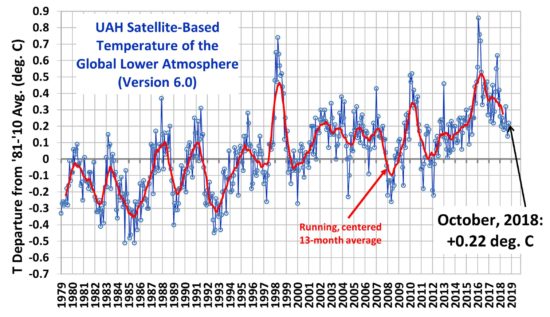
Global area-averaged lower tropospheric temperature anomalies (departures from 30-year calendar monthly means, 1981-2010). The 13-month centered average is meant to give an indication of the lower frequency variations in the data; the choice of 13 months is somewhat arbitrary… an odd number of months allows centered plotting on months with no time lag between the two plotted time series. The inclusion of two of the same calendar months on the ends of the 13 month averaging period causes no issues with interpretation because the seasonal temperature cycle has been removed, and so has the distinction between calendar months.
Various regional LT departures from the 30-year (1981-2010) average for the last 22 months are:
YEAR MO GLOBE NHEM. SHEM. TROPIC USA48 ARCTIC AUST
2017 01 +0.33 +0.32 +0.34 +0.10 +0.28 +0.95 +1.22
2017 02 +0.39 +0.58 +0.20 +0.08 +2.16 +1.33 +0.21
2017 03 +0.23 +0.37 +0.09 +0.06 +1.22 +1.24 +0.98
2017 04 +0.28 +0.29 +0.26 +0.22 +0.90 +0.23 +0.40
2017 05 +0.45 +0.40 +0.49 +0.41 +0.11 +0.21 +0.06
2017 06 +0.22 +0.34 +0.10 +0.40 +0.51 +0.10 +0.34
2017 07 +0.29 +0.31 +0.28 +0.51 +0.61 -0.27 +1.03
2017 08 +0.41 +0.41 +0.42 +0.47 -0.54 +0.49 +0.78
2017 09 +0.55 +0.52 +0.57 +0.54 +0.30 +1.06 +0.60
2017 10 +0.63 +0.67 +0.60 +0.47 +1.22 +0.83 +0.86
2017 11 +0.36 +0.34 +0.38 +0.27 +1.36 +0.68 -0.12
2017 12 +0.42 +0.50 +0.33 +0.26 +0.45 +1.37 +0.36
2018 01 +0.26 +0.46 +0.06 -0.11 +0.59 +1.36 +0.42
2018 02 +0.20 +0.25 +0.16 +0.03 +0.92 +1.19 +0.18
2018 03 +0.25 +0.40 +0.10 +0.07 -0.32 -0.33 +0.59
2018 04 +0.21 +0.31 +0.11 -0.12 -0.00 +1.02 +0.69
2018 05 +0.18 +0.41 -0.05 +0.03 +1.93 +0.18 -0.39
2018 06 +0.21 +0.38 +0.04 +0.12 +1.19 +0.83 -0.55
2018 07 +0.32 +0.43 +0.21 +0.29 +0.51 +0.30 +1.37
2018 08 +0.19 +0.22 +0.17 +0.12 +0.06 +0.09 +0.26
2018 09 +0.14 +0.15 +0.14 +0.24 +0.88 +0.21 +0.19
2018 10 +0.22 +0.31 +0.12 +0.34 +0.25 +1.11 +0.38
The linear temperature trend of the global average lower tropospheric temperature anomalies from January 1979 through October 2018 remains at +0.13 C/decade.
The UAH LT global anomaly image for October, 2018 should be available in the next few days here.
The new Version 6 files should also be updated at that time, and are located here:
Lower Troposphere: http://vortex.nsstc.uah.edu/data/msu/v6.0/tlt/uahncdc_lt_6.0.txt
Mid-Troposphere: http://vortex.nsstc.uah.edu/data/msu/v6.0/tmt/uahncdc_mt_6.0.txt
Tropopause: http://vortex.nsstc.uah.edu/data/msu/v6.0/ttp/uahncdc_tp_6.0.txt
Lower Stratosphere: http://vortex.nsstc.uah.edu/data/msu/v6.0/tls/uahncdc_ls_6.0.txt
Dr. Spencer, Last year, I presented a paper at the AGU Fall meeting which was an update to my earlier peer reviewed paper published in JTECH. I found evidence of a potential problem with your UAH analysis of MSU channel 4 data. My analysis showed a bias in your Lower Stratosphere (LS) product compared to the data produced by RSS and NOAA STAR, which can be seen as an step offset at about 1987-1988 in my figures 4.a and 4.b. This offset is most evident in the cross plots, figures 3.a and 3.b.
I also analyzed TMT data, with the results showing that your product exhibits a steady cooling trend for the MSU portion relative to the products from RSS and NOAA STAR. The fact that your MSU data exhibits a declining warmth relative to the other two series from 1979 until about 2004 explains the entire difference between the respective trends calculated for the period from 1979 thru 2016.
Of course, my comparison cant provide a definite conclusion regarding which data set is the most accurate measure of climate change. However, given that two of the three show more warming than your UAH should be given strong consideration. Your comments would be appreciated.
Mr. Swanson. Thank you for the comment. These differences have been noticed and discussed in our publications. For the latest, see Christy et al. 2018 IJRS https://www.tandfonline.com/doi/full/10.1080/01431161.2018.1444293
You are correct in the differences over the period of NOAA-12 and NOAA-14. As discussed in the paper, as we perform an objective procedure relying on data from the non-drifting (at this time) and better-calibrated NOAA-15 to deal with some of the spurious warming in NOAA-14 whereas RSS and NOAA do not. They retain the warming of NOAA-14 relative to NOAA-15 which lifts their time series higher as you noticed. That is the main reason for the difference. As we show using radiosondes with consistent instrumentation, all satellites have relative warming vs. the sondes in this period, but UAH’s is much reduced due to our adjustment procedure. Note that the procedure was developed without any use of the radiosonde information.
Here are the trend DIFFERENCES for 1979-2005 (period of MSU influence), tropics, satellite minus radiosondes (performed at radiosonde grid areas only). This from Table 3
UAH +0.045 +/- 0.066
RSS +0.116 +/- 0.070
NOAA +0.111 +/- 0.069
UW +0.117 +/- 0.069
Similarly for the satellite minus Reanalyses average. (full tropical coverage.)
UAH -0.008 +/- 0.039
RSS +0.066 +/- 0.049
NOAA +0.091 +/- 0.053
UW +0.064 +/- 0.040
As you can see, UAH is insignificantly different from the other systems, whereas RSS, NOAA and UW are significantly warmer.
Dr Christy,
I believe that the major source of disagreement between satellite datasets is the NOAA-15 vs NOAA-14 issue.
You say that NOAA-14 is spuriously warm. Compared to NOAA-15?
The RSS team say they can’t tell which of them is right or wrong, so they keep both and split the divergence. Also, they don’t want to guide significant choices of this kind by using independent data, because they want an independent dataset.
I think this is an interesting subject so I have compared the tropospheric satellite products with (all?) other relevant datasets during the NOAA 14-15 overlap 1999-2005:
https://drive.google.com/open?id=181P3P7qKKGRLGJWENmEMgji4ulPEKEgp
There is not a single dataset supporting the low trend of UAH v6 TLT. The other satellite datasets perform better vs radiosondes and reanalyses, suggesting that NOAA-14 is more right than NOAA-15.
The radiosonde datasets are independent vs satellites, but reanalyses are not since they ingest satellite data. However they suggest that NOAA-15 (TMT/AMSU-5) doesn’t make sense in a weather model (a reanalysis). This sensor can’t be reconciled with other data, it is clearly the odd man out, and become suppressed.
Another possibility is to compare NOAA-15 TMT/AMSU-5 vs neighbour AMSU channels 4 and 6:
https://drive.google.com/open?id=0B_dL1shkWewaSkpnOUxBVGNpWm8
UAH drops steeply vs the background until Aqua data is introduced.
RSS appears only half wrong. Actually, the drop in UAH matches almost perfectly the residual difference between AMSU-only and MSU-only in Mears & Wentz 2016 figure 7C
Shortly, AMSU channels 4 and 6 corroborate NOAA-14 TMT, but not NOAA-15.
So we have two possibilities, either the NOAA-15 AMSU-5 sensor is right and everything else is wrong, or the NOAA-15 AMSU-5 sensor is wrong.
Accepting the latter very obvious “odd man out” practice would reconcile satellite, radiosonde and reanalysis data, and reduce the structural uncertainty in satellite data significantly.
Olof R says, November 3, 2018 at 7:51 AM:
Hahaha! Notice how the Climate Politburo and its loyal agents never sleep, not until all dissidents are brought comfortable into the fold of ever-warming.
Remember, both RSS and NOAA STAR used to agree perfectly well with the UAHv6 TLT series from ~1997/98 forwards, until Mears & Wentz finally succumbed to the pressure (both outside and inside) and decided to massively ramp up their overall warming from the end of the 90s to the early 00s. NOAA STAR – naturally – followed suit soon thereafter. And voilà! UAHv6 suddenly became the “odd man out”. Go figure!
Olof R,
In this particular case, the “odd man out” is the correct one. The other ones are simply trying their best to justify the models and their pipe dream scenarios by twisting the data and warping reality.
And there’s a very neat way to find out why it’s the correct one. We use the CERES EBAF Ed4 data:
Gl UAHv6 TLT vs. Gl All-Sky DWLWIR at Sfc (EBAF Ed4):
https://okulaer.files.wordpress.com/2018/11/dwlwir-vs-tlt-uah.png
DWLWIR residual (DWLWIR minus TLT), UAHv6:
https://okulaer.files.wordpress.com/2018/11/dwlwir-residual-uahv6.png
Gl RSSv4 TLT vs. Gl All-Sky DWLWIR at Sfc (EBAF Ed4):
https://okulaer.files.wordpress.com/2018/11/dwlwir-vs-tlt-rss.png
DWLWIR residual (DWLWIR minus TLT), RSSv4:
https://okulaer.files.wordpress.com/2018/11/dwlwir-residual-rssv4.png
The usual from Kristian.
OlofR raises some specific issues with the satellite measurements, that could help account for the large uncertainty and controversy.
That can’t be it. Kristian has the real answer. Its the conspiracy!
He says look at DWLWIR. It should match troposphere temperature!
He fails to mention that the match between them is his unproven HYPOTHESIS, really a GUESS, more like a HOPE, because AGW cannot possibly be influencing DWLWIR.
When temperature data does not agree with his hypothesis/guess/hope, clearly it must be (one of) the temperature data sets thats’s wrong!
Of course he looks at it entirely backwards relative to normal science. The unproven hypothesis/guess/hope cannot be used as evidence of anything. In fact, it has its own problems.
This is just great. We were on the verge of having a real scientific discussion between peers, a discussion that has been scientific active since Christy/Spencer released UAH V6.
And what happens? The amateurs and “sceptics” like Kristian and the obsequious Gordon Robertson comes along with statements like;
“….should not be skeptical of the work done by the experts at UAH.”
What poor sceptics You both are, but what is worse, You effectively destroyed a very interesting scientific debate.
Olof R,
Do you understand the differences in the radiosondes used by Christy et al, and others such as RATPAC?
Have Christy et al made a reasonable choice of radisonde data sets?
Nate,
the radiosonde datasets use different methods of breakpoint detection and correction. Ratpac use fewer stations <85, the others around 500. However, they all give similar results and disagree less than satellite datasets ( think RSS v4 and UAH v6)
Here is a comparison of radiosonde datsets, reanalyses, RSS TTT and CMIP5 model average:
https://drive.google.com/open?id=0B_dL1shkWewaUzhXR0xmN3pEN0U
In the v6 method paper Spencer and Christy "validated" their product using the two datasets with the lowest trends, Ratpac B and RAOCORE. Both are unfit for the purpose, Ratpac B is unadjusted after 1996, and RAOBCORE is too circular since it is adjusted by reanalysis that ingests satellite data.
Still, even with Ratpac B as comparison it would have been easy to spot the trendbreak when AMSU satellites were introduced: ( the previous v 5.6 product compared much better to radiosondes)
http://postmyimage.com/img2/193_image.png
Thanks, Olof,
In Christys paper that he linked above, his figure 6 shows trends of only 0.085 C/decade for MT for a radiosonde set, IGRA. This seems rather much lower than what you show.
Olof,
Please, get off your high horse and step out of your hazy bubble. The data speaks very clearly on this topic.
The radiosonde datasets – or, rather, the ones with the steepest rise since the millennium – do NOT represent “Troposphere Truth”, as you seem blindly to believe. They are completely at odds with other relevant metrics, such as All-Sky OLR at the ToA (ERBS+CERES), surface temperature (GISTEMP LOTI, Had-CRUt4), and even new and strongly upward-adjusted satellite versions of tropospheric temperature (RSSv4 TLT), exhibiting obvious signs of severe methodological issues starting right around the time of the 1995-1996 switch between radiosonde networks/data sources. THAT’S when the problems began. THAT’S when the bizarre divergence pattern started to appear. It’s got nothing to do with the MSU-AMSU transition.
You’re looking in the wrong plase, Olof.
You see, the RATPAC-A series shows a waaay too low trend from 1979 to 2000/2001 (almost like a “pause”), relative to both UAHv6, RSSv4, GISTEMP LOTI, Had-CRUt4 and ERBS+CERES (OLR). And it’s all because of that major slump that occurs around 1995-1996 in the RATPAC data. We see the same thing happening with the HadAT2 data:
https://okulaer.files.wordpress.com/2016/02/trends-79-01.png
And so, what happens when it starts out much flatter, but ends up as high at the end anyway? The radiosonde datasets have some serious catching up to do after the first half, so the second half then naturally has to be much steeper in its rise than the other ones (GISTEMP LOTI, RSS4, ERBS+CERES). And that’s exactly what we see:
https://okulaer.files.wordpress.com/2016/02/trends-99-15.png
You can read all about it (and see lots more plots and comparisons) here:
https://okulaer.wordpress.com/2016/02/21/taminos-radiosonde-problem-part-1/
It simply makes no sense whatsoever. There is no good physical reason why the troposphere should hardly warm from 1979 to 2000/2001, during an extended period of time when both surface temperatures and Earth’s thermal (temperature-based) radiation flux to space (the All-Sky OLR at the ToA) saw a significant overall rise, and then, during the following 20 years, that relation is completely flipped around, tropospheric temperatures now suddenly rising much faster than both the surface temps and the OLR, specifically during the time when most researchers in the field (and, thus, the IPCC) acknowledged that warming rates had slowed down compared to the preceding decades. So that, in the end, the total rise (the only one that matters, right?) from 1979-1980 to 2015-2018 turns out to be more or less EXACTLY equal. Neat, isn’t it? Very fitting. Very convenient:
https://okulaer.files.wordpress.com/2018/10/ratpac-a-vs-rssv4-tlt-1979-2017-b.png
Dr. Christy, I read your latest paper a while back and there’s quite a bit there which I still need to digest. That said, I think that, as usual, it’s what you don’t say which is important. In the end, you all continue your comparisons of the satellite data with other records, including the balloon data and the re-analysis simulations. Then, you compare TMT data with model results, as you all have done for the past few years in your Congressional presentations, among others. However, in order to perform your comparisons, you first modify the other data sets, transforming those sets into simulated TMT series. You only briefly mention the method used to make these transformations and do not provide any links giving the assumptions used in creating these transformations or links to these the actual weighting functions which you applied in this processing. I did see a blog post in which you listed some or your weighting functions, but a blog post is not a proper reference.
Furthermore, you apply a similar process to the results of GCM runs, then finally show plots which claim that the models overstate future warming compared with your TMT data and your simulations. But, there is a major difference between the satellite data, the balloon data and the modeling results. Both the satellite and balloon data are measures taken at specific times of the day, as you note, the satellites flying over the Equator at (ideally) fixed local times and the balloon data collected at 0:00 and/or 12:00 UTC (mol). The models capture the daily diurnal cycle at the grid point level, thus include the daily low and high temperatures in an average. It’s widely recognized that the greatest temperature change will be an increase in the daily minimum temperatures, which the models will capture, but the satellite and sonde data can not. Not to forget that your graphical comparisons don’t indicate that the MSU 2/AMSU 5 satellite data is contaminated by the well known stratospheric cooling trend, thus the small warming in the TMT and the other simulated data is not representative of the true temperature change in the troposphere, a well known fact which is often overlooked or ignored, particularly in the political realm where your graphs are taken as “the bottom line”.
In your response to my comment, you gave no specific reply about my finding of an apparent bias in your UAH Lower Stratosphere (LS) data set relative to the those from RSS and NOAA STAR. Also, while your comment does mention the differing treatment of data from NOAA 14 and NOAA 15, the warming I found in your UAH data also appears in the earlier data from 8 previous satellites. When those satellites were launched, weren’t the instruments new and likely to be at their most accurate? Aren’t the corrections for orbit decay and drift in LECT applied to the end of the data set collected from each satellite? I must say that I don’t see how differences in later satellites could impact the data for the previous satellites.
My analysis of Arctic data also suggested that sea-ice has a significant influence on the annual cycle in the MSU/AMSU data. This influence is due to the difference in the emissivity of open water and sea-ice, the result being that open water appears colder than sea-ice for the same surface temperature, thus the decline in sea-ice coverage would add a negative trend to the brightness temperature. In addition, melt ponds appear as open water to the MSU/AMSU, thus an increasing trend in the coverage of sea-ice by melt ponds would register as an additional cooling trend. I submit that these effects impact all the MSU/AMSU analysis results.
In sum, I remain deeply skeptical of your claims that your work is the most accurate measure of our changing climate.
swannie…”However, in order to perform your comparisons, you first modify the other data sets, transforming those sets into simulated TMT series”.
You are out of order, swannie, you’d be banned on alarmist sites like realclimate, skepticalscience, desmogblog, for comments like that.
John Christy provided a good explanation and that should suffice. He’s an expert with a degree in climate science.
You talked about Congressional hearings. Perhaps you’ll recall the hearing where Hillary Clinton stood, with arms crossed, glaring at John Christy as he gave his testimony. She demonstrated herself to be a closed-minded, ignorant, and insensitive person for disrespecting John’s integrity and professionalism.
You are doing the same.
That’s why I am glad she lost to Trump, even though I am not a right-winger. The climate gods got her for being rude to John.
Gordo, I looked back thru the hearings before the U.S. Senate Committee on Environment and Public Works on which Mrs. Clinton sat, from 2003 thru 2009. All I found was a hearing on 22 July 2008 in which Dr. Spencer testified. Perhaps the hearing you recall was in 2001 or 2002, for which there is less information. Then too, perhaps your memory is that of one sitting at the witness table, since you refuse to identify yourself in any real sense.
As for my critique, I analyzed the available data and documented the results. My JTECH paper was peer reviewed and available for anyone to read and comment on. You, as usual, resort to character assignation and distortions, while ignoring the issues I raised. You have an agenda, which is abundantly clear when you jump from praise of Dr. Christy into the political realm as if that proves anything about the science. Of course, you speak of banning commenters because of their point of view, a clear sign of a far right wing authoritarian lunatic.
swannie…”n sum, I remain deeply skeptical of your claims that your work is the most accurate measure of our changing climate”.
Someone with your understanding of basic thermodynamics should not be skeptical of the work done by the experts at UAH. UAH is the only record with integrity, the rest having sold out to the alarmist cause.
“You should not be skeptical of the work done by the experts at UAH”
You should notice that there is disagreement among the experts.
It is unfortunate that the satellite data has real issues, that lead to such large uncertainty in the trends.
Swanson clearly has the chops to weigh in on this controversy, judging by Christy’s repsonse.
John…good to hear from you. Wish you and Roy well in your work and your battle against The Cause, as Michael Mann called it in the Climategate emails.
swannie…”A comparison of UAH v6 north polar lower stratospheric (TLS) data with that from Remote Sensing Systems (RSS) is presented, indicating a possible bias between 1986 and 1988″.
Swannie, you are a gem of obtuseness and arrogance. You have essentially challenged the UAH record using manipulated data from NOAA. Has your alarmist ego no bounds?
Recently, you provided an experiment performed on your kitchen stove as proof that the 2nd law of thermodynamics is null and void. You set up a metal plate on an electric stove top ring than heated the plate till its temperature stabilized. Then you mounted another metal plate about 4″ above the heated plate on soup cans and re-measured the temperature of the heated plate.
You noted that the heated plate’s temperature had increased from which you concluded that back-radiation from the mounted, cooler plate had warmed the heated plate.
When a few of us pointed out the flaw in your conclusion, you would not even consider it. You stubbornly stuck to you conclusion that invalidates the 2nd law.
It’s obvious that the heated plate warmed because your tin roof was interfering with it’s ability to dissipate heat via convection. That is a common occurrence with a heat source when it’s ability to dissipate heat is compromised.
I have seen power transistors burn out due to the lack of a proper heat sink in high ambient temperatures that interfered with their ability to dissipate heat. They get so hot you can’t touch them with burning your skin and that heating has no back-radiation upon which to blame the heating.
You repeated the experiment in an evacuated enclosure and arrived at the same conclusion. The rise in temperature of the heated plate was once again warmed due to an interference with its ability to dissipate heat via radiation. When you raise a cooler metal plate immediately in front of a radiating hotter plate, you would expect it to block the hotter plate’s radiation pattern.
The sad part is the AMS publishing your paper against UAH. It appears those alarmists will publish anything that upholds the pseudo-science of anthropogenic warming.
I’ll bet Spencer and Christy have a great deal of trouble getting published in the same alarmist journal.
Gordo, Thanks for the “plug”. For those who may not have seen it by now, here’s the link to my Green Plate Demonstration.
And this is how it really works, if the original black bodies remain black bodies and are not magically changed to insulators:
https://postimg.cc/image/jcotys8e3/
Huffingman chimes in with his same old distorted version of physics. The lunatic doesn’t understand that the thermal radiation emitted by the Blue Plate must be the same from each side, since the IR radiation is only a function of temperature, emissivity and surface area. His math shows 200 w/m^2 going toward the LHS, but 400 w/m^2 going toward the RHS. But, that’s what we’ve come to expect from the lunatic fringe that hangs out on this web site.
E. Swanson, you still don’t understand the simple graphic.
The blue plate IS emitting the same from both sides. The color-coded arrows should make it obvious.
“black bodies and are not magically changed to insulators:”
Yet JD is quite content to have black bodies magically change into mirrors.
He will never accept reality.
More misrepresentations and false accusations from anonymous Nate.
No surprise.
JD, cmon, we’ve been over this dozens of times.
Your diagram is a fraud. It shows a black body reflecting radiation.
You have never ever dealt with this problem honestly.
Yes Nate, we have been over this dozens of times. And you still don’t get it.
In the diagram, the blue plate reflects the flux from the green plate due to the fact that the green plate is at a lower temperature potential, i.e., downstream of the energy flow.
https://postimg.cc/image/jcotys8e3/
In the invalid scenario, the green plate must change from a black body to a semi-insulator, restricting radiative heat transfer. A black body does NOT reject the flux from a “hotter” body.
“the blue plate reflects the flux from the green plate due to..”
Nope. Impossible. Black bodies do not reflect, FOR ANY REASON, period.
In the correct graphic (link above),
1) The blue plate remains a “black body”, reflecting flux due to the 2LoT.
2) The green plate remains a “black body”, absorbing all flux from the “hotter” blue plate.
In the incorrect version, the green plate magically transforms into some unidentified reflector/inulator, defying the definition of a “black body”.
JD: “The blue plate remains a ‘black body’, reflecting flux due to”
JD: 7 is larger than 11 due to 11 being colder.
JD: A ham sandwich is a computer due to this one weird trick.
Don’t stop believin in magic, JD, but go find some new people to share it with.
Nate cannot responsibly support his failed pseudoscience, so he resorts to misrepresenting me, even creating blatantly false quotes.
JD,
You are repeatedly saying that a black body, defined to be a perfect absor*ber of light, can do something impossible: reflect light.
No, no it can’t ever do that.
Why don’t you get that?
Go ask your grandma, if 7 can ever be greater than 11? For any reason?
I am not misrepresenting your quotes at all.
“In the diagram, the blue plate reflects the flux from the green plate due to”
“The blue plate remains a ‘black body’, reflecting flux due to”
It doesnt matter at all what comes after ‘due to’, because impossible means that it NEVER EVER HAPPENS.
Sorry Nate, but you do not get to use an imaginary object fo violate the laws of physics.
And, you are avoiding the fact that your green plate is violating the definiton of a black body.
Also, you definitely are misrepresenting me.
Just a little reality for you….
OK JD,
Impossible = Possible. False = True.
Your message is coming thru loud and clear:
‘I don’t live in your world of facts’ and
‘I don’t need to be rational’
so
‘Don’t take my comments seriously’
OK, fine.
We will abide.
Nothing new.
Gordo, Your comments above about my demonstration of the “Green Plate Effect” just repeat your previous assertions without any sort of proof to support your claims. You simply assert that my results are wrong because they violate your conception of the Second Law of Thermodynamics, then give an example which you claim prove your lunatic physics. First you claimed that the warmer plate would “ignore” the thermal radiation from the cooler plate, then you claimed that the Green Plate “blocked” the thermal radiation leaving the higher temperature Blue Plate. There’s no evidence of such effects, which would be easily found by experimental tests of the physical properties of matter.
Without any evidence, your delusional physics compares to that of the Flat Earth mindset of folks who think the Biblical Creation myth is the true description of reality, a point of view which has been shown flat out wrong over and over again since Galileo with his telescope. Not to forget, you’ve agreed with HuffingMan’s ludicrous claims that the Moon doesn’t rotate, which is a fundamental fact of Astronomy and Astrophysics.
What does the comparison show if you use the older version of RSS? The logic that 2 of 3 has significance is flawed for me given the dynamic nature of climate data.
The older version of RSS (v3) would show a similar profile and trend to the current UAH.
The previous version of UAH (5.6) would lie between the current UAH and RSS trend.
https://tinyurl.com/ybx5yrfx
Thanks for the report, Roy.
Indeed. The monthly updates are appreciated.
Still at +0.13 Armageddon, it seems. Could more precision be reported? Let’s take the “debate” to 4 or 5 decimals.
More of the same ,same and the same.
Looks like your claim of massive cooling is a fizzer.
Not so fast. Most of the warming is due to the Arctic which is simply a factor of more open ocean water releasing heat. Add to that the warming tropics due to the building El Nino since June and you don’t have much left.
Where is the heat from all that extra CO2?
Richard: so except for the warming, there is no warming.(?)
Roy’s value is the temperature *anomaly,* so it’s not dependent on normal seasonal heating, like your mentioned in the Arctic.
Over 90% of the added heat goes into the ocean. News this week — a study found ocean warming to be on high end of previous estimates:
“Quantification of ocean heat uptake from changes in atmospheric O2 and CO2 composition,” L. Resplandy et al, Nature 563, pages 105–108 (2018).
https://www.nature.com/articles/s41586-018-0651-8
Previous values:
http://tinyurl.com/jbf2xco
Meh. Just a model.
“Without models, there are no data.”
– Paul N. Edwards, “A Vast Machine”
http://pne.people.si.umich.edu/PDF/Edwards_2009_A_Vast_Machine_Introduction.pdf
Oceans have warmed in last 40 years as CO2 has gone up – But question is, are the oceans, with 99.9% of the thermal energy the driver, or the driven? The increase of .01% of CO2 to air with only .07% energy is warming the body with 99.9% energy? Far more likely to be natural.
Who/what says 99.9% of the added LT energy goes into the oceans?
Everything I’ve read says it is about 90-93%….
No, oceans HOLD 99.9% of the thermal energy of the planet (excluding below the crust, of course). Are the oceans the driver, or the driven?
The increase of .01% of CO2 to air with only .07% energy is warming the body that holds 99.9% of the thermal energy of the planet? Is .07% pushing around 99.9%?
Again, where does your 99.9% number come from?
PS: Heat gained by the crust is not heat gained by the ocean.
PPS: How much heat *IS* being gained by the crust?
J,
Sure the oceans hold most of the heat, but most of it is deep and inaccessible. What matters is the amount exchanged w/ atmosphere, land and space.
Normally the exchange is tightly balanced. But in recent decades an imbalance is measured with a net to the ocean, at a rate of 0.5 – 1.0 W/m^2. This is small compared to the solar input of 240 W/m^2. But it ~ matches the imbalance between atmosphere and space.
I dont see the problem.
@David Appell
“The majority of the thermal energy at the Earths surface is stored in the ocean.”
– “Most of the solar energy that reaches the Earth is stored in the ocean and helps power oceanic and atmospheric circulation. In this manner, the ocean plays an important role in influencing the weather and climatic patterns of the Earth.”
– “The top 10 feet of the ocean hold the same amount of thermal energy as exists in the entire atmosphere.”
If you do the math, it’s 99.9%
The increase of .01% of CO2 to air with only .07% energy is warming the body that holds 99.9% of the thermal energy of the planet? Is .07% pushing around 99.9%?
J,
Given that the main input and output energy flows to the Earth are thru the atmosphere, is it surprising that the atmosphere could manage to vary the energy input to the ocean by < 1 part in 240?
Joe says:
“Most of the solar energy that reaches the Earth is stored in the ocean and helps power oceanic and atmospheric circulation.”
That’s exactly wrong.
Joe says:
The increase of .01% of CO2 to air…
That’s wrong.
The increase in atmo CO2 is now 46% compared to pre-industrial times, not “0.01%.”
–J says:
November 2, 2018 at 4:19 PM
No, oceans HOLD 99.9% of the thermal energy of the planet (excluding below the crust, of course). Are the oceans the driver, or the driven?–
“The crust is only about 3-5 miles (8 kilometers) thick under the oceans(oceanic crust) and about 25 miles (32 kilometers) thick under the continents (continental crust).”
http://volcano.oregonstate.edu/earths-layers-lesson-1
Or to use in sentence, most of the Earth crust is pretty hot.
And most of the ocean is pretty cold.
The crust under the ocean is 8 km and ocean above it about 4 km- roughly they have same thermal mass. Crust is denser material and ocean has more than 4 specific heat per kg, but per per volume water about twice, but there 1/2 volume of water compared to oceanic crust.
And continental crust much thicker and in terms of average temperature even hotter.
But most of crust is isolated/insulated in regards to surface, most of crust is insensitive to the warmth or cold at the surface- or disconnected from “climate”.
Or probably you should not use the term, crust.
Are oceans the driver or the driven?
Ocean absorb more of energy of sunlight than atmosphere or sun warmed ground surface.
It appear the topography of Land strongly affects the ocean temperature.
Or we in a icebox box climate due to the arrangement and topography of land masses.
Or our current arrangement of land masses has caused our ocean to have average temperature being within a range of 1 to 5 C.
And with Earth “normally” the ocean average temperature is about 10 C.
Or a result of plate tectonic activity/geological processes has cooled our oceans and has caused us to living in an Ice Age for more than 1 million years.
And, without an ocean, I believe Earth would have much lower average global temperature.
I would say ocean is global climate and global temperature, in that sense, ocean drives or if you like, is the god or the creator of global climate.
J…”Oceans have warmed in last 40 years as CO2 has gone up But question is, are the oceans, with 99.9% of the thermal energy the driver, or the driven?”
Exactly. It’s likely that significant warming is still occurring due to re-warming from the Little Ice Age. Also, as Tsonis et al pointed out, the interchange between the major ocean oscillations causes an ebb and flow of heating/cooling over decadal time slots.
David-
“The increase in atmo CO2 is now 46% compared to pre-industrial times, not “0.01%.”
I was comparing CO2 to air, not CO2 to CO2.
Yes, CO2 to CO2 is up 46%, but CO2 to air is up only .01%
Nate-
“Sure the oceans hold most of the heat, but most of it is deep and inaccessible.”
Not true, The top 10 feet of the ocean hold the same amount of thermal energy as exists in the entire atmosphere.
(sorry, I’m unable to post comment with link for some reason)
David-
– “Most of the solar energy that reaches the Earth is stored in the ocean…”
Well this site says so, so go argue with them:
see-the-sea (dot) org (slash) facts (slash) facts-body (dot) htm
(sorry had to write the link like that, otherwise comment wouldn’t post)
J says:
November 2, 2018 at 3:40 PM
“Oceans have warmed in last 40 years as CO2 has gone up But question is, are the oceans, with 99.9% of the thermal energy the driver, or the driven?”
_________________________________________-
Is this really a question?
If oceans would be the driver, ie the source of warming, their own temparature would go down, not up.
In fact, oceans are just a buffer for temperature change.
Without them, global warming would be much faster.
David, I said nothing about “normal seasonal heating”. The more open water is in comparison to the baseline period. It has nothing to do with seasonal changes.
The Resplandy paper is pretty laughable. All it take is for China to be under-reporting their CO2 emissions to make that paper nonsense. Of course, you will accept anything from your climate priests.
Fritz-
“If oceans would be the driver, ie the source of warming, their own temparature would go down, not up.
In fact, oceans are just a buffer for temperature change.
Without them, global warming would be much faster.”
Why would the ocean temperature necessarily go down? There are proven naturally occurring cold and warm decadal cycles in the Atlantic and Pacific. Depending on what cycle they’re in, the ocean temperature will either go down or up on its own.
You must understand, the ocean heat content is HUGE.
The state of the oceans now is a product of centuries of back and forth of a complex system that has 1000x the heat capacity of the air – just in the top tier of the ocean – this is not the inaccessible lower depth heat. Oceans run the climate system.
Joe,
“Not true, The top 10 feet of the ocean hold the same amount of thermal energy as exists in the entire atmosphere.”
The ocean mixed layer that exchanges heat with the atmosphere is ~ 100 m = 300 feet.
But it matters little how much more heat is stored in the ocean than the atmosphere.
The atmosphere does for the Earth what the fiberglass insulation does for my house. Both hold a tiny fraction of the heat in the system, but still control the rate of heat loss.
Joe says:
November 4, 2018 at 4:08 PM
Fritz says:
“If oceans would be the driver, ie the source of warming, their own temparature would go down, not up.
In fact, oceans are just a buffer for temperature change.
Without them, global warming would be much faster.”
Why would the ocean temperature necessarily go down?
______________________________________-
Due to law of physics.
Decreasing heat content causes decreasing temperature.
Fritz-
“Due to law of physics.
Decreasing heat content causes decreasing temperature.”
But why would the heat content of the ocean decrease?
Nate-
“But it matters little how much more heat is stored in the ocean than the atmosphere.”
-Actually, it does. A lot.
“The atmosphere does for the Earth what the fiberglass insulation does for my house.”
This leads to my next point: Warmer oceans release more water vapour into the atmosphere, and water vapour is BY FAR the most influential greenhouse gas. That’s where your global warming’s coming from.
That’s why I stated before: Oceans run the climate system.
Nate-
A perfect example in the past few years was the Super-Nino. Huge ocean temperature spike released huge amounts of water vapour into the atmosphere, causing the global temperature spike.
As the El-Nino wore off so did the global temperature.
Joe,
Yes El Nino is one of the ways the ocean and atmosphere exchange energy.
It goes both ways and the atmosphere wind patterns play a key role.
As with the AMOC, its a coupled, complicated system.
But, the fact that the deep-ocean takes so long to equilibrate with the surface, means that the anomalous flows of heat to and from it are small and lower impact.
Joe says:
November 5, 2018 at 2:53 PM
Fritz-
“Due to law of physics.
Decreasing heat content causes decreasing temperature.”
But why would the heat content of the ocean decrease?
_____________________________________________
Because oceans would lose energy, if they would warm the atmosphere.
You just told you graduated and you are engineer.
Either this was not true or your question is not honest.
Fritz-
“You just told you graduated and you are engineer.
Either this was not true or your question is not honest.”
What?? I did NOT say this.
“Because oceans would lose energy, if they would warm the atmosphere.”
Yes, and they are losing energy, very slowly. As I stated earlier, the top 10 feet of the ocean hold the same amount of thermal energy as exists in the entire atmosphere.
All that heat isn’t simply going away in a short time.
There is a lot of back and forth before ocean temperatures change their trend.
Joe says:
November 7, 2018 at 8:43 PM
Fritz-
“You just told you graduated and you are engineer.
Either this was not true or your question is not honest.”
What?? I did NOT say this.
“Because oceans would lose energy, if they would warm the atmosphere.”
Yes, and they are losing energy, very slowly. As I stated earlier, the top 10 feet of the ocean hold the same amount of thermal energy as exists in the entire atmosphere.
All that heat isn’t simply going away in a short time.
There is a lot of back and forth before ocean temperatures change their trend.
____________________________________________
No, they are not losing energy. And they would change their trend at once. They would lose the energy they deliver to atmosphere without any delay.
Just a single joule delievered to atmosphere means one joule less at once in ocean. This one joule doesnt exist twice, not even for one second.
Heat content of oceans would show a decrease, if it would warm the atmosphere. But if measurements arnt completely wrong, there is no back and force, no standstill, and no decrease, but clearly an INncrease. Also in deep layers.
Sorry I confused you with the other Joe. So maybe you really didnt understand.
Joe said:
I was comparing CO2 to air, not CO2 to CO2.
Yes, CO2 to CO2 is up 46%, but CO2 to air is up only .01%
The proper comparison is the relative proportion of GHGs, because it is the GHG effect that causes the av surface temp to be warmer than it would be absent an atmosphere (and absent the insulating effect of the other gases and clouds).
GHGs make up about 2% of the atmospheric mass. CO2 constitutes a fraction of that near the surface but proportionally more the higher you go, particularly in the stratosphere, where water vapour is in far tinier amounts than in the troposphere.
That still doesn’t account for the efficacy of the different gases to absorb (and re-emit) IR.
Based on physics and empirical measurements of the optical properties of various atmospheric gases, CO2 contributes between 9 and 26 % of the ‘greenhouse effect.’
Fritz-
But back to the first question: Why would the ocean heat content decrease? You still haven’t properly explained that.
And as I explained before, there are decadal cycles with the Pacific Decadal Oscillation, and Atlantic Multidecadal Oscillation – currently both in warm phases, warming the global oceans.
Also bear in mind that water cools much slower than it heats up – because heating usually involves a lot of energy in a short space of time.
In relation to the Earth, we don’t have the cold source equivalent of the Sun, therefore the oceans cool much slower than they warmed up.
barry said:
“CO2 constitutes a fraction of that near the surface but proportionally more the higher you go, particularly in the stratosphere, where water vapour is in far tinier amounts than in the troposphere.”
Yes, it is interesting to note that it is much colder up there than near the surface, despite CO2 being proportionally more the higher you go…
It is also interesting that the areas of the planet that have the least water vapour have the most temperature extremes near the surface, such as deserts, or in the case of high altitudes (mountains) are colder – due to a much lower ghg effect.
But going beyond just ghg’s, it almost seems like atmospheric pressure determines temperature… Think about it, lower altitudes are warmer than higher altitudes where atmospheric pressure is less.
Joe says:
November 10, 2018 at 1:51 AM
Fritz-
But back to the first question: Why would the ocean heat content decrease? You still haven’t properly explained that.
And as I explained before, there are decadal cycles with the Pacific Decadal Oscillation, and Atlantic Multidecadal Oscillation – currently both in warm phases, warming the global oceans.
_______________________________________
So what?
When ocean warms the atmosphere, it delievers heat content.
And when it delievers heat content, itself loses heat content.
Measurements show, its heat content is rising since decades. So it cant be the cause of atmosphere warming.
In fact it only attenuates warming of atmosphere, sometimes more and sometimes less. While la nina more and while el nino less.
There is nothing more to explain.
barry said:
CO2 constitutes a fraction of that near the surface but proportionally more the higher you go, particularly in the stratosphere, where water vapour is in far tinier amounts than in the troposphere.
Yes, it is interesting to note that it is much colder up there than near the surface, despite CO2 being proportionally more the higher you go
It is also interesting that the areas of the planet that have the least water vapour have the most temperature extremes near the surface, such as deserts, or in the case of high altitudes (mountains) are colder due to a much lower ghg effect.
But going beyond just ghgs, it almost seems like atmospheric pressure determines temperature Think about it, lower altitudes are warmer than higher altitudes where atmospheric pressure is less.
Joe,
Pressure doesn’t determine temperature. A scuba tank has 200 times the pressure of the atmosphere at the surface of the Earth, but after filling it quickly equilibrates to room temperature. A scuba tank has twice the pressure of Venus surface atmosphere. Why doesn’t it melt by wet suit?
Also, we know the temperature gradient changes with each atmospheric layer. EG, from surface a negative temperature gradient to troposphere, then a positive temperature gradient through the stratosphere, and a negative one again through the mesosphere, going positive again through the thermosphere spacewards.
Pressure declines fairly steadily as you go upwards, so pressure cannot be determining temperature at different levels of the atmosphere. Something else has to be responsible for these inversions of the temperature gradient. Changes in the relative composition and abundance of atmospheric gases is what causes these inversions. EG, the significant quantities of UV-absorbing ozone in the stratosphere, as well as a lack of convection, is the main reason why temperatures increase with height.
barry wrote:
“Also, we know the temperature gradient changes with each atmospheric layer. EG, from surface a negative temperature gradient to troposphere, then a positive temperature gradient through the stratosphere, and a negative one again through the mesosphere, going positive again through the thermosphere spacewards.
Pressure declines fairly steadily as you go upwards, so pressure cannot be determining temperature at different levels of the atmosphere. Something else has to be responsible for these inversions of the temperature gradient. Changes in the relative composition and abundance of atmospheric gases is what causes these inversions. EG, the significant quantities of UV-absorbing ozone in the stratosphere, as well as a lack of convection, is the main reason why temperatures increase with height.”
True, but that’s only because the absolute effect of pressure on a system’s (planet’s) temperature depends on the background energy level of the environment i.e. solar flux.
This is also why your scuba tank example wouldn’t burn – the ambient energy level isn’t high enough.
The same can be said for AGW where is it?
30-yr trend of UAH LT v6.0 = +0.14 C/decade.
Can you even notice .14 C/decade in a real life thermometer?
You’ve made the mistake of thinking that the uncertainty of an average equals the uncertainty of each individual thermometer.
If the uncertainty of the temperature reading for each temperature station is a constant dT_i = dT, then, assuming the measurements of the temperature stations T_i are normally distributed, the uncertainty in the average of N stations is
d(avg)=(dT)/sqrt(N)
which is much less than dT.
Keep using those El Ninos to create a trend DA.. its funny to watch 🙂
No warming apart from those El Ninos, and by the looks of it no persistent warmth from the 2015/16 El Nino
But just keep drawing those meaningless monkey-based lines, DA. 🙂
Long time lurker. Not a scientist, but Im not without intelligence enough to understand obfuscation, and I was my high school valedictorian and, I did graduate Dartmouth with a degree in engineering. Anyways, even I understand that the post that mentioned CO2 increasing by 0.01% was referring to total CO2 increasing from 0.03 to 0.04% of the atmosphere. If you didnt understand that it speaks volumes about your innate ability to understand others points, and if you did understand then it is another example of climate change alarmists willingness to distort the truth for their benefit. Joe in NY
“Keep using those El Ninos to create a trend DA.. its funny to watch ”
El ninos cannot make a trend.
They just cancel La Ninas, which we’ve had, on average, for the last 12 mo, and you guys ignore.
Don’t forget, Joe Peck, obfuscation can go both ways.
joe peck…”I understand that the post that mentioned CO2 increasing by 0.01% was referring to total CO2 increasing from 0.03 to 0.04% of the atmosphere. If you didnt understand that it speaks volumes about your innate ability to understand others points, and if you did understand then it is another example of climate change alarmists willingness to distort the truth for their benefit”.
**********
If you want to dig deeper, apply that 0.04% to the ideal gas law while holding the atmosphere volume relatively constant. Compare the nearly 99 mass percent of N2/O2 to the puny 0.04% of CO2 using Dalton’s law of partial pressures.
That tells the story. For a 1C rise in atmospheric temperature, CO2 cannot possibly supply more than a few hundredths degree C.
Ric says:
November 2, 2018 at 5:15 PM
“Can you even notice .14 C/decade in a real life thermometer?”
______________________________________
Doesnt matter.
This value is an average of many measurements.
Didnt you know?
Joe Peck says:
November 3, 2018 at 8:57 AM
Long time lurker. Not a scientist, but Im not without intelligence enough to understand obfuscation, and I was my high school valedictorian and, I did graduate Dartmouth with a degree in engineering. Anyways, even I understand that the post that mentioned CO2 increasing by 0.01% was referring to total CO2 increasing from 0.03 to 0.04% of the atmosphere.
_______________________________________
From 0.03 to 0.04 is an increase of 33%.
No matter where you gratuated or how intelligent you pretend to be.
If we accept the radiative imbalance calculations of the warmists a very simple calculation shows that it would take 860 years to raise the temperature of the Oceans by one degree Celsius.
Method
1 find the total mass of Oceans
2 factor in the radiative imbalance as a power input
3. use power mass and specific heat capacity of water and temperature rise of one degree Celsius to derive the time taken.
In fact the time taken would be much longer as no account is taken for melting ice and the very high value of the latent heat capacity of ice.
Gets things into a bit perspective …..doesn’t it
Bryan, that shows that we could be cooking on the surface well before the deep ocean warms. How does that help?
Maybe instead of guessing you simply start reading what really professional people do all the time, probably even before you were born:
https://www.data.jma.go.jp/gmd/kaiyou/english/ohc/ohc_global_en.html
I see you like graphs.
how about this one
https://www.epa.gov/climate-indicators/climate-change-indicators-sea-surface-temperature
You can see over a wide historic range there is quite a variation up and down
Notice the graph shows temperature in Fahrenheit units.
My calculation gives the energy input to the Oceans and is if anything more than 860 years.
Try the calculation for yourself if you are capable.
Sorry but your graph is by no means the right one: I was talking about Ocean Heat Content, and you answer with… Sea Surface Tempoerature!
Bindidon
The sea surface temperature is a reasonable proxy for the Ocean heat content
graph shows 1880 to 1910 …..fall
graph shows 1910 to 1940….. rise
graph shows 1940 to 1985 …..flat
graph shows 1985 to 2015 …..rise
What it does not show is any correlation to the so called greenhouse gasses
Bryan,
Considering the mass of the ocean and the mass of the atmosphere….
If the added energy that caused the rise of 1C in total ocean temp were transferred to the atmosphere, how much would the temp of the atmosphere rise?
If you can work it out the answer may surprise you.
The very first sentence in Chapter five of the IPCC’s AR4 report
http://www.ipcc.ch/publications_and_data/ar4/wg1/en/ch5s5-es.html
says:
The oceans are warming. Over the period 1961 to 2003, global ocean temperature has risen by 0.10°C from the surface to a depth of 700 m.
You know what Barry? A rise of 0.01°C isn’t going to warm anything more than 0.01°C.
I think it is generally accepted that the first law of thermodynamics is reliable.
So accepting (for the sake of discussion) that the radiative imbalance proposed by warmists is also correct; the conservation of energy equation calculates the time taken for the Earths Oceans to increase by one degree Celsius is 860 years .
Barry
The increased heat content of the Oceans cannot be transferred to the atmosphere.
Heat transfer only occurs from a higher to a lower temperature.
Once the temperatures equalize heat transfer stops.
You misunderstand the question, Bryan.
With your understanding of thermo, transfer (hypothetically) all the joules required to heat the oceans by 1C to the atmosphere and calculate the resulting temperature change for that mass.
Hint: it’s going to be a lot more than 1C!
Can you do the math?
I draw your attention, because you may mislead some people into thinking that a change in oceanic temps of 1C is a small thing. That would take far, far more energy to achieve than heating the atmosphere by the same amount.
Barry
Your question makes no sense because it ignores the laws of thermodynamic.
Transfer of heat energy is governed by these laws.
You could make up all sorts of ridiculous questions but there is no point to them.
For example what would happen if all the excess heat in the oceans was transferred to ‘the white house’ or to the north pole.
Get my point?
I believe so.
You are either incapable of or unwilling to consider my question, and your ‘point’ is to wave it away using ridicule as your device for this. Yes, heat flows from hot to cold, but that has nothing whatsoever to do with the specific point I’m making.
If all the energy required to heat the ocean by 1C were immediately transferred into the atmosphere, the resulting increase of atmospheric temps would be about 36C.
What’s my point? To illustrate that what may seem like a small warming in the ocean is actually an enormous energy increase. A 1C warming of the total oceans is a massive change. The change over the last three decades is an order of magnitude less, but still represents a huge amount of energy.
Steve,
“The oceans are warming. Over the period 1961 to 2003, global ocean temperature has risen by 0.10C from the surface to a depth of 700 m.”
I don’t see your point. The top surface of the global ocean has warmed ~ 0.8 C.
When you heat one side of a thick layer of material, the other side warms very little or very slowly.
Thats the whole point of making my attic insulation thicker.
Barry says
“A 1C warming of the total oceans is a massive change.”
I agree and thats why it takes 860 years for the warmist “radiative imbalance” to accomplish this massive energy transfer
But at the end of 860 years the Ocean average water temperature will go from say 14C to 15C
The near surface atmospheric temperature would also increase by about one degree Celsius.
The mass of the atmosphere is much less than the mass of the oceans..but as you say heat only flows from a higher temperature to a lower temperature so needless worries about it being 36degees celcius higher are misplaced
barry says:
November 5, 2018 at 5:49 AM
…
If all the energy required to heat the ocean by 1C were immediately transferred into the atmosphere, the resulting increase of atmospheric temps would be about 36C.
A 1C warming of the total oceans is a massive change.
And if all the energy used to heat up my 30 gal water heater were immediately transferred to a teacup of water it would explode in a ball of super heated steam.
The total ocean has not warmed 1C. Read Nate’s post. The ocean is what – 3700 meters deep? Only the top 700 meters is warmed so ~80% isn’t affected.
Yes the sun is ~5000K and if the Earth didn’t have a pathway for heat to escape, we would eventually heat up to that 5000K. But the Earth does loose heat and all the energy stored in the oceans isn’t going to magically rise up some day and heat the atmosphere to 36C.
You’ve used a convoluted chain of imaginary events to come up with a scary number. But I’m sure you are right, if all the heat necessary to heat the entire ocean all 3700 meters of it right to the bottom 1 degree Celsius, in one giant imaginary explosion yes that’s enough to heat things up to your scary 36 degrees and do a lot of damage.
Why do guys like you insist on coming up with scary scenarios that really don’t represent reality?
Nate says:
…
November 5, 2018 at 8:10 AM
The top surface of the global ocean has warmed ~ 0.8 C.
…
Bodies of water are usually warmer than the atmosphere. And so yes, if the ocean went from 15C to 15.8C the warming of the atmosphere would be greater by no more than that 0.8C.
The mass of the atmosphere is much less than the mass of the oceans.. but as you say heat only flows from a higher temperature to a lower temperature
What makes the atmosphere much warmer than the ocean depths? Why doesn’t the heat flow and render the whole system in thermal equilibrium? Something is preventing heat flowing from hot to cold and equalizing.
For the same reason that temperature is stratified, a change in 1C in the oceans would be experienced very differently in the atmosphere.
And if you want to know something else interesting, the average sea surface temperature of the globe is higher than the land/surface average. The skin of the ocean is warmer than the air. Which way should heat flow here?
so needless worries about it being 36degees celcius higher are misplaced
What crazy nut said that this could possibly happen? It wasn’t me.
Ice age temperature changes at the poles saw swings of 10-12C. At the equator, about 3C. A 1C warming of the atmosphere has been accompanied by ocean heat content changes (to 700 meters) of less than a third of that in degrees C. On that simple ratio, a 1C ocean heat content change should produce 3C in near-surface temps.
But the real picture is more complex. Changes in one component do not produce a 1-for-1 change in other components.
Barry says
“What crazy nut said that this could possibly happen? It wasn’t me.”
I think you should re-read your post of 5.49AM above where you say
“if all the energy required to heat the ocean by 1C were immediately transferred into the atmosphere, the resulting increase of atmospheric temps would be about 36C.”
Did I say this could possibly happen?
No, I was inviting you to do an energy calculation. Nothing about any of my posts suggested otherwise.
I don’t understand what could make you misinterpret so badly. I have to assume you couldn’t actually do the calculations, and swung wildly to deflect a simple question.
S D P,
So, it holds steady. This is good. If you are correct in your predictions, cold is in the future. This is not good.
+0.22 with El Nio conditions setting in is not a feather in the warmists cap. Looks like there will be a winter spike because of the El Nio then back to the freefall of the past 2 years come late spring.
So you are not aware of the lag between surface temps and satellite temps?
El Nio damn auto correct
Guess the site doesn’t like the symbol above the n…..I know it’s El nino people
Correct, the site wipes out your keyboard script. You have to use HTML code.
El Niño
Epsilon/sigma works sometimes, testing:
AσT^4
E = ε’σT4
Mr Spencer, why does this page show an error?
https://ghrc.nsstc.nasa.gov/amsutemps/amsutemps.pl
Look at the bright side, The zero warming has been extended another month , the disparity from the “CO2 control knob” climate models is larger still.
Evidence?
Stay out of my posts you7 creep
Just as I thought — no evidence whatsoever.
DA is getting DESPERATE. !!
Imagine what he will be like when this happens 🙂
https://i.postimg.cc/cC6z3SSd/biggestfail2.png
And here we go for another month of insightful comments!
I just ran the counts from the monthly UAH update article (didn’t include the other two posts). Huffman has broken his own single month record for most posts! Assuming he spends 10 hours a day at this, that comes to a post about every half hour. Of course this is not including his sock puppets or posts elsewhere. That is a bit frightening.
Just curious, did anybody learn anything at all from Huffman last month?
——
Huffm
September 61
October 659
——
Team
September 118
October 352
——
Gordo
September 74
October 245
——
Nate
September 46
October 247
——
Bobdr
September 0
October 176
——
Skept
September 3
October 173
——
Bobde
September 110
October 162
——
Ball4
September 0
October 187
——
barry
September 144
October 125
——
gbaik
September 54
October 100
——
Norma
September 49
October 81
——
appel
September 227
October 80
——
Bindi
September 79
October 77
——
Snape
September 40
October 72
——
Folke
September 0
October 64
——
Prete
September 95
October 59
——
Svant
September 15
October 49
——
Bowdr
September 0
October 40
——
Kraut
September 0
October 39
——
phi
September 31
October 32
Thanks Svante!
There’s a lot of pseudoscience to squash.
And, don’t be frightened, reality doesn’t really hurt. The only thing you have to fear is fear itself.
I told you, I am not Svante. I am not anyone but me.
You have a serious problem. Really. Is there some friend or family member you could confide in to maybe get some help?
Svante, no wonder you are unable to learn. There’s too many people inside your head.
Credit for the previous comment goes out to JD, DREMT, g.e.r.a.n, et. al.
No, I can’t be bothered this month. I realized that if people can’t even understand that a wooden horse on a carousel is rotating about an axis in the center of the carousel, and not on its own axis, then they either have a learning disability or they are mentally ill. And either way it’s just sad, not even funny any more. So I will be watching, maybe with some popcorn, if anything entertaining happens, but won’t be commenting. Having a little break, getting on with some more important things. Hopefully there will be some funny stuff to check in on occasionally, rather than just depressing. David seems to be on good form, so I will have a few chuckles at that obvious troll and his ridiculous antics. Maybe back next month. People will just have to assume that I am constantly asking them to please stop trolling. Oh and on another thread I saw Norman made one of my favorite comments of all time:
“Some real physics for you. Not that it will matter to you. Yes you can warm your coffee with ice, the energy in ice will be absorbed by the coffee adding energy and warming it. Depending upon the initial state of the coffee.”
This shows the Moon is clearly rotating:
https://en.wikipedia.org/wiki/File:Tidal_locking_of_the_Moon_with_the_Earth.gif
as every astronomer in the Milky Way will tell you.
This is the thing, David, I’m not even talking about the moon any more, I’m literally just talking about a carousel. Don’t even extend it to the moon issue. I don’t know what happened exactly but it seems people are so desperately determined to reject any argument on this moon issue that they no longer even understand the functioning of a merry-go-round. It’s just people making themselves ill. Not funny, sorry. Have fun.
The Moon is clearly rotating.
So what are you complaining about?
DREMT can’t even figure out the correct inertial reference frame to analyze the ferris wheel.
Sure, from the inertial reference frame, it’s rotating. It is rotating about an axis in the center of the carousel. Like I said: learning disability, or mentally ill.
nor the merry-go-round. nor the moon…..etc.
Yeah, ThickticGoneThick, I assume it’s you, seek professional help.
Hfs – there is no “correct” inertial reference frame in which to analyze the ferris wheel.
Don’t even bother David, he makes you look sane.
David,
Stick to stuff you understand. Like the earth heating the sun.
DREMT,
“it seems people are so desperately determined to reject any argument”
Your arguments were rejected when they were flawed and not convincing. Oh well.
You regularly rejected science-based arguments when they didnt support your beliefs, especially when they were way over your head.
Nate, a wooden horse on a carousel is rotating about an axis in the center of the carousel.
That is ALL I am saying. If you disagree, seek professional help.
The horse on a carousel first faces north (say), then west, then south, then east.
How is that not a rotation?
Indeed it is a rotation David. It is a rotation about an axis in the center of the carousel.
DREMT,
A horse on a merry-go-round rotates on its own axis wrt to the non-rotating reference frame.
Take a kinematics course. Oh, wait. There are prerequisites, like intelligence. Never mind.
A horse on a merry-go-round rotates about an axis in the center of the platform wrt to the non-rotating reference frame.
Take a kinematics course. Oh wait, there are pre-requisites, like intelligence. Never mind.
DA still can’t understand orbital motion?
DA do you even know what a “planet” is?
DREMT confuses rotation and orbit. Nothing new.
Put a north arrow on the horse. Watch the horse rotate on it own axis about the north arrow. No! No! It’s just imaginary, he shrieks!
SGW (the child playing with his screen name) says “A horse on a merry-go-round rotates on its own axis wrt to the non-rotating reference frame.”
No child, the merry-go-round is not even “rotating on its own axis” wrt anything. It is “orbiting”. Its motiion is “translational”.
That the horse is rotating is not being denied. It is rotating about an axis in the center of the carousel.
Shriek until you faint from your dementure, but you are wrong.
The real point is that MORE THAN ONE model can work to describe a situation. The motion of a moon in a circular orbit always facing the center can be modeled as
EITHER
* an object rotating around the center and NOT rotating additionally on its own axis (ie in a reference frame rotating once per month).
OR
* an object translating in a circle (ie in a non-rotating reference frame), but ALSO rotating on its axis once per month.
You can choose to analyze the motion either way, and both can work.
Much like a ball thrown straight up in a moving train can be analyzed in the train’s frame (it moves straight up and down) OR analyzed in the earth’s frame (it moves in a parabola.
Much like the circulation of a hurricane is due to EITHER the Coriolis psuedoforce (AKA fictitious force, AKA inertial force) in the earth rotating frame or due to real forces in an inertial frame.
Much like a ball rolling down a ramp can be analyzed with the x-axis horizontal or with the x-axis pointing down the ramp.
Basically, if you CHOOSE to work in a reference frame rotating once per month, then the moon DOES NOT rotate within that frame. If you CHOOSE to work in an inertial frame, then the moon DOES rotate within that frame.
The next question is which model is EASIER to work with? We actually have three models presented so far.
* The merry-go-round model (a horse fixed rigidly on a disk).
* The rail model (a horse fixed to a train car rolling around on a pair of rails)
* The axle model (an axle translating without rotating (ie a little notch carved in the axle always points north in an inertial reference frame), and the horse rotating frictionlessly on the axle).
For a circular orbit, I might actually agree with JD that either of the first two are easier to picture and to understand than the third. But for an elliptical orbit. The first two fail miserably.
You could stretch the disk somehow (or let the horse move in an out on the disk, always with the nose forward around the disk) to model an elliptical orbit, which would keep the same side facing directly toward the planet. But that is not how a real moon would face.
You could lay the tracks in an ellipse, always keeping the same side perpendicular to the tracks (but not pointed to the planet). But this is also not how a real moon would face.
You could move the axle in an ellipse, letting the horse always rotate around the frictionless axle at a constant rate (relative to the inertial reference frame). And this IS how a real moon moves.
RECAP: Any of the models works just fine for a circular orbit. Only one model also works properly for an elliptical orbit.
Tim, I am not talking about the moon. I am talking about a carousel. The wooden horse on a carousel is not rotating on its own axis, from any frame of reference. It is rotating about an axis in the center of the carousel. Agree, or remain delusional. Your choice.
Define “translation”.
If you are referring to me, I don’t need to, because I am talking about a carousel, and I am talking only about rotation
DREMT,
I am sorry the horse rotating on its own axis about the north arrow violates your safe space.
Deal with it, snowflake.
Tim, your physics is STILL messed up!
Your words: “an object translating in a circle (ie in a non-rotating reference frame), but ALSO rotating on its axis once per month.” is NOT the motion of the Moon!
You are still into “spin”. You are trying to redefine orbital motions.
A racehorse does NOT “rotate on its own axis” running an oval racetrack.
You have to ask yourself why you can’t face reality.
Look here:
https://en.wikipedia.org/wiki/File:Tidal_locking_of_the_Moon_with_the_Earth.gif
The dark side of the Moon is clearly rotating around the Moon’s central axis.
If you are trying to apply some sort of “translating reference frame” which hovers around the horse, then that is not applicable, because the entire carousel is in rotation about an axis in its center. It’s simply a case of a rigid body in rotation. You are wrong, deal with it, snowflake.
JD,
Define “translation”.
DA, if you ever passed anything close to a physics course, I hope you kept your receipt.
You’re due for a full refund.
Dr Roys Emergency Moderation Team says:
Indeed it is a rotation David. It is a rotation about an axis in the center of the carousel.
Yes, exactly.
Thank you.
SGW, define “maturity”.
Thank you, David. Finally!
WARNING! The following experiment will violate DREMT’s safe space.
Get an orange or similar shaped object. Mark a dot on its “equator”.
Grasp the orange in your hand, perform a quarter orbit, keeping the mark pointing towards the center of orbit. You have to rotate the orange in your hand while making the quarter orbit in order to keep the mark facing the center of orbit. The orange has rotated 90 degrees on its own axis while making the orbit.
Bummer, snowflake.
JD,
It’s hard to discuss kinematics if you don’t define your terms.
Define “translation”.
And still, the horse on a carousel is rotating about an axis in the center of the carousel.
JD,
You keep using the term “translation”. What are the parameters that must be met in order for an object’s motion to be described as “translation”. A definition, please.
SGW, you’re behaving like a 12-year-old that broke into his parents liquor cabinet.
Sober up, and I’ll try to help you tomorrow.
–Tim Folkerts says:
November 2, 2018 at 9:00 PM
The next question is which model is EASIER to work with? We actually have three models presented so far.
* The merry-go-round model (a horse fixed rigidly on a disk).
* The rail model (a horse fixed to a train car rolling around on a pair of rails)
* The axle model (an axle translating without rotating (ie a little notch carved in the axle always points north in an inertial reference frame), and the horse rotating frictionlessly on the axle).–
How about another model. This description:
“Viewed from above the plane of the solar system, the moon’s orbit looks like a thread weaving in and out of Earth’s orbital path over the course of time. That’s because over the course of 27 days it moves from inside Earth’s orbit at new moon to outside of it at full. At the true scale of the solar system, the thread is almost concentric to Earth’s orbit.”
http://astrobob.areavoices.com/2018/01/07/does-the-moon-orbit-the-earth-or-the-sun/
I am not sure how do the horse and/or rail analogy.
Next:
“For a circular orbit, I might actually agree with JD that either of the first two are easier to picture and to understand than the third. But for an elliptical orbit. The first two fail miserably.”
As above moon orbits both Earth and Sun, and both orbits are close to being a circle.
Earth has elliptical orbit around the sun. The average distance is
149.6 million km.
At Perihelion it’s 147.09
And at Aphelion it’s 152.10
If you draw circle with 14.96 mm radius
And if draw the elliptical which centered
14.709 mm and centered 15.209
Both will look like circles
With Moon average distance from Earth is 0.3844 million km
So make circle 38.44 mm radius
And draw the elliptical which centered
36.33 mm and centered 40.55 mm
So it’s going to about 2 mm wider and narrower as compared
to the circle.
For both Earth and Moon.
Hard to notice these ellipicals are actually not a circle
If double the earth distance to sun, scale 149.6 x 2 = 299.2 then have more similar size circles 29.92 mm radius [Earth] vs 38.44 mm radius [Moon]
Which is centered 29.418 mm and 30.418 mm and it’s about .5 mm wider and narrower as compared to circle [a pencil line width].
Or Moon orbit of Earth is a bit less than circle as compared Earth [or Moon] orbit of the Sun. And btw you need to draw a fairly large circle to measure the difference between them and a circle.
Any change in the direction of a vector is a rotation. If a vector in the x-y plane changes from (r, θ1) to (r, θ2), then the vector has rotated by an amount θ2 – θ1.
There are two vectors of particular interest for our horse.
1) A vector, V1, from the origin to the center of mass of the horse, describing the overall position of the horse.
2) A vector, V2, from the center of mass of the horse to the tip of the nose, describing the the overall orientation of the horse.
Suppose merry-go-round turns 90 degrees, with the horse moving from the north side to the east side.
For vector V1, the angle changes from θ1 = 90 to θ1 = 180; a rotation of +90 .
For vector V2, the angle changes from θ1 = 180 to θ1 = 270; also a rotation of +90.
DREMT,
“a wooden horse on a carousel is rotating about an axis in the center of the carousel.”
A strawman. If you think I disagreed with that, you weren’t paying attention.
This motion is ALSO, according to standard definitions, translation plus rotation.
But you reject this because it disagrees with your beliefs.
And according to angular momentum, this is ALSO equivalent to a combination of rotation-on-axis thru cm, and translation of center of mass.
But you reject this because it is science that is over your head.
The entire carousel is just a rigid body in rotation. The horse is no more rotating on its own axis than a dot you draw with a sharpie near the edge of a spinning dinner plate. Argument over.
Tim is still trying to re-defined both “orbiting” and “rotating on its own axis”.
Consider just the plafform of a merry-go-round. The platform is NOT moving. On the east edge of the platform is an arrow, mounted on a spindel through it’s center of mass. The arrow is spinning on its axis. The platform is NOT moving, but the arrow is “rotating on its own axis”.
Now stop the motion of the arrow, and point it due north. The arrow cannot move.
Then start the platform moving in a CCW motion. The arrow is now “orbiting”, but not “rotating on its own axis. The arrow is changing direction, due to the movement of the platform, but the arrow is not “rotating on its own axis”.
The arrow is displaying the same motion as both a racehorse and the Moon.
DREMT,
The fact that you now use the word ‘rotation’ to describe the horse on the platform (and by extension, the Moon), is definite progress.
It is a recognition that rotation means something very specific. It means ORIENTATION is changing. The horses orientation wrt to space is changing over time.
As to whether rotation (orientational change) is happening about on its own axis or another one is simply a matter of the mass being on-center or off-center.
Or rather, it is simply a matter of combining rotation with translation of the c.m. in a circular path.
Nate, I am only talking about a carousel. And I am only going to be talking on this one sub-thread, until people stop responding to me. Then I’m done for the month.
You found some amusing ways to delude yourself before, such as the parallel axis theorem, and I had some fun winding you up about it (because you deserve it). If you wish to believe that the horse on the carousel is rotating about any other axis than the one in the center, from any reference frame, or by whatever means you wish to deconstruct its motion to satisfy your beliefs, then go for it. I will be laughing at you all the way.
JD,
You still have not defined rigid body “translation”.
“Consider just the plafform of a merry-go-round. The platform is NOT moving. On the east edge of the platform is an arrow, mounted on a spindel through its center of mass. The arrow is spinning on its axis.”
The arrow is NOT spinning at all! An object cannot spin until something causes it to spin.
“Now stop the motion of the arrow, and point it due north. The arrow cannot move. Then start the platform moving in a CCW motion.”
The arrow was not spinning to begin with. Secondly, are you saying the arrow is kept pointing north? You are not clear.
Redo. And define “orbiting” while you are at it.
JD, you start by saying the arrow is free to spin on a spindle. If that is the case, then starting the merry-go-round rotating would leave the arrow pointing its original direction (north in this case). This always-pointing-north-arrow is maintaining its orientation with respect to the inertial reference frame — which seems like an excellent definition of “not rotating at all”.
“You found some amusing ways to delude yourself before, such as the parallel axis theorem”
Demonstrating to all that you don’t take science seriously.
Because you just don’t get it. And that’s ok.
But then you shouldn’t be absolutely certain it is wrong.
“I am only talking about the carousel”
Whether its a hockey puck on a platform or horse on a carousel, the moon in orbit, or a pen in an x-y plotter, the laws of motion are universal and apply to all of them.
So if the parallel-axis theorem works for a peanut-shaped object spinning about an off-center axis, it also works for a horse on the carousel and the Moon.
“by whatever means you wish to deconstruct its motion to satisfy your beliefs, then go for it. I will be laughing at you all the way.”
Ok, you probably laughed at the nerds in high school, the ones that went on to work at NASA and IBM.
That’s ok.
But then why are you trying to argue with those nerds, about science?!
That is actually funny, DREMT.
Keep spinning and twisting, Tim.
Your dead squirrel allows you to avoid reality.
Crickets from JD regarding the definition of rigid body “translation”. Figures.
If you cannot even properly describe your merry-go-round example, draw a picture (and take a refresher course in English)
Why SGW, I see you still haven’t sobered up yet.
No hurry, you’re putting on a great performance.
Nate writes an essay on the emotions that I seem to trigger in him simply by stating the fact that a carousel is a rigid body in rotation, and that is the end of it. Utterly obsessed with me, he refuses to write a comment to JD, or gbaikie, or anyone else, and just relentlessly prattles on.
“simply by stating the fact that a carousel is a rigid body in rotation”
In a bit of denial, there, DREMT.
Your quotes that I responded to are cited, and go well beyond this dry fact, beginning with we’re all “mentally ill”.
As far as JD, don’t worry, he’s wasted plenty of my time.
Jesus Christ, people. How can you let these trolls troll you into responding so easily? They’e not interested in what you think.
DNFTT!
Nate and others keep prattling on about the already settled matter, due to either their mental illness or learning disability.
It is fascinating to see how strong confirmation bias effects an argument. Additionally, one can see how often extraneous information is used to muddy the waters vs. an effort to reach an objective truth. The carousel is such an effective way to describe the motion and yet the moon is brought up whenever clarity is nearly reached.
Let’s say there are two children on a carousel horse. One of the horses is missing a bolt that fixes the horse to the pole. The rider on this horse can use his hands to make the horse turn while the other horse is rigid.
The father of one of the children must take the carousel horses to install them. At first, the two horses are placed side by side and placed on a flatbed. The truck is not moving and it is facing North. The children get on the horses and the horse missing the bolt is able to turn. The child on this horse turns the horse so it is facing East, then South, then West, and back North. They now face the same way again but the horse with the loose bolt has made one rotation.
The father allows the children to stay on the horse while he drives the horses to the fair to install them. During the drive North to the fair, the rigid horse always points in the same direction as the truck. The loose horse continues to point E, S, W and back N throughout the ride.
The first question is, are both horses rotating about their respective poles? If not, which horse is rotating?
Now the father installs the horses on the carousel. When the horses are installed, they face a large ferris wheel to the North. Before the carousel starts, the boy on the loose horse again turns his horse to face E, S, W, and back N
The second question, are both horses rotating about their respective poles? If not, which horse is rotating?
Now the operator turns on the carousel which runs counter-clockwise. The boy on the loose horse thinks it is fun to turn his horse so it always faces the ferris wheel, so he again turns it E, S, W, N; but a funny thing happens. Since the carousel is moving, his horse actually faces N, N, N, N. The boy on the rigid horse faces N, W, S, E and then back North
Now, the questions become:
Did the loose horse stop rotating around its pole when the carousel was turned on?
Did the rigid horse start rotating around its pole even though it has never turned before?
If you stop the carousel, does the loose horse magically start rotating about its pole again?
If the carousel was 100 miles wide, neither rider would be able to sense the orbital motion. You would have the loose horse spinning and the rigid horse remaining in the direction of the orbital path. If the horses escaped the orbital path and went straight, the loose horse would still be spinning and the rigid horse would still point in the direction of the forward motion.
If you bring up the moon in response, you have strong confirmation bias.
You are right
‘how often extraneous information is used to muddy the waters vs. an effort to reach an objective truth.’
But then you give us so much extraneous info, its almost impossible to decipher your POV, f_top_t.
BTW, your ‘Forget the moon, focus on carousels’ reminds us of someone. Are you DREMT resurrected?
‘Now the operator turns on the carousel which runs counter-clockwise. The boy on the loose horse thinks it is fun to turn his horse so it always faces the ferris wheel, so he again turns it E, S, W, N; but a funny thing happens. Since the carousel is moving, his horse actually faces N, N, N, N.’
If the loose horse was very very loose-so that there was no friction at all between it and its pole, then the pole cannot exert any torque on the horse.
Then the boy need not do anything, and the horse will simply maintain its N, N, N, N orientation, due to its orientational inertia, as the carousel and pole rotate.
Nate,
Answer the questions first (repeated below), then deflect. If you refuse to answer the questions than you have no intention of seeking the truth and just admit that.
1. On the flatbed, are both horses rotating about their respective poles?
A. YES
B. NO
2. If not, which horse is rotating?
A. Loose Horse is Rotating
B. Rigid Horse is Rotating
3. At rest on the carousel, are both horses rotating about their respective poles?
A. YES
B. NO
4. f not, which horse is rotating?
A. Loose Horse is Rotating
B. Rigid Horse is Rotating
Once the carousel is turned on:
5. Did the loose horse stop rotating around its pole when the carousel was turned on?
A. YES
B. NO
6. Did the rigid horse start rotating around its pole even though it has never turned before?
A. YES
B. NO
7. If you stop the carousel, does the loose horse magically start rotating about its pole again?
A. YES
B. NO
These are simple questions to answer. Your character and integrity will be revealed by your next response.
Many of the questions are self-evident, but I will answer them if you promise to answer mine:
“If the loose horse was very very loose-so that there was no friction at all between it and its pole, then the pole cannot exert any torque on the horse.
TRUE or FALSE?
Then the boy need not do anything, and the horse will simply maintain its N, N, N, N orientation, due to its orientational inertia, as the carousel and pole rotate.”
True or False?
“Are you DREMT resurrected?“
Nate, I am still here, still laughing at you, and will most likely be back next month. Try to face the reality that you are now talking to someone else, at least.
1. On the flatbed, are both horses rotating about their respective poles?
A. YES
B. NO
–NO
2. If not, which horse is rotating?
A. Loose Horse is Rotating
B. Rigid Horse is Rotating
–Loose horse
3. At rest on the carousel, are both horses rotating about their respective poles?
A. YES
B. NO
–NO
4. f not, which horse is rotating?
A. Loose Horse is Rotating
B. Rigid Horse is Rotating
–Loose horse
Once the carousel is turned on:
5. Did the loose horse stop rotating around its pole when the carousel was turned on?
A. YES
B. NO
–NO. It continues to rotate relative to the pole (which is itself rotating CCW). But it is NOT rotating wrt to inertial space or the ground (ie looks N,N,N,N).
6. Did the rigid horse start rotating around its pole even though it has never turned before?
A. YES
B. NO
NO it is not rotating wrt the now-rotating pole, but it is rotating CCW wrt inertial space and the ground (looks N,W,S,E).
7. If you stop the carousel, does the loose horse magically start rotating about its pole again?
A. YES
B. NO
NO, it was rotating wrt to the CCW rotating pole. That continues. But now it is ALSO rotating wrt to inertial space.
DREMT,
I know you have no time for us this month, but it is quite striking that you happened to be reading at just this moment!
Good, I’m glad of the coincidence, now you will amuse even more.
Although it was inherent in the example that the horse only turns about the pole when the child uses his hands to turn the horse, Otherwise the loose horse would perform exactly like the rigid horse without the child applying a rotational force.
“The rider on this horse can use his hands to make the horse turn while the other horse is rigid.”
The pole is an axis line for orientation.
That said, I will answer your questions.
Nate,
As promised, responses to your questions below.
If the loose horse was very very loose-so that there was no friction at all between it and its pole, then the pole cannot exert any torque on the horse.
TRUE or FALSE?”
This is really not germane, the example was orientational (torque, gravity, inertia are outside of the scope of the example and just adds complexity). The assumption was that the child is required to create rotational movement,
Thus, it is hard to answer TRUE of FALSE, because you are really asking a clarification on the structure of the example. The horse would not swing freely back and forth without the boy exerting a force, both horses would exhibit the exact same behavior without children on them. I guess the answer is false.
“Then the boy need not do anything, and the horse will simply maintain its N, N, N, N orientation, due to its orientational inertia, as the carousel and pole rotate.
True or False?”
Again, this would be false. The horses would share the exact same movement without one child creating the clockwise rotation.
I understand why you answered the way you did. You equate any change in direction as a rotational movement of the core object from some external frame of reference. If the truck was driving down a winding road that followed half circles on its way to the fair, you would describe the broad left hand turn as a counterclockwise rotation of the horses and a broad right hand turn as a clockwise rotation of the horses from the frame of reference of the fair. It would look like the children were spinning half way to the left and then back to center and half way to the right.
I disagree. I would view the truck/horses as traveling in variable directions and not rotating on their axis. Directional movement can change the orientation of an object externally, but it does not infer rotational movement to then object itself.
Appreciate your replies
I like your terms ‘sees N, W, S, E’ as good definition of something rotating wrt to space, and ‘sees N, N, N, N, as a good definition of something not rotating.
It agrees with the definitions from textbook kinematics. Which describes TRANSLATION as movement of the center of mass of an object while holding fixed its orientation, ie sees N, N, N, N.
These definitions of motion have worked well for scientists and engineers for centuries.
If the horse is on the carousel and going around and always sees N, N, N, N (regardless of mechanism). Then it is not rotating, but its center of mass is translating on a circular path.
So if the horse is on the carousel and going around while it sees N, W, S, E, it must be rotating. AND its center of mass is also translating on a circular path.
For the horse to go from not-rotating to rotating, there must be a torque on it, this is a form of Newton’s law.
The point of bringing that up was to say that the loose horse on the frictionless pole can experience no torque (turning force).
The carousel rotating can only apply a force on the center of mass of the loose horse. It can only make it TRANSLATE on a circular path. That is normally called orbiting.
While I understand your logic, it creates an arbitrary result from the same motions/mechanisms. To demonstrate, we agree on the following:
On the flatbed and static on the carousel, the loose horse is rotating around its axis (the pole) and the rigid horse is not.
When the carousel is turned on, you state that the loose horse is no longer rotating because it is facing N, N, N, N; and the static horse is now rotating.
Let’s describe the speed of the rotation as 1 RPM for the loose horse while on the flatbed and static on the carousel. Obviously, the speed of rotation of the rigid horse is ZERO RPM. In the example, the carousel also makes 1 revolution per minute. If the motions do not change, but the speed of rotation increases, this should have no effect on defined movement.
If we replace the child with a stronger faster one who can make the loose horse turn 4 RPMs, Since the formula for rotational speed is # of revolutions divided by time. Increasing the speed should not change the definition of the motions.
But what happens in our example?
On the flatbed and on the static carousel, the loose horse is now turning times (4) times per minute. When the carousel is turned on, the loose horse now faces W, S, E, N. The static horse faces the same directions as the loose horse at each quarter turn, but the loose horse has faced in every direction once for each 1/4 turn.
From any frame of reference the loose horse is rotating at four (4) RPMs
If a person was standing in the center of the carousel, he would see the loose horse rotate 4 times for each full rotation of the carousel
The child next to him would see the loose horse rotate 4 times for each full rotation of the carousel
A person on the ferris wheel, would see the loose horse rotate 4 times for each full rotation of the carousel
The motion could be described as:
The loose horse completes four (4) counterclockwise rotations for each orbit around the center of the carousel
The rigid horse completes zero (0) counterclockwise rotations for each orbit around the center of the carousel
If we slowed the horses down to the original speed, it would be described as:
The loose horse completes one (1) counterclockwise rotations for each orbit around the center of the carousel
The rigid horse completes zero (0) counterclockwise rotations for each orbit around the center of the carousel
Any other way to describe these motions would result in inconsistent descriptions based on the rotational speed
** Correction ** Clarifying rotational direction
The motion could be described as:
The loose horse completes four (4) CLOCKWISE rotations for each COUNTERCLOCKWISE orbit around the center of the carousel
The rigid horse completes zero (0) CLOCKWISE rotations for each COUNTERCLOCKWISE orbit around the center of the carousel
If we slowed the horses down to the original speed, it would be described as:
The loose horse completes one (1) CLOCKWISE rotations for each COUNTERCLOCKWISE orbit around the center of the carousel
The rigid horse completes zero (0) CLOCKWISE rotations for each COUNTERCLOCKWISE orbit around the center of the carousel
Any other way to describe these motions would result in inconsistent descriptions based on the rotational speed
Ftop_t
I thought you do not like muddying the waters!
“From any frame of reference the loose horse is rotating at four (4) RPMs
If a person was standing in the center of the carousel, he would see the loose horse rotate 4 times for each full rotation of the carousel”
If by ‘any frame of reference’ you include rotating ones and non rotating ones, then NO that is clearly not true.
In linear motion, kid is running on stopped train at 3 mph East. Train starts moving 3 mph West. Mom on ground sees kid running at 0 mph. Passengers on train see him running 3 mph.
Reference frames matter for rotational motion, just as they do for linear motion. Why wouldnt they?
Your second sentence, the person standing in the center is in a rotating frame of reference. By that I mean his N S E W directions are marked on the carousel. He will see the horse rotating 4 rpm wrt to the carousel and him. A bystander on ground will see horse rotating 5 rpm or 3 rpm depending on the direction horse is rotating.
Fixed horse is rotating 1 rpm relative to Earth, but 0 rpm relative to frame rotating with carousel at 1 rpm. Guy in center sees horse always pointing in same direction, so 0 rpm!
Nate,
You are correct with respect to someone standing beside the carousel.
Nate said:
“If by ‘any frame of reference’ you include rotating ones and non rotating ones, then NO that is clearly not true.”
After analyzing the rotational translation, I do agree that in the example, the bystander would see three (3) rotations. I agree that my statement with respect to the bystander was in error.
Assuming the perspectives line up along an x axis and a traditional coordinate plane for degrees with 0 / 360 degrees rests on the x-axis. We could define the locations as:
Standing on carousel (0,0)
Loose horse (5,0)
Rigid horse (6,0)
Bystander (10,0)
Horse heads pointing 90 degrees, head at coordinate (5,1)
The person on the horse would see the turning horse’s head pass by at 22.5, 112.5, 202.5, 292.5 degrees on the carousel
The person on the carousel would see the turning horse’s head pass at 67.5, 157.5, 247.5, 337.5
degrees on the carousel
The bystander would see the turning horse’s head pass by at 30, 150, 270 degrees on the carousel
(Note: for simplicity, I am considering that the bystander can see the head when it returns to pointing down the x axis)
In order to determine the translation of the loose horse, you would calculate the COUNTERCLOCKWISE rotation of the loose horse’s pole rotating against the centerpoint (0,0) of the carousel and the CLOCKWISE rotation of the horse’s head around its pole
As I mentioned, I agree that the bystander would only see three (3) rotations from his non-rotating frame of reference
It may devolve to semantics, but I would describe the motion of the loose horse’s head as:
Four (4) Clockwise rotations around the axis of the horse (the pole)
One (1) Counter-clockwise rotation of the horse around the center of the carousel
I would not describe the static horse’s head as one (1) rotation on its axis regardless of frame of reference. It would always translate as a counter-clockwise rotation around the center of the carousel
Enjoyed the discussion and the thought experiment.
Thanks.
Ok ftop. I think semantics is one way to look at it. Be well.
ftop = DREMT. Once a clown, always a clown. Same clown pseudo-science.
@SkepticsGoneWild
I have no idea who DREMT is. I joined this thread because I was fascinated by the discussion in September about rotational motion and orbit. Went to the NASA site and searched the web to satisfy my curiosity. For you to sit with your tin foil hat on and make unfounded claims of attribution is unbecoming.
Although I disagreed with Nate, he explored the subject in good faith. You have proven yourself to be incapable of conducting an objective review and have shown you will make evidence free assertions. A simple search would have show my occasional participation on this site over the last 4-5 years.
Intrigued by the the argument that an object on a carousel is rotating on its axis as well, I determined it should be easy to model.
I found this site that has an activity tab which allows you to rotate an object against either a center point (like a carousel) or around its own center of mass (like a rotating planet).
http://www.shodor.org/interactivate/activities/Transmographer/
If an object is rotating around its axis while it is rotating around a center axis you would apply both of these transformations in order to model the movement. This site let’s you do just that.
For example, transform a shape “around a point” (0,0) 180 degrees for the carousel movement and then transform the shape “around its center” 180 degrees for the synchronously rotation around its axis.
If you use the site below and rotate the object around a center point and then rotate it around its axis, the result is not consistent with a locked horse on a carousel. The horse would be facing backwards from its direction. This is applying the geometry of transformations. An object like a horse on a carousel is transforming around a center point. It is not transforming around its center axis.
If you use this site and only apply the transformation rule for rotating around a center point and then claim that the transformation around its axis is imputed in that movement, you are taking credit for a geometric transformation (around its axis) that has not been applied within the model.
It doesn’t matter if you stand on the center point, on the object, or outside of the area of movement; perception may be different, but the geometric transformation rules to model the movement are the same.
ftop,
Good find. Useful tool.
Notice, with rotation CCW about the origin (0,0), the object points N, W, S, E. IOW the black corner moves around the square.
But can also use TRANSLATION to move object around the origin. In that case it points N, N, N, N as it orbits the center. IOW black corner stays at bottom right.
Try these 2 experiments.
Experiment A.
RESET
cm -2, -3 black corner: bottom right
1.Rotate 90 deg around 0,0.
result: cm 3, -2, black corner top right
2.Rotate another 90 deg around 0, 0.
result cm 2, 3, black corner top left
Experiment B.
RESET
cm -2, -3 black corner: bottom right
1. Translate 5, 1. Rotate 90 deg around CENTER
result: cm 3, -2, black corner top right
2. Translate -1, 5. Rotate 90 deg around CENTER
result: cm 2, 3, black corner top left
Discussion:
In A we rotated square around origin. In B we translated square around origin and rotated it around its center.
The results are the same for the both experiments.
Conclusion: rotating an object around a point, like horse on a carousel, is EQUIVALENT TO translating it around the point PLUS rotating the object on its center.
Nate,
My understanding of the argument is that an object that is rotating around a center point is also in a synchronous rotation around its axis and that is why one side is always facing the center rotational point. Again, I will concede there may be a semantic issue.
To clarify my assumptions, the argument for those that believe the horse is rotating on its axis is that the movement of a horse around a carousel includes
1. A rotation around the center point of the carousel (rotating around a point in the tool)
2. A rotation around the pole (rotating around the center in the tool)
3. These rotations are synchronized
I argue that there is only one movement
1. A rotation around the center point of the carousel
2. There is no rotation occurring around the objects axis (the pole)
If it is agreed upon that this site accurately demonstrates the geometric rules of translation, than the formula for applying the movement to the translation should be to rotate the object an equal proportion around the center point and around the pole.
So there is a 360 degree translation around the carousel and a 360 translation around the pole.
I find it is easier to use a triangle and click on the buttons to Show original and show pre-image
Demonstration
I clicked on triangle until I had one that had a line on the x-axis from 0 to -8 with a point at (-4,-5)
It is an isosceles triangle pointing down on the left of the graph from the x-axis
First, we can click on the “around center” and turn it 90 degrees four times.
This would represent a 360 rotation about its axis
Next, we can enter (0,0) in the coordinates and we can rotate around the center point four times
This would represent one circle around the carousel
If we disagree that these two movements represent a rotation around a center point (one turn of the carousel) and rotation on an objects access, than we cannot proceed further, because these are basic laws
If we are to believe that both of these translations are happening, that we can apply them in 90 degree increments.
First,
Enter (0,0) and turn 90 degrees around the center point
Then, click on “around center” and turn 90 degrees on its axis
Enter (0,0) and turn 90 degrees around the center point
Then, click on “around center” and turn 90 degrees on its axis
Enter (0,0) and turn 90 degrees around the center point
Then, click on “around center” and turn 90 degrees on its axis
Enter (0,0) and turn 90 degrees around the center point
Then, click on “around center” and turn 90 degrees on its axis
The yellow point will again be at (-4,-5), but the movement is not consistent with how a rigid horse moves around a carousel.
Again, one could argue that the turn around its axis is imputed from the rotation around the center, but it is not a valid translation. If no requirement exists to translate “around center”, than there is no rotation around the object’s axis.
If one argues that an object rotating around a center point is also in a synchronous rotation around its axis, the translation rules (both around a point and around center) should apply cleanly with no caveat.
I do not see that happening here.
Ftop,
I noticed you are avoiding using the Translation tool. The whole point of my post was to combine translation with rotation about own axis, to obtain the motion of the horse on carousel. It works.
Translation means move from point a to point b without any rotation. That movement can form a curve or a circle – that is an orbit.
Synchronous orbit means orbit and rotation at the same rate.
You are trying to combine two rotations, and get odd results.
The Hateful Neight still can’t stop arguing with himself. He agrees with the “dry fact” that the entire carousel is a rigid body in rotation, then contradicts himself by suggesting a sub-section of that rigid body can be considered to be “translating plus rotating on its own axis”.
Uggghhh. He’s back.
“suggesting a sub-section of that rigid body can be considered to be ‘translating plus rotating on its own axis.”
Not just suggesting, demonstrating by experiment. The Translation tool allows you to translate (move an object from point a to b without rotation). The rotation tool allows you to rotate an object on its axis.
Combining the two motions turns out to produce EXACTLY the same motion as rotating the object around an off-center axis, like a horse on a carousel.
Sorry, it just works. Even you can try the experiment.
The Hateful Neight still can’t stop arguing with himself…
DREMT: I have no answers-What to do?-I know, toss an insult grenade. That usually does the trick.
You repeated yourself, so did I.
Want two more weeks of DREMT-free commenting? Stop responding.
Ok, DREMT, I control what you do? Weird and sad.
I see that when you don’t have any answers, you just toss an insult grenade.
Keep on arguing with yourself. Who knows, maybe you will even win one?
“when you dont have any answers”
Answers to what? When you are ready to post something besides 5th grade insults, I’ll have answers for you.
Oh, the irony.
😂
I learned he does not mind continually making a fool of himself in front of thousands of people.
Mark, what’s the purpose of your tallies?
If you don’t like the discussions, feel free to start your own treads.
I suppose, with concerted effort, I could make the list. Does it pay well enough to warrant said effort?
Is money your only motivator?
2.5 y ago was the monster El Nino.
So you think the ‘freefall’ from it should continue after 3 years?
Might be wishful thinking.
There is more cooling in the pipeline. Patience.
Nino3.4 temperature anomaly just took another big jump upward, now at 1.2 C:
https://www.tropicaltidbits.com/analysis/ocean/nino34.png
DA, ren will be happy to see you’re linking to the same sources he uses.
See, you can learn.
A short term transient event is nothing to hang your hat on.
Neither is ignoring basic physics.
Like the short term transient cooling we got this year due to La Nina.
There is no physical imperative for surface warming with increasing CO2 concentration. There are myriad forcings and feedbacks involved.
Bart, do you think CO2 doesn’t absorb infrared radiation, or do you think the Earth doesn’t emit it?
A short term cooling transient event is nothing to hang your hat on.
Nino 3.4 averaged -0.75 in the last 12 mo.
Surface temperatures are determined by radiative-convective equilibrium and input modulation via reflective cloud cover. Stop being willfully obtuse.
“Surface temperatures are determined by radiative-convective equilibrium and input modulation via reflective cloud cover.”
Fancy non-sequitur.
Really does nothing to rebut what was said about La Nina and its well-known effect on surface temps.
I think 3 years in a climate system is not a lot, and doubt most people across the globe could distinguish all that much from this year to 20 years ago. I’m not doubting of forcings or feedbacks, latent heat has and will cause some changes, the question is will the change in the inputs be enough to outpace the system’s forward inertia and how much will the system adapt to those changes.
I wonder why RSS reports two different versions of average global temperature.
V 4.0 which appears to be resisting the recent temperature decline trend as is NOAA &
V 3.3 which is corroborating the decline trend of the other reporting agencies.
https://pbs.twimg.com/media/DnZKG7qUwAAXHyM.jpg RSS here is v 3.3, Sept changes were tiny for all agencies.
Not seeing it. Current values of RSS 4.0 match those of early 2015. Same for UAH.
Comparison of RSS v3.3 and v4.0 and links to them are here: https://wattsupwiththat.com/2018/10/16/the-new-rss-tlt-data-is-unbelievable-or-would-that-be-better-said-not-believable-a-quick-introduction
v4.0 = best model to date
v3.3 = for comparison
v$.0 best agenda-driven model to date.
uses climate models to try to “adjust” reality to match the farcical “climate models”
Yes, Nate’s right. RSS v4 has a higher overall trend, but like every other GTemp data set shows that recent anomalies are cooler than during 2016 and 2017.
I don’t know what Pangburn is on about.
Armed with a Mechanical Engineering background (MSME, PE, 45+ years working experience) which provides a solid understanding of thermodynamics and heat transfer, extensive study of paleo climate as revealed by various proxies, recent study of gas processes at the molecule level, the rudiments of quantum mechanics, and lifetime curiosity, I am wading through the sometimes-misleading data, nonsense, BS and outright lies searching for the truth about cause of climate change. All things considered, CO2 appears to have little, if any, effect on climate.
Yes, Nate’s right. RSS v4 has a higher overall trend, but like every other GTemp data set shows that recent anomalies are cooler than during 2016 and 2017.
I dont know what Pangburn is on about.
Apparently you missed it: ,,… searching for the truth…,,
Oh, does your version of searching for the truth include failing to acknowledge when you’re wrong about something?
I wish you much luck. You will need a great deal.
Bar,, Click my name to see my blog/analysis. I welcome any rational assessment that identifies any significant error in it.
Sorry, you caught my interest when Nate pointed out you were mistaken about recent RSSv4 anomalies failing to drop down similarly to other data sets. I chimed in to see if you would deal squarely with this very straightforward, simple point.
You avoided the point with him and dodged it again with me. I’ve learned from this brief exchange that you don’t deal squarely and to the point. Charlie Brown kept on trying to kick the ball Lucy held for him and swept away at the last second every time. I’m not as stupid as Charlie Brown.
Dan, you undoubtedly have technical cred. But so do all of the PhD climate scientists who disagree with you, and many of us on this blog.
So this is no basis to judge your correctness. Like anyone else, you need to make convincing evidence-based arguments.
Posting arguments here is not working well, probably because of basic failure to communicate and a plethora of childish ad hominem attacks.
The constraints of Feedback Control Theory applied to determination of planet average global temperature, using proxy data extracted from Antarctic ice cores, proved that net feedback (feedback as defined in control theory) could not be significantly positive. This was my first assessment posted at Climate Research. It was made public April 13, 2009. It is still available on line at http://climaterealists.com/attachments/database/2010/The%20AGW%20Mistake.pdf . Without net positive feedback, GCMs predict little to no Global Warming caused by CO2.
Since then IMO I have discovered the main contributers to climate change. The subject is extensively discussed in my blog/analysis. I welcome any constructive comments and/or identification of errors.
Mother Nature will certainly demonstrate any fallacy.
oops, make that contributors
“ad hominem
adverb & adjective
1.(of an argument or reaction) directed against a person rather than the position they are maintaining.
‘vicious ad hominem attacks'”
Really?
“2. relating to or associated with a particular person.”
This the argument YOU made, Dan. That we should believe YOU because of your credentials.
Nat,, Look again, I said childish, not vicious.
No! I do not believe you should believe me or anyone else because of credentials.
Challenge my findings, all of which have been made available to the public with links to source data. My current blog/analysis and references cover most of my findings.
“Challenge my findings”
I did challenge your finding that RSS4 is not showing cooling recently that UAH is. Not true.
Depends on what is meant by recent. RSS v3.3 and v4.0 stopped drifting apart in about 2015 and v4.0 has trended roughly 0.2 K higher than v3.3 since then. So, if by recent is meant the last 3 years, they have about the same slope; if by recent is meant the last decade or so, not so much.
This issue exemplifies the fog encountered in search for the truth.
The average anomaly for this calendar year so far is .215 (above the 1981-2010 average). At what point can we say that the pause (of 1998-2014) has now returned? When the 13-month average gets down to an anomaly of .2 or below? Maybe .15 or below?
If/when the pause does return, it would represent a full 20 years without meaningful warming! That would mean that the Kyoto Protocol, An Inconvenient Truth, the IPCC’s Nobel Peace Prize, the Paris Climate Accords and all the other elements of what I say is global warming alarmism and hysteria, occurred at a time when warming was essentially non-existent.
Even if temps dont go down much further, so that its only an incomplete pause, thats still a very minimal rate of warming, much slower than the lower bounds of the climate models on which all the official projections are based.
Don’t see how a ‘pause’ can return.
A new pause could start, perhaps.
Eli: If if if.
The 20-yr trend of UAH LT v6.0 is +0.13 C/decade, the same as its overall trend since 1979.
The 20-yr trend of UAH LT v6.0 is +0.13 C/decade, the same as “natural variation”.
Natural variation due to what?
“Natural variation”, of course!
They say there are no “dumb questions”, but DA, you try to prove that wrong, continually.
What natural factors are causing warming of the LT, land, ocean SST and ocean?
DA, all of the natural factors interact to produce what we call “climate”.
Now, I have a dumb question for you: When do you plan to stop with your dumb questions?
So you think surface and LT warming is due to natural factors, yet you can’t name even one of them.
He believes trends pop into existence without any causative factors.
DA blabs: “…yet you can’t name even one of them.”
“Sun.”
DA is wrong, again.
Nothing new.
des, that would be a “misrepresentation”.
Is that all you’ve got?
Solar TSI has been slowly decreasing since the mid-1960s:
http://spot.colorado.edu/~koppg/TSI/TIM_TSI_Reconstruction.png
Try again.
JD
What is the correlation between global temps and the highs and lows of the 11-year solar cycle?
des, how much UV was absorbed by the oceans last month?
Bobdesbond says:
What is the correlation between global temps and the highs and lows of the 11-year solar cycle?
Pretty low, actually.
The Earth’s GMST simply is not very dependent on solar irradiance.
“simply is not very dependent on solar irradiance.”
roflmao..
of course not DA.. no energy from the sun at all.
WOW are you DUMB !!!
It will be hilarious watching if you continue to stick your head out of your troll-hole as the temperature starts to drop over the next several years. 🙂
David, I would venture to say … zero.
spike55 says:
of course not DA.. no energy from the sun at all.
The question is about INCREASED energy from the Sun, not just energy.
Can you point to data showing that? (No, you can’t.)
Nate, a pause could return if temps go back to where they were before a temporary spike. In that case, we would be able to say, ‘Climate hasn’t warmed globally since 1998 [for example], because the average temp is the same as it was back then.’
I’m not saying we’re actually there now; I’m just saying we’re getting somewhat close. I was actually wondering in my comment: At what level of anomaly could we say that?
David, how do you figure that the 20-yr trend is +0.13 C/decade? The global anomaly twenty years ago in October, 1998 was +0.40. Last month, it was +0.22. Show your work.
And even though my discussion of the potential for a return to the pause/hiatus is still an if in my opinion, my statement about the slight warming during the past two decades being outside the projections of all the official climate models, still very much stands. The existence of AGW is not a binary choice: a significantly slower warming due to a significantly lower climate sensitivity then officially assumed is a significantly less serious and less important problem.
“David, how do you figure that the 20-yr trend is +0.13 C/decade? The global anomaly twenty years ago in October, 1998 was +0.40. Last month, it was +0.22. Show your work.”
http://woodfortrees.org/plot/uah6/last:240/plot/uah6/last:240/trend
Least squares trend line; slope = 0.0127906 per year
just comparing 2 months in a period of 240 months is nonsense if you want to get a trend over that period.
Eli Mi says:
David, how do you figure that the 20-yr trend is +0.13 C/decade?
Linear regression.
Quite arbitrary.
Whatchu got that’s better?
My eyes. Your trendline is biased upward by transient phenomena. It’s absurd.
‘Whatchu got thats better?’ “My eyes”
Thats great, but what does that do for the rest of us?
Never seen that in a Methods section of a paper.
The linear trend over the last 20 years is not statistically significant and is indeed influenced rather strongly by ENSO events as Bart says. It’s a statistical fluke that the selected period matches the overall linear trend so closely.
Eli Mi says:
…y statement about the slight warming during the past two decades being outside the projections of all the official climate models, still very much stands.
Show your work.
1998 was a spike year, just as 2016 was. Not a good choice to start or end a trendline.
Need to consider all the points, and fit a line to these.
Look at other data sets at the surface. Larger trends are seen.
NH land has increased 2.5 degrees F in last 45 y. That is concerning.
https://tinyurl.com/ya4v9p48
Why is it “concerning”?
2.5 F = 28% of an inverse ice age.
Many climate impacts are already making themselves shown. It will only get worse. Do you even give a crap?
No they’re not. There is nothing unusual about the weather. You are being frightened by monsters under the bed. Grow up.
Bart, Like the rest of us, you are judged on the facts and evidence you provide. You assertions, on their own, lack credibility.
Nate, you should get some data you can trust.
Trend since 1979 of UAH Northern Hampshire LT v6.0 = +0.15 C/decade.
+0.015 °C per year?
Yeah, you might lose sleep over that statistically meaningless amount of natural variation.
I won’t.
What are the consequences of +0.15 C/decade, year-after-year, decade after decade?
What are the consequences of -0.15 C/decade, year-after-year, decade after decade?
Is writing like a child really the best you can do?
JD, would you please point out where in the data I should look for this trend of yours.
des, I didn’t mention any exact trend. Look up the word “hypothetical”.
But, if you don’t believe such a trend could occur, consider the peak of 1998 to some appropiate date in 2011.
Hahaha – and 30 minutes earlier YOU were complaining about cherry picking.
Hahaha, you have a great imagination.
And global land anomalies are now breaking through 3 F:
https://davidappell.blogspot.com/2018/10/land-only-temperature-anomalies.html
Eli Mi
“how do you figure that the 20-yr trend is +0.13 C/decade? …. Show your work.”
Mr Spencer gives that trend in his original post at the top of the page. Just to show how impartial you are, how about you demand that he show his work.
Temperature anomalies will have to be around 0.1-0.2 for the next years. I don’t really sea that happen. 2018 should have felt then influence of the weak La Nina last winter, but still average temperatures couldnt drop below 0.2 deg. My guess is that 2019 will end up warmer than 2018.
Krakatoa, thank you for giving me a direct response, unlike David, who thinks that writing the phrase linear regression is showing ones work.
I agree that anomalies will have to be under +0.2 for the two-decade+ trend to go down to zero, and for it to be possible to say that the hiatus/pause has resumed. And I am also doubtful, like you, whether that will actually happen. But the interesting thing is, were actually not that far from there at all. Time will tell.
Regarding the least-squares linear regression trendline you linked, what would you say the slope of this one is, for a 21-year trend? (Im not familiar enough with that site to know how to generate the numerical value.) Seems significantly lower than the 20-year:
http://woodfortrees.org/plot/uah6/last:252/plot/uah6/last:252/trend
Eli Mi says:
Krakatoa, thank you for giving me a direct response, unlike David, who thinks that writing the phrase linear regression is showing ones work.
Do you really need me to baby-walk you through summing up the x’s and y-squareds? Or using Excel’s SLOPE or LINEST functions?
Eli Mi says:
Regarding the least-squares linear regression trendline you linked, what would you say the slope of this one is, for a 21-year trend?
Eli, are you familiar with the term “cherry picking?”
It’s choosing the endpoints of one’s analysis in order to give the results one wants, regardless of whether they’re scientifically justified or significant.
That’s exactly what you’re doing by suggesting a 21-yr trend. Cherry picking.
BTW, the 21-yr trend of UAH LT v6.0 is still +0.07 C/decade.
You’re cherry picking by stopping the trend today. Of course, it is not presently possible to project further, but that does not make it less of a cherry pick.
These data have long term correlations in them. There is no assurance that the data will continue to evolve along the trendline.
Bart, what length of long-term, statistically significant trend would you prefer I quote?
Bart
As the data has varied between high and low over the past two years, by how much has the 40-year linear trend changed?
David, thank you for actually giving me a substantive response this time. And btw, a little baby-walking or handholding is ok sometimes; dont feel like its beneath your dignity to do so. I dont spend my whole day on this, as you seem to based on your comments here, so Im not as conversant with all the tools used to analyze the data.
I admit to cherry picking to some degree, but only to a degree. My endpoint after all is the present, so the only thing arbitrary is the starting point, and even that is a whole number of years, not an arbitrary month. (The starting point is always a somewhat arbitrary choice.)
And even though its somewhat of a cherry pick, it does tell us something: namely, that the rate of warming over the last 21 years is equivalent to only 0.7 C per century, if your number-crunching is right. That implies that either AGW is not as intense as claimed, or that natural climate variation is more significant than claimed. We are after all talking about an over two-decade-long period of time, not some brief window of a few years that was cherry-picked at both ends. Even if that linear regression result goes up by 0.1 or 0.2 C per century a year or two from now, thats not a very panic-inducing result.
A linear model is arbitrary. Forty years is arbitrary. You are putting on red tinted glasses and getting spooked on account that everything looks red.
Eli Mi
Why 21 years? Why not 19 years? Or 23 years?
Keep in mind David Dilley predicts significant cooling to begin a year from now. Given his record of correctly predicting hurricanes, I think it deserves mentioning.
On what basis is he predicting cooling (which always seems to be juuuuuuust around the corner…)?
The answer should be pretty obvious: solar sunspot activity.
Why does he expect solar sunspot activity to significantly decrease?
What about his prediction for cooling or 2008-9?
Dilley thinks the biggest factor currently is lunar cycles that have stopped Arctic air from moving south. He believes this cycle will change in winter of 2018-2019, and that Arctic air will cause a significant amount of cooling globally.
David Dilley, quoted from his ebook:
“Global temperatures have cooled during the past 12 months. During 2008 and 2009 the first stage of global cooling will cool the worlds temperatures to those observed during the years from the 1940s through the 1970s.”
– Jennifer Mahasey blog, 8/26/08
https://web.archive.org/web/20150903185650/http://jennifermarohasy.com/2008/08/david-dilley-predicts-global-cooling-now/
Looks like David the Dill likes to latch on to La Nina events and misrepresent them as a cooling climate.
Yes, I agree Bob. Salvatore invariably gets excited about 3-months trends or less, and is invariably proven wrong when more data comes in.
He never learns….
This ‘cooling around the corner’ has been predicted for at least 16 years by people who don’t like or agree with the idea of AGW.
They’ve been wrong for years. I don’t see that changing.
This ‘cooling around the corner’ …
You are right about that.
AGW is no where to be found. David refers to EL NINO for possible help which is not related to AGW in any manner.
EL NINO – being a 100% natural climatic variable.
AGW is stalled out and El NINO is not the answer.
Salvatore, this used to be your favorite graph:
https://www.tropicaltidbits.com/analysis/ocean/global.png
What happened?
You mean the same way you were hoping for the La Nina to help you out? I’m glad you agree that the La Nina cooling we got this year has no relation to the sun.
It still is my favorite graph.
SOI index continues to grow.
https://www.longpaddock.qld.gov.au/soi/
SOI is a proxy; NINO34 data are actual measurements —
https://www.tropicaltidbits.com/analysis/ocean/nino34.png
Monthly average SOI values
Aug -6.70
Sep -8.49
Oct 2.61
Nino34 temperatures and anomaly (C):
9/5/2018 27.0 0.3
9/12/2018 27.0 0.3
9/19/2018 27.0 0.3
9/26/2018 27.3 0.6
10/3/2018 27.4 0.7
10/10/2018 27.3 0.6
10/17/2018 27.6 0.9
10/24/2018 27.7 1.1
Source:
http://www.cpc.ncep.noaa.gov/data/indices/wksst8110.for
Where is El Nino visible in circulation?
https://images.tinypic.pl/i/00973/jgrb7cmaz29l.png
Where is an El Nino supposed to be visible in a map of circulation?
The equatorial current is still strong.
https://images.tinypic.pl/i/00973/6j6jdbo9zt9n.png
Temperature on the Galapagos 23 degrees C.
Where is the title and legend on that map?
(In fact, on most of your maps?)
Winter in North America will be early.
http://tropic.ssec.wisc.edu/real-time/mtpw2/product.php?color_type=tpw_nrl_colors&prod=namer×pan=24hrs&anim=html5
How does a graphic that covers only a single day tell you that, ren?
Thanks. The linear regression trend is also given near the bottom left of the data page, next to the word “Trend.”
Incredibly, Roy’s blog does not allow a link to UAH’s data!
His link works for me. It’s not updated for October yet, but that is usual for this time of the month.
Yes, the link works. But I wasn’t allowed to include it in a comment here.
Try using tinyurl.
Yeah, tired of that. It’s pretty pathetic when a blog owner won’t even allow links to HIS OWN DATA.
DA, maybe he likes to see you whine.
I know we do….
You’re saying that censorship is more important to Roy than scientific accuracy?
I doubt it.
I don’t know where you pulled that out of, but I have my suspicions….
Here is what the “experts” on this site have been saying since the La Nina ended:
ren, May 3 2018
“La Nina is weak, but may extend for several years.”
goldminor, May 4 2018
“the La Nina will reinstate itself, and then hold in place for the next 2 years.”
goldminor, May 7 2018
“here comes the next major La Nina, now. This will last for the next several years.”
goldminor, Jun 1 2018
“The ENSO is now going to return to la Nina conditions, although that may take till the end of the summer. At best there may be some slight gain in global temps in some of the summer months. After the end of this summer though, then temps are going down slope for the next 3 years approximately”
ren, Jun 2 2018
“El Nina again renew”
Salvatore, Jun 2 2018
“the tendency is still leading toward La Nina, rather then El Nino.”
Goldminor, Aug 1 2018
“I do expect that a La Nina will start to develop soon around the end of this month or in early September. Once that starts up it should last into 2020”
ren, Aug 2 2018
“I told you that El Nino will not develop”
Salvatore, Aug 11 2018
“the likelihood of El Nino conditions later this year has changed dramatically (from inevitable to very unlikely)”
Recall that Goldminor boasted that he ALWAYS managed to predict ENSO events correctly. Alas, the only evidence we have for his prior predictions is this year – and he got it horribly wrong. Proven success rate: 0%.
Needless to say, he has vanished from the comment section, ready to resurface at a later date under a different name and make the same claims, with a 50/50 chance of being correct.
Ren on the other hand will continue to make BS claims (such as “the tropopause is almost at the surface”) with the same “I’m right even when I’m wrong” attitude that Trump has.
You appear to be counting your chickens before they have hatched.
No, that is what these people were doing. Funny how your bias won’t allow you to see that.
Unlike them, I am not claiming that we are certain to have an El Nino, even at this stage. Only that they were wrong about their La Nina.
des, do you plan to show the results of ALL predictions? Or only a few cherry-picked ones?
As my aim was to show only that THOSE PARTICULAR PEOPLE were wrong, and the claims by those particular people extended over many months, then I have not cherry picked.
So when someone chooses some particular temperatures on some particular dates, that’s not picking cherries?
Is (x-mu)/sigma statistically significant?
JD, Again I find myself having to say HUH??
What part of my post has anything to do with “choosing some particular temperatures on some particular dates”?? As usual, you seem utterly confused.
Not sure why my name changed here.
des, apply your same methodology to temperatures. I’m trying to show you how “aiming” to prove someone wrong is “cherry-picking”. It’s selecting a certain amount of data that supports your beliefs.
So you are claiming that Goldminor was not wrong when he said on August 1 “I do expect that a La Nina will start to develop soon around the end of this month or in early September.”
You have a great imagination.
Your strategy … when you dig yourself into a hole, just give a pithy response in order to avoid the issue.
Bob,
The deniers all think AGW is wrong. But their own nutty ideas all disagree with each other.
You have Goldminor pegged.
Yet another analysis of the moon orbit issue which I typed up:
https://tinyurl.com/Orbital-KE
The non-physicists here won’t have the knowledge to challenge this, and will continue to resort to bluster and personal attacks.
des, it appears you have the velocities wrong, bottom of 1st page.
I stopped there.
Do explain.
If I understand your set up, red ball v should be Rω.
Ahh yes, my diagram was wrong. It is corrected now. You should now have no issue with those calculations.
Next problem is the “AND” at the bottom of page 2. Both of those are the same. You only get to count the energy once, not twice.
I stopped there.
Huh?? Look at the formula I derived a few lines previously.
It consists of TWO terms. Perhaps you would care to explain what each term represents, if not what I have stated.
des, now you’ve got the bottom of page 1 messed up again.
v = Rω, not v = rω
Please make sure all of your mistakes are corrected before I attempt to sort through it again. I can’t find where you are confused when there are so many mistakes.
Indeed. And did it affect anything that followed?
(Spoiler alert – the answer is no.)
I’m trying to figure out where you are getting confused, so the little mistakes slow me down.
In the first example, the total energy should be (mv^2)/2. Your two terms show the extra energy. Obviously something is wrong somewhere.
In the second example, points A, B, and P would not have the same linear velocity, as their radii change as they move. For example, in the position shown, B is (R + r) from the center. At the bottom, B would be (R – r) from the center.
Fix all your mistakes, and maybe it won’t be so confusing.
“Obviously something is wrong somewhere”
So your argument is “I am right, so you must be wrong even though I can’t find where”.
In the second example, how the hell can three collinear points move at different velocities while maintaining the orientation and length of the line? When a line moves a certain distance in a certain direction without changing its orientation, every point on that line MUST move that distance and in that direction. A and B are not moving in a circle, so those radii you have given are not constant. 180 degrees later those radii will have switched over.
A and B are definitely moving in circles.
At point P, B would be moving v = (R + r)ω
Point P at 90° CCW, B would be moving v = sqrt(R^2 + r^2)ω
Point P at 180°, B would be moving v = (R – r)ω
Bob, I see you have the circuits in JD’s brain starting to overload.
JD, I am impressed you caught the typo of v = Rw not v = rw.
JD says “A and B are definitely moving in circles.”
Yes — each moving in a circle with radius, R. Each moving with identical speed and identical period. There are no two ways around that.
Dim, this is obviously over your head.
Try wearing your dead squirrel as a hat. That should help.
Tim,
There are two figures in Bob’s example. In the second figure, A and B are not moving in circles, only P.
In the second figure, A and B will both move in an identical non-circular curvilinear path. Since both the paths of A and B are congruent, the movement of the line segment AB would be considered curvilinear translational motion.
You can always count on JD to revert to insults when he has nothing else.
Imagine B,P, & A being the tips of pencils. Each will draw a circle of radius R. if you think differently, say what shape you think they will be.
A and B will leave trails similar to Figure B, intersecting circles.
https://postimg.cc/rd4LSJtg
correction. The motion will be circular for A and B in the second figure, just offset from the origin. Still congruent circles, therefore, translational motion.
And the circles will cross each other.
JD,
You STILL have not defined “translation” of a rigid body.
JD
I meant to say … A and B are not moving in circles about O.
A, B and P move in circles with different centres that have the SAME RADIUS and the SAME ANGULAR VELOCITY, hence they MUST have the same linear velocity.
Figure A is transitional motion.
Even an immature drunk should be able to understand the simple motion.
https://postimg.cc/rd4LSJtg
JD,
I want a kinematic DEFINITION of rigid body translation.
Figure A is not moving. I see a hollow cylinder.
You claim to almost have a minor in physics. How do your alleged physics books define translation???
(he really does not have any physics books. only in his make-believe world)
Sigh .. Only the second figure has points labeled “A” & “B”.
* Point “P” moves in a circle of radius “R” centered at “O”
* Point “A” moves in a circle of radius “R” centered a distance “r” below “O”
* Point “B” moves in a circle of radius “R” centered a distance “r” above “O”
This is such basic stuff!
JD,
In order to claim an object is displaying translational motion, it has to meet certain criteria.
What is the criteria? What defines translational movement of a body?
I guess I was wrong. Maybe an immature drunk can’t understand the simple motion.
And, Dim Tim is still trying to understand the movements of the points.
You just can’t make this stuff up….
Wow JD! An admission that you were wrong AND an explanation of why in your opening paragraph!
Sorry des, I didn’t mean to leave you out.
Yes, you have a definite talent for perverting reality.
Feel better now?
How is it that, other than when you are sleeping, there is no time of the day when you are not able to respond within 30 minutes? Don’t you have work to do? Or … is this your work?
Sorry I didn’t respond within your allotted time, des.
I was busy deposting my recent check from Big Oil.
The Arctic sure took a big spike upward in October according to UAH data. This seems to be reflected by DMI Arctic temperature model data.
The DMI data is figured for an area from 80N to the pole. I assume UAH data measures Arctic temperature from the Arctic Circle northward, which would be a considerably larger area. Thus, the temperature anomaly would be quite less. For October, UAH showed +1.11C above normal. If you look at the DMI graph, you can see that the temperature anomaly for last month was +5 to +10C above normal! I know that what DMI calls normal and what UAH calls normal are different things. But you can clearly tell that most of the Arctic warming is occurring closer to the pole. In fact, maybe just about all of it.
So, if most of the above normal global temperature anomalies is occurring at night and near the pole, why is that so alarming? During the summer months, you don’t see such spikes above normal at all. Look at 1958 all the way through 2018. There are no above normal spikes that happen in the summer months. But this is when it really counts; the period of Arctic ice melt.
This is why I think this idea of the Arctic ice melting away to oblivion is faulty. The warming is occurring during the Arctic nights; not during the Arctic days. The Arctic ice is here to stay for a very long time. It will take a much warmer Interglacial Period than what we are currently having to melt the polar ice away.
I could not post the DMI data, but you all know about it.
Assuming you are referring to sea ice, its melt depends more on the temperature of the ocean than air temperatures, and ocean temperatures don’t have anywhere near as much diurnal variation as air temperatures. Only the likes of idiot Guy McPherson are claiming that sea ice will vanish all year round any time soon. But the September minimum is trending towards zero around 2035. Annual variation will probably see it vanish briefly some time before then, perhaps as early as 2022 if we happen to get another 2012. But it will almost certainly not repeat the following year, and 2035 will simply mark the point where roughly every second year is ice free for a brief period. Add another 20 years, sea ice in September will be the exception, not the rule.
If you are talking of melting of glacial ice on Greenland, that is also strongly governed by ocean temperatures. In fact, snow cover is the centre of Greenland is actually increasing. Warmer ocean temperatures around the coast are speeding up the flow of glaciers, and the next result is ice loss. But NO climate scientist is claiming we will lose any more than a small fraction of Greenland’s ice in the coming centuries. Only McPhuckson.
But NO climate scientist is claiming we will lose any more than a small fraction of Greenlands ice in the coming centuries. Only McPhuckson.
Depends on the RCP, which to-date is 8.5.
The different RCPs do not noticeably diverge until about 2025.
Rob Mitchell says:
The warming is occurring during the Arctic nights; not during the Arctic days.
What data says this?
DMI data DA.
Rob Mitchell
1. Why do you consider anomalies for just a month, instead of looking at 30 year trends?
2. You write as if you were the greatest expert: “During the summer months, you dont see such spikes above normal at all. Look at 1958 all the way through 2018. There are no above normal spikes that happen in the summer months.”
If you were an expert, you would know that
– while nearly all topmost absolute temperatures occur during (boreal or austral) summers and nearly all bottommost absolute temperatures occur during (boreal or austral) winters,
– nearly all topmost temperature anomalies occur during (boreal or austral) winter months.
Download anomaly temperature series, and sort them by descending order. Maybe you will then understand.
3. “The warming is occurring during the Arctic nights; not during the Arctic days.”
Where the heck does that nonsense come from???
Just check out DMI data from 1958 through 2018. There you will see the Arctic temperatures from 80N to the pole are quite stable during the summer months. I can’t post the link here, but it is easily available through any search engine. Bottom line, there is NO warming going on during the Arctic days from 80N to the pole.
Hey Blindon, what makes you think I am claiming some sort of expertise? All I am doing is looking at UAH data and DMI data, and noticing that very little, if any Arctic warming occurs during the summer months, i.e., the Arctic days.
rob…”There you will see the Arctic temperatures from 80N to the pole are quite stable during the summer months”.
It’s like climbing on Mt. Everest, which I try to do each weekend. ☺
At 20,000 feet altitude, during a sunny late spring to summer day, the air temp is normally sub-zero, but the direct rays of the Sun will keep you warmish. At night, you can freeze to death as temps plunge to -20C or so. That’s just summer.
At least in the Arctic summer, people can survive the night in summer with little problem.
We forget about the Third Pole, Everest, at 30,000 feet or its sisters like K2 and Kanshengjunga, where ice simply does not melt above a certain altitude (about 18,000 feet) despite all the alarmist claims about CO2 warming. That applies year round even in a region where temps in summer reach into the 30C range at 8000 feet.
Rob,
The summer temps don’t change much because most of the area North of 80N is covered in sea ice even in Summer.
The near-surface air temps are set by the temperature of the ice – 0C.
I got this information in an email from DMI, by the way.
Yes barry, I’ve been using that property of ice in my margaritas for years.
There’s a lot to learn, huh?
binny…”3. The warming is occurring during the Arctic nights; not during the Arctic days.
Where the heck does that nonsense come from???”
**********
From the same source that revealed most global warming occurs in Arctic winters.
Arctic SIE was 4th lowest since 1979, according to [can’t name institute] data:
Source:
[link to data not allowed here]
Jesus Appell, why are you so incredibly inflexible?
Everybody uses here tinyURL, but YOU must show us all that YOU don’t want to, instead of doing what all others do in order to succeed in informing us.
In earlier times I loved to play on flippers. On every of them we could read:
“It’s more fun to compete”.
It seems to me that you turned that into:
“It’s more easy to complain”.
According to the National Snow and Ice Data Center, the 2018 Arctic ice minimum ties for 6th lowest since the satellite record began. The lowest was 2012. We’ve had 6 years in a row of Arctic ice closing higher than the 2012 minimum. Looks like to me the Arctic ice melt is slowing down, and may have bottomed out.
Does that bother you DA?
Here’s a graph of September Arctic sea ice with a linear trend line running from 1979 to 2007 (the 2nd lowest September on record) and a view of what happened afterwards.
https://tinyurl.com/yc4my8mm
I see no sign of a slowdown, only the usual variability over a clear downward trend that hasn’t slowed in the last 11 years.
barry, what is the variance in sea ice SUPPOSED to be?
barry…”I see no sign of a slowdown, only the usual variability over a clear downward trend that hasnt slowed in the last 11 years”.
You forgot to mention that the variability applies only to the Arctic summer, which could extend into September. The rest of the year is business as usual with up to 10 feet of ice covering the Arctic Ocean.
It takes incredible cooling to freeze a salt water ocean with typical oceans waves, to a depth of 10 feet.
You alarmists live in a dream world.
Every month shows a decline over the 40 years, not just September. September has the strongest decline over the full period.
Those are facts. No dreaming here.
rob…”Looks like to me the Arctic ice melt is slowing down”
And that’s just in the one month of Arctic summer. The rest of the year, especially after solar energy disappears, the Arctic is as cold as it ever was.
DA…”Source:
[link to data not allowed here]”
No…it’s just that you are too stupid to figure a way to post the link. Either that or it’s part of your alarmist scheme to denigrate Roy’s site.
.
❶①❶①❶①❶①
❶①❶①❶①❶①
❶①❶①❶①❶①
❶①❶①❶①❶①
.
How “special” was the recent slowdown?
Warmists and Alarmists are still fighting the idea, that there was a recent slowdown. In order to show just how “special” the recent slowdown was, I have created a new type of graph, which shows the warming rate plotted against the date range which was used to calculate the warming rate.
That may sound confusing, but when you look at the graph, it will become clear. The graph is based on very simple principles.
https://agree-to-disagree.com/how-special-was-the-recent-slowdown
There was no statistically significant slowdown.
UAH LT v6.0 trend since Jan2001 = +0.11 C/dec
I have created a new type of graph, which shows the warming rate plotted against the date range which was used to calculate the warming rate.
I have no idea what graph means, and I’m not going to try to find it out.
It will suffice to give the temperature trend from any month in the past until today. With error bars. Much simpler.
David, using your lack of logic, over the past 10 years my average speed is less than 1 km/h (I don’t move while I am asleep, etc). Therefore I will not accept any speeding tickets which police try to give me.
Can YOU tell what the warming rate from 2002 to 2012 was, by looking at the warming rate from 2002 to 2018? What if there was no warming for 10 years, and then a lot of warming for 6 years? YOU wouldn’t be able to tell what had happened.
Your comment, “I have no idea what graph means, and Im not going to try to find it out”, tells me a lot about you. You are ignorant, and don’t want to change. You should fit in with the Alarmist mentality.
Sheldon, your writing is clearly full of crap, and I’m not the least bit interested in trying to understand you.
Get lost — you have nothing to contribute here.
Sheldon Walker says:
Can YOU tell what the warming rate from 2002 to 2012 was, by looking at the warming rate from 2002 to 2018?
Yes.
Sheldon, your post doesn’t even give units on your numbers, like “0.35.”
“Also nearby, is 2003 to 2013, with a warming rate of 0.35.”
Crackpottery.
Come back when you know how to do proper science, and not before.
David, you quoted that line “out of context”. Here it is with the preceding paragraph.
~ ~ ~ start of quote ~ ~ ~
The strongest slowdown is not all alone. It has some neighbours nearby. The closest is 2002 to 2013, with a warming rate of 0.22 (all warming rates are in degrees Celsius per century, I will not specify this each time that I give a warming rate).
Also nearby, is 2003 to 2013, with a warming rate of 0.35.
~ ~ ~ end of quote ~ ~ ~
Did you see the sentence before the one that you quoted? It said, “all warming rates are in degrees Celsius per century, I will not specify this each time that I give a warming rate.”
Writing “degrees Celsius per century” by every warming rate, is annoying for people reading the article. I explained clearly that I would leave this out. Any intelligent person would appreciate what I did. You obviously didn’t appreciate it.
My advice to you is, “when you find yourself in a hole, stop digging”.
But I don’t expect that you will take my advice.
I don’t believe that YOU are qualified to judge “proper science”.
Sheldon wrote, on his blog:
“Many Warmists and Alarmists would claim that you hadnt even slowed down, and that 7 km/h and 100 km/h were statistically the same value.”
Really dumb, Sheldon.
No one here should look at your blog — it’s full of crap. Simple crap. Get lost.
David,
Stop with the insecurities. Leave them at home. They’re annoying and add nothing to the subject.
On the other hand, if you feel that bad about yourself there are medications available to help.
So you believe the comment he was referring to was an intelligent one, is that right?
Why are you publishing the same so terribly boring stuff all the time on all blogs?
sheldon….”The warming rate (calculated using a linear regression), for the date range from 2002 to 2012, was 0.12 degrees Celsius per century. The graph is an X-Y graph. This calculated warming rate is plotted as a line, which runs from (2002, 0.12) to (2012, 0.12).
This is a horizontal line, which runs from 2002 to 2012 on the X-axis, at a height of 0.12 (the warming rate), on the Y-axis. Now just add more horizontal lines, for all of the other calculated warming rates, and you will have the finished graph”.
**********
Maybe I am misinterpreting your intent. Although I ‘think’ we are on the same side as skeptics, your analysis makes little sense to me.
A warming rate would have to be a positive trend with a positive slope. You cannot have a warming rate beginning at 0.12C and ending at 0.12C and have a horizontal line connecting them.
Rate means the speed at which something changes. Your red line indicating a rate of 0.12C based on a straight line makes no sense unless it is specified with a rate of change of 0C.
If your graph is intended as a bar graph, to indicate the change at specific temperatures, you should not specify each horizontal unit as a rate of change in warming.
“….the date range from 2002 to 2012, was 0.12 degrees Celsius per century. The graph is an X-Y graph. This calculated warming rate is plotted as a line, which runs from (2002, 0.12) to (2012, 0.12)”.
According to the IPCC, the warming rate from 1998 to 2012 was so uncertain they called it a warming hiatus. 0.12C/century would translate to 0.012C/decade, which is close to the IPCC rate if their declared error rate is considered. However, removing the sharp El Nino spike at 1998 should reduce any warming rate even further.
It may even be a cooling rate.
Gordon,
the graph is an experiment, to see if it displays warming rate information in a useful way.
Each horizontal line shows the range of years that is used for that warming rate calculation. If the horizontal lines runs from 2002 to 2012 on the X-axis, then the warming rate was calculated using the data from the years 2002 to 2012.
The height of the horizontal line on the Y-axis, shows what the calculated warming rate is.
Usually when a warming rate is plotted, it is just shown as a point, and you may be told that the warming rates were calculated using a 10 year linear regression. This graph actually shows you the range of years that the warming rate is calculated over. It makes it obvious that there is a lot of overlap in the year ranges, when calculating warming rates that have similar X values.
I enjoy trying to find new ways of displaying data. Sometimes it works well, and sometimes it doesn’t. Some people like the new way, and other people don’t like it. Everyone needs to find something that works for them.
The Western Arctic freezes quickly, which is a bad sign for America, because it means the shift of the stratospheric polar vortex above the eastern Arctic.
https://images.tinypic.pl/i/00973/zmxxv1mc2col.png
The distribution of ozone at the level of 30 hPa shows circulation in the stratospheric polar vortex.
https://pics.tinypic.pl/i/00973/v7k3nx8x4kgl.png
The air flows from Siberia over the western Arctic to northern Canada.
For comparison, circulation in the middle stratosphere in December 2017.
https://files.tinypic.pl/i/00973/onx0x3aehcdb.png
A big high in the Eastern Pacific is typical of La Nina conditions.
https://pics.tinypic.pl/i/00973/jry1jgdh3v8h.png
And La Nina is the only time a high occurs in the eastern Pacific, is that right ren?
Yes, if it works for several months.
I will say more, it will have an impact on the development of the high pressure in the north-east of Europe.
If WHAT “works” for several months? Why do you have so much trouble choosing the correct English words to get your meaning across?
This is the pattern of winter circulation over North America.
ren
Could you pleasew stop misinforming us with your private, unscientific meaning?
Please try to learn from professionals:
http://ds.data.jma.go.jp/tcc/tcc/products/elnino/elmonout.html#fig2
David Appell says,
“Really dumb, Sheldon.
No one here should look at your blog its full of crap. Simple crap. Get lost.”
*****
Sheldon does not deserve that. You’re the piece of crap who needs to needs to get lost.
Once again the finger print of agw cannot be dusted anywhere…… And so must endure another month of excuses
What do you believe is “the fingerprint of AGW”?
Look at the red running average curve nose-diving back to the 18 year global warming hiatus level.
Just about there.
The 1999-2014 average was +0.11.
Are we there yet?
For the pause to zero out completely the temperature would have to dip in opposite direction similar to the elnino spike , that’s the next three year proposition.
Or fall slowly over the next 30 years.
I’m trying to point out what the shortest reasonable expected time-frame would be to the impatient , do I have to spell it our really ???
Then let’s hear your prediction. By what year will we get our next 12-month average (UAH) that is UNRELATED TO LA NINA (or to a large near-equatorial volcano, VEI 5 or higher) that is at or below
(a) +0.2
(b) +0.1
(c) zero
For each, give three answers based on
(i) 50%
(ii) 80%
(iii) 95%
confidence.
Salvatore is requested to answer this also.
The only negative anomalies in the future will be in a moderate to strong La Nina, or after a Pinatubo-like eruption. A decade from now, we will need both of those together to go negative.
Given the 4-5 month lag in UAH TLT vrs ENSO 3.4, a few months of warming now seems ‘built-in’, irrespective of whether El Nino conditions develop over the northern hemisphere winter.
By my primitive calculations UAH TLT could go as high as +0.5 or more by early 2019. However, I am often wrong in these forecasts and this one may prove to be no exception.
TFN
We got 0.63 last year with no El Nino.
Yes, but that followed a Nino3.4 value of +0.55 5 months earlier.
At the moment, Nino3.4 is heading towards +1.5, so The FinalNail is correct in postulating a high UAH TLT early next year.
I estimate a 1 in 6 chance of UAH TLT exceeding +0.45 by April2019.
The surface temperature of the Pacific only increased at the equator, not throughout the entire Eastern Pacific.
https://www.ospo.noaa.gov/data/sst/anomaly/2018/anomw.11.1.2018.gif
Be patient.
ren
That is precisely what an El Nino involves – a warming of the EQUATORIAL Pacific. The most likely scenario is an El Nino similar in strength to the 2002/03 El Nino. Here is the SST map from the early part of that El Nino:
https://tinyurl.com/ya49er9z
Same as now.
Is this in response to my comment? If so, I don’t understand what you are trying to say. Surely if 0.63 is possible outside an El Nino then a significantly higher value is possible as the result of an El Nino.
Before you start making predictions which way the temperature will go read up what the real scientists say about it
https://goo.gl/9U92Np
‘real scientists’ ? LOL!
Dr Norman Page – an oil consultant with a PhD in Geology LOL!
No published papers. LOL!
Who has been incorrectly predicted cooling since 2010. LOL!
real scientists like Valentina Zharkova.
Don’t waste all your LOLs in one post, save some for the last laugh
Real scientists, Eben? Or those you think they are?
What is Zharkova’s training in climatology, or even in meteorology?
This is a classic example of debating straight out of climate shysters handbook , they would not address a single thing of substance from the page , go straight to pure ad hominem attacks instead
She is a great ‘expert’ in Solar Grand Minima predictions.
Eben
In her paper she makes predictions about future sunspot activity. I am not challenging that because that is her field of expertise, although the vast majority of experts say that this is impossible to predict.
In her paper she does NOT make predictions about the effect of sunspot activity on climate, despite what deniers try to claim. She has no expertise to make such predictions.
Re: “Since Oct 2015 sea level has risen at a rate of only 8.3 cms/century. It will likely begin to fall within the next 4 or 5 years”
In three years, I don’t think you can measure sea levels.
Sea level rise has been about 7 inches per century, 7″ converted to cm: 17.78 cm.
Or within next 4 or 5 years, if it remained at 8.3 cms/century from 2015 it could look like it’s falling- and if next 10 year it’s 8.3 cms/century then one could say it’s fallen rather dramatically.
One could read this to say the rate of 8.3 cm per century within the next 4 or 5 year will become lower than 8.3 cm per century since Oct 2015 – say 8 cm [or less] per century from Oct 2015. Even in future and dealing with 7 to 8 years, the noise/error in measurement is large factor, but is better than just 3 years.
Or I tend to think ocean are rising at about 7 inches per century, but btw, about a decade ago, I said it was about 8 inches per century, and think it’s possible within another 10 years, I could saying it’s about 6 inches per century.
8.3 cm is 3.26772″ and would be surprised [maybe alarmed] if I was saying 4″ per century or more correctly .4″ per decade is the new trend [mostly alarmed because it would appear that old age was seriously affecting my mental state].
It seems to me, likely, that we are still recovering from the Little Ice Age, though it’s possible within 5 to 10 years there could be evidence of the end of this recovery. And with hindsight the end could have been somewhere around 2015 or much earlier.
But I don’t expect anything dramatic, just as the last hundred years as failed to indicate anything dramatic- [oh I guess, one could call the Dust Bowl dramatic- and it was about 90 years ago].
A little recall for those endlessly debating about El Nino being the warming’s only source (especially Richard M, the major self-named ‘expert’ therein)
1. You all forget that the Nina’s cool the temperatures just like the Nino’s warm it up
2. You all forget that the aerosols produced by all major volcanic eruptions induce a cooling effect (St Helens and El Chichon: VEI 5; Pinatubo: VEI 6).
3. Extracting (1) and (2) out of the RSS 3.3 temperature series (similar to UAH 6.0) gave in 2013 out of 0.124 C / decade a residual increase of 0.086 C / decade.
That is, about 70%.
Eventually the argument as to whether warming is occurring will be determined in time. Statistically, if the current flat-line trend continues, how many years of data will it take before the answer is obvious and beyond doubt?
What “flat-line trend” are you talking about?
bob…”What flat-line trend are you talking about?”
The flat-line trend admitted by the IPCC from 1998 – 2012, which they called a hiatus. That was extended by UAH to 2015, before the massive EN of February 2016 drove global temps up.
Since that peak, we have been gradually cooling, and now we are back at the level of the IPCC and UAH flat-line trend.
As I said earlier, the AVERAGE of 1999-2014 was +0.11.
The average of even the past 12 months is nowhere near that low. In fact, we haven’t had a single month that low since the El Nino.
And the IPCC at no stage referred to a flat-line. They said “the GMST trend over 19982012 is estimated to be around one-third to one-half of the trend over 19512012 …. Even with this hiatus in GMST trend, the decade of the 2000s has been the warmest in the instrumental record of GMST”.
Of course, deniers will lose no sleep over their misrepresentations. It is what they are paid to do.
Mac said “the current flat line trend.”
Bob asked “which one?”
And Gordon replied with a period that ended 6 years ago.
Reading for comprehension, Gordon: 2/10
barry’s grade for “desperation”–100%.
There appear to be two flat line trends, one from 1979 to 1998 and one from 1998 to 2018. Something happened around 1998 to 2000 which resulted in a stable shift in measurements of about 0.15, which has remained relatively constant for about 20 years. This shift may be a result of systematic error in measurements, noise in the system, or from an as yet un-identified cause. Certainly there is no significant increase in temperature over the last 20 years. It is this flat-line trend to which I was referring. If this continues for the next five to ten years then the argument is settled? There will be a lot of alarmists with egg on their faces….
There appear to be two flat line trends, one from 1979 to 1998 and one from 1998 to 2018. Something happened around 1998 to 2000 which resulted in a stable shift in measurements of about 0.15, which has remained relatively constant for about 20 years.
That’s not statistically correct.
I use UAH because ‘skeptics’ raise a hue and cry about anything else. The hue and cry is illegitimate posturing, but to save the turgidness I acquiesce.
So,
UAH 6.0 trend 1979 to 1998:
0.162 (+/- 0.175) C/decade.
The mean trend here is greater than the overall satellite trend.
The latest 20 years (1998-1997):
0.078 (+/- 0.171) C/decade
Both trends are not statistically significant. Very little can be said about either of them, whether positive, flat-line or cooling, because the uncertainty includes all those possibilities.
Here’s a visual of the mean trends:
http://www.woodfortrees.org/plot/uah6/plot/uah6/from:1979/to:1999/mean:12/trend/plot/uah6/from:1998/to:2018/mean:12/trend
There are ways to test if there has been a pause or not – statistically.
If you are curious Marc, I can chat about that with you and give examples.
Thanks for your reply Barry. I agree with what you say that these current trends are not significant and are based on insufficient data, and may turn out to be positive or negative. The lack of significance is in itself informative. Data from the next 5 or 10 years may be decisive. Even if this does turn out to be a false alarm, at least it has stimulated research in our understanding of weather, and in alternative energy sources for which we will one day be grateful. I just hope that transitions are made at a slow enough pace so that there is no impact on the availability of energy for the poor and disadvantaged….
Mac says:
“Data from the next 5 or 10 years may be decisive”.
Ten years is just a blip. Try 250 years:
https://tinyurl.com/y7c37cyh
“I just hope that transitions are made at a slow enough pace so that there is no impact on the availability of energy for the poor and disadvantaged….”
Yes, the sooner the better. Poverty is a whole different problem though, bundling disparate problems makes a mess.
If you can see that the trends are not statistically significant, (and you seem to understand what that means) then you should agree that the term ‘pause’ is not applicable for the period 1998 to 2012/2015.
A pause would refer to a cessation of something previously happening. The clear inference is “pause in warming.” With the UAH data, we have neither occurring for the periods just mentioned.
One can do further analysis on the same data and determine a warming trend, but still no pause. There are also the other data sets for further insight.
Yes , 10 years in earth time is just a blip,…even less than a blip…..The problem is that politicians (and humans as a whole) tend to base decisions on short term trends, and do not appear to see beyond their career. So a non-significant positive correlation based on insufficient data is used as the basis for wide sweeping changes which impact on energy availability for everyone.
As an a now retired scientist (biological not meteorological) I am embarrassed that science is presented so poorly, and wonder what future real scientists will think of us when reflecting on these times. I think that there are sufficient politicians and scientists with enough intelligence and empathy to transition energy use to renewables at a pace which does not cause misery and hardship.
If data from the next 5 to 10 years reverse the (insignificant) positive correlation, then this will be an argument to focus resources on realistic environmental goals, such as deforestation, pollution, preservation of natural habitats etc….and not on an attempt to control the weather to fractions of a degree Celsius in a specified time by marginally slowing the rate of increase in the concentration of a single component within a background of immeasurable short-term natural variation, which given the complexity of the system is outright ridiculous….
The case for AGW rests on many strands of evidence, not just the temperature records of a thin slice of atmosphere. Fluctuations for that metric are expected.
No one is trying to “control the weather to fractions of a degree Celsius in a specified time.” This isn’t about weather variation, but about the background state upon which variation occurs. If CO2 is a significant ‘control knob’ the energy budget of the planet, then we do have a large say in how atmospheric CO2 evolves. It is human activity, after all, that is responsible for the rapid increase of the last 100 years or so.And it will be human action that largely determines how the atmospheric concentration will evolve over the coming decades (and possibly centuries).
My view of the mater is this:
We are conducting a vast and uncontrolled experiment with the atmosphere. We do not know for sure if the result will be little, severe, generally detrimental or benign.
However, unlike many kinds of risk, this problem is more acute because we don’t get to walk away from the experiment. We’re inside the test tube and we can’t escape. It’s a special risk management dilemma (different in kind than say, fire-proofing your house – you can always build another one if it burns down).
So for me, with a great deal of evidence suggesting that the problem could be very detrimental to societies, and because we won’t know for absolutely sure what the outcomes will be till we’re there, or mostly on the way there and it’s too little too late if the consequences are dire; strong prudence seems the best course of action, balanced against everything else that concerns us.
I think we can make inroads into this issue if we want to, and still deal with other issues in the world. Human society has always been able to chew gum and walk at the same time.
When you’re inside the test-tube with no escape, then being prudent about the conditions of your environment is the only rational course I can think of.
Mac says:
“transition energy use to renewables at a pace which does not cause misery and hardship.”
Carbon emissions have to pay for all those risks, but yes, ramp up gradually to let the economy adjust. Pity we wasted so much valuable time.
Dear Roy
The result you show is anomalies for that particular month relative to a reference period/month. That is fine if you want to see changes from year to year or longer.
Would it be possible to see an estimated absolute reference temperature for a specific month and area so as to compare it with observed temperature.
The temperature would not be the meteorology like 2m hight air temperature, but anyway.
“Would it be possible to see an estimated absolute reference temperature for a specific month and area so as to compare it with observed temperature.”
But… Svend Ferdinandsen: the anomalies are exactly what you need to compare surface and lower troposphere without being confronted with their differences, the first one being their absolute temperature (in the mean 15 C for surface and -9 C for the LT layer).
The -9 for LT layer must be an average over a year.
I was asking how this temperature varies during the year, a value for each month, and divided in the areas that is in the datafile.
Even the LT layer must be colder i winter times and warmer during the summer, at least in the northern latitudes.
If I was at home I could give you any UAH absolute temperature data for any spatial subset of their four atmospheric layers (LT. MT, TP, LS) using their climatology grid data, e.g. for LT:
https://www.nsstc.uah.edu/data/msu/v6.0/tlt/tltmonacg_6.0
with which you can compute absolute temperatures out of their grid anomalies stored in e.g. these files for LT:
https://www.nsstc.uah.edu/data/msu/v6.0/tlt/tltmonamg.1978_6.0
till
https://www.nsstc.uah.edu/data/msu/v6.0/tlt/tltmonamg.2018_6.0
Here is an example of a comparison based on anomalies, which would have no sense at all if based on absolute data:
https://drive.google.com/file/d/1TA_173lO4-emhJbcMA__8M_1XlwTPfZA/view
Three surface station time series for 1979-2018, compared with UAH 6.0’s lower troposphere layer microwave scan (restricted to what is above land, of course).
I find the comments and general discussion here to be far too much “in the weeds”. Why not examine the highest level and simplest of facts. What predictions have climate alarmists made, and what realities exist?
1) Sea levels will rise and cover vast areas of populated land displacing millions.
2) Sea Ice levels will continue to decline.
3) Severe atmospheric events will rise.
4) Global food production will fall.
Is that a good start?
1) Actual sea levels measured at a real location, Manhattan Island, and not using “data” and “models” for a “global” view show sea levels fell 4 inches in the last 10 years. I could pick several dozen other islands around the globe, and all would show the same, and then we could find another couple dozen that are sinking into the ocean. Fact is no major populated area is flooding.
2) The Arctic sea ice on today day 306 is 8.5 Sq. Km the same it was on day 306 in 2007. No change in a decade. It appears the decadal average reduction is slowing and possibly even leveling off.
3)This year saw a record low in hurricanes.
4) 2018 looks to be yet another record year for food crops.
The ice is not disappearing, seaside cities are not flooding, storms are not leveling our cities, and food is becoming increasingly plentiful. Do we need to work towards eliminating our dependence on oil, yes 100%. Do we need the world to spend trillions of dollars on dubious IPCC recommendations, no way.
Just one voters simple logic.
joe peck…”2) Sea Ice levels will continue to decline”.
The alarmists fail to qualify that statement. They are talking about a decline during the one month of Arctic summer. The rest of the year is business as usual.
Once solar energy stops reaching the Arctic, frigid air from the upper atmosphere descends upon the Arctic. The salt water ocean responds by freezing the ocean up to 10 feet thick.
Gordon Robertson
YOU: “Once solar energy stops reaching the Arctic, frigid air from the upper atmosphere descends upon the Arctic. The salt water ocean responds by freezing the ocean up to 10 feet thick.”
Why do you continue to make incorrect declarations. Rather than admit you know very little and make up most the material you post, you continue to make stuff up. It is annoying that you will never stop with the make believe fantasy.
Here is the reality:
https://createarcticscience.wordpress.com/2013/03/12/temperature-inversion-in-the-arctic/
The surface cools via radiant emission and cools much more than the atmosphere above. In this measured value the difference is 20 C colder surface.
If you knew even a little meteorology instead of making up things you know nothing about, you would know that descending air warms.
The alarmists fail to qualify that statement. They are talking about a decline during the one month of Arctic summer. The rest of the year is business as usual.
No, Arctic sea ice has declined over the whole 40 year record no matter which month you extract. The biggest decline has been for September, the month in which annual sea ice minimum almost always occurs.
barry: “No Arctic sea ice has declined over the whole 40 year record . . .”
Not true sir. See below . . .
Joe Peck says:
barry: “No Arctic sea ice has declined over the whole 40 year record . . .”
Not true sir. See below . . .
___________________________________________
It IS true. And you know it.
http://web.nersc.no/WebData/arctic-roos.org/observation/ssmi_mdev_ice-area.png
Joe, I was replying to Gordon, who said:
The alarmists fail to qualify that statement. They are talking about a decline during the one month of Arctic summer. The rest of the year is business as usual.
He erroneously believes that there has been a general decline over the whole record in only September. The fact is that the decline is there in every month (ie – over all Aprils, the sea ice has retreated overall in 40 years).
The graph you show, for example is of all September. Of course there is year to year variability. But this variability is not seeing any slowing down of the general downward trend.
https://tinyurl.com/yabo58r6
Absolutely that is a focus for the alarmist community which is why I love this graph:
https://climate.nasa.gov/vital-signs/arctic-sea-ice/
One doesn’t need a degree in climatology to realize that since 2007 there has only been one year where the minimum was lower than 4.2 mil Sq Km. Perhaps the decline will continue, perhaps not, but the fact is that as of this moment the annual decline in the minimum is stopped which is most definitely NOT what the IPCC has been predicting for the last 2 decades. If they got that wrong, what else might be wrong with their predictions and is that an agency I want to drive decision making for the globe?
Apparently when you have a couple of extraordinary years of low ice, a return to the previous decreasing trend line is not sufficient to say that the ice is still decreasing. Apparently the outliers set a new standard instead of being regarded as mere outliers.
I am unsure I agree with your characterization of “a couple of extraordinary years of low ice” or why that would alter the simple fact that ice minimums have been stable for a decade. A couple implies, 2 years, so which 2 years were extraordinary and for how long have we returned and how does that alter the change in the rate of decline? Most importantly, where in any IPCC report did they suggest it might be possible for Arctic Sea Ice minimums to remain constant for a decade?
2007 4.2
2008 4.7
2009 5.3
2010 4.9
2011 4.5
2012 3.4
2013 5.2
2014 5.3
2015 4.6
2016 4.3
2017 4.8
2018 4.6
IPCC projects over 30 year periods. This is generally considered (ie by WMO) a full climate period for global change.
The variability in Arctic sea ice cover from year to year is such that even if there were an underlying trend (which, God-like, you knew about), it could easily be obscured by the variability over 10 or even more years.
Short-term data has little info contained within it to help you discern a trend.
A first approach would be to plot the linear trend for the whole period and then examine the data that has caught your eye to see if there is much deviation from that trend. Another approach is to plot the data from the beginning to some point in the not too distant past – you said 10 years? – and then compare.
That’s what this graph does – plots linear trend up to and including 2007, and you can see what the data look like afterwards, compared to the trend to 2007 if it had remained constant to now.
https://tinyurl.com/yabo58r6
It is 2005. You look at the data for the past decade and use linear regression to project where we will be in 2018.
We’re now in 2018. How far off was that projection?
We can check what the IPCC projected against observations:
https://tinyurl.com/ybyyh72k
That was the most recent I could find (2012), but not hard to extend, as every year since 2007 has been lower than 2005 (the previous record holder).
Joe Peck
Here is a graph showing you how sea ice extent developed world-wide since 1979:
https://drive.google.com/file/d/18wH0gYDGtpfbuezk6beQUv5oTI7O94q-/view
I see two constant trends in the running means:
– Arctic sea ice declines;
– Antarctic sea ice increases.
The rest is all temporary rubbish.
Well, I realized in the end that I would never convince anyone, but I do enjoy seeing the replies. Thank you for the counter post. I do, however, wish you could refrain from words like “rubbish”. I don’t think it’s necessary to denigrate other facts even when you feel they are not important.
In that regard I will begin my reply by examining your use of English. First you use the words “sea ice extent developed”, but you show a graph of an “anomaly”. A graph of an anomaly is not a graph of sea ice extent. The simple fact is climatology models predicted a reduction in sea ice with no allowance for a cessation. I’m unsure how long of a pause is required before climatologists agree sea ice is not diminishing, but right now it looks like such is the case. Even the graph you posted, which is not updated to October by the way, shows a linear trend since 2007 in the Arctic. I will grant that there is an opposite trend at the moment in the Antarctic, but I am eager to see another 3 years of data before I say it is lasting.
As I said, thank you for your response, but I guess we can simply agree to disagree on the relative importance of our data sets.
Mr Peck
It seems to me that you are a very sensitive person.
Here you are quicky called an idiot just because you have an own opinion! This leads to a certain brutality.
But please don’t feel discredited just because I consider a ten year period be ‘temporary rubbish’ in comparison with the whole record.
But… before we continue exchanging our contradictory views, I need an explanation concerning your use of English.
What do you exactly mean with:
“First you use the words sea ice extent developed, but you show a graph of an anomaly. A graph of an anomaly is not a graph of sea ice extent.”
Or, asked more precisely: what do you exactly mean under an “anomaly”?
It seems that our understandings of this word must differ by a lot!
joe peck…”I’m unsure how long of a pause is required before climatologists agree sea ice is not diminishing, but right now it looks like such is the case”.
Remember…the diminishing ice is during one month of Arctic summer. The rest of the year it is increasing. That’s more a weather effect than anything. They should be looking at warming effects from the Atlantic and Pacific Oceans, or even ice being dumped in the North Atlantic due to the Arctic Ocean circulations like the Beaufort Gyre, and the Transpolar Drift.
binny…”Here you are quicky called an idiot just because you have an own opinion!”
Talk about sensitive.
I have called you an idiot for contradicting posts I have made from NOAA in which they admit to slashing their global surface station count from 6000 stations globally to less than 1500.
You come back with statistical bs from GHCN that has nothing to do with the admission. I know GHCN has had thousands more stations over the decades and that NOAA counts statistically derived data as real data.
When NOAA uses real data from 1500 stations globally to derive data for all the 2.5 x 2.5 grid cells they produce, you know there is a whole lot of synthesizing and fudging going on.
Most of the temperatures for those grid cells are not covered by real data. NOAA manufactures most of it in a climate model by interpolating and homogenizing the real data from less than 1500 surface stations, plus data from Argo buoys in the oceans.
I call you an idiot because you absolutely refuse to see the chicanery employed by NOAA to synthesize data.
Not only that, they proclaim certain years as the hottest ever when UAH shows the same years as very average years. NOAA declared 2014 the hottest ever by reducing the confidence level of that likelihood to 48%.
You have to be an idiot to fall for that garbage. You not only fall for it, you produce graphs based on data that is not even used by NOAA.
.
Robertson
As usual you write your ignorant, lying trash here on Roy Spencer’s site.
You do that because you are too much a coward to ‘publish’ your trash anywhere else. Even Pseudoskeptic-in-chief Joe Postma would ban you off his site.
You pretend to respect Roy Spencer but in fact, your lies are a daily insult to him.
Joe Peck says:
November 4, 2018 at 4:21 PM
Well, I realized in the end that I would never convince anyone
_______________________________________
Convince about what?
About falling sea level and growing ice area??
That was a silly attempt.
Data are publicly available. We know them and we are not as stupid as you hoped.
Gordon Robertson says:
November 5, 2018 at 12:50 AM
“Rememberthe diminishing ice is during one month of Arctic summer. The rest of the year it is increasing.”
___________________________________________
Unbelievable. You are really a shame, even for climate deniers.
Ice is diminishing during 6 months of the year.
And of course its increasing in winter. Thats because WINTER IS COLDER THAN SUMMER.
Global warming doesnt stop each autumn each year.
And ice area of EACH SINGLE month decreases, compared to the same months of previous years.
Again thank you for providing the graph. It lead me to previous discussions on WattsUp which got me to what for me is the heart of the issue. To wit, the graph you provided is claiming to represent total sea ice volume anomalies going back to 1979, but accurate data on such information is impossible and is based on estimations. However, in 2010 England launched the Cryostat-2 satellite which began taking highly accurate direct measurements of sea ice volume, but even that device is unable to accurately measure sea ice when ice ponding is present. More importantly the data from that satellite corroborates the MASIE Sea Ice Extent data to which I linked. The Cryostat-2 data shows no change in Arctic Ice volume for 10 yars straight:
http://www.cpom.ucl.ac.uk/csopr/seaice.html?show_cell_thk_ts_large=1&ts_area_or_point=all&basin_selected=0&show_basin_thickness=0&year=2018&season=Spring&thk_period=28
Finally, I was unable to determine the original source information for you graph so I am working on a hypothesis that it actually comes from the NASA funded data put together at Cal Tech which is in itself an experimental program using changes in the gravitational field which are then compared to an estimated baseline that is adjusted with each new measurement. Regardless, the data from Cryostat-2 directly contradicts the graph you posted which is not a direct measurement so I’m afraid it appears to me to be further climate science misdirection.
Joe in NY
Joe Peck says:
November 5, 2018 at 10:28 AM
“Again thank you for providing the graph. It lead me to previous discussions on WattsUp which got me to what for me is the heart of the issue. To wit, the graph you provided is claiming to represent total sea ice volume anomalies going back to 1979…”
_________________________________________
Which graph do you mean?
There are satellite-measurements of ice-AREA since 1979.
They are very accurate and show strong decrease.
Noone seriously believes ice-VOLUME doesnt also decrease the same time. You neither, if you are honest. “IF”…
fritz…”About falling sea level and growing ice area??
That was a silly attempt.
Data are publicly available. We know them and we are not as stupid as you hoped”.
Perhaps Joe was not aware of the lies you alarmists spread about sea ice. You have created a huge lie over falling ice levels when in fact you mean during the Arctic’s brief summer.
The rest of the year there is no warming to speak of since it’s -40C or so and the Arctic Ocean is covered with 10 feet of ice.
Gordon Robertson says:
November 6, 2018 at 10:03 PM
fritz”About falling sea level and growing ice area??
That was a silly attempt.
Data are publicly available. We know them and we are not as stupid as you hoped.”
Perhaps Joe was not aware of the lies you alarmists spread about sea ice. You have created a huge lie over falling ice levels when in fact you mean during the Arctics brief summer.
________________________________________
No, I mean exactly what was said and showed several times: Decreasing ice area of ALL SEASONS and ALL MONTHS.
If its a lie, blame arctic roos, not me.
Joe Peck says:
“…
Just one voters simple logic.”
_____________________________________________
Much more a trumpish attempt to cheat simple minded voters.
My experience online has so far shown me that people who react with personal comments instead of discussing the issues are not people I take seriously. Perhaps if I humanize myself:
https://healthunlocked.com/ataxia-uk/posts/137505041/my-sca1-progression-has-stopped.-my-alternative-therapy-for-sca1
https://www.facebook.com/profile.php?id=100006552090930
http://www.reefcentral.com/forums/showthread.php?t=2019225
Just wondering – do you notice people on your side of the debate who make personal comments as much as you notice those on the other side of the debate?
P{lease correct me if I am wrong, but my interpretation of your question’s true meaning is “do I recognize that I may be biased?” I am human and admit I can not stop my natural thought processes which science tells us are inherently biased, always.
Do I notice people on the other side of the debate? Yes, I believe I do, and in general I find their replies to be equally unhelpful in promoting honest discussion.
I find Dr. Spencer’s site to be most interesting, but when I discovered the comments section I was disappointed with what I found, and so I thought perhaps I could interject a tiny bit of genuine discourse. Perhaps I was wrong.
Joe Peck, you will find about a dozen commenters here that are opposed to facts and logic. They want to discourage you from making relevant comments.
Don’t let them stop you.
Joe stated:
“people who react with personal comments instead of discussing the issues are not people I take seriously.”
Here are some of JDHuffman’s comments:
“SGW, you’re behaving like a 12-year-old that broke into his parents liquor cabinet. Sober up, and I’ll try to help you tomorrow.”
“They say there are no “dumb questions”, but DA, you try to prove that wrong, continually.”
“Keep flinging your scum and slime, it just turns into gold here.”
“Yes des, responding to some of the low-lifes makes me dirty, but I use strong anti-bacterial soap…”
“Try to always include some pseudoscience, with your vapid opinions, for the best comedy.”
JDHuffman is a troll, Joe. You cannot take him seriously.
Joe,
JDHuffman is a disciple of Joseph Postma. Really fringe stuff, like the Greenhouse Effect is not real, the moon doesn’t rotate on it’s own axis, etc…..
Just avoid him like the plague.
Obviously SGW is one of the “dozen.
(At least he’s sobered up enough to be using his own screen name, now.)
There’s another one to add to your list, SGW.
des, do you believe I will not respond appropriately to misrepresentations, false accusations, and insults?
You have a lot of false beliefs.
No JD, I believe you will not respond appropriately, period. Appropriateness is not part of your makeup.
You have a lot of false beliefs.
joe peck…”Perhaps if I humanize myself:”
Joe…sorry to hear you are going through SCA1.
Glad you are exercising at a good heart rate. At 52, I’m guessing you are around 222 – 52 = 170 x 0.8 = 136 bpm.
How do you feel at that rate? Would not harm you to work out at 70%, or about 120 bpm. Your fitness would likely increase just as fast over the long term, maybe even faster.
80% and above is getting near an anaerobic range. It would be good for intervals, if you were working out at 70% and occasionally did intervals at 80%.
As a former soccer player who played at very high fitness levels, I learned the hard way that pushing the envelop does not necessarily lead to better fitness. In the early days, we trained till we were literally spitting up blood from our lungs in pre-season. Later on, I learned to ease into training and to build stamina gradually. Works just as well.
I have found that exercise has dramatically increased my quality of life as of late.
Re your diet, I’d like to see you add at least 4 grams of vitamin C a day plus 400 IU vitamin E. The core of our bodies, the cells, depend on C, without it, they fall apart. Both C and E are excellent free radical quenchers as well.
Thanks for the replies Gordon. I am actually investigating vitamin E today as I came across a clinical trial of a molecule, Vatiquinone, that has broad potential efficacy in numerous neurological disorders, but it turns out it is simply a man-made form of vitamin E with powerful anti-oxidant properties that helps with cellular survival:
https://www.clinicaltrials.gov/ct2/show/NCT01728064
https://healthunlocked.com/ataxia-uk/posts/139284679/vatiquinone-epi-743-a-possible-treatment-for-all-ataxias.
As to running, I have been a life long runner since age 14 when I joined cross country in high school. (I believe it may be part of the reason I do not have serious symptoms when the charts say I should.) Up until about a year ago I was running faster for a shorter period of time and probably closer to twice a week, but then I read this research report:
https://jamanetwork.com/journals/jamaneurology/article-abstract/2664948
In that study only the patients who achieved 80% of max and ran 4 times a week saw their progression halted. That plus the work done in animal models showing that exercise enhances autophagy led me to pick the level I use today. Also, good guess on my max.
I do take vitamin C, I just don’t post that as part of my “Alternative Therapy” as I haven’t found any evidence linking vitamin C to benefits in neurological disorders.
Thanks a bunch for reading that stuff! Puts a smile on my face to think someone is actually reading it.
Joe in NY
joe peck…”In that study only the patients who achieved 80% of max and ran 4 times a week saw their progression halted”.
I know there are benefits of that kind of training but there are good effects from running longer at a slower pace. Obviously you would not want to maintain a pace at an 80% HR for 5 or 10 miles.
There are cellular changes that take place on longer, stamina-based runs. I wonder if that would help?
Mind you, I would run 5 miles, with hills, and add 5 or 10 x 200 yard intervals runs at a pace of 80% or so on flat sections. That was aimed at helping me increase my overall speed.
Good luck.
joe….thought this page on fitness might interest you.
https://philmaffetone.com/method/
Can anyone explain the big increase in HAD 4 Crut data since Jones’s “naughty boy” BBC interview in 2010?
Back then he claimed that the 1975 to 2009 trend was 0.161 c/dec but today using the York Uni tool it is 0.193 c and the 2 earlier warming trends are today lower than in his 2010 BBC Q&A.
I suppose it’s one easy way to find some extra warming to enhance your CAGW nonsense? Certainly is MAN MADE warming, no doubt about it. Here’s the York Uni tool and I used the global UAH 4 Crut krig.
http://www.ysbl.york.ac.uk/~cowtan/applets/trend/trend.html And here’s his BBC interview Q&A in 2010, see Question A with the 4 warming trends that have now been suitably adjusted to crank up their CAGW alarmism.
Oh and don’t forget this is the IPCC’s preferred data-base. Any ideas? I just wish Willis could look at this data and offer his opinion? This is the longest data-base and yet nobody seems interested at all. But heck what’s an endless waste of trillions $ straight down the drain for a zero return, certainly doesn’t worry China/ India and their soaring co2 emissions? In fact they’re laughing all the way to their banks. See IEA data, unbelievable but true.
http://news.bbc.co.uk/2/hi/science/nature/8511670.stm
Would you please post that again without the codes. It is impossible to read the details.
Had4 data has more coverage than Had3, particularly in the Northern polar region and Russia.
This is largely the cause of a warmer trend for the period you cited (and overall), as the Arctic is warming faster than the rest of the globe.
You can google for the difference between Had4 and Had3 and you’ll find articles with more detail. Here’s one.
https://tinyurl.com/ycnhfb6r
As barry explained already, you compare
– Had-CRUT in 2010 (i.e. Had-CRUT3) with Had-CRUT4, whose land component CRUTEM4 integrates hundreds of Arctic stations absent before 2012,
– and, above all, Had-CRUT3 with Kevin Cowtan’s Had-CRUT4 kriging variant, which shows also much higher temperatures in the Arctic due to interpolation combined with satellite data.
You made the usual double mistake, as do all pseudoskeptics like Robertson for example, who does not know anything but boasts and trumpets all the time.
So before writing: shouldn’t you first read papers, e.g. Jones et alii 2012?
You will find all you need there, but… maybe you prefer to discredit the work of others. Your choice.
P.S. Salvatore del Prete wrote last mont the same stuff as you do today.
binny…”You made the usual double mistake, as do all pseudoskeptics like Robertson for example, who does not know anything but boasts and trumpets all the time”.
Facts about Had-crut:
1)gets its data from GHCN, therefore it’s corrupt.
2)In the Climategate email scandal its leader, Phil Jones:
a)threatened to block skeptic papers at IPCC reviews, using his power as a Coordinating Lead Author, along with his partner Kevin. It appears he blocked a paper from John Christy of UAH.
b)bragged about using Mann’s ‘hide-the-decline’ trick, chicanery aimed at hiding decreasing temperatures.
c)applauded the death of skeptic, John Daly.
3)refused to release Had-crut data to Steve McIntyre for an independent audit. Urged his alarmist cronies in the Climategate emails to help him block an FOI submitted by McIntyre to the UK government, asking for release of the data.
All in all, a real classy outfit. The support of its chicanery here, and the scientific misconduct of its leader, by the likes of you and your fellow alarmists, reflects how classy you all are.
Robertson
As usual you write your ignorant, lying trash here on Roy Spencer’s site.
You do that because you are too much a coward to ‘publish’ your trash anywhere else. Even Pseudoskeptic-in-chief Joe Postma would ban you off his site.
You pretend to respect Roy Spencer but in fact, your lies are a daily insult to him.
binny…”As usual you write your ignorant, lying trash here on Roy Spencers site”.
Only an idiot would claim I am lying when everything I claimed can be easily verified. The Climategate emails are there for everyone to see.
Excellent point Joe. I can say that honestly because I have no axe to grind unlike some bloggers on this site.
Then surely you can find an “excellent point” made by someone on the other side of the debate that you are prepared to give equal praise to.
bob…”Then surely you can find an excellent point made by someone on the other side of the debate that you are prepared to give equal praise to”.
And surely you could stop replying like a parrot and provide some scientific rebuttals to sate your whines about the good science being provided from the other side.
Like a parrot eh Gordie? Perhaps you could link to another comment which I have copied this one from. or do you not know what that phrase means?
A cool high above the eastern Pacific creates a low cloud cover that cools the surface of the ocean.
https://pics.tinypic.pl/i/00973/9120nzcky3as.png
Sorry ren – where is ocean surface temperature shown on your map?
ren…”A cool high above the eastern Pacific creates a low cloud cover that cools the surface of the ocean”.
Hey, ren, how’s it going? Keep up the good work.
Yeah ren – keep linking to graphs that you don’t understand.
Good observation Ren, temperature anomalies have dropped since then. Do you expect this to continue?
People keep bringing up ‘the pause’ as if it is a current thing.
Here is the linear trend from 1998 (UAH6.0)
http://www.woodfortrees.org/plot/uah6/plot/uah6/from:1998/trend
It seems to have been completely forgotten by some that the ‘pause’ was based entirely on a linear trend of global temps: from 1998 give or take a few months. To claim that the ‘pause’ is ongoing or has returned, is to reject the measure that gave rise to it. And indeed, some ‘skeptics’ have done precisely this: most tacitly, one or two quite brazenly.
Once the mean trend line since 1998 went positive early 2016 (and WUWT called its ending), some ‘skeptics’ became interested in statistical significance, even though they had been mostly deaf to the notion while the mean trend line was flat or negative. Suddenly ‘skeptics’ started saying “no statistically significant trend” since 1998 (and earlier). They didn’t seem to realize that this doesn’t mean that there is no trend.
barry, do you consider the current +0.013 °C per year a “statistically significant” trend?
Significance depends on duration.
+0.013 over 5 years is not significant. Over 40 years it most certainly is.
Linear trend UAH for the whole period:
0.128 (+/- 0.057) C/decade
[95% confidence interval]
That is a statistically significant warming trend.
barry…”That is a statistically significant warming trend”.
We had a major El Nino in 2016, which has nearly dissipated, producing a positive trend in the process.
The problem with you number crunchers, as both Kristian and I have pointed out, is your utter inability to relate the numbers to the physical causation (context).
One thing is for sure, CO2 has nothing to do with any warming trends.
No, Gordon, the linear trend for the whole period was positive and statistically significant before the 2016 el Nino year. EG,
1979 to 2015:
0.114 (+/- 0.063) C/decade
Statistically significant warming trend.
1979 to 2010:
0.121 (+/- 0.084) C/decade
Statistically significant warming trend
The first year in which the full UAH record achieves statistical significance is 2001.
1979 to 2001:
0.139 (+/- 0.136) C/decade
Attribution of cause was irrelevant to the topic. Go ahead and start a new thread on that, if that is what obsesses you.
Interestingly, all people trying to exxagerate trends speak about them using C / century, and all people trying to do the inverse speak about them using C / year.
Does Roy Spencer use either? No.
He uses C / decade, like do all people having a brain.
barry…”People keep bringing up ‘the pause’ as if it is a current thing”.
Oh… cut the incessant whine and the NOAA-esque statistical attempts to refute the pause.
The IPCC admitted 15 years of it and the UAH graph on this site shows another 3 years.
It’s obviously not a pause, 18 years is ample proof that CO2 is having no effect.
We had a brief positive trend due to an extreme EN in early 2016 and since then the global average has slowly returned to the level of the pause. I’m sure we will have more brief positive trends but they will likely always drop back.
I expect it will continue in this fashion:
https://tinyurl.com/ya65jlqc
El Nino conditions are present over the last few weeks on a range of metrics. NINO3.4 region SSTs have been above Nino threshold, and most but not all indicators have likewise been at Nino phase.
Some handy links:
https://www.tropicaltidbits.com/analysis/ocean/
http://www.bom.gov.au/climate/enso/
http://www.bom.gov.au/climate/enso/indices.shtml?bookmark=nino3.4
http://www.cpc.ncep.noaa.gov/products/analysis_monitoring/lanina/enso_evolution-status-fcsts-web.pdf
Don’t forget this:
http://ds.data.jma.go.jp/tcc/tcc/products/elnino/elmonout.html#fig2
Playing with UAH and AMO in graphs:
First UAH and AMO 1988-2018:
http://www.woodfortrees.org/plot/uah6/mean:240/plot/esrl-amo/mean:240/from:1988
Then AMO 1860-2018
AMO seams to vary in a periodic way.
If repeated it will change to a colder phase now.
http://www.woodfortrees.org/plot/esrl-amo/mean:360/plot/esrl-amo/mean:360/from:1988
A sign can be seen if we uses mathematics:
http://www.woodfortrees.org/plot/uah6/mean:240/plot/uah6/mean:240/derivative/scale:50/plot/uah6/mean:240/derivative/scale:50/trend
And what about the PDO?
Temperature above 20 latitudes in the Eastern Pacific.
https://www.ospo.noaa.gov/data/sst/contour/gulfcalf.fc.gif
US Pacific
https://www.ospo.noaa.gov/data/sst/contour/uspacifi.fc.gif
So you show ABSOLUTE temperatures instead of anomalies, simply illustrating how temperatures drop off as you head poleward, and pretending it shows cooling.
Thanks ren for yet again showing that you have no idea what your links are showing.
bob…”Thanks ren for yet again showing that you have no idea what your links are showing”.
Did ren say anywhere that he was trying to make a point? He may simply be sharing interesting graphics he comes across. Better still, he may be trying to p*** you off, and he seems to be succeeding.
You seem to be confused about the difference between being pissed off and laughing out loud at his ineptitude.
“Ren-Man” doesn’t have the social interaction skills to even understand the concept of deliberately yanking someone’s chain.
“Playing with UAH and AMO in graphs”
Indeed, that is exactly what you do: playing like a child does with toys.
How can you compare a temperature series showing a trend (be it UAH LT or GISS surface, doesn’t matter) with an intentionally detrended time series like the (detrended) AMO in use everywhere to show the cyclic behavior behind its trend?
https://www.esrl.noaa.gov/psd/data/correlation/amon.us.long.mean.data
And what now concerns “A sign can be seen if we uses mathematics” : you can’t imagine how many people do “use mathematics” when it fits to their egocentric narrative.
binny…”How can you compare a temperature series showing a trend (be it UAH LT or GISS surface, doesnt matter) with an intentionally detrended time series like the (detrended) AMO in use everywhere to show the cyclic behavior behind its trend?”
Who said the graphs had to coincide in units? He may simply be superimposing one upon the other to show a comparison in slope.
Seems to me that Kristian had to explain that to you as well.
Is it possible to show more incompetence than you do?
binny…”Is it possible to show more incompetence than you do?”
I call you an idiot partly due to your seriously myopic views. You seem incapable of seeing anything in statistics outside of number crunching. That leads me to conclude that you have no formal training in statistics.
lasse…”Then AMO 1860-2018
AMO seams to vary in a periodic way”.
Have you read Tsonis et al on that issue? They claimed all the oscillations operate together, in conjunction and opposition. In conjunction, the global temps rise and in opposition they fall.
AMO is in line with UAH
AMO is de-trended
Still there is a trend in UAH and in the de-trended AMO
Explain this?
Playing with Google:
https://en.wikipedia.org/wiki/Atlantic_multidecadal_oscillation
http://notrickszone.com/2018/10/01/in-the-arctic-amo-nao-predominantly-force-ocean-temperatures-and-cause-major-melting-events/
And this graph:
https://realclimatescience.com/wp-content/uploads/2018/10/NASAGISSGlobalSurfaceTemperatureAnomaly1_shadow.png
Adjustments hide the AMO temperature governance.
https://realclimatescience.com/wp-content/uploads/2018/10/AlterationsToNASAGISSGlobalSurfaceTemperaturesSinceTheYear2000_shadow.png
Yes Lasse, I think we could be in for a multi-decadal pause, or near as dammit. See AMO estimate here:
https://tinyurl.com/y7c37cyh
Bobdesbond, it doesn’t look like the PDO does much.
It is disturbing to see some folks still making the mistake of comparing a forcing directly with earth temperature.
A forcing, i.e. cloud cover, a proxy such as SSN anomaly or, TSI, is a power thing while temperature change of a body with effective thermal capacitance is an energy thing. It is conceptually invalid to compare power to energy. To get an energy thing from a forcing (for legitimate comparison) it is necessary to account for the amount of time spent at each activity level. That, of course, is accomplished by taking the integral of the anomaly of the forcing from some reference level. Another example of this type of mistake made by SkS is shown here: https://pbs.twimg.com/media/DF15dh8V0AAC0CY.jpg
Yes Dan, and that is not the only mistake made. The entire “energy balance” is a joke.
People that subtract 240 (Earth’s “average radiation” to space) from 390 (Earth’s “average radiation” from surface), and then claim the atmosphere is “trapping” 150 Watts/m^2 (the difference), don’t have any understanding of the relevant physics.
These folks are both disturbing, as you stated, and also hilariously incompetent.
What’s that for a nonsense, Mr Pangburn?
Nobody uses such a comparison in scientific papers. All science people use a radiative balance equation based on Stefan-Boltzmann to relate things like TSI and temperature.
A good example of that I read last year with interest (because it was NOT written by some world-wide known pundits):
https://www.sciencedirect.com/science/article/pii/S0016716914714977
Bindidon states: “Nobody uses such a comparison in scientific papers.”
The subject is about the confusion of “power” with “energy”. This confusion occurs throughout institutionalized pseudoscience, where Earth’s “energy balance” is being discussed. DA has mentioned his “missing 150 Watts/m^2” how many times?
I know you have mentioned previously that you do not know physics, but at least try to understand a little, before you link someone else to “nonsense”.
Bin,, Perhaps you have inadvertently revealed part of the problem. Relating TSI to temperature only works for steady-state conditions. The planet is never in steady-state. A quick look at the linked paper suggests they might have made a similar mistake. A competent course in engineering heat transfer analysis (including transient) might help.
For the past 40 years, the rate of change of CO2 in the atmosphere has been a reliable proxy for globally averaged temperature:
http://woodfortrees.org/plot/esrl-co2/derivative/mean:12/from:1979/plot/uah6/offset:0.6/scale:0.23
There is variation in the stochastic series, of course, but by and large, the series have tracked one another.
Currently, there is a discrepancy, in that global temperature appears to be lagging the CO2 measure. The last time we had such a discrepancy was in about 1991-1992. The global temperature briefly continued upward while CO2 rate of change plunged. At the end of that interval, the temperature plunged to re-sync with the CO2 measure.
I expect we are in a similar holding pattern right now, with some temporary phenomenon holding temperature high. I expect an imminent plunge in the global temperature measure. When it will occur is anyone’s guess, but the handwriting is on the wall. The CO2 rate of change proxy portends rapid cooling at some point in the near future.
That is Bart as usual: pseudomath helping him to “expect an imminent plunge in the global temperature measure”.
But in one year or two or three, when Bart sees he utterly failed, he sure will tell us “Oh you misunderstood me at that time”…
Interesting ploy. Do you have any examples to back it up?
Don’t try to divert and confuse, Bart. You exactly know what I mean with your superficial WFT CO2 derivative toys.
I have no idea what you are talking about. I have never retreated from the obvious implication that temperature is driving CO2 concentration. It assuredly is.
bart…”I have never retreated from the obvious implication that temperature is driving CO2 concentration. It assuredly is”.
Makes sense. if you heat the oceans, they outgas CO2.
The oceans outgas CO2 only when they are saturated with CO2. They are not yet saturated and won’t be in the near future. Until saturation is reached, what happens as the oceans warm is that their rate of uptake of CO2 slows. Same result, but not the right reason.
(Note that when I refer to outgassing and uptake above, I am referring to the NET result. The oceans are constantly BOTH taking up CO2 and releasing it in a near-equilibrium process. Until we reach saturation, the net result will always be uptake.)
des, at standard atmospheric pressure, what is the temperature of a volume of seawater at CO2 “saturation”?
“The oceans outgas CO2 only when they are saturated with CO2.”
No. The oceans outgas whenever the partial pressure in the atmosphere is less than a proportionate concentration in the oceans (Henry’s law). This will almost always be the case at the equator, and the opposite will prevail at the poles.
Thus, there is a flow, a “conveyor belt” if you will, of CO2 running through the deep oceans, through the atmosphere, and back down again. Impeding that flow has the same potential redistributive impact as impeding the flow of heat radiation to space. The quantity accumulates behind the obstruction until the pressure surmounts the obstruction. Over the near term, that begets the essentially integral relationship we see between temperature and atmospheric CO2 concentration.
Bart, your model just has very little going for it.
1. It fails to satisfy Henry’s Law. Henry’s law cannot produce a 40% rise in atmospheric CO2 with only a 1 C temperature rise.
2. It does not agree at all with ice-core CO2 history during the glacial-interglacial transitions or the Medieval Warm Period to Little Ice Age.
3. The ocean’s concentration of CO2 is also rising, which is NOT produced by a temperature rise nor consistent with Henry’s law.
4. The ocean is a NET sink for CO2, so it cannot be the source of it.
5. Anthro CO2 history QUANTITATIVELY matches the accumulation of atmospheric and oceanic carbon. Your model calls that a coincidence and buries anthro CO2 somewhere.
6. Your model makes no quantitative predictions. It has arbitrary parameters that don’t come from the real world, known physics or chemistry. It is just hand-waving and mathturbation.
1. It satisfies Henry’s law explicitly
2. The ice cores have no means of validation. But, even if they did, there is no guarantee that a regime change did not occur. What we know for sure is what the most modern, most reliable measurements tell us. And, they tell us that temperatures have been driving the recent uptick in atmospheric CO2 concentration.
3) Oceanic increase is explicit in my model.
4) The only way to conclude that the ocean is a net sink is through circular logic.
5) The rate of change of CO2 QUANTITATIVELY matches the temperature anomaly, and it also matches all the variation as well.
6) It makes the prediction that if temperatures resume rising, so will the rate of change of CO2, and that they will fall with decreasing temperatures, or stay the same with a temperature plateau. This has already been verified. In the past two decades, the rate of change of CO2 concentration paused just when temperatures did. Contrariwise, emissions kept climbing relentlessly and substantially upward.
http://oi63.tinypic.com/11gniqg.jpg
“It makes the prediction that if temperatures resume rising, so will the rate of change of CO2, and that they will fall with decreasing temperatures, or stay the same with a temperature plateau. This has already been verified.”
You simply notice a weak correlation, with a presumption of causation-the downfall of many ideas in science history.
Your model is not quantitative. It does not predict or simulate the 40% rise with 1 C warming. You have not predicted anything other than the pre-existing correlation.
You have not shown corroborating evidence from many other available data sets (ocean fluxes, Co2 vs depth, latitude, etc).
The figure is a cherry pick of less than a decade. Bob and I have shown similar failures of your relationship.
In any case, anthro CO2 does not CANCEL natural short-term variation due to ENSO, etc.
“It satisfies Henrys law explicitly” just a declaration. Again 40% rise is inconsistent with Henrys law.
“The ice cores have no means of validation.” Unproven declaration. Plenty of validation-direct 20th century overlaps.
“The only way to conclude that the ocean is a net sink is through circular logic.”
Nope, explicit measurements of Ocean/atm CO2 fluxes.
“The rate of change of CO2 QUANTITATIVELY matches the temperature anomaly”
Nope it fails to match at low frequencies and high frequencies with the same factor, and the factor is a fit parameter-not predicted by your model. Model does not predict or simulate the 40% rise with 1 C warming.
bob…”The oceans outgas CO2 only when they are saturated with CO2″.
Not so, CO2 is continuously out-gassed from colder parts of the ocean and absorbed by warmer parts. The oceans exchange 50% of the CO2 going into and out of the atmosphere. They absorb 50% of the CO2 emitted by humans.
bart…”The oceans outgas whenever the partial pressure in the atmosphere is less than a proportionate concentration in the oceans (Henrys law)”.
Much better stated than my minimal explanation.
“The figure is a cherry pick of less than a decade.”
Fully 12 years in which emissions increased over 40%, and concentration did not budge.
“Again 40% rise is inconsistent with Henrys law.”
Incorrect. My model is fully consistent with Henry’s law.
“Plenty of validation-direct 20th century overlaps.”
Does not say anything about long term validity.
“Nope, explicit measurements of Ocean/atm CO2 fluxes.”
Not even possible.
“…it fails to match at low frequencies and high frequencies with the same factor…”
Incorrect. It matches very well with a single scale factor and baseline offset.
Bart,
Your model is not quantitative-no parameters in the model come from real world measurements.
Where is the demonstrated 40% increase with 1% T rise?
It is just fooling around with made-up parameters. it is not consistent with know physics.
forgot all about isotopes: there is an awful lot of corroborating evidence that increased carbon in the atmosphere comes from FF.
‘CO2 produced from burning fossil fuels or burning forests has quite a different isotopic composition from CO2 in the atmosphere. This is because plants have a preference for the lighter isotopes (12C vs. 13C); thus they have lower 13C/12C ratios. Since fossil fuels are ultimately derived from ancient plants, plants and fossil fuels all have roughly the same 13C/12C ratio about 2% lower than that of the atmosphere. As CO2 from these materials is released into, and mixes with, the atmosphere, the average 13C/12C ratio of the atmosphere decreases.’
‘Sequences of annual tree rings going back thousands of years have now been analyzed for their 13C/12C ratios. Because the age of each ring is precisely known** we can make a graph of the atmospheric 13C/12C ratio vs. time. What is found is at no time in the last 10,000 years are the 13C/12C ratios in the atmosphere as low as they are today. Furthermore, the 13C/12C ratios begin to decline dramatically just as the CO2 starts to increase around 1850 AD’
N:’Nope, explicit measurements of Ocean/atm CO2 fluxes.’
B: “Not even possible.”
Wrong
https://www.pmel.noaa.gov/co2/file/CO2+Flux+Map
“Where is the demonstrated 40% increase with 1% T rise? “
All you have to do is integrate the rate of change. The derivative and the integral are dual to one another, and contain the same information. If the derivative matches, so will the integral over the same interval.
“…forgot all about isotopes…”
And, you can keep forgetting them. This is on the same level as convicting witches because the crops died. It is a post hoc ergo propter hoc argument.
“Nope, explicit measurements of Ocean/atm CO2 fluxes.”
No, a model of CO2 fluxes. It’s circular. Garbage in, garbage out.
“forgot all about isotopes…”
“This is on the same level as convicting witches because the crops died. It is a post hoc ergo propter hoc argument.”
Your usual hyperbolic equivalences between real science and magic, without a hint of justification.
You might as well join JD and friends in the ‘everything is pseudoscience’ club.
Constantly crying wolf in Latin? Not remotely accurate.
bart…”Interesting ploy. Do you have any examples to back it up?”
binny prefers creating graphics in his Excel program based on thousands of NOAA stations that are currently not in use, to compare NOAA data to UAH. He doesn’t understand the difference, please don’t confuse him by asking for scientific evidence.
but the handwriting is on the wall
I wonder when the old phrase “the writing is on the wall” turned into this version. What about handwriting improves the original?
“The phrase comes from the Biblical story of Daniel, in which the prophet interprets some mysterious writing that a disembodied hand has inscribed on the palace wall, telling King Belshazzar that he will be overthrown.”
Probably another Americanism. Like how they turned “I couldn’t care less” into the absolutely illogical “I could care less”.
Uh… no. It is the original. See post above.
Where in your link does it say it is the original?
The biblical phrase is “writing on the wall.” Not “handwriting” on the wall. It came into usage in the same way a few hundred years ago, and only recently have I seen the “handwriting” on the wall more proliferate (but maybe it appears more in olden times than I know).
Always bugged me because it seems a less elegant usage. Don’t get a linguist started!
The phrase has been in usage for over 2000 years, yet you are sure “handwriting” has only recently come into vogue? Why in the world are you arguing this?
The biblical phrase is “writing on the wall.” Not “handwriting” on the wall. It came into usage in the same way a few hundred years ago, and only recently have I seen the “handwriting” on the wall more proliferate. Always bugs me because it seems a less elegant usage.
Actually, the phrase doesn’t appear in the bi-bull at all.
Here is the quote from the Bible:
“In the same hour came forth fingers of a man’s hand, and wrote over against the candlestick upon the plaister of the wall of the king’s palace: and the king saw the part of the hand that wrote.” Daniel 5:5
The writing was placed on the wall by a “hand”. In common usage, either “handwriting” or “writing” is correct. “Handwriting” is more descriptive.
“Handwriting is more descriptive”
Because of course without writing “hand” it could have been confused with foot-writing or vag-writing.
Exactly.
Daniel 5 speaks of the “writing” that appears on the wall, but never uses the term “handwriting.”
https://christiananswers.net/bible/dan5.html
There’s no particular quote, the “writing” is mentioned several times.
First appearance of the phrase referencing the notion (1700s) was “writing on the wall.” As far as know it is only recently that this other version has become more proliferate. I’d never heard of it until recently (maybe 15 years ago). Then again, I read a source saying that the “handwriting” version is more common in the US. Couldn’t find earliest usage for that version. Merriam-Webster website has it:
https://www.merriam-webster.com/words-at-play/word-histories-dinner/writing-on-the-wall
Of course it doesn’t. The original text wasn’t even in English. But, it refers to a disembodied hand, and it is difficult for writing to appear via the agency of a hand without it being handwriting. It’s kind of how the word came to be. Hand-writing, you see. It’s a combination of “hand” and “writing”.
Pro tip: sarcasm works best when accompanied by insight or wit.
It’s an inelegant phrasing, rhythmically and conceptually.
Dude…
Only 1991-92? How about 1985, 1996, 2005-06, 2008 and 2011-12.
How would a similar prediction have turned out for you if you had made it at those times?
Of course, by predicting that temperature will respond to CO2 and not the other way around, you are conceding to the science of greenhouse gases.
And I forgot 2000.
Now – see if you can spot the connection between all those years.
The same graph, but only up to 2000:
http://woodfortrees.org/plot/esrl-co2/derivative/mean:12/from:1979/to:2000/plot/uah6/offset:0.6/scale:0.23/to:2000
Bart in 2000: “The CO2 rate of change proxy portends rapid cooling at some point in the near future.”
I’m not saying temperature will respond to CO2. I am saying the CO2 rate of change and temperature anomaly tend to move together. One of two things is almost surely going to happen: the temperature anomaly will plunge to match up to the CO2 rate of change, or the rate of change will jump up to match the temperature anomaly. I expect the former to be more likely, because it is more in line with the ~60 year cycle. We shall see what happens.
What 60 year cycle are you referring to?
Whatever it is, to justify its existence you had better have a minimum of 3 complete cycles of data if the pattern is very clear (2 cycles is coincidence), more cycles if not.
That’s an arbitrary limit. After two cycles, it has staying power, and it is reasonable to expect it will likely continue.
There are 10 year snippets of nino3.4 that look like two periods of a sine wave. Look at 1980s.
https://climatedataguide.ucar.edu/climate-data/nino-sst-indices-nino-12-3-34-4-oni-and-tni
Then, of course, the pattern changes..
So what? This is what stochastic systems do. A recurring pattern can shift on a dime. But, it is likely to continue a priori.
“But, it is likely to continue a priori.”
Huh?
Before a measurement is made, the most likely outcome is that which adheres to the previously established pattern.
If so, then you should have some success at predicting ENSO a year or two ahead.
And of course, if the second scenario turns out to be correct 6-12 months from now, you will make a similar post announcing that your were wrong?
Previous excursions from the underlying pattern have taken as long as a decade or so to revert to form.
This isn’t a binary judgment. We are dealing with a stochastic system here. One can project the most likely evolution, but there are no guarantees.
By 2026, if the pattern has not reasserted itself, the likelihood of a regime change that has disrupted it will become rapidly more probable. But, that will not negate the existence of the pattern. It simply means I will have to reevaluate my expectations going forward.
“the rate of change of CO2 in the atmosphere has been a reliable proxy for globally averaged temperature”
Except for “Only 1991-92? How about 1985, 1996, 2005-06, 2008 and 2011-12.”
And don’t forget 1959-1979.
Proxies for temperature need to have a plausible mechanism for the correlation.
Tree rings, boreholes, ice core isotopes, etc, all have a known mechanism linking them to temperature.
The rate of change of CO2 does not have any known or plausible mechanism linking it to decadal temperature change.
Bart,, My finding is that the temporary phenomenon is rising water vapor, mostly from irrigation, which will eventually level out (sect 8 in my blog/analysis).
NASA/RSS TPW thru Aug, 2018 is at https://pbs.twimg.com/media/Dn4VhvlV4AACGDR.jpg
Your “finding”?? Hahaha
“mostly from irrigation”. Can you demonstrate that irrigation is more important than temperature?
I don’t believe irrigation spiked during El Ninos, but temperature certainly did.
Nate,, Irrigation and temperature are about equally important. Calculations in sect 8 of my blog/analysis show that WV has been increasing about twice as fast as calculated from surface liquid water temperature increase. The assessment of world sources of WV in sect 9 reveals that nearly all of the WV increase has coincided with the increase in irrigation. The extrapolation back to the depths of the LIA looks credible.
Certainly the el Nino bump caused the WV bump above the trend. Also certainly the WV uptrend will end eventually, if it has not already ended. The WV trend looked pretty flat from 2002 until the el Nino happened. NASA/RSS TPW thru Aug, 2018: https://pbs.twimg.com/media/Dn4VhvlV4AACGDR.jpg
Sept is up a bit but still below the long term trend. Too soon to be sure what is immediate next.
Dan,
Have you published any of your blog analysis? If not, why not?
It’s a hurdle that is worthwhile.
It would allow peer-reviewers to give you expert feedback/critique, enable your ideas to influence the rest of the scientific community, and let readers (such as us) know that your work has been vetted and deserves our time and attention.
I’m not sure of your culprit, because what I see is a very steady trend since at least 1900, with a ~60 year cycle superimposed on it. So, I think the cause of the observed warming is steady, and long term.
But, otherwise, I find your inputs very interesting Dan, and always look forward to reading them.
Dan, looking at the graph, the El Nino effect on WV is quite large, comparable to the 30 y trend.
How then can the temperature-trend effect on WV trend be considered too small? It doesnt look that way at all.
Nate,, That (temperature effect and irrigation about the same effect on WV) is the result of calculations as shown in Section 8 of my blog/analysis (Fig 3 there ended 2 months earlier than the TPW graph linked above).
My thinking is that el Nino local warm water pushes an extra bunch of WV into the air which shows up in the TPW measurements. This was a temporary addition, on top of the trend. Global average TPW has been hovering between 29.0 and 29.5 kg/m^2 for 8 months. Happenings in the next few months should tell whether the WV uptrend has ended or not. Increasing WV is the only thing substantially countering average global temperature decline so if WV uptrend has ended, GW has ended.
“Increasing WV is the only thing substantially countering average global temperature decline so if WV uptrend has ended, GW has ended.”
Sure, but true if cause and effect are reversed
The observation that WV is increasing about twice as fast as calculated from liquid surface water temperature increase is compelling evidence that about half of WV increase is cause and the rest is effect.
JD…”I was busy depositing my recent check from Big Oil”.
☺
… business acquaintances sharing their life secrets …
… insane asylum cellmates saying goodnight to each other ….
Yes Gordon, it sure rankles the clowns.
They imagine we earn huge fortunes, by being skeptics. Just as they imagine they understand the relevant physics.
Their imaginations help them avoid reality.
Your imagination leads you believe you qualify as a ‘skeptic’.
Des
“Of course, by predicting that temperature will respond to CO2 and not the other way around, you are conceding to the science of greenhouse gases.”
The way I see it, both are responding to changes in global SST, not to each other.
Perhaps not necessarily global SST, which does not appear (though, this could be a product of bias) to be falling at present, but maybe a particular region. If I had the time, I would search the data bases for a match with a particular region.
Sorry – “…does NOT appear to be falling at present…”
In other words, if you had time you would look for an opportunity to cherry pick a region that happens to work in your favour (at the present time), while ignoring the rest.
No. In other words, I would try to localize the effect that is clearly evident in the data even using coarse, bulk measurements.
“both are responding to changes in global SST”
Actually, the carbon uptake of land biomass is very sensitive to temperature and precipitation.
Seems to explain much of the CO2 response to the seasons, and ENSO.
See e.g. https://journals.ametsoc.org/doi/10.1175/JCLI-D-14-00672.1
This, and the dominant paradigm, are circular exercises. They start with the result they want, and come up with a model that seems to produce the results they see.
But, this can always be done, and does not amount to a compelling argument. It is epicyclic, and it ignores the excellent agreement in the long term between the rate of change of atmospheric CO2 and the temperature anomaly. Occam’s razor says the simplest explanation, that the rate of change of atmospheric CO2 is overwhelmingly driven by temperatures, is most likely the correct one.
Yeah, because of course the discovery of real physics such as quantum mechanics was driven by the Occam’s razor approach.
Sometimes, you should just wait before replying, and make sure what sounds good in your head at the moment is going to make the impact you intended.
bob…”Yeah, because of course the discovery of real physics such as quantum mechanics was driven by the Occams razor approach”.
I think it’s fair to question whether quantum theory is real physics. It’s more a modeled version of reality based on math and models.
In the purest sense, physics should be about observation and conclusion based on the scientific method. QM seems to be the antithesis of that.
The basis of QM is the quanta introduced by Planck. The notion of quanta was derived through fudging math to make the curve of EM intensity versus wavelength fit what was being observed rather than what was expected based on E = hf.
It took real physics to verify Planck’s hypothesis.
There is nothing in quantum theory that can be observed directly. QM is based on Newtonian physics but it had to be developed because Newtonian physics did not explain the motion of atoms correctly.
That does not mean Newtonian physics, or real physics, should be discarded, it is needed to verify the claims of those using quantum theory.
It seems Occam’s razor may apply here. Some modern theories in QM are so absurd they should be abandoned for simpler explanations.
bart…”They start with the result they want, and come up with a model that seems to produce the results they see”.
Nothing new, that’s been going on with statistical models since at least the latter part of the 19th century when Boltzmann and Maxwell began dabbling in statistical mechanics. Same with Planck.
They all had hard scientific results toward which they could work and fit their statistical models. Kind of bass ackwards, since models are supposed to precede the reality.
Maxwell had the work of Faraday as the basis of his electromagnetic theory, even though none of them put it together to realize far-field electromagnetic radiation and its relationship to electrons and atoms.
Of course, electrons had yet to be discovered in the times of Maxwell, Clausius, Stefan, Tyndall, and Boltzmann and the development of statistical models. Planck did his work on the UV catastrophe just as electron theory was emerging but he ignored it. He later claimed that had he paid attention, electron theory would have made his work so much easier.
Boltzmann had the work of Stefan, his professor, on which to build his statistical models. Stefan got his data from the real experiments of Tyndall in which he ran an electric current through a platinum filament till it glowed and gave off different colours.
Planck solved the ultraviolet catastrophe by essentially curve fitting and fudging his math till it fit the curve. From that came quantum theory.
The problem that arises is that there is often an infinite possible selection of system parameters that will reproduce the same observables to within the same error bounds. Finding a unique parameterization is not generally even possible. Constraints must be imposed to winnow down the options, and the constraints selected are frequently a product of confirmation bias.
As the saying goes, all models are wrong, but some are useful. Some are useful for advancing human progress. Some are useful for advancing agendas.
bart…”As the saying goes, all models are wrong, but some are useful. Some are useful for advancing human progress. Some are useful for advancing agendas”.
That’s the thing, validated models versus invalidated models. In my field of electronics, you can model a circuit and immediately validate it by building the circuit and testing it. In electronics, experience tells you nothing is ever exact. You can build a circuit using precision components and it likely won’t work exactly as predicted by the model, or by your own design.
That’s a useful application of models and it becomes very useful with binary logic where you can build a complex digital circuit and troubleshoot the logic in the model rather than soldering and desoldering components.
In climate science, it’s a bust because no one can possibly model something as complex as the atmosphere with any degree of accuracy. Modelers have focused on radiation because there were already stock equations for radiation that were easily adapted to the differential equations used in models.
As if that problem was not enough, modelers have included bad physics into the models, like assigning CO2 a warming factor and including positive feedbacks that don’t exist. Take both away and you have no appreciable warming.
Gordon – I agree profusely with your main thrust. Those of us who have toiled with actual hardware, and coaxed it into doing what we want, have an innate appreciation for the necessity of validation that is entirely lacking on the side of those who do not have to produce functional goods.
You can have everything modeled to a tee, and still find it just does not work as it should according the theories that have been rigorously established and verified for decades or longer. The Devil, as they say, is always in the details, and nature takes any path it can to confound expectations.
Designing a working system is like drawing up a legal document. Nature does not adhere to the spirit of the agreement. You must explicitly address and deny each and every alternative interpretation that skirts the intent.
“Occams razor says the simplest explanation, that the rate of change of atmospheric CO2 is overwhelmingly driven by temperatures’
Must be sarcasm, right?
CO2 is increasing in the atmosphere, by 40% in a century. What are the possible models.
1. We dug up a huge reservoir of stored carbon and emitted it into the atmosphere as CO2. It has accumulated in the atmosphere, ocean, and biosphere at approximately the rate of emissions.
2. CO2 is emitted from natural sources and accumulates in the air, ocean and biosphere at a rate that closely matches the anthro rate, while simultaneously the anthro carbon is almost all sequestered into the deep ocean. The increase in natural emissions is due a temperature rise of 1 C in the last century. The temperature rise produces a throttling of the deep ocean sequestration of carbon, by a TBD linear-in-temperature mechanism, possibly the slowing AMOC. The unpwelling of deep ocean carbon is not throttled, even though the AMOC current is.
#1 has lots of corroborating evidence from the carbon cycle, ice cores, carbon flux measurements, ocean chemistry, isotope analysis.
Therefore #2 ALSO requires that the carbon cycle understanding, and all other corroborating evidence for #1 are deeply flawed.
Which best fits Occam’s razor?
#2. Otherwise, you have to come up with some exotic way to dissipate the temperature dependence at low frequency, and that leads to a whole rat’s nest of improbable modeling assumptions.
You need more than just the one correlation graph to hang your hat on. Need independent corroborating evidence like the emissions model has.
How about data showing that the ocean is a source rather than a sink, or data on deep-ocean co2 flux, or the AMOC vs temperature.
You seem disinclined to look for such things that could be supportive.
What’s exotic?
If its the low frequency in temperature, nothing exotic needed there. Just growth of GHG and GHE.
If its low frequency in CO2 derivative nothing exotic there, just emissions growth.
As a result both are going up, and that’s what you would like to call a LF correlation-but its weak, and cause and effect can be (and likely are) reversed.
The temperature model is consistent with a trend in the rate of change, and matches it precisely. In order to shoehorn in a significant contribution to that trend from human emissions, I would have to scale down the temperature model to the point where the variations no longer match.
Alternatively, I can filter out the low frequency portion of the temperature signal to make way for a human influence. But, this is A) completely arbitrary, B) essentially requires treating anthropogenic input on an unequal basis vis a vis natural input (can be done on an equal basis, but only by introducing a very highly nonlinear and contrived dynamical framework that rapidly increases sensitivity as the concentration increases), and C) ignores the fact that there is already an excellent match for the long term trend with the temperature data alone. It would be quite exotic.
This is the route that Ferdinand Englebeen has taken in attempting to refute my position, but he is too inexperienced to realize that he is implicitly positing an exotic, highly nonlinear system response that would be required to justify his assumptions.
I really don’t need more corroborating evidence (though I do have some, such as the standstill in the rate of change while emissions accelerated markedly during the “pause”). Unlike isotope measures or ice cores, this one is not subject to alternative explanations. The rate of change is what it is, and it matches the temperature anomaly, and the arrow of causality is plainly from the latter to the former.
It would be physically possible to have an additional relationship in which the temperature is partly responsive to CO2 concentration. But, if it is a positive relationship, that would comprise an unstabilizable positive feedback loop, so we know that cannot be to any level of significance (i.e., there could be a small sensitivity of temperature to CO2 that would remain stable due to the overall rate of CO2 dissipation, but that rate is evidently small, and therefore the sensitivity would have to be small in the present climate state).
I’ve considered this question in depth – I’ve been hawking my interpretation for over a decade now – and there are no chinks in the armor. This is very definitely what is going on. Eventually, it will be recognized when emissions keep rising, and concentration fails to keep track even more egregiously than it already has.
“The temperature model is consistent with a trend in the rate of change, and matches it precisely. In order to shoehorn in a significant contribution to that trend from human emissions, I would have to scale down the temperature model to the point where the variations no longer match.”
‘Precisely’?
First of all, no. You are obviously too emotionally attached to this idea to be objective about it. Like a mom whose kid got in trouble at school, ‘Not my child, he would never do that’
Secondly. Shoehorn? Circular logic. You are assuming the model is correct. Then claiming the other model doesnt explain the difference.
The decadal trend can be QUANTITATIVELY explained by emissions, and the HF variation explained well by natural – ie ENSO. No shoehorn necessary.
Simple – Occam happy, not exotic.
‘I really dont need more corroborating evidence’
The attitude of a zealot, not a scientist.
Thought you were different from JD and his racehorse.
“The decadal trend can be QUANTITATIVELY explained by emissions…”
Only by making completely arbitrary and ad hoc assumptions about where an arbitrary portion (about half) of it disappears to.
But, you’re not getting it. Even your side admits fluctuations in CO2 are being driven by temperatures. The long term trend in temperature anomaly must therefore also drive CO2, or there has to be some mechanism to remove it from consideration. There is no such plausible mechanism.
As a result, any contribution from human emissions has to add additionally on top of that. There is little to no room for it.
“Even your side admits fluctuations in CO2 are being driven by temperatures. The long term trend in temperature anomaly must therefore also drive CO2, or there has to be some mechanism to remove it from consideration. There is no such plausible mechanism.”
Really?! No such mechanism?! C’mon Bart.
When you slightly heat up a body of water or piece of land, it outgasses until it reaches equilibrium with the atmosphere. It straightforwardly happens in a finite amount of time, determined by surface to volume. It is an exponential with a finite time constant. The derivative is exponential with the same time constant, as you know.
Clearly, the Earth, with several types and sizes of carbon sinks, is going to have several time constants. Yes?
Calculations and simulations, measurements of response to volcanoes, show that these time constants range from ~ 1 year for soils up to 1000 years for deep ocean and much longer for mineral deposition.
It seems quite clear that the response to El Nino, which is a heterogeneous warming pattern, has mostly to do with land response in the areas that warm the most, which is fast. Certainly the deep ocean has little response to El Nino.
No reason whatsoever to assume that the derivative response to a 1 y perturbation (El Nino), should produce the same size response to a 100 y perturbation.
“No reason whatsoever to assume that the derivative response to a 1 y perturbation (El Nino), should produce the same size response to a 100 y perturbation.”
No, no reason to assume it. It is observed, so it is a given. This is like saying, there is no reason to assume a ball released from a height will fall to the ground. Indeed, there is no reason to assume it. We can confirm it directly. No assumption required.
‘No such mechanism’
I gave you a mechanism.
Do you have a solid reason to doubt that the Earth, with several types and sizes of carbon sinks (land, ocean surface, deep ocean, biosphere, minerals) is going to have several time constants?
‘It is observed, so it is a given.’
Circular logic!
You observe a phenomenon, not the cause of it.
You are supporting my POV, and you don’t even realize it. It is precisely my point that we have a temperature modulated flow with very long time constants which begets integral-like action in the near term.
No, if there are some short time-constants, then these sinks are saturated, removed from longer time-scale responses. The long time response, will have a lower derivative.
That’s a fantasy unreeling in your head. It is not mathematically sound, nor does it comport with the evidence.
The burden of proof is on you. Lets see what ya got.
Bart
“I am saying the CO2 rate of change and temperature anomaly tend to move together.”
Yes. Co2 levels increase faster during el nino years, slower during la ninas.
And, in the long term as well:
https://tinyurl.com/l4r6ex7
“The way I see it, both are responding to changes in global SST, not to each other.”
Bingo!
I was referring to specifically to Bart’s graph, and how it correlates to ENSO
https://blogs.egu.eu/divisions/cl/files/2017/03/Fig.2.jpg
https://blogs.egu.eu/divisions/cl/2017/03/16/the-climate-tango-of-enso-and-co2/
Nice article, but just can’t seem to put 2 and 2 together. If the rate of change of CO2 tracks temperature anomaly, then there is little to no room for human influence. The level is determined by temperature. All one needs to do to find the change in concentration is integrate the relationship. Human inputs need not apply.
Bart says:
November 4, 2018 at 7:02 PM
Nice article, but just cant seem to put 2 and 2 together. If the rate of change of CO2 tracks temperature anomaly, then there is little to no room for human influence.
______________________________________________
Human influence to what? To CO2-Rise?
Its not only “influenced” by humans, its completely CAUSED by human emissions. Emissions are twice as high as rise in atmosphere.
Sea surface temperature only gives a positiv feedback.
The warmer sea surface, the slower it adsorps CO2.
You are getting a bit excited there Fritzee all human cause……no influence from any of the 1000 or so natural variations
Regards
Harry
Harry Cummings says:
November 4, 2018 at 9:37 PM
You are getting a bit excited there Fritzee all human causeno influence from any of the 1000 or so natural variations
____________________________________________
Exactly. No “natural variation”.
CO2-rise is completely 100% and alone caused by human emissions.
Nature even attenuates the rising.
Mainly my humans, but not 100%. Without the human input it would still rise and fall, but outside of glacial periods this variation is small.
fritz….”CO2-rise is completely 100% and alone caused by human emissions”.
All 0.01% of atmospheric gases rise?
Gordon Robertson says:
November 5, 2018 at 2:15 AM
fritz….”CO2-rise is completely 100% and alone caused by human emissions”.
All 0.01% of atmospheric gases rise?
______________________________________
All of the 46% rise (from 280ppm to 410ppm) is caused by humans to 100%.
Yes of course.
fritz…”All of the 46% rise (from 280ppm to 410ppm) is caused by humans to 100%”.
You do mean the ‘theoretical’ 46% rise, don’t you?
There is no reliable proof of that. All we have are bubble of CO2 trapped in ice cores retrieved from Antarctic ice. Jaworowski, an expert on ice cores, explained the problems with such proxies.
For one, as pressure increases at depth with ice, the CO2 bubbles turn to solids called clathrates. When drilled out, the pressure reduces and the clathrates turn back into a gas. How do we know the conversion back and forth does not interfere with the concentration?
The areas in the Antarctic from which the cores were retrieved varied markedly in CO2 concentrations. The IPCC picked a concentration that suited their lame theory.
Also, the drilling produces melt water which dilutes the gases.
Studies have been done by reliable chemists like Kreutz, who found CO2 as high as 400 ppmv in the atmosphere in the 1930s.
Remember how proxies did MBH98 (hockey stick) in? In the 1960s, when atmospheric temps were increasing, the proxies were showing declining temperatures. That prompted the team to invent ‘the trick’, a devious scheme to hide the declining temperatures.
Studies have been done by reliable chemists like Kreutz, who found CO2 as high as 400 ppmv in the atmosphere in the 1930s.
Baloney. Kreutz failed to correct for local industrial sources.
DA…”Baloney. Kreutz failed to correct for local industrial sources”.
Kreutz had a degree in chemistry and took great pains to ensure his readings were correct.
“Emissions are twice as high as rise in atmosphere.”
This is meaningless regurgitation of the ridiculously bad pseduo-mass balance argument. The fact that the sum total of all human-caused emissions since Prometheus is roughly half of the observed rise has no bearing on the question of attribution.
It comes down to efficiency of the sinks. If they are inefficient, then emissions collect and take a long time to dissipate. If they are very efficient, they can take out all but a tiny residual of all human inputs.
The evidence before us tells us it is the latter. We can calculate the CO2 level merely based upon the starting point, and the temperature history. We don’t need human inputs to get a very accurate result.
The sinks are very efficient, and the observed rise is the residual of natural inputs, which are on the order of at least 30 times greater than human induced inputs from release of latent CO2 in fossil fuels.
If the rate of change of CO2 tracks temperature anomaly, then there is little to no room for human influence. The level is determined by temperature.
That doesn’t follow in the least. It’s quite possible that the rate of change matches temp fluctuations, and that the overall increase is anthropogenic.
By analogy, if you tracked the changes of acceleration in a car that was driving into a choppy headwind, you would find the rate of acceleration neatly meshes with the fluctuations in wind speed.
But you would be making a poor leap of logic to then presume that it was the wind powering the car.
“you would find the changes in the rate of acceleration neatly meshes with the fluctuations in wind speed.”
There is more than a match with the fluctuations. The long term evolution also matches.
If your wind speed correlates positively with vehicle speed across the entire frequency spectrum, like the temperature record does with the CO2 rate of change, then you probably have something like this:
https://tinyurl.com/y8mlx2nf
If vehicle acceleration was constant (fuel to the internal combustion engine increased steadily), the fluctuations captured by a derivative of that rate of increase could easily match wind fluctuations. It would be a perfect or near-perfect match, because the derivative is expressing changes in the acceleration rate.
And you would produce this wonderfully correlated chart and announce that the overall acceleration of the car is due to the wind.
The rise of CO2 in the atmos year by year is an order of magnitude larger than the fluctuations you are expressing with your chart. Let’s see how CO2 annual and the derivative stack up against each other.
http://www.woodfortrees.org/plot/esrl-co2/from:1960/mean:12/plot/esrl-co2/from:1960/derivative/mean:12/offset:310
You’re not charting the rise, you’re plotting the minute fluctuations in the rate – which are fairly well (but not perfectly) correlated with temps – particularly ENSO events.
This tiny fluctuation in the rate of change is not an expression of the overall rise of CO2, nor remotely an indicator of the cause of the rise.
“This tiny fluctuation in the rate of change is not an expression of the overall rise of CO2, nor remotely an indicator of the cause of the rise.”
Yes, it is, because of the curvature. The integration of the rate of change produces the absolute concentration. If the series match in the rate of change domain, they are going to match when integrated.
Granted, the match in the linear portion of the rise in absolute concentration is wholly a result of the arbitrary offset parameter selected in the affine temperature related model in the rate of change domain. But, the quadratic portion is a result of the integration of the linear trend in the rate of change, and that is not an arbitrary match.
When the data are scaled such that the fluctuations match in the rate of change domain, the trends match as well. Thus the trend is accounted for by the temperature relationship. Human emissions also have a trend. It cannot be added in significantly without forcing a significant rescaling of the temperature related model to deweight the trend in temperature. But, that results in no longer matching the fluctuations.
The upshot is, the temperature model explains essentially all of the dynamics, and there is little to no room in which to introduce a significant human component.
The trend rate of the derivative since 1979 is something like 0.02 PPM/decade. All that tells you is that the rise of CO2 is (potentially) accelerating. It gives no information as to what is causing the rise. An anti-derivative may also match if the derivative does, match, but you do so much arbitrary scaling to make the fit that the result is meaningless. Except for the offset, the choices in parameters you make to get the correlation have no physical meaning.
CO2 has risen steadily for decades while temps have fluctuated, and even while we had a real ‘pause’ for 30 years last century. Temps are not leading the CO2 rise, or we would have seen a matching curve for the 20th century. And we know absolute CO2 background concentration doesn’t fluctuate wildly because we have 60 years of direct measurement to corroborate.
Even simpler, annual change of CO2 in the atmos is always positive, but not temperature. On the scale you are finding correlation, which is monthly temp and annual CO2, the absolute CO2 record should fluctuate as temperature does. But it doesn’t.
There is a mechanism that explains this steady rise of CO2, and that is the continuous release of CO2 into the atmosphere from human activity.
“All that tells you is that the rise of CO2 is (potentially) accelerating.”
… in lock step with the temperature anomaly.
“Even simpler, annual change of CO2 in the atmos is always positive, but not temperature.”
The integral of temperature is. It is an integral relationship, not a proportional one.
You guys are flailing.
barry says:
“you’re plotting the minute fluctuations in the rate – which are fairly well (but not perfectly) correlated with temps – particularly ENSO events.”
Quite big I would say:
http://tinyurl.com/ycsgfx4g
From here:
https://tinyurl.com/yaogerpr
CO2 changes are a lot like temperatures, large short term fluctuations on a long term trend.
Bart says:
Thus the trend is accounted for by the temperature relationship.
And why is the temperature increasing?
Increased solar activity, decreased cloud cover, normal oscillations between terrestrial heat reservoirs… There are plenty of candidates. The Earth has been alternately warming and cooling for eons. Long before humans ever had whatever meager capacity we do now for influencing it.
Bart says:
Increased solar activity, decreased cloud cover, normal oscillations between terrestrial heat reservoirs
Where is your data?
You haven’t, and can’t, provide any evidence for these claims.
So why are you making them?
bart…”The Earth has been alternately warming and cooling for eons”.
I was reading an account of one of Shackleton’s trips to Antarctica, circa 1910. He had a famous geologist aboard who specialized in glaciology. He stated at one point that glaciers have been melting for thousands of years.
Even in the past few hundred years, due to the Little Ice Age, glaciers have been growing and receding. During the LIA, a glacier near Chamonix, France, grew across a valley and wiped out a village. When the LIA ended circa 1850, receding glaciers since have been blamed on anthropogenic warming.
Gordon Robertson says:
1910! Isn’t 20th century science flawed?
Svante, you realize your graph there is showing changes in the growth rate of CO2, not fluctuations in CO2 levels? The derivative hugely amplifies tiny variations in the rate at which CO2 is increasing. And it is already known that ENSO events affect CO2. What your graph does not correlate is CO2 levels with temperature over time (or ENSO events over time). Actual concentration is increasing. ENSO and temp are not shown to be responsible for that.
barry says:
“Svante, you realize your graph there is showing changes in the growth rate of CO2, not fluctuations in CO2 levels?
The derivative hugely amplifies tiny variations in the rate at which CO2 is increasing. And it is already known that ENSO events affect CO2. What your graph does not correlate is CO2 levels with temperature over time (or ENSO events over time). Actual concentration is increasing. ENSO and temp are not shown to be responsible for that.”
Yes, I just think you are wrong when you say ‘tiny variations in the rate’. The graph shows the rate dropping 50% from 1998 to 2000, perfectly matched to the ENSO.
The long term temperature correlates to ln(CO2) of course.
The ‘ln’ is an IR ab*sorp*tion artefact so that’s another clue for Bart.
“The long term temperature correlates to ln(CO2) of course.”
Two slowly increasing series with slightly positive curvature. Easy to get a spurious match – just perform a least squares regression of the one against the other to get the affine coefficients.
It is much more difficult to get a match of a complex series with both high and low frequency information. There is such a match between the temperature and the CO2 rate of change. The notion that this excellent match is spurious, mere happenstance, is not credible.
“There is such a match between the temperature and the CO2 rate of change.”
Sure, once the three parameters of integration that Bart does are specified. I could pick three different parameters and find little correlation. Bart is simply doing an excellent job curve fitting to find such a match.
“There is such a match between the temperature and the CO2 rate of change. The notion that this excellent match is spurious….”
https://tinyurl.com/yc27r2zn
Do you see an excellent match here, looking a mid to low frequencies, Bart? I don’t.
If you can only see a match when you use your secret recipe, then it is not excellent, and simply a red herring.
“…once the three parameters of integration that…”
At most two, and one doesn’t really count because the baseline of the temperature anomaly is arbitrary.
It matches both in the short term and the long, with effectively a single scaling parameter. Ignoring that remarkable match is just whistling past the graveyard.
Ignoring the mismatch is self-delusion.
“the baseline of the temperature anomaly is arbitrary.”
Not after the value is selected. Your analysis, if fundamental, would return the selected basis value. You have to fit it, I could choose another value & the other two parameters and find much less to no correlation. You really have curve fitted your result.
Absolute gibberish. You two amaze me in how far you are willing to rationalize to avoid what is right in front of your eyes.
You mean it’s all due to deforestation?
That doesn’t agree with isotopic evidence.
My last comment was gibberish, it was meant to go here:
http://www.drroyspencer.com/2018/11/uah-global-temperature-update-for-october-2018-0-22-deg-c/#comment-330254
Nice article, but just cant seem to put 2 and 2 together. If the rate of change of CO2 tracks temperature anomaly, then there is little to no room for human influence.
This is simply a leap of logic. High frequency fluctuations by no means account perforce for low frequency rise. They could quite easily be (and almost certainly are) influenced by different factors.
In the animal kingdom, predation attenuates population growth of species. Bart’s leap of logic would, by the numbers, tell us that predation somehow effects the sexual organs, or reproductive drive of the prey.
Why do you keep pushing this false, or at least misleading, claim? The rate of change of CO2 matches the temperature anomaly data in every temporal regime, both the short and the long term. It’s not just the fluctuations. It’s the whole ball of wax.
Not true; you certainly have’t proven that, except by eyeballing a graph. Not sufficient.
Also not true on an annual basis. Why not?
No, Bart.
https://tinyurl.com/ya9brabd
You have 12-month rolling average CO2 rate change matching monthly temp fluctuations. When you match rolling average you see a steady annual rise in CO2 (even steadier than the rolling average), but not temperature. You are claiming CO2 leads temp at the monthly level. They certainly do not when you look at absolute change. The CO2 rate-change is a fairly good correlation, the absolute change simply isn’t.
CO2 rises while the 30-year pause in temps occurs mid-20th century. That’s a significant long term mismatch.
If the derivative gives you good match, then the integral (the anti-derivative) will likely, too. After a bunch of arbitrary parameter fiddling.
And you still have used correlation to determine causation. Surely you know the speciousness of this practice.
Barry, you are not even having the same conversation. The relationship is an integral one between temperature and absolute CO2.
I don’t see an integral relationship is there in any meaningful way. You try to demonstrate with your graph where you adjust several parameters to make the fit, but these values (except for the offset) have no physical basis.
The integral relationship you display arrives not from using values that can be traced to the physical world, but from tuning and tuning until you finally get a fit. Knob-twiddling to get 2 lines to match.
“Knob-twiddling to get 2 lines to match.”
Yes, that is Bart’s contribution.
Bart’s correlation graph, after taking numerous beatings, keeps on getting resuscitated.
Its just like JD’s GPE diagram, Gordon’s Ideal-Gas-Law argument, or Mike’s thermometer in the sun.
Like JD, Mike and Gordon, Bart is remarkably ambivalent or hostile to other science that could test his ideas.
There is a lot of CSI type of evidence out there.
If he’s right, atmospheric carbon ought to have the ‘fingerprint’ of deep-ocean carbon.
Does it?
https://www.ncbi.nlm.nih.gov/pmc/articles/PMC4534253/
There have been no beatings. Just a lot of chaff thrown in the air in a monumental effort to ignore what is plainly visible.
Yes, how do you explain the isotopic evidence?
And why is oxygen declining by 4 ppm a year?
https://tinyurl.com/y7oox7l8
I don’t know. There could be dozens of possible explanations. This is a post hoc ergo propter hoc argument.
Here is a look at lower-frequency correlations by using a 3 year smoothing.
Scale to make trends match, then higher frequencies don’t match.
https://tinyurl.com/y9d8c8av
Scale to make higher frequencies match, then trends dob’t match.
https://tinyurl.com/yc27r2zn
The single-scale-factor model takes a beating
This is called desperation…
A monumental effort to ignore what is plainly visible..
Bart says:
“I don’t know. There could be dozens of possible explanations.”
Name one that agrees with isotopic evidence and satellite measurements:
https://tinyurl.com/y6vuzses
Satellite measurements with Kriging:
https://tinyurl.com/yd5yqjm5
Showing where CO2 is doesn’t tell you where it came from. And, isotopic “evidence” relies upon assumptions of what the signature should be in the absence of anthropogenic inputs. Those assumptions cannot be validated.
“isotopic evidence relies upon assumptions”
OMG, its called science, Bart.
Isotope analysis is a mature science. The people who make a living studying this stuff know what they’re doing.
Isotope analysis.
Bart: ‘This is a post hoc ergo propter hoc argument.’
Hardly, its called having a hypothesis, and testing it with all available measurements.
Something you should be vigorously pursuing.
Bart says:
“Showing where CO2 is doesnt tell you where it came from.”
It does, because winds and diffusion dilutes it.
The CO2 increase comes from areas with high concentration.
For example the Beijing-Shanghai axis.
It also goes down in areas with high concentration, as sinks attract sinking material. Aggregation also depends on pressure (which depends upon land features and land/sea interfaces) and currents. It’s a very hairy, 4 dimensional manifold governed by notoriously cantankerous partial differential equations.
Bart,
As you can see in the video, the scale is in ppm so pressure does not matter.
Yes there are CO2 sinks and sources, and now you can see them from space.
Sahel biomass burning, China and the Tennessee Valley Authority:
https://tinyurl.com/ybdaqkml
The Gillette coal field and the UMM Said Refinery and Port:
https://tinyurl.com/yal73cmg
I slowly add particulate matter into the flow of water into a receptacle. Where does the particulate matter aggregate? Near the source?
No, near the drain. The outcome of complex flow problems is not predetermined based upon simple rules.
You cannot determine sources and sinks merely based upon aggregation. Aggregation is dependent upon rate and location of input, and the outcome of complex transport processes. You may be able to cherry pick some instances in which your expectations appear to match results, but this is not dispositive, nor globally applicable.
Do you have any evidence that CO2 accumulates by itself in the atmosphere?
Yes, by the fact that it is there at all. It is a balance between what is flowing in, and what is flowing out – accumulation and dissipation. If it were not accumulating, we would quickly run out. To the degree those actions are balanced, the extant quantity is stationary. But, there is no law that demands that they be balanced, and it only takes a tiny natural imbalance to overwhelm the small amount we put in.
I agree. And places of inflow have slightly higher concentration, and vice versa.
Co2 released from a strong source is concentrated. Once it disperses and mixes into the atmosphere it can’t unmix and get concentrated again.
Not without violating 2LOTs requirement of increasing entropy.
Bart, check out https://tinyurl.com/ycmo57lx
Latest paper in review here:
https://tinyurl.com/y9dhm6uq
Averages in fig. 2.
Svante – the thing that ties the areas of highest concentration together is not industrial activity, but greenery. The Western part of the US is comparatively devoid of it. Same with China. The Amazon and Congo are very high in it.
Just because one can find a few places that seem consistent with the paradigm does not mean that other paradigms are inconsistent with it.
You mean its all due to deforestation?
That doesnt agree with isotopic evidence.
” find a few places that seem consistent with the paradigm does not mean that other paradigms are inconsistent with it.”
The paradigm is our understanding of the carbon-cycle. Which is based on known physics and chemistry, and empirical knowledge, 60 years of building more and more sophisticated mathematical models, always being challenged with data.
To borrow from Bart’s logic: a-priori we should expect new data to be consistent with the paradigm that has worked so far.
If it appears to be consistent, then a new paradigm is not yet needed.
Again, you are hung up on the idea that aggregation will only occur at sources. This is a facile viewpoint. Aggregation will occur at attractor regions of the very complex governing dynamics. That can be both source, sink, and mixed areas.
We are talking about CO2 in atmosphere.
All you have is diffusion.
Please find a citation describing how CO2 can congregate near a sink.
Bart,
“just cant seem to put 2 and 2 together.”
That’s evident. Not to worry, I’m working on an analogy that should help.
–Spotless Days
Current Stretch: 18 days
2018 total: 184 days (60%)–
So far 1/2 a year of spotless days
–Thermosphere Climate Index
today: 4.05×10^10 W Cold
Max: 49.4×10^10 W Hot (10/1957)
Min: 2.05×10^10 W Cold (02/2009) —
1/2 as cold as in 02/2009
Will it get colder than it did in 02/2009?
Will it matter if it does, and what happen if get a lot
colder than it did 02/2009 [or stays colder for a longer time]
would that have any effect?
[Other than lower the drag on low orbiting satellites and/or international space station]
http://spaceweather.com/
I find it hilarious that the same people who claim that CO2 can’t have a measurable effect on our climate because it constitutes only only 1 part in 2500 of our atmosphere suddenly lose this ‘skepticism’ when it comes to the possibility of our thermosphere which constitutes only 1 part in 50000 of our atmosphere being able to transfer its minuscule heat content to warm the troposphere.
bob…”I find it hilarious that the same people who claim that CO2 cant have a measurable effect on our climate because it constitutes only only 1 part in 2500 of our atmosphere….”
It’s equally hilarious that you can’t prove it does.
The Ideal Gas Laws say it can’t. But, hey, what did Dalton, Gay-lussac, Boyle, Charles, and Avogadro know when you find them all so hilarious?
When you can’t defend a stance, change topics. Straight from Exxon’s staff handbook.
des, Gordon is not changing topics. He is addressing your own quote.
And, are you really studying “Exxon’s staff handbook”, or is that just your imagination?
False accusations and out-of-control imaginations are often signs of desperation.
Yet again you are confused. I didn’t make a quote. Unless you believe putting ‘skepticism’ in inverted commas qualifies as a quote instead of an expression of doubt.
Very good, des. Semantics and pedantics help you avoid reality.
Feel free to use such tactics whenever you feel trapped by facts and logic.
Yeah – I thought I’d give your approach a try.
Great des, welcome aboard!
Now you won’t need to use all those tricks.
The Ideal Gas Law simply states PV = nRT. The arguments about the impact of CO2 relate to heat, Q, which is not in the Ideal Gas Law. Thus the Ideal Gas Law neither proves nor disproves anything about what CO2 can do. That would be akin to arguing that a small heater inside a large container of gas can’t have a measurable effect.
If you disagree, how SPECIFICALLY do you think “PV = nRT” proves CO2 cannot effect the atmospheric temperature? Is PV/nR somehow fixed — independent of CO2, the orbit of the earth, sun light, or any other variables?
Tim tries to sneak in the old trick of making CO2 a “heat source”:
“That would be akin to arguing that a small heater inside a large container of gas can’t have a measurable effect.”
Desperate delusion or delusional desperation?
JD tries to sneak in the old trick of diverting to a different issue.
If you disagree, how SPECIFICALLY do you think PV = nRT proves CO2 cannot effect the atmospheric temperature? Is PV/nR somehow fixed independent of CO2, the orbit of the earth, sun light, or any other variables?
tim…”The Ideal Gas Law simply states PV = nRT. The arguments about the impact of CO2 relate to heat, Q, which is not in the Ideal Gas Law”.
********
What do you call that ‘T’ thingy? It’s temperature, a measure of heat, Q.
I have tried to remove V, making it a constant. I know it’s not really but it’s close enough to being constant.
Then we have to ignore the dynamics for now, like changing pressure, thermals, etc.
If we can take the atmosphere as a constant volume, or take a layer of it at constant volume, then:
P = (nR/V)T
n is a constant, R is a constant and V as well, therefore
P = T with (nR/V) as the proportionality constant.
Apply Dalton….the total gas pressure equals the sum of the partial pressures. We can apply that roughly as N2 and O2 supplying 99% of the pressure, or thereabouts. CO2 only applies 0.04% or thereabouts.
Although temperature is conceived as an average measure related to all molecules in a gas, I am reasoning that since P = the sum of the partial pressures, then T being equal to P, it must equal the sum of the temperatures supplied by each gas.
Therefore, N2/O2 supplies 99% of the heat, thereabouts, and CO2, only about 0.04%.
Now you can start up the dynamics processes. The situation should remain roughly the same, with CO2 supplying barely any heat.
Untrue Tim. You seem to have an awfully hard time handling truth. That should concern you.
And turning on bold does NOT indicate you understand any relevant physics. Physics really has little to do with typing, as is regularly verified on this blog. So, forget trying to wow anyone with bold. It just won’t work.
Now, if you want me to teach you any more physics, you must first pass the prerequisite.
When a racehorse is running an oval track, is it also “rotating on its own axis”?
The answer is a simple “yes” or “no”. Typing excercises are for typing class.
Tim,
JD has made it clear that his comments are not intended to be rational or taken seriously.
http://www.drroyspencer.com/2018/11/uah-global-temperature-update-for-october-2018-0-22-deg-c/#comment-328284
Nate makes it clear that he has nothing to offer except misrepresentations, false accusations, and insults.
Nothing new.
We are looking for the unit W (Watts) Gordon.
Nate is consistently one of the smartest commenters at this site.
Gordon, you can never explain warming without considering radiative transfer.
AGW is a quantum phenomenon, not a classical one.
PS Gordon: I realize you choose to lie about this.
svante…”We are looking for the unit W (Watts) Gordon.”
Porquoi?
Temperature is measured in degrees.
DA…”AGW is a quantum phenomenon, not a classical one”.
So, thermometers are now quantum, are they?
You need to understand that quantum theory is a mathematical abstraction. It does not describe reality, it just talks about it in vague terms.
QM describes atoms as a differential equation with many solutions. However, we know that atoms are real, physical entities because they have mass and they can be seen indirectly by firing x-rays through thin sheets of gold. Their shadows show up on a screen.
Physicist, David Bohm, an expert in QM once stated that both Newtonian physics and quantum physics, as dualities, have reached the ends of their respective roads. He suggested we might have to find a better way to observe reality without the use of time. In other words, find a better relationship between mass and energy.
Gordon Robertson says:
We want to know the warming power [W], since Q is measured in Joules and we want the rate.
“I have tried to remove V, making it a constant. I know its not really but its close enough to being constant.”
Nope! Not even close! The volume is completely free to change as temperature changes. There is no ‘ceiling’ keeping the volume constant. As temperature changes, the volume changes.
Gordon say:
“What do you call that ‘T’ thingy? It’s temperature, a measure of heat, Q.”
* Temperature is a measure of *average KE*.
* Temperature is closely related to U, internal energy (for fixed mass and specific heat).
* Temperature CHANGE is closely related to Q, heat.
But, no, temperature is definitely not a measure of heat, Q.
“Although temperature is conceived as an average measure related to all molecules in a gas …”
This is a much better description of temperature.
“I am reasoning that since P = the sum of the partial pressures, then T being equal to P, …”
Temperature (in K) is not equal to Pressure (N/m^2). The two are proportional (everything else being equal), but certainly not equal.
“[temperature] must equal the sum of the temperatures supplied by each gas.”
If a box of gas is at 300K, then each constituent– no matter its partial pressure — is at 300K. You seem to be saying that if you add together equal amounts of gases at 100K, 200K and 300K, the overall temperature would be the sum = 600K. I am sure you don’t mean that, so maybe you could clarify.
Perhaps you mean something more like “internal energy must equal the sum of the internal energies supplied by each gas.”
svante…”We want to know the warming power [W], since Q is measured in Joules and we want the rate”.
Q is measured in calories, the joule, 1 watt/second, is a unit of mechanical energy (work) related to the horsepower/watt. However, Joule, the scientist, discovered an equivalence between work and heat, in which a calorie is EQUIVALENT to so many joules.
When you see heat referred to in joules, you are seeing the mechanical heat equivalent of Q. not its native measure.
You have to be very careful with this otherwise you’ll reach erroneous conclusions such as a net balance of ‘energy’ satisfying the 2nd law. When that happens, anything goes, like the pseudo-science of AGW in which GHGs in a cooler atmosphere, warmed by IR from the warmer surface, can radiate the energy back to raise the temperature of the surface.
It’s called perpetual motion and why you alarmists cannot see that is the mystery.
Nice smoke-screen Gordon.
Please stay focused.
There is no unit conversion between power and temperature.
They are different properties.
The ideal gas law does not tell you how much power CO2 can catch.
Gordon Robertson says:
Its equally hilarious that you cant prove it does.
Gordon is incapable of understanding the science, because he can’t handle the math.
“I find it hilarious that the same people who claim that CO2 can’t have a measurable effect on our climate because it constitutes only only 1 part in 2500 of our atmosphere suddenly lose this ‘skepticism’ when it comes to the possibility of our thermosphere which constitutes only 1 part in 50000 of our atmosphere being able to transfer its minuscule heat content to warm the troposphere.”
I think you got your “same people”, confused.
“These results come from the SABER instrument onboard NASA’s TIMED satellite. SABER monitors infrared emissions from carbon dioxide (CO2) and nitric oxide (NO), two substances that play a key role in the energy balance of air 100 to 300 kilometers above our planet’s surface.”
https://spaceweatherarchive.com/2018/09/27/the-chill-of-solar-minimum/
The Thermosphere Climate Index numbers refer how much energy emitted into space:
“To help keep track of what’s happening in the thermosphere, Mlynczak and colleagues recently introduced the “Thermosphere Climate Index” (TCI)–a number expressed in Watts that tells how much heat NO molecules are dumping into space. During Solar Maximum, TCI is high (“Hot”); during Solar Minimum, it is low (“Cold”).
“Right now, it is very low indeed,” says Mlynczak. “SABER is currently measuring 33 billion Watts of infrared power from NO. That’s 10 times smaller than we see during more active phases of the solar cycle.” ”
And:
“We see a cooling trend,” says Martin Mlynczak of NASA’s Langley Research Center. “High above Earth’s surface, near the edge of space, our atmosphere is losing heat energy. If current trends continue, it could soon set a Space Age record for cold.”
And it seems you are only one talking warming troposphere.
I was wondering how soon and how cold it will go and will it have any kind of effect [other than the already known effect upon satellites.
So it’s settled – what happens in the thermosphere has no correlation with what happens in the troposphere.
Ok, but what about Stratosphere which about 9.5% of atmosphere, or perhaps mostly just the Mesosphere which is .5% of atmosphere.
I generally don’t think the stratosphere has much effect upon global temperatures though there are others who seem to think it’s has a large effect.
But I do think stratosphere does have large effect upon weather, and perhaps could reach an agreement about stratosphere playing dominate role in global weather.
Greenhouse warming predicts that the stratosphere cools as the troposphere warms. Which is observed.
–David Appell says:
November 6, 2018 at 5:49 PM
Greenhouse warming predicts that the stratosphere cools as the troposphere warms. Which is observed.–
Global troposphere has warmed about 1 C, how much has global stratosphere cooled?
What Would Happen If Mars And Venus Swapped Places?
https://astrobiology.nasa.gov/news/what-would-happen-if-mars-and-venus-swapped-places/
linked from
https://tallbloke.wordpress.com/
“The question regarding Venus and Mars was proposed as a gedankenexperiment or “thought experiment”; a favorite of Albert Einstein to conceptually understand a topic. Dropping such a problem before the interdisciplinary group in Houston was meat before lions: the elements of this question were about to be ripped apart.”
And,
“Colose noted that without a thicker atmosphere or ocean, heat would not be transported efficiently around Mars. This would lead to extreme seasons and temperature gradients between the day and night. Mars’s thin atmosphere produces a surface pressure of just 6 millibars, compared to 1 bar on Earth. At such low pressures, the boiling point of water plummets to leave all pure surface water frozen or vaporized.
Mars does have have ice caps consisting of frozen carbon dioxide, with more of the greenhouse gas sunk into the soils. A brief glimmer of hope for the small world arose in the discussion with the suggestion these would be released at the higher temperatures in Venus’s orbit, providing Mars with a thicker atmosphere.
However, recent research suggests there is not enough trapped carbon dioxide to provide a substantial atmosphere on Mars. In an article published in Nature Astronomy, Bruce Jakosky from the University of Colorado and Christopher Edwards at Northern Arizona University estimate that melting the ice caps would offer a maximum of a 15 millibars atmosphere.”
And they say Venus would not cool down [quickly- or even slowly].
I disagree in regards to just about all of it.
And I liked the bit at end:
“Of course, moving a planet’s orbit is beyond our technological abilities. There are other techniques that could be tried, such as an idea by Jim Green, the NASA chief scientist and Dong involving artificially shielding Mars’s atmosphere from the solar wind.
“We reached the opposite conclusion to Bruce’s paper,” Dong noted cheerfully. “That is might be possible to use technology to give Mars an atmosphere. But it is fun to hear different voices and this is the reason why science is so interesting!”
Venus mass of atmosphere:
Total mass of atmosphere: ~4.8 x 10^20 kg
Specific heat of CO2
Average surface temperature: 737 K (464 C)
CO2 at 700 K is 1.126 KJ per kg per K
https://www.engineeringtoolbox.com/carbon-dioxide-d_974.html
4.8 x 10^20 kg times 1.126 is 5.4 x 10^20 KJ per 1 K increase or decrease in temperature.
How much does Venus currently emit. Well,
Black-body temperature (K) 226.6 and Earth is 254.0
254 K blackbody emits about 236 watts [or about 240 watts]
And 226.6 blackbody emits: 149 watts- call it 150 watts.
And Venus has something like 510 million square km or
510 million million square meters, 5.1 x 10^14 square meters times 150 is 7.65 x 10^16 watts per second emitted.
And in 1 million seconds: 7.56 x 10^22 watts or 7.65 x 10^19 KJ seconds of heat lost in 1 million seconds.
54 x 10^19 / 7.65 x 10^19 is 7
Or takes 7 million seconds to cool by 1 K
7 million seconds is 1944.45 hours or 81 days.
Or would cool 4.5 K per year.
But not counting how much sunlight is absorbed at Mars distance, and would I say it’s not going to absorb much.
So in 100 years Venus would cool down a lot or if give it, say 500 years it would reach some kind of equilibrium. And one get a significant amount of warming from the contracting atmosphere- or probably more heat than the hot rocky surface of Venus.
Anyhow what happen if Venus atmosphere cools by 1/2 or 737 K to 368.5 K [95.35 C]. Does it change things?
Obviously one far denser air at the surface, but what happens to air at 1 atm pressure- which is currently at about 50 km elevation.
Does it roughly stay at same temperature and merely be a lower elevation. And also does atmosphere above 1 atm pressure also remain about the same. And also do the clouds also basically stay the same.
One thing which should change a fair amount is the Venus global wind. Maybe instead of 4 to 5 days, it takes a week or two to encircle the globe. Or perhaps it even just stops occurring.
And possible if interfere will global wind, this might alter the Venus clouds. The mixing of winds may make clouds be more uniform, so they could get less uniform.
Let’s go back in time to when Venus first appears at Mars distance and it’s hot at rocky surface. The cloud rain acid, it falls and evaporates and then reforms into droplets at higher elevation.
Now acid droplets are acid + plus water. Wiki:
“Venusian clouds are thick and are composed mainly (75-96%) of sulfuric acid droplets”
Or the variation of 75-96% is variation of amount water diluting the acid. A question is what is mostly evaporating first the water or acid. Anyhow, back to wiki:
“Sulfuric acid is produced in the upper atmosphere by the Sun’s photochemical action on carbon dioxide, sulfur dioxide, and water vapour. Ultraviolet photons of wavelengths less than 169 nm can photodissociate carbon dioxide into carbon monoxide and atomic oxygen. Atomic oxygen is highly reactive; when it reacts with sulfur dioxide, a trace component of the Venusian atmosphere, the result is sulfur trioxide, which can combine with water vapour, another trace component of Venus’s atmosphere, to yield sulfuric acid.” So further from the sun, less sunlight and so less production of Sulfuric acid.
So lower atmosphere is hot for decades, it rains acid for decades, and the weaker sunlight is making less Sulfuric acid.
Anyhow, if cloud remain the same or are altered, not sure it’s makes much difference- in terms of how warm Venus is- and if Venus is a habitable planet.
One thing about it, is the weak sunlight at Mars distance is going to cause more darkness at the rocky surface and already has a rocky surface that is mostly in darkness.
The darkness is probably biggest factor making the rocky surface inhabitable especially combine with the pressure.
And in terms habitability some imagine there could be life in the upper atmosphere of Venus at the moment.
But shorten it, I think Venus would become a cold frozen planet at Mars distance- and thereby lack problem of being under so much CO2 and N2 gas and darkness it create at the surface.
Basically, Earth like with 3 atm of N2 with few atmospheres of CO2 with a dimly lit surface. Very cold [not vacation to live in this cold and dim place] and more of desert [a lack of water] than Mars.
gbaikie….”What Would Happen If Mars And Venus Swapped Places?”
It would be a p***-off for one. I’d be looking in the south for Mars and it would be in the West. Venus would be in the south and not the west.
What’s the point of wondering?
Best I could do on short notice/
Think of ENSO as a stock that goes up 400 points one year, down 400 points the next, but stays about the same overall.
CO2 is a small but steady stock – goes up 3 points when ENSO is high, 2 points when ENSO is low.
********
In any given year, ENSO will be the big mover, and CO2 will appear to just tag along.
Long term, though, CO2 is what drives the market (up 250 points in 100 years)
snape…”Long term, though, CO2 is what drives the market (up 250 points in 100 years)”
Lot’s of thought-experiments…no proof.
Proof that GordonR will ignore:
“Increases in greenhouse forcing inferred from the outgoing longwave radiation spectra of the Earth in 1970 and 1997,” J.E. Harries et al, Nature 410, 355-357 (15 March 2001).
http://www.nature.com/nature/journal/v410/n6826/abs/410355a0.html
“Radiative forcing measured at Earths surface corroborate the increasing greenhouse effect,” R. Philipona et al, Geo Res Letters, v31 L03202 (2004).
http://onlinelibrary.wiley.com/doi/10.1029/2003GL018765/abstract
“Observational determination of surface radiative forcing by CO2 from 2000 to 2010,” D. R. Feldman et al, Nature 519, 339343 (19 March 2015).
http://www.nature.com/nature/journal/v519/n7543/full/nature14240.html
Temperature also drives CO2 in the long term, at least since reliable records became available from MLO:
https://tinyurl.com/l4r6ex7
As that is the interval over which the lion’s share of the rise in concentration has been observed, it is apparent that human contributions have negligible impact.
How did correlation become causation in this argument?
How does a rate increase of a fraction of 1 ppm over 60 years explain a total increase of 90 ppm?
Bart’s graph of minute variations in CO2 change rate correlating with temp fluctuations don’t get anywhere near explaining the steady CO2 rise which is 2 orders of magnitude larger than the increased change rate.
It’s not just the fluctuations that correlate. It’s the entire rate of change curve in both the short and the long term.
I’m not allowed to post here a simple question to Bart.
What a marvelous science blog this is.
DA…”Im not allowed to post here a simple question to Bart.
What a marvelous science blog this is”.
I have not found one URL I could not post here using a simple change in the URl.
You still don’t get it. The rate of change curve inm any dimension does not demonstrate correlation of absolute change, nor reflects the physical mechanism behind the absolute change.
You haven’t connected the minute CO2 fluctuations with the absolute changes over time. You’re only asserting it.
Over 4 decades the rate of change has increased by potentially 0.02 ppm/decade. Rate change fluctuations are on the order of a fraction of a ppm.
None of this gets a fraction of the distance towards explaining a 70 ppm increase over the same period. The fluctuations in the rate change are not – cannot be – the cause of the rise.
You’ve accounted for the waves but not the tide. Simple as that.
No, Barry, that is simply not the case. The rate of change and the absolute change are equivalent information. The latter is simply the definite integral of the former.
Its not just the fluctuations that correlate. Its the entire rate of change curve in both the short and the long term.
That does not answer the question of how correlation suddenly becomes causation.
And the integral correlation isn’t there. That’s just your tuning.
There is no way that a 100ppm rise in CO2 is caused by temps. Otherwise we would see such changes in the longer term record.
And the ice cores should be showing CO2 changes of of several hundred PPM, as the surface temp changes by 5 and 6 degrees.
Nothing corroborates your over-tuned integral graph. And the rate of change graph aligns with what is already known about those fluctuations.
Your fallacy is: invincible ignorance. Further discussion is pointless.
Roy,
Have you seen this:
https://agupubs.onlinelibrary.wiley.com/doi/epdf/10.1002/2014GL062596http://www.drroyspencer.com/library/pics/email-image-drroyspencer.jpg
When I clicked on your link I got “page not found”.
Me too. Cleaning up his URL, perhaps he meant this paper:
“Recent global warming hiatus dominated by low-latitude temperature trends in surface and troposphere data,” Hans Gleisner GRL (2014).
https://agupubs.onlinelibrary.wiley.com/doi/epdf/10.1002/2014GL062596
That should be Gleisner et al.
Eben said:
“For the pause to zero out completely the temperature would have to dip in opposite direction similar to the elnino spike, that’s the next three year proposition.”
There were a couple of posts 20 months ago at WUWT that asked the same question.
https://wattsupwiththat.com/2017/02/19/how-imminent-is-the-uah-pause-now-includes-some-january-data/
https://wattsupwiththat.com/2017/03/14/how-imminent-is-the-rss-pause-now-includes-january-and-february-data/
I’ll update for UAH, going with Eben’s suggestion of the “next three year[s].”
For the mean trend 1998 to 2022 to be zero or negative, the average anomaly over the 3 years from now on (ie, for Nov and Dec 2018, too) would need to be 0C or cooler.
When did we last have a 3-year period averaging a 0C anomaly in the UAH record?
1994-1996.
You can check out what that looks like by scrolling to the top of this page and having a look at the temperature chart. Click on it, or here to get a larger view.
I’m willing to lay bets that the 1998 trend will not return to 0 C/decade or less by 2022.
Barry My question to you is are you using calendar years starts and ends in your calculation ? try a 36 month period instead and check around 1998.
And I bungled up, I meant around 2008
No consecutive 36-month period that includes 2008 gets as low as 0C average.
Joe Peck
“In that regard I will begin my reply by examining your use of English. First you use the words ‘sea ice extent developed” but you show a graph of an “anomaly”. A graph of an anomaly is not a graph of sea ice extent. ”
I still await your explanation concerning this really strange opinion.
How can you write that? Please help me in understanding you.
Anomalies are nothing else than deltas (also called ‘departures’) from a mean of absolute values computed over a given period, called reference period, baseline or climatology.
Exactly as Mr Spencer computes his anomalies out of (1) absolute values and (2) the monthly means of these absolute values within a period (here:1981-2010), so are sea ice extent (or area or volume) anomalies presented in this graph:
https://drive.google.com/file/d/18wH0gYDGtpfbuezk6beQUv5oTI7O94q-/view
The original absolute monthly sea ice extent and area data you easily can obtain here:
ftp://sidads.colorado.edu/DATASETS/NOAA/G02135/north/monthly/data/
ftp://sidads.colorado.edu/DATASETS/NOAA/G02135/south/monthly/data/
It is the data user’s job of course to compute the monthly means and the anomalies out of this absolute data.
If he doesn’t understand the concept of anomalies, he does not have the ability to even understand the concept of relative velocities, so it’s a giveaway that he doesn’t understand basic high school physics.
I think Valentina Zharkova has found the keys to the cause of climate change.
Here is GWPF produced youtube video with title: Professor Valentina Zharkova: The Solar Magnet Field and the Terrestrial Climate.
Link: https://www.youtube.com/watch?v=M_yqIj38UmY
Does it make sense that its the sun?
Maybe this might be of interest for you:
https://wattsupwiththat.com/2018/10/27/svalgaard-paper-reconstruction-of-9000-years-of-solar-activity/
I note from Bindidon’s link that the record is disturbed because of fossil fuel use and nuclear testing.
Do you know if anyone is taking similar measurements on Mars?
Is that all you were able to read out of that paper?
What a brainless comment.
–Does it make sense that its the sun?–
Yes.
Her idea may allow us to predict solar cycles.
But she admits she does not know much a climate.
And I think she is wrong about about how severe cooling effect will be, but Poland [or Russia or Canada] might get quite cold and I think in terms of global temperature, I think it will be a measurable effect. And could more severe than ice age scare of the 70’s.
Now, if we get some big volcanic eruptions also, it could be a bit worst, but that always been the case- and have not had such a big enough eruption in last 100 years. And it might require more than a single big eruption to have much effect.
Anyhow, over last +100 year, the ocean has warmed and ocean surface has warmed and roughly we are different situation as compared the time of Maunder minimum. And being lukewarmer it’s possible there is some warming effect from the increased CO2 levels. Or in terms short periods of time [a decade or two], it should not have much effect upon global temperature [maybe a larger effect than the increased levels of CO2] but in near term- years- it’s will mostly about weather- cold weather, and probably mostly in northern parts of northern hemisphere.
gbaikie
You are right in expecting some harsh cooling for regions like Russia, Northern America in case of a Maunder Minimum, but only if it is sustained by huge volcano eruption sequences like during the LIA.
But I read somewhere that in their absence, the sum of Maunder, Wolf, Dalton, Spoerer and Oort minima would probably not lead to a cooling above 0.4 C / century.
Few deniers understand or will admit this, but the Earth’s climate is quite insensitive to changes in solar output. The IPCC puts solar climate sensitivity at about 0.1 C/(W/m2), as does differentiating the zero-dimensional energy balance equation, which I’ve shown here many times.
Sunshine during the Maunder Minimum was only about 1-1.5 W/m2 less recent decades:
http://spot.colorado.edu/~koppg/TSI/TIM_TSI_Reconstruction.png
I think Valentina Zharkova has found the keys to the cause of climate change.
What specifically makes you think that?
Doesnt this show a downwards trend in global average temps?
The answer depends on which global temps you are looking at.
For the surfaces I’m not sure:
https://ds.data.jma.go.jp/tcc/tcc/products/gwp/temp/ann_wld.html
(The Tokyo Climate Center of Japan’s Met Agency produces the world’s coolest surface temperature series: 0.14 C /decade)
The 0.14 C are for the satellite era (1979-2018).
No. The word ‘trend’ has a specific meaning. You see up and down fluctuations throughout the record. A trend is a more persistent phenomenon.
Kelly Brian says:
Doesnt this show a downwards trend in global average temps?
No.
No.
Kelly…”Doesnt this show a downwards trend in global average temps?”
Are you referencing the UAH graph on this site?
There has been a downward trend since the strong El Nino peak of February 2016. Other than that, the trend was flat from 1998 – 2015.
We are waiting to see where the temps go from here.
A 2-year trend!
Ha!!!
Not statistically significant in the least, Herr Dr Robertson. Not in the least.
Really, Gordon, try not to make ridiculing you so easy.
To All,
Is there a way to edit posts or are we forever stuck with out typos?
Unfortunately not. Many commenters user therefore Winword or the like for preparing them. Before entering I often copy the post into
https://mothereff.in/html-entities
and paste its result into the post editor.
Thanks!
Bart
My analogy was off the mark. Sorry for the snark.
****
You wrote,
“The sinks are very efficient, and the observed rise is the residual of natural inputs, which are on the order of at least 30 times greater than human induced inputs from release of latent CO2 in fossil fuels.”
I don’t agree, but at least I understand your argument now.
I laid out a mathematical framework for what I believe is going on here.
Snape
What about reading this?
https://moyhu.blogspot.com/2013/08/temperature-drives-co2.html
There are also other interesting controversies between this Bart and Ferdinand Engelbeen (simply google for both names).
Bart is a lover of simplifications. That’s why he so well-known at pseudoskeptic sites like e.g. hockeyschtick etc.
Meh. The usual obfuscation. Totally misses the smoking gun, to which I refer in the note above to Barry.
http://www.drroyspencer.com/2018/11/uah-global-temperature-update-for-october-2018-0-22-deg-c/#comment-328385
What physics says an.omal.y goes as the time derivative of CO2?
First, you must recognize that it undoubtedly does. You do not need a physical theory for that. You just need honesty. There is a remarkable consistency between the two series, related effectively by a single scaling factor (since the temperature anomaly baseline is arbitrary).
Next, you must recognize that the arrow of causality is necessarily in the direction of temperature to CO2. It is absurd to imagine that temperatures are driven by the rate of change of CO2, without regard to overall concentration.
Then, you can start hypothesizing about a physical basis. My hypothesis was outlined here. It is physically consistent and plausible. I do not claim it is the explanation, but I do expect it is similar in that we have a temperature modulated flow between reservoirs with very long term dynamics which begets integral-like action in the near term.
Without a physics-based reason, you aren’t doing anything significant, just claiming some spurious relation based on looks.
Bart says:
Then, you can start hypothesizing about a physical basis. My hypothesis was outlined here.
I’ve looked at that.
1. you don’t define half the variables you used.
2. you need a lot of free parameters.
3. you think a “toy model” equals reality.
4. you give no physical basis.
The physical basis is a temperature modulated flow between reservoirs with very long term dynamics which begets integral-like action in the near term. If you had more experience in dynamic modeling, you would find this commonplace and unremarkable.
Nice job Roy. Just keep this up for another 200 years and we will all be able to see an obvious trend.
Roy himself states that the global trend is +0.13 C/decade, for the lower troposphere.
DA…”Roy himself states that the global trend is +0.13 C/decade, for the lower troposphere”.
Although Roy has not said so, John Christy of UAH revealed that ‘true’ warming over the UAH range did not occur till the 1998 El Nino. That is in line with the definition of anomalies by NOAA, that -ve anomalies represent cooling wrt the baseline.
Therefore, 18 years of that 0.13C/decade trend represented a recovery from cooling till 1998. From 1998 – 2015, the trend was flat. Therefore, 0.13C/decade does not represent this data well. It does not describe the physical reality.
John Christy has also claimed there has been little or no warming over the range, which is true. There has been virtually no warming in the Tropics, cooling in Antarctica, a variable warming in the Arctic. Since 1998, with the exception of the 2016, EN, there was about 0.2C warming, and it happened all at once.
Gordon Robertson says:
Although Roy has not said so, John Christy of UAH revealed that true warming over the UAH range did not occur till the 1998 El Nino.
Gordon, you are way too easy to make a fool of.
UAH LT v6.0 trend from beginning of record to Jan 1997 = +0.09 C/dec, 3/4ths of today’s value.
Gordon Robertson,
“I have found that exercise has dramatically increased my quality of life as of late.”
****
Sadly, it appears that exercise does little to lessen the severity of Dunning-Kruger.
I hope he gives his body a harder workout than he does his brain.
snape and bob…I understand your plight and your frustrations. It must be hard to be out-thought on physics as badly as I out-think both of you.
And the way that you out think Einstein, right?
Bin
Thanks for the article. Do you suppose Bartemis is related to Artemis? Dimwittys?
****
Seriously, though, the idea is at least logical. If a huge anount of “natural” CO2 is continuously being absorbed by the ocean, and higher ocean temperatures (for example, since the LIA) do this less efficiently, then it stands to reason the excess could remain in the atmosphere. No additional input necessary.
*****
I assume the actual numbers and rates poke a hole in the theory, but I haven’t read through it very carefully yet.
The only hole is the one that ostrich is sticking his head in. Refer to my reply to Bindidon. Don’t assume. Do your own due diligence.
Come on. The science is firmly behind us. We don’t need to resort to insults.
It’s not an insult. An insult would be calling him stupid. Here, I am simply noting that he is ignoring that which is plainly evident in order to maintain his faith in that which he wishes to believe.
Snape says:
If a huge anount of natural CO2 is continuously being ab.sorb.ed by the ocean, and higher ocean temperatures (for example, since the LIA) do this less efficiently, then it stands to reason the excess could remain in the atmosphere.
Yes. It’s not happening yet, but it’s one of the biggest fears of the carbon scientists I’ve talked to. The Amazon is now approaching saturation as a carbon sink, and eventually the ocean will too.
https://www.sciencemag.org/news/2015/03/amazon-rainforest-ability-soak-carbon-dioxide-falling
If the ocean were to stop ab.sorb.ing carbon, it would be bad news.
DA…”Its not happening yet, but its one of the biggest fears of the carbon scientists Ive talked to”.
That’s because you only ever talk to uber-alarmists who are desperate to maintain tenure and get funding for their propaganda.
Gordon: which carbon scientists should I talk to instead?
PS: Don’t list deniers.
DA, here’s what you should do:
1) Get therapy.
2) Learn to face reality.
3) Learn some physics.
The East Siberian Sea quickly freezes.
https://pics.tinypic.pl/i/00974/ovawsz16kfw4.png
Really?
Look at this temperature world map
https://ds.data.jma.go.jp/tcc/tcc/products/gwp/temp/map/temp_map.html
Start consecutive monthly outputs beginning with 2018 January, and compare the East Siberian Sea with Canada’s High Arctic…
So what? What’s the significance?
???
Robertson’s permanent ignorance
“binny prefers creating graphics in his Excel program based on thousands of NOAA stations that are currently not in use, to compare NOAA data to UAH. He doesnt understand the difference, please dont confuse him by asking for scientific evidence.”
*
You, Robertson, call me an idiot. But in fact, you are the dumbest, most ignorant and most pretentious boaster on this web site.
You never would be able to generate temperature time series out of GHCN stations, let alone out of Roy Spencer’s grid data in order to properly compare them.
You don not know anything of what you are talking about.
And THAT, Robertson, is the one and only reason why you discredit, denigrate, deny and lie all the time.
Really?
https://images.tinypic.pl/i/00974/ui0qs3s65bb9.png
Look at this temperature in US.
https://files.tinypic.pl/i/00974/8sdgmajd0sk5.png
And? Any problem, ren? We are November 6th…
Actually I’m in Spain, absolute temps far far above 0 C, but 5 / 6 C below last year according to neighbours.
Congratulations! You can go skiing.
https://pics.tinypic.pl/i/00974/outwlpbt1edn.png
ren: What does a single-day snapshot say about climate *CHANGE*?
Really?
https://files.tinypic.pl/i/00974/9iuulwm1t8ra.png
https://patriotpost.us/opinion/59147-increased-water-vapor-not-co2-most-likely-reason-for-recent-warm-septembers
Good points, Joe Bastardi.
An appropriate surname.
You are a child.
We are all children of nature.
Same old rubbish you see everywhere. El Ninos cause global warming “step-ups.” The fatuousness of this notion is easily discovered by running the evolution of temps back in time with that premise. A thousand years back and we would be 10C cooler.
Yes. Here is a graph of annual temperatures (surface, from N.O.A.A.) as a function of ENSO type. It shows that El Nino years are getting warmer, La Nina years are getting warmer, and ENSO-neutral years are getting warmer:
https://davidappell.blogspot.com/2018/07/increasing-temperatures-of-enso-seasons.html
Now watch deniers completely ignore these data, and even deny them.
This winter will be more dry over eastern Siberia and Canada.
http://tropic.ssec.wisc.edu/real-time/mtpw2/product.php?color_type=tpw_nrl_colors&prod=alaska×pan=24hrs&anim=html5
Some interesting points:
“However, think about how much we do not know about ocean warmth, like underwater volcanoes. Another thing to consider: If it is true we are pulling out of a glacial period, maybe all we are seeing is where the earth is supposed to go. Perhaps the set point is higher. But who knows what the planet’s temperature is supposed to be?”
Natural factors are leading to a slight COOLING in the last few decades (Sun, Milankovitch factors). So are polluting aerosols.
It is beyond sad that someone like Joe Bastardi doesn’t understand the condensability of water vapor or the Clausius-Claperyon.
Either Bastardi doesn’t understand basic physics, or he is being purposely misleading. Take you pick.
CC *equation*
I “pick”, DA is BOTH ignorant of the relevant physics, and purposely misleading.
Ger*an: Based on what evidence?
Based on your rejection of reality.
The rubbish is CO2 as a possible climate driver which it isn’t.
Salvatore, your level of ideology is exactly the same as that of CO2 alrmists like Appell.
We *SHOULD* be alarmed about CO2.
Bindidon says:
“Salvatore, your level of ideology is exactly the same as that of CO2 alrmists like Appell.”
The difference is that Appell has proof for his facts.
Appell, “proof”, and “facts”, all in the same sentence.
Great humor, Mark!
What facts did I get wrong?
You don’t have any “facts”, DA.
DavidA says:
“What facts did I get wrong?”
I think you were wrong to about Encyclopedia Britannica here:
https://tinyurl.com/y7nczhxe
It was quite up to date and did not contradict you.
Satellite measurements with Kriging:
https://tinyurl.com/yd5yqjm5
The previous comment landed the wrong place …
Salvatore look at the highs in the north.
https://files.tinypic.pl/i/00974/py81yiufsde4.png
Thanks Ren.
ren, what does a one-day plot say about climate CHANGE?
Do you understand that a snapshot cannot say anything about change?
Then prove my facts wrong. I’d relish being corrected….
Sal didn’t know what ren was showing him, or why, which is why he had to resort to the polite ‘thank you’.
Salvatore, what do find scientifically wrong with results like these, showing CO2’s effects?
“Radiative forcing measured at Earths surface corroborate the increasing greenhouse effect,” R. Philipona et al, Geo Res Letters, v31 L03202 (2004).
http://onlinelibrary.wiley.com/doi/10.1029/2003GL018765/abstract
“Observational determination of surface radiative forcing by CO2 from 2000 to 2010,” D. R. Feldman et al, Nature 519, 339343 (19 March 2015).
http://www.nature.com/nature/journal/v519/n7543/full/nature14240.html
barry
I don’t like these incompetent, dishonest boasters pretending things they do not have half a clue about.
Somewhere I read:
“The alarmists fail to qualify that statement. They are talking about a decline during the one month of Arctic summer. The rest of the year is business as usual.”
Here is a 12 month trend table for Arctic sea ice extent from 1979 till 2017, expressed in Mkm2 / decade:
Jan | -0.49
Feb | -0.47
Mar | -0.41
Apr | -0.37
May | -0.35
Jun | -0.48
Jul | -0.70
Aug | -0.78
Sep | -0.85
Oct | -0.82
Nov | -0.55
Dec | -0.49
Average | -0.56
As you can see, all months show a decline. Of course, September is highest: that is here the one and only *business as usual”.
Nice from Joe Peck to explain us that the trend since 2008 is flat, but that probably happened more than once.
Yes, Bin, being factually incorrect is no shame as long as you immediately correct yourself. But this blog is littered with people who not only deny and ignore their mistakes, they affect a condescending tone while they commit them.
Nice from Joe Peck to explain us that the trend since 2008 is flat, but that probably happened more than once.
Of course it has. Lord Monckton claimed the same for the period between 1991 and 2003 (Beaufort Sea). The Arctic has other decadal periods of supposed flatness. All you have to do is select the data precisely to get the look you want.
Not even “immediately.”
If you’re wrong, just admit you’re wrong. That will actually gain you respect.
binny…”Here is a 12 month trend table for Arctic sea ice extent from 1979 till 2017….”
What does sea ice extent have to do with anything? The Arctic Ocean is a dynamics body of water with two major circulation currents in it: The Beaufort Gyre and the Transpolar Drift.
The ice is always moving, compressing and expanding. It packs against the Canadian north shore at times leaving the Siberian coast ice free.
The true measure is how thick the ice is on average, which is around 10 feet. It takes tremendous cold to freeze a dynamically moving salt water ocean to that depth.
Clue in. There is no solar energy for several months each winter. It gets damned cold with no solar energy and a piddly amount of CO2 has absolutely no effect on that.
The rest of the year is business as usual despite your un-referenced propaganda.
When you show Arctic sea ice extent decline during the satellite era, you inevitably become an alarmist in the eyes of (pseudo)skeptics.
A few weeks ago, I read an interesting article about historical ice extent data in the Northern Hemisphere, compiled in
arctic.atmos.uiuc.edu/SEAICE/timeseries.1870-2008
The article was written by Patrick Lockerby in 2010:
https://www.science20.com/chatter_box/arctic_ice_october_2010
The data unfortunately is not accessible, so I can only show the graph he created according to that data:
https://www.science20.com/files/images/1870_2010.jpg
Interesting to see that the sea ice extent starts declining around 1950. All the time before, the trend was very flat, even for the summers.
Bindidon, as you likely realize, sea ice extent data from 1870 is extremely questionable. Even the latest data, now almost 40 years, is filled with “modeling”. It is even possible that the errors are larger than the actual variance.
All results are based on modeling.
Yes: I do ‘likely realise’.
But it seems to me that or people like you, everything that does not fit to the narrative is “highly questionable”.
There are much more data you trust in that is ‘filled with modeling’. The list begins with WeatherBELL’s reanalysis data, continues with DMI’s Arctic data, etc etc.
All that is based on ‘modeling’.
It is even possible, JDHuffman, that the Monn rotates on its axis. I guess you will crudely wonder one day when you suddenly see a sequence of photographs taken by a spece telescope from a Lagrange point…
Sorry Bindidon, but I don’t blindly accept all data. I especially don’t accept calculated “trends” from unverifiable data.
And a video camera at a Lagrange point would indeed verify that the Moon is NOT “rotating on its own axis”. But that can be verified from Earth, as the same side always faces Earth. People still refuse to concede the point. Just as they refuse to accept that the validity of sea ice extent data is extremely questionable.
This clearly shows the Moon is rotating about its axis – keep your eyes on the Moon’s dark patch:
https://en.wikipedia.org/wiki/File:Tidal_locking_of_the_Moon_with_the_Earth.gif
If it wasn’t, the Moon wouldn’t be tidally locked.
DA, were you able to get a refund on any science classes you may have taken?
It’s a shame you can’t understand and interpret a simple animation. One that clearly shows the Moon is rotating.
https://en.wikipedia.org/wiki/File:Tidal_locking_of_the_Moon_with_the_Earth.gif
It’s a shame that you don’t know any physics.
The resultant force on an orbiting body produces a change in direction. The continual change in direction then forms the orbit. That change in direction is what you see in the computer graphics. It is the same change you see if you watch a racehorse run an oval track. The horse is NOT “rotating on its own axis”.
The concept is not really that complicated, but you do have to be able to think for yourself.
You refuse to look at and analyze the animation.
Why?
https://en.wikipedia.org/wiki/File:Tidal_locking_of_the_Moon_with_the_Earth.gif
David Appell
YOU: “You refuse to look at and analyze the animation.
Why?”
That is because g.e.r.a.n is a troll who is not interested in the truth. If you try to pin him down on even one point he dodges and weaves away ignoring the request. I think I tried to get him to answer a question about 10 times on another thread. It is a waste of time to talk with this foolish clown at all.
You will get the same responses over and over with little to show for the effort.
I have asked this poster to do his own experiments, since he does not accept the work of others, he is too lazy to even try. This one is a worthless waste of effort. Let him go and hope he does not invade your conversation. When he does it is always something stupid.
DA, my comment above just explained your confusion about the animation. You don’t have the ability to understand it.
And poor Norman shows up with just the same old false accusations, misrepresentations, and insults.
Nothing new.
Again you ignore the animation, which makes it clear that the Moon is indeed rotating.
No clown, the animation is correct. Your interpretation of it is incorrect. You don’t understand the relevant physics, and you can’t think for yourself.
Possibly you have issues that cannot be fixed.
Look at the animation.
Look at the Moon’s polar axis.
Is the Moon’s dark surface patch rotation around that axis?
You’re right, Norman, of course. But it’s really fun to back these deniers into a corner, and see what lies they will say to try to escape.
Clown, how many times have I explained that animation to you?
Ger*an diverts yet again.
You don’t understand the relevant physics, and you can’t think for yourself.
Possibly you have other issues that cannot be fixed.
Stare at the Moon’s polar axis:
https://en.wikipedia.org/wiki/File:Tidal_locking_of_the_Moon_with_the_Earth.gif
Is the black patch rotating about it?
Very good DA. You have provided that link about 4 times, just in the last hour.
Obsessed?
If you want to understand it, try this:
http://www.drroyspencer.com/2018/11/uah-global-temperature-update-for-october-2018-0-22-deg-c/#comment-328439
This isn’t about forces, dummy, it’s simply about movement. Movement you are afraid to acknowledge.
Stare at the Moon’s polar axis as it rotates around the Earth.
Is the black patch rotating about that axis?
https://en.wikipedia.org/wiki/File:Tidal_locking_of_the_Moon_with_the_Earth.gif
That’s five times now, DA. Five times, with the same link that you can’t understand.
I have a theory that pseudoscience leads to mental problems. You’re making my case for me….
Why are you afraid to acknowledge that the dark patch on the Moon is obviously rotating around the Moon’s polar axis?
Get professional help, DA.
Ger*an has no reply but to parrot his own self. Can’t argue based on the facts.
Where is the link you’ve used 5 times?
Did you lose your link?
From NASA’s website:
‘The moon makes a complete orbit around Earth in 27 Earth days and rotates or spins at that same rate, or in that same amount of time. Because Earth is moving as well, rotating on its axis as it orbits from our perspective, the moon appears to orbit us every 29 days.’
The moon spins. Need more be said?
Carbon500, you haven’t been paying attention. This is not a new issue.
The Moon issue is a perfect example of how pseudoscience takes over people’s minds. Many different sources claim the Moon “rotates on its own axis”. But, just a quick investigation reveals it does NOT.
But, most people cannot think for themselves, and become intimadated by “NASA”. The Moon issue is a perfect analogy to the AGW issue.
DA…”Look at the Moons polar axis.
Is the Moons dark surface patch rotation around that axis?”
No, it’s not, there is no angular momentum of a radial line about that axis. You are seeing an illusion related to the Moon, as an entire rigid body, performing curvilinear motion, moves in its orbit.
Naturally, the dark spot ‘appears’ to be rotating in the way you claim but that’s the effect of the Moon having one face held toward the Earth.
carbon…”From NASAs website:
The moon makes a complete orbit around Earth in 27 Earth days and rotates or spins at that same rate, or in that same amount of time”.
This is the same NASA, the home of GISS, who has been spreading pseudo-science about global warming/climate change. GISS once claimed 2014 as the warmest year ever using a 37% probability that their claim was right.
Not everyone at NASA is smart. Many of them carve out little niches and spout pseudo-science. Your quote is one of them.
There is no way any planetary body orbits a star or other planet while rotating exactly once during it orbit. The likelihood of that is slim to none. The Moon is performing curvilinear motion in which all particles in the Moon remain fixed in a motion parallel to the tangent line of each point of its orbit.
Tidal locking means what it says, one face of the Moon is locked facing the Earth. That means it cannot rotate on its axis. If it did, the locked face would turn away from facing the Earth and all faces would be seen by the Earth since we turn 28 times in one lunar orbit.
I am not going to get dragged into this whole discussion again. But I think one point needs to be made.
All motion is relative to the reference frame you choose (a few blokes like Galileo, Newton, and Einstein explained this long ago).
* Relative to ANY reference frame not rotating relative to the ‘fixed stars’, the moon is rotating.
* Relative to ANY reference frame not rotating relative to the ‘fixed ground’, the horse on the merry-go-round is rotating.
* Relative to ANY reference frame rotating with the same angular velocity vector as the merry-go-round platform, the horse is not rotating.
Dim, no one is dragging you into this discussion. You are interjecting yourself into it.
So, get over yourself.
I can not be certain if you are incompetent or dishonest. I sometimes think you are both, based on your constant tendency to “spin” the truth.
Here, the discussion is NOT about choosing a reference frame. The discussion is about “rotating on its own axis”, as shown by the gif of the sphere:
https://en.wikipedia.org/wiki/Rotation_around_a_fixed_axis
The Moon, the racehorse, and a race car do NOT “rotate on their own axis”, as they “orbit”.
You cannot run away from reality. It will always catch you.
JD, this discussion is EXACTLY about choosing a frame of reference. You choose one frame — that’s fine. But others choose other frames — and that is STILL fine.
No Tim, the issue is NOT about choosing a frame of reference. The horse, or Moon, is either “rotating on its own axis”, or it is not. You do not get to make up your own reality.
There is probably a small airport close to you. Single-prop airplanes are common at small airports. Ask a couple of pilots to assist you. Have them start their engines, and adjust prop speed to the same rpm. Now, neither prop is rotating, in reference to the other. Stick your arm into the prop of one of the planes. It will not hurt you, because the props are not rotating, “in the chosen reference frame”.
Be sure to have someone take “before” and “after “photos”.
You can label the two photos: “Clown with 2 arms”, and “Clown with 1 arm”.
Learn to face reality. Learn some physics. And clean up your act.
“The horse, or Moon, is either rotating on its own axis, or it is not. You do not get to make up your own reality.”
No, ‘reality’ depends on your choice of reference frame. If I toss a ball straight up as I ride in a car, what is the “real” motion? To me in the car, the ball goes straight up and down. To a person standing beside the road, the ball goes in a parabola.
Both are correct, in their own reference frame (and both understand that the other is correct in the other frame). Neither is “making up their own re