
 Home/Blog
A new paper in Nature Climate Change by Santer et al. (paywalled) claims that the 40 year record of global tropospheric temperatures agrees with climate model simulations of anthropogenic global warming so well that there is less than a 1 in 3.5 million chance (5 sigma, one-tailed test) that the agreement between models and satellites is just by chance.
And, yes, that applies to our (UAH) dataset as well.
While it’s nice that the authors commemorate 40 years of satellite temperature monitoring method (which John Christy and I originally developed), I’m dismayed that this published result could feed a new “one in a million” meme that rivals the “97% of scientists agree” meme, which has been a very successful talking point for politicians, journalists, and liberal arts majors.
John Christy and I examined the study to see just what was done. I will give you the bottom line first, in case you don’t have time to wade through the details:
The new Santer et al. study merely shows that the satellite data have indeed detected warming (not saying how much) that the models can currently only explain with increasing CO2 (since they cannot yet reproduce natural climate variability on multi-decadal time scales).
That’s all.
But we already knew that, didn’t we? So why publish a paper that goes to such great lengths to demonstrate it with an absurdly exaggerated statistic such as 1 in 3.5 million (which corresponds to 99.99997% confidence)? I’ll leave that as a rhetorical question for you to ponder.T
There is so much that should be said, it’s hard to know where to begin.
Current climate models are programmed to only produce human-caused warming
First, you must realize that ANY source of temperature change in the climate system, whether externally forced (e.g. increasing CO2, volcanoes) or internally forced (e.g. weakening ocean vertical circulation, stronger El Ninos) has about the same global temperature signature regionally: more change over land than ocean (yes, even if the ocean is the original source of warming), and as a consequence more warming over the Northern than Southern Hemisphere. In addition, the models tend to warm the tropics more than the extratropics, a pattern which the satellite measurements do not particularly agree with.
Current climate model are adjusted in a rather ad hoc manner to produce no long-term warming (or cooling). This is because the global radiative energy balance that maintains temperatures at a relatively constant level is not known accurately enough from first physical principles (or even from observations), so any unforced trends in the models are considered “spurious” and removed. A handful of weak time-dependent forcings (e.g. ozone depletion, aerosol cooling) are then included in the models which can nudge them somewhat in the warmer or cooler direction temporarily, but only increasing CO2 can cause substantial model warming.
Importantly, we don’t understand natural climate variations, and the models don’t produce it, so CO2 is the only source of warming in today’s state-of-the-art models.
The New Study Methodology
The Santer et al. study address the 40-year period (1979-2018) of tropospheric temperature measurements. They average the models regional pattern of warming during that time, and see how well the satellite data match the models for the geographic pattern.
A few points must be made about this methodology.
- As previously mentioned, the models already assume that only CO2 can produce warming, and so their finding of some agreement between model warming and satellite-observed warming is taken to mean proof that the warming is human-caused. It is not. Any natural source of warming (as we will see) would produce about the same kind of agreement, but the models have already been adjusted to exclude that possibility.
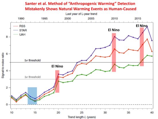
- Proof of point #1 can be seen in their plot (below) of how the agreement between models and satellite observations increases over time. The fact that the agreement surges during major El Nino warm events is evidence that natural sources of warming can be mis-diagnosed as an anthropogenic signature. What if there is also a multi-decadal source of warming, as has been found to be missing in models compared to observations (e.g. Kravtsov et al., 2018)?
- John Christy pointed out that the two major volcanic eruptions (El Chichon and Pinatubo, the latter shown as a blue box in the plot below), which caused temporary cooling, were in the early part of the 40 year record. Even if the model runs did not include increasing CO2, there would still be agreement between warming trends in the models and observations just because of the volcanic cooling early would lead to positive 40-year trends. Obviously, this agreement would not indicate an anthropogenic source, even though the authors methodology would identify it as such.
- Their metric for measuring agreement between models and observations basically multiplies the regional warming pattern in the models with the regional warming pattern in the observations. If these patterns were totally uncorrelated, then there would be no diagnosed agreement. But this tells us little about the MAGNITUDE of warming in the observations agreeing with the models. The warming in the observations might only be 1/3 that of the models, or alternatively the warming in the models might be only 1/3 that in the observations. Their metric gives the same value either way. All that is necessary is for the temperature change to be of the same sign, and more warming in either the models or observations will cause an diagnosed increase in the level of agreement metric they use, even if the warming trends are diverging over time.
- Their metric of agreement does not even need a geographic “pattern” of warming to reach an absurdly high level of statistical agreement. Warming could be the same everywhere in their 576 gridpoints covering most the Earth, and their metric would sum up the agreement at every gridpoint as independent evidence of a “pattern agreement”, even though no “pattern” of warming exists. This seems like a rather exaggerated statistic.
These are just some of my first impressions of the new study. Ross McKitrick is also examining the paper and will probably have a more elegant explanation of the statistics the paper uses and what those statistics can and cannot show.
Nevertheless, the metric used does demonstrate some level of agreement with high confidence. What exactly is it? As far as I can tell, it’s simply that the satellite observations show some warming in the last 40 years, and so do the models. The expected pattern is fairly uniform globally, which does not tell us much since even El Nino produces fairly uniform warming (and volcanoes produce global cooling). Yet their statistic seems to treat each of the 576 gridpoints as independent, which should have been taken into account (similar to time autocorrelation in time series). It will take more time to examine whether this is indeed the case.
In the end, I believe the study is an attempt to exaggerate the level of agreement between satellite (even UAH) and model warming trends, providing supposed “proof” that the warming is due to increasing CO2, even though natural sources of temperature change (temporary El Nino warming, volcanic cooling early in the record, and who knows what else) can be misinterpreted by their method as human-caused warming.


