Home/Blog
The total warming of the hottest 3 days in each summer month averaged across 400 mostly-airport weather stations is only 1.2 deg. F over 40 years.
I recently posted about the weather observations from Reagan National Airport that showed the warmest days of summer have experienced no statistically significant warming in the last 40 years, despite this being the period of maximum radiative forcing from increasing atmospheric CO2.
Of course, you would never know this based upon media reports… in fact, most people are probably under the impression that our hottest days are rapidly getting hotter.
One commenter on my post (correctly) pointed out that what I presented was just one weather station. Well, now I have processed ~400 mostly-airport (WBAN) weather stations and over 2,000 cooperative observer (COOP) stations across the U.S.
Here’s a plot of those station locations.
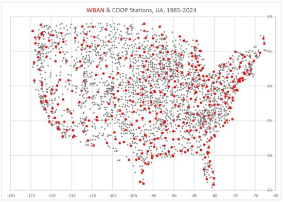
The period I’m addressing is the last 40 years (1985-2024) because we have Landsat-based Impervious Surface (IS) cover data at high spatial resolution (30 m) for those years, and I’m looking at how recent warming trends are impacted by the urban heat island (UHI) effect. IS is a percentage cover of Landsat pixels by roads, parking lots, buildings, and other human development impervious surfaces.
Daily High Temperature (Tmax) Results
I don’t like “heat waves” as a statistical quantity. It is “binary”, which means it has an arbitrarily chosen threshold of temperature and number of days of duration, and those can be manipulated to give very different results for heat wave trends.
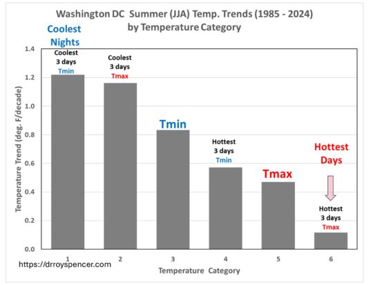
Instead, I computed a statistic which has no threshold, is always the same number of days, and occurs every month: the average of the 3 warmest (and 3 coolest) days in each summer month (June, July, August) during 1985-2024.
I can then compute trends in those, just like is usually done for the average of all daily Tmax (or Tmin). I did this separately for the mostly-airport (WBAN) stations which are well maintained for aviation safety reasons, and for the COOP stations which have varying and mostly unknown levels of quality control, siting, etc.
Since people are used to looking at time series, we will start with the multi-station average summer temperatures for 3 of the 9 U.S. climate regions as defined by NOAA/NWS. From top to bottom, these are the Upper Midwest, the Northeast, and the Southeast; I have offset the warmest-3 and coolest-3 day results for legibility:
Note how much more slowly the warmest 3 days per month are warming compared to the coolest 3 days. As an example, for the Northeast U.S. climate region (PA/MD and northeastward), the hottest summer days have been warming at an average rate of 0.10 C/decade, which equates to 0.7 deg. F over 40 years. All 9 climate regions exhibited this feature, by varying amounts. Again, these results are all for daily maximum temperatures, Tmax.
Next, I took all of the stations in the U.S., and split them into 7 equal-size groups of increasing IS growth which I am using as a proxy for urbanization for the purposes of temperature impacts of the urban environment. These plots are different: The temperature trend is on the vertical axis, while the category of urbanization growth is on the horizontal axis. Again, these results are for Tmax; the results for WBAN stations are on the left, and for COOP stations are on the right:
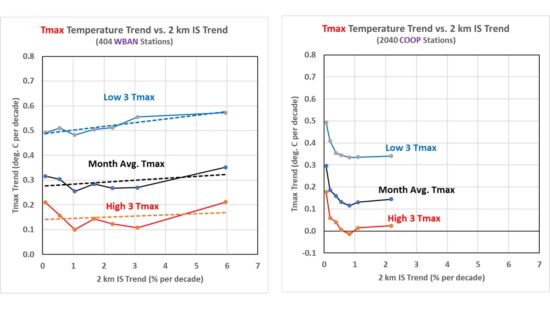
There is little dependence of the 40-year temperature trends on the rate of growth in urbanization (IS trend), maybe just slight upward slope with the most rapidly urbanizing stations experiencing a little higher warming trend. The generally higher trends at low values of IS growth (especially in the COOP data) are because most of those stations are in the western U.S., where warming trends have been greater. I wouldn’t put too much faith in the absolute values of the COOP trends because no time-of-observation (TOBS) adjustment has been made. But that should not affect the spread between warmest and coolest days.
What really stands out is the fact that the coolest summer days are warming much faster than the warmest summer days. The difference in warming trends is about 0.35 C/decade in the WBAN data, a little less in the COOP stations. This suggests a moderation of summer temperatures, with less variability.
Averaged over all 400 WBAN stations, the warming trend equates to only 1.2 deg. F of warming in 40 years. I would wager this weak upward trend in the warmest summer days is much less than what most people would expect, given media coverage of “heat waves”.
And if you are wondering how the trend in the average of all Tmax temperatures in the month compares to NOAA’s official homogenized, area-averaged dataset, they are about the same, to within 0.01 or 0.02 deg. C/decade
Daily Low Temperature (Tmin) Results
As seen in the next plot, the effects of increasing urbanization are much more pronounced in daily minimum (Tmin) than daily maximum (Tmax) temperatures, with the greatest warming trends occurring at stations with the fastest growth in impervious surfaces.
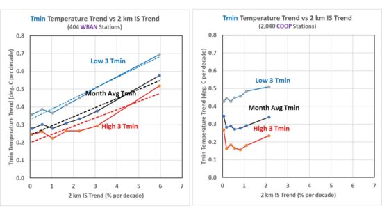
Note that these plots allow one to estimate what the station average warming trends would be in the absence of urbanization by just looking at where the regression lines intersect the vertical axis (IS trend = 0). Remember, the 7 IS trend groups have equal numbers of stations. If those values are used for the “climate signal” (as opposed to the increasing urbanization signal), the trends are not too different from those in Tmax
Conclusion
My main takeaway is that, contrary to what we have been told, there has been very little warming of the hottest summer days averaged across the U.S. in the last 40 years. The second takeaway is that nighttime (Tmin) temperatures are warming rapidly with urbanization, but when those statistics are extrapolated to no growth in urbanization, the average Tmin warming trend is greatly reduced, especially for rapidly growing locations.