Archive for December, 2025

The Record Hot UK Summer of 2025: Validation of the UKMO Methodology, but the Record Was Only in Tmin

Friday, December 19th, 2025

UPDATE: Criticism of the Following Post from The Daily Sceptic

Due to the holidays, I just now saw the post at The Daily Sceptic criticizing my support of the UK Met Office methodology for combining temperature monitoring stations’ data. In retrospect, I should have made it clear that my comments that follow only address the UKMO method for combining stations of various lengths of record, how they “replace” closed stations with surrounding stations, and the use of urbanization-influenced stations. I do not mean to suggest that there are no other time-dependent changes (say, in instrumentation types) that could cause spurious warming in the record. Nor do I claim there are no time-dependent increases in urban heat island spurious biases in the record. I only address (1) the fact that a closed station being replaced with a surrounding station does not necessarily cause problems with long-term monitoring; (2) that the UKMO creation of a fine (1×1 km) grid of UK temperatures from extremely sparse data does not seem to cause spurious trends in the record, and (3) just because a station is poorly-sited doesn’t mean it can’t be used for long-term monitoring. I agree that there are other issues I did not address which impact long-term trends in the UK (or elsewhere). In other words, I was not trying to be comprehensive in my analysis.

SUMMARY

  1. My analysis of UK daily high (Tmax) and low (Tmin) temperatures during 1960-2025 using a station relative bias removal method produces UK-average summer temperature variations essentially identical to the very different UKMO methodology.
  2. In both my and the UKMO analysis, 1976 (not 2025) was the hottest summer in daily high temperatures (Tmax), with 2025 taking 3rd or 4th place; the “record” hot year of 2025 was due to nightly low temperatures (Tmin) being anomalously warm.
  3. The average of the three hottest daytime temperatures in each summer month put the summer of 2025 in 4th place since 1960, behind 1976, 1995, and 2022 (which were essentially identical).

There has been criticism of the UK Met Office’s methodology for monitoring long-term changes in UK-average temperatures, starting with Tallbloke’s (Ray Sanders’) blog post on 31 October 2024. A major criticism that Tallbloke has is the fact that most UK stations do not meet the World Meteorological Organization (WMO) criteria for a good climate monitoring station. The UKMO doesn’t actually use the WMO quality classification system, but their own 4-tiered system. Another criticism is that many UK stations have closed in recent years, and so those stations are, in effect, estimated (“fabricated”?) from surrounding stations.

No Station is Perfect

On the subject of which WMO (or UKMO) class of station is suitable for long-term climate monitoring, I think it’s important to note that a station could be placed in a non-natural, anomalously warm urban environment, but as long as that environment stays the same over time, it can probably still be used for climate change monitoring.

For example, the urban heat island (UHI) effect of London was described over 200 years ago by Luke Howard. Even if London is significantly warmer than the surrounding rural areas, it might be that there has been little additional UHI warming since then, and so a downtown London weather station might be adequate for monitoring large-scale climate change, since I have no reason to believe that (say) 1 deg. C of large-scale warming will lead to city warming substantially different from 1 deg. C.

On the additional subject of replacing a closed station with estimates from surrounding stations (which NOAA also does because so many of their UNHCN stations in the U.S. have closed, a process that has also been criticized), I believe it is a little disingenuous to claim those data are “fabricated”. Rather than continuing the closed station record with estimates from surrounding stations, one could just use the surrounding stations, which is the same thing.

The UKMO’s Fancy High-Resolution Mapping of UK Temperatures

The Met Office divides the UK land mass into tiny (1×1 km) grid cells, and the temperature in each one is estimated from the nearest station(s) using average, regression-based adjustments for elevation, latitude, longitude, terrain shape, coastal proximity, and land use variations. The result is a seemingly complete coverage of UK for the purpose of temperature monitoring:

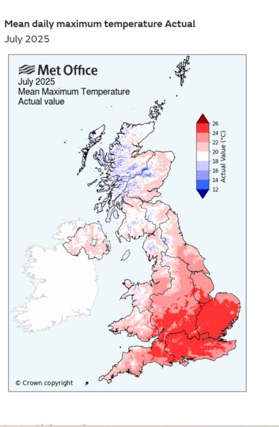
And I get why this is done: the UKMO primary mission is to provide daily weather monitoring and forecasts, and given limited station data providing actual measurements, their system provides useful temperature estimates in areas far removed from actual weather stations.

Of course, all of this high-resolution fanciness must be anchored by actual measurements, and in the daily Global Historical Climate Network (GHCNd) database, only ~100 stations exist across the UK in recent years. (There were very few GHCNd stations before 1960, so I will address temperature change only since then here). This means only 1 in ~2,400 UK grid cells has an actual temperature monitoring station in the GHCNd dataset, which is the dataset all global temperature monitoring efforts rely upon. While the UKMO might have access to somewhat more stations than are included in the GHCNd dataset, my point will remain valid.

Nevertheless, this doesn’t mean that long-term climate change can’t be monitored with the existing station network. What complicates matters is that stations come and go over time, and this can introduce biases that change over time and corrupt long-term estimates of temperature change. How one accounts for, and adjusts for, these changes is not a settled matter.

Removing Relative Biases Between Stations

From what I’ve been able to glean, the UKMO does not actually calculate and remove relative biases between stations. Instead, they use the above-described strategy to evaluate how station temperatures vary with latitude, longitude, elevation, proximity to the coast, land use (e.g. urbanization), etc., then apply regression-based techniques to estimate temperatures on the 1×1 km grid. This has no doubt involved considerable effort, and having done similar kinds of data analysis myself, it’s a complex task.

A simpler way of monitoring climate change is to assume that long-term (in the current example, 65 years) warming trends that actually exist in nature are pretty uniform across the UK. If this assumption holds, we can just take whatever stations exist over time, no matter where they are located or what their local microclimate-induced biases are, and quantify how the temperatures at each one varies over time, and then average all of those variations together. This methodology is somewhat similar to that of Hansen and Lebedeff, 1987, as well as our UAH satellite global temperature dataset.

In my implementation of this relative bias removal method, I start with the stations having the longest periods of record. In the UK, only 3 stations have had continuous records in all 126 years from 1900 to 2025: CET Central England, Armagh, and Stornoway Airport. (Only 31% of the UK stations had periods of record at least half as long, 63+ years). I average those 3 stations together. Then, I take the station(s) with the next-longest record (Oxford, 124 years), compute the average difference with the original series, and add it to the series to make a new 4-station average. This is done sequentially for all (148) stations in the UK since 1900 that have at least 2 years of record, going down the list from the longest periods of record to the shortest. Again, since there were few stations before 1960, the following plots cover variations since 1960.

Amazingly, the result using this simple relative bias removal method produces yearly summer-average temperatures (average of daily high [Tmax] and daily low [Tmin]) that are nearly identical to the much fancier UKMO methodology:

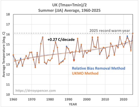
In this plot (as well as the others, below) for display purposes I have removed a small (~1-2 deg C) temperature offset due to my use of the original 3 stations for an absolute temperature baseline, whereas the UKMO uses their gridded estimate of the entire area of the UK. The linear trends in the above plot are essentially identical, at +0.27 C/decade.

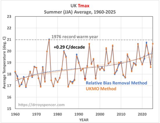
But that record high did not exist for the daytime high temperatures. As seen in the next plot, 2025 was very similar to several years since 1995, while 1976 holds the record for hottest summertime daily high temperatures:

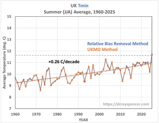
So, where did the 2025 record come from? It was due to the nighttime temperatures being so warm (although I don’t see how 53 deg. F is is insufferably warm). This was true in both analyses of the station data:

Finally, since I am analyzing daily temperature data, I can compute the average of the three hottest daytime temperatures in each summer month, which produces this:

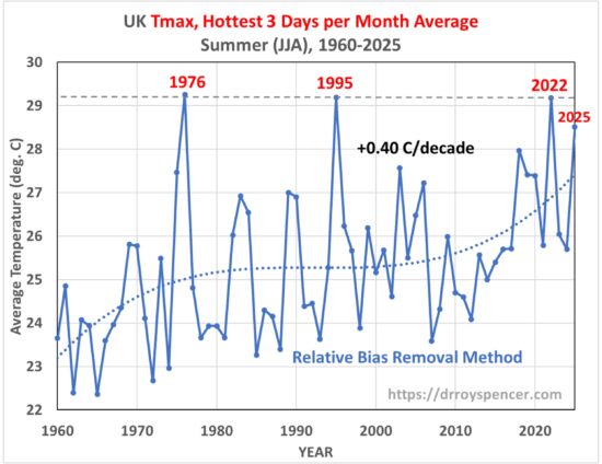
For this statistic we see that the record is a 3-way tie between 1976, 1995, and 2022. We also see a stronger warming trend (+0.40 C/decade vs ~+0.26 C/decade in all-days average Tmax and Tmin). I suspect this is due to more Saharan air intrusions in recent decades, which are the primary cause of excessively hot days in the UK.

Conclusions

Despite criticisms of the UKMO data and methods for computing UK-average temperatures, I find that a simple bias-removal method of combining all available UK stations produces essentially identical results to the much more complex UKMO methodology. It should provide some vindication for the UKMO methodology in the context of climate temperature trend monitoring.

The record hot summer of 2025 in the UK was in the nightly minimum temperatures, not in the daytime maximum temperatures. This is true in both my analysis and that of the UKMO.

Finally, neither my nor the UKMO method accounts for possible changes in stations over time, such as an increasing urban heat island (UHI) effect at some stations. Based upon our work on this in recent years I suspect this effect since 1960 would be small, but I don’t know that for sure.

Canada Summer Temperature Trends, 1900-2023: Part Deux

Tuesday, December 9th, 2025

Summary

An improved method for merging weather station temperature data leads to revised temperature trends for the period 1900-2023 for the 6 largest southern provinces of Canada, compared to those I previously posted here and here. The general conclusions remain the same, but the details change somewhat. Because of the improved methodology, this post supersedes those posts. The main conclusions for the period 1900-2023 are:

  1. Southern Canada daily high summer temperatures [Tmax] have warmed at only 1/3 the rate of daily low temperatures [Tmin]: +0.06 and +0.18 C/decade, respectively;
  2. Averaged across southern Canada, 2021 and 1961 are the two hottest summers for daily high temperatures;
  3. Even though 2021 is the hottest for Tmax, none of the individual 6 provinces has 2021 as record warmest; and
  4. Tmax and Tmin trends are surprisingly uniform across those 6 provinces.

The “New” Methodology

In recent months I’ve spent a lot of time investigating various methods for combining different weather station records for the purpose of quantifying long-term temperature changes. One of the things I discovered is that, if there are few stations in a given year, doing a homogenization process such as the Menne and Williams (2009) Pairwise Homogenization Algorithm (PHA, used by NOAA and the BEST dataset providers) can lead to a random walk behavior as errors in the method in a single year will then propagate through all later years. This is probably not a problem in the U.S. since there are so many stations, but in other parts of the world it could be an issue. So, I think it is worthwhile to use an alternative methodology involving different assumptions.

After my previous posting of the aforementioned analyses of Canadian temperature trends, a few people (including John Christy) correctly pointed out that my straight averaging of all available stations in a province (or U.S. state) isn’t the best way to come up with a long term time series of temperatures. This is because as stations come and go over the years, they might be in different areas with different average weather. Of course, I already knew this, but ignored that nuance for the time being. But when I implemented a method that removes inter-station biases, I discovered that it did make some difference (as expected).

So, I implemented the merging procedure that John and I have used for many years with our UAH satellite temperature dataset, which is to remove relative station (or satellite) biases during overlap periods of time. This takes out any inter-station differences due to geographic location, altitude, urban heat island effects, poor siting of thermometers, equipment differences, etc. What isn’t accounted for is any spurious station temperature trend effects, say due to increasing urbanization, a sensor location or equipment change at that station, etc. So, for this initial version of the method I am assuming those changes average out over time. Of course, UHI effects would not average out over time since they almost always operate in one direction (spurious warming).

One issue is how to start the merging of stations together. I concluded that it is best to start with the stations with the longest periods of record, then add in the other stations, in ranked decreasing order of length-of-record, after removing each station’s offset (bias) relative to the average of all previously merged stations. As an example, the Alberta data merging (results shown later) involves a total of 950 separate stations, with varying lengths of record. The longest operating Alberta station was 111 out of 124 possible years (1900-2023). Half of the Alberta stations had periods of record of 15 years or less. The shortest period of record included was 2 years, because that is the minimum necessary to remove an average inter-station bias as well as have any time-variation information.

Results

The following figure shows the daily high (Tmax) and low (Tmin) summer (June-July-August) temperature trends, 1900-2023, for the 6 provinces from which I analyzed data. The other provinces have very few stations by comparison to these six.

There is a surprising (at least to me) level of consistency in the trends across the provinces. The Tmax trends average only 1/3 the Tmin trends, so summer nights are warming much faster than summer days. Again, urban heat island efects have not been removed, so it remains unknown how much of this difference is due to UHI effects, which are much more pronounced in Tmin than in Tmax.

The next figure shows the yearly time series averaged across those 6 provinces. I’ve included the linear trend as well as a 3rd order polynomial fit to the data, the latter to reveal the warmth during the Dust Bowl years of the 1930s.

Interestingly, even though none of the individual provinces had 2021 (the year of the epic late-June heat wave in western Canada) as the record warmest summer, the average across the 6 provinces did have 2021 as record warmest, barely edging out 1961:

Note that the Dust Bowl years of the 1930s shows up much more in the Tmax than Tmin data, probably due to lower humidity air. The cool summers of 1992-93 after the major eruption of Mt. Pinatubo also show up clearly.

Individual Province Time Series

Following are the 6 individual province time series of yearly summer Tmax and Tmin; all temperature scales span 8 deg. C of range for ease of comparison. I present these without comment, except to point out that the warmest BC year was 1958, not the epic heat wave year of 2021, the effects of which were maximized in this province. My next step after this is to apply the same methodology to the 48 contiguous U.S. states (CONUS), and compare to NOAA’s homogenized trends for those states.

Canada Summer Daily Low Temperature Trends, 1900-2023

Friday, December 5th, 2025

UPDATE: This post has been superseded by this one in which I remove inter-station biases with a new station merging strategy.

This is the Tmin (daily minimum temperature) version of the Canada temperature trend results I posted yesterday , which were for Tmax (daily maximum temperatures). These results are quite different: whereas the high temperatures have seen essentially no warming trends across southern Canada since 1900, the nighttime temperatures have warmed in each one of the 6 provinces. In the next few days I will post just how much these observed Canadian temperature trends depart from the CMIP6 climate model simulations, which are the primary tool being used to change energy policy.

SUMMARY

  1. Over the period 1900-2023, the average summer (JJA) daily low temperatures across the six southernmost large provinces of Canada (British Columbia, Alberta, Saskatchewan, Manitoba, Ontario, and Quebec) show warming trends, averaging +0.14 C/decade.
  2. The strongest warming (+0.18 C/decade) occurred for the coolest summer nights (coolest 3 days per summer month), while the warmest summer nights warmed at +0.10 C/decade.
  3. Whereas 7 of the 10 warmest summer daytime (high) temperatures occurred in the 1930s, 8 of 10 of the warmest nighttime (low) temperatures have occurred since 2003.
  4. Results for the 6 provinces separately are also presented.

Introduction

Below I present analyses of summertime daily low temperature (Tmin) trends from all available stations in the 6 southernmost large provinces, based upon the daily Global Historical Climate Network (GHCNd) dataset. These are the 6 provinces that border the Lower 48, and contain 86% of Canada’s population. (The results for daily high temperatures [Tmax] were posted yesterday.)

I simply averaged together the relevant statistics (monthly average Tmin, average of the warmest 3 days’ Tmin in each month, and average of the coolest 3 days’ Tmin in each month) from all available stations. Each station had to have at least 90% of the days in a month reporting data for that month to be included in the analysis.

Since stations come and go over the years, and since there are some large terrain elevation variations in western Canada, I performed an elevation correction to these Tmin metrics, in all provinces, using the departure of each year’s station-average elevation from the all-year (1900-2023) station average elevation, using a lapse rate of 6.5 deg. C per km. Corrections for average changes in station-average latitude were not done, which might be necessary in the winter since there are large North-South gradients in air temperature then. Such corrections in the summer would likely be small, but I can revisit that nuance at a later time.

Results

I’ll start with the 6-province average Tmin temperature time series, along with the total number of stations available in each year. In all plots that follow, I list the linear temperature trends, but plot a 3rd order polynomial fit to the data to help capture any multi-decadal variations not well reflected in simple linear trends. In all provinces the number of stations increases from 1900 to the 1970s, then decreases substantially in recent years.

As can be seen in the first plot (averages for all 6 major provinces), there has been an average summertime warming trend of +0.14 C/decade

I have also annotated 2021, which experienced the extreme heatwave in late June in western Canada. That event helped to push the warmest 3-day average Tmin metric (red curve) to the highest average temperature of any year since 1900. (Just to be clear, this is the warmest 3 days in each month in *minimum* daily temperature [Tmin]).

Notably, 8 of the 10 warmest summers in the all-days average Tmin have occurred since 2003. But, as I will show in the next few days, numbers matter: these warming trends are well below what the CMIP6 climate models produce for the same region of Canada.

Individual Provinces

The results for the individual provinces follow. I present them without comment; my Canadian friends can peruse the results for their home province if they wish. These are presented from West to East:

Canada Summer Daily High Temperature Trends, 1900-2023

Thursday, December 4th, 2025

NOTE: This post has been superseded by this one in which I remove inter-station biases with a new station merging strategy.

SUMMARY

  1. Over the period 1900-2023, the average summer (JJA) daily high temperatures across the six southernmost large provinces of Canada (British Columbia, Alberta, Saskatchewan, Manitoba, Ontario, and Quebec) show no trend.
  2. The average of the 3 hottest days’ in each month month show a slight downward trend, while the 3 coolest days’ average temperature per month shows a slight upward trend.
  3. Recent years have generally averaged as warm as was experienced in the 1920s to 1940s, with 7 of the 10 hottest summers occurring in the 1930s.
  4. Results for the 6 provinces separately are also presented.

Introduction

Given media reports, it is likely that most Canadians think they have been experiencing unprecedented summer warmth in the last couple of decades. But this isn’t true.

Below I present analyses of daily high temperatures (Tmax) from all available stations in the 6 southernmost large provinces, based upon the daily Global Historical Climate Network (GHCNd) dataset. These are the 6 provinces that border the Lower 48, and contain 86% of Canada’s population.

I simply averaged together the relevant statistics (monthly average Tmax, average of the warmest 3 days in each month, and average of the coolest 3 days in each month) from all available stations. Each station had to have at least 90% of the days in a month reporting data for that month to be included in the analysis.

Since stations come and go over the years, and since there are some large terrain elevation variations in western Canada, I performed an elevation correction to these Tmax metrics, in all provinces, using the departure of each year’s station-average elevation from the all-year (1900-2023) station average elevation, using a lapse rate of 6.5 deg. C per km. Corrections for average changes in station-average latitude were not done, which might be necessary in the winter since there are large North-South gradients in air temperature then. Such corrections in the summer would likely be small, but I can revisit that nuance at a later time.

Results

I’ll start with the 6-province average Tmax temperature time series, along with the total number of stations available in each year. In all plots that follow, I list the linear temperature trends, but plot a 3rd order polynomial fit to the data which captures the dominant feature of relative warmth in the 1920s to 1940s and in the most recent decades, but relative coolness in the intervening decades. In all provinces the number of stations increases from 1900 to the 1970s, then decreases substantially in recent years.

As can be seen in the first plot (averages for all 6 major provinces), there has been no long-term linear trend in the average summertime Tmax (0.00 deg. C/decade), a small downward trend in the 3 hottest days per month (-0.02 deg. C/decade), and a slight warming trend in the 3 coolest days per month (+0.03 deg. C/decade). Relative warmth around the 1930s is evident, as well as warming in recent years.

I have also annotated 2021, which experienced the extreme heatwave in late June in western Canada. While that pushed the hottest 3-day average Tmax metric (red curve) to the highest average temperature of any year since 1900, the 3-month (all-days) average summer Tmax temperatures was very close to other years (3rd place, behind 1961 and 1919).

Notably, 7 of the 10 hottest summers occurred in the 1930s.

Individual Provinces

The results for the individual provinces follow. I present them without comment; my Canadian friends can peruse the results for their home province if they wish. These are presented from West to East:

UAH v6.1 Global Temperature Update for November, 2025: +0.43 deg. C

Tuesday, December 2nd, 2025

The Version 6.1 global average lower tropospheric temperature (LT) anomaly for November, 2025 was +0.43 deg. C departure from the 1991-2020 mean, down from the October, 2025 value of +0.53 deg. C.

The Version 6.1 global area-averaged linear temperature trend (January 1979 through November 2025) remains at +0.16 deg/ C/decade (+0.22 C/decade over land, +0.13 C/decade over oceans).

The following table lists various regional Version 6.1 LT departures from the 30-year (1991-2020) average for the last 23 months (record highs are in red).

YEARMOGLOBENHEM.SHEM.TROPICUSA48ARCTICAUST
2024Jan+0.80+1.02+0.58+1.20-0.19+0.40+1.12
2024Feb+0.88+0.95+0.81+1.17+1.31+0.86+1.16
2024Mar+0.88+0.96+0.80+1.26+0.22+1.05+1.34
2024Apr+0.94+1.12+0.76+1.15+0.86+0.88+0.54
2024May+0.78+0.77+0.78+1.20+0.05+0.20+0.53
2024June+0.69+0.78+0.60+0.85+1.37+0.64+0.91
2024July+0.74+0.86+0.61+0.97+0.44+0.56-0.07
2024Aug+0.76+0.82+0.69+0.74+0.40+0.88+1.75
2024Sep+0.81+1.04+0.58+0.82+1.31+1.48+0.98
2024Oct+0.75+0.89+0.60+0.63+1.90+0.81+1.09
2024Nov+0.64+0.87+0.41+0.53+1.12+0.79+1.00
2024Dec+0.62+0.76+0.48+0.52+1.42+1.12+1.54
2025Jan+0.45+0.70+0.21+0.24-1.06+0.74+0.48
2025Feb+0.50+0.55+0.45+0.26+1.04+2.10+0.87
2025Mar+0.57+0.74+0.41+0.40+1.24+1.23+1.20
2025Apr+0.61+0.77+0.46+0.37+0.82+0.85+1.21
2025May+0.50+0.45+0.55+0.30+0.15+0.75+0.99
2025June+0.48+0.48+0.47+0.30+0.81+0.05+0.39
2025July+0.36+0.49+0.23+0.45+0.32+0.40+0.53
2025Aug+0.39+0.39+0.39+0.16-0.06+0.69+0.11
2025Sep+0.53+0.56+0.49+0.35+0.38+0.77+0.32
2025Oct+0.53+0.52+0.55+0.24+1.12+1.42+1.67
2025Nov+0.43+0.59+0.27+0.24+1.32+0.78+0.37

The full UAH Global Temperature Report, along with the LT global gridpoint anomaly image for November, 2025, and a more detailed analysis by John Christy, should be available within the next several days here.

The monthly anomalies for various regions for the four deep layers we monitor from satellites will be available in the next several days at the following locations:

Lower Troposphere

Mid-Troposphere

Tropopause

Lower Stratosphere